It’s Time to Start Making Your Web Apps Reactive

Original Source: https://www.sitepoint.com/reactive-web-apps/?utm_source=rss

It's Time to Start Making Your Web Apps Reactive

This article was created in partnership with Manning Publications. Thank you for supporting the partners who make SitePoint possible.

You’ve heard of the principle of “survival of the fittest”, and you know that it’s especially true in web development. Your users expect split-second performance and bug-free interfaces — and if you can’t deliver them, you can be sure they’ll go straight to a competitor who can. But when it comes to survival, it’s important to remember the full principal of evolution: the best way to thrive is to be adaptable to change.

That’s where reactive programming comes in. Reactive applications are created to be adaptable to their environments by design. Right from the start, you’re building something made to react to load, react to failure, and react to your users. Whatever being deployed to production throws at your application, reactive programming will mean it can handle it.

How does reactive programming achieve this? It embeds sound programming principles into your application right from the very beginning.

Reactive Applications Are Message-driven

In reactive programming, data is pushed, not pulled. Rather than making requests of data that may or may not be available, client recipients await the arrival of messages with instructions only when data is ready. The designs of sender and recipient aren’t affected by how you propagate your messages, so you can design your system in isolation without needing to worry about how messages are transmitted. This also means that data recipients are only consuming resources when they’re active, rather than bogging down your application with requests for unavailable data.

Reactive Applications Are Elastic

Reactive applications are designed to elastically scale up or scale down, based on the amount of workload they have to deal with. A reactive system can both increase or decrease the resources it gives to its inputs, working without bottlenecks or contention points to more easily shard components and then distribute resources among them. Not only does this save you money on unused computing power, but even more importantly, it means that your application can easily service spikes in user activity.

Reactive Applications Are Responsive

Reactive applications must react to their users, and to their users’ behavior. It’s essential that the system responds in a timely manner, not only for improved user experience, but so that problems can be quickly identified and (hopefully!) solved. With rapid response times and a consistent quality of service, you’ll find that your application has simpler error handling as well as much greater user confidence.

Reactive Applications Are Resilient

Reactive applications need to respond, adapt, and be flexible in the face of failure. Because a system can fail at any time, reactive applications are designed to boost resiliency through distribution. If there’s a single point of failure, it’s just that — singular. The rest of your reactive application keeps running, because it’s been built to work without relying on any one part.

Further Resources

Reactive programming can be challenging to master. Fortunately, there’s lots of resources to help you out. Some of the best are the books and videos of Manning Publications, publishers of the highest quality tech books and videos you can buy today.

Exploring Modern Web Development is a 100% free guide to the most common tools for reactive programming. With this well-rounded sampler, you’ll have a firm foundation for developing awesome web apps with all the modern reactive features and functions today’s users expect.

SitePoint users can get 40% off top Manning reactive programming and web development books and videos with the coupon code NLSITEPOINT40. Check out popular bestsellers here.

The post It’s Time to Start Making Your Web Apps Reactive appeared first on SitePoint.

Free HTML Templates for Photographers

Original Source: http://feedproxy.google.com/~r/1stwebdesigner/~3/BJRXzw16F54/

Every photographer should have an online portfolio, but it’s not exactly easy to make one yourself. If you’re not familiar with web development, it’s going to be very hard to make a site from scratch.

Thanks to template designers, you won’t have to. You can find hundreds of totally free HTML templates online. All you have to do is add your own text and images, and you can even use them as a base to add your own HTML elements.

Want to try it? We’ve collected some of the best, free, photography-focused HTML templates. Give your photos the gorgeous presentation they deserve.

UNLIMITED DOWNLOADS: Email, admin, landing page & website templates

DOWNLOAD NOW

Studio

Example of Studio

Studio is an absolutely stunning photography theme jam-packed with opportunities to show off your photos. The homepage is dedicated to a slider of your work, and nearly every page besides includes at least a small scrolling gallery.

Sentra

Example of Sentra

Professional photographers and videographers will love this one. The header features an animated photography slideshow that scrolls seamlessly into a lightbox gallery. There’s room for a blog and contact form too. This is a template that’s sure to help you attract more customers.

Snapshot

Example of Snapshot

Snapshot is a dark theme for photo agencies. The professional, modern look is enhanced by beautiful scrolling animations and plenty of room to show off photos. There’s a contact form, testimonial slider, and a small portfolio gallery with lightbox support too.

Shutter

Example of Shutter

Shutter is all about the photography. The dark homepage is free of fluff and completely dedicated to a gallery featuring your work. Fixed sidebar navigation leads you to another gallery, bio page, contact form, and even a blog.

Dimension

Example of Dimension

This really cool one-page design uses a card-based layout. Each link opens a popup card with room for text and images. It’s very simple, but with the full-screen photo background, it can make an effective small portfolio for photographers.

Photon

Example of Photon

Photon uses a scrolling slider to hook new users, with a call to action to lead them right to your gallery pages. Once they’re done exploring your work, they’ll definitely want to visit your services or contact page to learn more.

Strata

Example of Strata

This simplistic design features a fixed sidebar with social links, avatar, and a small about section. Scrolling reveals a beautiful lightbox gallery and contact form so clients can reach out. One nice touch here is the subtle parallax effect on the left as you scroll.

Earth

Example of Earth

Earth has a pretty unique design: the site is made entirely of a full-screen gallery, which swipes to show a second gallery slider, contact form, or about page as you click. It’s definitely an interesting idea and it’s implemented very well.

Louie

Example of Louie

Neatly and carefully designed, Louie is the perfect portfolio for photographers. It uses a fixed left sidebar that follows you across the whole site, with multiple bite-sized pages to concisely show off your work.

Photography

Example of Photography

This beautiful homepage portfolio is great for photographers of all caliber. Featuring a gorgeous full-screen header, collapsible fixed navigation, a moderately sized lightbox gallery, a contact form, and support for a blog, you’ve got all the elements you’ll need to make your debut as a professional photographer.

The Card

Example of The Card

Sometimes simple is best, and a picture is worth a thousand words. This design uses small cards for a minimal amount of text, and otherwise relies on the full-screen background and lightbox gallery page to prove that you’re worth hiring. This site is like a big slideshow for your best work.

Gorgeous HTML Photography Themes

Free HTML templates have made creating a website much more accessible. Now you don’t need to learn advanced web design skills or hire a developer to make a portfolio site; just upload a file and tweak some text.

You can have a beautiful, stand-out website with just a little work, and you can get back to focusing on your photography career.


Apple’s latest Mac Pro is easy to fix (just expensive to buy)

Original Source: http://feedproxy.google.com/~r/CreativeBloq/~3/wkUIQFeBA5A/apple-mac-pro-fix

The latest Apple Mac Pro may look like a cheese grater, but it is one hell of a machine. Buying one also has a hefty price tag. The Mac Pro will cost you at least $6,000, and you could spend over $52,000 on the highest spec version.

With such a big outlay, you'd want it to be reliable. No one wants to splash out a such a wad of cash to only have to pay again to get to it fixed. But according to iFixit – a site that that teaches people how to fix almost anything – the latest Mac Pro is "Fixmas miracle,". It's "a masterclass in repairability”. Though iFixit sadly didn't test out how to fix those $400 Mac Pro wheels you can buy as an extra. 

Mac Pro

Looks easy to fix. Doesn’t it?

So what makes it easy to repair? Well you can fix it using "only standard tools" and more interestingly, with "no tools at all", meaning that some parts are repairable with just your fingers.

Another plus point is the adoption of "industry-standard sockets and interfaces" for its major components. This means that they're easy to get hold of (see Apple’s list of approved repairs) and replace.  

But, be warned, there are a few drawbacks as noted by iFixit. The SSDs (Solid State Hard Drives) used by Apple are custom-made, and replacing these does require an Apple technician.

We love that the Mac Pro is offering peace of mind (well sort of) and making its desktops easier to fix. But, when you are paying a premium for a top of the range model, you really shouldn't be worrying about having to fix it. You should simply be enjoying what it brings to your everyday existence. And if you'd spent $6,000 or more on a machine, would you be brave enough to fix it yourself?

Read iFixit's full breakdown here.

IKEA takes a bite out of Apple in hilarious new adApple MacBook Pro 16-inch review$999 Mac Pro stand: Has Apple lost the plot?

How to Quickly and Easily Remove a Background in Photoshop

Original Source: https://www.sitepoint.com/how-to-quickly-easily-remove-a-background-in-photoshop/?utm_source=rss

How to Quickly and Easily Remove a Background in Photoshop

This article on how to remove a background in Photoshop remains one of our most popular posts and was updated in 2019 for Adobe Photoshop 2020.

Photoshop offers many different techniques for removing a background from an image. For simple backgrounds, using the standard magic wand tool to select and delete the background may well be more than adequate. For more complicated backgrounds, you might use the Background Eraser tool.

The Background Eraser Tool

The Background Eraser tool samples the color at the center of the brush and then deletes pixels of a similar color as you “paint”. The tool isn’t too difficult to get the hang of. Let me show you how it works.

Remove a Background, Step 1: Open your Image

Start by grabbing an image that you want to remove the background from. I’ll be using the image below, as it features areas that range from easy removal through to more challenging spots. I snagged this one for free from Unsplash.

The example image: man standing against lattice background

Now let’s open it in Photoshop.

The example image opened in Photoshop

Remove a Background, Step 2: Select Background Eraser

Select the Background Eraser tool from the Photoshop toolbox. It may be hidden beneath the Eraser tool. If it is, simply click and hold the Eraser tool to reveal it. Alternatively, you can press Shift + E to cycle through all the eraser tools to get to the Background Eraser. If you had the default Eraser tool selected, press Shift + E twice to select the Background Eraser Tool.

choosing the background eraser tool

Remove a Background, Step 3: Tune Your Tool Settings

On the tool options bar at the top of the screen, select a round, hard brush. The most appropriate brush size will vary depending on the image you’re working on. Use the square bracket key ([ or ]) for quickly scaling your brush size.

selecting a brush

Alternatively, you can right-click your mouse anywhere on the artboard to change the size and hardness of your brush too.

alternative way to change brush size

Next, on the tool options bar, make sure Sampling is set to Continuous (it’s the first of the three icons), the Limits to Find Edges* and the *Tolerance has a range of 20-25%.

sampling, limits and tolerance

Note: a lower tolerance means the eraser will pick up on fewer color variations. While a higher tolerance expands the range of colors your eraser will select.

Remove a Background, Step 4: Begin Erasing

Bring your brush over your background and begin to erase. You should see a brush-sized circle with small crosshairs in the center. The crosshairs show the “hotspot” and delete that color wherever it appears inside the brush area. It also performs smart color extraction at the edges of any foreground objects to remove “color halos” that might otherwise be visible if the foreground object is overlaid onto another background.

beginning the process

When erasing, zoom up your work area and try to keep the crosshairs from overlapping on the edge of your foreground. It’s likely that you’ll need to reduce the size of the brush in some places to ensure that you don’t accidentally erase part of your foreground subject.

The post How to Quickly and Easily Remove a Background in Photoshop appeared first on SitePoint.

5 Best Mozilla Firefox Privacy-focused Add-ons

Original Source: https://www.hongkiat.com/blog/firefox-privacy-addons/

If you’re a privacy enthusiast, you might be using one of the best open-source web browsers: Mozilla Firefox. Even if you don’t care about online privacy, it’s best to opt for…

Visit hongkiat.com for full content.

How We Can Solve the Cryptocurrency Energy Usage Problem

Original Source: https://www.sitepoint.com/cryptocurrencies-energy-usage-problems-solutions/?utm_source=rss

Cryptocurrencies and Energy Usage: Problems and Solutions

Bitcoin is still the most important cryptocurrency people know about, and it serves as the entry point of the crypto space. However, every innovative project has to pay its price. For Bitcoin, it is its high carbon footprint created by mining.

Bitcoin mining works by solving cryptographic puzzles, also referred to Proof of Work (PoW). The miner that’s first to find the solution receives a Bitcoin reward. However, this race towards finding the solution comes with high energy usage, as it’s a resource-intensive process requiring a lot of electricity.

Currently, Bitcoin mining uses 58.93 TWh per year. An online tool by the University of Cambridge showed that Bitcoin uses as much energy as the whole of Switzerland. More important is the carbon footprint of Bitcoin. The electricity generated for powering the Bitcoin network equals 22 megatons of CO2 on a yearly basis. You can compare this carbon footprint with the footprint of a city like Kansas City (US).

This article will cover the following topics:

how the amount of energy consumed by each blockchain project differs depending on the implemented consensus algorithm
possible solutions for the high energy usage of Bitcoin
the effect of the Bitcoin network using a lot of excess and green energy.

To get started, let’s discuss if Bitcoin’s energy usage really is a problem?

Are We Thinking the Wrong Way about Bitcoin’s Energy Usage?

Let’s take a moment to think about where the energy for Bitcoin mining comes from. It’s worth questioning if the electricity the Bitcoin nodes use does harm the environment?

Many countries have an excess of electricity, especially when it comes to green energy solutions. The energy coming from green solutions like wind farms or solar plants is often hard to store or sell when the supply outweighs demand. This is true for many countries, especially China, which is responsible for 70 percent of the world’s Bitcoin mining.

As Bitcoin mining requires a lot of energy, node operators look for countries with cheap electricity prices. Reuters reported that “wasted [Chinese] wind power amounted to around 12 percent of total generation in 2017”. This means that node operators often end up in countries with an excess of energy. In those countries, Bitcoin mining plays an important role in neutralizing the energy market. Besides that, without Bitcoin mining, this excess of electricity is otherwise wasted.

Is it safe to say that Bitcoin does not contribute to environmental CO2 production? No, it does contribute for sure. However, the energy usage and CO2 pollution we think Bitcoin is responsible for is actually much lower.

Think about making a credit card payment. Every time you pull out your credit card to make a transaction, you also contribute to environmental pollution. You are not aware of the gigantic server plants of up to 100,000 square-feet to store and process all your transactions. Not to mention other things like their offices, payment terminals, or bank vaults.

It’s easy to attack Bitcoin for its energy usage. Therefore, it’s important to know that there is also an enormous hidden energy usage behind the VISA network. On the other side, the Bitcoin network only processes 100 million transactions per year, whereas the financial industry reaches up to 500 billion transactions per year.

The post How We Can Solve the Cryptocurrency Energy Usage Problem appeared first on SitePoint.

25 Free Figma Resources, Tutorials, Templates, UI Kits and More!

Original Source: http://feedproxy.google.com/~r/1stwebdesigner/~3/kw3r2T3Q_Fw/

If you work in the design industry, Figma is an excellent resource. Not only does it allow you to work on design projects with your team remotely, it also allows you to collaborate in real-time. It’s a true-blue interfacing tool that includes a variety of features to make it easy to generate new ideas and follow them through to completion.

Figma also makes it possible to create animated prototypes, solicit contextual feedback from your team or clients, build systems to use again and again, and more. It’s a pretty versatile tool that makes collaborating on design projects across the office or across the country a snap.

But as with getting started with any new tool, setting up everything and getting into a good workflow might take some trial and error. That’s why we’ve put together some useful Figma resources for establishing your team’s workflow, including tutorials, templates, UI kits, and more.

Your Web Designer Toolbox
Unlimited Downloads: 500,000+ Web Templates, Icon Sets, Themes & Design Assets


DOWNLOAD NOW

Tutorials

Here are some tutorials that walk you through getting started with Figma as well as some of its more complex features.

1. Figma’s YouTube Channel

Example from Figma’s YouTube Channel

2. Figma Tutorial for Creating a Mobile Layout

Example from Figma Tutorial for Creating a Mobile Layout

3. DesignLab: Figma 101 – A Free 7-day Course for Mastering Figma

Example from DesignLab: Figma 101 - A Free 7-day Course for Mastering Figma

4. Envato Tuts+ Figma Tips and Tricks

Example from Envato Tuts+ Figma Tips and Tricks


5. Figma YouTube Channel: Getting Started

Example from Figma YouTube Channel: Getting Started

6. 12 Free Figma Tutorials & Courses

Example from 12 Free Figma Tutorials & Courses

7. Figma Tutorial: How (and Why) to Use it for Your Next Project

Example from Figma Tutorial: How (and Why) to Use it for Your Next Project

8. LevelUpTuts: Mastering Figma Videos

Example from LevelUpTuts: Mastering Figma Videos

9. Creative Bloq: Create a Responsive Dashboard with Figma

Example from Creative Bloq: Create a Responsive Dashboard with Figma

10. Understanding Figma as a UI Beginner

Example from Understanding Figma as a UI Beginner

11. How to Streamline Your UI/UX Workflow with Figma

Example from How to Streamline Your UI/UX Workflow with Figma

Templates

If you want to get up and running right away in Figma, the following templates should make the task easy.

12. Figma Templates

Example from Figma Templates

13. Figma Freebies

Example from Figma Freebies

14. FigmaCrush Templates

Example from FigmaCrush Templates

UI Kits

These UI kits for Figma take away some of the guesswork in establishing the overall look and feel of your projects and workflow.

15. Free Figma UI Kits

Example from Free Figma UI Kits

16. Figma Freebies UI Kits

Example from Figma Freebies UI Kits

17. Figma UI Kit

Example from Figma UI Kit

18. Free UI-Kit for Sketch & Figma

Example from Free UI-Kit for Sketch & Figma

Other Resources

For some more general information, tutorials, and comprehensive guides, these miscellaneous resources are also helpful.

19. Figma Finder – Figma Resources & UI Kits

Example from Figma Finder

20. Free Figma UI Kits, Templates, & Design Systems

Example from Free Figma UI Kits, Templates, & Design Systems

21. FigmaCrush – Figma UI Kits, Templates & Freebies

Example from FigmaCrush - Figma UI Kits, Templates & Freebies

22. Figma Freebies – Free UI Kits & Figma Templates

Example from Figma Freebies - Free UI Kits & Figma Templates

23. Figma Freebies – Systems, Grids, UI Kits & Templates

Example from Figma Freebies - Systems, Grids, UI Kits & Templates

24. Figma Resources

Example from Figma Resources

25. Free Figma Resources & Templates

Example from Free Figma Resources & Templates

Getting Started with Figma Has Never Been So Easy

There’s no reason you have to go it alone when learning about how Figma works. This collection of tutorials, UI Kits, and other resources should make it a lot easier to get started and to learn how to best use Figma for your team.

All of the resources included here are listed as free, but make sure to read the terms for each before you use them in a project for personal or commercial use.


Case Study: Portfolio of Bruno Arizio

Original Source: http://feedproxy.google.com/~r/tympanus/~3/X3iv3PSeaEY/

Introduction

Bruno Arizio, Designer — @brunoarizio

Since I first became aware of the energy in this community, I felt the urge to be more engaged in this ‘digital avant-garde landscape’ that is being cultivated by the amazing people behind Codrops, Awwwards, CSSDA, The FWA, Webby Awards, etc. That energy has propelled me to set up this new portfolio, which acted as a way of putting my feet into the water and getting used to the temperature.

I see this community being responsible for pushing the limits of what is possible on the web, fostering the right discussions and empowering the role of creative developers and creative designers across the world.

With this in mind, it’s difficult not to think of the great art movements of the past and their role in mediating change. You can easily draw a parallel between this digital community and the Impressionists artists in the last century, or as well the Bauhaus movement leading our society into modernism a few decades ago. What these periods have in common is that they’re pushing the boundaries of what is possible, of what is the new standard, doing so through relentless experimentation. The result of that is the world we live in, the products we interact with, and the buildings we inhabit.

The websites that are awarded today, are so because they are innovating in some aspects, and those innovations eventually become a new standard. We can see that in the apps used by millions of people, in consumer websites, and so on. That is the impact that we make.

I’m not saying that a new interaction featured on a new portfolio launched last week is going to be in the hands of millions of people across the globe in the following week, although constantly pushing these interactions to its limits will scale it and eventually make these things adopted as new standards. This is the kind of responsibility that is in our hands.

Open Source

We decided to be transparent and take a step forward in making this entire project open source so people can learn how to make the things we created. We are both interested in supporting the community, so feel free to ask us questions on Twitter or Instagram (@brunoarizio and @lhbzr), we welcome you to do so!

The repository is available on GitHub.

Design Process

With the portfolio, we took a meticulous approach to motion and collaborated to devise deliberate interactions that have a ‘realness’ to it, especially on the main page.

The mix of the bending animation with the distortion effect was central to making the website ‘tactile’. It is meant to feel good when you shuffle through the projects, and since it was published we received a lot of messages from people saying how addictive the navigation is.

A lot of my new ideas come from experimenting with shaders and filters in After Effects, and just after I find what I’m looking for — the ‘soul’ of the project — I start to add the ‘grid layer’ and begin to structure the typography and other elements.

In this project, before jumping to Sketch, I started working with a variety of motion concepts in AE, and that’s when the version with the convection bending came in and we decided to take it forward. So we can pretty much say that the project was born from motion, not from a layout in this matter. After the main idea was solid enough, I took it to Sketch, designed a simple grid and applied the typography.

Collaboration

Working in collaboration with Luis was so productive. This is the second (of many to come) projects working together and I can safely say that we had a strong connection from start to finish, and that was absolutely important for the final results. It wasn’t a case in which the designer creates the layouts and hands them over to a developer and period. This was a nuanced relationship of constant feedback. We collaborated daily from idea to production, and it was fantastic how dev and design had this keen eye for perfectionism.

From layout to code we were constantly fine-tuning every aspect: from the cursor kinetics to making overhaul layout changes and finding the right tone for the easing curves and the noise mapping on the main page.

When you design a portfolio, especially your own, it feels daunting since you are free to do whatever you want. But the consequence is that this will dictate how people will see your work, and what work you will be doing shortly after. So making the right decisions deliberately and predicting its impact is mandatory for success.

Technical Breakdown

Luis Henrique Bizarro, Creative Developer — @lhbzr

Motion Reference

This was the video of the motion reference that Bruno shared with me when he introduced me his ideas for his portfolio. I think one of the most important things when starting a project like this with the idea of implementing a lot of different animations, is to create a little prototype in After Effects to drive the developer to achieve similar results using code.

The Tech Stack

The portfolio was developed using:

ExpressPrismicGSAPPugThree.js

That’s my favorite stack to work with right now; it gives me a lot of freedom to focus on animations and interactions instead of having to follow guidelines of a specific framework.

In this particular project, most of the code was written from scratch using ECMAScript 2015+ features like Classes, Modules, and Promises to handle the route transitions and other things in the application.

In this case study, we’ll be focusing on the WebGL implementation, since it’s the core animation of the website and the most interesting thing to talk about.

1. How to measure things in Three.js

This specific subject was already covered in other articles of Codrops, but in case you’ve never heard of it before, when you’re working with Three.js, you’ll need to make some calculations in order to have values that represent the correct sizes of the viewport of your browser.

In my last projects, I’ve been using this Gist by Florian Morel, which is basically a calculation that uses your camera field-of-view to return the values for the height and width of the Three.js environment.

// createCamera()
const fov = THREEMath.degToRad(this.camera.fov);
const height = 2 * Math.tan(fov / 2) * this.camera.position.z;
const width = height * this.camera.aspect;

this.environment = {
height,
width
};

// createPlane()
const { height, width } = this.environment;

this.plane = new PlaneBufferGeometry(width * 0.75, height * 0.75, 100, 50);

I usually store these two variables in the wrapper class of my applications, this way we just need to pass it to the constructor of other elements that will use it.

In the embed below, you have a very simple implementation of a PlaneBufferGeometry that covers 75% of the height and width of your viewport using this solution.

2. Uploading textures to the GPU and using them in Three.js

In order to avoid the textures to be processed in runtime while the user is navigating through the website, I consider a very good practice to upload all images to the GPU immediately when they’re ready. On Bruno’s portfolio, this process happens during the preloading of the website. (Kudos to Fabio Azevedo for introducing me this concept a long time ago in previous projects.)

Another two good additions, in case you don’t want Three.js to resize and process the images you’re going to use as textures, are disabling mipmaps and change how the texture is sampled by changing the generateMipmaps and minFilter attributes.

this.loader = new TextureLoader();

this.loader.load(image, texture => {
texture.generateMipmaps = false;
texture.minFilter = LinearFilter;
texture.needsUpdate = true;

this.renderer.initTexture(texture, 0);
});

The method .initTexture() was introduced back in the newest versions of Three.js in the WebGLRenderer class, so make sure to update to the latest version of the library to be able to use this feature.

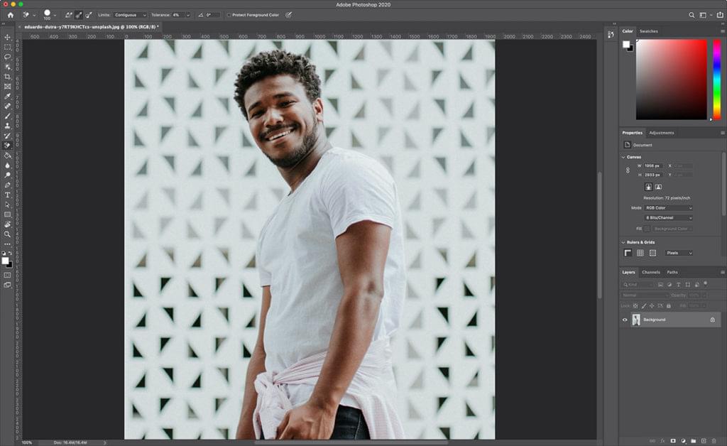
But my texture is looking stretched! The default behavior of Three.js map attribute from MeshBasicMaterial is to make your image fit into the PlaneBufferGeometry. This happens because of the way the library handles 3D models. But in order to keep the original aspect ratio of your image, you’ll need to do some calculations as well.

There’s a lot of different solutions out there that don’t use GLSL shaders, but in our case we’ll also need them to implement our animations. So let’s implement the aspect ratio calculations in our fragment shader that will be created for the ShaderMaterial class.

So, all you need to do is pass your Texture to your ShaderMaterial via the uniforms attribute. In the fragment shader, you’ll be able to use all variables passed via the uniforms attribute.

In Three.js Uniform documentation you have a good reference of what happens internally when you pass the values. For example, if you pass a Vector2, you’ll be able to use a vec2 inside your shaders.

We need two vec2 variables to do the aspect ratio calculations: the image resolution and the resolution of the renderer. After passing them to the fragment shader, we just need to implement our calculations.

this.material = new ShaderMaterial({
uniforms: {
image: {
value: texture
},
imageResolution: {
value: new Vector2(texture.image.width, texture.image.height)
},
resolution: {
type: “v2”,
value: new Vector2(window.innerWidth, window.innerHeight)
}
},
fragmentShader: `
uniform sampler2D image;
uniform vec2 imageResolution;
uniform vec2 resolution;

varying vec2 vUv;

void main() {
vec2 ratio = vec2(
min((resolution.x / resolution.y) / (imageResolution.x / imageResolution.y), 1.0),
min((resolution.y / resolution.x) / (imageResolution.y / imageResolution.x), 1.0)
);

vec2 uv = vec2(
vUv.x * ratio.x + (1.0 – ratio.x) * 0.5,
vUv.y * ratio.y + (1.0 – ratio.y) * 0.5
);

gl_FragColor = vec4(texture2D(image, uv).xyz, 1.0);
}
`,
vertexShader: `
varying vec2 vUv;

void main() {
vUv = uv;

vec3 newPosition = position;

gl_Position = projectionMatrix * modelViewMatrix * vec4(newPosition, 1.0);
}
`
});

In this snippet we’re using template strings to represent the code of our shaders only to keep it simple when using CodeSandbox, but I highly recommend using glslify to split your shaders into multiple files to keep your code more organized in a more robust development environment.

We’re all good now with the images! Our images are preserving their original aspect ratio and we also have control over how much space they’ll use in our viewport.

3. How to implement infinite scrolling

Infinite scrolling can be something very challenging, but in a Three.js environment the implementation is smoother than it’d be without WebGL by using CSS transforms and HTML elements, because you don’t need to worry about storing the original position of the elements and calculate their distance to avoid browser repaints.

Overall, a simple logic for the infinite scrolling should follow these two basic rules:

If you’re scrolling down, your elements move up — when your first element isn’t on the screen anymore, you should move it to the end of the list. If you’re scrolling up, your elements move to down — when your last element isn’t on the screen anymore, you should move it to the start of the list.

Sounds reasonable right? So, first we need to detect in which direction the user is scrolling.

this.position.current += (this.scroll.values.target – this.position.current) * 0.1;

if (this.position.current < this.position.previous) {
this.direction = “up”;
} else if (this.position.current > this.position.previous) {
this.direction = “down”;
} else {
this.direction = “none”;
}

this.position.previous = this.position.current;

The variable this.scroll.values.target is responsible for defining to which scroll position the user wants to go. Then the variable this.position.current represents the current position of your scroll, it goes smoothly to the value of the target with the * 0.1 multiplication.

After detecting the direction the user is scrolling towards, we just store the current position to the this.position.previous variable, this way we’ll also have the right direction value inside the requestAnimationFrame.

Now we need to implement the checking method to make our items have the expected behavior based on the direction of the scroll and their position. In order to do so, you need to implement a method like this one below:

check() {
const { height } = this.environment;
const heightTotal = height * this.covers.length;

if (this.position.current < this.position.previous) {
this.direction = “up”;
} else if (this.position.current > this.position.previous) {
this.direction = “down”;
} else {
this.direction = “none”;
}

this.projects.forEach(child =>; {
child.isAbove = child.position.y > height;
child.isBelow = child.position.y < -height;

if (this.direction === “down” && child.isAbove) {
const position = child.location – heightTotal;

child.isAbove = false;
child.isBelow = true;

child.location = position;
}

if (this.direction === “up” && child.isBelow) {
const position = child.location + heightTotal;

child.isAbove = true;
child.isBelow = false;

child.location = position;
}

child.update(this.position.current);
});
}

Now our logic for the infinite scroll is finally finished! Drag and drop the embed below to see it working.

You can also view the fullscreen demo here.

4. Integrate animations with infinite scrolling

The website motion reference has four different animations happening while the user is scrolling:

Movement on the z-axis: the image moves from the back to the front. Bending on the z-axis: the image bends a little bit depending on its position. Image scaling: the image scales slightly when moving out of the screen.Image distortion: the image is distorted when we start scrolling.

My approach to implementing the animations was to use a calculation of the element position divided by the viewport height, giving me a percentage number between -1 and 1. This way I’ll be able to map this percentage into other values inside the ShaderMaterial instance.

-1 represents the bottom of the viewport. 0 represents the middle of the viewport. 1 represents the top of the viewport.

const percent = this.position.y / this.environment.height;
const percentAbsolute = Math.abs(percent);

The implementation of the z-axis animation is pretty simple, because it can be done directly with JavaScript using this.position.z from Mesh, so the code for this animation looks like this:

this.position.z = map(percentAbsolute, 0, 1, 0, -50);

The implementation of the bending animation is slightly more complex, we need to use the vertex shaders to bend our PlaneBufferGeometry. I’ve choose distortion as the value to control this animation inside the shaders. Then we also pass two other parameters distortionX and distortionY which controls the amount of distortion of the x and y axis.

this.material.uniforms.distortion.value = map(percentAbsolute, 0, 1, 0, 5);

uniform float distortion;
uniform float distortionX;
uniform float distortionY;

varying vec2 vUv;

void main() {
vUv = uv;

vec3 newPosition = position;

// 50 is the number of x-axis vertices we have in our PlaneBufferGeometry.
float distanceX = length(position.x) / 50.0;
float distanceY = length(position.y) / 50.0;

float distanceXPow = pow(distortionX, distanceX);
float distanceYPow = pow(distortionY, distanceY);

newPosition.z -= distortion * max(distanceXPow + distanceYPow, 2.2);

gl_Position = projectionMatrix * modelViewMatrix * vec4(newPosition, 1.0);
}

The implementation of image scaling was made with a single function inside the fragment shader:

this.material.uniforms.scale.value = map(percent, 0, 1, 0, 0.5);

vec2 zoom(vec2 uv, float amount) {
return 0.5 + ((uv – 0.5) * (1.0 – amount));
}

void main() {
// …

uv = zoom(uv, scale);

// …
}

The implementation of distortion was made with glsl-noise and a simple calculation displacing the texture on the x and y axis based on user gestures:

onTouchStart() {
TweenMax.to(this.material.uniforms.displacementY, 0.4, {
value: 0.1
});
}

onTouchEnd() {
TweenMax.killTweensOf(this.material.uniforms.displacementY);

TweenMax.to(this.material.uniforms.displacementY, 0.4, {
value: 0
});
}

#pragma glslify: cnoise = require(glsl-noise/classic/3d)

void main() {
// …

float noise = cnoise(vec3(uv, cos(time * 0.1)) * 10.0 + time * 0.5);

uv.x += noise * displacementX;
uv.y += noise * displacementY;

// …
}

And that’s our final code of the fragment shader merging all the three animations together.

#pragma glslify: cnoise = require(glsl-noise/classic/3d)

uniform float alpha;
uniform float displacementX;
uniform float displacementY;
uniform sampler2D image;
uniform vec2 imageResolution;
uniform vec2 resolution;
uniform float scale;
uniform float time;

varying vec2 vUv;

vec2 zoom(vec2 uv, float amount) {
return 0.5 + ((uv – 0.5) * (1.0 – amount));
}

void main() {
vec2 ratio = vec2(
min((resolution.x / resolution.y) / (imageResolution.x / imageResolution.y), 1.0),
min((resolution.y / resolution.x) / (imageResolution.y / imageResolution.x), 1.0)
);

vec2 uv = vec2(
vUv.x * ratio.x + (1.0 – ratio.x) * 0.5,
vUv.y * ratio.y + (1.0 – ratio.y) * 0.5
);

float noise = cnoise(vec3(uv, cos(time * 0.1)) * 10.0 + time * 0.5);

uv.x += noise * displacementX;
uv.y += noise * displacementY;

uv = zoom(uv, scale);

gl_FragColor = vec4(texture2D(image, uv).xyz, alpha);
}

You can also view the fullscreen demo here.

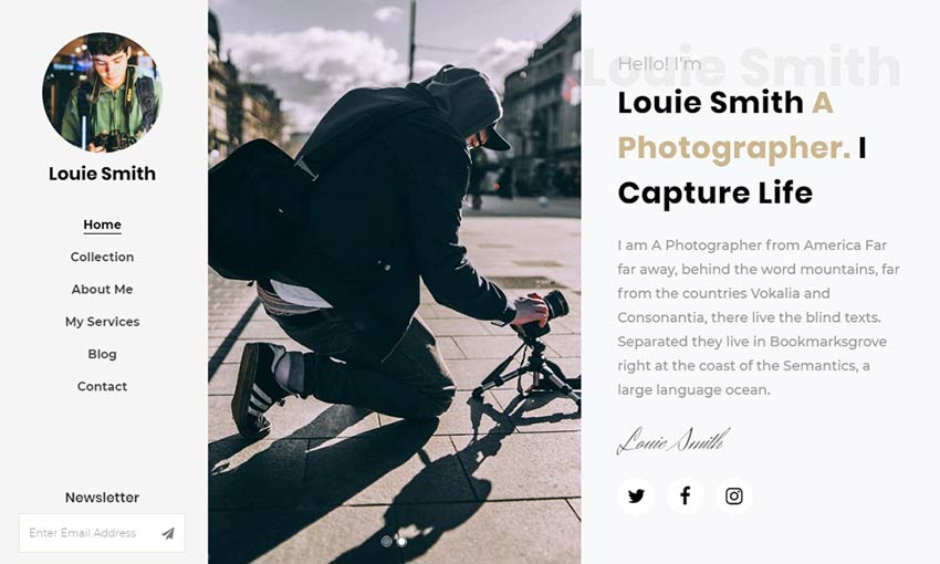
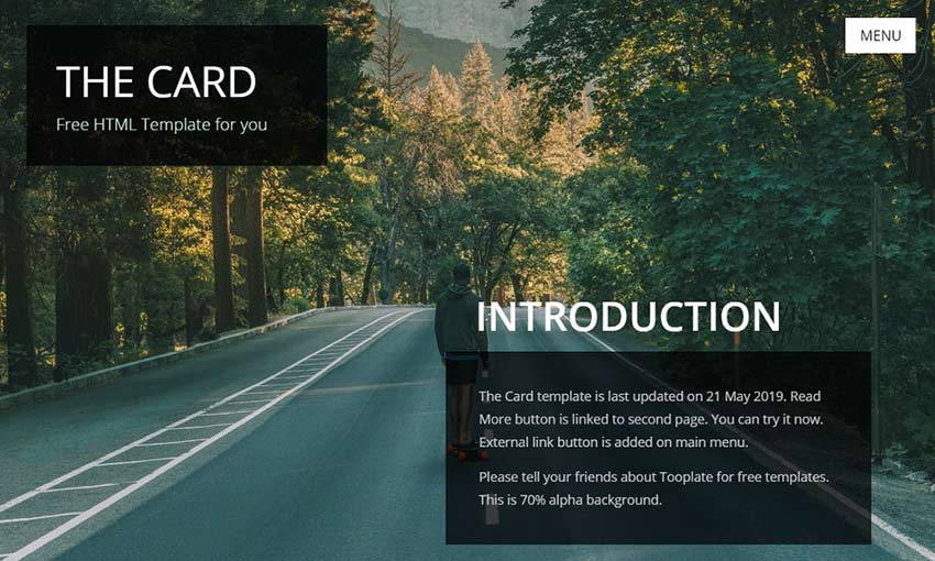
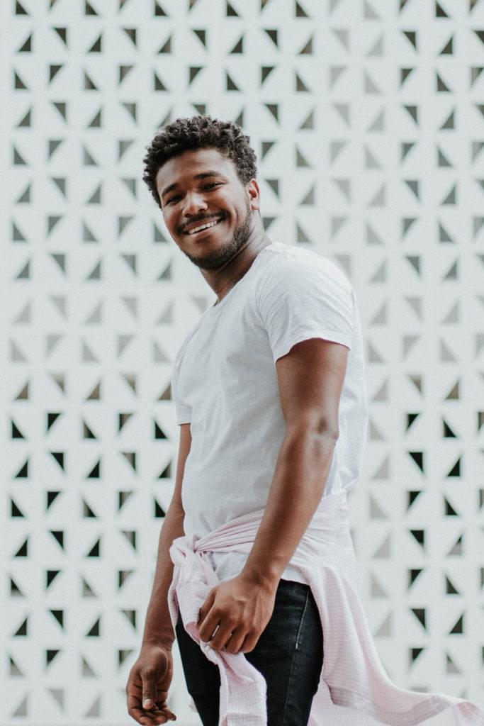
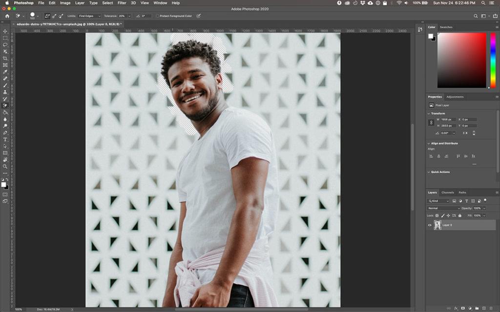
Photos used in examples of the article were taken by Willian Justen and Azamat Zhanisov.

Conclusion

We hope you liked the Case Study we’ve written together, if you have any questions, feel free to ask us on Twitter or Instagram (@brunoarizio and @lhbzr), we would be very happy to receive your feedback.

Case Study: Portfolio of Bruno Arizio was written by Bruno Arizio and published on Codrops.

Understanding and Using rem Units in CSS

Original Source: https://www.sitepoint.com/understanding-and-using-rem-units-in-css/?utm_source=rss

CSS units have been the subject of several articles here on SitePoint (such as A Look at Length Units in CSS, The New CSS3 Relative Font Sizing Units, and The Power of em Units in CSS). In this article, we increase the count by having an in-depth look at rem units, which have excellent browser support and a polyfill if you need support for old IE.

This article was updated in December, 2019 to reflect the current state of rem unit sizing with CSS. For more on CSS font and text properties, read our book, CSS Master, 2nd Edition.

What Are rem Units?

You might have encountered the term “R.E.M.” before while listening to the radio or your music player. Unlike their musical counterparts, named for the “Rapid Eye Movement” during deep sleep, in CSS rem stands for “root em”. They won’t make you lose your religion nor believe in a man on the moon. What they can do is help you achieve a harmonious and balanced design.

According to the W3C spec the definition for one rem unit is:

Equal to the computed value of font-size on the root element. When specified on the font-size property of the root element, the rem units refer to the property’s initial value.

This means that 1rem equals the font size of the html element (which for most browsers has a default value of 16px).

Rem Units vs. Em Units

The main problem with em units is that they are relative to the font size of their own element. As such they can cascade and cause unexpected results. Let’s consider the following example, where we want lists to have a font size of 12px, in the case where the root font size is the default 16px:

[code language=”css”]
html {
font-size: 100%;
}

ul {
font-size: 0.75em;
}
[/code]

If we have a list nested inside another list, the font size of the inner list will be 75% of the size of its parent (in this case 9px). We can still overcome this problem by using something along these lines:

[code language=”css”]
ul ul {
font-size: 1em;
}
[/code]

This does the trick, however we still have to pay a lot of attention to situations where nesting gets even deeper.

With rem units, things are a simpler:

[code language=”css”]
html {
font-size: 100%;
}

ul {
font-size: 0.75rem;
}
[/code]

As all the sizes are referenced from the root font size, there is no more need to cover the nesting cases in separate declarations.

Font Sizing with Rem Units

One of the pioneers of using rem units for font sizing is Jonathan Snook with his Font sizing with REM article, back in May, 2011. Like many other CSS developers, he had to face the problems that em units bring in complex layouts.

At that time, older versions of IE still had large market shares and they were unable to zoom text that was sized with pixels. However, as we saw earlier, it is very easy to lose track of nesting and get unexpected results with em units.

The main issue with using rem for font sizing is that the values are somewhat difficult to use. Let’s see an example of some common font sizes expressed in rem units, assuming, of course, that the base size is 16px:

10px = 0.625rem
12px = 0.75rem
14px = 0.875rem
16px = 1rem (base)
18px = 1.125rem
20px = 1.25rem
24px = 1.5rem
30px = 1.875rem
32px = 2rem

As we can see, these values are not very convenient for making calculations. For this reason, Snook used a trick called “62.5%“. It was not a new discovery, by any means, as it was already used with em units:

[code language=”css”]
body { font-size:62.5%; } /* =10px */
h1 { font-size: 2.4em; } /* =24px */
p { font-size: 1.4em; } /* =14px */
li { font-size: 1.4em; } /* =14px? */
[/code]

As rem units are relative to the root element, Snook’s variant of the solution becomes:

[code language=”css”]
html { font-size: 62.5%; } /* =10px */
body { font-size: 1.4rem; } /* =14px */
h1 { font-size: 2.4rem; } /* =24px */
[/code]

One also had to take into account the other browsers that didn’t support rem. Thus the code from above would have actually been written this way:

[code language=”css”]
html {
font-size: 62.5%;
}

body {
font-size: 14px;
font-size: 1.4rem;
}

h1 {
font-size: 24px;
font-size: 2.4rem;
}
[/code]

While this solution seems to be close to the status of a “golden rule”, there are people who advise against using it blindingly. Harry Roberts writes his own take on the use of rem units. In his opinion, while the 62.5% solution makes calculation easier (as the font sizes in px are 10 times their rem values), it ends up forcing developers to explicitly rewrite all the font sizes in their website.

The post Understanding and Using rem Units in CSS appeared first on SitePoint.

5 Signs It’s Time to Quit Your Job

Original Source: https://www.sitepoint.com/quitting-job-signs/?utm_source=rss

“Jerry wouldn’t let me go to the emergency room.”

Jenny010137 recounted her story on Reddit. She had a major health crisis, but Jerry, her boss, wasn’t buying it.

Jerry wouldn’t let me go to the emergency room after the heavy vaginal bleeding I had been experiencing suddenly got way worse. I went over his head and got permission to go. I called my mom, told her to meet me in the ER. The ER nurse said he’d never seen so much blood. An ER nurse said this. It’s determined I need a couple of blood transfusions and will be admitted.

Jenny’s mom calls Jerry on her behalf.

My mom calls Jerry, who then proceeds to tell her that it’s just stress, and I NEED TO GET BACK TO WORK. At this point, I couldn’t even lift my own head up, but sure, I can take a bus across town and go back to work.

Doctors told Jenny they found a large growth that needed a biopsy.

They found a large growth that needed a biopsy. Jerry kept insisting that it couldn’t be cancer because I’d be tired and losing weight. I had lost eight pounds in a week and went to bed the minute I got home. I was still recovering from the procedure when Jerry called me to let me know I was fired for taking too much time off. Five days later, I was diagnosed with cancer. Fuck you, Jerry. Fuck you.

Think about that for a second.

Jenny is losing blood rapidly. There’s a good chance she’s dying. Her boss can’t be bothered to verify that she’s okay. While she’s in the hospital fighting for her life, he fires her for taking “too much time off.”

This situation is obviously one to walk away from.

But it’s not always so clear cut.

Sometimes you’re in a situation where there are both positive and negative aspects of the job. With situations like these, the decision isn’t always as obvious as we’d like it to be. Walk away from a promising position prematurely and you may burn bridges and destroy any goodwill you’ve built up.

What’s the best way to know?

If you focus on the signs, you may be right, but too much uncertainty means you may handle things in a way that’s less than ideal.

There’s a better way.

Focus your attention on the right set of principles and you’ll have the framework you need to decide when it’s time to quit your job (or not). Let’s take a look at these principles.

Principle #1: Your Job Violates Your Boundaries

Art Markman, professor of psychology at the University of Texas at Austin, shared a story relayed to him by a reader.

My mother suddenly passed away on a Friday evening. On the Sunday my boss showed up to my house with groceries and flowers and suggested that I go into the office on Monday for the quarterly meeting. After all, “this was a pivotal time” for the business.

I didn’t go in the next day because of my overwhelming grief. I later found out that I was to receive an award on that Monday. Was this a career-limiting move, or is my boss not clear on boundaries?

This boss meant well, but his concern was self-serving and not at all in the best interests of his employee. What’s worse, he may not have understood why it was a problem if his employee spoke to him about it later on.

This is why you need boundaries.

Boundaries act as gatekeepers in a variety of professional, emotional, social, physical and situations. Here’s why you need boundaries and why they’re so important:

They protect you from abusive or toxic behavior (for example, managers or co-workers making inappropriate demands, verbal abuse, inappropriate conversation, or details that are immoral or infringe on your values).
Boundaries define how others can or should communicate with you.
Good boundaries protect you from sacrificing your autonomy, freedom of choice, family, identity, integrity or contacts.
Great boundaries attract more of the people, projects and opportunities you want. When set up appropriately, these boundaries repel the items you don’t want.

How do you set great boundaries?

It’s a simple process. First, determine what you do and don’t want. Next, figure out what your employer wants or doesn’t want.

Sounds simple, right?

Figuring out what you want is really about asking the right question (see above). Figuring out what your employer wants is really about identifying criteria that are documented in some way. That’s important, because it gives you the leverage you need to protect yourself (legally) against any inappropriate behavior.

But setting boundaries is risky.

Consider this common idea: Tell your boss No and you could get fired (or worse). If developers are smart, they’ll avoid biting the hand that feeds them.

This rationale is trash.

If you set a boundary, it will be tested. Those around you — your manager, co-workers, other developers — will attempt to back you into a corner. You’re going to have to find appropriate ways to rise to the challenge and enforce your boundaries.

Why go to the trouble? Because boundaries limit the damage from the other four principles discussed in this article. If you don’t have strong boundaries, you’ll face the problems discussed here. It doesn’t matter if you’re employed or you own your own business.

If you have poor boundaries, you won’t be able to achieve your goals.

Principle #2: Your Job Goes Against Your Goals

Reddit user YellowRoses had goals until their boss torpedoed those goals.

How do you deal with feeling disrespected by your boss? from r/careerguidance

They were promised a promotion. They negotiated with their boss and earned a verbal agreement regarding their promotion, only for said promotion to be denied with an “Oh, that’s not happening now.” No explanation or attempts at justifying the rescinded promise.

What if your employer isn’t aware of your goals? Still doesn’t matter. If you have a specific goal in mind, you’re responsible for that goal. Not your co-workers, employer, or family members. Are you pushing for the director’s position that’s opened up? Prefer to stay in your current role but receive the same pay as managers? It’s on you.

This seems obvious, until you realize most people wait to be chosen. They wait for someone to approve of their audition, accept them, recruit them, promote them, extend a helping hand, etc. Which goes nowhere fast.

To be clear, it’s generally a good idea to discuss your goals with your employer, provided that you’re in a good place to do so. If your employer laughs at you, mocks your goal, or decides they’re unwilling to help you meet said goals, it’s on you to make it happen.

The post 5 Signs It’s Time to Quit Your Job appeared first on SitePoint.