Original Source: http://feedproxy.google.com/~r/CreativeBloq/~3/i3USGPEdp_M/best-free-fonts-for-designers-1233380
Searching for the best free fonts can be a massive time-suck. You find yourself scrolling through thousands of seemingly similar fonts before frustratingly realising that your perfect font is miles out of your price range.
Luckily, there are tonnes of free fonts out there, and we've cherry picked the best ones available for you to download right now. And even better, we've divided them intro eight useful categories so you can save your scrolling finger and spend more time using the new free fonts you've discovered. (For more fonts you'll really enjoy, head over to our fun font post). Our categories are:
Serif fonts – often found in projects involving lots of text, such as books, newspapers and magazines.Sans serif fonts – commonly used for shorter text settings, such as captions and credits. Sans serifs are also a good choice for an audience of young children or anyone learning to read.Handwriting fonts – lend an authentic handwritten feel to designs. Often used on invitations or cards.Retro and vintage fonts – for transporting your designs back in time. These fonts also work really well in sci-fi-themed artwork. Brush fonts – like handwriting fonts, these are ideal for adding that handwritten touch, for example on invitations or greeting cards.Tattoo fonts – these free fonts can be just the thing for a tattoo design.Graffiti fonts – for adding an urban, gritty edge to any project.Unusual fonts – because some free fonts defy categorisation.
If you're after multiple fonts but aren't sure which typefaces will work together, our list of perfect font pairings should help. And if you don't know the difference between a font and a typeface, read our post on font vs typeface to find out.
Note that at the time of writing, the typeface collections listed here can be used in your projects for free, but please be sure to check the terms of use before you download these free fonts, as some are only suitable for personal, not commercial, use.
So what are you waiting for? Find and download your perfect free font right here.
The best free fonts: Serif fonts
01. Colus
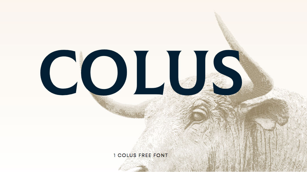
Add a touch of sophistication to headlines with Colus
Colus is a free display font inspired by stone and wooden carved letter inscriptions. It has a classical, almost noble appearance and is great for creating imposing headlines, adding a touch of class to logos and introducing sophistication to poster designs.
Free for personal useDOWNLOAD HERE
02. Amagro
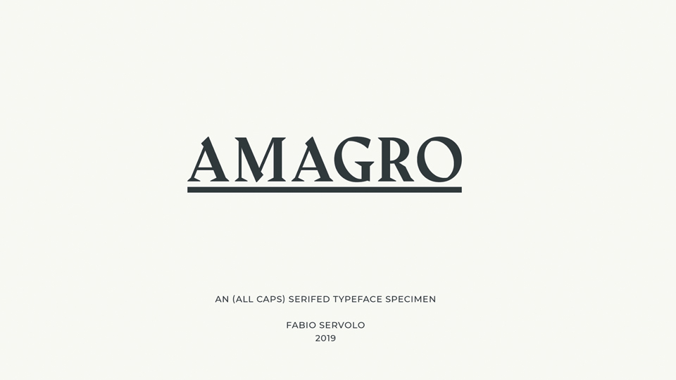
Amagro is a majestic all caps serif font
Amagro is an all caps serif typeface brought to the design community by Fabio Servolo. It has strong angular serifs that make it perfect for imposing newspaper style headlines. A classy ampersand and neat easy-to-read numerics also mean it's ideal for getting your designs noticed. Additional weights are available on request if you want them.
Free for personal and commercial useDOWNLOAD HERE
03. Woodland
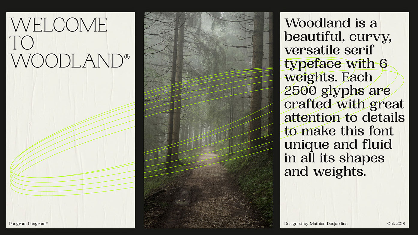
Woodland has an understated elegance
Woodland is an elegant sans font with six weights designed by Mathieu Desjardins for Pangram Pangram. Commercial licences start from $30 but you can try Woodland for personal use for free. It's a versatile font that would work in body copy as well as titles, and there's an understated elegance to it that we really like.
Free for personal use (commercial licences available)DOWNLOAD HERE
04. Giveny
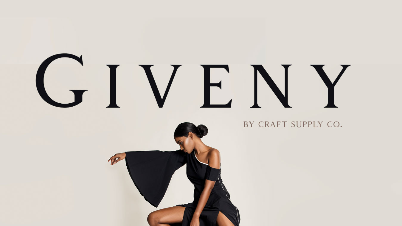
Add a touch of class to your designs with Giveny
This classy free font lends a sophisticated feel to your project. It looks good on arty magazines, posters, greetings cards or quotes, and was created by Craft Supply Co. Multi-lingual characters are available, as are a range of punctuation marks. To use the font in your commercial projects, you can buy it for $16.
Free for personal useDOWNLOAD HERE
05. Blacker
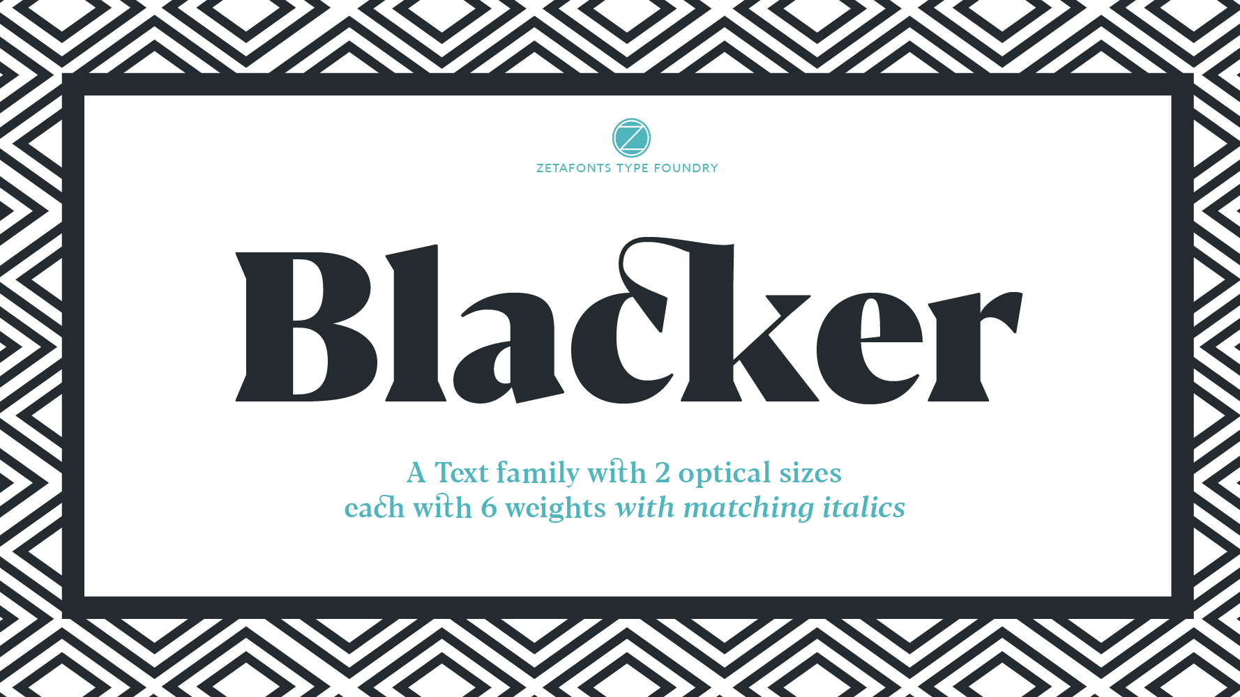
Blacker is not your average serif font
Blacker is not your average serif font. And that's why we love it. A twist on a classic design, Blacker is a wedge serif font family, created by Cosimo Lorenzo Pancini and Andrea Tartarelli. The designers' Behance page states Blacker is a "take on the contemporary 'evil serif' genre: typefaces with high contrast, 1970s-evoking proportions and sharp wedge serifs".
Blacker is available in six weights, from light to heavy, with matching italics. Prices for Blacker start from $25, however you can currently get Blacker Text Light and Blacker Display Medium Italic completely free.
Free for personal use (two weights only)DOWNLOAD HERE
06. Poly
Poly is legible on the web even at smaller sizes
Poly is a medium contrast serif font for web use. It was designed by Nicolás Silva to give increased legibility than other web serifs even at smaller point sizes. It achieves this with a vertical emphasis, utilising short ascenders and a very high x-height to ensure clarity.
Free for personal and commercial useDOWNLOAD HERE
07. Coldiac
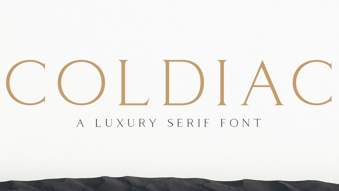
There’s more than a touch of luxury to this free font
For a luxurious serif font, look no further than Coldiac. It works well for a small amount of body text, or for headlines, print ads and other marketing materials. What makes Coldiac stand out is "the relatively low contrast of strokes, the slightly squarish shapes of round characters and the emphasised businesslike nature", according to its creators. A commercial version of the font – which includes multilingual characters and illustrations is available for $15.
Free for personal useDOWNLOAD HERE
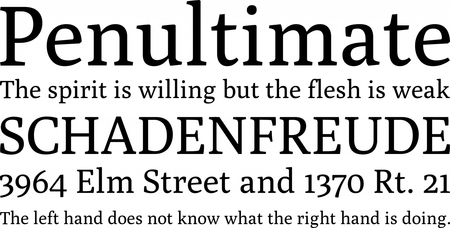
08. Bitter
This serif font is designed to work well on screens
Sans-serif fonts tend to work better for screen use, but this free slab serif typeface has been specially designed to provide a comfortable reading experience on screens. Bitter was designed by Sol Matas, and is available through Argentinian type collaborative Huerta Tipográfica. It combines generous x-heights with minimal variation in stroke weight.
Free for personal and commercial useDOWNLOAD HERE
09. Casa Stencil
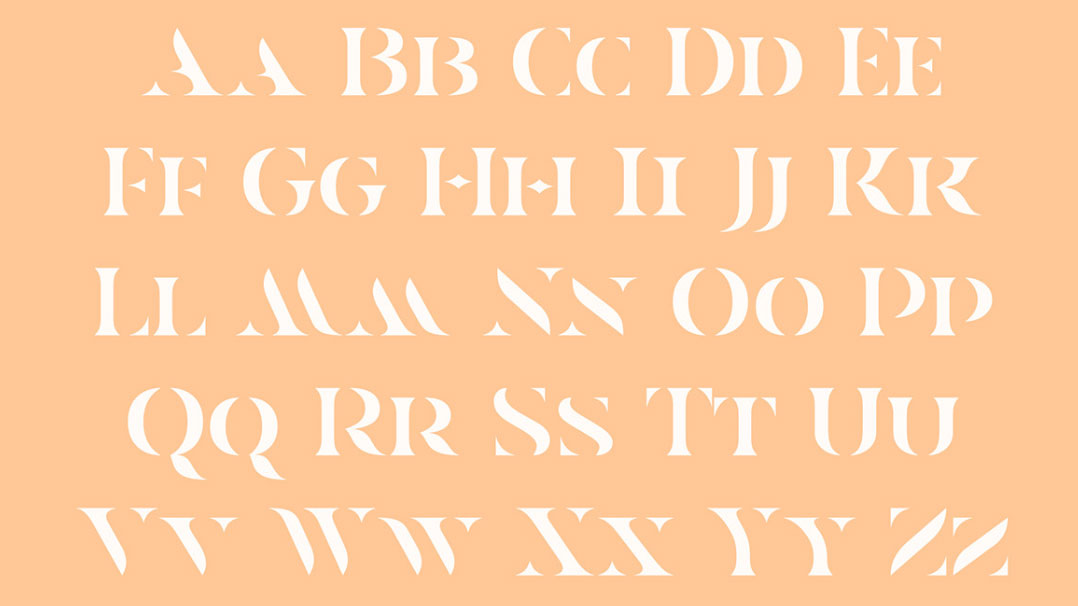
Add some elegance to your designs with Casa Stencil
Casa Stencil is an extremely elegant stencil font that you probably won't want to use in large quantities. It's great for headings and making a statement with your type, though. It comes with language support and accents, and if you did want to buy a commercial licence ($20), you get some rather pleasing posters of the font thrown in for free. It's by Mathieu Desjardins, the same designer who created Woodland (above).
Free for personal useDOWNLOAD HERE
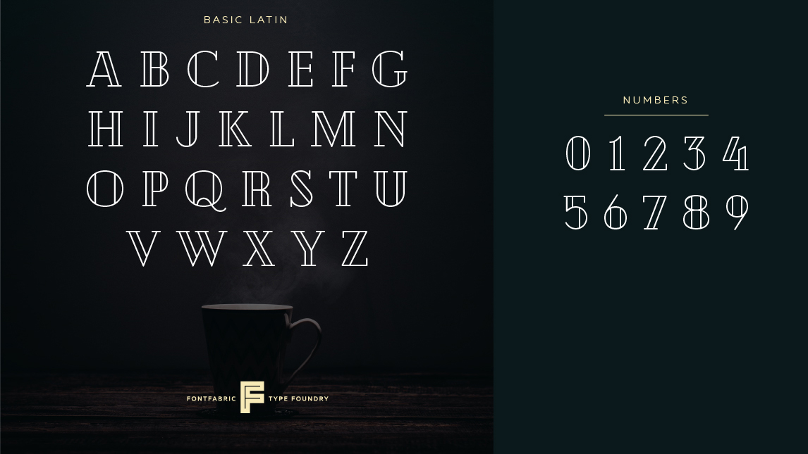
10. Playfair Display
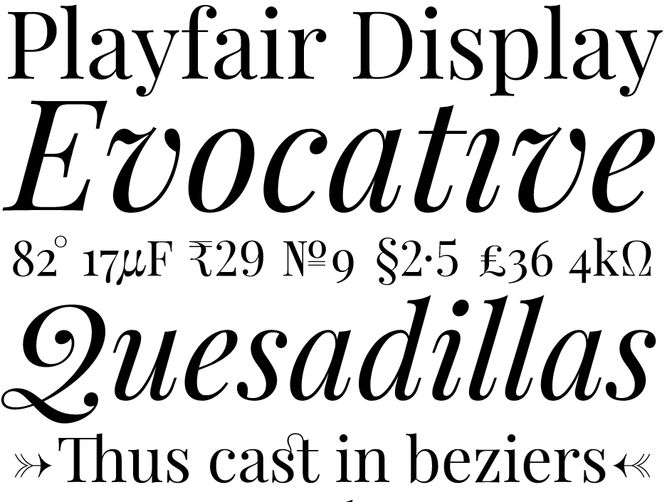
This free font family is an open source project
This free serif display font takes inspiration from the late 18th century European Enlightenment and the work of type designer John Baskerville. The high-contract letterforms have delicate hairlines, relating to the rise in popularity of pointed steel pens, which took over from the previous broad nib quills during this period. The typeface design is a project led designed by Dutch designer Claus Eggers Sørensen.
Free for personal and commercial useDOWNLOAD HERE
11. Lora
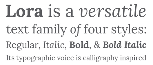
Brushed curves contrast with driving serifs in this free font
Lora is a free font that has its roots in calligraphy. It was originally designed for type foundry Cyreal in 2011, with a Cyrillic extension added in 2013, and comes in four styles: regular, bold, italic, and bold italic.
Brushed curves contrast with driving serifs to give this free font a well-balanced, contemporary feel. Although Lora is technically optimised for use on the web, it also works well in print projects.
Free for personal and commercial useDOWNLOAD HERE
12. Butler
Inspired by both Dala Floda and the Bodoni family, Butler is a free font designed by Fabian De Smet. His aim was to bring a bit of modernism to serif fonts by working on the curves of classical serif fonts, and adding an extra stencil family.
The Butler family contains 334 characters, seven regular weights and seven stencil weights, and includes text figures, ligatures and fractions. It also suits many different languages with its added glyphs. De Smet suggests it would work well for “posters, very big titles, books and fancy stuff”.
Free for personal and commercial useDOWNLOAD HERE
13. Crimson Text
Crimson Text is a free font family inspired by old-time book typefaces
Here’s a free font family created specifically for book production, inspired by old-time, Garamond-esque book typefaces. Crimson Text is the work of German-born, Toronto-based designer Sebastian Kosch, who says he was influenced by the work of Jan Tschichold, Robert Slimbach and Jonathan Hoefler.
It’s also favourite free font of Taylor Palmer, a senior UX designer based in Utah, USA. "Crimson is a sophisticated serif that makes a nice alternative to traditional Garamond-esque typefaces,” he says. “It also has a very expressive italic, which pairs nicely with strong, geometric sans-serifs like Futura or Avenir."
Free for personal and commercial useDOWNLOAD HERE
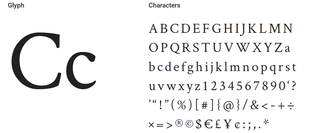
14. Aleo
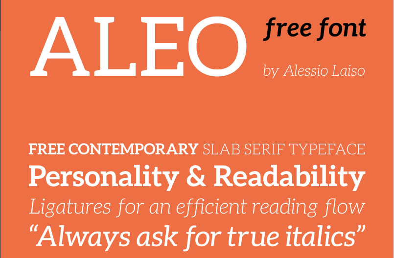
Aleo is one of those rare free fonts that manages to perfectly balance personality with legibility
Aleo has semi-rounded details and a sleek structure, giving a sense of personality while maintaining a good level of legibility. This free font family comprises six styles: three weights (light, regular and bold), with corresponding true italics. Released under the SIL Open Font License, it was designed by Alessio Laiso, a designer at IBM Dublin, as the slab serif companion to Lato.
Free for personal and commercial useDOWNLOAD HERE
15. Brela
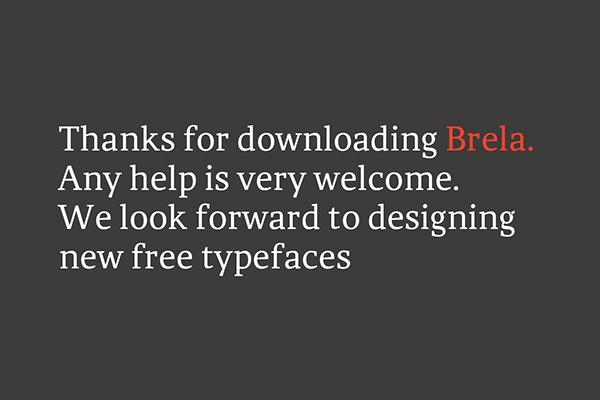
Free font Brela works well in editorial designs, both for headlines and body text
Brela is a humanistic serif font designed exclusively for editorial design. With a generous x-height, it’s very legible, even at tiny sizes, yet it works equally well in bold, large headlines. This free font was designed by Spanish creative agency Makarska Studio and comes in regular and bold weights.
Free for personal and commercial useDOWNLOAD HERE
16. Libre Baskerville
Free font Libre Baskerville is optimised for reading body text on screen
Libre Baskerville is a web font optimised for body text (typically 16px). It’s based on the American Type Founder's Baskerville from 1941, but it has a taller x-height, wider counters and a little less contrast, allowing it to work well for reading on screen. This open source project is led by Impallari Type, a type design foundry based in Rosario, Argentina.
"I like to keep my eye on the Libre fonts, like Libre Baskerville,” enthuses Taylor Palmer, a senior UX designer based in Utah, USA. He also recommends you check out its sister font, Libre Franklin, which is also free. “Libre Franklin hearkens back to strong, traditional typefaces, like Franklin Gothic, that have the declarative nature of something like a newspaper headline but are simple enough to set as paragraph text," he explains.
Free for personal and commercial useDOWNLOAD HERE
17. Slabo
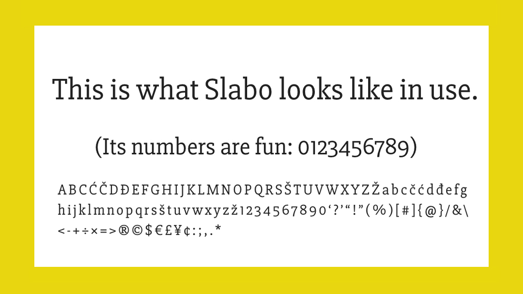
A modern serif font tuned to pixel perfection
Slabo was designed by John Hudson, co-founder of Tiro Typeworks foundry. Slabo is a growing collection of size-specific web fonts, with Slabo 27px and Slabo 13px out so far, fine-tuned precisely for use at those specific pixel sizes. The blocky feel of its ligatures give a modern twist to the serif font, perfect for online designs.
Free for personal and commercial useDOWNLOAD HERE
18. Merriweather
Merriweather is featured in more than 3,000,000 websites, according to Google Fonts
A truly open source free serif font, Merriweather has its own project on GitHub. It was designed by Sorkin Type to be easy to read on screens, particularly. "It features a very large x-height, slightly condensed letterforms, a mild diagonal stress, sturdy serifs and open forms," it says.
Free for personal and commercial useDOWNLOAD HERE
Next page: Free sans-serif fonts
The best free fonts: Sans-serif fonts
19. Red Hat
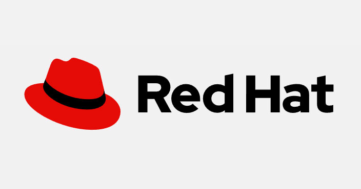
Fedora not required
If you're not down with Linux and open source then this name's not going to mean a lot to you; don't worry too much about that, because all we're interested in here its font, designed by Jeremy Mickel as part of its Pentagram-led branding exercise. Red Hat, the font, is inspired by American sans serifs, and comes in two optical sizes and a range of weights. And like Linux itself, it's free to use (but a lot easier to get to grips with).
Free for personal and commercial useDOWNLOAD HERE
20. Public Sans
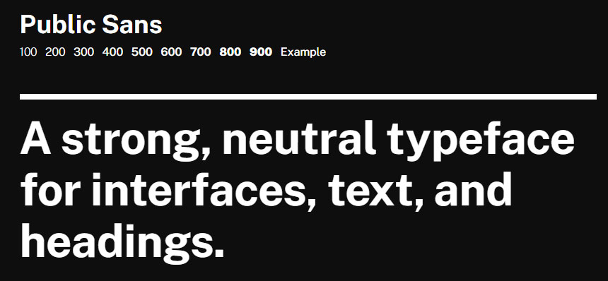
A sensible sans for serious projects
Based on Libre Franklin and created as part of the United States Web Design System, Public Sans is a free, open source web font designed to be used in interfaces, text and headings. It's a strong, sober font with a neutral look, plenty of weights and as few quirks as possible; ideal for serious projects where you're trying to avoid unnecessary visual distraction.
Free for personal and commercial useDOWNLOAD HERE
21. Loki
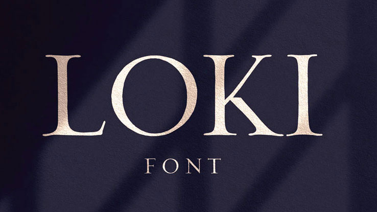
Loki is great for titles
Loki is a bit of a hybrid font, it's a hand-written brush script with a sans serif base, and contains some rather pleasing curves. Loki was created by Krisjanis Mezulisand Ieva Mezule – apparently the name was inspired by the "trickster" Norse god, Loki. This is one for making a statement, and works particularly well in large titles.
Free for personal and commercial use DOWNLOAD HERE
22. Manrope
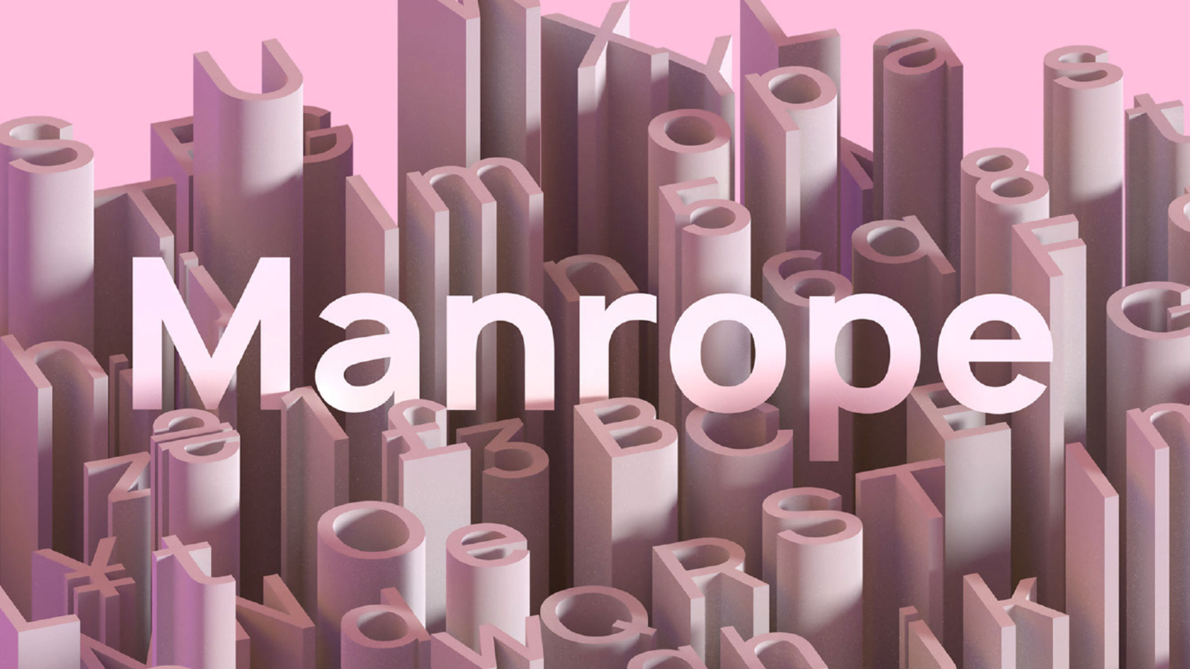
This modern typeface comes with icon ligatures
Manrope was created by Michael Sharanda, and is an open-source font family that was designed for multiple, modern uses: it works in titles, paragraphs, print and on the web. This is the second version of the font, and comes in seven styles. There's no italics available (the creator believes italics isn't necessary in modern times), but the font covers most Latin and Cyrillic languages. It also has clever features such as the ability to automatically switch to straight or curly quotes.
Free for personal and commercial use (see terms for commercial use)DOWNLOAD HERE
23. Salt
Atmospheric font Salt comes in two weights: regular and bold. It was created by Masha Chuprova and has a 'low centre of gravity'. We love the octopus illustrations used to demonstrate it, too. It's free for personal and commerical use, though you'll need to give your name and email to Pixel Surplus in order to download it.
Free for personal and commercial useDOWNLOAD HERE
24. Alcubierre
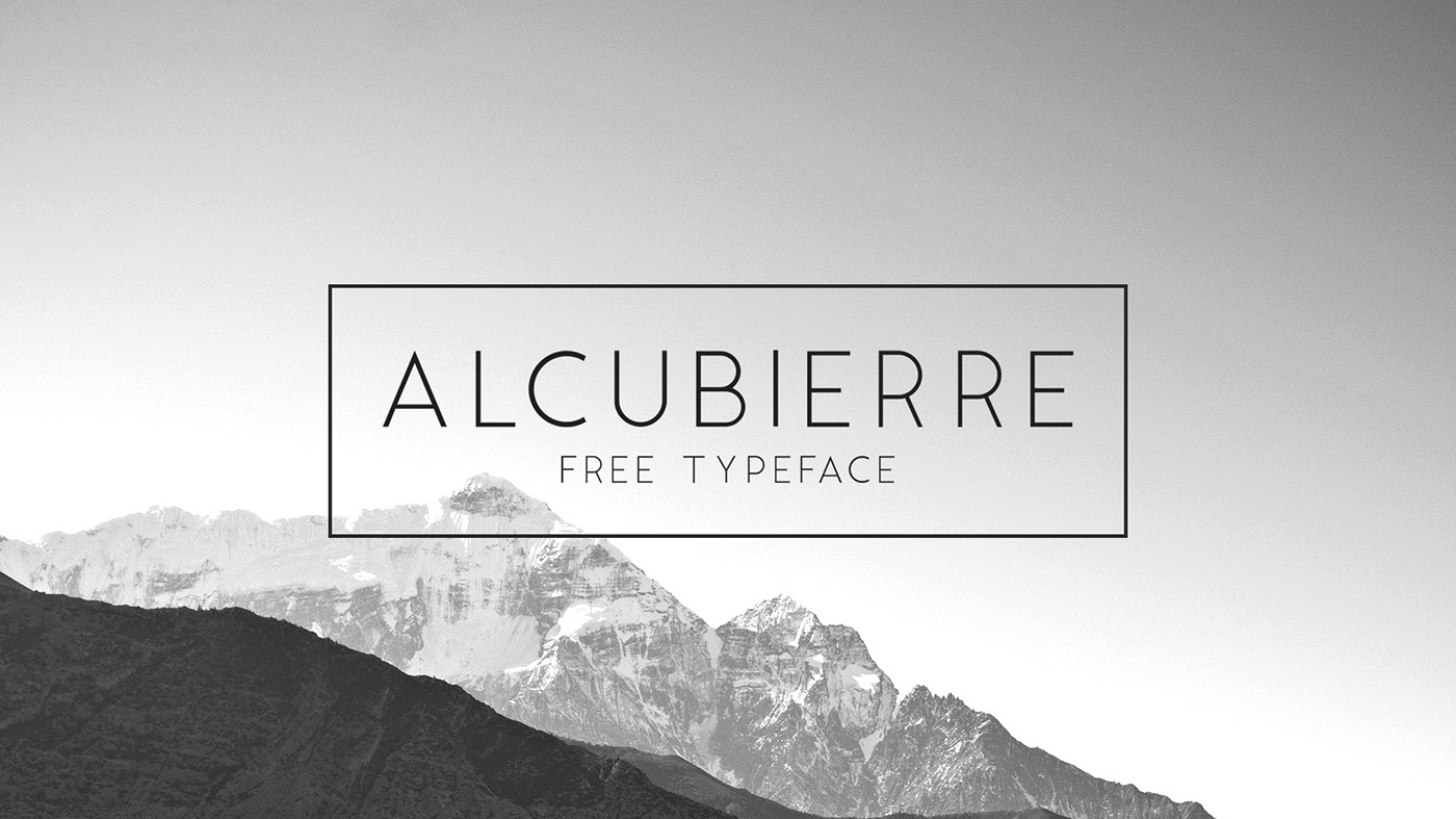
This clean, minimal font works for a variety of uses
Geometric sans serif typeface Alcubierre is the work of designer Matt Ellis. Following in the footsteps of his original free font Ikaros, this clean, minimal typeface works for a variety of uses. Ellis is super-generous too, offering both designs to all totally free for both personal and commercial use.
Free for personal and commercial useDOWNLOAD HERE
25. Moon
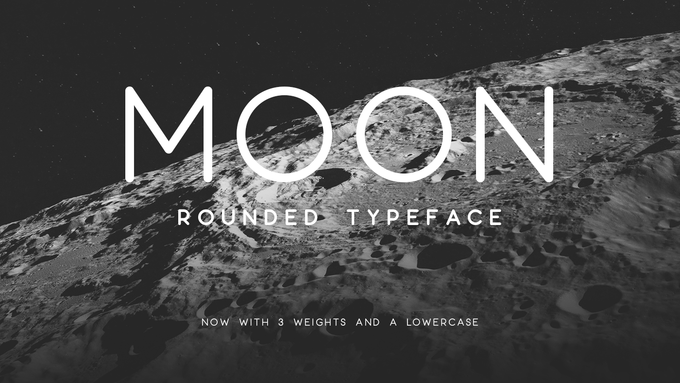
Moon is free for personal use
Moon is a rounded, sans-serif font that comes in three weights and has recently been updated to include a lowercase. It's the work of designer Jack Harvatt, who has made it available to download on his Behance page. Moon is free for personal projects, but if you want to use it commercially you'll need to pay for a licence.
Free for personal use onlyDOWNLOAD HERE
26. Big John / Slim Joe
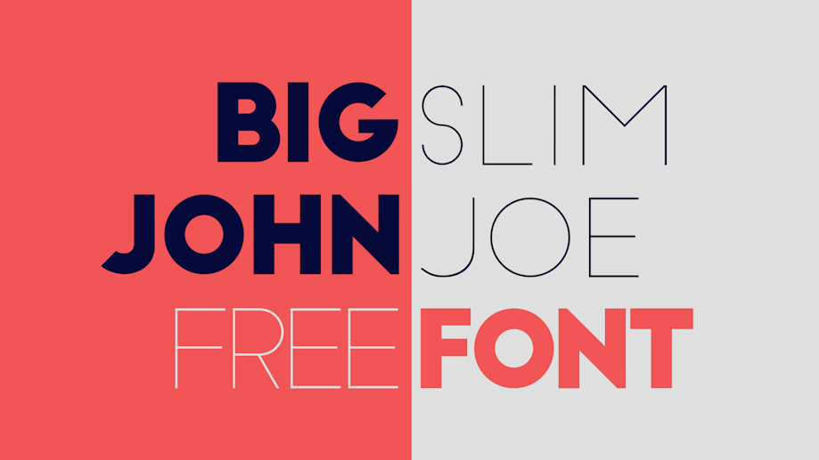
These two sans-serif fonts work together perfectly
Big John was created by designer Ion Lucin for his personal use. Eventually, he decided to share it on Behance, and then went on to add an ultra-light sister font: Slim Joe. Both are all-caps fonts, and contrast perfectly when combined together. These fonts are ideal for titles and headlines, and can be downloaded for free on Behance.
Free for personal and commercial useDOWNLOAD HERE
27. Titillium Web
Titillium is a free font that works best at larger sizes
For a free font, Titillium has a highly respectable pedigree, born of a type design project at Italy’s Accademia di Belle Arti di Urbino. Each academic year, a dozen students work on the project, developing it further and solving problems, and they ask all graphic designers who use Titillium in their projects to email them some examples of the typeface family in use, to help them develop it further.
“Titillium has been a favourite font of mine for a few years now,” says Rob Hampson, head of design at The Bot Platform, a platform for building bots on Messenger. “It’s sharp, contemporary and comes in a wide range of weights. In my opinion, it works best in larger sizes; for example, for titles. That said, with careful consideration, it could be used as a body font.”
Free for personal and commercial useDOWNLOAD HERE
28. Atami
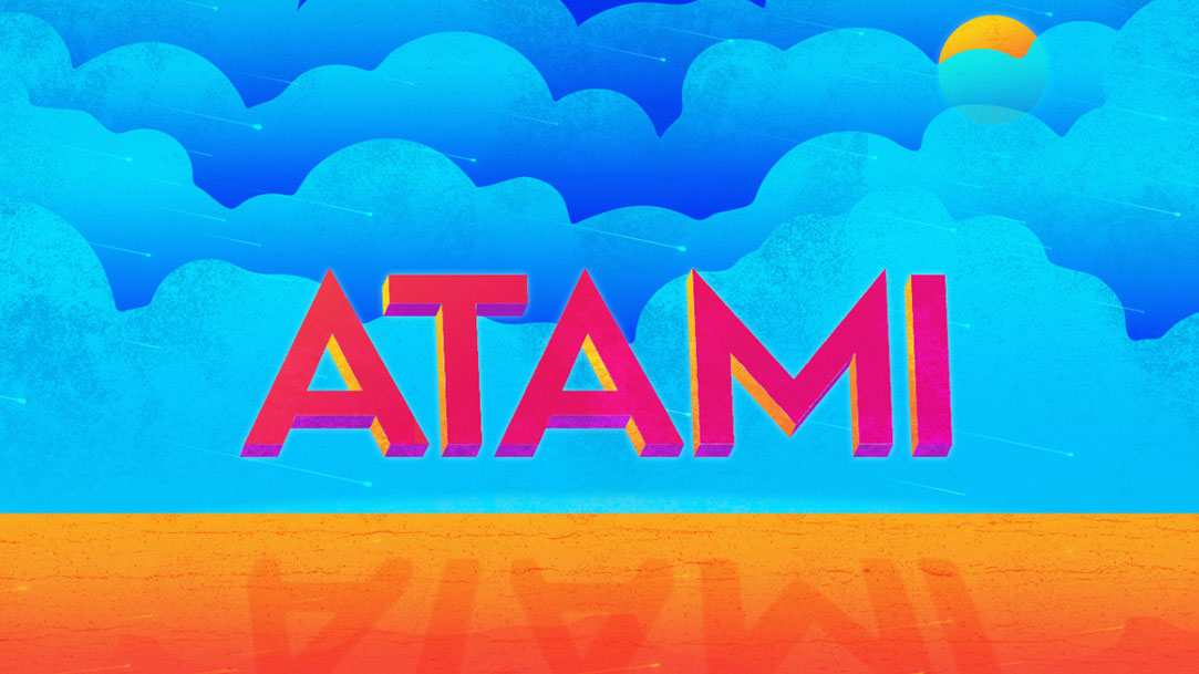
Atami is a bold font with a modern feel
Atami's a pretty experimental typeface, and that's why we love it. It comes in two different weights and three styles and would be ideal for creating posters and logotypes. It was made by Andrew Herndon and is free for both personal and commercial use, although donations (as always) are appreciated.
Free for personal and commercial useDOWNLOAD HERE
29. Chivo
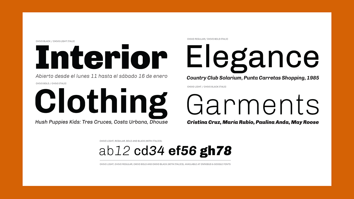
Chivo is one of the most eye-catching free fonts around
Chivo is a grotesque typeface that’s ideal for headlines, and other page furniture where you want to grab attention. Both confident and elegant, it’s been released in four weights with matching italics. This free font is the work of Héctor Gatti and the Omnibus-Type Team.
Free for personal and commercial useDOWNLOAD HERE
30. Comfortaa
Free font Comfortaa could work well in a logo design
Comfortaa is a rounded geometric sans-serif type design intended for large sizes. Created by Johan Aakerlund, a design engineer at the Technical University of Denmark, it’s a simple, good looking font that includes large number of different characters and symbols. Part of the Google Font Improvements Project, the latest updates to the family include the addition of a Cyrillic character set and support for Vietnamese.
David Airey, a graphic designer and occasional writer in Northern Ireland, is among its admirers. “A lot of free fonts need too much work cleaning up the points, but that doesn’t mean you can’t find good options,” he says. “For an identity project, I used Comfortaa as the base for a bespoke wordmark. The before and after are really quite different, but Johan’s work gave me a great foundation, and the client loves the result.”
Free for personal and commercial useDOWNLOAD HERE
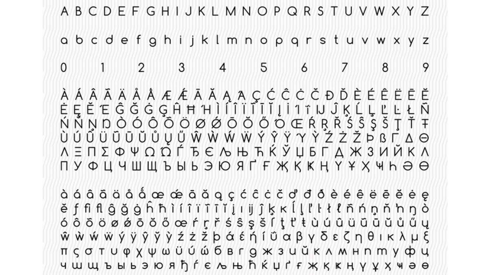
31. Noto Sans
Free font Noto Sans supports more than 800 languages
Noto Sans is a free font family designed by Google supporting more than 100 writing systems, 800 languages, and hundreds of thousands of characters. Noto fonts are intended to be visually harmonious across multiple languages, with compatible heights and stroke thicknesses. The family include regular, bold, italic and bold italic styles, and it has a serif sister family, Noto Serif.
Free for personal and commercial useDOWNLOAD HERE
32. HK Grotesk

HK Grotesk is one of our favourite free fonts for casting small text
HK Grotesk is a sans-serif typeface inspired by the classic grotesques, such as Akzidenz Grotesk, Univers, Trade Gothic and Gill Sans. It was designed by Hanken Design Co with the aim of creating a friendly and distinguishable font that’s suitable for small text. It has recently expanded its language support with the addition of Cyrillic characters (Bulgarian, Russian and Serbian).
Free for personal and commercial useDOWNLOAD HERE
33. Aileron
One of our favourite hybrid free fonts, Aileron is a relaxed choice for on-screen reading
Aileron is a versatile, neo-grotesque sans-serif that’s somewhere between Helvetica and Univers. Created by Sora Sagano, a designer at Tipotype, it aims to provide readers with a high level of visual comfort. It’s available in 16 weights, from ultralight to black.
Free for personal and commercial useDOWNLOAD HERE
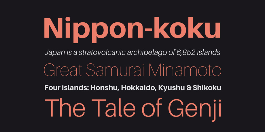
34. Ubuntu
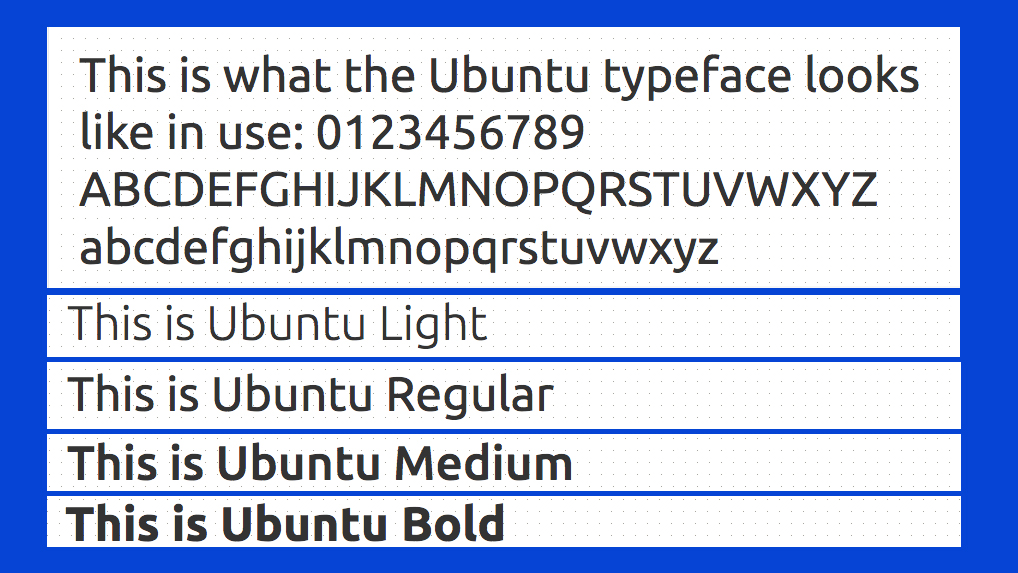
Ubuntu is a custom-designed free font for screen use
This free font has been specially created to complement the tone of voice of Ubuntu, the Linux operating system for personal computers, tablets and smartphones. Designed by font foundry Dalton Maag, it uses OpenType features and is manually hinted for clarity on desktop and mobile screens.
Free for personal and commercial useDOWNLOAD HERE
35. Clear Sans
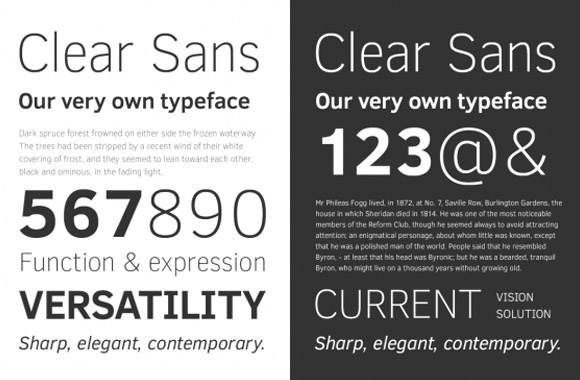
Who knew Intel did free fonts?
Clear Sans is a versatile font designed by Intel designed with on-screen legibility in mind. Suitable for screen, print, and web, this free font is notable for its minimised characters and slightly narrow proportions, making it a great choice for UI design, from short labels to long passages (it has, for instance, been adopted by Mozilla for the ‘Firefox for Android’ browser).
Created by Daniel Ratighan at Monotype under the direction of Intel, Clear Sans supports a wide range of languages using Latin, Cyrillic and Greek, and includes medium, regular, thin, and light weights with upright, italic, and bold styles.
Free for personal and commercial useDOWNLOAD HERE
36. Source Sans Pro
Adobe’s first foray into open source type, Source Sans Pro remains one of the design community’s most popular free fonts
Released in 2012, Source Sans Pro was the first open source type family for Adobe, and has proved wildly popular. It was envisioned as a classic grotesque typeface with a simple, unassuming design, intended to work well in user interfaces. It was designed by Paul D. Hunt, who continues to work as a type designer at Adobe.
Source Sans Pro is one of the favourite free fonts of James Hollingworth, a senior-level digital designer and illustrator based near Bath, UK. “It’s such a solid, reliable font to use in design work,” he enthuses. “Being dyslexic myself, I find it a very easy font to read, and it works brilliantly in user interfaces.”
Free for personal and commercial useDOWNLOAD HERE
Also read: 20 fonts every graphic designer should own
Next page: Free handwriting fonts
The best free fonts: Handwriting fonts
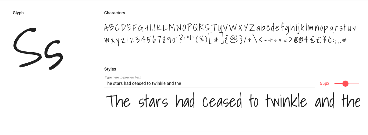
37. Timothy
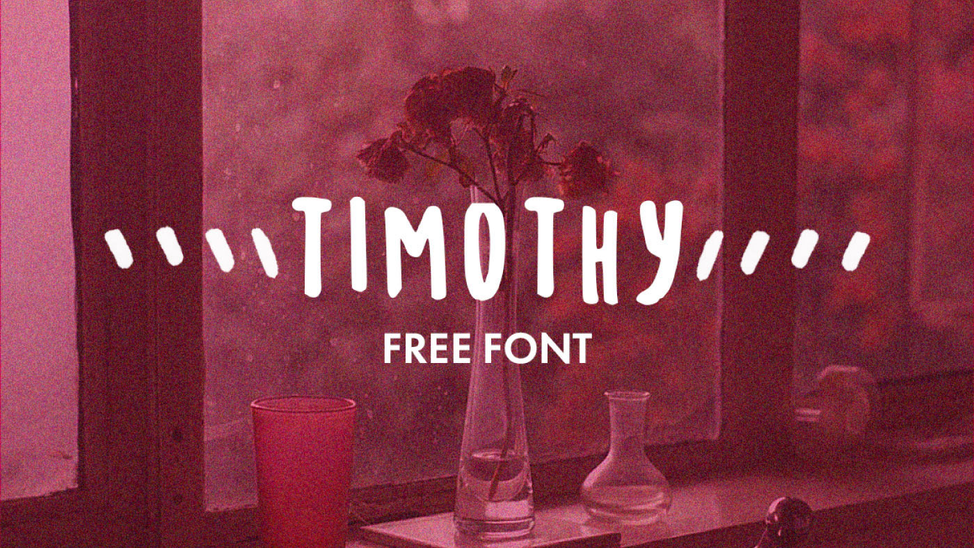
Handwritten fonts aren’t all about swirly scrawl
Handwriting fonts don't have to be about swirly letters. In this hand-drawn font, Timothy, it's block capitals that add a hand-written touch. Timothy was inspired by designer Timothy Goodman and is free for personal and commercial use. We think it'd be good for invitations of handwritten notes.
Free for personal and commercial useDOWNLOAD HERE
38. Kavivanar
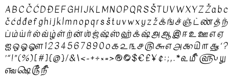
This slanted handwriting font is based on typical Tamal handwriting
This bold handwriting font was inspired by the slanting letterforms found in typical Tamal handwriting (as well as a Tamil alphabet, it also includes Latin letterforms). Kavivanar was designed by Tharique Azeez, a type designer based in Sri Lanka, and is free to download.
Free for personal and commercial useDOWNLOAD HERE
39. Tomato Soup
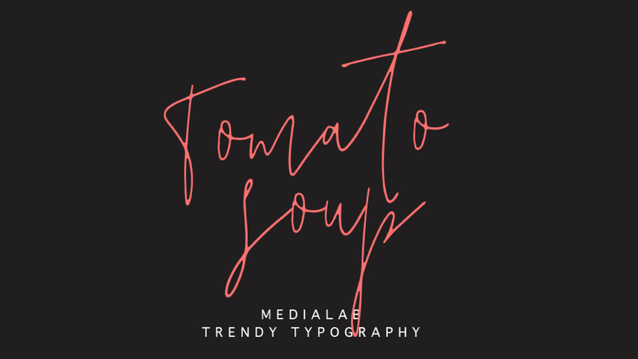
The scratchy handmade feel of Tomato Soup is ideal for invitations or to recreate a handwritten note look
If you ever feel like you want to recreate the scratchy handwriting of your doctor or perhaps teacher, this is the font for you. Tomato Soup was made by Typed.one and looks best when there's less text – we wouldn't recommend writing out long chunks of text with it. However, it's ideal for invitations or anywhere where you want to recreate the handmade look. And if it doesn't quite fit the bill, check out our round up of other brilliant free script fonts from around the web.
Free for personal and commercial useDOWNLOAD HERE
40. Ambarella
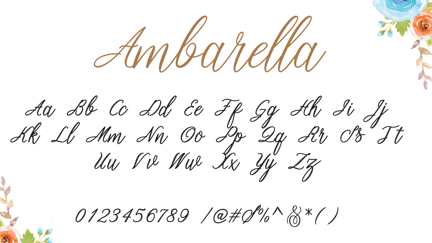
Ambarella is a beautiful calligraphy typeface
Ambarella is a beautiful free font from Polem Studio. The handwritten design in a modern calligraphy style includes various swashes, alternates and Western European characters.
Free for personal and commercial useDOWNLOAD HERE
41. Quefira
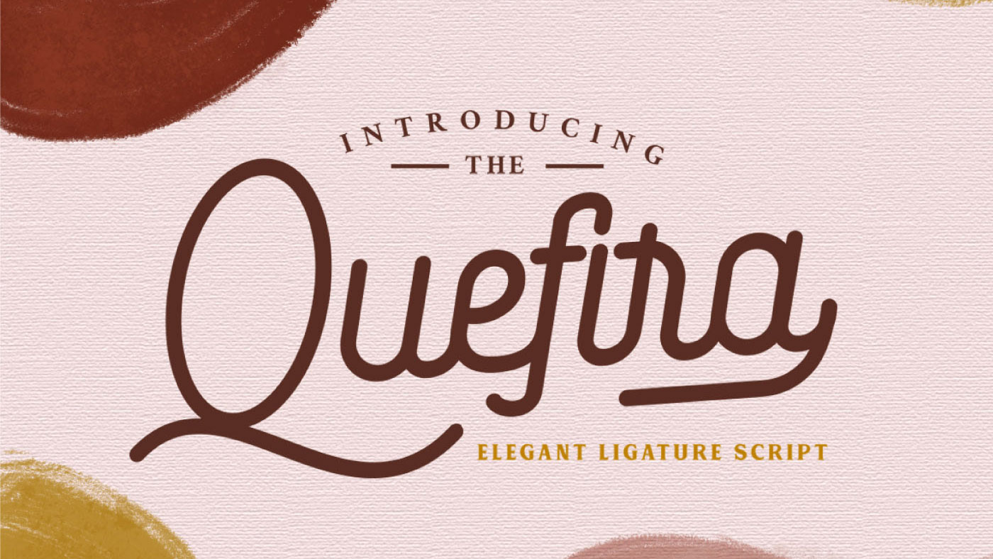
This swooshy font adds style to your designs
Querifa Script by Vultype Co has swooshing ligatures yet still manages to have an uncluttered feel. It could work in invites or greetings cards, as well as menus and packaging. It comes with numerals and punctuation as well as a stylish set of alternates.
Free for personal and commercial useDOWNLOAD HERE
42. Nickainley
Nickainley is a free font based on vintage-style handwriting
Nickainley is one of our favourite free handwriting fonts. This Monoline script with a classic, vintage feel, includes uppercase and lowercase characters, as well as numerics and punctuation marks. Offering a variety of possible use cases, including logos, T-shirt designs, letterhead and signage, this free font was created by Indonesian agency Seniors Studio.
Free for personal and commercial useDOWNLOAD HERE
43. Shadows into Light
This free handwriting font has rounded edges and a clean feel
Shadows Into Light is the work of type designer Kimberly Geswein. Ideal for adding a personal touch to your projects, this free font features rounded edges and neat, clean characters. It's currently available in one style only, but has already proven extremely popular.
Free for personal and commercial useDOWNLOAD HERE
44. Pacifico
Pacifico is one of the most laid-back free fonts around
Pacifico is a fun brush script handwriting font inspired by 1950s American surf culture. This open source font was one of the great contributions to the free software community by the late designer Vernon Adams.
Free for personal and commercial useDOWNLOAD HERE
45. Cute Punk
Cute Punk is a free font based on handwriting, but with a twist
Cute Punk offers a vibrant, youthful and thoroughly modern take on the handwriting font. Infusing the style with a striking, almost geometric feel, this free font is the work of Flou, a designer and illustrator from Bratislava, Slovakia.
Free for personal and commercial useDOWNLOAD HERE
46. Yellowtail
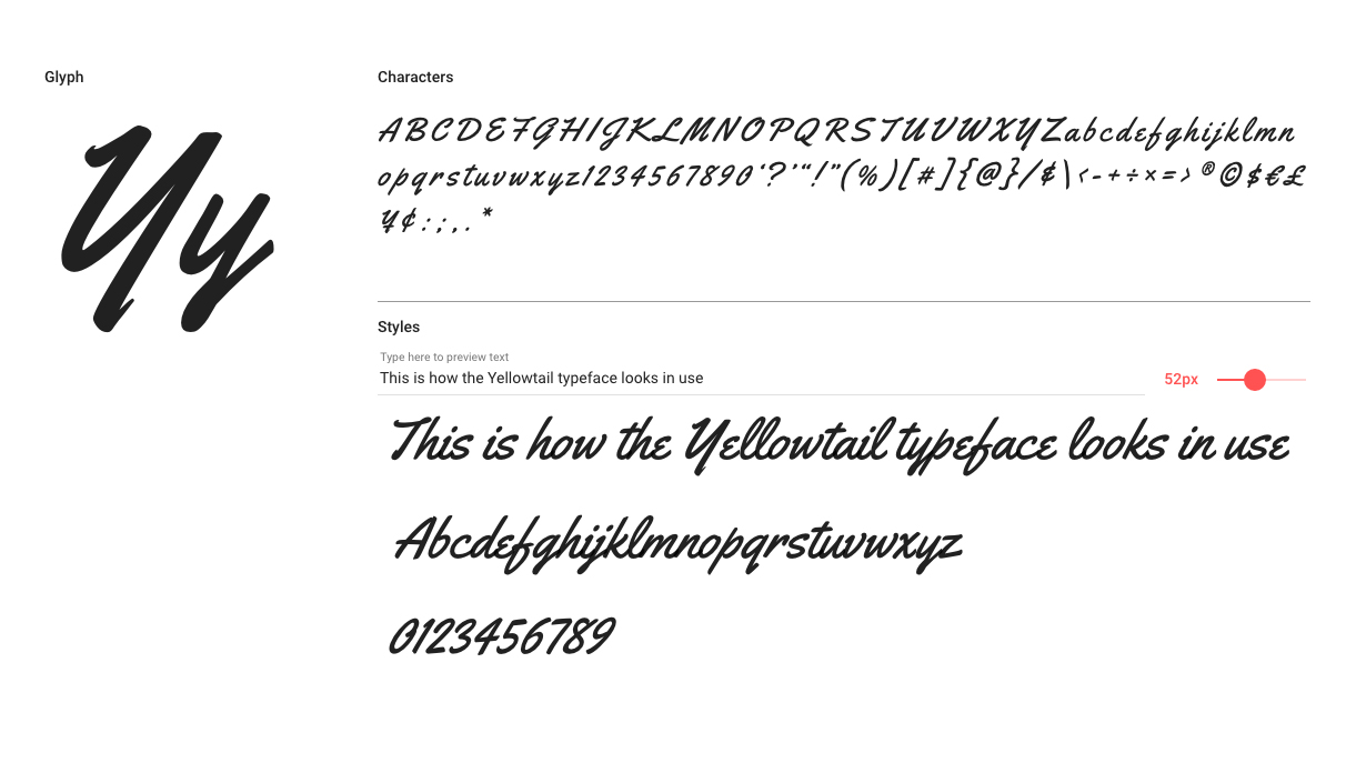
Free font Yellowtail features a classic approach to handwritten, brush lettering
Yellowtail is an old-school, flat, brush font that evokes classic 1930s typefaces like Gillies Gothic and Kaufmann. Designed by typography institute Astigmatic, its mixture of connecting and non-connecting letterforms gives it a unique look and ensures good legibility.
Free for personal and commercial useDOWNLOAD HERE
Next page: Free vintage and retro fonts
The best free fonts: Vintage and retro fonts
47. Lazer 84
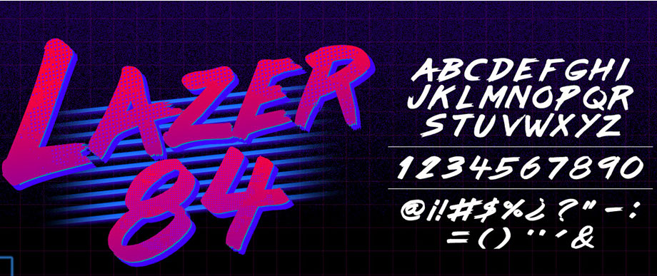
Inject the ’80s into your projects with this fun font
This retro font fits in a few categories: it's a brush font too. We love its super-'80s vibe, and can just imagine it used as the opening titles of an '80s sitcom. This font was created by Juan Hodgson and is free for personal use, and you can pay what you want to use it for commercial purposes. A Summer 85 font is also available.
Free for personal use (make a donation for commercial use)DOWNLOAD HERE
48. Nature Sans
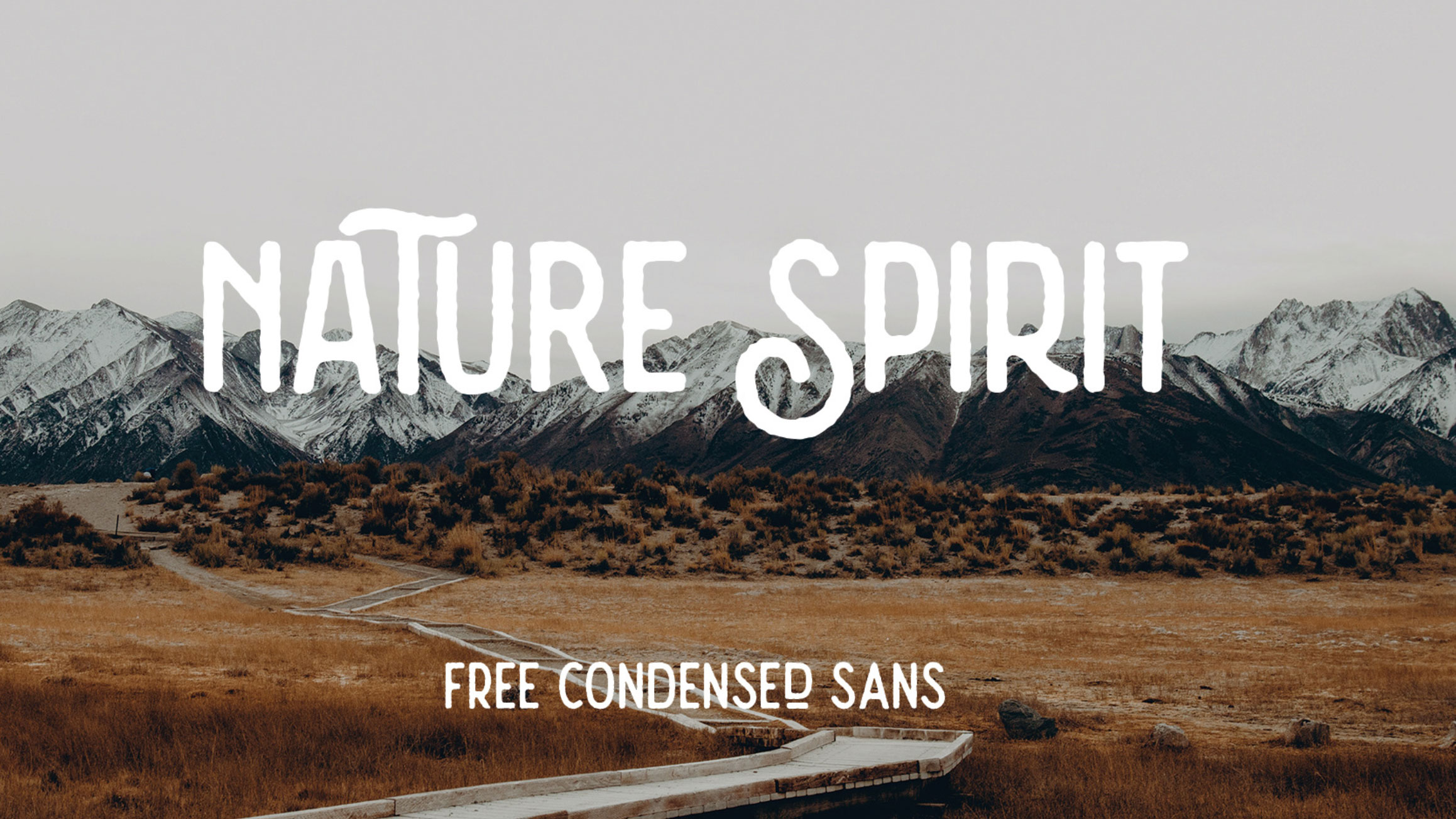
Vintage flourishes make this a fun retro font
Nature Spirit is a vintage font by Alex Joganic of 1871 Project. The retro styling recalls hippy communes and an adventurous spirit, making it well suited for a vintage project. There are two styles – rough and regular – depending on whether you like your lines straight or a little rough round the edges.
Free for personal and desktop commercial useDOWNLOAD HERE
49. Cheque
Cheque started life as a student project before graduating to a full font
Based on geometric shapes and with a classic, vintage look, Cheque started off as a student project by Fontfabric's Mirela Belova, then grew into a full display font. At its best when used in headlines or compositions, it comes in Regular and Black versions that are free for both personal and commercial use.
Free for personal and commercial useDOWNLOAD HERE
50. Bauru
Bauru is a free font with a lot of soul
Bauru is based on the kind of lettering that instantly sums up the feeling of a bygone age. One of the best free retro fonts, this could work well in portraying a sense of nostalgia and timeless values within a wide range of branding, posters, advertising or logo design. It was designed by Brazilian art director and illustrator Pier Paolo.
Free for personal and commercial useDOWNLOAD HERE
51. LOT
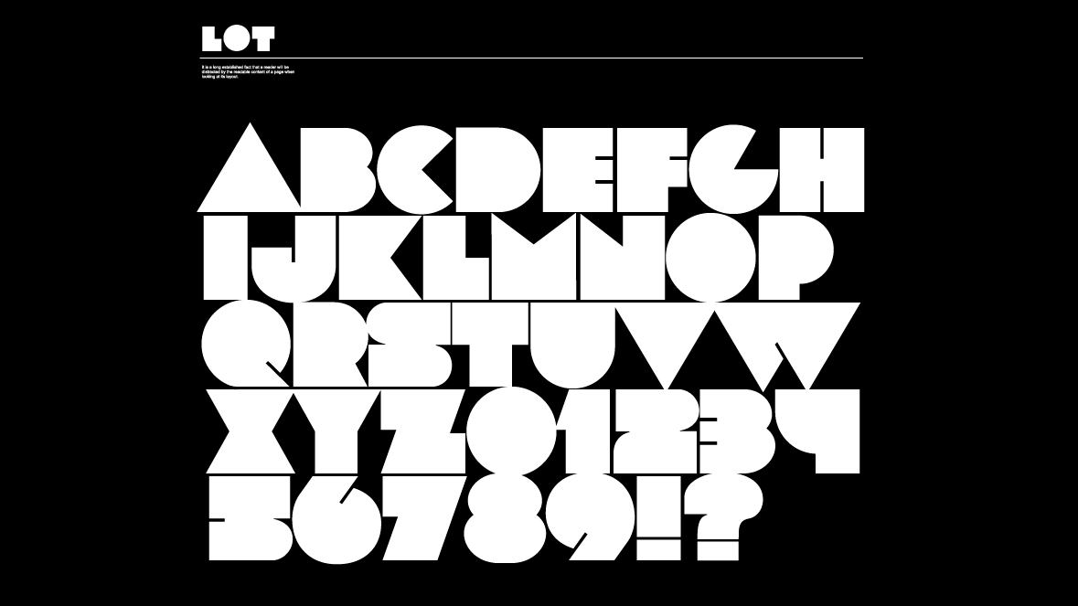
LOT is one of the fattest, coolest, retro-est free fonts around
Reminiscent of the stylised block lettering of 1970s and 1980s advertising, posters and magazine design, LOT nonetheless provides a sleek new take on a vintage style with its collection of fat, geometric letterforms. Featuring 78 characters, this free font would work well in posters, logos and headlines. It’s the work of independent type foundry FontFabric.
Free for personal and commercial useDOWNLOAD HERE
52. Jocker
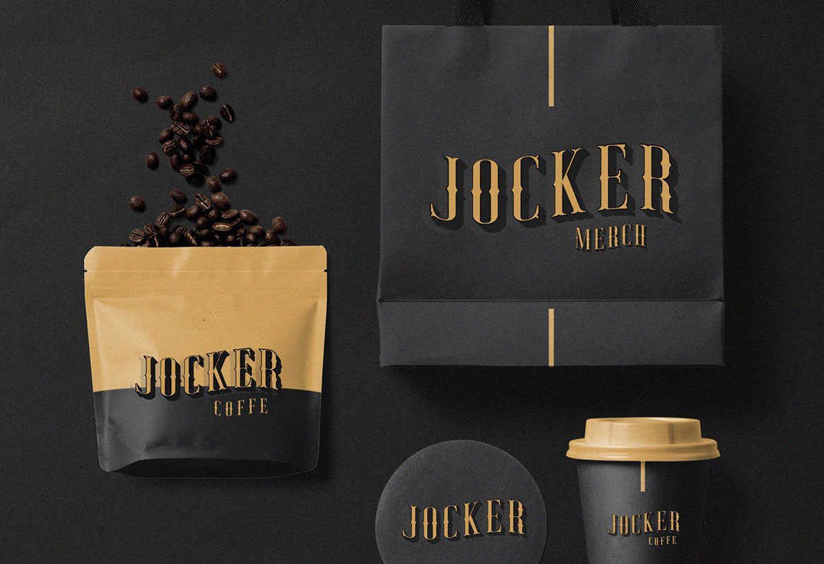
Jocker works great on vintage logos
Jocker is a vintage font design that's available for free for personal use and has a fun, circus feel, which is great for posters, logo designs and packaging. This font was drawn from scratch and has since had more layers of detail added to it.
Free for personal useDOWNLOAD HERE
53. Paralines
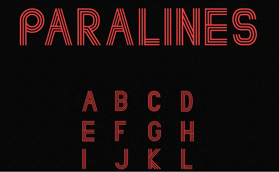
Anyone who remembers TV titles of the 1970s and ’80s will recognise the style of this retro-futuristic free font
Featuring idiosyncratic use of parallel lines, Paralines takes inspiration from both decades-old design and modern-day typography. This free font would suit any project aiming to evoke the graphic design of the 1970s and early 1980s. It’s the work of freelance UK designer Lewis Latham.
Free for personal and commercial useDOWNLOAD HERE
54. Hamurz
Free font Hamurz offers a hipster take on retro styles
Hamurz is a hipster-style retro typeface with rough edges and rounded shapes. Created by Bagus Budiyanto, it offers a multitude of potential uses, such as logos, headings, or designs for T-shirts, badges or letterpress printing.
Free for personal and commercial useDOWNLOAD HERE
Next page: Free brush fonts
The best free fonts: Brush fonts
55. Festival
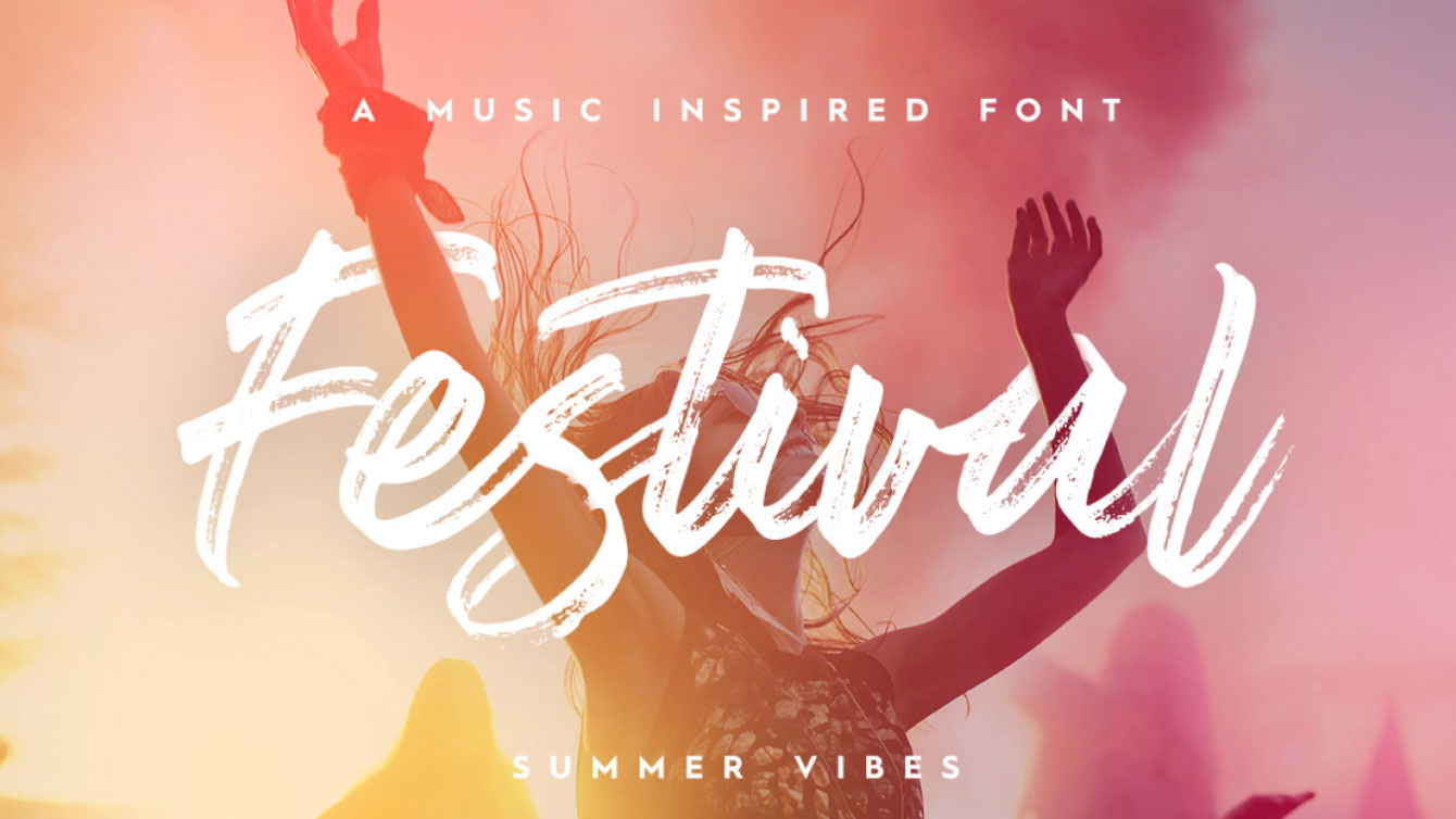
Festival adds a summery feel to your designs
If you're gearing up for festival season and want a font that reflects your mood, why not try Festival? This hand-drawn brush font by Pixel Surplus adds a summery feel to your designs and features multi-lingual characters. You could even use it to create a sign to hold up at your next summer gig.
Free for personal useDOWNLOAD HERE
56. Leafy
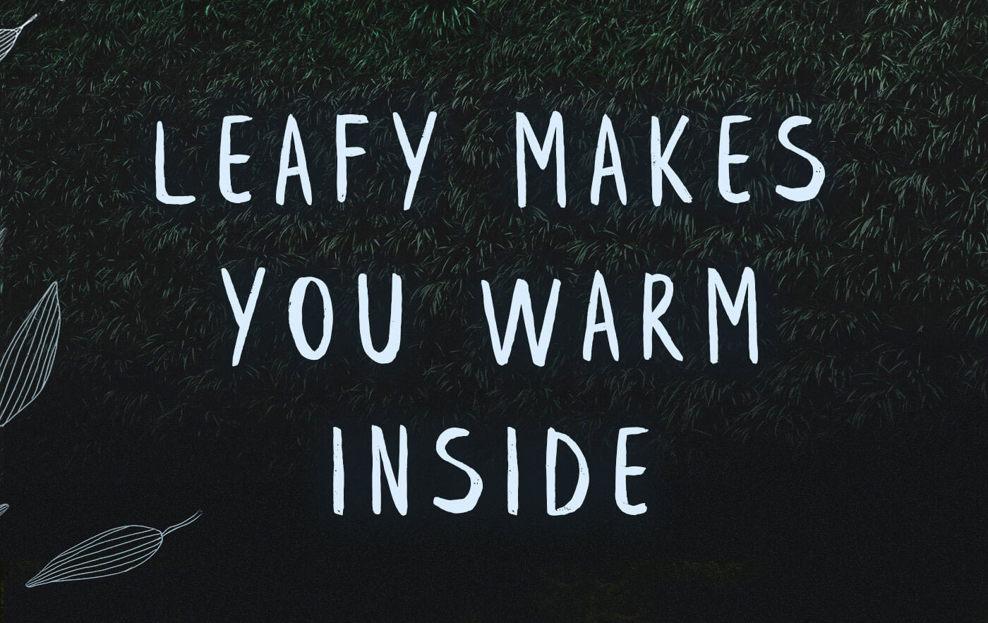
Leafy features 95 hand-crafted characters
Featuring 95 unique, hand-crafted characters, Leafy is an all-caps brush font drawn by Ieva Mezule and assembled by Krisjanis Mezulis of Latvian agency, Wild Ones Design. Perfect for any design that could use a personal, handmade feel, it's free for both personal and commercial use.
Free for personal and commercial useDOWNLOAD HERE
57. Playlist
Free brush font Playlist is great for illustrated designs and merchandise
Playlist is a hand-drawn font with dry brush styles that comes in three varieties: Script, Caps, and Ornament. Ideal for illustrated designs, including posters, T-shirts and other merchandise, this is one of our favourites. For more, see our list of free brush fonts.
Free for personal and commercial useDOWNLOAD HERE
58. Sophia
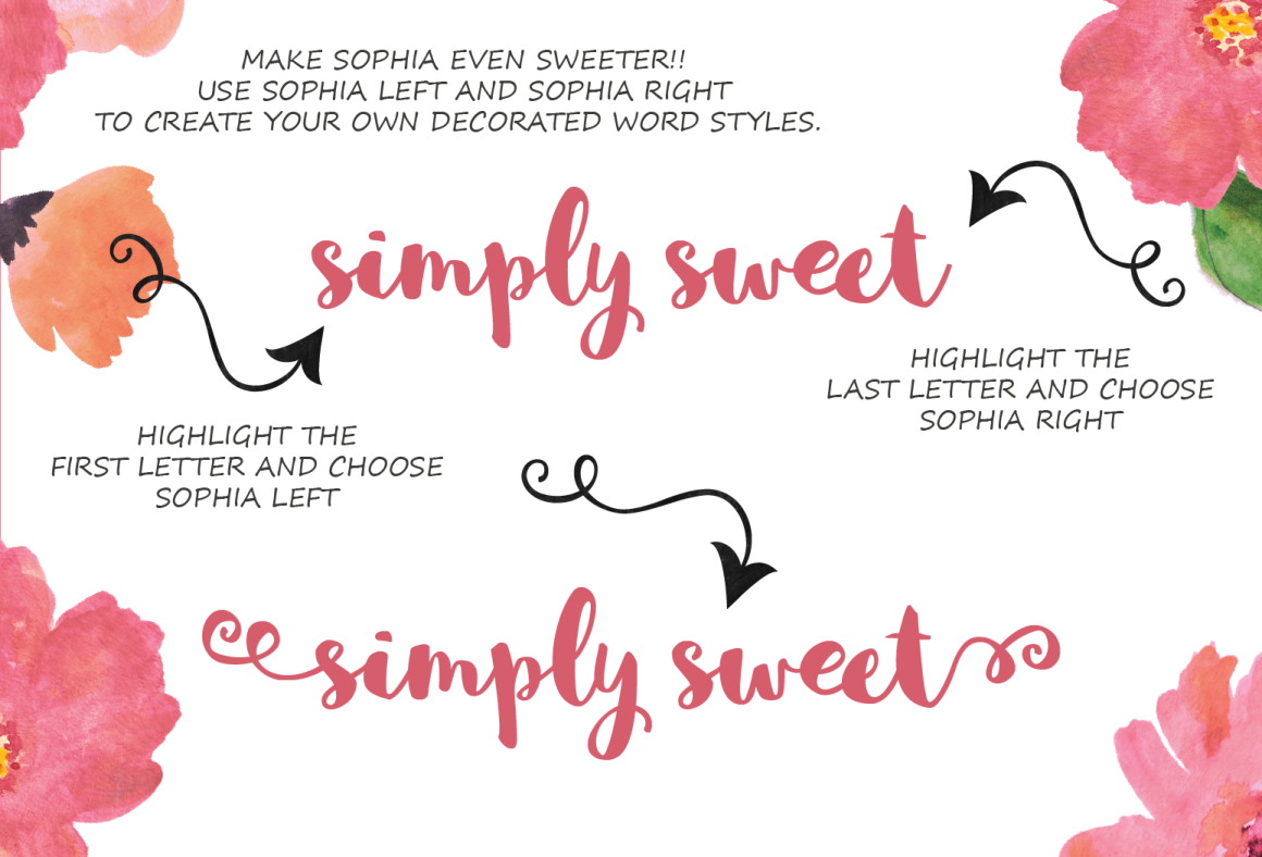
Free font Sophie offers a decorative take on brush script handwriting
Sophie is light, friendly and slightly off-kilter, in a fun way. Described as “a hand-lettered brush script with a sweet decorative bonus", the family includes multilingual glyphs, as well as left and right stylistic letter combinations. This free font was designed by Mats-Peter Forss and Emily Spadoni, of Finland and the USA respectively.
Free for personal and commercial useDOWNLOAD HERE
59. Reckless
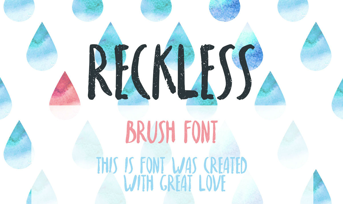
Free font Reckless has an upbeat feel
Reckless is a handwritten brush font that includes uppercase and extended Latin characters. As shown above, it would work well with a watercolour-effect design, either in print or on the web. It was created by Russian designer Nadi Spasibenko.
Free for personal and commercial use (pay with a tweet)DOWNLOAD HERE
60. Kust
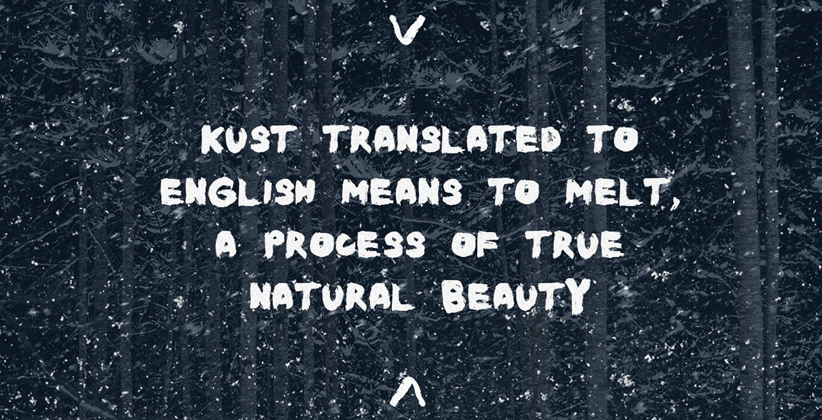
Brush fonts don’t have to be twee, as free font Kust shows
Kust is a handwritten, all-caps font with a distorted, slightly corrupted look. This free font was based on letters drawn on hard paper, with a thick brush using pure black ink, by fashion designer and artist Leva Mezule. It comes courtesy of Wildtype Design, a studio based in Latvia.
Free for personal and commercial useDOWNLOAD HERE
Also read: 10 special wedding fonts
Next page: Free tattoo fonts
The best free fonts: Tattoo fonts
61. Rose Tattoo
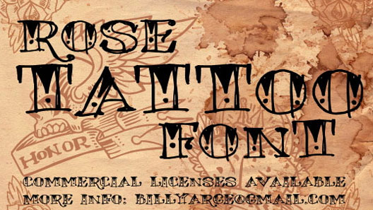
Go all out with Rose Tattoo
Okay, so this one's a little OTT, but what's the point of having a tattoo font if it's not gonna stand out? This font was created by Billy Argel and is free for personal use, meaning you are free to ink it all over your body. Just make sure your design is quite big – we can't see this one being legible in small sizes.
Free for personal useDOWNLOAD HERE
62. Betty
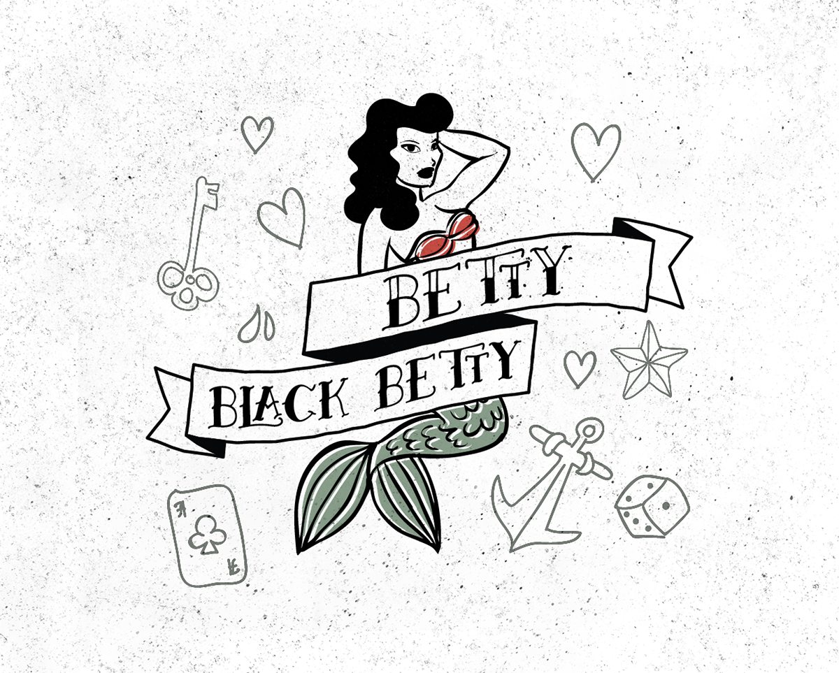
Free font Betty is inspired by old-school tattoo art
None of your hipster stars or tribal tattoos here. Betty is one of those free tattoo fonts that reaches back into the past to a bygone age, when every 'real man' had a sailor’s anchor and ‘I heart Mum’ inked on his bicep. This free font is the work of Athens-based designer Anastasia Dimitriadi.
Free for personal and commercial useDOWNLOAD HERE
63. Angilla
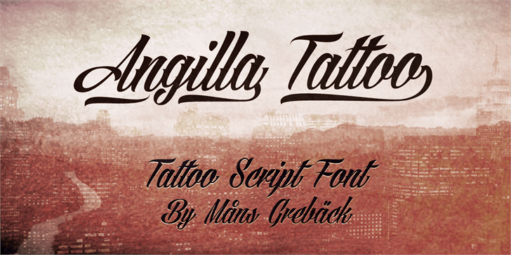
Angilla is one of the best free fonts we’ve seen in the tattoo script style
This tattoo script font draws on the spirit of calligraphy to create something extremely fresh and stylish. This free font is the work of Swedish designer Måns Grebäck.
Free for personal use onlyDOWNLOAD HERE
64. Serval
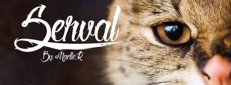
Free font Serval offers a scratchy style for tattoo lettering
Another calligraphic font that’s perfect for tattoo stylings, Serval is a wiry, scratchy beast of a design. This free font is the inspired work of Maelle.K and Thomas Boucherie.
Free for personal use onlyDOWNLOAD HERE
65. MOM
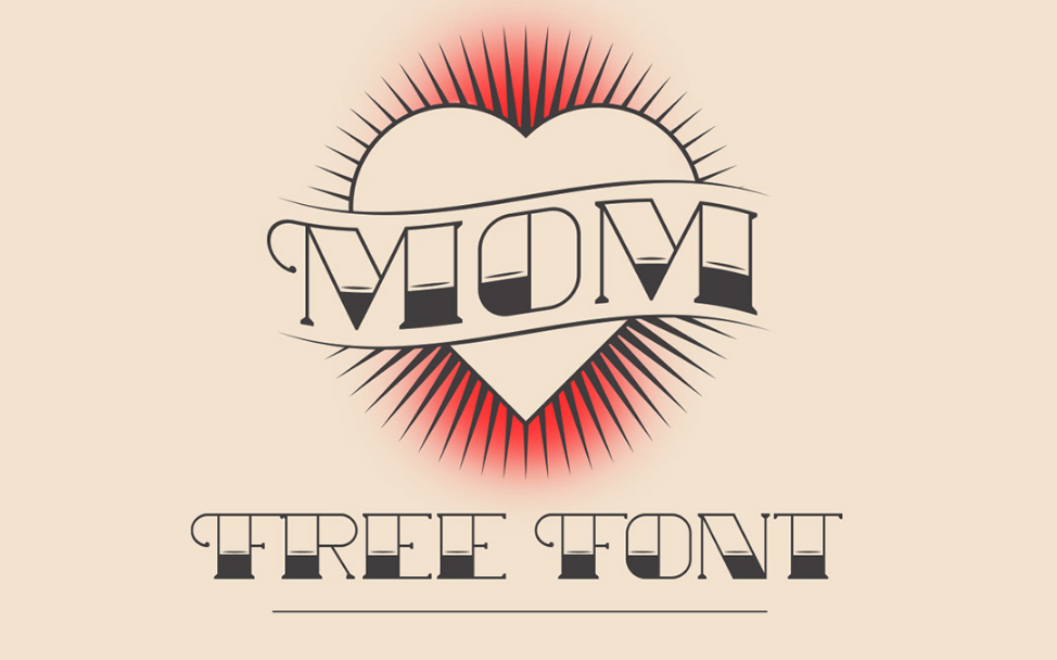
MOM is a font inspired by the old school tattoo lettering of the American tradition
MOM is a font inspired by the old-school tattoo lettering of the American tradition, and a tribute to the great tattoo artists of the past. This free font is the creation of Rafa Miguel, an art director based in Santo Domingo, Dominican Republic.
Free for personal and commercial useDOWNLOAD HERE
66. Original Gangsta
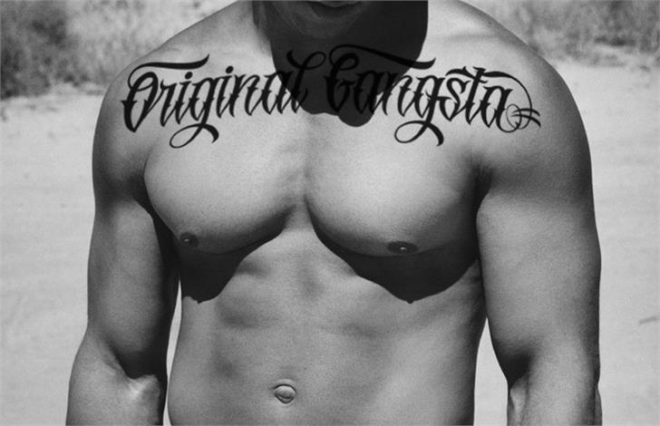
Original Gangsta is a free font with uncompromising style
Want a tattoo font that shows no mercy? Original Gangsta is a hard-edged script font that’s both stylish and uncompromising. This free font was created by Gilang Purnama Jaya, a designer from Indonesia.
Free for personal use onlyDOWNLOAD HERE
Also read: 52 best free tattoo fonts
Next page: Free graffiti fonts
The best free fonts: Graffiti fonts
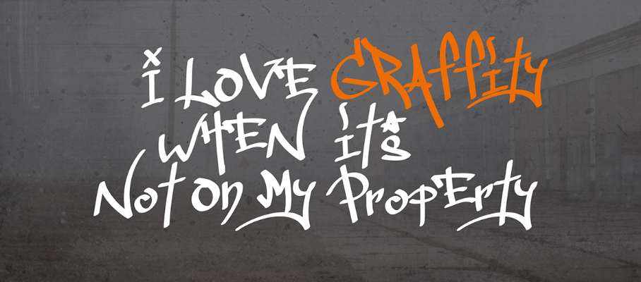
67. Ruthless Dripping One
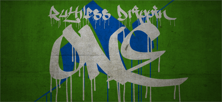
Ruthless Dripping One is one of the few free fonts in the graffiti space that’s keeping it real
Most free graffiti fonts are really just stylised cursives that lack the sense of art, style and playfulness that’s so central to the urban street art scene. Ruthless Dripping One by Swedish designer Måns Grebäck bucks the trend with this free font, which combines calligraphy with paint drips to create something more on the money.
Free for personal use onlyDOWNLOAD HERE
68. Urban Jungle
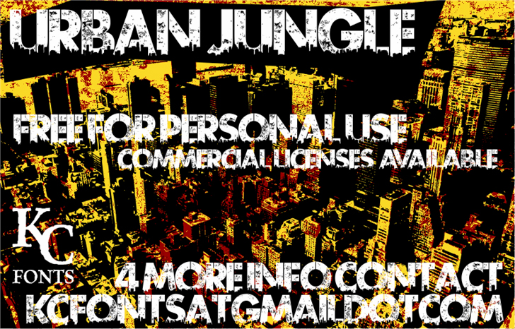
Distressed free font Urban Jungle conveys the look of street stencilling brilliantly
Stencils are a big focus of modern day street art, for both practical and aesthetic reasons. Here, Urban Jungle draws on the stencil tradition and adds a distressed texture that instantly evokes the sweat and fury of the street. It’s the work of Canadian typographer Kevin Christopher, aka KC Fonts.
Free for personal use onlyDOWNLOAD HERE
69. Blow Brush
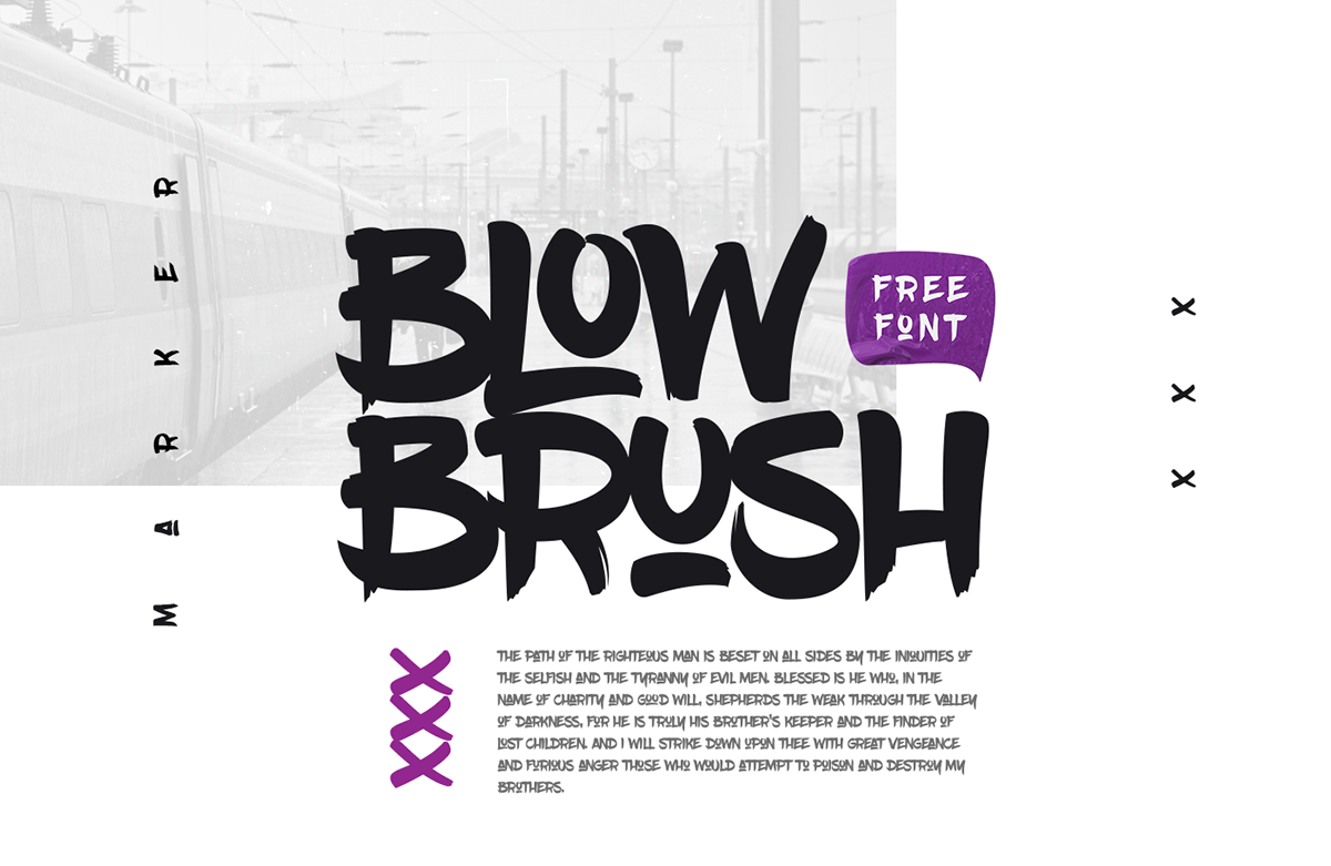
Free font Blow Brush is inspired by hip-hop and urban culture
There’s a real energy and boldness to Blow Brush, a handwritten, marker-style font inspired by hip-hop and urban culture. Quirky enough to feel authentic, but formal enough to provide legibility and font functionality, this free font is the work of Petar Acanski, aka Raz, a Serbian multidisciplinary designer and front end developer. It includes a full set of uppercase characters, numbers, 22 ligatures, a selection of special characters and some variations.
Free for personal and commercial useDOWNLOAD HERE
70. Sister Spray
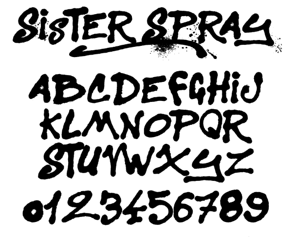
Free font Sister Spray brings together spray paint-style letters, numbers and splodges
Sister Spray is a beautifully messy, spray paint-style font that includes letters, numbers and a bunch of splatters, splotches and strokes. This free font is the work of French typeface design workshop ImageX.
Free for personal use onlyDOWNLOAD HERE
71. Tag Type
Free font Tag Type delivers just what the name suggests
Tag Type is inspired by graffiti tags that contains upper- and lowercase letters, numerals and punctuation. Both Latin and Cyrillic characters are included in this free font, which is the work of Ukranian designer Andy Panchenko.
Free for personal use and charity useDOWNLOAD HERE
Also read: The 40 best free graffiti fonts
Next page: Free unusual fonts
The best free fonts: Unusual fonts
72. Stanley
Stanley exudes elegance
For a truly stylish font, download Stanley. Created by Jérémie Gauthier, this font combines rounded and more geometric forms and the results are striking. Stanley would work well for luxury branding or packaging, and is free for both personal and commercial use.
Free for personal and commercial useDOWNLOAD HERE
73. Elixia
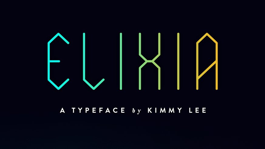
This unusual font has a mystical vibe
Based around a hexagonal grid, Elixia is a slightly condensed typeface with a strong vertical emphasis. It was created by artist and designer Kimmy Lee back in 2005, and includes upper case, lower case, numerals, extended characters, accents and stylistic alternates. Elixia would be best suited for use as a decorative display font, thanks to its mystical, futuristic vibe.
Free for personal and commercial useDOWNLOAD HERE
74. Gilbert
Gilbert is named after the designer of the rainbow flag
Gilbert Baker, who died in 2017, was a LGBTQ activist and artist who's best known for creating the iconic rainbow flag, and he's been commemorated by this striking free display font. Designed with headlines and banner slogans in mind, Gilbert is available as a standard vector font as well as a colour font in OpenType-SVG format, and an animated version.
Free for personal and commercial useDOWNLOAD HERE
75. Carioca
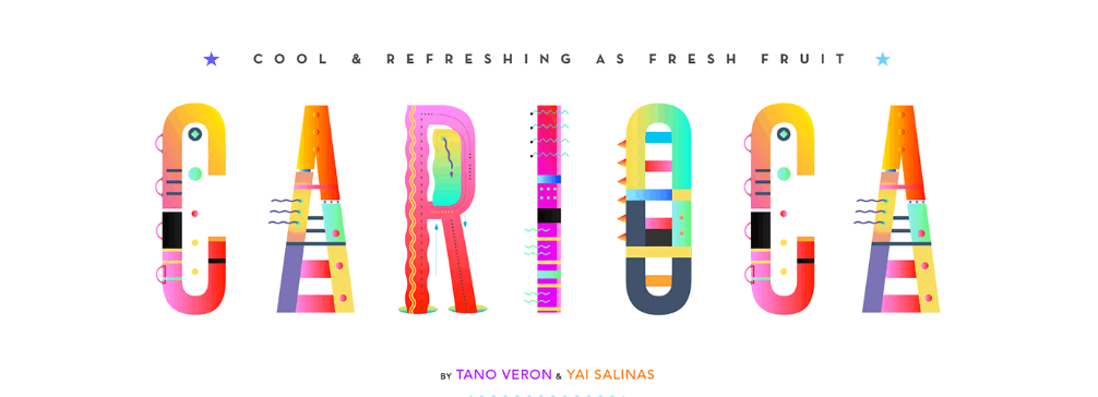
A fresh, fruity and colourful free font
Carioca is a fresh, fun and fruity creation, based on a morphological colour and pattern. This delightful free font was developed as part of a three-month experimental type project by Argentinian graphic designers Tano Veron and Yai Salinas. Contact the designers if you want to use it commercially.
Free for personal use DOWNLOAD HERE
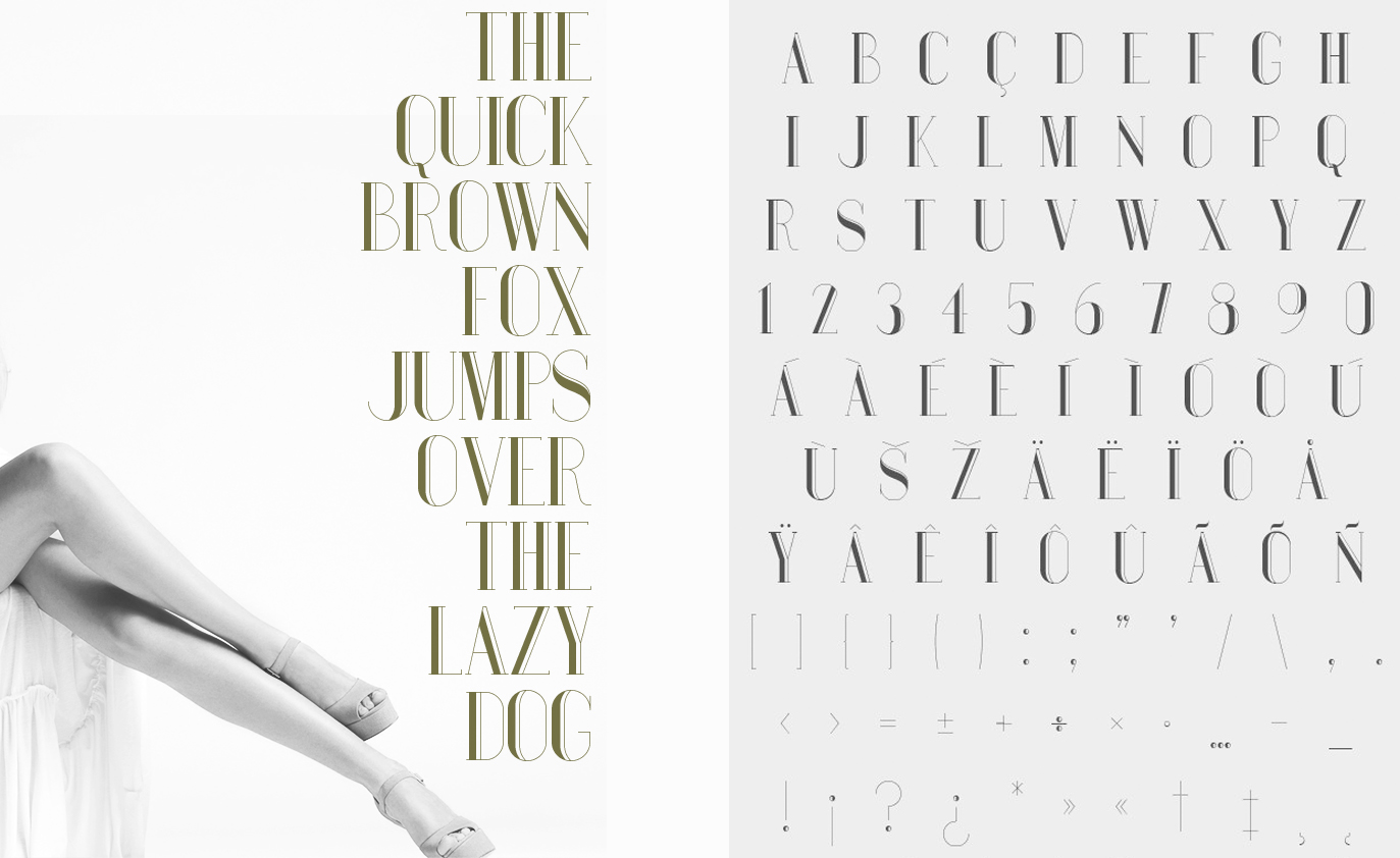
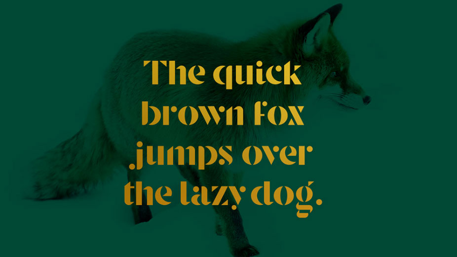
76. Le Super Serif
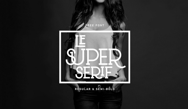
Le Super Serif is one of the few experimental free fonts that actually works
Le Super Serif is that rare thing: a typographical experiment that actually works. It’s described by its creator, Dutch designer Thijs Janssen, as “a fashionable uppercase typeface with a little modern Western flavour to it”. This free font features 88 ligatures and comes in the weights Regular and Semi-Bold.
Free for personal and commercial useDOWNLOAD HERE
77. Porto
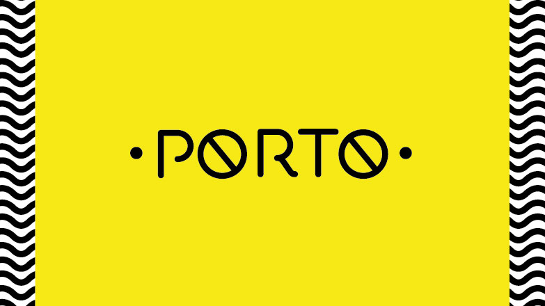
This nautical-themed free font is pretty delightful
Porto is a nautical themed free font that Upper Font Foundry says was "so gorgeous" it couldn't bear to hide it away. And that's good news for you, as you get to use it. We can imagine this font working well on posters or invitations.
Free for personal use (check terms for commercial)DOWNLOAD HERE
78. Tiny Hands
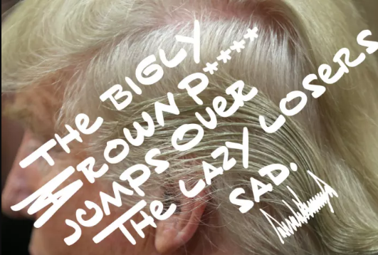
Yes, this free font is dedicated to the eccentric handwriting of Donald Trump
Even though Buzzfeed is aiming to transform into a serious news organisation, it’s still managing to maintain its sense of fun. And here’s a great example: a free font based on US President Donald Trump’s eccentric handwriting style. It was created by typographer Mark Davis, and apart from being a very funny satire, it could actually work well as a cartoon or comic-book font.
Free for personal and commercial useDOWNLOAD HERE
Related articles:
40 must-see examples of kinetic typography5 classic fonts that are still on trend (and why)21 perfect font pairings


 There’s always a balance between visual design and functional design. Many of the “rules” of design as we know them exist to make visuals more functional.

 Over the last few years, everyone’s been talking about Dark Mode. It’s said to boost productivity and focus while reducing eye strain. It’s also supposed to be better for your battery life.
 You know, I remember the good old days when all you had to worry about at Halloween was how to stop a gang of sugar-crazed 8 year-olds throwing eggs at your house. Not any more. Here are 5 emerging technologies that are bound to give you the creeps: