Original Source: https://www.smashingmagazine.com/2020/05/angular-templates-pug/
How To Create Better Angular Templates With Pug
How To Create Better Angular Templates With Pug
Zara Cooper
2020-05-28T11:00:00+00:00
2020-05-28T17:08:35+00:00
As a developer, I appreciate how Angular apps are structured and the many options the Angular CLI makes available to configure them. Components provide an amazing means to structure views, facilitate code reusability, interpolation, data binding, and other business logic for views.
Angular CLI supports multiple built-in CSS preprocessor options for component styling like Sass/SCSS, LESS, and Stylus. However, when it comes to templates, only two options are available: HTML and SVG. This is in spite of many more efficient options such as Pug, Slim, HAML among others being in existence.
In this article, I’ll cover how you — as an Angular developer — can use Pug to write better templates more efficiently. You’ll learn how to install Pug in your Angular apps and transition existing apps that use HTML to use Pug.
Managing Image Breakpoints
A built-in Angular feature called BreakPoint Observer gives us a powerful interface for dealing with responsive images. Read more about a service that allows us to serve, transform and manage images in the cloud. Learn more →
Pug (formerly known as Jade) is a template engine. This means it’s a tool that generates documents from templates that integrate some specified data. In this case, Pug is used to write templates that are compiled into functions that take in data and render HTML documents.
In addition to providing a more streamlined way to write templates, it offers a number of valuable features that go beyond just template writing like mixins that facilitate code reusability, enable embedding of JavaScript code, provide iterators, conditionals, and so on.
Although HTML is universally used by many and works adequately in templates, it is not DRY and can get pretty difficult to read, write, and maintain especially with larger component templates. That’s where Pug comes in. With Pug, your templates become simpler to write and read and you can extend the functionality of your template as an added bonus. In the rest of this article, I’ll walk you through how to use Pug in your Angular component templates.
Why You Should Use Pug
HTML is fundamentally repetitive. For most elements you have to have an opening and closing tag which is not DRY. Not only do you have to write more with HTML, but you also have to read more. With Pug, there are no opening and closing angle brackets and no closing tags. You are therefore writing and reading a lot less code.
For example, here’s an HTML table:
<table>
<thead>
<tr>
<th>Country</th>
<th>Capital</th>
<th>Population</th>
<th>Currency</th>
</tr>
</thead>
<tbody>
<tr>
<td>Canada</td>
<td>Ottawa</td>
<td>37.59 million</td>
<td>Canadian Dollar</td>
</tr>
<tr>
<td>South Africa</td>
<td>Cape Town, Pretoria, Bloemfontein</td>
<td>57.78 million</td>
<td>South African Rand</td>
</tr>
<tr>
<td>United Kingdom</td>
<td>London</td>
<td>66.65 million</td>
<td>Pound Sterling</td>
</tr>
</tbody>
</table>
This is how that same table looks like in Pug:
table
thead
tr
th Country
th Capital(s)
th Population
th Currency
tbody
tr
td Canada
td Ottawa
td 37.59 million
td Canadian Dollar
tr
td South Africa
td Cape Town, Pretoria, Bloemfontein
td 57.78 million
td South African Rand
tr
td United Kingdom
td London
td 66.65 million
td Pound Sterling
Comparing the two versions of the table, Pug looks a lot cleaner than HTML and has better code readability. Although negligible in this small example, you write seven fewer lines in the Pug table than in the HTML table. As you create more templates over time for a project, you end up cumulatively writing less code with Pug.
Beyond the functionality provided by the Angular template language, Pug extends what you can achieve in your templates. With features (such as mixins, text and attribute interpolation, conditionals, iterators, and so on), you can use Pug to solve problems more simply in contrast to writing whole separate components or import dependencies and set up directives to fulfill a requirement.
Some Features Of Pug
Pug offers a wide range of features but what features you can use depends on how you integrate Pug into your project. Here are a few features you might find useful.
Adding external Pug files to a template using include.
Let’s say, for example, that you’d like to have a more succinct template but do not feel the need to create additional components. You can take out sections from a template and put them in partial templates then include them back into the original template.
For example, in this home page component, the ‘About’ and ‘Services’ section are in external files and are included in the home page component.
//- home.component.pug
h1 Leone and Sons
h2 Photography Studio
include partials/about.partial.pug
include partials/services.partial.pug
//- about.partial.pug
h2 About our business
p Lorem ipsum dolor sit amet, consectetur adipiscing elit, sed do eiusmod tempor incididunt ut labore et dolore magna aliqua. Ut enim ad minim veniam, quis nostrud exercitation ullamco laboris nisi ut aliquip ex ea commodo consequat.
//- services.partial.pug
h2 Services we offer
P Our services include:
ul
li Headshots
li Corporate Event Photography

HTML render of included partial templates example (Large preview)
Reusing code blocks using mixins.
For example, let’s say you wanted to reuse a code block to create some buttons. You’d reuse that block of code using a mixin.
mixin menu-button(text, action)
button.btn.btn-sm.m-1(‘(click)’=action)&attributes(attributes)= text
+menu-button(‘Save’, ‘saveItem()’)(class=”btn-outline-success”)
+menu-button(‘Update’, ‘updateItem()’)(class=”btn-outline-primary”)
+menu-button(‘Delete’, ‘deleteItem()’)(class=”btn-outline-danger”)

HTML render of menu buttons mixin example (Large preview)
Conditionals make it easy to display code blocks and comments based on whether a condition is met or not.
– var day = (new Date()).getDay()
if day == 0
p We’re closed on Sundays
else if day == 6
p We’re open from 9AM to 1PM
else
p We’re open from 9AM to 5PM
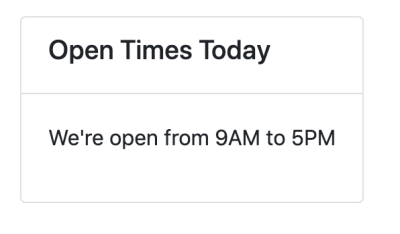
HTML render of conditionals example (Large preview)
Iterators such as each and while provide iteration functionality.
ul
each item in [‘Eggs’, ‘Milk’, ‘Cheese’]
li= item
ul
while n < 5
li= n++ + ' bottles of milk on the wall'
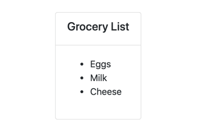
(Large preview)
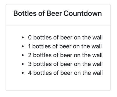
HTML renders of iterators example (Large preview)
Inline JavaScript can be written in Pug templates as demonstrated in the examples above.
Interpolation is possible and extends to tags and attributes.
– var name = ‘Charles’
p Hi! I’m #{name}.
p I’m a #[strong web developer].
a(href=’https://about.me/${name}’) Get to Know Me
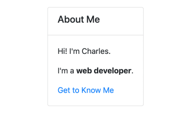
HTML render of interpolation example (Large preview)
Filters enable the use of other languages in Pug templates.
For example, you can use Markdown in your Pug templates after installing a JSTransformer Markdown module.
:markdown-it
# Charles the Web Developer

## About
Charles has been a web developer for 20 years at **Charles and Co Consulting.**
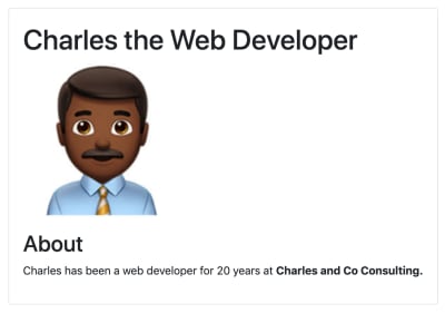
HTML render of filter example (Large preview)
These are just a few features offered by Pug. You can find a more expansive list of features in Pug’s documentation.
How To Use Pug In An Angular App
For both new and pre-existing apps using Angular CLI 6 and above, you will need to install ng-cli-pug-loader. It’s an Angular CLI loader for Pug templates.
For New Components And Projects
Install ng-cli-pug-loader.
ng add ng-cli-pug-loader
Generate your component according to your preferences.
For example, let’s say we’re generating a home page component:
ng g c home –style css -m app
Change the HTML file extension, .html to a Pug extension, .pug. Since the initial generated file contains HTML, you may choose to delete its contents and start anew with Pug instead. However, HTML can still function in Pug templates so you can leave it as is.
Change the extension of the template to .pug in the component decorator.
@Component({
selector: ‘app-component’,
templateUrl: ‘./home.component.pug’,
styles: [‘./home.component.css’]
})
For Existing Components And Projects
Install ng-cli-pug-loader.
ng add ng-cli-pug-loader
Install the html2pug CLI tool. This tool will help you convert your HTML templates to Pug.
npm install -g html2pug
To convert a HTML file to Pug, run:
html2pug -f -c [Pug file path]
Since we’re working with HTML templates and not complete HTML files, we need to pass the -f to indicate to html2pug that it should not wrap the templates it generates in html and body tags. The -c flag lets html2pug know that attributes of elements should be separated with commas during conversion. I will cover why this is important below.
Change the extension of the template to .pug in the component decorator as described in the For New Components and Projects section.
Run the server to check that there are no problems with how the Pug template is rendered.
If there are problems, use the HTML template as a reference to figure out what could have caused the problem. This could sometimes be an indenting issue or an unquoted attribute, although rare. Once you are satisfied with how the Pug template is rendered, delete the HTML file.
Things To Consider When Migrating From HTML To Pug Templates
You won’t be able to use inline Pug templates with ng-cli-pug-loader. This only renders Pug files and does not render inline templates defined in component decorators. So all existing templates need to be external files. If you have any inline HTML templates, create external HTML files for them and convert them to Pug using html2pug.
Once converted, you may need to fix templates that use binding and attribute directives. ng-cli-pug-loader requires that bound attribute names in Angular be enclosed in single or double quotes or separated by commas. The easiest way to go about this would be to use the -c flag with html2pug. However, this only fixes the issues with elements that have multiple attributes. For elements with single attributes just use quotes.
A lot of the setup described here can be automated using a task runner or a script or a custom Angular schematic for large scale conversions if you choose to create one. If you have a few templates and would like to do an incremental conversion, it would be better to just convert one file at a time.
Angular Template Language Syntax In Pug Templates
For the most part, Angular template language syntax remains unchanged in a Pug template, however, when it comes to binding and some directives (as described above), you need to use quotes and commas since (), [], and [()] interfere with the compilation of Pug templates. Here are a few examples:
//- [src], an attribute binding and [style.border], a style binding are separated using a comma. Use this approach when you have multiple attributes for the element, where one or more is using binding.
img([src]=’itemImageUrl’, [style.border]=’imageBorder’)
//- (click), an event binding needs to be enclosed in either single or double quotes. Use this approach for elements with just one attribute.
button(‘(click)’=’onSave($event)’) Save
Attribute directives like ngClass, ngStyle, and ngModel must be put in quotes. Structural directives like *ngIf, *ngFor, *ngSwitchCase, and *ngSwitchDefault also need to be put in quotes or used with commas. Template reference variables ( e.g. #var ) do not interfere with Pug template compilation and hence do not need quotes or commas. Template expressions surrounded in {{ }} remain unaffected.
Drawbacks And Trade-offs Of Using Pug In Angular Templates
Even though Pug is convenient and improves workflows, there are some drawbacks to using it and some trade-offs that need to be considered when using ng-cli-pug-loader.
Files cannot be included in templates using include unless they end in .partial.pug or .include.pug or are called mixins.pug. In addition to this, template inheritance does not work with ng-cli-pug-loader and as a result, using blocks, prepending, and appending Pug code is not possible despite this being a useful Pug feature.
Pug files have to be created manually as Angular CLI only generates components with HTML templates. You will need to delete the generated HTML file and create a Pug file or just change the HTML file extension, then change the templateUrl in the component decorator. Although this can be automated using a script, a schematic, or a Task Runner, you have to implement the solution.
In larger pre-existing Angular projects, switching from HTML templates to Pug ones involves a lot of work and complexity in some cases. Making the switch will lead to a lot of breaking code that needs to be fixed file by file or automatically using a custom tool. Bindings and some Angular directives in elements need to be quoted or separated with commas.
Developers unfamiliar with Pug have to learn the syntax first before incorporating it into a project. Pug is not just HTML without angle brackets and closing tags and involves a learning curve.
When writing Pug and using its features in Angular templates ng-cli-pug-loader does not give Pug templates access to the component’s properties. As a result, these properties cannot be used as variables, in conditionals, in iterators, and in inline code. Angular directives and template expressions also do not have access to Pug variables. For example, with Pug variables:
//- app.component.pug
– var shoppingList = [‘Eggs’, ‘Milk’, ‘Flour’]
//- will work
ul
each item in shoppingList
li= item
//- will not work because shoppingList is a Pug variable
ul
li(*ngFor=”let item of shoppingList”) {{item}}
Here’s an example with a property of a component:
//- src/app/app.component.ts
export class AppComponent{
shoppingList = [‘Eggs’, ‘Milk’, ‘Flour’];
}
//- app.component.pug
//- will not work because shoppingList is a component property and not a Pug variable
ul
each item in shoppingList
li= item
//- will work because shoppingList is a property of the component
ul
li(*ngFor=”let item of shoppingList”) {{item}}
Lastly, index.html cannot be a Pug template. ng-cli-pug-loader does not support this.
Conclusion
Pug can be an amazing resource to use in Angular apps but it does require some investment to learn and integrate into a new or pre-existing project. If you’re up for the challenge, you can take a look at Pug’s documentation to learn more about its syntax and add it to your projects. Although ng-cli-pug-loader is a great tool, it can be lacking in some areas. To tailor how Pug will work in your project consider creating an Angular schematic that will meet your project’s requirements.

(ra, yk, il)


 Rad Power Bikes e-bikes aren’t just healthier for you, they’re healthier for the environment. (Image source: Rad Power Bikes)
