User Authentication with the MEAN Stack

Original Source: https://www.sitepoint.com/user-authentication-mean-stack/

In this article, we’re going to look at managing user authentication in the MEAN stack. We’ll use the most common MEAN architecture of having an Angular single-page app using a REST API built with Node, Express and MongoDB.

When thinking about user authentication, we need to tackle the following things:

let a user register
save their data, but never directly store their password
let a returning user log in
keep a logged in user’s session alive between page visits
have some pages that can only been seen by logged in users
change output to the screen depending on logged in status (e.g. a “login” button or a “my profile” button).

Before we dive into the code, let’s take a few minutes for a high-level look at how authentication is going to work in the MEAN stack.

The MEAN Stack Authentication Flow

So what does authentication look like in the MEAN stack?

Still keeping this at a high level, these are the components of the flow:

user data is stored in MongoDB, with the passwords hashed
CRUD functions are built in an Express API — Create (register), Read (login, get profile), Update, Delete
an Angular application calls the API and deals with the responses
the Express API generates a JSON Web Token (JWT, pronounced “Jot”) upon registration or login, and passes this to the Angular application
the Angular application stores the JWT in order to maintain the user’s session
the Angular application checks the validity of the JWT when displaying protected views
the Angular application passes the JWT back to Express when calling protected API routes.

JWTs are preferred over cookies for maintaining the session state in the browser. Cookies are better for maintaining state when using a server-side application.

The Example Application

The code for this article is available on GitHub. To run the application, you’ll need to have Node.js installed, along with MongoDB. (For instructions on how to install, please refer to Mongo’s official documentation — Windows, Linux, macOS).

The Angular App

To keep the example in this article simple, we’ll start with an Angular app with four pages:

home page
register page
login page
profile page

The pages are pretty basic and look like this to start with:

Screenshots of the app

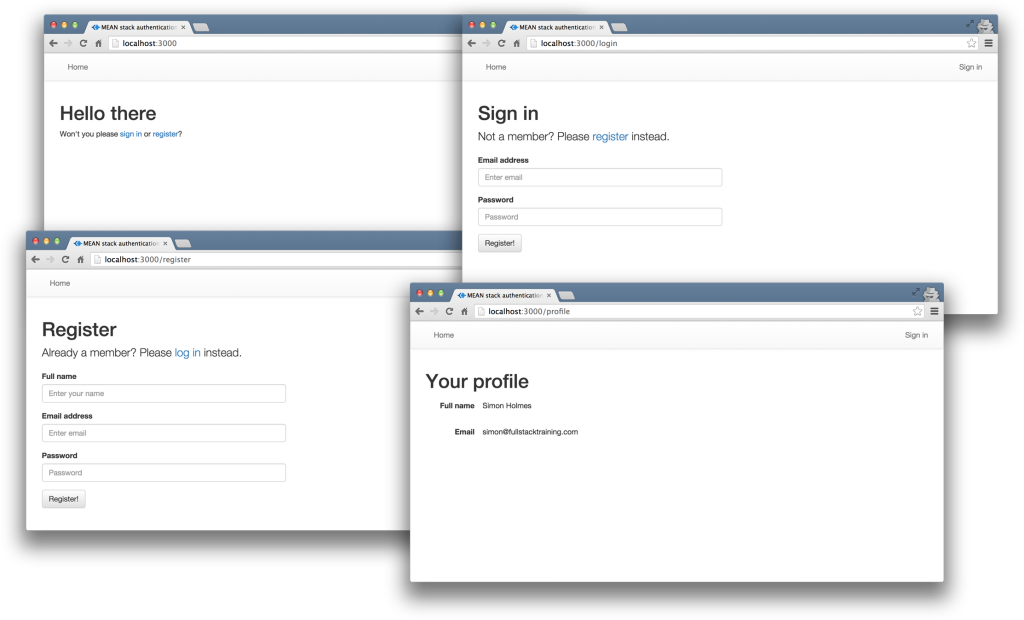
The profile page will only be accessible to authenticated users. All the files for the Angular app are in a folder inside the Angular CLI app called /client.

We’ll use the Angular CLI for building and running the local server. If you’re unfamiliar with the Angular CLI, refer to the Angular 2 Tutorial: Create a CRUD App with Angular CLI to get started.

The REST API

We’ll also start off with the skeleton of a REST API built with Node, Express and MongoDB, using Mongoose to manage the schemas. This API has three routes:

/api/register (POST) — to handle new users registering
/api/login (POST) — to handle returning users logging in
/api/profile/USERID (GET) — to return profile details when given a USERID.

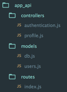
The code for the API is all held in another folder inside the Express app, called api. This holds the routes, controllers and model, and is organized like this:

Screenshot of api folder structure

At this starting point, each of the controllers simply responds with a confirmation, like this:

module.exports.register = function(req, res) {
console.log(“Registering user: ” + req.body.email);
res.status(200);
res.json({
“message” : “User registered: ” + req.body.email
});
};

Okay, let’s get on with the code, starting with the database.

Creating the MongoDB Data Schema with Mongoose

There’s a simple user schema defined in /api/models/users.js. It defines the need for an email address, a name, a hash and a salt. The hash and salt will be used instead of saving a password. The email is set to unique as we’ll use it for the login credentials. Here’s the schema:

var userSchema = new mongoose.Schema({
email: {
type: String,
unique: true,
required: true
},
name: {
type: String,
required: true
},
hash: String,
salt: String
});

Managing the Password without Saving It

Saving user passwords is a big no-no. Should a hacker get a copy of your database, you want to make sure they can’t use it to log in to accounts. This is where the hash and salt come in.

The salt is a string of characters unique to each user. The hash is created by combining the password provided by the user and the salt, and then applying one-way encryption. As the hash can’t be decrypted, the only way to authenticate a user is to take the password, combine it with the salt and encrypt it again. If the output of this matches the hash, the password must have been correct.

To do the setting and the checking of the password, we can use Mongoose schema methods. These are essentially functions that you add to the schema. They’ll both make use of the Node.js crypto module.

At the top of the users.js model file, require crypto so that we can use it:

var crypto = require(‘crypto’);

Nothing needs installing, as crypto ships as part of Node. Crypto itself has several methods; we’re interested in randomBytes to create the random salt and pbkdf2Sync to create the hash (there’s much more about Crypto in the Node.js API docs).

Setting the Password

To save the reference to the password, we can create a new method called setPassword on the userSchema schema that accepts a password parameter. The method will then use crypto.randomBytes to set the salt, and crypto.pbkdf2Sync to set the hash:

userSchema.methods.setPassword = function(password){
this.salt = crypto.randomBytes(16).toString(‘hex’);
this.hash = crypto.pbkdf2Sync(password, this.salt, 1000, 64, ‘sha512’).toString(‘hex’);
};

We’ll use this method when creating a user. Instead of saving the password to a password path, we’ll be able to pass it to the setPassword function to set the salt and hash paths in the user document.

Checking the Password

Checking the password is a similar process, but we already have the salt from the Mongoose model. This time we just want to encrypt the salt and the password and see if the output matches the stored hash.

Add another new method to the users.js model file, called validPassword:

userSchema.methods.validPassword = function(password) {
var hash = crypto.pbkdf2Sync(password, this.salt, 1000, 64, ‘sha512’).toString(‘hex’);
return this.hash === hash;
};

Generating a JSON Web Token (JWT)

One more thing the Mongoose model needs to be able to do is generate a JWT, so that the API can send it out as a response. A Mongoose method is ideal here too, as it means we can keep the code in one place and call it whenever needed. We’ll need to call it when a user registers and when a user logs in.

To create the JWT, we’ll use a module called jsonwebtoken which needs to be installed in the application, so run this on the command line:

npm install jsonwebtoken –save

Then require this in the users.js model file:

var jwt = require(‘jsonwebtoken’);

This module exposes a sign method that we can use to create a JWT, simply passing it the data we want to include in the token, plus a secret that the hashing algorithm will use. The data should be sent as a JavaScript object, and include an expiry date in an exp property.

Adding a generateJwt method to userSchema in order to return a JWT looks like this:

userSchema.methods.generateJwt = function() {
var expiry = new Date();
expiry.setDate(expiry.getDate() + 7);

return jwt.sign({
_id: this._id,
email: this.email,
name: this.name,
exp: parseInt(expiry.getTime() / 1000),
}, “MY_SECRET”); // DO NOT KEEP YOUR SECRET IN THE CODE!
};

Note: It’s important that your secret is kept safe: only the originating server should know what it is. It’s best practice to set the secret as an environment variable, and not have it in the source code, especially if your code is stored in version control somewhere.

That’s everything we need to do with the database.

Set Up Passport to Handle the Express Authentication

Passport is a Node module that simplifies the process of handling authentication in Express. It provides a common gateway to work with many different authentication “strategies”, such as logging in with Facebook, Twitter or Oauth. The strategy we’ll use is called “local”, as it uses a username and password stored locally.

To use Passport, first install it and the strategy, saving them in package.json:

npm install passport –save
npm install passport-local –save

Configure Passport

Inside the api folder, create a new folder config and create a file in there called passport.js. This is where we define the strategy.

Before defining the strategy, this file needs to require Passport, the strategy, Mongoose and the User model:

var passport = require(‘passport’);
var LocalStrategy = require(‘passport-local’).Strategy;
var mongoose = require(‘mongoose’);
var User = mongoose.model(‘User’);

For a local strategy, we essentially just need to write a Mongoose query on the User model. This query should find a user with the email address specified, and then call the validPassword method to see if the hashes match. Pretty simple.

There’s just one curiosity of Passport to deal with. Internally, the local strategy for Passport expects two pieces of data called username and password. However, we’re using email as our unique identifier, not username. This can be configured in an options object with a usernameField property in the strategy definition. After that, it’s over to the Mongoose query.

So all in, the strategy definition will look like this:

passport.use(new LocalStrategy({
usernameField: ’email’
},
function(username, password, done) {
User.findOne({ email: username }, function (err, user) {
if (err) { return done(err); }
// Return if user not found in database
if (!user) {
return done(null, false, {
message: ‘User not found’
});
}
// Return if password is wrong
if (!user.validPassword(password)) {
return done(null, false, {
message: ‘Password is wrong’
});
}
// If credentials are correct, return the user object
return done(null, user);
});
}
));

Note how the validPassword schema method is called directly on the user instance.

Now Passport just needs to be added to the application. So in app.js we need to require the Passport module, require the Passport config and initialize Passport as middleware. The placement of all of these items inside app.js is quite important, as they need to fit into a certain sequence.

The Passport module should be required at the top of the file with the other general require statements:

var express = require(‘express’);
var path = require(‘path’);
var favicon = require(‘serve-favicon’);
var logger = require(‘morgan’);
var cookieParser = require(‘cookie-parser’);
var bodyParser = require(‘body-parser’);
var passport = require(‘passport’);

The config should be required after the model is required, as the config references the model.

require(‘./api/models/db’);
require(‘./api/config/passport’);

Finally, Passport should be initialized as Express middleware just before the API routes are added, as these routes are the first time that Passport will be used.

app.use(passport.initialize());
app.use(‘/api’, routesApi);

We’ve now got the schema and Passport set up. Next, it’s time to put these to use in the routes and controllers of the API.

Continue reading %User Authentication with the MEAN Stack%

How to Enable AI with Secure Communications

Original Source: https://www.sitepoint.com/ai-the-future-of-apps/

This article was sponsored by BlackBerry. Thank you for supporting the partners who make SitePoint possible.

Imagine a healthcare platform that designs the perfect treatment plan for a patient based on their medical history. Picture a chatbot that automatically generates legal appeals or resolves customer disputes in minutes. Imagine a virtual assistant that knows your habits, likes, and dislikes, and can suggest activities based on this knowledge.

This technology already exists today, and it is just the beginning. Alongside the Enterprise of Things, we are on the verge of a second revolution. Artificial intelligence will change everything, from how we protect ourselves from cyberattacks to how we go about our daily lives.

And much like the Enterprise of Things, businesses that do not start planning for artificial intelligence now will be left behind – according to Tata Consultancy Services, 84% of businesses believe AI will be essential.

Building A Smarter Enterprise – Artificial Intelligence and App Development

Application development will be the foundation of the move towards artificial intelligence. Businesses that integrate AI into their apps will be able to provide new services and a better, more personalized user experience. They will be able to gain deeper insights into how their customers think and act, and open new revenue streams through those insights.

Moreover, artificial intelligence will power new, transformative interactions between people, machines, and the Internet of Things.

Through AI-driven analysis, businesses will gain a deeper understanding of their market and their staff. Automation will allow workers to respond proactively to customer complaints or security incidents, boost productivity, reduce costs, and minimize employee error. And through machine learning, businesses will be able to make better, more informed decisions than ever before.

In time, people will demand such capabilities. Next-generation apps and services will be expected to not only support human-to-human interactions, but also human-to-machine and machine-to-machine interactions. Just as mobile apps are critical to business success today, artificial intelligence will be critical to success very soon.

Getting Past The Roadblocks to Enterprise AI

Though most businesses acknowledge artificial intelligence’s importance, AI remains elusive. The issue is primarily one of complexity and cost. In a 2017 study by Infosys, 72% of IT professionals found time constraints were a roadblock to AI adoption, while 71% referenced financial limitations. Resistance to change and a lack of clarity around AI’s value were also hindrances.

Even for businesses that manage to overcome those challenges, security remains a core issue. AI apps will routinely deal with sensitive data such as customer information, internal messages, login credentials, usage details, and even intellectual property. Left unencrypted, such services could leak that data into the wrong hands.

Communications Platform as a Service (CPaaS) tools are central to overcoming these challenges. By integrating real-time communications into their apps – and tying that functionality to its AI services – developers allow for better, deeper interactions between AI and user. More importantly, with the right CPaaS solution, they ensure those interactions are kept secure, and that the AI does not leak critical data.

How The BBM Enterprise SDK Makes Your Apps Smarter

Here’s where the BBM Enterprise SDK comes in. A secure CPaaS platform built on BlackBerry’s strength in secure mobile messaging, it gives your developers everything they need to incorporate secure, enterprise-grade messaging functionality in their apps. You can use commonly used identity and user management providers to make development even easier.

More importantly, it offers several features that directly empower artificial intelligence:

Embedded voice, video, chat. Enable your users to reach out to anyone around the world and be reached they want, whether for emergency communications, peer-to-peer collaboration, or by receiving personalize support services.
Publish/Subscribe Services. Create channels which broadcast to subscribing users. This keeps them updated on all new activity in a collaboration space, whether by another user or from the machine-readable information your application consumes.
Chatbots and Routing Services. Provide real-time support for your users via a chatbot which can process their data, activity, and messages. This information is then used to route them to the correct contact.
AI-Driven Predictive Analytics. AI algorithms enable behind-the-scenes user empowerment, delivering relevant information to users when they need it. These include location-based alerts or suggested actions based on user behavior.
Secure IoT Data Sharing. Eliminate the worry of cached copies or “fingerprints in the cloud” that could compromise privacy while also supporting real-time data sharing across all endpoints – human and machine.

We suggest that you first download the free SDK and familiarize yourself with the BBM Enterprise SDK with Blackberry’s Getting Started Guide.

Now that you’re ready, let’s dive into some examples that can help you get started with your AI journey…

How to Create Data Streams via Whiteboarding

This example shows how you can send arbitrary data in a BBM Enterprise SDK chat to create a shared whiteboard that allows us to do the following:

Create new whiteboards with one or more users
Share pictures and markup

Continue reading %How to Enable AI with Secure Communications%

Outdoors Template

Original Source: http://feedproxy.google.com/~r/tympanus/~3/Gjco7wLANuM/

Today we’re very excited to share an experimental implementation of one of Gil Huybrecht’s designs with you. Gil creates fantastic signature designs with amazing animations and he kindly permitted us code up one of his works.

outdoors_featured

The design project is called “Outdoors” and it has a very interesting layout with a content/image slideshow and an expanding element. While we tried to implement it as close as possible to the design, we opted to adjust some details. We hope you like the way that it turned out!

If you like Gil’s design, we recommend you checking out his Skillshare class where he teaches about visual hierarchy and spacing.

Note that this implementation is a proof-of-concept that uses modern CSS properties like grid and custom properties. You’ll need to implement proper fallbacks for older browsers.

The layout is powered by layered CSS grids which allow us to use a more semantic HTML structure (see mobile version) without repeating content. We use anime.js for the animations, imagesLoaded for preloading the images and Charming.js for the handling the letter structure of the titles.

Have a look at some screenshots:

outdoors_01

outdoors_02

outdoors_03

We hope you enjoy this layout and find it inspiring!

Thank you, Gil, you rock!

References and Credits

Design by Gil Huybrecht
Images by Unsplash.com
anime.js by Julian Garnier
imagesLoaded by Dave DeSandro
Charming.js by Yuan Qing

Outdoors Template was written by Mary Lou and published on Codrops.

Popular Design News of the Week: January 22, 2018 – January 28, 2018

Original Source: https://www.webdesignerdepot.com/2018/01/popular-design-news-of-the-week-january-22-2018-january-28-2018/

Every week users submit a lot of interesting stuff on our sister site Webdesigner News, highlighting great content from around the web that can be of interest to web designers. 

The best way to keep track of all the great stories and news being posted is simply to check out the Webdesigner News site, however, in case you missed some here’s a quick and useful compilation of the most popular designer news that we curated from the past week.

Note that this is only a very small selection of the links that were posted, so don’t miss out and subscribe to our newsletter and follow the site daily for all the news.

Facebook Just Invented a New Unit of Time


UI Design Inspiration – Jan 2018


Finding Dead CSS


Web Typography Quiz by Better Web Type


Gradient Topography Animation


35+ Best Free Script Fonts for Designers


Instagram’s Latest ‘Feature’ Proves it’s not Listening


Year in Pixels


Bolt ECommerce


Lean UX Principles to Keep your Users Happy


Nerv – A Blazing Fast React Alternative


Drag and Drop for Design Systems


22 Awesome Websites with Stunning Free Stock Images


Eight Microinteractions to Help Improve UX


How a Single Line of Computer Code Put Thousands of Innocent Turks in Jail


Iris – Protect your Eyes from your Computer’s LCD


This is the World’s First Graphical AI Interface


Stripe: Ending Bitcoin Support


10 Best Free Monospaced Fonts for Code Snippets


Secret Heroes of UX Design


The Art of Storyboarding


Build a Better Homepage


How I Got Hired by GitHub


Stop Asking if Users Want Notifications from your Site


The Language of UX


Want more? No problem! Keep track of top design news from around the web with Webdesigner News.

All-In-One Resume & CV Builder by MotoCMS – only $24!

Source

p img {display:inline-block; margin-right:10px;}
.alignleft {float:left;}
p.showcase {clear:both;}
body#browserfriendly p, body#podcast p, div#emailbody p{margin:0;}

Frank And Oak's locally Made Wool Suiting Campaign Illustrations

Original Source: http://feedproxy.google.com/~r/abduzeedo/~3/0TUo-4XXNOE/frank-and-oaks-locally-made-wool-suiting-campaign-illustrations

Frank And Oak’s locally Made Wool Suiting Campaign Illustrations

Frank And Oak's locally Made Wool Suiting Campaign Illustrations

AoiroStudio
Jan 30, 2018

Ever since the last feature of Amanda Mocci on ABDZ, she has been crafting her work so beautifully. It can be seen in Fast Company, books and in her personal exploration where I feel she is shining the most. There is so much depth and the contrast is being shown to a whole new level. For the new, Amanda Mocci is an art director and artist based in Montreal, QC. We are sharing a series of illustrations she shared for Frank And Oak, a very popular Men’s Clothing & Women’s Styles. They were promoting their locally Made Wool suits for Men and as you can see. It’s just amazing!

New illustrations created for Frank And Oak’s locally made wool suiting campaign. It was so much fun to work on these! Many thanks to the awesome team at Frank And Oak

More Links
Learn more about Amanda Mocci at amandamocci.com
Follow Amanda on Facebook
Follow Amanda on Instagram
Previous Feature on ABDZ
Illustration
Frank And Oak's locally Made Wool Suiting Campaign IllustrationsFrank And Oak's locally Made Wool Suiting Campaign IllustrationsFrank And Oak's locally Made Wool Suiting Campaign IllustrationsFrank And Oak's locally Made Wool Suiting Campaign IllustrationsFrank And Oak's locally Made Wool Suiting Campaign Illustrations


amanda mocci
illustration
frank and oak


Collective #386

Original Source: http://feedproxy.google.com/~r/tympanus/~3/-wg4i-3RBfM/

C386_Freshbooks

Our Sponsor
Invoice Software That Saves You Time

FreshBooks makes small business invoicing and billing so simple, you’ll be amazed at the time you have to focus on doing what you love and how much faster you get paid.

Try It Free

C386_intersectionobs

Now You See Me: How To Defer, Lazy-Load And Act With IntersectionObserver

A great article by Denys Mishunov, where he explains how to work with IntersectionObserver.

Read it

C386_genartwork

Tips to improve your generative artwork

Tyler Hobbs offers some valuable advice to help improve your generative artwork.

Read it

C386_pulse

2018.makemepulse.com

Some awesome little games made by the team of Makemepulse.

Check it out

C386_font

Free Font: Geizer

Inspired by horror fiction and heavy metal, Matt Cole Wilson created this awesome font.

Get it

C386_courseroot

Courseroot

A database of online courses categorized after price, difficulty, certificate quality, and more.

Check it out

C386_uxai

The UX of AI

An article about Google Clips and what it means in practice to take a human-centered approach to designing an AI-powered product.

Read it

C386_left

Left

An open source, distraction-less writing tool with auto-complete, a synonyms dictionary, writing statistics, markup-based navigation and a speed-reader.

Check it out

C386_iOS

iOS 11 UI Kit for iPhone X (Sketch)

Design+Code made this fantastic iOS 11 UI Kit for Sketch.

Get it

C386_win10

Digital Design is Never Done

Ruediger Kinast writes about how the Microsoft design team made the Windows 10 mail and calendar apps more fluent.

Read it

C386_detection

Building a real-time smile detection app with deeplearn.js and the web Shape Detection API

The first article in a series explaining how to perform face detection in the browser using deeplearn.js and the web Shape Detection API. By Jozef Maxted.

Read it

C386_fabric

Audiofabric

A fabric-like 3D audio visualization made by Taylor Baldwin.

Check it out

C386_hacker101

Hacker101

The Hacker101 video lessons aim to teach many useful things about web security.

Check it out

C386_ecommerce

Fusion E-commerce UI Kit (PSD, Sketch)

A lovely minimal e-commerce UI Kit by GateUi.

Get it

C386_greenlet2

Greenlet

With Greenlet you can move an async function into its own thread. By Jason Miller.

Check it out

C386_chess

The King vs. Pawn Game of UI Design

Erik Kennedy compares UI design to chess and shows how to use the analogy to improve your skills.

Read it

C386_jsappsecure

Building Secure JavaScript Applications

Gergely Nemeth goes through the most frequently asked questions on how to make a JavaScript application more secure.

Read it

C386_naturefont

Free Font: Nature

Zamara Reyes designed this interesting display font.

Get it

C386_webpack

Webpack Demos

A collection of simple and clear Webpack demos to get you started. By Ruan YiFeng.

Check it out

C386_keyboard

Moving efficiently in the CLI

An excellent diagram in a flashcard format for keyboard shortcuts in the command line.

Check it out

C386_webworkers

How JavaScript works: The building blocks of Web Workers + 5 cases when you should use them

The 7th article in a series that explores JavaScript and its building components. By Alexander Zlatkov.

Read it

C386_isometric

React Isometric Grids

Hung-Wei Wu made this React version of our Isometric Grids.

Check it out

C386_scalability

Awesome Scalability, Availability, and Stability Back-end Design Patterns

A curated list of selected readings to illustrate scalability, availability, and stability design patterns in back-end development.

Check it out

C386_topography

From Our Blog
Gradient Topography Animation

An organic SVG shape layer animation based on Diana Hlevnjak’s work “Gradient Topography”. Powered by anime.js.

Check it out

Collective #386 was written by Pedro Botelho and published on Codrops.

3 Essential Design Trends, February 2018

Original Source: https://www.webdesignerdepot.com/2018/01/3-essential-design-trends-february-2018/

Sometimes design trends are tough to see, even when you are looking for them. This month is no exception with trends that include use of circles in design, split screen layouts, and dark backgrounds with light text.

These elements might seem like common design tools but when used in similar ways across the board, distinct trends start to emerge.

Here’s what’s trending in design this month:

1. Circles

The implied meanings and associations of circles in design can have a lot to do with their usage. Circles imply a sense of completeness and harmony. They are used to represent love, energy and power. (It’s somewhat surprising that more designers don’t use circles regularly.)

While the most common uses of circles recently has been in the form of buttons or calls to action thanks to Google’s Material Design, circles are taking on stronger design roles.

The thing that can be difficult about circles is the canvas and shape of websites—either distinctly horizontal (desktop screens) or vertical (mobile screens). So the design has to use circles in space so that the shape doesn’t get lost in the responsive format. Each of the examples below do a good job or maintaining the circular flow without losing the shape as the canvas shifts.

KymberleeJay uses a big pink circle to bring attention to the main copy on the screen. The eye moves directly from the woman’s face to the strong round shape.

Buddha Pizza implies a circle with text and ingredients surrounding a slice. Part of what makes the circle appear is the idea that a pizza is often round. Even with the triangular image in the middle of the screen, the circle is obvious.

Hotel Poispois uses floating circles to create visual interest, but they also serve as giant buttons that take users to different parts of the website.

2. Split Screens

Split screen designs are one of those trends that grows in popularity and then disappears, but it always seems to circle back. The latest iteration of the trend includes both super bold split screens and more subtle pairings.

The great thing about split screen designs is that they work with the responsive format beautifully. You get double content on desktop and stacked content on mobile screens. Regardless of device, the user doesn’t feel like he or she missed out on anything by changing device type.

Split screen design also provides a solution for having dual pieces of content with almost equal importance. You can showcase multiple elements and offer two distinct courses of action (and associated calls to action) on the screen at one time.

This concept puts users in control of the design, allowing them to feel like there is a choice in how to interact with the content.

Taco Bill’s website is a prime example of this. The design immediately poses a question to users: Do you want to order food to go or do you want a reservation to eat in. The split screen design does more than just make the design easier to use, it actually shows users that they have multiple options visually.

Nikos Pandazaras takes another approach with the photography portfolio website design. The site showcases two vertical photos side by side with the navigation in the middle. It’s a different approach for a portfolio style design but effective in that users get to see more images immediately. The split screen style implies that both images carry equal weight and one is no more important than the other.

D’Aucy uses a more subtle split screen aesthetic. One side includes an image on a textured background paired with the same color background without any texture and a headline. The design is a good way to help draw the eye across the screen so that all the content is viewed.

3. Dark Backgrounds, White Text

Dark backgrounds and white text are a classic combination. But this trend is emerging with a twist—there’s video or animation in the dark background.

Whether the movement is subtle, such as Top Estates, or fast and furious, such as Bullying and Behavior, the action in the background is what helps draw users even. The lack of color adds an element of mystery and makes the scene a little more enticing.

White type adds to the starkness of the design. While it is easy to read—that’s a good thing—the text isn’t overwhelming the design. These projects are a bit more stark by nature. The driving visual element is movement in the dark space of the background. All of the designs below feature looping animations that help create a feel for the projects.

The darker the background with these designs, the more mystery they create. Darker backgrounds also increase readability because of the amount of contrast with white text. The speed of animations can create a sense of calm or frenzy.

It’s pretty spectacular how much information can come from what at first glance looks like such simple designs.

Conclusion

The nice thing about this collection of trends is that they are all things you can implement in almost any design project. Use of circles, split screens and dark backgrounds aren’t limited to a certain style of design. You can use these ideas to freshen us a site that’s feeling a little stale or incorporate them into a new project.

As with any trend, think about the content and context before you get started. Does the visual plan help you achieve your overall goal with the design?

All-In-One Resume & CV Builder by MotoCMS – only $24!

Source

p img {display:inline-block; margin-right:10px;}
.alignleft {float:left;}
p.showcase {clear:both;}
body#browserfriendly p, body#podcast p, div#emailbody p{margin:0;}

How Dark UX Patterns Target The Most Vulnerable

Original Source: https://www.webdesignerdepot.com/2018/01/how-dark-ux-patterns-target-the-most-vulnerable/

A dark user experience pattern is loosely defined as a way to trick users into performing certain actions. These actions always benefit the company employing these techniques, and often leave user out of pocket in at least one way. Sometimes this is monetary; other times it’s at the cost of privacy, time, or even user rights.

Some of the most common dark patterns include disguising advertisements, sneaking additional items into a user’s basket, making it difficult to cancel a subscription, and tricking users to share information they did not intend to. The list goes on, and it’s becoming a more prominent issue.

There’s a line between clever marketing and trickery

As larger sites like Amazon and Facebook employ various dark user experience patterns, other competitors and websites follow on, pushing them to become the norm. There’s a line between clever marketing and trickery. These practices fall within the latter, and are solely focused on profiting from the user in shameful ways.

Just to examine how widely employed these techniques are, consider the following examples.

The first is from Amazon. It’s just one of a number of screens they show to users who are not currently Amazon Prime members. The primary call-to-action is front and center. Rather than it being a ‘Next’ or ‘Continue’ button as the user would expect, it instead charges £7.99 to your card immediately. The option to continue is instead hidden with a text link that blends in with  both the footer and the confusing text copy.

For the most vulnerable, such as elderly, those less proficient with the language used, or users with a disability, these types of practices can provide a great deal of confusion and distress.

Even as a designer who is aware of these tricks, it’s still incredibly easy to fall victim to them. Not to mention, they are an annoyance and create a distrust between company and consumer.

As long as practices like this are legal and continue to convert at such high rates, companies will continue to employ them

In a perfect world, Amazon would outline the benefits in a simple to read format with the primary call-to-action allowing the user to skip and continue. In reality, they hide the details in small print: print too small to read for just over 5% of the world’s population. They present the information in an oddly structured format with a confusing variety of bold text weights, different colors, and so much text it deters the user from reading through it all. As long as practices like this are legal and continue to convert at such high rates, companies will continue to employ them.

While Amazon targets the pockets of vulnerable consumers, Facebook is more interested in the user sharing as much information about themselves as possible—even if they are not intending to do so. While Facebook have made progress on privacy issues compared to earlier versions, they continue to use subtle but persuasive and confusing design techniques, and copy like below.

Despite going through every privacy setting and selecting ‘Only Me’, sections which contain very personal and detailed information are still defaulted to be shared publicly. Not only is this an issue with privacy, but also with security. The ease at which hackers can subsequently obtain information to answer the likes of security questions is astonishing. The dropdown is subtle and demands nowhere near as much attention as the primary call-to-action. Similar modals also use microcopy to trick users. Consider this example:

At first glance, nothing seems too untoward. At a closer look, it becomes clear that Facebook is pushing users into sharing their bio to the News Feed. It’s doing this by implying that by clicking ‘Cancel’, you are cancelling changes made to your bio. In reality, ‘Cancel’ means ‘No’. Again, it’s the type of practice that can trick even the most privacy-conscious. For the rest of users, it’s an example of just how far Facebook will push the limits if it means users will share more, interact more, and ultimately have a positive impact on their advertising revenue figures.

In the product and web design industries, aesthetics, sales techniques, and profits are all often placed above accessibility and the well-being of users. Shopify, LinkedIn, Instagram, CloudFlare, and GoDaddy are just a few names who go to such measures to impact their bottom line.

aesthetics, sales techniques, and profits are all often placed above accessibility and the well-being of users.

It might just be making an email unsubscribe link smaller to blend in. Or making it impossible to close your account. Or something even more subtle like making you submit your name, email and full address before giving a shipping cost estimation. But it’s these dark patterns that impact the usability and accessibility of the web in really quite severe ways.

For most of us, it’s simply an annoyance. For the people who are most vulnerable, it can make things near impossible to use or understand. They may not be able to find that hidden unsubscribe link. They may not notice that something has been added to their basket during checkout. And they may become entirely disillusioned and confused with privacy settings, disguised ads and friend spam.

it’s the responsibility of everyone within product and marketing teams to ensure [dark patterns are] safeguarded against

The web has become a place where you have to be extremely conscious and learned of areas like security, privacy, and trickery—even by the biggest reputable companies in the world. For everyone, this quite simply isn’t possible. And these patterns don’t even begin to touch upon larger issues with accessibility such as readability and color practices.

Designers and teams need to be aware of their responsibility not just to clients, employers, and shareholders, but to everyday users too. Accessibility issues and dark patterns hit the vulnerable the hardest, and it’s the responsibility of everyone within product and marketing teams to ensure this is safeguarded against.

Until better laws and regulations are introduced to protect against this, it’s the duty of teams to design responsibly and garner a balance between profit maximizing and providing the optimum usability and accessibility for all users.

All-In-One Resume & CV Builder by MotoCMS – only $24!

Source

p img {display:inline-block; margin-right:10px;}
.alignleft {float:left;}
p.showcase {clear:both;}
body#browserfriendly p, body#podcast p, div#emailbody p{margin:0;}

Get Things Done More Efficiently than Ever with monday.com

Original Source: http://feedproxy.google.com/~r/1stwebdesigner/~3/c5tUA1hhILs/

Designers know that communication and organization are essential to making a project successful. Otherwise, it’s just too easy to suffer from setbacks and misunderstandings. Working as a team means knowing who’s responsible for handling tasks, keeping tabs on progress and being mindful of deadlines. But even if you’re working on your own, you still need a way to stay on top of your to-do list.

Thankfully, there is a solution. monday.com turns task management and collaboration into a visual experience. Its unique combination of a user-friendly UI and powerful functionality make it a must-have tool. They have helped companies of all sizes get things done more efficiently – and they can help you do the same. Let’s find out how:

Keep Track of Everything (and Everyone)

When it comes to project work, there are so many things we need to stay on top of. Trying to do so with email or traditional meetings ends up causing more problems than they solve. There’s got to be a better way.

monday.com (formerly known as dapulse) is here to save the day with everything you need. Use it to communicate with team members, manage and assign tasks, share progress, files and more. They have a strong set of core features to help you achieve your goals, including:

The Ultimate Board

Use boards to keep track of every aspect of your projects. You can set up multiple boards to provide anything from a high-level view of what your team is working on to a task list for a single person.

Boards are designed to be intuitive and user-friendly. From color-coded task statuses to a simple drag-and-drop method for moving things around – there’s no steep learning curve to adjust to. Things simply work.

And, you’ll love the fact that you can tag each task and easily search for every related item in the system. This makes it incredibly painless to find what you’re looking for.

monday.com Board

Communicate with Ease

With monday.com, you’ll find that communicating with team members and clients is both easy and enjoyable. Participants are kept in the loop with new message notifications on their desktop or mobile devices in real-time. That means you’ll spend less time in pointless meetings and more time knocking tasks off your list.

You can also share files directly from your device or supported third-party cloud services. Plus, this forum provides a great place to share new ideas, feedback or ask a quick question. And, because everything is all in one place, you won’t have to dig through huge archives to go back and reference something. Try doing that with email.

As a bonus, you can cheer on team members by sharing .gifs and giving them a thumbs-up. A little bit of encouragement can go a long way!

Visualize it All

Seeing your projects in a visual manner can really open your eyes to the bigger picture. With monday.com’s Timeline feature, you’ll see a listing of team members, which projects they’re assigned to and respective dates. It’s all there in an attractive and interactive chart.

The Timeline lets you easily find out which team members are super-busy, along with those who might have time for a new task assignment. Because it provides such a great view of what’s happening, you’ll be better able to stay on top of project deadlines. Task management has never looked so good.

monday.com Timeline

Real Results from Real People

Reading about how monday.com’s features make life easier is great. But when you see the real-life results others have had, it’s all the more impressive. You’ll find that monday.com has been utilized by companies ranging from solo entrepreneurs all the way up to large corporations.

It’s not often that a tool can be successfully used by such a wide variety of clients. This speaks to monday.com’s flexibility in adapting to the different needs of its users. The system can be easily customized to your specific requirements – no matter how simple or complex.

And it’s a great fit for every industry. Your first thought might be of a hot tech company – and it does do wonders there. But it’s also been an indispensible tool for schools, fitness gurus and even a small bike company.

Both pop culture and nature aficionados will be thrilled to know that monday.com also helped out a team from Discovery Channel to plan the ever-popular “Shark Week”:

Take Task Management to the Next Level for Free with monday.com

Implementing a strong task management tool can transform the way you work. You’ll have a better understanding of your projects – right down to the smallest details. Team members will stay on the same page and be aware of their own responsibilities. This results in projects that get done more quickly and with fewer hiccups. monday.com provides you with a highly-visual and easy-to-use platform that brings everything and everyone together.

The best part is that you can start using monday.com for free. Experience this revolutionary tool for yourself and see how much it can streamline your workflow.


Offboarding In The Online World

Original Source: https://www.smashingmagazine.com/2018/01/customer-offboarding/

By now, we’ve all heard about onboarding — the beginning of a relationship between a company and a user — but what about offboarding? Both go hand in hand as being two of the most important interactions you can have with a user, but offboarding gets much less publicity and sometimes is even altogether ignored. So, what exactly is it, and why is it so important?
Offboarding is usually described as the interaction between a company and their customer at the end of the customer journey.