3D Art Trends & Techniques: A Journey

Original Source: https://abduzeedo.com/3d-art-trends-techniques-journey

3D Art Trends & Techniques: A Journey

abduzeedo0331—23

Javier Pardina, a skilled 3D artist, has created a breathtakingly beautiful visual spectacle using Maxon Cinema 4D and Redshift Render. The work, titled “Particle Cobwebs,” features a delicate and intricate network of sparkling particles that seem to float in mid-air, forming a gossamer web that is both ethereal and mesmerizing.

The level of detail in the cobweb network is remarkable, with each individual strand and particle being precisely placed to create a cohesive and realistic effect. The use of light and shadow further enhances the 3D work, adding depth and dimensionality to the cobwebs.

One of the most impressive aspects of “Particle Cobwebs” is how the sparkling particles are animated to create a sense of movement and fluidity. The particles seem to dance and shimmer in the light, adding to the overall ethereal quality of the work.

The color palette chosen by Pardina is also noteworthy, with a combination of cool blues and warm golds creating a sense of contrast and balance. The overall effect is both calming and energizing, making it a perfect piece for a variety of settings.

The use of Maxon Cinema 4D and Redshift Render is particularly impressive in this 3D work, allowing for a level of detail and realism that would be difficult to achieve with other software. The attention to detail in the cobweb network and the use of lighting and animation truly showcase the power of these 3D tools.

Overall, “Particle Cobwebs” is a stunning example of the beauty and versatility of 3D art. Javier Pardina’s skillful use of Maxon Cinema 4D and Redshift Render has resulted in a visual masterpiece that captures the imagination and inspires wonder. This 3D work is sure to leave a lasting impression on anyone who views it.

3D stills

3D still from Javier Pardina's work titled Particle Cobwebs3D still from Javier Pardina's work titled Particle Cobwebs3D still from Javier Pardina's work titled Particle Cobwebs3D still from Javier Pardina's work titled Particle Cobwebs3D still from Javier Pardina's work titled Particle Cobwebs3D still from Javier Pardina's work titled Particle Cobwebs3D still from Javier Pardina's work titled Particle Cobwebs3D still from Javier Pardina's work titled Particle Cobwebs3D still from Javier Pardina's work titled Particle Cobwebs3D still from Javier Pardina's work titled Particle Cobwebs3D still from Javier Pardina's work titled Particle Cobwebs3D still from Javier Pardina's work titled Particle Cobwebs3D still from Javier Pardina's work titled Particle Cobwebs3D still from Javier Pardina's work titled Particle Cobwebs3D still from Javier Pardina's work titled Particle Cobwebs3D still from Javier Pardina's work titled Particle Cobwebs3D still from Javier Pardina's work titled Particle Cobwebs3D still from Javier Pardina's work titled Particle Cobwebs

For more information make sure to check out Javier Pardina’s Website or follow him on Behance and  Instagram

Adidas really messed up with its BLM logo complaint

Original Source: https://www.creativebloq.com/news/adidas-blm-logo-complaint

We’ve never seen a brand backpedal so fast.

Branding and visual identity for augmented reality developer

Original Source: https://abduzeedo.com/branding-and-visual-identity-augmented-reality-developer

Branding and visual identity for augmented reality developer

abduzeedo0329—23

Estúdio Capim created the branding and visual identity for Jeph, the leading augmented reality (AR) developer in Brazil and a renowned figure in the world of AR. Jeph has been helping some of the world’s most innovative brands to connect with their audience through immersive AR experiences. To establish Jeph as an appealing partner for brands with a futuristic outlook, a strong and authentic identity was created.

The concept was to showcase Jeph’s artistry and present him as an innovative and attractive partner for brands that prioritize cutting-edge technology. To achieve this, an unconventional approach was taken. The project was centered on rejecting conventional design rules and experimenting with maximalism and anti-design trends.

Despite the intentionally loud and messy appearance, anti-design requires a high level of care and precision. The project was meticulously executed, with a combination of different typographies, overlapped images, and crowded spaces that defy traditional design standards.

The identity also features internet-inspired elements and a versatile sticker family that can be used in various layout compositions, making it fun and modern. The result is a highly unique and bold identity that stands out from the crowd.

By positioning Jeph as a pioneer in AR development, the identity appeals to forward-thinking brands that seek to engage with their audiences in new and exciting ways. With his bold and highly distinctive identity, Jeph is set to become a go-to partner for brands that want to push the boundaries of technology and design.

Branding artifacts

Branding and visual identity artifact for AR developerBranding and visual identity artifact for AR developerBranding and visual identity artifact for AR developerBranding and visual identity artifact for AR developerBranding and visual identity artifact for AR developerBranding and visual identity artifact for AR developerBranding and visual identity artifact for AR developerBranding and visual identity artifact for AR developerBranding and visual identity artifact for AR developer

Credits

Branding & art direction: Capim
Copywriter: Marcelly Guerrero
Motion design: Ted Oliver
3D artist & Animator: Marcelo Junior

For more information make sure to check out Estúdio Capim’s website.

What is a Docker Container and How to Create One

Original Source: https://www.sitepoint.com/docker-container-create/?utm_source=rss

What is a Docker Container and How to Create One

Learn what a Docker container is, the steps for creating a Docker container, as well as handy use cases for them and how to keep them secure.

Continue reading
What is a Docker Container and How to Create One
on SitePoint.

Overcoming The Challenges Of Content Creation For Informational Websites

Original Source: https://smashingmagazine.com/2023/03/overcoming-challenges-content-creation-informational-websites/

Web apps and e-commerce sites may get all the love these days, but the majority of the web is still informational, and most websites are still content-led. Whether it’s a marketing website trying to convince you to buy a product or an informational site seeking to educate and answer your questions, the web is still dominated by words. But unfortunately, these sites face two substantial challenges:

According to the Nielsen Norman Group, users only read 20 to 28% of a webpage.
Most people who write content for the web lack the necessary skills, which leads to poor-quality content.

In an ideal world, professionals would write our website copy, but that rarely happens, especially in larger organizations. Instead, we have an eclectic mix of people from all parts of the organization posting content online, which is why content quality is often poor.

Of course, complaining about this fact fixes nothing. So, what can we do to improve the copy on our websites when we potentially have dozens of inexperienced people posting the copy online?

Unsurprisingly, there’s no single magic answer that will fix the quality of our site content. However, there are four techniques we can use that together can get us where we want to be. When implemented correctly, these techniques can have a transformational impact.

Technique #1: Provide Content Creators Training

In my experience, most of the training that content creators receive focuses on how to use the content management system, not how to write good web copy. Even when they do receive training on how to write online, this is often in the form of live training.

Live training has its place, but it comes with its drawbacks. It is hard to arrange and needs to be repeated every time there is a new member of staff. However, the biggest problem with live training is that unless the person goes out of that training session and starts using what they learned immediately and on an ongoing basis, they quickly forget what they have learned and fall back into old patterns of writing.

What content creators really need is training material they can easily reference when they sit down to create content for the website. The material should be broken down into modules that are directly related to things they might want to do, like the following:

How to optimize a page for search engines.
How to ensure your page is accessible.
How to structure your content.
How to write clear and engaging titles.
How to make content more engaging.

And so on.

Each module should be small, self-contained, and take only a few minutes to digest. Ideally, it should also be supported by video walkthroughs and include specific actions people can take.

There should also be checklists that ensure they have thought of all the things that need doing when writing, all as quickly accessible as possible.

Technique #2: Make Content Creators Accountable

If content creators are not made accountable for the content they create, they will not put the effort in to ensure its quality.

To address this issue, we can assign every page on a website to a specific individual and potentially even add their contact details to the page in case users have questions. Doing this motivates content creators to ensure the page answers as many user questions as possible and is up-to-date.

You may meet resistance to this idea because people change roles, and so responsibilities change. However, that is why pages should have a specific owner. Too often, pages do not get handed over when people move on, and these orphan pages are abandoned, leading to content ROT (redundant, out of date or trivial content).

Ensuring content remains relevant and up-to-date is essential, which leads me to my third technique.

Technique #3: Establish Governance Around Website Content

The only way content will remain up-to-date is if it is reviewed regularly. And to achieve that, we need some governance that motivates content creators to do exactly that with the pages for which they are responsible.

You can create this motivation by establishing a policy stating that if certain conditions are not met, the content will be archived.

What these conditions are is entirely up to you. You could require a page to meet a certain threshold of page views or engagement (encouraging content creators to ensure page titles are relevant and clear.) You could even flag pages that perform poorly in search engine rankings.

However, as an absolute minimum, you should require pages to be reviewed regularly — how regularly will depend on your content and situation.

For instance, I work on many public sector and higher education websites where change is slow. In such cases, an annual review of pages is usually sufficient, except for certain time-sensitive pages.

If the condition is not met (such as the page not being reviewed by a required date), the page could be removed from navigation and search, effectively orphaning it. Whatever you decide, it should also have a banner added to the page saying that the content may not be up-to-date and to contact the page owner for the latest information. This will motivate the content creator to update the page to avoid a lot of emails!

Another condition I often use is poor user feedback on a page, which brings me to my final technique for ensuring quality content.

Technique #4: Provide Content Creators with Good Feedback

One way to gather user feedback for content creators is through surveys. Surveys can be added to the bottom of a page or integrated into the site experience, asking users how they found the content and if there is anything missing that they would like to see.

Another way to gather feedback is through social media listening. Monitoring social media channels can help you understand how users are engaging with your content and what they are saying about it. This can be valuable in identifying areas of your site that may need improvement or in identifying content that resonates with your audience.

In addition, it’s important to regularly review your site’s analytics to see which pages are performing well and which are not. Special attention should be given to dwell time, traffic levels, and search engine rankings.

By analyzing this data, you can better understand which pages may need improvement or which topics are of most interest to your audience.

Whatever the case, all of this feedback needs to be made available to content creators because if the page rates poorly, it will encourage content creators to act.

You can also take this technique even further by celebrating the most successful content creators or the most improved pages by giving out awards and prizes (much like employee of the month).

Bringing It All Together

To bring these techniques together, we can create a content creator’s dashboard that shows each content creator all the pages they are responsible for. This dashboard will display how well pages are performing and highlight pages that are doing well or poorly.

At the top of the dashboard, we can flag pages that need the content creator’s particular attention — pages that are in danger of being archived because they need reviewing or have been rated poorly.

Finally, we can integrate training directly into the dashboard in the form of quick tips (like the Hemingway App example) and more detailed advice on how to address questions content creators may have at that point.

Of course, the approach I have laid out in this post is not a comprehensive solution to poor quality, but it does at least put in place a framework for improvement. One that works well for large sites that have a significant number of content creators who are not web copy specialists.

By using these four techniques together, we can ensure that the copy on our websites is of high quality and that our users find the content they are looking for.

Further Reading on SmashingMag

“Why Content Is Such A Fundamental Part Of The Web Design Process”, Matt Saunders
“How To Deal With Redundant, Out-Of-Date And Trivial Content ROT”, Paul Boag
“50 Resources And Tools To Turbocharge Your Copywriting Skills”, Freya Giles
“Information And Information Architecture: The BIG Picture”, Carrie Webster

Unreal Engine 5 puts actual real people into Lords of the Fallen

Original Source: https://www.creativebloq.com/news/lords-of-the-fallen-tech

Fantasy becomes reality.

Cyberpunk inspired Three.js Scene with JavaScript and Blender

Original Source: https://tympanus.net/codrops/2023/03/22/cyberpunk-inspired-three-js-scene-with-javascript-and-blender/

Learn how to code a vibrant Cyberpunk scene using Three.js, complete with post-processing and dynamic lighting, no shader expertise needed!

How to add Twitter Feed to Shopify Website

Original Source: https://ecommerce-platforms.com/articles/how-to-add-twitter-feed-to-shopify-website

Learning how to add a Twitter feed to your Shopify website enables your brand to showcase its social presence on pages like your homepage, blog, and even product pages.

The great part about embedding a Twitter feed on your website is that it automatically updates Twitter content on your website, meaning you don’t have to copy over posts from your Twitter page.

In addition, a Twitter feed is an excellent way to inject a significant amount of imagery on your website; many brands use Twitter galleries or feeds to serve as their homepage image galleries.

There are two ways to add a Twitter feed to your Shopify website:

With an app

By embedding code for a Twitter widget

In this guide, we’ll walk you through both methods, allowing you to decide on which one works best for you. We recommend trying each option, as you may find that one looks or functions better than the other, depending on your site layout and workflow.

Keep reading to learn all about how to add a Twitter feed to a Shopify website!

How to Add Twitter Feed to Shopify Website

To begin, we’ll explore how to add a Twitter feed to Shopify with an app. There are several Twitter apps in the Shopify App Store, all of which provide unique functionality. Some give you social media buttons, Twitter follower counts, or even auto-posting. What we’re looking for, however, is an app to sync your current Twitter feed, displaying a certain number of the most recent posts from your account (or another public account).

Method 1: Add Twitter Feed to Shopify with an App

There are some free, and some paid, Twitter feed apps available for download through the Shopify App Store. In this tutorial, we’ll use the Zestard Twitter Feed app, since it provides the functionality required, and it’s free. If you decide on a different app, we suggest trying out all the free apps first, since this isn’t exactly a feature that you should have to pay for.

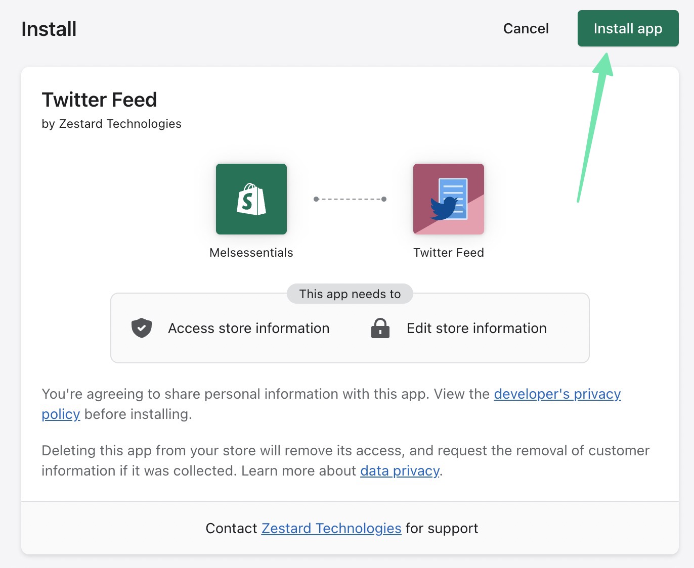
To begin, install the Zestard Twitter Feed app on your Shopify store. If you’re still getting started with Shopify, learn how to create your store here. You can find apps by logging into your Shopify account, and going to Add Apps, or navigating directly to the App Store.

Click Add App in the Shopify App Store, then Install App once it brings you back to the dashboard screen with information about permissions and privacy.

installing the app - how to add Twitter feed to Shopify website

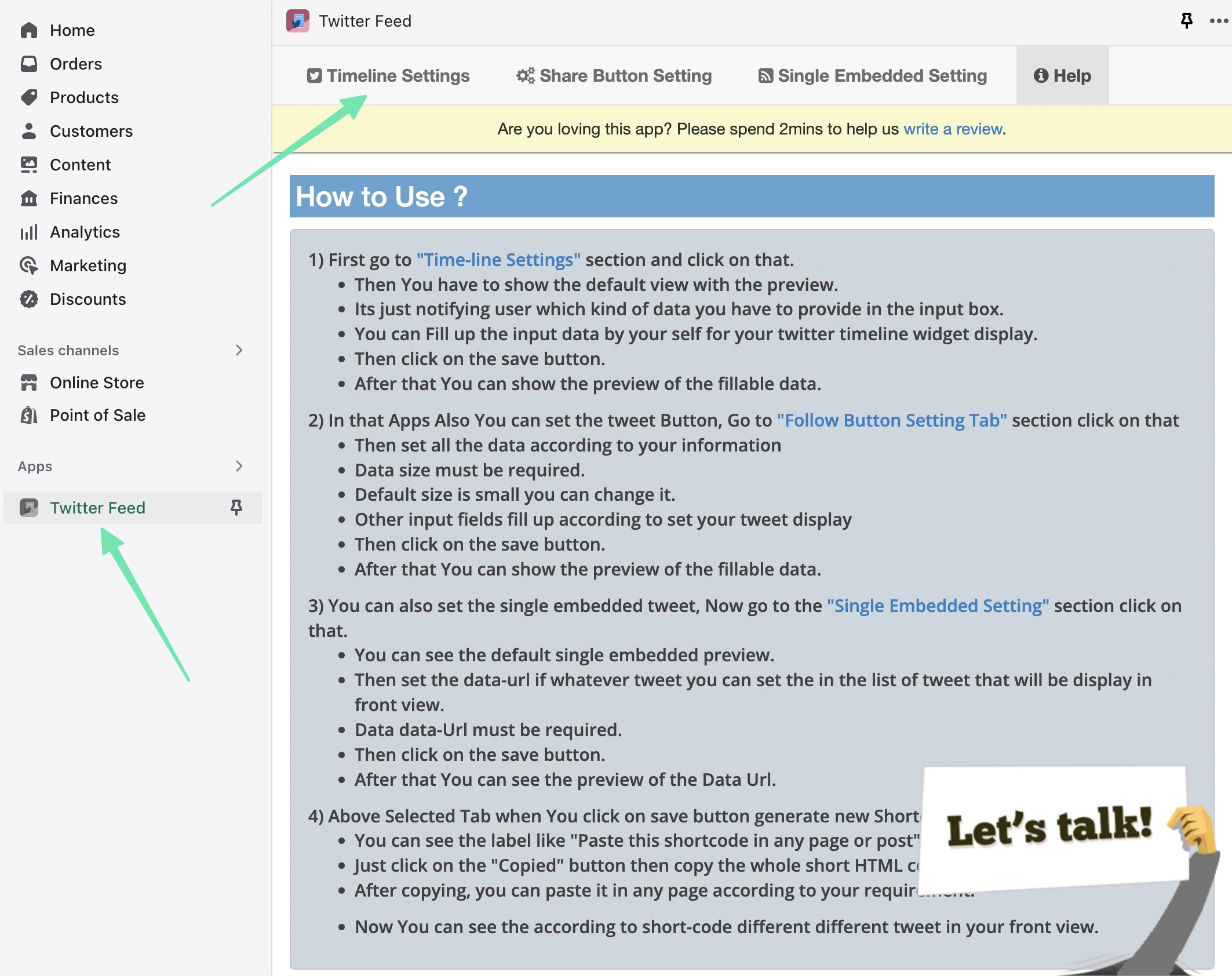
Once installed, you’ll see a new tab for Twitter Feed under the Apps tab in Shopify. There’s also a section on How to Use the app, which you can follow to properly set it up.

Some configuration is required before viewing any Twitter feeds on the frontend. Go to Timeline Settings to start.

going to the Twitter Feed app

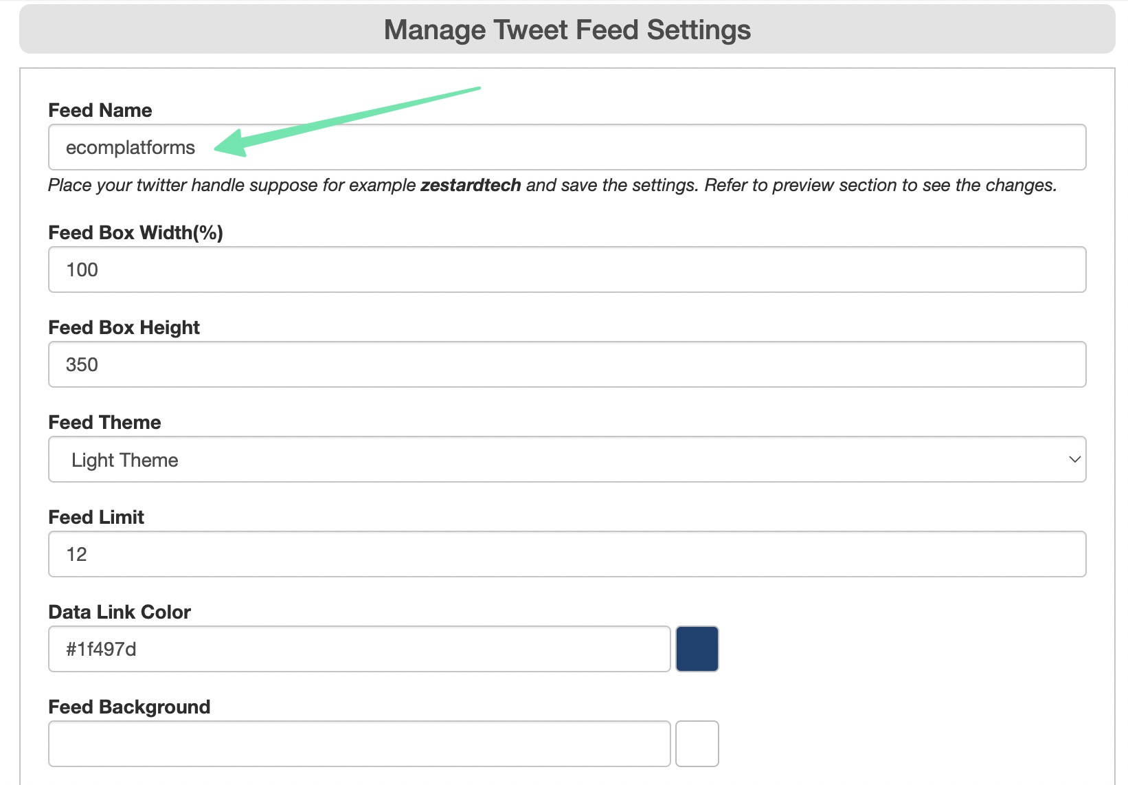
This page provides several fields for customizing the overall appearance and content of the feed.

The most important field to fill is the Feed Name; type or paste in the Twitter handle you want to pull from. It’s possible to display the feed from any public Twitter profile.

Other settings include:

Feed Box Width

Feed Box Height

Feed Theme (Light or Dark)

Feed Limit (only displaying a certain number of recent tweets)

Data Link Color

Feed Background Color

Once you’re done customizing, make sure you click on the Save Changes button to render a preview.

placing in the feed name

After clicking Save Changes, the app generates a preview of the Twitter feed. Feel free to scroll through the feed and go back to adjust settings based on what you’d like to achieve.

a preview of the Twitter feed in Shopify

Right above the preview, you’ll see that the app also generated a shortcode for the feed. This is a unique bit of code for you to paste anywhere on your Shopify website. Click to Copy the code to your clipboard.

the shortcode

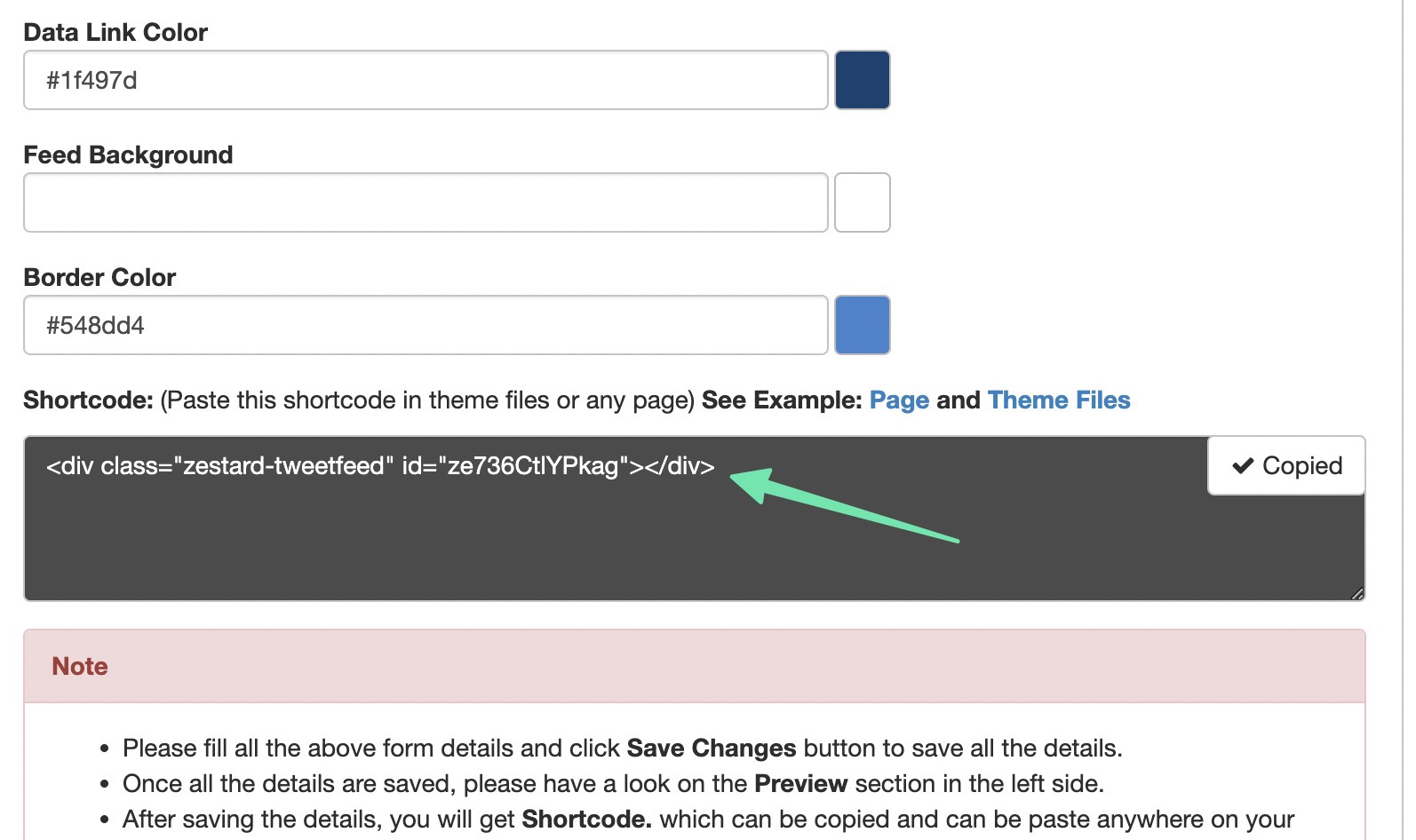
The Twitter Feed app reveals a popup for you to easily copy the code. All you have to do is use the keyboard shortcode CTRL + C (Command + C for Mac) to copy the shortcode to your computer’s clipboard.

copying the shortcode for how to add Twitter feed to Shopify website

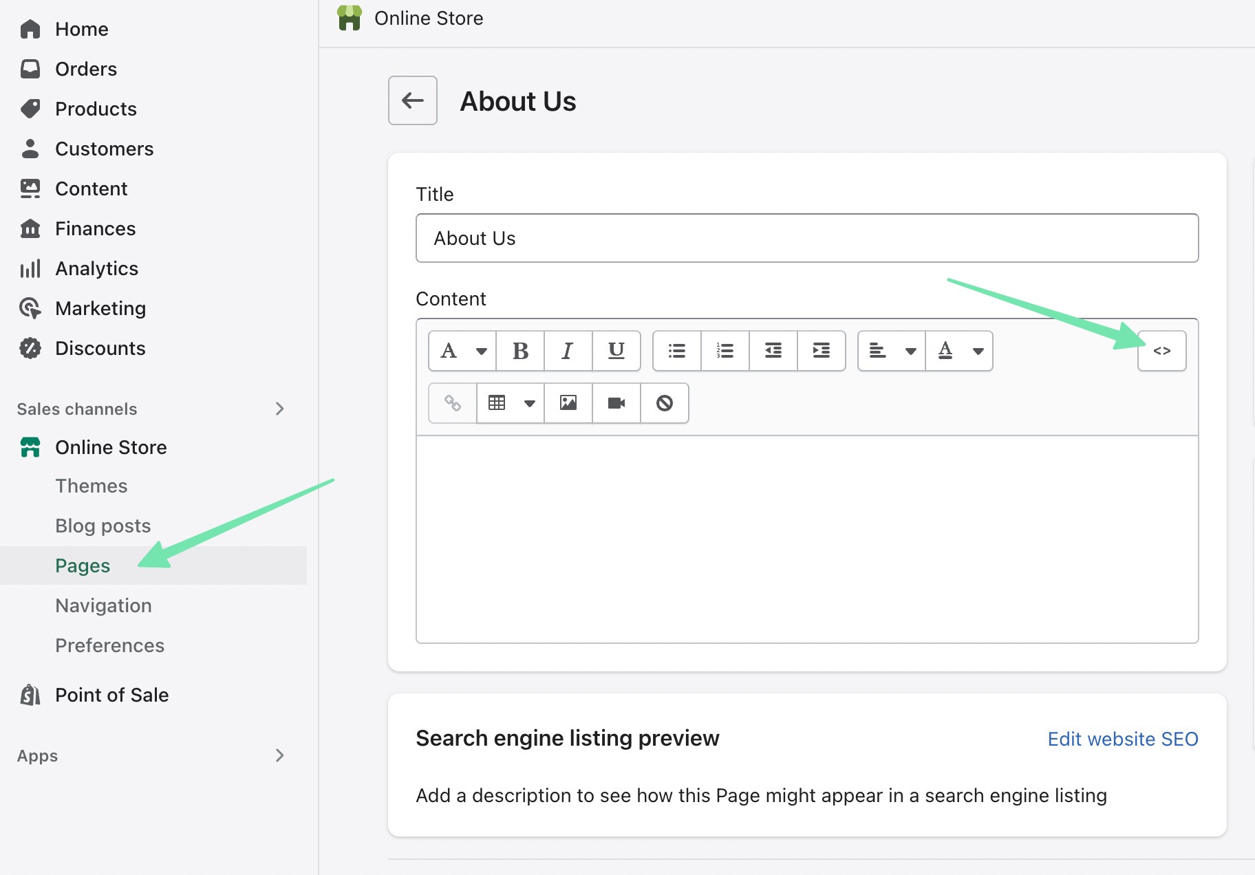
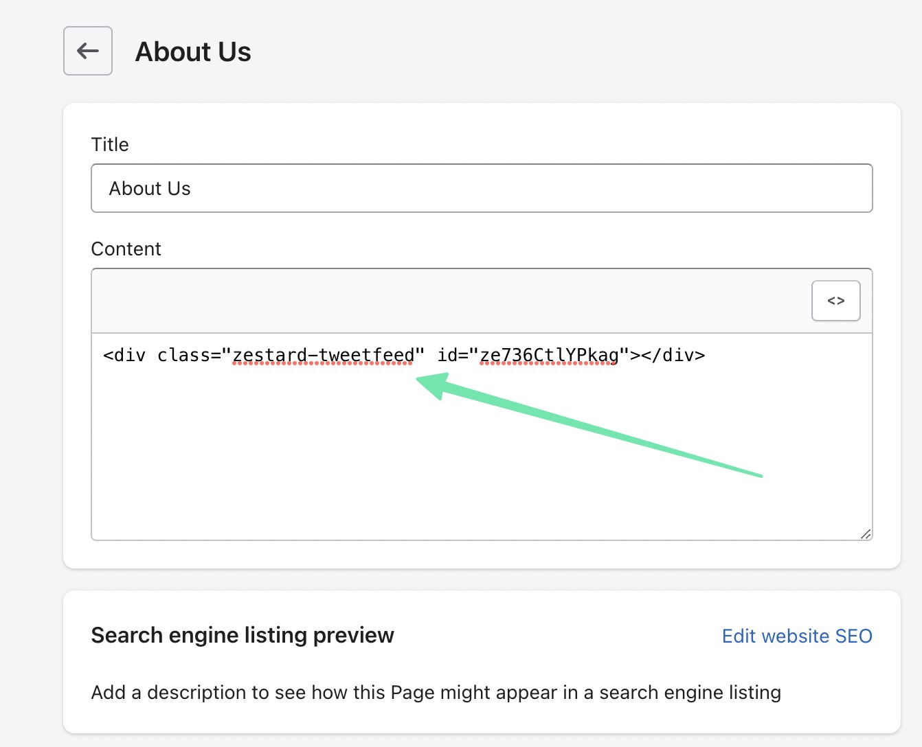
You may want to place the Twitter feed on a Shopify webpage, like on your About Us, Contact, or Support pages. To do so, go to Online Store > Pages in Shopify. Open the new page for which you’d like to add the feed. Click the <> (Show HTML) button to switch from the Visual Editor to the HTML Code Editor.

choosing the HTML editor

Paste the previously copied shortcode into the HTML editor. If there’s other content on the page, simply choose where you want the feed to go, and insert the code there. Be sure to save the page.

pasting code into Shopify page

Navigate to the frontend of that page by previewing or going to its web address. You’ll now see the Twitter feed displayed exactly where you inserted the shortcode.

the results on the frontend

Many online store owners would rather learn how to add Twitter feed to a Shopify homepage. In that case, Shopify provides a visual customizer for the homepage, making it even easier to insert the Twitter feed shortcode.

For that, go to Online Store > Themes > Customize.

Next, find the area in which you’d like to place the Twitter feed. Click the Add Section button in this area. Search for the Custom Liquid theme section and insert it into Shopify.

adding a section

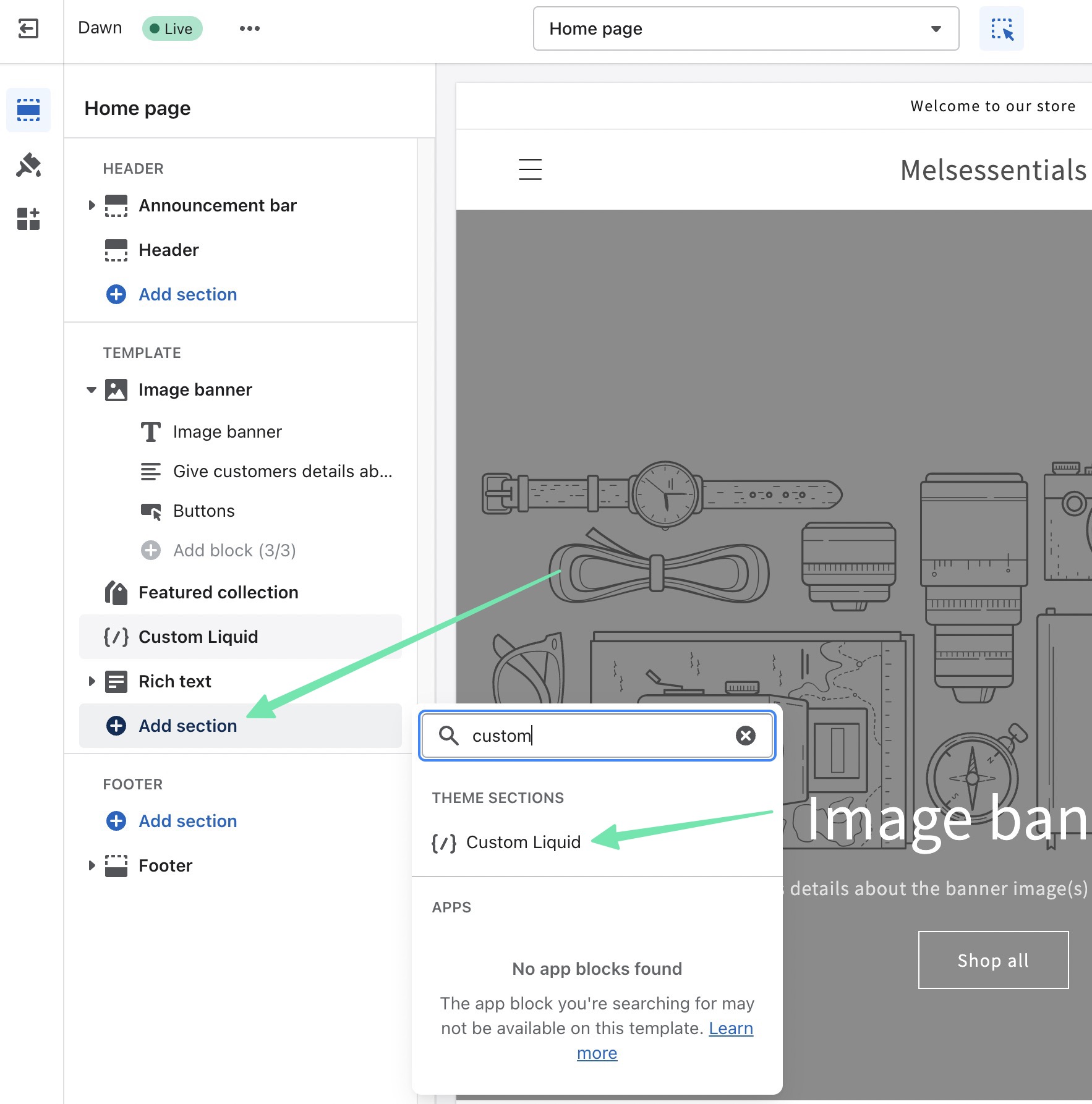
The Custom Liquid theme section presents several settings on the left side. The most important of which is the Custom Liquid field. Paste in the shortcode previously copied from the Twitter Feeds app.

After clicking Save, you’ll see the Twitter feed rendered in the Shopify homepage preview to the right.

You might even customize the section a bit with options for:

Color Scheme

Section Padding

Custom CSS

how to add Twitter feed to Shopify website using the custom liquid section

The last way to insert a shortcode from the Twitter Feeds app is by adding it to the actual theme source code. This is generally only recommended if you’d like the Twitter feed to globally appear in certain sections or pages.

To do so, go to Online Store > Themes in Shopify. Click on the Ellipsis (…) button to reveal more options. Click on Edit Code from the drop-down menu.

editing code

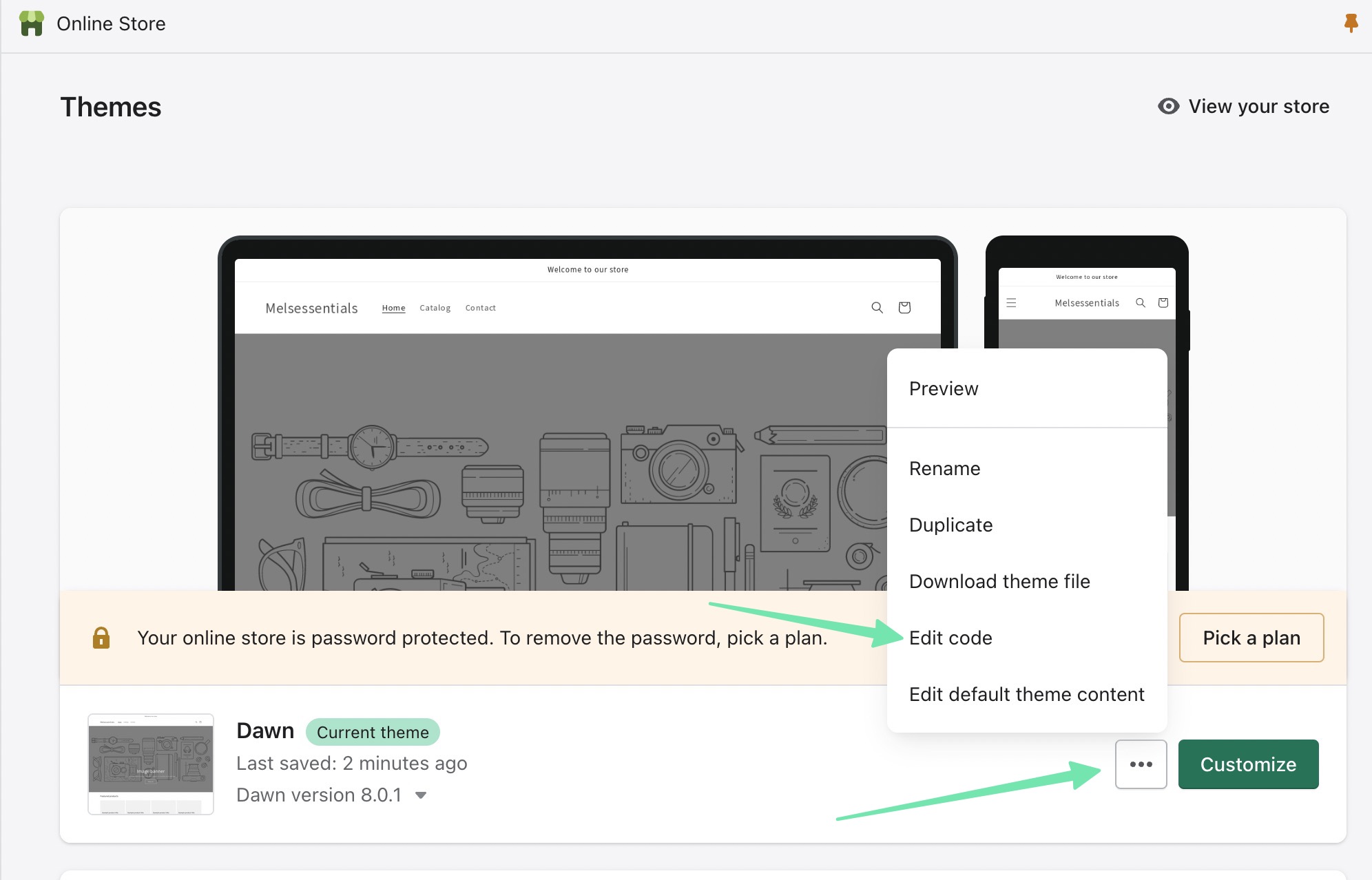
Pick the theme.liquid file and paste the code wherever you want within the theme coding. As an alternative, you could choose to modify Templates or Sections for more control over where the Twitter feed appears.

how to add Twitter feed to Shopify website through the theme files

Other settings you can find in the Twitter Feed app include:

Options to embed a single Tweet (or Retweet)

A tool to generate a Twitter sharing button

Options to show hashtag feeds

Method 2: Add Twitter Feed to Shopify with an Embedded Twitter Widget

Twitter offers a way to publish any public timeline to your website. This means that you have the ability to show your brand’s feed, or the posts from another account.

To get started, go to Publish.Twitter.com.

Paste or type in the URL of the Twitter profile you’d like to display as a feed on your Shopify store. Click on the arrow button to proceed.

pasting in a Twitter URL

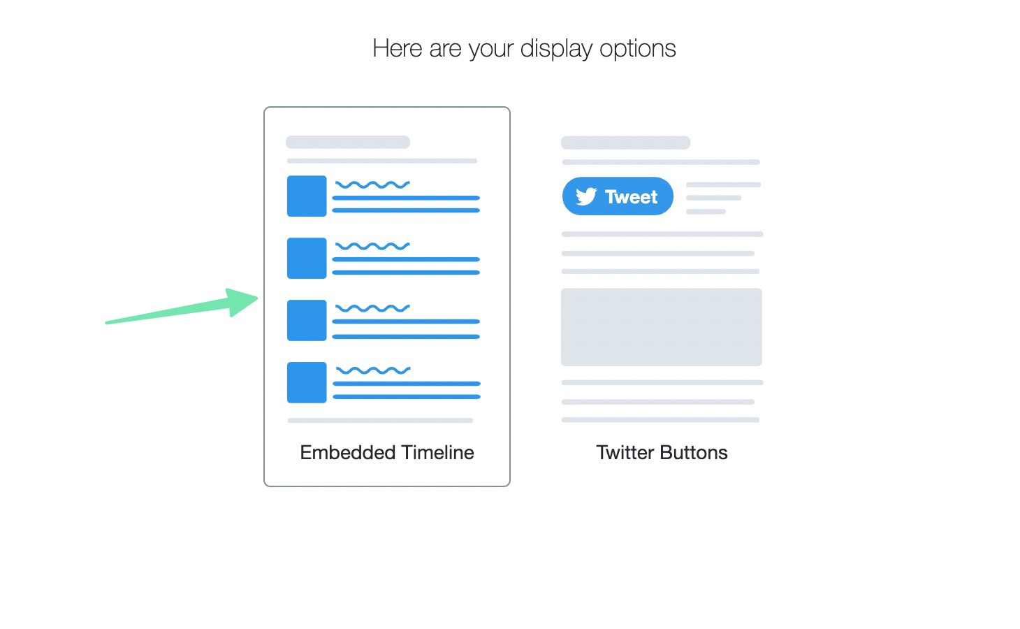
Here, you have two options:

Embedded Timeline

Twitter Buttons

The Twitter Buttons are useful for adding a Follow or Mention button somewhere on your website. But for this article, we’re more focused on getting a Twitter feed to appear. So, select the Embedded Timeline option.

choosing an embedded timeline on Twitter

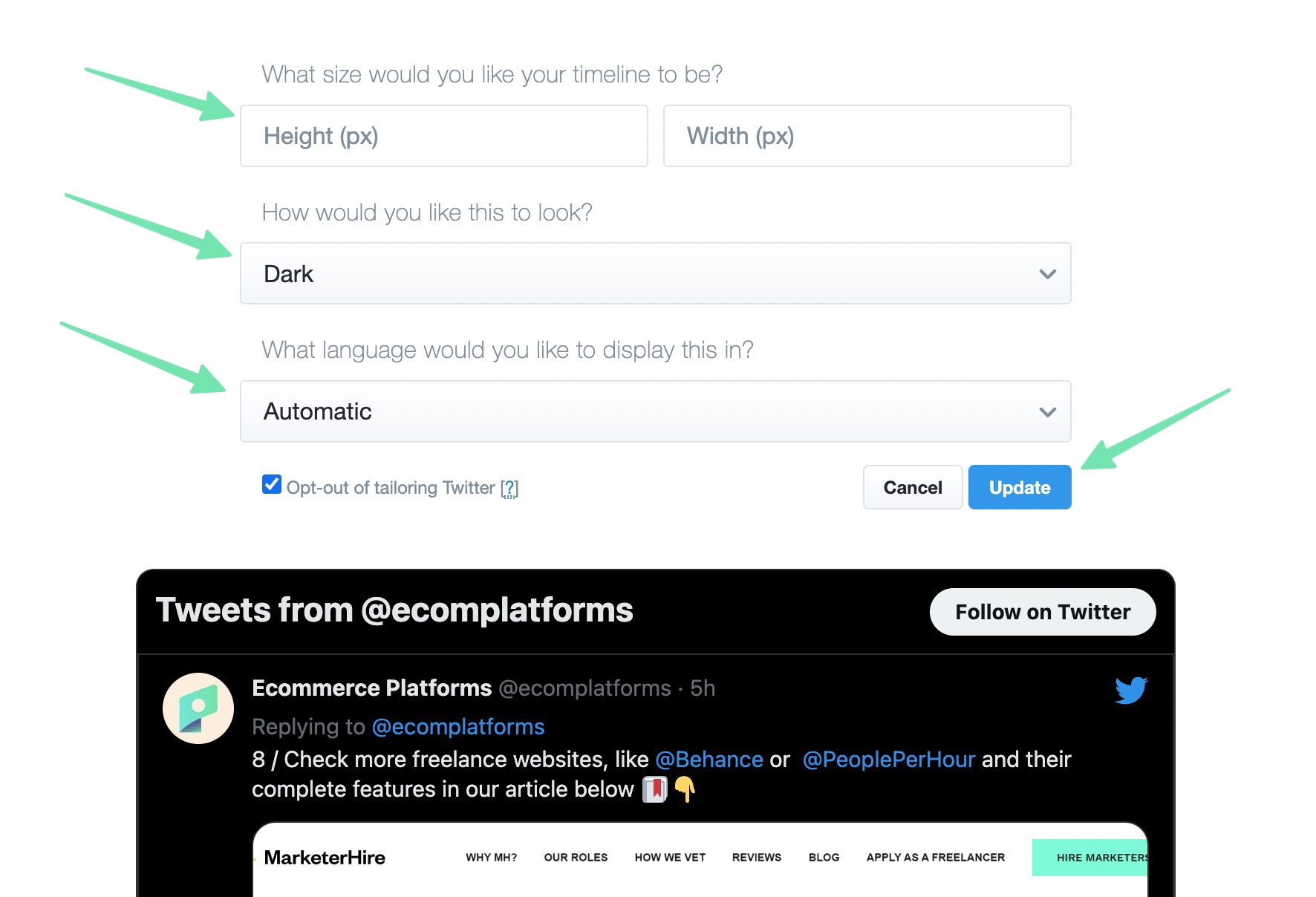
Twitter automatically generates the Twitter feed widget code. However, we suggest clicking on the Set Customization Options link to format the feed fully before publishing to your website.

setting customization options

This reveals several settings to change the appearance of your feed widget:

Height

Width

Look (Dark or Light)

Language (You can usually just go with Automatic)

Click the Update button to see your modifications in the preview below. As you can see, our simple change from Light to Dark already rendered in the preview.

customizing the Twitter widget

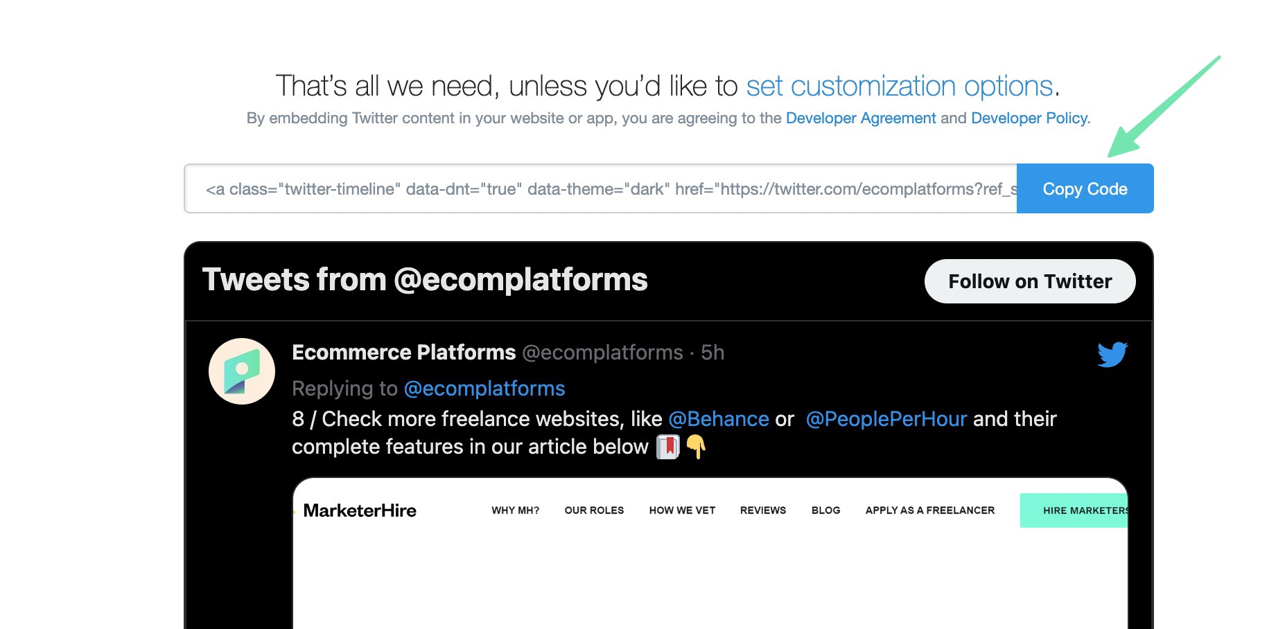
Once you’re happy with the way your Twitter feed looks, click on the Copy Code button to copy the widget code to your computer’s clipboard.

copying the Twitter code

Now it’s time to learn how to add the Twitter feed to your Shopify website. The easiest option is to place the feed on your Shopify homepage, via a Shopify section.

Go to Online Store > Themes > Customize to open the Shopify visual customizer. Find the area of the homepage you’d like to insert the Twitter feed. Click one of the Add Section buttons to reveal Shopify’s collection of sections. Scroll through the list or search for the Custom Liquid section. Click to add that to the page.

adding a section

Use the Custom Liquid field to paste the previously copied code (from the Twitter website). Feel free to adjust other section settings like the Color Scheme, Section Padding, or Custom CSS.

You’ll notice that, initially, all that’s shown is a link to the Tweets of your Twitter account.

pasting in the code

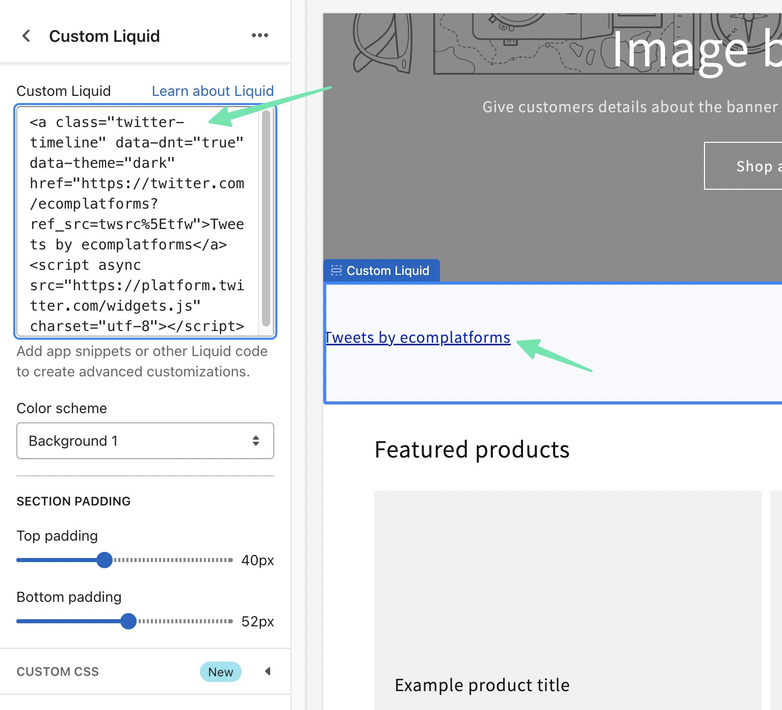
You simply have to click the Save button for Shopify to render the Twitter feed in the customizer preview.

how to add Twitter feed to Shopify website in the customizer

An additional way to add a Twitter feed via embed code is by placing it into a specific page in Shopify. Go to Online Store > Pages to accomplish this. Open the page in which you’d like to edit.

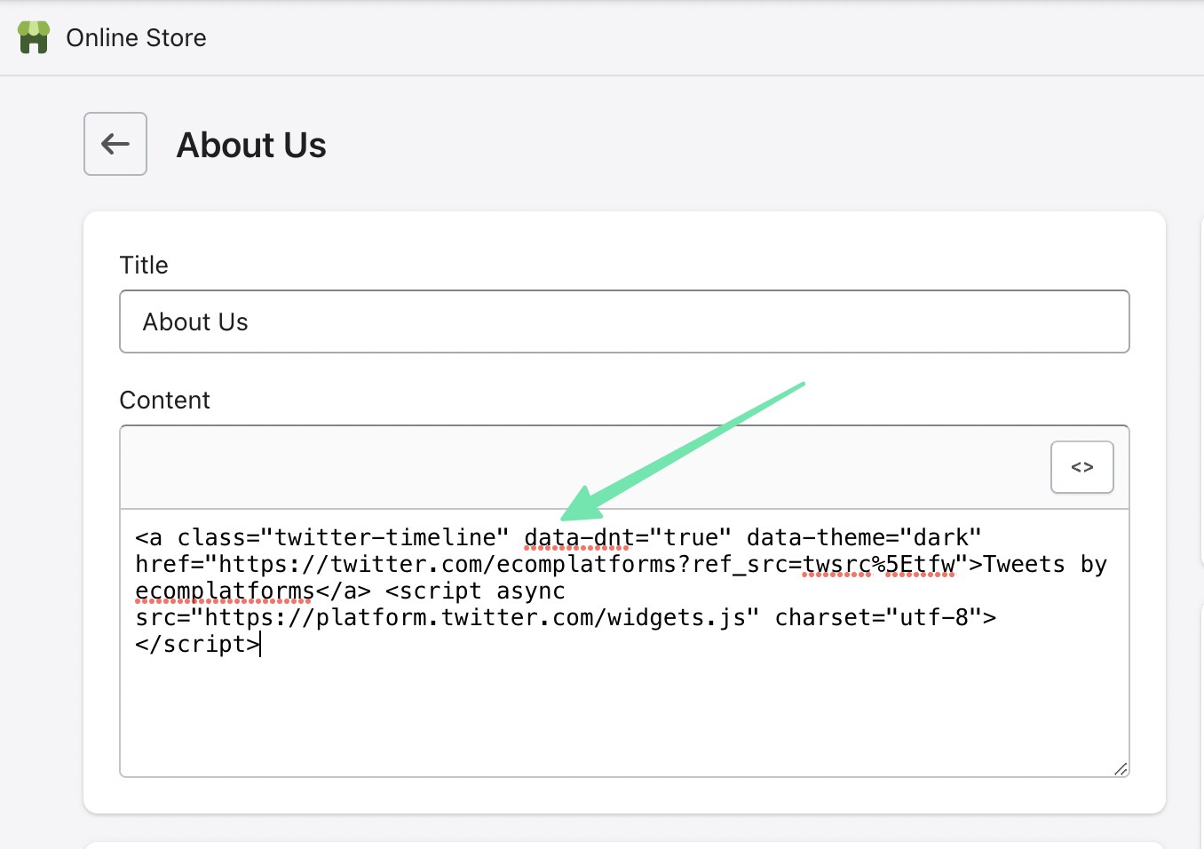
Once in the page editor, click on the Show HTML (<>) button. This switches from the Visual Editor to the Custom HTML Editor, which is required for adding code.

going to a page

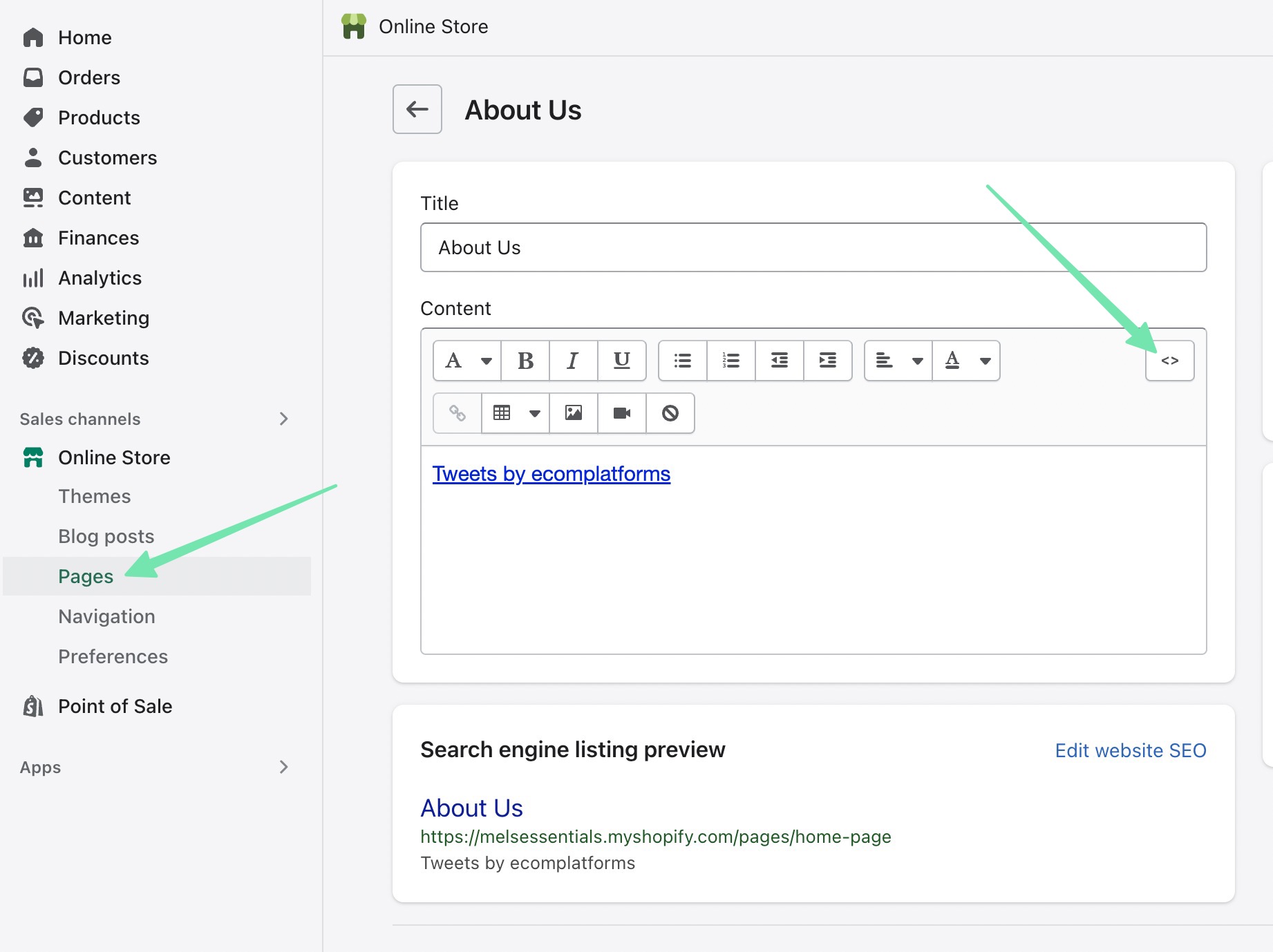
Paste in the code you originally copied from Twitter. Click on the Save or Publish button for the changes to take effect.

pasting code in a page

Either preview the page or go to its frontend view. Here, you’ll see the Twitter feed displayed alongside any other content you may have had on that page.

twitter feed on the frontend

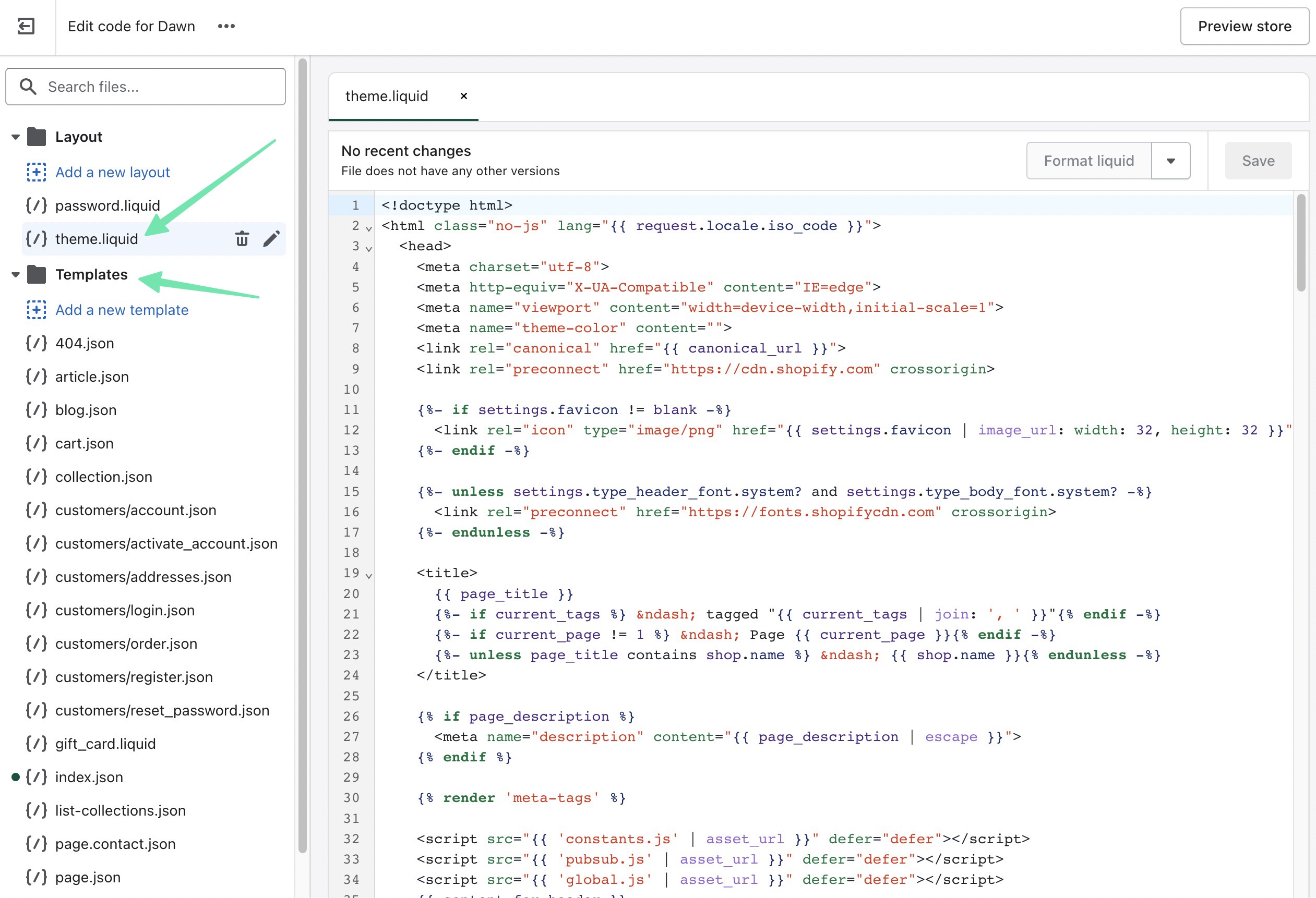
The last way to embed a Twitter widget with code is by utilizing the Shopify theme files. Go to Online Store > Themes to begin. Choose the Ellipsis (…) button, then select Edit Code.

edit code in Shopify

The theme.liquid file gives you complete control over the theme you currently have installed on Shopify. Paste the Twitter feed code wherever you want the feed to appear in the theme. Otherwise, it’s possible to utilize Template and Section files in case you’d rather the Twitter feed only appear in certain portions of your website, like in the sidebar.

how to add Twitter feed to Shopify website using the theme files

That’s How to Add a Twitter Feed to a Shopify Website!

You may have noticed that using a Shopify app still creates a shortcode for you to place anywhere on your website. That may get you to ask, “what’s the point of using an app?” There are three reasons:

Using an app means all of your work is contained to one dashboard: Shopify.

There are far more customization settings available in Twitter Feed apps when compared to what’s offered through the Twitter embeddable widget.

A shortcode is at least a little less intimidating than the code provided by Twitter.

And that’s all there is to it! We hope our complete guide on how to add Twitter feed to Shopify has helped you figure out if a plugin or code widget is right for your ecommerce store. We encourage you to look into other apps for embedding alternative social media feeds, like an Instagram feed, or even for showing something like social proof or TikTok videos. Let us know in the comments if you have any questions!

The post How to add Twitter Feed to Shopify Website appeared first on Ecommerce Platforms.

5 Best Free Video Converters for Mac

Original Source: https://www.hongkiat.com/blog/free-mac-video-converters/

Want to do some simple video conversion on your Mac but not ready to get a paid tool just yet? Well, the good thing is that there are some free video converter apps for Macs out there.

We have researched, tested, and experimented with many of the free video-converting apps out there, and in the following list, you will find some of the best ones that we found together with their respective pros and cons and what each one is best for.

1. The Video Converter
The Video ConverterThe Video Converter
 Best for:  Easy, quick and straightforward video converting.

Developed by Float Tech, LLC, The Video Converter’s best feature is its lightweight (3.4MB in size) and super easy to use through a straightforward interface. Plus, there are no annoying pop-up ads.

You simply drag and drop or upload the video to convert and get results instantly. The converted video will be saved into the Download folder. It also supports bulk video conversion and various formats in the free version.

Input: MP4, MOV, MP3
Output: MP4. MP4. WEBM, GIF, MOV, WMV, 3GX, AAC, AVI, FLAC, FLV, M4A, MKV, OGG, WAV, MPG

Note: Conversion to some formats (MP4, MP3, GIF, WMV, MKA, MKV, WAV, MPG) requires a premium pass. A premium pass costs $2.48/month or a Lifetime Pass for $12.98

What we like:

It is free, with a simple interface, and no ads.

What we don’t like:

It only convert video, nothing more nothing less; converting to some formats requires a premium pass.

Download The Video Converter for Mac

2. Handbrake
HandbrakeHandbrake
 Best for:  Many options to customize the converted video.

Also listed as one of the apps in our 100 Useful Free Mac apps, Handbrake is an open-source video transcoder that provides much information about your input video, including its current tracks, filters, and dimensions, all of which you can change for your output video. You can also see the progress of your current frame in real-time.

Apart from Mac, the app is available for Windows and Linux as well. Plus, it offers tons of output presets, so just provide where you want to use the video (e.g., Gmail 720p30 or Android 1080p30), and it will convert accordingly.

You can also change the video encoder (AV1, H.265, and H.264, MPEG-4 and MPEG-2, VP8, and VP9), video quality, framerate, and much more for the output video. It also supports batch and bulk converting.

Input: MP4, MKV, WEBM
Output: MP4, MKV, WEBM

What we like:

Open source and free, versatile.

What we don’t like:

Limited to only three input and output video formats.

Download Handbrake for Mac

3. Smart Converter
Smart ConverterSmart Converter
 Best for:  Convert (from and to) videos compatible with other Apple devices.

Smart Converter app is simple to use through a powerful yet intuitive interface. Just drag and drop the video, choose an output format (like Apple TV, QuickTime, iPad, or Music, etc.), and then click to convert.

So basically, the app does not allow you to choose the output format. Instead, it converts your video to a format that can be played on a specified device.

Input: MOV, MKV, AVI
Output: Apple and Android device

What we like:

Ad-free, easy to convert.

What we don’t like:

Unable to choose the output file format.

Download Smart Converter for Mac

4. VLC
VLCVLC
 Best for:  A 2-in-1 app for playing and converting videos.

VLC is more commonly known as a media player, but the app can also convert your videos into the required format. You can also alter the video and audio codec for the output video. The app is available for Windows and Linux as well.

The conversion process is fairly simple, just hit Command + Shift + S, or go to File > Convert & Stream, drag-drop your video, choose a profile (or click Customize to choose other file formats), select a destination for output, and then click Save.

Related: 20 Tips For VLC Player Users

Input: MOV, MKV, AVI, MP4
Output: MPEG, WEBM, OGG, MP4, MOV, FLV, RAW, WMV

What we like:

Output quality is good.

What we don’t like:

Cannot do bulk convert.

Download VLC for Mac

5. Prism
PrismPrism
 Best for:  Ripping videos from disc.

If you want a free video-converting app that does more than just convert video, then Prism by NCH Software is the one to go with. Aside from converting video, you can add video effects, trim and split your video, and convert video directly from your DVD or Blu-ray disc.

Through a simple interface, you just drop or upload your videos, select your output format, and click the convert button. The app supports bulk video conversion and also allows you to customize the encoding settings and video output options.

Prism also had a paid version with advanced features, but the free version is good enough if you are converting videos for non-commercial usage.

Input: 3GP, AMV, ASF, AVI, DIVX, DV, FLV, ISO, M4V, MKV, MOD, MOV, MP4, MPE, MPEG, MPG, MSNWCTCP, MVE, NUT, OGV, SWF, TOD, VC1, VIV, VOB, WEBM, WEBP, WMV, XVID
Output: 3GP, AMV, ASF, AVI, DIVX, DV, FLV, GIF, JPG sequence, M2TS, M4V, MKV, MOV, MP3, MP4, MPG, OGV, PNG sequence, RM, SWF, VOB, WAV, WEBM, WMV, SWF, XVID

What we like:

Converts videos really fast.

What we don’t like:

The app’s interface seems a little dated.

Download Prism for Mac

The post 5 Best Free Video Converters for Mac appeared first on Hongkiat.

Free Fonts For Interface Designers

Original Source: https://smashingmagazine.com/2023/03/free-fonts-interface-designers/

Not every project has the budget to spend a lot of money on fonts. But that doesn’t mean that typography needs to play a secondary role when the budget is tight. The variety and quality of free and open-source fonts out there is impressive and enables everyone to use beautiful, well-crafted typefaces.

In this post, we compiled some free fonts that we came across and that you probably haven’t spotted before. Some of them shine with their flexibility, some put a special focus on readability, and others are a great choice if you want to make a bold statement. As different as the fonts are, they all have one thing in common: You can use them for free in both personal and commercial projects. A huge thank-you to the wonderful type designers and contributors for making their fonts available to all of us! 👏🏼👏🏽👏🏾

Recursive

Built to maximize versatility, control, and performance, Recursive is a five-axis variable font that can go from Sans to Mono. Taking full advantage of variable font technology, it gives you full flexibility.

Recursive allows you to choose from a wide range of predefined styles or dial in exactly what you want for each of its axes: Monospace, Casual, Weight, Slant, and Cursive. Inspiration came from single-stroke casual signpainting to give the font a flexible and warmly energetic look, making it a great fit for data-rich-apps, technical documentation, code editors, and much more. Designed by Stephen Nixon, with contributions from Lisa Huang, Katja Schimmel, Rafał Buchner, and Cris R Hernández.

Yrsa & Rasa

The type families Yrsa and Rasa have a different approach than other type projects. They build upon the existing typefaces Merriweather and Skolar Gujarati to produce two entirely new type families that span different writing systems.

Yrsa supports over 92 languages in Latin script and has a special focus on properly shaping the accents in Central and East European languages. Rasa supports a wide array of basic and compound syllables used in Gujarati. Both type families include five weights and are intended for continuous reading on the web. Perfect for longer articles in online news, magazines, or blogs. Designed by Anna Giedryś and David Březina.

Space Grotesk

Space Grotesk is a proportional sans-serif typeface variant based on Colophon Foundry’s fixed-width Space Mono family. It retains the idiosyncratic details of the monospace while optimizing for improved readability of non-display sizes.

Space Grotesk includes four weights and open-type features like old-style and tabular figures, superscript and subscript numerals, fractions, and stylistic alternates. Latin Vietnamese, Pinyin, and all Western, Central, and South-Eastern European languages are supported. Designed by Květoslav Bartoš for Florian Karsten Typefaces.

Figtree

Figtree combines friendly curved shapes, a simple monolinear construction, a high x-height, and slight taper into a charming geometric typeface that ensures maximum readability.

Figtree comes in seven weights, ranging from Light to Black, and includes typographic finesses such as fractions, monospace numbers, and scientific inferiors. Minimal but not stiff, casual but not silly, the typeface beautifully manages to maintain a crisp, clean feeling. Designed by Erik Kennedy.

Reforma

Reforma is a versatile font family designed for long-form reading. Commissioned to celebrate the centenary of the university reform of the Universidad Nacional de Córdoba, Argentina, the typeface had to convey four premises: plurality, intellectual heritage, versatility, and free availability.

After three years of work, 20 font styles were born that work harmoniously in different contexts. They are grouped into three subfamilies — from a classic serif to a modern sans-serif and an intermediate hybrid style with flare serifs — and are available in three weights plus an ultra-black companion set for headings. Reforma beautifully manages to strike the balance between tradition and novelty while staying super-versatile. Designed by Alejandro Lo Celso, Jorge Ivan Moreno Majul, Francisco Galvez Pizarro, Francis Ramel, and Oscar Yañez.

Hanken Grotesk

If you’re looking for a versatile sans-serif typeface inspired by the classic grotesques, Hanken Grotesk might be right down your alley. It shines with a friendly, distinguishable look and is equally suitable for small text and headings.

Nine weights are available, ranging from Thin to ExtraLight, Light, Regular, Medium, SemiBold, Bold, ExtraBold, and Black. Each weight comes with matching italics. A modern classic designed by Alfredo Marco Pradil.

Grenze

Grenze combines the best of two worlds. As a hybrid between Roman and Blackletter styles, it transports a sense of boldness and texture while at the same time offering the readability of classical typefaces.

The family includes nine weights (Thin, Extra Light, Light, Regular, Medium, Semibold, Bold, Extra Bold, and Black) with matching italics. To respond to different needs, Grenze comes with some useful advanced features such as ligatures, ornaments, extended language support, and various figure sets. Designed by Renata Polastri and the Omnibus team.

Fira Sans

Originally designed as a system font for Mozilla’s FirefoxOS, the humanist sans-serif Fira Sans grew into a versatile open-source typeface that stays readable across screen qualities and sizes.

Fira Sans is available in 18 styles, including nine weights and accompanying italics. The package also includes a mono-spaced variant. Designed by Carrois Apostrophe in cooperation with Erik Spiekermann.

Atkinson Hyperlegible

Certain letters and numbers can be hard to distinguish from one another for low-vision readers. Atkinson Hyperlegible is here to change that. Named after Braille Institute founder J. Robert Atkinson, the typeface focuses on letterform distinction to increase character recognition and improve readability.

Recognizable footprints, differentiated letterforms, unambiguous characters, and exaggerated forms are some of the techniques that optimize readability and give the typeface its distinctive look. Atkinson Hyperlegible includes four fonts, with two weights (Regular, Bold, Italics, Italics Bold). Thanks to accent characters, 27 languages are supported. Designed by Braille Institute of America.

Anek

The multi-script typeface Anek tells a very special story. It covers nine Indian languages plus Latin and was created through a collaboration of twelve type designers working across eight cities in India. The design of each script is deeply rooted in its typographic culture, while the different scripts live together in visual harmony.

All Anek fonts share visual similarities like circles and circular shapes, robust letter structures, and delicate joineries. With 40 styles per set, Anek is one of the few Indian variable display fonts with such a large set of weight and width styles. Designed by Sarang Kulkarni, Girish Dalvi, Noopur Datye, Hanif Kureshi, Maithili Shingre, Yashodeep Gholap, Divya Kowshik, Aadarsh Rajan, and Shuchita Grover.

Source Sans

Designed by Paul D. Hunt, Source Sans is Adobe’s first open-source typeface family. The sans-serif draws inspiration from classic grotesques and is characterized by a visual simplicity that works equally well in long-form texts just like as short labels in user interfaces.

Source Sans comes in six weights (ExtraLight, Light, Regular, SemiBold, Bold, Black) plus matching italics. The fonts offer wide language support for Western and East European languages, Vietnamese, Pinyin romanization of Chinese, and Navajo. A modern classic.

Beattingvile

If you’re looking for a font to give your project a personal, hand-made touch, Beattingvile by Garisman Studio is worth checking out.

The multilingual script font features stylistic alternates, swashes, and ligatures and is perfect for all projects where you want to make a statement that is a bit bolder. Perfect for headings, branding, label design, logo type, quotes, and much more — both on screen and in print.

Disket Mono

Monospace fonts often have a technical feel to them, waking connotations of coding editors or typewriters. Disket Mono is a bit different. The font strikes a perfect balance between the inspiration it draws from geometry, grids, and architecture and using soft corners for a more tactile, personal feel.

Disket Mono comes in two weights (Regular and Bold) and supports twenty languages. A beautiful display font, designed by Mariano Diez.

Srbija Sans

Srbija Sans is a neo-grotesque sans-serif typeface with a geometric look. It gets by without any decorative details, but when you look more closely, you’ll notice how small design decisions improve readability and give the clear shapes a warm and natural touch.

The typeface includes 315 glyphs, supporting Latin and Cyrillic, and featuring accents and ligatures, mathematical symbols, and currencies. Srbija Sans was designed by Vedran Eraković and Studio Metaklinika for the National Tourism Organisation of Serbia.

The League Of Moveable Type

The League of Moveable Type opened its doors back in 2009 when designers were just gaining the ability to put custom fonts on the web. The project’s mission has stayed the same since day one: to raise the design standards of the web.

Micah Rich, maintainer of the foundry, cares deeply about good typography and empowering everyone with great design skills. That’s why the catalogue only features carefully-picked open-source fonts — 17 at the moment. You can use them for free however and wherever you want.

Google Fonts

It’s certainly not an insider’s tip but always a great place to look for free fonts: Google Fonts. The library features more than 1,400 open-source font families for more than 135 languages, plus icons for common actions and items.

By the way, if you want to dive deeper into the principles of typography or delve into all of the artistic and technical aspects of modern typesetting and font technology, the Google Fonts Knowledge library is a treasure chest of typography wisdom.

Wrapping Up

Do you have a favorite free font that isn’t listed in the post? Let us know in the comments below. We’d love to hear about it!