Scroll, Refraction and Shader Effects in Three.js and React

Original Source: http://feedproxy.google.com/~r/tympanus/~3/yLq4lAOm__4/

In this tutorial I will show you how to take a couple of established techniques (like tying things to the scroll-offset), and cast them into re-usable components. Composition will be our primary focus.

In this tutorial we will:

build a declarative scroll rigmix HTML and canvashandle async assets and loading screens via React.Suspenseadd shader effects and tie them to scrolland as a bonus: add an instanced variant of Jesper Vos multiside refraction shader

Setting up

We are using React, hooks, Three.js and react-three-fiber. The latter is a renderer for Three.js which allows us to declare the scene graph by breaking up tasks into self-contained components. However, you still need to know a bit of Three.js. All there is to know about react-three-fiber you can find on the GitHub repo’s readme. Check out the tutorial on alligator.io, which goes into the why and how.

We don’t emulate a scroll bar, which would take away browser semantics. A real scroll-area in front of the canvas with a set height and a listener is all we need.

I decided to divide the content into:

virtual content sectionsand pages, each 100vh long, this defines how long the scroll area is

function App() {
const scrollArea = useRef()
const onScroll = e => (state.top.current = e.target.scrollTop)
useEffect(() => void onScroll({ target: scrollArea.current }), [])
return (
<>
<Canvas orthographic>{/* Contents … */}</Canvas>
<div ref={scrollArea} onScroll={onScroll}>
<div style={{ height: `${state.pages * 100}vh` }} />
</div>

scrollTop is written into a reference because it will be picked up by the render-loop, which is carrying out the animations. Re-rendering for often occurring state doesn’t make sense.

A first-run effect synchronizes the local scrollTop with the actual one, which may not be zero.

Building a declarative scroll rig

There are many ways to go about it, but generally it would be nice if we could distribute content across the number of sections in a declarative way while the number of pages defines how long we have to scroll. Each content-block should have:

an offset, which is the section index, given 3 sections, 0 means start, 2 means end, 1 means in betweena factor, which gets added to the offset position and subtracted using scrollTop, it will control the blocks speed and direction

Blocks should also be nestable, so that sub-blocks know their parents’ offset and can scroll along.

const offsetContext = createContext(0)

function Block({ children, offset, factor, …props }) {
const ref = useRef()
// Fetch parent offset and the height of a single section
const { offset: parentOffset, sectionHeight } = useBlock()
offset = offset !== undefined ? offset : parentOffset
// Runs every frame and lerps the inner block into its place
useFrame(() => {
const curY = ref.current.position.y
const curTop = state.top.current
ref.current.position.y = lerp(curY, (curTop / state.zoom) * factor, 0.1)
})
return (
<offsetContext.Provider value={offset}>
<group {…props} position={[0, -sectionHeight * offset * factor, 0]}>
<group ref={ref}>{children}</group>
</group>
</offsetContext.Provider>
)
}

This is a block-component. Above all, it wraps the offset that it is given into a context provider so that nested blocks and components can read it out. Without an offset it falls back to the parent offset.

It defines two groups. The first is for the target position, which is the height of one section multiplied by the offset and the factor. The second, inner group is animated and cancels out the factor. When the user scrolls to the given section offset, the block will be centered.

We use that along with a custom hook which allows any component to access block-specific data. This is how any component gets to react to scroll.

function useBlock() {
const { viewport } = useThree()
const offset = useContext(offsetContext)
const canvasWidth = viewport.width / zoom
const canvasHeight = viewport.height / zoom
const sectionHeight = canvasHeight * ((pages – 1) / (sections – 1))
// …
return { offset, canvasWidth, canvasHeight, sectionHeight }
}

We can now compose and nest blocks conveniently:

<Block offset={2} factor={1.5}>
<Content>
<Block factor={-0.5}>
<SubContent />
</Block>
</Content>
</Block>

Anything can read from block-data and react to it (like that spinning cross):

function Cross() {
const ref = useRef()
const { viewportHeight } = useBlock()
useFrame(() => {
const curTop = state.top.current
const nextY = (curTop / ((state.pages – 1) * viewportHeight)) * Math.PI
ref.current.rotation.z = lerp(ref.current.rotation.z, nextY, 0.1)
})
return (
<group ref={ref}>

Mixing HTML and canvas, and dealing with assets

Keeping HTML in sync with the 3D world

We want to keep layout and text-related things in the DOM. However, keeping it in sync is a bit of a bummer in Three.js, messing with createElement and camera calculations is no fun.

In three-fiber all you need is the <Dom /> helper (@beta atm). Throw this into the canvas and add declarative HTML. This is all it takes for it to move along with its parents’ world-matrix.

<group position={[10, 0, 0]}>
<Dom><h1>hello</h1></Dom>
</group>

Accessibility

If we strictly divide between layout and visuals, supporting a11y is possible. Dom elements can be behind the canvas (via the prepend prop), or in front of it. Make sure to place them in front if you need them to be accessible.

Responsiveness, media-queries, etc.

While the DOM fragments can rely on CSS, their positioning overall relies on the scene graph. Canvas elements on the other hand know nothing of the sort, so making it all work on smaller screens can be a bit of a challenge.

Fortunately, three-fiber has auto-resize inbuilt. Any component requesting size data will be automatically informed of changes.

You get:

viewport, the size of the canvas in its own units, must be divided by camera.zoom for orthographic camerassize, the size of the screen in pixels

const { viewport, size } = useThree()

Most of the relevant calculations for margins, maxWidth and so on have been made in useBlock.

Handling async assets and loading screens via React.Suspense

Concerning assets, Reacts Suspense allows us to control loading and caching, when components should show up, in what order, fallbacks, and how errors are handled. It makes something like a loading screen, or a start-up animation almost too easy.

The following will suspend all contents until each and every component, even nested ones, have their async data ready. Meanwhile it will show a fallback. When everything is there, the <Startup /> component will render along with everything else.

<Suspense fallback={<Fallback />}>
<AsyncContent />
<Startup />
</Suspense>

In three-fiber you can suspend a component with the useLoader hook, which takes any Three.js loader, then loads (and caches) assets with it.

function Image() {
const texture = useLoader(THREE.TextureLoader, “/texture.png”)
// It will only get here if the texture has been loaded
return (
<mesh>
<meshBasicMaterial attach=”material” map={texture} />

Adding shader effects and tying them to scroll

The custom shader in this demo is a Frankenstein based on the Three.js MeshBasicMaterial, plus:

the RGB-shift portion from DigitalGlitcha warping effect taken from Jesper Landbergand a basic UV-coordinate zoom

The relevant portion of code in which we feed the shader block-specific scroll data is this one:

material.current.scale =
lerp(material.current.scale, offsetFactor – top / ((pages – 1) * viewportHeight), 0.1)
material.current.shift =
lerp(material.current.shift, (top – last) / 150, 0.1)

Adding Diamonds

The technique is explained in full detail in the article Real-time Multiside Refraction in Three Steps by Jesper Vos. I placed Jesper’s code into a re-usable component, so that it can be mounted and unmounted, taking care of all the render logic. I also changed the shader slightly to enable instancing, which now allows us to draw dozens of these onto the screen without hitting a performance snag anytime soon.

The component reads out block-data like everything else. The diamonds are put into place according to the scroll offset by distributing the instanced meshes. This is a relatively new feature in Three.js.

Wrapping up

This tutorial may give you a general idea, but there are many things that are possible beyond the generic parallax; you can tie anything to scroll. Above all, being able to compose and re-use components goes a long way and is so much easier than dealing with a soup of code fragments whose implicit contracts span the codebase.

Scroll, Refraction and Shader Effects in Three.js and React was written by Paul Henschel and published on Codrops.

5 Tips For Buying a Used Flagship Smartphone

Original Source: http://feedproxy.google.com/~r/Designrfix/~3/Pjhnil59_Bg/5-tips-for-buying-a-used-flagship-smartphone

Flagship smartphones denote that they are the best smartphone that has ever been created till date by the company. So, a flagship smartphone is equipped with the finest features and hardware. At the time of launch, these products are priced at a very high price, which makes it unaffordable to the masses. So, many users […]

The post 5 Tips For Buying a Used Flagship Smartphone appeared first on designrfix.com.

Apple Boxing Day sale 2019: All the best deals on Apple devices

Original Source: http://feedproxy.google.com/~r/CreativeBloq/~3/A4JxEefGZHM/apple-boxing-day-sale-2019

Welcome to Creative Bloq's guide to the Apple boxing Day sale. If you held out over the pre-Christmas shopping events in the hopes of snapping up an even bigger discount in January, now's the time to get shopping. 

In this article you'll find all the best offers from the Apple Boxing Day sale. Digging out the best deals can be a daunting prospect – and let's face it, you're probably not functioning at your peak right now. We've split the deals into products, to make it much easier to navigate the Apple Boxing Day sale as you struggle through your carb coma / eggnog hangover / Quality Street stupor. After all, there's nothing worse than making a mistake and ordering the wrong thing, or checking out before finding the same thing cheaper elsewhere. Use the jump links to go straight to the Apple device you're looking for. 

The Apple Store isn't likely to be the best place to shop the Apple Boxing Day sale. You'll probably find bigger discounts at other retailers or – if you're not yet ready to leave you living room – online. 

Below is a list of the retailers that offered the biggest discounts over the pre-Christmas shopping events (Black Friday and Cyber Monday), so it's worth doing a quick check to see they're getting involved in the Apple Boxing Day sale too. Use the quick links below to take a look yourself, or scroll down for sales guide, broken down into products.

Amazon (US and UK)Best BuyWalmartVeryCurrys PC WorldAOLaptops Direct
Apple Boxing Day sale: iPad deals

In the pre-Christmas sales, we saw plenty of excellent iPad discounts across a whole range of models – including the all-new 10.2‑inch iPad. Check out the best prices in your region – including any Apple Boxing Day sale offers – using the widget below. Figuring out which is the best offer, taking into account the different models, storage options and features, can be difficult. Make sure you pay attention to the specs you're getting before you hit 'Add to cart'. 

Apple Boxing Day sale: MacBook deals

MacBooks are pretty much always in demand – mainly because, as designers will well know, this kind of top-quality kit doesn't come cheap. Luckily they're also often the target of big discounts, if you're on the ball and looking in the right places. Whether you're after a classic MacBook, a MacBook Air or MacBook Pro, chances are you'll be able to pick up a discounted model right now.

The price widgets below will display the best prices available right now, so you can see who's getting involved in the Apple Boxing Day sale. 

Apple has recently released a new MacBook Pro (read our MacBook Pro 16-inch review). While we might see deals on that model, based on what we saw in the Black Friday sales, we'd expect the best discounts in the Apple Boxing Day sale to be on slightly older models. If you're happy not having the latest, greatest MacBook then that's a good way to pick up a bargain. Another hot tip is to keep an eye out for refurbished models – there can be some hidden gems on pre-owned models.

We saw some okay (but not amazing) discounts on Apple Pencils in the run-up to Christmas. Will Apple's Boxing Day sale yield any better price cuts? Check out the widget below for the best prices right now.

Not sure which version you need? Explore our Apple Pencil vs Apple Pencil 2 comparison. 

Apple Boxing Day sale: AirPods deals

These are the headphones of the moment, and we saw a fair few good AirPod discounts in the run-up to Christmas, on both the original AirPods and the AirPods Pro. These true wireless earbuds aren't quite as new and exciting now (and there's a fair bit of competition hitting the market from people like Amazon and Microsoft). 

For the best prices in your area right now, including any gems from the Apple Boxing Day sale, check out the price widget below. Alternatively, explore our dedicated Apple AirPod deals guide.

There were plenty of Apple Watch offers in the run-up to the holidays, with the newly released Series 5 meaning retailers were happy to drop their prices to shift older stock. Check out the best prices right now – on the Series 5 as well as previous models – below. 

Apple Boxing Day sale: iMac and Mac deals
How to make the most of the Apple Boxing Day sale

To get the best deal possible, it's a good idea to plan ahead. Do your research and decide what product, model and specs will suit your needs. It's also best to have a price in mind that you're happy to spend. You don't want to end up being overwhelmed by the different Apple Boxing Day sale options and making the wrong decision, or overpaying. Once you've decided on the product you're after, you can start tracking its price on various retailers – or even simpler, bookmark this page and keep checking it. 

Read more:

Adobe deals: Where to get a Creative Cloud discount

Popular Design News of the Week: December 9, 2019 – December 15, 2019

Original Source: https://www.webdesignerdepot.com/2019/12/popular-design-news-of-the-week-december-9-2019-december-15-2019/

Every week users submit a lot of interesting stuff on our sister site Webdesigner News, highlighting great content from around the web that can be of interest to web designers. 

The best way to keep track of all the great stories and news being posted is simply to check out the Webdesigner News site, however, in case you missed some here’s a quick and useful compilation of the most popular designer news that we curated from the past week.

Note that this is only a very small selection of the links that were posted, so don’t miss out and subscribe to our newsletter and follow the site daily for all the news.

PNGDB.com – Download Millions of Free PNG Images


Free Vector Illustrations for Web Designers


15 Tools Web Designers Should Try in 2020


People with Cool Avatars


New Levi’s Logo is Infuriating Typophiles


Why You Shouldn’t Use Solid or Underlined Text Fields


Leonardo: Contrast-based Color Generator


Accessibility Tips for Web Developers


17 Useful Tools for UI/UX Designers


Responsive Breakpoints Generator


18 Christmas Gifts for Designers


Sentence Lengths


Is it Possible to Draw the Internet?


Modern Brands Going Back to their Vintage Logos


Why CSS HSL Colors are Better!


10 Ways to Make a Fully Personalized UI


Mental Models for Designers


Introducing Unsplash for Brands


Investigating the Designer’s Aesthetic-Accessibility Paradox


Think You Can’t Escape Google? You Haven’t Seen Anything yet


Measuring User Experience with Usability Metrics


Why You Shouldn’t Ignore Smaller Web Design Projects


Branding is Dead, CX Design is King


Principles of Conversational Design


Why Systems Give You More Creativity


Want more? No problem! Keep track of top design news from around the web with Webdesigner News.

Source

p img {display:inline-block; margin-right:10px;}
.alignleft {float:left;}
p.showcase {clear:both;}
body#browserfriendly p, body#podcast p, div#emailbody p{margin:0;}

R/GA LookBook and Manifest of Management Principles

Original Source: http://feedproxy.google.com/~r/abduzeedo/~3/hKo4qDWBQuk/rga-lookbook-and-manifest-management-principles

R/GA LookBook and Manifest of Management Principles

abduzeedoDec 12, 2019

Ryan Atkinson and his team brief was to design a physical book to manifest our Management Principles. The Business Transformation team at R/GA (among many things) is known for it’s sneaker culture. And because they know that good managers make their people look good, they thought it only fitting to bring their sneaker culture and management principles together to create the BT Lookbook — A collection designed to help you find your own (management) style and put your best foot forward.

For the art direction of the photography we shot a “polaroid-in-the-moment” style to emphasize the concept of a fashion lookbook a little more. Hard shadows, hot lighting and even a bit of blur were all intentionally designed to reference powerhouse fashion magazines like self service.

Editorial Design

Check out Ryan’s Instagram


35 Coming Soon Pages For Your Inspiration

Original Source: https://www.hongkiat.com/blog/coming-soon-pages-for-your-inspiration/

One of the most important aspects of promotion is to create a hype of your product or service before it’s launch. In this respect, an interesting coming soon page can play an important role in…

Visit hongkiat.com for full content.

22 Amazing Gifts For Designers – 2019 Edition

Original Source: http://feedproxy.google.com/~r/1stwebdesigner/~3/peba5PyQO-E/

We have collected 22 fantastic Christmas gifts for all your creative web designer and graphic designer friends out there. While not exhaustive, these are some of the best gifts for designers available right now, just in time for your holiday shopping.

Ready? Let’s get started with our 2019 gift guide!

Rocketbook Smart Reusable Notebook

Rocketbook - Gifts For Designers - 1st Web Designer

The Rocketbook notebook provides a classic pen and paper experience, yet is built for the digital age. Although it feels like a traditional notebook, the Rocketbook is endlessly reusable and connected to all of your favorite designer’s relevant cloud services. When your designer friend writes using any pen from the Pilot Frixion line, their writing sticks to Rocketbook pages like regular paper. But add a drop of water… and the notebook erases like magic. Designed for those who want an endlessly reusable notebook to last for years, if not a lifetime, the Rocketbook has pages made with synthetic materials that provide an extremely smooth writing experience. Blast handwritten notes to popular cloud services like Google Drive, Dropbox, Evernote, box, OneNote, Slack, iCloud, email and more using the free Rocketbook application for iOS and Android.

CHECK PRICE ON AMAZON

reMarkable – the Paper Tablet – 10.3″ Digital Notepad and E-reader

reMarkable - Gifts For Designers - 1st Web Designer

reMarkable is the first digital device that gives your favorite designer a pen-to-paper note-taking experience. reMarkable converts theirr hand-written notes to typed text, making them easy to refine, organize and share. With no backlight or glare, reMarkable offers a paper-like reading experience they won’t find on any LCD display. Annotate on their documents just like theywould on paper. Includes digital tools like undo, erase, move, and many more.

CHECK PRICE ON AMAZON

Wacom Intuos Pro Digital Graphic Drawing Tablet

Wacom Intuous Pro Drawing Tablet - Gifts For Designers - 1st Web Designer

The professional standard in creative pen tablets Wacom Intuos Pro sets a new standard for professional graphics tablets. The new Wacom Pro Pen 2 features impressive pressure sensitivity, tilt response and virtually lag free tracking. Your favorite designer will get natural creative control while they illustrate, edit or design digitally with Intuos Pro.

CHECK PRICE ON AMAZON

Wacom INTUOS4/CINTIQ21 Grip Pen

Wacom Intuous4 Grip Pen - Gifts For Designers - 1st Web Designer

Sketch and write on an Intuos tablet or Cintiq display comfortably with this Wacom Grip Pen stylus. It has a contoured body and ergonomic weight to help prevent wrist fatigue during extended use, and its tilt sensitivity provides a natural feel for accurate drawing. Maximize productivity with the programmable side switches and pressure-sensitive eraser.

CHECK PRICE ON AMAZON

Moleskine Pen+ Smart Writing Set Pen & Dotted Smart Notebook

Moleskine Smart Writing Set - Gifts For Designers - 1st Web Designer

Your favorite designer will watch their ideas travel off the page and evolve on screen. Part of the Smart Writing System, the Smart Writing Set is an instant-access kit containing a dotted layout Paper Tablet, Pen+ smart pen and Moleskine Notes app: everything needed to bring all the advantages of digital creativity to freehand notes and sketches.

CHECK PRICE ON AMAZON

Adobe Stock – Try Risk Free For 30 Days!

Adobe Stock Subscription - Gifts For Designers - 1st Web Designer

Give the gift that keeps on giving, starting with a risk-free 30-day trial! Find the perfect high-res, royalty-free, stock image to enhance your favorite designer’s next creative project. Preview watermarked images inside designs first. Then license, access and manage them directly within Photoshop, InDesign, Illustrator, and other Adobe desktop apps.

GET THE FREE TRIAL

Vaydeer USB 3.0 Wireless Charging Aluminum Monitor Stand Riser

Vaydeer Monitor Stand - Gifts For Designers - 1st Web Designer

Your favorite designer can create additional space on their desktop while adding USB 3.0 ports, wireless charging for your devices, and keyboard and mouse storage, all in a sleek and affordable package!

CHECK PRICE ON AMAZON

Sinstar 8 in 1 Aluminum Multi Port Adapter Type C Combo Hub

Sinstar Multi Port Adapter - Gifts For Designers - 1st Web Designer

This handy little device features three USB 3.0 ports, SD and Micro SD card slots, Ethernet, charging port, and 4K HDMI video output. The compact and easy-to-use design makes it simple to take the Type-C USB Hub with you anywhere you go. Your favorite designer won’t be far from the convenience of accessing their favorite USB devices.

CHECK PRICE ON AMAZON

Rhodia Webnotebook

Rhodia Webnotebook - Gifts For Designers - 1st Web Designer

The Rhodia Webnotebook has a leatherette cover with a glued spine. The Webnotebook is A5 in size and has 96 sheets with an elastic closure to keep the book closed. The Webnotebook has a coloured ribbon and expanding pocket.

CHECK PRICE ON AMAZON

Lemome A5 Hardcover Dot Grid Notebook with Pen Loop

Lemome Notebook - Gifts For Designers - 1st Web Designer

A popular choice for everyday use, designers can use it to capture ideas, drafts, and drawings. Never lose your pen again, since the strap holds the pen and fits securely onto the side of the notebook. You’ll never have to rummage around again for something to write. Thick premium paper means it’s perfect to write and draw on.

CHECK PRICE ON AMAZON

Field Notes Signature Series Notebook 2-Pack

Field Notes - Gifts For Designers - 1st Web Designer

What designer doesn’t want Field Notes? Field Notes Signature Series Notebook 2-Packs are available in two versions: Cream covered books with plain ruled paper inside, or gray covered sketch books with plain paper inside. The covers are gently debossed with just a tint of ink. Inside you’ll find 72 pages of very high quality white Strathmore Premium Wove paper. The ruled pack has a fine application of gray lines on the pages.

CHECK PRICE ON AMAZON

Pantone: 10 Notebooks

Pantone Notebooks - Gifts For Designers - 1st Web Designer

Ten petite journals feature Pantone’s iconic color chip design in ten sumptuous shades. Grid-dot interior pages and a sturdy slipcase make these notebooks eminently practical and chic for on-the-go note-taking when used solo, and an eye-catching object for desktop display when grouped together.

CHECK PRICE ON AMAZON

Envato Elements

Envato Elements - Gifts For Designers - 1st Web Designer

Another gift that keeps on giving! One affordable subscription provides access to 1,800,000+ assets, including graphics, video, audio, presentation templates, photos, fonts, WordPress themes and plugins, and so much more. Sign up the designer you care about and they will forever be grateful!

SIGN UP NOW

Bellroy Classic Pouch

Bellroy Classic Pouch - Gifts For Designers - 1st Web Designer

The Classic Pouch is the humble sidekick that can make a big difference to your favorite designer’s day. They’ll never again leave behind their pen, charger, gum or lip balm, just because they can’t keep track of their essentials. And they won’t rummage around their bag looking for them, either. The Classic Pouch is the place to keep them in one place (and in the right place). An everyday pouch for keeping daily essentials in one spot — cables, cosmetics, toiletries, tools and more!

CHECK PRICE ON AMAZON

Vintage Typography Notecards

Vintage Typography Cards - Gifts For Designers - 1st Web Designer

Discovered in vintage typographic manuals, the specimens featured on these elegant cards range from one-of-a-kind hand-drawn samples to classic favorites used in the early decades of the twentieth century. The back of each card features a minihistory of the typeface’s origins and use.

CHECK PRICE ON AMAZON

Fifty Type Specimens: From the Collection of Tobias Frere-Jones

Fifty Type Specimens - Gifts For Designers - 1st Web Designer

Fifty Type Specimens is a collection of postcards with stunning images of typography, for inspiration, correspondence, or display. Cards feature classic letterforms, pages from specimen books, and crops of gorgeous letters presented in a box with the feel of an old specimen book. Historic typefaces, selected by renowned designer Tobias Frere-Jones, are organized into four geographic categories by thumb tabs: Germany, France, United States, and the United Kingdom.

CHECK PRICE ON AMAZON

UI PROGO Stainless Steel Stencils

UI Progo Stencils - Gifts For Designers - 1st Web Designer

Premium quality materials with innovative design to create the ultimate tool for stenciling. With icons that are large enough to actually use, these stencils are a must-have for all designers, artists, students, and journaling enthusiasts. Complete with the latest social media icons, these stencils give you what you need to create the perfect design you have in mind. Made to be portable, you can take them with you to work, the office, or class.

CHECK PRICE ON AMAZON

2020 Stendig Wall, Office, and Home Calendar

Stendig Wall calendar - Gifts For Designers - 1st Web Designer

This calendar is special. It is much more than just a wall calendar: It is a masterpiece of art. This is the original, genuine and authentic work of the great Massimo Vignelli, designed in 1966. This modern calendar has withstood the test of time. Year after year designers, architects, doctors, lawyers, and many others purchase this calendar to let guests in their home or office know one thing: “I have style”.

CHECK PRICE ON AMAZON

Creative Workshop: 80 Challenges to Sharpen Your Design Skills

Creative Workshop - Gifts For Designers - 1st Web Designer

80 creative challenges that will help designers achieve a breadth of stronger design solutions, in various media, within any set time period. Exercises range from creating a typeface in an hour to designing a paper robot in an afternoon to designing web pages and other interactive experiences. Each exercise includes compelling visual solutions from other designers and background stories to help your favorite designer increase their capacity to innovate.

CHECK PRICE ON AMAZON

A Few Minutes of Design: 52 Activities to Spark Your Creativity

A Few Minutes of Design - Gifts For Designers - 1st Web Designer

This colorful, handy card deck presents fifty-two exercises and activities to jump-start your favorite designer’s creative juices, free them from creative block, start a new project, or finish an existing one. Each exercise offers insight into the innumerable small decisions involved in design: How to establish a pattern, continue a series, how to say it without words, how to name a project, what fits, and what doesn’t? These cards benefit established practicing designers or creatives in any field with activities that are sometimes playful, sometimes challenging, but always enlightening. Each activity is estimated to take 15 minutes.

CHECK PRICE ON AMAZON

Meggs’ History of Graphic Design

Meggs History of Graphic Design - Gifts For Designers - 1st Web Designer

Meggs’ History of Graphic Design is the industry’s unparalleled, award-winning reference. With over 1,400 high-quality images throughout, this visually stunning text will guide your favorite designer through a saga of artistic innovators, breakthrough technologies, and groundbreaking developments that define the graphic design field. The initial publication of this book was heralded as a publishing landmark, and author Philip B. Meggs is credited with significantly shaping the academic field of graphic design.

CHECK PRICE ON AMAZON

Pantone Postcard Box: 100 Postcards

Pantone Postcards - Gifts For Designers - 1st Web Designer

With a palette drawn from the systems of Pantone, each postcard in this set of 100 offers a different bold hue to brighten up your favorite designer’s mail.

CHECK PRICE ON AMAZON


The Evolution of JavaScript Tooling: A Modern Developer’s Guide

Original Source: https://www.sitepoint.com/javascript-tooling-evolution-modern-developers-guide/?utm_source=rss

The Evolution of JavaScript Tooling: A Modern Developer’s Guide

This article was created in partnership with Sencha. Thank you for supporting the partners who make SitePoint possible.

JavaScript application source code has traditionally been hard to understand, due to code being spread across JavaScript, HTML, and CSS files, as well as events and data flowing through a number of non intuitive paths. Like all software, the JavaScript development environment includes bundlers, package managers, version control systems, and test tools. Each of these requires some learning curve.

Inconsistencies and incompatibilities between browsers have historically required various tweaks and special cases to be sprinkled around the code, and very often fixing a bug in one browser breaks something on another browser. As a result, development teams struggle to create and maintain high quality, large-scale applications while the demand for what they do soars, especially at the enterprise-application level where business impact has replaced “How many lines of code have you laid down?”

To deal with this complexity, the open-source community as well as commercial companies have created various frameworks and libraries, but these frameworks and libraries have become ever more complicated as they add more and more features in an attempt to make it easier for the developer. Still, frameworks and libraries offer significant advantages to developers and can also organize and even reduce complexity.

This guide discusses some of the more popular frameworks and libraries that have been created to ease the burden of writing complex user interface (UI) code and how enterprise applications, especially data-intensive apps, can benefit from using these frameworks and UI components to deliver applications faster, with better quality, and yet stay within any development shop’s budget.

Complexity of Modern Web Development

Andrew S. Tanenbaum, the inventor of Minix (a precursor to Linux often used to bring up new computer chips and systems), once said1, “The nice thing about standards is that you have so many to choose from.” Browsers followed a number of standards, but not all of them, and many just went their own way.

That’s where the trouble started — the so-called “Browser Wars.” How each browser displayed the data from these websites could be quite different. Browser incompatibilities still exist today, and one could say they are a little worse because the Web has gone mobile.

Developing in today’s world means being as compatible as possible with as many of the popular web browsers as possible, including mobile and tablet.

What about mobile?

Learning Android Java (Android) can be difficult if the developer hasn’t been brought up with Java. For Apple iOS, Objective C is a mashup of the C programming language and Smalltalk, which is different but not entirely alien to C++ developers. (After all, object-oriented concepts are similar.) But given the coming of (Apple) Swift and a new paradigm, “protocol-oriented programming,” Objective C has a questionable future.

In contrast, the JavaScript world, through techniques such as React Native or Progressive Web Apps, allows for development of cross-platform apps that look like native apps and are performant. From a business perspective, an enterprise can gain a number of advantages by only using one tool set to build sophisticated web and mobile apps.

Constant change causes consternation

The JavaScript world is particularly rich in how much functionality and how many packages are available. The number is staggering. The number of key technologies that help developers create applications faster is also large, but the rate of change in this field causes what’s called “JavaScript churn,” or just churn. For example, when Angular moved from version 1 to 2 (and again from 3 to 4), the incompatibilities required serious porting time. Until we embrace emerging Web Components standards, not everything will interoperate with everything else.

One thing that can be said is that investing in old technologies not backed by standards can be career-limiting, thus the importance of ECMA and ECMAScript standards as well as adherence to more or less common design patterns (most programming is still, even to this day, maintenance of existing code rather than fresh new starts and architectures). Using commonly used design patterns like Model-View-Controller (MVC), Model-View-Viewmodel (MVVM), and Flux means that your code can be modified and maintained more easily than if you invent an entirely new paradigm.

Having large ecosystems and using popular, robust, well-supported tools is one strategy proven year after year to yield positive results for the company and the developer’s career, and having industry-common or industry-standard libraries means that you can find teammates to help with the development and testing. Modern development methodologies practically demand the use of frameworks, reusable libraries, and well-designed APIs and components.

Popularity of Modern Frameworks and Libraries

Stack Overflow, an incredibly popular developers website used for questions and answers (#57 according to Alexa as of January 2019), tracks a great deal of data on the popularity of various technologies and has become a go-to source for developers. Their most recent survey continued to show the incredible popularity of both JavaScript and JavaScript libraries and frameworks:

NPM Downloads of Popular Front-end Libraries
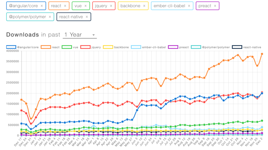
NPM Downloads of Popular Frontend Libraries. (Source)

According to Stack Overflow, based on the type of tags assigned to questions, the top eight most discussed topics on the site are JavaScript, Java, C#, PHP, Android, Python, jQuery and HTML — not C, C++, or more exotic languages like Ocaml or Haskell. If you’re building websites, you’re very likely going to want to use technologies that are popular because the number of open-source and commercial/supported products provides you with the ability to code and test more quickly, resulting in faster time to market.

What this means to developers is that the JavaScript world continues to lead all others in the number of developers, and while older technologies like jQuery are still popular, clearly React and Angular are important and continue growing. The newcomer, Vue, is also becoming more and more popular.

Selecting Angular, React, or Vue

Angular versus React versus Vue — there are so many open-source tools. Add to that libraries like Backbone.js and a hundred others. How can developers update their knowledge of so many? Which one should they choose? To some extent this decision is choosing text editors: it’s a personal choice, it’s fiercely defended, and in the end each might actually work for you.

If your main concern is popularity so you don’t get boxed into learning a complicated, rich programming environment only to see support wither away, then React is clearly “winning” as the long-term trend line shows. But popularity is only one attribute in a long shopping list of important decision factors.

Long-term trend lines of various popular frameworks and libraries
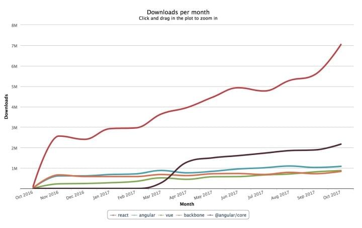
Long-term trend lines of various popular frameworks and libraries. (Source)

The post The Evolution of JavaScript Tooling: A Modern Developer’s Guide appeared first on SitePoint.

Should Your Portfolio Site Be A PWA?

Original Source: https://www.smashingmagazine.com/2019/12/should-your-portfolio-site-be-pwa/

Should Your Portfolio Site Be A PWA?

Should Your Portfolio Site Be A PWA?

Suzanne Scacca

2019-12-12T12:00:00+00:00
2019-12-12T20:06:07+00:00

This is going to seem like an odd thing to suggest, considering how much work is required to build a progressive web app instead of a responsive website. But, for many of you, your portfolio site should be built as a PWA.

There are a number of benefits to doing this, which I’ll outline below, but the bottom line is this:

If you want to spend less time looking for clients, applying to design gigs and convincing prospects to hire you, a PWA would be a wise investment for your business.

Why Do Web Designers Need to Build PWAs for Themselves?

If you’ve spoken to clients about building PWAs for their businesses, then you know the usual selling points:

A progressive web app is inherently fast, reliable and engaging.

But for a web designer or developer, there are other reasons to build a PWA for your business.

Reason #1: Show and Tell

When it comes to selling clients on a PWA, you have to remember that the concept is still relatively new, at least in terms of public awareness.

Remember when we made the shift from mobile “friendly” websites to responsive? You couldn’t just summarize what a responsive website was and then expect clients to be okay with paying more than they would for a non-responsive site. You had to actually show them the difference in terms of design and, more importantly, demonstrate the benefits.

More or less, I think consumers are familiar with responsive design today, even if they don’t know it by name. Just look at the statistics on how many more people visit websites on mobile devices or how Google rewards mobile-first sites. This wouldn’t be possible without responsive design.

For PWAs, it’s going to take some time for consumers to truly understand what they are and what value they add to the web. And I think that will naturally start to happen as more PWAs appear.

For now though, your prospects are going to need more than an assurance that PWAs are the future of the web. And they most definitely will need the benefits broken down into terms they understand (so that means no talk of service workers, caching or desktop presence).

One of the best ways to sell prospects on a PWA without overcomplicating it is to say, “Our website is a PWA.” Not only is this a great way to introduce the PWA as something they’re already familiar with, but it’s basically like saying:

We’re not trying to sell you some hot new trend. We actually walk the walk.

And when you do open up the conversation this way, their response should hopefully be something like:

Wow! I was wondering how you got XYZ to happen.

Take Mutual Mobile, for example.

Let’s say a prospective client found the PWA in search results and decided to poke around the portfolio to see what kind of work the consultancy had done in the past.

This is what they would see:

Mutual Mobile PWA bottom sticky bar

The Mutual Mobile PWA includes a social share sticky bar on the portfolio pages. (Source: Mutual Mobile) (Large preview)

In addition to the sticky header that keeps the logo ever-present along with the menu, there’s a new bottom bar that appears on this page.

This sticky bottom bar serves a number of purposes:

The number of shares works as social proof.
The quick links to social media encourage visitors to share the page with others, especially if they know someone who’s in need of a designer.
The email icon makes it easy to send a copy of the page to themselves or to someone else — again, serving as a referral or reminder that this page is worth following up on.

This isn’t the only place where the bottom bar appears on the Mutual Mobile site. As you might’ve guessed, it also shows up on the blog — a place where engagement and sharing should be happening.

Mutual Mobile blog with social share

The Mutual Mobile blog includes a sticky bottom banner with social share buttons and counts. (Source: Mutual Mobile) (Large preview)

I’m particularly fond of this use of the bottom bar considering how difficult it can be to place social share icons on responsive websites. Either they sit at the very top or bottom of the post where they’re not likely to be seen or they’re added in as a hovering vertical bar which can compromise the readability of the content.

This might seem like such an insignificant feature of a PWA to highlight, but it can make a huge difference if your responsive site (or that of your client) is lacking in engagement.

Plus, the fact that the bottom bar only appears at certain times demonstrates this company’s understanding of how PWAs work and how to make the most of their app-like features.

That said, you don’t want to use your PWA to brag about your progressive web app development prowess.

Instead, simply present your PWA as an example of what can be done and then explain the value in using PWA-specific features to increase engagement and conversions.

And if you have a story to tell about why you built a PWA for your business that you know the prospect can relate to, don’t be afraid to bring it up. Storytelling is a really powerful sales tactic because it doesn’t feel like you’re selling at all. It’s more genuine.

Reason #2: Create Something DIY Builders Can’t

I’ve tested most of the major drag-and-drop builders and I get why business owners would consider this seemingly more cost-effective DIY approach now. A few years ago? No way. But these technologies really are getting better in terms of being able to “design” a professional-looking website. (Speed, security and functionality are a whole other story though.)

Knowing this and knowing the direction the web is going in, it would be a wise move for web designers to start transitioning their businesses over to PWAs. Not completely, at first. There are still clients who will be willing to pay a web designer to build a website for them (instead of trying and doing it on their own).

But if you can start advertising progressive web app design or development services on your site and then turn your website into a PWA, you’d put yourself in a great position. Not only would you be seen as a forward-thinking designer, but you’d be poised to work with a higher quality of client down the road.

And for the time being, you’d have a PWA that’s sure to impress as it carefully straddles the line between the convenience of a website and the sleekness of a native app.

Let me show you an example.

This is the PWA for Build in Amsterdam:

Build in Amsterdam walkthroughA walkthrough of the Build in Amsterdam Cases pages. (Source: Build in Amsterdam)

It’s simple enough in terms of content. There are only pages for Cases (which pulls double duty as the home page), About and Contact. Really, with the quality of cases and context about those cases provided, that’s really all this digital agency needs.

If you do decide to turn your portfolio site into a PWA, consider doing something similar. With fewer pages and a focus on delivering only the most pertinent information, the experience will feel just as efficient and streamlined as a native app.

Back to Build in Amsterdam:

The design is incredibly engaging. Every time one of the Cases images is clicked, it feels as though visitors are entering a new portal.

While a clear top and bottom banner aren’t clearly present as they would be in a mobile app, it’s just as easy to get around this app.

The menu button, for instance, is always available. But notice how a new set of navigational options appear along the bottom as the prospect moves down the page:

Build in Amsterdam bottom navigation

Build in Amsterdam utilizes the bottom banner to add custom navigation to its PWA. (Source: Build in Amsterdam) (Large preview)

The conveniently placed Back and Forward arrows direct prospects to other work samples. The center button then takes them back to the home/Cases page.

It’s not just the addition of navigational buttons that makes this PWA unique. It’s the style of transition in and out of pages that makes it a standout as well.

So, if you’re looking to make a really strong impression with prospective clients now, build yourself a PWA that will knock their socks off from the get-go. The longer you keep your web presence on the cutting edge of design, the more likely you’ll be seen as a design authority in the not so distant future (when everyone’s finally caught onto PWAs).

Reason #3: Make Conversion Smoother

I bet you wouldn’t mind letting your site do more selling on your behalf.

While you can certainly outfit your responsive website with contact forms, how do you convince visitors to take the leap? For starters, messaging and design need to really speak to them, so much so that they think:

This sounds like a great fit. How do I get in touch?

But rather than leave them to open the navigation and locate the Contact page (if it’s even there, since many companies now hide it in their footer), your contact form should be just one simple click away.

It’s not as though you can’t do this with a website. However, it’s the extra style provided by a PWA that’s going to get you more attention and engagement in the long run.

Take the Codigo PWA, for example.

Codigo home page to contact form conversionAn example walkthrough from the Codigo home page to conversion. (Source: Codigo)

The above is a walkthrough from the home page to the Works page. The transition through these pages is smooth, stylish and sure to catch the attention of someone looking for a web designer who can shake things up for their brand.

Below each sample, prospects find big red Back and Forward buttons. This makes it easy to quickly navigate through various works. If they prefer to backtrack to the main page, they can use the “Back to Work” button that’s always available in the top-left corner.

Down past the big red buttons is where Codigo invites prospects to get in touch. This call-to-action isn’t done in a traditional manner though. Instead of one big CTA that says “Let’s Chat”, the options are broken up as follows:

Build
Co-incubate
Customize
Organize

This allows the agency to ask a specific set of questions based on what the prospect actually needs in terms of mobile app development. And, again, the transition between screens is highly engaging. What’s more, the transitions happen super fast, so there’s no lag time that causes prospects to wonder if that’s how slow their own app would be.

Overall, it’s setting a really strong impression for what a PWA can be.

As you know, PWAs integrate really well with the features of our phones, so don’t feel like you have to put all your focus into a contact form if a click-to-call, click-to-text or click-to-email button would be better. Just find the right CTA and then program your PWA to simplify and streamline those actions for you.

Wrapping Up

I know this probably wasn’t what you wanted to hear, especially when you’re already too busy trying to drum up and complete paid work for clients. But you know how it is:

It’s difficult finding time to work on your business because no one’s paying you to do it. But when you finally do, you’ll be kicking yourself for not doing it sooner.

And as we move into a new decade, there’s no better time than the present to look at your website and figure out what needs to be done in order to future-proof it. From what we know about the mobile-first web and how powerful PWAs are for engagement and conversion, that’s likely where your website is headed sooner or later. So, why not expedite things and get it done now?

Further Reading on SmashingMag:

An Extensive Guide To PWAs
Will PWAs Replace Native Mobile Apps?
How To Integrate Social Media Into Mobile Web Design
Can You Make More Money With A Mobile App Or A PWA?

Smashing Editorial
(ra, yk, il)

Is The F-Pattern Still Relevant in Web Design?

Original Source: https://www.webdesignerdepot.com/2019/12/is-the-f-pattern-still-relevant-in-web-design/

It’s always good to have a set of guidelines to follow when designing a website — especially if you have little to no user data to go on.

Over the years, we’ve been introduced to tons of these guidelines and design trends; some of which have fallen out of favor while others have persisted over the years. One of those web design guidelines that’s persisted is the F-pattern.

But is it still relevant today, what with mobile-first design practices?

What Is The F-Pattern?

When we refer to patterns like the F-pattern, Gutenberg layout, or layer-cake pattern in web design, what we’re talking about is how readers scan the content on a page. And thanks to heat mapping technology and research from organizations like Nielsen Norman Group (going back to 2006), we have proof of its existence.

As you can see from these eye-tracking studies from NNG, the F-pattern isn’t always an explicit “F” shape.

Instead, it refers to a general reading pattern whereby certain parts of the page are read in full — usually at the top and somewhere in the middle. In some cases, readers may stop to peruse additional sections of the page, making the pattern look more like the letter “E”. The rest of the page, for the most part, gets lightly scanned along the left-hand margin.

This principle actually applies to both desktop and mobile screens.

Although mobile devices have a smaller horizontal space, readers still have a tendency to focus on the top section, scan down the page a bit, read a bit more, and then scan down to the end. Again, it won’t look like a traditional “F” shape, but the concept is the same.

Is the F-pattern Still Relevant?

Essentially, this is the message the F-pattern has taught web designers and copywriters: “No one’s going to look at everything you’ve done, so just put the good stuff at the top.”

It seems like a pessimistic way to approach web design, doesn’t it?

The fact of the matter is, it is a pessimistic approach. At the time it was devised, however, we didn’t know any better. We were looking at the data and thinking, “Okay, this is how our users behave. We must create websites to suit that behavior.”

But the best web designers don’t just kick back and let visitors take the reins. They take control of the experience from start to finish, so that visitors don’t have to figure out where to go or what to do next. Designers carefully craft a design and lay out content in a way that draws visitors into a website and takes them on a journey.

When NNG revisited its report on the F-shaped pattern in 2017, this is the conclusion it came to:

“When writers and designers have not taken any steps to direct the user to the most relevant, interesting, or helpful information, users will then find their own path. In the absence of any signals to guide the eye, they will choose the path of minimum effort and will spend most of their fixations close to where they start reading (which is usually the top left most word on a page of text).”

Basically, our visitors are only resort to reading a page using the F-pattern when we’ve provided a subpar experience.

So, to answer the question above: No, the F-pattern isn’t still relevant.

What Should Web Designers Do Instead?

It’s important to recognize that visitors are bound to scan your website. Everyone’s so short on time and patience these days that it’s become a natural way of engaging with the web.

That said, there’s a difference between scanning a web page to see if it’s worth reading and scanning a web page simply to get it over and done with (which is essentially what the F-pattern encourages).

Knowing this, web designers should create pages that encourage scanning — to start, anyway. Pages that contain:

Short sentences and paragraphs;
Headers and subheaders to give a quick and informative tease of what’s to come;
Elements that create natural pauses, like bulletpoints, images, bolded text, hyperlinks, bountiful spacing, etc.

If you can keep visitors from encountering intimidating walls of text, they’ll be more likely to go from scanning the page to reading it… instead of scanning it and closing out the browser.

I’d also recommend not focusing so much on reading patterns. Unless you’re spending a lot of time designing text-heavy pages, they’re not going to apply as much.

Instead, focus on designing an experience that’s welcoming and encouraging, and makes it easy for your visitors to go from Point A to Point B. If you direct them to the most valuable bits of your website, they’ll follow you.


Featured image via Unsplash.

Source

p img {display:inline-block; margin-right:10px;}
.alignleft {float:left;}
p.showcase {clear:both;}
body#browserfriendly p, body#podcast p, div#emailbody p{margin:0;}