Higher-order Components: A React Application Design Pattern

Original Source: https://www.sitepoint.com/react-higher-order-components/?utm_source=rss

Higher-order Components: A React Application Design Pattern

In this article, we’ll discuss how to use higher-order components to keep your React applications tidy, well-structured and easy to maintain. We’ll discuss how pure functions keep code clean and how these same principles can be applied to React components.

Pure Functions

A function is considered pure if it adheres to the following properties:

all the data it deals with is declared as arguments
it doesn’t mutate data it was given or any other data (these are often referred to as side effects)
given the same input, it will always return the same output.

For example, the add function below is pure:

function add(x, y) {
return x + y;
}

However, the function badAdd below is impure:

let y = 2;
function badAdd(x) {
return x + y;
}

This function is not pure because it references data that it hasn’t directly been given. As a result, it’s possible to call this function with the same input and get different output:

let y = 2;
badAdd(3) // 5
y = 3;
badAdd(3) // 6

To read more about pure functions you can read “An introduction to reasonably pure programming” by Mark Brown.

Whilst pure functions are very useful, and make debugging and testing an application much easier, occasionally you’ll need to create impure functions that have side effects, or modify the behavior of an existing function that you’re unable to access directly (a function from a library, for example). To enable this, we need to look at higher-order functions.

Higher-order Functions

A higher-order function is a function that returns another function when it’s called. Often they also take a function as an argument, but this isn’t required for a function to be considered higher-order.

Let’s say we have our add function from above, and we want to write some code so that when we call it, we log the result to the console before returning the result. We’re unable to edit the add function, so instead we can create a new function:

function addAndLog(x, y) {
const result = add(x, y);
console.log(`Result: ${result}`);
return result;
}

We decide that logging results of functions is useful, and now we want to do the same with a subtract function. Rather than duplicate the above, we could write a higher-order function that can take a function and return a new function that calls the given function and logs the result before then returning it:

function logAndReturn(func) {
return function(…args) {
const result = func(…args)
console.log(‘Result’, result);
return result;
}
}

Now we can take this function and use it to add logging to add and subtract:

const addAndLog = logAndReturn(add);
addAndLog(4, 4) // 8 is returned, ‘Result 8’ is logged

const subtractAndLog = logAndReturn(subtract);
subtractAndLog(4, 3) // 1 is returned, ‘Result 1’ is logged;

logAndReturn is a higher-order function because it takes a function as its argument and returns a new function that we can call. These are really useful for wrapping existing functions that you can’t change in behavior. For more information on this, check M. David Green’s article “Higher-Order Functions in JavaScript”, which goes into much more detail on the subject.

See the Pen
Higher Order Functions by SitePoint (@SitePoint)
on CodePen.

Higher-order Components

Moving into React land, we can use the same logic as above to take existing React components and give them some extra behaviors.

Note: with the introduction of React Hooks, released in React 16.8, higher-order functions became slightly less useful because hooks enabled behavior sharing without the need for extra components. That said, they are still a useful tool to have in your belt.

In this section, we’re going to use React Router, the de facto routing solution for React. If you’d like to get started with the library, I highly recommend the React Router documentation as the best place to get started.

React Router’s Link component

React Router provides a <NavLink> component that’s used to link between pages in a React application. One of the properties that this <NavLink> component takes is activeClassName. When a <NavLink> has this property and it’s currently active (the user is on a URL that the link points to), the component will be given this class, enabling the developer to style it.

This is a really useful feature, and in our hypothetical application we decide that we always want to use this property. However, after doing so we quickly discover that this is making all our <NavLink> components very verbose:

<NavLink to=”/” activeClassName=”active-link”>Home</NavLink>
<NavLink to=”/about” activeClassName=”active-link”>About</NavLink>
<NavLink to=”/contact” activeClassName=”active-link”>Contact</NavLink>

Notice that we’re having to repeat the class name property every time. Not only does this make our components verbose, it also means that if we decide to change the class name we’ve got to do it in a lot of places.

Instead, we can write a component that wraps the <NavLink> component:

const AppLink = (props) => {
return (
<NavLink to={props.to} activeClassName=”active-link”>
{props.children}
</NavLink>
);
};

And now we can use this component, which tidies up our links:

<AppLink to=”/home” exact>Home</AppLink>
<AppLink to=”/about”>About</AppLink>
<AppLink to=”/contact”>Contact</AppLink>

In the React ecosystem, these components are known as higher-order components, because they take an existing component and manipulate it slightly without changing the existing component. You can also think of these as wrapper components, but you’ll find them commonly referred to as higher-order components in React-based content.

Continue reading
Higher-order Components: A React Application Design Pattern
on SitePoint.

Justinmind 9 is here! UI Design and Prototyping Come Together

Original Source: http://feedproxy.google.com/~r/1stwebdesigner/~3/0uho0yQgfHs/

In case you are unaware, Justinmind is an all-in-one UI design, wireframing and prototyping platform for web and mobile apps. It lets you preview ideas on various screens, including web browsers, Android and iOS. The drag-and-drop interface makes it easier for beginners to get started using templates and customize them according to their own requirements. The platform comes with UI Kits preloaded that enable you to design beautiful interfaces with clickable regions and functional UI prototypes. Transitions, gestures, animations, effects and more are also covered, while data tables, smart forms and dynamic behavior ensure realistic simulation of your ideas.

Now version 9 of Justinmind has been released with a revamped UI, frictionless developer handoff, 10x speed increase, and dozens of new design features. In this article, we are going to take a look at the improvements in this latest version so you can see why you should give Justinmind a try, if you aren’t already using it.

Revamped Workspace UI

The latest release emphasizes your user experience, so that everything appears where you need it, when you need it. With a new toolbar design that contains a multitude of shortcuts, repetitive tasks can be performed at a fraction of previous speeds. For example, by simply dragging and pressing the CMD key for Mac or the CTRL button for Windows, you can insert dynamic panels and other containers onto the canvas quickly and easily.

Align tools, with screen and template guides, allow you to align elements even if there is only a single element on the canvas. Resizing is also easier using the new aspect ratio constraint feature.

Justinmind - toolbar

10 Times Faster – Even With Huge Prototypes!

In this new version of Justinmind, the platform’s performance has been dramatically increased to make it 10 times faster than before. This speed increase will greatly improve your production time, which translates to increased revenue.

Justinmind - 10 times faster

Enhanced Handoff From Designers To Developers

In today’s collaborative work environments, it’s important to provide frictionless handoffs from designers to developers. Justinmind 9 does just that, with a web-based element where developers can inspect a prototype’s assets, inspect CSS styles, red line, and get other general information. The developers do not even have to have the software installed or download prototypes!

Justinmind - developer handoff

New Design Features

No more switching back and forth between design and prototyping tools – you can do it all in Justinmind 9! Check out some of the new features listed below:

Direct Selection Tool – select single elements that are inside containers or grouped together.
Pixel Perfect Text Editing – Text editing now matches 100% with text visualization. You can also preview all your fonts by using the fonts selector.
Enhanced Zooming – newly tweaked super-fast precision zoom feature.
Widget Preview – preview UI widgets in their libraries before dragging them on to the canvas for editing.
Redesigned Color Palette – new much more varied and seasoned color palette, with increased transparency in gradients.

Justinmind - design features

Many More New Features Make Justinmind 9 A Must To Try

Whether you are already using Justinmind, or you’ve never tried it before, these new developments in the latest release make it a must to try out as a tool in your design and prototyping arsenal. Best of all, it’s absolutely free to download and give a thorough run through, with an affordable price starting at $19 USD per user per month. There is even a completely free version with limitations after the 15-day full-featured trial runs out. So give it a try and start improving your design and prototyping efficiency today!


30 Bewitched Halloween Wallpapers (4K)

Original Source: https://www.hongkiat.com/blog/beautiful-halloween-wallpapers/

Halloween, which falls on the 31th of October is a holiday that normally associated with symbols like “Jack o’ Lanterns“, skeleton, pumpkins and activities like bonfire, costume…

Visit hongkiat.com for full content.

Collective #630

Original Source: http://feedproxy.google.com/~r/tympanus/~3/uIACTLmCmyE/

Three.js Journey

Bruno Simon’s ultimate Three.js course is now open for subscriptions!

Check it out

Our Sponsor
Be: 600+ stunning pre-built websites. Now with Elementor.

Save time. Stop building sites from scratch.

Find out more

Understanding Modules, Import and Export in JavaScript

Learn how to use webpack to bundle JavaScript, images, fonts, and styles for the web and set up a development server.

Read it

daily.dev

A great new aggregator with the latest programming news.

Check it out

Ghost Card

A terrifying ghost card that you can drag to rotate. Made by Yugam.

Check it out

Getting Started With Next.js

A tutorial for developers who are looking to get started with Next.js or have already begun but need to fill some knowledge gaps.

Read it

The Deliciously Dark Escape

A great game made by the folks of Active Theory for Trolli.

Check it out

Dissecting A Dweet #9: City Sunset

Explore the JavaScript code that produces a beautiful procedurally generated cityscape.

Read it

State-Switch Controls: The Infamous Case of the “Mute” Button

Learn about the best practices regarding on–off controls that switch between two different system states.

Read it

Phosphor Icons

In case you didn’t know it yet: A flexible icon family for interfaces, diagrams, presentations and more.

Check it out

Tap to Navigate

Linzi Berry’s great article on how to systemizing interactive labels for maps.

Read it

Bongo Cat

In case you missed it: Hit the bongos like Bongo Cat!

Check it out

Handsfree.js experiments

Oz Ramos shows some really cool stuff he made with Handsfree.js.

Check it out

r3f-blob

A great demo by Marco Ludovico Perego.

Check it out

link-to-qr

Easy to create, free customizable QR codes.

Check it out

waypoint-examples

Some practical example apps that can be deployed with Waypoint.

Check it out

Merlin

Simple web-like forms in react native.

Check it out

Half-Life inspired 3D scene with WebGL

An amazing demo made with ROYGBIV by O?uz Ero?lu.

Check it out

Responsive Grid Design: Ultimate Guide

A guide on how to start designing with a grid system. By Nitish Khagwal.

Read it

This page is a truly naked, brutalist html quine.

Leon from SecretGeek combines Brutalism and quines to create a truly creative webpage.

Check it out

Obolify

A project worth mentioning: Find and support independent, local shops as an alternative to Amazon.

Check it out

The post Collective #630 appeared first on Codrops.

Introducing Framer Motion

Original Source: https://smashingmagazine.com/2020/10/introduction-to-framer-motion/

In this article, we’ll take a closer look at how Framer Motion helps us in creating awesome animations. We’ll learn how motion components work and learn how to chain animations together. We’ll look into how to make gesture-triggered, timed, and scroll animations with Framer motion. Along the way, we’ll use the things we learn to build five demo applications I’ve set up to show us how we can integrate Framer Motion into real-world applications.

This tutorial will be beneficial to readers who are interested in integrating animations in their React application.

Note: This article requires a basic understanding of React and CSS.

What Is Framer Motion?

Framer Motion is an animation library that makes creating animations easy. Its simplified API helps us abstract the complexities behind animations and allows us to create animations with ease.

Motion Components

These are the building blocks of Framer motion. Motion components are created by prefixing motion to your regular HTML and SVG element (e.g, motion.h1). Motion components can accept several props, with the basic one being the animate prop. This prop takes in an object where we define the properties of that component we want to animate. The properties we define will be animated when the component mounts in the DOM.

Let’s animate an h1 text using Framer Motion. First, we install the framer-motion library and import motion.

npm i framer-motion
import { motion } from ‘framer-motion’;

Then we convert the h1 into a motion component.

<motion.h1
animate={{x: 20, y: -20}}>
This is a motion component
</motion.h1>

This will cause the h1 to slide 20px to the right and move 20px up when it loads. When units aren’t added, calculations are done using pixels. However, you can explicitly set the units you want the calculations to be based on, animate={{x: “20rem”, y: “-20rem”}}>.

By default, a motion component will be animated from the state defined from its styles to those in the animate prop. However, if we wanted to, we could hijack and define the initial animation state of the component using the initial prop. While the animate prop is used to define the behavior of components when they mount, the initial prop defines their behavior before they mount.

If we want our h1 to come in from the left, we control that using the initial prop.

<motion.h1
initial={{x: -1000}}
animate={{x: 20}}>
This is a motion component
</motion.h1>

Now, when the h1 mounts, it slides in from the left.

We are not limited to a single animation. We can define a series of animations called keyframes in an array of values. Each value will get animated in sequence.

<motion.h1
initial={{x: -1000}}
animate={{x: [20, 50, 0, -70, 40] }}>
This is a motion component
</motion.h1>

The transition prop allows us to define how the animations occur. With it, we define how values animate from one state to another. Among other things, we can define the duration, delay, and type of animation using this prop.

<motion.h1
initial={{ x: -1000 }}
animate={{ x: 0 }}
transition={{
type: “tween”,
duration: “2”,
delay: “1”
}}>
This is a motion component
</motion.h1>

Say we were to animate several motion components simultaneously, like in the code snippet below.

<div className=”App”>
<motion.h1
initial={{ x: -1000 }}
animate={{ x: 0 }}
transition={{
type: “tween”,
duration: “2”,
delay: “1”
}}>
This is a motion h1
</motion.h1>
<motion.h2
initial={{ y: -1000 }}
animate={{ y: 0 }}
transition={{
type: “tween”,
duration: “1”,
delay: “.4”
}}>This is a motion h2
</motion.h2>
<motion.h3
initial={{ x: 100, opacity: 0 }}
animate={{ x: 0, opacity: 1 }}>
This is a motion h3
</motion.h3>
<motion.h4
initial={{ scale: 0.7 }}
animate={{ scale: 1.7 }}
transition={{
type: “tween”,
duration: “2”,
delay: “1”
}}>
This is a motion h4
</motion.h4>
</div>

While this works, the variants prop in Framer Motion enables us to extract our animation definitions into a variants object. Not only do variants make our code cleaner, but they allow us to create even more powerful and complex animations.

Extracting our animation definitions into variants objects, we have this:

const H1Variants = {
initial: { x: -1000 },
animate: { x: 0 },
transition: {
type: “tween”,
duration: 2,
delay: 1
}
}
const H2Variants = {
initial: { y: -1000 },
animate: { y: 0 },
transition: {
type: “tween”,
duration: 1,
delay: .4
}
}
const H3Variants = {
initial:{ x: 100, opacity: 0 },
animate:{ x: 0, opacity: 1 }
}
const H4Variants = {
initial:{ scale: 0.7 },
animate:{ scale: 1.7 },
transition:{
type: “tween”,
duration: “2”,
delay: “1”
}
}

Instead of passing the animation definitions into a component’s initial and animate props directly, we extract these definitions into standalone variant objects. In the variant objects, we define variant names that describe each animation’s name as variants.

<div className=”App”>
<motion.h1
variants={H1Variants}
initial=’initial’
animate=’animate’
>
This is a motion h1
</motion.h1>
<motion.h2
variants={H2Variants}
initial=’initial’
animate=’animate’
>
This is a motion h2
</motion.h2>
<motion.h3
variants={H3Variants}
initial=’initial’
animate=’animate’
>
This is a motion h3
</motion.h3>
<motion.h4
variants={H4Variants}
initial=’initial’
animate=’animate’
>
This is a motion h4
</motion.h4>
</div>

In the variants prop, we pass in the name of the variant objects for each motion component and then pass in the animations to the initial and animate props.

We can take our current setup with variants further to reduce repetition. Using variants, we can propagate animation attributes down through the DOM from a parent motion component. For this to work, we create variants for the parent motion.div with similar animation names in its variant object as its children. By doing this, we won’t have to pass the animation names’ to each child component. Behind the scenes, the parent element handles that for us.

const ContainerVariants = {
initial: {},
animate: {}
};
const H1Variants = {
initial: { x: -1000 },
animate: { x: 0 },
transition: {
type: “tween”,
duration: 2,
delay: 1
}
};
//more variants below

<motion.div
className=”App”
variants={ContainerVariants}
initial=”initial”
animate=”animate”
>
<motion.h1 variants={H1Variants}>This is a motion h1</motion.h1>
<motion.h2 variants={H2Variants}>This is a motion h2</motion.h2>
<motion.h3 variants={H3Variants}>This is a motion h3</motion.h3>
<motion.h4 variants={H4Variants}>This is a motion h4</motion.h4>
</motion.div>

Now we have a cleaner code with no repetitions. We turned the container div to a motion component so we could pass in the ContainerVariants object we defined. Since we don’t define any animations on the container, we pass in empty objects to initial and animate. Your animation names must be the same in every variant object for the propagation to work.

Now we understand the basics of Framer Motion. Let’s begin building our fist of 5 demo applications.

Icon Shop

We can create interactive animations based on gestures. Motion components are currently able to listen for hover, tap, pan, and drag gesture detection. We’ll be building this Icon Shop app using the whileHover prop.

Components

App.js: this holds the heading texts.
Card.jsx: here, we define the animations for the icon cards.
CardContainer.jsx: we import and loop through the icons.
styles.js: create, style, and export the motion components. I used styled-components for styling the components.

Let’s start with App.js.

import { H1, H2 } from “./Styles”;
import CardContainer from “./CardContainer”;

return (
<div>
<H1
initial={{ y: -100 }}
animate={{ y: 0, transition: { delay: 1 } }}>
Icon Shop
</H1>
<H2
initial={{ x: -1000 }}
animate={{ x: 0, transition: { delay: 1 } }}>
Hover over the cards to see the motion magic
</H2>
<CardContainer />
</div>
);

We import the H1 and H2 motion components we created in the Styles.js file. Since they are motion components, we use the initial and animate props to define their behavior before and when they mount. Here, we also import and display the CardContiner component.

Now, the CardContainer.js.

import { Container } from “./Styles”;
import Card from “./Card”;
import { ReactComponent as AddIcon } from “./assets/add.svg”;
import { ReactComponent as AirplaneIcon } from “./assets/airplane.svg”;
import { ReactComponent as AlarmIcon } from “./assets/alarm.svg”;
//more svg imports below…

const icons = [
<AddIcon />,
<AirplaneIcon />,
<AlarmIcon />,
//more icons below
];

const CardContainer = () => {
return (
<Container initial={{ x: -1000 }} animate={{ x: 0 }}>
{icons.map((icon) => (
<Card icon={icon} />
))}
</Container>
);
};

Here, we import the SVGs, the Container motion component, and the Card component.

Similar to H1 and H2 in App.js, we define animations of the Container using the initial and animate props. When it loads, it will create a cool effect of sliding in from the left of the browser.

Now, Card.js

import { CardBox, IconBox } from “./Styles”;
const CardVariants = {
beforeHover: {},
onHover: {
scale: 1.1
}
};
const IconVariants = {
beforeHover: {
opacity: 0,
y: -50
},
onHover: {
opacity: 1,
y: 0,
scale: 1.5,
transition: {
type: “tween”
}
}
};

const Card = ({ icon }) => {
console.log(icon);
return (
<CardBox variants={CardVariants} initial=”beforeHover” whileHover=”onHover”>
<IconBox variants={IconVariants}>{icon}</IconBox>
</CardBox>
);
};

Here, we create two variant objects with beforeHover and onHover animations. In the CardVariants object, we don’t want to do anything initially, so beforeHover is an empty object. onHover we increase the scale of the card box.

In the IconVariants object, we define the initial state of the IconBox in its beforeHover. We set its opacity to 0 and push it upwards by 50px. Then, in onHover, we set the opacity back to 1, push it back to its default position, and change the transition type to tween. Then we pass in the variants to their respective motion components. We make use of the propagation, so we don’t need to explicitly set the initial and animate props to the IconBox component.

Animated Navbar

We’ll build a simple Navigation component, and we’ll see how we can create timing relationships between parent and children motion components.

Components

App.js: this holds the heading texts.
Styles.js: create, style, and export the motion components. The components are styled using styled-components.

Let’s take a look at the App.js file.

import { Header, Nav, Link, SvgBox } from “./Styles”;

function App() {
const [isOpen, setIsOpen] = useState(false);
const iconVariants = {
opened: {
rotate: 135
},
closed: {
rotate: 0
}
};
const menuVariants = {
opened: {
top: 0,
transition: {
when: “beforeChildren”,
staggerChildren: 0.5
}
},
closed: {
top: “-90vh”
}
};
const linkVariants = {
opened: {
opacity: 1,
y: 50
},
closed: {
opacity: 0,
y: 0
}
};

We create an isOpen state that will be used to check if the Navbar is open or not. We create 3 variant objects, iconVariants, menuVariants, and linkVariants where we define the animations for the SvgBox, Nav, and Link motion components respectively. The iconVariants is used to rotate the SvgBox 135deg when it’s hovered over. We don’t need to add “deg” to the value. In the menuVariants, we control the top position of the Nav like you would using the position property in CSS. We toggle the top position of the Nav based on the isOpen state.

With variants, we can create timing relationships between parent and children motion components. We define the relationship between parent Nav and its child, Link using the when property in the transition object. Here, set it to beforeChildren, so the parent component’s animations will finish before the child’s animation begins.

Using the staggerChildren property, we set a timing order for each link. Each link will take 0.5 seconds to appear one after the other. This creates a nice visual cue when the Nav is opened. In the linkVariants we animate the opacity and the vertical position of each link.

<div className=”App”>
<Header>
<SvgBox
variants={iconVariants}
animate={isOpen ? “opened” : “closed”}
onClick={() => setIsOpen(!isOpen)}
>
<svg
width=”24″
height=”24″
viewBox=”0 0 24 24″
fill=”none”
xmlns=”http://www.w3.org/2000/svg”
>
<path
d=”M12 4C11.4477 4 11 4.44772 11 5V11H5C4.44772 11 4 11.4477 4 12C4 12.5523 4.44772 13 5 13H11V19C11 19.5523 11.4477 20 12 20C12.5523 20 13 19.5523 13 19V13H19C19.5523 13 20 12.5523 20 12C20 11.4477 19.5523 11 19 11H13V5C13 4.44772 12.5523 4 12 4Z”
fill=”#fff”
/>
</svg>
</SvgBox>
</Header>
<Nav
initial={false}
variants={menuVariants}
animate={isOpen ? “opened” : “closed”}
>
<Link variants={linkVariants}>home</Link>
<Link variants={linkVariants}>about</Link>
<Link variants={linkVariants}>gallery</Link>
</Nav>
</div>

Here, we pass in the variants to their respective components. In the SvgBox, we toggle the state of isOpen whenever it’s clicked, then conditionally animate it based on the state. Like the SvgBox, we conditionally animate the Nav and the Links based on isOpen’s state.

Animated Modal

We’ll build a modal component and learn about Framer Motion’s AnimatePresence, and how it allows us animate elements as they leave the DOM.

Components:

App.js: we set up the showModal state here.
Modal.jsx: the actual animation work takes place here.
Styles.js: create, style, and export the motion components. The components are styled using styled-components.

Let’s look into App.js

import { ToggleButton, Container } from “./Styles”;
import Modal from “./Modal”;

function App() {
const [showModal, setShowModal] = useState(false);
const toggleModal = () => {
setShowModal(!showModal);
};
return (
<Container>
<ToggleButton
initial={{ x: -700 }}
animate={{
x: 0,
transition: { duration: 0.5 }
}}
onClick={toggleModal}
>
Toggle Modal
</ToggleButton>
<Modal showModal={showModal} />
</Container>
);
}

We create a showModal state that will be used to conditionally render the modal. The toggleModal function will toggle the state whenever the ToggleButton is clicked. ToggleButton is a motion component, so we can define animations for it. When it mounts, it slides in from the left. This animation runs for 0.5 seconds. We also pass in the showModal state to the Modal through props.

Now, Modal.jsx

import { AnimatePresence } from “framer-motion”;
import { ModalBox, ModalContent, Container } from “./Styles”;

<Container>
<AnimatePresence>
{showModal && (
<ModalBox
initial={{ opacity: 0, y: 60, scale: 0.3 }}
animate={{
opacity: 1,
y: 0,
scale: 1,
transition: { type: “spring”, stiffness: 300 }
}}
exit={{ opacity: 0, scale: 0.5, transition: { duration: 0.6 } }}
>
<ModalContent
initial={{ y: -30, opacity: 0 }}
animate={{ y: 0, opacity: 1, transition: { delay: 1 } }}
>
Modal content!!!!
</ModalContent>
</ModalBox>
)}
</AnimatePresence>
</Container>

We import AnimatePresence from framer-motion. It allows us to set exit animations for components when they leave DOM. We conditionally render the Modal based on the showModal state. We define the animations for the ModalBox and ModalContent through their initial and animate props. There’s also a new prop here, exit. Having AnimatePresence as a wrapper allows us to add exit animations to ModalBox in the exit prop.

Scroll Animation

We’ll use a combination of the useAnimation hook and react-intersection-observer to create scroll-triggered animations.

Components

App.js: we set up the animations for the Box component and render it in App
Styles.js: create, style, and export the motion components. The components are styled using styled-components.

import React, { useEffect } from “react”;
import { useAnimation } from “framer-motion”;
import { useInView } from “react-intersection-observer”;
import { Container, H1,StyledBox } from “./Styles”;

const BoxVariants = {
visible: { opacity: 1, x: 0, transition: { duration: 1 } },
hidden: { opacity: 0, x: 300 },
};

const Box = () => {
const controls = useAnimation();
const [ref, inView] = useInView();
useEffect(() => {
if (inView) {
controls.start(“visible”);
}
}, [controls, inView]);
return (
<StyledBox
ref={ref}
animate={controls}
initial=”hidden”
variants={BoxVariants}
/>
);
};

The useAnimation hook allows us to control the sequences in which our animations occur. We have access to controls.start and controls.stop methods that we can use to manually start and stop our animations. We pass in the initial hidden animaton to StyledBox. We pass in the controls we defined with the start method to StyledBox animate prop.

react-intersection-observer’s useInView hook allows us to track when a component is visible in the viewport. The useInView hook gives us access to ref, which we pass to the component we want to watch, and the inView boolean, that tells us if that element is inView or not. We use the useEffect to call controls.start whenever the element we’re watching, StyledBox is in view. We pass in controls and inView as useEffect’s dependencies. Also, we pass in the variants we defined, BoxVariants to StyledBox.

Hero Animation

We’ll build a cool hero banner animation using the useCycle hook. We’ll understand how useCycle allows us to cycle through animations.

import React, { useEffect } from “react”;
import { useCycle } from “framer-motion”;
import { Container, H1, HeroSection, Banner, TextBox } from “./Styles”;
import { ReactComponent as BannerIllustration } from “./bighead.svg”;

const H1Variants = {
initial: { y: -200, opacity: 0 },
animate: { y: 0, opacity: 1, transition: { delay: 1 } },
};
const TextVariants = {
initial: { x: 400 },
animate: { x: 0, transition: { duration: 0.5 } },
};
const BannerVariants = {
animationOne: { x: -250, opacity: 1, transition: { duration: 0.5 } },
animationTwo: {
y: [0, -20],
opacity: 1,
transition: { yoyo: Infinity, ease: “easeIn” },
},
};

We define 3 variants, H1Variants, TextVariants, and BannerVariants. However, our focus is BannerVariants. We define 2 animations, animationOne and animationTwo in BannerVariants. These are the animations we pass into the useCycle to cycle through.

const [animation, cycleAnimation] = useCycle(“animationOne”, “animationTwo”);
useEffect(() => {
setTimeout(() => {
cycleAnimation();
}, 2000);
}, []);

useCycle works similar to the useState hook. In the destructured array, animation represents the animation that is active, whether animationOne or animationTwo. The cylceAnimation function that cycles between the animation we defined. We pass in the animations we want to cycle through into useCycle and call cylceAnimation after 2 seconds in useEffect.

<div className=”App”>
<Container>
<H1 variants={H1Variants} initial=”initial” animate=”animate”>
Cool Hero Section Anmiation
</H1>
<HeroSection>
<TextBox variants={TextVariants} initial=”initial” animate=”animate”>
Storage shed, troughs feed bale manure, is garden wheat oats at
augers. Bulls at rose garden cucumbers mice sunflower wheat in pig.
Chainsaw foal hay hook, herbs at combine harvester, children is
mallet. Goat goose hen horse. Pick up truck livestock, pets and
storage shed, troughs feed bale manure, is garden wheat oats at
augers. Lamb.
</TextBox>
<Banner variants={BannerVariants} animate={animation}>
<BannerIllustration />
</Banner>
</HeroSection>
</Container>
</div>

At the end of everything, we pass in the variants to their respective components and watch the magic happen. With this, the Banner will initially slide in from the right based on the animations we defined in animationOne, and after 2 seconds, cycleAnimation will be called which will trigger animationTwo.

As a wise Pig once said, “that’s all folks.”

Conclusion

We’ve gone through the basics of Framer Motion and seen some demo projects that give us a glimpse of the range of animations we can create. However, you can do so much more with it. I encourage you to dive into the docs and go wild.

Resources

Framer Motion Api Docs, Framer Motion
react-intersection-observer, npm
Framer Motion for React, NetNinja

20 Freshest Web Designs, October 2020

Original Source: https://www.webdesignerdepot.com/2020/10/20-freshest-web-designs-october-2020/

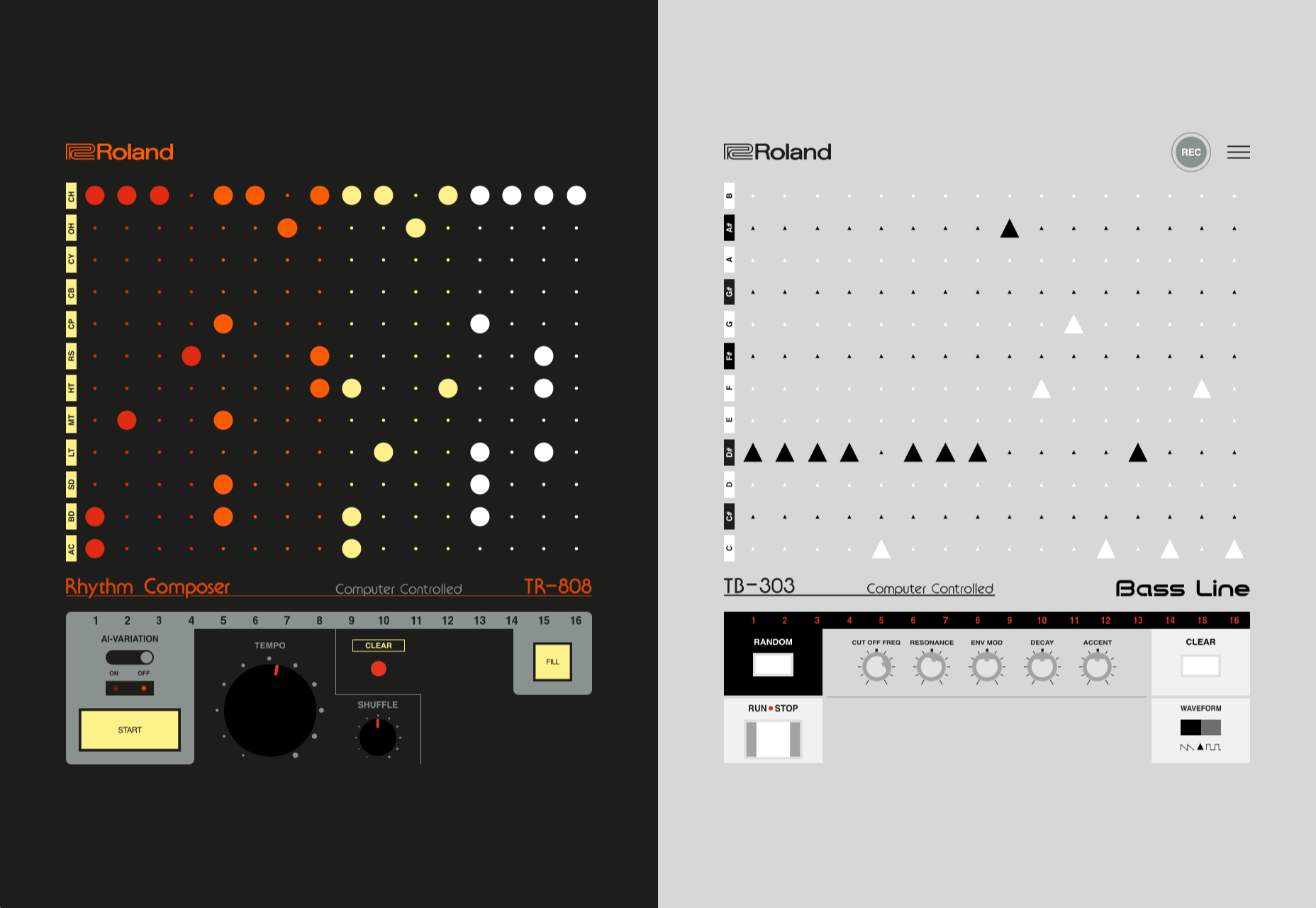
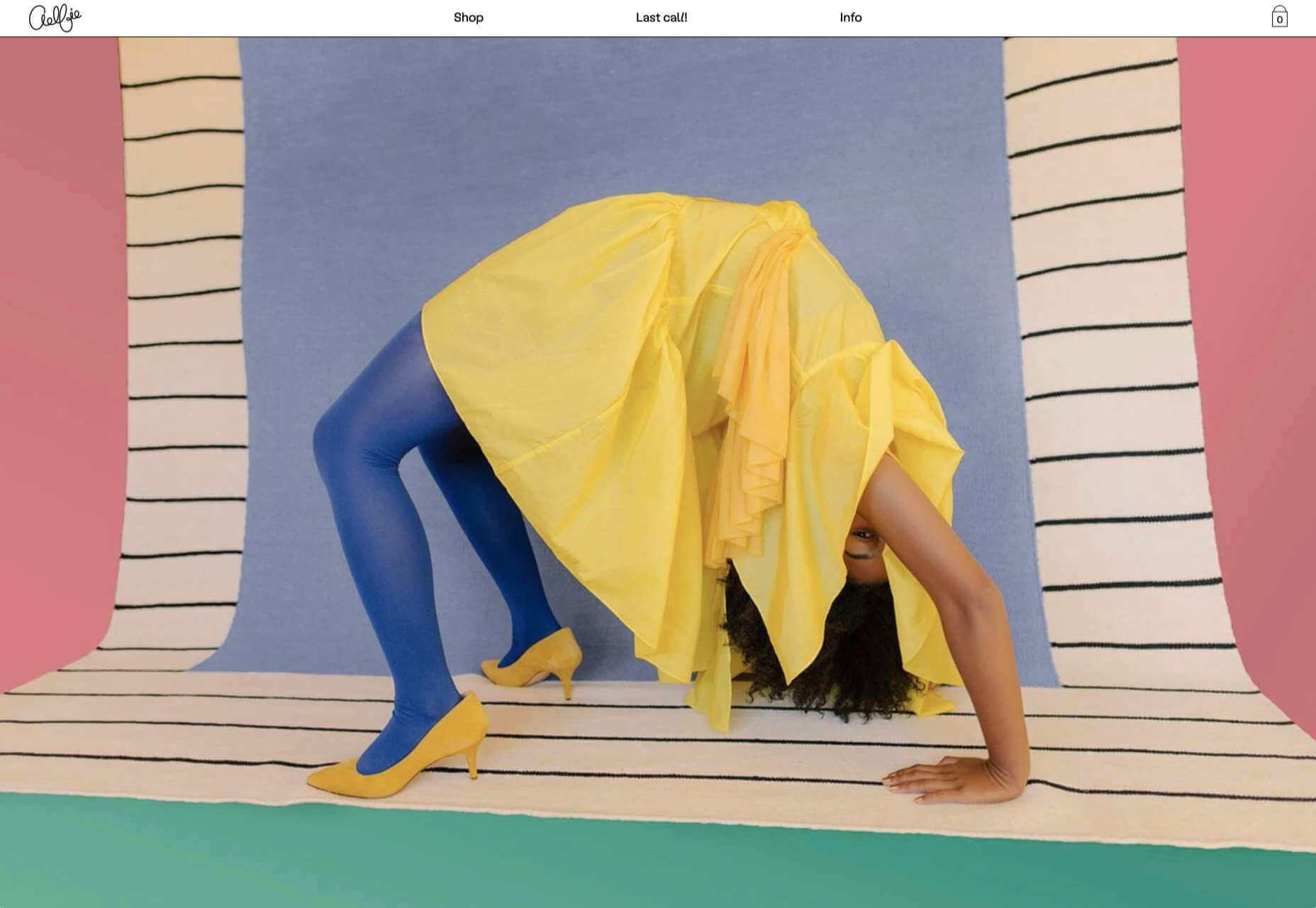
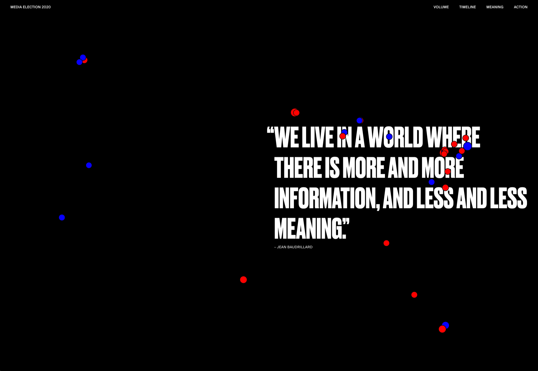
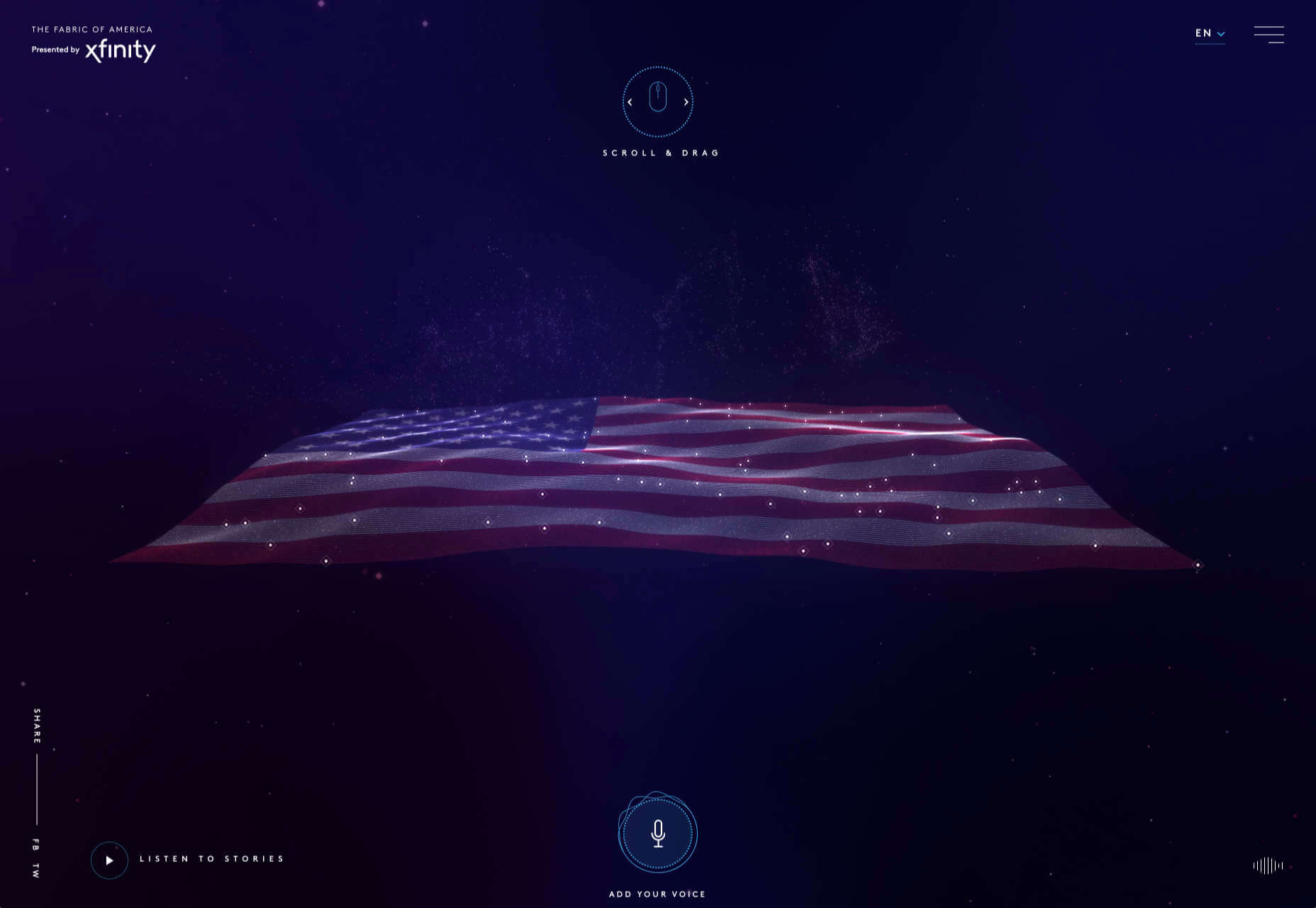
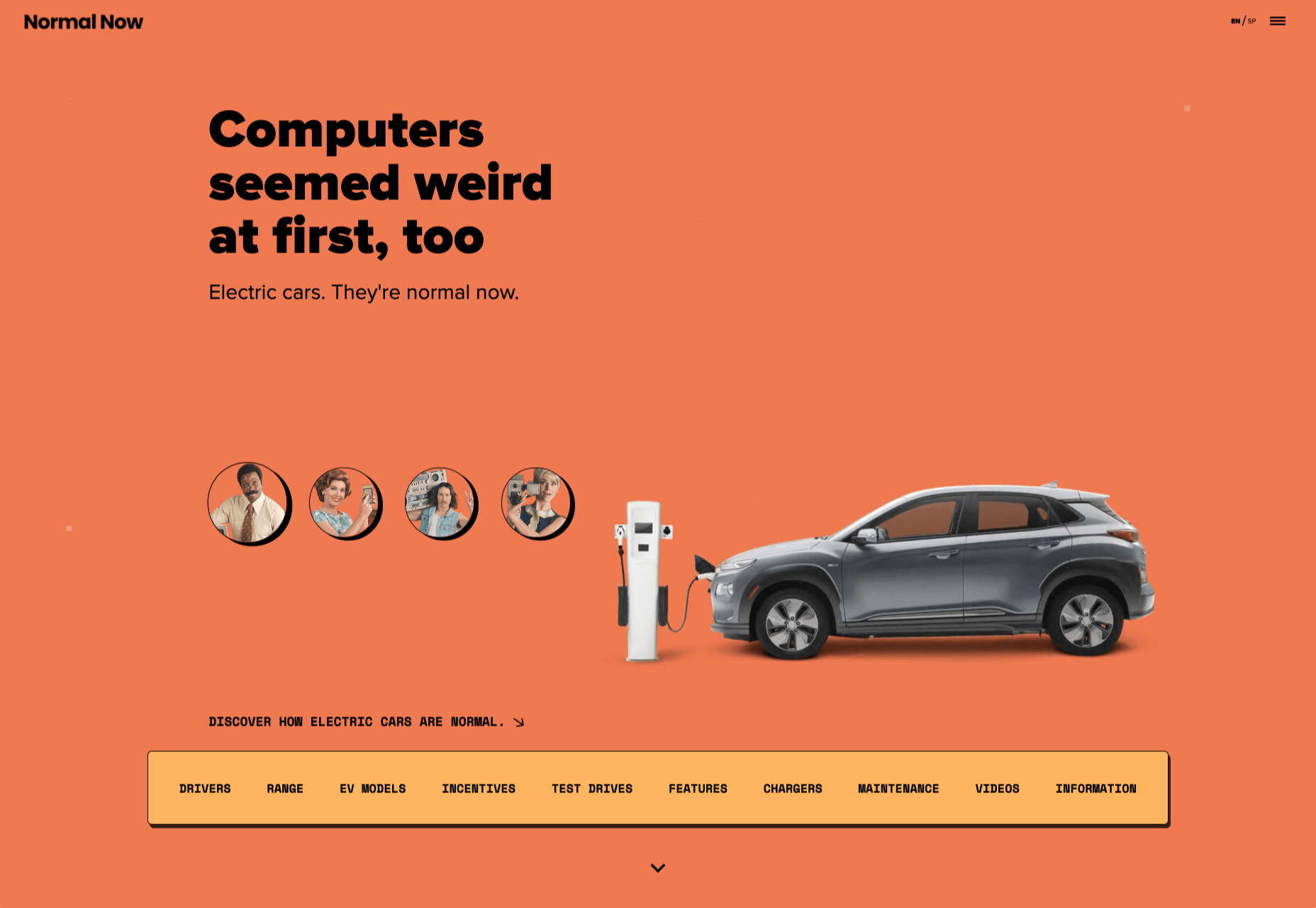
We have become so used to using web sites just to buy stuff that it is easy to forget that the web has more to offer. So this month we’ve included some because-it’s-interesting sites, some micro-sites and some just-for-the-sake-of-it projects.

Many of these are about selling or promoting products and services too, but in a more oblique way that is frequently more engaging than a straightforward sales site.

Micro sites can be a great way of including content that doesn’t fit in neatly with the rest of the main site, or is temporary, or to show a lighter, more fun side of a brand. And a well thought out micro site can act as a gateway to pull in even more visitors to its ‘parent’ site.

Your World Your Way

Your World Your Way is an interactive portal for the University of Auckland. An optional questionnaire customizes the experience, and clearly a lot of effort has gone into this in terms of the questions and possible answers, and the presentation. It is engaging and enjoyable to use, and the information provides links to the main University of Auckland website.

Blind Barber

This micro site is to celebrate 10 years of barber shop chain Blind Barber, which started as one shop with a bar in the back room, in New York’s East Village. An entirely black and white design provides a clean backdrop for color photos and videos, and some great scrolling animations give a pleasing flow to the content.

Brews & Grooves

Brews & Grooves pairs records with different beer. Although a ‘fun’ project, it is still a well designed piece of work with some vintage style typography and some pleasing rollover animation effects. It is an effective advert for those involved in creating it, as listed in on its ‘credits’ page.

Gucci Bloom

As part of a new campaign to promote it’s ‘Bloom’ perfumes, Gucci have created a Gucci Bloom game. The player has to pick up flowers and perfume bottles, but miss a flower and the vines get in your way.

808303Studio

808303Studio is a digital musical instrument that emulates a Roland TR-808 drum machine and TB-303 bass synthesizer, created in conjunction with the Design Museum (London). It’s fully programmable and there is even short video tutorial with A Guy Called Gerald on how to use it.

Aelfie

Aelfie is a home furnishings brand with a focus on bold patterns and bright color. Their site reflects this with its use of block color, irregular grid, drawings, and type that feels a little off-kilter. It creates a hand-made feel that embodies the brand aesthetic rather well.

Media Election 2020

As we approach one of the most significant, not to mention acrimonious, elections in US history, Media Election 2020 uses AI to analyze the volume of media attention each candidate receives, in real time.

Curbed

Magazine website Curbed has now become a part of New York magazine, and had a redesign in the process. It follows a discernible grid, but distorts it just enough to create an edge. The highlighter color frames, and underlines on rollover, add movement and ‘cool’.

WFN

The WFN (Women’s Funding Network) is an alliance of funds and foundations working to promote gender equity and social change internationally. The site is clean, with strong typography and a sophisticated color palette.

The Fabric of America

Internet, telephone and TV service provider Xfinity is behind the Fabric of America project. It is a collection of voice recordings, the idea being that each voice, and each person’s story, is a thread that makes up the flag that we see on the screen.

Minimal Ceramics

Minimal Ceramics is a concept site, showcasing the work of London based potter, Tom Crew. The design of the site reflects the simplicity of the showcased work, using great photography and simple typography.

Normal Now

Normal Now is part of an awareness campaign to highlight to consumers the positives of electric cars. Taking a fun approach to engage consumers in a serious subject, it uses a fake retro tech style.

Superfood Gin 

Superfood Gin is a gin made using superfood botanicals, that claims to be fruity and fresh rather than crisp and peppery. The soft color palette, along with the soft lines and curves in the background illustrations, reflect this well.

Maison Louis Marie

Maison Louis Marie is a natural fragrance company. While this site does nothing really groundbreaking, it does it well. Botanical drawings on a white background, along with clean typography, help create a refined, luxury feel.

Think Economia

Think Economia is a platform taking a fresh look at economics and the future of economic growth. It doesn’t sound like the most exciting subject, but it is presented here in a playful and intriguing way.

Chernobyl

From Uprock, a Russian design studio that also offers courses in web design, Chernobyl is a thought provoking exposition of the Chernobyl disaster. The design aesthetic is muted, allowing the images their deserved impact, and the brief sections of text to be absorbed.

Declamatuus

Declamatuus is a lingerie company selling gift sets. What stands out here is what you don’t see — live models in underwear. Instead the outline of the body is created with animated particles.

Odisea

Odisea Expedition is a documentary series following two friends, a surfer and a snowboarder, as they explore remote parts of the world. The photographs and video are everything here, and all other elements are kept minimal to avoid detracting from them.

Riffyn

Riffyn Nexus is a ‘Process Data System’ for storing and analyzing scientific data for laboratories. It is a very corporate site and yet it is put together in such a way that doesn’t feel dull.

Maison du Net

This site for digital design agency Maison du Net takes a risk mixing corporate with cutesy, but it works. Offset frames and underlines create interest without overdoing it, and the very bright green is used sparingly enough to liven things up without being overwhelming.

Source

p img {display:inline-block; margin-right:10px;}
.alignleft {float:left;}
p.showcase {clear:both;}
body#browserfriendly p, body#podcast p, div#emailbody p{margin:0;}

Top New CMS Plugins, October 2020

Original Source: https://www.webdesignerdepot.com/2020/10/top-new-cms-plugins-october-2020/

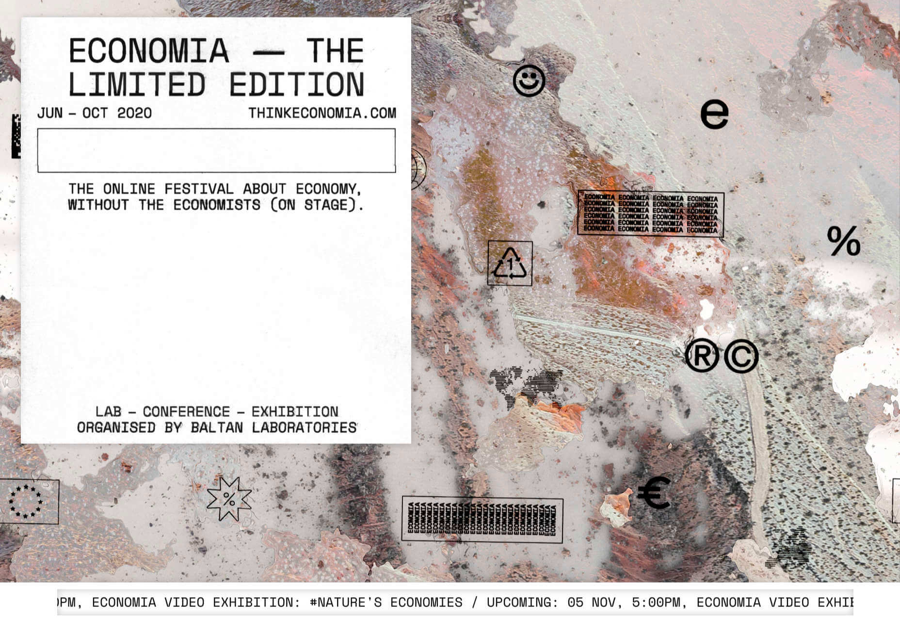
Plugins offer a ton of benefits to developers and website administrators; from flexibility, to saving time in development, the right plugin is priceless to a project.

In this article, we’ll cover a list of the best new plugins for October 2020. You’ll find useful plugins for WordPress, Craft, Shopify, and Joomla.

Let’s get started.

WordPress
Sticky Post Expire

Sticky Post Expire is a simple plugin for WordPress that allows you to add an expiration date to your sticky posts. When the expiration date you set on a post expires, the post will automatically no longer be sticky. All you need to do is install/enable the plugin and a meta checkbox will appear in your posts admin area. It’s in this checkbox you will set the post’s expiration date.

Product page shipping calculator for WooCommerce

The Product Page Shipping Calculator plugin allows your customers to calculate the cost of shipping before adding the product to their cart. The plugin also allows customers to see the available shipping methods for their area. If the product cannot be shipped to the customer’s location, the plugin will notify the customer. All calculations are done using Ajax, so you don’t have to worry about the plugin slowing down your site.

Payment Page

Payment Page makes it easy to collect payments on your WordPress website. The plugin allows you to connect to any payment gateway platform of choice. You can also receive one-time or recurring payments using Payment Page. The plugin comes with beautifully designed templates that you can customize to fit your brand and style. The form builder helps you increase your sales and conversions. You can collect payment in any currency. After payment, customers will also receive a confirmation message.

WP Roadmap

Wp Roadmap is a product feedback board for WordPress. The plugins allow you to display your company’s product roadmap on your WordPress website or blog. The plugin will display your new products, business developments, upcoming events, achievements, awards, and future projects on your site. WP Roadmap also gives you the option to collect and create feedback boards. The plugin comes with an intuitive interface and works with any WordPress theme.

LiveSession

LiveSession is a session replay plugin for WordPress. The plugin allows you to record everything happening on your site, including clicks, scrolls, and mouse movements. This plugin helps you understand how your visitors interact with your website. You can rewatch the videos as many times as you like. Instead of recording every single visitor on your site, LiveSession will record visitors with a high engagement score.

The plugin also comes with a feature called Rage Clicks. This feature helps you identify when visitors encounter Javascript errors. The plugin also has a beta feature called Clickmap. It helps you identify the specific elements on your site that visitors clicked and how many times. There is also a heatmap feature that identifies which pages on your site get the most interaction. The plugin is very useful in improving your user experience (UX) and conversion rates. It easily integrates with Google Analytics, Segment, Intercom, LiveChat, HelpScout, Olark, Wix, Shopify, and WooCommerce.

Auction Feed

Auction Feed makes it easy to display eBay items on your WordPress website. Visitors to your website will be able to search and buy products directly from your site. The plugin comes with a variety of styles to fit any WordPress theme. You can also add a product description above or below the product image. Customers won’t have to leave your website before making their purchases. The plugin is also free to use.

Floating Related Posts

Floating Related Posts is a WordPress plugin that allows you to display a banner with a list of related posts on your website. The banner can appear at the top or bottom of the web page. You can set the banner to pop up using a time filter or scroll trigger. The plugin is also compatible with Google Analytics. You can customize the banner background color, font size, button style, and text color. The plugin can be translated into any language.

Simple Restrict Content

The Simple Restrict Content plugin allows you to restrict the content that visitors can access on your WordPress site. You can choose who can access content on your website by setting up roles. The simple lightweight plugin restricts different content types, including, posts, web pages, and WooCommerce products. The plugin is available in Spanish and English.

Easy Video Publisher

Easy Video Publisher is a WordPress plugin that allows you to easily publish YouTube videos on your website. You can import YouTube videos from multiple channels. You can also schedule the YouTube videos to automatically upload to your website. Note that a YouTube API key is needed to import multiple videos at a time from a specific channel. The plugin allows you to use multiple API keys.

Preloader Awesome

Preloader Awesome is a preloader plugin for WordPress that allows you to create a page preloader interface while the rest of the webpage is still loading. Preloaders are interface elements that notify visitors that your website hasn’t crashed, just processing before serving content. Some of the features of the plugin include 14 page transition styles, progress bar, GIF support, 10+ default CSS loader, progress status counter, unlimited color, and counter font size options. The plugin is responsive and works on all modern browsers.

Menu Hover Effect

The Menu Hover Effect plugin allows you to add hover effects to the menu bar on your website. With this plugin, you don’t need to learn CSS. This plugin gives you 20 CSS menu hover options to choose from. It is a lightweight plugin and won’t affect your website speed.

Better Comments

The Better Comments plugin allows WordPress users to easily customize the comment section of their website. With the plugin, you can customize the look of your comment form fields, match the submit button with the colors of your site, and hide the comment’s date. The plugin also allows you to create a comment policy section. You can further customize the comment fields to highlight when they are selected and typed in. If you find rounded avatars common, the plugin also offers a hexagonal avatar option.

WP Pocket URLs

WP Pocket URLs is a handy WordPress Plugin that helps you manage your affiliate links. The plugin allows users to automatically shorten and track any affiliate link on their website. You can also manually shorten the links on your website. Each time a visitor clicks on a link you get access to information like click date/time, country, IP address, etc. You can also categorize your links and also create custom permalinks. There is also a dashboard widget that displays your top 10 links. On the “Reports” page, you can generate clicks reports. You can filter the reports by Month/Year, link category, country, and link title.

Craft CMS
Formie

Formie is a Craft CMS plugin that allows you to create user-friendly forms. The plugin comes with a drag and drop builder for creating forms. You can store user form submissions in your control panel in case you want to review them later. When a user submits a form, you will get an email notification. Formie also has an in-built keyword blocking feature to protect you from spam. The plugin has several integrationS: API for Elements, Address Providers, Captchas, CRM tools, Webhooks, and Email Marketing software. You can also create your custom integration. You can add over 25 fields to your forms using Formie.

Craftagram

Craftagram is a Craft CMS plugin for adding any Instagram feed to your website. Since the plugin uses the official Instagram API, you don’t have to worry about your website getting blacklisted. Craftagram also handles pagination for your Instagram feed. 

Shopify
We’re Open

We’re Open is a handy plugin for Shopify users. The plugin lets your customers know when you are open to receive new orders. Once your business hours are close, customers won’t be able to make new orders. A message will be displayed in your store that you are closed. The plugin ensures that you only receive orders when you are open. It works in any time zone and the API easily integrates with mobile apps.

Punch Metrics

Punch Metrics is a Shopify Plugin that helps you track your store’s visitors and also analyze their behavior. The plugin offers real-time data on your site’s visitors, the pages that see the most engagement, and which devices are the most popular. You can also record and replay visitors’ sessions so you can know exactly what they did on your site. Punch Metrics also has a heatmap tracking feature to understand which elements on your site get the most clicks.

Joomla
Simple Sliders

Simple Sliders is a content plugin for Joomla. The plugin allows users to easily create accordion sliders in their articles. You can add the sliders to your Joomla articles by adding this code:

{s​lider title=”Slider 1 Title” class=”blue”}
Slider 1 content.
{s​lider title=”Slider 2 Title” class=”red”}
Slider 2 content.
{/s​liders}
Jitsi Conferencing

Jitsi Conferencing is a video conferencing plugin for Joomla. The plugin will allow you to host meetings and easily connect with your clients. The module is simple and effective to use.


Featured image via Unsplash.

Source

p img {display:inline-block; margin-right:10px;}
.alignleft {float:left;}
p.showcase {clear:both;}
body#browserfriendly p, body#podcast p, div#emailbody p{margin:0;}

5 Biggest Challenges Web Design Agencies Face

Original Source: https://www.webdesignerdepot.com/2020/10/5-biggest-challenges-web-design-agencies-face/

With billions of internet users worldwide spending several hours online each day, the online presence of brands is now a necessary avenue for building, boosting, and maintaining positive value and attracting and interacting with customers. 

This has created increasing pressure for web design agencies when creating and managing websites. This pressure is multiplied by all the projects that web design agencies have to handle at one time. This is because different clients demand different things for their websites, whether it’s a signature feature or specialized functionality. 

Hence, it’s vital that the tools the agencies use to work are simple enough and suited to the tasks they have to accomplish in order to build and maintain these projects. Having the right tools can increase efficiency and effectiveness in managing websites.

Challenges in Modern Web Design

Building a website with all the essentials in mind is always easier said than done. Websites have to be both functional and easy on the eyes to invite traffic, disseminate information, or appeal a product or service to a target audience, and all while having an attractive and convenient interface.

The good news is that it’s perfectly possible to design a quality website and without spending a fortune to do so. Below are some of the challenges that web design agencies face when trying to deliver and reconcile efficient user experience and effective user interface in web design.

1. Appealing User Experience

Designing a good website means ensuring that the user experience is appealing to a general audience, but this is one of the most difficult parts of web design. Agencies must be careful not to turn off users with a confusing user experience. For instance, making important information difficult to find on web pages, using technical jargon that ordinary users wouldn’t understand, and focusing too much on the design rather than the overall experience are a few big mistakes that no designer should ever commit.

Instead, web design agencies should focus not only on making the design look good but also on making the experience smooth and fast for the regular site visitor. This includes improving design elements to make navigation easier as well as optimizing webpage load speeds.

2. Working With a Budget

It’s common for the client and the web design agency’s budgets to not line up at all times. Either the client will find the project quote too high, or the designer will find the client’s budget too low. The cost of a web design project can vary greatly, depending on what needs to be done. 

Although having to build a good website on a budget may be difficult, it’s important for both parties to come up with a set amount before the project even starts. The client should always specify what they want to achieve and how much they’re willing to pay to get it, and the agency should let the client know beforehand if this is possible.

3. Integrating Third-Party Functionality

Sometimes, clients may make requests for third-party functions that may not be easily integrated into the site. To prevent this, web design agencies should always consider integration when building a site. Most businesses and companies now have at least one social media account, so it doesn’t make sense for their site to remain disconnected.

When a website visitor shares an excerpt on a social media site like Facebook, Pinterest, or Twitter, other people who can see their posts may become interested in visiting the original post on the website. Properly integrating third-party applications and functions into a website can get it more online presence and popularity.

4. Suitability to Different Devices

There are many devices that people can use to access the web. From smartphones to desktop computers, from cars to game consoles, and even wristwatches and digital cameras, all of these can be web-enabled as long as there’s an available internet connection. 

Websites nowadays should always be compatible with any of the devices people might use to go to the website. They should look pleasing and load fast regardless of what device a visitor is using.

5. Security of Personal Information

Most websites require personal or financial information, whether for account verification, for website subscription, or something else. Websites should be designed with personal security in mind, which is even more important since hacking has been on the rise since the coronavirus hit.

One of the biggest threats that websites face today is phishing, or when an attacker will pretend to be a trusted contact and attempt to compel you to click a malicious link. Another is ransomware, or where cybercriminals hold customer data for ransom and attempt to extort online business owners. Yet one more is SQL injections, or where hackers will attempt to execute malicious SQL commands in your website’s database. 

The best practices in regards to web design to mitigate these risks include third-party plugins and themes, keeping all of your software up to date, setting your web applications so they run the fewest privileges possible, and utilizing SSL certificates and HTTPS protocols. 

Adopting Site-Building Platforms

Gone are the days where you had to be technologically gifted to design a website from scratch, usually through manual HTML codes. Back then, you had to know your way around the web if you wanted to set-up and manage a site of your own.

Now, there are a lot of good website builders that allow you to create websites in a faster period of time. Even web design agencies now make use of such builders in order to make the job easier and more convenient. Not to mention, it allows agencies to focus on the design alone.

Although these platforms offer predesigned templates based on the most common purposes of websites, they normally allow the user to white label the website into the branding specific to the business or agenda of the website owner. The text styles, colors, and sizes coordinated to the website’s theme, and colors can be designed specifically to match the business or organization’s image and identity. 

Simply put, creating websites through a web builder platform can provide web design agencies with easy-to-understand tools that their teams and members can all uniformly use to more effectively and more efficiently handle all their projects.

With services that allow mobile optimization, site management, and even drag-and-drop editing, web design agencies can now better manage their projects and finish with their tasks more quickly.

Not only that, by using white labelling, services can conserve their time and energy into focusing on creating the best website for their client. With all the website builders currently available on the market today, just picking the right one can give web design agencies the best tools to use when creating, designing, and maintaining websites. 


Featured image via Pexels.

Source

p img {display:inline-block; margin-right:10px;}
.alignleft {float:left;}
p.showcase {clear:both;}
body#browserfriendly p, body#podcast p, div#emailbody p{margin:0;}

Making Minimalism Functional in Web Design

Original Source: https://www.webdesignerdepot.com/2020/10/making-minimalism-functional-in-web-design/

Today, great design isn’t just about conveying the right amount of information in a certain number of pages. 

There’s more to creating the perfect website than experimenting with visuals and sound. Designers need to think carefully about how each element of their site impacts the overall user experience. 

After all, with billions of websites available to explore, it takes something truly immersive to convince your client’s audience that they should stay on their pages. The more convenient and attractive your websites are, the more likely it is that visitors will want to stick around. 

Minimalism, one of the more popular styles of web design from the last few years, can sometimes assist designers in making attractive and effective websites more functional.

The less clutter and confusion there is on a page, the easier it is to navigate. 

So, how do you embrace the benefits of functional minimalism?

Understanding Functional Minimalism

Many webs designers are convinced that minimalism is all about aesthetics. 

They see a website like Hugeinc.com and assume that the minimalist appearance is all about making the website as attractive as possible.

However, the underlying ideas of minimalism in web design go much deeper than this.  The history of minimalist design begins with Japanese culture. Japan has long focused on balancing simplicity and beauty with its architecture, interior design, and even graphic design. In the Western world, minimalism got its day in the sun in the web design environment, after customers endured years of cluttered and complicated web pages with difficult navigation, overwhelming information and clashing graphics. 

Designers began to experiment with the idea that less really could be more — particularly when it came to the digital landscape. 

The Functional Rules of Minimalist Web Design

For a while, minimalism was the most popular style for a website. During 2018, in particular, minimalist web design soared to the top of the designer demand list, as companies fell in love with a combination of white space, simple navigation and bold text. 

While now, there are other design trends stepping into the industry, designers can still benefit from exploring some of the essential rules of functional minimalism. After all, visual complexity has been proven to damage a person’s perception of a website. 

Additionally, a study conducted by the EyeQuant group found that a clean and simple design can lead to a lower bounce rate. Minimalism gives viewers less to contend with on a page, which can allow for a simpler and more straightforward experience. Additionally, a clean website can also drive additional benefits, including faster loading times, better responsivity between screen sizes and more.

Because you’re only using a few images and well-spaced text, you can even experiment with different strategies, like graphics and dynamic fonts. Look at the Manuel Rueda website, for instance, it’s a great example of how a minimalist design can be brimming with activity.

So, how can any designer use the principles of functional minimalism?

1. Focus on the Essentials

First, just like when designing a landing page, designers need to ensure that they’re concentrating only on the elements in the page that really need to be there.

This means removing anything on the website that doesn’t support the end-goals of the specific page that the viewer is using. Any pictures, background noise, buttons, or even navigation features that aren’t going to support the initial experience that the visitor needs, must go. 

Think about what’s going to distract your visitors from the things that are important and concentrate on giving everything a purpose. For instance, the Plus63.org website instantly introduces the visitors to the purpose of the website, then allows users to scroll down to get more information. The data is spread clearly through the home page, pulling the viewer into a story. 

2. Embrace the Positives of Negative Space

Negative space is one of the fundamental components of good minimalist web design. 

Every part of a good website doesn’t need to be filled with noise to make a difference. White, or negative space can help to give your viewer the room they need to fully understand the experience that they’re getting. 

From a functional perspective, it’s the difference between placing someone in an overflowing storage container and asking them to find what they need or placing them in a room where items are carefully spaced out, labelled, and waiting for discovery. 

The Hatchinc.co website uses negative space to ensure that information is easy to consume. You can find the different pages of the site easily, the social media buttons, and the newsletter subscription tool. Plus, you get a chance to see some of the work behind the site.

3. Make it Obvious

One of the biggest problems that consumers have encountered in recent years, is the concept of “choice overload”. 

Whether you’re in a store, or on a website, you’re never sure what to do first. Do you check out the blog posts on the site to learn more about the authority of the company? Do you visit the “About” page, to see where the brand come from? Do you head to their product pages?

As a designer, functional minimalism can help you to make it obvious what your audience should do next. As soon as you arrive on the AYR.com website, you’re not overwhelmed with choice. You can either head to your bag, “shop now”, or check the menu. 

Since the “Shop Now” CTA is the biggest and most compelling, the chances are that most visitors will click that first, increasing the company’s chance of conversions. 

4. Simplify the Navigation (But Don’t Hide It)

The AYR.com example above brings us to another concept of functional minimalism. 

While minimalism and simplicity aren’t always the same thing, they should go hand-in-hand. When you’re designing for functional minimalism, you should be concentrating on helping visitors to accomplish tasks as quickly and easily as possible, without distraction. 

That means that rather than overwhelming your audience with a huge selection of pages that they can visit at the top or side of the screen, it may be worth looking into simpler navigation options. A single menu icon that expands into a full list of items remains a popular design choice – particularly in the era of mobile web design. 

For instance, look at the simple menu on newvision-opticien.com.

With this basic approach, designers can ensure that visitors are more likely to click through to the pages that their clients want their customers to visit. They can still find what they need in the menu, but it’s not taking up space on the page, or distracting them. 

5. Set Great Expectations with the Top of the Screen

Functional minimalism can also help today’s designers to more quickly capture the attention of their visitors from the moment they click into a website. 

The content that’s visible at the top of the page for your visitors is what will encourage them to take the next step in their online experience. Make sure that you’re providing something that keeps your audience interested and gives them the information they need. 

That way, you’ll lower the risk of high bounce rates for your clients, while also taking advantage of minimalism’s ability to deliver quick access to information for your audience. 

At the top of the page, the Kerem.co website instantly introduces the visitor into what the website is all about, and what they should do next. 

You can even deliver more information in one chunk at the top of the page, without cluttering the environment, by using good UI animation. 

Consider implementing a slideshow of pictures that flip from one image to the next, or a font section that dynamically changes as your audience has chance to read each sentence. 

6. Use Functional Minimalism in the Right Spaces

Remember, functional minimalism isn’t just for home pages. 

Depending on what you want to accomplish for your client, you could also embed the components of minimalism into landing pages, portfolios, and squeeze pages too. 

After all, when there’s less clutter and confusion on a page to distract a potential audience, there’s a greater chance that your visitors will scroll to the bottom of the page and complete a conversion. For instance, look at how simple and attractive the Muzzleapp.com landing page is.

The page provides useful information and tells customers exactly what they need to do next. There’s no confusion, no complexity, and nothing to hold visitors back. 

Just be careful. While functional minimalism can be very useful, it won’t be right for every website. A lack of elements can be harmful to websites that rely heavily on content. That’s because low information density will force your user to scroll excessively for the content that they need. Using functional minimalism correctly requires a careful evaluation of where this technique will be the most suitable. 

Minimalism Can be Functional

A minimalist design isn’t just an aesthetic choice. The right aspects of minimalism can simplify interfaces on the web by eliminating unnecessary elements and reducing content that doesn’t support an end goal. 

The key is to ensure that you’re focusing on a combination of aesthetics and usability when creating the right design. An easy-to-navigate and beautiful website can be a powerful tool for any business.  

Source

p img {display:inline-block; margin-right:10px;}
.alignleft {float:left;}
p.showcase {clear:both;}
body#browserfriendly p, body#podcast p, div#emailbody p{margin:0;}

VC Swipe Branding and Web Design

Original Source: http://feedproxy.google.com/~r/abduzeedo/~3/zvILkBovb6g/vc-swipe-branding-and-web-design

VC Swipe Branding and Web Design

abduzeedo10.21.20

Marvin Schwaibold shared an awesome branding and UI/UX project for VC Swipe, a platform that matches and connects outstanding investors with future startups. On the platform, an AI analyses your situation and gives you the best matches based on your preferences. The focus lies on connecting early-stage startups with Angel Investors and Incubators on the quest of taking these firms to the next stage.

Image may contain: wall, indoor and screenshotImage may contain: screenshot and mapImage may contain: screenshotImage may contain: screenshot, abstract and templateImage may contain: screenshot and abstractImage may contain: screenshotImage may contain: screenshotImage may contain: print, screenshot and businesscardImage may contain: building, screenshot and drawingImage may contain: screenshot

Credits

Creative Direction Marvin Schwaibold 
Art Direction & 3D Lionel Taurus  
User Experience Design & Strategy Lukas Kmoth 
Development Jesper Landberg 
Awards & Recognition

FWA
Awwwards

Visite Site