Original Source: https://www.smashingmagazine.com/2018/08/best-practices-for-mobile-form-design/
Best Practices For Mobile Form Design
Best Practices For Mobile Form Design
Nick Babich
2018-08-28T16:00:09+02:00
2018-08-28T14:30:50+00:00
(This article is kindly sponsored by Adobe.) Forms are the linchpin of all mobile interactions; it stands between the person and what they’re looking for. Every day, we use forms for essential online activities. Recall the last time you bought a ticket, booked a hotel room or made a purchase online — most probably those interactions contained a step with filling out a form.
Forms are just a means to an end. Users should be able to complete them quickly and without confusion. In this article, you’ll learn practical techniques that will help you design an effective form.
What Makes For An Effective Form
The primary goal with every form is completion. Two factors have a major impact on completion rate:
Perception of complexity
The first thing users do when they see a new form is estimate how much time is required to complete it. Users do this by scanning the form. Perception plays a crucial role in the process of estimation. The more complex a form looks, the more likely users will abandon the process.
Interaction cost
Interaction cost is the sum of efforts — both cognitive and physical — that the users put into interacting with an interface in order to reach their goal. Interaction cost has a direct connection with form usability. The more effort users have to make to complete a form, the less usable the form is. A high interaction cost could be the result of data that is difficult to input, an inability to understand the meaning of some questions, or confusion about error messages.
The Components Of Forms
A typical form has the following five components:
Input fields
These include text fields, password fields, checkboxes, radio buttons, sliders and any other fields designed for user input.
Field labels
These tell users what the corresponding input fields mean.
Structure
This includes the order of fields, the form’s appearance on the page, and the logical connections between different fields.
Action buttons
The form will have at least one call to action (the button that triggers data submission).
Feedback
Feedback notifies the user about the result of an operation. Feedback can be positive (for example, indicating that the form was submitted successfully) or negative (saying something like, “The number you’ve provided is incorrect”).
This article covers many aspects related to structure, input fields, labels, action buttons and validation. Most points mentioned in this article have visual do and don’t examples; all such examples were created using Adobe XD.
Input Fields
When it comes to form design, the most important thing a designer can do is to minimize the need for typing. Reducing input effort is essential. Designers can achieve this goal by focusing on form field design.
Minimize The Total Number Of Fields
Every field you ask users to fill out requires some effort. The more effort is needed to fill out a form, the less likely users will complete the form. That’s why the foundational rule of form design is shorter is better — get rid of all inessential fields.
Baymard Institute analyzed checkout forms and found that a too long or too complicated checkout process is one of the top reasons for abandonment during checkout. The study found that the average checkout contains almost 15 form fields. Most online services could reduce the number of fields displayed by default by 20 to 60%.
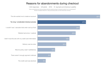
Top reasons for abandonment during checkout. (Image: Baymard Institute) (Large preview)
Many designers are familiar with the “less is more” rule; still, they ask additional questions in an attempt to gather more data about their users. It might be tempting to collect more data about your users during the initial signup, but resist that temptation. Think about it this way: With every additional field you add to your form, you increase the chance of losing a prospective user. Is the information you gain from a field worth losing new users? Remember that, as long as you’ve collected a user’s contact information, you can always follow up with a request for more data.
Clearly Distinguish All Optional Fields
Before optimizing optional fields, ask yourself whether you really need to include them in your form. Think about what information you really need, not what you want. Ideally, the number of optional fields in your form should be zero.
If after a brainstorming session, you still want to include a few optional questions in your form, make it clear for users that those fields are optional:
Mark optional fields instead of mandatory ones.
If you ask as little as possible, then the vast majority of fields in your form will be mandatory. Therefore, mark only those fields in the minority. For instance, if five out of six fields are mandatory, then it makes sense to mark only one field as optional.
Use the “Optional” label to denote optional fields.
Avoid using the asterisk (*) to mean “optional.” Not all users will associate the asterisk with optional information, and some users will be confused by the meaning (an asterisk is often used to denote mandatory fields).
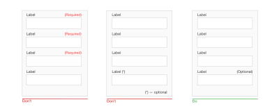
Clearly distinguish all optional fields. (Large preview)
Size Fields Accordingly
When possible, use field length as an affordance. The length of an input field should be in proportion to the amount of information expected in the field. The size of the field will act as a visual constraint — the user will know how much text is expected to be entered just by looking at the field. Generally, fields such as ones for area codes and house numbers should be shorter than ones for street addresses.
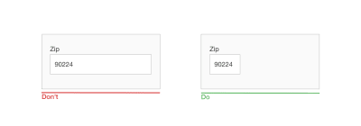
The size of a field is used as a visual constraint. (Large preview)
Offer Field Focus
Auto-focus the first input field in your form. Auto-focusing a field gives the user an indication and a starting point, so that they are able to quickly start filling out the form. By doing that, you reduce the interaction cost — saving the user one unnecessary tap.
Make the active input field prominent and focused. The field focus itself should be crystal clear — users should be able to understand at a glance where the focus is. It could be an accented border color or a fade-in of the box.
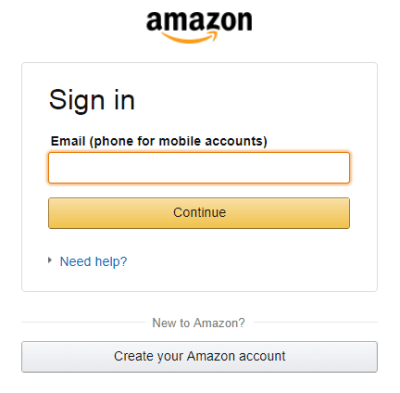
Amazon puts strong visual focus on the input field. (Large preview)
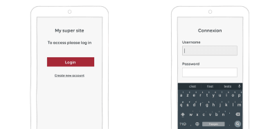
Don’t Ask Users To Repeat Their Email Address
The reason why an extra field for the email address is so popular among product developers is apparent: Every company wants to minimize the risk of hard bounces (non-deliverables caused by invalid email addresses). Unfortunately, following this approach doesn’t guarantee that you’ll get a valid address. Users often copy and paste their address from one field to another.
Avoid asking users to retype their email address. (Large preview)
Provide “Show Password” Option
Duplicating the password input field is another common mistake among product designers. Designers follow this approach because they believe it will prevent users from mistyping a password. In reality, a second field for a password not only increases interaction cost, but also doesn’t guarantee that users will proceed without mistakes. Because users don’t see what they’ve entered in the field, they can make the same mistake twice (in both fields) and will face a problem when they try to log in using a password. As Jakob Nielsen summarized:
Usability suffers when users type in passwords and the only feedback they get is a row of bullets. Typically, masking passwords doesn’t even increase security, but it does cost you business due to login failures.
Instead of duplicating the password field, provide an option that allows users to view the password they have chosen to create. Have an icon or checkbox that unmasks the password when clicked. A password preview can be an opportunity for users to check their data before sending.
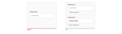
Not being able to see what you’re typing is a huge issue. Providing a ‘Show password’ option next to the password field will help to solve this problem. (Large preview)
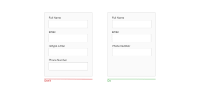
Don’t Slice Data Fields
Do not slice fields when asking for a full name, phone number or date of birth. Sliced fields force the user to make additional taps to move to the next field. For fields that require some formatting (such as phone numbers or a date of birth), it’s also better to have a single field paired with clear formatting rules as its placeholder.
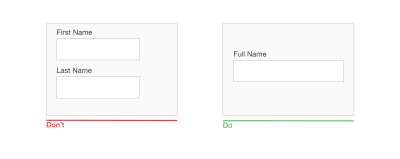
Avoid splitting input fields; don’t make people jump between fields. Instead of asking for a first name and last name in two separate fields, have a single ‘Full name’ field. (Large preview)
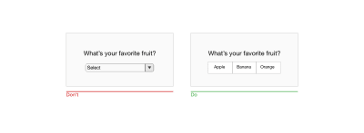
Avoid Dropdown Menus
Luke Wroblewski famously said that dropdowns should be the UI of last resort. Dropdowns are especially bad for mobile because collapsed elements make the process of data input harder on a small screen: Placing options in a dropdown requires two taps and hides the options.
If you’re using a dropdown for selection of options, consider replacing it with radio buttons. They will make all options glanceable and also reduce the interaction cost — users can tap on the item and select at once.
(Large preview)
Use Placeholders And Masked Input
Formatting uncertainty is one of the most significant problems of form design. This problem has a direct connection with form abandonment — when users are uncertain of the format in which they should provide data, they can quickly abandon the form. There are a few things you can do to make the format clear.
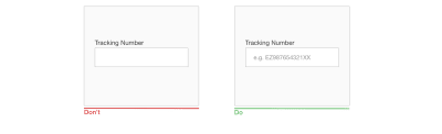
Placeholder Text
The text in an input field can tell users what content is expected. Placeholder text is not required for simple fields such as “Full name”, but it can be extremely valuable for fields that require data in a specific format. For example, if you design search functionality for tracking a parcel, it would be good to provide a sample tracking number as a placeholder for the tracking-number field.
(Large preview)
It’s vital that your form should have a clear visual distinction between the placeholder text and the actual value entered by the user. In other words, placeholder text shouldn’t look like a preset value. Without clear visual distinction, users might think that the fields with placeholders already have values.
Masked Input
Field masking is a technique that helps users format inputted text. Many designers confuse field masking with placeholder text — they are not the same thing. Unlike placeholders, which are basically static text, masks automatically format the data provided by the user. In the example below, the parentheses, spaces and dashes appear on the screen automatically as a phone number is entered.
Masked input also makes it easy for users to validate information. When a phone number is displayed in chunks, it makes it easier to find and correct a typo.
 Masked input for a phone number. (Image: Josh Morony)
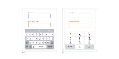
Provide Matching Keyboard
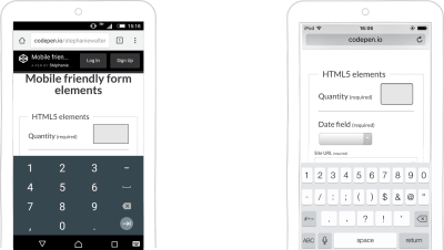
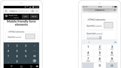
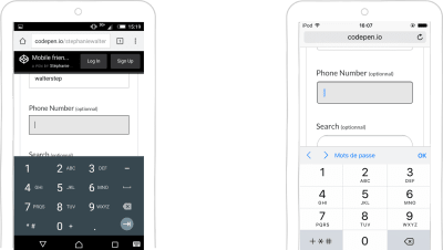
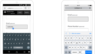
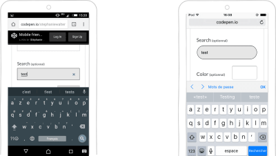
Mobile users appreciate apps and websites that provide an appropriate keyboard for the field. This feature prevents them from doing additional actions. For example, when users need to enter a credit card number, your app should only display the dialpad. It’s essential to implement keyboard matching consistently throughout the app (all forms in your app should have this feature).
Set HTML input types to show the correct keypad. Seven input types are relevant to form design:
input type=”text” displays the mobile device’s normal keyboard.
input type=”email” displays the normal keyboard and ‘@’ and ‘.com’.
input type=”tel” displays the numeric 0 to 9 keypad.
input type=”number” displays a keyboard with numbers and symbols.
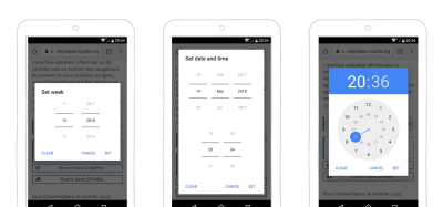
input type=”date” displays the mobile device’s date selector.
input type=”datetime” displays the mobile device’s date and time selector.
input type=”month” displays the mobile device’s month and year selector.
When users tap into a field with credit card number, they should see a numerical dialpad — all numbers, no letters. (Large preview)
Use A Slider When Asking For A Specific Range
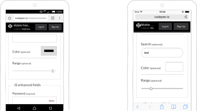
Many forms ask users to provide a range of values (for example, a price range, distance range, etc.). Instead of using two separate fields, “from” and “to”, for that purpose, use a slider to allow users to specify the range with a thumb interaction.
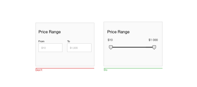
Sliders are good for touch interfaces because they allow users to specify a range without typing. (Large preview)
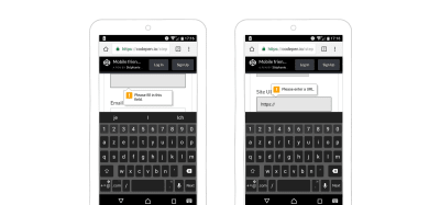
Clearly Explain Why You’re Asking For Sensitive Information
People are increasingly concerned about privacy and information security. When users see a request for information they consider as private, they might think, “Hm, why do they need this?” If your form asks users for sensitive information, make sure to explain why you need it. You can do that by adding support text below relevant fields. As a rule of thumb, the explanation text shouldn’t exceed 100 characters.
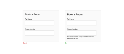
A request for a phone number in a booking form might confuse users. Explain why you are asking for it. (Large preview)
Be Careful With Static Defaults
Unlike smart defaults, which are calculated by the system based on the information the system has about users, static defaults are preset values in forms that are the same for all users. Avoid static defaults unless you believe a significant portion of your users (say, 95%) would select those values — particularly for required fields. Why? Because you’re likely to introduce errors — people scan forms quickly, and they won’t spend extra time parsing all of the questions; instead, they’ll simply skip the field, assuming it already has a value.
Protect User Data
Jef Raskin once said, “The system should treat all user input as sacred.” This is absolutely true for forms. It’s great when you start filling in a web form and then accidentally refresh the page but the data remains in the fields. Tools such as Garlic.js help you to persist a form’s values locally until the form is submitted. This way, users won’t lose any precious data if they accidentally close the tab or browser.
Automate Actions
If you want to make the process of data input as smooth as possible, it’s not enough to minimize the number of input fields — you should also pay attention to the user effort required for the data input. Typing has a high interaction cost — it’s error-prone and time-consuming, even with a physical keyboard. But when it comes to mobile screens, it becomes even more critical. More typing increases the user’s chance of making errors. Strive to prevent unnecessary typing, because it will improve user satisfaction and decrease error rates.
Here are a few things you can do to achieve this goal:
Autocomplete
Most users experience autocompletion when typing a question in Google’s search box. Google provides users with a list of suggestions related to what the user has typed in the field. The same mechanism can be applied to form design. For example, a form could autocomplete an email address.
 This form suggests the email host and saves users from typing a complete address. (Image: GitHub)
Autocapitalize
Autocapitalizing makes the first letter a capital automatically. This feature is excellent for fields like names and street addresses, but avoid it for password fields.
Autocorrect
Autocorrection modifies words that appear to be misspelled. Turn this feature off for unique fields, such as names, addresses, etc.
Auto-filling of personal details
Typing an address is often the most cumbersome part of any online signup form. Make this task easier by using the browser function to fill the field based on previously entered values. According to Google’s research, auto-filling helps people fill out forms 30% faster.
 Address prefill. Image: Google
Use The Mobile Device’s Native Features To Simplify Data Input
Modern mobile devices are sophisticated devices that have a ton of amazing capabilities. Designers can use a device’s native features (such as camera or geolocation) to streamline the task of inputting data.
Below are just a few tips on how to make use of sensors and device hardware.
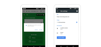
Location Services
It’s possible to preselect the user’s country based on their geolocation data. But sometimes prefilling a full address can be problematic due to accuracy issues. Google’s Places API can help solve this problem. It uses both geolocation and address prefilling to provide accurate suggestions based on the user’s exact location.
 Address lookup using Google Places API. (Image: Chromatic HQ) (Large preview)
Using location services, it’s also possible to provide smart defaults. For example, for a “Find a flight” form, it’s possible to prefill the “From” field with the nearest airport to the user based on the user’s geolocation.
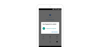
Biometric Authorization
The biggest problem of using a text password today is that most people forget passwords. 82% of people can’t remember their passwords, and 5 to 10% of sessions require users to reset a password. Password recovery is a big deal in e-commerce. 75% of users wouldn’t complete a purchase if they had to attempt to recover their password while checking out.
The future of passwords is no passwords. Even today, mobile developers can take advantage of biometric technologies. Users shouldn’t need to type a password; they should be able to use biometric readers for authentication — signing in using a fingerprint or face scanning.
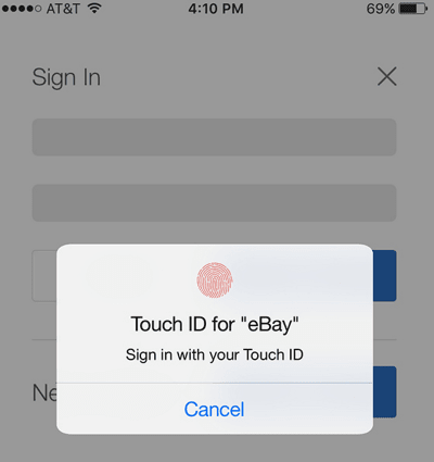
eBay took advantage of the biometrics functionality on smartphones. Users can use their thumbprint to login into their eBay account. (Large preview)
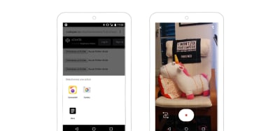
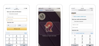
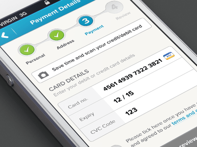
Camera
If your form asks users to provide credit card details or information from their driver’s license, it’s possible to simplify the process of data input by using the camera as a scanner. Provide an option to take a photo of the card and fill out all details automatically.
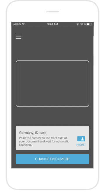 Let users scan their identity card, instead of having to fill out their credit card information manually. (Image: blinkid)
But remember that no matter how good your app fills out the fields, it’s essential to leave them available for editing. Users should be able to modify the fields whenever they want.
Voice
Voice-controlled devices, such as Apple HomePod, Google Home and Amazon Echo, are actively encroaching on the market. The number of people who prefer to use voice for common operations has grown significantly. According to ComScore, 50% of all searches will be voice searches by 2020.
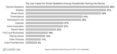
How people in the US use smart speakers (according to comScore) (Large preview)
As users get more comfortable and confident using voice commands, they will become an expected feature of mobile interactions. Voice input provides a lot of advantages for mobile users — it’s especially valuable in situations when users can’t focus on a screen, for example, while driving a car.
When designing a form, you can provide voice input as an alternative method of data input.
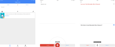
Google Translate provides an option to enter the text for translation using voice. (Large preview)
Field Labels
Write Clear And Concise Labels
The label is the text that tells users what data is expected from them in a particular input field. Writing clear labels is one of the best ways to make a form more accessible. Labels should help the user understand what information is required at a glance.
Avoid using complete sentences to explain. A label is not help text. Write succinct and crisp labels (a word or two), so that users can quickly scan your form.
Place The Label And Input Close Together
Put each label close to the input field, because the eye will visually know they’re tied together.
A label and its field should be visually grouped, so that users can understand which label belongs to which field. (Large preview)
Don’t Use Disappearing Placeholder Text As Labels
While inline labels look good and save valuable screen estate, these benefits are far outweighed by the significant usability drawbacks, the most critical of which is the loss of context. When users start entering text in a field, the placeholder text disappears and forces people to recall this information. While it might not be a problem for simple two-field forms, it could be a big deal for forms that have a lot of fields (say, 7 to 10). It would be tough for users to recall all field labels after inputting data. Not surprisingly, user testing continually shows that placeholders in form fields often hurt usability more than help.
Don’t use placeholder text that disappears when the user interacts with the field. (Large preview)
There’s a simple solution to the problem of disappearing placeholders: the floating (or adaptive) label. After the user taps on the field with the label placeholder, the label doesn’t disappear, it moves up to the top of the field and makes room for the user to enter their data.
 Floating labels assure the user that they’ve filled out the fields correctly. (Image: Matt D. Smith)
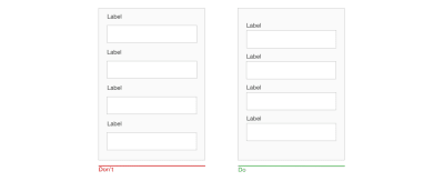
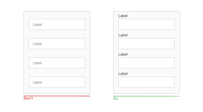
Top-Align Labels
Putting field labels above the fields in a form improves the way users scan the form. Using eye-tracking technology for this, Google showed that users need fewer fixations, less fixation time and fewer saccades before submitting a form.
Another important advantage of top-aligned labels is that they provide more space for labels. Long labels and localized versions will fit more easily in the layout. The latter is especially suitable for small mobile screens. You can have form fields extend the full width of the screen, making them large enough to display the user’s entire input.

(Large preview)
Sentence Case Vs. Title Case
There are two general ways to capitalize words:
Title case: Capitalize every word. “This Is Title Case.”
Sentence case: Capitalize the first word. “This is sentence case.”
Using sentence case for labels has one advantage over title case: It is slightly easier (and, thus, faster) to read. While the difference for short labels is negligible (there’s not much difference between “Full Name” and “Full name”), for longer labels, sentence case is better. Now You Know How Difficult It Is to Read Long Text in Title Case.
Avoid Using Caps For Labels
All-caps text — meaning text with all of the letters capitalized — is OK in contexts that don’t involve substantive reading (such as acronyms and logos), but avoid all caps otherwise. As mentioned by Miles Tinker in his work Legibility of Print, all-capital print dramatically slows the speed of scanning and reading compared to lowercase type.

All-capitalized letters are hard to scan and read. (Large preview)
Layout
You know by now that users scan web pages, rather than read them. The same goes for filling out forms. That’s why designers should design a form that is easy to scan. Allowing for efficient, effective scanning is crucial to making the process of the filling out a form as quick as possible.
Use A Single-Column Layout
A study by CXL Institute found that single-column forms are faster to complete than multi-column forms. In that study, test participants were able to complete a single-column form an average of 15.4 seconds faster than a multi-column form.
Multiple columns disrupt a user’s vertical momentum; with multiple columns, the eyes start zigzagging. This dramatically increases the number of eye fixations and, as a result, the completion time. Moreover, multiple-column forms might raise unnecessary questions in the user, like “Where should I begin?” and “Are questions in the right column equal in importance to questions in the left one?”
In a one-column design, the eyes move in a natural direction, from top to bottom, one line at a time. This helps to set a clear path for the user. One column is excellent for mobile because the screens are longer vertically, and vertical scrolling is a natural motion for mobile users.
There are some exceptions to this rule. It’s possible to place short and logically related fields on the same row (such as for the city and area code).

If a form has horizontally adjacent fields, the user has to scan the form following a Z pattern. When the eyes start zigzagging, it slows the speed of comprehension and increases completion time. (Large preview)

(Large preview)
Create A Flow With Your Questions
The way you ask questions also matters. Questions should be asked logically from the user’s perspective, not according to the application or database’s logic, because it will help to create a sense of conversation with the user. For example, if you design a checkout form and asks for details such as full name, phone number and credit card, the first question should be for the full name. Changing the order (for example, starting with a phone number instead of a name) leads to discomfort. In real-world conversations, it would be unusual to ask for someone’s phone number before asking their name.
Defer In-Depth Questions To The End
When it comes to designing a flow for questions you want to ask, think about prioritization. Follow the rule “easy before difficult” and place in-depth or personal questions last. This eases users into the process; they will be more likely to answer complex and more intrusive questions once they’ve established a rapport. This has a scientific basis: Robert Cialdini’s principle of consistency stipulates that when someone takes a small action or step towards something, they feel more compelled to finish.
Group Related Fields Together
One of the principles of Gestalt psychology, the principle of proximity, states that related elements should be near each other. This principle can be applied to the order of questions in a form. The more related questions are, the closer they should be to each other.
Designers can group related fields into sections. If your form has more than six questions, group related questions into logical sections. Don’t forget to provide a good amount of white space between sections to distinguish them visually.

Generally, if your form has more than six questions, it’s better to group related questions into logical sections. Put things together that make sense together. (Large preview)
Make A Long Form Look Simpler
How do you design a form that asks users a lot of questions? Of course, you could put all of the questions on one screen. But this hinder your completion rate. If users don’t have enough motivation to complete a form, the form’s complexity could scare them away. The first impression plays a vital role. Generally, the longer or more complicated a form seems, the less likely users will be to start filling in the blanks.
Minimize the number of fields visible at one time. This creates the perception that the form is shorter than it really is.
There are two techniques to do this.
Progressive Disclosure
Progressive disclosure is all about giving users the right thing at the right time. The goal is to find the right stuff to put on the small screen at the right time:
Initially, show users only a few of the most important options.
Reveal parts of your form as the user interacts with it.
 Using progressive disclosure to reduce cognitive load and keep the user focused on a task. (Image: Ramotion)
Chunking
Chunking entails breaking a long form into steps. It’s possible to increase the completion rate by splitting a form into a few steps. Chunking can also help users process, understand and remember information. When designing multi-step forms, always inform users of their progress with a completeness meter.
Progress tracker for e-commerce form. (Image: Murat Mutlu) (Large preview)
Designers can use either a progress tracker (as shown in the example above) or a “Step # out of #” indicator both to tell how many steps there are total and to show how far along the user is at the moment. The latter approach could be great for mobile forms because step indication doesn’t take up much space.
Action Buttons
A button is an interactive element that direct users to take an action.
Make Action Buttons Descriptive
A button’s label should explain what the button does; users should be able to understand what happens after a tap just by looking at the button. Avoid generic labels such as “Submit” and “Send”, using instead labels that describe the action.
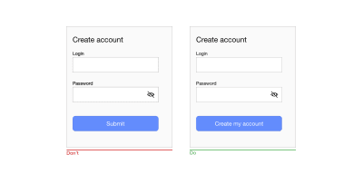
Label should help users finish the sentence, ‘I want to…’ For example, if it’s a form to create an account, the call to action could be ‘Create an account’. (Large preview)
Don’t Use Clear Or Reset Buttons
Clear or reset buttons allow users to erase their data in a form. These buttons almost never help users and often hurt them. The risk of deleting all of the information a user has entered outweighs the small benefit of having to start again. If a user fills in a form and accidentally hits the wrong button, there’s a good chance they won’t start over.
Use Different Styles For Primary And Secondary Buttons
Avoid secondary actions if possible. But if your form has two calls to action (for example, an e-commerce form that has “Apply discount” and “Submit order”) buttons, ensure a clear visual distinction between the primary and secondary actions. Visually prioritize the primary action by adding more visual weight to the button. This will prevent users from tapping on the wrong button.

Ensure a clear visual distinction between primary and secondary buttons. (Large preview)
Design Finger-Friendly Touch Targets
Tiny touch targets create a horrible user experience because they make it challenging for users to interact with interactive objects. It’s vital to design finger-friendly touch targets: bigger input fields and buttons.
The image below shows that the width of the average adult finger is about 11 mm.

People often blame themselves for having “fat fingers”. But even baby fingers are wider than most touch targets. (Image: Microsoft) (Large preview)
According to material design guidelines, touch targets should be at least 48 × 48 DP. A touch target of this size results in a physical size of about 9 mm, regardless of screen size. It might be appropriate to use larger touch targets to accommodate a wider spectrum of users.
Not only is target size important, but sufficient space between touch targets matters, too. The main reason to maintain a safe distance between touch targets is to prevent users from touching the wrong button and invoking the wrong action. The distance between buttons becomes extremely important when binary choices such as “Agree” and “Disagree” are located right next to each other. Material design guidelines recommend separating touch targets with 8 DP of space or more, which will create balanced information density and usability.

(Large preview)
Disable Buttons After Tap
Forms actions commonly require some time to be processed. For example, data calculation might be required after a submission. It’s essential not only to provide feedback when an action is in progress, but also to disable the submit button to prevent users from accidentally tapping the button again. This is especially important for e-commerce websites and apps. By disabling the button, you not only prevent duplicate submissions, which can happen by accident, but you also provide a valuable acknowledgment to users (users will know that the system has received their submission).
 This form disables the button after submission. (Image: Michaël Villar)
Assistance And Support
Provide Success State
Upon successful completion of a form, it’s critical to notify users about that. It’s possible to provide this information in the context of an existing form (for example, showing a green checkmark above the refreshed form) or to direct users to a new page that communicates that their submission has been successful.
 Example of success state. (Image: João Oliveira Simões)
Errors And Validation
Users will make mistakes. It’s inevitable. It’s essential to design a user interface that supports users in those moments of failures.
While the topic of errors and validation deserves its own article, it’s still worth mentioning a few things that should be done to improve the user experience of mobile forms.
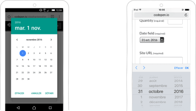
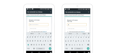
Use Input Constraints for Each Field
Prevention is better than a cure. If you’re a seasoned designer, you should be familiar with the most common cases that can lead to an error state (error-prone conditions). For example, it’s usually hard to correctly fill out a form on the first attempt, or to properly sync data when the mobile device has a poor network connection. Take these cases into account to minimize the possibility of errors. In other words, it’s better to prevent users from making errors in the first place by utilizing constraints and offering suggestions.
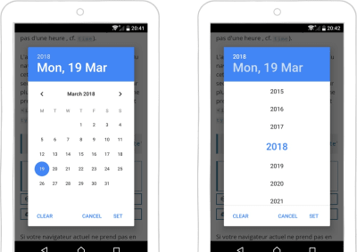
For instance, if you design a form that allows people to search for a hotel reservation, you should prevent users from selecting check-in dates that are in the past. As shown in the Booking.com example below, you can simply use a date selector that allows users only to choose today’s date or a date in the future. Such a selector would force users to pick a date range that fits.

You can significantly decrease the number of mistakes or incorrectly inputted data by putting constraints on what can be inputted in the field. The date picker in Booking.com’s app displays a full monthly calendar but makes past dates unavailable for selection. (Large preview)
Don’t Make Data Validation Rules Too Strict
While there might be cases where it’s essential to use strict validation rules, in most cases, strict validation is a sign of lazy programming. Showing errors on the screen when the user provides data in a slightly different format than expected creates unnecessary friction. And this would have a negative impact on conversions.
It’s very common for a few variations of an answer to a question to be possible; for example, when a form asks users to provide information about their state, and a user responds by typing their state’s abbreviation instead of the full name (for example, CA instead of California). The form should accept both formats, and it’s the developer job to convert the data into a consistent format.
Clear Error Message
When you write error messages, focus on minimizing the frustration users feel when they face a problem in interacting with a form. Here are a few rules on writing effective error messages:
Never blame the user.
The way you deliver an error message can have a tremendous impact on how users perceive it. An error message like, “You’ve entered a wrong number” puts all of the blame on the user; as a result, the user might get frustrated and abandon the app. Write copy that sounds neutral or positive. A neutral message sounds like, “That number is incorrect.”
Avoid vague or general error messages.
Messages like “Something went wrong. Please, try again later” don’t say much to users. Users will wonder what exactly went wrong. Always try to explain the root cause of a problem. Make sure users know how to fix errors.
Make error messages human-readable.
Error messages like “User input error: 0x100999” are cryptic and scary. Write like a human, not like a robot. Use human language, and explain what exactly the user or system did wrong, and what exactly the user should do to fix the problem.
Display Errors Inline
When it comes to displaying error messages, designers opt for one of two locations: at the top of the form or inline. The first option can make for a bad experience. Javier Bargas-Avila and Glenn Oberholzer conducted research on online form validation and discovered that displaying all error messages at the top of the form puts a high cognitive load on user memory. Users need to spend extra time matching error messages with the fields that require attention.
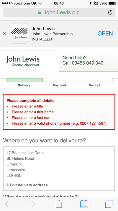
Avoid displaying errors at the top of the form. (Image: John Lewis) (Large preview)
It’s much better to position error messages inline. First, this placement corresponds with the user’s natural top-to-bottom reading flow. Secondly, the errors will appear in the context of the user’s input.
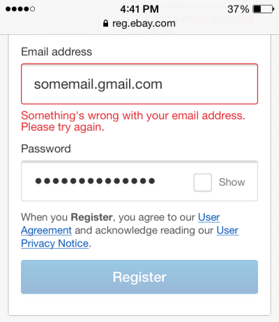
eBay uses inline validation. (Large preview)
Use Dynamic Validation
The time at which you choose to display an error message is vital. Seeing an error message only after pressing the submit button might frustrate users. Don’t wait until users finish the form; provide feedback as data is being entered.
Use inline validation with real-time feedback. This validation instantly tells people whether the information they’ve typed is compatible with the form’s requirements. In 2009, Luke Wroblewski tested inline validation against post-submission validation and found the following results for the inline version:
22% increase in success rate,
22% decrease in errors made,
31% increase in satisfaction rating,
42% decrease in completion times,
47% decrease in the number of eye fixations.
But inline validation should be implemented carefully:
Avoid showing inline validation on focus.
In this case, as soon as the user taps a field, they see an error message. The error appears even when the field is completely empty. When an error message is shown on focus, it might look like the form is yelling at the user before they’ve even started filling it out.
Don’t validate after each character typed.
This approach not only increases the number of unnecessary validation attempts, but it also frustrates users (because users will likely see error messages before they have completed the field). Ideally, inline validation messages should appear around 500 to 1000 milliseconds after the user has stopped typing or after they’ve moved to the next field. This rule has a few exceptions: It’s helpful to validate inline as the user is typing when creating a password (to check whether the password meets complexity requirements), when creating a user name (to check whether a name is available) and when typing a message with a character limit.
 Reward early, punish late is a solid validation approach. (Image: Mihael Konjević)
Accessibility
Users of all abilities should be able to access and enjoy digital products. Designers should strive to incorporate accessibility needs as much as they can when building a product. Here are a few things you can do to make your forms more accessible.
Ensure The Form Has Proper Contrast
Your users will likely interact with your form outdoors. Ensure that it is easy to use both in sun glare and in low-light environments. Check the contrast ratio of fields and labels in your form. The W3C recommends the following contrast ratios for body text:
Small text should have a contrast ratio of at least 4.5:1 against its background.
Large text (at 14-point bold, 18-point regular and up) should have a contrast ratio of at least 3:1 against its background.
Measuring color contrast can seem overwhelming. Fortunately, some tools make the process simple. One of them is Web AIM Color Contrast Checker, which helps designers to measure contrast levels.
Do Not Rely On Color Alone To Communicate Status
Color blindness (or color vision deficiency) affects approximately 1 in 12 men (8%) and 1 in 200 women in the world. While there are many types of color blindness, the most common two are protanomaly, or reduced sensitivity to red light, and deuteranomaly, or reduced sensitivity to green light. When displaying validation errors or success messages, don’t rely on color alone to communicate the status (i.e. by making input fields green or red). As the W3C guidelines state, color shouldn’t be used as the only visual means of conveying information, indicating an action, prompting a response or distinguishing a visual element. Designers should use color to highlight or complement what is already visible. Support colorblind people by providing additional visual cues that help them understand the user interface.
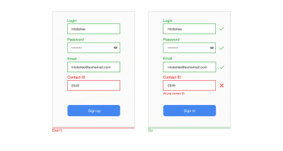
Use icons and supportive text to show which fields are invalid. This will help colorblind people fix the problems. (Large preview)
Allow Users To Control Font Size
Allow users to increase font size to improve readability. Mobile devices and browsers include features to enable users to adjust the font size system-wide. Also, make sure that your form has allotted enough space for large font sizes.
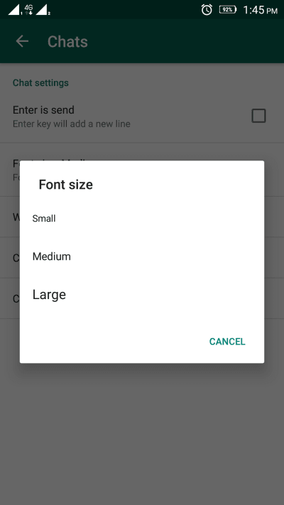
WhatsApp provides an option to change the font size in the app’s settings. (Large preview)
Test Your Design Decisions
All points mentioned above can be considered as industry best practices. But just because something is called a “best practice” doesn’t mean it is always the optimal solution for your form. Apps and websites largely depend on the context in which they are used. Thus, it’s always essential to test your design decisions; make sure that the process of filling out a form is smooth, that the flow is not disrupted and that users can solve any problems they face along the way. Conduct usability testing sessions on a regular basis, collect all valuable data about user interactions, and learn from it.
Conclusion
Users can be hesitant to fill out forms. So, our goal as designers is to make the process of filling out a form as easy as possible. When designing a form, strive to create fast and frictionless interactions. Sometimes a minor change — such as properly writing an error message — can significantly increase the form’s usability.
his article is part of the UX design series sponsored by Adobe. Adobe XD tool is made for a fast and fluid UX design process, as it lets you go from idea to prototype faster. Design, prototype and share — all in one app. You can check out more inspiring projects created with Adobe XD on Behance, and also sign up for the Adobe experience design newsletter to stay updated and informed on the latest trends and insights for UX/UI design.

(al, yk, il)


 No, it’s not a clickbait title and yes, starting with $100 can get you an actual running store.