Expanding Grid Menu

Original Source: http://feedproxy.google.com/~r/tympanus/~3/jN2zzrzblic/

Today we’d like to share a little menu animation with you. The idea is inspired by an effect that can be seen in this video, right at the beginning: a couple of differently sized boxes slide out and fill the screen. We thought this might be a nice idea applied to a menu using CSS Grid.

GridMenu_featured

The demo is kindly sponsored by monday.com: Knowledge Sharing System perfect for your team. If you would like to sponsor one of our demos, find out more here.

We use anime.js for the animations and imagesLoaded for preloading the images.

Attention: Modern CSS properties at work, please view in an updated browser!

We’ve created two different styles; have a look at the screenshots and check out the demos.

To open the menu, click on the + info in the bottom left corner.

GridMenu_01

GridMenu_02

We hope you enjoy this little menu and find it useful!

References and Credits

Images by Unsplash.com
anime.js by Julian Garnier
imagesLoaded by Dave DeSandro

Expanding Grid Menu was written by Mary Lou and published on Codrops.

Collective #402

Original Source: http://feedproxy.google.com/~r/tympanus/~3/D-yWNWKQWMY/

C402_WOTW

Inspirational Website of the Week: The Mads

Smooth animations with playful interactions made us pick “The Mads” this week.

Get inspired

C402_sponsor

Our Sponsor
Mobile Authentication Simplified

With 5 minutes and a few bits of config, you can build an app connected to OpenID, Active Directory, OAuth2 or SAML.

Learn more

C402_template

Tabler

A well designed dashboard template with a responsive and high quality UI.

Check it out

C402_JS14

JavaScript in 14 minutes

A fantastic little guide that will get you started with the most important JavaScript concepts in an interactive way.

Check it out

C402_storyboarder

Storyboarder

A great tool to create story visualizations in a quick and easy way.

Check it out

C402_cssplanets

Solar System Explorer in CSS

A fantastic demo by Jamie Coulter where you can explore the planets and moons of our solar system in pure CSS.

Check it out

C402_spatial

Spatial Hash Canvas Particles

An experiment by Jack Rugile where he explores a basic spatial hash to reduce the amount of collision calculations.

Check it out

C402_plot

Plot Parade

A d3.js powered artsy chart generator by Krisztina Szűcs.

Check it out

C402_egg

Eggradients

Ready to use, trendy background gradients in the shape of eggs and with witty names 🙂

Check it out

C402_test

Unit Testing in JavaScript

A tutorial by Tania Rascia where you’ll learn how to perform unit tests on JavaScript with Mocha by developing a calculator app in Node.js.

Read it

C402_lagradar

LagRadar

A tool for tracing when your app drops below 60fps. By Ben Birch.

Check it out

C402_vfonts

Variable Fonts

A great tool for discovering and trying variable fonts.

Check it out

C402_contents

How display: contents; Works

An article by Ire Aderinokun where she explains the interesting “contents” value of the display property in CSS.

Read it

C402_cssapi

Working with the new CSS Typed Object Model

Eric Bidelman explains the new API for CSS that allows to work with values in JavaScript.

Read it

C402_mobbin

Mobbin

Get inspiration for the latest mobile design patterns from this curated gallery.

Check it out

C402_snake

How to create the snake highlight animation with anime-js

Mikael Ainalem’s tutorial on how to create an SVG highlight line animation.

Check it out

C402_hotspot

Hotspot 3D

A great way to compare smartphones. Made with WebGL.

Check it out

C402_Gstyle

Google publishes a JavaScript style guide. Here are some key lessons.

Daniel Simmons summarizes the most interesting and relevant rules from Google’s JavaScript Style Guide.

Read it

C402_musicvideo

Video Music

An arpeggiator that is controlled by the average hue from your camera. By Jake Albaugh.

Check it out

C402_vunits

Introduction to Viewport Units

Jen Simmons shows you how CSS viewport units can be used in creative ways.

Watch it

C402_Bootstrap

Learn Bootstrap 4 for free

A great course with 10 interactive screencasts that will teach you Bootstrap 4. Read more about it in this article.

Check it out

C402_modules

ES modules: A cartoon deep-dive

Lin Clark takes a look at what problem ES modules solve and how they are different from modules in other module systems.

Read it

C402_aria

Creating Accessible HTML: A Crash Course in ARIA Landmark Regions

Genevieve Nelson explains some useful details of ARIA Landmark Regions.

Read it

Collective #402 was written by Pedro Botelho and published on Codrops.

The Secret Sauce for Creating an Amazing Product

Original Source: https://www.sitepoint.com/the-secret-sauce-for-creating-an-amazing-product/

This article was originally published on Monday.com. Thank you for supporting the partners who make SitePoint possible.

9 out of 10 startups fail. This apocryphal statistic is generally accepted as fact because the simple truth is, building a successful business is hard.

There are many obvious factors that have contributed to monday.com’s success as a product and business—hard work, luck, determination—but much of where we’ve arrived today is thanks to the less obvious lessons that our founders learned the hard way.

When launching a new business and looking for a product/market fit, many people ask questions like:

Do we solve a problem?
Do people understand our solution?
Are they able to implement our solution?
Do we add value?

This is a good start, but it’s not close to enough. In this post, we’ll share some of our co-founders Roy Man and Eran Zinman’s hard-earned insights on how they built a strong business. They’ve both been developing and building products since they were kids and have a lot of successes and failures under their belt.

Beautiful design and excellent code don’t matter (at first)

Roy: “I built two startups that succeeded in some aspects but failed to turn into viable businesses. They were really good looking products with an excellent code base, but that didn’t help. It also didn’t help that people who saw these products were amazed and loved them—something didn’t work and I had no idea what.

So I went to my good friend and mentor Avishai Abrahami, the CEO of Wix, and told him that he had to show me how to get it right. So I joined Wix in 2010 when they were a startup of 80 people.”

Eran: “After I got my degree, I started my own company building a search engine for user reviews, where you could get an aggregated view of all reviews. I rented 15 computers that crawled the web 24/7 and put them on the second floor of my mom’s house. I got a call from our Internet provider who were like, ‘Uh, what are you doing?’

“I made every mistake you can make as an entrepreneur. I thought that you have to build an excellent product before you raise money. We kept improving it and perfecting it for a whole year while I burned through my life’s savings. Finally, my account was frozen, and I had to call it quits.

Working with your intuition is always wrong. You look at other companies and success stories and try to reverse-engineer them. It’s never like that. I thought, ‘I’m going to create the next Google. When I launch, it’s going to be perfect.’ I had no idea that I should have shared it with users and gotten feedback really early on.”

Roy: “When I joined Wix, I couldn’t believe how bad their codebase was. Their product design was pretty childlike, and the UI was horrible. Nothing acted like anything you’d expect. The Head of Product back then was proud of the fact that their ‘color picker’ was designed by a color-blind person.

Continue reading %The Secret Sauce for Creating an Amazing Product%

6 Web Design Features to Wow Your Audience

Original Source: http://feedproxy.google.com/~r/Designrfix/~3/C478kMWBDxs/6-web-design-features-wow-audience

As a web designer, you already know how important it is to stay up to date on the latest trends in web design. Sometimes, though, going back to something classic works just as well as adding something cutting-edge. The key to stellar web design is to always have your user’s experience in mind. What does […]

The post 6 Web Design Features to Wow Your Audience appeared first on designrfix.com.

97% Off: Get the Social Media Rockstar Bundle for Only $29

Original Source: http://feedproxy.google.com/~r/Designrfix/~3/M9GEQYc54U4/97-off-social-media-rockstar-bundle

When Facebook was first introduced more than a decade ago, a lot of people thought it’s just a fad that will be forgotten about in the coming years. It’s 2018, and the social media wave isn’t ending anytime soon. In fact, it is bound to become bigger in the coming years. If you want your […]

The post 97% Off: Get the Social Media Rockstar Bundle for Only $29 appeared first on designrfix.com.

The best MacBook and MacBook Pro deals for Easter

Original Source: http://feedproxy.google.com/~r/CreativeBloq/~3/YwzEQ_lfzSo/best-macbook-and-macbook-pro-deals

We’ve searched high and low to find the very best MacBook Pro deals and the best MacBook deals available right now – so if you’re looking to purchase a cheap MacBook, look no further. You’ll find the biggest deals from the most reputable retailers below. 

We've split the bargains here into US and UK sections, so you can find what you're after, faster. And at the bottom of the page, you'll see the very biggest savings that our pro deal checker software has found, today, as well. 

Here are today's best deals for the MacBook Pro and MacBook… 

The best Microsoft Surface deals for Easter 2018
US: The best MacBook and MacBook Pro deals
UK: The best MacBook and MacBook Pro deals

Related articles:

Apple launches the iMac ProTop alternatives to MacBook Pro for designersApple brings the iPad Pro closer to the MacBook replacement you need

UX In Contact Forms: Essentials To Turn Leads Into Conversions

Original Source: https://www.smashingmagazine.com/2018/03/ux-contact-forms-essentials-conversions/

Fresh Resource for Web Developers — March 2018

Original Source: https://www.hongkiat.com/blog/designers-developers-monthly-03-2018/

Useful PHP-related resources including frameworks and other learning material.

Visit hongkiat.com for full content.

12 Fixed Sticky Navbars That’ll Grab Your Attention

Original Source: https://www.webdesignerdepot.com/2018/03/12-fixed-sticky-navbars-thatll-grab-your-attention/

Sticky menus, sliding navigations, fixed navbars…there’s quite a few names for this trend.

But they all mean the same thing: a navigation that follows you around the page while you scroll.

Not everyone likes this design style because it takes up extra space on the page. But it also gives users direct access to all nav links from anywhere on the page.

If you’re looking for sticky menus with eye appeal these examples are sure to get you excited. And if you’re looking for inspiration on your own project these are guaranteed to delight.

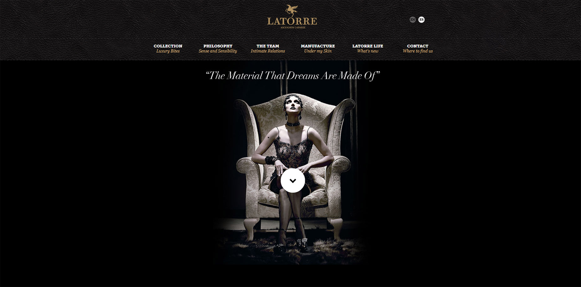
1. Ascensión Latorre

I don’t understand a word of French but luckily it’s not needed to appreciate this sticky navbar on the Ascensión Latorre website.

At the very top of the page you’ll see a full logo with text and the nav links. When scrolling down the text actually disappears and the navbar slides up.

This takes up far less space and it’s certainly ideal for graphics-heavy menus.

I’ve even seen this technique with logos that resize smaller on scroll too. This design just hides the text, but they could save even more room by resizing the pegasus graphic smaller.

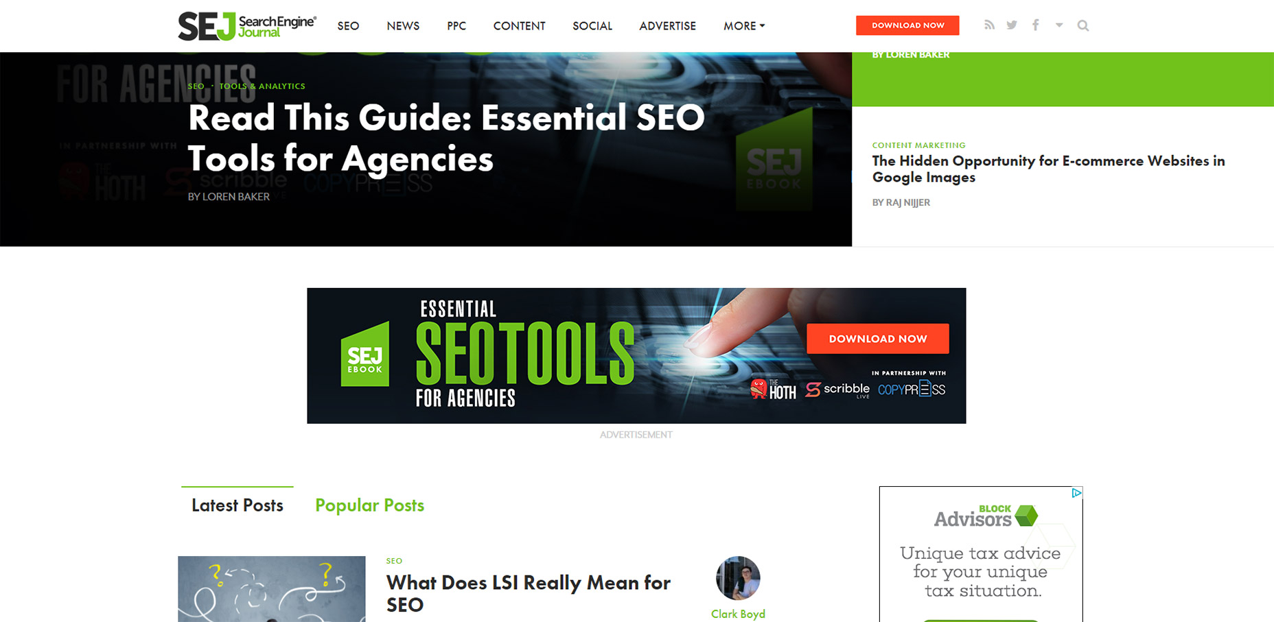
2. Search Engine Journal

This has to be my favorite navbar effect just because I’ve never seen it on any other website. SEJ is a great blog and I think they know user experience design.

Quick note: you can only see this effect on the homepage. You’ll notice the navbar remains stickied on all pages but I’m specifically talking about the logo animation.

If you visit the homepage you’ll find the logo embedded directly in their “featured story” box, one major component in a great magazine-style website. But if you scroll down past that featured box you’ll catch a really cool animation.

The nav text shifts over to the right and the logo animates into view. This is such a cool design because it feels so dynamic.

Yes their sticky navigation is pretty cool. Nice dropdown menus, great colors, typography, etc. But that logo animation is one feature I’ll never forget.
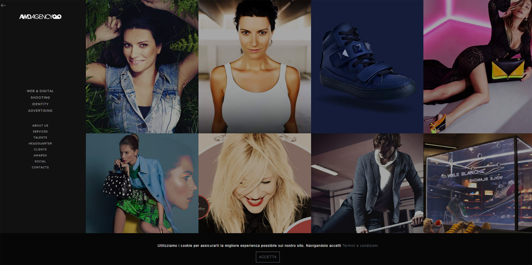
3. AWD Agency

Moving onto the AWD Agency website, this is the first vertically-oriented nav in my list.

They do a great job of keeping that menu stickied along the side of the page without taking up much space. How?

With a hidden menu toggle, of course!

Just click the little icon towards the left-hand side to open the menu. Click it again to close it. This remains accessible for all users on all devices so it works on the largest desktop monitors and the smallest smartphones.

Very clean effect and a nice way to handle fixed vertical navigation.
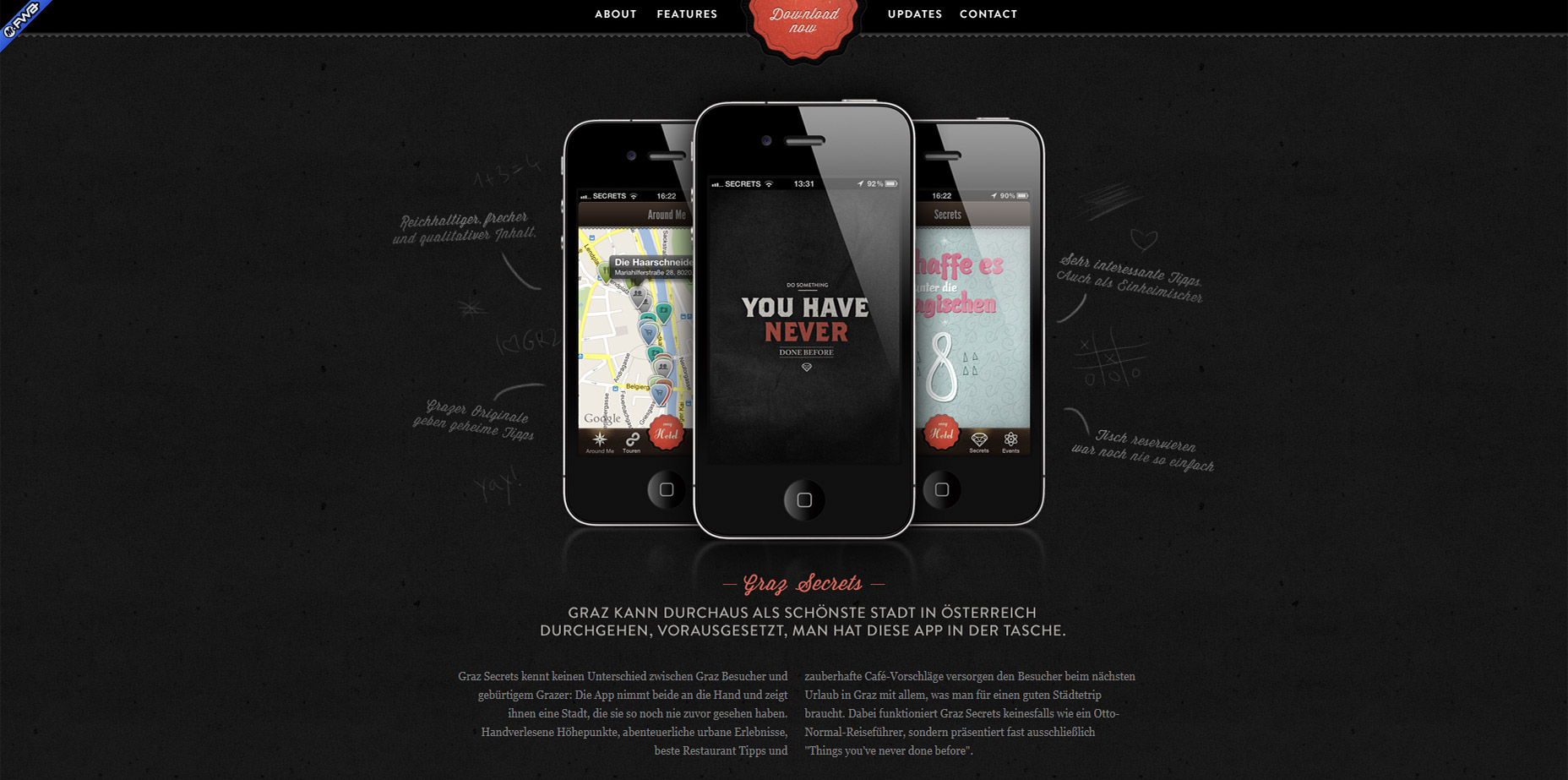
4. Graz Secrets

I’ve never used the Graz Secrets iPhone app. But after using their website I’d like to think the app has just as much of a fantastic user experience.

The top navbar stays fixed and uses a small border to keep it distinguished from the page content.

One design style I really like is the center “download now” button.

It stays animated even while you scroll so it’s meant to grab attention. Plus it blends nicely into the navbar so it feels like one cohesive unit.
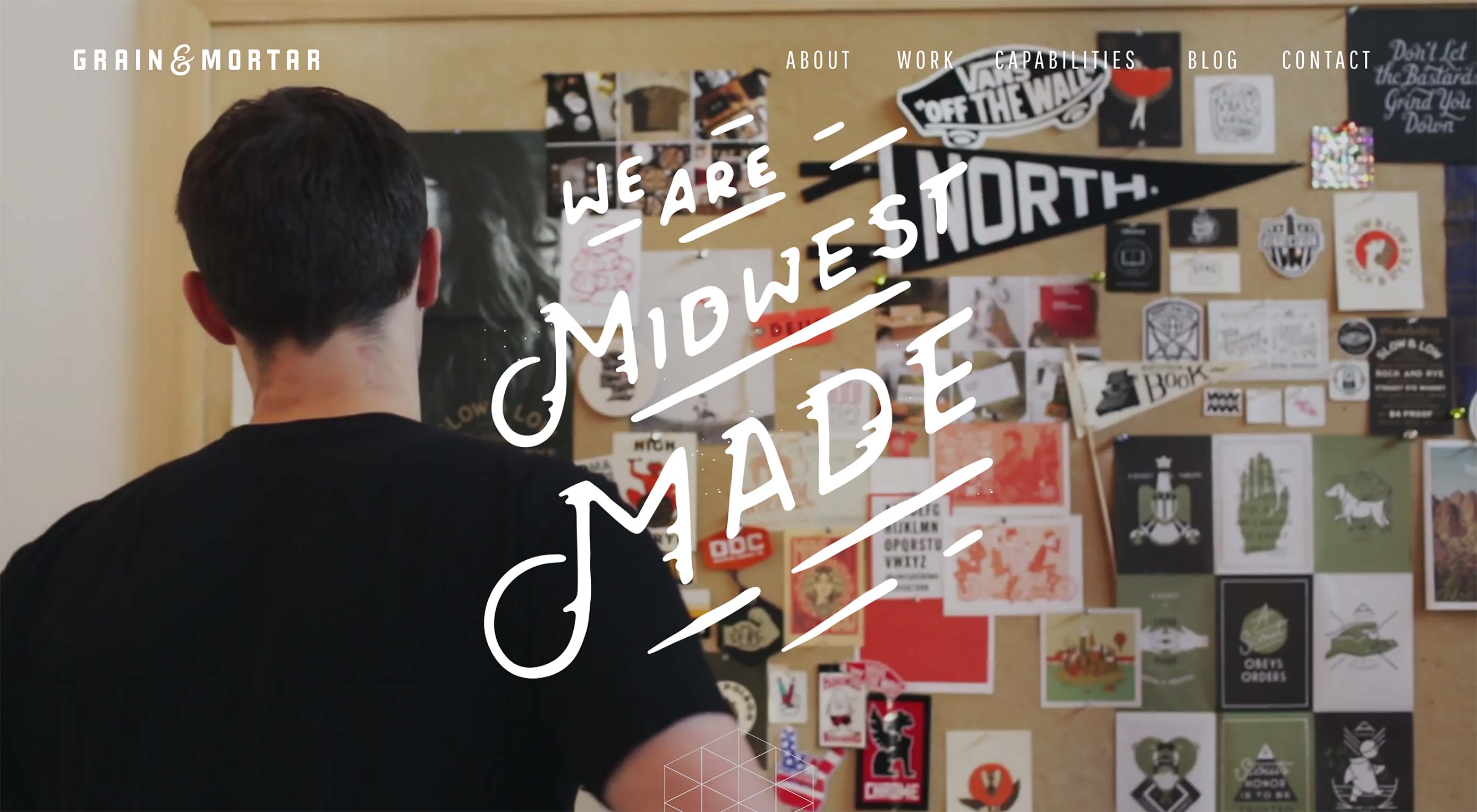
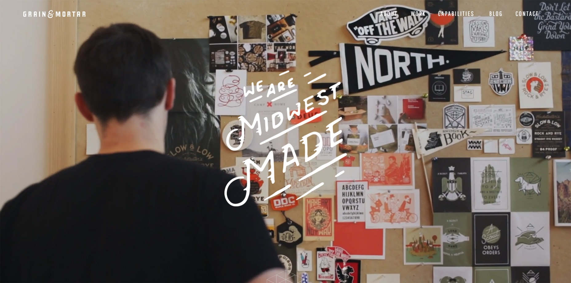
5. Grain & Mortar

Grain & Mortar has to be one of the cleanest agency website I’ve seen this past year.

So many layouts are cluttered with excess graphics, animations, or just designed to be “hip” yet come off as confusing. Not G&M. I could go on about all of their layout’s awesome features, but this post is about sticky navigations. And they have a sleek one.

The navbar doesn’t even appear until you scroll down past the header. A very cool effect and it can work well for websites that have large hero images in their headers.
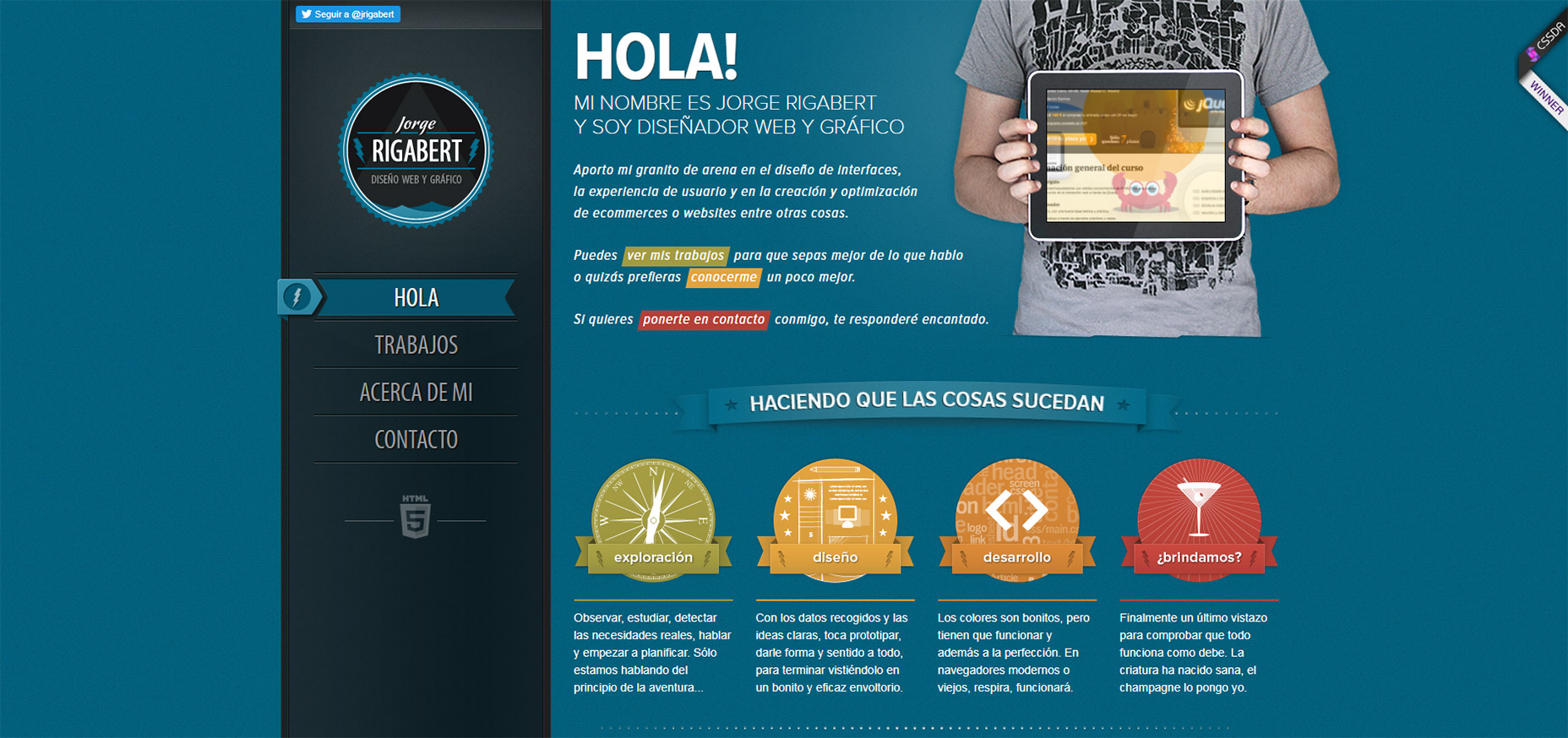
6. Jorge Rigabert

The portfolio website of Jorge Rigabert is another example of a non-English design with excellent user experience.

Whenever I see a website that I can’t read, but I still understand how to navigate, it tells me the site was designed well.

On this page you’ll find a fixed vertical nav that scrolls with you along the page. Since it’s a single-page design the links highlight depending on which section you’re viewing.

That’s a pretty common effect for single page layouts but it’s handled very nicely on Jorge’s page.
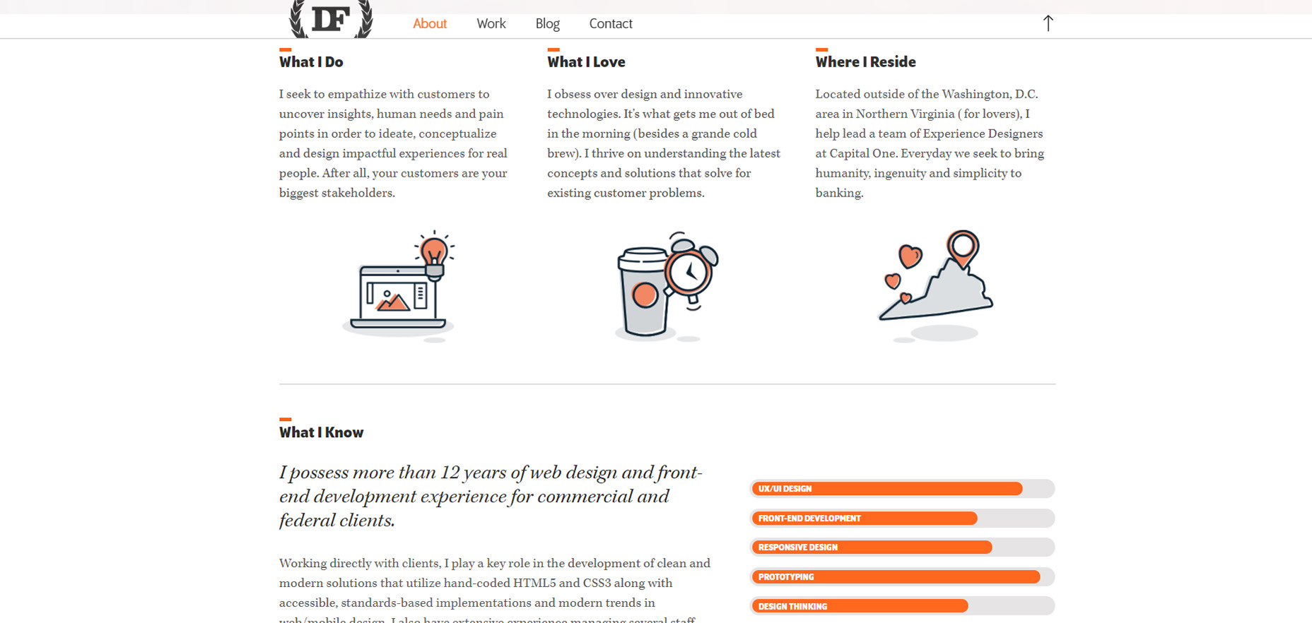
7. Daniel Filler

One other portfolio I really like is Daniel Filler’s site.

This borrows the same element from Grain & Mortar where you see the fullsize hero image header at the top, but as you scroll down the navbar shifts into “view mode” with a clean semi-transparent background.

If you search the web you’ll find plenty of ways to recreate this style. And there are lots of tips out there on designing great hero headers too.

The nicest thing about Daniel’s header bar is the small form. It doesn’t take up much space but you still know it’s his website. Also the small upwards-facing arrow is a nice touch to bring visitors right back to the top of the page(especially on mobile).
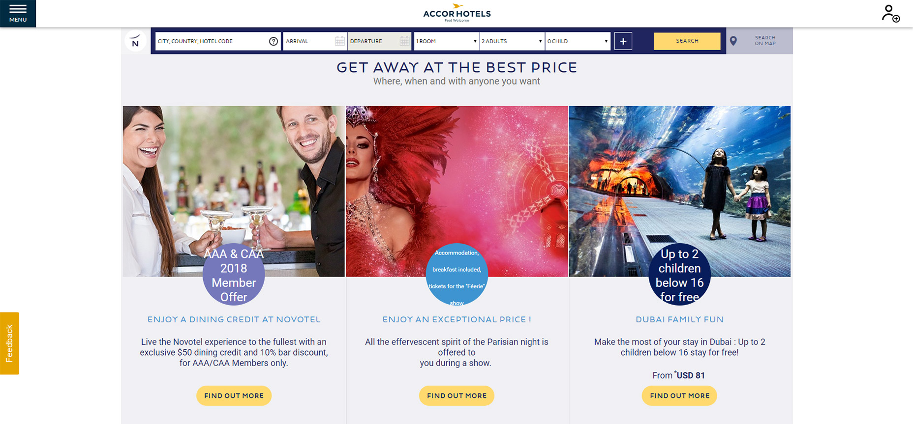
8. Novotel Hotels

Of all the hotel websites I’ve studied, the sticky nav on Novotel Hotels is definitely unique.

As you scroll down the navbar follows, of course.

But once you hit the booking details bar you’ll notice that gets stickied too. Pretty cool!

I’m sure this design technique helps to increase leads and help users plan their trips a lot faster.

9. FHOKE

So the FHOKE agency has a pretty basic navigation.

It’s actually more like many smaller elements that follow you along the page, just kept near the top.

There is no background color on the navigation bar so the menu links blend seamlessly into the page. But they also change color as they pass over certain page elements.

This helps to increase contrast while still making the navigation accessible across the page.
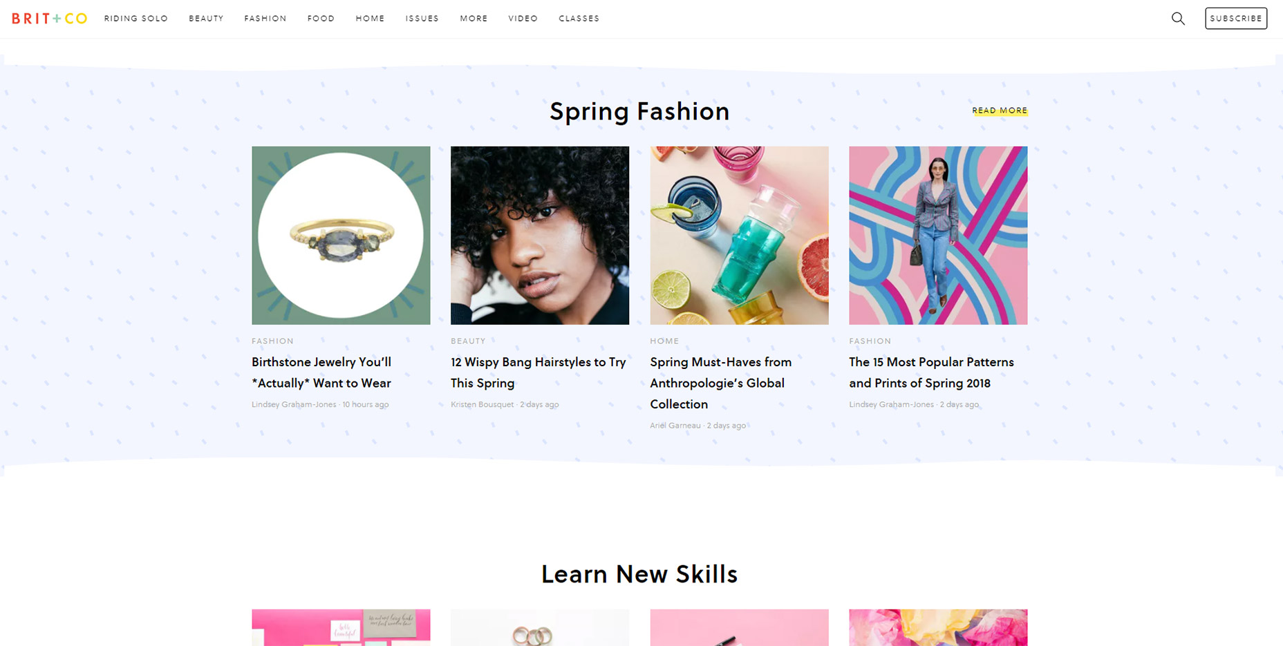
10. Brit + Co

There’s a couple nice things about the Brit + Co sticky navigation menu.

Going beyond the design and dropdowns, I really like the auto-hide feature which saves a lot of space while reading content.

When you scroll down the menu automatically hides out of view. Then as you scroll back up it pops out to greet you once more.

The other nice thing is the search feature, it’s all controlled dynamically and it falls directly underneath the navigation.

A very simple effect yet certainly something that’ll grab your eye.
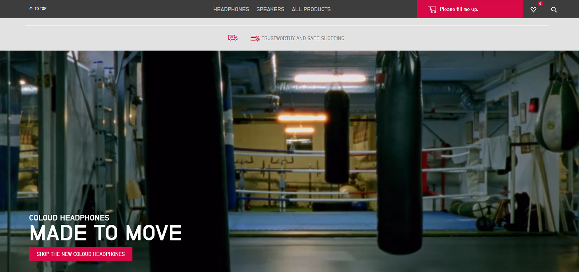
11. Coloud

Have a look at the Coloud website and scroll a bit on the page.

You’ll notice the top navigation does appear at the top, but it looks…different.

This navigation is minified so it takes up less space and it doesn’t even sport the company logo. Seems crazy but I think I get why.

People should know what site they’re on because the logo was at the very top when the page first loaded. Nobody is gonna forget the website just because they scroll down.

And the “scroll to top” link is probably more valuable than a logo anyways.

This seems like a technique that could do well on all sorts of ecommerce websites or lengthier blog posts.
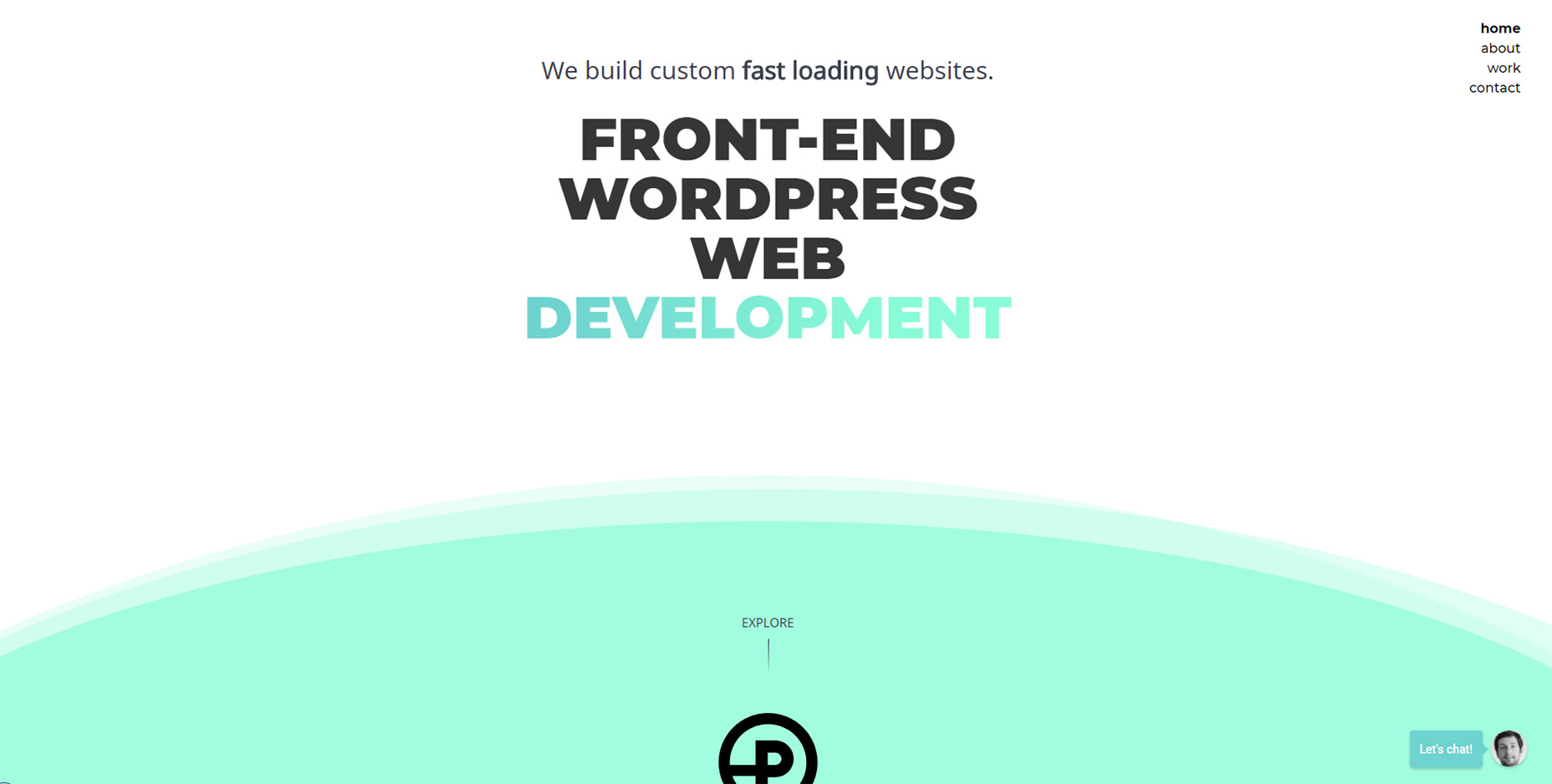
12. Prollective

Last but certainly not least is a simple example of sticky navigation in action.

Check out Prollective and have a look in the top-right corner. Four links in a vertical column.

And that’s it! No scrolling logo, no search bar, nothing else to get in the way. If you have a small website with only a few pages this can work tremendously well.

This technique saves space by avoiding the top bar and it still gives visitors direct access to all links from everywhere on the site. It’s an effect that could do very well on minimalist projects.

Add Realistic Chalk and Sketch Lettering Effects with Sketch’it – only $5!

Source

p img {display:inline-block; margin-right:10px;}
.alignleft {float:left;}
p.showcase {clear:both;}
body#browserfriendly p, body#podcast p, div#emailbody p{margin:0;}

Essential Web Technologies to Learn (2018 Edition)

Original Source: https://inspiredm.com/essential-web-technologies-learn-2018-edition/

Becoming a web developer is easy, so they say. What most people feeding you that line neglect to mention is that while almost anyone can be a web developer, not everyone using that title is good at web development.

All of us must make a start somewhere, and if you’re just getting started in your web developer career, this article is for you. It is also an article for seasoned web developers who may not have kept up with the latest essential skill sets and want to discover what they are for 2018.

1. HTML

This is the most obvious essential skill that any web developer needs to know. At the least, you’ll need to be an expert in HTML5.

HTML is the “language of the web”, and it’s what all sites are built in, even sites that aren’t built in it. What does that mean? It means sites that are built with another language like PHP are in the end rendered to HTML because this is the language browsers understand.

Basically if there is no HTML, there is no web page.

illustration courtesy of Maggie Appleton

2. CSS

HTML is like the frame of a building, CSS is like the cladding. The CSS defines how elements in the page will look, and also to some extent how they will function.

Learning CSS was once optional, but now it isn’t. You can build a good website without using a single line of CSS, but you’ll look like a complete amateur to anyone viewing the source code of the page.

3. JavaScript

There are people who will tell you it’s possible to be a web developer without learning JavaScript. Those people are wrong.

JavaScript is a powerful language that allows you to include client-side interactivity in your web pages. Not every website needs JavaScript, but every web developer does.

illustration courtesy of Maggie Appleton

4. DOM

Having learned the basics of JavaScript and CSS, you’re ready to make an in-depth study of the DOM, and in this way make full use of what you’ve learned so far. If you don’t learn to dominate the DOM, you will never really make it to the top in front-end development. That means you’ll be stuck making mediocre business sites in WordPress instead of working on really interesting projects that test the limits of your creativity.

5. PHP

Learning PHP is a big step up from learning JavaScript, but the good news is that it’s an even easier language to learn (it’s smaller for a start). PHP handles interactivity and other important tasks on the server side.

There’s another language called ASP that fills a similar role. The difference is that only a minority of websites use ASP (but that’s still millions), and so it’s much less essential to learn ASP than to learn PHP.

Other server side languages that could be interesting to learn but are not considered essential to learn include:

Ruby
ColdFusion
PERL
Java (also a client side language)
Python (also a client side language)
C++ (also a client side language)

There are also a few more obscure languages out there like Lua and Haskell, but you’re very unlikely to ever be asked to code anything in those languages, and if you’ve ever seen them, it’s likely you wouldn’t want to use them.

The one exception is Go, a programming language developed at Google as a viable alternative for C++. It hasn’t really caught on yet, but it actually is quite a good language for doing things that you’d otherwise use C++ for.

Learning any of these alternative languages makes you an interesting programmer, while learning PHP makes you a useful and employable programmer.

illustration courtesy of  Sandor

6. AJAX

After you have leaned JavaScript and at least one server side language, you’ll be ready for AJAX. Probably the best way to think of AJAX is that it provides a bridge between client side processing and server side processing.

There are some things you would want to do that would require reloading the entire page if you handled those things entirely server side. By using AJAX, you can generate server responses that update your page without reloading.

7. MySQL

This is one of those things like PHP where it’s not the only technology in its class, but it’s so widely used that it has basically become the defacto standard, and it would be kind of crazy not to learn it.

MySQL is a free open source database system. It works very well, it doesn’t cost anything, it has reasonably good security. These are all reasons why it is so popular.

8. GIMP or PhotoShop

Even as a developer, you will often need to work with images. It’s not enough to just be able to use GIMP or PhotoShop, you should be a master of them. Preferably learn to use both.

The big dilemma you’ll run into is that for web work, GIMP is the best tool for the job, but around 90 percent of companies prefer you to use PhotoShop as it is ingrained into their culture.

The reason why GIMP is more suitable is that it’s actually designed for working in RGB color, while PhotoShop was intended for print design and is based on CMYK. That’s just the beginning of the differences though.

If you can do it in GIMP you can do it in PhotoShop, but the reverse is not true.

9. GIT

When you work on corporate and collaborate projects, a robust content versioning system (CVS) is essential, and GIT is popular due to being cross-platform and available anywhere.

Learning GIT is not simple. It is one of the most complicated content versioning systems around. Learning to use it is still essential because it is the most used CVS in existence, and is unlikely to be replaced any time soon.

The things you’ll need to be able to do (at a minimum) include:

Creating repositories
Pushing (check in) and Pulling (check out) code
Conflict resolution
Create project description pages and so on.

GIT is not fun. It doesn’t do anything interesting. Nobody will know if you used it or didn’t use it. But if you are being hired by an agency, they’ll expect you to be thoroughly familiar with it.

10. SEO

It can be important to have at least a basic understanding of SEO, even if it is only to ensure you don’t break any of the rules, or that you can advise clients if they’re at risk of breaking the rules.

As a developer, you’ll rarely be responsible for the actual site content, and often you won’t even be responsible for the design. That doesn’t give you a free pass to ignore SEO, however, because if the client does slip up and can somehow blame it on you, they will.

New web technologies are always emerging

It’s important to get a good grounding in the ten essential technologies listed above, because that will set you up in a good position to cope with the newer technologies that are about to come along. You’ll be ready for those changes and confident enough to handle them.

header image courtesy of Achin

The post Essential Web Technologies to Learn (2018 Edition) appeared first on Inspired Magazine.