Crafting Fintech Identity: A Closer Look at Deserve Branding
Original Source: https://abduzeedo.com/crafting-fintech-identity-closer-look-deserve-branding
Crafting Fintech Identity: A Closer Look at Deserve Branding

abduzeedo0425—24
Dive deep into the evolution of fintech branding and visual identity with the Deserve Branding project by Humbleteam, featuring a unique color palette and modern aesthetics.
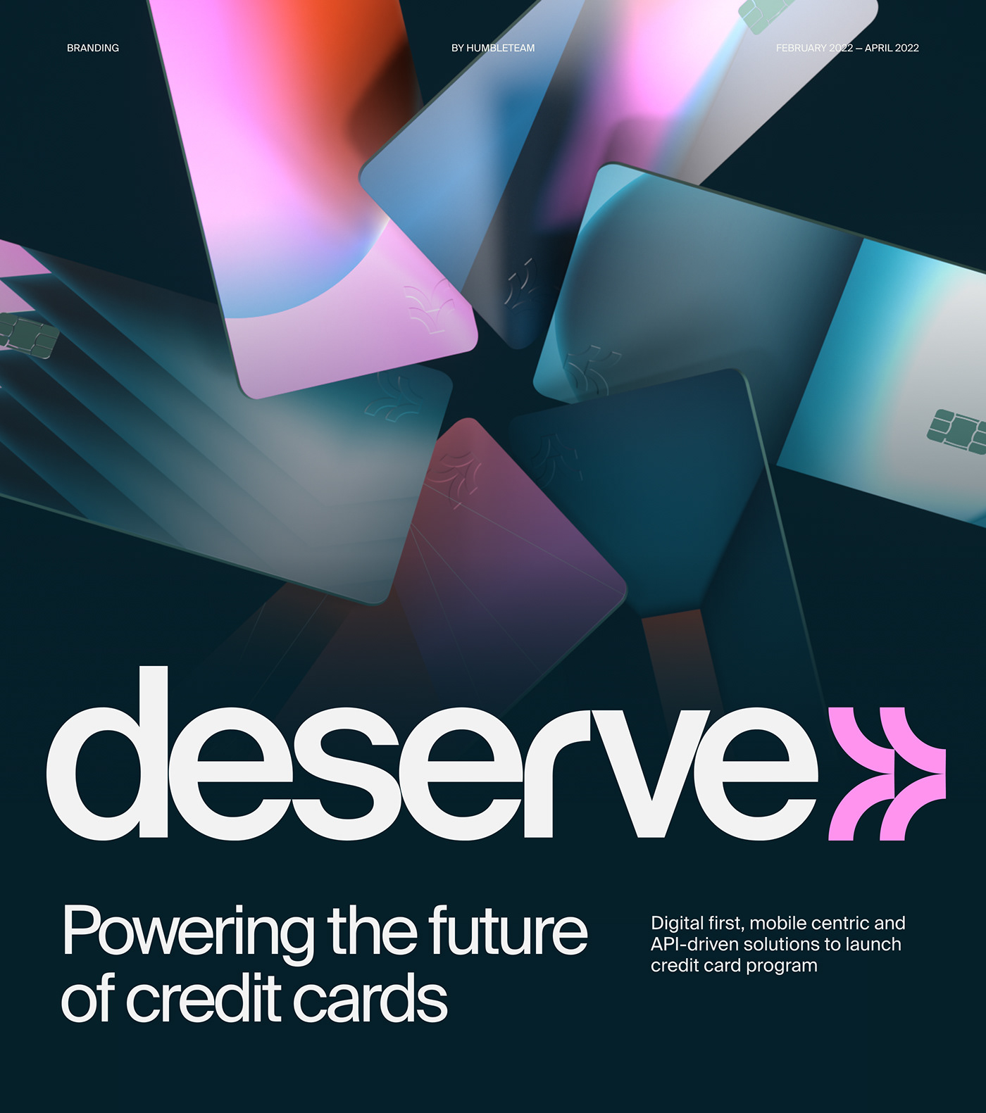
In the competitive fintech landscape, the power of a distinctive brand identity cannot be underestimated. The project ‘Deserve Branding’ by Humbleteam is a compelling case study in effective visual strategy for a fintech brand. This article explores the design elements that make the brand both visually appealing and strategically sound.
Visual Strategy and Color Dynamics
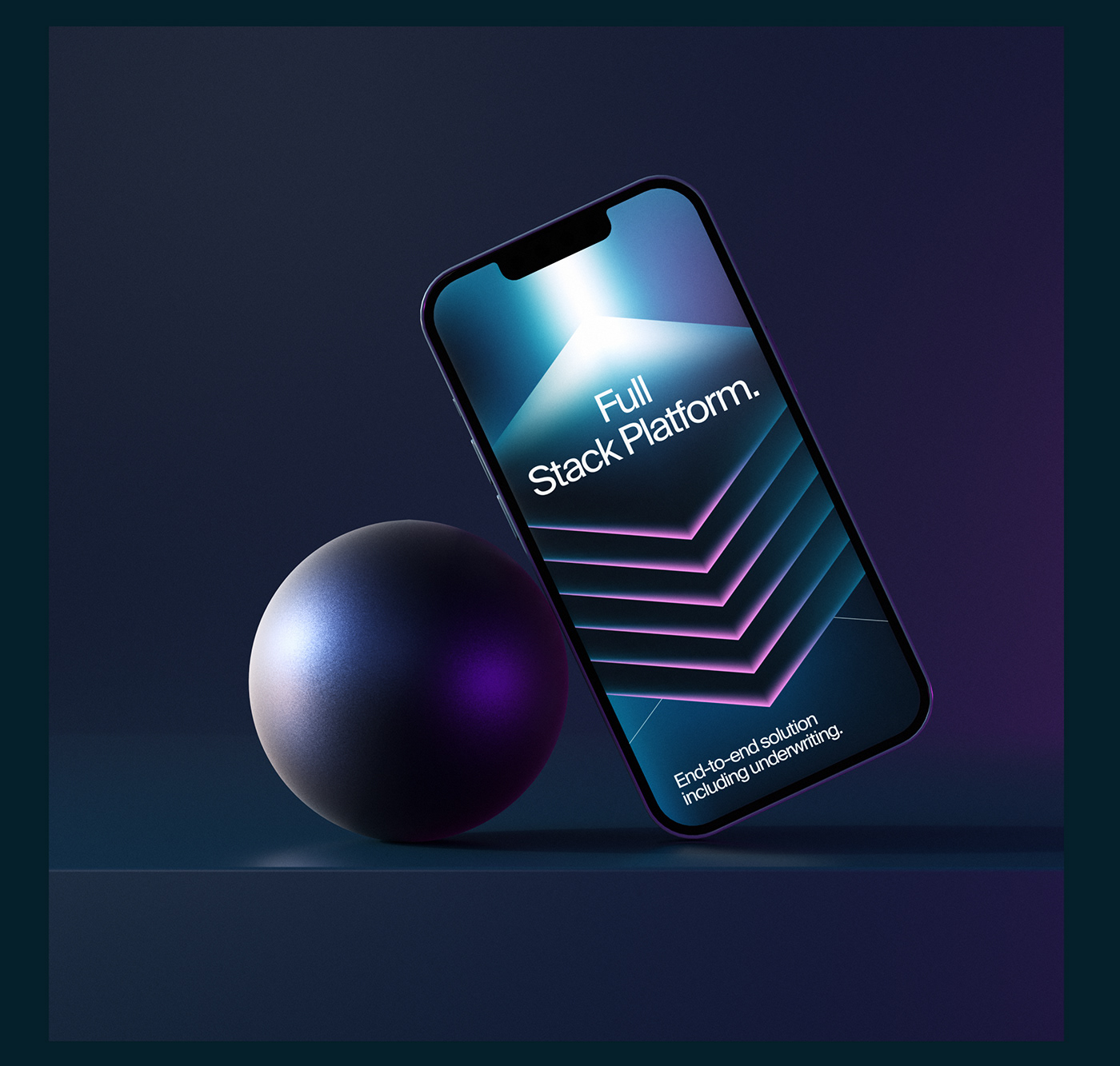
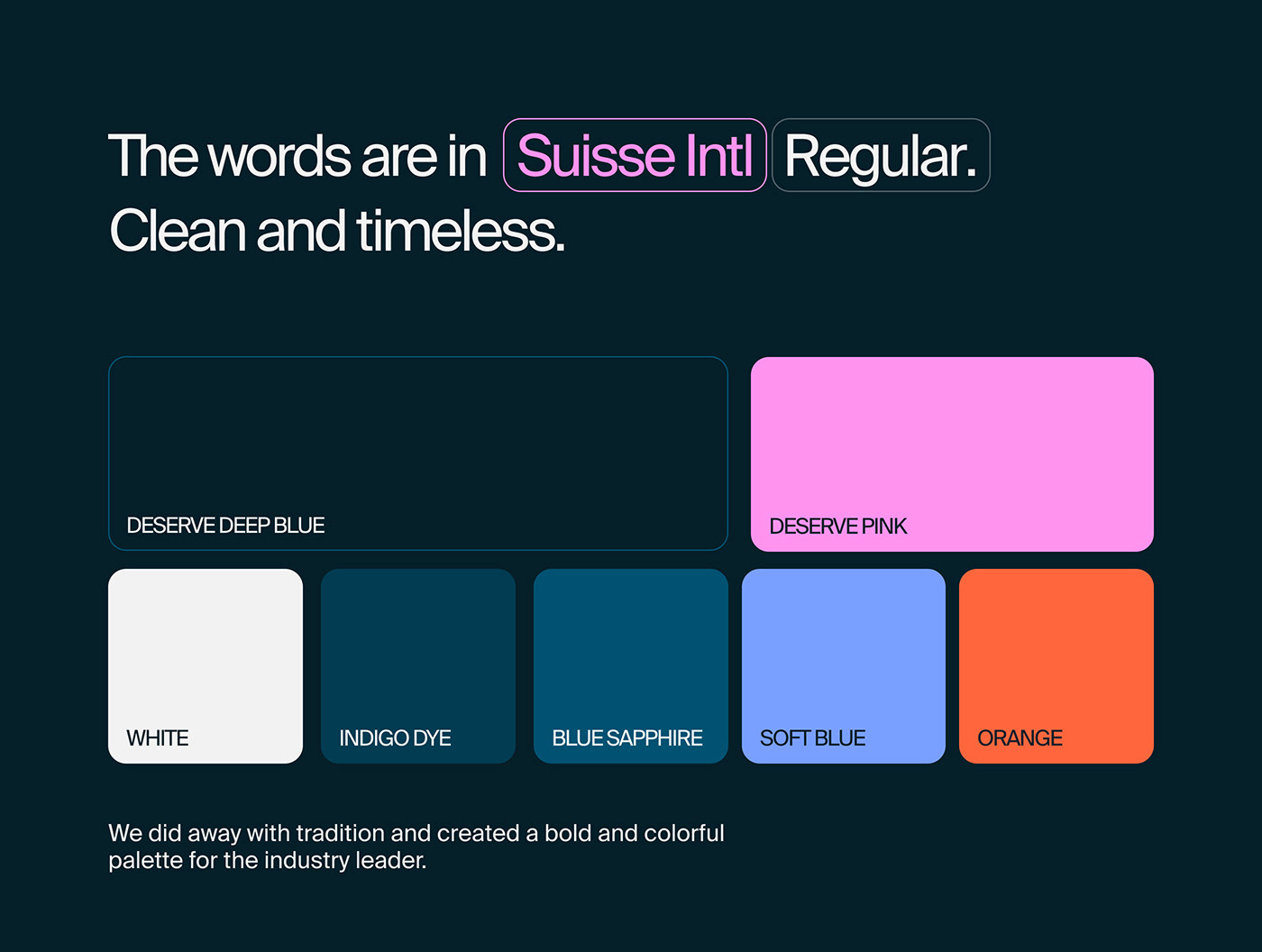
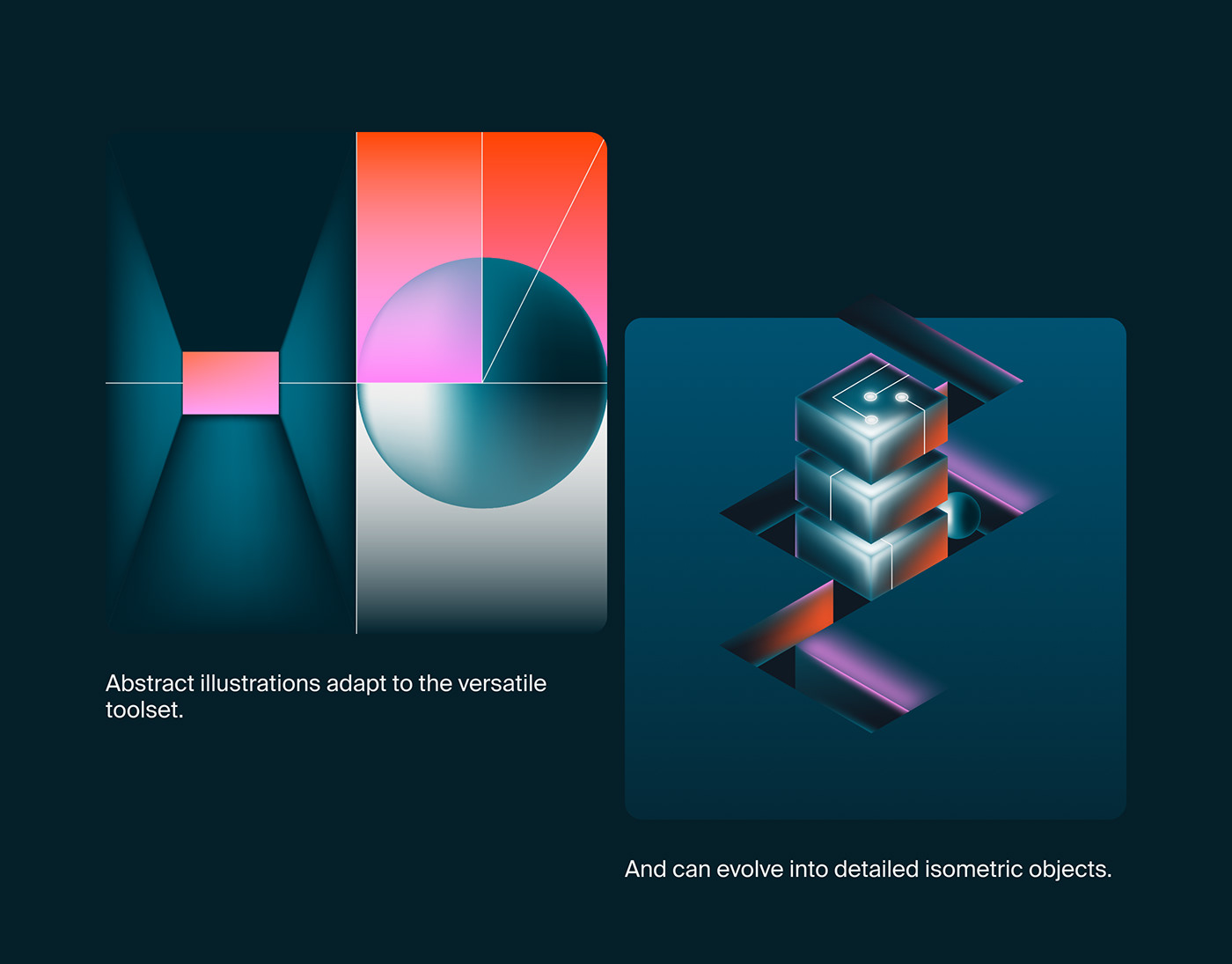
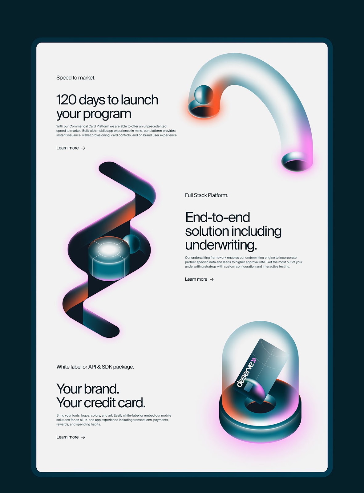
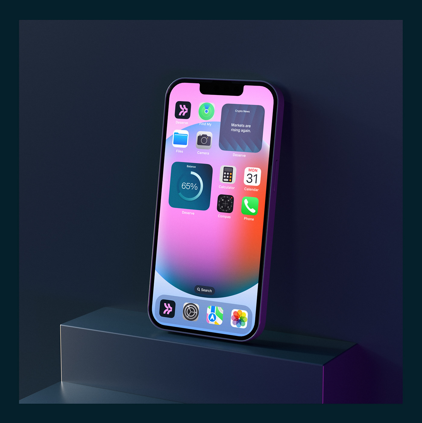
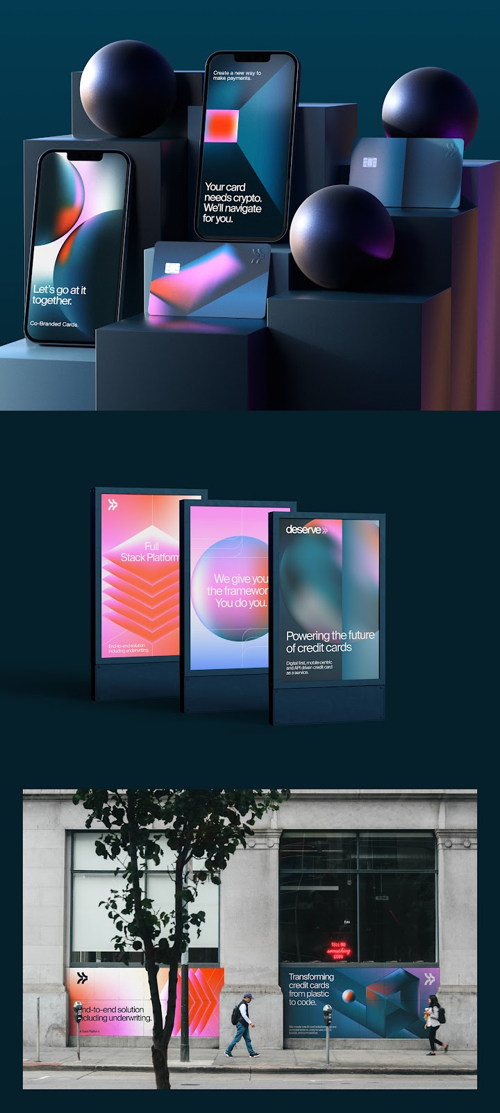
At the core of Deserve’s branding is a carefully chosen color palette that combines shades of blue and indigo with striking pink and orange accents. This combination not only sets the brand apart in a market dominated by more conservative hues but also injects a sense of energy and innovation into the visual identity. The use of gradients enhances this effect, adding a layer of depth and modernity that speaks to both the brand’s heritage and its future-oriented ethos.
The typography employed in the Deserve branding further underscores the brand’s commitment to clarity and usability. A sans-serif font is utilized for its clean, approachable look, while the bold logotype ensures that the brand remains memorable in a sea of competitors. These elements together foster a sense of trust and professionalism, critical in the fintech sector where customer confidence is paramount.
Subtle Echoes of the Past
A notable aspect of the Deserve project is its nod to 80s futurism. This aesthetic choice does not merely serve as a stylistic preference but acts as a bridge connecting the era known for its bold visions of the future with today’s technological advancements in financial services. This retro-futuristic vibe resonates particularly well with a demographic that appreciates a blend of nostalgia and modernity in service delivery.
As noted by Humbleteam’s lead designer, “Our goal was to merge tradition with innovation. The 80s futurism aesthetic complements the forward-thinking technology solutions provided by Deserve.”
In Conclusion
Deserve’s branding exemplifies how thoughtful design can effectively convey a fintech brand’s values and vision. By combining vibrant colors, functional typography, and a hint of retro appeal, Humbleteam has crafted an identity that is not only visually captivating but also strategically aligned with the brand’s objectives.
In an era where fintech companies vie for attention and loyalty, such a well-orchestrated visual identity is not just desirable—it’s essential.
Branding and visual identity artifacts

For more information make sure to check out the humbleteam 🟠website at humbleteam.com


Leave a Reply
Want to join the discussion?Feel free to contribute!