10 Design Principles That Will Dramatically Boost User Experience

Original Source: http://justcreative.com/2017/10/30/10-design-principles-that-will-dramatically-boost-user-experience/

This article was contributed HubMonks.

A strong user experience (UX) is instrumental in your online marketing success. Increased engagement results into increased leads, which translates into greater revenue.

In this article we will specifically dissect the design principles that influence the extent to which your web page performs for users.

Page Objectives


It is not enough to say that you want an excellent website with a good user experience. See the difference between UX and UI here. It is vital to define what your visitors and your business should achieve from the web page. It should be understood that your goals and the audience’s goals may differ. Your visitors’ goals are about finding information or getting a downloadable eBook, while your goals may include increasing engagement, form fill-ups or downloads. The trick is to strike a balance to create a win-win situation for both users and your business. Your goals should help you in establishing the following:

Who the target audience are?
How to craft effective content?
How to organize the website?
How to measure the effectiveness of the website?

In order to understand marketers’ vision it is important to have the key team-members of the design team while discussing online goals in an organization.

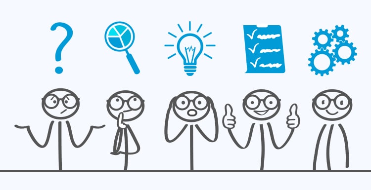
User Journey Mapping

User-journey mapping is a visual or a graphical representation of the overall storytelling from the user’s first touch point with your organization, to building a perspective around your service or product or brand, and communicates with them through various mediums. This process is very narrative in nature and requires a text-based approach to describe the nuances of the customer experience.

The story is told from the customer’s perspective, but also lays importance on the important intersections between user expectations and business requirements. Here are the key points that you will have to include in user journey mapping

Visual demonstration of the journey.
Understand user behaviour on the existing website analytics.
Understand the interactive elements that will help them achieve their goals.

Visual Hierarchy

Source: http://edgemm.com

The above picture clearly defines the purpose of visual hierarchy. Visual hierarchy covers almost all the considerations of design; however it tends to give importance to the vital elements of your web page where you want to draw the user’s attention. A robust visual hierarchy also groups similar elements and organize them into meaningful patterns to carry an effective communication process with the viewer. How does a designer actually create a good visual hierarchy? Well, they just need to look for that in their inventory! Here are the key components:

Size: Using size as a hierarchal tool is a great way to guide them to the key components of your web page.
Colour: Colour is a great organizer and also infuses personality. Bold and contrasting colors will demand attention.
Contrast: When audience see something on the web page that is a deviation from the others, they want to know more about it. You could differentiate an important part of the page from the core content of the page with the help of contrasting colors.
Proximity: If there are multiple sections in a web page, how you place related objects of a section is what defines a good proximity. It helps in clearly associating similar content.
Density and Whitespace: When you populate a section of the webpage densely, it looks unfavourable in terms of UX. Similarly, keeping too much space between elements will break the link. So, the elements need to be placed and separated with whitespace to differentiate which elements are related and which aren’t. 

F-Pattern Scanning

Visual signs in text such as headings, sections, bolding help users take shortcuts while scanning through the web page and they don’t need to read everything. When they don’t find these signals, they are left to help themselves. Users create their short while scanning the web page and make out if they would like to engage or not. According to this study by Nielsen Norman Group, the pattern of this scanning behaviour forms the shape of the letter “F.”

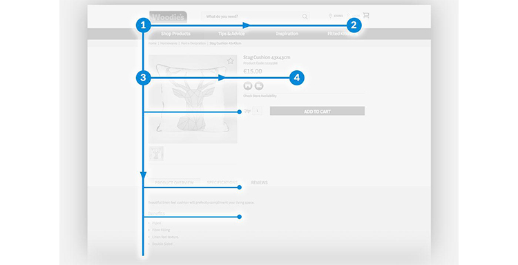
Source: Monsoon Consulting

If you want to ensure that your users’ attention is drawn towards the most important elements of the web page (Calls-to-action, forms, images, videos), it is highly recommended to follow an F pattern and place your elements accordingly. 

Responsive Design

Responsive design is like a jigsaw puzzle! Responsive web design requires movement of various elements of the page that changes the initial design. Organizing elements to fit could be a great challenge with responsive design as larger pages and their elements will have to shrink to fit on narrow platforms for a mobile phone or tablet. We have listed some vital considerations below:

Consider a mobile-first strategy.
Include a hamburger collapsible menu (or similar) in case of multiple items.
Optimize image for all the types of devices (desktop, smartphones, tablets).
Optimize the content for mobile devices as the content for desktop will occupy too much space.
Check the loading speed once the pages are live and check if certain design components are reducing the load speed.
Implement Google’s AMP (Accelerated Mobile Pages) that is meant to optimize the content load time on mobile phones.

Calls-to-action

Calls-to-action play a vital role in boosting your website conversions. A single call-to-action is empowered with the responsibility to attract attention and later get clicked on. These two factors will race your website towards a high ROI. So, what are the key principles of a call-to-action that designers need to consider?

Size: Decide the size of the call-to-action by ensuring that it gets noticed amongst the other elements of the web page. If the call-to-action button should be placed below a form, the size should be equal to that of the fields of that form.
Text: If the marketer has decided on the text for various pages and sections, they should be communicated with the designers with the copy. This will help them in determining the ideal size.
Colour: Colour plays 70% of the role in attracting the viewers’ attention. Ensure that it stands out from the rest of the section by smart usage of colours.
Button Shape: If there are various sections and smaller objects in a single webpage, how smartly you define a button by carving its shape is important. Ensure that the shape stands out from the rest of the objects.
A/B Testing: The best practice to gauge effectiveness of a call-to-action is by creating different variants of colour, text, and fonts. Monitor which CTAs are more successful. At HubMonks we insert the CTA from the HubSpot marketing tool for all our HubSpot COS web development projects so that clients are able to measure the button’s performance. 

Forms

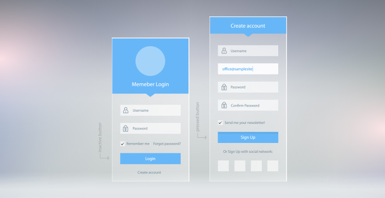
There is a huge difference between forms and advanced forms that boost UX. Even forms have various design principles that help users understand its hierarchy and helps designers utilize less space with all the important fields included.

Label alignment helps users identify the field with its corresponding label. Proper alignment also consumes less space that ultimately boosts the psychological factor to get form-fills.
Placeholder text is a great innovation in forms, wherein the user is able to see the label inside the field which disappears once the user brings the cursor on the box.

Cognitive Load


Cognitive load in web design refers to the amount of thought process a person has to give while they are engaged in the buyer’s journey. The cognitive load theory is differentiated in two types for user experience:

Intrinsic cognitive load: It refers to minimal usage of copy so that the user is not hampered from completing a specific task on the web page.
Germane cognitive load: It refers to the effort devoted to process information and how user understands the pattern of the information by mentally organizing categories of information and any relationship among them.

Hick’s Law

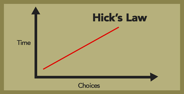
Source: My Site Auditor

Designers could explain this law to the marketers so that users are not overwhelmed with too much information or options. Hick’s Law tells us that the time taken by a person to make a decision depends upon the number of choices available to him or her. See here for more psychology principles.

Interaction Design

Source: colossom.com

Interaction design is dedicated to creating engaging interfaces with prediction about the user behaviour. It is essential to know how users and technology communicate with each other. Here are some questions that you should consider when designing for the best interaction:

How users can interact? Which parts of the website will be interacted by the user with mouse, finger, or stylus?
Which clues will make it easier for the users to interact? The colour, size, shape, text will differentiate the objects and helps users in understanding these interactive points.
Is information chunked into seven items at a time? Users tend to keep only five-nine items in their short term memory.
Are various sections of the website differentiated with the help of edges and corners? Elements like menus need to be differentiated by these design considerations. Moreover, they form a boundary stating that the finger or the mouse cannot be moved beyond that boundary.

Conclusion

The whole concept of user experience is centered around having a clear understanding of the targeted users, their needs, their values, abilities, and their limitations. It takes into account your business goals and objectives. The best practices of UX works towards promoting the quality of how the user interacts with your website and the perceptions of the product and all related services.

When you are running a marketing campaign, you tend to pull interested prospects and make them a part of your marketing funnel. At every point of this funnel, your users need guidance to move smoothly towards their journey with your organization. The points discussed in this article will help you create an exceptional user experience that helps them achieve their goals and boost your business initiatives.

Dev is the Head of Marketing at HubMonks, a HubSpot content optimization system (COS) partner for major inbound marketing agencies and brands. You can contact him on Facebook and Twitter. Top photo by PhotoSpin.

5 Ways to Design With Accelerated Mobile Pages

Original Source: https://www.webdesignerdepot.com/2017/10/5-ways-to-design-with-accelerated-mobile-pages/

The mobile web keeps growing at a rapid pace.

Smartphones continue to sell strongly, with Apple alone forecasting to bring in $180 billion from its smartphones by 2021. There are over 224 million smartphone users in the United States, making the mobile web an essential focus for any website owner.

The continued growth of mobile web users makes it important for designers and front-end developers to grasp proper design for accelerated mobile pages.

The practice of accelerated mobile pages emphasizes design choices that align with what search engines perceive as friendly, including a defined audience, high-quality content, proper formatting and seamless mobile compatibility. You will notice a variety of accelerated mobile pages when browsing Google in mobile by the abbreviation AMP in search results.

Accelerated mobile pages still use HTML, though they incorporate special elements that prioritize speed on mobile devices. AMP technical requirements are established by the AMP Project, with the standards worked on alongside major traffic influencers like Google. The project was created in response to clunky user interfaces and slow load times when browsing sites on a mobile device.

AMP emphasizes instant speed and a familiarized appearance, giving creators the ability to style their pages within the AMP framework. The boilerplate-centric design on most AMP pages gives a similar feel of navigation, despite differences in content presentation and color schemes.

The result is a faster, more cohesive browsing experience that improves drop rates, increases reader engagement and ushers in mobile web browsing as a mainstay.

With the power and potential of AMP so evident, it’s practical for designers to regard the tips below to help optimize the AMP experience, so their clients will benefit in a variety of ways.

1. Consider AMP-Carousel for the Homepage

Make an impression on the page most of your visitors will begin with. Static content can be displayed on AMP to showcase available products, piquing interest for e-commerce sites as well as those displaying general content.

The AMP-carousel feature enables designers to display multiple similar pieces of content on a horizontal axis. After importing the carousel component in the header, you can utilize type=”carousel” to show up a list of images, appearing as a continuous strip. It’s an eye-catching feature that’s ideal for the front page when you’re trying to hook visitors into seeing something beyond the homepage.

2. Show Related Posts and Products

Encourage site visitors to dig deep into your content. You can accomplish this by showing a list of related products or posts to the one they’re presently viewing. You can statically publish a list of relevant content, accomplishing it instantaneously by using <amp-list>, which populates a CORS request into an amp-mustache template to result in dynamically generated content relevance you can personalize to your specific preference.

If visitors enter a landing page that doesn’t align with their requests, they will either leave the site or look further for what they’re seeking. The suggestion of product alternatives is an excellent method to accommodate the user’s search process, at the very least drawing them more into the site. Even if they do not find what they are searching for exactly, they may find an alternative that does the job just as well.

3. Use AMP-Analytics to Find Areas to Improve

It’s important for any website owner to know how visitors are interacting with the content. The <amp-analytics> component can be used either directly or integrated with a third-party analytics platform, including Google Analytics. Within the <amp-analytics> tag, add the “type” attribute and set the value to your vendor of choice, of which there are many options. The <amp-analytics> component will help website owners have a clearer picture of what pages and design elements are resulting in conversions and which components are experiencing low user engagement.

It’s important to keep in mind when analyzing analytics that, with AMP, smart caching is naturally embedded. The result is that you may view less traffic than usual. Just keep the caching element in mind when analyzing your numbers initially.

4. Use the Built-In Validator

Ideally, designers will never get something wrong, but it can happen. To ensure everything is working properly on a page, use AMP’s built-in validator by adding #development=1 to the end of the page URL. If you open Chrome dev-tools and see the message “AMP validation successful,” then everything is working. If not, you can dig in deeper until the issue resolves. You can also use Chrome dev-tools to verify that all external resources, ranging from images and videos to custom fonts and iframes, are loaded properly.

Additionally, you can validate metadata by using Google’s Structured Data Testing Tool, either by fetching a URL or inserting a code snippet. These tools can help ensure everything is validated, so search engine crawling is enabled. On the note of search engine crawling, also double-check your robots.txt file, to verify that “Disallow: /amp/” is not present in any line. If it’s there, crawlers will not be able to access your AMP files.

5. Implement Ads Within AMP

Another benefit of AMP is a preexisting framework for implementing ads. The amp-ad, or amp-embed, component is a container to display an ad. The ads load alongside all the other resources, with the <amp-ad> custom element.

JavaScript is nonexistent inside the AMP document. Instead, AMP load an iframe from an iframe sandbox. You can set width and height values within <amp-ad>, with the “type” argument specifying the ad network displayed. The “src” attribute loads a script tag for the specified ad network, with various data attributes available to accommodate further configuration from ad networks.

You can also set a placeholder or option for no available ad, via the placeholder attribute. Video ads are also possible with native support, with thorough media component support.

Accelerated mobile pages help increase search engine visibility among mobile users, especially now that Google is embracing AMP pages in its search results.

Additionally, quicker loading times, flexible personalization and visual components that seek to improve bounce rate make for a better mobile user experience than ever.

Accelerated mobile pages provide a fantastic framework for the continuing growth of mobile web users.

The Amazing New BLOCKS 3.2: Easily Create Professional Website Templates – only $14!

Source

p img {display:inline-block; margin-right:10px;}
.alignleft {float:left;}
p.showcase {clear:both;}
body#browserfriendly p, body#podcast p, div#emailbody p{margin:0;}

7 Ways to Keep Your Site Alive

Original Source: https://www.webdesignerdepot.com/2017/10/7-ways-to-keep-your-site-alive/

Once upon a dark, stormy night, when all was quiet, a lone web designer was designing away. He had Sketch open, a coffee nearby, and a cheerful tune in his wired earbuds, because Bluetooth is weird and has a delay that bugged the heck out of our Hero. Ahem, anyway…

During a lull in the music, our intrepid designer saw a notification on his phone. It was an email from his favorite customer, and he smiled. That smile disappeared when he read the contents. There were three broken links in the client’s site. Three!

“It’s okay.” he thought. “That happens someti…” But the list went on. The slideshow was broken. The layout looked a “little bit weird, somehow”. And worst of all, the contact form didn’t work.

In a panic, he scrambled to type in the URL. Everything looked fine. No, it looked pristine. He’d just fix the broken links and… no. He was thorough and diligent. He opened up ChromeFox* to see how the site looked in the client’s browser of choice.

It was as though staring into the mouth of Hell, and this portal to damnation was three pixels off-center. But all is not lost, dear Reader. Our fictional designer might be shamed, but we can help you avoid this. New web designers would be wise to follow this list, and save themselves from incredible awkwardness!

* All names have been changed to protect imaginary browsers.

1. Check Your Links

Every so often, go back and click on every link in your website. Every. Single. One. You should definitely do this after making any major changes to your site, obviously, but not only then. Servers can be weird sometimes. And if you link to outside sources of information, you need to check to make sure they’ve not been broken, removed, moved, or simply been eaten by some computer error.

Few things look as amateur as links that are no longer relevant, or don’t work.

2. Update Your Content

Out-of-date content doesn’t look great. It’s not as bad as a broken link, but it can make people decide to leave, and not come back. Up-to-date information is relevant information.

God knows how often I’ve been looking for information, only to have Google’s top results be four or five years out of date

Now, if you have a brochure site for a small business, and the prices are not often subject to change, it can be fine to mostly leave the content alone. But if you have any sort of blog, media feed, or what-have-you: keep it up to date. Update once a month at the least.

If you offer useful information, tutorials, or reference information, keep that up to date, too. Go back and make edits when stuff happens. You might even want to publish new editions of entire articles when things change. God knows how often I’ve been looking for information, only to have Google’s top results be four or five years out of date.

3. Test On New Browsers And Devices

When a new browser comes out, test your site. If you friend gets a new phone or tablet, ask to borrow it so you can test your site. New version of JavaScript comes out? Test your site with it. Get a new TV that can browse the web? You get the idea, I’m sure.

4. Double Check All JavaScript Interactions

This is actually a big one. So many sites now rely on JavaScript for basic functionality. This is a practice I’ve never condoned; but I’ve decided that I dislike beating my head against brick walls. Scripters gonna script. Large swathes of content, and even entire websites will stop working if their JavaScript stops working for any reason.

Even if you didn’t build your site that way,

5. Double Check All Forms

It’s one thing if a small widget stops working. That’s not ideal. Forms are another matter. Forms are typically used for contacting people, or buying things, and other very essential functions. They are one of the primary ways that users provide websites with vital information. If they’re willing to fill out a form, that means they’re at least partially willing to commit to whatever you have to offer.

Forms can stop working for a variety of reasons. Maybe the form has JS, and it stopped working (see above), or maybe the PHP version on your server got upgraded. Maybe the email account your contact form is sending messages to stopped working for whatever reason. Maybe it’s getting flagged as SPAM. Whatever the reason, check the forms regularly, so you don’t lose business.

6. Update All Hacks And Workarounds

Okay, sometimes, when you build a site, you use hacks. You use workarounds. When things get dire, you use polyfills. This is normal, and everyone does it; because no matter how ugly the hacks might be, your site must be beautiful.

But browsers get updates, browser market saturation changes, and CSS gets updated, too. At least once a year—and whenever you hear of any big changes to browsers that might affect your site—you should check to see if any of your hacks and workarounds are now obsolete. If they are, they could actually slow your site down.

7. Have A Backup Plan

No, I mean that literally. Have a plan for backing up your entire website. Now, any decent web host should be handling backups for you, for the most part. However for smaller sites, it’s totally worth it to make regular manual backups yourself.

Large sites are another thing entirely. People with data caps (now those are spooky) could easily run into trouble when downloading gigabytes of data regularly. In this case, look into a third-party backup solution. It costs money, but it’s worth it.

And that’s it. Regular testing and considerable preparation are what it takes to make sure you are never shamed by a site that fails to work, or even “Just looks wrong”. Good luck!

Last Day: 5,000+ Pixel-Perfect Icons from Icon54 – only $24!

Source

p img {display:inline-block; margin-right:10px;}
.alignleft {float:left;}
p.showcase {clear:both;}
body#browserfriendly p, body#podcast p, div#emailbody p{margin:0;}

10 Inspiringly Designed Admin Dashboard Layouts

Original Source: http://feedproxy.google.com/~r/1stwebdesigner/~3/nE1jeYhXOc8/

Admin dashboards are an integral part of almost any web-based service or product. They form the area where users can interact with a product or service via a password-protected login stage.

Prominent examples include WordPress, Stripe, and Shopify. They typically include a significant amount of options and editable content. As such, the designer of an admin dashboard is tasked with incorporating these options while maintaining usability, design consistency, and simplicity.

When executed to a high level, the results can be stunning and present some of the very best examples of user interface and user experience design.

You might also like: 10 Free Bootstrap Dashboard Admin Templates.

V – Role Editor

Role Editor Inspiring Designed Admin Dashboard Layouts

This role editor dashboard uses an abundance of white space alongside a beautifully selected color palette to use across default avatars, icons and buttons.

Pehia Dashboard

Pehia Dashboard Inspiring Designed Admin Dashboard Layouts

A highly visual example, Pehia’s dashboard utilises subtle pink and orange gradients throughout as well as overlapping shapes, simple icons, and large user imagery.

Project Management Dashboard

Project Management Dashboard Inspiring Designed Admin Dashboard Layouts

This project management dashboard utilises a card-based user interface with a bold use of color for project status and tracking. The sidebar and cards contrast perfectly with the grey background color.

Zeta Hr Dashboard

Zeta Hr Dashboard Inspiring Designed Admin Dashboard Layouts

This simple but effective dashboard design by Zeta offers tremendous contrast and a beautifully spacious layout. The colors are on-point and highlight the different dashboard sections particularly well.

Sweetapp

Sweetapp Inspiring Designed Admin Dashboard Layouts

Sweetapp’s user interface focuses on white with a primary green color. Depth is provided via subtle shadows and border outlines. The design is spacious and the iconography is excellent.

Tenory Practice Activity

Tenory Practice Activity Inspiring Designed Admin Dashboard Layouts

This dashboard design by TenorySync uses plenty of white space and bold card background colors. The timeline has been executed beautifully with great depth and visual effect.

SpendStore

SpendStore Inspiring Designed Admin Dashboard Layouts

SpendStore has kept their use interface design very simple. It’s highlighted with beautiful gradient buttons and a satisfying off-pink highlight color. The details have been executed with precision in this admin dashboard.

Tapcore

Tapcore Inspiring Designed Admin Dashboard Layouts

Tapcore’s dashboard is exceedingly clean and uses many aspects of the Material design movement. The content sections use a subtle drop shadow for contrast and the iconography is cohesive throughout.

Metronic

Metronic Inspiring Designed Admin Dashboard Layouts

The Metronic admin dashboard template is a standout amongst competition. The navigation is unique but has a high degree of usability. The colors work beautifully throughout the graphs, charts, and typography.

Papanda

Papanda Inspiring Designed Admin Dashboard Layouts

Papanda uses a two-tone color scheme of blue and orange. It also integrates custom illustrations which are a delight to experience and offer extra brand continuity throughout the design.


Halloween Illustration: Well That's Pennywise!

Original Source: http://feedproxy.google.com/~r/abduzeedo/~3/6VrVxj5tWUM/halloween-illustration-well-thats-pennywise

Halloween Illustration: Well That’s Pennywise!

Halloween Illustration: Well That's Pennywise!

AoiroStudio
Oct 26, 2017

We are only a few days from Halloween, are you still trick and treating? Hah! I’ve been quite fascinated by the latest adaption from Stephen King’s movie “It”. With both events combined, it’s a nice occasion to revisit the main character of one of the scariest movies of the year. Hello Pennywise! Let’s take a look at this illustration for Halloween by Germany-based designer Martin Hoffmann, after having 3 days of free time between two jobs. Why not having fun taking a poke at Pennywise? What do you think?

Martin Hoffmann is a graphic & character designer and illustrator based in Stuttgart, Germany. Focusing his work into Book Illustration, Cover Design, Kids Art, Children Books, Visual Concepts, Scribbles, Story Board, Logo Design and more. Check him out on Behance.

More Links
Learn more about Martin Hoffmann at illustration-und-design.com
Follow Martin Hoffmann on Behance
Illustration
Halloween Illustration: Well That's Pennywise!Halloween Illustration: Well That's Pennywise!Halloween Illustration: Well That's Pennywise!Halloween Illustration: Well That's Pennywise!Halloween Illustration: Well That's Pennywise!Halloween Illustration: Well That's Pennywise!


illustration
digital art
halloween


5 CCleaner Tips and How to Use It Efficiently

Original Source: http://www.hongkiat.com/blog/ccleaner-tips-and-tricks/

CCleaner is considered one of the best PC cleaning utilities that offers multiple cleaning tools in a single interface to ensure your PC is clean and junk free. If you want to use CCleaner but…

Visit hongkiat.com for full content.

Collective #360

Original Source: http://feedproxy.google.com/~r/tympanus/~3/3SETaaraR2M/

C360_UserTesting

Our Sponsor
What Are Your Users Actually Thinking?

User feedback is key to creating awesome experiences. Learn how to build an effective user testing plan and get actionable insights fast.

Get the Guide

C360_Accessible

Stop Designing For Only 85% Of Users: Nailing Accessibility In Design

A great article on how to create more accessible UIs with lots of tips and helpful resources.

Read it

C360_Sitemod

Sitemod

A Chrome extension that you can use to modify any website in real-time and share it with others.

Check it out

C360_Modal

Light Modal

A modal without any JavaScript, powered by CSS.

Check it out

C360_xoihazard

webgl-triangulation

Fantastic WebGL demo by xoihazard.

Check it out

C360_SpaSeo

SEO for Vue.js SPA: Prerendering & Server-Side Rendering

Snipcart’s developer Max shows you how to handle SEO with a Vue.js SPA.

Watch it

C360_Polygon

SVG Polygon Generator

A very handy SVG polygon generator by Varun Vachhar.

Check it out

C360_DL

Want to know how Deep Learning works? Here’s a quick guide for everyone

Radu Raicea’s easy introduction to Deep Learning.

Read it

C360_Cheatsheet

ES2015+ Cheatsheet

A useful overview of new JavaScript features in ES2015, ES2016, ES2017 and beyond.

Check it out

C360_Waves

SVG waves with feDisplacementMap

Learn how to make SVG waves and ripples with feDisplacementMap in this article by Gabi.

Read it

C360_Budget

Can You Afford It? Real-world Web Performance Budgets

A very interesting article on performance budgets for web projects.

Read it

C360_Hugo

Hugs

A super simple starting point for Hugo websites.

Check it out

C360_Font

Free Font: AO Mono

An edgy free monospace typeface by Atelier Olschinsky.

Get it

C360_CSS

Success with CSS

Jo Franchetti writes about ways to keep CSS maintainable and scalable.

Read it

C360_NewCSSLayout

The New CSS Layout, An Excerpt

An excerpt from Chapter 3 of Rachel Andrew’s new book, The New CSS Layout.

Check it out

C360_FontBase

FontBase: Google Fonts

FontBase now allows to easily activate Google Fonts and use them as if they were local.

Check it out

C360_Mozilla

Mozilla brings Microsoft, Google, the W3C, Samsung together to create cross-browser documentation on MDN

Last Collective we mentioned Microsoft’s engagement with Mozilla; read more about Mozilla’s plan to grow collaboration with Microsoft, Google, and other industry leaders on MDN Web Docs.

Read it

C360_Grid3D

Isometric CSS Grid experiment in three planes

Andy Barefoot explores 3D grids in this great demo.

Check it out

C360_SeaDebris

Sea Debris Concept

Beautiful parallax demo by Adam Kuhn.

Check it out

C360_SearchEngine

Riot Search Engine

A distributed and very efficient open source search engine.

Check it out

C360_Speech

Speech Recognition Is Not Solved

Read why we still don’t have human-level speech recognition in this article by Awni Hannun.

Read it

C360_Fires

Fire aftermath

Robin Kraft made this open imagery of the October 2017 Sonoma-Napa fires available on Mapbox.com.

Check it out

C360_SharingFiles

Yopp

A dead simple way to share a file between your phone and your computer.

Check it out

C360_Bit

How We Started Sharing Components as a Team

Jonathan Saring writes about why his team decided to build Bit, a way to share and sync source code components between different SCM repositories and projects.

Read it

Collective #360 was written by Pedro Botelho and published on Codrops.

Building Your Business Platform with Simbla

Original Source: http://feedproxy.google.com/~r/1stwebdesigner/~3/aIed7GfyCOg/

Most website builders will help you create a basic website. But what if you need more? If your goal is to build a customized platform that serves the needs of your business – then you’ll want to know more about the Simbla Website Builder.

Simbla enables you to create your own responsive website via their simple drag-and-drop UI. Powerful functionality such as a blog or ecommerce can be quickly added through their App Market. What’s more, their Online Database feature will both power your website and allow you to create advanced web applications.

Let’s have a look under the hood and see how this platform can change your business for the better:

Simbla Helps You Build Fully-Responsive Websites

Fully-Responsive Websites

Simbla gives you plenty of choice when it comes to building your website. You can choose from their massive selection of responsive website templates that can be customized to your liking. Or, you can build something completely unique with their user-friendly Website Wizard.

Either way, you can be confident that your site will look great on any device. Plus, you won’t have to worry about dealing with code. Simbla does all the heavy lifting in the background – building your site using rock-solid Bootstrap 3 and HTML5.

They also understand that using high-quality imagery is a key ingredient for online success. So they’ve provided users with access to their library of photos. That means you won’t have to waste time scouring the web for just the right photo – it’s all available in one convenient place.

Powerful Data-Driven Applications Made Easy with Simbla

Powerful Data-Driven Applications Made Easy

Simbla’s platform for building websites with ease has also been applied to their Online Database and Web Application builder. You’ll be able to build a database and easily implement data into your website via readymade widgets. And, because it’s all based on the powerful Parse server, custom web applications can be developed via JavaScript. Together, it results in a tremendously flexible means to customize a data-driven website.

Web Widgets
Web Widgets are what connect your website to your online database. They allow you to add high-level functionality with drag-and-drop simplicity. Features such as search, data tables, forms, image galleries and charts will enhance UX and can be styled in a variety of ways.

User Roles and Permissions
Simbla takes advantage of Parse server’s permissions model. Each user role has its own set of permissions. You can use it to set up membership-based websites – or just restrict specific areas. Combine it with the Registration and Login/Logout Web Widgets to easily allow members access to your content.

Extensible via JavaScript
Your Online Database can be accessed via JavaScript to create custom web applications. Users will be able to interact with your data in a lightning-fast environment. For example, you might build an application to enable custom filtering of a database query. This provides users with the data they’re seeking in a user-friendly way.

The Simbla App Market Provides Essential Business Functionality

The App Market Provides Essential Business Functionality

There are certain features that every website needs in order to be successful. That’s where Simbla’s App Market really shines. It connects to your Online Database and enables you to implement top-notch functionality into your site. The best part is that you can conveniently manage everything in one place.

Blogs
Blogs are a great way to share information with visitors to your site. Simbla’s Blog app is easy to set up and manage, great for SEO and has the flexibility you need. Changing the design and structure of your blog is a piece of cake.

If you’re looking for a unique way to display headlines, you’ll want to check out the News app. It places your headlines in an attention-grabbing news ticker format.

Ecommerce
Selling online just got a whole lot easier. Simbla’s ecommerce app will display your products in a clean and organized manner. A simplified checkout process will help to minimize cart abandonment. Meanwhile, you’ll be able to manage and track it all through the back end. You’ll have the information you need to make smart business decisions.

Plus, you can take advantage of the Product Catalog app to share detailed information with customers. Add images, technical specifications and more to help customers learn about your products.

Lead Manager
Simbla’s Lead Manager app enables you to keep track of all leads generated through your website. All it takes to get started is adding a widget to your site. You’ll be able to add custom fields to get the exact types of information you’re looking for. From there, you can to track lead sources, manage their status and check progress. The app also allows for an internal chat, so you can check in with team members.

More Essential Apps are Coming Soon
Simbla is continually crafting new tools to help your business succeed online. Currently in development are CRM, Email Marketing, Knowledge Base, Online Scheduling and Site Analytics apps. The goal is to provide you with powerful business applications in one easy-to-use interface.

Start with Simbla for Free

Start with Simbla for Free

Running a website often means managing accounts with several outside services. Applications that handle crucial functions such as ecommerce, analytics and lead management may each be provided by a different vendor. Simbla, on the other hand, brings it all together under one roof – using a single database. Your data is no longer spread out across the web.

Plus, the platform enables you to create custom applications that are tailored to your specific needs. Combine that with the ability to easily create a beautiful responsive website and it’s easy to see why Simbla is ahead of the pack.

Get started with Simbla for free and take advantage of a complete platform for your business.


Collective #359

Original Source: http://feedproxy.google.com/~r/tympanus/~3/TAiWx3sJbM4/

C359_WOTW

Inspirational Website of the Week: Reflet

An elegant design with some experimental user interaction. Our pick this week.

Get inspired

C359_Fullstory

This content is sponsored via Syndicate Ads
FullStory: See, Search, and Understand Your User Experience

Actions speak louder than interviews. High-fidelity session playback shows how real users experience your site. Searchable, shareable, flawless on dynamic apps.

Try FullStory free

C359_Microsoft

Documenting the Web together

Microsoft has started its amazing collaboration with Mozilla by contributing and redirecting to the MDN Web Docs.

Read it

C359_Awards

Unsplash Awards 2017

The Unsplash Awards was created to recognize the powerful impact Unsplash contributors have made through their generosity and artistry. Check out 13 photography categories that feature their work.

Check it out

C359_Gutenberg

Gutenberg

A dependency-free static site generator written in Rust.

Check it out

C359_HistoryCSS

A Look Back at the History of CSS

A great read by Jason Hoffman on the fascinating evolution of CSS.

Read it

C359_GeometricFont

Free Font: Geometric

A unique font designed by Monika Gause.

Get it

C359_Shaders

How to solve a maze using shaders

A video tutorial by Shadron that shows how to solve any maze in the form of a picture, using a GLSL shader.

Watch it

C359_CSSGridStory

The Story of CSS Grid, from Its Creators

Read what the people who have contributed to the development of CSS Grid say about this important milestone in CSS history.

Read it

C359_Checklist

Front-End Checklist

The Front-End Checklist is a list of all the important bits to have and test before launching a webpage.

Check it out

C359_Docs

DevDocs

DevDocs combines multiple API documentations in a fast, organized, and searchable interface.

Check it out

C359_fontloading

web-font-loading-recipes

Some demos that show different web font loading strategies.

Check it out

C359_Frontend

The most essential list of resources for Front-End beginners

A multi-lingual list of great resources for starting out with web development.

Check it out

C359_CSSGridLaracast

CSS Grids for Everyone

Some great Laracast episodes on mastering CSS Grid.

Check it out

C359_Uber

Meet Horovod: Uber’s Open Source Distributed Deep Learning Framework for TensorFlow

Read about Horovod, an open source component which makes it easier to start—and speed up—distributed deep learning projects with TensorFlow.

Read it

C359_Moodly

Moodily

Moodily allows designers to gather and collaborate on design inspiration.

Check it out

C359_NN

But what *is* a Neural Network?

Great two part video series on how Neural Networks work.

Watch it

C359_PaintAPI

Improving Performance with the Paint Timing API

If you missed it: Umar Hansa explains the Paint Timing API.

Read it

C359_panels

Only CSS: Not Conflict Panel

A great demo by Yusuke Nakaya of rotating 3D panels.

Check it out

C359_PixabayAPI

Pixabay Developer API

The Pixabay API gives you free access to over a million photos, illustrations, vector graphics and videos.

Check it out

C359_multimodal

Combining Graphical And Voice Interfaces For A Better User Experience

A great read on multi-modal interfaces by David Pasztor.

Read it

C359_FontBlackletter

Free Font: Ozymandias

A beautiful blackletter font by Sebastian Fermin.

Get it

C359_DesignSystems

Design Systems

Susan Robertson’s summary of some of the interesting ideas in Alla Kholmatova’s book, Design Systems.

Read it

C359_writing

Writing

Writing is a lightweight, distraction-free text editor in the browser with Markdown and LaTeX support.

Check it out

C359_ShapeSVG

From Our Blog
Dynamic Shape Overlays with SVG

Some ideas for multi-layered SVG shape overlays that get generated dynamically with adjustable properties for a variety of effects.

Check it out

Collective #359 was written by Pedro Botelho and published on Codrops.

The Perfect Office – ZTE Axon M, Microsoft Surface Book, Office Ideas and More

Original Source: http://feedproxy.google.com/~r/abduzeedo/~3/76JO4d46zmk/perfect-office-zte-axon-m-microsoft-surface-book-office-ideas-and-more

The Perfect Office – ZTE Axon M, Microsoft Surface Book, Office Ideas and More

The Perfect Office - ZTE Axon M, Microsoft Surface Book, Office Ideas and More

PauloGabriel
Oct 24, 2017

We’ve seen some great gadgets and equipment for designers. There are so many cool stuff out there that we could assemble infinite perfect office spaces every week! So we’ll assemble some, and we’d like you to help us. What equipment would the perfect office have?

This week we begin with the Alexa-powered speakers Ultimate Ears, which feature battery life from 12 to 16 hours. There’s also the ZTE Axon M which features not only one display, but two, for you to extend your use of this fantastic smartphone. You’ll also find the latest Microsoft Surface Book 2, which is pretty dope. But there’s more!

Ultimate Ears Speakers

The Perfect Office - ZTE Axon M, Microsoft Surface Book, Office Ideas and More!

if you’re looking for more Alexa-powered speakers, you’ll be interested to learn that Ultimate Ears has announced two new portable Bluetooth speakers that feature Alexa integration. This comes in the form of the Ultimate Ears BLAST and MEGABLAST speakers which are actually not the first Ultimate Ears speakers to feature Alexa support. In terms of features, both speakers appear to be more or less similar as they will both feature WiFi connectivity and will allow users to take calls on the speaker. They are also waterproof up to depths of 3 feet for up to 30 minutes, and will feature 12 hours of battery life for the BLAST and 16 hours for the MEGABLAST. (at Ubergizmo)

EvoDesk Adjustable Desk

The Perfect Office - ZTE Axon M, Microsoft Surface Book, Office Ideas and More!

Treat your body right even during long work days with the EvoDesk Electronic Height Adjustable Desk. Complete with a sleek look, this intelligent desk moves as you need throughout the day. Located on the side are controls to give you instant height adjustment. In fact, it has a maximum height of 50 inches to meet your height requirements. Offering you the finest materials, you also have your choice of three surface sizes. If you can’t stick to one size, you’re in luck. The EvoDesk has an expandable frame. This means that you can swap out different surface sizes as and when you need. It totally evolves with you and your needs. Incredibly, using the built-in controls, the desk moves at a rate of 1.5 inches per second. It takes just moments to change up your posture. (at The Gadget Flow)

ZTE Axon M

The Perfect Office - ZTE Axon M, Microsoft Surface Book, Office Ideas and More!

Amidst all the grumbling about lack of innovation in the smartphone space, ZTE is trying something genuinely novel with the Axon M. It’s 5.2-inch, 1080p display wouldn’t be much to brag about if it didn’t have a twin on the back. A hinge lets you place them side-by-side, giving you a 6.75-inch display. You can extend the home screen and apps to fill both screens, run two apps side-by-side, and even mirror the content, letting you set the phone up, tent-style, for two-person viewing. A Snapdragon processor, fingerprint sensor, and 20-megapixel camera round out the specs. (at Uncrate)

Microsoft Surface Book 2

The Perfect Office - ZTE Axon M, Microsoft Surface Book, Office Ideas and More!

It’s not the lightest laptop on the market — the 15-inch model weighs over four pounds — but it is among the fastest. Packing 8th-generation Intel dual- and quad-core processors and Nvidia GeForce graphics, the Microsoft Surface Book 2 has the computing power to crunch through any job (or game) with ease. It retains the detachable display of its predecessor, letting it convert from laptop to tablet instantly, and its 17 hours of maximum battery life ensure it’ll run all day without needing a charge. (at Uncrate)

Platonics Arc 3D Printer

The Perfect Office - ZTE Axon M, Microsoft Surface Book, Office Ideas and More!

3D printers have clear benefits when creating architectural models, but none of the options on the market have been built with that in mind. Until now. The Platonics Arc 3D Printer is the first to be designed specifically for architects. Created using feedback from practicing professionals, it uses a self-cleaning, self-calibrating design to eliminate time-wasting setup and maintenance processes. Using specialized software that links to most popular architectural apps, you can move from a CAD file to printable STL in just four steps, freeing up more time to focus on what’s important: your design. (at Uncrate)

Office Ideas!

Here are some office ideas for you! How do you like these? Don’t forget that you may suggest gadgets or ideas via twitter: @paulogabriel – Also, if you’d like to sponsor this post, drop me a line! I hope you enjoy these! Cheers. 😉

The Perfect Office - ZTE Axon M, Microsoft Surface Book, Office Ideas and More! The Perfect Office - ZTE Axon M, Microsoft Surface Book, Office Ideas and More! The Perfect Office - ZTE Axon M, Microsoft Surface Book, Office Ideas and More! The Perfect Office - ZTE Axon M, Microsoft Surface Book, Office Ideas and More!

perfect office
office ideas
home office