10 Real-World Reasons Designers Should Know SEO

Original Source: https://www.webdesignerdepot.com/2019/02/know-seo-on-page-seo-10-real-world-reasons-designers-should-know-seo/

For web designers today, creating a website can mean a whole lot than just functionality, usability and aesthetic appeal. Today, every new-born website requires a thorough integration of Search Engine Optimization (SEO) protocols to become crawlable and get indexed by search engines such as Google.

A good website can attract great amounts of traffic. However, to make sure your traffic is relevant, geo-specific, and hails from the target segment, you must utilize SEO properly. According to one piece of HubSpot research, 77% of people research a brand before getting in touch with it. This means your site design, structure, content, and marketing practices must be spot on if you want spectacular search results!

Both off-page and on-page SEO are imperative to the ranking process for any website on Google. Here, we are going to discuss why web designers should know about on-page SEO well enough to create a website that not only attracts visitors, but also ranks on top of Google search engine result pages (SERPs).

1. Higher Rankings

On-page SEO involves many elements such as HTTP status code, URLs and their friendliness with the search engine. Other aspects include the correct addition of meta tags, descriptions and further heading tags on your search link on Google SERPs. All of these elements make a huge difference in on-page SEO. Therefore, a web designer who knows these details must know when to apply them in the right order so that the website receives higher rankings on Google.

2. Greater Search Accuracy

With the growing number of internet users, the demand of the data has also increased. There are so many brands for a similar product, over hundreds of online stores, and numerous branches of the same brand. Before any potential customer makes an appearance in a store, they are highly likely to search them on the internet. The statistics clearly support this as 18% more shoppers prefer Google over Amazon for searching a product and 136% of times a search engine is preferred over other websites for the same purpose. Similarly, local searches lead 50% of the mobile users to take a tour to the nearby store within 24 hours. This further necessitates web designers to readily know about on-page SEO so that the client’s business page is more visible on web.

3. More Mobile Traffic

The state of inbound reporting suggests that generating traffic is one of the main marketing challenges faced by website designers and marketers. Website designers have the opportunity to integrate SEO metrics from the start and not only make the website more user-friendly, but device responsive as well. According to marketing technology facts by Sweor 57% of the mobile users abandon a brand’s website if it has a poor mobile responsive website. SEO helps you improve these flaws and add in high-quality visual content for better marketing. Designers can use this to their advantage and focus on building an attractive, rankable and responsive website.

4. Higher Engagement

In the present era, every online brand is reflection of how far up it is on Google rankings. On-page SEO helps build a strong network of internal linking that keeps the user engaged on the website by offering them more valuable information on the right time.

It also helps brings exposure to those sectors of the website that need more attention and helps generate a positive user experience from the visitor. This helps the brand focus on its goals and deploy different marketing strategies to boost revenues.

5. Impartial Benefits for SMEs

While large businesses may dominate the small ones in terms of size, operations and employee strength, SEO does not discriminate between SMEs and Large enterprises. SEO does not require a sizeable investment and most entrepreneurs and SMEs can afford hiring a few resources or even build their own department. However, SMEs with constrained budgets may not be able afford a dedicated department for SEO. Therefore, web designers must know SEO beforehand since there is no guarantee they will get any guidance from the company when the website gets live.

6. More Quality Traffic

Designing a website with proper on-page SEO helps Google’s spiders to crawl through your URLs faster and index your pages more relevantly on their SERPs. Research conducted by Moz suggests that 71.33% of clicks made on a website are present on the first page of search results. This means that more and quality traffic would be driven to your website generating more leads, increasing the conversion rates and ROI as well.

7. Using Innovative Technologies

Content has a direct effect on your customers. According MindMeld, 60% of the users have started using voice search features to interact with search engines when making queries. This means that the designers now need to optimize the website and content for voice search as well. According to Backlinko, the average word length that helps rank the website in the first page of Google is 1890 words. Also, the use of most suitable keywords gives your website ranking a boost bringing it on the first result page of the search engine. To get more advanced SEO features, web designers also deploy SEO extensions for more optimized performance and cost effectiveness.

8. Increases Page Loading Speed

Every website designer knows that loading speed plays a deciding role in online rankings as well as user experience. Some of the factors that lower the webpage speed are the large images, bad URLs and coding, and themes with too many widgets. Thus, knowing on-page SEO helps the designer avoid such errors when designing the website, improving its loading speeds far more efficiently as compared to when it is operational.

9. Greater User Experience

You must be wondering how SEO improves the UX, right? Well, good SEO offers informative, readable and highly usable content to the readers. Also, it helps to design a visually attractive website that is nicely navigated and performs well. These features make users happy and enhance their experience on the web page. So if you’re planning to leave a long lasting impression right from the start, you must put in some on-page SEO from the beginning.

10. Cost-Effectiveness

Its irrefutable that SEO has a great cost advantage. A skilled web designer knows how well systematic integration of on-page SEO can save costs that can pile up later if the website starts getting traffic. Everything from page titles, meta descriptions, meta tags, URL structure, body tags, keyword density down to image SEO must be prepared prior to its operation stage. Neglecting these key points can be detrimental to the website’s overall progress and may result on expensive retro-fitting at a later date.


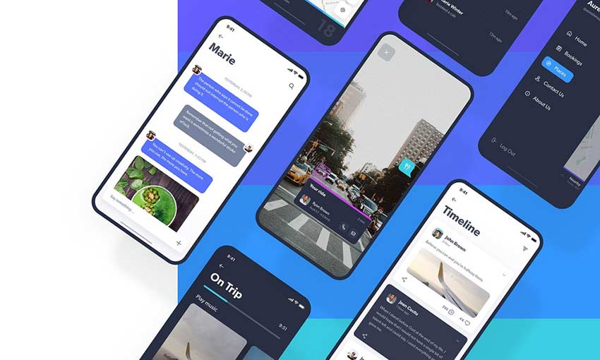
Featured image via Unsplash

Add Realistic Chalk and Sketch Lettering Effects with Sketch’it – only $5!

Source

p img {display:inline-block; margin-right:10px;}
.alignleft {float:left;}
p.showcase {clear:both;}
body#browserfriendly p, body#podcast p, div#emailbody p{margin:0;}

Collective #495

Original Source: http://feedproxy.google.com/~r/tympanus/~3/3TzaDXf4fm8/

C495_react

Progressive React

A guide by Houssein Djirdeh on how to optimize React apps.

Read it

C495_Pramp

This content is sponsored via Thought Leaders
Pramp – Free frontend mock interview practice

Can you ace an interview? Make sure you can. Pramp, a peer-to-peer mock interviews platform allows you to practice on-demand for free.

Get unlimited interview credits

C495_dialog

<details-menu> element

GitHub’s menus and dialogs work without JavaScript because of Mu-An Chiou’s great exploration of how to use <details> for JS-less popovers. Check out the version for dialogs and Mu-An Chiou’s notes on <details> at Brooklyn JS.

Check it out

C495_essentialscss

Pure CSS Drawing Essentials

CSS art master Diana Smith shares her top 5 CSS properties she uses in order to produce pure CSS art.

Check it out

C495_videoplayer

Onelineplayer

A free web video player without branding and quality loss that loads 2x faster than others while supporting HQ previews.

Check it out

C495_colortool

Der Bunt: Color Harmonies (Alpha 1)

A beautiful way to tinker with color spaces and systems.

Check it out

C495_newsletter

Tech Productivity

Tech Productivity is a short weekly newsletter for tech professionals with productivity-related tools, articles, and other resources. By Louis Lazaris.

Check it out

C495_googlefonts

Make your Google Fonts render faster

A tool that generates a small wrapper around Google Fonts that adds font-display support and helps to render text quicker.

Check it out

C495_scand

Scandinavian Houses: Free Vector Images

A beautiful set of vector houses made by Tatiana Lapina.

Get it

C495_graphql

Try GraphQL

An interactive GraphQL tutorial made by Ryan Chenkie.

Check it out

C495_packcircles

Packing Circles inside a Rectangle

Mike Bostock is exploring a variant on Wang et al.’s circle-packing algorithm to pack circles inside a rectangle.

Check it out

C495_wordpress

Improving WordPress Code With Modern PHP

Leonardo Losoviz gives us a tour of the PHP features newly-available to WordPress and suggests how these can be used to produce better software.

Read it

C495_ascii

Explaining Code using ASCII Art

John Regehr collected some wonderful ASCII code embeds.

Check it out

C495_personalweb

personal-website

A repository that gives you the code you’ll need to kickstart a personal website that showcases your work as a software developer.

Check it out

C495_silo

Silo

A daring and refreshing layout and design. With dark mode option.

Check it out

C495_cache

Exploring a back/forward cache for Chrome

Learn about the back/forward cache (bfcache) prototype in this article with videos by Addy Osmani.

Read it

C495_acccolors

CSS Variables + calc() + rgb() = Enforcing High Contrast Colors

Josh Bader shows how to make sure colors have enough contrast with Custom Properties.

Read it

C495_vscode

Visual Studio Code Settings and Extensions for Faster JavaScript Development

Tilo Mitra shares some VS Code extensions and settings for better JS development.

Check it out

C495_font

Free Font: Arco

Rafael Olivo Díaz created this playful font.

Get it

C495_blobby

Blobby Hill

A fun blobby demo by Alex Zaworski.

Check it out

C495_type

Interactive Typography Cheatsheet

Christian Heilmann created this helpful cheatsheet that explains some typography jargon. Read more about it in this article.

Check it out

Collective #495 was written by Pedro Botelho and published on Codrops.

SVG Filter Effects: Moving Forward

Original Source: http://feedproxy.google.com/~r/tympanus/~3/Z9mQmEc5x48/

Over the course of six weeks, we published six articles that covered a variety of SVG Filter effects and the filter primitives used to create them:

SVG Filters 101— in which we covered the basics for getting started with SVG filters.
In the second article, Outline Text with <feMorphology>, we learned about feMorphology and how it can be used to shrink and expand content. We saw how we can use it co create text outlines and paint-like image effects.
The third article, Poster Image Effect with <feComponentTransfer> was our first step into the world of feComponentTransfer. We learned how we can use it to create poster image effects.
In the fourth article, Duotone Images with <feComponentTransfer> we dug further into feComponentTransfer. We learned how to use it to recreate Photoshop’s duotone effects by creating gradient maps and applying them to images.
In the fifth article, Conforming Text to Surface Texture with <feDisplacementMap> we recreated another Photoshop-grade effect and learned how to conform text to surface texture. We saw how the steps to recreate Photoshop effects are very similar in SVG.
And in the sixth article, Creating Texture with <feTurbulence> we learned how to generate our own textures using SVG’s feTurbulence primitive. We learned how to use it to distort HTML and SVG content, as well as simulate natural texture by combining it with SVG’s lighting effects. All pretty powerful stuff.

Even though we covered a lot of areas, I can confidently say that we barely scratched the surface of what’s possible with SVG Filters. In this short follow-up article, I want to share some of my favorite resources to learn more about SVG Filters.

Moving Forward: SVG Filter Learning Resources and Experiments

To get an even broader idea of the incredible possibilities that SVG Filters bring to the Web, I highly recommend checking out Lucas Bebber’s Codepen profile. Lucas is the guy who created the famous Gooey Effect using SVG Filters. His experiments include even more impressive effects that are guaranteed to inspire you and get you excited about the possibilities that SVG brings to the Web.

See the Pen Gooey Menu by Lucas Bebber (@lbebber) on CodePen.light

See the Pen CSS Text filling with water by Lucas Bebber (@lbebber) on CodePen.light

Michael Mullany was my go-to resource for learning when I took my first dive into the world of SVG filters. I learned a lot from his writing, his contributions to the Web Platform Docs’ SVG Filters entries, and his Codepen experiments which are literally an SVG Filters gold mine! Check out this Stranger Things logo recreated entirely with SVG Filters:

See the Pen Stranger Things Logo in SVG (Filters) by Michael Mullany (@mullany) on CodePen.light

David Dailey has a fantastic introduction to SVG Filters in which he shows a wide range of possible effects that he created with feTurbulence, including but not limited to heavy cloud and bokeh-like effects.

Screen Shot 2019-01-21 at 15.00.18

The results of adjusting the results of feTurbulence with other filter primitives. Adjusting and saturating colors with feColorMatrix, as well as sharpening with feConvolveMatrix are examples of things you can do with generated noise.

Dirk Weber also created some of the best SVG Filter effects that I personally learned a lot from. He shared his experiments in an article on Smashing Magazine more than three years ago! He shares a variety of text effects created using SVG filters. You’ll find examples of grunge texture, protruding and 3D text, water splash effects (uses feTurbulence), and many more. Dirk uses two filter primitives in his experiments that we didn’t touch on in this series:

feTile which is a utility primitive which fills a target rectangle with a repeated, tiled pattern of an input image. Yoksel also has a great example created using a series of operations including feTile that is worth exploring.

and feConvolveMatrix which is one of the more complex and also more powerful primitives. It applies a matrix convolution filter effect. A convolution combines pixels in the input image with neighboring pixels to produce a resulting image. A wide variety of imaging operations can be achieved through convolutions, including blurring, edge detection, sharpening, embossing, and beveling. I haven’t personally experimented with this primitive just yet, but I know other people who have.

GroupSome of the text effects that Dirk Weber covers in his article o n Smashing Magazine.

Yoksel’s SVG experiments on Codepen are also a great resource to learn from. She even created this fantastic visual SVG Filters tool which you can use to create effects and copy-paste the generated code to use in your own projects.

Screen Shot 2019-01-21 at 15.17.07The visual SVG Filters editor by Yoksel.

And last but not least, you can find all there is to know about elements, properties and attributes of SVG Filters in The SVG Filters Specification.

Why SVG Filters?

SVG is currently a lot more powerful than CSS when it comes to creating graphical effects on the web. And there are several reasons why creating visual effects on the web is better than importing them as images from graphics editors like Photoshop and Illustrator:

In the days and age of the responsive web, we are no longer dealing with one image. For every image we use on the web, we should be providing responsive versions of that image optimized for different user contexts and performance. This means that if you create an image and then decide to change something about the effect in it, you’re going to have to change the effect in multiple images, which will easily turn into a maintenance nightmare. Creating effects in the browser, on the other hand, means they are resolution-independent and easier to edit.
The ability to apply filter effects on the web helps to maintain the semantic structure of the document, instead of resorting to images which—aside from generally being a fixed resolution—tend to obscure the original semantics of the elements they replace. This is especially true for effects applied to text. When effects are applied to real text on the web, that text is going to be searchable, selectable and accessible.

Effects created on the web are easier to edit, change, and update without having to jump between the graphics editor and the code editor or browser.
And last but not least, effects created on the web can be animated and interacted with. This is one of their most important points of strength.

Final Words

Thank you for joining me on this SVG Filters journey over the last few weeks. I hope this series has inspired you to start experimenting with SVG Filters and using them more when and where appropriate. There are many effects that you can create that would definitely be filed as experimental. But there are also many practical applications for filters in the wild as well. My hope is that this series has given you a glimpse of what’s possible and that it encourages you to unleash your imagination and to start creating your own practical use cases.

Finally, I hope you enjoyed this series and found it useful. Thank you for reading. =)

SVG Filter Effects: Moving Forward was written by Sara Soueidan and published on Codrops.

Text Trail Effect

Original Source: http://feedproxy.google.com/~r/tympanus/~3/TZqJ49_YG7Q/

Today we’d like to share a little text effect for a slideshow with you. It’s based on the animation seen in the Dribbble shot Abstract is hiring. The idea is to show a trail of a text when transitioning between slides of a slideshow. The animations are made using TweenMax.

Attention: Note that this is very experimental and that we use modern CSS properties that might not be supported in older browsers.

We’ve created five demos with different typography and effects for the images as we go from one slide to another. The text trail layout is made by using a flexbox container that will make the height of each text container shrink so that all fit into the viewport (height). Some of the texts will be visible in full height (we set them specifically to flex: none). Using blend modes and rotations also creates an interesting look.

TextTrailEffect_01

TextTrailEffect_02

TextTrailEffect_03

TextTrailEffect_04

TextTrailEffect_05

We hope you enjoy this effect and find it useful!

References and Credits

Images from Unsplash.com
TweenMax by Greensock
imagesLoaded by Dave DeSandro

Text Trail Effect was written by Mary Lou and published on Codrops.

Top 10 Google Web Fonts For Bold Header Text

Original Source: http://feedproxy.google.com/~r/1stwebdesigner/~3/Xf1EcICM5ig/

Since webfont support is basically universal there’s no good reason to stick to the defaults. Google Webfonts is the largest source of free fonts with hundreds of typefaces to pick from.

Since page headers are the strongest elements they usually work best with custom fonts. However it can be tough whittling down the best choices, and that’s exactly why I wrote this post.

All the Fonts You Could Ask For


DOWNLOAD NOW

1. Montserrat

montserrat font

The first in my collection is Montserrat. This font can work for pretty much anything but I think it works incredibly well as header text.

I’ve used this for navigation text with all caps, customized letter spacing, along with many different font styles from thin to super thick. Montserrat fits the bill perfectly across the board and it’s one of the more universal fonts blending into anything from a tech blog to a funeral parlor website.

The font only weighs about 500 bytes using the default style so it’s incredibly light. And with so many different styles you can get a lot of different looks from this one family.

If you’re looking for a unique heading font try Montserrat. It probably won’t work for everyone but it’s a safe starting font that many designers love.

2. Merriweather

merriweather typeface

A much thicker serif alternative is Merriweather which I also like as a body font. This versatile typeface really looks great anywhere on your site and it’ll bring plenty of attention to your headers.

If you try Merriweather for a larger page heading I suggest using the bold or bold italic style. They are surprisingly clean but they probably need some letter spacing adjustments. Either way the style and darkness of the letters are super easy to follow.

When pairing this font I usually do a sans-serif body typeface. The contrasting styles create a natural divide between headers & body copy. Plus most people find sans-serif easier to read on average for body content.

But I see a lot of sites with serif headers and they all look great. Merriweather is a nice starting point for serif, but if you don’t like it you’ll find tons of alternatives in this post.

3. Josefin Sans

josefin sans font

Modern and classy best describes Josefin Sans. It feels like a font straight from a 1950s jazz lounge, or maybe something you’d see on the front page of The New Yorker.

It does have a distinct curvy style and the thin letters save a lot of horizontal space. You can toy with all-caps or different letter spacings to create many unique styles all from this one font family.

Some sites just look better with thin heading fonts. If you’re looking for one to try I absolutely recommend Josefin Sans with its unique letter designs and its many bold/italic styles.

4. Arvo

arvo webfont

One other serif font I really like is Arvo. This font has a lot of character which you’ll notice right away in the bolder styles.

I really feel like Arvo works best on blogs and digital magazines because the font grabs so much focus. It’s one of the strongest fonts in this list and the serif design grabs even more attention.

If you’re launching a magazine-style blog then Arvo can work well as a strong header. But if your blog works better with sans-serif fonts this can be too much. One alternative that’s a bit more subtle is Crete Round but it doesn’t have the same eye-catching appeal as Arvo.

5. Raleway

raleway font

I’ve seen Raleway on many larger blogs and online magazines for its distinct style and large variety of font variations.

For big heading text I think a mid-level thickness works best so the letters don’t get too wide. Default letter spacing is great so every word is clearly legible.

One feature unique to Raleway is the “w” letter form. It crosses in the middle which looks like two “v”s stacked together. Some may like this, others won’t. But it’s definitely unique to Raleway so it’ll stand out in your page headers too.

6. Catamaran

catamaran font

One of the newer fonts I found recently is Catamaran. It comes with 9 font styles from thin to black and varying thicknesses inbetween.

What I like most about this font is the offbeat lettering. Each letter takes on a very unique style and you can see this in the bolder styles. When used in heading text these letters really shine and jump off the page.

Because the bold styles are so thick you should only use Catamaran in headers with larger font sizes. It can look OK at all sizes but Catamaran really feels like a thick header typeface.

7. PT Sans

pt sans font

PT Sans is soft with smooth edges and thin letters. For headers I only like the bold style of PT Sans because the “normal” style just feels way too thin.

I also prefer PT Sans for headers only since it just feels too soft for regular body text. But any PT Sans header is going to look amazingly clean and readable. This font actually has a sister named PT Serif that also works well.

Between the two, I personally prefer PT Sans. It has smoother edges than the serif version and I feel it just works better in page headings and especially for blogs.

8. Open Sans

open sans font

Open Sans is small, versatile, and super clean. It deserves a spot in this collection because it’s a simple font and one of the fastest loading fonts from the entire Google Fonts library.

The majority of sans-serif fonts play well with any site. Plus you can use sans-serif fonts in both your header and body text making Open Sans a reasonable choice for the entire website. One alternative I really like is Muli which has a lot more character as a header font.

But Muli’s downside is the larger file size. Ultimately this is what makes Open Sans so great because slower sites don’t rank as well and they provide a worse UX all around.

9. Roboto Slab

roboto slab

For a strong serif header font you might try Roboto Slab and just see how it looks. The letters aren’t too thick and the tags that hang off don’t distract the reader.

I generally prefer Roboto Slab for headers instead of the sans-serif version called Roboto. The serif version just feels stronger and leaves a much bigger impression on the viewer.

Truth be told they’re both awesome and you can’t go wrong either way. They both support all the common unicode characters and they’re both amazing choices for your website headings.

10. Ubuntu

ubuntu webfont

The free Ubuntu font can be used for practically anything from nav text to large headers and even body copy. It’s extremely versatile and it’s lightweight with a pretty fast load time.

Rounded edges on the letters make this feel sleek and modern. It’s also one of the few fonts that really can be used in multiple places on your site which can cut down the total number of fonts you need.

Ubuntu was designed back in 2010 so it’s been around for quite a while. Now that webfonts are much more common the Ubuntu family is widely used in web design.

Wrapping Up

Whenever I design a new site these 10 fonts are my go-to choices for headers. They’re much better than the stock OS defaults and your layout will really stand out from the others with these strong header fonts.


Start Your Project Off Right with 7 Free Adobe XD UI Kits

Original Source: http://feedproxy.google.com/~r/1stwebdesigner/~3/iYrxQBxlwZg/

UI/UX design is tough work. Designing all the little pieces and screens from scratch can end up being extremely time-consuming. Luckily, plenty of amazing designers out there have released UI kits, a helpful resource that can seriously cut down on time as well as providing inspiration.

Premade assets, screens and pages will allow you to get right to the site or app design. Skip all the tedious setting up and start working on the actual product. Here are seven of the best free UI kits, made just for Adobe XD users.

Social Meet Up UI Kit

Social Meet Up UI Kit

An iOS kit made for social media apps, Social Meet Up comes with an absolute ton of content. 80+ screens provide everything needed to create a social network, a perfect launching pad for your app’s UI. The strong, feminine design is just perfect for a project like this. And the kit is built to be easily customized, so keep the parts you like and mix it up with your own brand.

Non-Profit UI Kit

Non-Profit UI Kit

Designed for non-profits, this kit offers everything you need to build a website that looks beautiful and reaches further. Two colors and three fonts create a simple but memorable palette. The responsive website prototype comes with home, about, donation and various other pages relevant for a non-profit. 30+ components and 20+ screens will give you plenty to work with here.

Smartwatch UI Kit

Smartwatch UI Kit

There are plenty of resources for website and app designers, but what about for a smartwatch? With 60 screens, 20 customizable components and 30 icons, this UI kit leaves little to be desired. Whatever kind of smartwatch app you’re making, there’s something to build on here, and plenty of room to add your own unique style.

Pawtastic UI Kit

Pawtastic UI Kit

If you’re creating a website for pet services, look no further. Pawtastic comes with various super helpful components, including a well-crafted sign-up process and various customizable UI elements. The colors and typography look amazing here. And by downloading the free pack, you get 15 wireframes too! This is one that just can’t be passed up.

Fashion Influencer UI Kit

Fashion Influencer UI Kit

Fashion designer? You’ll adore this elegant UI kit. With 10+ pages to work off of and over 50 components, you won’t be running out of material any time soon. These designs are made with a careful, sophisticated style, perfect for a fashion portfolio or an online clothing store. For any project that’s trying to nail the fashionable look, the potential here is unlimited.

Dashboard UI Kit

Dashboard UI Kit

This one is just awesome! If you’re building a site with data visualization, Dashboard has exactly what you need. 15 customizable charts, 10 screens and 100+ UI components – a dizzying amount of resources for your project. The prototype is actually interactive as well, so customizing and even embedding it into a website is no problem. Show the world your designs as you work with this comprehensive UI resource.

Navigo Transportation UI Kit

Navigo Transportation UI Kit

This unique UI kit is designed for transportation and GPS apps – specifically ones made for iOS and iPhone X. With 60+ assorted screens, spread across 6 categories, you’ll find plenty of content to keep you going. There’s even statistics and profile pages to really add some personality to your app.

Easily Create Website Mockups

People who create and release UI kits for free are a godsend for web and UI/UX designers. Finding or creating assets and components eats up so much time. Using one of these kits, you can skip all of that and start drafting your new website right away. Try out one of these professionally made kits and get right to the action! No more scrambling to meet a deadline.


Ode to Simplicity in Graphic Design Playing with Lines

Original Source: http://feedproxy.google.com/~r/abduzeedo/~3/8G-oKU2CseA/ode-simplicity-graphic-design-playing-lines

Ode to Simplicity in Graphic Design Playing with Lines

abduzeedoFeb 25, 2019

I am a fan of simplicity and for this post, I would love to share some artwork that inspired me for some recent personal projects. These are graphic design explorations using simple elements like lines and adding some deformation. It is a super simple effect, you can basically create it in Photoshop using the Displacement Map. The same goes if you want to animate it in After Effects. As I said, the effect is easy to be recreated, however, to achieve elegance and simplicity requires a lot of experimentation.

Graphic Design

Ode to Simplicity in Graphic Design Playing with Lines Ode to Simplicity in Graphic Design Playing with Lines Ode to Simplicity in Graphic Design Playing with LinesOde to Simplicity in Graphic Design Playing with Lines Ode to Simplicity in Graphic Design Playing with Lines Ode to Simplicity in Graphic Design Playing with Lines Ode to Simplicity in Graphic Design Playing with Lines Ode to Simplicity in Graphic Design Playing with Lines Ode to Simplicity in Graphic Design Playing with Lines


3 Essential Design Trends, March 2019

Original Source: https://www.webdesignerdepot.com/2019/02/3-essential-design-trends-march-2019/

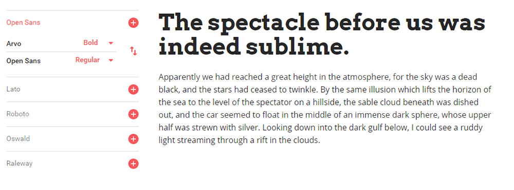
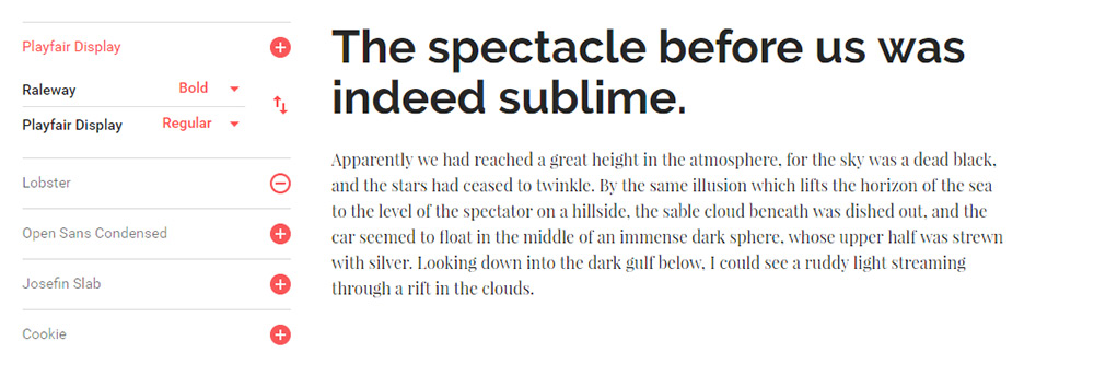
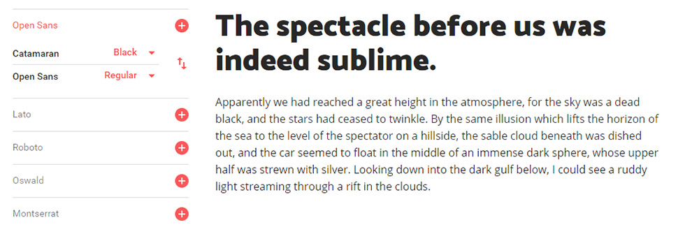
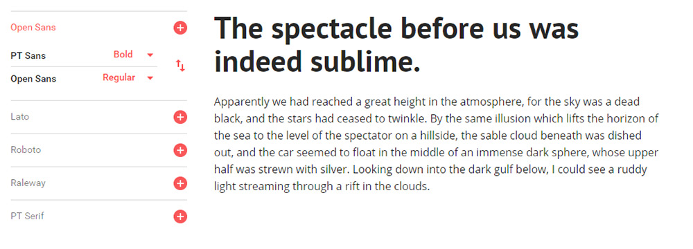
Typography, color and distinct layouts are all elements that contribute to any design project. They are also elements of design that can trend over time.

That’s exactly what we are seeing this month as bold design elements are just the things that are making certain website designs come to the forefront. Here’s what’s trending in design in this month.

Bold Serifs

Big, thick lettering can draw attention and tell a story. And that’s just what designers are doing with the use of more bold, thick serifs in projects.

Thicker letterforms are a good choice for reverse typography or in situations where there is a lot going on to compete with the words. The challenge is that bold typography can be a little overwhelming when there’s a lot of it to read.

So, you have to balance viewability with readability.

When picking a bold serif, look for something that’s a mid-range weight and not overly thick. Look for letters with a more round shape; not too tall or condensed either, to encourage reading.

While many the examples below are focused on bold serifs only, the best advice is to pair them with a less heavy option as well. (Maybe mix and match the bold and regular weights of a typeface.)

Some users will equate bold type in the same manner as all caps, assuming that it is screaming at them. You can avoid this by using bold serifs with purpose for just a few key words or phrases and balance other screen elements so that it’s not a weighty aesthetic.

While this can be a somewhat tricky trend to use, you can see from the examples below that it can work rather nicely. There’s nothing wrong with going bold when it contributes to the overall meaning and content in the rest of the design.

Red Text and Accents

It’s like I blinked and red text and accents were suddenly everywhere.

This is an accent color choice that was wildly popular at one time and quickly faded out of fashion about the time flat and material colors emerged. (Brighter reds clashed with all the other bright color options.)

But red is back.

This color choice is interesting because it is so attention-grabbing. It can also create quite an emotional bond with users. Just be aware that people can really like red or really hate it; there’s not a lot of middle ground when it comes to a color that’s connected to passion, love, anger and fear.

In each of the examples below, red is the thing that draws you into the design.

With the interactive Adidas website for Footlocker, red elements tell you where to click and engage with the game. The colors seem to “lift” right off of the movie-style video playing in the background.

Branu uses red lettering to draw you in. On a stark white background with a simple video element, it’s just sharp enough to make you stop and look.

Finally, the conference website uses red to give you the information you need over a loop of b-roll in the background. The color helps you find the event dates quickly and pinpoints a key element in the main navigation.

While all three shades of red are a bit different, they aren’t that far apart on the color spectrum. Use of red is bright and saturated. It’s the hue you think of first and that toddlers first learn to color with. (There’s no softening this color trend right now.)

More Split Screens

At a glance split screens aren’t new. We’ve been talking about – and loving on – this website design trend for a while now. And this is one concept that seems to keep getting better with time.

The latest iterations of split screen designs are more aesthetic than stacked for responsive functionality (although that’s a distinct bonus).

Split screens aren’t stuck in perfectly symmetrical patterns either. None of the examples below features a perfect split – unless it is part of another element. Both ATB and Yusuf Ozturk’s sites feature animations within the split screen so that the screen elements actually shift to highlight content or interactivity.

ATB use hover action to move the screen left and right as users choose which path to take with the design. It’s a clever way to connect the human or machine learning experience.

Ozturk’s site opens with a center split screen with a brain in the middle; hover actions revel design on one side of the brain and development on the other to showcase what’s you’ll find in the portfolio site. The animation is clean and sharp, and you can actually get caught playing with it for a while.

VM Consulting has a more traditionally designed split screen but uses the right side as a giant navigation menu. The heavy blue side paired with the lighter navigation is brilliantly balanced and easy to understand. (The color palette helps make this design shine as well.)

Conclusion

Are these design trends just right or too bold for your projects? While I love everything about split screen designs, I’m not 100 percent convinced when it comes to thick serifs and red accents. (These just seem to need more sparing use to me.) What do you think? Let’s start a conversation.

What trends are you loving (or hating) right now? I’d love to see some of the websites that you are fascinated with. Drop me a link on Twitter; I’d love to hear from you.

Add Realistic Chalk and Sketch Lettering Effects with Sketch’it – only $5!

Source

p img {display:inline-block; margin-right:10px;}
.alignleft {float:left;}
p.showcase {clear:both;}
body#browserfriendly p, body#podcast p, div#emailbody p{margin:0;}

5 apps that are shaking up the art market

Original Source: http://feedproxy.google.com/~r/CreativeBloq/~3/bxBggxbNrs8/5-apps-that-are-shaking-up-the-art-market

It’s always been tough to make money from art. But for big-city artists and curators, the cost of real estate for galleries and studio space has made it even tougher to build a sustainable practice.

The growing popularity of art fairs has also had an effect, by creating destination experiences that might be great for bringing people in, but not necessarily for actually selling art.

But artists willing to embrace digital technology and take charge of their own destinies have never had it so good. Social media, online platforms, transactional ecommerce platforms and mobile apps have made it possible to reach global audiences, build personal brands, and sell art on more favourable terms than ever before. In this article, we take a look at the art apps that are shaking things up for creatives. 

Selling art online

The artist’s digital journey often starts on social media, with artists using tools like Instagram to promote work and build an audience. Now there are also digital platforms to monetise creativity, and a new breed of digital-first players are building unique connections between artists and collectors, creating markets that simply didn’t exist in the pre-digital age.

16 great places to sell your design work online

Alongside this is an explosion of new channels to reach art lovers, whether it’s using Snapchat to provide behind-the-scenes looks into the creative process, or engaging with storytellers on podcasts to help spread the word (check out this playlist of great art podcasts).

With the global online art market worth around $4.22 billion in 2017, up 12 per cent from the previous year, these new digital tools and platforms are already revolutionising the world of fine art for artists and art-lovers. Here are five apps and platforms that are leading that revolution, creating new ways to make fine art profitable.

01. Artsy

Artsy art app

The art on sale on Artsy ranges from design items such as ceramics to sculpture to photography

Artsy has a vision to transform the art world through technology, and it’s executed on that vision from day one, delivering an online platform that connects art lovers to galleries and artists in a global community. Its library encompasses a dizzying breadth of art, from Old Masters to contemporary artists. 

Under the hood, Artsy has built relationships with galleries and art fairs, combining their understanding of art markets with its deep technological expertise to provide gallerists and curators with tools and data to promote the artists they represent.

02. Patreon

Patreon art apps

Get direct support for your work using Patreon

Patreon is rethinking how artists and creators can finance their work, by enabling direct funding appeals to patrons and supporters. A digital spin on an age-old model, the San Francisco-based platform gives emerging artists control over their careers, without them being beholden to the existing gatekeepers of the art world.

Patreon enables artists to garner financial support for their work directly from the people who love it the most. The platform enables both the discovery of new artists and support for established artists, while leveraging learnings from ecommerce and crowdfunding to help artists make direct appeals to support their creative efforts.

03. Artfare

Artfare art apps

Artfare connects potential patrons to artists

Launched in February 2019, Artfare puts a new spin on the art fair model, using a mobile app, in-house curators and local pop-up shows and fairs to create connections between artists and collectors in local art scenes, starting with New York. 

Artfare promotes vibrant local art scenes by bringing artists and collectors together through messaging, studio visits and sales of art works. Using Artfare’s listings, artists can promote works for sale on social platforms such as Instagram (where they’ve often built big followings). In addition they can monetise them through online sales using the Artfare app – it gives them more control and effectively tilts the economics of art-buying in their favour. 

04. Paddle 8

Paddle 8 art apps

Paddle 8 is a bit like eBay for art

Paddle 8 is a curated auction platform that enables a global community of buyers to discover and bid for art in real time. By digitally enabling the auction mechanic, it helps to promote artists’ work and drive sales, creating a global, digital spin on a market dynamic that was previously often limited to those with privilege and access.

05. Uprise Art

Uprise Art art app

You can talk to one of Uprise Art’s personal art advisors if you’re not sure what you’re looking for

This one isn't an app, but a platform. The team at Uprise Art are driven by a mission to enable a new generation of digitally savvy collectors to discover and buy art from emerging artists. Uprise Art is effectively a digital gallery, working online and via pop-ups, collaborations and booths at art fairs to showcase the work of a roster of talented artists. 

By creating a digital-first gallery experience and constantly innovating the model – connecting with high-flying tech start-ups to provide art for their offices or working directly with interior designers – Uprise Art gives emerging artists new opportunities to have their work discovered and purchased.

Read more:

The 10 best drawing booksHow to succeed as a designer-makerThe best online art classes

Tokyo Storefronts in Beautiful Watercolor by Mateusz Urbanowicz

Original Source: http://feedproxy.google.com/~r/abduzeedo/~3/ubs76M_hzC0/tokyo-storefronts-beautiful-watercolor-mateusz-urbanowicz

Tokyo Storefronts in Beautiful Watercolor by Mateusz Urbanowicz

GisMullrFeb 22, 2019

Mateusz Urbanowicz aka. Matto, is a very talented illustrator and digital designer. Born and raised in Silesia, Poland, Matto currently lives in Tokyo. The artist has a lot of beautiful artworks on his portfolio. But one series of illustrations he created really caught my attention. Tokyo Storefront series is a collection of exquisite watercolor pieces showcasing Tokyo shops. What is so unique about it is that Matto turns the busy life of Tokyo into delicate illustrations. You are almost transported to a parallel Tokyo where everything is calm and quiet. Subtle lines and colors give life to storefronts the artist encountered in some of his explorations around the city. Forget the concrete jungle and all of the gray colors you see in Tokyo and enjoy some beautiful watercolor storefronts.

I have been to Tokyo in 2013 and I loved everything about it. And Matto is totally right, the small shops in super old buildings will grab your attention. His idea of illustrating these unique storefronts is amazing. The watercolor give them a nice delicate touch. Check out his pieces and get ready to see some Tokyo gems. Make sure to visit his websites to see some making-of videos of his pieces. Enjoy!

Born and raised in Silesia, Poland. Studied electronic engineering until found out that making art can be more than a weird hobby. Finished Computer Graphics at Polish Japanese Institute of Information Technology, and thanks to a Japanese government scholarship, moved to Japan to study animation and comics. Graduated with honors from Kobe Design University with a short animated movie “Right Places.” From 2013 started working as a backgrounds artist and animation creator for Comix Wave Films animation studio in Tokyo. Apart from professional work, keeps creating illustration series, paintings, comics, videos and other personal works.

More about Mateusz Urbanowicz:

mateuszurbanowicz.com
Behance
Instagram
Facebook

Make sure to check his other two series: Cold In Yokohama and Bicycle Boy.