How to Create a WooCommerce Store on the Cloud in 10 Minutes

Original Source: https://www.sitepoint.com/how-to-create-a-woocommerce-store-on-the-cloud-in-10-minutes/?utm_source=rss

While online shopping via eCommerce has been growing steadily for years, there’s been an unprecedented explosion since the start of the pandemic.

Even if you own a brick-and-mortar store, having an online presence has never been so important.

An eCommerce store doesn’t just boost your income. It provides an alternate stream of revenue, limiting your exposure to events like the one we’re currently in. And of course, an eCommerce store enables businesses to reach a much larger market than a storefront alone.

In this tutorial, we explain how you can create your eCommerce store with WooCommerce on the cloud in just ten minutes.

WordPress is one of the most popular content management systems in the world. It now powers 37.5% of all sites on the Internet, and that number isn’t inflated by all of those forgotten blogs with an audience of one. 38% of websites in the Quantcast Top 10k are WordPress-powered, too.

If you look past the Gatsby front-end, the site you’re reading this article on is powered by WordPress, too.

WooCommerce is a popular WordPress plugin that converts your WordPress site into an eCommerce store. WordPress and WooCommerce are both open source, and actively developed. The community and support for both the platform and the plugin are tremendous. It’s an easy choice for beginners and experts in web development.

But that’s enough talk. Let’s fire up a server on the cloud and create an eCommerce store.

Continue reading
How to Create a WooCommerce Store on the Cloud in 10 Minutes
on SitePoint.

7 Telltale Signs of Facebook Addiction

Original Source: https://www.hongkiat.com/blog/facebook-addiction-signs/

Facebook has become so much a part of our life now that with close to a billion users out there, one can easily throw a stone and hit a Facebook user. User engagement in Facebook activities, like…

Visit hongkiat.com for full content.

Style React Components: 7 Ways Compared

Original Source: https://www.sitepoint.com/react-components-styling-options/?utm_source=rss

I’ve been working with a couple of developers in my office on React projects, who have varied levels of React experience. This article arose from a question one of them asked about how best to style React components.

The Various Styling Approaches

There are various ways to style React components. Choosing the right method for styling components isn’t a perfect absolute. It’s a specific decision that should serve your particular use case, personal preferences, and above all, architectural goals of the way you work. For example, I make use of notifications in React JS using Noty, and the styling should be able to handle plugins too.

Some of my goals in answering the question included covering these:

global namespacing
dependencies
reusability
scalability
dead-code elimination

There seems to be a number of ways of styling React components used widely in the industry for production level work:

inline CSS
normal CSS
CSS in JS libraries
CSS Modules
Sass & SCSS
Less
Stylable

For each method, I’ll look at the need for dependencies, the difficulty level, and whether or not the approach is really a good one or not.

Inline CSS

Dependencies: None
Difficulty: Easy
Approach: Worst

I don’t think anyone needs an introduction to inline CSS. This is the CSS styling sent to the element directly using the HTML or JSX. You can include a JavaScript object for CSS in React components, although there are a few restrictions such as camel casing any property names which contain a hyphen. You can style React components in two ways using JavaScript objects as shown in the example.

Example
import React from “react”;

const spanStyles = {
color: “#fff”,
borderColor: “#00f”
};

const Button = props => (
<button style={{
color: “#fff”,
borderColor: “#00f”
}}>
<span style={spanStyles}>Button Name</span>
</button>
);

Regular CSS

Dependencies: None
Difficulty: Easy
Approach: Okay

Regular CSS is a common approach, arguably one step better than inline CSS. The styles can be imported to any number of pages and elements unlike inline CSS, which is applied directly to the particular element. Normal CSS has several advantages, such as native browser support (it requires no dependencies), there’s no extra tooling to learn, and there’s no danger of vendor lock in.

You can maintain any number of style sheets, and it can be easier to change or customize styles when needed. But regular CSS might be a major problem if you’re working on a bigger project with lots of people involved, especially without an agreed style guide for writing CSS.

Example
/* styles.css */

a:link {
color: gray;
}
a:visited {
color: green;
}
a:hover {
color: rebeccapurple;
}
a:active {
color: teal;
}

import React from “react”;
import “styles.css”;

const Footer = () => (
<footer>
&copy; 2020
<a href=”https://twitter.com/praveenscience”>Find me on Twitter</a>
</footer>
);

export default Footer;

More Information

You can read more about regular CSS usage of the W3C’s Learning CSS page. There are many playgrounds — such as JS Bin, JSFiddle, CodePen, and Repl.it — where you can try it out live and get the results in real time.

CSS-in-JS

CSS-in-JS is a technique which enables you to use JavaScript to style components. When this JavaScript is parsed, CSS is generated (usually as a <style> element) and attached into the DOM.

There are several benefits to this approach. For example, the generated CSS is scoped by default, meaning that changes to the styles of a component won’t affect anything else outside that component. This helps prevent stylesheets picking up bloat as time goes by; if you delete a component, you automatically delete its CSS.

Another advantage is that you can leverage the power of JavaScript to interact with the CSS. For example, you can create your own helper functions in JavaScript and use them directly in your CSS to modify the code.

Next, we’ll look at two libraries that can be used to implement this in a React app.

JSS

Dependencies: react-jss
Difficulty: Easy
Approach: Decent

JSS bills itself as “an authoring tool for CSS which allows you to use JavaScript to describe styles in a declarative, conflict-free and reusable way”. It’s framework agnostic, but when it comes to styling React components, React-JSS integrates JSS with React using the new Hooks API.

Example
import React from “react”;
import {render} from “react-dom”;
import injectSheet from “react-jss”;

// Create your styles. Since React-JSS uses the default JSS preset,
// most plugins are available without further configuration needed.
const styles = {
myButton: {
color: “green”,
margin: {
// jss-expand gives more readable syntax
top: 5, // jss-default-unit makes this 5px
right: 0,
bottom: 0,
left: “1rem”
},
“& span”: {
// jss-nested applies this to a child span
fontWeight: “bold” // jss-camel-case turns this into ‘font-weight’
}
},
myLabel: {
fontStyle: “italic”
}
};

// Define the component using these styles and pass it the ‘classes’ prop.
const Button = ({ classes, children }) => (
<button className={classes.myButton}>
<span className={classes.myLabel}>{children}</span>
</button>
);

// Finally, inject the stylesheet into the component.
const StyledButton = injectSheet(styles)(Button);

const App = () => <StyledButton>Submit</StyledButton>
render(<App />, document.getElementById(‘root’))

More Information

You can learn more about this approach in the JSS official documentation. There’s also a way to try it out using their REPL (read-eval-print loop).

Styled-Components

Dependencies: styled-components
Difficulty: Medium
Approach: Decent

Styled-components is a further library that implements the above-mentioned CSS-in-JS technique. It utilizes tagged template literals — which contain actual CSS code between two backticks — to style your components. This is nice, as you can then copy/paste CSS code from another project (or anywhere else on the Web) and have things work. There’s no converting to camel case or to JS object syntax as with some other libraries.

Styled-components also removes the mapping between components and styles. As can be read in their documentation, this means that when you’re defining your styles, you’re actually creating a normal React component that has your styles attached to it. This makes your code more succinct and easy to follow, as you end up working with a <Layout> component, as opposed to a <div> with a class name of “layout”.

Props can be used to style styled components in the same way that they are passed to normal React components. Props are used instead of classes in CSS and set the properties dynamically.

Example
import React from “react”;
import styled, { css } from “styled-components”;

const Button = styled.button`
cursor: pointer;
background: transparent;
font-size: 16px;
border-radius: 3px;
color: palevioletred;
margin: 0 1em;
padding: 0.25em 1em;
transition: 0.5s all ease-out;
${props =>
props.primary &&
css`
background-color: white;
color: green;
border-color: green;
`};
`;

export default Button;

More Information

Styled-components has detailed documentation, and the site also provides a live editor where you can try out the code. Get more information on styled-components at styled-components: Basics.

CSS Modules

Dependencies: css-loader
Difficulty: Tough (Uses Loader Configuration)
Approach: Better

If you’ve ever felt like the CSS global scope problem takes up most of your time when you have to find what a particular style does, or if getting rid of CSS files leaves you nervously wondering if you might break something somewhere else in the code base, I feel you.

CSS Modules solve this problem by making sure that all of the styles for a component are in one single place and apply only to that particular component. This certainly solves the global scope problem of CSS. Their composition feature acts as a weapon to represent shared styles between states in your application. They are similar to mixins in Sass, which makes it possible to combine multiple groups of styles.

Example
import React from “react”;
import style from “./panel.css”;

const Panel = () => (
<div className={style.panelDefault}>
<div className={style.panelBody}>A Basic Panel</div>
</div>
);

export default Panel;

.panelDefault {
border-color: #ddd;
}
.panelBody {
padding: 15px;
}

Please note that, if you’re using Create React App, it supports CSS Modules out of the box. Otherwise, you’ll need webpack and a couple of loaders that enable webpack to bundle CSS files. Robin Wieruch has a great tutorial on this.

Continue reading
Style React Components: 7 Ways Compared
on SitePoint.

30 Cool Computer Keyboards You Can Buy

Original Source: https://www.hongkiat.com/blog/cool-computer-keyboards-2018/

Collection of cool computer keyboards ranging from gaming to typewriter-inspired keyboards and more.

The post 30 Cool Computer Keyboards You Can Buy appeared first on Hongkiat.

Visit hongkiat.com for full content.

Getting Started with Eleventy

Original Source: https://www.sitepoint.com/getting-started-with-eleventy/?utm_source=rss
Eleventy (or 11ty) is a Node.js static site generator (SSG). SSGs do most rendering work at build time to create a set of static HTML, CSS, and JavaScript files. The resulting pages need not have server-side dependencies such as runtimes or databases.

This leads to several key benefits:

hosting is simple: you’re serving HTML files
systems are secure: there’s nothing to hack
performance can be great.

Eleventy has become increasingly popular and has attracted attention from big names in web development. It’s ideal for content sites and blogs, but has been adapted for online shops and reporting systems.

In most cases, you’ll be using Eleventy to generate HTML pages from Markdown documents which insert content into templates powered by engines such as Nunchucks. However, this tutorial also demonstrates how to use Eleventy as a complete build system for all assets. You don’t necessarily need a separate system such as npm scripts, webpack or Gulp.js, but you can still enjoy automated builds and live reloading.

Do You Need a JavaScript Framework?

A few SSGs adopt client-side JavaScript frameworks such as React or Vue.js. You can use a framework with Eleventy, but it’s not enforced.

In my view, a JavaScript framework is probably unnecessary unless you’re creating a complex app. And if you’re creating an app, an SSG is not the right tool! Gatsby fans may disagree, so please challenge/ridicule me on Twitter!

Show Me the Code

Eleventy claims to be simple, but it can be daunting when moving beyond the basics. This tutorial demonstrates how to build a simple site with pages and blog/article posts — a task often handled by WordPress.

The full code is available at https://github.com/craigbuckler/11ty-starter. You can download, install, and launch it on Windows, macOS, or Linux by entering the following commands in your terminal:

git clone https://github.com/craigbuckler/11ty-starter
cd 11ty-starter
npm i
npx eleventy –serve

Then navigate to the home page at http://localhost:8080 in your browser.

The steps below describe how to build the site from scratch.

Install Eleventy

Like any Node.js project, start by creating a directory and initializing a package.json file:

mkdir mysite
cd mysite
npm init

Then install Eleventy as a development dependency:

npm i @11ty/eleventy –save-dev

Note: this project installs modules as development dependencies since they need only run on a development machine. Some hosts with automated build processes may require you to use standard runtime dependencies.

Render Your First Page

Create a src directory where all source files will reside, then create an index.md file inside it. Add home page content such as:

‐‐‐
title: 11ty starter site
‐‐‐

This is a demonstration website using the [11ty static site generator](https://www.11ty.dev/). It shows pages, blog posts, lists, and tags.

The whole build process is managed through 11ty.

Content between the ‐‐‐ dash markers is known as front matter. It defines name-value metadata about the page which can be used to set parameters for Eleventy and templates. Only a title is set here, but you’ll add descriptions, dates, tags, and other data shortly.

An Eleventy configuration file named .eleventy.js must be created in your project’s root folder. This simple example code returns an object, which specifies the following:

the source src directory for source files
the build directory where website files will be created

// 11ty configuration
module.exports = config => {

// 11ty defaults
return {

dir: {
input: ‘src’,
output: ‘build’
}

};
};

To build the site and start a live-reloading server powered by Browsersync, enter the following:

npx eleventy –serve

Eleventy renders everything it finds in the src directory and outputs the resulting content to build:

$ npx eleventy –serve
Writing build/index.html from ./src/index.md.
Wrote 1 file in 0.12 seconds (v0.11.0)
Watching…
[Browsersync] Access URLs:
—————————————
Local: http://localhost:8080
External: http://172.27.204.106:8080
—————————————
UI: http://localhost:3001
UI External: http://localhost:3001
—————————————
[Browsersync] Serving files from: build

In this case, a single build/index.html file is created can be accessed by loading the URL http://localhost:8080 in your browser.

first 11ty render

The HTML file created at build/index.html contains content rendered from the markdown file at src/index.md:

<p>This is a demonstration website using the <a href=”https://www.11ty.dev/”>11ty static site generator</a>. It shows pages, blog posts, lists, and tags.</p>
<p>The whole build process is managed through 11ty.</p>

The Eleventy server can be stopped with Ctrl | Cmd + C.

Note: it’s rarely necessary to stop Eleventy during site development, because new files are automatically rendered. However, the sections below add further configuration options, so restarting is required.

Creating Templates

Eleventy can use almost any JavaScript templating engine. Nunchucks is a good option since it’s comprehensive and used throughout the documentation at 11ty.dev.

Change the front matter in src/index.md to this:

‐‐‐
title: 11ty starter site
description: This is a demonstration website generated using the 11ty static site generator.
layout: page.njk
‐‐‐

This instructs Eleventy to use the page.njk Nunchucks template for layout. By default, Eleventy looks for templates in an _includes sub-directory in the source directory (src/). Any files located there are not rendered themselves but are used during the build process.

Create this new template at src/_includes/page.njk:

{% include “partials/htmlhead.njk” %}

<main>
{% block content %}

<h1>{{ title }}</h1>

{{ content | safe }}

{% endblock %}
</main>

{% include “partials/htmlfoot.njk” %}

The template places the title defined in the page’s front matter within an <h1> heading and replaces {{ content }} with HTML generated from the Markdown. (It uses the safe Nunchucks filter to output HTML without escaping quotes and angle brackets.)

The two {% include %} definitions reference files included within the template. Create an HTML header file at src/_includes/partials/htmlhead.njk, which also uses the page’s title and description:

<!DOCTYPE html>
<html lang=”en”>
<head>
<meta charset=”UTF-8″ />
<meta name=”viewport” content=”width=device-width, initial-scale=1.0″ />
<title>{{ title }}</title>
<meta name=”description” content=”{{ description }}”>
</head>
<body>

Then create the HTML footer at src/_includes/partials/htmlfoot.njk:

</body>
</html>

Stop and restart Eleventy with npx eleventy –serve.

The rendered buildindex.html file now contains a fully formed HTML page:

<!DOCTYPE html>
<html lang=”en”>
<head>
<meta charset=”UTF-8″ />
<meta name=”viewport” content=”width=device-width, initial-scale=1.0″ />
<title>11ty starter site</title>
<meta name=”description” content=”This is a demonstration website generated using the 11ty static site generator.”>
</head>
<body>

<h1>11ty starter site</h1>

<p>This is a demonstration website using the <a href=”https://www.11ty.dev/”>11ty static site generator</a>. It shows pages, blog posts, lists, and tags.</p>
<p>The whole build process is managed through 11ty.</p>

</body>
</html>

Note: when you view the source within a browser, you’ll also see a <script> has been added by BrowserSync after the <body> element. This is used to trigger live reloads and will not be present in the final build (see the “Build a Production Site” section below).

Create Further Pages

You can now create further content, such as an obligatory “About Us” section.

src/about/index.md:

‐‐‐
title: About us
description: What we do.
‐‐‐

Some information about us.

src/about/team.md:

‐‐‐
title: Our team
description: Information about us.
‐‐‐

Who are we and what we do.

src/about/privacy.md:

‐‐‐
title: Privacy policy
description: We keep your details private.
‐‐‐

Our privacy policy.

None of these files reference a template in their front matter. Eleventy lets you define defaults for all files in a directory by creating a <directory-name>.json file. In this case, it’s named src/about/about.json. It sets JSON values to use when they’re not explicitly defined in the page’s front matter:

{
“layout”: “page.njk”
}

Rerun npx eleventy –serve and examine the build folder to see how the site is starting to take shape:

index.html: the home page
about/index.html: about us page
about/team/index.html: team page
about/privacy/index.html: privacy policy page

You can therefore use a slug-like URL in your browser. For example, http://localhost:8080/about/team/ shows the team page index.html file.

Unfortunately, it’s impossible to navigate between pages! You need a menu …

Create Navigation Menus

Eleventy provides a standard navigation plugin, which is installed by entering the following:

npm i @11ty/eleventy-navigation –save-dev

Plugins must be referenced in your .eleventy.js configuration file before the final return statement:

// 11ty configuration
module.exports = config => {

/* — PLUGINS — */

// navigation
config.addPlugin( require(‘@11ty/eleventy-navigation’) );

// 11ty defaults
return {

dir: {
input: ‘src’,
output: ‘build’
}

};
};

eleventyNavigation: front-matter sections must be defined in every page you want in the menu. The section sets the following:

A key for the page’s menu. This could be identical to the title but is often shorter.
An optional parent, which references the parent page’s key.
An optional order number; lower values appear first in the menu.

The home page front matter in src/index.md can be updated accordingly:

‐‐‐
title: 11ty starter site
description: This is a demonstration website generated using the 11ty static site generator.
layout: page.njk
eleventyNavigation:
key: home
order: 100
‐‐‐

The about page at src/about/index.md:

‐‐‐
title: About us
description: What we do.
eleventyNavigation:
key: about
order: 200
‐‐‐

The team page at src/about/team.md:

‐‐‐
title: Our team
description: Information about us.
eleventyNavigation:
key: team
parent: about
order: 210
‐‐‐

The privacy policy page at src/about/privacy.md:

‐‐‐
title: Privacy policy
description: We keep your details private.
eleventyNavigation:
key: privacy
parent: about
order: 220
‐‐‐

Note: using order values in multiples of 10 or higher allows pages to be inserted between others later without any manual renumbering.

A navigation menu can now be added to the page template at src/_includes/page.njk:

{% include “partials/htmlhead.njk” %}

<header>
<nav>
{{ collections.all | eleventyNavigation | eleventyNavigationToHtml | safe }}
</nav>
</header>

<main>

This is some magic Eleventy plugin code which examines all pages and filters them with an eleventyNavigation() function to create a hierarchical list. That list render is rendered to HTML using an eleventyNavigationToHtml() function.

Restart npx eleventy –serve load any page to view the menu.

the unstyled menu

You can now navigate to any page defined within eleventyNavigation front matter.

Improve the Navigation

The navigation plugin returns a basic HTML list:

<ul>
<li><a href=”/”>home</a></li>
<li>
<a href=”/about/”>about</a>
<ul>
<li><a href=”/about/team/”>team</a></li>
<li><a href=”/about/privacy/”>privacy</a></li>
</ul>
</li>
</ul>

This will be adequate for most sites, but you can improve it. For example:

provide an option to show the menu to a specific level — such as the top level only in the header and all pages in the footer
highlight the active page while making it unclickable
set styling classes for active and open menu items.

One way to achieve this is by creating a reusable shortcode, which will be familiar to anyone who’s used WordPress. A shortcode, and any optional arguments, runs a function which returns an HTML string that’s placed in the template.

Stop your Eleventy server and update the src/_includes/page.njk template to use a {% navlist %} shortcode in the <header> and <footer> sections:

{% include “partials/htmlhead.njk” %}

<header>
<nav>
{% navlist collections.all | eleventyNavigation, page, 1 %}
</nav>
</header>

<main>
{% block content %}

<h1>{{ title }}</h1>

{{ content | safe }}

{% endblock %}
</main>

<footer>
<nav>
{% navlist collections.all | eleventyNavigation, page, 2 %}
</nav>
</footer>

{% include “partials/htmlfoot.njk” %}

The navlist shortcode is passed three parameters:

Every page filtered through the eleventyNavigation() function, which returns a hierarchical list of page objects. Each page defines a children array of subpages.
The current page.
An optional level. A value of 1 returns the HTML for the top level only. 2 returns the top level and all immediate child pages.

The navlist shortcode must be registered using an .addShortcode() function in .eleventy.js before the return statement. It’s passed a shortcode name and the function to call:

/* — SHORTCODES — */

// page navigation
config.addShortcode(‘navlist’, require(‘./lib/shortcodes/navlist.js’));

You can now export a function in lib/shortcodes/navlist.js. The code below recursively examines all pages to generate the appropriate HTML (don’t worry if this is difficult to follow).

Note: the shortcode file has been created outside of the src folder since it’s not part of the site, but you could also define it in src/_includes.

// generates a page navigation list
const
listType = ‘ul’,
elementActive = ‘strong’,
classActive = ‘active’,
classOpen = ‘open’;

// pass in collections.all | eleventyNavigation, (current) page, and maximum depth level
module.exports = (pageNav, page, maxLevel = 999) => {

function navRecurse(entry, level = 1) {

let childPages = ”;

if (level < maxLevel) {
for (let child of entry.children) {
childPages += navRecurse(child, level++);
}
}

let
active = (entry.url === page.url),
classList = [];

if ((active && childPages) || childPages.includes(`<${ elementActive }>`)) classList.push(classOpen);
if (active) classList.push(classActive);

return (
‘<li’ +
(classList.length ? ` class=”${ classList.join(‘ ‘) }”` : ”) +
‘>’ +
(active ? `<${ elementActive }>` : `<a href=”${ entry.url }”>`) +
entry.title +
(active ? `</${ elementActive }>` : ‘</a>’) +
(childPages ? `<${ listType }>${ childPages }</${ listType }>` : ”) +
‘</li>’
);

}

let nav = ”;
for (let entry of pageNav) {
nav += navRecurse(entry);
}

return `<${ listType }>${ nav }</${ listType }>`;

};

Rerun npx eleventy –serve and navigate to the About page. The header <nav> HTML now contains the following:

<ul>
<li><a href=”/”>home</a></li>
<li class=”active”><strong>about</strong></li>
</ul>

The footer <nav> HTML contains this:

<ul>
<li><a href=”/”>home</a></li>
<li class=”open active”>
<strong>about</strong>
<ul>
<li><a href=”/about/team/”>team</a></li>
<li><a href=”/about/privacy/”>privacy</a></li>
</ul>
</li>
</ul>

Continue reading
Getting Started with Eleventy
on SitePoint.

Units Research Review interdisciplinary trip around tech emotions

Original Source: http://feedproxy.google.com/~r/abduzeedo/~3/_tGahGhQNy8/units-research-review-interdisciplinary-trip-around-tech-emotions

Units Research Review interdisciplinary trip around tech emotions

abduzeedo09.22.20

What if we took another look at technology? Rather than trying to understand how it works, Units Research Review sets out to discover what it feels like to be around it, from fascination to abandonment or devotion. 

Units is a Paris-based design studio, specialized around technological issues. From neurosurgical micro-robots to festive machines to connected objects, the studio’s practice is anchored in the analysis and formalization of new technologies.

In September 2020, Units publishes the first issue of its research journal, Units Research Review (URR), to support its approach.  By giving the voice to anthropologists, designers, artists and historians, URR investigates the “Technical Happiness” theme in order to study the range of emotions that technology conveys. The aim of this first issue is to provide a plural perspective on technical emotions within our cultural sphere.  Between research notebook, game book and collection of plastic productions, U.R.R takes you, through 11 contributions, on the technical side.

As a conclusion of the review, Units proposes a manifesto for generating technical experiences through emotions. The magazine is available for sale at a price of 10€ and it comes with a free shipping.

Get your copy here : https://units.design/product/technical-happiness/

While reading U.R.R, you will find games such as labyrinths, crosswords, dot to connect or a personality test. ©Rimasùu

Catharine Rossi, design historian, tells us about the history of nightclubs, using technical devices to participate in our letting go since the late 1960s. © Rimasùu

Packaging of Units Research Review © Rimasùu

Côme Lart, designer, gives us his vision of technology through computer-generated images along with a text that reveals a possible technical aesthetic.⁠ © Côme Lart & Rimasùu

Exclusive interview with Nicolas Nova, anthropologist who looks back at the emergence of a form of “breakdown of technological fantasy”.⁠ © Rimasùu

Article from Emmanuel Grimaud, a french anthropologist observing an engineer in India who designed a scanner, able to detect the auras of objects around us. © Rimasùu

Article from Benedict Redgrove a photographer who takes us behind the scenes of the world’s space agencies such as Nasa. © Rimasùu


Learn date-fns: A Lightweight JavaScript Date Library

Original Source: https://www.sitepoint.com/date-fns-javascript-date-library/?utm_source=rss

Introduction to date-fns

Working with dates in JavaScript is a pain. Native date methods are often verbose and occasionally inconsistent — something which also makes them error-prone. But good news is at hand. There are several libraries that exist to take the pain out of date manipulation. These libraries are to JavaScript dates, what jQuery is to the native DOM API.

Let me give you an example. This is the accepted answer to a Stack Overflow question asking how to get last day of the month:

var t = new Date();
alert( new Date(t.getFullYear(), t.getMonth() + 1, 0, 23, 59, 59) );

Of course that works, but it’s not immediately obvious what the numbers after getMonth represent. Now contrast that with the considerably more readable:

const today = new Date();
console.log( lastDayOfMonth(today) );

That lastDayOfMonth method is one provided by date-fns, a self-proclaimed comprehensive toolset for manipulating JavaScript dates in the browser and Node.js.

In this article I’m going to show you how to get up and running with date-fns. After reading you’ll be able to drop it into your projects and take advantage of its many helper methods to manipulate dates with ease. This will make code like t.getMonth() + 1, 0, 23, 59, 59 a thing of the past.

So, Why Not Just Use Moment.js?

The elephant in the room is Moment.js. This library has undoubtedly become the de-facto standard for working with dates in JavaScript. So why not use that? Why do we need another JavaScript date library?

Well, according to Sasha Koss, the creator of date-fns, Moment.js has a few inherent problems which motivated him to create date-fns. Sasha expands on what these problems are on the project’s GitHub page, but in a nutshell:

Moment.js is mutable which can cause bugs.
It has a complex OOP API (which doubles the mutability problem).
It has a performance overhead due to the complex API.
Its build size is large when used with Webpack, as locale files are included as part of the bundle.

Let’s contrast that with date-fns (taken from the project’s homepage):

Date-fns is immutable, always returning a new date instead of changing the one you pass in.
It has a simple API. You always have one function that does one thing.
It is fast. You can be sure that your users will have the best user experience.
It is the perfect companion for Webpack. With the function-per-file style you can pick just what you need and stop bloating your project with useless functionality.

For me, the feature that makes it shine is its ease of use. When using it on a web-based project, you can just grab date-fns from a CDN, drop it into your page and profit. More about that next…

Installation

There are a variety of ways to install the library.

It’s available as an npm package:

npm install date-fns –save

Or via Yarn:

yarn add date-fns

Or Bower:

bower install date-fns

Or from a CDN:

<script type=”text/javascript” src=”https://cdnjs.cloudflare.com/ajax/libs/date-fns/1.28.5/date_fns.min.js”/>

If you chose this method, please note that the library is namespaced under a dateFns object, in the same way that jQuery is namespaced under $.

<script>
console.log(
dateFns.isToday(new Date())
);
</script>

Date-fns Basic Usage

Assuming you’re using a module loader you can require only those parts you need. The following example shows you how to format a date.

const format = require(‘date-fns/format’);
console.log(
format(new Date(2017, 6, 6), ‘MM/DD/YYYY’)
);

// ’06/07/2017′

Want to change the locale? No problem:

Continue reading
Learn date-fns: A Lightweight JavaScript Date Library
on SitePoint.

Exciting New Tools for Designers, September 2020

Original Source: https://www.webdesignerdepot.com/2020/09/exciting-new-tools-for-designers-september-2020/

It’s fun to see new website design tools that reflect current times and the state of the world. That’s very true this month with new databases devoted to diversity and women in technology, as well and resources to make your design life easier.
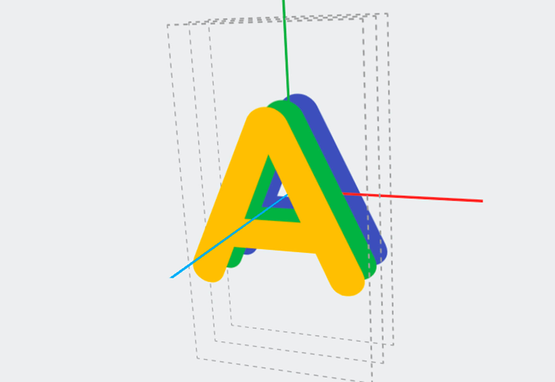

Here’s what’s new for designers and developers this month:

Ztext.js

Ztext.js is an easy to implement, three-dimensional typography tool for the web that works with any font you want to use. With the popularity of 3D effects and animation, this tool has a lot of practical applications. Everything you need, including documentation, is available from developer Bennett Feely on his website and GitHub. (It’s free but you can show appreciation with a donation if you like it.)

Gradient Magic

Gradient Magic is a free gallery of fun and interesting CSS gradients. You can sort through a random selection or by category of color to find just the right gradient for your project. Some of them would make really neat backgrounds or image overlays.

Impossible Checkbox

Impossible Checkbox is a fun little divot that you’ll want to play with and emulate. Click or tap the slider to activate and a nifty little friend pops up. Now here’s the fun part: You can’t leave it checked, and take note of the changing expression of the checkbox character.

Diversify Tech

Diversify Tech isn’t your average job board; it is a collection of resources – and opportunities – for underrepresented people in technology. It includes a weekly roundup and everything from scholarships, to events, to jobs, to speaking opportunities.

Women in Tech

Women in Tech is a list of apps made by women. The apps are ranked and chosen based on upvotes and is a good resource if you want to help support women-owned projects. Search or submit an app for inclusion.

Devello Studio

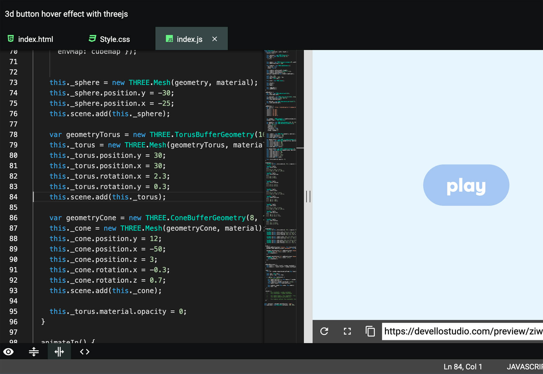
Devello Studio is a tool that allows you to write code in the cloud. You don’t have to install anything and no matter where you are, just can open a project in-browser, and continue development where you had left off last time. Plus, it works with GitHub support built right in.

Hustl

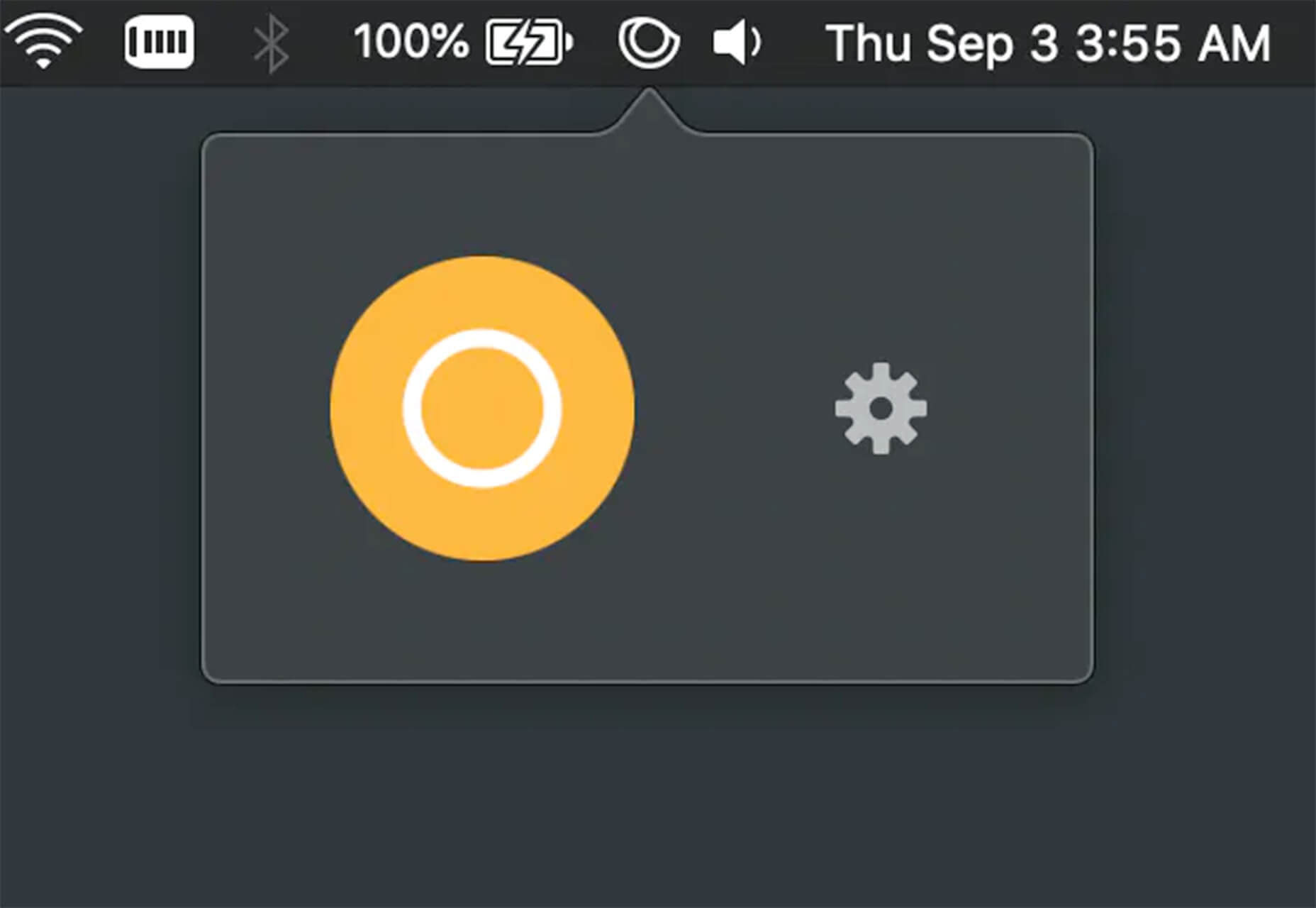
Hustl is a premium Mac app that allows you to create time-lapse videos of your screen. Use it to show off work or projects or create a cool video for your portfolio. Plus you can use it to capture just one active app so you don’t have to do a lot of editing later.

FeedBaxley

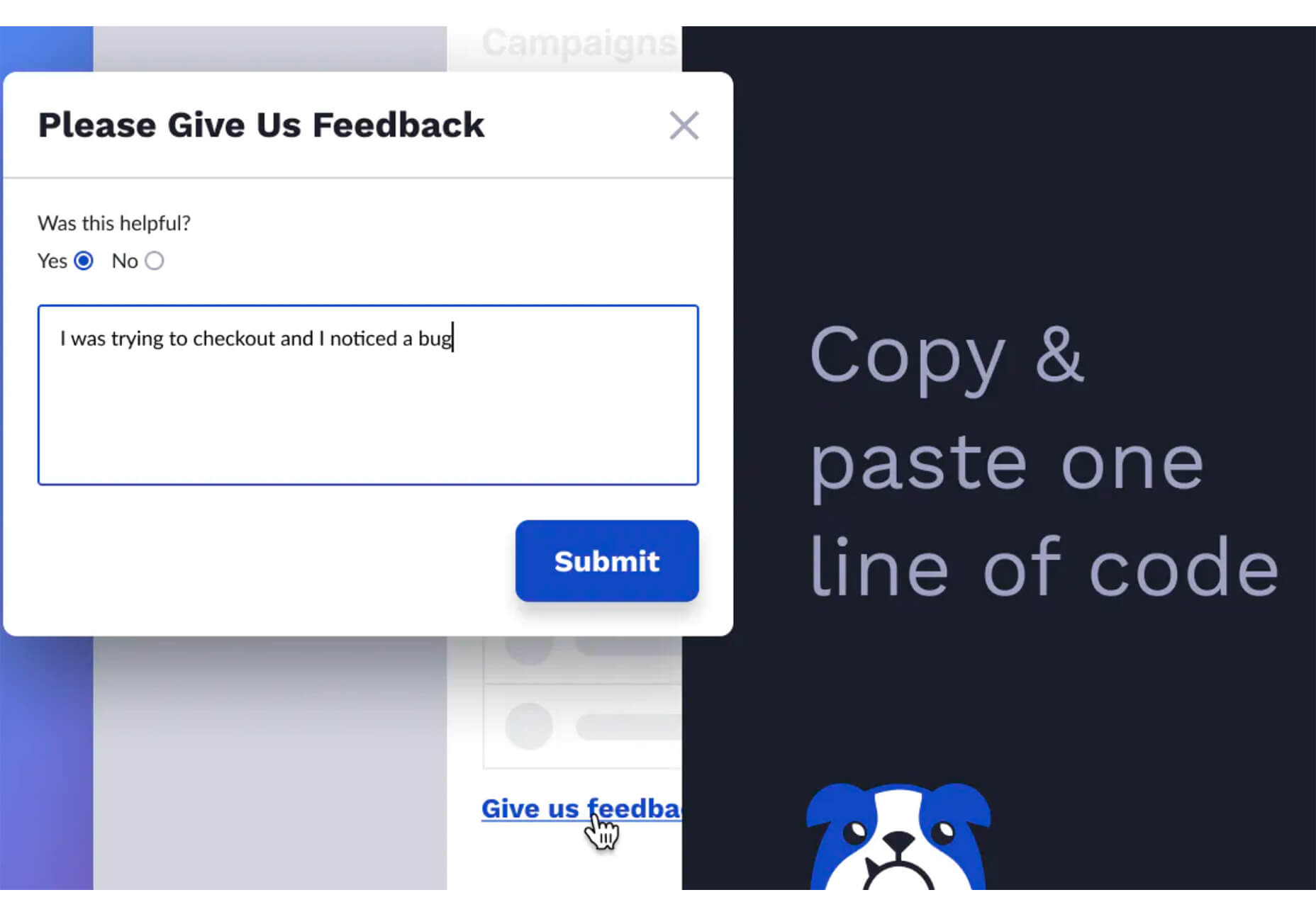
FeedBaxley is a user feedback tool that helps you (and users) figure out what’s frustrating before it becomes a real issue. You can customize everything to match your brand and set it up with copy and paste tools. Feedback integrates with Slack, making it easy for you to analyze information with a team.

BestTime

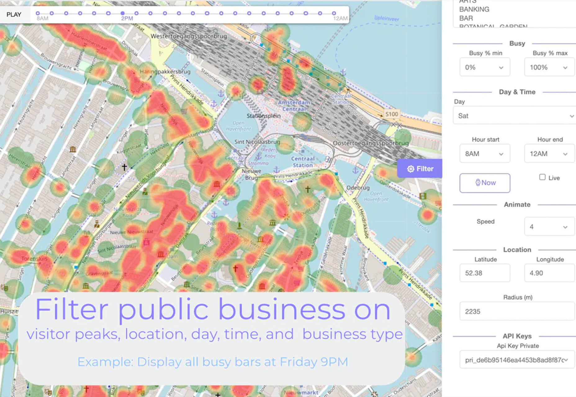
BestTime launched a major update with a new tool that makes it possible to analyze visitor peaks of public business (cafe, gym, etc) for whole areas. Using the heatmap API you can find businesses at popular times, locations, or by business type.

Pixeltrue

Pixeltrue is a new collection of free SVG illustrations and Lottie animations in a trendy style. They are available for commercial and personal use and add a bit of whimsical delight to website projects. (The error illustrations are particularly fun.)

Previewed

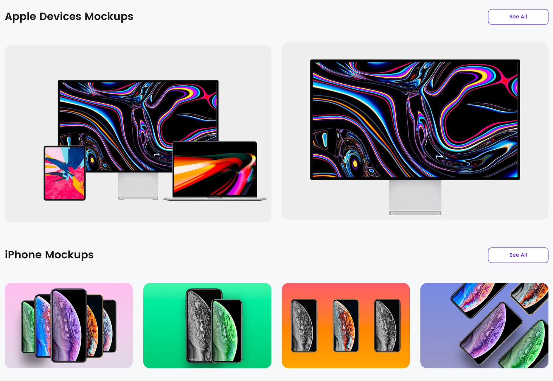
Previewed has tons of cool and realistic mockups that you can use to create the perfect setting for digital projects. You can find mockups for a variety of devices and cool panoramas that work perfectly for elements such as app store previews.

Alt Text Overlay Bookmarklet

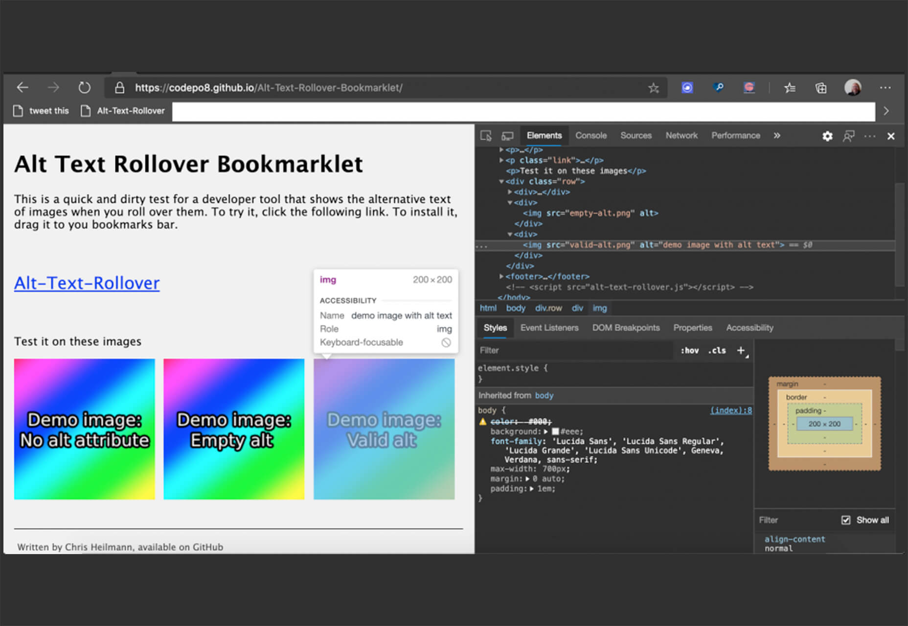
The Alt Text Overlay Bookmarklet solves a common problem: It shows what images use alt text and what that text is. The tool was created by Christian Heilmann and he’s put it on GitHub for you to play with and test.

MergeURL

MergeURL allows you to merge and shorten up to five links. Enter the links and mergeurl.com/o/xxxxx, for example, will open all the URLs associated with that link. The tool is free to use and you don’t have to register to use the service.

Infinity Search

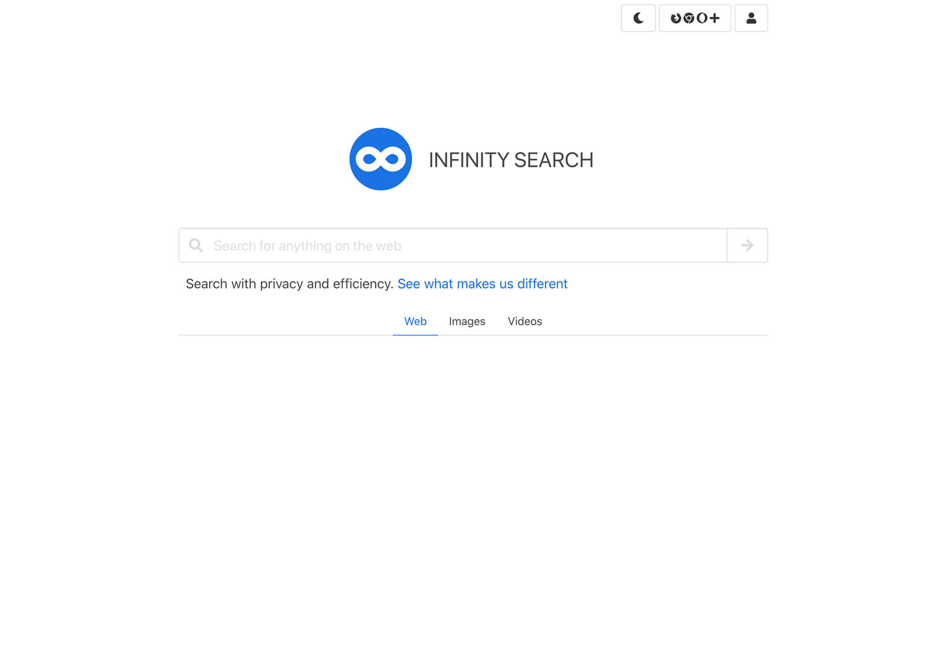
Infinity Search is a new search engine that lets you look for things privately and efficiently. Search the web, images, or videos. Here’s a little about how it works: “While we retrieve results from other search engines like Bing and Wikipedia, we also have our own indexes of links that are displayed in our search results. We are actively working on improving these indexes and they will only get better.”

Blade UI Kit

Blade UI Kit is a set of renderless components to use in Laravel Blade Views. It’s built for the tall stack and is completely open source. It includes 26 components and you can contribute as well.

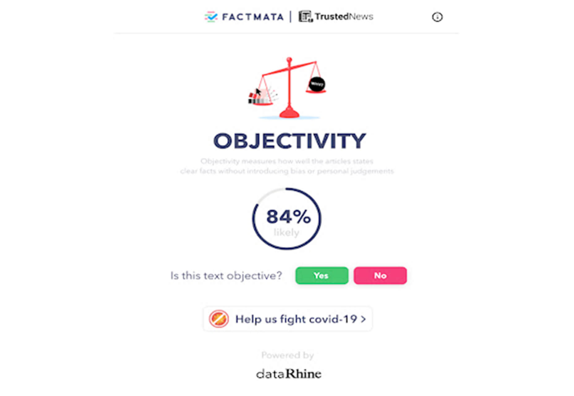
Trusted News

Trusted News is a Google Chrome extension that uses AI to assist in evaluating the quality of the online content. In its first release, it scores the objectivity for a selected article, testing whether it is written from a neutral perspective as opposed to a subjective one.

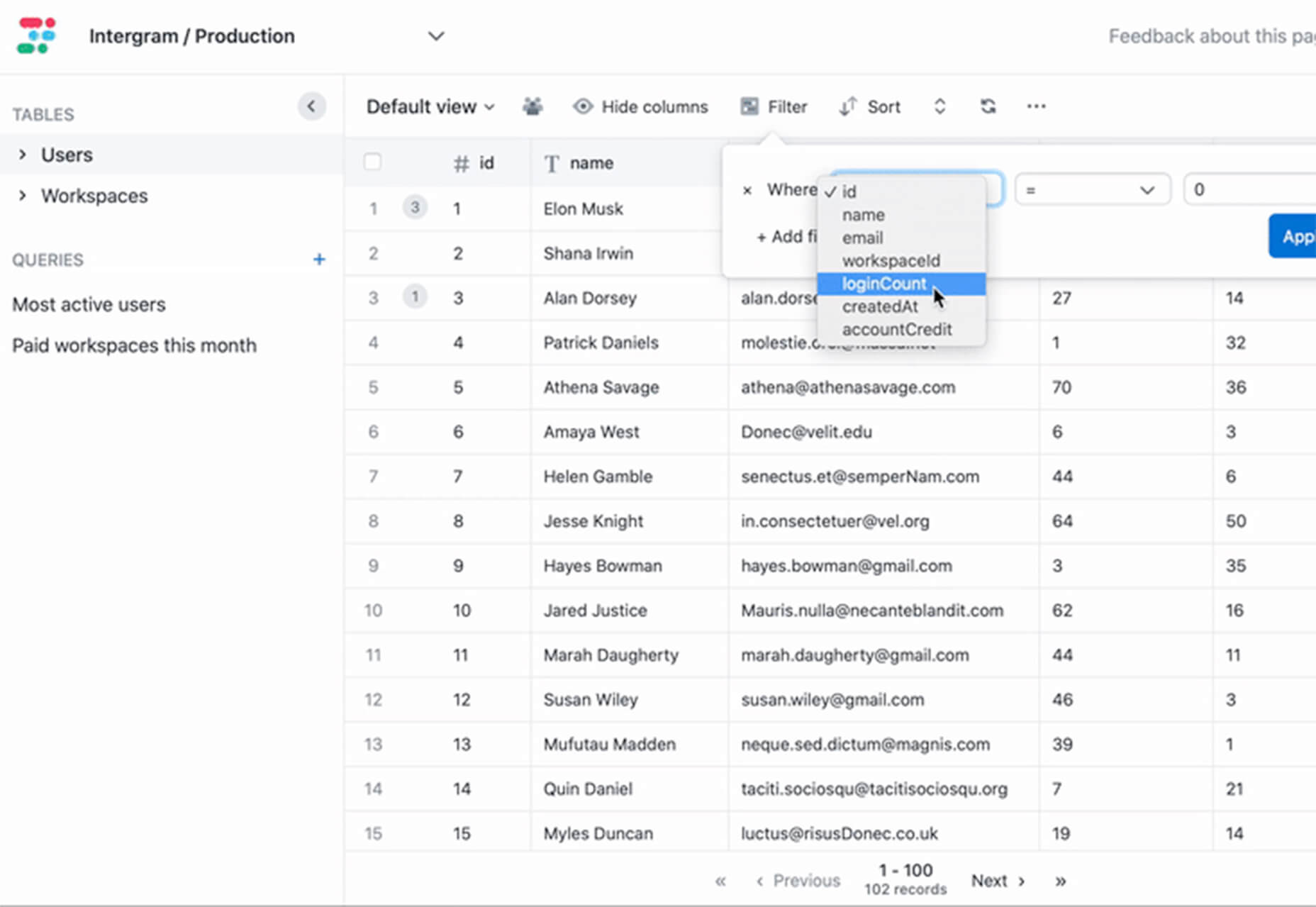
BaseDash

BaseDash allows you to edit production data without coding. You can make changes to the database with the ease of a spreadsheet. This tool makes it easy to find and edit information in a hurry. It works with all major databases including MySQL, PostgreSQL, Amazon Redshirt, Microsoft SQL Server, and more.

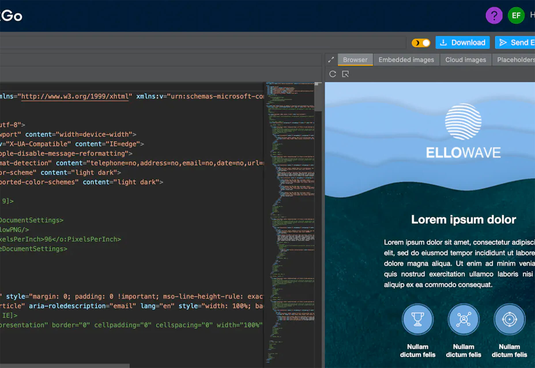
Email2Go

Email2Go is a service that helps you create email templates and test them on dozens of physical devices and applications. It’s free right now while it is in early release.

Iconscout Converter

The Iconscout Converter allows you to convert icons and images from one file format to another for free. Convert SVG, PNG, JPG, and PDF with a single click.

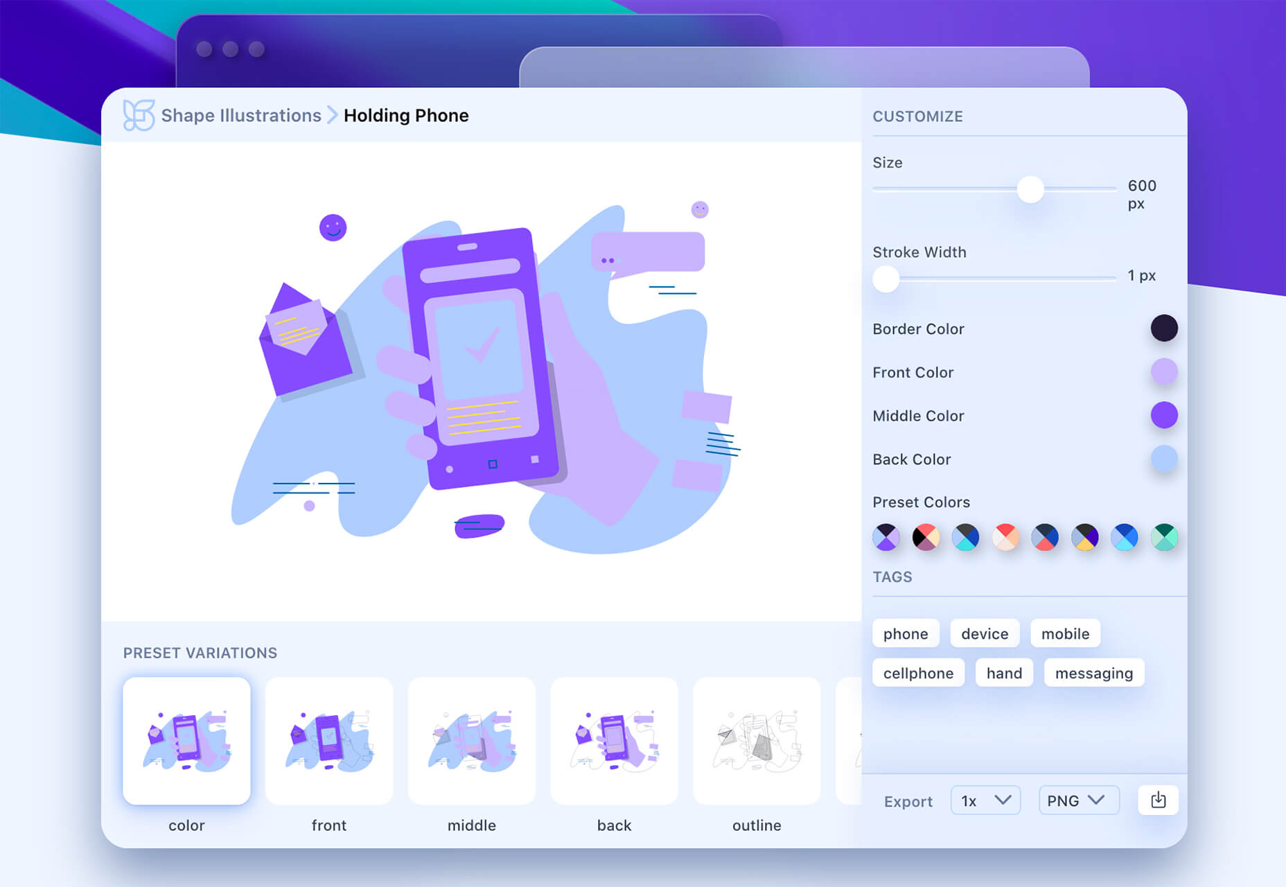
Shape 2

Shape 2 is a massive collection of 5,000+ unique icons and illustrations with a full-blown web editor. Customize colors, stroke width, size and full variations that can export to SVG, PDF, PNG, GIF, and React. This is a premium tool and includes a discounted release price for now.

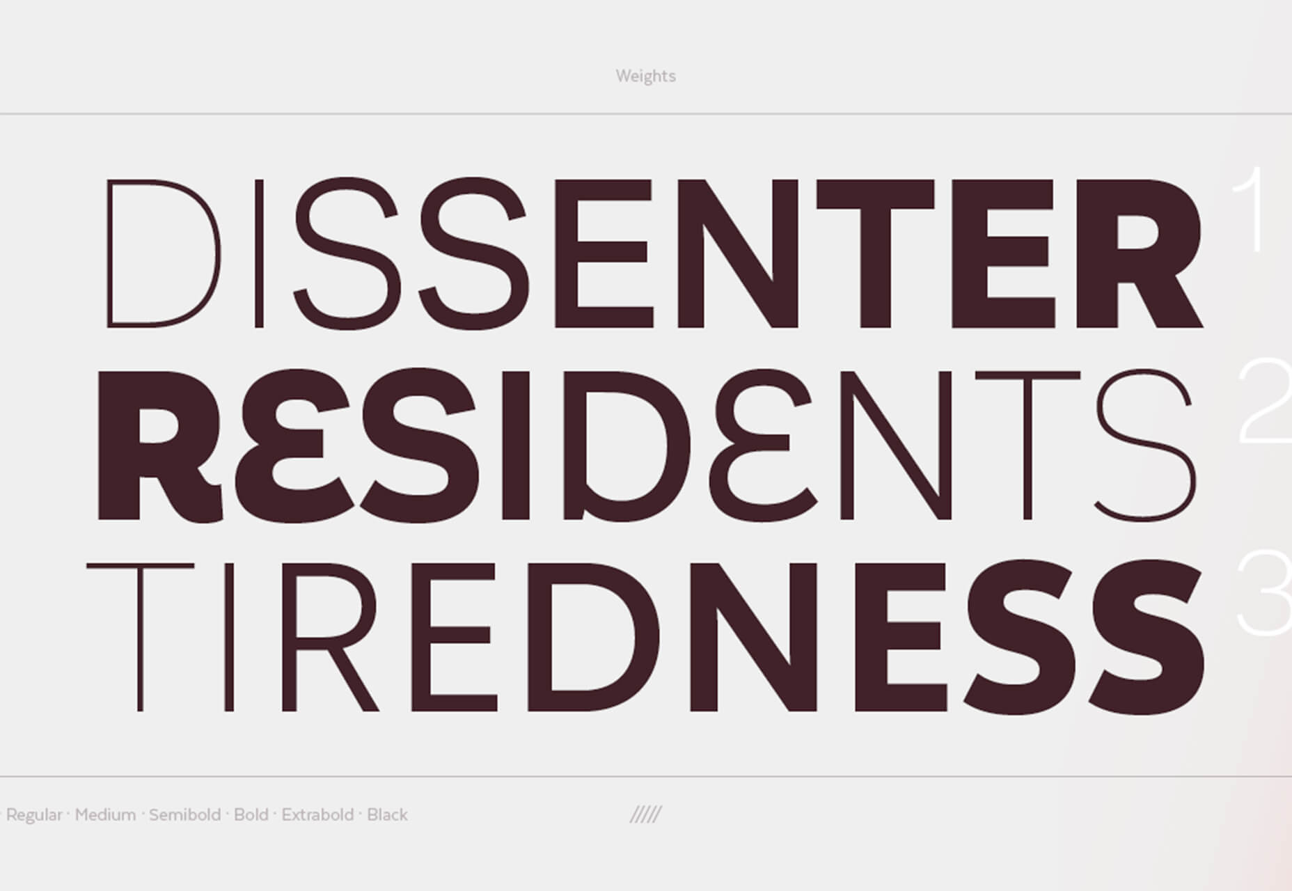
Aestetico

Aestetico is a beautiful sans serif that includes a massive family with 54 styles. This premium typeface is highly readable and has modern lines and curves that make it a great option for a variety of uses.

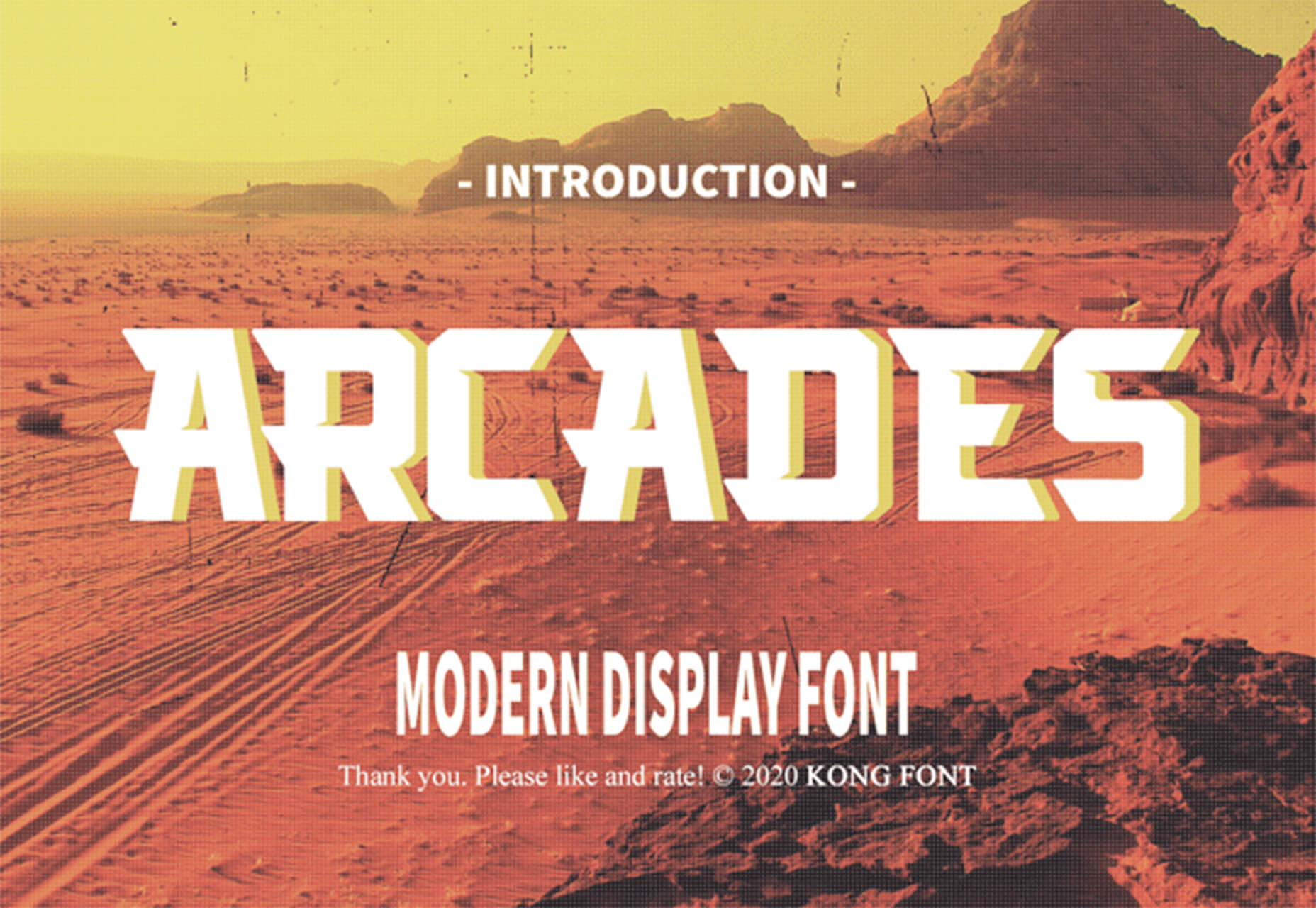
Arcades

Arcades is a modern display font with a retro, 1980s-style vibe. It includes regular and italic styles.

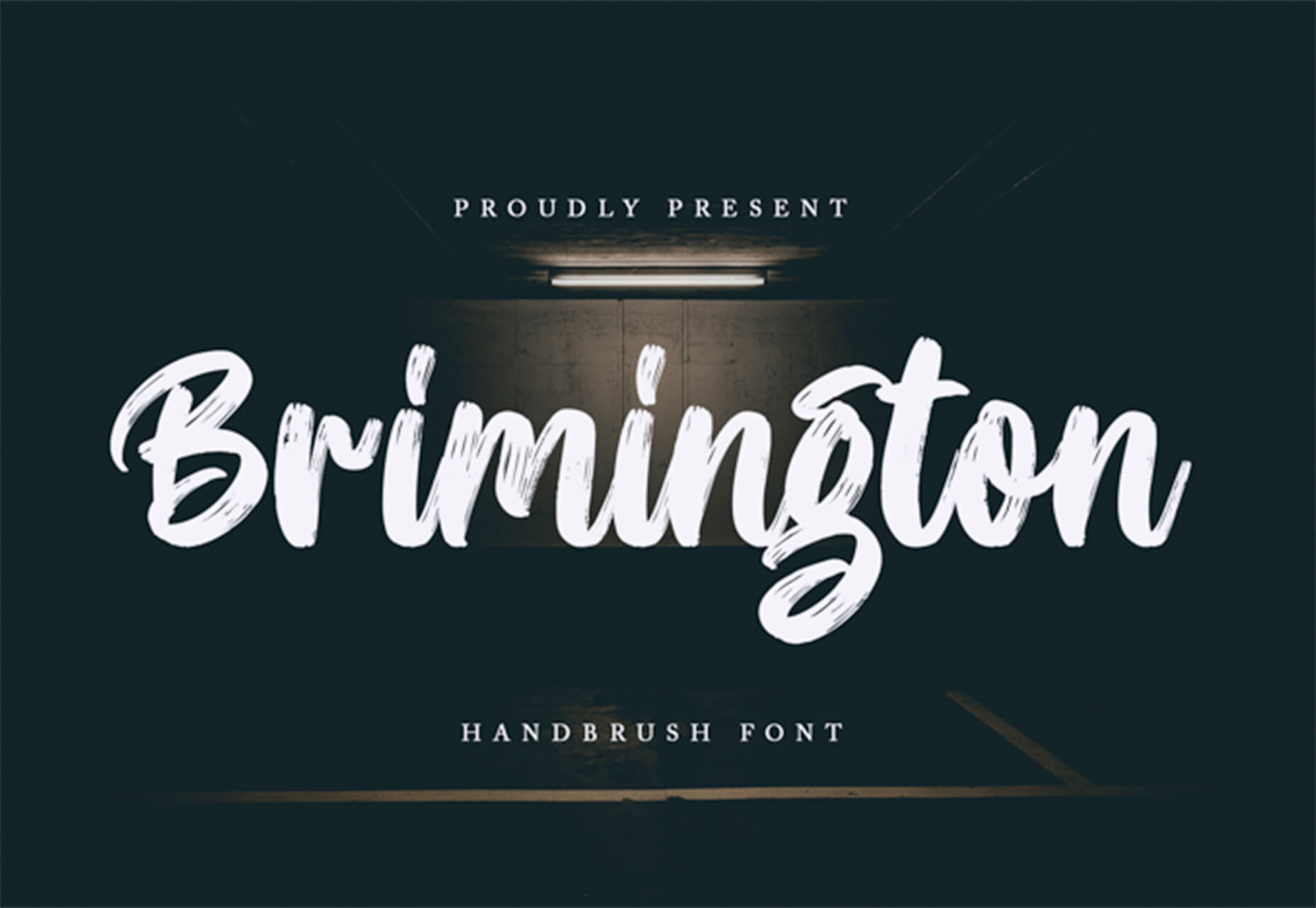
Brimington

Brimington is a handwriting style typeface with rough strokes and smooth curves. It includes a set of 227 characters and 219 glyphs in a readable design.

California Signature

California Signature is a typeface duo with a slab serif and handwriting style that are perfectly paired. The thick and thin options provide a yin and yang effect.

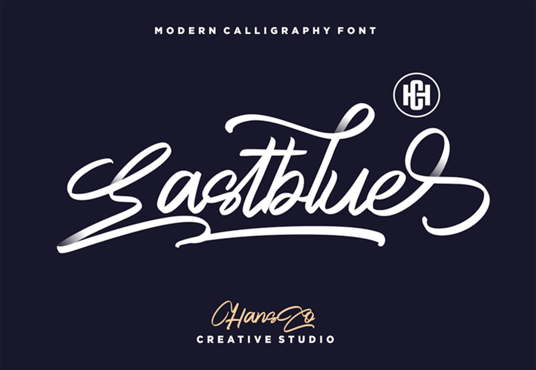
Eastblue

Eastblue is a script typeface with long swashes and interesting curves. It includes a solid character set and is free for personal use only.

Source

p img {display:inline-block; margin-right:10px;}
.alignleft {float:left;}
p.showcase {clear:both;}
body#browserfriendly p, body#podcast p, div#emailbody p{margin:0;}

Hometime Minimalist Branding Redesign

Original Source: http://feedproxy.google.com/~r/abduzeedo/~3/aHbj9IqybfU/hometime-minimalist-branding-redesign

Hometime Minimalist Branding Redesign

abduzeedo09.21.20

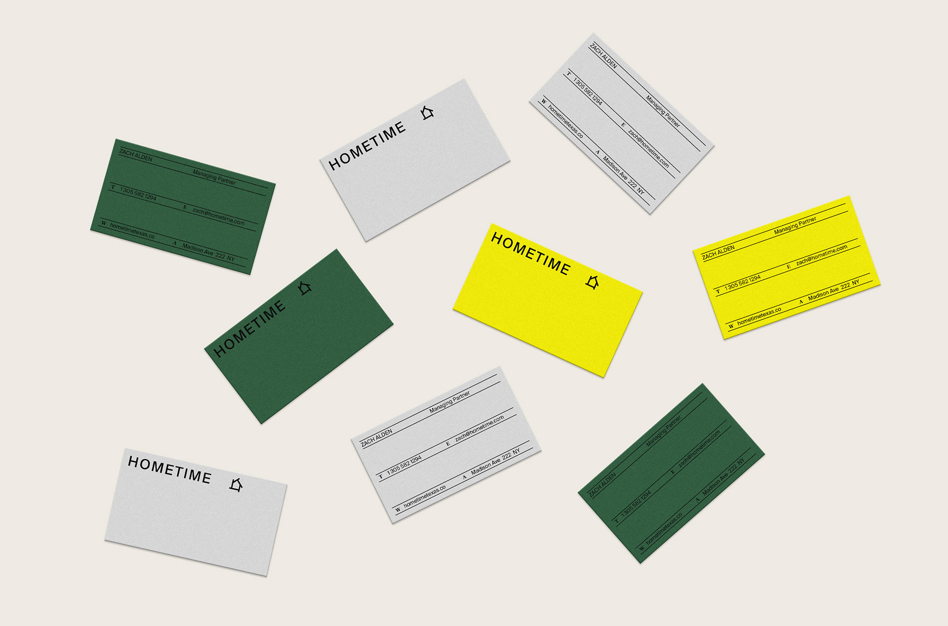
Bruno Canales shared a  new project, this time it’s the branding redesign for Hometime, a residential management company in Dallas, Texas. Their main objective is to be a one stop shop for home maintenance, reparation and remodels. The visual solution emerges from paying attention to the tradition found in residential homes, but imbuing with a contemporary and vibrant twist.

The marks, typography and applications are inspired in an architectural element that is central to American residences: the vinyl siding. Chromatically, the branding draws inspiration from construction sites and handyman’s tools. The tension between the new and the old is also represented in the typefaces; a combination between a modernist sans serif and an older transitional serif.

LInks

Instagram
Behance


ASICS Feel Fast & Dynaflyte FF – Illustration and Motion Design

Original Source: http://feedproxy.google.com/~r/abduzeedo/~3/qHBCcbkQYcA/asics-feel-fast-dynaflyte-ff-illustration-and-motion-design

ASICS Feel Fast & Dynaflyte FF – Illustration and Motion Design
ASICS Feel Fast & Dynaflyte FF - Illustration and Motion Design

abduzeedo09.17.20

Adhemas Batista directed a series of animations for Asics Worldwide partnering with Zombie Studio and commissioned by 180LA, advertising agency based in Los Angeles. The series of animations is a fun representation of the feeling of running with the Flytefoam technology by Asics. Live action direction by David Black.

Stills

For more information make sure to check out:

Adhemas.com
Instagram