15 Free Web-Based Apps & Tools For Web Developers

Original Source: http://feedproxy.google.com/~r/1stwebdesigner/~3/5jBAilx70ek/

With the right tools you can build a website from scratch in less than a day. This requires some experience, but web development is easier to pick up than you’d think.

The best way to speed up a dev workflow is with tools that automate your process and help to improve your knowledge.

I’ve organized my top picks for the best tools/web apps for web developers here that can make you a much better developer in the long run.

1. RawGit

rawgit generate github

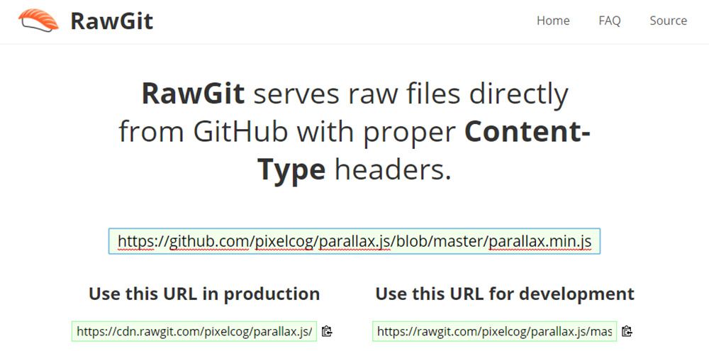
I’m constantly finding incredible projects on GitHub that I want to demo. But downloading the whole repo or pulling via npm is a lot of effort for something I may not even like.

That’s where RawGit can help. You simply copy the URL of any file in a GitHub repo into this tool, and it’ll spit out a raw content URL with proper headers for embedding into a web page.

You can do this with any CSS/JS files in any GitHub repo online. This way you can demo literally any GitHub project without downloading files locally. Pretty cool!

2. CSSReflex Frameworks

css reflex list

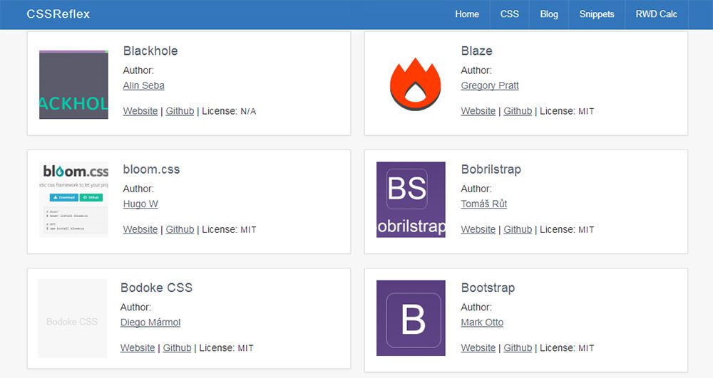
With so many frameworks to choose from it can be tough getting started. It’s also easy to feel like you’re missing out on some secluded underground framework.

The folks at CSS Reflex put together a huge frameworks list for just this occasion. It’s certainly not complete but it is one of the most complete lists I’ve seen.

Each framework includes a small icon along with details about the license and links to the main site + GitHub repo. It’s all organized alphabetically so you can scroll through all these frontend frameworks to mark whichever ones you want to try.

Another great site like this is CSS DB although it’s a bit tougher to browse through.

3. WP Hasty

wp hasty generator

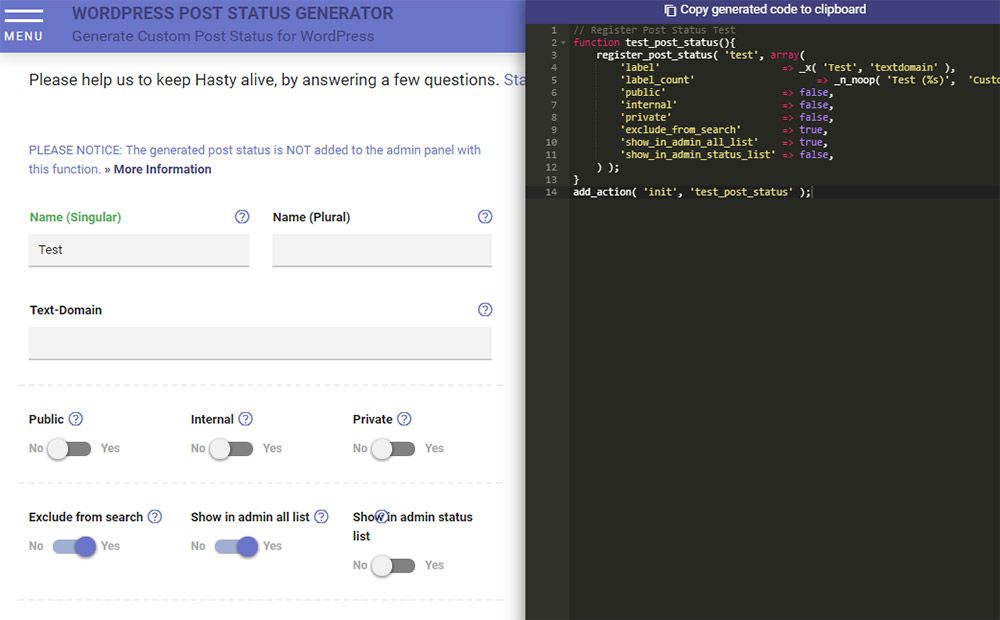
WordPress developers always want shortcuts to shave time off theme development. WP Hasty is the best solution I’ve found since it’s one of the most detailed code generators out there.

With WP Hasty you never need to memorize templates or code snippets for WordPress features. You just select what you want, pick your settings, and then copy/paste the code right into your functions file. Easy!

These features include WP menus, custom taxonomies, shortcodes, custom WP_Query() loops, and even snippets for adding elements to the visual composer.

No doubt this is the best WP code generator you can find and it’s brilliant for saving time on WP development.

4. Animista

animista webapp

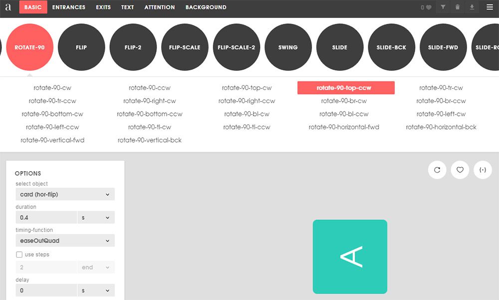
You can also find a ton of web-based CSS animation generators. These got popular right after the release of CSS3 when CSS animation got popular.

But over the years many new code generators have sprung up and my favorite is Animista.

This tool is so detailed and easy to use. It’s by far the best CSS animation tool to date.

It’ll let you select which styles you want for your animation and auto-generate all the keyframes. You can even pick if you want CSS prefixes or if you want the code minifed by default.

Plus this animation editor is gorgeous with dozens of CSS3 techniques at the click of a button(full visual editor). If you’re sick of hard-coding CSS animations then you’ll want to bookmark Animista for safe keeping.

5. CSS3 Generator

css3 generator webapp

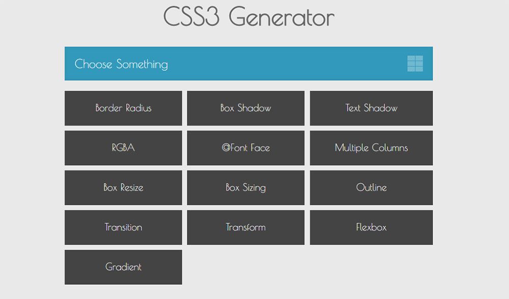
The CSS3 Generator is a handy code generator that’s been around for years. This is also one of the best for getting quick & easy CSS3 codes in case you forget the syntax or just don’t want to type it all out.

Note this does support the CSS3 transition property but it does not support custom animation with keyframes. So this works well in conjunction with Animista, but it’s not a replacement.

The better features aren’t in the animated codes, but rather with the more complex CSS3 properties like gradients and flexbox.

6. Can I Use

caniuse flexbox webapp

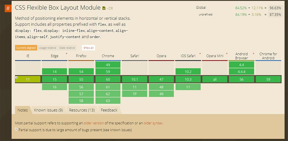
Browser support changes all the time and thankfully we’re moving towards an era where most CSS & JS features are supported.

But if you’re concerned with legacy browsers then Can I Use is an unrivaled resource. It’s the ultimate database of browser support for CSS and JavaScript with information on every browser. All versions of Firefox, IE, Chrome, Opera, and even mobile browsers are included.

You just search for a CSS property or JS method to find the related table. There you can view all browser versions or just check whichever browser you’re unsure about.
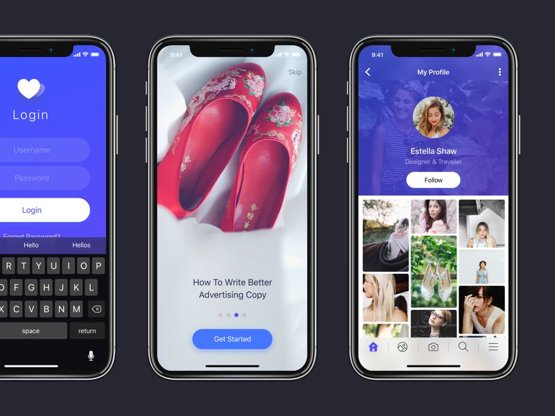
7. CodePen

codepen ide

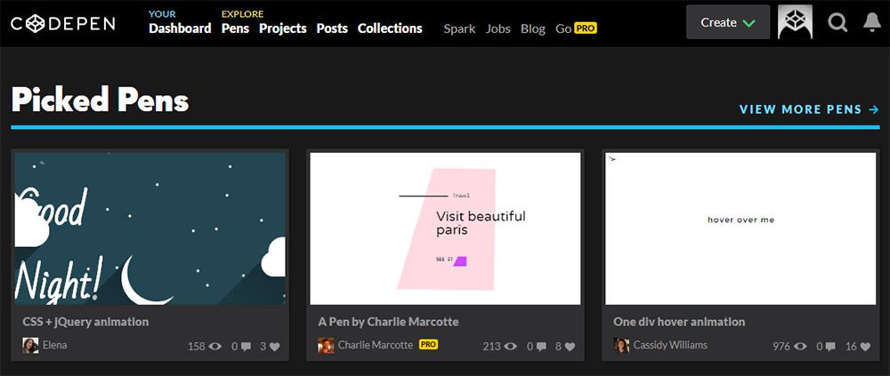
I can’t write this gallery without including some type of cloud IDE. Being able to code right in your browser is one of the biggest changes in web development over the past 10 years.

And right now my top recommendation is CodePen because it’s just so detailed and supports so many features.

It lets you write Sass/Less right in CodePen and it’ll auto-compile for you. Same goes for Haml/Jade templating and you can even include remote JS libraries like jQuery.

A browser-based editor has almost become the starting point for demoing ideas. No software required beyond a web browser and some Internet access.

8. Quantity Queries

quantity queries webapp

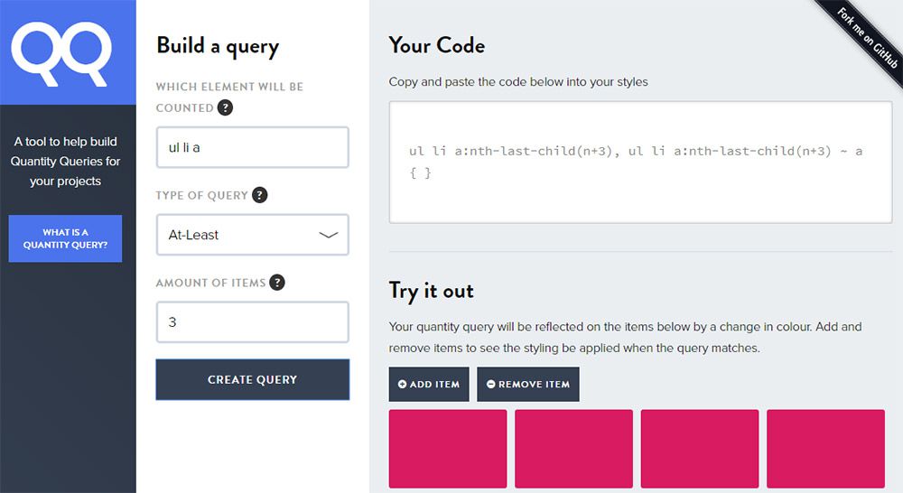
Not everyone uses CSS quantity queries since they’re a lesser-known feature in the language. But with the Quantity Queries webapp you can auto-generate these queries fast.

I’ve yet to find another CSS generator that supports quantity query code. The only trouble is that this site doesn’t really explain how a QQ works, at least not in fine detail.

So it helps if you already know how to write quantity queries and then use this more as a time saver.

9. MJML Framework

mjml newsletter framework

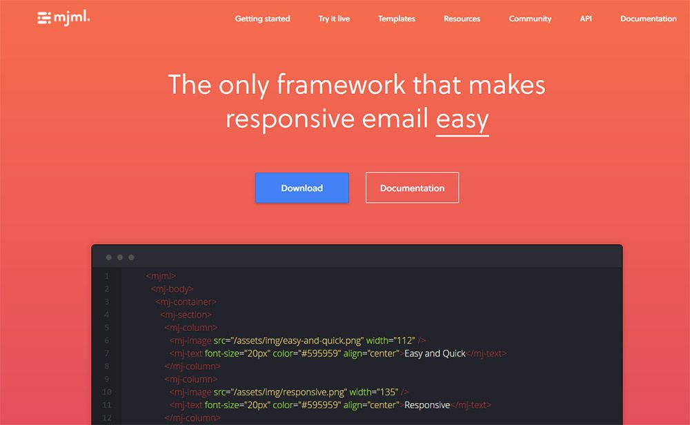
Frontend web developers aren’t just tasked with creating websites. They often need to develop newsletters and these do not have the easiest coding standards.

That’s why other devs created email newsletter frameworks to save time and frustration. One of my favorites is the MJML framework which has its own custom syntax for building newsletters.

It may take a little while to learn, but once you get it, you’ll never want to go back. Plus this even has a live editor where you can test your newsletter designs right in your browser, just like CodePen but for newsletters.

The best tool for anyone developing a custom newsletter layout.

10. Mega Tags

metatags social generator

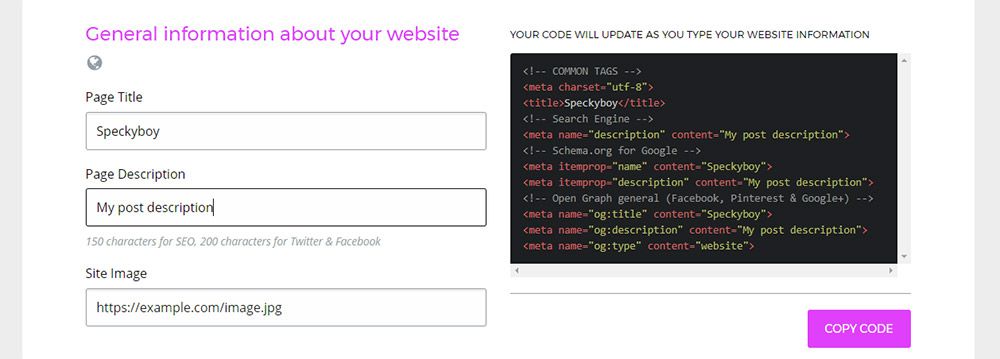
Every website features meta tags in the header section. These define the language, the page size for mobile, and many other settings like social features.

Mega Tags focuses on that last part. It’s a social meta tag generator site where you can input what type of site you have and what type of meta tags you want.

The default is Open Graph which works on Facebook, Pinterest, Google+, LinkedIn and many others. But you can also add custom Twitter meta tags too, and you can even change the information with a handy visual editor.

11. Clean CSS

clean css tools

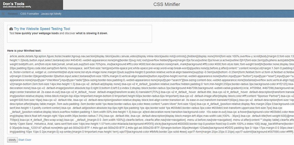
Code formatting is never an easy task. Some developers create their own scripts to automate minifying code but it’s a lot easier to use someone else’s script.

That’s why Clean CSS is so valuable. It’s a free website with tons of small webapps for minifying code, cleaning out duplicate codes, and auto-formatting whatever code you want.

It has different apps for HTML, CSS, JS, SQL, XML and even JSON notation. Plus new tools get added every so often which makes this a wonderful resource for code cleanup.

12. Sharing Buttons

social sharing buttons

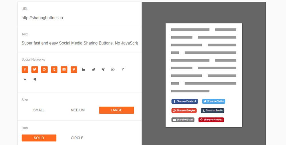
Looking to add quick & easy social buttons onto your site? Then Sharing Buttons is the perfect tool.

It runs with SVG icons and uses HTML for opening new sharing windows. Everything is styled with CSS so the whole webapp generates compliant code without any JavaScript.

Some devs may like this, others may hate it. But it’s one of the few social sharing button scripts that automates the whole process and gives you quite a few styles to pick from.

13. Layout Debugger

css layout debugger

This small script works as a bookmarklet in your browser. You simply drag the link up to your bookmarks bar & visit any website you want to study.

Clicking the bookmarklet automates small CSS outlines to show how certain elements fall in the DOM. This way you can easily study where certain divs end and how child elements are contained.

Really simple script but super useful for debugging CSS layouts.

14. Larder

larder code bookmarking

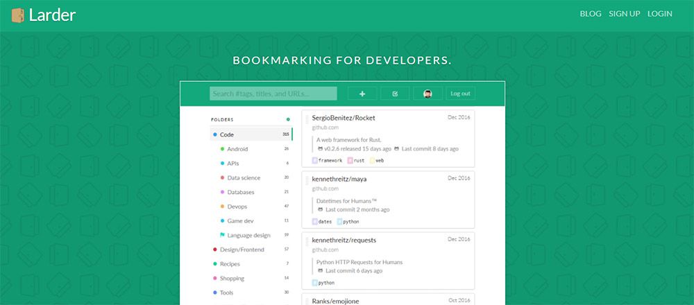
This isn’t so much a coding tool but rather a resource for coders. Larder lets you bookmark your favorite snippets from around the web and keep them organized based on language or project type.

You can curate libraries of your favorite codes or projects straight from GitHub. It’s like Delicious but geared strictly towards coders.

And if you connect with GitHub repos they’ll automatically sync new changes every day. This way you can keep on top of updates and keep your bookmarks fresh.

15. Panda Reader

panda reader webapp

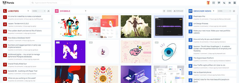
I know reading through news isn’t always productive but Panda Reader should be a staple for every web developer.

It’s the best web-based RSS feed reader with a slant towards the web design crowd. You can choose among dozens of popular tech & design blogs along with larger sites like Dribbble or GitHub.

This way you can keep on top of news, hot new projects, and updates to current projects. All from one handy dashboard. Plus this comes with built-in bookmarking so it works like Larder but with tech/dev articles around the web.


Ember.js: The Perfect Framework for Web Applications

Original Source: https://www.sitepoint.com/ember-js-perfect-framework-web-applications/

Ember.js is an opinionated frontend JavaScript framework that has been getting a lot of interest lately. This article will introduce some key concepts of the framework while building a simple application with it, in order to show a basic example of what it is capable of producing.

Our example application is going to be a Dice Roller, including the ability to roll some dice and view a history of all dice rolls that have been performed to date. A fully working version of this application is available from Github

The Ember.js framework pulls together a lot of modern JavaScript concepts and technologies into one single bundle, including but not limited to:

The use of the Babel transpiler tool, to support ES2016 throughout.
Testing support at the Unit, Integration and Acceptance levels as standard, powered by Testem and QTest.
Asset building using Broccoli.js.
Support for live reloading, for shorter development cycle times.
Templating using the Handlebars markup syntax.
URL Routing first development to ensure that deep linking is fully supported throughout.
Full data layer built around JSON API, but pluggable for whatever API access you need.

In order to work with Ember.js, it is assumed that you have an up-to-date installation of Node.js and npm. If not then these can be downloaded and installed from the Node.js website.

It should also be mentioned that Ember is purely a frontend framework. It has a number of ways of interacting with the backend of your choice, but this backend is not in any way handled by Ember itself.

Introducing ember-cli

A lot of the power of Ember.js comes from its command line interface (CLI). This tool – known as ember-cli – powers much of the development lifecycle of an Ember.js application, starting from creating the application, through adding functionality into it all the way to running the test suites and starting the actual project in development mode.

Almost everything that you do whilst developing an Ember.js application will involve this tool at some level, so it is important to understand how best to use it. We will be making use of it throughout this article.

The first thing we need to do is ensure that the Ember.js CLI is correctly installed and up-to-date. This is done by installing from npm, as follows:

$ npm install -g ember-cli

and we can check it was successfully installed by running the following command:

$ ember –version
ember-cli: 2.15.0-beta.1
node: 8.2.1
os: darwin x64

Creating Your First Ember.js App

Once ember-cli is installed, you are ready to start creating your application. This is the first place we will be making use of the Ember.js CLI tool – it creates the entire application structure, setting everything up ready to run.

$ ember new dice-roller
installing app
create .editorconfig
create .ember-cli
create .eslintrc.js
create .travis.yml
create .watchmanconfig
create README.md
create app/app.js
create app/components/.gitkeep
create app/controllers/.gitkeep
create app/helpers/.gitkeep
create app/index.html
create app/models/.gitkeep
create app/resolver.js
create app/router.js
create app/routes/.gitkeep
create app/styles/app.css
create app/templates/application.hbs
create app/templates/components/.gitkeep
create config/environment.js
create config/targets.js
create ember-cli-build.js
create .gitignore
create package.json
create public/crossdomain.xml
create public/robots.txt
create testem.js
create tests/.eslintrc.js
create tests/helpers/destroy-app.js
create tests/helpers/module-for-acceptance.js
create tests/helpers/resolver.js
create tests/helpers/start-app.js
create tests/index.html
create tests/integration/.gitkeep
create tests/test-helper.js
create tests/unit/.gitkeep
create vendor/.gitkeep
NPM: Installed dependencies
Successfully initialized git.

$

This has caused an entire application to be created which is ready to run. It has even set up Git as source control to track your work.

Note: If you wish, you can disable the Git integration and you can prefer Yarn over npm. The help for the tool describes this and much more.

Now, let’s see what it looks like. Starting the Ember application for development purposes is – once again – also done using ember-cli:

$ cd dice-roller
$ ember serve
Livereload server on http://localhost:49153
‘instrument’ is imported from external module ’ember-data/-debug’ but never used
Warning: ignoring input sourcemap for vendor/ember/ember.debug.js because ENOENT: no such file or directory, open ‘/Users/coxg/source/me/writing/repos/dice-roller/tmp/source_map_concat-input_base_path-2fXNPqjl.tmp/vendor/ember/ember.debug.map’
Warning: ignoring input sourcemap for vendor/ember/ember-testing.js because ENOENT: no such file or directory, open ‘/Users/coxg/source/me/writing/repos/dice-roller/tmp/source_map_concat-input_base_path-Xwpjztar.tmp/vendor/ember/ember-testing.map’

Build successful (5835ms) – Serving on http://localhost:4200/

Slowest Nodes (totalTime => 5% ) | Total (avg)
———————————————-+———————
Babel (16) | 4625ms (289 ms)
Rollup (1) | 445ms

We are now ready to go. The application is running on http://localhost:4200, and looks like this:
Default application screen

It is also running a LiveReload service which automatically watches for changes to the filesystem. This means that you can have an incredibly fast turnaround time when tweaking your site design.

Let’s try it?

The initial page already tells us what to do, so let’s go and change the main page and see what happens. We’re going to change the app/templates/application.hbs file to look like the following.

This is my new application.

{{outlet}}

Note: The {{outlet}} tag is part of how Routing works in Ember. We will cover that later on.

The first thing to notice is the output from ember-cli, which should look as follows:

file changed templates/application.hbs

Build successful (67ms) – Serving on http://localhost:4200/

Slowest Nodes (totalTime => 5% ) | Total (avg)
———————————————-+———————
SourceMapConcat: Concat: App (1) | 9ms
SourceMapConcat: Concat: Vendor /asset… (1) | 8ms
SimpleConcatConcat: Concat: Vendor Sty… (1) | 4ms
Funnel (7) | 4ms (0 ms)

This tells us that it has spotted that we changed the template and rebuilt and restarted everything. We’ve had zero involvement in that part of it.

Now let’s look at the browser. If you’ve got LiveReload installed and running you will not even have needed to refresh the browser for this to be picked up, otherwise, you will need to reload the current page.

First Change

Not very exciting, but this is with almost no effort on our part that we’ve achieved this.

In addition, we get a fully set up test suite ready to run. This is – unsurprisingly – run using the Ember tool as well, as follows:

$ ember test
⠸ Building’instrument’ is imported from external module ’ember-data/-debug’ but never used
⠴ BuildingWarning: ignoring input sourcemap for vendor/ember/ember.debug.js because ENOENT: no such file or directory, open ‘/Users/coxg/source/me/writing/repos/dice-roller/tmp/source_map_concat-input_base_path-S8aQFGaz.tmp/vendor/ember/ember.debug.map’
⠇ BuildingWarning: ignoring input sourcemap for vendor/ember/ember-testing.js because ENOENT: no such file or directory, open ‘/Users/coxg/source/me/writing/repos/dice-roller/tmp/source_map_concat-input_base_path-wO8OLEE2.tmp/vendor/ember/ember-testing.map’
cleaning up…
Built project successfully. Stored in “/Users/coxg/source/me/writing/repos/dice-roller/tmp/class-tests_dist-PUnMT5zL.tmp”.
ok 1 PhantomJS 2.1 – ESLint | app: app.js
ok 2 PhantomJS 2.1 – ESLint | app: resolver.js
ok 3 PhantomJS 2.1 – ESLint | app: router.js
ok 4 PhantomJS 2.1 – ESLint | tests: helpers/destroy-app.js
ok 5 PhantomJS 2.1 – ESLint | tests: helpers/module-for-acceptance.js
ok 6 PhantomJS 2.1 – ESLint | tests: helpers/resolver.js
ok 7 PhantomJS 2.1 – ESLint | tests: helpers/start-app.js
ok 8 PhantomJS 2.1 – ESLint | tests: test-helper.js

1..8
# tests 8
# pass 8
# skip 0
# fail 0

# ok

Note that the output talks about PhantomJS. This is because there is full support for Integration tests that run in a browser, and by default, these run headless in the PhantomJS browser. There is full support for running them in other browsers if you wish, and when setting up continuous integration (CI) it is worth doing this to ensure that your application works correctly in all supported browsers.

How an Ember.js app is structured

Before we get to actually writing our application, let’s explore how it is structured on the filesystem. The ember new command above will have created a whole directory structure on your computer, with lots of different parts. Understanding all of these is important to efficiently work with the tool and create amazing projects.

Continue reading %Ember.js: The Perfect Framework for Web Applications%

Monthly Web Development Update 10/2017: CSS Grid, CAA Pitfalls, And Image Optimization

Original Source: https://www.smashingmagazine.com/2017/10/monthly-web-development-update-10-2017/


Editor’s Note: Welcome to this month’s web development update. Anselm has summarized the most important happenings in the web community that have taken place over the past few weeks in one handy list for you. Enjoy!

Web Development Update October 2017

As web developers, we’re working in a very diverse environment: We have countless options to specialize in, but it’s impossible to keep up with everything. This week I read an article from a developer who realized that even though he has been building stuff for the web for over seven years, sometimes he just doesn’t understand what’s going on: “I’m slamming my keyboard in frustration as another mysterious error appears in my build script,” he writes.

The post Monthly Web Development Update 10/2017: CSS Grid, CAA Pitfalls, And Image Optimization appeared first on Smashing Magazine.

10 Free iOS 11 UI Kits, Mockup Templates & Icon Sets

Original Source: http://feedproxy.google.com/~r/1stwebdesigner/~3/iMtWINgw_v4/

The launch of iOS 11 has resulted in a great selection of resources being designed and released.

These include iPhone X grids, full iOS 11 app designs, beautiful device mockups, app icons, and complete UI kits.

Many of these have been executed to an incredibly high standard and are available for various applications, including Sketch, Photoshop, Adobe XD, and Figma. As well as this, most resources are free for personal and commercial use, meaning you can download and play with as many of them as you like.

They are a perfect aid when building your next app, and also a valuable resource to learn the specifications and features of iOS 11 and the iPhone X.

In this collection we bring together ten of the most beautiful and free iOS 11 resources for you.

Dark & Light iPhone X Minimal

Dark Light iPhone X Minimal Free iOS 11 UI Kits Mockups Icon Sets

These minimal iPhone X mockups for Adobe XD are perfect for showcasing your iOS 11 app designs. They come in both light and dark variants.

iOS 11 GUI

iOS 11 GUI Free iOS 11 UI Kits Mockups Icon Sets

This iOS 11 GUI Template is incredibly useful as a resource and reference when designing an app for iPhone X and/or iOS 11. It has almost every element you could ever need and also comes in handy for copying across visual effects and spacing.

8 iOS 11 Icons Sketch Resource

8 iOS 11 Icons Sketch Resource Free iOS 11 UI Kits Mockups Icon Sets

These 8 icons are a great starting point if you’re designing or redesigning an app icon for iOS 11. The style is much-refined, as are the icon graphics.

Food Dark iOS 11

Food Dark iOS 11 Free iOS 11 UI Kits Mockups Icon Sets

This dark food app resource for iPhone is a stunning example of what can be achieved within iOS 11 guidelines. It has effectively carried through many elements you’ll find in default iOS apps like the app store.

iOS 11 Grid Template Sketch Resource

iOS 11 Grid Template Sketch Resource Free iOS 11 UI Kits Mockups Icon Sets

This grid template is incredibly handy when starting out on a new iPhone app design project. The grids are clear and structured and save a great deal of time and energy when laying out a new user interface.

iPhone X Wireframe with iOS 11 Guides

iPhone X Wireframe with iOS 11 Guides Free iOS 11 UI Kits Mockups Icon Sets

These blue iPhone X wireframe templates are beautifully put together and serve as the perfect base for building mid- to high- fidelity wireframes upon. They would also be great for printing and sketching low fidelity wireframes on.

If you’re looking for more free wireframe templates, take a look at this collection.

Verb App for iOS 11 Sketch Resource

Verb App for iOS 11 Sketch Resource Free iOS 11 UI Kits Mockups Icon Sets

Another great example of an iOS 11 app design is this Verb app kit for Sketch. It’s beautifully presented and incorporates a wide variety of elements and styles from Apple’s user interface guidelines.

iPhone X Clay

iPhone X Clay Free iOS 11 UI Kits Mockups Icon Sets

These clay iPhone X mockups offer a slightly different style to standard mockups. They strip away the intricacies of the actual iPhone design and work perfectly when combined with minimal user interface designs.

iOS 11 App Store Sketch Resource

iOS 11 App Store Sketch Resource Free iOS 11 UI Kits Mockups Icon Sets

This recreation of the redesigned iOS 11 app store is a great resource when examining the new direction of iOS. It includes many of the new elements and styles including buttons, icons, rounded images, and larger input fields.

iPhone X 4K Mockups

iPhone X 4K Mockups Free iOS 11 UI Kits Mockups Icon Sets

This realistic iPhone X mockup, made in Cinema 4D, is extremely close to being mistaken for a photograph. The shadows and highlights are perfectly crafted and present a resource that would look exceptional on any landing page design.

You might also like:

10 Free Mockup Templates for Featuring Mobile Apps
10 Incredibly Detailed Free Mobile UI Kits For Sketch


10 Best Windows Search Alternatives

Original Source: http://www.hongkiat.com/blog/windows-search-alternative/

Windows Search features is a handy tool to easily find what you are looking for in your system. However, it also comes with its own drawbacks, for example, it doesn’t search contents of a file…

Visit hongkiat.com for full content.

Symfony Flex: Paving the Path to a Faster, Better Symfony

Original Source: https://www.sitepoint.com/symfony-flex-paving-path-faster-better-symfony/

Symfony Flex is a modern replacement for the Symfony Installer, and not the name of the next Symfony version. As the intro text says:

Internally, Symfony Flex is a Composer plugin that modifies the behavior of the require and update commands. When installing or updating dependencies in a Flex-enabled application, Symfony can perform tasks before and after the execution of Composer tasks.

The new Symfony will be called just Symfony 4, and while this tutorial will deal only with the Flex tool, it will mention some Symfony 4 upgrades as well.

Still Under Development

Symfony Flex can be considered a Composer wrapper, in that it provides your Symfony project with additional options during installation and configuration. It was developed with simplicity in mind, and obviously heavily influenced by the user-friendliness of Laravel. Remember, Laravel got to its current level of popularity due to its ease of use and the low entry barrier it provides newcomers with, and Symfony wanted to emulate this.

It should be noted that both Flex and Symfony 4 are still under development, slated for release somewhere at the end of November this year (2017). As such, some of the features mentioned in this post may have changed by the time you read it, but we’ll do our best to keep it up to date.

Most notably, the use of a makefile and the make tool to build a project if Symfony/Console is unavailable is still up in the air, as it seems to not be working properly on some operating systems. Fabien recently held a survey around this, asking for the community’s suggestions to a replacement, and overwhelmingly, the community voted in favor of just making Symfony/Console required.

Survey result

What’s Different?

Most notably, Flex respects the coming Symfony 4 updates which boil down to the following major changes:

PHP 7+ is required
all folders are optional. If your project isn’t using one, it doesn’t have to be there. This makes the directory tree much simpler and more readable. Additionally, often useless files like .htaccess, LICENSE, and README have been removed as well – a project which needs those can easily add them.
there is no more web folder. Instead, there is the public folder, like in all other major frameworks. This consolidates user experience across ecosystems.
temporary files go under /var in the root of the project folder, with the /var/cache subfolder reserved for long term cache, like merged class files for deploying apps as read-only artifacts
source code goes under /src. No /app.
configuration goes into /config.
templates go into /templates.
Flex will have its own Symfony-verified list of packages that are referenced by one and one alias alone. So executing composer require cli will actually trigger Flex, which will look in its list of packages, find the one tagged as cli (in this case, Symfony Console), and install it. These “official” packages are called recipes, and can be found here. To accept user-submitted recipes, a flag exists in Flex’s configuration which needs to be set to true: composer config extra.symfony.allow-contrib true. Those recipes can be found here. By officially endorsing some packages, Symfony is in many ways becoming as opinionated as Laravel. While this is bad in some ways, it’s very good in many more ways: a consolidated, opinionated way to build Symfony apps used by most people so that everyone is on the same page.
bundle fragments no longer need to be custom-activated and added into a ton of files. Flex automates this, as well as their removal.
instead of parameters in config files, Symfony 4 will be using environment variables like Laravel

Bootstrapping

As usual, we’ll assume you’re already running a healthy VM environment like Homestead Improved so you can follow along.

Okay, let’s get our hands dirty with an example app. All Symfony apps can now be started from the bare bones super-minimal Symfony Skeleton app:

composer create-project symfony/skeleton flexy

Notice the created directory structure.

Directory structure

In /public, we no longer have app.php and app_dev.php, only the index.php file. The type of the environment (test / dev / prod) is now dictated with environment variables, and reads the configuration from the /config folder.

Notice how the end of the installation process mentions that make cache-warmup was called, and that you can run make serve. This is where the new Symfony uses the “controversial” Makefile approach mentioned above. This might change.

Out of the box, opening this skeleton in the browser will throw an error because no routes have been defined yet. Let’s fix this.

index:
path: /
defaults: { _controller: ‘AppControllerDefaultController::index’ }

config/routes.yaml

We’ll need to create this controller and its index action:

<?php

namespace AppController;
use SymfonyComponentHttpFoundationResponse;

class DefaultController
{
public function index()
{
return new Response(‘Hello’);
}
}

This will produce a simple Hello screen, like so:

Hello Symfony

Execution Permissions

If you try to install a binary like the Symfony/Console with composer req cli, you might run into the following problem:

~ bin/console
-bash: bin/console: Permission denied

This is a known hiccup when using virtual machines, and can be easily fixed by either:

running the console with php bin/console instead of running it directly, or
adding the “execute” permission to the file on the host machine (not from within the virtual machine), by executing: chmod +x bin/console. This will allow the direct execution of bin/console from within the VM then.

Continue reading %Symfony Flex: Paving the Path to a Faster, Better Symfony%

12 Best Web Design Podcasts

Original Source: https://www.webdesignerdepot.com/2017/10/12-best-web-design-podcasts/

The best way to keep up with industry news is through podcasts. So much happens on a monthly basis and keeping a list of the best podcasts can help you stay on top of major industry changes.

We’ve curated some of our top picks here with a nice variety of topics. These podcasts offer a mix between frontend web development topics along with more UI/UX design topics for visual designers.

1. Developer Tea

If you’re big into development then you’ll want to bookmark Developer Tea. Episodes can vary in length from 15-20 minutes up to an hour but the content is always superb.

New episodes come out every couple days so it’s one of the most up-to-date podcasts you’ll find. Developer Tea follows ideas in web development beyond just coding such as web optimization and security.

But even newbie developers can find a lot of great tips in here with advice for coding bootcamps and handy learning resources. Well worth checking out especially due to the volume of content.

2. Front End Happy Hour

The world of frontend development is always expanding with new libraries and hot new tools. Front End Happy Hour is a weekly podcast updating listeners on the happenings in the web dev world.

Anyone who builds websites should really study frontend development first. It’s the gateway to building great websites and it’s much simpler than backend development which has so many different languages to pick from.

And if you’re just getting into frontend dev work then Front End Happy Hour is sure to entertain.

This podcast is very laid-back so it feels like a friendly conversation rather than business talk. Certainly a more appealing style for devs who enjoy ramblings and opinions along with dev convos.

3. ShopTalk

The ShopTalk Show is a wildly popular podcast hosted by web legends Dave Rupert and Chris Coyier. It’s also a weekly podcast with some really interesting topics that delve pretty deep into modern techniques.

Chris actually founded the well-known CSS Tricks website and he also helped create the online IDE CodePen. You’re in good hands with these two hosts as they wax on about browser quirks, new W3C changes, and the future of the web.

I recommend this for pretty much anyone who runs or manages websites.

It does have a technical barrier to entry so if you aren’t a developer many of these episodes will go right over your head. But the topics are super insightful so you’re bound to learn something along the way.

4. Style Guides Podcast

Corporate brands and company websites all need style guides. These are essential for keeping the same look and feel over many pages and building a consistent design across many mediums (ads, landing pages, mobile apps).

The Style Guides Podcast is actually hosted on the awesome StyleGuides.io website. This site curates a bunch of style guides along with design assets, tips, tutorials, and books covering the process of designing great style guides.

Naturally the podcast is just one more amazing resource for anyone who wants to learn about this process.

Currently in season 2 this podcast offers close to 20 episodes (and counting) with a bunch of talented designers. It’s a niche resource but incredibly valuable for anyone studying style guide design work.

5. Responsive Web Design Podcast

Here’s another niche podcast focusing on responsive web design and how it’s changing each year.

If you do any frontend dev work I highly recommend the Responsive Web Design Podcast. It’s hosted by two industry pros Karen McGrane and Ethan Marcotte, both of whom have extensive knowledge in this area.

Ethan literally wrote the book on responsive web design so you know this is a podcast you can trust. Some episodes talk about trends in the industry, others bring on guests like this episode with the Salesforce team.

Either way this is the de-facto resource for RWD and modern web design in general. It’s great for designers but especially valuable for developers.

6. CodeNewbie

Looking to get into the web dev scene but unsure of where to start? There are tons of free resources to help you learn but it also helps listening to others’ paths breaking into this space.

CodeNewbie is a podcast dedicated to interviewing coders and talking about their journey into the field. It updates roughly once a week with interviews from programmers, frontend developers, and other tech-oriented folks who’ve made coding a career.

Some episodes offer more advice for beginners while others talk about specific subjects like website load time and web accessibility. Each episode is a goldmine for newbies just getting into web development.

7. Motion And Meaning

Val Head and Cennydd Bowles host the fast-growing web UX animation podcast Motion And Meaning.

Both Val and Cennydd have a long track record of incredible design work and they’re experts on the topics of animation, microinteractions, and how these tie into the user experience.

Each episode usually has a special guest who joins to discuss a specific topic in detail. This topic can be general motion graphics or specific techniques like mobile UX prototyping.

If you have any interest in motion design or animation for the web then you’ll find a lot of value in this podcast.

8. CTRL+Click Cast

For something a little more general check out the CTRL+Click Cast. Lea Alcantara and Emily Lewis host each episode with special guests and tips for everything web-related.

Most episodes follow trends in web development with topics on workflow tools like npm and tech stacks. But you can find plenty of episodes on more general web concepts like the mobile web and more design-oriented trends.

This podcast dates back to 2009 so it’s been online for almost a decade. It’s gotta be one of the oldest web-related podcasts and each new episodes delivers even more value.

9. Let’s Make Mistakes

Let’s Make Mistakes is a general design podcast covering ideas beyond just the web. Although it does focus a lot on web design it’s also a podcast for anyone who loves digital design work.

This is another very casual show and it’s not 100% business all the time. You’ll certainly learn a lot but it’s also a podcast for listening to personalities and soaking up design culture.

Totally worth checking out if you’re into digital design or looking to get into it.

10. Non Breaking Space Show

The Non Breaking Space Show brings on a new guest every week related to web design.

It’s been running since 2012 so there’s a long list of episodes to go through. But since the web advances so fast it’s best to stick with episodes from the past 1-2 years (unless you find a guest you love!)

Most topics revolve around web development which can include SVG work, accessibility, APIs, and JavaScript advancements. If you’re into coding then you’ll dig these incredible guests but this may not be as useful to non-techie listeners.

11. Design Life

On the flip side Design Life is very much a designer’s podcast. It’s hosted by two digital designers Charli Marie and Femke who share their thoughts on design industry news, landing jobs, creating portfolios and other related tips.

This is a true design podcast so it’s absolutely stellar for anyone who loves the design side of things.

New episodes come out on a weekly basis and they date back to 2016 so there’s a sizable archive to go through.

12. JavaScript Jabber

JavaScript Jabber is the best resource for picking up tips on JS coding and related libraries.

Each episode brings on a new guest and topics range from Node to Vue.js and even lesser-known JS APIs.

In case you couldn’t tell by the title, this is pretty much 100% JavaScript focused. You should already have experience with JavaScript before listening to these episodes or you’ll wind up lost and confused.

But for developers who can’t get enough JS highlights the JavaScript Jabber podcast is always a great listen. They even have a suggestion page if you wanna toss out topic ideas for future episodes.


Sweeten Up Your Typeface Toolbox with Chocolates Condensed – only $9!

Source

p img {display:inline-block; margin-right:10px;}
.alignleft {float:left;}
p.showcase {clear:both;}
body#browserfriendly p, body#podcast p, div#emailbody p{margin:0;}

From the Ashes: Beautiful Art Benefits California Wildfire Relief funds

Original Source: http://feedproxy.google.com/~r/abduzeedo/~3/CFkmfkNoF1o/ashes-beautiful-art-benefits-california-wildfire-relief-funds

From the Ashes: Beautiful Art Benefits California Wildfire Relief funds

from the ashes

ibby
Oct 13, 2017

If you’ve been following the horrific wildfires ravaging our beloved wine country here in California you may enjoy a moment to take in a small piece of positive news proving art can really rally a movement for good. Enter the amazing husband/wife duo Eric Rewitzer and Annie Galvin, the founders of printmaking workshop 3 Fish Studios located in San Francisco’s Sunset District. Annie created a lovable watercolor print of a California poppy rising from the ashes to pay homage to the victims of this heart-wrenching natural disaster while also doing their part to contribute to the relief effort. Through today, ALL proceeds of 3 Fish Studios iconic I LOVE YOU CALIFORNIA collection will go to support relief efforts for those affected by the California wildfires. 3 Fish have also just released a set of inspirational cards, printed on donated 16-point card stock featuring the “rising from the ashes” print. The four-card packs ($10) will also benefit ongoing relief efforts. An inspiring story from an inspiring couple doing their part to make a difference through art. 

I love you California

From the Ashes

from the ashesABOUT 3 FISH STUDIOS

Eric Rewitzer and Annie Galvin are printmakers and painters, husband and wife, and founders of 3 Fish Studios. The Outer Sunset hub is home to their workshop and studio, where art happens daily and visitors are always welcome; they love collaborating, making, and sharing creative projects with cool folks.

Annie was born and raised in Ireland. She worked as an illustrator in a Dublin agency before moving to San Francisco in 1989, two weeks before the earthquake.  Annie is inspired by San Francisco, Vogue magazine, comic books, Josef Frank textile designs, gardens, Mexican wrestlers, the short stories of Haruki Murakami, and her own dreams and daydreams. She doodles constantly.

Eric was born and raised on the industrial shores of Lake Michigan. He studied at the Cleveland Institute of Art, and moved to the west coast in 1987. Eric finds constant inspiration in the scale and diversity of the the California culture and landscape, and will forever love the mix of natural beauty, urban grit, and human diversity on display in San Francisco.

Annie and Eric met in Berkeley in 1998, were married in 2001, and started 3 Fish Studios in 2007. From its original space in the Dogpatch to its now permanent place in the Ocean Beach Republic, the pair have created a dedicated space where they can make and show their work together, and invite people—neighbors and newbies alike—to do the same. 


watercolor
3 Fish Studios
california wildfire


Launching a New WordPress Site – Part 2: On-Site Tasks

Original Source: http://www.hongkiat.com/blog/launching-new-wordpress-site-part-2/

Launching a new WordPress site involves many different tasks. The first part of this article looked into off-site tasks you need to execute outside of the WordPress dashboard, such as hosting, FTP…

Visit hongkiat.com for full content.

How to master colour theory

Original Source: http://feedproxy.google.com/~r/CreativeBloq/~3/ag5mUpLgq3k/colour-theory-11121290

Colour is such a pervasive part of everything we visually encounter in the world, that for many designers it becomes an intuitive choice. If you think back to school though, you'll recall being told at a young age that there are three 'primary' colours – Red, Yellow, and Blue. We were all taught that any colour can be created by mixing these three colours in varying quantities.

It turns out that this isn't quite right (although it's still workable enough in practice to be taught the world over to five-year-olds).

Get Adobe Creative Cloud
How colour is formed

Colour theory: image 1

Colour theory stretches back to at least the 15th century

Understanding how colour is formed and, more importantly, the relationships between different colours, can help you to use colour more effectively in your designs.

The Bauhaus school understood this in the 1920s and 1930s, with staff and students going on to develop colour theories for evoking particular moods and emotions through choice of palette in design and architecture.

The theory of colour is a discipline that stretches back much further than that – at least to the 15th century – and encompasses physics, chemistry and mathematics to fully define and explain the concepts. However, much of this is unnecessary to being able to use colour effectively. 

This quick primer will give you a handy overview of all the important aspects to help you start making informed decisions.

Colour systems

There are two primary colour systems – methods by which colour is reproduced: additive and subtractive (also known as reflective). We use both on a daily basis – the screen you’re reading this article on uses additive colour to generate all the colours you see, while the book you’re reading uses subtractive colour for its front cover.

In simple terms – anything that emits light (such as the sun, a screen, a projector, etc) uses additive, while everything else (which instead reflects light) uses subtractive colour.

01. Additive

Colour theory: RGB

Additive colour is based on red, green, and blue – RGB for short

Additive colour works with anything that emits or radiates light. The mixture of different wavelengths of light creates different colours, and the more light you add, the brighter and lighter the colour becomes.

When using additive colour, we tend to consider the building block (primary) colours to be Red, Green, and Blue (RGB), and this is the basis for all colour you use on screen. In additive colour, white is the combination of colour, while black is the absence of colour.

02. Subtractive

Colour theory: CMYK

Subtractive colour is based on cyan, magenta, and yellow

Subtractive colour works on the basis of reflected light. Rather than pushing more light out, the way a particular pigment reflects different wavelengths of light determines its apparent colour to the human eye.

Subtractive colour, like additive, has three primary colours – Cyan, Magenta, and Yellow (CMY). In subtractive colour white is the absence of colour, while black is the combination of colour, but it’s an imperfect system.

The pigments we have available to use don’t fully absorb light (preventing reflected colour wavelengths), so we have to add a fourth compensating pigment to account for this limitation.

We call this “Key”, hence CMYK, but essentially it’s black. Without this additional pigment, the closest to black we’d be able to render in print would be a muddy brown.

The colour wheel

Colour theory: Colour wheel

The modern colour wheel has been in use since the 18th century

In order to make it easier to see the relationship between different colours, the concept of the modern colour wheel was developed around the 18th century. These early wheels plotted the different primary colours around a circle, mixing different primary colours together in strict ratios to achieve secondary and tertiary colours.

The colour wheel allows us to see at a glance which colours are complementary (opposite each other on the wheel), analogous (adjacent to each other on the wheel), triadic (three colours positioned at 120 degrees on the wheel from each other) and so on.

Each of these relationships can produce pleasing colour combinations. There are many more pleasing relationships between colours based on their position on the wheel. There are free apps for picking a colour scheme, or you could use your designer's eye to pick your own. Click through to the next page for a little help on this.

Next page: the three components of colour, colour gamut, and more…

The three components of a colour

Colour theory: Hue saturation

The three component parts that help us define a colour are hue, saturation and brightness

Yellow is yellow is yellow, right? Well, actually, no; there are many different colours we could refer to as yellow. Different shades or tints, saturations and hues are all possible while still being within the yellow part of the colour wheel. As a result, there are three primary component parts that help us define a colour:

01. Hue

This is the position on the colour wheel, and represents the base colour itself. This is typically referred to in degrees (around the colour wheel), so a yellow colour will appear between 50 and 60 degrees, with the perfect yellow appearing at 56 degrees. Green, meanwhile, appears at 120 degrees on the wheel at so on.

02. Saturation

This is a representation of how saturated (or rich) a colour is. Low saturation results in less overall colour, eventually becoming a shade of grey when fully desaturated. Saturation is normally referred to as a percentage between 0 and 100%.

03. Brightness

This is how bright a colour is, typically expressed as a percentage between 0 and 100%. A yellow at 0% brightness will be black, while the same yellow hue and saturation at 100% brightness will be the full yellow colour.

Colour gamut

Colour theory: gamut

Colour gamut describes the range of potential colours a system can reproduce

Colour gamut is a way of describing the full range of potential colours a system can reproduce. It may surprise you to learn that the range of colours achievable in CMYK is different to that you can achieve with RGB.

This is partially because of the nature of the two different systems, but also (in the real world at least) as a consequence of limitations in our technology – screens aren’t always capable of producing the same range of colours as each other, and pigments reflect light at a non-uniform rate as you reduce their saturation.

Colour perception

Finally, it’s worth looking at how different colours can affect the way we perceive other colours. A typical illustration of this features a mid-grey tone placed over a light grey background, and the same mid-grey tone shown over a dark grey background.

The apparent brightness of the mid-grey is altered according to the context in which you see it – a trick of the eye, working to make sense of its surroundings. Hues works in the same way as tones when placed adjacent to other colours, allowing you to create different effects using the same palette of colours.

Further reading

There's more to explore in the world of colour, which is why we've got a tag for all of our articles on the subject of colour. Visit creativebloq.com/tag/colour to explore our latest colour articles, or read some of these highlights below.

01. The designer’s guide to using colour in branding

Colour sells. Whether you’re working with a product, service or space, the ‘right’ combinations of colours can influence how someone feels, thinks and behaves – with powerful results.

What are the ‘right’ combinations, and how can designers sidestep subjective debates to harness the power of colour more effectively in branding projects? Computer Arts magazine takes a look in this guide, speaking to experts in colour branding and looking at tools to help you make the right choices.

02. How to pick the perfect colour palette every time

In the 1980s, colour psychologist Angela Wright identified links between patterns of colour and patterns of human behaviour. She went on to develop the Colour Affects System, which identifies links between four colour groups and four basic personality types, based on original research involving Aristotle, Newton and German writer Johann Wolfgang von Goethe.

If harnessed correctly, designers can use the Colour Affects System to control the message of their colour palettes and, crucially, kill subjective debate around colour in client meetings with evidence to back up their decisions. This guide from Computer Arts magazine's colour issue explains how it works…

03. How to manage colours in Photoshop

This article provides a great overview for users who are new to colour management, with practical advice for managing colours in Photoshop.

It explores how to convert your images from RGB to CMYK mode, and the effect this will have on the colours within your image; how to customise your colour settings to suit your particular needs; and how to sync your colour profile across all of your Adobe CC apps, add a particular colour profile provided by your printer, and preview a CMYK version of your design without losing any RGB information.

Get Adobe Creative Cloud
04. 10 colour management terms designers need to know

Getting your colours right means getting your head around some tricky terms. There are a number of jargon terms that might baffle you – so we've put together this handy guide. 

Have a read, and you'll soon be able to sort your spectrophotometer from your tristimulus colorimeter…

05. 4 ways to master colour in logo design

Colour is a universal language in design. It can help convey a brand’s personality, create market standout, and evoke an emotional response. This article reveals four ways to work with colour more effectively in your logo design work… 

06. Outstanding uses of colour in branding

Successfully 'owning' a colour is a big deal. With this in mind, we've explored how different brands around the world have staked their respective claims to 10 colours – in some cases with considerable success.

07. The best colour tools for web designers

For web designers, one of the most important choices to make is over colour selections. Choose the wrong ones, and you might just lose out on an opportunity.

But how do you know which colours work well together? To help with the important task of colour selection, this article points you in the direction of some of the best free colour tools on the web (plus one special bonus at the end for Mac users).