10 Ways To Learn PPC Like a Pro

Original Source: https://www.webdesignerdepot.com/2017/12/10-ways-to-learn-ppc-like-a-pro/

Businesses looking for online marketing and web services are rarely looking for one provision. Typically, they are looking for an agency that can act as a one-stop-shop for all their internet-based projects.

Pay-per-click advertising is one such service that businesses are interested in. The ability to promote their company on search engines like Google and Bing is integral to earning revenue online. But if you’ve never delved into the world of PPC, how do you bring this service into your wheelhouse?

In this article, we will cover ten cost-effective and actionable ways you can learn to set up, manage and optimize Pay-Per-Click campaigns for your clients. When used, these resources will make it easy for you to confidently offer PPC to your customers.

1. Lynda.com

This online learning platform is owned by LinkedIn and specializes in expert led training. They offer a range of PCC courses, from beginner level to advanced techniques. For a fee of $19.99 per month, you can have access to over 6,000 courses. The PPC focused courses cover everything from sophisticated targeting methods to account structuring and auditing. A great resource for employees looking to take on PPC responsibilities or business owners who want to have a firm understanding of the services they offer.

2. Google Adwords

When it comes to PPC advertisements, there is no disputing that Google is the giant. Website hosting company godaddy spends over $5 million per year on Google Adwords alone. If you want to be a successful PPC service provider, you have to know the Google Adwords platform inside out. Thankfully, Google offers several courses and official documents that can be accessed for free. Even better is that the courses are self-paced, so you can learn on your own schedule and have peace of mind knowing you are getting the information straight from the horse’s mouth.

3. Udemy

Udemy is another online learning site that offers affordable classes on a variety of topics. They update their courses each year, so you can be confident you are learning all the latest tips and tricks. Over 11,000 people have already taken their 2017 PPC course, and it has a rating of 4.8 out of 5. If you want to learn how to use PPC to boost traffic to websites or remarket to your previous website visitors, this is the perfect place to start.

4. Unbounce

Unbounce is landing page creation software. If you plan on managing PPC campaigns, chances are you will have to learn how to create landing pages. What is a landing page? It’s any web page that is created specifically with conversion focus in mind. Usually, PPC ads will include the link to a landing page rather than a website homepage to reduce the likelihood that visitors will be distracted on the website or click exit before completing the conversion step. Unbounce has a PPC blog that is full of insider tips, recent updates, and valuable tidbits of information.

5. Wordstream

When notable brands like The New York Times, Entrepreneur Magazine, and The Huffington Post trust an online learning site, you know it is worth considering. Such is the case with Wordstream, a marketing software and PPC management solutions site. Wordstream offers proprietary programs like their Adwords Performance Grader, which analyzes your current campaigns and lets you know where there is room for improvements. But what really helps them stand out is their absolute mountain of PPC learning material. Better yet, you don’t need to be a Wordstream customer to access most of their content

6. Bing Ads

Bing is owned by Microsoft, and the multinational technology company offers its own courses on learning its platform. The Bing Ads Training Courses take you through every step of creating, managing, and optimizing a Bing advertising campaign. And while Bing is commonly viewed as a secondary search engine in comparison to Google, it is still a lucrative path to take for businesses looking to gain traction online. Did you know that the Bing Network Audience spend 34 per cent more online than average internet searchers? Potential customers on this platform are likely to buy and invest in brands they see as trustworthy. A great place to make your company known!

7. The Ultimate Guide to PPC Advertising

This book by Richard Stokes is available on Amazon for approximately $20.00. Richard is the founder of the digital intelligence firm AdGooRoo, and has unique insight into the world of online paid advertising. In this book, he shares his personal strategies to increase click-through rates, steal impressions from competitors, and much more. Well worth the read!

8. PPC Hero

PPC Hero is the perfect go-to website for all things PPC. From interesting and educational blog posts to webinars and toolkits, there is something for every learner. Learn everything from Adwords Smart Display to how to utilize Excel to capture your PPC data. Be prepared to dedicate a fair amount of time to this website, however. The sheer amount of valuable info is astonishing!

9. Klientboost

Klientboost is a well-recognized resource in the online marketing industry. They are known for helping clients build landing pages that convert and PPC campaigns that drive traffic and revenue. They offer several courses, some more complex than others. Their 7-Day Adwords Toolbelt course is packed with useful tips. You can also check out their guides, webinars and blogs. Each has a plethora of practical, game-changing material to learn from!

10. CXL Institute

If you are already able to create a PPC framework and complete the basics, but you want to optimize the work you have done to increase conversions, this is the site for you. You won’t find run-of-the-mill updates and tutorials here. The CXL Institute prides itself on offering detailed, comprehensive articles, courses, workshops and conferences. Topics often covered include A/B split testing, Google Tag Manager, email marketing, and more. Google itself trains some of their employees by sending them to the CXL Institute courses, so you can be certain that you are learning from the very best.

LAST DAY: 250 High-Resolution Textures with Extended License – only $19!
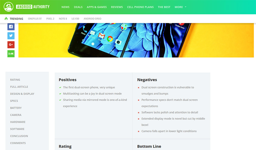
Source

p img {display:inline-block; margin-right:10px;}
.alignleft {float:left;}
p.showcase {clear:both;}
body#browserfriendly p, body#podcast p, div#emailbody p{margin:0;}

CSS Glitch Effect

Original Source: http://feedproxy.google.com/~r/tympanus/~3/88gNj-zE9ZA/

Today we’d like to show you how to create a little experimental glitch-like effect on an image. The effect will be powered by CSS animations and the clip-path property. The technique involves using several layers of images where each one will have a clip-path, a blend mode and a translation applied to it. It was inspired by the technique seen on the speakers page of the 404 conference.

ImageGlitchEffect_Featured

Please note this effect is very experimental; we use several properties that won’t work in older browsers. The clip-path property is not supported in IE or Edge.

We also use CSS variables for setting some properties that will allow for an easy adjustment of the effect.

Breaking down the effect

When searching the web for an easy to use and light-weight glitch implementation, we came across this question on Reddit. Somebody was asking how the glitch effect was pulled off on the speaker line up page of the 404 conference. The glitch effect was made using CSS animations on a stack of three images that are the same. The animations consist of a rapidly changing clip property on all layers except the first one. Additionally, the layers are being moved slightly. So what we are seeing, is slices of the image, slightly offset and in constant movement.

We wanted to experiment with this and recreate the effect using the clip-path property instead. Although it has less browser support (it doesn’t work in IE or Edge), it allows for a more flexible usage since we can use percentage values and apply it to elements that are not necessarily positioned absolutely.

Combining the effect with background blend modes, allows us to create some interesting looking image effects.

The way this works is to create an image stack where each overlaying image will animate its clip-path in, what looks like, random sizes. We’ll use a stack of 5 images:

<div class=”glitch glitch–style-1″>
<div class=”glitch__img”></div>
</div>

Let’s have a look at the main styles for the hover effect that you can see in the last demo. Note that we’ve defined some variables previously, but they should be self-explanatory:

.glitch {
position: relative;
width: var(–glitch-width);
max-width: 400px;
height: var(–glitch-height);
max-height: calc(400px * 1.25);
overflow: hidden;
margin: 0 auto;
}

.glitch:hover {
cursor: pointer;
}

.glitch__img {
position: absolute;
top: calc(-1 * var(–gap-vertical));
left: calc(-1 * var(–gap-horizontal));
width: calc(100% + var(–gap-horizontal) * 2);
height: calc(100% + var(–gap-vertical) * 2);
background: url(../img/1.jpg) no-repeat 50% 0;
background-color: var(–blend-color-1);
background-size: cover;
background-blend-mode: var(–blend-mode-1);
}

We don’t want to show the sides being cut off, so we make sure that the image dimensions take the gap, i.e. the movement into consideration.

Then, we set the background colors and blend modes for each layer:

/* Set the background colors for the glitch images*/
.glitch__img:nth-child(2) {
background-color: var(–blend-color-2);
background-blend-mode: var(–blend-mode-2);
}

.glitch__img:nth-child(3) {
background-color: var(–blend-color-3);
background-blend-mode: var(–blend-mode-3);
}

.glitch__img:nth-child(4) {
background-color: var(–blend-color-4);
background-blend-mode: var(–blend-mode-4);
}

.glitch__img:nth-child(5) {
background-color: var(–blend-color-5);
background-blend-mode: var(–blend-mode-5);
}

As this is going to be a hover effect, we want all layers except the first one to be hidden by default:

.glitch__img:nth-child(n+2) {
opacity: 0;
}

Then, on hover, we show all layers:

.glitch:hover .glitch__img:nth-child(n+2) {
opacity: 1;
}

And we also apply the animations and a transform to each layer:

.glitch:hover .glitch__img:nth-child(2) {
transform: translate3d(var(–gap-horizontal),0,0);
animation: glitch-anim-1-horizontal var(–time-anim) infinite linear alternate;
}

.glitch:hover > .glitch__img:nth-child(3) {
transform: translate3d(calc(-1 * var(–gap-horizontal)),0,0);
animation: glitch-anim-2-horizontal var(–time-anim) infinite linear alternate;
}

.glitch:hover > .glitch__img:nth-child(4) {
transform: translate3d(0, calc(-1 * var(–gap-vertical)), 0) scale3d(-1,-1,1);
animation: glitch-anim-3-horizontal var(–time-anim) infinite linear alternate;
}

/* Hover flash animation on last image */
.glitch:hover > .glitch__img:nth-child(5) {
animation: glitch-anim-flash 0.5s steps(1,end) infinite;
}

The calc(-1 * var(–gap-horizontal)) basically allows us to set a negative value of a given variable.

Have a look at this slow motion visualization to see what’s going on under the hood (this GIF is quite big, so it might take a while to load):

glitchvisualization2

The last layer is only flashing and moving slightly while the others also get cut by a clip-path.

Let’s have a look at one of the animations for setting the clip-path:

@keyframes glitch-anim-1-horizontal {
0% {
-webkit-clip-path: polygon(0 2%, 100% 2%, 100% 5%, 0 5%);
clip-path: polygon(0 2%, 100% 2%, 100% 5%, 0 5%);
}
10% {
-webkit-clip-path: polygon(0 15%, 100% 15%, 100% 15%, 0 15%);
clip-path: polygon(0 15%, 100% 15%, 100% 15%, 0 15%);
}
20% {
-webkit-clip-path: polygon(0 10%, 100% 10%, 100% 20%, 0 20%);
clip-path: polygon(0 10%, 100% 10%, 100% 20%, 0 20%);
}
30% {
-webkit-clip-path: polygon(0 1%, 100% 1%, 100% 2%, 0 2%);
clip-path: polygon(0 1%, 100% 1%, 100% 2%, 0 2%);
}
40% {
-webkit-clip-path: polygon(0 33%, 100% 33%, 100% 33%, 0 33%);
clip-path: polygon(0 33%, 100% 33%, 100% 33%, 0 33%);
}
50% {
-webkit-clip-path: polygon(0 44%, 100% 44%, 100% 44%, 0 44%);
clip-path: polygon(0 44%, 100% 44%, 100% 44%, 0 44%);
}
60% {
-webkit-clip-path: polygon(0 50%, 100% 50%, 100% 20%, 0 20%);
clip-path: polygon(0 50%, 100% 50%, 100% 20%, 0 20%);
}
70% {
-webkit-clip-path: polygon(0 70%, 100% 70%, 100% 70%, 0 70%);
clip-path: polygon(0 70%, 100% 70%, 100% 70%, 0 70%);
}
80% {
-webkit-clip-path: polygon(0 80%, 100% 80%, 100% 80%, 0 80%);
clip-path: polygon(0 80%, 100% 80%, 100% 80%, 0 80%);
}
90% {
-webkit-clip-path: polygon(0 50%, 100% 50%, 100% 55%, 0 55%);
clip-path: polygon(0 50%, 100% 50%, 100% 55%, 0 55%);
}
100% {
-webkit-clip-path: polygon(0 70%, 100% 70%, 100% 80%, 0 80%);
clip-path: polygon(0 70%, 100% 70%, 100% 80%, 0 80%);
}
}

The slices will go from tiny, to a bit larger and also nothing, leaving a “pause” on some of the frames and then starting again from another position.

A great tool to visualize clip paths is Clippy by Bennett Feely.

The final animation is a simple flash of the last layer:

@keyframes glitch-anim-flash {
0% {
opacity: 0.2;
transform: translate3d(var(–gap-horizontal), var(–gap-vertical), 0);
}
33%, 100% {
opacity: 0;
transform: translate3d(0,0,0);
}
}

This looks especially interesting when applying an overlay blend mode with a fitting color.

Note that we can also apply this effect to text elements. Check out the demos to see it in action!

And that’s it! We hope you’ve found some inspiration in this little experiment.

References and Credits

Images by Unsplash.com
imagesLoaded by Dave DeSandro

CSS Glitch Effect was written by Mary Lou and published on Codrops.

Gifts for Creatives During the Holiday Season and Beyond

Original Source: http://inspiredm.com/gifts-creatives-holiday-season-beyond/

Inspired Magazine
Inspired Magazine – creativity & inspiration daily

Do you have a creative in your life? We’re talking about the artsy types who would rather spend time curled up reading a book in front of the fire. Those friends and family who put deep thought into the gifts they give and would rather not another plain shirt from the department store.

The good news is that creatives are often not that picky, since they can always get inventive with the gifts they receive. However, there’s something great about finding that quirky or useful gift for their profession or everyday life, whether it be a shape-shifting chair that adds some character to their home or a set of musical wine glasses where the notes are set by the amount of liquid.

Overall, gifts for creatives need to be both exciting and useful. You’re not trying to buy a gimmick or gag gift that’s going to be used once then thrown in the trash or re-gifted.

Nope.

We want to outline some gifts for creatives that standout, make people laugh, and allow you and your friends and family to have a wonderful holiday season.

If You’d Like to Search for Your Own Gifts for Creative People

We’ll outline some awesome and unique gifts below, but if you’re more interested in completing the gift search yourself, or you like the products below, but want more options, consider using the new Sunny expert gift guide from Uncommongoods.

The Uncommongoods website serves as one of the best places online to find presents for your creative loved ones, but Sunny makes the process much easier. For instance, all you have to do is tell Sunny who you’re buying for and what interests that person has. After that, it delivers a wide range of creative items for you to pick from and filter based on price.

The Best Gifts for Creatives
1. A Shape-shifting Ollie Chair

A Shape-shifting Ollie Chair is perfect for people who may have limited space but don’t want to sacrifice on style when it comes to furniture. Not only does it cater to creatives with the design, but it allows them to get creative when furnishing their apartments or smaller homes.

The great part is that the chair can be used outdoors or indoors, and it’s as comfortable as it is attention-grabbing.

2. Major Scale Musical Wine Glasses

Have you ever tried to put on a little symphony with a few wine glasses? It’s one of the most fun party tricks in the book, where you dab a bit of liquid on your finger and run it along the edge of the glass. However, the average person wouldn’t know how much liquid to have in each glass to hit a certain note.

With these musical glasses the notes are marked on the sides, so you can wow your music-oriented friends and give them something to entertain themselves with, even when they’re not playing an instrument.

3. Novel Teas

Writers and readers alike are known to drink tea and coffee. Writers use tea to help relax and spend countless hours penning books. On the other hand, a reader drinks tea to calms the nerves and pairs that with a good book on a cold afternoon.

This Sri Lanken tea set comes packed with 25 tea bags, all of which have a daily quote from one of your favorite authors. For instance, you can start your day with some words of wisdom from CS Lewis.

Of all the gifts for creatives, this is certain to be one of the most useful ones. You can think about which of your bookworm friends also enjoys tea and get this affordable gift that is sure to please them.

4. Deep Sea Sand Art

Creativity comes in many forms, but just about every person who identifies as a creative knows the value of the imagination.

Not all art is for everyone, but the deep seas sand art intrigues people of all ages, as it creates a mystical vision that sits on your coffee table, desk, kitchen counter, or anywhere in the house. The glittery sands shift down with gravity, displaying beautiful art that looks like aspects of nature.

You might see a few clouds one day and a set of mountains the next. Oceans, smoke, and deserts may all appear, making it a great gift for inspiration and allure.

5. Reclaimed Wood Bike Silhouette Art

Some of the most successful creatives in the world now the value of exploring the outdoors. Biking is a great way to keep the mind and body fresh, while also engaging you with the nature and people around you.

Although this isn’t exactly a real bicycle, it’s a beautiful handmade work of art, using reclaimed wood and materials sourced straight from Canada.

6. Dog Egg Mold

Creative folks often have dogs or other pets, since it’s sometimes easier to relate to animals than people.

So, if your friend or family member loves dogs, consider getting them this dog egg mold. It’s like a simple work of art every morning, and it might just remind them of their best canine friend.

7. Music Note Measuring Spoon Set

Here’s another gem for the music lover in your life. Hopefully, they like to cook, too! If not, the music note measuring spoon hangs nicely as a decoration for the kitchen.

8. Make Your Own Hot Sauce Kit

Cooking is an art in itself, and since hot sauces have become so popular as of late, why not give your creative friend an experience in their kitchen?

The “make your own hot sauce” kit comes with six bottles and hot sauce packets. You can even customize the labels!

9. Tabletop Cornhole

If your creative loved one enjoys a good party game, the tabletop cornhole gift pairs well with beer, wine, or a night with friends eating food. You get to launch miniature corn hole bags, yet there’s no need to store a large gaming set in your garage.

10. 100 Books Scratch Off Poster

Finally, what better way to wow your reading friends than by giving them a bucket list for books to read? They can scratch off the books and try to complete as many of them as they can.

If you have any questions about Sunny from Uncommongoods, or if you’re curious about any of these gifts for creatives, feel free to click through the links above or drop a line in the comments below!

header image courtesy of Jacob Rhoades

This post Gifts for Creatives During the Holiday Season and Beyond was written by Inspired Mag Team and first appearedon Inspired Magazine.

10 Best Subreddits For UI & UX Designers

Original Source: http://feedproxy.google.com/~r/1stwebdesigner/~3/XpS3Na-3JQA/

Reddit is the #1 social news community for every topic. Sports, gaming, fishing – there’s a community for everyone. Naturally this includes all kinds of design topics from web to mobile.

So I’ve curated my picks for the top 10 subreddits geared towards designers. Each sub comes with a different community, but all of them can be useful if you’re looking for design ideas or advice from other designers.

Take a look and see what you think!

1. /r/Design

reddit /r/design

First in this list has to be /r/Design. This subreddit is also one of the largest digital design subs with over 200k subscribers.

Granted, this community isn’t just focused on interface design. It runs the gamut of digital design including logos, branding, print work and even motion graphics. There’s a lot you can learn from skimming the front page.

But it’s also one of the best subs to pick up ideas for new projects, find cool interviews, or just share your ideas with the community. Since it’s a fairly large sub you’re guaranteed to get some comments on anything you post.

2. /r/web_design

reddit /r/web_design

The default web design community is /r/web_design and it has been around for quite a few years. This one’s even larger than the main design sub with more active posts per day.

At the time of this writing it has a total of 290k subscribers and counting. Many front page articles relate to guides, tutorials and general resources for web design.

But this is also a place for newbies to come and ask basic questions. You’ll see a lot of beginner-level questions on the front page so this can feel like an introductory forum at times. Yet there’s also a good number of pros who lurk around as well. This one is full of gems.

3. /r/webdev

reddit /r/webdev

It may seem weird that I’m recommending a development community in a UI/UX design list. But /r/webdev isn’t just for developers. In fact, it’s mostly a frontend community so there’s a lot of overlap.

The front page updates daily with new posts, most of which relate to professional development work. HTML, CSS, and JavaScript are key topics. If you consider yourself a designer who codes, you should definitely subscribe.

But even if you don’t code, this is still a great community to keep up with the pulse of modern web development.

4. /r/userexperience

reddit /r/userexperience

Reddit’s /r/userexperience sub is pretty small but very active. Most regular users comment frequently and the sub has grown a lot over the years.

User experience is a tricky subject because it doesn’t just relate to websites. It can cover mobile apps, software and pretty much anything that’s interactive and digital.

This sub is a fantastic place to learn and pick up advice relevant to the UX field.

Also, if you want another place to browse, this subreddit is one of the more active UX communities.

5. /r/UI_Design

reddit /r/ui_design

General interface design is a broad topic with a lot of room for discussion. The /r/UI_Design community is a small one, and not necessarily the most active.

But it does allow for a huge range of topics – so long as they relate to interface design. It’s a great place to share an article you’ve read or even share an article you wrote on your blog.

Each day there’s an estimated 2-4 new posts, so the front page does move. The community is also engaging if you pose a great question about design.

6. /r/servers

reddit /r/servers

You may not think that designers need to know anything about servers. But if you work as a freelancer, then you should understand them – at least at a basic level.

On the /r/servers subreddit you’ll find advice for managed hosting, VPS hosting and shared hosting alike. Depending on the type of site you’re launching, this subreddit can help you make a great decision that will fit your needs.

However, it can also be a fairly complex community, discussing more advanced technologies like memcached & varnish. You certainly don’t need to delve that far, but it helps to have a working knowledge of web servers.

7. /r/learnwebdesign

reddit /r/learnwebdesign

While this sub is small and very quiet, I still think /r/learnwebdesign is a great place to subscribe.

It’s a small community geared towards beginners and semi-intermediate designers. Every post links to a tutorial or detailed article that can help improve your design skills.

Articles range from how-tos in Photoshop all the way to more technical guides for frontend design in the browser.

8. /r/design_critiques

reddit /r/design_critiques

Here’s a much larger and more active sub, totaling nearly 30k subscribers at the time of this writing.

In /r/design_critiques, you can post your work and ask for honest critiques. The community is full of beginners, semi-skilled pros and industry veterans alike. This means the critiques you’ll get can range from simple quips to incredibly useful paragraphs.

For a free community, it’s one of the best you’ll find on this topic. Whether you just need a small pick-me-up or need genuine design advice, I highly recommend checking out this sub.

And, you can even learn from the critiques of other people’s work – if you browse around long enough.

9. /r/usability

reddit /r/usability

Humans are the ones who use technology and it’s humans that we’re designing for. The /r/usability community forces you to keep this in mind by sharing articles related to HCI and general usability.

This sub is not just about web design. It covers everything related to usability from wearables to desktop software.

But what I’ve found is that most usability topics relate to each other. Yes, there are differences between mediums and devices, but usability is an easy topic to read through once you understand the main goal: to help the end user.

10. /r/UnsolicitedRedesigns

reddit /r/UnsolicitedRedesigns

I stumbled onto this sub a few years back and it’s been one of my favorites to hit every so often. As the name suggests, /r/UnsolicitedRedesigns is a curation of redesign projects created by designers – just for fun. They include new branding & identity designs, new websites and mobile apps.

It’s a pretty small community and there’s usually about 1-2 new posts per week.

Still, the community is fantastic and some of the constructive critiques are surprisingly helpful. It’s a place you come back to time & again for new ideas.


Ways to Make Your Ecommerce Store Stand Out for The Holidays

Original Source: http://feedproxy.google.com/~r/Designrfix/~3/3Osmq2-OMxg/ways-ecommerce-store-stand-holidays

With the holiday shopping season approaching rapidly, now is the time to get your site ready to serve the crowds of joyous gift givers who will be clamoring for your finely curated array of products. To keep them in a gifting frame of mind when they visit your site, here are five ways to make […]

The post Ways to Make Your Ecommerce Store Stand Out for The Holidays appeared first on designrfix.com.

What’s New for Designers, December 2017

Original Source: https://www.webdesignerdepot.com/2017/12/whats-new-for-designers-december-2017/

The holiday season is upon us, and that’s the perfect time to give yourself a few design goodies. While the season for new releases has slowed some, there are still plenty of news design tools and beta releases to test out. Take the opportunity to play with some of these great new elements for designers.

If we’ve missed something that you think should have been on the list, let us know in the comments. And if you know of a new app or resource that should be featured next month, tweet it to @carriecousins to be considered!

DesignEvo

Want to create a logo on your own in just a few minutes? DesignEvo is a free online logo maker that has more than 3,000 templates to help you create a simple logo in a hurry. Search by template type (or brand category) to start working on a custom logo right away. Everything you need, including icons, color swatches and fonts, are included in your logo design.

Oiga

Project management tools are a must have part of the creative workflow. Every project comes with assets, colors, fonts, files and schedules that team members have to be aware of. Oiga, which is currently in beta, is a modern project management tool that helps you keep track of everything in one place. It’s designed for remote work and unlike many other project management tools, it also includes an asset manager so that everything is in one place.

Google Poly

Google is developing a great repository of three-dimensional assets for AR and VR apps. What’s even better is that all of these assets are open source and come with creative commons licenses so that you can use them. The database is growing quickly and is a great resource for getting started with these cutting-edge apps.

Flawless

Flawless is an app that uses real-time comparisons of expected and implemented designs to help you ensure the quality of mobile apps.

SessionStack

Ever wonder what your app looks like to users? SessionStack helps you see web app problems in the same way users do. This tool can help you pinpoint and correct small issues before they become major problems. The biggest feature of this tool is the record and playback tool.

Direction Reveal

Direction Reveal is a plugin that detects which direction a user enters and exits a block so that content and hover actions follow the same user action. Hidden content animates from the direction the user enters or can animate based on the direction a user leaves. This makes for pretty interesting animated effects. Animations can swing, slide or rotate.

Color Scheme Generator

Generate a color palette from a base color. See different optimum color combinations rooted in color theory. This is a great tool for designers that struggle with picking colors.

Superstruct

Superstruct makes it easy to define interfaces and then validate JavaScript data against them. It is designed for validating data at runtime, so it throws (or returns) detailed runtime errors. This can be useful for accepting arbitrary input in a REST or GraphQL API. But it can also be used to validate internal data structures at runtime.

World City Icons

The world cities icon pack includes graphic representations of popular cities from around the globe. Each icon is drawn in a vector format and collections include Asia and Oceania, Middle East and Africa, Europe, North and Central America and South America. Each icon comes in line style, but can be filled.

Threed

Threed helps you generate three-dimensional mockups in-browser. Just upload a design, adjust a few settings and download the mockup. The tool, which is still in beta, is free to use.

Scri.ch

Draw something on the screen and save the unique link to share. It’s like the grown up (digital) version of an Etch-a-Sketch.

Akaunting

With so many creative professionals working in the gig economy, it’s important to have plenty of effective and low-cost tools to help with business tasks. Akaunting is free accounting software for small businesses and freelancers. It is an open source tool that provides invoicing, expense tracking and basic accounting so you can keep up with finances easily.

Orion

This tool bills itself as the best icon tool with a large database of elements to search, download and customize. The search features are robust when it comes to finding just what you envision (and don’t want to draw yourself).

Electron Toolkit

Electron Toolkit is a lightweight open source application to launch Electron apps. It bundles a suite of tools to generate assets and artifacts such as installers, binaries, icons, screenshots, and product videos. You can even generate full landing pages.

Instabug Integrations Tool

The Instabug Integration Tool help you receive detailed bug reports and in-app messages directly from whatever tools you use. Whether it’s Jira, GitHub, Slack and more, there are dozens of integrations to help your team focus on what matters without disrupting workflow.

Creative Equals

There’s a lot of talk about making sure the creative space is welcome, diverse and inclusive. Creative Equals includes resources and information to help you or your business, and the industry as a whole, drive change and provide a more equal playing field for all creatives. It’s packed with training resources, campaigns and even a talent recruiting tool.

Lona Studio

Airbnb has a new tool for defining and using design systems and it is making the experiment public. “What if we had a single design system specification that encodes all of the detail needed to accurately translate from design to code? This spec would act as the source of truth. An engineer could then write code which captures the design with 100% accuracy. If the design file is missing a key piece of information, the designer and engineer could work together to add it to the source of truth.” That’s the concept of Lona, which operates on component files and is supposed to work with your current design tools.

Ballada

Ballada is a brush-style typeface with a slanted stance and plenty of loops and curves. It has a somewhat feminine feel and is designed for display use. It is free for personal and commercial projects.

Brewmaster Gothic

Brewmaster Gothic is a block-style sans serif for display type. The typeface is powerful and bold and includes a full set of uppercase letters.

Onomber

Onomber is an interesting geometric style typeface with mixed cap heights for extra visual interest. It has open letterforms that can work well in display uses.

Spirited

Spirited is a set of hand-drawn letters that create a modern script with a retro feel. This typeface could work for logos, display type or other special projects that require a font with a special touch.

Studio Gothic

Studio Gothic is a simple sans serif with uniform stroke widths with thick and thin options. The versatile typeface can work for display or larger text blocks and has a modern feel.

3500+ Textures, Brushes, Icons, Watercolors & More Graphic Elements

Source

p img {display:inline-block; margin-right:10px;}
.alignleft {float:left;}
p.showcase {clear:both;}
body#browserfriendly p, body#podcast p, div#emailbody p{margin:0;}

Industrial Design: Color of Time Minimalist Wall Clock

Original Source: http://feedproxy.google.com/~r/abduzeedo/~3/X_uTtStN0dY/industrial-design-color-time-minimalist-wall-clock

Industrial Design: Color of Time Minimalist Wall Clock

Industrial Design: Color of Time Minimalist Wall Clock

abduzeedo
Dec 19, 2017

Dae-hoo Kim shared this beautiful industrial design project for a wall clock titled the Color of Time. The concept of time is like a numerical representation of a moment. Our time is flowing, time and light are most closely related. Through this design, I wanted to express the continuous change of light with the clock. As the hour hand rotates, you will see a palette that visualizes the light. It shows emotions for the time and continuous light changes during a day. Along with this, even though it is not expressed as a number, it is possible to know intuitively the time through the color of the hour hand, thereby achieving a minimal expression of time.

2017
Norman Zammitt, Blue Burning, 1982  at SFMOMA
Industrial Design process

While the hour hand rotates 360 degrees for 12 hours, the internal color palette rotates 180 degrees. I have structurally considered the characteristics of a watch that will have two different lights for a specific time point (AM and PM) for 24 hours a day.

23 : 30

19 : 20

13 : 50

For more information and to check out more industrial design projects by Dae-hoo Kim make sure to visit his Behance profile at https://www.behance.net/abledavid

industrial design


To Hell With Subtle Design

Original Source: https://www.webdesignerdepot.com/2017/12/to-hell-with-subtle-design/

Don’t try to be so damn subtle in web design.

Okay, let me explain that…

About a year or so ago, I made a terrible mistake: I tried to be funny; More specifically, I tried my hand at stand-up comedy. I sat down, wrote out a bunch of jokes that I found amusing; and collected some online acquaintances in video chat to try them out. I did it this way because I live in Mexico, but my first language is English.

And here’s what I found out: Unless people already know you, they may not immediately understand you when you’re trying to be clever. They tend to take what you say rather literally. Also, they will only trust you with a joke that has a long set-up if they already think you’re funny. Also, Mexicans can have a really dark and subtle sense of humor that doesn’t translate to everyone else and it has rubbed off on me. The only Mexican in the virtual room was my biggest fan.

Cleverness is overrated; Subtlety is useless

In web design, those first two points are the ones that truly apply: Cleverness is overrated; Subtlety is useless.

Just give them what they want without making them jump through mental hoops. As a comedian, I failed my “audience” by presenting them with small puzzles. I mean, I thought they were just clever references with obvious punchlines. I figured if they just thought about it for a split second, they’d laugh like I did. That was silly of me.

When people go to a comedian, they don’t want puzzles. They want laughs. That’s why some of the most obvious jokes can carry entire careers. It’s why comedians usually start a set with quick, almost-guaranteed jokes. Once they have captured the attention of the audience—once the audience trusts them to deliver the laughs—they can go into subtler material, and longer jokes.

When people browse the Internet looking for information, they don’t want websites to be puzzles. They don’t want references or clever gimmicks. Those things can be a nice bonus (or Easter egg) but users shouldn’t have to get through them to get to the information or product they want.

So What Exactly Do You Want Us To Stop Doing?

I’m so glad you asked! Let’s tackle subtlety and overwrought cleverness in UX Design: Every time someone comes up with a newfangled form of navigation, an overly-artistic layout, or hides content behind unnecessary clicks, Sir Tim Berners-Lee cries. Stop making Sir Tim cry.

Every time someone…hides content behind unnecessary clicks, Sir Tim Berners-Lee cries

I’m not saying to never do anything new or interesting with your layout. I’m saying that you need to be more careful about it. Every time you consider a brand new approach in web design, ask yourself if it’s going to make things easier or harder for users to find. Then go ask some users. Any users. For the love of all that is holy, stop hiding information and UI elements that people need.

Now, on mobile devices, it might make some sense to hide your navigation behind an extra tap, but that’s really the limit. On tablets and desktop computers, primary navigation just shouldn’t be hidden. It just shouldn’t. There is no good reason. Aesthetics is not a good reason.

Let’s take another example: forms. There is no reason they should not look like forms. No matter how clever it might seem to make text inputs look like something else, it’s really not a big help. Not unless you put up a sign that says, “Click here, and here, and here…”, and then you’re just making more work for yourself.

Yes, forms are sometimes ugly, boring, and frustrating—just like in the offline world. Can they be better? Yes, but only as long as they are still recognizable as forms. The moment they look like anything else, users have to spend extra time figuring them out. Congratulations! You made forms more irritating.

The bits of your website that users actually interact with don’t have to be clever, innovative, or subtle. They just need to work.

On Subtle UI Flourishes

Let’s address UI design next: drop shadows, gradients, and contrast. Specifically, let’s talk about the near-complete absence of contrast on some sites. I’ll admit, this is a trap I’ve fallen into many times, myself: Please don’t look at my current writing portfolio, I’m just about to redesign it yet again.

When you make a gradient, or a drop shadow, it can be tempting to make it as subtle as possible. Light grey stuff on white backgrounds looks elegant. Or at least that’s something we tell ourselves. The truth is, if your user is looking at your site on a screen where that’s not quite calibrated right, a lot of those details can disappear entirely.

If you’re depending on something like a drop shadow or gradient to create affordances (or clues as to how the interface works), having those details disappear can seriously affect usability. It’s a different kind of subtlety, yes, but it needs to be addressed.

Conclusion

Don’t hold back. Be bold with your colors, your contrast, and your user experience design. Go wild! The only real constraints should be usability, and efficiency. And by that I mean don’t hide the content or features that your users are looking for.

Metaphorically hit them in the face with what they want. It’s what they want.

3500+ Textures, Brushes, Icons, Watercolors & More Graphic Elements

Source

p img {display:inline-block; margin-right:10px;}
.alignleft {float:left;}
p.showcase {clear:both;}
body#browserfriendly p, body#podcast p, div#emailbody p{margin:0;}

Top 10 Web Design Trends From 2017

Original Source: http://feedproxy.google.com/~r/1stwebdesigner/~3/0pcjN1GtfxI/

As another year comes to a close we can marvel at the massive growth in the design space. There’s no denying this year was an active one that’s seen enough growth to rival the past decade combined!

It’s hard whittling down to a few select trends but I always find a few that jump out at me.

This list is merely the best trends that I’ve seen over 2017, most of which I expect to carry over well into 2018. If you’re looking for the latest design trends have a peek and see what you think!

1. Building With Frameworks

Bootstrap framework homepage

The explosion of web frameworks comes at a time when the number of modern frameworks just keeps growing. It seems never-ending and it’s pretty clear that frameworks are here to stay.

Developers can save loads of time by using these frameworks rather than starting from scratch. The only trouble is that, in the past, frameworks have always seemed so limited.

But these days you have dozens of amazing frameworks to pick from that go far beyond Bootstrap. This makes it easy to build custom sites from scratch with unique designs – without having to reinvent the wheel.

2. In-Post Related Links

in-post related items

I’ve noticed this trend on a few larger news sites and it’s something I hope to see more often in blogs.

We all know about the “related post” widgets that appear after articles. Many of these run through native ad networks like Taboola, while others consist of legitimate internal links. But you can also add these related posts inside your content.

WordPress makes this super easy with free plugins that pull links automatically into your content.

This is likely to increase pageviews and keep people on your site for longer periods of time. Not a bad strategy if you’re hoping to increase your pageviews in 2018.

3. Scroll-Up Sticky Navigation

Android Authority sticky nav

The sticky navigation trend has been around for years. But over the past year, I’ve noticed a slightly different trend growing in popularity: scroll-up sticky navigation.

These only appear when the user is scrolling back up the page. When the user scrolls down past a certain point the navigation automatically hides out of view. This increases readability while still making navigation accessible with one scroll (or swipe).

You can see a great example of this technique at Android Authority.

4. Microinteractions

example microinteraction

The more I research microinteractions, the more I notice these features on the web. Heck, visit the Android Authority example above and click on their search icon. It’s an example of microinteraction to a tee.

I have a feeling these little animations are here to stay. They’re getting easier to create with so many JS/CSS animation libraries, and modern browsers can support much more interactivity (including mobile browsers).

You don’t need to force these microinteractions into your projects but they’re worth considering if you want to test some UX ideas.

5. Native In-Post Sponsorships

Native in-post ad blocks

I’ll admit, this trend is a mix of one-part design and one-part marketing. But if you can blend ads naturally into your content they’ll be far less annoying than the auto-play garbage we get from traditional ad networks.

Take a look at almost any post on Search Engine Journal. You’ll notice they use in-post ad blocks with custom icons, backgrounds and disclosures stating that they’re advertisements. Naturally blended and very well designed.

I’m not sure how much they could charge for this placement but I think it’s a great choice for small publishers with a niche audience.

6. Article Subheadings

Article subheading

Your page headline is perhaps the most important factor in getting people to stick around. But what about adding a sub-headline?

This can help explain the content in more detail. Plus, it gives you another chance to sell the article and keep people scrolling down.

I see this on many Computerworld posts along with other major news sites. If you use a fullscreen headline layout this would definitely be worth testing.

7. Single-Page Table of Contents

Table of contents Android Authority

We’re all familiar with the Wikipedia table of contents. This is a table for browsing complex entries to find that one tidbit you’re looking for…or to help you waste 30 minutes researching unrelated factoids.

Nonetheless, I think more websites are adopting the table of contents feature in the coming year. This is already popular in large guides where the linkable headers certainly help to spruce up the content.

You can try this with guides like custom reviews that draw in readers who just want fast information (Android Authority really has implemented a lot of these trends!)

The table of contents may take awhile to go mainstream in web design. But with Google favoring longform content I think they are here to stay.

8. Google AMP

AMP mobile pages

Google announced their Accelerated Mobile Pages in late 2015. It’s been around for a few years but it’s been a slow grind to reach mainstream designers.

I can’t say this will become the norm for all mobile sites. But I do think it has grown a lot and it’ll keep growing with larger publishers into 2018.

Most AMP pages see a higher listing in Google and a faster page load. It can also lead to higher bounce rates, but this is usually fine for news sites or fast-paced viral blogs.

9. Animated Page Logos

Animated page logos

I haven’t seen this effect on too many websites but I have a feeling it’s gaining momentum. The popularity of vector graphics, HTML5 canvas elements, and JS animations means that anyone can animate their logo.

There are multiple ways to approach animated logos. You can follow the likes of Bittbox with a custom logo animation on every page. Or you can approach things like Search Engine Land’s logo, where it appears larger at the top of the page, then slides into the sticky navigation when scrolling down.

Web animation as a whole trend is massive. It’s already been a huge part of 2017 and I think it’s going to sneak into website logos more in the coming years.

10. SVG Graphics

Snap.svg library

As a follow-up to my previous point, I’ve also seen a massive increase in SVGs used unabashedly in modern websites.

Even production sites for large businesses and startups are using SVGs. They’re natively supported by all browsers so you really can’t go wrong here. Not to mention that with a graphics library like SVG.js, you can even manipulate these graphics far easier than JPEGs or PNGs.

Nobody can really tell the future, but these are some of the fastest rising design trends that I think will carry into the coming year. They’ve left quite a mark on 2017 – so keep your eyes peeled for these trends while out browsing the web.


5 Free Tools To Notify You of Website Content Changes

Original Source: https://www.hongkiat.com/blog/detect-website-change-notification/

To know when a website changes its content, you have to go to that website and check it frequently and manually. This doesn’t sound like much work, unless it comes to an e-commerce site or a…

Visit hongkiat.com for full content.