What’s New for Designers, December 2017
Original Source: https://www.webdesignerdepot.com/2017/12/whats-new-for-designers-december-2017/
 The holiday season is upon us, and that’s the perfect time to give yourself a few design goodies. While the season for new releases has slowed some, there are still plenty of news design tools and beta releases to test out. Take the opportunity to play with some of these great new elements for designers.
If we’ve missed something that you think should have been on the list, let us know in the comments. And if you know of a new app or resource that should be featured next month, tweet it to @carriecousins to be considered!
DesignEvo
Want to create a logo on your own in just a few minutes? DesignEvo is a free online logo maker that has more than 3,000 templates to help you create a simple logo in a hurry. Search by template type (or brand category) to start working on a custom logo right away. Everything you need, including icons, color swatches and fonts, are included in your logo design.

Oiga
Project management tools are a must have part of the creative workflow. Every project comes with assets, colors, fonts, files and schedules that team members have to be aware of. Oiga, which is currently in beta, is a modern project management tool that helps you keep track of everything in one place. It’s designed for remote work and unlike many other project management tools, it also includes an asset manager so that everything is in one place.

Google Poly
Google is developing a great repository of three-dimensional assets for AR and VR apps. What’s even better is that all of these assets are open source and come with creative commons licenses so that you can use them. The database is growing quickly and is a great resource for getting started with these cutting-edge apps.

Flawless
Flawless is an app that uses real-time comparisons of expected and implemented designs to help you ensure the quality of mobile apps.

SessionStack
Ever wonder what your app looks like to users? SessionStack helps you see web app problems in the same way users do. This tool can help you pinpoint and correct small issues before they become major problems. The biggest feature of this tool is the record and playback tool.

Direction Reveal
Direction Reveal is a plugin that detects which direction a user enters and exits a block so that content and hover actions follow the same user action. Hidden content animates from the direction the user enters or can animate based on the direction a user leaves. This makes for pretty interesting animated effects. Animations can swing, slide or rotate.

Color Scheme Generator
Generate a color palette from a base color. See different optimum color combinations rooted in color theory. This is a great tool for designers that struggle with picking colors.

Superstruct
Superstruct makes it easy to define interfaces and then validate JavaScript data against them. It is designed for validating data at runtime, so it throws (or returns) detailed runtime errors. This can be useful for accepting arbitrary input in a REST or GraphQL API. But it can also be used to validate internal data structures at runtime.

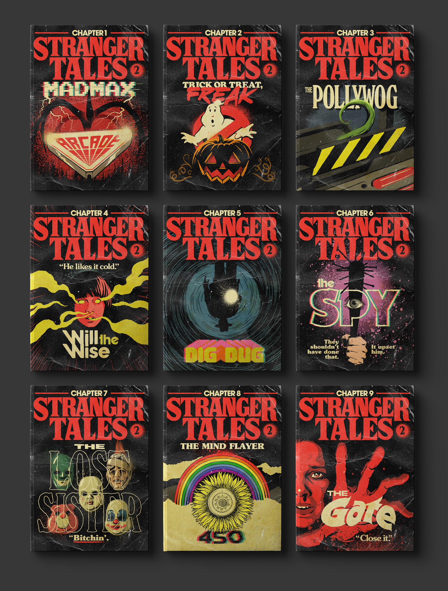
World City Icons
The world cities icon pack includes graphic representations of popular cities from around the globe. Each icon is drawn in a vector format and collections include Asia and Oceania, Middle East and Africa, Europe, North and Central America and South America. Each icon comes in line style, but can be filled.
![]()
Threed
Threed helps you generate three-dimensional mockups in-browser. Just upload a design, adjust a few settings and download the mockup. The tool, which is still in beta, is free to use.

Scri.ch
Draw something on the screen and save the unique link to share. It’s like the grown up (digital) version of an Etch-a-Sketch.

Akaunting
With so many creative professionals working in the gig economy, it’s important to have plenty of effective and low-cost tools to help with business tasks. Akaunting is free accounting software for small businesses and freelancers. It is an open source tool that provides invoicing, expense tracking and basic accounting so you can keep up with finances easily.

Orion
This tool bills itself as the best icon tool with a large database of elements to search, download and customize. The search features are robust when it comes to finding just what you envision (and don’t want to draw yourself).

Electron Toolkit
Electron Toolkit is a lightweight open source application to launch Electron apps. It bundles a suite of tools to generate assets and artifacts such as installers, binaries, icons, screenshots, and product videos. You can even generate full landing pages.

Instabug Integrations Tool
The Instabug Integration Tool help you receive detailed bug reports and in-app messages directly from whatever tools you use. Whether it’s Jira, GitHub, Slack and more, there are dozens of integrations to help your team focus on what matters without disrupting workflow.

Creative Equals
There’s a lot of talk about making sure the creative space is welcome, diverse and inclusive. Creative Equals includes resources and information to help you or your business, and the industry as a whole, drive change and provide a more equal playing field for all creatives. It’s packed with training resources, campaigns and even a talent recruiting tool.

Lona Studio
Airbnb has a new tool for defining and using design systems and it is making the experiment public. “What if we had a single design system specification that encodes all of the detail needed to accurately translate from design to code? This spec would act as the source of truth. An engineer could then write code which captures the design with 100% accuracy. If the design file is missing a key piece of information, the designer and engineer could work together to add it to the source of truth.” That’s the concept of Lona, which operates on component files and is supposed to work with your current design tools.

Ballada
Ballada is a brush-style typeface with a slanted stance and plenty of loops and curves. It has a somewhat feminine feel and is designed for display use. It is free for personal and commercial projects.

Brewmaster Gothic
Brewmaster Gothic is a block-style sans serif for display type. The typeface is powerful and bold and includes a full set of uppercase letters.

Onomber
Onomber is an interesting geometric style typeface with mixed cap heights for extra visual interest. It has open letterforms that can work well in display uses.

Spirited
Spirited is a set of hand-drawn letters that create a modern script with a retro feel. This typeface could work for logos, display type or other special projects that require a font with a special touch.

Studio Gothic
Studio Gothic is a simple sans serif with uniform stroke widths with thick and thin options. The versatile typeface can work for display or larger text blocks and has a modern feel.

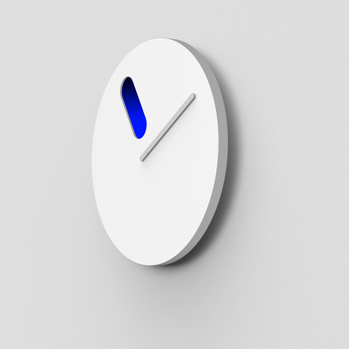
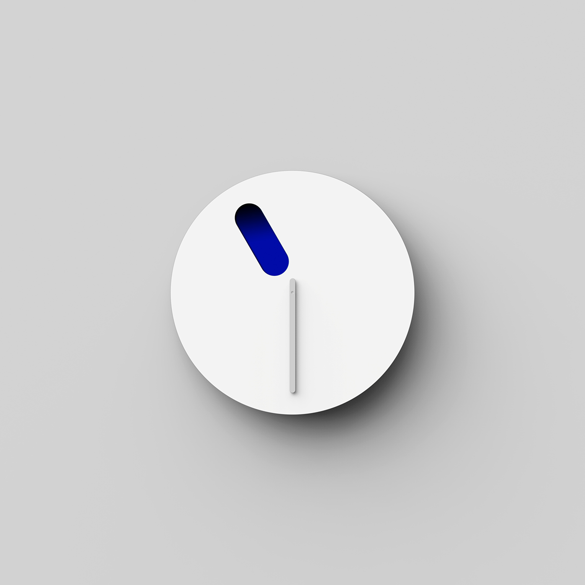
3500+ Textures, Brushes, Icons, Watercolors & More Graphic Elements
![]()
Source
p img {display:inline-block; margin-right:10px;}
.alignleft {float:left;}
p.showcase {clear:both;}
body#browserfriendly p, body#podcast p, div#emailbody p{margin:0;}

 Norman Zammitt, Blue Burning, 1982 at SFMOMA
 23 : 30
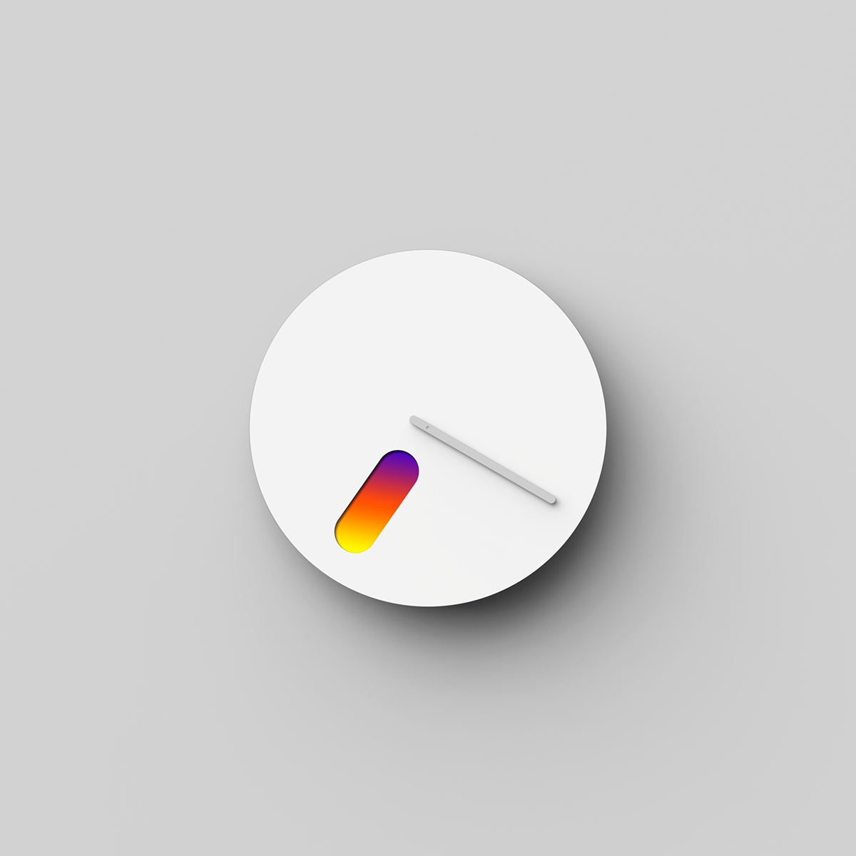 19 : 20
 13 : 50
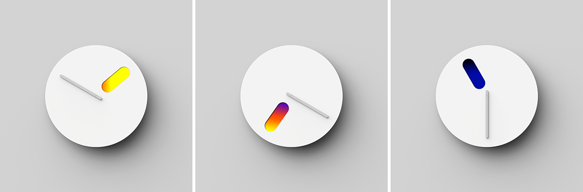
 Don’t try to be so damn subtle in web design.