Industrial Design: Color of Time Minimalist Wall Clock
Original Source: http://feedproxy.google.com/~r/abduzeedo/~3/X_uTtStN0dY/industrial-design-color-time-minimalist-wall-clock
Industrial Design: Color of Time Minimalist Wall Clock

abduzeedo
Dec 19, 2017
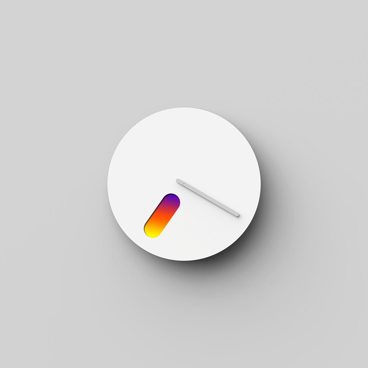
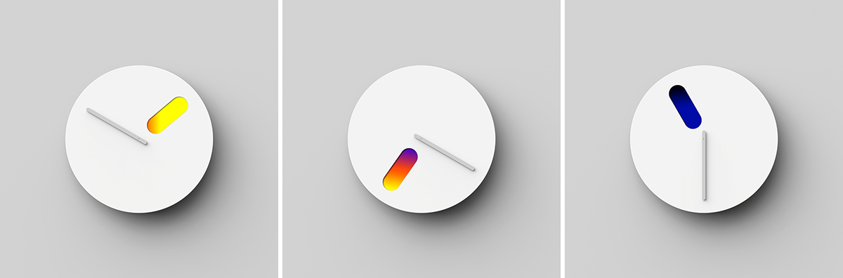
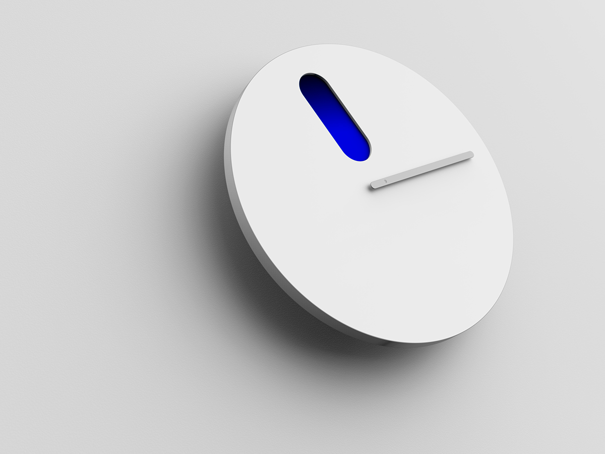
Dae-hoo Kim shared this beautiful industrial design project for a wall clock titled the Color of Time. The concept of time is like a numerical representation of a moment. Our time is flowing, time and light are most closely related. Through this design, I wanted to express the continuous change of light with the clock. As the hour hand rotates, you will see a palette that visualizes the light. It shows emotions for the time and continuous light changes during a day. Along with this, even though it is not expressed as a number, it is possible to know intuitively the time through the color of the hour hand, thereby achieving a minimal expression of time.
2017
 Norman Zammitt, Blue Burning, 1982 at SFMOMA
Industrial Design process

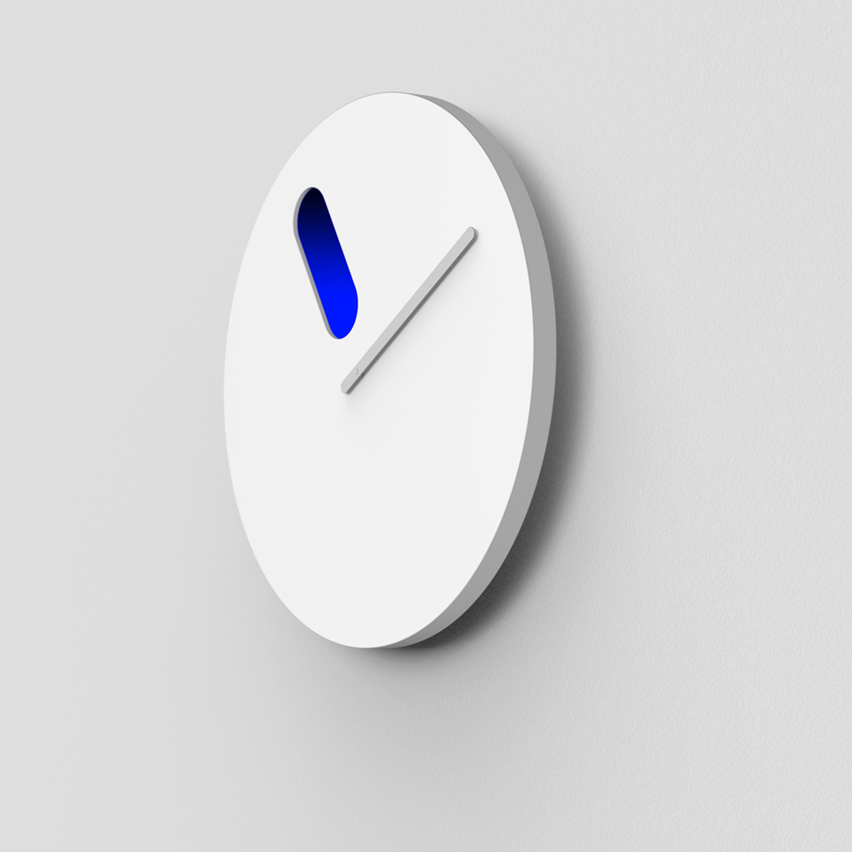
While the hour hand rotates 360 degrees for 12 hours, the internal color palette rotates 180 degrees. I have structurally considered the characteristics of a watch that will have two different lights for a specific time point (AM and PM) for 24 hours a day.
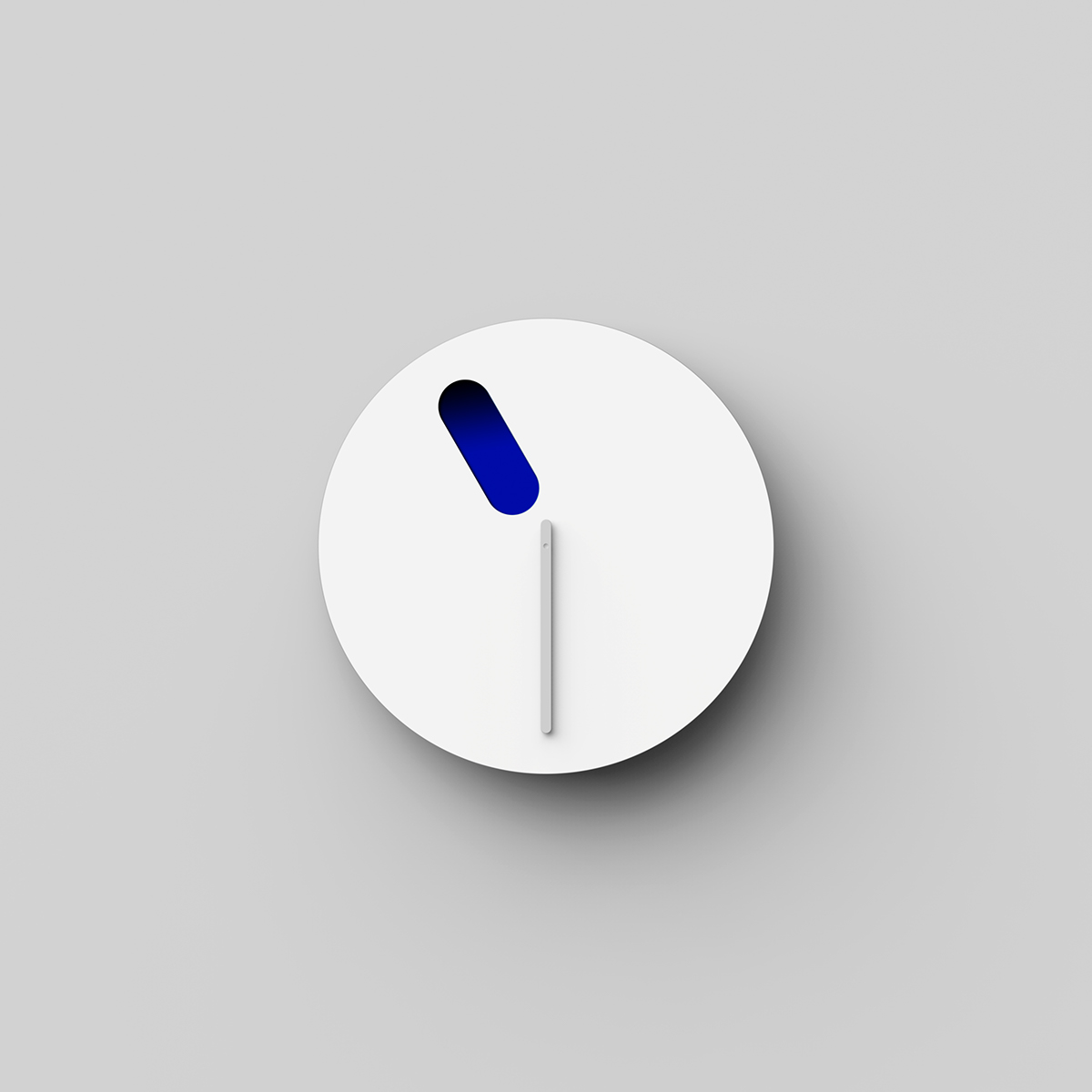 23 : 30
 19 : 20
 13 : 50
For more information and to check out more industrial design projects by Dae-hoo Kim make sure to visit his Behance profile at https://www.behance.net/abledavid
industrial design


Leave a Reply
Want to join the discussion?Feel free to contribute!