It’s Beginning To Look A Lot Like… December (2018 Wallpapers Edition)
Original Source: https://www.smashingmagazine.com/2018/11/desktop-wallpaper-calendars-december-2018/
It’s Beginning To Look A Lot Like… December (2018 Wallpapers Edition)
It’s Beginning To Look A Lot Like… December (2018 Wallpapers Edition)
Cosima Mielke
2018-11-30T09:01:00+01:00
2018-12-04T17:38:33+00:00
What are you looking forward to in December? Spending time with family and friends during the holidays, watching the birds gather in your snowy backyard, or celebrating “Bathtub Party Day” maybe? These are just some of the things that inspired artists and designers to create their desktop wallpapers this month.
All wallpapers in this post come in versions with and without a calendar for December 2018 and can be downloaded for free — as it has been our monthly tradition since more than nine years already. To cater for an extra bit of December joy, we also collected some wallpaper favorites from past years at the end of the post. Happy December and happy holidays!
Further Reading on SmashingMag:
60 Beautiful Christmas Photoshop Tutorials
Winter- And Holiday-Inspired Icon Sets
How To Draw A Cartoon In Illustrator
How To Create Dramatic Vector Illustrations
Please note that:
All images can be clicked on and lead to the preview of the wallpaper,
You can feature your work in our magazine by taking part in our Desktop Wallpaper Calendar series. We are regularly looking for creative designers and artists to be featured on Smashing Magazine. Are you one of them?
Meet Smashing Book 6 — our brand new book focused on real challenges and real front-end solutions in the real world: from design systems and accessible single-page apps to CSS Custom Properties, CSS Grid, Service Workers, performance, AR/VR and responsive art direction. With Marcy Sutton, Yoav Weiss, Lyza D. Gardner, Laura Elizabeth and many others.
Table of Contents →
Christmas Wreath
“Everyone is in the mood for Christmas when December starts. Therefore I made this Christmas wreath inspired wallpaper. Enjoy December and Merry Christmas to all!” — Designed by Melissa Bogemans from Belgium.

preview
with calendar: 320×480, 640×480, 800×480, 800×600, 1024×768, 1024×1024, 1152×864, 1280×720, 1280×800, 1280×960, 1280×1024, 1400×1050, 1440×900, 1600×1200, 1680×1050, 1680×1200, 1920×1080, 1920×1200, 1920×1440, 2560×1440
without calendar: 320×480, 640×480, 800×480, 800×600, 1024×768, 1024×1024, 1152×864, 1280×720, 1280×800, 1280×960, 1280×1024, 1400×1050, 1440×900, 1600×1200, 1680×1050, 1680×1200, 1920×1080, 1920×1200, 1920×1440, 2560×1440
Cardinals In Snowfall
“During Christmas season, in the cold, colorless days of winter, Cardinal birds are seen as symbols of faith and warmth! In the part of America I live in, there is snowfall every December. While the snow is falling, I can see gorgeous Cardinals flying in and out of my patio. The intriguing color palette of the bright red of the Cardinals, the white of the flurries and the brown/black of dry twigs and fallen leaves on the snow-laden ground, fascinates me a lot, and inspired me to create this quaint and sweet, hand-illustrated surface pattern design as I wait for the December 2018 snowfall in my town!” — Designed by Gyaneshwari Dave from the United States.

preview
with calendar: 640×960, 768×1024, 1280×720, 1280×1024, 1366×768, 1920×1080, 2560×1440
without calendar: 640×960, 768×1024, 1280×720, 1280×1024, 1366×768, 1920×1080, 2560×1440
Cozy
“December is all about coziness and warmth. Days are getting darker, shorter and colder. So a nice cup of hot cocoa just warms me up.” — Designed by Hazuki Sato from Belgium.

preview
with calendar: 320×480, 640×480, 960×560, 1024×768, 1280×960, 1440×900, 1600×1200, 1920×1080, 1920×1200, 2560×1440
without calendar: 320×480, 640×480, 960×560, 1024×768, 1280×960, 1440×900, 1600×1200, 1920×1080, 1920×1200, 2560×1440
Sweet Snowy Tenderness
“You know that warm feeling when you get to spend cold winter days in a snug, homey, relaxed atmosphere? Oh, yes, we love it too! It is the sentiment we set our hearts on for the holiday season, and this sweet snowy tenderness is for all of us who adore watching the snowfall from our windows. Isn’t it romantic?” — Designed by PopArt Studio from Serbia.

preview
with calendar: 320×480, 640×480, 800×480, 800×600, 1024×768, 1024×1024, 1152×864, 1280×720, 1280×800, 1280×960, 1280×1024, 1366×768, 1400×1050, 1440×900, 1600×1200, 1680×1050, 1680×1200, 1920×1080, 1920×1200, 1920×1440, 2560×1440
without calendar: 320×480, 640×480, 800×480, 800×600, 1024×768, 1024×1024, 1152×864, 1280×720, 1280×800, 1280×960, 1280×1024, 1366×768, 1400×1050, 1440×900, 1600×1200, 1680×1050, 1680×1200, 1920×1080, 1920×1200, 1920×1440, 2560×1440
’Tis The Season Of Snow
“The tiny flakes of snow have just begun to shower and we know it’s the start of the merry hour! Someone is all set to cram his sleigh with boxes of love as kids wait for their dear Santa to show up! Rightly said, ’tis the season of snow, surprise and lots and lots of fun! Merry Christmas!” — Designed by Sweans Technologies from London.

preview
with calendar: 320×480, 640×480, 800×480, 800×600, 1024×768, 1024×1024, 1152×864, 1280×720, 1280×800, 1280×960, 1280×1024, 1366×768, 1400×1050, 1440×900, 1600×1200, 1680×1050, 1680×1200, 1920×1080, 1920×1200, 1920×1440, 2560×1440
without calendar: 320×480, 640×480, 800×480, 800×600, 1024×768, 1024×1024, 1152×864, 1280×720, 1280×800, 1280×960, 1280×1024, 1366×768, 1400×1050, 1440×900, 1600×1200, 1680×1050, 1680×1200, 1920×1080, 1920×1200, 1920×1440, 2560×1440
Bathtub Party Day
“December 5th is also known as Bathtub Party Day, which is why I wanted to visualize what celebrating this day could look like.” — Designed by Jonas Vanhamme from Belgium.

preview
with calendar: 320×480, 640×480, 800×480, 800×600, 1024×768, 1280×720, 1280×800, 1280×960, 1400×1050, 1600×1200, 1680×1200, 1920×1080, 1920×1200, 1920×1440, 2560×1440, 2560×1600
without calendar: 320×480, 640×480, 800×480, 800×600, 1024×768, 1280×720, 1280×800, 1280×960, 1400×1050, 1600×1200, 1680×1200, 1920×1080, 1920×1200, 1920×1440, 2560×1440, 2560×1600
Cold Days, Warm Feelings
“Everything that reminds me of the cold days of December. I’ve tried to put everything in one illustration, the snow, hot coffee, mountains, snowman. Also my illustration is blue, it’s a cold color, so this give the illustration more of a winter effect.” — Designed by Dennis van den Heuvel from Belgium.

preview
with calendar: 800×480, 1024×768, 1280×960, 1680×1200, 1920×1440
without calendar: 800×480, 1024×768, 1280×960, 1680×1200, 1920×1440
Oh Deer, It’s Cold!
“December brings more than Christmas only. It brings Winter. It brings the cold.” — Designed by Ellen Theuwen from Belgium.

preview
with calendar: 640×480, 800×480, 800×600, 1024×768, 1024×1024, 1152×864, 1280×720, 1280×800, 1280×960, 1280×1024, 1366×768, 1400×1050, 1440×900, 1600×1200, 1680×1050, 1680×1200, 1920×1200, 1920×1440, 2560×1440
without calendar: 640×480, 800×480, 800×600, 1024×768, 1024×1024, 1152×864, 1280×720, 1280×800, 1280×960, 1280×1024, 1366×768, 1400×1050, 1440×900, 1600×1200, 1680×1050, 1680×1200, 1920×1200, 1920×1440, 2560×1440
Portland Snow Globe
Designed by Mad Fish Digital from the USA.

preview
with calendar: 320×480, 1024×1024, 1280×720, 1680×1200, 2560×1440
without calendar: 320×480, 1024×1024, 1280×720, 1680×1200, 2560×1440
Another Christmas
“‘Christmas waves a magic wand over this world, and behold, everything is softer and more beautiful.’ (Norman Vincent Peale)” — Designed by Suman Sil from India.

preview
with calendar: 1280×720, 1280×800, 1280×960, 1280×1024, 1366×768, 1400×1050, 1440×900, 1600×1200, 1680×1050, 1920×1080, 1920×1200, 1920×1440, 2560×1440
without calendar: 1280×720, 1280×800, 1280×960, 1280×1024, 1366×768, 1400×1050, 1440×900, 1600×1200, 1680×1050, 1920×1080, 1920×1200, 1920×1440, 2560×1440
A December To Remember
“Of all the months of the year, there is not a month so welcome to the young or so full of happy associations as this last month of the year. A month of giving, celebrations, and holidays. Christmas month is here. Make this last month of the year special for you and the ones around you.” — Designed by Procurement Software from India.

preview
with calendar: 320×480, 640×480, 800×480, 800×600, 1024×768, 1024×1024, 1152×864, 1280×720, 1280×800, 1280×960, 1280×1024, 1366×768, 1440×900, 1600×1200, 1680×1050, 1680×1200, 1920×1080, 1920×1200, 1920×1440, 2560×1440
without calendar: 320×480, 640×480, 800×480, 800×600, 1024×768, 1024×1024, 1152×864, 1280×720, 1280×800, 1280×960, 1280×1024, 1366×768, 1440×900, 1600×1200, 1680×1050, 1680×1200, 1920×1080, 1920×1200, 1920×1440, 2560×1440
December Music
“Have you ever noticed how people have characteristic (or weird) poses playing instruments? It was my inspiration for drawing very simple and funny stick-figure musicians. Over the years I have drawn everything from violinists to pipa players (Chinese instrument) and from electric guitarists to tubaists. I never get bored of drawing new instrumentalists, ensembles or, in this case, a Christmas band. I wish you a very happy December with lots of music!” — Designed by Franke Margrete from The Netherlands.

preview
with calendar: 320×480, 360×480, 376×668, 768×1024, 1024×1024, 1280×720, 1280×800, 1280×1024, 1366×768, 1366×1050, 1440×900, 1536×864, 1600×900, 1920×1080, 1920×1440, 2560×1440, 2560×1600, 3840×2160, 5120×2880
without calendar: 320×480, 360×480, 376×668, 768×1024, 1024×1024, 1280×720, 1280×800, 1280×1024, 1366×768, 1366×1050, 1440×900, 1536×864, 1600×900, 1920×1080, 1920×1440, 2560×1440, 2560×1600, 3840×2160, 5120×2880
The Mountains Shout Freedom
“December is that time of the year where snows starts to fall. It’s from this moment that we can go skiing and snowboarding again. It’s the best time of the year.” — Designed by Jasper Bogaert from Belgium.

preview
with calendar: 960×540, 1440×810, 1920×1080, 2880×1620, 3840×2160, 5760×3240
without calendar: 960×540, 1440×810, 1920×1080, 2880×1620, 3840×2160, 5760×3240
Meeeh
“December is when winter begins, so I decided to go for some nice, cold, pastel colors and a wintery scenario. The ram is a family-related symbol and it’s cute, so I named it Meeeh.” — Designed by Ana Matos from Portugal.

preview
with calendar: 320×480, 800×600, 1280×1024, 1440×900, 1680×1050, 1920×1080, 2560×1440
without calendar: 320×480, 800×600, 1280×1024, 1440×900, 1680×1050, 1920×1080, 2560×1440
Snow & Flake
“December always reminds me of snow and being with other people. That’s why I created two snowflakes Snow & Flake who are best buddies and love being with each other during winter time.” — Designed by Ian De Lantsheer from Belgium.

preview
with calendar: 320×480, 640×480, 800×480, 800×600, 1024×768, 1024×1024, 1152×864, 1280×720, 1280×800, 1280×960, 1280×1024, 1366×768, 1400×1050, 1440×900, 1600×1200, 1680×1050, 1680×1200, 1920×1080, 1920×1200, 1920×1440, 2560×1440
without calendar: 320×480, 640×480, 800×480, 800×600, 1024×768, 1024×1024, 1152×864, 1280×720, 1280×800, 1280×960, 1280×1024, 1366×768, 1400×1050, 1440×900, 1600×1200, 1680×1050, 1680×1200, 1920×1080, 1920×1200, 1920×1440, 2560×1440
Midnight Aurora
“I was inspired by beautiful images of the Aurora that I saw on the internet.” — Designed by Wannes Verboven from Belgium.

preview
with calendar: 320×480, 640×480, 800×480, 800×600, 1024×768, 1024×1024, 1152×864, 1280×720, 1280×800, 1280×960, 1280×1024, 1366×768, 1400×1050, 1440×900, 1600×1200, 1680×1050, 1680×1200, 1920×1080, 1920×1200, 1920×1440, 2560×1440
without calendar: 320×480, 640×480, 800×480, 800×600, 1024×768, 1024×1024, 1152×864, 1280×720, 1280×800, 1280×960, 1280×1024, 1366×768, 1400×1050, 1440×900, 1600×1200, 1680×1050, 1680×1200, 1920×1080, 1920×1200, 1920×1440, 2560×1440
Enlightened By The Christmas Spirit
“Christmas is the most wonderful time of the year! Once we’ve had our fill of turkey and welcomed the holiday season, we’re constantly encouraged to get into the spirit of the festive season.” — Designed by Mobile App Development from India.

preview
with calendar: 320×480, 640×480, 800×480, 800×600, 1024×768, 1024×1024, 1152×864, 1280×720, 1280×800, 1280×960, 1280×1024, 1366×768, 1400×1050, 1440×900, 1600×1200, 1680×1050, 1680×1200, 1920×1080, 1920×1200, 1920×1440, 2560×1440
without calendar: 320×480, 640×480, 800×480, 800×600, 1024×768, 1024×1024, 1152×864, 1280×720, 1280×800, 1280×960, 1280×1024, 1366×768, 1400×1050, 1440×900, 1600×1200, 1680×1050, 1680×1200, 1920×1080, 1920×1200, 1920×1440, 2560×1440
All Of Them Lights
“I created this design in honour of the 9th of December, the day of lights.” — Designed by Mathias Geerts from Belgium.

preview
with calendar: 320×480, 640×480, 800×480, 800×600, 1024×768, 1024×1024, 1152×864, 1280×720, 1280×800, 1280×960, 1280×1024, 1366×768, 1400×1050, 1440×900, 1600×1200, 1680×1200, 1920×1080, 1920×1200, 1920×1440, 2560×1440
without calendar: 320×480, 640×480, 800×480, 800×600, 1024×768, 1024×1024, 1152×864, 1280×720, 1280×800, 1280×960, 1280×1024, 1366×768, 1400×1050, 1440×900, 1600×1200, 1680×1200, 1920×1080, 1920×1200, 1920×1440, 2560×1440
Brrrr…!
Designed by Oumayma Jamali from Belgium.

preview
with calendar: 320×480, 800×600, 1600×1200, 1920×1080, 2560×1440
without calendar: 320×480, 800×600, 1600×1200, 1920×1080, 2560×1440
Christmas House
Designed by Antun Hiršman from Croatia.

preview
with calendar: 800×600, 1280×720, 1440×900, 1680×1200, 1920×1080, 1920×1440, 2560×1440
without calendar: 800×600, 1280×720, 1440×900, 1680×1200, 1920×1080, 1920×1440, 2560×1440
Christmas December
Designed by Think 360 Studio from India.

preview
with calendar: 1366×768, 1440×900, 1920×1080, 2560×1440
without calendar: 1366×768, 1440×900, 1920×1080, 2560×1440
Separate Holidays
“My parents are divorced so I don’t really like the holidays because it feels like I always have to choose between my mum and dad.” — Designed by Micheline Van Looveren from Belgium.

preview
with calendar: 320×480, 640×480, 800×480, 800×600, 1024×768, 1024×1024, 1152×864, 1280×720, 1280×800, 1280×960, 1280×1024, 1366×768, 1400×1050, 1440×900, 1600×1200, 1680×1050, 1680×1200, 1920×1080, 1920×1200, 1920×1440, 2560×1440
without calendar: 320×480, 640×480, 800×480, 800×600, 1024×768, 1024×1024, 1152×864, 1280×720, 1280×800, 1280×960, 1280×1024, 1366×768, 1400×1050, 1440×900, 1600×1200, 1680×1050, 1680×1200, 1920×1080, 1920×1200, 1920×1440, 2560×1440
Human Rights Month
“December is Human Rights Month, so I decided to design a wallpaper for this special month.” — Designed by Jonas Vanhamme from Belgium.

preview
with calendar: 320×480, 640×480, 800×480, 800×600, 1024×768, 1280×720, 1280×800, 1280×960, 1400×1050, 1600×1200, 1680×1200, 1920×1080, 1920×1200, 1920×1440, 2560×1440, 2560×1600
without calendar: 320×480, 640×480, 800×480, 800×600, 1024×768, 1280×720, 1280×800, 1280×960, 1400×1050, 1600×1200, 1680×1200, 1920×1080, 1920×1200, 1920×1440, 2560×1440, 2560×1600
Winter Morning
“Early walks in the fields when the owls still sit on the fences and stare funny at you.” — Designed by Bo Dockx from Belgium.

preview
with calendar: 320×480, 640×480, 800×480, 800×600, 1024×768, 1024×1024, 1152×864, 1280×720, 1280×800, 1280×960, 1280×1024, 1366×768, 1400×1050, 1440×900, 1600×1200, 1680×1050, 1920×1080, 1920×1200, 1920×1440, 2560×1440
without calendar: 320×480, 640×480, 800×480, 800×600, 1024×768, 1024×1024, 1152×864, 1280×720, 1280×800, 1280×960, 1280×1024, 1366×768, 1400×1050, 1440×900, 1600×1200, 1680×1050, 1920×1080, 1920×1200, 1920×1440, 2560×1440
Homeless Christmas
“December automatically brings to mind the Christmas spirit, the smell of delicious food, and the joy of opening beautiful presents. A couple of years ago I volunteered in a homeless shelter for a while. I even spent New Years’ Eve at the shelter. And ever since, Christmas also reminds me that a lot of others are much less fortunate than me…” — Designed by Kim Haesen from Belgium.

preview
with calendar: 1024×1024, 1280×960, 1280×1024, 1400×1050, 1440×900, 1600×1200, 1680×1050, 1680×1200, 1920×1080, 1920×1200, 1920×1440, 2560×1440
without calendar: 1024×1024, 1280×960, 1280×1024, 1400×1050, 1440×900, 1600×1200, 1680×1050, 1680×1200, 1920×1080, 1920×1200, 1920×1440, 2560×1440
Christmas Feelings
Designed by Lieselotte Philips from Belgium.

preview
with calendar: 320×480, 640×480, 800×480, 800×600, 1024×768, 1024×1024, 1152×864, 1280×720, 1280×800, 1280×960, 1440×900, 1600×1200, 1680×1050, 1680×1200, 1920×1080, 1920×1200, 1920×1440, 2560×1440
without calendar: 320×480, 640×480, 800×480, 800×600, 1024×768, 1024×1024, 1152×864, 1280×720, 1280×800, 1280×960, 1440×900, 1600×1200, 1680×1050, 1680×1200, 1920×1080, 1920×1200, 1920×1440, 2560×1440
Merry Christmas
“‘Christmas gives us the opportunity to pause and reflect on the important things around us.’ (David Cameron)” — Designed by Pinki Ghosh Dastidar from India.

preview
with calendar: 1280×720, 1280×800, 1280×960, 1280×1024, 1366×768, 1400×1050, 1440×900, 1600×1200, 1680×1050, 1920×1080, 1920×1200, 1920×1440, 2560×1440
without calendar: 1280×720, 1280×800, 1280×960, 1280×1024, 1366×768, 1400×1050, 1440×900, 1600×1200, 1680×1050, 1920×1080, 1920×1200, 1920×1440, 2560×1440
International Tea Day
“December 15 is International Tea Day, so I thought to design a cup of tea, which also represents the cold weather during the winter.” — Designed by Hannah De Wachter from Belgium.

preview
with calendar: 320×480, 800×600, 1024×1024, 1152×864, 1280×720, 1280×1024, 1440×900, 1600×1200, 1680×1050, 1920×1080, 2560×1440
without calendar: 320×480, 800×600, 1024×1024, 1152×864, 1280×720, 1280×1024, 1440×900, 1600×1200, 1680×1050, 1920×1080, 2560×1440
Money Doesn’t Grow On Trees
“I wanted to emphasize people who do not have enough money to celebrate Christmas like everyone else in the world.” — Designed by Angelique Buijzen from Belgium.

preview
with calendar: 320×480, 640×480, 800×600, 1024×768, 1024×1024, 1280×720, 1280×800, 1280×960, 1280×1024, 1366×768, 1400×1050, 1440×900, 1600×1200, 1680×1050, 1920×1080, 1920×1200, 1920×1440, 2560×1440
without calendar: 320×480, 640×480, 800×600, 1024×768, 1024×1024, 1280×720, 1280×800, 1280×960, 1280×1024, 1366×768, 1400×1050, 1440×900, 1600×1200, 1680×1050, 1920×1080, 1920×1200, 1920×1440, 2560×1440
Explore The World
“‘We must go beyond textbooks, go out into the bypaths and untrodden depths of the wilderness and travel and explore and tell the world the glories of our journey.’ (John Hope Franklin)” — Designed by Dipanjan Karmakar from India.

preview
with calendar: 1280×800, 1280×960, 1280×1024, 1400×1050, 1440×900, 1680×1050, 1920×1080
without calendar: 1280×800, 1280×960, 1280×1024, 1400×1050, 1440×900, 1680×1050, 1920×1080
Oldies But Goodies
Ready for a trip back in time? Here’s a collection of December goodies from past years that are too good to be forgotten. Please note that these wallpapers don’t come with a calendar.
’Tis The Season To Be Happy
Designed by Tazi from Australia.

preview
without calendar: 320×480, 640×480, 800×600, 1024×768, 1152×864, 1280×720, 1280×960, 1600×1200, 1920×1080, 1920×1440, 2560×1440
Christmas Cookies
“Christmas is coming and a great way to share our love is by baking cookies.” — Designed by Maria Keller from Mexico.

preview
without calendar: 320×480, 640×480, 640×1136, 750×1334, 800×480, 800×600, 1024×768, 1024×1024, 1152×864, 1242×2208, 1280×720, 1280×800, 1280×960, 1280×1024, 1366×768, 1400×1050, 1440×900, 1600×1200, 1680×1050, 1680×1200, 1920×1080, 1920×1200, 1920×1440, 2560×1440, 2880×1800
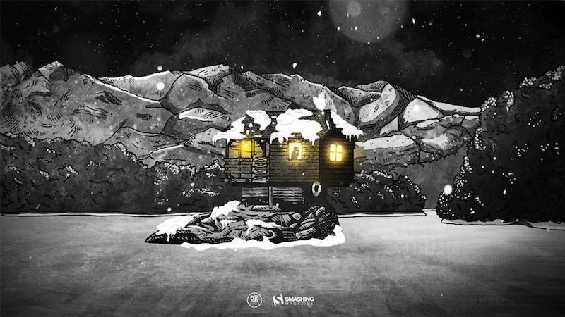
The House On The River Drina
“Since we often yearn for a peaceful and quiet place to work, we have found inspiration in the famous house on the River Drina in Bajina Bašta, Serbia. Wouldn’t it be great being in nature, away from the civilization, swaying in the wind and listening to the waves of the river smashing your house, having no neighbors to bother you? Not sure about the Internet, though…” — Designed by PopArt Studio from Serbia.
preview
without calendar: 640×480, 800×600, 1024×1024, 1152×864, 1280×720, 1280×960, 1280×1024, 1366×768, 1400×1050, 1440×900, 1600×1200, 1680×1200, 1920×1080, 1920×1200, 1920×1440, 2560×1440
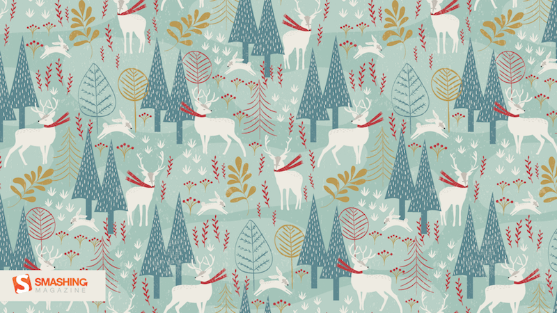
Christmas Woodland
Designed by Mel Armstrong from Australia.
preview
without calendar: 320×480, 640×480, 800×480, 800×600, 1024×768, 1024×1024, 1152×864, 1280×720, 1280×800, 1280×960, 1280×1024, 1366×768, 1400×1050, 1440×900, 1600×1200, 1680×1050, 1680×1200, 1920×1080, 1920×1200, 1920×1440, 2560×1440
Getting Hygge
“There’s no more special time for a fire than in the winter. Cozy blankets, warm beverages, and good company can make all the difference when the sun goes down. We’re all looking forward to generating some hygge this winter, so snuggle up and make some memories.” — Designed by The Hannon Group from Washington D.C.

preview
without calendar: 320×480, 640×480, 800×600, 1024×768, 1280×960, 1440×900, 1600×1200, 1680×1050, 1680×1200, 1920×1080, 1920×1440, 2560×1440
Joy To The World
“Joy to the world, all the boys and girls now, joy to the fishes in the deep blue sea, joy to you and me.” — Designed by Morgan Newnham from Boulder, Colorado.

preview
without calendar: 320×480, 640×480, 800×480, 800×600, 1024×768, 1024×1024, 1152×864, 1280×720, 1280×800, 1280×960, 1280×1024, 1400×1050, 1440×900, 1600×1200, 1680×1050, 1680×1200, 1920×1080, 1920×1200, 1920×1440, 2560×1440
Winter Wonderland
“‘Winter is the time for comfort, for good food and warmth, for the touch of a friendly hand and for a talk beside the fire: it is the time for home.’ (Edith Sitwell) — Designed by Dipanjan Karmakar from India.

preview
without calendar: 1280×720, 1280×800, 1280×960, 1280×1024, 1366×768, 1400×1050, 1440×900, 1600×1200, 1680×1050, 1680×1200, 1920×1080, 1920×1440, 2560×1440
December Through Different Eyes
“As a Belgian, December reminds me of snow, cosiness, winter, lights and so on. However, in the Southern Hemisphere it is summer at this time. With my illustration I wanted to show the different perspectives on December. I wish you all a Merry Christmas and Happy New Year!” — Designed by Jo Smets from Belgium.

preview
without calendar: 320×480, 800×480, 1280×800, 1280×1024, 1920×1080, 2560×1440
’Tis The Season (To Drink Eggnog)
“There’s nothing better than a tall glass of Golden Eggnog while sitting by the Christmas tree. Let’s celebrate the only time of year this nectar of the gods graces our lips.” — Designed by Jonathan Shears from Connecticut, USA.

preview
without calendar: 1024×768, 1152×864, 1280×960, 1440×1080, 1680×1260, 1920×1440, 2048×1536, 2560×1440
Gifts Lover
Designed by Elise Vanoorbeek from Belgium.

preview
without calendar: 800×480, 800×600, 1024×768, 1024×1024, 1152×864, 1280×800, 1280×960, 1280×1024, 1366×768, 1400×1050, 1440×900, 1600×1200, 1680×1050, 1680×1200, 1920×1080, 1920×1200, 1920×1440, 2560×1440
The Southern Hemisphere Is Calling
“Santa’s tired of winter (and the North Pole) and is flying to the South part of the globe to relax a little bit. He deserves a little vacation, don’t you think?” — Designed by Ricardo Gimenes from Sweden.

preview
without calendar: 320×480, 640×960, 1024×768, 1024×1024, 1280×800, 1280×960, 1280×1024, 1366×768, 1400×1050, 1440×900, 1600×1050, 1600×1200, 1680×1050, 1680×1200, 1920×1080, 1920×1200, 1920×1440, 2560×1440, 2880×1800
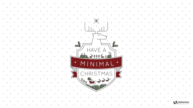
Have A Minimal Christmas
“My brother-in-law has been on a design buzzword kick where he calls everything minimal, to the point where he wishes people, “Have a minimal day!” I made this graphic as a poster for him.” — Designed by Danny Gugger from Madison, Wisconsin, USA.
preview
without calendar: 750×1334, 1080×1920, 1136×640, 1280×960, 1920×1080, 2560×1440, 5210×2880
Christmas Time!
Designed by Sofie Keirsmaekers from Belgium.

preview
without calendar: 320×480, 1024×1024, 1280×1024, 1440×900, 1920×1200, 2560×1440
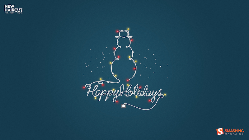
Happy Holidays
Designed by Bogdan Negrescu from the United States.
preview
without calendar: 320×480, 1024×768, 1280×800, 1280×1024, 1440×900, 1920×1080, 2560×1440
It’s In The Little Things
Designed by Thaïs Lenglez from Belgium.

preview
without calendar: 640×480, 800×600, 1024×768, 1280×1024, 1440×900, 1600×1200, 1680×1050, 1920×1080, 1920×1200, 2560×1440
Join In Next Month!
Please note that we respect and carefully consider the ideas and motivation behind each and every artist’s work. This is why we give all artists the full freedom to explore their creativity and express emotions and experience throughout their works. This is also why the themes of the wallpapers weren’t anyhow influenced by us, but rather designed from scratch by the artists themselves.
Thank you to all designers for their participation. Join in next month!

 Perl Advent has been running since 2000 and is the longest running web advent calendar that I know of. Now old enough to enjoy a festive sherry (in Europe at least), they are back for 2018 for 24 merry days of Perl.
 I have to admit a little bias in this subject as 24 Ways is the calendar started by my husband, business partner and fellow Smashing Magazine editor, Drew McLellan. 24 Ways has been running since 2005, when Drew had the idea to post a new article each day of December until Christmas. I don’t think either of us expected that on the 30th November 2018, Drew would still be staying up until midnight to check that the first article went live!
 Ever since 2009, the Performance Calendar has been helping us to speed up the web. It is up again for the 10th year in a row and is maintained by Sergey Chernyshev.
 Next on my list is the French language calendar, 24 Jours De Web. Their first year of publication was 2012, and they are supporting the charity L’Auberge des Migrants, asking readers to donate to help refugees in Calais and the North of France, providing material and food aid, support and advocacy.
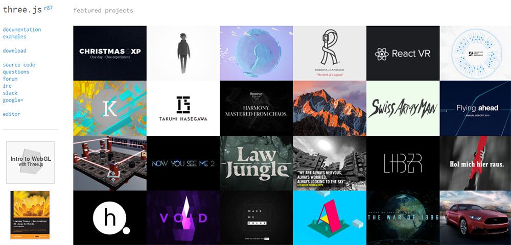
 The Christmas XP calendar is a little different. Rather than an article each day, they bring us a WebGL experiment. They have been bringing us experiments in WebGL since 2012.
 If you would like to brush up on your AWS skills then the AWS Advent calendar promises “a yearly exploration of AWS in 24 parts”. You’ll find a wide range of articles on security, deployment strategy and general tips and techniques to be aware of when using Amazon Web Services.
 If PHP is your language of choice then you can look forward to 24 days of PHP articles over at 24 Days in December. They began publishing in 2015, when Andreas Heigl realized that he missed Web Advent who had stopped publishing in 2012.
 The 24 Pull Requests calendar is a little different. It began in 2012 with the idea that contributors should, “Send 24 pull requests between December 1st and December 24th.” The idea being that this would be 24 gifts to the open-source community from every contributor. Since the project began, 19,859 have contributed (at the time of writing).
 UXmas have been publishing their Advent Calendar for UX folk since 2012. I am very impressed that they already have their call for submissions for 2019 up and running. So, you can read some useful aticles this year and submit your idea for next year at the same time.
 24 Accessibility are back for a second year of accessibility posts in the run-up to Christmas. The project was started by Dennis Deacon, an Accessibility Engineer with The Paciello Group, and will be well worth following this year.
 Fronteers are running 24 posts in Dutch on their blog. A lovely touch is that each writer chooses a charity, and the Fronteers organization will donate 75 euros on their behalf.
 If you would prefer a puzzle over an article, take a look at Advent of Code. Created by Eric Wastl, this is an Advent calendar of small programming puzzles for a variety of skill sets and skill levels that can be solved in any programming language you like.
 24 Days In Umbraco is a calendar of articles relating to the Umbraco CMS. They have been publishing every December since 2012. Their About page says that the calendar started when:
 New this year is a daily public speaking tip on the Notist blog.
 The Data-Driven Advent Calendar will contain an article about data journalism each day of Advent. The project is from Journocode who are computer scientists and journalists working in newsrooms across Germany.
 Posting to Medium, A Computer Of One’s Own will highlight the lives of the pioneers of the computer age. The project is by Alvaro Videla, with illustrations by Sebastian Navas.
 A set of calendars sponsored by Norwegian company Bekk. They are supporting React Christmas, JavaScript Christmas, Security Christmas and Elm Christmas. That’s a whole lot of articles to curate!

