Original Source: http://feedproxy.google.com/~r/CreativeBloq/~3/3BqcxN66gQo/best-404-pages-812505
Creating 404 pages might not be the first thing you'll think about when making a website, but they are essential. While a 404 page is something that you ideally don't want visitors to see, the best ones turn the situation to the designer or brand's advantage.
More and more, we're seeing bespoke 404 pages that use wit, clever UX or beautiful design to sweeten the pill of finding yourself in the wrong place. Whether its some thoughtful CSS animation, a cool parallax scrolling effect, or just some smarter-than-your-average copy, there are plenty of ways to liven up your 404 error pages – as these examples prove.
The best 404 pages can become a mini-ambassador for the website itself. They might even be shared on Twitter or relevant blogs as an example of the site's commitment to customer service or unique design style. The 404 error pages we present here have achieved all this and more, so take a look and be inspired to think outside the box with your own.
01. Ready to go survival
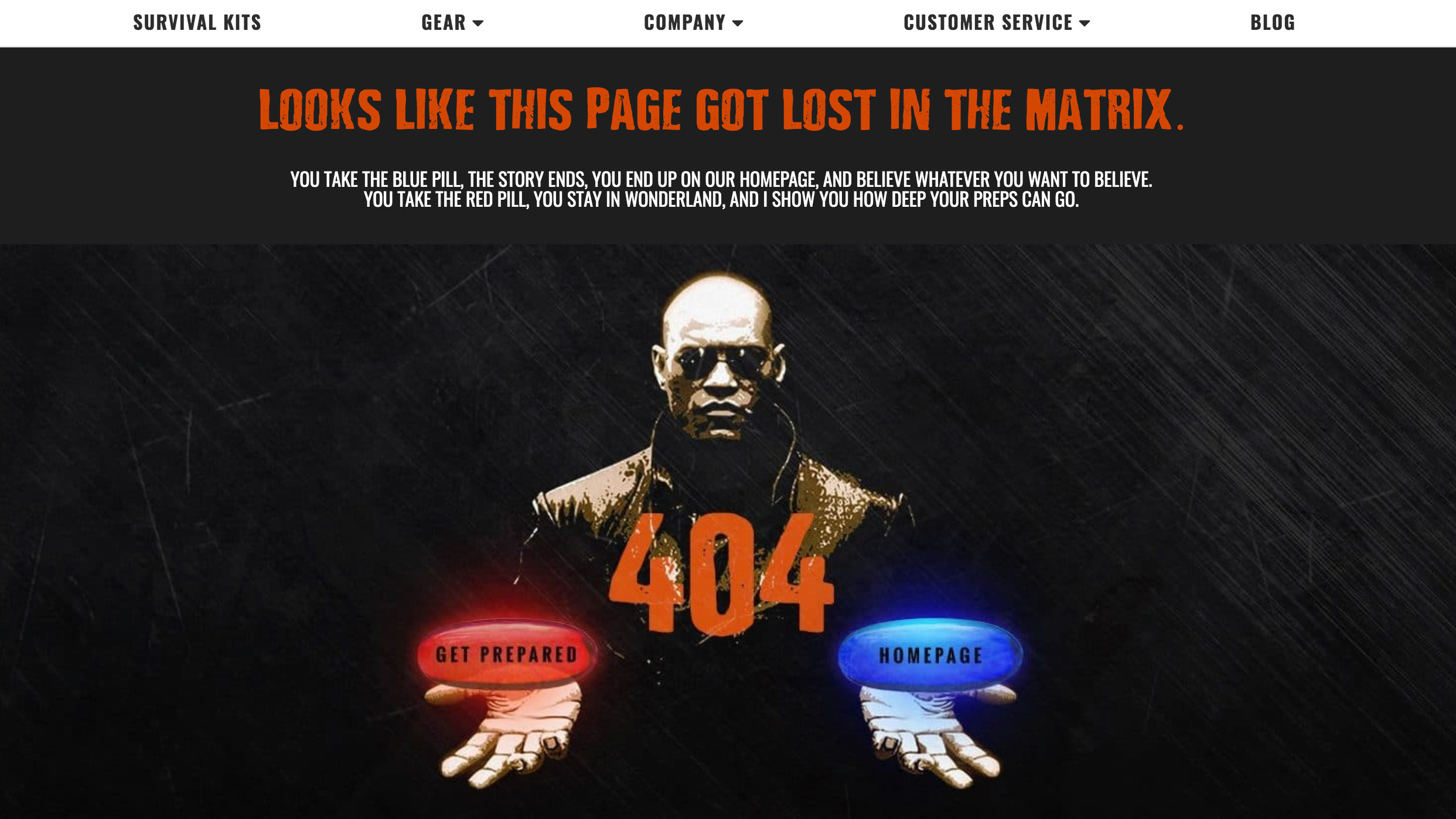
We all love a good movie reference within a 404 page (and there are several of them included in our list). This survival site refers to The Matrix in its 404 page and gives you two options: clicking the red or the blue pill. Naturally, both keep you on the site.
02. Carwow
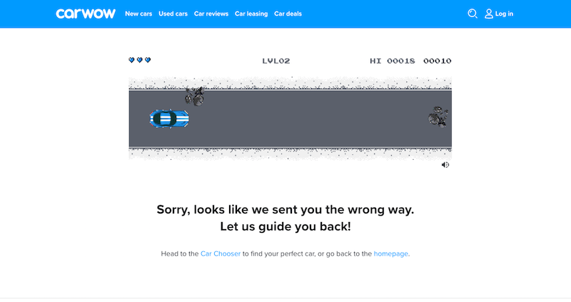
This car buying comparison site helps you find the perfect car, but when you go off course, its 404 page provides a clever on-theme way to keep you on site. Visitors are presented with an 8-bit game style screen. All you need to do is hit the Start text to enjoy the simple horizontal scrolling game, where all you need to do is avoid obstacles and other cars. Give to a try.
03. Color of the Year
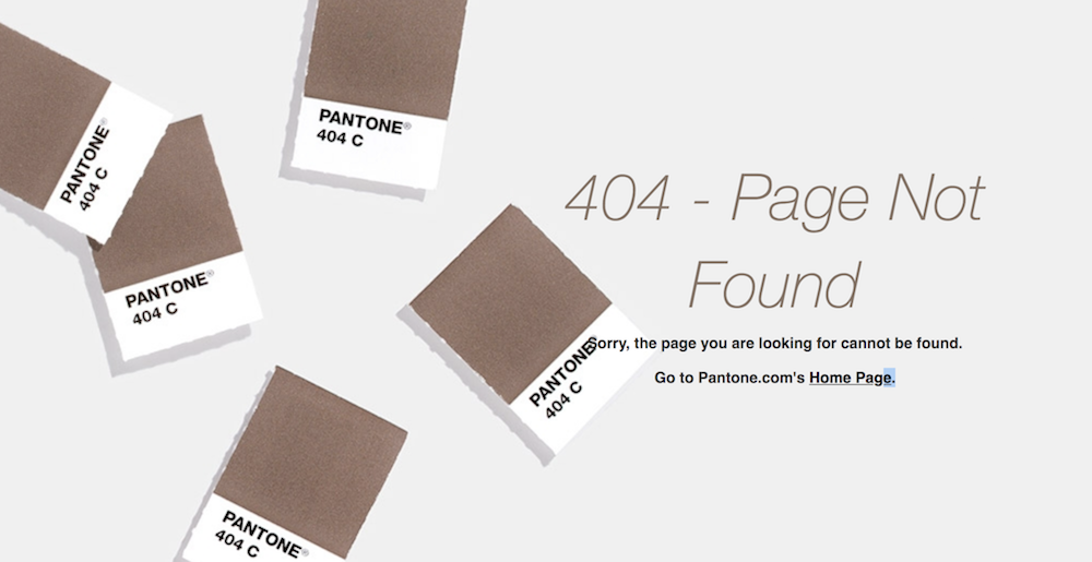
This site is dedicated to everything to do with PANTONE's Color of the Year. Everything about it has been beautifully designed, including its 404 page. The site goes into an impressive amount of depth, with sections on relevant colour systems, suggested palettes, and examples of the shade in use. Meanwhile, the 404 page takes a smart-but-simple approach. There's a short explanatory message and a swatch of PANTONE shade 404, which is a delightfully appropriate grey-brown, to match the user's mood when finding themselves there.
04. Ueno
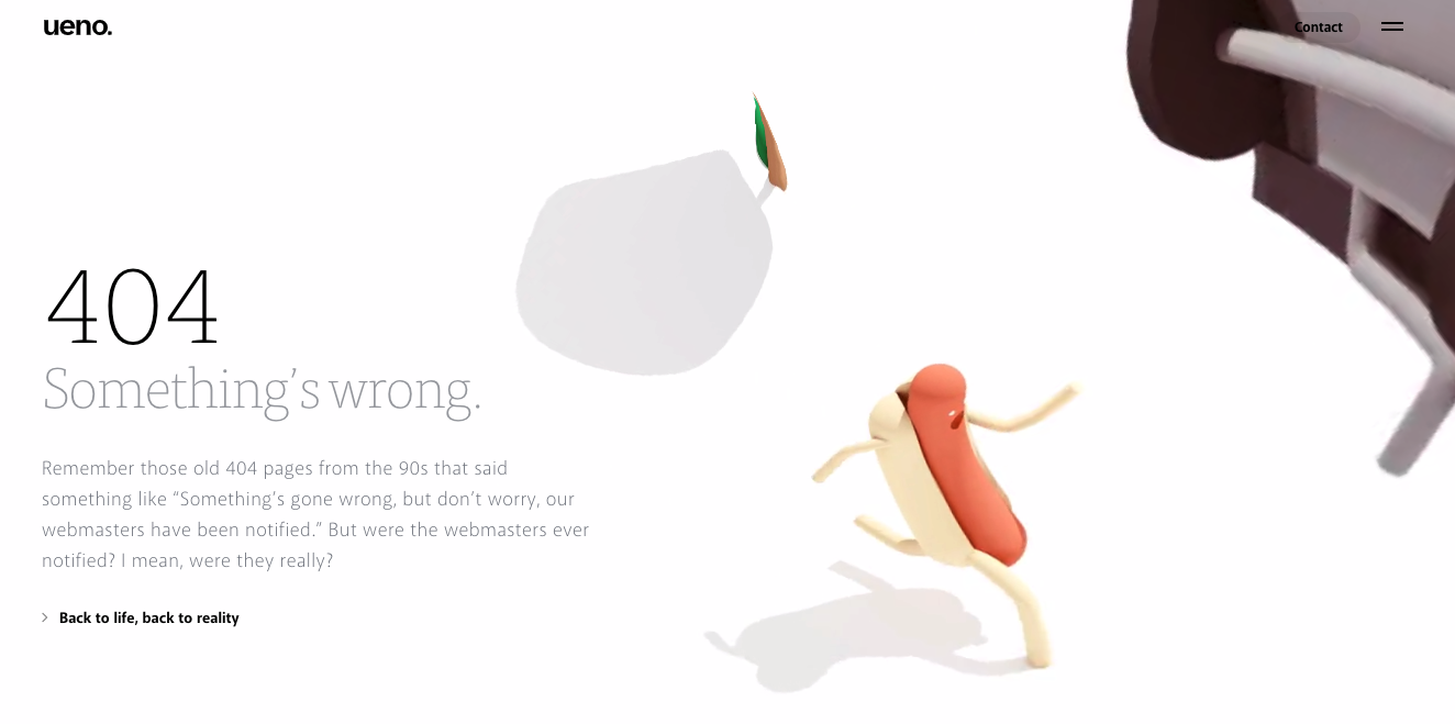
Image: Ueno
Ueno is a full-service agency with a standout 404 page. What you're seeing above doesn't capture the full effort that's gone into it: the hotdog is animated so it runs in an infinite loop through a surreal landscape, and there are several hilarious explanatory messages to explore. It's bonkers and totally unique – visit the error page here.
05. Gymbox
Gym Box is a gym company that aims to offer "the most unique and diverse classes in London". The limits of that claim might be the kind of magnificent '80s fitness spectacle that appears on its 404 page. Short shorts, crop tops and pelvic thrusting – what more could you want from an error page?
06. Slack
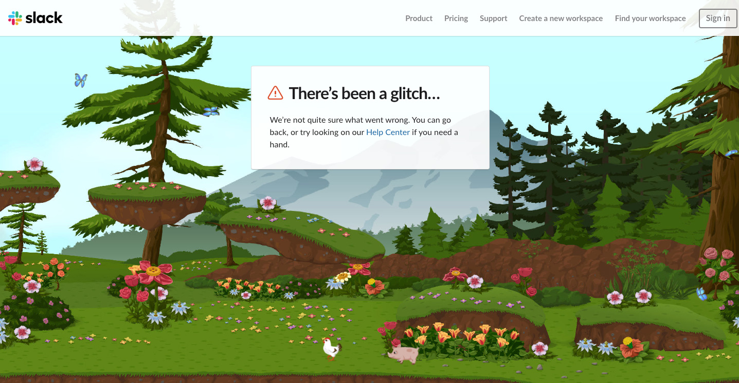
Image: Slack
It's only a slight exaggeration to say that Slack's 2019 logo update was met with widespread horror, and its super-saccharine 404 page is sure to have its fair share of haters too. Go wrong in Slack, and you're directed to a magical landscape of lush foliage, mountains and rainbows, where butterflies, chickens and tiny little pigs roam free. The scene scrolls horizontally with your mouse movement, too (try it here).
07. Purée Maison
Purée Maison is a creative agency specialising in communication strategy, and its characterful website is full of delightful animations (we'd recommend taking a look around). We're particular fans of this surreal 404 page, which somehow manages to perfectly capture the pain of hitting a digital wall.
08. Pixar
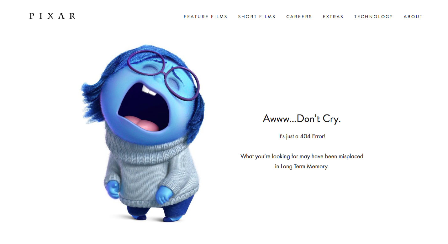
Image: Pixar
Some people can take things just a little too much to heart. Pixar's 404 page, featuring Sadness from 2015's hugely popular Inside Out, is simple, straightforward and does the job. If it's representative of your reaction to getting a 404 error, though, then maybe you need to re-examine your life a little.
09. Matteo Vandelli
You don't need to be a major brand to put a bit of effort into your 404 page. We love this interactive example from graphic designer Matteo Vandelli. He's used the error page from his design portfolio as another opportunity to show off his creativity and design savvy. As the visitor mouses over the 404 text, it ripples and shifts like water. The effect is strangely mesmerising.
10. 20th Century Fox
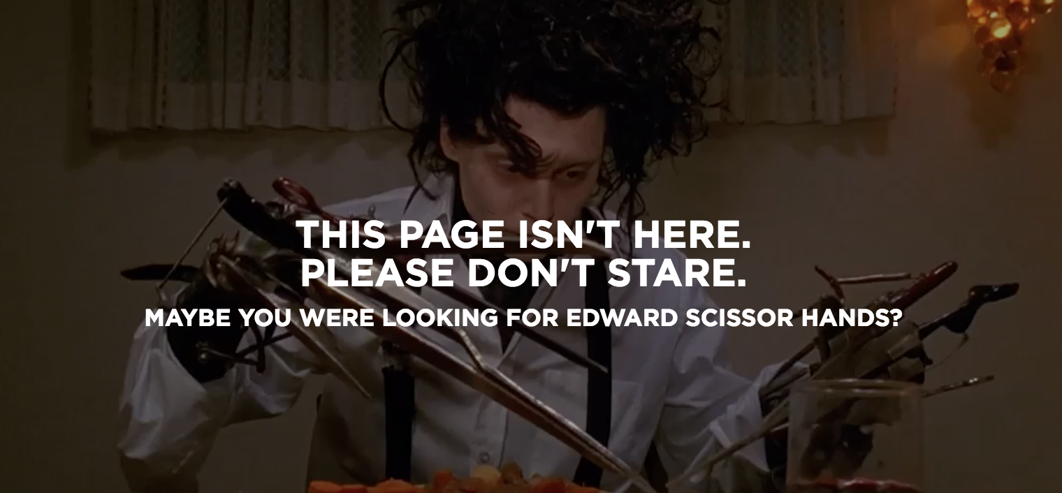
Can't find the film you want? Fox Movies' site has a great way to inspire you for when you get a URL wrong; its 404 page pops up with a still from a cult movie, with a pithy caption and a selection of other films you might like to watch. We've spotted snippets from Edward Scissorhands, Revenge of the Nerds and Napoleon Dynamite, amongst others (take a look to see which one you get).
11. Cloud Sigma
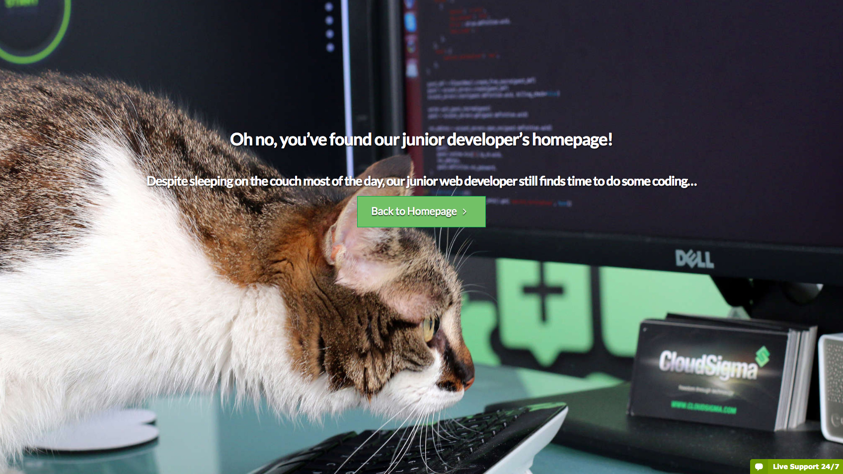
Cloud Sigma is a cloud server and cloud hosting service operating in the US, Europe and Asia-Pacific region. While flexible cloud servers are useful, they're not exactly fun, which we guess is why the company has made a little extra effort to inject some humour into its tongue-in-cheek 404 error page. We wonder how long it'll be before this helpful-looking junior developer gets poached by the competition.
12. BluePath
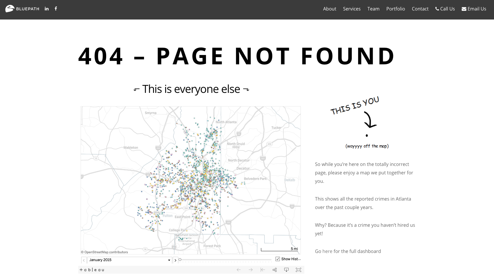
Another website to use humour on its 404 error page is Atlanta-based data strategy consulting firm BluePath. The page shows a map of Atlanta, with a dot on the other side of the page indicating the visitor is 'Wayyyy off the map'. In an extremely tenuous link, the map also includes data-driven info showing reported crimes in the area. "Why? Because it’s a crime you haven’t hired us yet!" Ah, these whacky data analysts.
13. Marvel
Marvel keeps things solidly on-brand by basing its 404 error page on the universe's Watcher. Perhaps because Uatu isn't much of a looker (sorry), Marvel has decided to pander to visitors more shallow than ourselves and add his eye only, against the backdrop of Black Widow. Extra cool points for making the eye follow the visitor's cursor round the screen.
14. Kualo
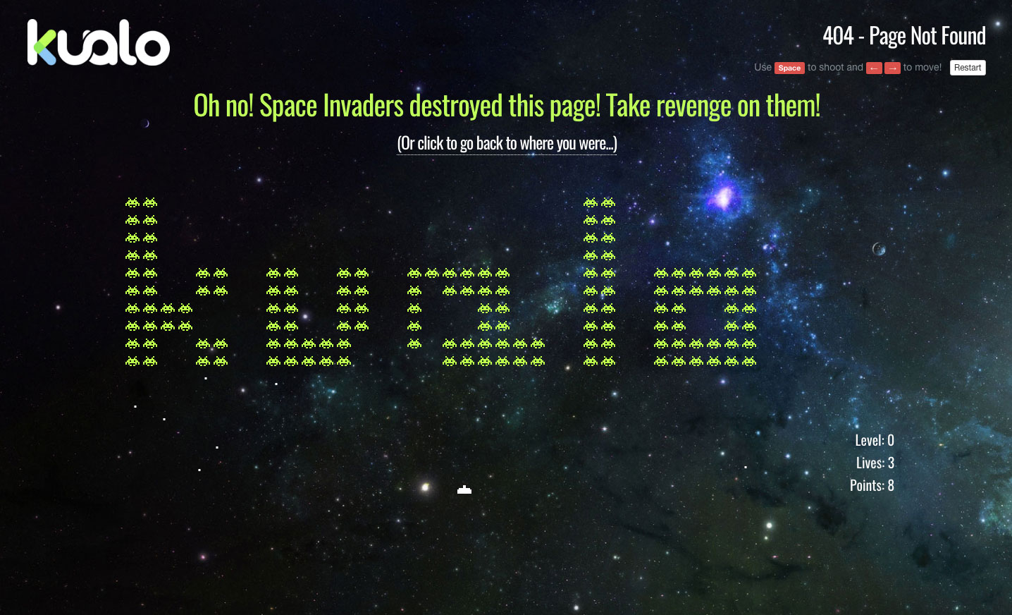
Web hosting company Kualo has been in business for over 15 years – an eternity in internet time – and its 404 page harks back to yesteryear by treating visitors to a game of Kualo-themed Space Invaders. It's not perfect. The key strategy of picking off the fleet's outer edges to slow the invaders' descent doesn't work, for starters. But it is fun, and it can earn you a discount on your hosting deal if you manage to score over 1,000 points. Play it here.
Its inclusion in this article has also inspired US pest control company Pointe Pest Control to include its own Pest Invaders game on its 404 error page, complete with different flying and crawling bugs to spray.
As Chloe Zollinger from Pointe says: "Reaching a 404 error page is most often frustrating for a site user. We understand how important user experience on a webpage is. To better our visitors' experience, our team dedicated themselves to creating an interactive game on our 404 page."
15. Waaark
French studio Waaark's 404 page is nice enough to look at, but it's better to listen to – although maybe not at work. Inspired by Stephen Hawking, the Hitchhiker's Guide to the Galaxy and Portal, it uses a JavaScript text-to-speech tool called meSpeak to subject you to a sweary robotic tirade. Plug your headphones in and take a look.
16. Steve Lambert
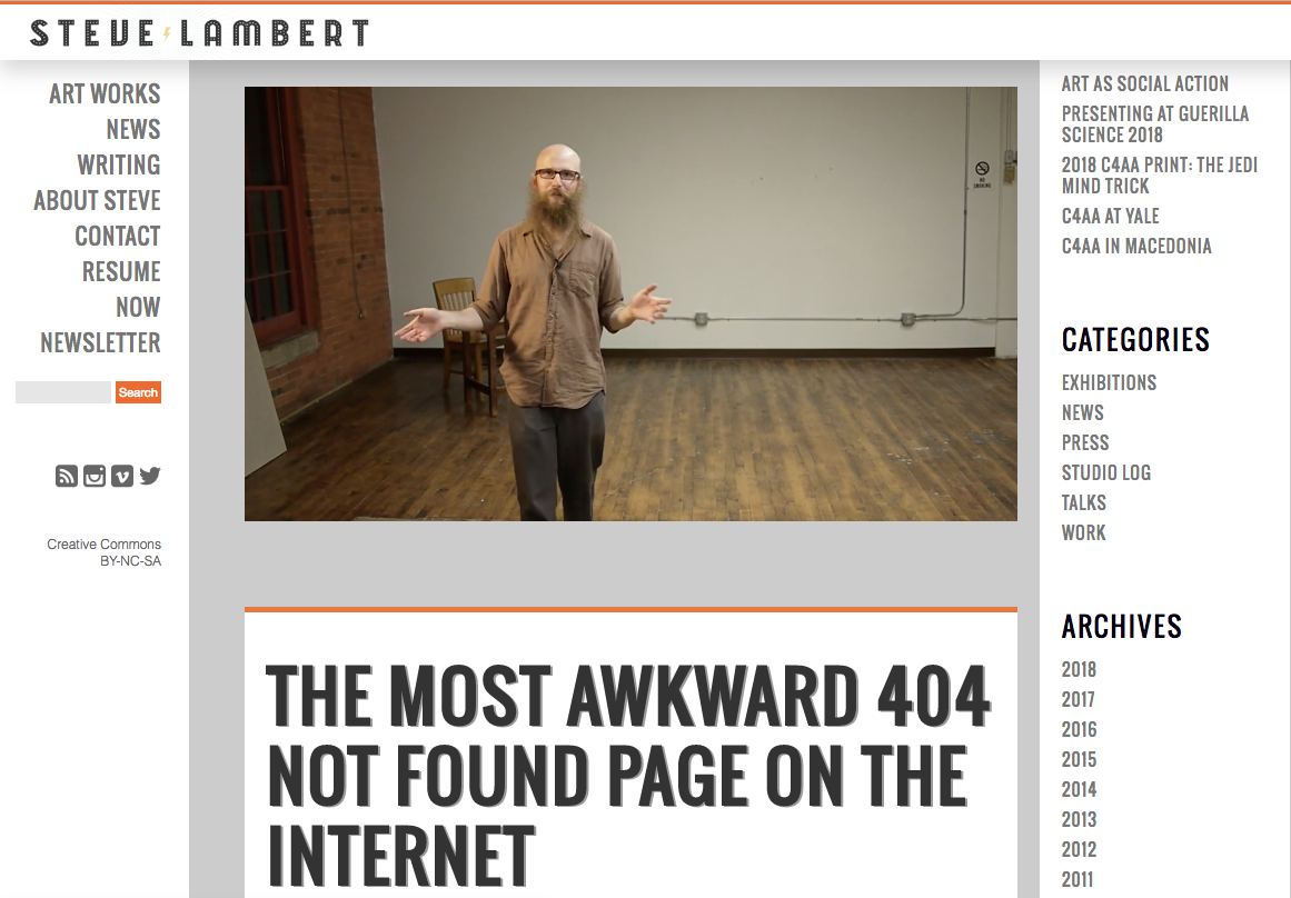
New York-based artist Steve Lambert describes this as "the most awkward 404 not found page on the internet", and you know, he may well be right. It features an excruciating piece to camera that just goes on and on. We defy you to get to the end of his video without any part of your body clenching.
Next page: More inspiring 404 pages to explore
17. Victoria Spicer
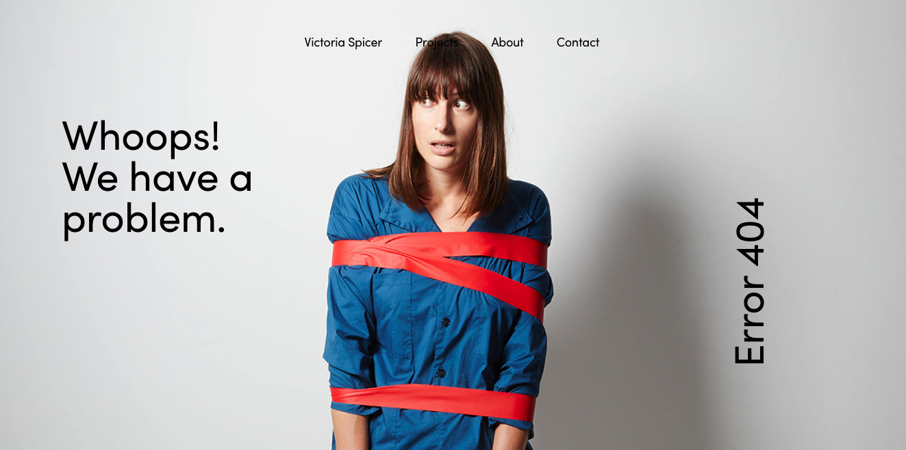
Image: Victoria Spicer
Victoria Spicer is a set designer and prop stylist based in London. As you'd expect, her portfolio site is packed with beautiful photography, and her 404 error page is no different. It shows off her playful side while still keeping things looking polished.
18. Figma
Even though we have a copy of Illustrator CC right here, and could play with anchor points and Bézier curves literally any time we want, we're still entranced by Figma's 404 page. Oversized 404 text is rendered in vectors that you can reshape to your heart's content. Have a go for yourself.
19. Airbnb
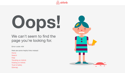
This 404 page from Airbnb features a simple-but-delightful animation of an unlucky girl dropping her ice-cream on the floor. Airbnb has built its reputation on being personable and friendly, and this 404 page suits its brand image perfectly.
20. Hot Dot Production
Hot Dot Productions has applied its 'where design meets technology' tagline to its impressive 404 page, which features the three numbers made up of hundreds of tiny dots that change direction or disperse in response to the visitor's mouse movements. Seriously cool. Play around with it yourself here.
21. Lego
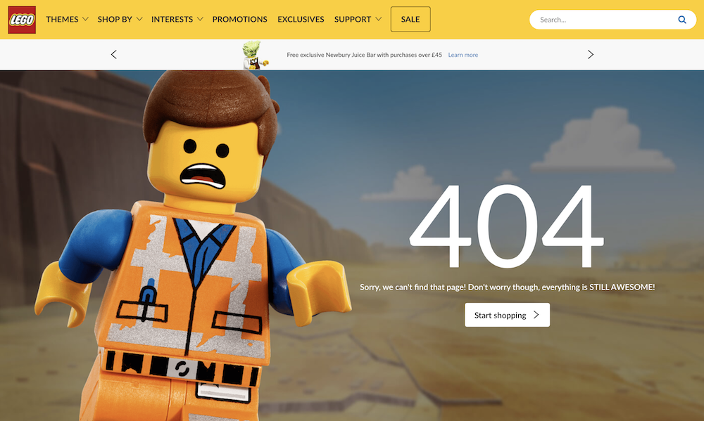
LEGO can do no wrong in our eyes (have you read our piece on how Lego reinvented itself as a super-brand yet?). We love this 404 page with leading Lego Movie character Emmet taking centre stage, and, reminding us that everything is still awesome.
22. GitHub
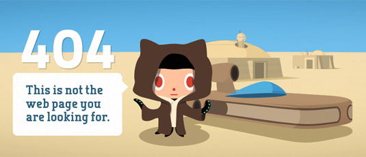
You'd expect some tech wizardry from a website dedicated to code versioning. The 404 page targets a different kind of geeks with a simple Star Wars parody elevated by a smart parallax effect when you move your mouse. GitHub also has a nice 500 page for when the server breaks.
23. CSS Ninjas
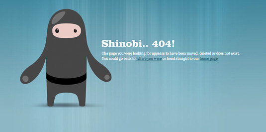
The web design world loves ninjas. Often as part of a self-styled job title. Falling in with the trend (and, we guess, its name), the 404 page for CSS Ninjas features a clean, stylised illustration that reflects the site's general approach to design.
24. MailChimp
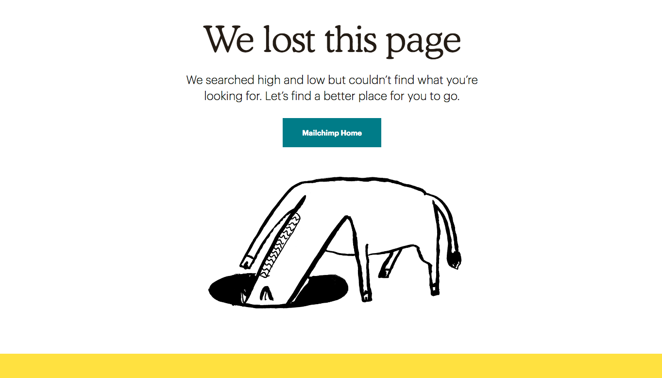
In autumn 2018, ultra-hip email newsletter service MailChimp underwent a rebrand, and its 404 page has a new look to match. The new-look error page features on of the off-beat, naive illustrations around which MailChimp's new branding centres. And really, what says 'I'm lost' better than a donkey with its head in a hole?
25. Volta Footwear
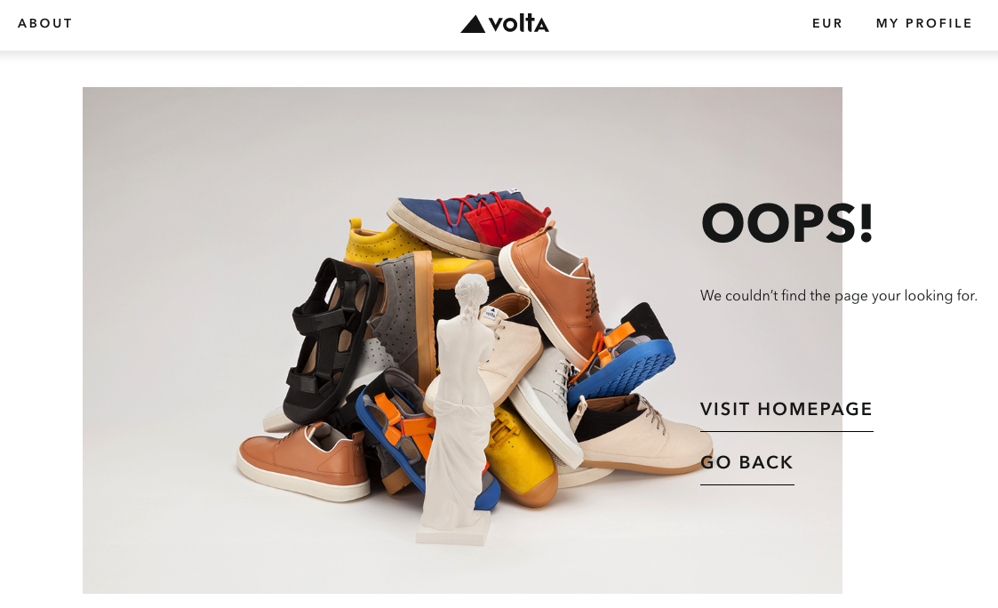
Image: Volta
Volta is a footwear store based in Milan. Its website includes plenty of cool UI design touches, and we like that it's not just gone for a standard 404 page, either. Good quality, dedicated product photography with a quirky touch – a miniature marble statue that nods to the flagship store's Italian home – help elevate this error page.
26. Bret Victor
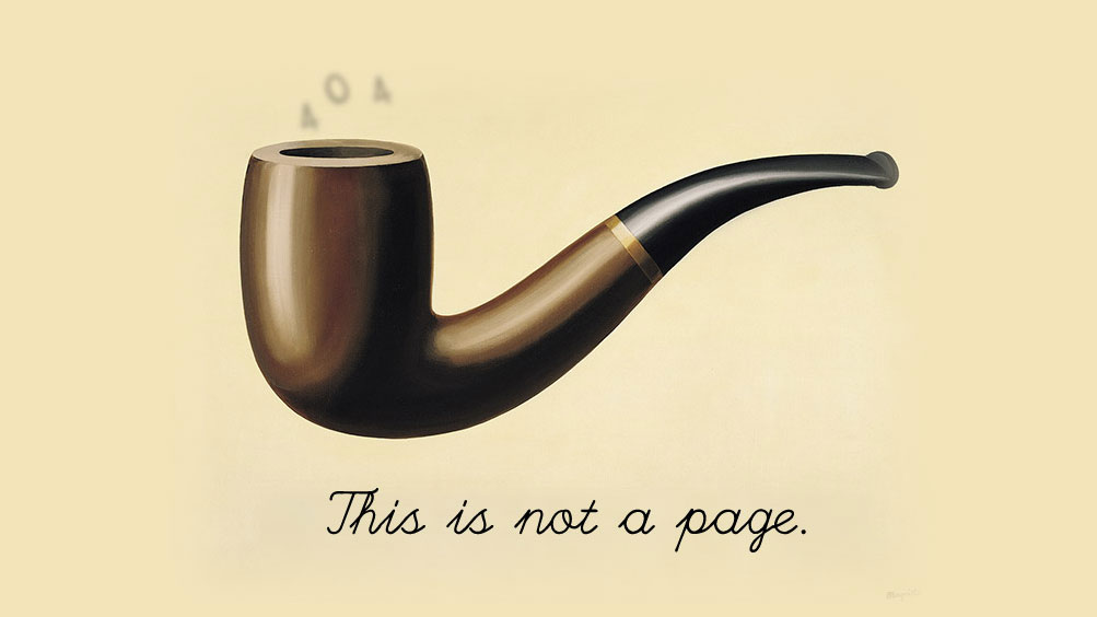
Computer scientist Bret Victor's 404 page, inspired of course by René Magritte's iconic painting, The Treachery of Images, confronts the viewer with some challenging philosophical questions. If this is not a page, then what is it? What constitutes a 'page'? Is it a thing that can be truly said to exist? What is the 'this' that this apparent non-page is referring to? Is anything truly real? Makes you think, no?
27. IMDb
Another awesome, movie-based 404 error page can be found on the IMDb website. This comprehensive database of film facts has jazzed up its 404 page with iconic quotes from famous films, subtly edited to fit their new purpose. Take a look to see which one you get.
28. Bit.ly
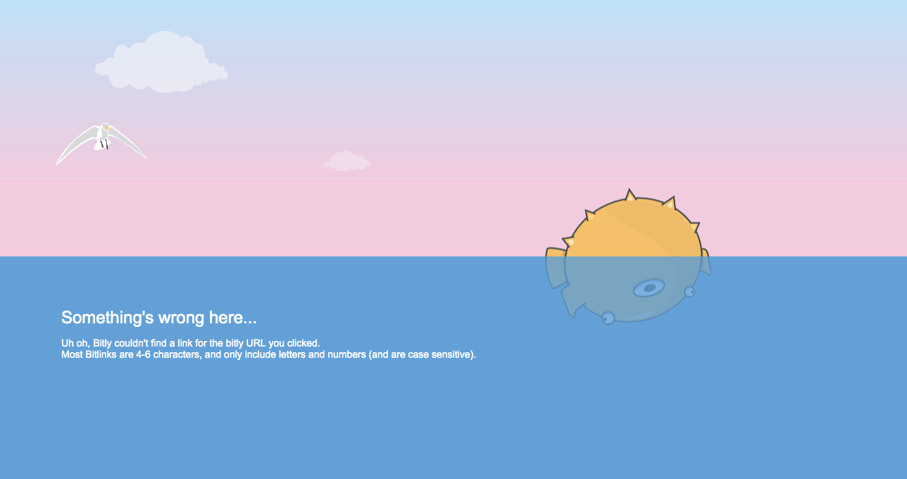
Image: Bitly
The 404 page for link shortening service Bit.ly features a cute Pufferfish bobbing upside-down in an interactive sea. The stranded fish responds to your mouse movements, and subtly animation details in the clouds and seagull help create a calming mood.
29. DropBox
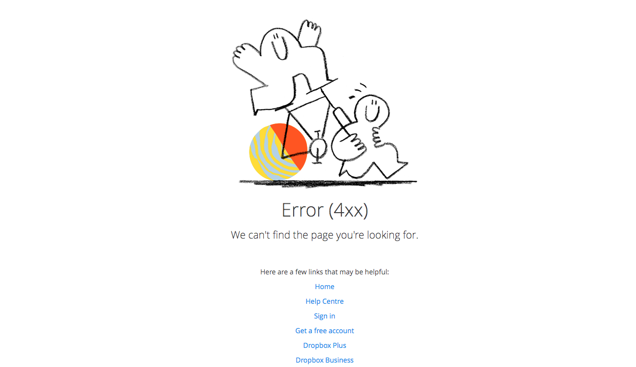
DropBox has replaced the Escher-esque impossible box that adorned its 404 page for years, with a similarly quirky illustration. We like to think of an abstract representation of everything going wrong – the wheels coming off. It's a nice, simple hand-drawn illustration that gets the message across well, with plenty of helpful navigation links for a top user experience.
30. eHarmony
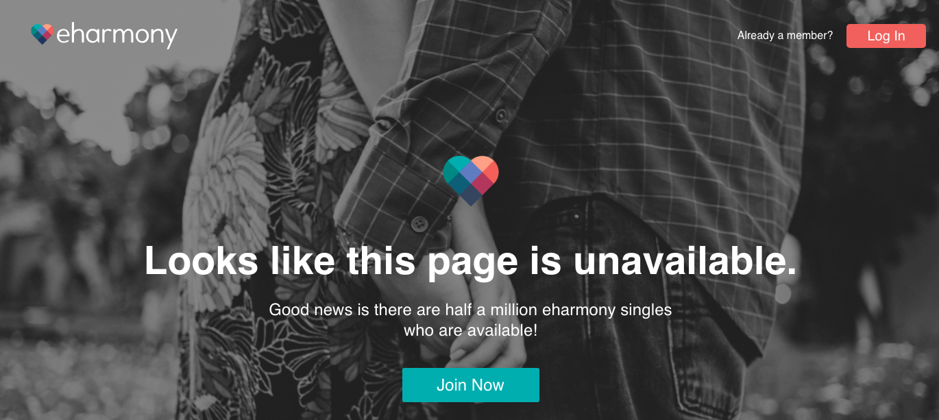
The last thing you want to hear when you're looking for love is that it can't be found. Online matchmaking service eHarmony's 404 page softens the blow with the news that while the page you're after is unavailable, there are still about half a million fish left in the sea.
31. Starbucks
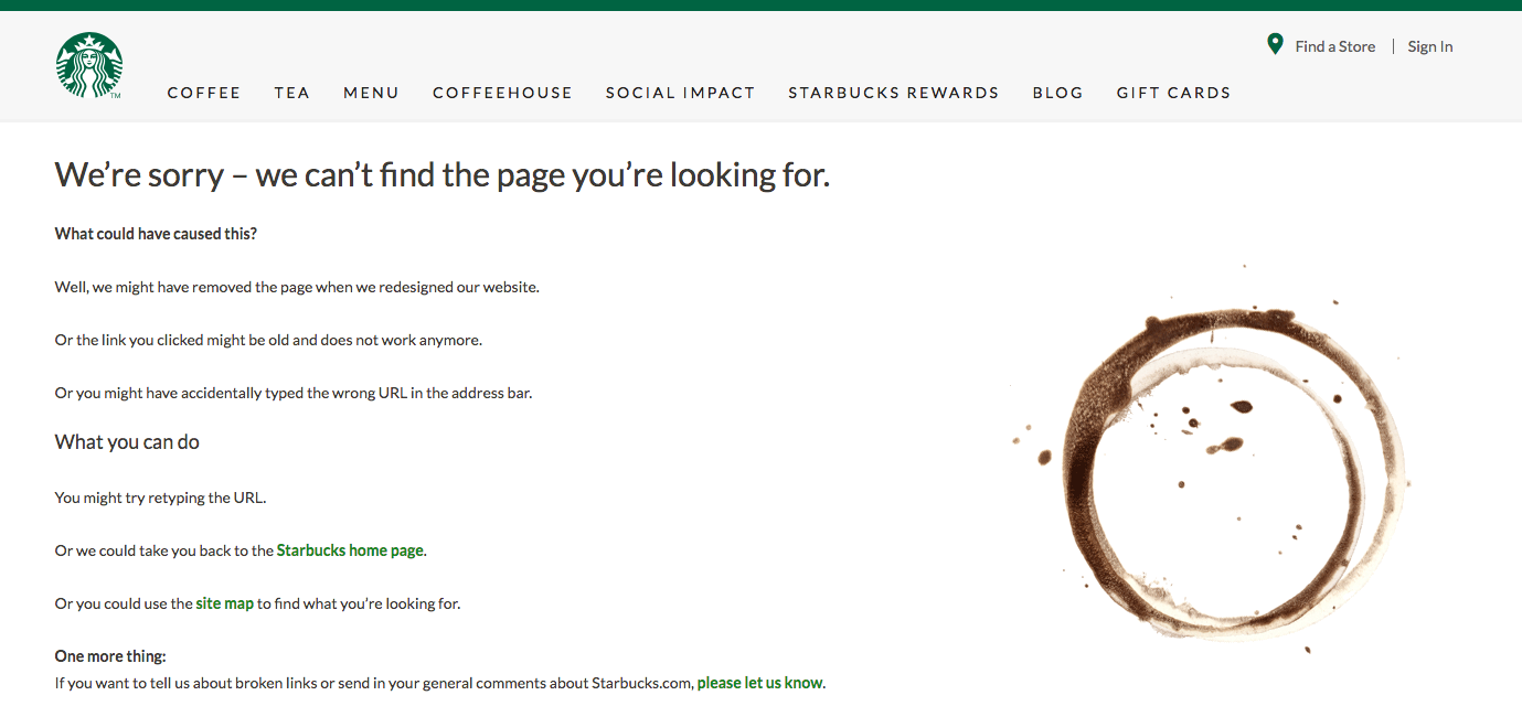
Starbucks makes good use of its primary product to illustrate its 404 message. In this instance, the tell-tales signs of a missing coffee cup are used to tell the story. There's also some jargon-free copy to help the user find what they were looking for.
32. Blizzard Entertainment
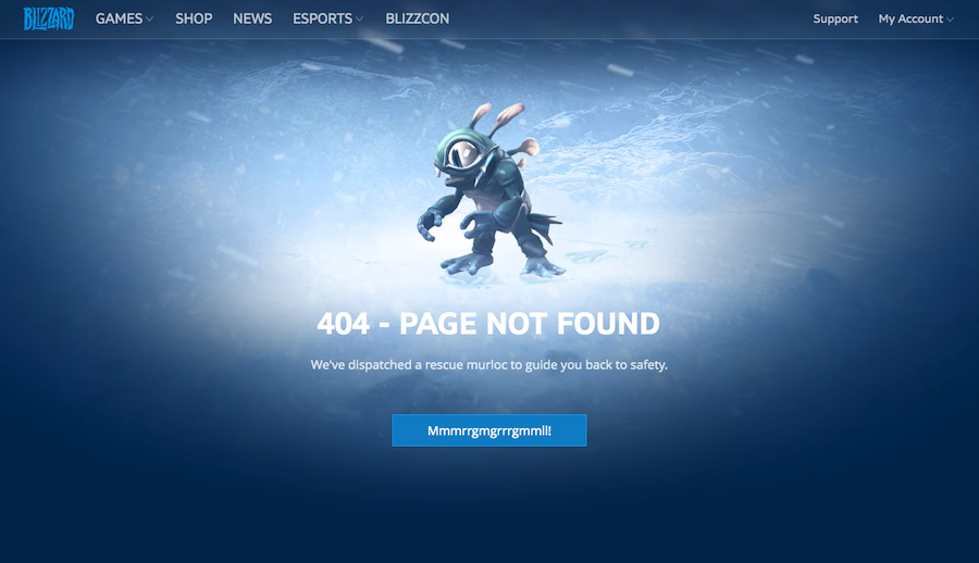
Video game developer Blizzard keeps it simple and on brand with its 404 page. An animated character grabs the attention with a message telling visitors 'We've dispatched a rescue murloc to guide you back to safety'. Not sure what 'Mmmrrgmgrrrgmmll!' means but hit the button and back to the home page you go.
Related articles:
The best website builders in 201910 painful UI fails (and what you can learn from them)27 top character design tips


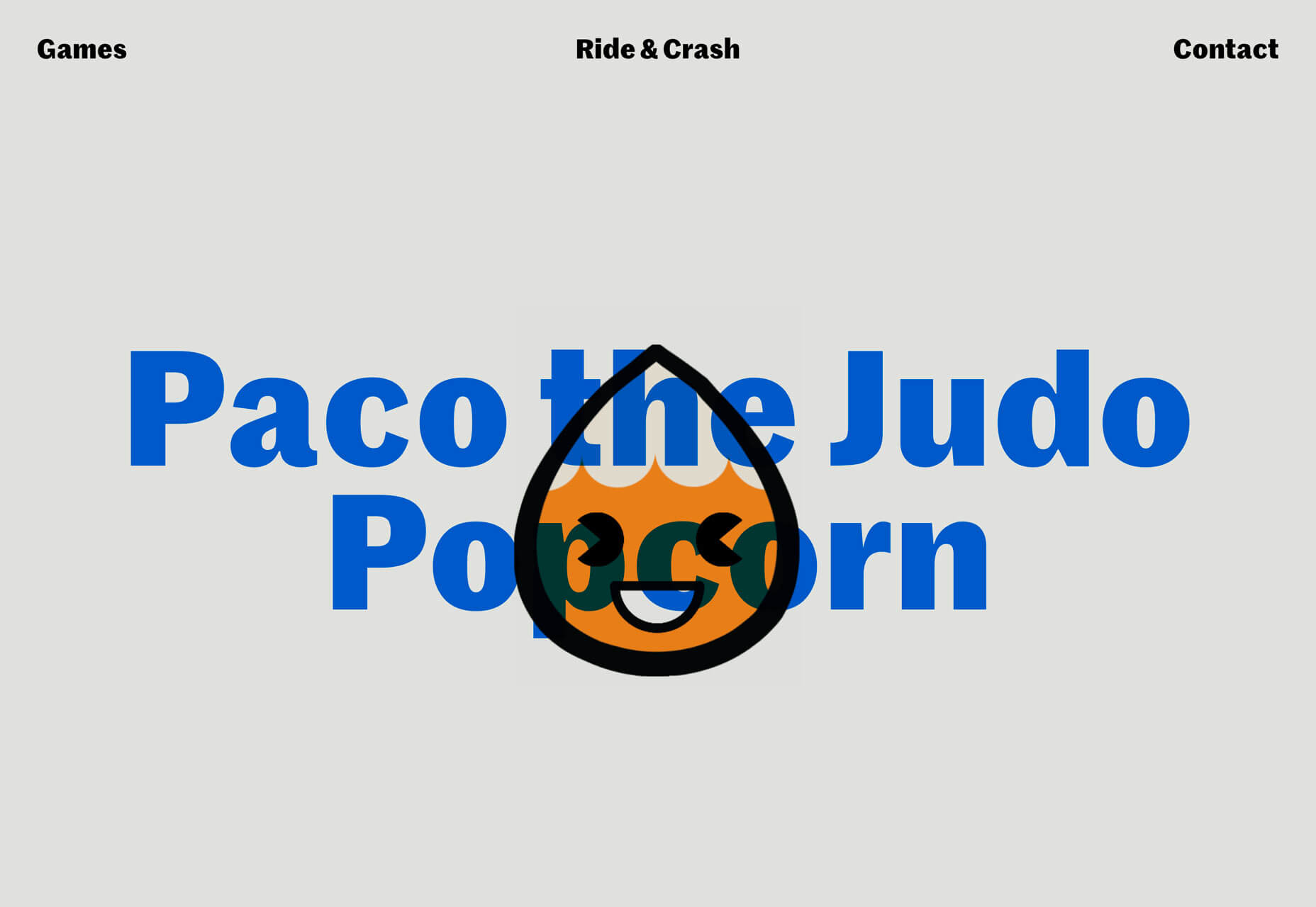
 In this month’s collection we’re seeing some minor trends, like the return of sliders, over-sized text, and liquid effects. But the biggest thing of note is a brand new trend: brutalist typography and layouts, made more appealing by soft, feminine color palettes. Enjoy!


 There’s always a balance between visual design and functional design. Many of the “rules” of design as we know them exist to make visuals more functional.

 Over the last few years, everyone’s been talking about Dark Mode. It’s said to boost productivity and focus while reducing eye strain. It’s also supposed to be better for your battery life.
 You know, I remember the good old days when all you had to worry about at Halloween was how to stop a gang of sugar-crazed 8 year-olds throwing eggs at your house. Not any more. Here are 5 emerging technologies that are bound to give you the creeps: