Is this Paris Olympics 2024 logo concept better than the official design?
Original Source: http://feedproxy.google.com/~r/CreativeBloq/~3/-Z_bfHbH6sg/paris-olympics-2024-logo-concept
Earlier this month, the official logo for the Paris 2024 Olympics was unveiled, and, like many logos before it, the design was met with some heavy criticism. Maybe the Olympic logo creative team should've have read our guide to logo design before starting? Or maybe, this offering from design agency Graphéine should have won the Olympic logo bid?
Graphéine's concept Olympic logo design (above) draws inspiration from the official Paris 2024 Candidacy logo (below, this is the one used for the official Olympic bid). The latter uses the year 2024 and the Eiffel Tower to create a clever visual trick, while the former concept logo uses sweeping lines in the Olympic colours to form the shape of the iconic French architecture to make a striking and clever design. And we love it.
Compare both to the official Paris 2024 logo, and the reactions it got, here.
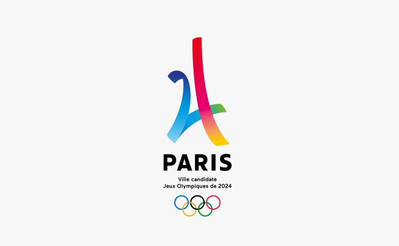
Can you see the number 24?
But is Graphéine's Eiffel Tower logo too predictable? A report from the design team stated: "We were aware of entering a particularly used visual territory where the kitsch border is very close. It is also a powder keg, where the risk of accusations of plagiarism hangs high."
The answer, in our humble opinion is no. The combination of the landmark and Olympic colours is elegantly realised, and the swooping shape, as the Graphéine intended, certainly conveys a feeling of sport momentum. Plus there's more than meets the eye, with the Eiffel Tower graphic not only representing the city's most recognisable feature, but resembling a sports track and symbolising five continents coming together to compete.
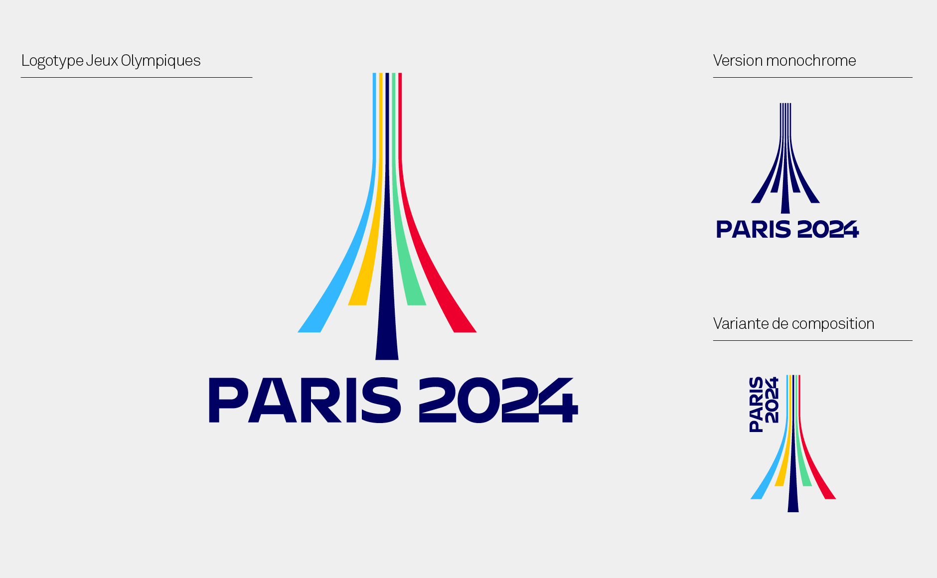
On your marks, get set… logo!
Just like any logo design pitch for the Olympics, it also comes with a Paralympic iteration. This design uses the same visual language to establish a symbolic link between the designs. According to the agency it's a "strong gesture that can act as a bridge between the world of valid athletes and that of disabled athletes."
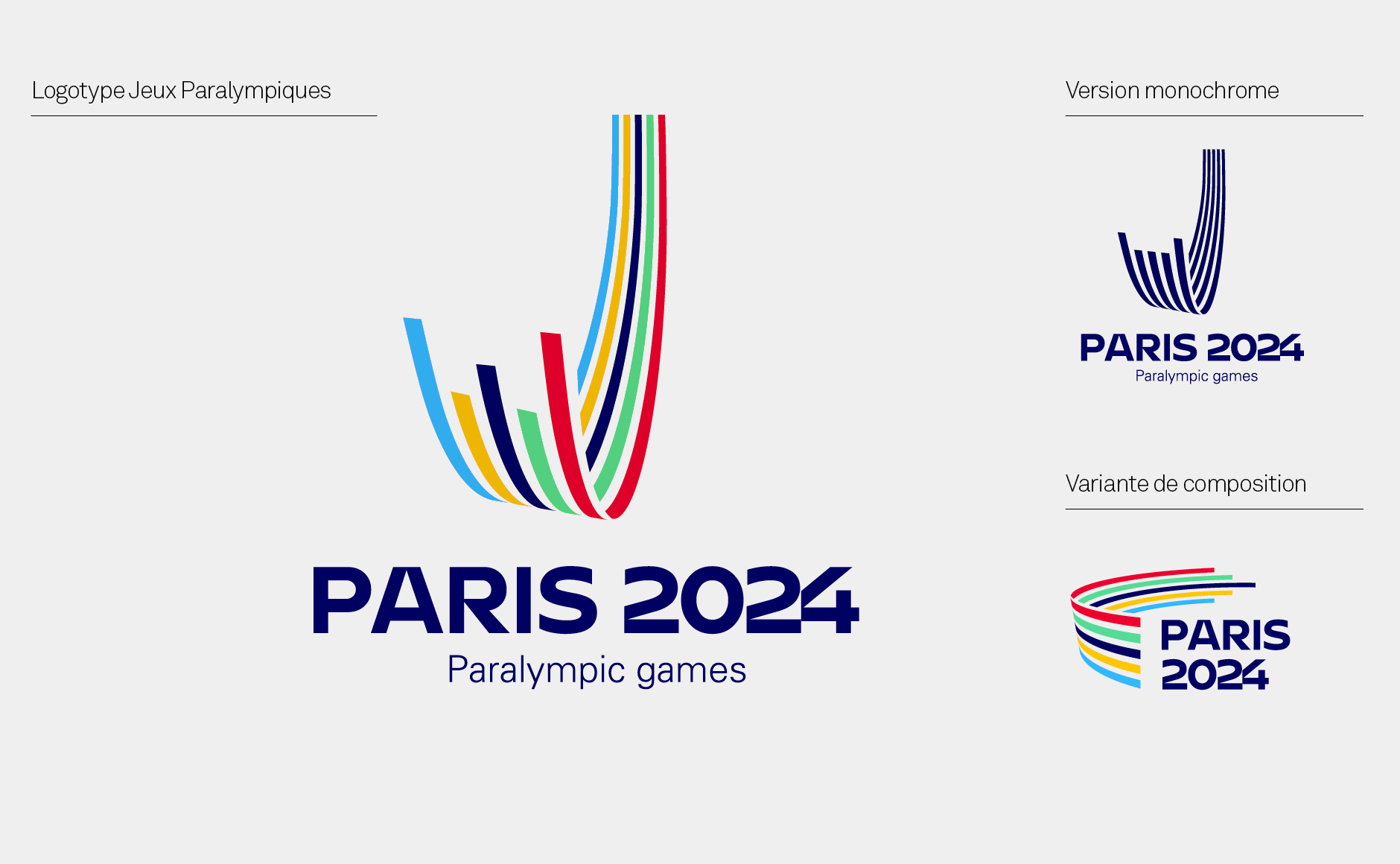
The Paralympics concept logo shares the same visual language
While ultimately this design will only see the light of day on design sites like ours, Graphéine's Paris 2024 Olympics logo offers valuable insight into what it takes to design such a prolific event.
Related articles:
Tokyo 2020 strikes gold with its recycled Olympic medalsIs the Tokyo 2020 logo better than the official design?The surprising story behind the Joker logo


Leave a Reply
Want to join the discussion?Feel free to contribute!