Sunshine All Day Every Day (August 2018 Wallpapers Edition)

Original Source: https://www.smashingmagazine.com/2018/07/desktop-wallpaper-calendars-august-2018/

Sunshine All Day Every Day (August 2018 Wallpapers Edition)

Sunshine All Day Every Day (August 2018 Wallpapers Edition)

Cosima Mielke

2018-07-31T13:11:56+02:00
2018-07-31T15:32:00+00:00

Everybody loves a beautiful wallpaper to freshen up their desktops. So to cater for new and unique artworks on a regular basis, we embarked on our monthly wallpapers adventure nine years ago, and since then, countless artists and designers from all over the world have accepted the challenge and submitted their designs to it. It wasn’t any different this time around, of course.

This post features wallpapers created for August 2018. Each of them comes in versions with and without a calendar and can be downloaded for free. A big thank-you to everyone who participated!

Finally, as a little bonus, we also collected some “oldies but goodies” from previous August editions in this collection. Please note, that they only come in a non-calendar version. Which one will make it to your desktop this month?

Please note that:

All images can be clicked on and lead to the preview of the wallpaper,
We respect and carefully consider the ideas and motivation behind each and every artist’s work. This is why we give all artists the full freedom to explore their creativity and express emotions and experience throughout their works. This is also why the themes of the wallpapers weren’t anyhow influenced by us, but rather designed from scratch by the artists themselves.

Submit your wallpaper

We are always looking for creative designers and artists to be featured in our wallpapers posts. So if you have an idea for a wallpaper, please don’t hesitate to submit your design. We’d love to see what you’ll come up with. Join in! →

Meet Smashing Book 6 with everything from design systems and accessible single-page apps to CSS Custom Properties, Grid, Service Workers, performance, AR/VR and responsive art direction. New frontiers in front-end and UX with Marcy Sutton, Harry Roberts, Laura Elizabeth and many others.

Table of Contents →
Purple Haze

“Meet Lucy: she lives in California, loves summer and sunbathing at the beach. This is our Jimi Hendrix Experience tribute. Have a lovely summer!” — Designed by PopArt Web Design from Serbia.

Purple Haze

preview
with calendar: 320×480, 640×480, 800×480, 800×600, 1024×768, 1024×1024, 1152×864, 1280×720, 1280×800, 1280×960, 1280×1024, 1366×768, 1400×1050, 1440×900, 1600×1200, 1680×1050, 1680×1200, 1920×1080, 1920×1200, 1920×1440, 2560×1440
without calendar: 320×480, 640×480, 800×480, 800×600, 1024×768, 1024×1024, 1152×864, 1280×720, 1280×800, 1280×960, 1280×1024, 1366×768, 1400×1050, 1440×900, 1600×1200, 1680×1050, 1680×1200, 1920×1080, 1920×1200, 1920×1440, 2560×1440

Coffee Break Time

Designed by Ricardo Gimenes from Sweden.

Coffee Break Time
preview
with calendar: 320×480, 640×480, 800×480, 800×600, 1024×768, 1024×1024, 1152×864, 1280×720, 1280×800, 1280×960, 1280×1024, 1366×768, 1400×1050, 1440×900, 1600×1200, 1680×1050, 1680×1200, 1920×1080, 1920×1200, 1920×1440, 2560×1440
without calendar: 320×480, 640×480, 800×480, 800×600, 1024×768, 1024×1024, 1152×864, 1280×720, 1280×800, 1280×960, 1280×1024, 1366×768, 1400×1050, 1440×900, 1600×1200, 1680×1050, 1680×1200, 1920×1080, 1920×1200, 1920×1440, 2560×1440

A Midsummer Night’s Dream

“Inspired by William Shakespeare.” — Designed by Sofie Lee from South Korea.

A Midsummer Night’s Dream
preview
with calendar: 800×480, 1024×768, 1280×720, 1280×800, 1600×1200, 1680×1050, 1680×1200, 1920×1080, 2560×1440
without calendar: 800×480, 1024×768, 1280×720, 1280×800, 1600×1200, 1680×1050, 1680×1200, 1920×1080, 2560×1440

This August, Be The Best!

“Here is the August monthly calendar to remind you of your as well as your team’s success in the previous months. Congratulations, you guys deserved all the success that came your way. Hope you continue this success this month and in the coming months.” — Designed by Webandcrafts from India.

This August, Be The Best!

preview
with calendar: 320×480, 640×480, 800×480, 800×600, 1024×768, 1024×1024, 1152×864, 1280×720, 1280×800, 1280×960, 1280×1024, 1366×768, 1400×1050, 1440×900, 1600×1200, 1680×1050, 1680×1200, 1920×1200, 1920×1440, 2560×1440
without calendar: 320×480, 640×480, 800×480, 800×600, 1024×768, 1024×1024, 1152×864, 1280×720, 1280×800, 1280×960, 1280×1024, 1366×768, 1400×1050, 1440×900, 1600×1200, 1680×1050, 1680×1200, 1920×1200, 1920×1440, 2560×1440

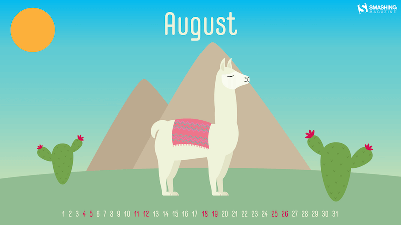
No Drama LLama

“Llamas are showing up everywhere around us, so why not on our desktops too?” — Designed by Melissa Bogemans from Belgium.
No Drama LLama
preview
with calendar: 320×480, 640×480, 800×480, 800×600, 1024×768, 1024×1024, 1152×864, 1280×720, 1280×800, 1280×960, 1280×1024, 1400×1050, 1440×900, 1600×1200, 1680×1050, 1680×1200, 1920×1200, 1920×1440, 2560×1440
without calendar: 320×480, 640×480, 800×480, 800×600, 1024×768, 1024×1024, 1152×864, 1280×720, 1280×800, 1280×960, 1280×1024, 1400×1050, 1440×900, 1600×1200, 1680×1050, 1680×1200, 1920×1200, 1920×1440, 2560×1440

The Colors Of Life

“The countenance of the clown is a reflection of our own feelings and emotions of life in the most colorful way portrayed with a deeper and stronger expression whether it is a happy clown or a sad clown. The actions of the clown signify your uninhibited nature — the faces of life in its crudest form — larger, louder, and in an undiluted way.” — Designed by Acowebs from India.

The Colors Of Life

preview
with calendar: 320×480, 640×480, 800×480, 800×600, 1024×768, 1024×1024, 1152×864, 1280×800, 1280×960, 1280×1024, 1366×768, 1440×900, 1680×1050, 1680×1200, 1920×1080, 1920×1200, 1920×1440, 2560×1440
without calendar: 320×480, 640×480, 800×480, 800×600, 1024×768, 1024×1024, 1152×864, 1280×800, 1280×960, 1280×1024, 1366×768, 1440×900, 1680×1050, 1680×1200, 1920×1080, 1920×1200, 1920×1440, 2560×1440

Hello August

“August brings me to summer, and summer brings me to fruit. In the hot weather there is nothing better than a fresh piece of fruit.” — Designed by Bram Wieringa from Belgium.

Hello August

preview
with calendar: 800×600, 1280×1024, 1440×900, 1680×1050, 1920×1080, 1920×1200, 2560×1440
without calendar: 800×600, 1280×1024, 1440×900, 1680×1050, 1920×1080, 1920×1200, 2560×1440

Exploring Thoughts

“Thoughts, planning, daydreams are simply what minds do. It’s following the human impulse to explore the unexplored, question what doesn’t ring true, dig beneath the surface of what you think you know to formulate your own reality, and embrace the inherent ‘now’ of life. The main character here has been created blending texture and composition. Thoughts will never have an end.” — Designed by Sweans from London.

Exploring Thoughts
preview
with calendar: 320×480, 800×480, 800×600, 1024×768, 1024×1024, 1152×864, 1280×720, 1280×800, 1280×960, 1280×1024, 1366×768, 1400×1050, 1440×900, 1600×1200, 1680×1050, 1680×1200, 1920×1080, 1920×1200, 1920×1440, 2560×1440
without calendar: 320×480, 800×480, 800×600, 1024×768, 1024×1024, 1152×864, 1280×720, 1280×800, 1280×960, 1280×1024, 1366×768, 1400×1050, 1440×900, 1600×1200, 1680×1050, 1680×1200, 1920×1080, 1920×1200, 1920×1440, 2560×1440

Chilling At The Beach

“In August it’s Relaxation Day on the 15th so that’s why I decided to make a wallpaper in which I showcase my perspective of relaxing. It’s a wallpaper where you’re just chilling at the beach with a nice cocktail and just looking at the sea and looking how the waves move. That is what I find relaxing! I might even dip my feet in the water and go for a swim if I’m feeling adventurous!” — Designed by Senne Mommens from Belgium.

Chilling At The Beach

preview
with calendar: 1280×720, 1280×800, 1920×1080, 2560×1440
without calendar: 1280×720, 1280×800, 1920×1080, 2560×1440

Let Peace Reign

“The freedom and independence sprouts from unbiased and educated individuals that build the nation for peace, prosperity and happiness to reign in the country for healthy growth.” — Designed by Admission Zone from India.

Let Peace Reign

preview
with calendar: 320×480, 640×480, 800×600, 1024×768, 1024×1024, 1152×864, 1280×720, 1280×800, 1280×960, 1280×1024, 1366×768, 1400×1050, 1440×900, 1600×1200, 1680×1050, 1920×1080, 1920×1200, 1920×1440, 2560×1440
without calendar: 320×480, 640×480, 800×600, 1024×768, 1024×1024, 1152×864, 1280×720, 1280×800, 1280×960, 1280×1024, 1366×768, 1400×1050, 1440×900, 1600×1200, 1680×1050, 1920×1080, 1920×1200, 1920×1440, 2560×1440

On The Ricefields Of Batad

“Somebody once told me that I should make the most out of vacation. So there I was, carefully walking on a stone ridge in the ricefields of Batad. This place is hidden high up in the mountains. Also August is harvesting season.” — Designed by Miguel Lammens from Belgium.

On The Ricefields Of Batad

preview
with calendar: 1680×1200, 1920×1080, 1920×1200, 1920×1440, 2560×1440
without calendar: 1680×1200, 1920×1080, 1920×1200, 1920×1440, 2560×1440

Fantasy

Designed by Ilse van den Boogaart from The Netherlands.

Fantasy

preview
with calendar: 1280×1024, 1366×768, 1400×1050, 1440×900, 1600×1200, 1680×1050, 1680×1200, 1920×1080, 1920×1200, 1920×1440, 2560×1440
without calendar: 1280×1024, 1366×768, 1400×1050, 1440×900, 1600×1200, 1680×1050, 1680×1200, 1920×1080, 1920×1200, 1920×1440, 2560×1440

Oldies But Goodies

The past nine years have brought forth lots of inspiring wallpapers, and, well, it’d be a pity to let them gather dust somewhere down in the archives. That’s why we once again dug out some goodies from past August editions that are bound to make a great fit on your desktop still today. Please note that these wallpapers, thus, don’t come with a calendar.

Happiness Happens In August

“Many people find August one of the happiest months of the year because of holidays. You can spend days sunbathing, swimming, birdwatching, listening to their joyful chirping, and indulging in sheer summer bliss. August 8th is also known as the Happiness Happens Day, so make it worthwhile.” — Designed by PopArt Studio from Serbia.

Happiness Happens In August

preview
without calendar: 320×480, 640×480, 800×480, 800×600, 1024×768, 1024×1024, 1152×864, 1280×720, 1280×800, 1280×960, 1280×1024, 1366×768, 1400×1050, 1440×900, 1600×1200, 1680×1050, 1680×1200, 1920×1080, 1920×1200, 1920×1440, 2560×1440

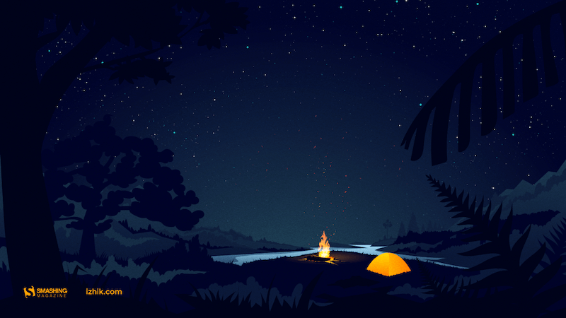
Psst, It’s Camping Time…

“August is one of my favorite months, when the nights are long and deep and crackling fire makes you think of many things at once and nothing at all at the same time. It’s about these heat and cold which allow you to touch the eternity for a few moments.” — Designed by Igor Izhik from Canada.
Psst, It’s Camping Time...

preview
without calendar: 1024×768, 1024×1024, 1280×720, 1280×800, 1280×960, 1280×1024, 1400×1050, 1440×900, 1600×1200, 1680×1050, 1680×1200, 1920×1080, 1920×1200, 1920×1440, 2560×1440

Bee Happy!

“August means that fall is just around the corner, so I designed this wallpaper to remind everyone to ‘bee happy’ even though summer is almost over. Sweeter things are ahead!” — Designed by Emily Haines from the United States.

Bee Happy!

preview
without calendar: 640×480, 800×600, 1280×720, 1280×800, 1280×960, 1366×768, 1400×1050, 1440×900, 1600×1200, 1680×1050, 1680×1200, 1920×1080, 1920×1200, 1920×1440, 2560×1440

Hello Again

“In Melbourne it is the last month of quite a cool winter so we are looking forward to some warmer days to come.” — Designed by Tazi from Australia.

Hello Again

preview
without calendar: 320×480, 640×480, 800×600, 1024×768, 1152×864, 1280×720, 1280×960, 1600×1200, 1920×1080, 1920×1440, 2560×1440

A Bloom Of Jellyfish

“I love going to aquariums – the colours, patterns and array of blue hues attract the nature lover in me while still appeasing my design eye. One of the highlights is always the jellyfish tanks. They usually have some kind of light show in them, which makes the jellyfish fade from an intense magenta to a deep purple – and it literally tickles me pink. On a recent trip to uShaka Marine World, we discovered that the collective noun for jellyfish is a bloom and, well, it was love-at-first-collective-noun all over again. I’ve used some intense colours to warm up your desktop and hopefully transport you into the depths of your own aquarium.” — Designed by Wonderland Collective from South Africa.

A Bloom Of Jellyfish

preview
without calendar: 320×480, 800×600, 1024×768, 1280×960, 1680×1050, 1920×1200, 2560×1440

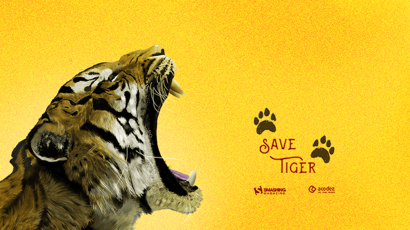
Let Us Save The Tigers

“Let us take a pledge to save these endangered species and create a world that is safe for them to live and perish just like all creatures.” — Designed by Acodez IT Solutions from India.
Let Us Save The Tigers

preview
without calendar: 320×480, 640×480, 800×480, 800×600, 1024×768, 1024×1024, 1152×864, 1280×720, 1280×800, 1280×960, 1280×1024, 1366×768, 1400×1050, 1440×900, 1600×1200, 1680×1050, 1680×1200, 1920×1080, 1920×1200, 1920×1440, 2560×1440

Shades

“It’s sunny outside (at least in the Northern Hemisphere!), so don’t forget your shades!” — Designed by James Mitchell from the United Kingdom.

Shades

preview
without calendar: 1280×720, 1280×800, 1366×768, 1440×900, 1680×1050, 1920×1080, 1920×1200, 2560×1440, 2880×1800

Ahoy

Designed by Webshift 2.0 from South Africa.

Monthly Quality Desktop Wallpaper - August 2012

preview
without calendar: 1366×768, 1440×900, 1680×1050, 1920×1080, 1920×1200, 2560×1440

About Everything

“I know what you’ll do this August. 🙂 Because August is about holiday. It’s about exploring, hiking, biking, swimming, partying, feeling and laughing. August is about making awesome memories and enjoying the summer. August is about everything. An amazing August to all of you!” — Designed by Ioana Bitin from Bucharest, Romania.

About Everything

preview
without calendar: 320×480, 800×480, 800×600, 1024×768, 1280×960, 1280×1024, 1440×900, 1600×1200, 1680×1050, 1920×1080, 1920×1200, 1920×1440, 2560×1440

Shrimp Party

“A nice summer shrimp party!” — Designed by Pedro Rolo from Portugal.

Shrimp Party

preview
without calendar: 320×480, 800×600, 1280×800, 1440×900, 1600×1200, 1920×1080, 2560×1440

The Ocean Is Waiting

“In August, make sure you swim a lot. Be cautious though.” — Designed by Igor Izhik from Canada.

The Ocean Is Waiting

preview
without calendar: 640×480, 800×480, 800×600, 1024×768, 1024×1024, 1152×864, 1280×720, 1280×800, 1280×960, 1280×1024, 1400×1050, 1440×900, 1600×1200, 1680×1050, 1680×1200, 1920×1080, 1920×1200, 1920×1440, 2560×1440

Oh La La… Paris Night

“I like the Paris night! All is very bright!” — Designed by Verónica Valenzuela from Spain.

Oh la la.... Paris night

preview
without calendar: 800×480, 1024×768, 1152×864, 1280×800, 1280×960, 1440×900, 1680×1200, 1920×1080, 2560×1440

World Alpinism Day

“International Day of Alpinism and Climbing.” Designed by cheloveche.ru from Russia.

World Alpinism Day

preview
without calendar: 1024×768, 1280×800, 1280×1024, 1440×900, 1680×1050, 1920×1200

Estonian Summer Sun

“This is a moment from Southern Estonia that shows amazing summer nights.” Designed by Erkki Pung / Sviiter from Estonia.

Estonian Summer Sun

preview
without calendar: 320×480, 1024×1024, 1280×800, 1440×900, 1920×1200

Aunt Toula At The Beach

“A memory from my childhood summer vacations.” — Designed by Poppie Papanastasiou from Greece.

Aunt Toula At The Beach

preview
without calendar: 320×480, 640×480, 800×480, 800×600, 1024×768, 1024×1024, 1152×864, 1280×720, 1280×800, 1280×960, 1280×1024, 1366×768, 1400×1050, 1440×900, 1600×1200, 1680×1050, 1680×1200, 1920×1080, 1920×1200, 1920×1440, 2560×1440

Flowing Creativity

Designed by Creacill, Carole Meyer from Luxembourg.

Flowing creativity

preview
without calendar: 320×480, 1024×768, 1024×1024, 1280×800, 1280×1024, 1680×1050, 1920×1080, 1920×1200, 2560×1440, 2880×1800, 1366×768

Searching for Higgs Boson

Designed by Vlad Gerasimov from Russia.

Monthly Quality Desktop Wallpaper - August 2012

preview
without calendar: 800×600, 960×600, 1024×768, 1152×864, 1229×768, 1280×800, 1280×960, 1280×1024, 1400×1050, 1440×900, 1440×900, 1440×960, 1600×1200, 1600×1200, 1680×1050, 1728×1080, 1920×1200, 1920×1440, 2304×1440, 2560×1600

Unforgettable Summer Night

Designed by BootstrapDash from India.

Unforgettable Summer Night

preview
without calendar: 320×480, 640×480, 800×480, 800×600, 1024×768, 1024×1024, 1152×864, 1280×720, 1280×800, 1280×960, 1280×1024, 1366×768, 1440×900, 1440×1050, 1600×1200, 1680×1050, 1680×1200, 1920×1080, 1920×1200, 1920×1440, 2560×1440

Join In Next Month!

Thank you to all designers for their participation. Join in next month!

The future of design: AR will be bigger than the internet

Original Source: http://feedproxy.google.com/~r/CreativeBloq/~3/gZMcIB_Bf74/the-future-of-design-ar-will-be-bigger-than-the-internet

Soon, a new era of experimental design and design thinking will be upon us. We’ll have entirely augmented experiences everywhere we walk, and voice design is the next big horizon for creatives. 

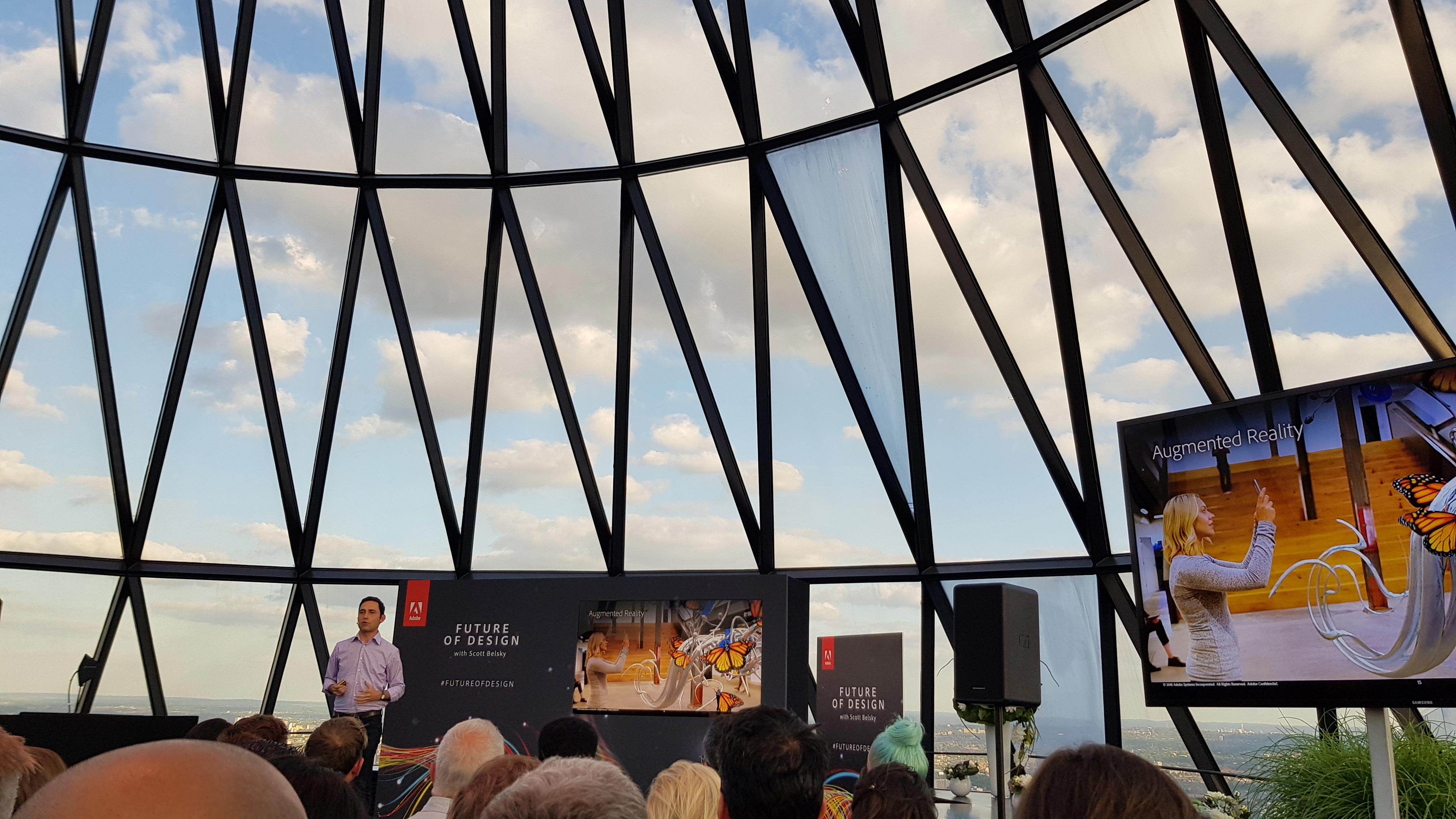
They’re just two predictions into the future of design shared by Scott Belsky, co-founder of Behance, and Adobe's chief product officer and executive vice president of Creative Cloud. 

Belsky took to the stage in London at an exclusive Adobe event earlier this summer to talk through the challenges and opportunities presented by emerging technologies – and to forecast the future for designers.

scott belsky at the gherkin in London

Scott Belsky at Adobe’s Future of Design event in London

As the future becomes increasingly commoditised, he said, creativity – and the role of user experience designers, particularly – will become increasingly important. 

"Companies are putting designers at the head of the table," he explained. "The user’s experience of technology these days is even more important than the tech itself. The UI is what distinguishes a product; a company. That’s one reason why designers are being employed across industries.”

Get 15% off Adobe Creative Cloud with our exclusive offer

In fact, when Adobe spoke to hiring managers at a range of top companies, 87 per cent of them said that UX designers are some of their most critical hires right now. 

So aside from a bright future for UX designers, what else is next for design? Here are five predictions Belsky made at the event – followed by an exclusive conversation with Creative Bloq, in which he explores the biggest new challenges and opportunities designers should prepare for.

Jump straight to the Scott Belsky interview
01. Augmented reality

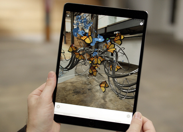
We’ll soon have entirely augmented experiences everywhere we walk. AR will be as critical as the web,” Belsky predicted, adding that this is why Adobe has developed Project Aero, a powerful new augmented reality tool that makes it easier for designers and developers to create immersive content, and bridge the gap between the physical and digital worlds. More on that below.

02. Voice design

“It’s the simplest interface of all, so we need to be able to design for it,” he said. Voice design tools are being brought into Adobe XD because we’re moving into a voice-driven world (think: Amazon Echo and Google Home) – and it’s raising many questions for designers, not least ethical ones.  

03. Artificial intelligence

Labour will become increasingly automated, with AI and machine learning helping creatives work smarter and faster by taking on repetitive tasks. “AI is a vertical of creativity,” said Belsky. “Think of it as a creative assistant.” 

04. Connected creativity

New tools like Adobe Capture – which turns photos on your phone or tablet into creative assets – will continue to deliver on the creative freedom promised by Creative Cloud in increasingly unique ways. “There’s an idea that in some ways we’re still chained to desktop – we expect to do our professional work there,” he said. “But that’s not where creativity happens.”

05. Ethics in design

What are our responsibilities for the end customer experience? What is the responsibility of the designer in preserving a consumer choice? When using visual search, such as Google, you're presented with a lot of options. Using a voice interface, this might not be the case – so who chooses which option you get, and how can you ensure the consumer’s best interests are served? Ethical questions have always been important, but in this new age of design they're even more so.

New challenges and opportunities for designers

ipad with image of creature on it

Project Aero: immersive media is poised to become the next disruptive platform. Welcome to the first wave of mainstream AR

So will AR really be bigger than the web? What sorts of questions is voice design raising? And what skills will designers need to meet the future of design head-on? We caught up with Belsky after the event to find out more…

What are the biggest opportunities of AR for designers?

Scott Belsky: I believe AR will do almost everything the web does for us, but in the context of our physical world, rather than on a screen. It will change the way we do everything from finding our way around cities, to reviewing the menu in restaurants, to dating, to fixing appliances in our homes. 

AR will do almost everything the web does for us, but in the context of our physical world, rather than on a screen. It will change the way we do everything.

Scott Belsky

Augmented Reality will enrich these experiences in ways we can barely imagine. However, none of this is possible without designers creating compelling three-dimensional interactive content and being able to collaborate with developers across platforms. 

AR and voice have the greatest potential to disrupt the way we experience the world. Every business group across Adobe is thinking about and building for AR because we strongly believe that it’s a transformative medium. AR is at the intersection of our physical and digital worlds, and requires a fundamentally different paradigm for interaction and design beyond the traditional screen experience. Designers will have the opportunity to literally design a new reality, and that’s going to be fun and challenging. 

How soon will AR be everywhere?

SB: We’re at the beginning of a journey with augmented reality. We believe that Project Aero is breaking new ground, with the goal of simplifying the development of AR content, delivering an even more powerful medium for storytelling for artists and designers around the world. Through our collaboration with Apple, Pixar and other partners, Project Aero will give creative professionals the ability to create more authentic experiences. 

What’s compelling is the quality and depth of the imagery, which makes the experience real and even more vivid. The industry is evolving at a rapid pace and there will be commercial and consumer demand for these types of experiences.

We see the potential of AR experiences to enable new forms of creative expression, spawn new customer experiences, and ignite new business models that we can’t even imagine today. We envision immersive media ultimately becoming ubiquitous in everyday life.  We’ll have a new interface through which we interact with a range of retail, news, search and other common applications.

What are the biggest challenges of AR for designers? How will Project Aero help?

SB: Most designers I speak with are excited about AR, but have no idea where to get started designing immersive experiences and how to work with developers to make them a reality. 

Our challenge is to help designers work with the tools they know and love, like Photoshop or Adobe XD for screen design, and then import their work to new tools like Adobe Dimension to make their creations 3D. And then, with Project Aero, designers will be able to make their creations interactive and easily 'published' to locations in augmented reality.  

For the first time, designers will be able to lay out and manipulate designs in physical spaces with a ‘what you see is what you get’ tool, making AR creation more fluid and intuitive. What’s more, delivering these immersive experiences to audiences on mobile devices will become faster, easier and safer. 

How can designers get ahead in voice design?

SB: Design is becoming more immersive and voice has become more important. Increasing numbers of people use a voice interface to order dinner, choose music, set reminders, and so many other tasks, thanks in large part to consumer products like Amazon’s Alexa and Google Assistant. 

Smart speakers will be installed in more than 70 million U.S. households by 2022, according to a Juniper Research report, and consumers have high expectations of voice technology because they’re used to naturally interacting and talking to people. For designers, creating voice user interface (VUI) experiences requires new skills that transcend the keyboard, mouse and screen.

For designers to be successful in the future, they’ll need to know how to create a voice interface that is efficient and intuitive.

Scott Belsky

For designers to be successful in the future, they’ll need to know how to create a voice interface that is efficient and intuitive. Our goal is to help designers succeed in this medium and in the broader world of immersive and interaction design. That’s one of the reasons we’ve invested so heavily in Adobe XD as an experience design platform that can adapt to new modalities over time.  

Adobe XD brings prototyping and design together, which has unlocked new capabilities including allowing designers to easily switch from wireframes to prototypes and use tools such as After Effects to add deeper animations to their UX/UI designs. Unfortunately, I can’t share more now, but you’ll see a massive amount of innovation from us as it relates to XD in the coming months. 

What are the biggest hurdles posed by voice design? 

SB: As I mentioned, there has been a tremendous growth in voice-enabled devices. For designers, creating VUI experiences requires new skills since you cannot simply apply the same design guidelines to VUI, as you would a graphical app or web experience. Designers must have a deep understanding of human communication and natural conversation flow to design for VUIs.

Additionally, it requires a mindset shift to design for this medium. VUIs need to contain the right amount of information to meet users’ expectations and provide users with information on what they can do with the technology. For example, proactive prompting along the lines of, 'What can I help you with today?' might help a user get started. Without visual guidance, it’s easy for the user to get lost.

There are, of course, ethical considerations when it comes to VUI design too. For example, designers will need to carefully consider how often the technology is listening or recording, and clearly spell that out for the user. Companies and their designers will need to ensure privacy is baked into the product from the start. 

Another important issue in voice is the default settings. When you ask your voice assistant to order flowers, what service does it default to using? Making tasks easy is great for consumers, but the design will have to make it transparent how those tasks are happening and give users the option of changing the defaults so they can personalise the experience.

Related articles:

How to future-proof yourself as a designer10 huge graphic design trends to know for 2018The ultimate guide to design trends

Help design the new Firefox logo

Original Source: http://feedproxy.google.com/~r/CreativeBloq/~3/KDnzxsGheWE/help-design-the-new-firefox-logo

When it comes to Firefox, most people think of the colour critter-cum-web browser that brightens up their desktop. For Firefox though, this isn't quite enough. According to Tim Murray, the creative director at the company's nonprofit owner, Mozilla, there's more to the web browser than is reflected in the current logo design (see below).

Old Firefox logo

The previous Firefox logo has been in use since 2017

To help correct this injustice, Firefox revealed in a blog post earlier this week that it wants the public to get involved with helping to evolve its brand. It follows in the footsteps of Mozilla, which open-sourced the process of selecting its new design and brand identity in 2017.

The decision to move the Firefox brand forwards through a redesign comes as users find new ways to use internet, with methods that are not truly reflected in the flaming fox design.

"As an icon, that fast fox with a flaming tail doesn’t offer enough design tools to represent this entire product family," says Murray. "Recoloring that logo or dissecting the fox could only take us so far. We needed to start from a new place."

To create a brand system that truly communicates what Firefox is all about, a team of product and brand designers at Mozilla have reworked its design system. The two systems can be explored below in the gallery by clicking left to right with the arrows.

What do you think? If we're being honest, and slightly contrarian, we like the fox icons in system 2, but prefer the geometric icon designs in system 1. Go figure.

Crucially though, this isn't a decision by public vote. Firefox is looking for constructive feedback to be left in the comments section of the blog post. And it's important to keep in mind that these icon designs aren't final. You could help shape their look!

So if you've got something useful to say, head over to the blog, leave a comment, and help shape a piece of sure to be ubiquitous design.

Related articles:

11 places to find logo design inspirationQuiz: guess the logo, can you identify these brands?How to price logo design services

UX for emerging experiences

Original Source: http://feedproxy.google.com/~r/CreativeBloq/~3/gXjVXQFPctg/ux-for-emerging-experiences

As the web landscape changes so does user experience and to stay competitive you need to embrace the new. One thing that doesn't change is the user. If they have a poor user experience they will simply look elsewhere. So what are the emerging experiences that you need to consider today?

The theory of UX

These are the seven key themes that you should be designing for: inclusivity and accessibility, immersion, trust and transparency, coherence, conversation, collaboration and efficiency. Alongside these key themes we reveal the tools that you will need to ensure design success.

Design for inclusivity

Sometimes referred to as 'Universal Design', inclusive design considers as many people's needs and abilities as possible, instead of a 'one size fits all' approach to the experience.

As designers it can be easy to unwittingly design for those that are just like us, or prioritise these considerations due to tight budgets or deadlines. As designers we should be aiming to include people with varying ranges of cognitive or physical disability, rather than exclude them. Designers should do this by removing the barriers that create extra effort and separation, enabling the end user of your product or service to have the confidence to participate equally, and without support. 

tech for Good homepage

Tech For Good also has a podcast

Over the next year, expect to see inclusive and ethical design become an expected part of the UX Design process. Fortunately, there are plenty of other people getting involved in the digital community, with social movements such as The A11Y Project, AXSChat and Tech For Good gathering rapid momentum over the past 12 months. These groups provide a supportive space for designers to learn more about the inclusive design process and the problems that different people face when using technology. 

Inclusive design shouldn’t be confused with accessible design.

Inclusive design shouldn't be confused with accessible design. Products and services are usually made accessible as an afterthought; for example, a watch might be retrospectively made accessible for blind people by including braille numbering on top of the watch face. This modification to a device designed for those with sight may solve one technical problem, but introduce many more issues for those that are blind. Inclusive design seeks to fundamentally redesign a product from scratch, removing barriers from the start. Inclusive design is proactive, not reactive.

When starting any new project, one of the most important questions UX designers should ask themselves at all stages of the design process is, 'Who will this design exclude?'

Top tools
Funkify Disability Simulator
Funkify is an extension for Chrome that helps you experience the web and interfaces through the eyes of users with different abilities and disabilities. Funkify is created by a team of usability and accessibility experts in Sweden. Stark
The colour-blind simulator and contrast checker for Sketch. Simulate the various forms of colour-blindness by quickly previewing your Sketch designs and make adjustments as needed.Contrast
A macOS app that provides access to WCAG colour contrast ratios. The entire app UI updates instantly when picking colours, making it easy to get the colour contrast information you need to make informed decisions about the colour of your text.
Design for immersion

Traditionally, UX designers had a clear separation of realities to design for: real life, and the experience delivered on screen by the person's device. Now the lines have been well and truly blurred with Augmented Reality (AR) and Virtual Reality (VR) entering into mainstream use. It's not enough to design for screens, pages and offline touchpoints anymore, now the concept of multiple dimensions opens up a plethora of ways to enhance the experience. 

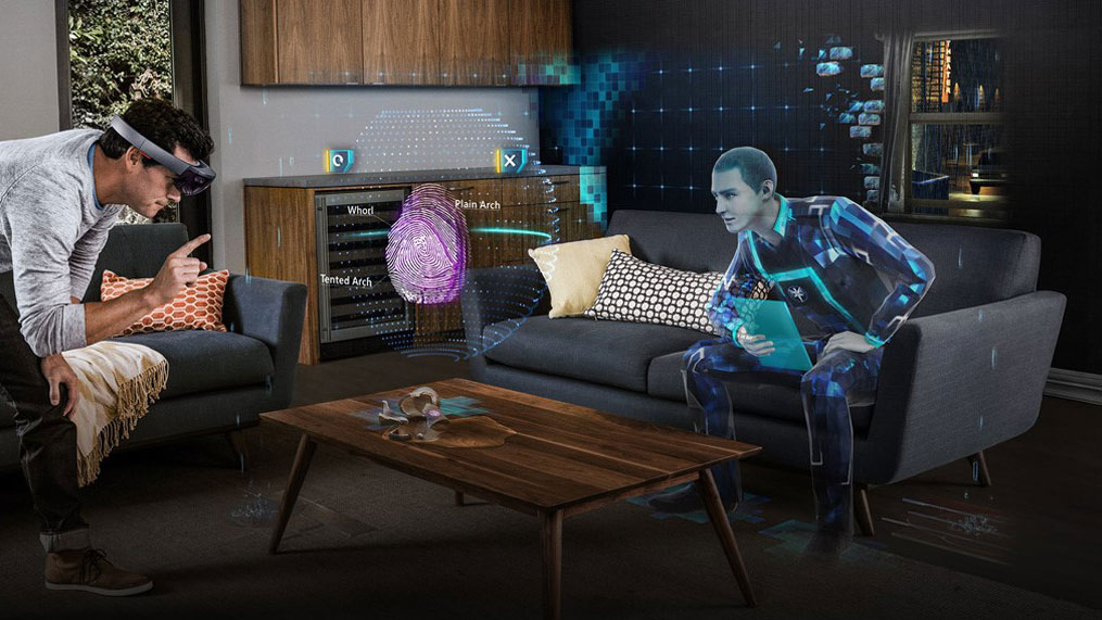
A whole host of interactions can be incorporated into designs, such as picking up, pinching, pushing and pulling, facial expressions, and even air tapping for Microsoft's HoloLens. To get them to do this, you must also think about the cues you will give users that are used to interacting with flat screens, how will you encourage them to look around in the space? 

microsoft hololens

Microsoft HoloLens brings holograms into the real world

With new immersive technologies you can now use audio to grab attention, or display elements just off screen to prompt them to move left and right. This new technology also gives you the opportunity to play around with objects in a 3D space, so it's important that designers become comfortable in how shadow and light can be used to create the illusion of depth and mass for objects in the interface.

Designers also need to be conscious of the right context to use these interactions. As a user interacting with an Augmented Reality app whilst driving would be entirely inappropriate, and it might be that a voice interaction is more suitable in this type of scenario. Thorough research and testing is required of the UX practitioner to find and understand these contexts and user goals.

Overall, expect the prevalence of AR and VR to increase rapidly over the next few years as businesses and organisations find ways for this technology to fit their business models.

Top tools
A-Frame
A-Frame is a web framework for building VR experiences. Originally developed by Mozilla, it is an independent open source project. A-Frame is HTML, making it simple to get started.Microsoft HoloLens
Microsoft's 'mixed-reality' product, HoloLens, is the first self-contained, holographic computer, enabling you to engage with your digital content and interact with holograms in the world around you.
Design for collaboration

As UX Designer and its many permutations become more ubiquitous as a role, teams are growing and they have a bigger seat at the table. As a result, more business stakeholders are interested in knowing – or even being involved – in what you're doing. 

The UX role has now matured, and there are plenty of online communities, tools, conferences, and books aimed specifically for the UX designer. To complete the perfect storm, the digital marketplace is also saturated with multiple offerings for a single type of product, and organisations are more willing to invest the time in creating unique user experiences to make them stand out in a fiercely competitive crowd. Suddenly, UX practitioners find they not only have a voice, but are influential in navigating a product or service to market. 

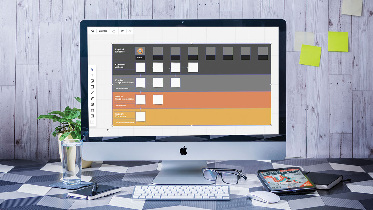
Realtime Board

Use RealtimeBoard to design journey maps, personas and other planning canvases

Superior soft skills are the secret weapon behind superior UX teams. This includes communication, listening, empathy, workshop facilitation, teamwork and storytelling. These provide the foundation that all other deliverables are based on. How do you know if the prototype you are testing will meet a user need if you have not listened properly in the research phase of the project? 

These skills are not an innate talent and need to be practised just like any other skill. Not only that, but developing your soft skills as a team enables you all to communicate properly with one another, forming a common strategy so you can all aim for the same goal. There are many good UX practitioners, but great ones have exceptional soft skills to help them do their job.

Collaborating with the customer or client is also essential to a smooth-running project. There are many tools such as Marvel, InVision and Axure that will enable you to quickly prototype up your work to show them the 'Promised Land', instead of sending emails back and forth you can now make your solutions come alive. The benefit of this approach is increased buy-in from clients and customers, and frictionless collaboration.

Some of the biggest obstacles to collaboration come from people not understanding what UX activities entail.

Some of the biggest obstacles to collaboration on a project can come from other business stakeholders and departments not understanding what UX activities entail. The solution here is to be as transparent and as open as possible. As a team you can pique people's interest by creating exciting areas of wall space in high traffic areas where deliverables such as personas, journey maps and wireframes can be displayed to spark conversations between different people within the business.

Even the rise of remote working and distributed teams is a waning threat to any UX team. There's a tool for every stage of the process, and you don't even need to be in the same room as each other. Project planning and management can be organised through tools such as Slack or Flock or Asana. Visual deliverables can be taken care of using collaborative whiteboards such as RealtimeBoard. Teams can work simultaneously to create fully fledged prototypes using one of the new generation of tools like Figma or InVision.

Top tools
Figma
Figma is a browser-based design tool that makes it easier for teams to create software. Present and prototype in the same tool as you design. Version control your team designs.Float
Float enables you to visualise your team's project assignments, overtime and time off in one place. Collaborate on project plans and resolve conflicts with real-time drag-and-drop scheduling.Loop11
Loop11 is integrated with JustInMind.com and is used to create prototypes that can then be used to run online usability tests, with the results shown in detailed reports and in-test videos. 
Design for trust

Trust is a human emotion that can be designed for, and can make or break the user's experience, but why is it so hard? Well, there's a lot out there to put off even the most savvy digital user, with dark UX patterns, fake news and clickbait rife. Emerging technologies such as blockchain and self-driving vehicles will put the majority of UX designers' skills to the test. 

In recent years trust has shifted from being controlled from the top-down by the business or organisation, to being collectively controlled by users via social media about how trustworthy (or untrustworthy) their experiences with a brand have been. It's fair to say that companies are not in control of this aspect of how they are viewed anymore, and so it's imperative that a brand's actions speak louder than its words. 

To gain the trust of the user, the experience must become as transparent as possible, with businesses being open about their motives, beliefs and activities. Designers can enable that relationship by not hiding away this information from the user, removing any anxieties they may have.

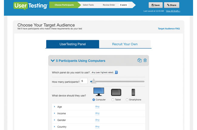
user testing. com

UserTesting.com is a great online tool for unmoderated testing

When a customer takes a leap of faith and invests their time, and possibly their money in your product or service, you suddenly have a social responsibility to make good on that relationship. So despite all that, how can trust be designed for? Thankfully there are a few techniques UX designers can use to instil confidence in the end user throughout their journey.

We all judge a book by its cover, and it's also well known that a user is more likely to trust a site that is more aesthetically pleasing. This is called the aesthetic-usability effect, and is described as us perceiving beautiful things as easier to use over ugly ones (even if that is not the case). Included in the look and feel of the site aesthetic should be the tone of voice and type of imagery that are used to convey a professional, reliable impression of the business or organisation. 

Of course, the ultimate indicator of trust should always be in the user testing results, along with observations of the user's reactions to sites. Subjective measures like trust can also be captured at the end of tests. Moderated user testing will always provide much greater insights, but there are tools online to run unmoderated tests such as UserTesting.com.

Top tools
Dark Patterns
Dark Patterns are tricks used in websites and apps that make you buy or sign up for things that you didn't mean to. The purpose of the Dark Pattern Library site is to spread awareness and to document the companies that use such techniques.Government Research Consent Guidelines
The UK government website contains an entire manual on service design and the consent forms you need signed to ensure you can be trusted with a person's data gathered during user research.
Design for coherence

With more and more touchpoints emerging, organisations are in danger of their user's journey becoming so heavily fragmented that it could become an incoherent mess. To add to the omnichannel experience there are now chatbots and other voice interfaces to consider in the user's journey, so the experiences and conversations people have with them need carefully designing.

Planning is key, taking a 'helicopter view' of the entire user's journey with the business. This should include doing as much user research as possible to make sure the touchpoints you design align with their goals, and what they're doing in real life. Turning this research into user journey maps and personas will help guide designers on which touchpoints should be used for different audiences. Many tools exist for supporting these activities; Smaply caters for all of the above, and Xtensio can be used to create simple personas and diagrams, but there are also more traditional offline tools such as Axure that you can use to get the job done. 

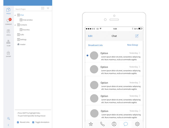
Mockflow interface

With MockFlow you can plan and create better user interfaces

It's also important to consider which touchpoints shouldn't be designed for, especially if it is discovered during the research that it would be inappropriate to use certain methods to contact certain audiences. For example, on a digital experience dealing with a homeless person registering for support services, would it be appropriate to ask for an address? 

Designing a coherent experience means not just designing for screens and apps anymore, but every means of contact the customer has with that organisation, so that a unified message can be delivered, regardless of the type of touchpoint. It's imperative that this key message is decided on from the start. The entire UX team should know from research what message to deliver. 

It's a common belief that the more material you present to the user, the greater chance that some of it will be remembered. It's the old adage of throwing a load of mud in the hope some will stick, but this isn't true. Your audience will end up confused about the message you are trying to deliver.

Top tools
Axure
Create simple click-through diagrams or highly functional, rich prototypes with conditional logic, dynamic content, animations, math functions, and data-driven interactions. Use Axure Share to upload content to share with your team.Asana
Asana is an online project management tool, designed to help teams track their work. Asana gives you everything you need to stay in sync, hit deadlines, and reach your goals.MockFlow
MockFlow provides a full solution for design teams, which includes wireframing, sitemaps, UI spec systems, design workflow and more. Enables you to plan and create better user interfaces together within a single suite.Storyboard That
Storyboards are a fun and engaging way to relay research findings and user journeys to stakeholders. Use the extensive image library and flexible templates to create storyboards of this information.Smaply
This website has an online editor which enables you to integrate basic service design tools into your daily work, such as user journey maps, stakeholder maps and personas. Your designs can be downloaded as PDFs and image files.
Design for efficiency

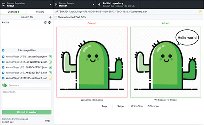
Kaktus interface

With Kaktus you can implement version control without having to learn a new set of tools

As UX teams grow, there are smarter ways of managing the multitude of design assets created by a team. No more naming your work 'homepage_wireframe_finalFinal14.pdf', or taking it in turns to work on the same document in your team. Thankfully now there are tools aimed specifically at design teams to version control design work. The majority are based on Git, the same technology used by developers to manage their application code.

There are so many advantages to using this sort of software to manage your designs. Not only can multiple designers work on the same project at the same time, but you can roll back to a previous version if needed.  Although you will only see the current version of a file, a full version history is kept and reviewing the changes made between versions of a file are even possible. These features of version control mean problems like losing work when a file is accidentally overwritten, or two people decide to make changes to the same thing are now a thing of the past.

Once changes are made, many tools let you communicate those changes to the team. This is a step forward in terms of productivity and efficiency, enabling projects to be completed as quickly as possible. Lots of the larger web-based design tools like Figma and UXPin provide this as part of the subscription, but there are standalone tools like Kaktus, Abstract and Folio for Mac.

Design for conversation

The rise of chatbots and other conversational devices such as Amazon Alexa and Google Home has been all pervasive over the past few years, and many companies are still trying to work out where this new technology can be inserted into their strategy with customers. But where does traditional experience design fit in, especially when there will be no physical interface to design? This is a new frontier for service design, with endless possibilities for designing intuitive and human-centred experiences that people love.

Conversations between human beings are intricate, complex and heavily nuanced. Not to mention the cultural and semantic differences that are commonly observed in humans across the world. How do you anticipate and plan for the vast array of possible questions and reactions a human being might have? Designers will need to spend time designing all the possible flows and outcomes these conversations might take. And the more human the experience can be the better, but how can you make a machine appear human? How do you build a relationship with a machine?  These are questions the UX designer must consider to create an effective outcome for the end user.

man with laptop

Conversational interfaces bring a whole new set of challenges with them

Understanding the context that your designs will be used in is also important, so rigorous and in-depth research is essential. Would your target audience use a voice interface walking down the street? Would it be usable if it was a noisy street? All this can be answered by spending time understanding your users and capturing what their goals are.

Another essential part of the UX practitioner's role will be in planning for and testing these conversational interfaces. This will be very different to traditional testing of apps and sites, and will require much more rigorous planning of scripts and testing sessions. 

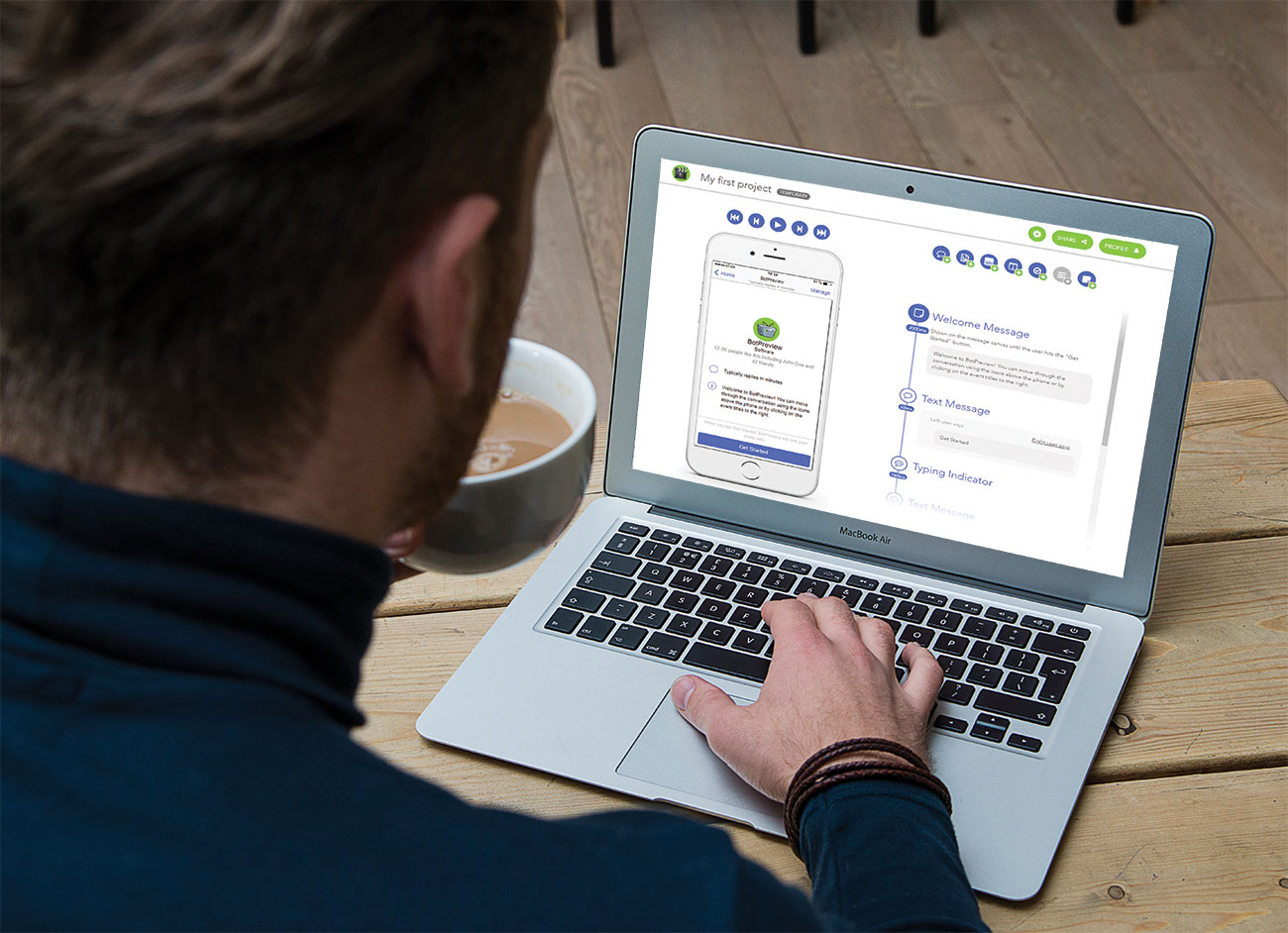
There are a few tools for designing the proposed chatbot conversations and also the UI, such as BotPreview and Botsociety, which then enable you to go and test these conversations out on real people before you release your chatbot or conversational UI. As a result of this frenzied focus given to this emerging technology, expect to see new roles created as offshoots of the standard UX Designer and – relatively new – UX Writer titles, such as 'Conversational Designer' (catering for research, testing, behaviours and personality of the interface) and 'Conversational Strategist' (a niche role dedicated to designing the flows and logic of the conversations).

Top tools
BotPreview
Sketch and design your own chatbot interactions using the BotPreview online editor and share them or export as static HTML or MP4/GIF video, without writing a single line of code.Botsociety
Design voice and chat interfaces using the online web editor by quickly building a high-fidelity preview of your next chatbot or voice assistant. Botsociety takes care of the appearance, the platform limitations, the preview, the export and the user testing for you.Botmock
Botmock uses a drag-and-drop editor with templates to build prototypes of conversational design. Map out the customer's journey, and create a live preview that can be exported to GIF and video.Bots UI Kit for Sketch
A simple and fully customisable Sketch UI kit to help you design and showcase your Facebook Messenger Bots. All elements are turned into new branded Sketch symbols, so prototyping has never been easier.Walkie
This tool is especially for Slack users to help design slack bot dialogues. It provides an easy way to write and test bot dialogues, which include buttons and also attachments.

This article was originally published in issue 274 of creative web design magazine Web Designer. Buy issue 274 here or subscribe to Web Designer here.

Related articles:

New skills in UX designWhat are the main barriers to good UX today?Why graphic designers need to master UX

The 10 best stamp designs inspired by TV and movies

Original Source: http://feedproxy.google.com/~r/CreativeBloq/~3/P8RAse3JN-Y/the-10-best-stamp-designs-inspired-by-tv-and-movies

She may live in a castle and have her face on stamps and money, but Queen Elizabeth II does have to do a lot of boring admin. And it's not just signing legislation and sending 100th birthday cards, she even has to approve each and every stamp design produced by the Royal Mail.

It's not just Christmas designs either. These days Britain’s postal service is releasing more and more limited edition stamps in order to make some extra cash from a generation that don’t actually send many letters. 

In this post, we bring together 10 of our favourites stamp designs, all created in tribute to TV shows and movies and featuring some of our favourite character designs.

01. Doctor Who

Stamp showing William Hartnell as The Doctor

Released in 2013, this stamp design features William Hartnell as the first actor to play The Doctor 

First screened in 1963, the day after John F Kennedy’s assassination, sci-fi show Doctor Who quickly became a Saturday tea-time institution for children and adults alike. Unfortunately by the 1980s its low budget effects looked increasingly anachronistic, and it was canned in 1989. But fan love for the show failed to abate, and a successful reboot in 2005 under the helm of Russell T Davies rewarded their patience several times over. 

Assured a prime place in British television history, not to mention its future, Doctor Who got the Royal Mail seal of approval in 2013, the year of its 50-year anniversary.  

The 11 first-class stamps combined each of the different actors to have played the Time Lord on TV to date, set against a backdrop evoking the ‘time tunnel’ effect shown in the opening credits. Our favourite is featured above. Framing the First Doctor as played by William Hartnell, it’s a simple but arresting composition that feels both of its time and strikingly modern; very much a case of ‘less is more’. You can view the full collection here. 

02. Game of Thrones

Stamp showing Kit Harington as Jon Snow

Launched this January, these stamps pay tribute to this popular fantasy show

The biggest fantasy TV hit of the 2010s, Game of Thrones, may be American-led, but the UK has provided the majority of actors and hosted most of the filming, mostly in Northern Ireland. So it’s fully appropriate for the Royal Mail to pay tribute to the show that even Penny, the non-nerd character in Big Bang Theory, likes – because, in her words, “It's got dragons and people doing it.” 

Released in January 2018, the 10 stamps feature the following characters: Sansa Stark, Jon Snow, Eddard Stark, Olenna Tyrell, Tywin Lannister, Tyrion Lannister, Cersei Lannister, Arya Stark, Jaime Lannister and Daenerys Targaryen. 

Our favourite (above) portrays Kit Harington as Jon Snow, one of the show’s most popular characters and one whose parentage continues to be a source of frenzied speculation. Set against a snow-laden background, it’s a dramatic composition that beautifully sums up the epic bombast and big themes at the heart of the saga’s appeal. You can see the full collection here.

03. Star Wars 

Stamp showing Luke Skywalker and Darth Vader in a light sabre duel

Luke faces off against Vader in this gloriously epic stamp design

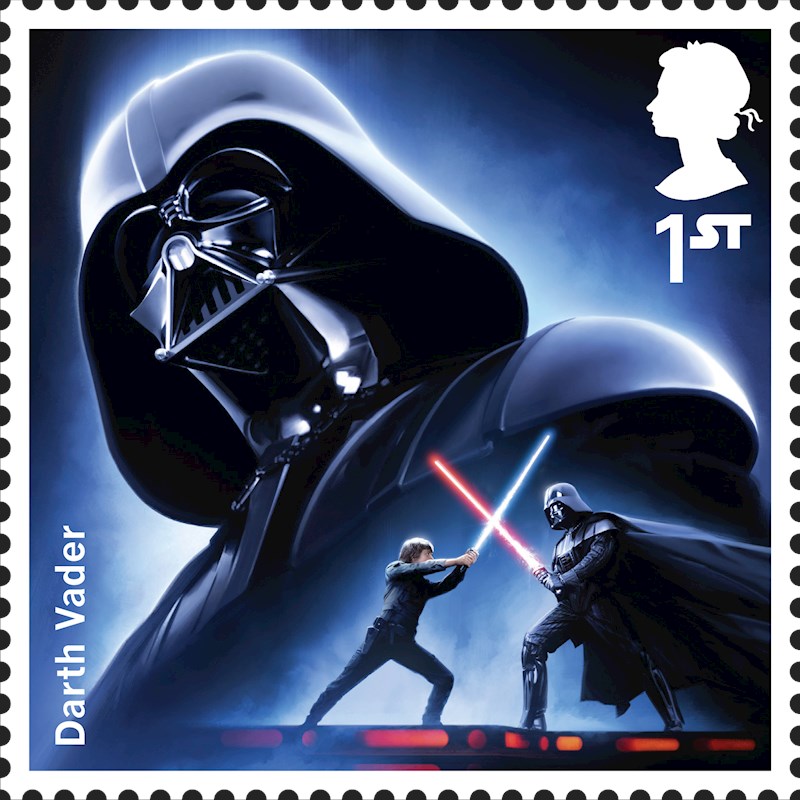
In 2018, with disappointing box-office returns for the Solo spin-off, the Star Wars franchise is starting to look on shaky ground, but this time last year the space opera series seemed unbeatable. And as British involvement in Star Wars has been pivotal (the first, in 1977, was filmed at Elstree and Shepperton, and the most recent two in Pinewood), it made perfect sense for the Royal Mail to commission a series of stamps celebrating The Last Jedi.

The stamps, which were designed by Malcolm Tween of Digital Progression, feature characters from across the saga, including Darth Vader, Han Solo, Chewbacca, Luke Skywalker, Princess Leia, Obi Wan Kenobi, R2-D2, C3PO, Boba Fett and Yoda, plus new characters from The Force Awakens Rey, Finn, BB8 and Kylo Ren. 

Our favourite has to be the one above featuring Luke and Vader, the epic father-son struggle that lay at the heart of the first trilogy. Summoning the spirit of legendary Star Wars poster illustrator Drew Struzan, but translating a poster design into one that works in a tiny space, this is a great example of elegant minimalism. You can see the full range of stamps here.

04. Monty Python

Stamp showing the original Monty Python team

This tribute to Monty Python brilliantly harnesses their subversive spirit

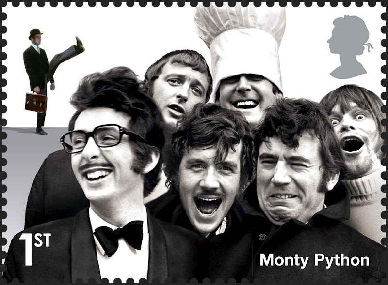
It’s difficult to imagine how different comedy was before Monty Python’s Flying Circus hit our screens in 1969. Taking its cues from Surrealism and Dada art movements, the anarchic troupe completely reinvented what comedy could look like, in both their late-night TV show and ensuing films, including the widely banned Biblical parody, Life of Brian. Today the show's influence is obvious in everything from South Park and Family Guy to the phrases that have entered everyday speech (such as the use of ‘spam’ to describe unwanted emails). 

This design was released by the Royal Mail, appropriately enough, on April Fool's day in 2015 as part of a special range of ‘Comedy Greats’ stamps. Featuring the classic Monty Python team of six (Graham Chapman, John Cleese, Terry Gilliam, Eric Idle, Terry Jones and Michael Palin), it’s a perfectly chosen shot that effortlessly captures the untrammelled energy of the young team. And it’s been beautifully integrated with an image of John Cleese from the Ministry of Silly Walks sketch, providing an instant blast of nostalgia for any Brit of a certain age. You can see the full range of British comedy stamps here. 

05. Dracula

Stamp showing Dracula about to bite a comatose woman

This stamp design, based on 1958 movie Dracula, brilliantly conveys the melodramatic essence of Hammer Horror

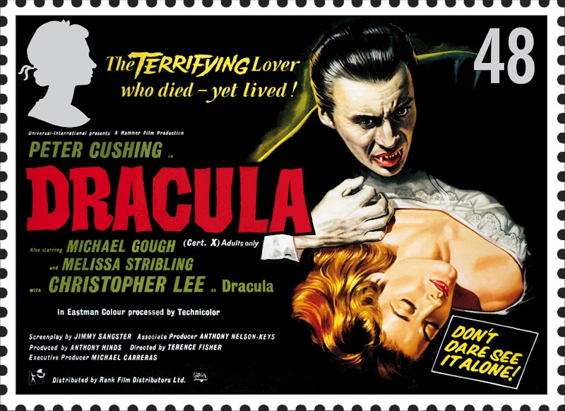
When the British film industry looks back on its glorious past, it tends to focus on the highbrow and critically acclaimed stuff, from Alfred Hitchcock to Ken Loach. But it’s important to remember that some of the most successful and popular British movies have been more towards the cheesier end of the scale. And so in 2008, the Royal Mail decided to pay tribute to two so-bad-its-good traditions in UK film-making: the Carry On series of bawdy comedies, and the melodramatic series of horror movies made by Hammer Films between the 1950s and 1970s. 

Starring Christopher Lee as Count Dracula and Peter Cushing as Van Helsing, Dracula was a critical and commercial hit on release in 1958, and it’s now considered a classic of the genre; ranked the 65th best British film ever in a 2017 poll for Time Out magazine. And this marvellously crafted stamp harnesses the best of horror poster and book jacket design in reminding us of just what an impact it made on audiences. 

The colours, typography and use of hyperbolic quotes are all note-perfect, and the way that the Queen’s silhouette has been effortlessly co-opted into the design is quite unnerving. You can see the full range of stamps here. 

06. Harry Potter

Stamp featuring Michael Gambon as Albus Dumbledore

Dumbledore is taking no prisoners in this Harry Potter stamp tribute

No list of popular culture-inspired stamps could fail to include Harry Potter, one of the most critically and commercially successful film franchises of all time. That's partly thanks to author JK Rowling's insistence that the movie be made in Britain, with British actors. This move both ensured the distinctive nature of the novels translated perfectly to the big screen, and kick-started London's nascent VFX industry into the bargain.

Released in 2011, the Royal Mail's Magical Realms series included two gems paying tribute to the series, featuring arch-villain Voldemort and his adversary, Albus Dumbledore (shown above). It's a striking composition, featuring the magical professor in full combat mode against a background of swirling, menacing auras; a reminder that for all the schoolyard hi-jinks, there's also a dark and gritty backbone that lies at the heart of the series' appeal.

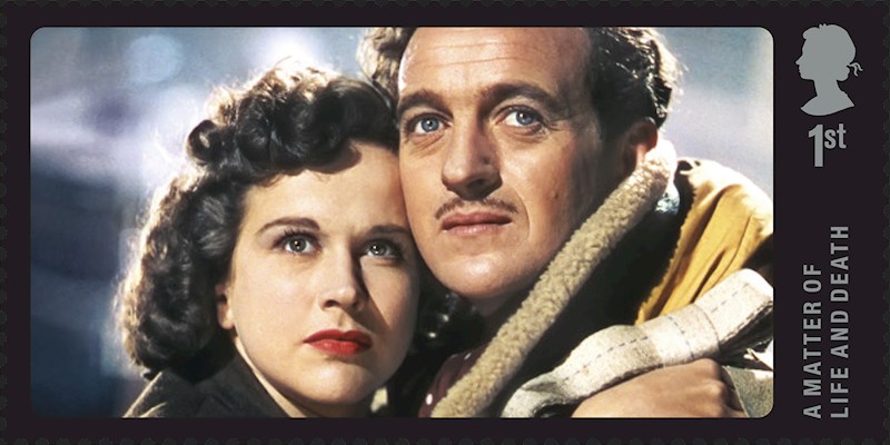
07. A Matter of Life and Death

David Niven and Kim Hunter

One of the greatest British movies of all time is honoured with this simple stamp design

If you’ve never seen the 1946 film A Matter of Life and Death (released in the US as Stairway to Heaven), then do something about it. The fantasy-romance revolves around a mixup in heaven, leading to an airman surviving a crash when he was actually meant to die. In a similar way to It’s a Wonderful Life, it had an emotional and powerful effect at the time on audiences, who were all coping with losing loved ones in the war. More recently, it was picked by Total Film as the second greatest British film ever made (in case you're wondering, Get Carter was number one).

This stamp was created as part of the Royal Mail’s Great British Film series, released in May 2014, and features Kim Hunter and David Niven, enclosed in a simple black rectangle. It's an elegantly minimal design that perfectly encapsulates the classic, iconic nature of its subject. You can check out the full series here.

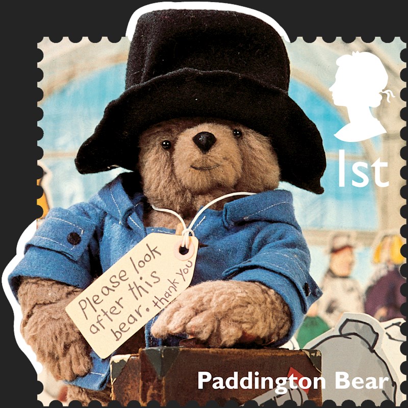
08. Paddington Bear

Paddington Bear waiting to be adopted at Paddington Station

This stamp shows the story of Paddington in a nutshell

It may have taken a while to come to the big screen, in the form of 2014 film Paddington and the 2017 sequel Paddington 2. But the bear from Darkest Peru with a taste for marmalade has been a hit with kids for decades via the Michael Bond books, first published in 1958, and the spin-off TV series created by London-based animation company FilmFair in 1975. 

The latter entranced youngsters with its unusual visual approach, combining a 3D stop-motion puppet of Paddington with minimal 2D drawings of backgrounds and other characters. (In one memorable scene, the bear’s adopted parent Mr Brown hands him a jar of marmalade that becomes 3D when Paddington touches it.)

In January 2014, the Royal Mail paid tribute to Paddington with this stamp design, part of its range of Classic Children’s TV stamps, and all the essential elements are there. The 2D background of Paddington station, the ‘Please look after this bear’ label, and the bear himself, striking a characteristically jaunty pose, tell you everything you need to know. We particularly like the playful ‘cut out and keep’ element where Paddington’s head and elbow break out of the traditional rectangle of the postage stamp; very children’s TV. You can see the full range of children’s TV stamps here.

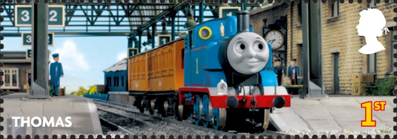
09. Thomas the Tank Engine

Thomas the Tank Engine

Thomas seems to have his eye on the Queen in this tongue-in-cheek stamp

Another of Britain’s biggest children’s TV exports, Thomas the Tank Engine is a fictional steam locomotive who first appeared in The Railway Series books, which were created by the Reverend Wilbert Awdry. Thomas is based on a toy train he made for his son, Christopher. 

On TV since 1979, the show has become an award-winning hit around the world, and narrators have included everyone from Beatles drummer Ringo Starr to controversial American stand-up George Carlin. In June 2011, the Royal Mail marked the 100th anniversary of the Reverend Albry with a special series of stamps. Six featured images from the TV series, Thomas and Friends, and four others featured illustrations from The Railway Series books. 

Our favourite, shown above, uses a 'widescreen' format to bring forth a cinematic feel; perfectly evoking the jaw-dropping wonder of a railway as it appears in the mind of a child. We also like the cheeky way Thomas seems to be giving the eye to the Queen. You can see the full collection here. 

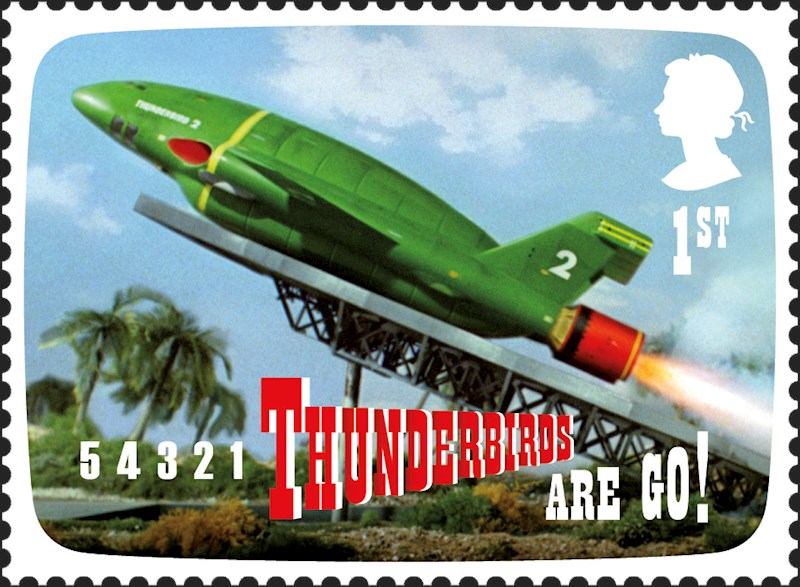
10. Thunderbirds

Stamp showing the Thunderbirds rocket taking off

A blast of nostalgia comes in the form of this Thunderbirds-themed stamp 

Created by Gerry and Sylvia Anderson between 1964 and 1966, Thunderbirds was a children’s sci-fi series that combined marionette puppetry with scale model special effects. Broadcast in more than 60 countries around the world, it had such an influence on successive generations of youngsters that it has since returned in a number of formats, including a 2004 live-action movie and a 2015 computer animation.

The Andersons created a lot of other hit shows too, including Stingray, Captain Scarlett and Joe 90. But nothing will be more nostalgia-inducing for a certain age-demographic than the classic countdown: “5-4-3-2-1 Thunderbirds are go!”. And so it’s to the credit of the Royal Mail that their stamp tribute focuses not on a particular character but that iconic sequence. You can see the full range of Anderson stamps here.

Read more:

Savage Brexit stamps are the best of BritishCreate cool collage illustrations66 brilliant print adverts

5 Great HTML5 Video Players

Original Source: https://www.sitepoint.com/5-great-html5-video-players/

There has been an increasing demand for creators to develop their own custom video platform which they can use to advance their own advertising, marketing or branding goals. Although YouTube and other similar platforms are generally more promising, hosting videos on your own and using a video player of your choice offers more control over how your videos are used.

Irrespective of whether you are a YouTube video creator or social media influencer, we've compiled a list of 5 of the greatest HTML5 video players. This list has been compiled after taking into consideration a few important needs, such as:

Fast and responsive
Easy to install and use
Compatibility quotient across browsers
Robust and all round playlist options
Ability to include an advertisement at various stages of the video – before, during or after
Ability to integrate self-hosted videos with those from channels like YouTube, Dailymotion, Vimeo, etc.

Now that we have an idea what to look for, here is a list of the top 5 HTML5 Video Players.

VideoJS

VideoJS, an open source HTML5 video player is built using JavaScript and CSS. It's an HTML5 video player with optional support for Flash. Having Flash as a fallback option is especially helpful when you're using it on browsers that do not support HTML5. It can extend its support to Vimeo and YouTube.

Launched in the year 2010, VideoJS currently serves more than 400,000 websites across the internet. VideoJS is equally compatible on mobile devices as well as desktops.

Some of the top features of VideoJS include:

Plugin Support: VideoJS supports multiple plugins like analytics, advertising, playlists as well as support for advanced formats such as HLS and DASH. A full list of supported plugins can be found VideoJS plugin page.
Skinning: Everything about VideoJS is customizable. You can easily customize the way it looks by editing the CSS style. Steve Heffernan has a codepen demo for customizing VideoJS skin that should help you get started.
Ready adaptability to various plugins makes this player much more useful. Some sample plugins include:

Analytics: Ability to track Google Analytics events from the VideoJS player
Brand: You can add the logo of your brand to the player
Playlist: Support for playlists
Chromecast: Ability to cast a video to a device using a Chromecast device

JW Player

JW Player has been around for ages and was one of the most popular Flash video players for the web. Later on, it extended its support for HTML5 video playback. JW Player is completely customizable, has a responsive HTML5 video and has a large variety of features right from analytics support to accessibility and full HTML5 video controls.

It has perhaps the best website video player with its wide array of video supported solutions. JW player also works very well as an HTML5 video player for WordPress websites. It can also be used as an alternate option for YouTube's video player. Interestingly, before Google purchased YouTube, the original YouTube video player was based on JW Player.

One of the key reasons that the JW Player is above its peers in this category because of the sheer amount of features it provides via a number of different add-ons. These can range from advertising partnerships to closed captions as well as popular social networking tools.

As mentioned earlier, the player is completely customizable and supports a number of custom user-defined themes. It also comes with an integrated API. It has a number of different plugins to support the more popular CMSs, which makes integration fairly simple.

Kaltura HTML5 Video Player

Kaltura Player is a free-to-use, open source HTML5 video player that can be used to create multiple and custom inter-browser and inter-device skins that can match or complement the design of your website. The Kaltura player comes with numerous player templates to choose from.

Some of the key features include:

Robust, all-round Performance
Multi-platform support
Advertising & Analytics: It supports most ad formats including VAST v. 3.0 as well as integrated plugins that can be used across a wide range of video ad networks. These include Google's Doubleclick Ad Platform, FreeWheel, Eye Wonder, Ad Tech, Tremor Video, AdapTV and many more.

Flowplayer

Flowplayer is an extremely simple video player for creators who wish to include video playback on their websites. Integrating and the markup process for Flowplayer is decidedly straightforward, which is one of its major benefits.

At the outset, it is important to note that Flowplayer is primarily aimed at those creators who host video files independently. In case creators are using a streaming service such as Vimeo or YouTube, both streaming services provide code that can be used to embed the player itself onto the website or landing page.

Flowplayer is 100% customizable as well as skinnable and comes with support for including subtitles, modifying the playback speed, including video analytics and monetization opportunities.

The post 5 Great HTML5 Video Players appeared first on SitePoint.

Bring a brand to life with illustration

Original Source: http://feedproxy.google.com/~r/CreativeBloq/~3/nyKBIbc4vxE/bring-a-brand-to-life-with-illustration

Many brands choose to use illustration to do at least some of the talking for them, and if it’s true that an image speaks a thousand words, it’s easy to see why. Whether through content, style, implicit narrative or (likely) all three, an image can communicate what copy and typography often can’t, at once setting out a mood, tone of voice, target audience and attitude in a succinct visual. 

The illustrator hotlist 2018

The idea of using illustration not just in a campaign, but as a core part of a brand’s visual identity is perhaps less common than it once was, and seems more aligned to certain sectors than others. Luxury food packaging design, for instance, especially on seasonal ranges: think high-end Christmas chocolate boxes. Or craft beer, a sector that’s seemingly indefatigable when it comes to both new variants and breweries.

An illustration route is straight to the point: it’s an instant emotional connection that can surpass language barriers

Chloe Templeman, Design Bridge

So what can illustration do that type, photography and copy alone can’t? For one, it shows a uniqueness, and in the right hands, it delivers on-shelf standout like few other approaches can. There’s far less chance, for instance, of a brand commissioning the same illustrator, style and image as there is of it using a similar typeface or colourway. 

Broadly speaking, a brand commissioning illustration also subtly communicates a level of thought and attention. In a similar way to brands working with bespoke, hand-drawn typography, even digitally created illustration hints at a person behind a brand. This helps build its story and tells us that there’s more to the product than just ‘buy me’.

As Chloe Templeman, creative director at Design Bridge puts it, the notion of image as story is as, “old as cave paintings and hieroglyphics, and has come full circle to emojis. An illustration route is straight to the point: it’s an instant emotional connection that can surpass language barriers.”

Boozy illustration

Thirst Craft is a Glasgow-based branding and design agency specialising in the drinks sector, whose portfolio boasts no shortage of richly illustrated designs – including the design for Loch Lomond Brewery used as the headline image for this article. According to creative director Matt Burns, it’s little surprise that the craft beer sector in particular has latched onto illustration as the perfect conduit for communicating a brand’s attitude and uniqueness. 

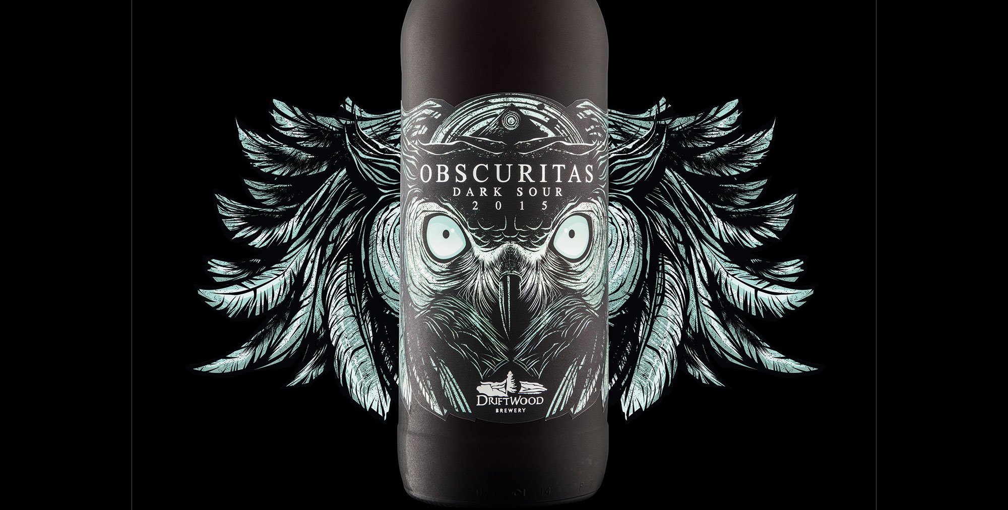
Hired Guns Creative created this packaging for Driftwood Brewery

“Illustration is created by the hand, and that hand-rendered touch lends itself nicely to craft beer, and the whole ‘brewed by hand’ story,” he says. “There’s something personable about illustration, so it’s a great way to communicate and tell a story of that brewery, but there’s also something kind of quite edgy and visually exciting about illustration, which is why it works well on pack.”

Burns adds that illustration is engaging and has a lot of energy, meaning that people can really relate to it. “It captures that level of excitement and emotion… rather than being a sales tool, it’s a piece of art. People want to keep the cans, and you don’t get that with other packaging.” 

Hired Guns Creative is an agency based in British Columbia, Canada which, like Thirst Craft, has chosen to specialise in solely creating designs for alcohol, with most of its work across the craft beer sector and the majority of that work relying on illustration in one form or another. So why is craft beer such a rich font of illustrated packaging?

Rather than being a sales tool, it’s a piece of art

Matt Burns, Thirst Craft

“A lot of it comes down to trying to compete on shelf,” says managing partner Leif Miltenberger. “The craft beer market in North America and in the UK is exploding, so every product on that shelf is trying to scream as loud as it can for attention. Really bold, eye-catching illustration is a good way to stand out, and is difficult for other companies to emulate. A lot of craft beer companies have packaging design that’s very minimalist, and although you can stand out through typography, bright colours, or certain printing techniques, it’s easier for another company to come along and replicate that.”

For craft beer in particular, brands are selling an attitude as much as a liquid: “A lot of people in that space really try to align themselves with counterculture through their brand, and illustration is a great way to do that. You can design things for the craft beer guys that major beer or spirit brands would be too scared to do,” says Miltenberger. Somewhat unusually, Hired Guns chooses to create all its illustration in-house, mostly by creative director Richard Hatter.

Investing in craft

When a brand commissions illustration work, it’s not only a way of augmenting or creating a more cohesive brand world or message, it sends out a signal that it cares about its product, and the people that are buying it. A distinctive, characterful illustration is a symbol of uniqueness and distinction, immediately elevating it above nondescript system fonts or less ownable colour palettes. 

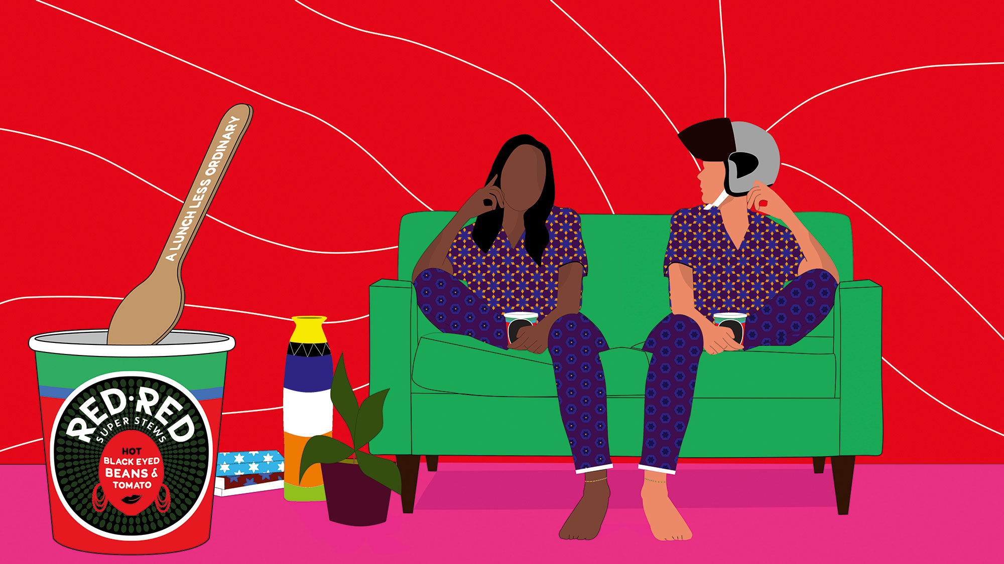
Silas Amos gave Red Red a surreal vibe with illustration

“It shows they value the appearance of the product as well as what’s inside,” says Miltenberger. “Some people think that if the product is good enough, it’ll be successful, but that’s not the case. It’s a super-competitive market. Sometimes you get the feeling from the illustration that they’re trying to target a certain demographic – maybe something hand-drawn to feel authentic and appeal to millennials or hipsters or whatever name they have on their demographic. But bigger corporations more and more are co-opting that approach: a hand-drawn gin label doesn’t mean its created in small batches by someone who cares.”

Being seen as a creative brand is priceless… The more avant-garde you are, the more you’re making a difference

Silas Amos

As Burns points out, such intricate packaging is also a crucial hook – especially within the craft beer sector: “The packaging is what makes people buy the first one, and the product makes them buy the second, third and fourth.”

Careful and considered commissioning also gives the sense of a brand being not just about product, but artistry. “Being seen as a creative brand is priceless,” says creative strategist and designer Silas Amos. “For brands, it’s about creating an aura around themselves. The more avant-garde you are or the more you visually snag, the more you’re making a difference.” 

There’s also the question of how much a brand is seen to be investing in craft, continues Amos. “Craft is telling a story, and that tends to be whimsical – pictures are a good way to tell whimsical stories.”

One of the reasons we’ve recently seen a wave of illustration that hints at care, craft and heritage is the fact that so many brands are celebrating landmarks. Their 100th or 150th anniversary is a perfect chance to put their flag back in the ground, and show a world full of shiny start-ups that they’ve been in it for the long haul; they’re reliable, an institution. 

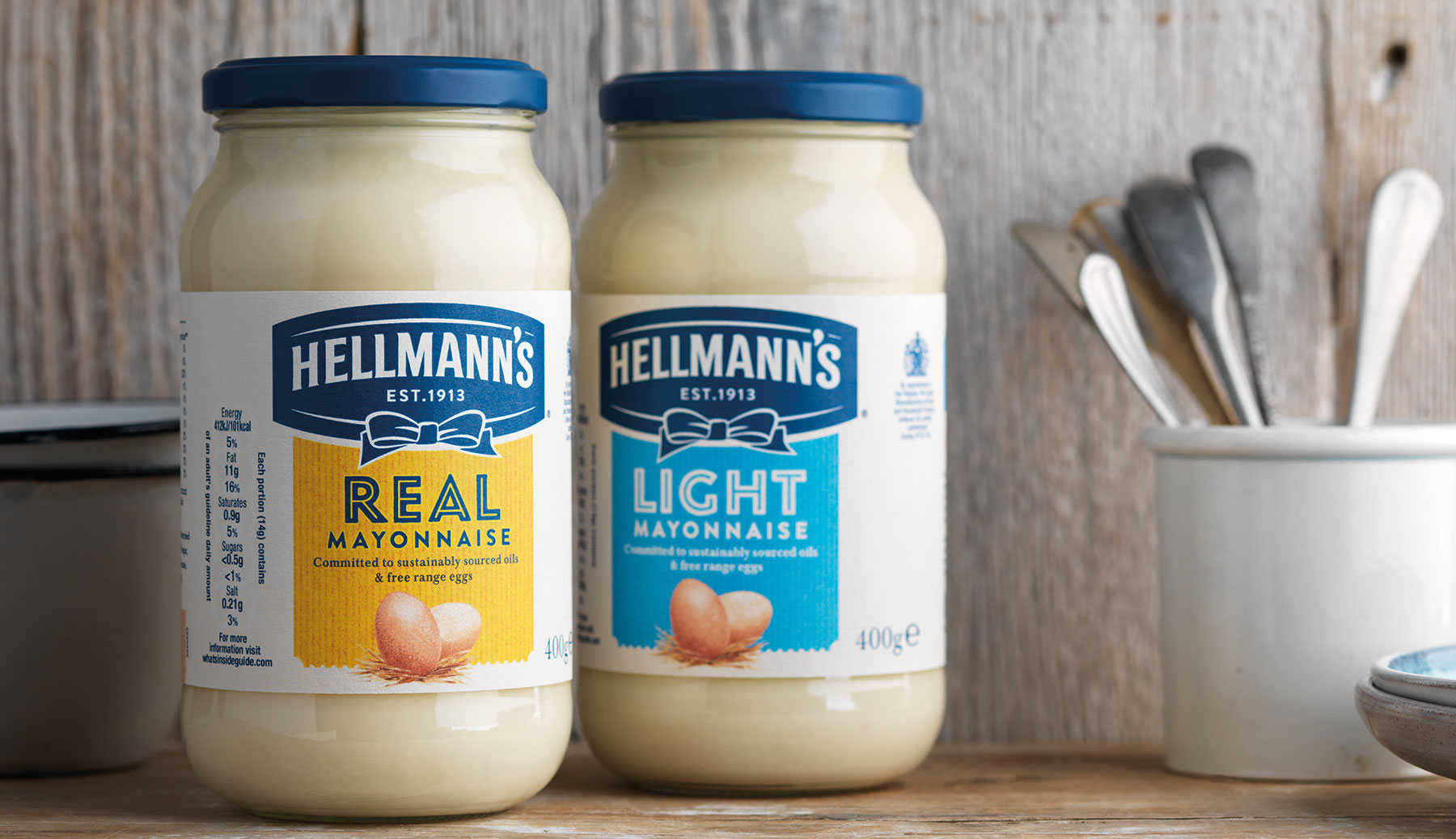
hellmann's mayonnaise bottles

Design Bridge played on the heritage of Hellmann’s with this design

At the forefront of Design Bridge’s recent work for Hellmann’s Mayonnaise, for instance, was stripping the aesthetic away from synthetic-leaning imagery to usher in a new, softer, watercolour-like, hand-drawn style of illustration. “It feels like more love has been put into it,” says Templeman.

Brand storytelling

It’s that ability for illustration to convey narrative that brings London-based studio Together Design to draw on it (excuse the pun) for so many projects. As creative director and founder Heidi Lightfoot puts it, illustration is perfect for branding projects as it can communicate, “really big themes and messages that you just couldn’t sum up in a photograph.” 

In a photograph, Lightfoot explains, you really have to feel some resonance to the people being featured. “But in illustration it’s often less personal, so we tend to find illustration really useful in communicating big themes that are part of a client’s message.”

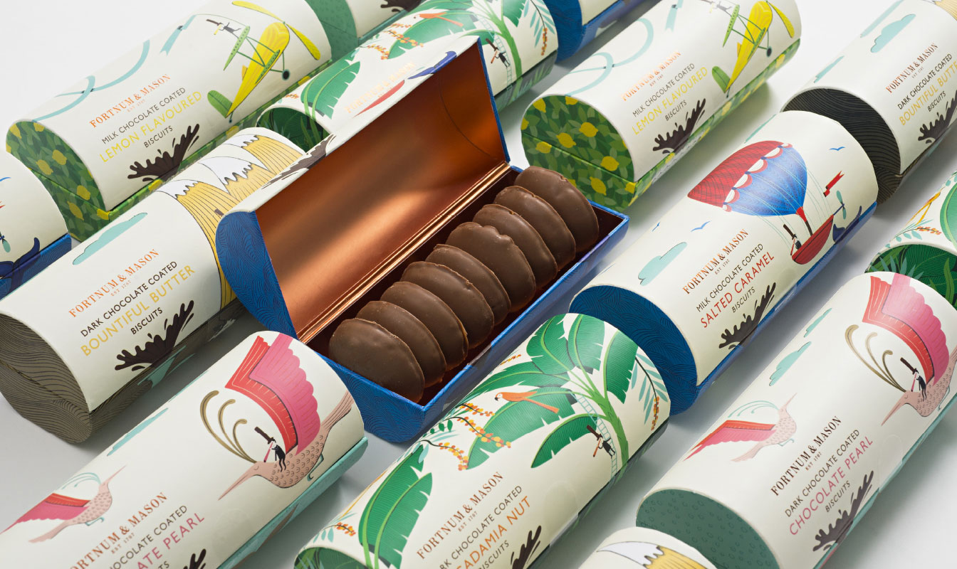
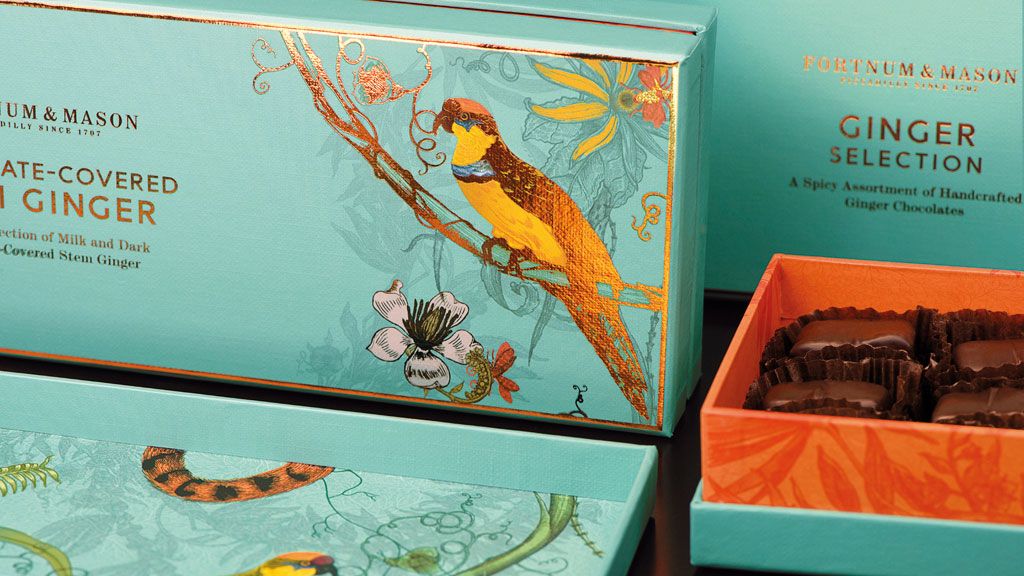
fortnum & mason biscuit packaging

Together Design put together this packaging and illustration for Fortnum & Mason

That sense of illustration as a succinct and easily manipulated conduit for a brand’s message extends into what it says about the brand itself – again, what’s “inherent in a drawing is artistry and craft in a way that’s harder to communicate in other ways,” says Lightfoot. 

“Type can feel quite cold, and photography can occasionally feel quite glossy, but with an illustration you usually see the hand of the artist. That artistry in craft communicates care, warmth and a bespoke quality, which is lovely for brands who want to communicate those attributes. Then if you’re using one style across different materials, it becomes part of the brand’s handwriting.”

Choosing the right collaborators

A few years back, the typical way for an agency to find the right illustrator for a project would have been through submitted physical portfolios or using agencies and organisations such as the AOI. Nowadays, it’s more a mix of good old-fashioned ‘who you know’ and trawling through online portfolios and social media, most notably Instagram, and for Together Design, sometimes Pinterest too. 

For Burns, finding the best illustrator for the project is “more gut instinct than anything else,” and he warns against the temptation to simply hire the person who’s available at the right time, at the right price – especially when up against tighter deadlines and smaller product budgets.

For Amos, the process of hiring an illustrator to work on a brand is similarly instinctual. “There’s no hard and fast rule or set process [for commissioning], but as a designer, I think in pictures, so I’ve already got something in my head and I’m looking to translate that into a picture. Sometimes you see a person’s work and think ‘their style would be great’, and that informs the answer; but sometimes you have the answer and you’re looking for the style.” 

The artist will always bring their own take on something and that brings a whole new angle

Heidi Lightfoot, Together Design

Of course, as Burns hints, you can’t always get what you want when it comes to your dream commission. You have to take into account budget, availability, and the opinions of any other stakeholders who might have a say in the final look and feel.

But what makes a person great to work with, should they fit all of those more pragmatic criteria? For Amos, the best sort of relationship is “a little bit of a ping-pong match,” and Lightfoot agrees that it’s vital to find someone willing to collaborate, and work through potentially numerous iterations with the designers.

“No matter how perfect the brief is, when you see the first rough there will always be ways to improve, or perhaps the emphasis on different elements has changed,” she says. “It’s nice to be able to have a conversation about that rather than one stage and one stage only, though that’s very rare as illustrators are usually very open to ideas from both sides. The artist will always bring their own take on something and that brings a whole new angle. It’s all about collaboration, not just telling people what to do.” 

The key to that sort of working relationship is both clarity and flexibility: setting out a clear brief, but being willing and open to listen to new ideas and seeing an illustrator not as a gun for hire, but a crucial cog in the bigger creative machine.

When to illustrate

Of course, as with any other design communication tool – be it copy, typography, photography, pattern or colour – designers working with global brands have to do some careful research into any unexpected signifiers that might say something they don’t want to say in other countries.

When Design Bridge worked with Timorous Beasties on a set of highly illustrative packaging for Fortnum & Mason, for instance, the team soon discovered that moths are seen as unlucky for certain cultures; and had to take care with the shape and colouration of the butterflies that appeared in the work. 

Design Bridge worked with Timorous Beasties on this packaging

As we’ve seen, illustration and craft beer are superbly comfortable bedfellows, and many food brands, too, use illustrative imagery to convey their message and create on-pack details. So are there any sectors where illustration wouldn’t work?

According to Lightfoot, not really. “There might be sectors or client types you wouldn’t think could use it, but illustration can disrupt in an exciting manner,” she says. “Even with a product where photography might be king – maybe with something like a tech brand – there’s always a way that illustration can play a part in the marketing, and I’m excited about brands that use it as part of their core messaging.” 

Templeman agrees: “An illustration route goes straight to the point in conveying a brand’s message. It has so much stretch and there’s such a huge spectrum of different styles – from more linear, stripped-back work to infographics to beautiful artworks – that I can’t think of a brand that illustration would never be right for.” 

This article was originally published in Computer Arts, the world's best-selling design magazine. Buy issue 279 or subscribe here.

Read more:

19 best painting and drawing apps for iPad8 up-and-coming designers to watch from D&AD New Blood7 biggest illustration trends of 2018

Popular Design News of the Week: July 23, 2018 – July 29, 2018

Original Source: https://www.webdesignerdepot.com/2018/07/popular-design-news-of-the-week-july-23-2018-july-29-2018/

Every week users submit a lot of interesting stuff on our sister site Webdesigner News, highlighting great content from around the web that can be of interest to web designers. 
The best way to keep track of all the great stories and news being posted is simply to check out the Webdesigner News site, however, in case you missed some here’s a quick and useful compilation of the most popular designer news that we curated from the past week.

Note that this is only a very small selection of the links that were posted, so don’t miss out and subscribe to our newsletter and follow the site daily for all the news.

The Future of Mobile Web? It’s all About Progressive Web Apps


Finally… Capture your Screen Without all that Mess on your Desktop ✨


Google Video Shows All-white Redesigns for Gmail, Google Photos, and More


Forget About your Logo. Nobody Cares.


Fresh Fonts Freshen up your Font News


Your Coworker with the Annoying Sit-stand Desk May Be Onto Something


20 White Texture Background Graphics


What if People were Paid for their Data?


We’re Underestimating the Mind-warping Potential of Fake Video


5 Ways to Take Better Control of your WordPress Website


Keyframes: A Community for Animators


Designers Talk: What We Didn’t Expect


Hacking User Perception to Make your Websites and Apps Feel Faster


Site Design: Emergence


Queer UX Experience


How to Give Project Estimates—and When not to Estimate at all


Timeqube – Beautiful Timer that Helps Waste Less Time in Meetings


8 Logo Design Cliches You Should Avoid


One Year After Massive Takedowns, Dark Web Marketplaces are Thriving


User Research: Is More the Merrier?


Netflix is Launching a New TV Interface Starting Today


How We Improved Our Landing Page Conversion Rate by 500%


Why Logo Placement is Essential to your Company Website


7 Design Lessons from Silicon Valley’s Most Important Failure


Adobe Shares Pantone’s Summer Trending Colours


Want more? No problem! Keep track of top design news from around the web with Webdesigner News.

Add Realistic Chalk and Sketch Lettering Effects with Sketch’it – only $5!

Source

p img {display:inline-block; margin-right:10px;}
.alignleft {float:left;}
p.showcase {clear:both;}
body#browserfriendly p, body#podcast p, div#emailbody p{margin:0;}

Logging Activity With The Web Beacon API

Original Source: https://www.smashingmagazine.com/2018/07/logging-activity-web-beacon-api/

Logging Activity With The Web Beacon API

Logging Activity With The Web Beacon API

Drew McLellan

2018-07-27T13:40:14+02:00
2018-07-27T14:14:35+00:00

The Beacon API is a JavaScript-based Web API for sending small amounts of data from the browser to the web server without waiting for a response. In this article, we’ll look at what that can be useful for, what makes it different from familiar techniques like XMLHTTPRequest (‘Ajax’), and how you can get started using it.

If you know why you want to use Beacon already, feel free to jump directly to the Getting Started section.

What Is The Beacon API For?

The Beacon API is used for sending small amounts of data to a server without waiting for a response. That last part is critical and is the key to why Beacon is so useful — our code never even gets to see a response, even if the server sends one. Beacons are specifically for sending data and then forgetting about it. We don’t expect a response and we don’t get a response.

Think of it like a postcard sent home when on vacation. You put a small amount of data on it (a bit of “Wish you were here” and “The weather’s been lovely”), put it in the mailbox, and you don’t expect a response. No one sends a return postcard saying “Yes, I do wish I was there actually, thank you very much!”

For modern websites and applications, there’s a number of use cases that fall very neatly into this pattern of send-and-forget.

Getting the process just right ain’t an easy task. That’s why we’ve set up ‘this-is-how-I-work’-sessions — with smart cookies sharing what works really well for them. A part of the Smashing Membership, of course.

Explore features →

Smashing TV, with live sessions for professional designers and developers.

Tracking Stats And Analytics Data

The first use case that comes to mind for most people is analytics. Big solutions like Google Analytics might give a good overview of things like page visits, but what if we wanted something more customized? We could write some JavaScript to track what’s happening in a page (maybe how a user interacts with a component, how far they’ve scrolled to, or which articles have been displayed before they follow a CTA) but we then need to send that data to the server when the user leaves the page. Beacon is perfect for this, as we’re just logging the data and don’t need a response.

There’s no reason we couldn’t also cover the sort of mundane tasks often handled by Google Analytics, reporting on the user themselves and the capability of their device and browser. If the user has a logged in session, you could even tie those stats back to a known individual. Whatever data you gather, you can send it back to the server with Beacon.

Debugging And Logging

Another useful application for this behavior is logging information from your JavaScript code. Imagine you have a complex interactive component on your page that works perfectly for all your tests, but occasionally fails in production. You know it’s failing, but you can’t see the error in order to begin debugging it. If you can detect a failure in the code itself, you could then gather up diagnostics and use Beacon to send it all back for logging.

In fact, any logging task can usefully be performed using Beacon, be that creating save-points in a game, collecting information on feature use, or recording results from a multivariate test. If it’s something that happens in the browser that you want the server to know about, then Beacon is likely a contender.

Can’t We Already Do This?

I know what you’re thinking. None of this is new, is it? We’ve been able to communicate from the browser to the server using XMLHTTPRequest for more than a decade. More recently we also have the Fetch API which does much the same thing with a more modern promise-based interface. Given that, why do we need the Beacon API at all?

The key here is that because we don’t get a response, the browser can queue up the request and send it without blocking execution of any other code. As far as the browser is concerned, it doesn’t matter if our code is still running or not, or where the script execution has got to, as there’s nothing to return it can just background the sending of the HTTP request until it’s convenient to send it.

That might mean waiting until CPU load is lower, or until the network is free, or even just sending it right away if it can. The important thing is that the browser queues the beacon and returns control immediately. It does not hold things up while the beacon sends.

To understand why this is a big deal, we need to look at how and when these sorts of requests are issued from our code. Take our example of an analytics logging script. Our code may be timing how long the users spend on a page, so it becomes critical that the data is sent back to the server at the last possible moment. When the user goes to leave a page, we want to stop timing and send the data back home.

Typically, you’d use either the unload or beforeunload event to execute the logging. These are fired when the user does something like following a link on the page to navigate away. The trouble here is that code running on one of the unload events can block execution and delay the unloading of the page. If unloading of the page is delayed, then the loading next page is also delayed, and so the experience feels really sluggish.

Keep in mind how slow HTTP requests can be. If you’re thinking about performance, typically one of the main factors you try to cut down on is extra HTTP requests because going out to the network and getting a response can be super slow. The very last thing you want to do is put that slowness between the activation of a link and the start of the request for the next page.

Beacon gets around this by queuing the request without blocking, returning control immediately back to your script. The browser then takes care of sending that request in the background without blocking. This makes everything much faster, which makes users happier and lets us all keep our jobs.

Getting Started

So we understand what Beacon is, and why we might use it, so let’s get started with some code. The basics couldn’t be simpler:

let result = navigator.sendBeacon(url, data);

The result is boolean, true if the browser accepted and queued the request, and false if there was a problem in doing so.

Using navigator.sendBeacon()

navigator.sendBeacon takes two parameters. The first is the URL to make the request to. The request is performed as an HTTP POST, sending any data provided in the second parameter.

The data parameter can be in one of several formats, all if which are taken directly from the Fetch API. This can be a Blob, a BufferSource, FormData or URLSearchParams — basically any of the body types used when making a request with Fetch.

I like using FormData for basic key-value data as it’s uncomplicated and easy to read back.

// URL to send the data to
let url = ‘/api/my-endpoint’;

// Create a new FormData and add a key/value pair
let data = new FormData();
data.append(‘hello’, ‘world’);

let result = navigator.sendBeacon(url, data);

if (result) {
console.log(‘Successfully queued!’);
} else {
console.log(‘Failure.’);
}

Browser Support

Support in browsers for Beacon is very good, with the only notable exceptions being Internet Explorer (works in Edge) and Opera Mini. For most uses, that should be fine, but it’s worth testing for support before trying to use navigator.sendBeacon.

That’s easy to do:

if (navigator.sendBeacon) {
// Beacon code
} else {
// No Beacon. Maybe fall back to XHR?
}

If Beacon isn’t available and your request is important, you could fall back to a blocking method such as XHR. Depending on your audience and purpose, you might equally choose to not bother.

An Example: Logging Time On A Page

To see this in practice, let’s create a basic system to time how long a user stays on a page. When the page loads we’ll note the time, and when the user leaves the page we’ll send the start time and current time to the server.

As we only care about time spent (not the actual time of day) we can use performance.now() to get a basic timestamp as the page loads:

let startTime = performance.now();

If we wrap up our logging into a function, we can call it when the page unloads.

let logVisit = function() {
// Test that we have support
if (!navigator.sendBeacon) return true;

// URL to send the data to, e.g.
let url = ‘/api/log-visit’;

// Data to send
let data = new FormData();
data.append(‘start’, startTime);
data.append(‘end’, performance.now());
data.append(‘url’, document.URL);

// Let’s go!
navigator.sendBeacon(url, data);
};

Finally, we need to call this function when the user leaves the page. My first instinct was to use the unload event, but Safari on a Mac seems to block the request with a security warning, so beforeunload works just fine for us here.

window.addEventListener(‘beforeunload’, logVisit);

When the page unloads (or, just before it does) our logVisit() function will be called and provided the browser supports the Beacon API our beacon will be sent.

(Note that if there is no Beacon support, we return true and pretend it all worked great. Returning false would cancel the event and stop the page unloading. That would be unfortunate.)

Considerations When Tracking

As so many of the potential uses for Beacon revolve around tracking of activity, I think it would be remiss not to mention the social and legal responsibilities we have as developers when logging and tracking activity that could be tied back to users.

GDPR

We may think of the recent European GDPR laws as they related to email, but of course, the legislation relates to storing any type of personal data. If you know who your users are and can identify their sessions, then you should check what activity you are logging and how it relates to your stated policies.

Often we don’t need to track as much data as our instincts as developers tell us we should. It can be better to deliberately not store information that would identify a user, and then you reduce your likelihood of getting things wrong.

DNT: Do Not Track

In addition to legal requirements, most browsers have a setting to enable the user to express a desire not to be tracked. Do Not Track sends an HTTP header with the request that looks like this:

DNT: 1

If you’re logging data that can track a specific user and the user sends a positive DNT header, then it would be best to follow the user’s wishes and anonymize that data or not track it at all.

In PHP, for example, you can very easily test for this header like so:

if (!empty($_SERVER[‘HTTP_DNT’])) {
// User does not wish to be tracked …
}

In Conclusion

The Beacon API is a really useful way to send data from a page back to the server, particularly in a logging context. Browser support is very broad, and it enables you to seamlessly log data without negatively impacting the user’s browsing experience and the performance of your site. The non-blocking nature of the requests means that the performance is much faster than alternatives such as XHR and Fetch.

If you’d like to read more about the Beacon API, the following sites are worth a look.

“W3C Beacon specification,” W3C Candidate Recommendation
“MDN Beacon documentation,” MDN web docs, Mozilla
“Browser support information,” caniuse.com

Smashing Editorial
(ra, il)

Exclusive Freebie: Communication  Icon Pack

Original Source: https://inspiredm.com/exclusive-freebie-communication-icon-pack/

The power of communication cannot be underestimated, especially not with the Freepik Communication Icon Pack. It has everything that you could think of in relation communication in the modern world. 

From smart slick cameras, tablets, and folders you have everything you can think of. Communication is all around us and is changing as the world evolves and modernizes. This icon pack is a constant reminder of that. There are three versions of each icon available and they are 100 percent editable which means you can customize them to suit your needs.

Each icon is free to download and even better you can find more styles on the Freepik and Flaticon websites. You can use the icons from anything to postcards to stationary. Free for personal and commercial use!

Download this awesome resources from here.

The post Exclusive Freebie: Communication  Icon Pack appeared first on Inspired Magazine.