What it's like to be a Batman artist: Tony S Daniel shares his story

Original Source: http://feedproxy.google.com/~r/CreativeBloq/~3/VJm6L3TFoV0/what-its-like-to-be-a-batman-artist-tony-s-daniel-shares-his-story

Just like the Joker, Tony S Daniel is wrestling with Batman. As we’re interviewing him, issue 45 of the latest series is in its death throes, and it simply won’t die.

Normally, Batman wouldn’t be such a problem for the artist, who’s returning to a character he’s pencilled numerous times during his career. The trouble is that his inker has dropped out mid-issue, so he’s on double duty, drawing and inking his boards on the fly, Fed Ex-ing them off to DC Comics while responding to our questions.

Art techniques: top tutorials for painting and drawing

Long hours aside, Batman is where Tony’s fans want him, and it’s where he wants to be. “It’s like that feeling you get when you go back to your favourite place,” he says. “It’s still what you remember, but you’re older and wiser and maybe you can even appreciate a few details you didn’t first time around. It’s a good feeling.”

Working with writer Tom King, this latest run is kicking off with a new time-travelling storyline featuring Booster Gold, Catwoman and, of course, the Caped Crusader. Tony has always been a fan of a bigger, darker and grittier Batman, a character whose moods are shaped by the murder of his parents in Gotham City. He’s an artist who feels he’s at his most effective when he’s loose and spontaneous.

Aquaman, Wonder Woman, Batman and the Flash striking a heroic pose

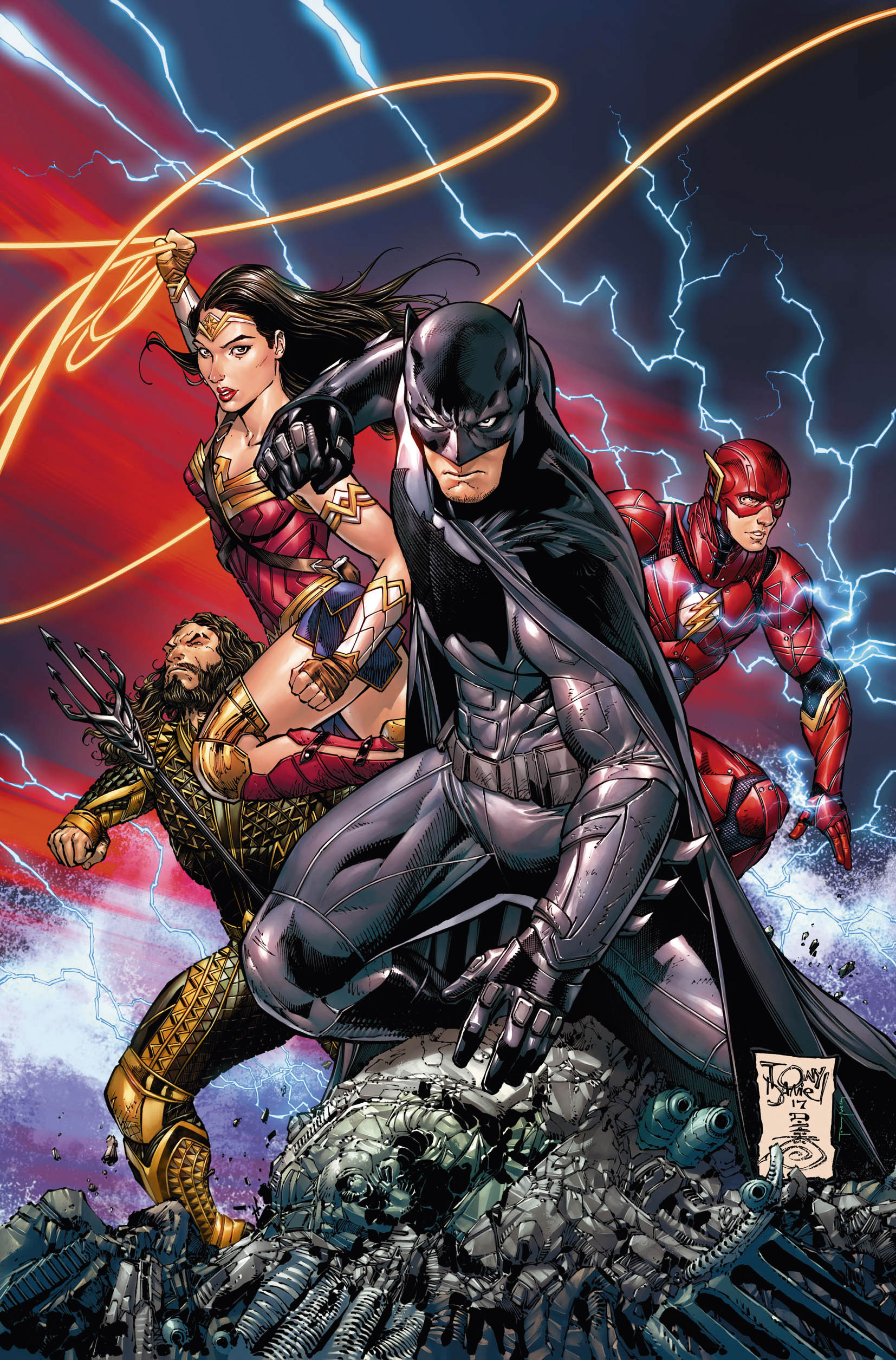
This cover variant accompanied the 2017 issue of Justice League that DC published to coincide with the Warner Bros. fi lm based on the series

There’s a sense that Tony wants to get back on track with Batman. His last significant encounter with the character was during the New 52 reboot DC carried out in 2011. Tony relaunched Detective Comics at that time, which features Batman as its lead. The run ended prematurely with Tony feeling a little burned out.

“I was overworked at that time, writing Hawkman, and writing and drawing Detective Comics. It caught up with me real fast and the quality wasn’t what I demanded of myself,” he says.

I’ve learned you have to say ‘no’ to things sometimes. It could be in your own best interest

Tony S Daniel

He continues: “I could’ve stayed on for a couple more years, but I knew it would best to take a break and regroup. I’ve learned you have to say ‘no’ to things sometimes. It could be in your own best interest.”

Batman at his best

For Tony, the best Batman he’s ever drawn was during the R.I.P. story arc with writer Grant Morrison. The partnership between Tony on pencils and Grant weaving a mad storyline began on Batman issue 670, in 2007, with The Resurrection of Ra’s al Ghul. 

That first cover remains one of Tony’s favourites, and fans remember this period as one of the greatest in the character’s history. With the spontaneity of Grant’s plotting matched in Tony’s pencils, many put the artist up there right alongside the likes of Frank Miller and Neal Adams in the Batman pantheon.

Batman looking down on the Joker surrounded by doll heads

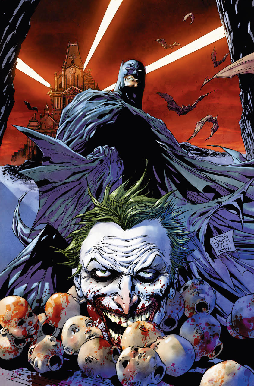
Tony’s unsettling cover for Detective Comics, volume 1 – part of DC’s ambitious New 52 relaunch of its titles back in 2011

“That was a magical time for me. I was so into it,” says Tony. “I couldn’t wait to read each script from Grant, because like every other fan, I wanted to know what the hell was going on! It really was a classic story and I’m so proud to have been a part of it.” 

If it was this version of Batman that brought Tony into the mainstream, it was an earlier book called The Tenth that put him on the map within the comics world. First published in 1997 by Image Comics, Tony owned the IP and The Tenth was a platform for him to both write and draw at the same time.

Dynamic and different, it featured young people with supernatural powers, up against Rhazes Darkk and his evil supermonsters. Originally, the plan was for Tony to block out the story and for Beau Smith to write and letter it.

Catwoman feasts on pop corn as she watches Batman fight the Joker

A new era of Batman begins with the current series issue 45, as Tony returns on pencils.

“After the first arc, I realised that I was doing more and more of the writing and dialogue, and thought I’d give it a try. It felt very natural for me,” he says.

“I love being the writer and artist. I do have a greater sense of being the storyteller, as opposed to being the artist only. I will get back to creator-owned at some point. Maybe next year, I hope. Though there’s risks with going down the creator-owned route, I’ve never shied away from risks.”

Writing on the side

After writing and drawing other comics at Image and Dark Horse, Tony was so inspired by the writing side that he took time out of comics to become a screenwriter.

Back in the world of comics, although he’s written and drawn hits like the Batman story Battle for the Cowl, and relaunched Deathstroke as artist-writer, today he prefers to draw alongside a good writer, and keep his screenwriting going on the side. He’s finishing a script with James Bonny, so watch this space.

Deathstroke and Harley Quinn amongst the ruins of Gotham

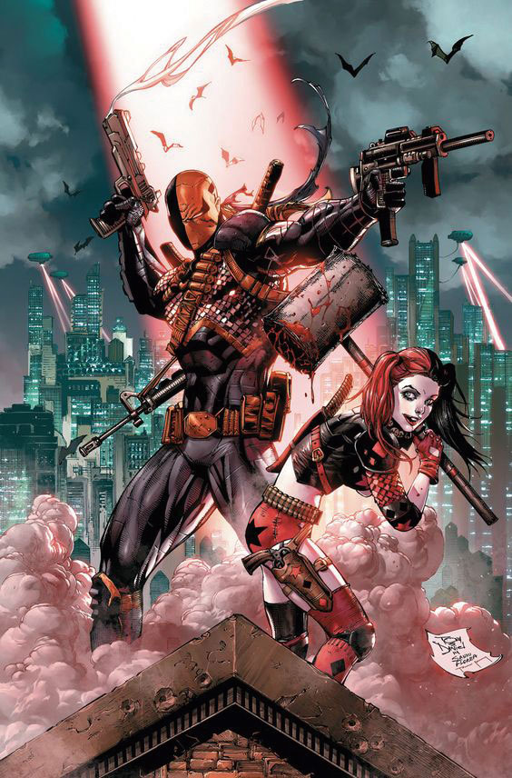
The cover to Tony’s fourth issue of Deathstroke, featuring Harley Quinn helping to bring Gotham to its knees

At the moment, Tony has his hands full with his current comics. On top of Batman, he’s drawing Damage. Although DC already had a character called Damage, to all intents and purposes the current series is a new launch. It’s got that tell-tale strength and directness you expect from a Tony S Daniel comic, with a fresh feel and – literally – a smashing main character.

“My style has constantly mutated over the years,” says Tony. “I don’t think I’ve ever forced a style change – it’s always happened slowly, organically. I think I have a mix of realism and cartoonishness that I try to balance. I find that if I go too realistic, the work ends up looking flat.”

This article originally appeared in ImagineFX issue 160; subscribe here. 

Related articles:

How to create a comic page5 ways to improve your digital art skillsHow to colour comics

Collective #438

Original Source: http://feedproxy.google.com/~r/tympanus/~3/zfuMSJF18o8/

C438_WOTW

Inspirational Website of the Week: Volt By Drive

A great game-like design with some nice animations. Our pick this week.

Get inspired

C438_NW

Our Sponsor
Earn your master’s in Information Design and Strategy

Learn to blend digital skills like information architecture & experience design in Northwestern’s online master’s program for designers.

Apply now

C438_city

Little Big City

A fantastic project by Yi Shen: generating a real city on a little planet with the help of ClayGL.

Check it out

C438_game

Pyxel

Pyxel is a retro game development environment in Python.

Check it out

C438_fusionjs

Introducing Fusion.js: A Plugin-based Universal Web Framework

Leo Horie from Uber Engineering introduces Fusion.js, an open source web framework for building lightweight, high-performing apps.

Read it

C438_costjs

The Cost Of JavaScript In 2018

Addy Osmani covers some strategies you can use to deliver JavaScript efficiently while still giving users a valuable experience.

Read it

C438_doodles

theDoodleLibrary

A fantastic collection of free, reusable drawings and doodles in a vector (SVG) format.

Check it out

C438_css

CSS exclusions with Queen Bey

Chen Hui Jing writes about CSS Exclusions and new CSS features in general,? and why we should keep them out regardless of current browsers’ support.

Read it

C438_task

Taskbook

Taskbook enables you to effectively manage your tasks and notes across multiple boards from within your terminal.

Check it out

C438_clipboard

The Clipboard API Crashcourse

A practical guide to the Clipboard API by David East.

Check it out

C438_bullshitweb

The Bullshit Web

A very interesting article by Nick Heer on the course the web took concerning unnecessary page load for questionable purposes.

Read it

C438_network

Dynamic resources using the Network Information API and service workers

Learn about the new Network Information API that allows developers to determine the connection types and the underlying connection technology that the user agent is using. By Dean Hume.

Read it

C438_zen

CodeZen

With this tool you can generate shareable and elegant images from your source code.

Check it out

C438_betweenjs

Between.js

A lightweight JavaScript (ES6) tweening library by Alexander Buzin.

Check it out

C438_apps

UI Sources

Get real product insights from the best designed and top grossing apps on the App Store with this email newsletter.

Check it out

C438_native

Performance Techniques in 2017

A slide deck with lots of info on getting native performance with new Web APIs.

Check it out

C438_vunits

The trick to viewport units on mobile

Louis Hoebregts shows an interesting trick to get viewport units behave on mobile.

Read it

C438_reportingobs

ReportingObserver: know your code health

Eric Bidelman writes about the ReportingObserver, a new API that lets you know when your site uses a deprecated API or runs into a browser intervention.

Read it

C438_motion

Improve your motion

An article by Erick Leopoldo with practical tips on how to make animations better.

Read it

C438_font

Free Font: Bivona

A playful, energetic font by Dathan Boardman from Rocket Type.

Get it

C438_loader

Space Loader

A great space themed loader by Chris Gannon.

Check it out

Collective #438 was written by Pedro Botelho and published on Codrops.

Be Legendary. Nike Branding Concept for Tokyo 2020

Original Source: http://feedproxy.google.com/~r/abduzeedo/~3/4wQsSWfJdIg/be-legendary-nike-branding-concept-tokyo-2020

Be Legendary. Nike Branding Concept for Tokyo 2020

Be Legendary. Nike Branding Concept for Tokyo 2020

AoiroStudio
Aug 02, 2018

Daniele Caruso is a freelance illustrator based in Swindon, United Kingdom. He is working mainly in illustration, graphic design and branding. We are taking a look at his branding concept for Nike: Be Legendary, for the upcoming and anticipated Tokyo 2020. With the tagline “legendary”, Daniele included mythological creatures to create an artistic atmosphere alongside with the colour palette that totally reminds me of Dotonbori (the bright heart) from Osaka, Japan. What do you think? Would you like this kind of visual approach if it was from Nike.

More Links
danielecaruso.com
Behance
Be Legendary. Nike Branding Concept for Tokyo 2020Be Legendary. Nike Branding Concept for Tokyo 2020Be Legendary. Nike Branding Concept for Tokyo 2020Be Legendary. Nike Branding Concept for Tokyo 2020

nike
branding
concept
illustration
tokyo


The best colour tools for web designers

Original Source: http://feedproxy.google.com/~r/CreativeBloq/~3/XoqHAngN_VI/the-best-colour-tools-for-web-designers

As web designers, one of the most important choices we make has to do with our colour selections. Choose the wrong ones, and you might just lose out on an opportunity. It's true – the colours we choose can have a psychological impact on those who view them.

For example, red is generally viewed as a high-energy colour, while blue implies calmness and peace. To illustrate this point, consider the colours you might use on a website selling children's toys versus a site for a law firm. Chances are, you'll go with bright, vibrant colours for the former, and muted tones of blue and grey for the latter.

But how do you know which colours work well together? Luckily, you don't have to be a master at colour theory to put together a workable colour palette. To help you with the important task of colour selection, here are some of the best free colour web design tools (plus one special bonus at the end for Mac users).

01. HueSnap

hue snap colour tool

Snap inspiration on the go and turn it into colour palettes

Inspiration can strike at any time. It might be the decor of a hotel room or the light in the park one evening that sparks the inspiration for your next website colour scheme. For when that happens, HueSnap is here to help. You can snap a photo and use HueSnap to extract the colours from the image and make them into a palette. 

The app is tailored for mobile use, and you can save and share your palettes with others. There are plenty of features to help you modify a palette, such as options to choose complementary and compound colours, and your palettes can have up to six colours each.

02. Khroma

khroma colour tools

Khroma uses AI to suggest colours you’ll like

Khroma is an AI colour tool that aims to help you easily browse and compare original colour combinations. With it, users train an AI algorithm to act like an extension of their brain. Users start by picking 50 colours they like, and these colours are used to train a neural network that can recognise hundreds of thousands of other similar colours. Find out more about Khroma and how to use it here.

03. Coolors.co

Laptop, desktop and mobile screens displaying colour palettes

The Explore section includes hundreds – if not thousands – of palette options

Coolors offers a wide variety of tools for adjusting the palette just the way you want it. In addition, you can export your final creation in many different formats so you can use it virtually wherever you want. 

Coolors isn’t just a tool to create a colour palette, it also allows you to view other completed creations from other users so that you can draw inspiration. The Explore section has hundreds (if not thousands) of palettes you can view, save, and edit yourself. Even better, Coolors is available on desktop computers, and as an iOS application, an Adobe Photoshop and Illustrator add-on – and even a Google Chrome Extension for easy access.

04. Adobe Color CC

Colour wheel selection screen with adjustment tools

This has been around a while, but is still incredibly useful

Free tool Adobe Color CC has been around for a while, and it's one of the best colour tools out there for picking a colour palette. Not only can you create your own colour schemes, but you can also explore what others have created. 

Select a colour from the wheel or from an image and apply colour rules such as only using complementary colours, monochromatic colours or shades of the colour you select, to generate a colour palette. Or, click on each colour and explore the colour wheel to customise the selection. As an added bonus, you can save the themes you create to your Adobe library.

05. Colordot

Bars of colours with reference numbers

Use simple mouse gestures to build up your colour palette

Colordot by Hailpixel is an excellent free online tool for creating a colour palette. Using simple mouse gestures, you can select and save colours. Move your mouse back and forth for hue; up and down for lightness; scroll for saturation and click to save a colour to your palette. Click the tog icon to see each colours RGB and HSL values. It also has a $0.99/£0.99 iOS app that allows you to capture colours with your camera.

06. Eggradients

eggradients screen shot

Gradient inspiration and thought-provoking names

Eggradients offers ideas for beautiful gradients to use within your design work, put together by someone with both a great eye for colour and an interesting sense of humour. Each gradient, displayed in an egg shape, comes with its own thought-provoking name. Examples include 'Wozniak’s Broken Heart' for a pale blue and 'Merciful Enemy' for a yellow to green transition. 

07. 147 Colors

Grid of multicoloured swatches

This free tool includes the standard CSS colours

When you're responsible for generating easy-to-read CSS, sometimes using standard colours and colour names is the way to go. Thanks to 147 Colors by Brian Maier Jr, you can get a glimpse of all of them, and pick the ones that work for you. 

It contains the 17 standard colours, plus 130 other CSS colour names. Filter the results by shades of blue, green and so on, or choose from the full rainbow of 147 colours.

08. Canva Color Palette Generator

Canvas tool colour selection screen

Create a colour palette based on an image

The Color Palette Generator by Canva is perfect if you're looking to create a colour palette based around a particular image.  Although other tools offer similar options, Canva’s is super-simple to use: you upload an image and the generator will return a palette of the five main colours contained in it. You can click on the colours you like and copy the HEX value to your clipboard.

Unfortunately, this is where the usefulness of Canva’s offering ends, as this is all you can do with its palette generator – you cannot adjust the colours of the palette. The only other options you have are to copy the hex values provided or upload another photo.

09. Material Design Palette

Material Design Palette selection screen

Create a palette based on Google’s Material Design principles

With Material Design Palette you can select two colours, which are then converted into a full colour palette for you to download, complete with a preview. 

The company also offers Material Design Colors, which enables designers to see the different shades of a colour, along with their corresponding HEX values.

10. ColourCode

Bars of colours with HEX values

Save and export colour palettes as SCSS, LESS or PNG files

ColourCode by Tamino Martinius and Andreas Storm is similar to Colordot, but it offers a bit more guidance. This free tool hits you right in the face, showcasing a background that changes colours with your cursor movement. Besides that, this tool offers different categories for the palette (analogue, triad, quad, monochrome, monochrome light etc). 

With ColourCode, you can set different options along the colour wheel to create an original combination. You can also save your palette or export it as a SCSS or LESS file. You can even export to PNG, if you'd like.

11. Color Calculator

Colour Calculator instruction screen

Select a colour and a colour harmony, and this tool will generate a colour palette

The Color Calculator is straightforward: you select a colour and a colour harmony option. In return, you get back the results of your recommended colour scheme. 

What's nice about this site, however, is that it also goes into a little bit of detail about colour theory and how it relates to your colour choices.

12. HTML Color Code

HTML Color Code download screen

This suite of tools includes a list of standard colour names

This bulging free suite of tools by Dixon & Moe includes an in-depth colour picker with plenty of explanations of colour rules; a series of colour charts featuring flat design colours, Google's Material design scheme and the classic web safe colour palette; and a list of standard HTML colour names and codes. 

This site also offers tutorials and other resources for web designers, and options to export results from its tools as HEX codes, HTML, CSS and SCSS styles.

13. W3Schools: Colors Tutorial

Colors Tutorial naming examples screen

This free tutorial includes links to a number of handy colour tools

If you're looking for an all-in-one solution that includes a guide to colours, as well as a number of different tools, then the Colors Tutorial at W3Schools is the perfect choice.

Not only can you learn about colour theory, colour wheels, and colour hues, but you'll also be able to use the other tools it has, such as the Color Converter. With this tool, you're able to convert any colour to-and-from names, HEX codes, RGB, HSL, HWB and CMYK values.

14. Digital Color Meter (Mac)

Example of Digital Color Meter in action

Mac’s built-in tool lets you grab colours from your screen

OK, Mac users… this one's for you. With your machine's built-in Digital Color Meter tool, you can 'grab' a colour from anywhere on your screen, then get the values for that colour as a decimal, hexadecimal, or percentage. Plus, you can even 'copy' the selected colour as a text or image.

Read more:

If celebrities were Pantone colours3 huge colour trends for 2018How to pick the perfect colour palette every time

How to use Media Queries in JavaScript with matchMedia

Original Source: https://www.sitepoint.com/javascript-media-queries/

When it was first introduced, responsive design was one of the most exciting web layout concepts since CSS replaced tables. The underlying technology uses media queries to determine the viewing device type, width, height, orientation, resolution, aspect ratio, and color depth to serve different stylesheets.

If you thought responsive design was reserved for CSS layouts only, you’ll be pleased to hear media queries can also be used in JavaScript, as this article will explain.

Media Queries in CSS

In the following example, cssbasic.css is served to all devices. But, if it’s a screen with a horizontal width of 500 pixels or greater, csswide.css is also sent:

[code language=”html”]
<link rel="stylesheet" media="all" href="cssbasic.css" />
<link rel="stylesheet" media="(min-width: 500px)" href="csswide.css" />
[/code]

The possibilities are endless and the technique has long been exploited by most websites out there on the Internet. Resizing the width of your browser triggers changes in the layout of the webpage.

With media queries nowadays it’s easy to adapt the design or resize elements in CSS. But what if you need to change the content or functionality? For example, on smaller screens you might want to use a shorter headline, fewer JavaScript libraries, or modify the actions of a widget.

It’s possible to analyze the viewport size in JavaScript but it’s a little messy:

Most browsers support window.innerWidth and window.innerHeight. (IE before version 10 in quirks mode required document.body.clientWidth and document.body.clientHeight.)
window.onresize
All the main browsers support document.documentElement.clientWidth and document.documentElement.clientHeight but it’s inconsistent. Either the window or document dimensions will be returned depending on the browser and mode.

Even if you successfully detect viewport dimension changes, you must calculate factors such as orientation and aspect ratios yourself. There’s no guarantee it’ll match your browser’s assumptions when it applies media query rules in CSS.

The post How to use Media Queries in JavaScript with matchMedia appeared first on SitePoint.

User Experience Psychology And Performance: SmashingConf Videos

Original Source: https://www.smashingmagazine.com/2018/08/smashingconf-ux-videos/

User Experience Psychology And Performance: SmashingConf Videos

User Experience Psychology And Performance: SmashingConf Videos

The Smashing Editorial

2018-08-01T13:30:35+02:00
2018-08-01T15:01:09+00:00

Today, we’d like to shine a light on two videos from our archives as we explore two very different approaches to User Experience (UX). The first explores how we relate our websites to the needs and situations of our visitors, trying to meet them where they are emotionally. The second is a detailed technical exploration into how we measure and track the data around performance as it relates to user experience.

The second video may seem unrelated to the first video; however, while the collecting and analyzing of data might seem very impersonal, the improvements we can make based on the information makes a real difference to the experience of the people we build our sites to serve.

Designing Powerful User Experiences With Psychology

Recorded at the SmashingConf in San Francisco earlier this year, Joe Leech explains how psychology impacts user experience. Joe explains the frustrations people using our products face, and the things happening in their everyday lives and environment that can make interacting with our websites and applications difficult. He goes on to help us understand how we can design in a way to help these visitors rather than frustrate them.

How’s The UX On The Web, Really?

Once you have created a great user experience, how do you know that it is really working well? Especially in terms of site performance, we can track how people are using our sites and examine that data to see what is really happening.

At the SmashingConf in London, Ilya Grigorik was the Mystery Speaker and spoke about the ways to assess performance in real terms, and benchmark your application against other destinations on the web.

Enjoyed listening to these talks? There are many more SmashingConf videos on Vimeo. We’re also getting ready for the upcoming SmashingConf in New York — see you there? 😉

With so much happening on the web, what should we really pay attention to? At SmashingConf New York 2018 ?? we’ll explore everything from PWAs, font loading best practices, web performance and eCommerce UX optimization, to refactoring CSS, design workflows and convincing your clients. With Sarah Drasner, Dan Mall, Sara Soueidan, Jason Grigsby, and many other speakers. Oct 23–24.

Check the speakers →

SmashingConf New York 2018, with Dan Mall, Sara Soueidan, Sarah Drasner and many others.

Smashing Editorial
(ra, il)