The Trouble with Cheap eCommerce

Original Source: http://feedproxy.google.com/~r/1stwebdesigner/~3/S6YL4ZuvVoQ/

It used to be that building an eCommerce website was an arduous and expensive task. And while that is still the case in some specialized situations, those barriers have been largely removed when it comes to more mainstream usage.

Take WooCommerce, for example. It’s a free eCommerce plugin for WordPress; the most widely used content management system on Earth. Right out of the box, it enables anyone to sell their products and accept payments online. If you need more specialized functionality, it’s widely available in the form of free or reasonably-priced premium extensions.

This is certainly a great development for small businesses that don’t necessarily have a huge budget for building a website. But, what type of impact does it have on eCommerce overall? And what, if any, negative side effects have “cheap” eCommerce platforms had on web designers?

Square Holes and Round Pegs

It seems that, no matter how many online stores you build, no two will be exactly the same. Products, services and even business owners are all variables that need to be taken into consideration – and that’s even before you start the design and development process.

On the surface, it may look as though a tool like WooCommerce is perfect to handle all the different quirks that go along with customizing an eCommerce site. After all, you get to pick and choose which extensions you need. Plus, skilled developers can even create their own solutions.

Yet, it often feels like we’re trying to bend and shape extensions or the basic cart itself to fit into our own narrow use cases. The results are mixed, with some features essentially going against the grain of what the original software was intended to do.

Yes, we have options, but what if those options don’t really align with our needs? And this isn’t just limited to WooCommerce. Other, more proprietary eCommerce suites aren’t necessarily more flexible – some are even less so.

The problem here is that a one-size-fits-all approach means that site owners won’t necessarily get everything they want. That shouldn’t even be a problem, as low-cost solutions aren’t meant to attend to each and every need. But that brings us to the next point.

Square Holes and Round Pegs

The Expectation of Low (Or No) Cost

Because the barrier to entry is so low, many seem to think that eCommerce can and should be done on the cheap. The expectation is that, no matter the need, a top-quality shop can be built for very little cost.

Sometimes, that expectation actually comes to fruition. Depending on a client’s specific needs, it is possible to build something that looks great and performs the necessary functions on a tight budget. However, it doesn’t mean that every case is going to turn out that well.

The more realistic view is that each and every feature that goes into a website has an associated cost. This is especially true for eCommerce, where a seemingly “little” tweak can take up a lot of time and resources to implement.

But because there are so many free and low-cost tools out there, some clients simply expect that everything can be taken care of with minimal effort and at extremely little cost. Personally, I’ve seen cases where site owners refused to even purchase a fairly cheap but specific bit of functionality that was critical to making sure orders came through correctly.

It may be a risk they were willing to take, but the approach was very short-sighted.

The Expectation of Low (Or No) Cost

Above All, eCommerce is an Investment

As the professional designers and developers in the room, it’s up to us to communicate exactly what goes into making an eCommerce site work. That doesn’t need to include every single technical detail. But it should include an honest assessment of how complex the entire process is and that one-size-fits-all often means making some sacrifices.

Even more important is that clients should understand that an investment in their eCommerce site is an investment in their own success. It’s understandable that some far-flung features could be put on hold until there are more resources available. However, there are some types of functionality that are simply too vital to skimp on.

Once, I worked with a client who utilized a SaaS shopping cart provider that increased their monthly subscription fees. As any of us might, the client lamented the fact that costs were going up. But when you looked at the bigger picture, the price hike was miniscule when compared to the amount of money being made off of the website itself. It was a relatively small price to pay for success.

If that same client were to sell through more traditional brick-and-mortar channels, their overhead costs would have been significantly more. Yet, because they were used to paying very little for eCommerce capabilities, the expectations were completely different.

This is a point worth making to clients who scoff at paying a bit extra for a worthy investment. Relatively speaking, the potential rewards for doing things the right way can easily outweigh the initial cost.

eCommerce is an Investment

Keeping It Real

While free and low-cost eCommerce isn’t the right way to go for everyone, it can still be quite effective for many businesses. The key is in understanding what it can and can’t do, along with keeping realistic expectations.

The bottom line is that you’re not going to create a site that works exactly like Amazon on a shoestring budget. Clients often see what the “big” players are doing and naturally want to mimic their success. While we can certainly understand their hopes, we also need to communicate what can be done for what they’re able to spend.

Overall, it’s great to see that anyone can enter the eCommerce game. Our goal as designers should be to help clients learn about the positives, negatives and realities of selling online.

Brand Identity for New York City Architecture Firm Dash Marshall

Original Source: http://feedproxy.google.com/~r/abduzeedo/~3/Cll8SUM5pwk/brand-identity-new-york-city-architecture-firm-dash-marshall

Brand Identity for New York City Architecture Firm Dash Marshall

Brand Identity for New York City Architecture Firm Dash Marshall

abduzeedo
Jun 05, 2018

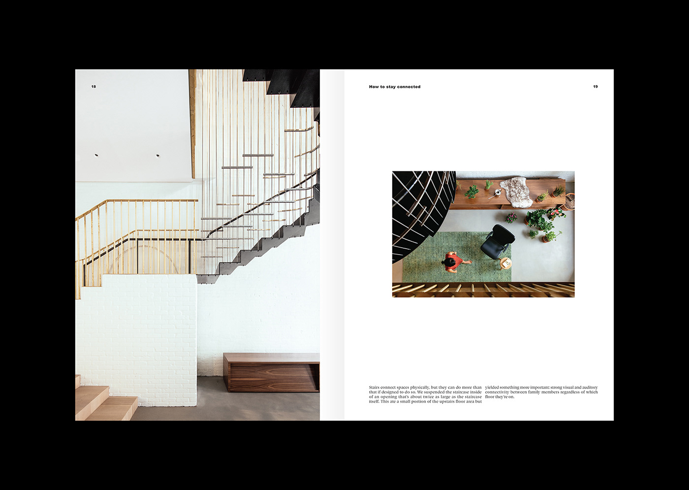
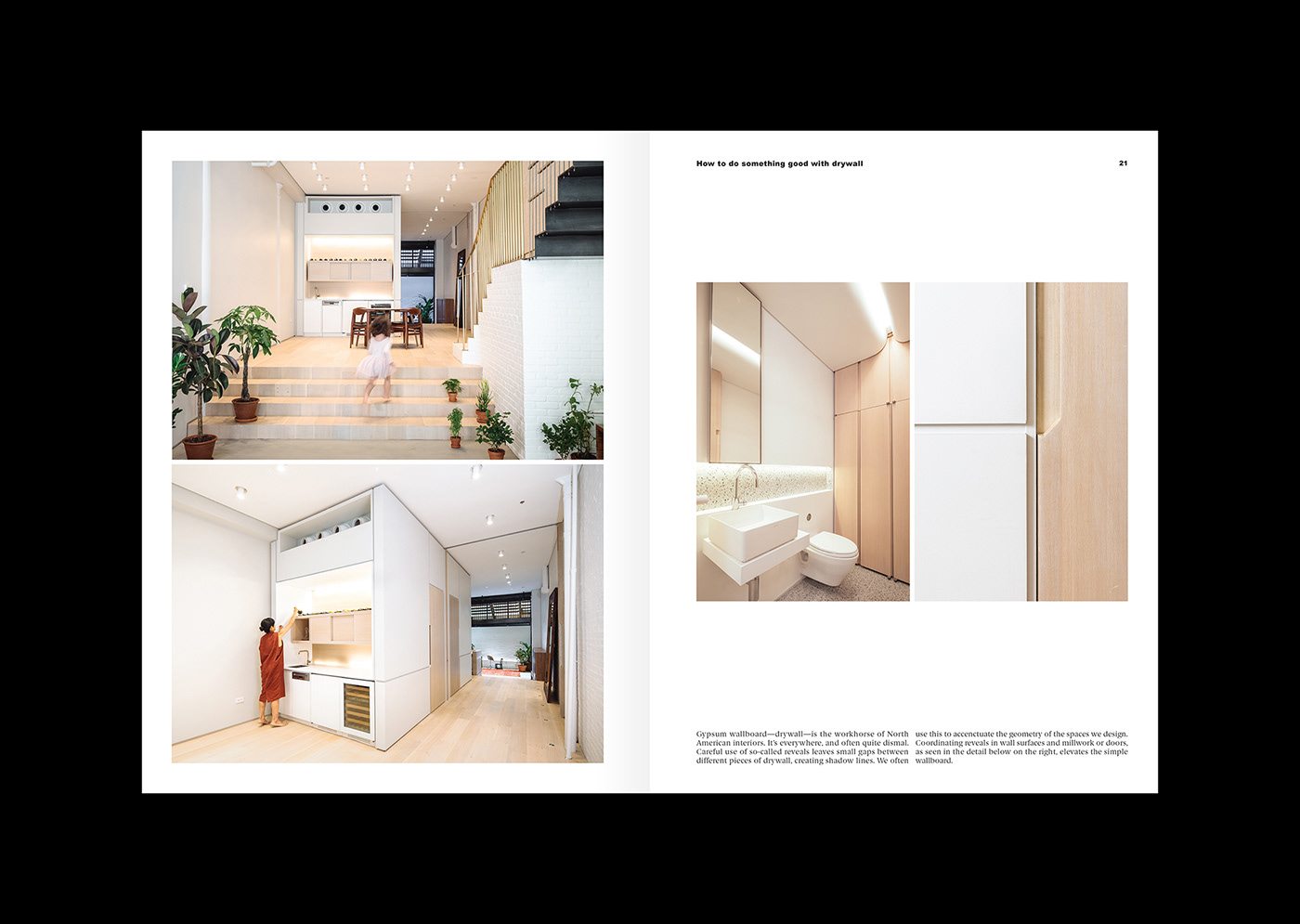
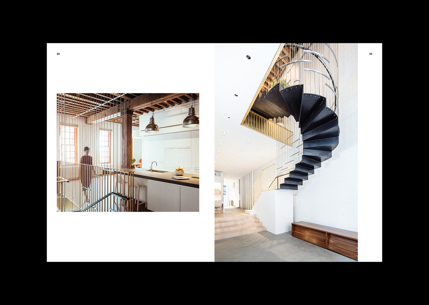
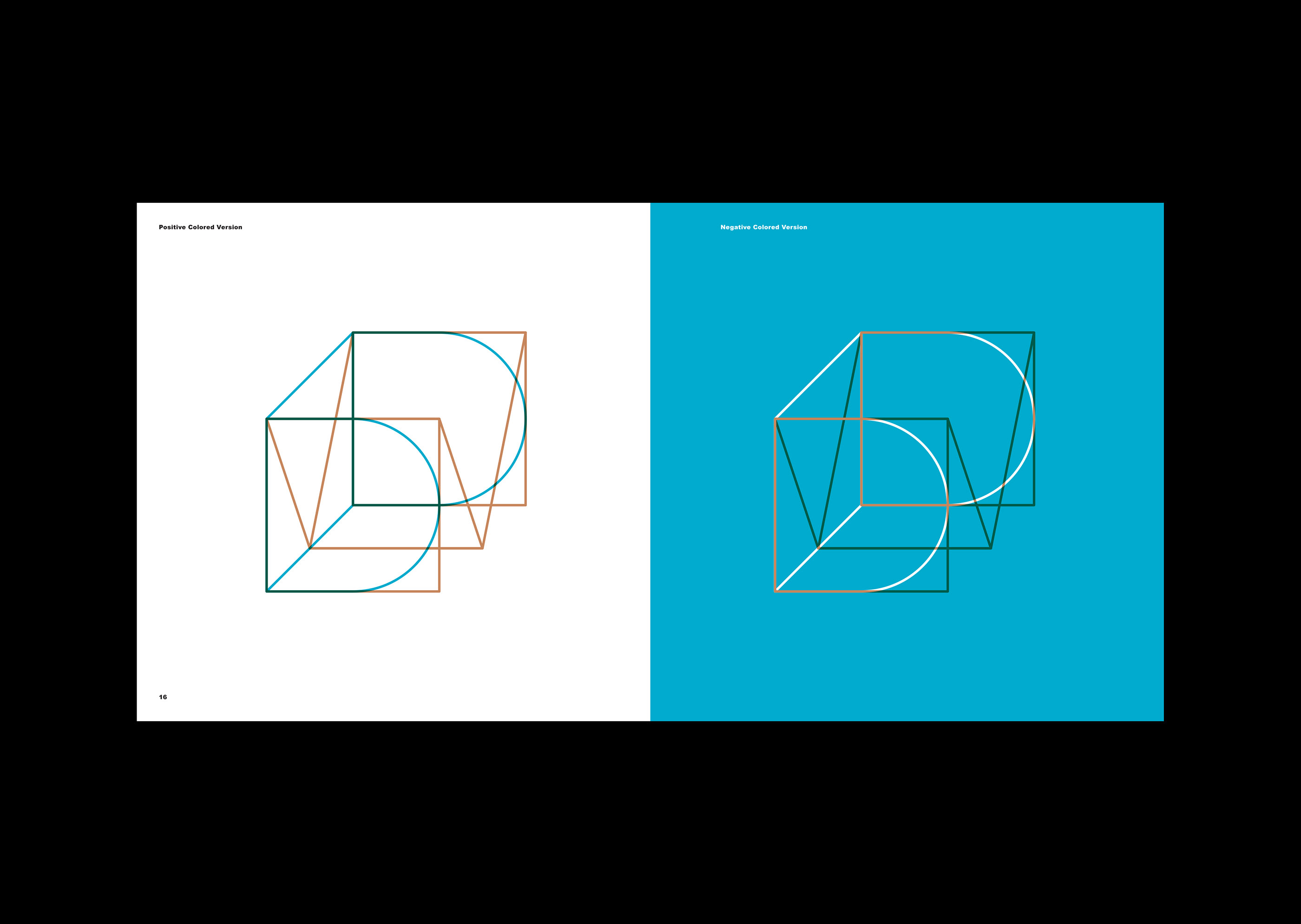
TwoPoints.Net shared a beautiful brand identity project for the New York City architecture firm Dash Marshall. When designing the corporate identity they realized that architecture acts in the intersection of the old and the new, the static and the flexible, the properties of matter and the lives of people. Within these constraints, Dash Marshall creates spaces which tell the stories of their habitants and invites them to create new ones.

“Just as Michel de Certeau argued that spatial stories are what actuate the notion of place, our physical environments can give rise to new characters and events by organizing, proffering and collectivizing human sensibilities. They may even allow certain transgressions to occur, as the Independent Group aspired to do. For this reason, an architecture that upholds its commitment to its users holds tremendous power: its narratives of the past and present are the framework from which to imagine the future scripts of tomorrow.” writes Esther Choi (estherchoi.net) in the preface of the book “Matter Battle, 45 Lessons Learned” by Dash Marshal

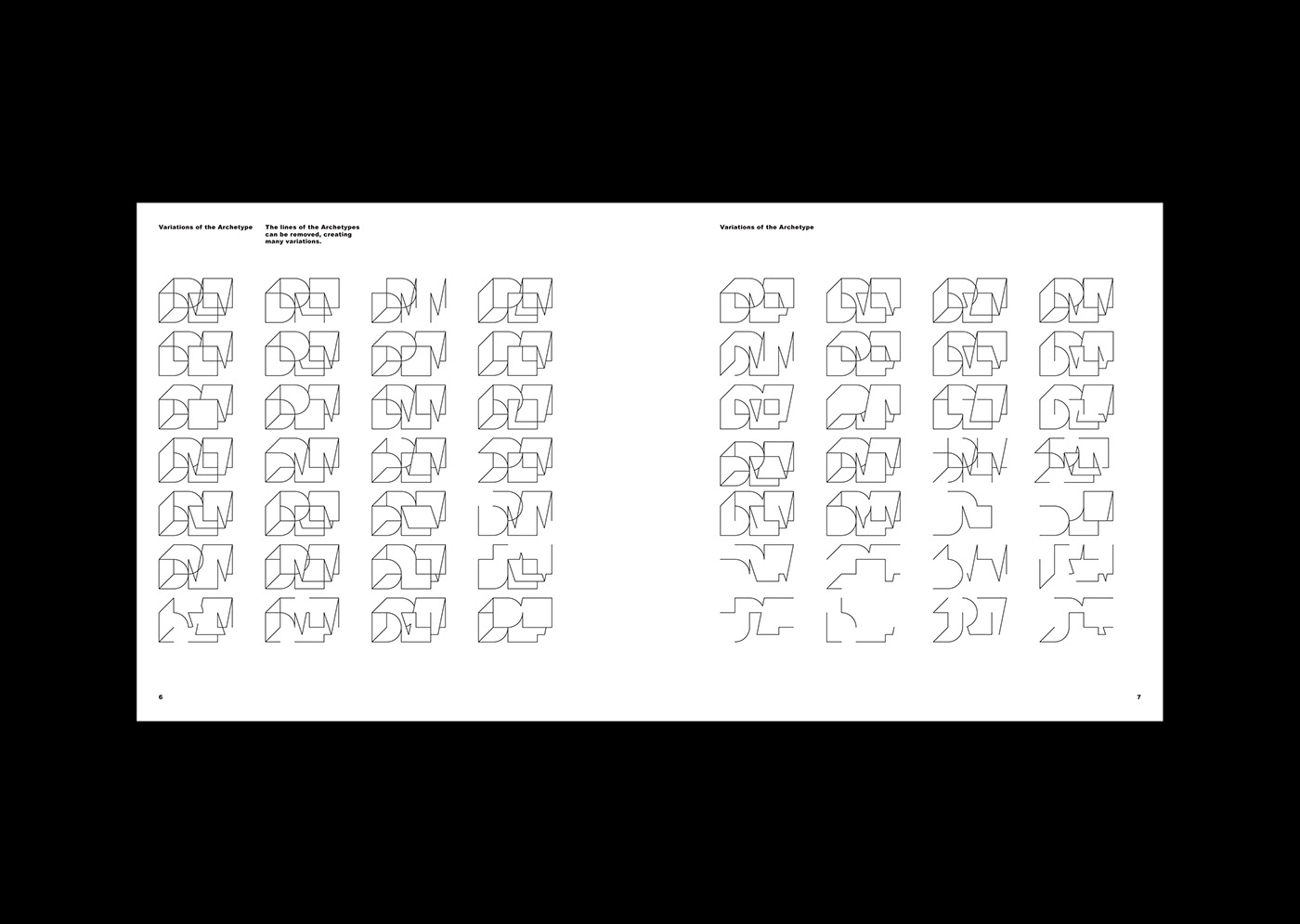
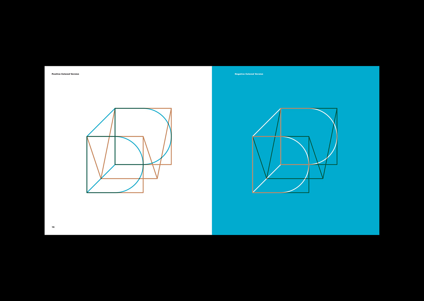
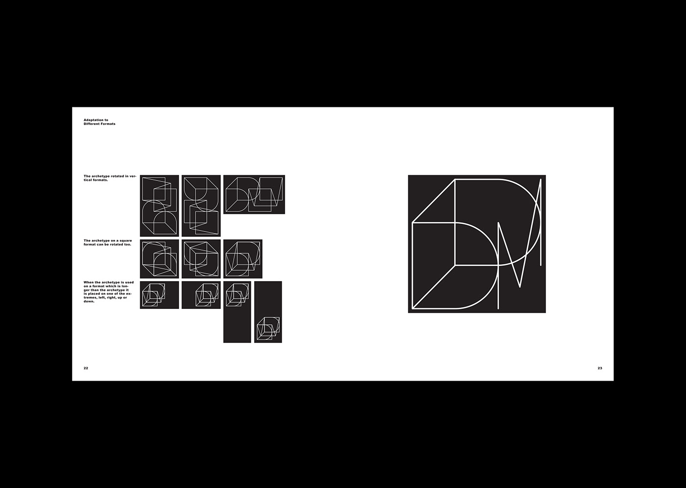
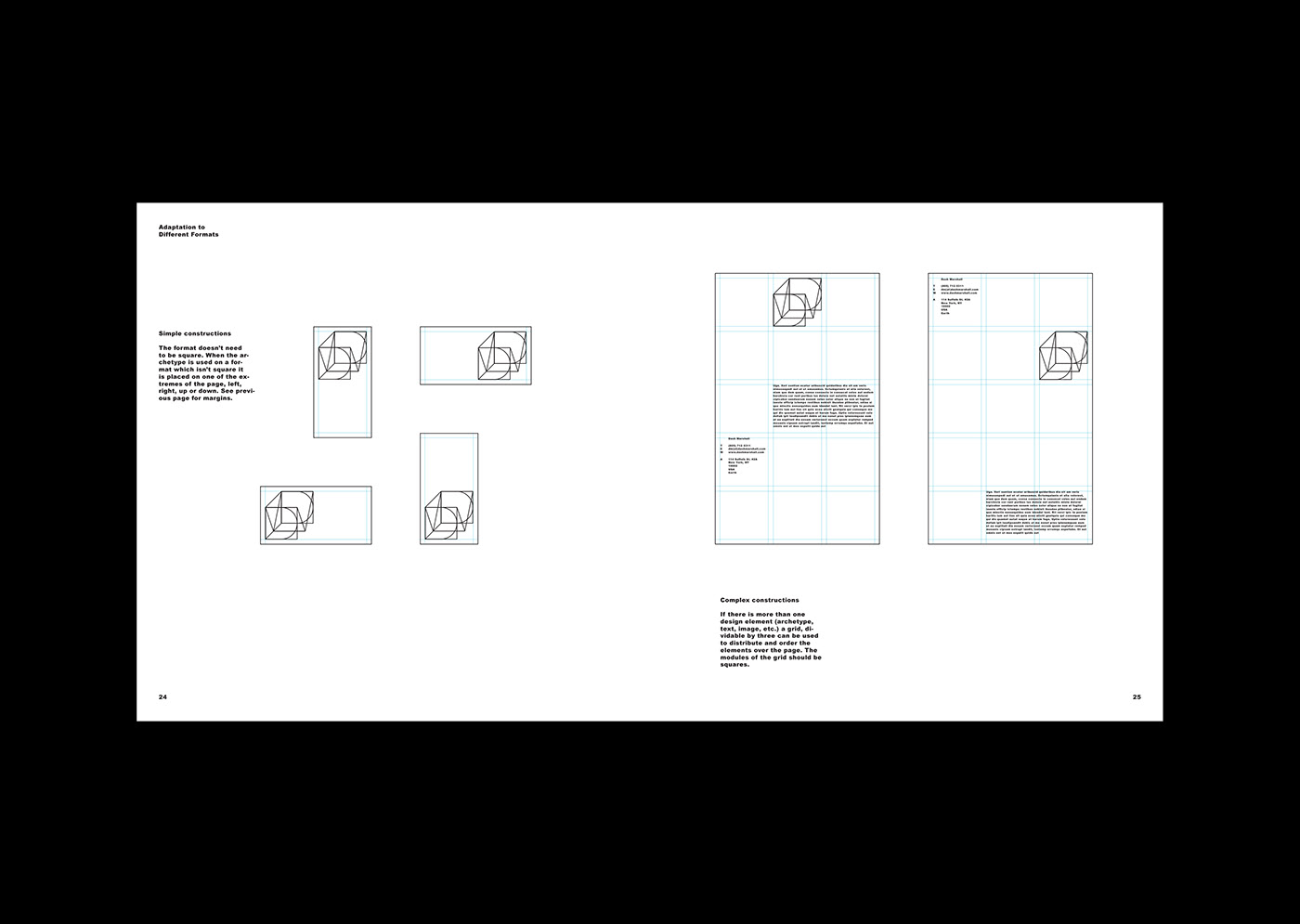
The obvious eventually came to us as a surprise. Today’s corporate communication has become almost exclusively digital. It is context-responsive, morphological and semiological, and almost unaware of physical constraints. To design a consistent visual language for an architecture office, acting in the material, but communicating in the immaterial world, was the challenge. Our solution is a flexible visual identity which works within a confined space of the letters “D” and “M”. Like outer walls of an apartment or the plot of a house, the letters “DM” create a confined space, but within this framework nearly anything is possible.

To tell the stories of Dash Marshall we have not just designed their Visual Identity, but also their website, the book “Matter Battles: 45 Lessons Learned” and the booklet “Small Measures”.

Client: Dash Marshall
Year: 2015—2018

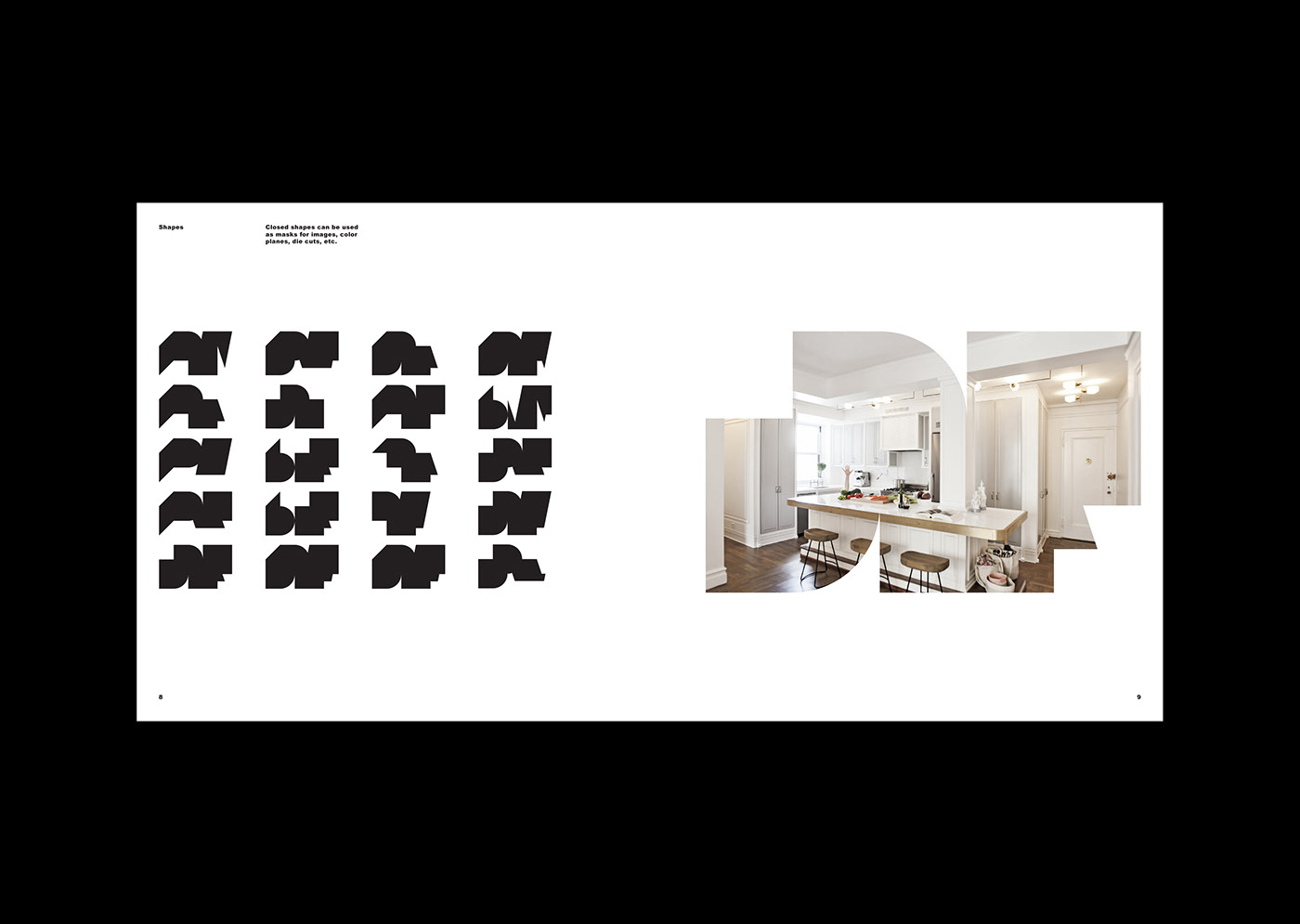
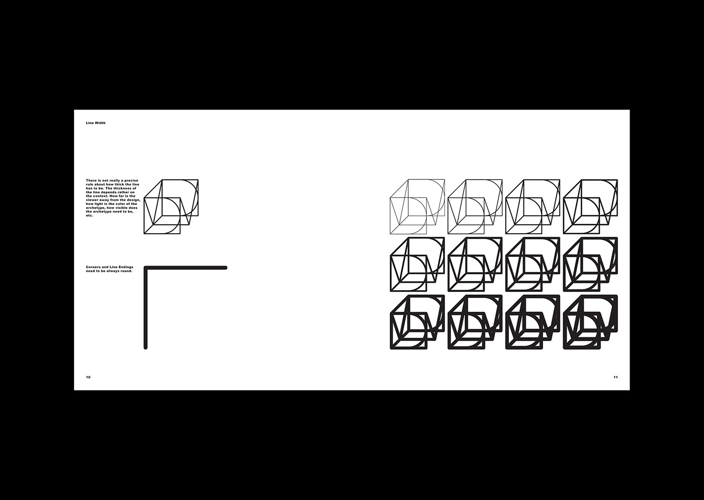
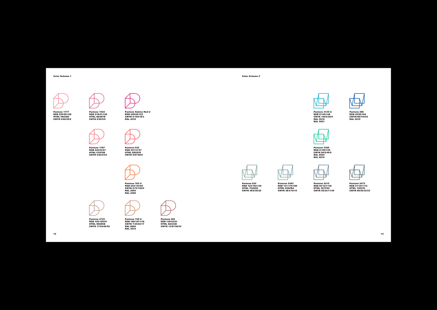
The letters “DM”, drawn in the isometric perspective, are the archetype of the visual identity. The lines of the letters may be removed and colored, creating a multitude of variations of the icon.

Brand Identity

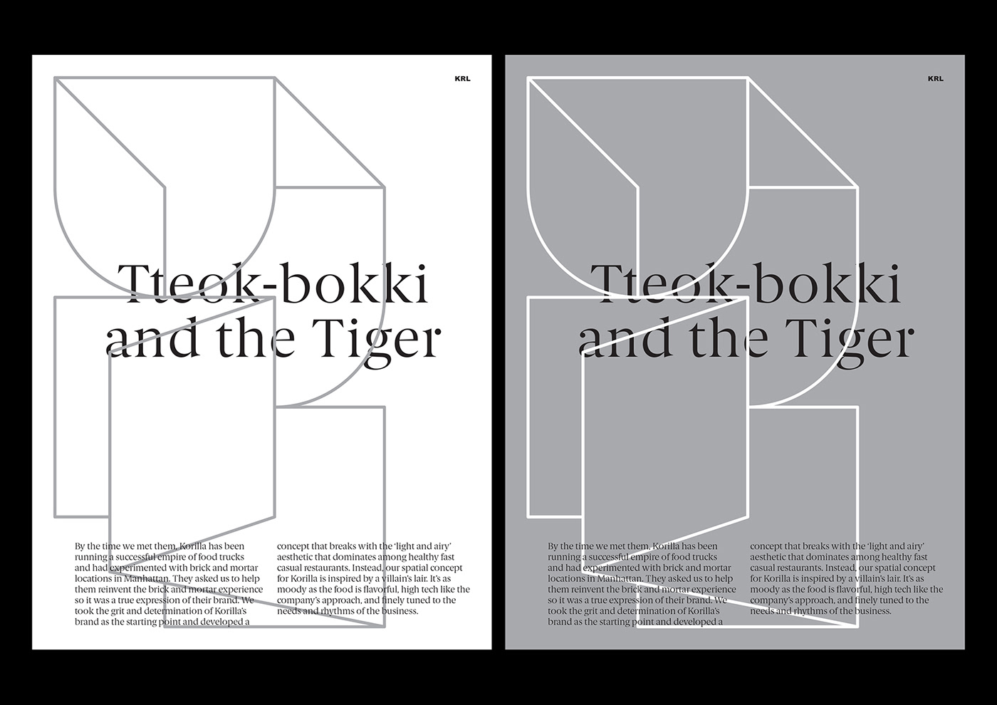
Dash Marshall’s architecture plays with contradictions as old and new, classic and modern, emotional and rational. To visualize these contrasts we added the drawn Berlingske to the constructed graphic system.

“Matter Battle, 45 Lessons Learned” by Dash Marshall.

Producing a beautiful book has to be considered today a statement in itself. The time, work and money going into a physical object, which will be given away to only 200 select individuals, shows the appreciation of the constraints of the physical world.

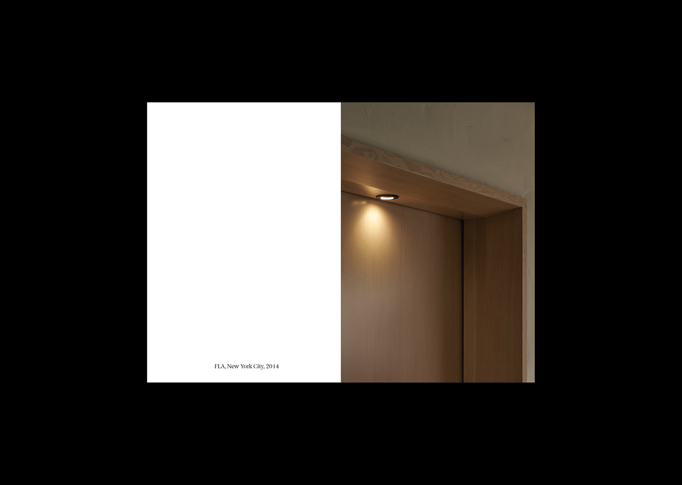
Along with the big book, comes a smaller, shorter book called “Small Measures”, focusing on the details of the projects and presenting them only in cropped images. The combination of a large and small book give Dash Marshall the flexibility to convey their work in different ways based on the needs of a given situation. A small book for small meetings, A big book for more substantial introductions, or both for moments of special gratitude.


branding


Brand Identity for Really. by Tata&Friends Studio

Original Source: http://feedproxy.google.com/~r/abduzeedo/~3/i9qU546aZbM/brand-identity-really-tatafriends-studio

Brand Identity for Really. by Tata&Friends Studio

Brand Identity for Really. by Tata&Friends Studio

abduzeedo
Jun 04, 2018

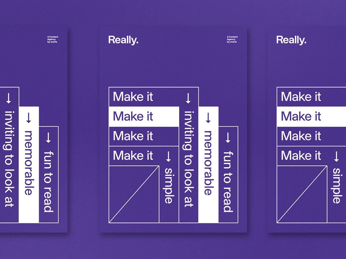
Tata&Friends Studio shared a beautiful brand identity project on their Behance profile. It’s for Everis’ content agency. There are many things to talk about the design solution but for me, the most important is the simplicity. I love seeing projects that rely on simple typography with handpicked visual ornaments to focus on the basics. It’s all the contrast of types and wise usage of white space.

Really is the content agency of everis. As content creators their work range from illustrations, infographics – to video production, a wide range of different creative projects. Really craft contents and visual solutions for brands. Our approach was to define the naming and visual universe of the brand. 

Brand identity

Naming: 

The name Really. is a statement, represents a solution, a final product, something to be proud of. 

Visual: 

We use holographic stamping to create “the metaphor of everything” in order to represent the creative result.


Tata&Friends Studio is ta design muscle for positive brands. They believe in process, research, experiments, curiosity and positive thinking. It is a collaborative studio, a place to grow, to collaborate, to learn and to share knowledge.


10 Unique & High Quality Free Photoshop Brush Packs

Original Source: http://feedproxy.google.com/~r/1stwebdesigner/~3/N3c0dx4cWFc/

Whether you’re a photographer, artist or designer, Photoshop brushes can be a huge help. Simulate watercolors, clouds, smoke, grain, explosions – the extent of what they can do is limitless. People seem to collect and hoard Photoshop brushes like they’re going out of style.

The huge demand has led to an abundance of free resources across the web. Even if you can’t afford huge, premium packs, you can still find quality brushes for use in your work. Here are ten invaluable and beautiful brush sets – available for anyone to download.

Your Designer Toolbox
Unlimited Downloads: 500,000+ Web Templates, Icon Sets, Themes & Design Assets


DOWNLOAD NOW

Ultimate Brush Pack 5

Ultimate Brush Pack 5

Who could say no to 87 high-resolution brushes? These explosive patterns can add a paint-like, textured feel to your images. Great for clouds, abstract pieces and anything that requires a dynamic texture.

83 Light and Burst Brushes

83 Light and Burst Brushes

Lens flares, sunbeams and bursts of light; these brushes can give any image a sunny, bright effect. It also works great for general lighting, magical effects and even as background textures. Along with rays and waves of light, there are also halos and coronas to give the sun a more striking ring.

Bling Effects Pack

Bling Effects Pack

Sometimes a picture needs some extra bling. Maybe some sparkles, a lens flare, or a perfectly-placed light flash will do the trick. The Bling Effects Pack can help you add some pizzazz to a boring picture. Just remember that effects like this should be used sparingly as enhancements.

Watercolor 93

Watercolor 93

This pack of nearly a hundred brushes was created from actual dabs of watercolor that were scanned. There are varying shapes, intensities and luminosities to each brush – so there’s a ton of variety. If you’re creating something that requires a softer look, these watercolors will do the trick.

Hair Brush Set

Hair Brush Set

Whether you’re painting hair or just need a wispy, soft texture, the Hair Brush Set can get the job done. You’ll need a pressure sensitive tablet to get the full detailing effect. Perfect for creating fine, feathery textures.
lazy brush set

lazy brush set

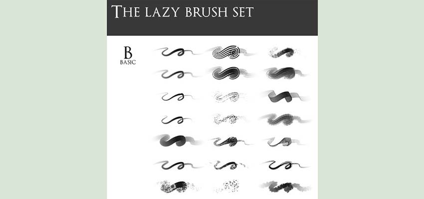
Need a huge pack of essentials? The lazy brush set contains 174 brushes, varying from basics to textures to silhouettes and light flares. It’s great for artists, but many of these brushes can be used in design work too. If you can only download one brush set, choose this one; it’s huge and contains just about everything you’ll need.

Free Brush Stroke Photoshop Brushes

Free Brush Stroke Photoshop Brushes

These 15 high-resolution brush strokes look great in almost any project. Modelled after watercolors, they have a multitude of uses, from professional effects to sketches to grungy art pieces. Basic, but essential.

Free Hi-Res Photoshop Brushes: Acrylic Textures

Free Hi-Res Photoshop Brushes: Acrylic Textures

If you need a rough, realistic, watercolor-like look, these acrylic textures will be perfect. At 2500px, every stroke will be detailed and gorgeous. If your designs turn out looking false or cartoony, these brushes can help them to appear more organic.

Radiate Brush Set

Radiate Brush Set

Looking for something a little more abstract? Great for posters, backgrounds and tech projects, Radiate was created by modifying different shapes. The fringe style is just what you need if you’re trying to make your piece look extra cool.

Mad Fractal

Mad Fractal

Fractal brushes are great for backgrounds, wispy textures and abstract designs. Their randomness makes an image more interesting. And there’s 30 brushes, so your design options with this collection are limitless.

Beautiful Brushes

Finding the best brushes can take some experimenting, so feel free to download lots of them to test out! The sites listed here have plenty of free brush packs to try. Do some digging and testing until you have some that you feel comfortable using. Once you find one (or ten) that work for you, you’ll be effortlessly crafting beautiful art, photos and web design layouts.


Where These Companies Got Their Names From – Part 1

Original Source: https://www.hongkiat.com/blog/where-these-companies-got-their-names-from-part-1/

World-famous companies with the origin of their names and the ideas behind their establishment

The post Where These Companies Got Their Names From – Part 1 appeared first on Hongkiat.

Visit hongkiat.com for full content.

5 Simple Steps to Zero Conversions

Original Source: https://www.webdesignerdepot.com/2018/06/5-simple-steps-to-zero-conversions/

Alright, so let me begin by addressing the title because there is a method to my madness: There are literally hundreds of articles out there with tips, tricks, and best practices when it comes to e-commerce; some are generic and some are more technical but they do cover most areas of interest.

But how about the big no-nos of e-commerce? How can you be sure you won’t make a single sale today? Well, that’s why I’m here. I’ll go through a list of the biggest deal breakers and conversion killers that a store owner can implement to make sure their precious inventory will never reach the grubby hands of shoppers.
Follow these tips and you won’t make a single sale…

1. The Store Platform

That’s right, the platform is one of the biggest decisions in building a store that doesn’t sell anything. You’ll have to pick one that is hard to use and maintain, needs a heavy server to run, and has to be slow, and by slow I mean 1992 dial-up slow. You want people to feel comfortable with your store and waiting in line is something that seems to happen to you every time you hit the mall, so why not try to recreate this all too familiar feeling by making the customer wait a couple minutes before the site loads.

the platform is one of the biggest decisions in building a store that doesn’t sell anything

Do not fall for the hype of getting for a popular self-hosted e-commerce platform like Magento, or Woocommerce, and especially don’t fall for any of those fancy e-commerce Software-as-a-Service providers like Shopify, or Zento. Oh no no no. Find one that has yet to build a developer community, one that has a limited list of features and make sure it costs a lot (that’s how you know it’s going to be great).

The domain name is important too. Get one that perfectly describes what you are trying to sell (or not). Something like www.buy-the-perfect-pair-of-black-loafers-that-go-with-everything.com. Get a lot of characters in there and do use as many hyphens as the registrar will allow.

2. The Design

Every now and then you’ll have one stubborn user that sticks around while the site loads painfully for minutes on end. Since they waited this long you’ll want to use every bit of real estate on the website. Leave no room unused. Have anything and everything display on the first page with lots of buttons and input fields to click on.

Make sure you show your pop-up on Every. Single. Page.

The logo needs to be on par with your brand image and to accomplish that, I’d advise you use Clipart. Open up MSPaint, drop a couple of cliparts in there and you are all set. (Why spend hundreds or thousands of dollars on fancy logo designers when you can do it yourself?)

After you’ve carefully created the site you’ll want to have a couple of pop-up show up, and don’t be fooled: people click on the “hide” button by mistake all the time. Make sure you show your pop-up on Every. Single. Page.

3. The Product

There will be some that might try to convince you need to spend time and money doing your research before selling a product. Don’t believe the hype! If you are going to do this whole selling of goods online you need to have a solid conviction and trust your instincts. Basically listen to our good friend, Shia LaBeouf’s words of wisdom: Just do it! (You’ll be surprised at the outcome, trust me!)

If you are going to sell your own product, go both feet in! Talk to the company building the product and make sure they make anywhere from 25,000 to 100,000 units. You’ll want to fill your warehouse with inventory, after all, you do know what the people want.

Pricing is going to be important too. Don’t worry about knowing the market, cost of production, or the competitors, what’s important is that you stick to your guns—your initial assessment. Keeping tabs on costs and different factors like storing fees, handling or shipping will only slow you down. Ain’t nobody got time for that.

4. Customer Support

Customer lifetime value, customer loyalty, support department, man stop pushing that hippy stuff. Listen, we as a community of dedicated “Zero conversion shop entrepreneurs” (yeah, we are making this a thing) need to unite and scream off the top of our lungs: “We don’t care!” Don’t answer the phone, don’t email back, and avoid any social media interaction with your customer, you already have a lot on your plate and you certainly don’t need that negativity in your life.

Now if you absolutely need to contact customers I’d advise you email them. You might like to try a little something that I like to call “the email waterboarding technique.” Send them a message about a product you have and every couple of days you ask them if they’ve seen it and if they are ready to buy it. Your email subject should read: “How about now?”

5. Marketing

Deals, special offers, freebies, free shipping? Are you kidding me? You have worked your ass off getting here and after countless minutes setting up your website and putting together a design after slapping on a logo made by your 12 yo nephew—who, everyone knows, is good with computers—you really don’t want to give away free stuff.

If you build it, they’ll come

So when you think about offering discounts or rewards to your customers remember kids, just say no!

What about Ads, you say? No! The Ad industry is but a smoke screen for the large enterprises that want to reach into your pockets and grab your hard earned cash. You really don’t want to get mixed with the likes of them in order to get customers. Like my favorite quote from the movie Field of Dreams said: “If you build it, they’ll come.” Just get the website up and people will storm the gates.

How about marketing automation? Well, robots are taking more of our jobs with each passing day so it is our responsibility, nay, our duty to make sure no robot, bot or machine learning technique will ever take a real person’s job away from them. Hubspot, Marketo, and Autopilot are just a few examples of services that would eliminate countless hours of doing manual sales groundwork so avoid them at any cost!

Conclusion

To summarise the wisdom I’ve shared with you all, to make sure you don’t have a store that sells you have to follow these 5 simple rules. Thank you for sticking with me through this article and, remember, only YOU can stop people from buying stuff from your online store.

PS. If on the other hand, you’d actually like to run a successful store, then take advice in this article, and do exactly the opposite.

Add Realistic Chalk and Sketch Lettering Effects with Sketch’it – only $5!

Source

p img {display:inline-block; margin-right:10px;}
.alignleft {float:left;}
p.showcase {clear:both;}
body#browserfriendly p, body#podcast p, div#emailbody p{margin:0;}

Apache vs Nginx Performance: Optimization Techniques

Original Source: https://www.sitepoint.com/apache-vs-nginx-performance-optimization-techniques/

Some years ago, the Apache Foundation’s web server, known simply as “Apache”, was so ubiquitous that it became synonymous with the term “web server”. Its daemon process on Linux systems has the name httpd (meaning simply http process) — and comes preinstalled in major Linux distributions.

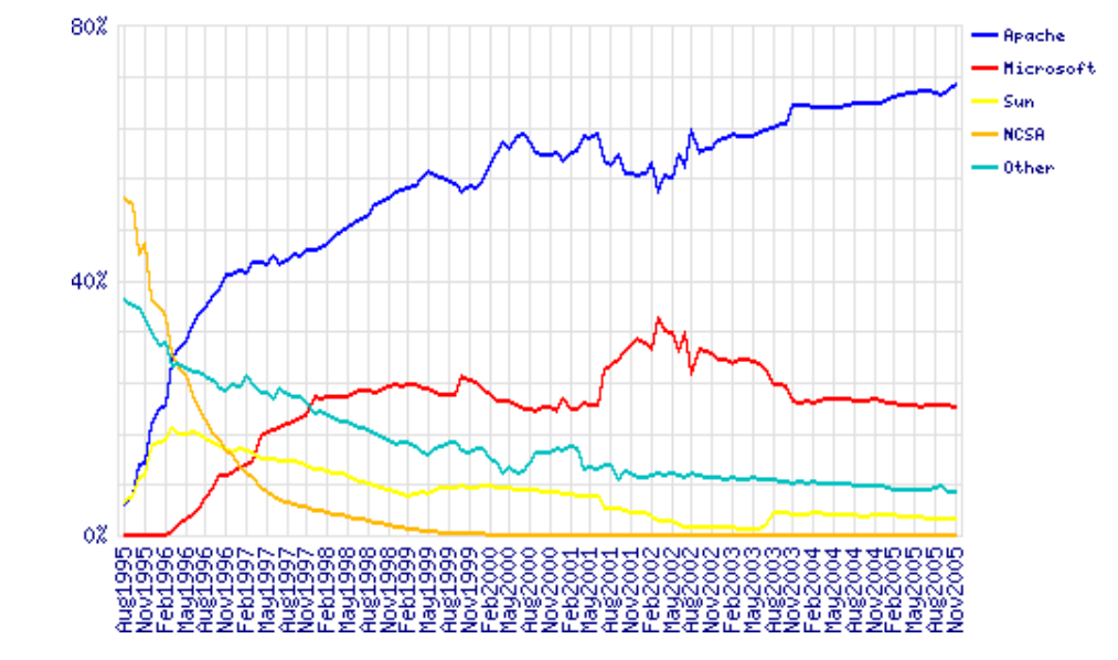
It was initially released in 1995, and, to quote Wikipedia, “it played a key role in the initial growth of the World Wide Web”. It is still the most-used web server software according to W3techs. However, according to those reports which show some trends of the last decade and comparisons to other solutions, its market share is decreasing. The reports given by Netcraft and Builtwith differ a bit, but all agree on a trending decline of Apache’s market share and the growth of Nginx.

Nginx — pronounced engine x — was released in 2004 by Igor Sysoev, with the explicit intent to outperform Apache. Nginx’s website has an article worth reading which compares these two technologies. At first, it was mostly used as a supplement to Apache, mostly for serving static files, but it has been steadily growing, as it has been evolving to deal with the full spectrum of web server tasks.

It is often used as a reverse proxy, load balancer, and for HTTP caching. CDNs and video streaming providers use it to build their content delivery systems where performance is critical.

Apache has been around for a long time, and it has a big choice of modules. Managing Apache servers is known to be user-friendly. Dynamic module loading allows for different modules to be compiled and added to the Apache stack without recompiling the main server binary. Oftentimes, modules will be in Linux distro repositories, and after installing them through system package managers, they can be gracefully added to the stack with commands like a2enmod. This kind of flexibility has yet to be seen with Nginx. When we look at a guide for setting up Nginx for HTTP/2, modules are something Nginx needs to be built with — configured for at build-time.

One other feature that has contributed to Apache’s market rule is the .htaccess file. It is Apache’s silver bullet, which made it a go-to solution for the shared hosting environments, as it allows controlling the server configuration on a directory level. Every directory on a server served by Apache can have its own .htaccess file.

Nginx not only has no equivalent solution, but discourages such usage due to performance hits.

Server share stats, by Netcraft

Server vendors market share 1995–2005. Data by Netcraft

LiteSpeed, or LSWS, is one server contender that has a level of flexibility that can compare to Apache, while not sacrificing performance. It supports Apache-style .htaccess, mod_security and mod_rewrite, and it’s worth considering for shared setups. It was planned as a drop-in replacement for Apache, and it works with cPanel and Plesk. It’s been supporting HTTP/2 since 2015.

LiteSpeed has three license tiers, OpenLiteSpeed, LSWS Standard and LSWS Enterprise. Standard and Enterprise come with an optional caching solution comparable to Varnish, LSCache, which is built into the server itself, and can be controlled, with rewrite rules, in .htaccess files (per directory). It also comes with some DDOS-mitigating “batteries” built in. This, along with its event-driven architecture, makes it a solid contender, targeting primarily performance-oriented hosting providers, but it could be worth setting up even for smaller servers or websites.

Hardware Considerations

When optimizing our system, we cannot emphasize enough giving due attention to our hardware setup. Whichever of these solutions we choose for our setup, having enough RAM is critical. When a web server process, or an interpreter like PHP, don’t have enough RAM, they start swapping, and swapping effectively means using the hard disk to supplement RAM memory. The effect of this is increased latency every time this memory is accessed. This takes us to the second point — the hard disk space. Using fast SSD storage is another critical factor of our website speed. We also need to mind the CPU availability, and the physical distance of our server’s data centers to our intended audience.

To dive in deeper into the hardware side of performance tuning, Dropbox has a good article.

Monitoring

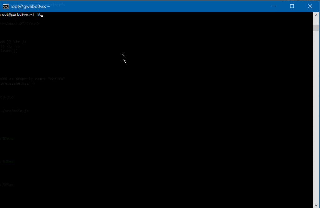
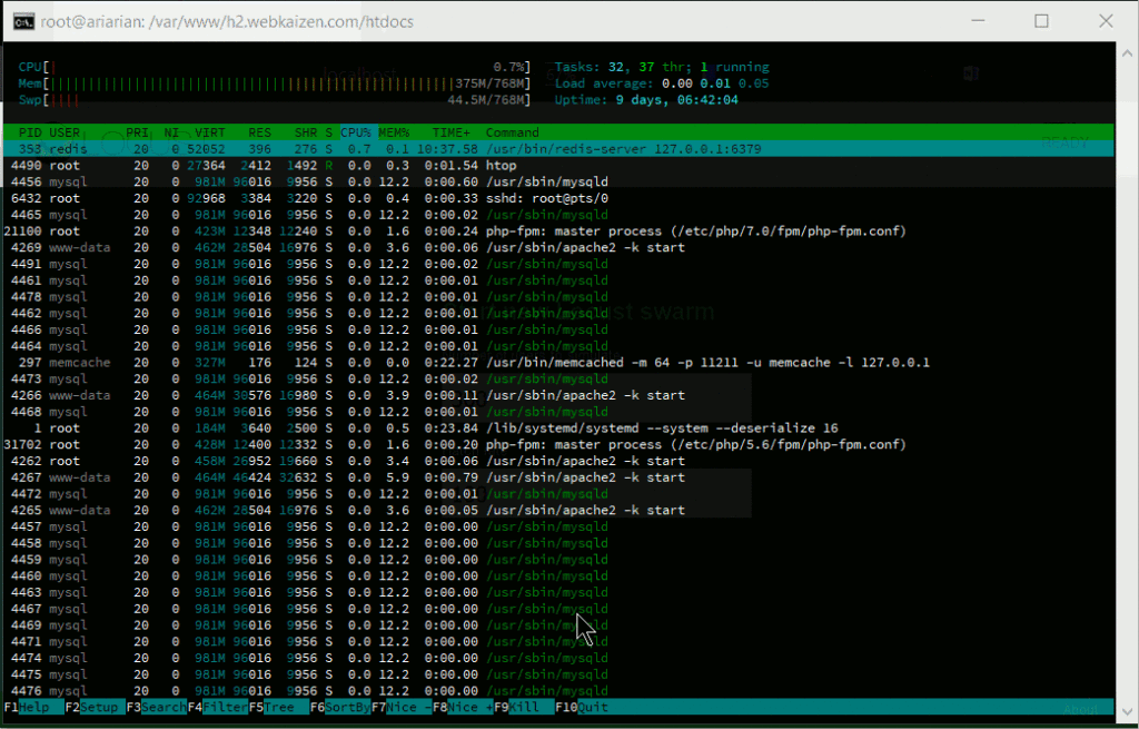
One practical way to monitor our current server stack performance, per process in detail, is htop, which works on Linux, Unix and macOS, and gives us a colored overview of our processes.

HTOP

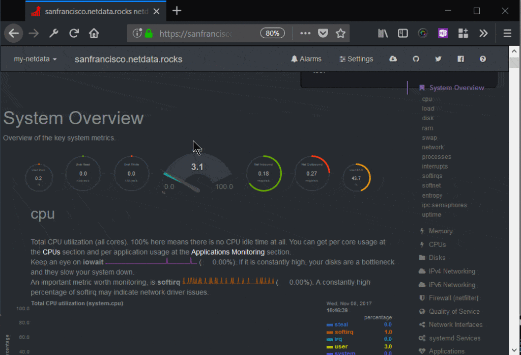
Other monitoring tools are New Relic, a premium solution with a comprehensive set of tools, and Netdata, an open-source solution which offers great extensibility, fine-grained metrics and a customizable web dashboard, suitable for both little VPS systems and monitoring a network of servers. It can send alarms for any application or system process via email, Slack, pushbullet, Telegram, Twilio etc.

Netdata dashboard

Monit is another, headless, open-source tool which can monitor the system, and can be configured to alert us, or restart certain processes, or reboot the system when some conditions are met.

Testing the System

AB — Apache Benchmark — is a simple load-testing tool by Apache Foundation, and Siege is another load-testing program. This article explains how to set them both up, and here we have some more advanced tips for AB, while an in-depth look at Siege can be found here.

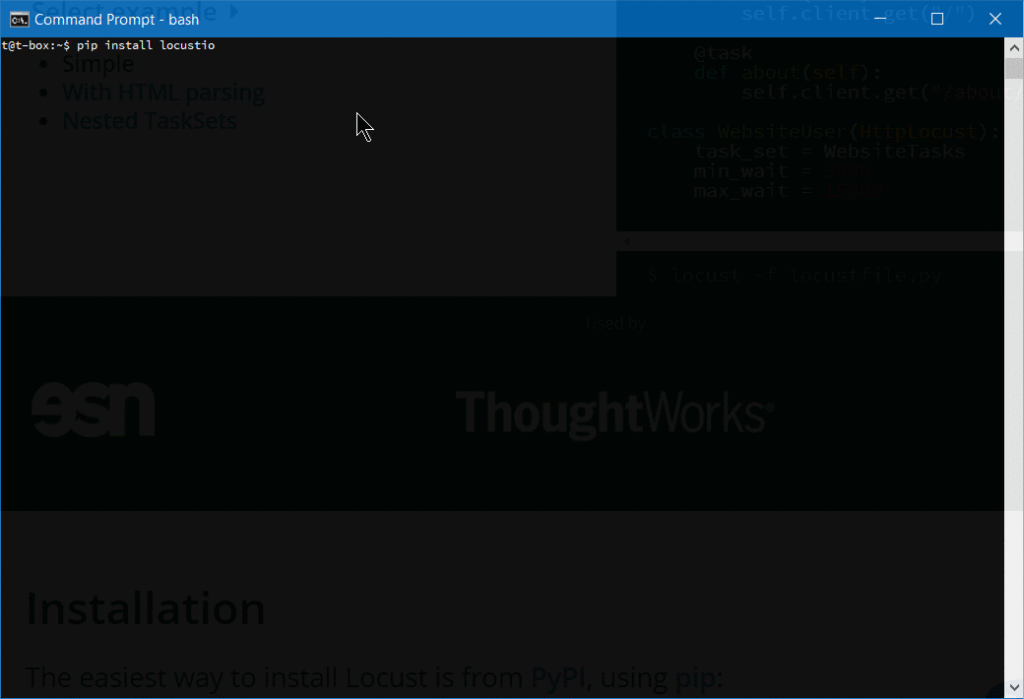
If you prefer a web interface, there is Locust, a Python-based tool that comes in very handy for testing website performance.

Locust installation

After we install Locust, we need to create a locustfile in the directory from which we will launch it:

from locust import HttpLocust, TaskSet, task

class UserBehavior(TaskSet):
@task(1)
def index(self):
self.client.get(“/”)

@task(2)
def shop(self):
self.client.get(“/?page_id=5”)

@task(3)
def page(self):
self.client.get(“/?page_id=2”)

class WebsiteUser(HttpLocust):
task_set = UserBehavior
min_wait = 300
max_wait = 3000

Then we simply launch it from the command line:

locust –host=https://my-website.com

One warning with these load-testing tools: they have the effect of a DDoS attack, so it’s recommended you limit testing to your own websites.

Tuning Apache
Apache’s mpm modules

Apache dates to 1995 and the early days of the internet, when an accepted way for servers to operate was to spawn a new process on each incoming TCP connection and to reply to it. If more connections came in, more worker processes were created to handle them. The costs of spawning new processes were high, and Apache developers devised a prefork mode, with a pre-spawned number of processes. Embedded dynamic language interpreters within each process (like mod_php) were still costly, and server crashes with Apache’s default setups became common. Each process was only able to handle a single incoming connection.

This model is known as mpm_prefork_module within Apache’s MPM (Multi-Processing Module) system. According to Apache’s website, this mode requires little configuration, because it is self-regulating, and most important is that the MaxRequestWorkers directive be big enough to handle as many simultaneous requests as you expect to receive, but small enough to ensure there’s enough physical RAM for all processes.

libapache2-mod-php7 mpm_prefork HTOP report

A small Locust load test that shows spawning of huge number of Apache processes to handle the incoming traffic.

We may add that this mode is maybe the biggest cause of Apache’s bad name. It can get resource-inefficient.

Version 2 of Apache brought another two MPMs that try to solve the issues that prefork mode has. These are worker module, or mpm_worker_module, and event module.

Worker module is not process-based anymore; it’s a hybrid process-thread based mode of operation. Quoting Apache’s website,

a single control process (the parent) is responsible for launching child processes. Each child process creates a fixed number of server threads as specified in the ThreadsPerChild directive, as well as a listener thread which listens for connections and passes them to a server thread for processing when they arrive.

This mode is more resource efficient.

2.4 version of Apache brought us the third MPM — event module. It is based on worker MPM, and added a separate listening thread that manages dormant keepalive connections after the HTTP request has completed. It’s a non-blocking, asynchronous mode with a smaller memory footprint. More about version 2.4 improvements here.

We have loaded a testing WooCommerce installation with around 1200 posts on a virtual server and tested it on Apache 2.4 with the default, prefork mode, and mod_php.

First we tested it with libapache2-mod-php7 and mpm_prefork_module at https://tools.pingdom.com:

mpm prefork test

Then, we went for testing the event MPM module.

We had to add multiverse to our /etc/apt/sources.list:

deb http://archive.ubuntu.com/ubuntu xenial main restricted universe multiverse
deb http://archive.ubuntu.com/ubuntu xenial-updates main restricted universe multiverse
deb http://security.ubuntu.com/ubuntu xenial-security main restricted universe multiverse
deb http://archive.canonical.com/ubuntu xenial partner

Then we did sudo apt-get updateand installed libapache2-mod-fastcgi and php-fpm:

sudo apt-get install libapache2-mod-fastcgi php7.0-fpm

Since php-fpm is a service separate from Apache, it needed a restart:

sudo service start php7.0-fpm

Then we disabled the prefork module, and enabled the event mode and proxy_fcgi:

sudo a2dismod php7.0 mpm_prefork
sudo a2enmod mpm_event proxy_fcgi

We added this snippet to our Apache virtual host:

<filesmatch “.php$”>
SetHandler “proxy:fcgi://127.0.0.1:9000/”
</filesmatch>

This port needs to be consistent with php-fpm configuration in /etc/php/7.0/fpm/pool.d/www.conf. More about the php-fpm setup here.

Then we tuned the mpm_event configuration in /etc/apache2/mods-available/mpm_event.conf, keeping in mind that our mini-VPS resources for this test were constrained — so we merely reduced some default numbers. Details about every directive on Apache’s website, and tips specific to the event mpm here. Keep in mind that started servers consume an amount of memory regardless of how busy they are. The MaxRequestWorkers directive sets the limit on the number of simultaneous requests allowed: setting MaxConnectionsPerChild to a value other than zero is important, because it prevents a possible memory leak.

<ifmodule mpm_event_module>
StartServers 1
MinSpareThreads 30
MaxSpareThreads 75
ThreadLimit 64
ThreadsPerChild 30
MaxRequestWorkers 80
MaxConnectionsPerChild 80
</ifmodule>

Then we restarted the server with sudo service apache2 restart (if we change some directives, like ThreadLimit, we will need to stop and start the service explicitly, with sudo service apache2 stop; sudo service apache2 start).

Our tests on Pingdom now showed page load time reduced by more than half:

Pingdom test

The post Apache vs Nginx Performance: Optimization Techniques appeared first on SitePoint.

​Download 10 Free Images From Adobe Stock

Original Source: https://www.webdesignerdepot.com/2018/06/%E2%80%8Bdownload-10-free-images-from-adobe-stock/

It’s been just three years since Adobe unveiled Adobe Stock, and in that time the service has grown from 40 million photos and vectors, to over 90 million assets ranging from professional photographs, to high-quality 3D files; that’s over 45,000 new assets uploaded every day.

The bitmaps, vectors, videos, 3D models, and design templates offer both designers and businesses a simple way of employing art-direction as a sales tool, without the associated cost.

Professional-Grade Assets

In a world of competitive marketing, social media, and 24 hour advertising, successful brands need shots that aren’t just well-taken, but well produced, with post-production in Adobe Lightroom or Photoshop as a minimum requirement.

As the devices we view the web on become more sophisticated, the need for professional-grade images grows; the time has passed when snap-shots taken on a home-camera—even a high-end model—are sufficient.

Because Adobe Stock is tightly integrated into the tools that professional photographers prefer, Adobe Stock has a disproportionately high number of professional photographers uploading work, giving users unprecedented access to the type of quality shot that actively draws in users.

In addition to the normal range of images, Adobe Stock Editorial delivers a hand-picked set of premium images that are highly topical. If your business works in fast-paced news media, or leverages current events to engage users, then Adobe Stock Editorial gives you access to images that you won’t find anywhere else.

Taking Your Business Global with Adobe Stock

One of the biggest issues facing brands in 2018 is the increasing global identity of consumers. Even when selling nationally, brands are finding that customers expect to be represented in marketing material.

Gone are the days when a company could shoot its catalogue on the back lot and hope to make a connection with its customer base; a company based in New Jersey needs to include assets that speak to consumers in New Mexico.

Even when a company has the budget to hire a professional photographer, a team of models, hair and makeup professionals, and post-production services, it’s rare that there’s the budget to ship the team to different locations. Adobe Stock enables companies to engage different cultures, both interstate, and international, by providing professional grade images that reflect their customers, no matter where they’re located.

Adobe Stock assets are royalty-free, meaning there are no geographic, or time limits on using them. And Adobe Stock excels at enabling brands to express their values through selective images; different nationalities, cultures, genders, and age groups can all be found in a few clicks.

Adobe Stock also helps you combat safe-guarding issues. Because all Adobe Stock images of people include model releases (meaning the model has consented to their likeness being used) you can safely add pictures of people, including children, without running into privacy issues.

By using Adobe Stock you’re gaining access to the local expertise of photographers worldwide, leveraging their insights to engage your audience in ways you never expected.

Adobe CC Integration

Adobe Stock has the tightest integration with Adobe Creative Cloud (CC) of any stock provider, and includes numerous features that are exclusive to CC members.

CC products allow you to browse through Adobe Stock images, and even search by keyword, directly in the UI. In the case of images you can try before you buy using water-marked images, and only pay for images if you decide to license them. Purchasing couldn’t be simpler thanks to Adobe CC Libraries; when you buy the stock, the water-marked version of the asset is automatically swapped for a clean, high-quality version.

Adobe Stock even supplies design templates. Now, you can create a new file in your favorite Adobe design app by selecting a purchased template, then customizing it as per your requirements.

10 Free Images

To help you experience the power and depth of Adobe Stock for yourself, Adobe are offering WebdesignerDepot readers 10 free images.

To claim your free images, simply create a free Adobe ID (you don’t need an Adobe CC membership).


[– This is a sponsored post on behalf of Adobe –]

Add Realistic Chalk and Sketch Lettering Effects with Sketch’it – only $5!

Source

p img {display:inline-block; margin-right:10px;}
.alignleft {float:left;}
p.showcase {clear:both;}
body#browserfriendly p, body#podcast p, div#emailbody p{margin:0;}

Find Awesome Design Case Studies in the Case Study Club

Original Source: https://www.hongkiat.com/blog/find-design-case-studies/

Huge online repository of design-focused case studies in the area of UI, UX, product design, and branding etc.

The post Find Awesome Design Case Studies in the Case Study Club appeared first on…

Visit hongkiat.com for full content.

20 Best New Portfolios, June 2018

Original Source: https://www.webdesignerdepot.com/2018/06/20-best-new-portfolios-june-2018/

Welcome back, Readers. It’s June, and if I got paid extra for every instance of the word “minimalist” in this article, I could probably afford to vacation in Canada. Well, my point is that minimalism is the general theme of this month, because that’s what it has all come down to: various forms of minimalism.

Still, within that descriptor, there’s a fair amount of variety to be had here. Enjoy.

Note: I’m judging these sites by how good they look to me. If they’re creative and original, or classic but really well-done, it’s all good to me. Sometimes, UX and accessibility suffer. For example, many of these sites depend on JavaScript to display their content at all; this is a Bad Idea™, kids. If you find an idea you like and want to adapt to your own site, remember to implement it responsibly.
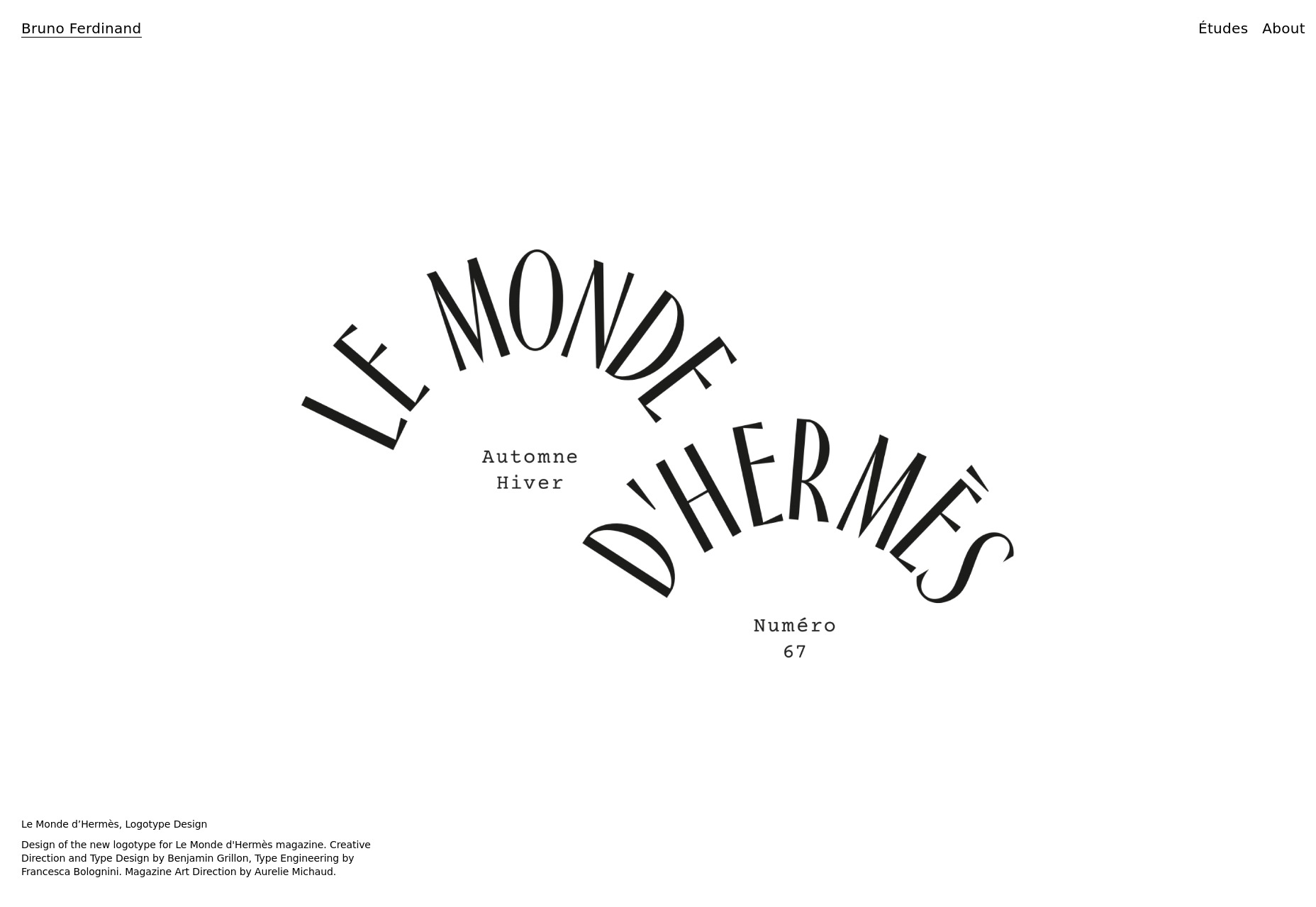

Bruno Ferdinand

Bruno Ferdinand is a designer with strong type skills and the nearly-obligatory hipsterish tendencies we see a lot of nowadays. The guy does simple, beautiful, and kind of rustic design rather well.

Platform: JS app

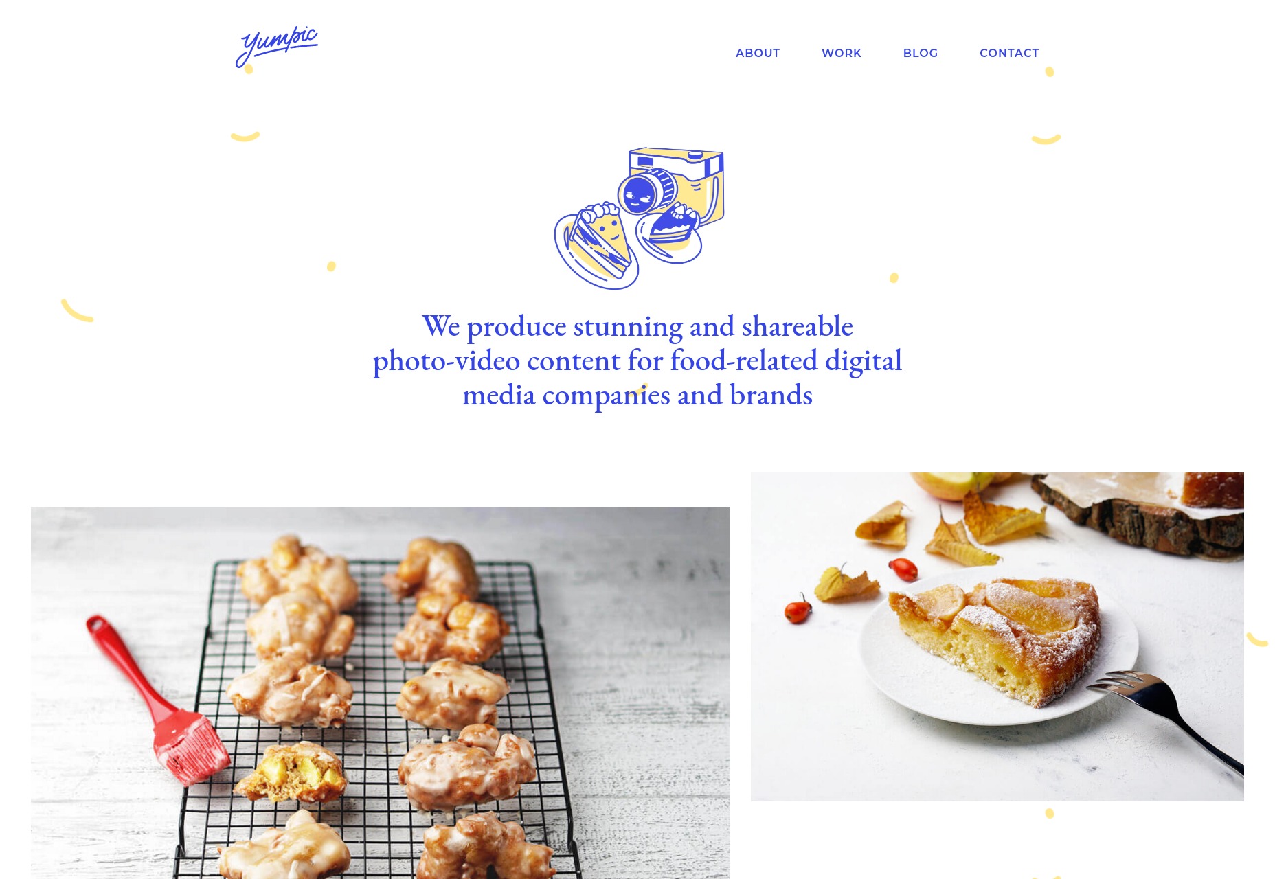
Yumpic

Yumpic is a portfolio site featuring — and you might have guessed this — photos and videos of food. They specialize in food-related digital content for anyone who wants to make the perfect Instagram account, and also (read: actually mostly) for people who make money off their food. The actual portfolio work is artfully interspersed with illustration and playful touches, which definitely sets the right mood,in my opinion.

Platform: WordPress

Duane Dalton

Duane Dalton’s portfolio pretty strongly reflects his print-focused work, being minimalist and asymmetrical. It’s one of the simpler sites on this list, but no less visually pleasing for that.

Platform: Static Site

Kenta Toshikura

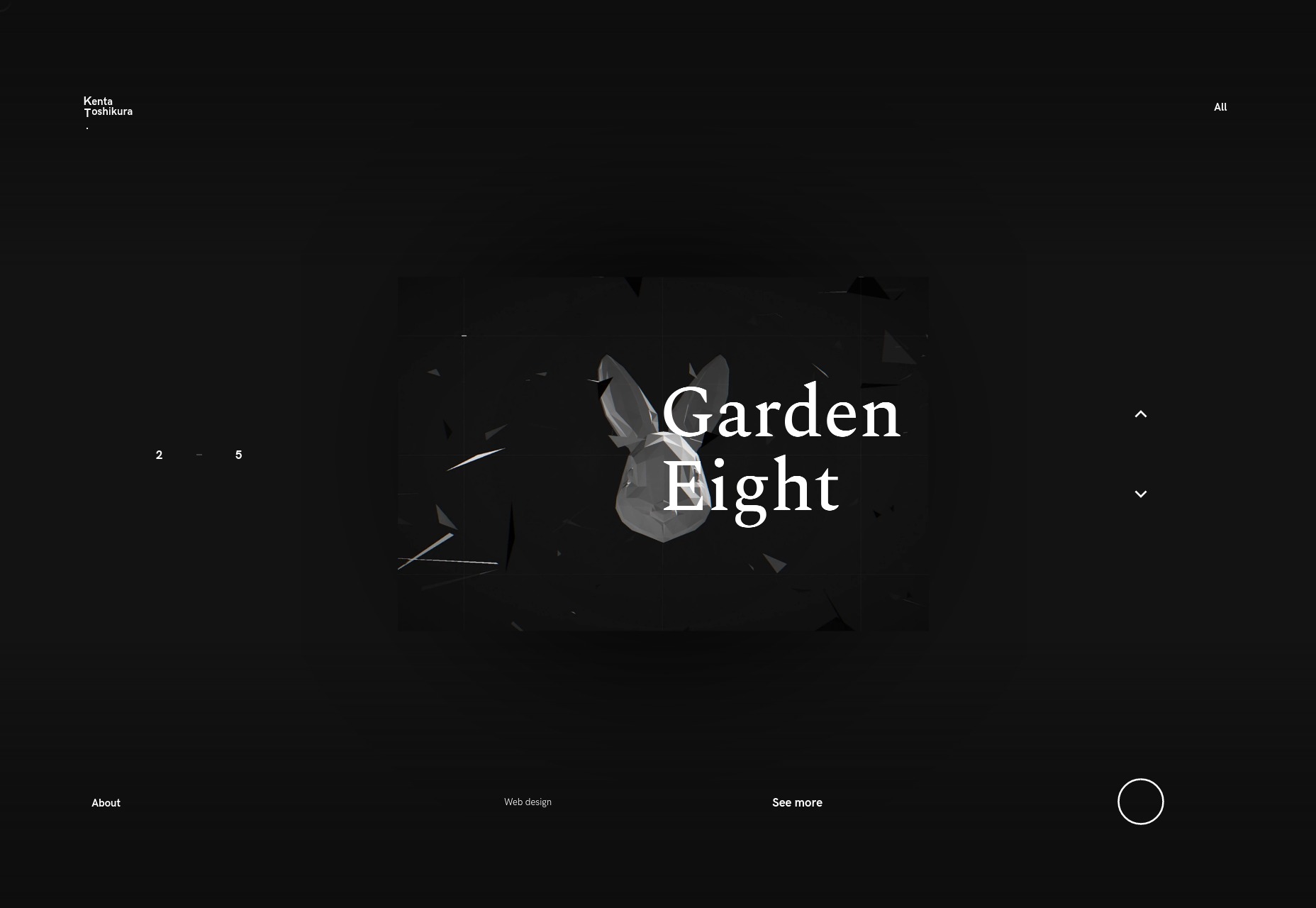
Kenta Toshikura’s website is one of those minimalist-looking presentation-style sites. As is par for the course in cases like these, I’d not look too closely at the usability, but the visuals and general aesthetic style are just plain pretty, darnit. In particular, there’s this touch of 3D-feeling typography that catches my eye.

Platform: Static Site

Ellen Mandemaker

I’m not precisely sure what Ellen Mandemaker makes, precisely, but my best guess is art. And art is what you get from the get go: you’ll see a collage of it to begin with, and then a simple and orderly portfolio that promptly and efficiently throws you into the deep end. It’s one of those portfolios that made me think “I’m not entirely sure what I’m looking at, but I like it.”

Platform: Static Site

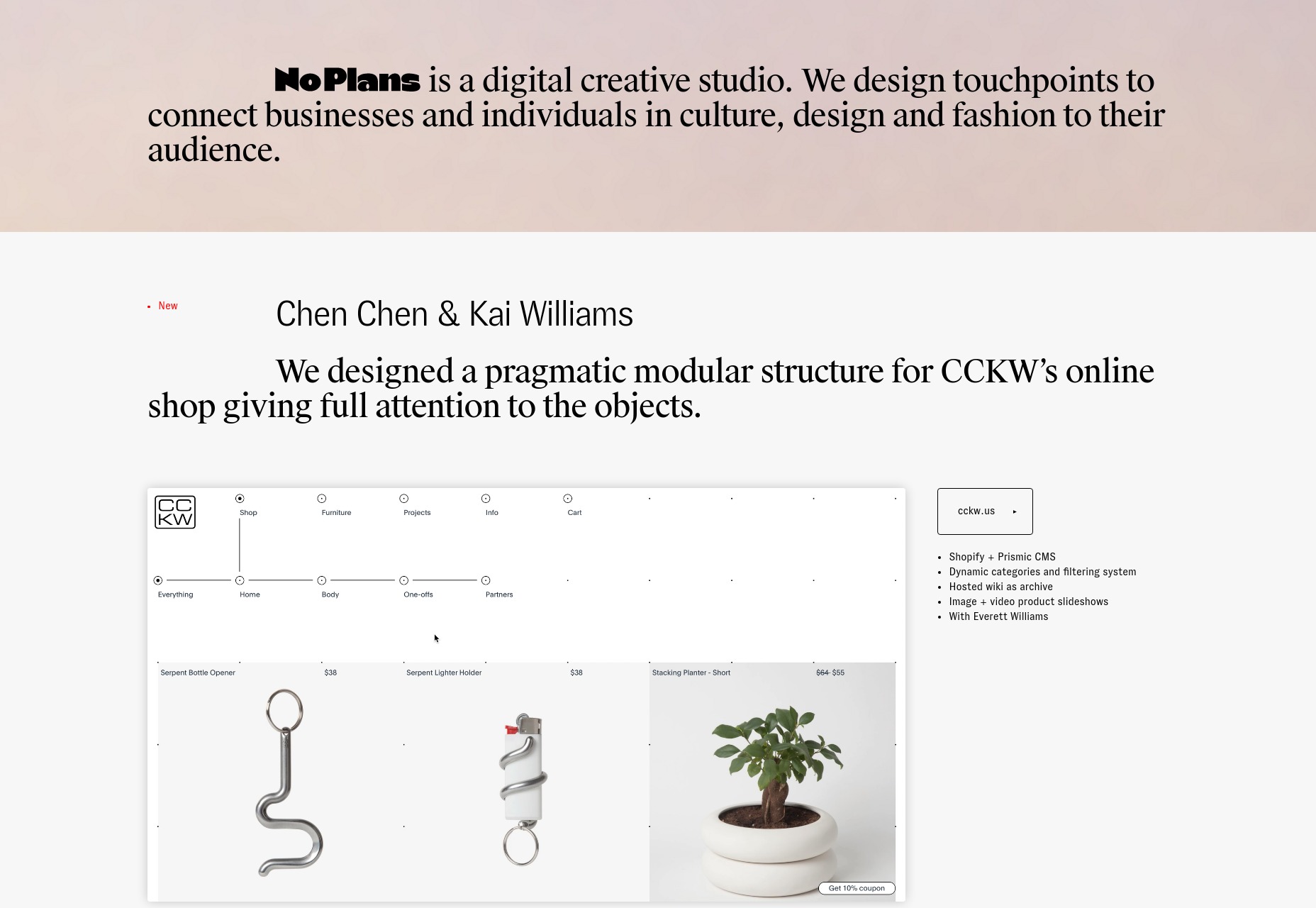
No Plans

No Plans is a one-page portfolio that keeps things fairly simple, preferring a clean design and a decidedly serif-friendly way of doing things. Also, they indent some of their paragraphs. I know, right? You hardly ever see that these days.

Platform: WordPress

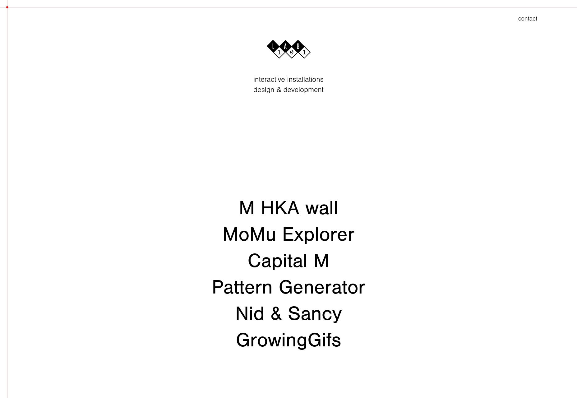
Lab101

I’ll never be a fan of sites that change your cursor, but everything else about Lab101 is pretty solid. The overall aesthetic is minimalist and modern, with some interesting touches of 3D animation on the “Contact” page.

Platform: WordPress

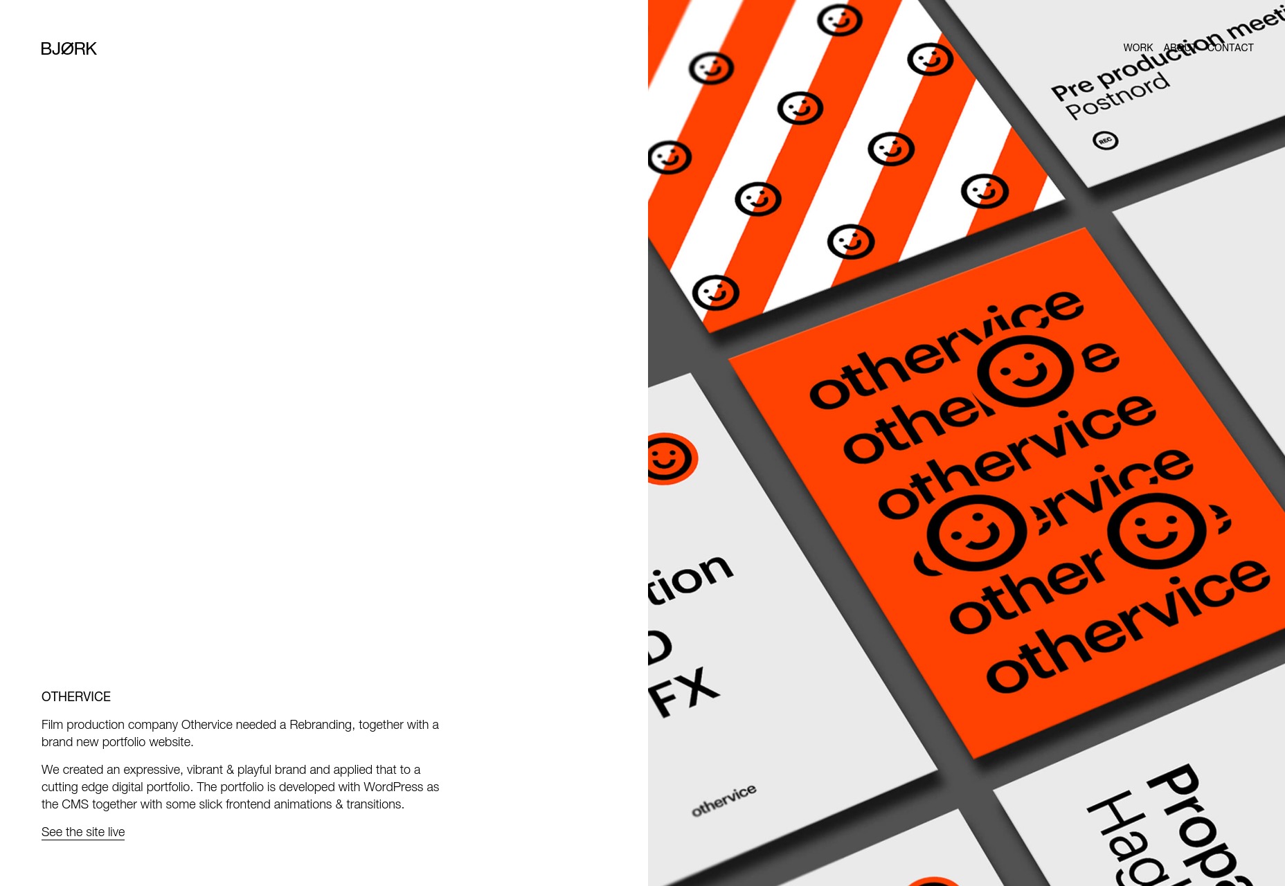
Studio Bjørk

Studio Bjørk has a thing for monochromatic palettes, diagonal lines, and horizontal layouts. And you know what? It works out pretty darned well for them. There’s also a significant bit of animation, great type, and some background video here and there, all combining to make a site that a marketer would call dynamic. Oh,

[Sighs.] Fine, I’ll call it dynamic, too. It just sounds so much like marketer-speak that I didn’t want to say it.

Platform: Static Site

Juul Hondius

I often make reference to magazine-style designs ion this article series, but Juul Hondius’ portfolio is one of the more interesting examples I’ve seen lately. It looks like an old, ooold magazine, complete with small spacing issues and slightly cramped text, combined with beautiful and striking photography.

Those might technically be “issues”, but the design as a whole hits me with a very specific sense of nostalgia that just sells the imagery to me. Besides, it’s a photographer’s site. How badly do you want to read the text anyway?

Platform: Static Site

Thu-Van Tran

Thu-Van Tran’s website has one main theme that makes it visually interesting: layers. Every page is loaded on top of the home page like one piece of paper overlaying another. It’s like a paper prototype come to life. Combined with the sheer simplicity of layout, and strong typographic choices, it stands out.

Platform: Static Site

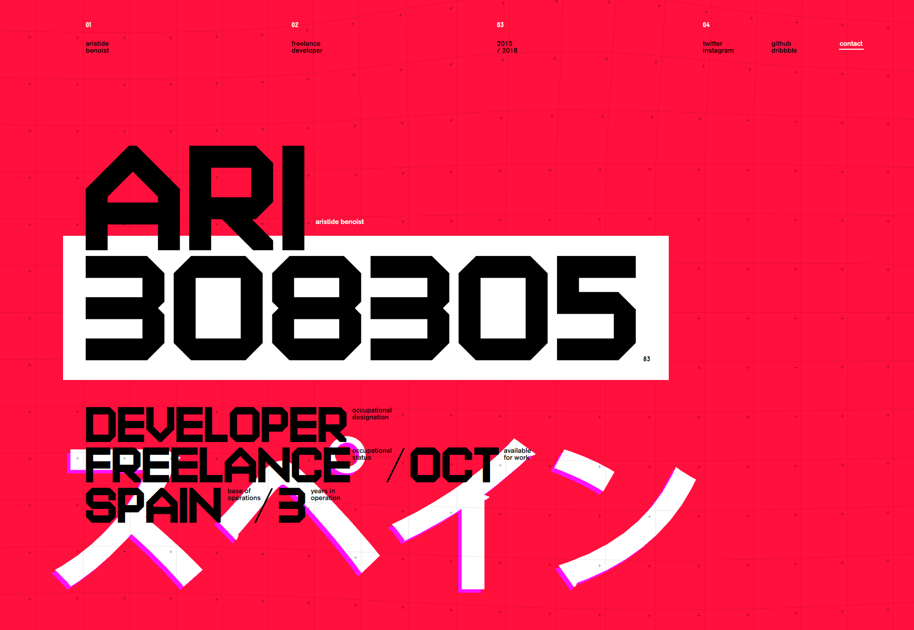
Aristide Benoist

Aristide Benoist’s portfolio combines a grid-based aesthetic with warping animations to striking effect. While most of the text could and certainly should be bigger, the visual theme of this site is enough to make you look, at least. Whether it’s interesting enough to make you grab your glasses will greatly depend on the user.

Platform: Static Site

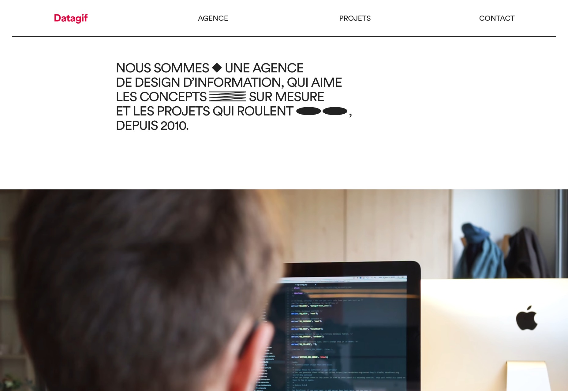
Datagif

Datagif love their sans-serif type, and apparently spicing up standard layouts with geometric flourishes and animation. This one’s not going to blow your mind, but it looks good, even kind of playful for all the corporate aesthetic it has. Give it a look.

Platform: Static Site (I think)

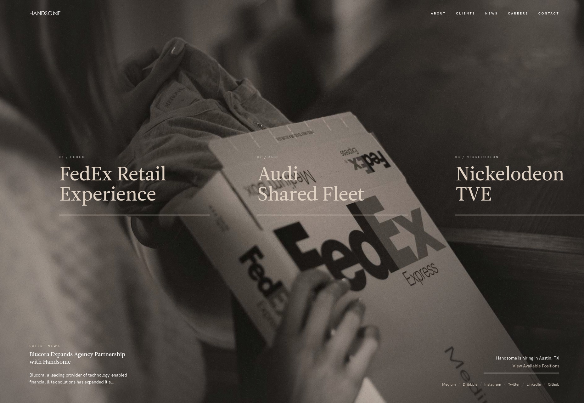
Handsome

Oh, Handsome takes me back maybe five years or so. The large serif type, the darkened photos as backdrops, all those barely visible straight lines. Did we just go back to the early days of flat design? Well, it’s both nostalgic, nearly perfectly executed, and a pleasure to browse.

Platform: Static Site

Sister

Sister’s agency site is living proof that any design style, even the once super-artsy minimalism-with-asymmetry trend, can be given an almost corporate flair. And that’s not a criticism. Corporate-feeling front end design tends to be modern and devastatingly effective in its simplicity, and the same is true here.

Not a fan of those occasional modal pop-ups, though. That’s a corporate trend that can go straight to hell.

Platform: WordPress

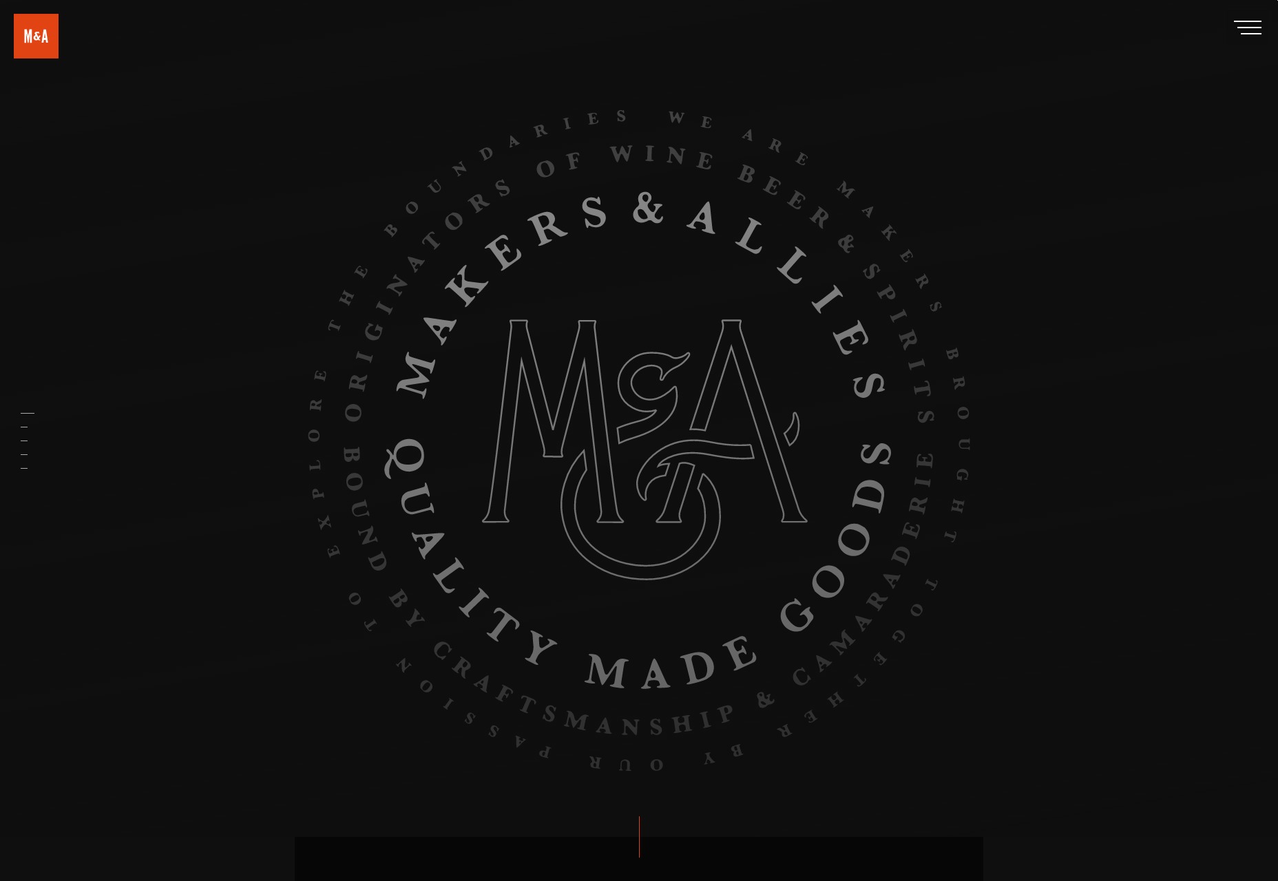
Makers and Allies

Makers and Allies is a branding studio in the finest tradition of hipster design studios, but with a lot more motion design added to the mix. It evokes just the right balance of rustic aesthetics with the modern technical competence we expect. Or at least the animation we expect. Whatever, it looks good, even if some of the text could use more contrast.

Platform: WordPress

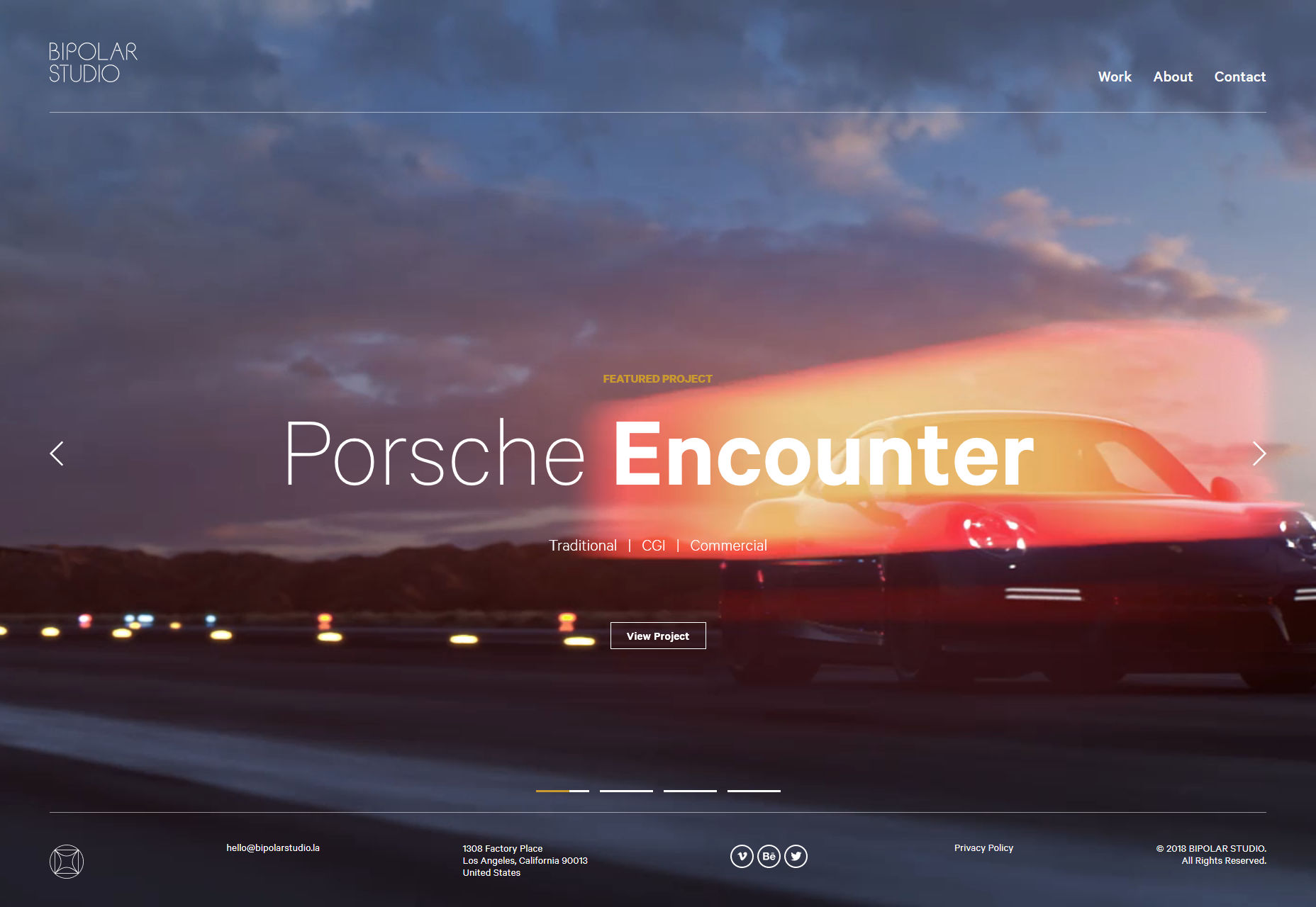
Bipolar Studio

Bipolar Studio combines motion graphics with a pretty modernist aesthetic style, and good old fashioned big type. Their work basically is video, so it’s they use a lot of it in their design. I do like the little “stats” section at the end of each project page, detailing what it took to complete each project.

It’s just that, and I can’t believe I’m saying this, but the logo could be bigger. With type that thin, it should be.

Platform: Static Site and/or JS App

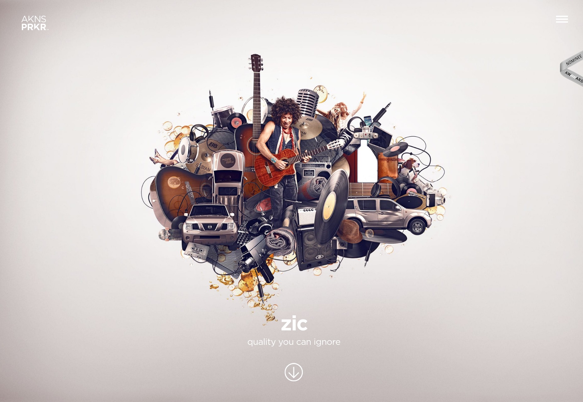
Akins Parker

Akins Parker’s agency site wasn’t made with Powerpoint, but it’s presentational design in its purest form. You go to see this one for the graphics, not for the usability.

Platform: Static Site

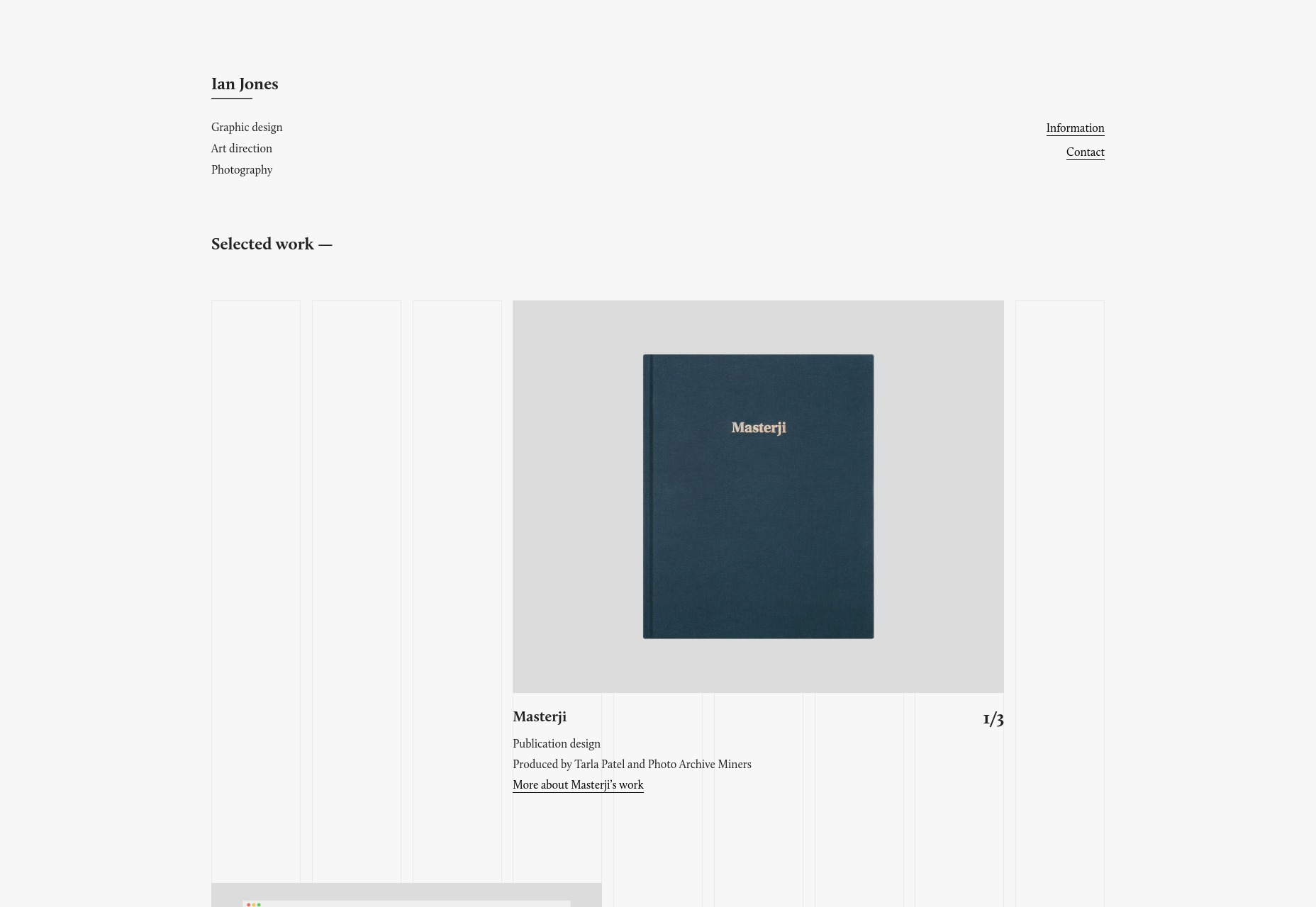
Ian Jones

Ian Jones’ portfolio is another site to embrace the visual grid theme. But unlike many other sites, the visual representation of the grid is only visible when his work is on the page. It’s a dead-simple approach, but it looks calm and professional, and I can’t fault that.

Platform: Static Site

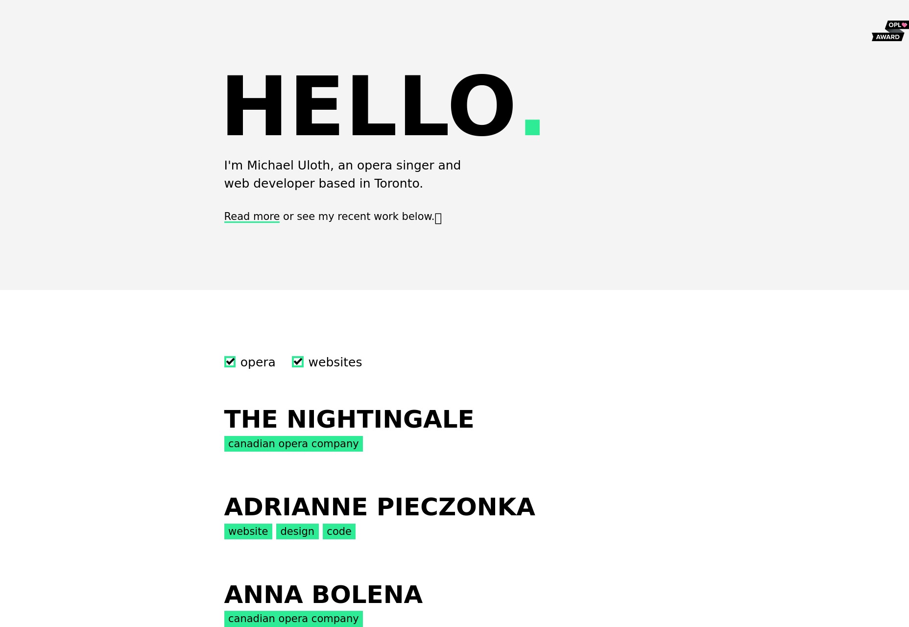
Michael Uloth

Michael Uloth is a rare talent indeed. When he’s not literally singing opera, he builds minimalist-yet-beautiful websites for artsy people. His own site is no exception.

Platform: Static Site and/or JS App

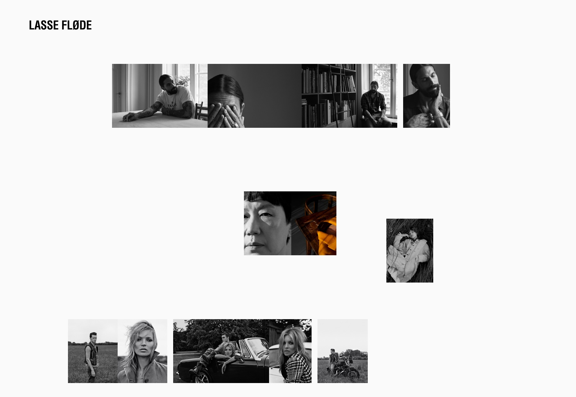
Lasse Fløde

Lasse Fløde is a photography studio with a striking one-page portfolio. Lovers of white space should definitely enjoy this one, as it employs that asymmetrical almost collage-style so favored by many photography portfolios these days. Simple and effective.

Platform: Static Site

Add Realistic Chalk and Sketch Lettering Effects with Sketch’it – only $5!

Source

p img {display:inline-block; margin-right:10px;}
.alignleft {float:left;}
p.showcase {clear:both;}
body#browserfriendly p, body#podcast p, div#emailbody p{margin:0;}