20 Best New Portfolios, June 2018
Original Source: https://www.webdesignerdepot.com/2018/06/20-best-new-portfolios-june-2018/
 Welcome back, Readers. It’s June, and if I got paid extra for every instance of the word “minimalist” in this article, I could probably afford to vacation in Canada. Well, my point is that minimalism is the general theme of this month, because that’s what it has all come down to: various forms of minimalism.
Still, within that descriptor, there’s a fair amount of variety to be had here. Enjoy.
Note: I’m judging these sites by how good they look to me. If they’re creative and original, or classic but really well-done, it’s all good to me. Sometimes, UX and accessibility suffer. For example, many of these sites depend on JavaScript to display their content at all; this is a Bad Idea , kids. If you find an idea you like and want to adapt to your own site, remember to implement it responsibly.
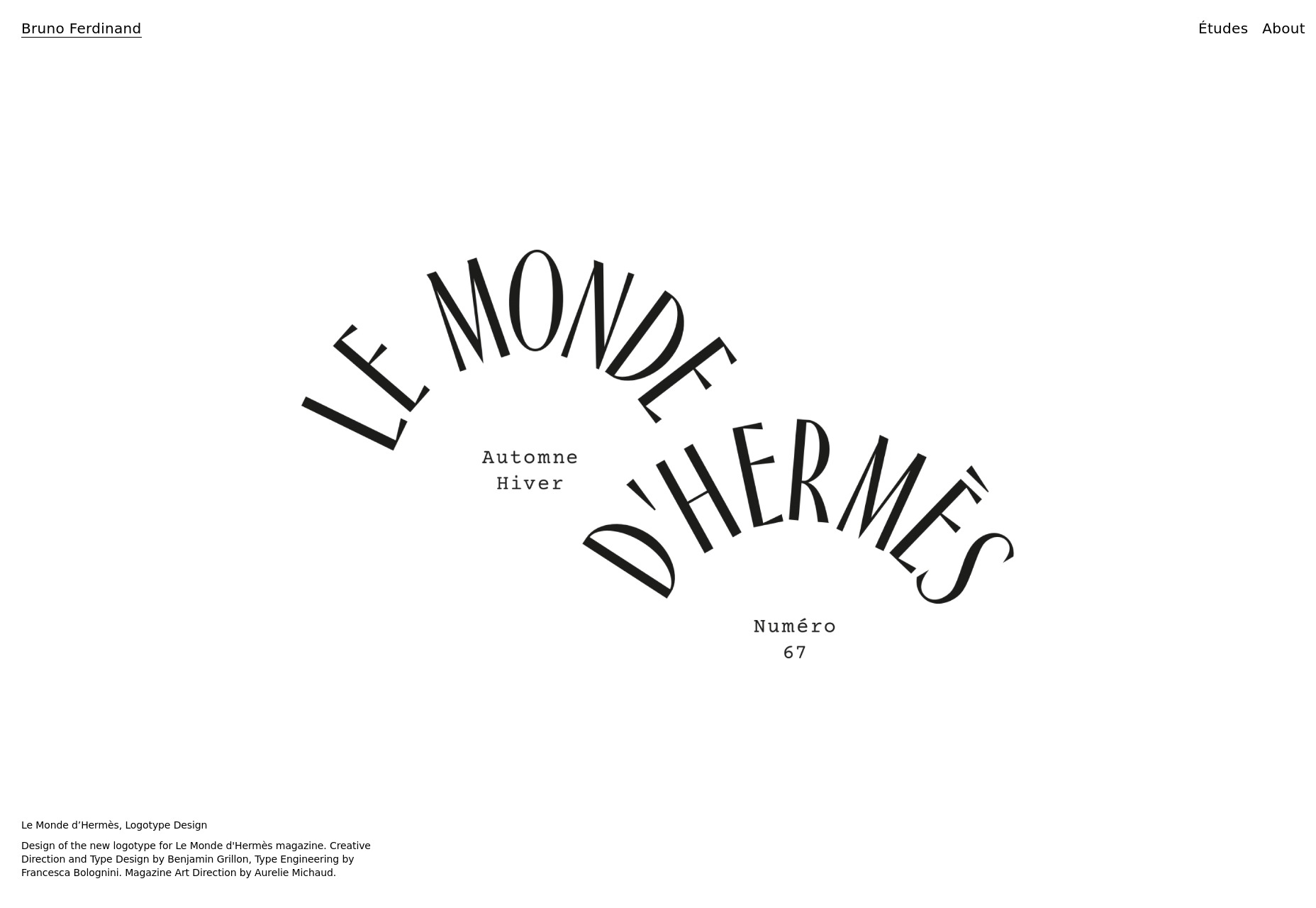
Bruno Ferdinand
Bruno Ferdinand is a designer with strong type skills and the nearly-obligatory hipsterish tendencies we see a lot of nowadays. The guy does simple, beautiful, and kind of rustic design rather well.
Platform: JS app
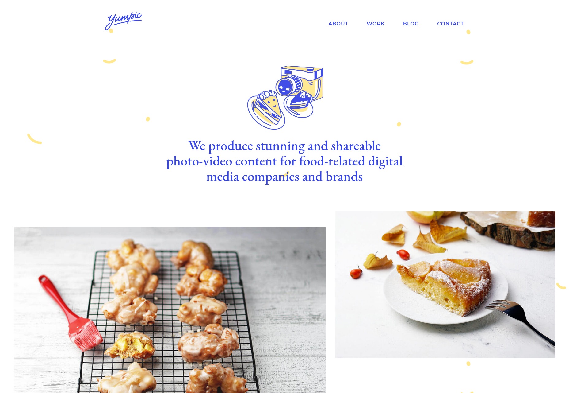
Yumpic
Yumpic is a portfolio site featuring — and you might have guessed this — photos and videos of food. They specialize in food-related digital content for anyone who wants to make the perfect Instagram account, and also (read: actually mostly) for people who make money off their food. The actual portfolio work is artfully interspersed with illustration and playful touches, which definitely sets the right mood,in my opinion.
Platform: WordPress
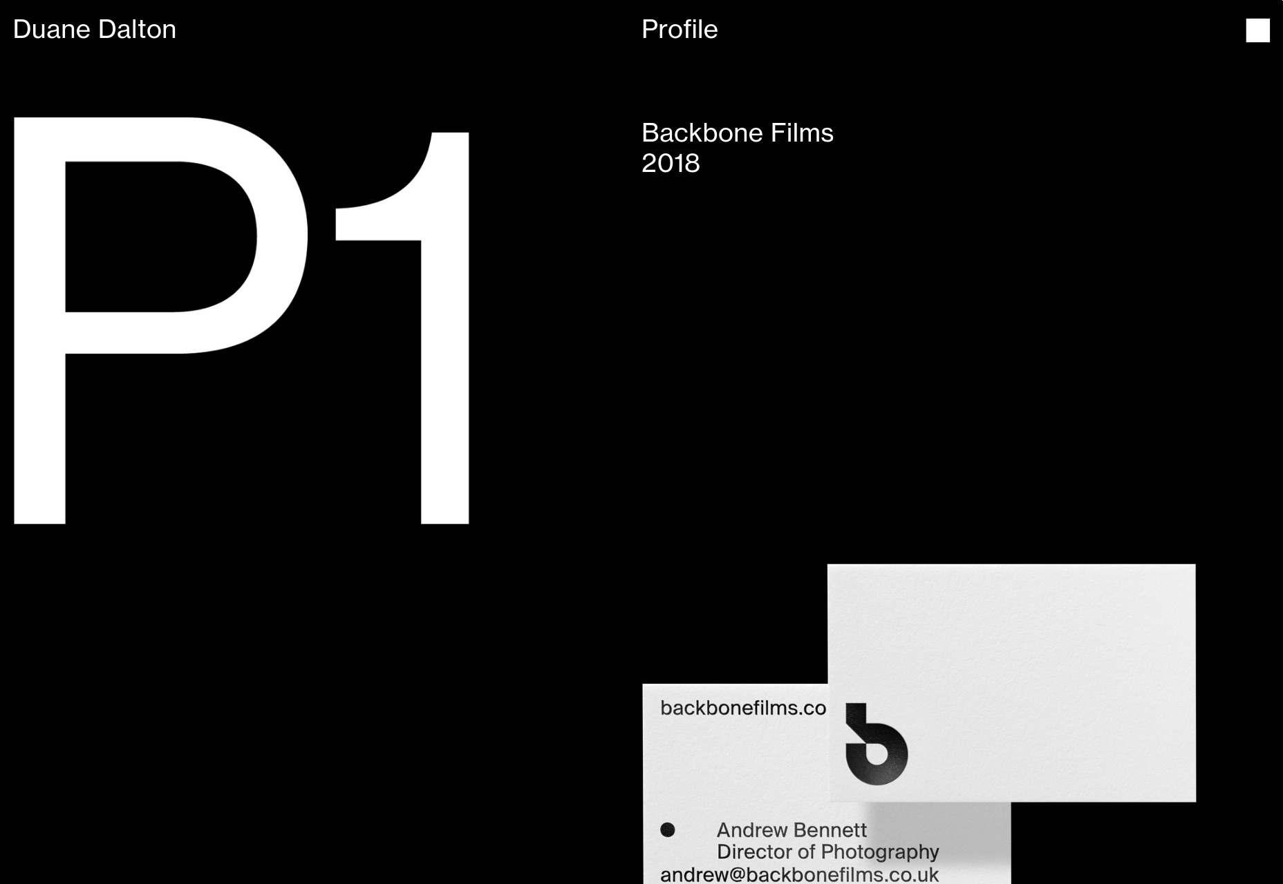
Duane Dalton
Duane Dalton’s portfolio pretty strongly reflects his print-focused work, being minimalist and asymmetrical. It’s one of the simpler sites on this list, but no less visually pleasing for that.
Platform: Static Site
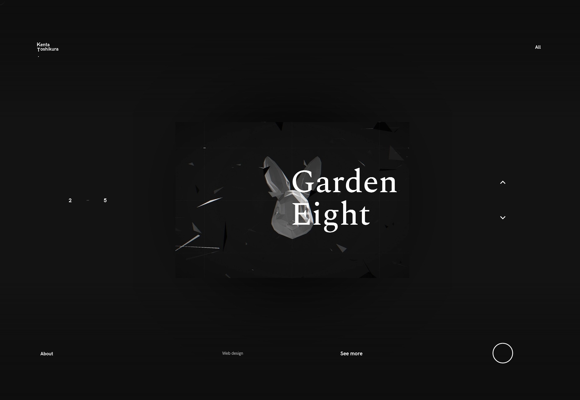
Kenta Toshikura
Kenta Toshikura’s website is one of those minimalist-looking presentation-style sites. As is par for the course in cases like these, I’d not look too closely at the usability, but the visuals and general aesthetic style are just plain pretty, darnit. In particular, there’s this touch of 3D-feeling typography that catches my eye.
Platform: Static Site
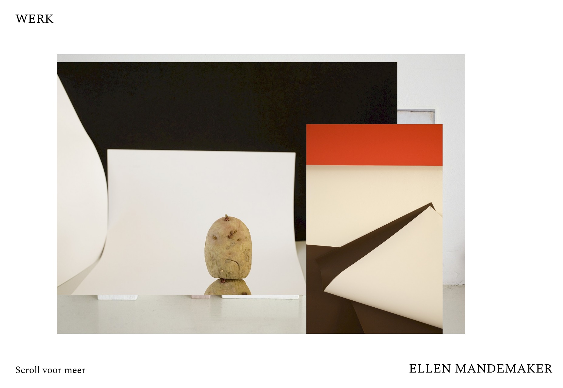
Ellen Mandemaker
I’m not precisely sure what Ellen Mandemaker makes, precisely, but my best guess is art. And art is what you get from the get go: you’ll see a collage of it to begin with, and then a simple and orderly portfolio that promptly and efficiently throws you into the deep end. It’s one of those portfolios that made me think “I’m not entirely sure what I’m looking at, but I like it.”
Platform: Static Site
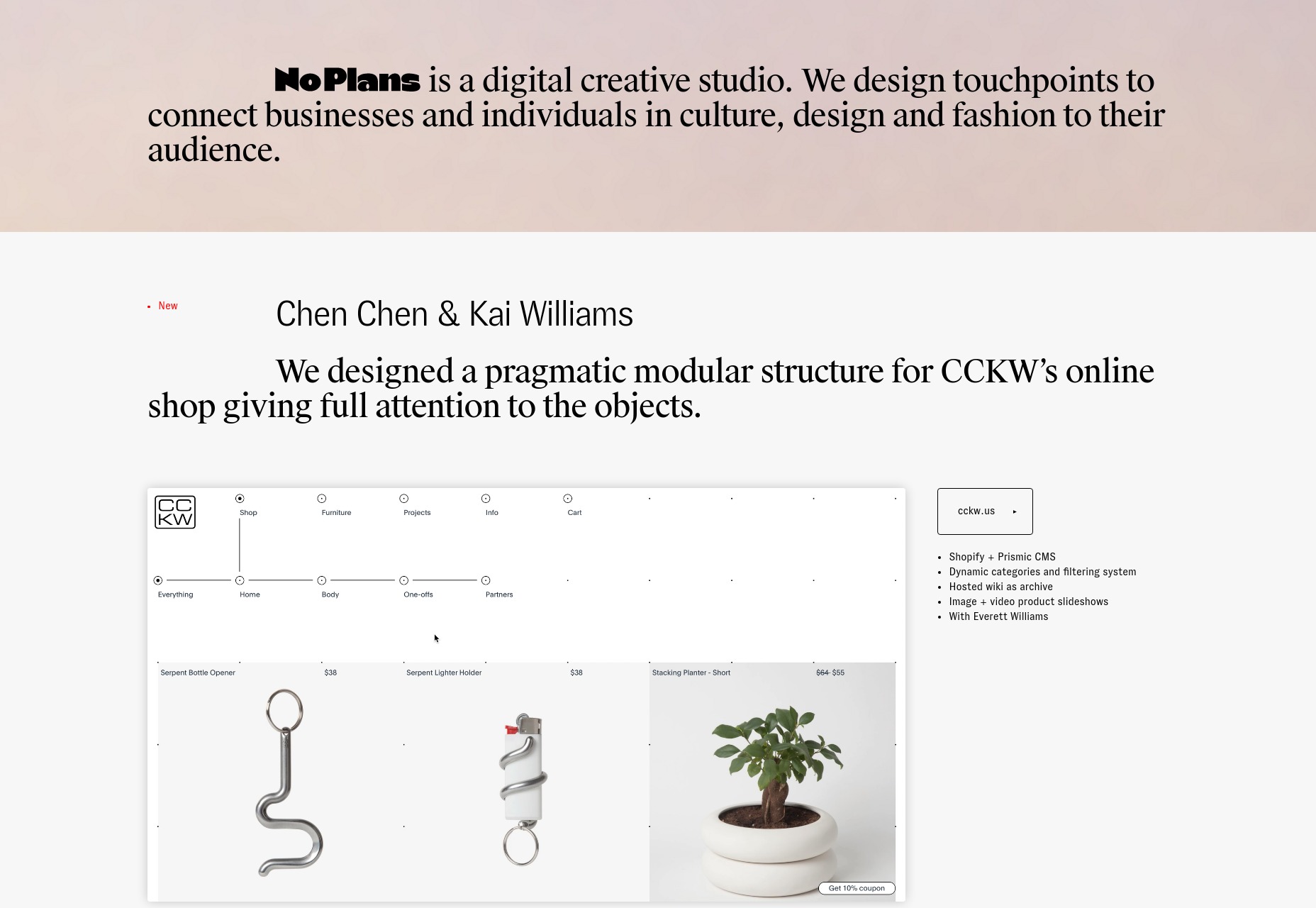
No Plans
No Plans is a one-page portfolio that keeps things fairly simple, preferring a clean design and a decidedly serif-friendly way of doing things. Also, they indent some of their paragraphs. I know, right? You hardly ever see that these days.
Platform: WordPress
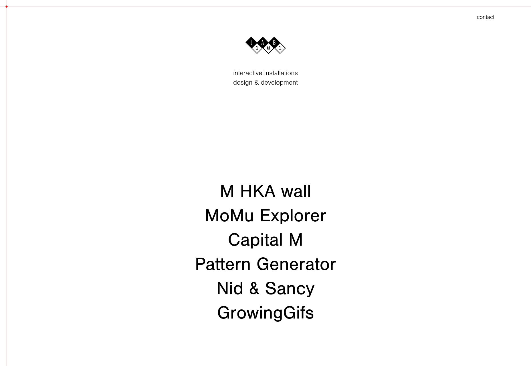
Lab101
I’ll never be a fan of sites that change your cursor, but everything else about Lab101 is pretty solid. The overall aesthetic is minimalist and modern, with some interesting touches of 3D animation on the “Contact” page.
Platform: WordPress
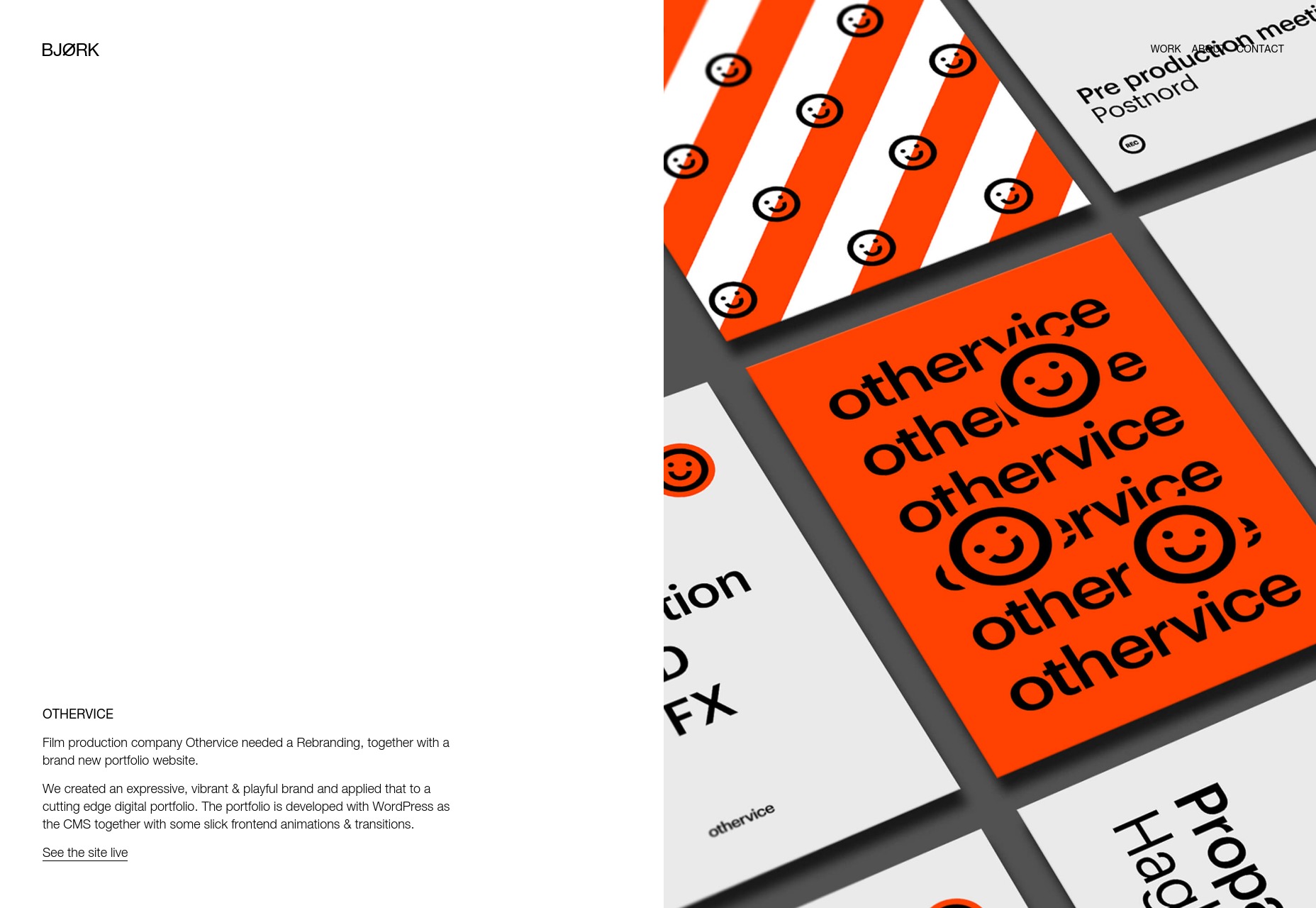
Studio Bjørk
Studio Bjørk has a thing for monochromatic palettes, diagonal lines, and horizontal layouts. And you know what? It works out pretty darned well for them. There’s also a significant bit of animation, great type, and some background video here and there, all combining to make a site that a marketer would call dynamic. Oh,
[Sighs.] Fine, I’ll call it dynamic, too. It just sounds so much like marketer-speak that I didn’t want to say it.
Platform: Static Site
Juul Hondius
I often make reference to magazine-style designs ion this article series, but Juul Hondius’ portfolio is one of the more interesting examples I’ve seen lately. It looks like an old, ooold magazine, complete with small spacing issues and slightly cramped text, combined with beautiful and striking photography.
Those might technically be “issues”, but the design as a whole hits me with a very specific sense of nostalgia that just sells the imagery to me. Besides, it’s a photographer’s site. How badly do you want to read the text anyway?
Platform: Static Site
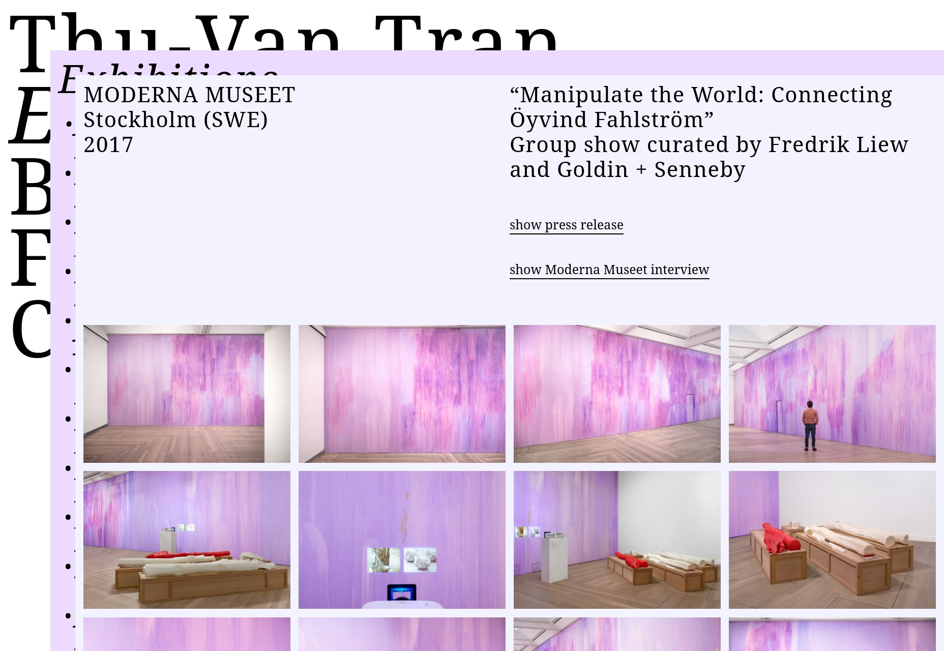
Thu-Van Tran
Thu-Van Tran’s website has one main theme that makes it visually interesting: layers. Every page is loaded on top of the home page like one piece of paper overlaying another. It’s like a paper prototype come to life. Combined with the sheer simplicity of layout, and strong typographic choices, it stands out.
Platform: Static Site
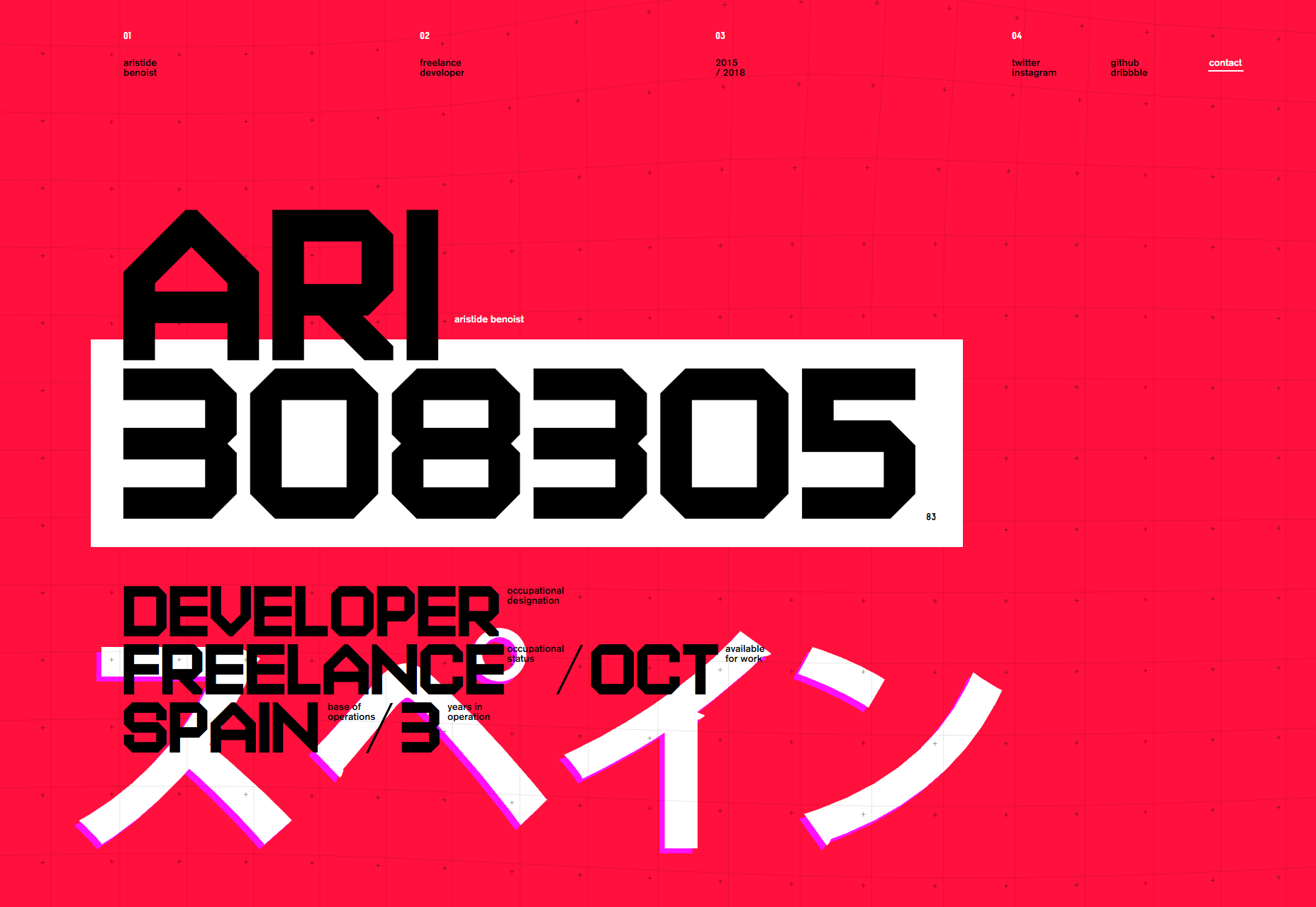
Aristide Benoist
Aristide Benoist’s portfolio combines a grid-based aesthetic with warping animations to striking effect. While most of the text could and certainly should be bigger, the visual theme of this site is enough to make you look, at least. Whether it’s interesting enough to make you grab your glasses will greatly depend on the user.
Platform: Static Site
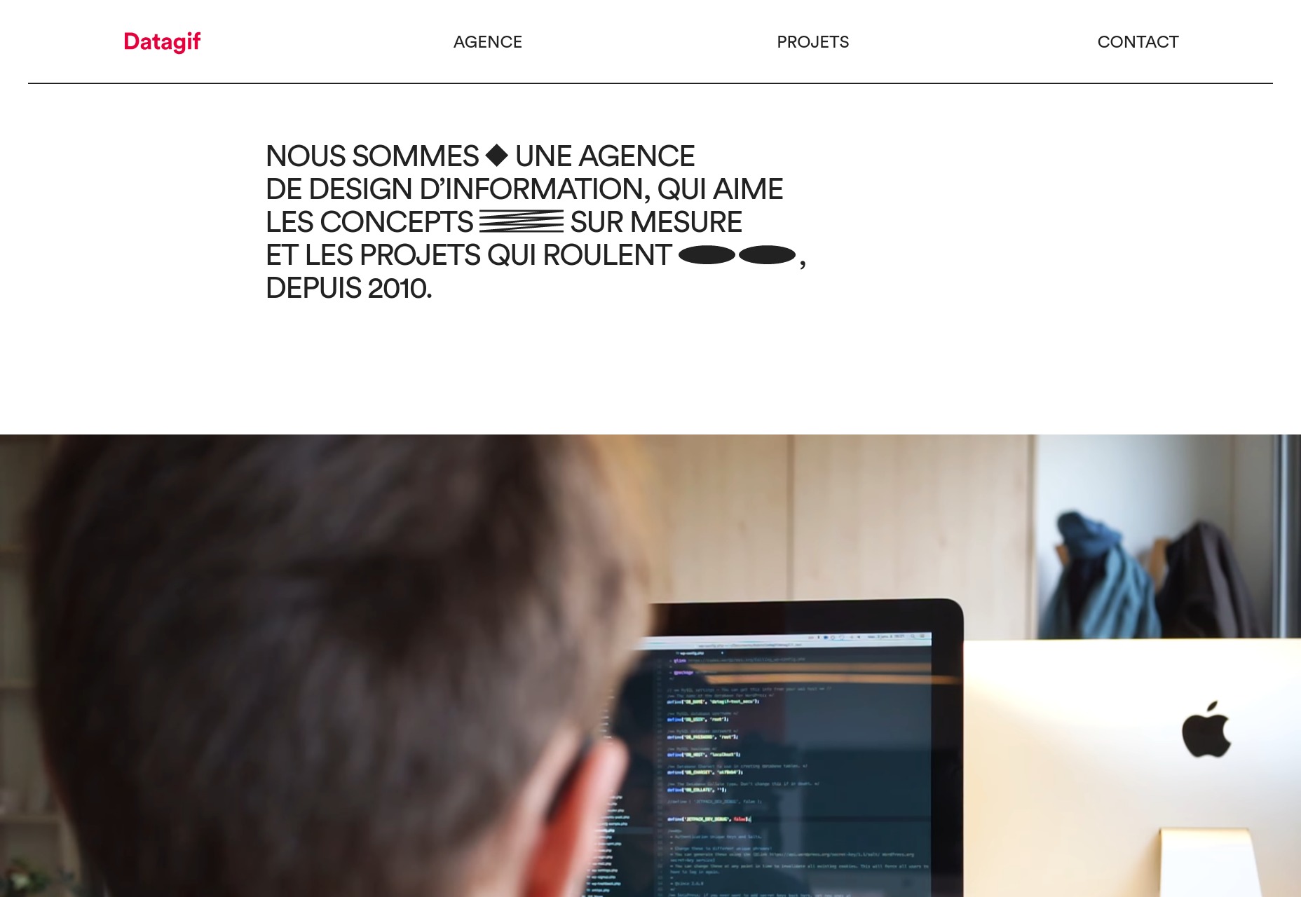
Datagif
Datagif love their sans-serif type, and apparently spicing up standard layouts with geometric flourishes and animation. This one’s not going to blow your mind, but it looks good, even kind of playful for all the corporate aesthetic it has. Give it a look.
Platform: Static Site (I think)
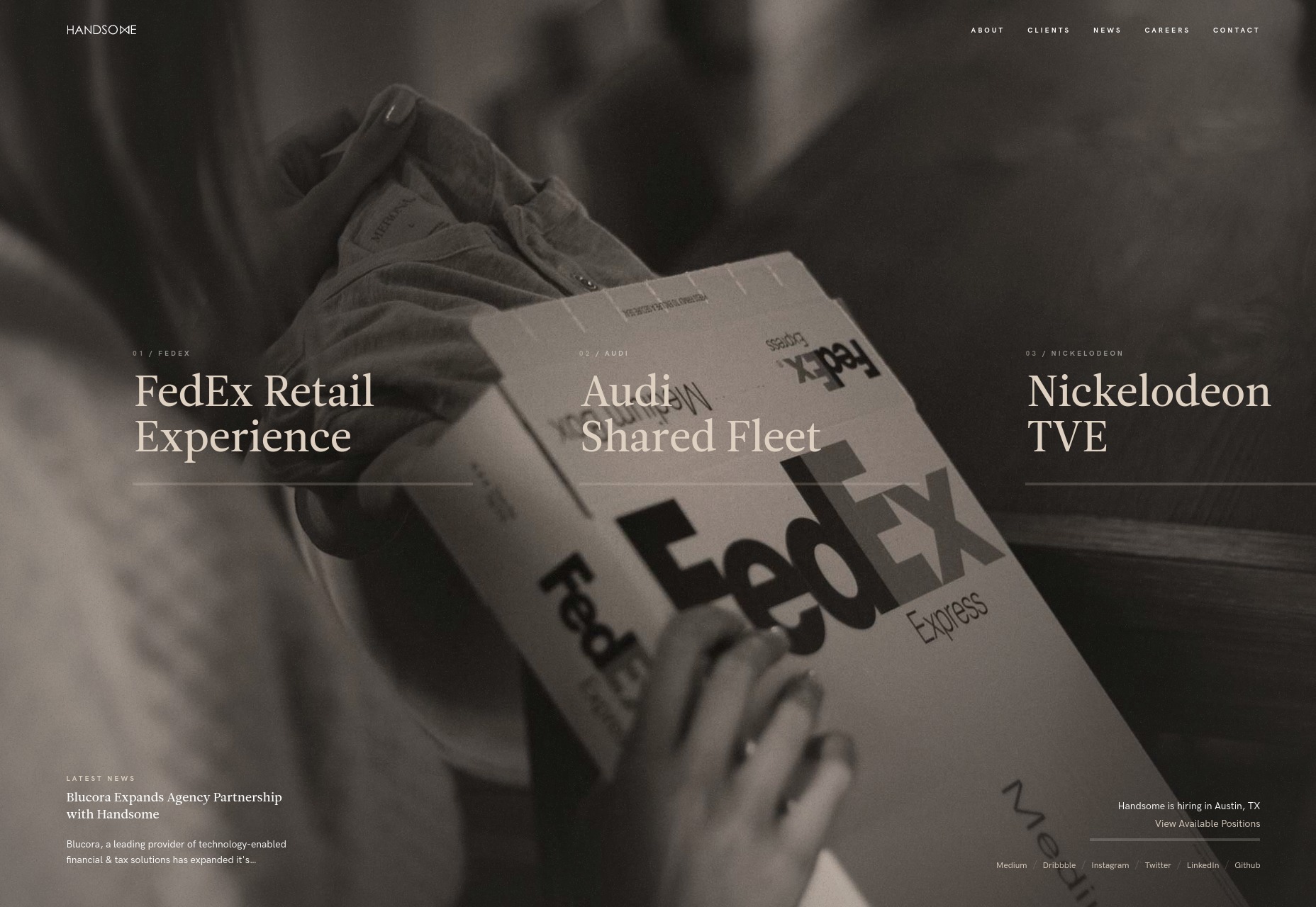
Handsome
Oh, Handsome takes me back maybe five years or so. The large serif type, the darkened photos as backdrops, all those barely visible straight lines. Did we just go back to the early days of flat design? Well, it’s both nostalgic, nearly perfectly executed, and a pleasure to browse.
Platform: Static Site
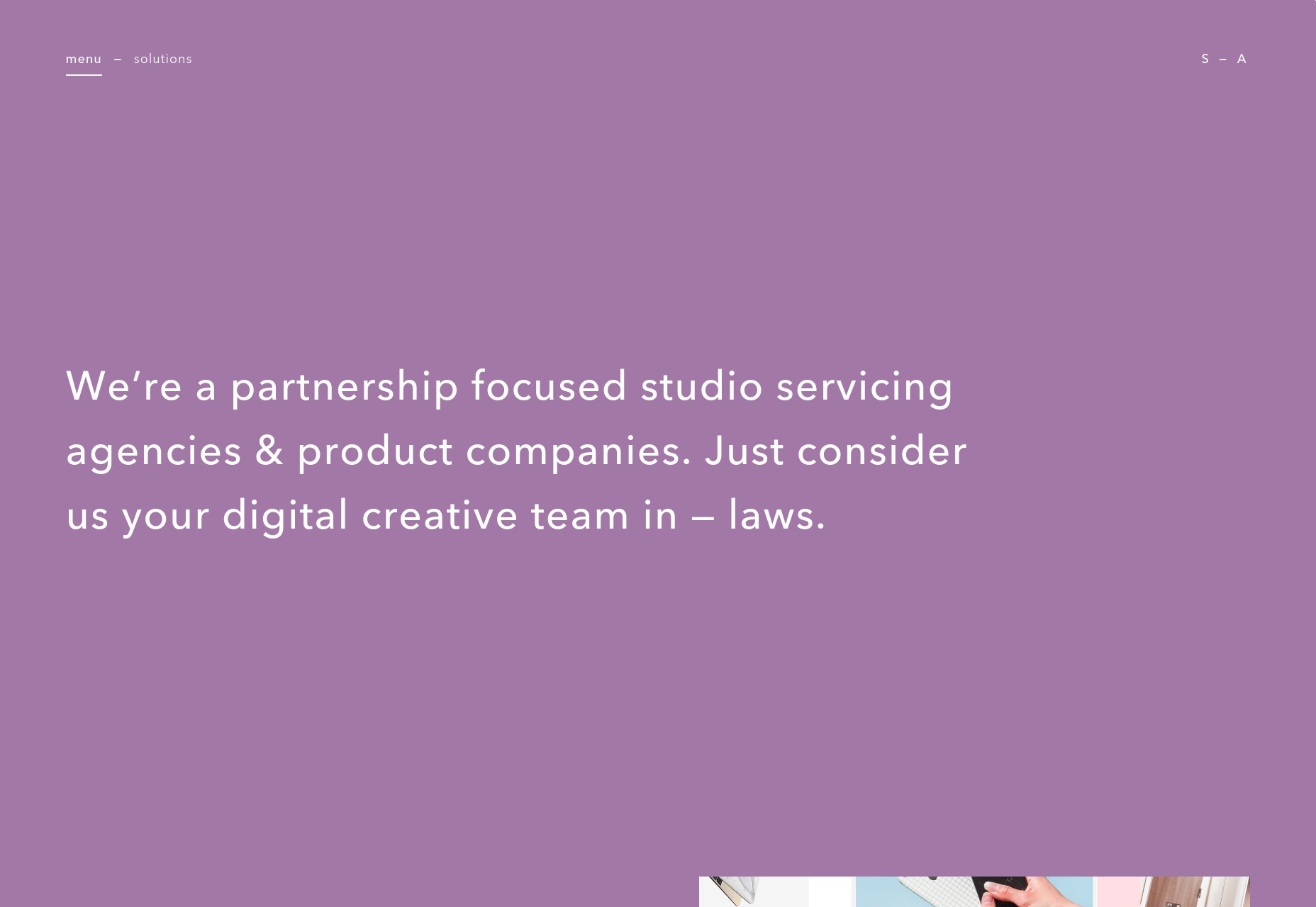
Sister
Sister’s agency site is living proof that any design style, even the once super-artsy minimalism-with-asymmetry trend, can be given an almost corporate flair. And that’s not a criticism. Corporate-feeling front end design tends to be modern and devastatingly effective in its simplicity, and the same is true here.
Not a fan of those occasional modal pop-ups, though. That’s a corporate trend that can go straight to hell.
Platform: WordPress
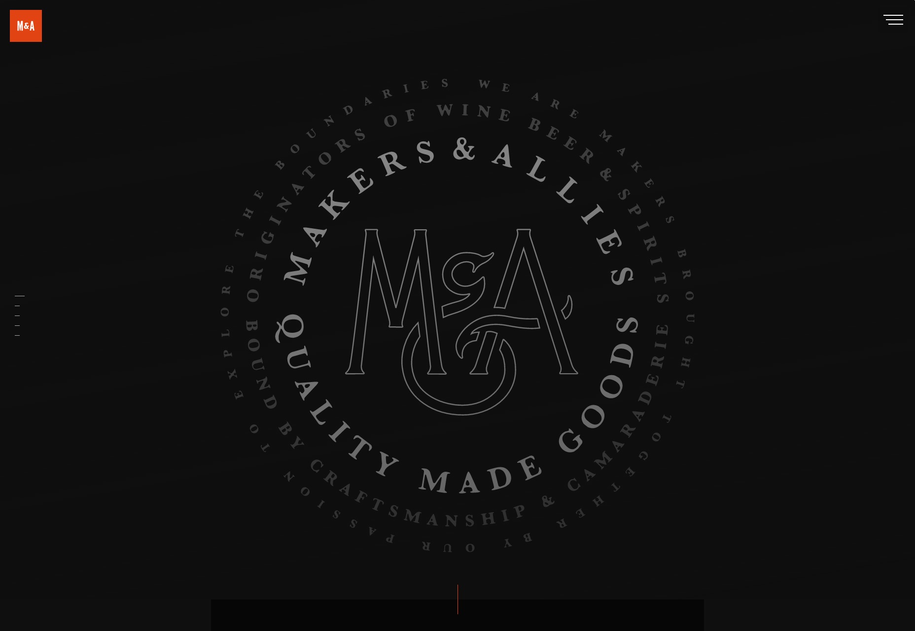
Makers and Allies
Makers and Allies is a branding studio in the finest tradition of hipster design studios, but with a lot more motion design added to the mix. It evokes just the right balance of rustic aesthetics with the modern technical competence we expect. Or at least the animation we expect. Whatever, it looks good, even if some of the text could use more contrast.
Platform: WordPress
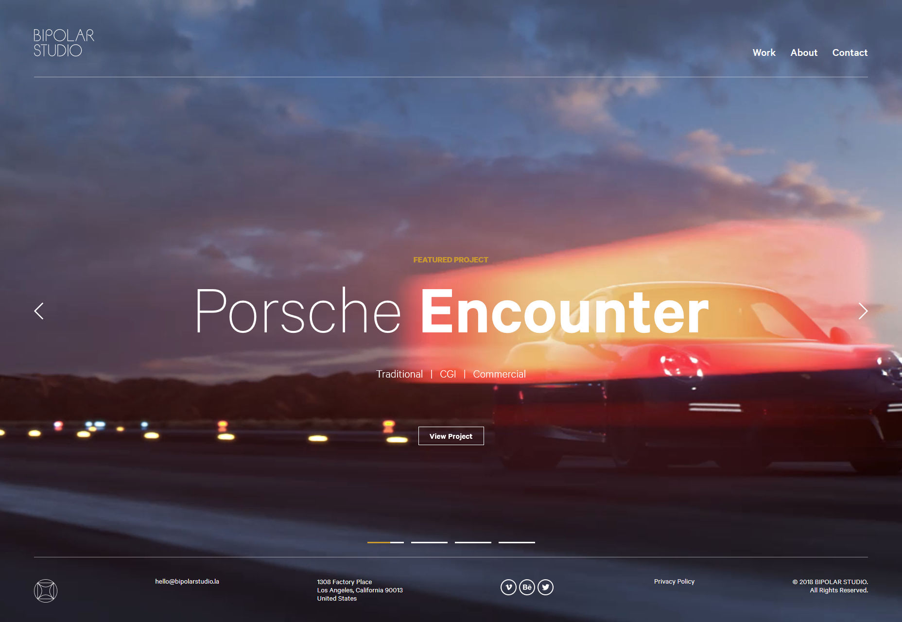
Bipolar Studio
Bipolar Studio combines motion graphics with a pretty modernist aesthetic style, and good old fashioned big type. Their work basically is video, so it’s they use a lot of it in their design. I do like the little “stats” section at the end of each project page, detailing what it took to complete each project.
It’s just that, and I can’t believe I’m saying this, but the logo could be bigger. With type that thin, it should be.
Platform: Static Site and/or JS App
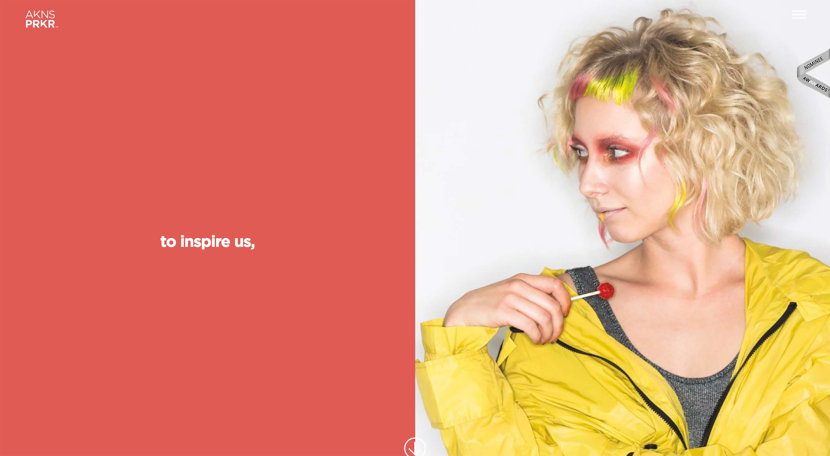
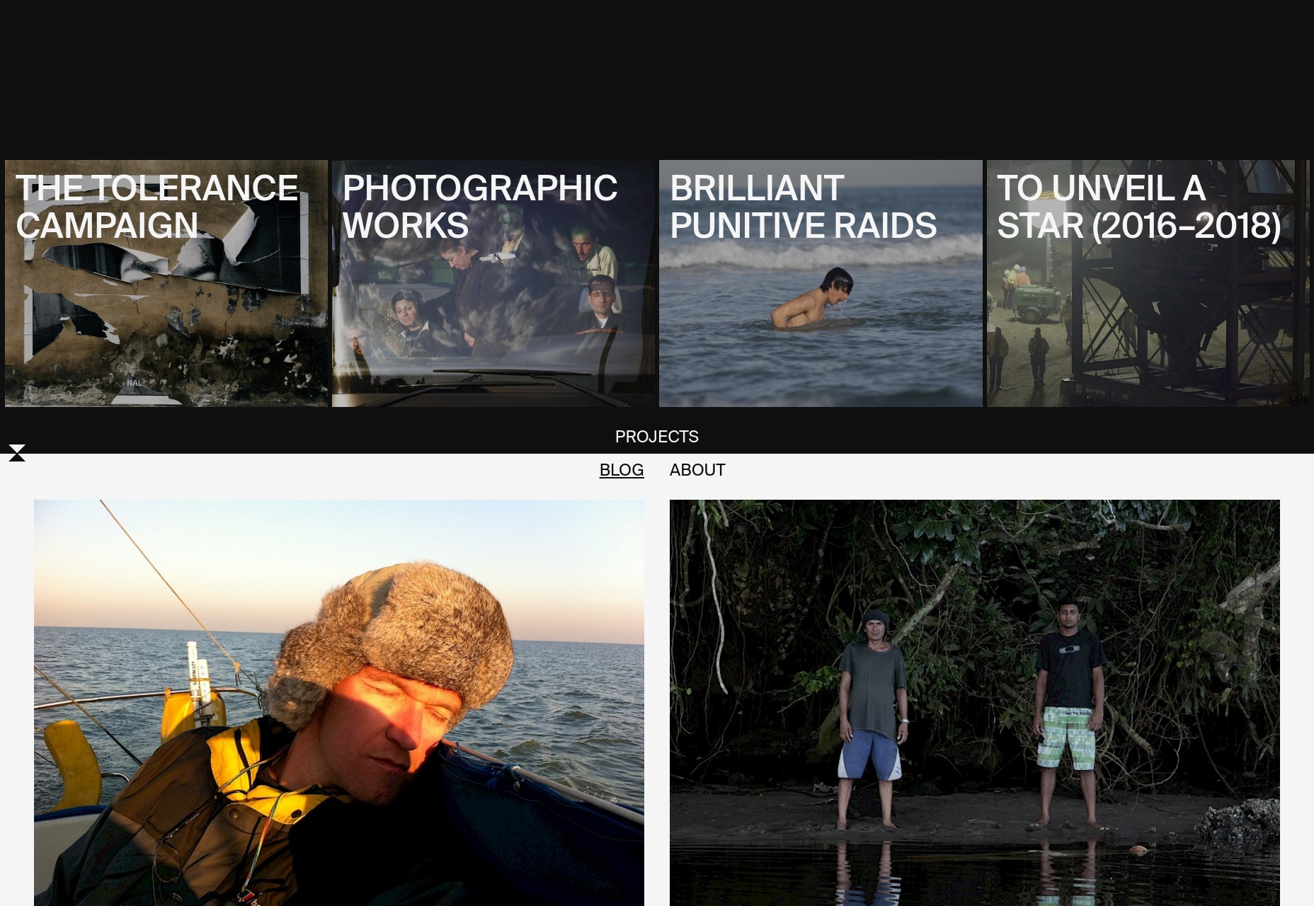
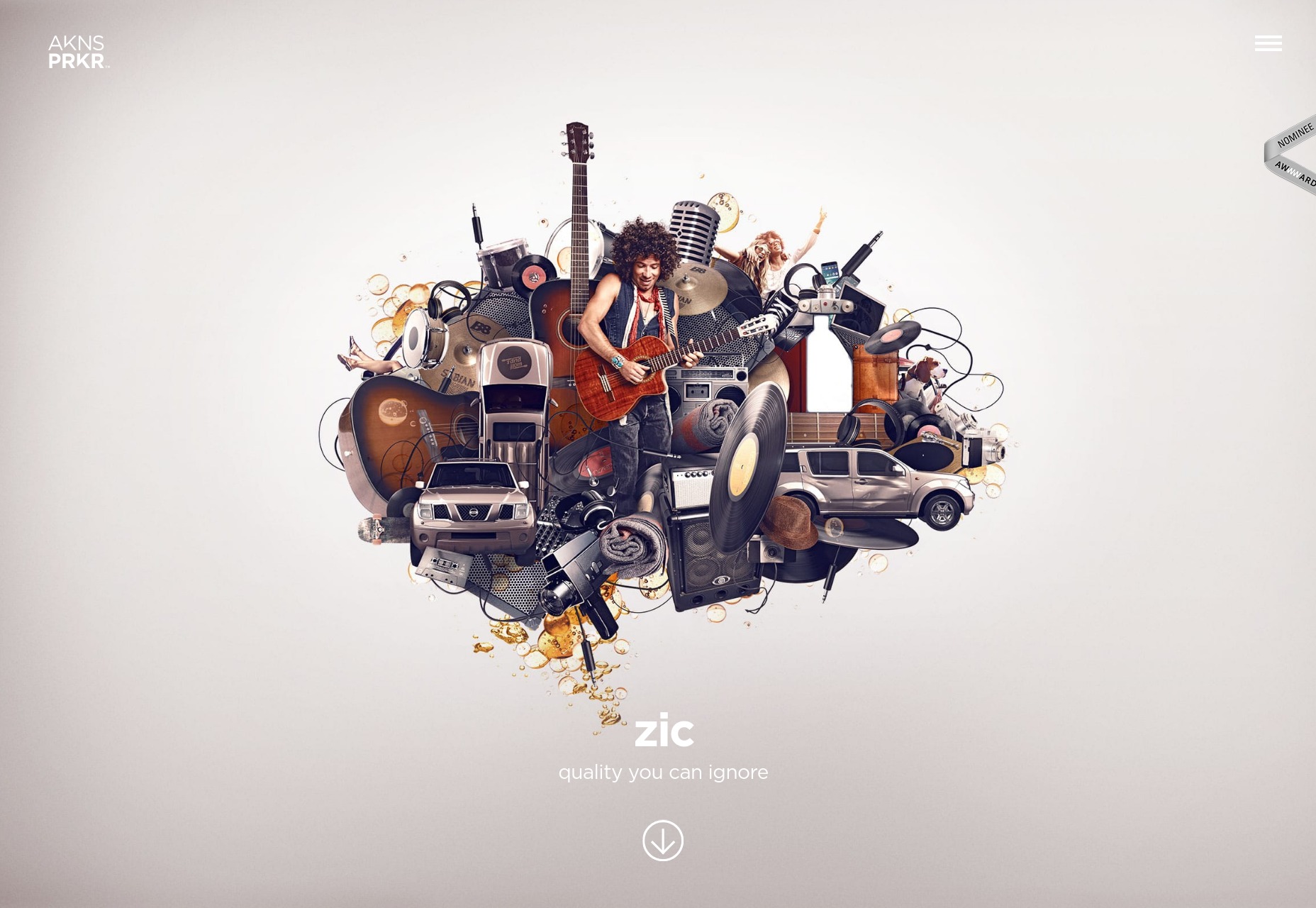
Akins Parker
Akins Parker’s agency site wasn’t made with Powerpoint, but it’s presentational design in its purest form. You go to see this one for the graphics, not for the usability.
Platform: Static Site
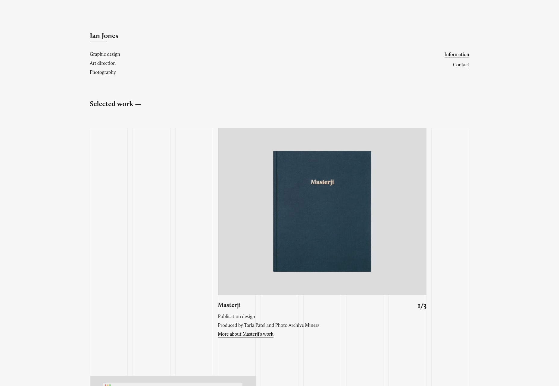
Ian Jones
Ian Jones’ portfolio is another site to embrace the visual grid theme. But unlike many other sites, the visual representation of the grid is only visible when his work is on the page. It’s a dead-simple approach, but it looks calm and professional, and I can’t fault that.
Platform: Static Site
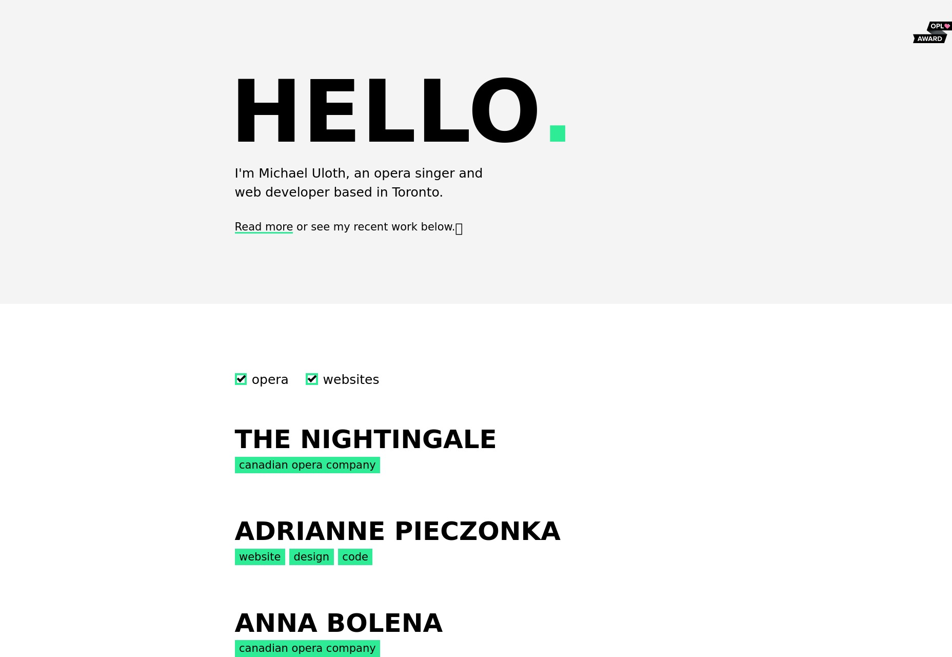
Michael Uloth
Michael Uloth is a rare talent indeed. When he’s not literally singing opera, he builds minimalist-yet-beautiful websites for artsy people. His own site is no exception.
Platform: Static Site and/or JS App
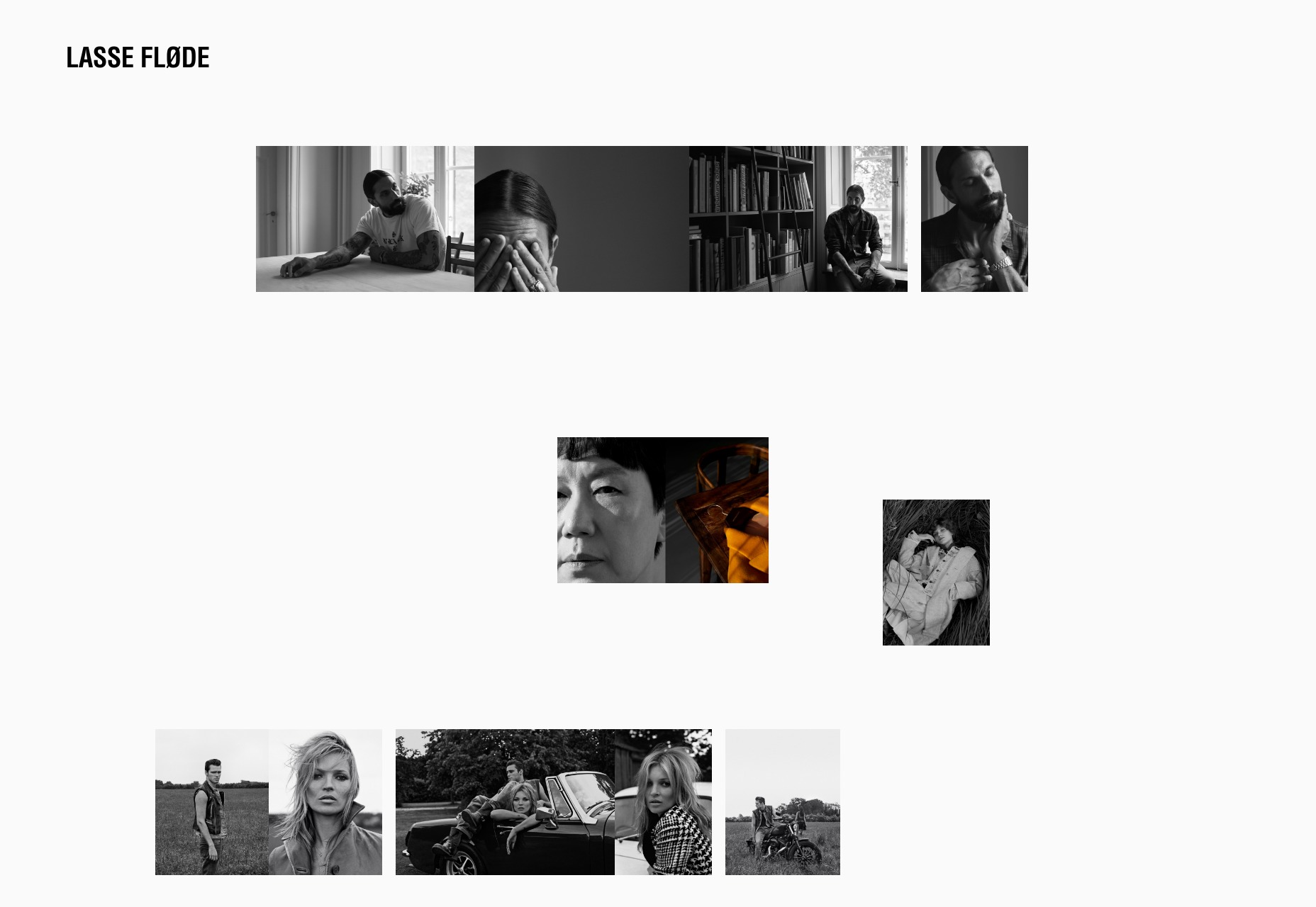
Lasse Fløde
Lasse Fløde is a photography studio with a striking one-page portfolio. Lovers of white space should definitely enjoy this one, as it employs that asymmetrical almost collage-style so favored by many photography portfolios these days. Simple and effective.
Platform: Static Site
Add Realistic Chalk and Sketch Lettering Effects with Sketch’it – only $5!
![]()
Source
p img {display:inline-block; margin-right:10px;}
.alignleft {float:left;}
p.showcase {clear:both;}
body#browserfriendly p, body#podcast p, div#emailbody p{margin:0;}


Leave a Reply
Want to join the discussion?Feel free to contribute!