Book Review – Universe: Exploring the Astronomical World

Original Source: http://feedproxy.google.com/~r/abduzeedo/~3/Cdz0U6_UJAA/book-review-universe-exploring-astronomical-world

Book Review – Universe: Exploring the Astronomical World

Book Review - Universe: Exploring the Astronomical World

ibby
Aug 24, 2017

With all of the eclipse hullabaloo we felt very apropos to feature this beautiful book Universe: Exploring the Astronomical World by acclaimed astronomer Paul Murdin. Previous to studying the skies above the US, Australia, England, Scotland and Spain, Murdin was a research scientist for the UK Government and the Royal Astronomical Society. This book is for anyone in your life with an eye for art and an obsession with astronomy. One can explore the stars and planets from ancient cave paintings to animation all brought to life by an international panel of experts.

“I believe everyone should have a broad picture of how the universe operates and our place in it. It is a basic human desire.” —Stephen Hawking

This beautiful book is a groundbreaking survey that celebrates the popular subject of astronomy through 300 images created by those who have been inspired by the mystery of our beloved universe above. Arranged to highlight thought-provoking contrasts and similarities,  you’ll be delighted by paintings, photographs, sculpture, animation, prints, sketches, and digital renderings with iconic works by renowned photographers, artists, and astronomers alongside previously unpublished finds.

You can pre-order Universe now for $59.95 and this title will ship by October 9th, just in time for the holidays. 

Buy Now

book review
universe
Astronomical World


Image Optimization in Advanced Web Development

Original Source: http://feedproxy.google.com/~r/1stwebdesigner/~3/w19uUDx023c/

Web-quality imagery is always a balancing act between using the smallest possible file size while providing good image quality. Embedding a photo straight off your DSLR may look nice, but it will slow your website’s load to a crawl, while an over-compressed image may improve the speed of your site yet discredit the design and overall aesthetic.

For the two types of image assets we predominantly deal with – photos and icons/illustrations – we perform a mixture of image quality checks and compression techniques that work well in most case scenarios.

File Types and When to Use Them

There are three image file types we use when building websites: .jpg .png and .svg.

JPGs are best used for photos such as landscapes, scenery or people. For imagery in content, such as a blog article image, we aim for 20-70kb. Larger background photos can get up to 500kb, but 200kb is a good average.

JPGs are lossy (they recompress and degrade the image quality each time you export), and they don’t manage gradients very well. If you have a gradient in an image, sometimes you can separate the image into two cuts so that you can render the gradient in a separate background using CSS gradients instead.

PNGs are best for assets such as logos and icons because they support transparency and because logo and icons often use a more limited color palette – since PNGs achieve compression through a reduction in the number of colors.

A PNG can be lossy, but we typically use lossless, meaning every pixel is saved exactly without degrading the color palette, resulting in a higher-quality image.

SVGs have the best quality of all and are used for vector art due to their scalability. We often use them with logos, however, SVGs do create more work for the browser to render and can create sluggishness as the page loads, so the quality of your image should always be balanced against its complexity.

As an example of when we use PNGs and SVGs, compare the logos for Silver Screen Insider and Bozeman Websites. For the former, we used an SVG. For Bozeman Websites, because of the complexity introduced with CSS animation when a user scrolls down, we chose to use PNGs instead so as not to compromise browser performance.

Sometimes the best solution is a combination of both: for the logo on JTech’s website, the “JT” component is a PNG, but the “Celebrating 20 Years” is an SVG in order for it to retain its quality in all viewport sizes.

Optimization Techniques

In order to get the best possible results, it is important to optimize your images. To do so, we utilize three programs: ImageOptim (for JPGs and PNGs), ImageAlpha (for PNGs) and Scour (for SVGs).

Optimizing JPGs

ImageOptim reduces the file size of JPGs and PNGs. For large images, such as the ones we use for background panels, we cap dimensions at 1600x1200px. For content photos such as an image inserted in a blog article, we cap dimensions between 200-800px wide.

After resizing to its final resolution, the image is output in Photoshop using the best quality available. Each time we compress the image it loses some fidelity, so we prefer to rely solely on ImageOptim for compression rather than having Photoshop do a pass. Photoshop is noticeably less efficient: its “save for web” at quality 65 produces an image of equal file size but poorer fidelity than ImageOptim’s quality 85.

Retina JPGs

When targeting retina or other high-density displays, we’ve found it works best to save a single JPG at twice the resolution, but use higher compression, around 50-60 in ImageOptim, which can produce a high-quality image that looks good on both retina and standard, lower-density displays. This technique allows us to use a single asset for retina and standard displays rather than cutting and loading multiple versions and without quadrupling the size of our images.

Optimizing PNGs

For PNGs, we output from Photoshop using PNG 24 in their “save for web” option, then run it through ImageOptim. If it detects that the image is using fewer than 256 colors, ImageOptim will losslessly convert the image to a PNG 8, a simpler file format that can produce very light-weight files.

With ImageOptim, our final output of an image without too many complexities (minimal color, simple shapes, and resolution less than 200x200px) can range in size from 15kb down to under 1kb.

Optimizing Larger PNGs

For more complex images, if we can’t produce a file between 15kb and 50kb with ImageOptim, we use ImageAlpha. ImageAlpha is used to process PNGs from a PNG 24 (millions of colors) to a PNG 8 (256 colors maximum), changing the image from lossless to lossy, ultimately aiming for the one with the smallest number of colors.

Lossiness in this format primarily means strategic refinement of the color palette, eliminating the least-noticeable colors to produce an image that still looks great while reducing its complexity.

After exporting from ImageAlpha, we run it through ImageOptim so it can be optimized further.

Optimizing SVGs

When it comes to SVGs, we reduce as much complexity as possible before we export the image from Illustrator. An often tedious process due to their size, we first try to reduce the number of layers to a minimum while still accurately displaying the artwork. It is then saved as an SVG in Illustrator and optimized with a program called Scour.

We use this automator script to make it a bit easier to use in macOS, allowing you to right-click an SVG file in the Finder and optimize the SVG through the Services menu. We often use font files for vector graphics that are single-color with a program called Glyphs.

Conclusion

Properly optimizing imagery is just another way we can improve the performance of our websites, prevent browser bloat, reduce server and bandwidth resource usage, hasten page load time, keep the development infrastructure clean and provide a much more desirable experience for the end-user.

We hope this exploration of our experience with JPG, PNG and SVG file types, image compression and quality tools are a resource for you as we continually refine our own process to produce websites of high caliber.


12 Essential Scroll-To-View Animation Trends

Original Source: https://www.webdesignerdepot.com/2017/08/12-essential-scroll-to-view-animation-trends/

Animated page elements are super common on landing pages and startup websites. But they’re not always talked about in design circles because the idea of “animate on view” isn’t covered a lot.

I use the phrase scroll-to-view because it seems like an accurate description. Basically as you scroll down the page new animated elements come into view.

It’s not a technique that works for every website but it does add a nice touch into certain layouts. And I’ve curated some of my favorites here to showcase how these scroll-to-view animations work and why you might try using them yourself.

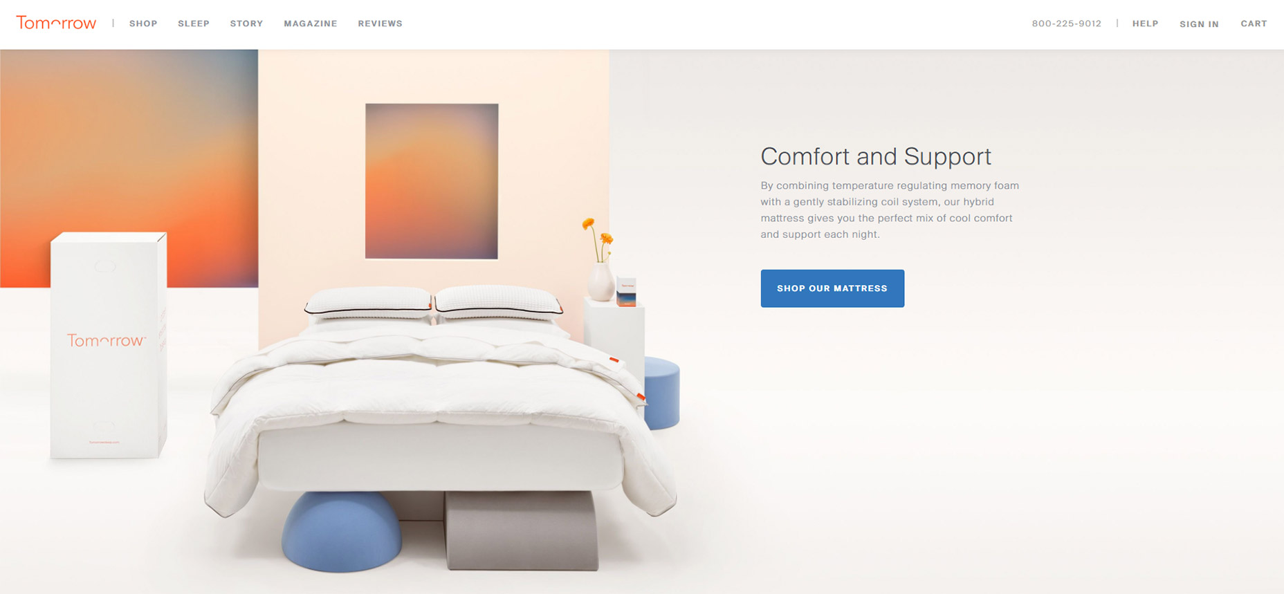
1. Tomorrow Sleep

On the Tomorrow Sleep website you’ll notice a few fairly benign animated effects. These fade different pieces of text and CTAs into view all around the layout.

What’s interesting is how most of the images and background areas are fully visible even on first scroll. Many websites use fading animation to display images and screenshots while keeping the text visible.

This minor difference helps draw attention to the text as it fades into view. A great way to capture attention from visitors browsing along.

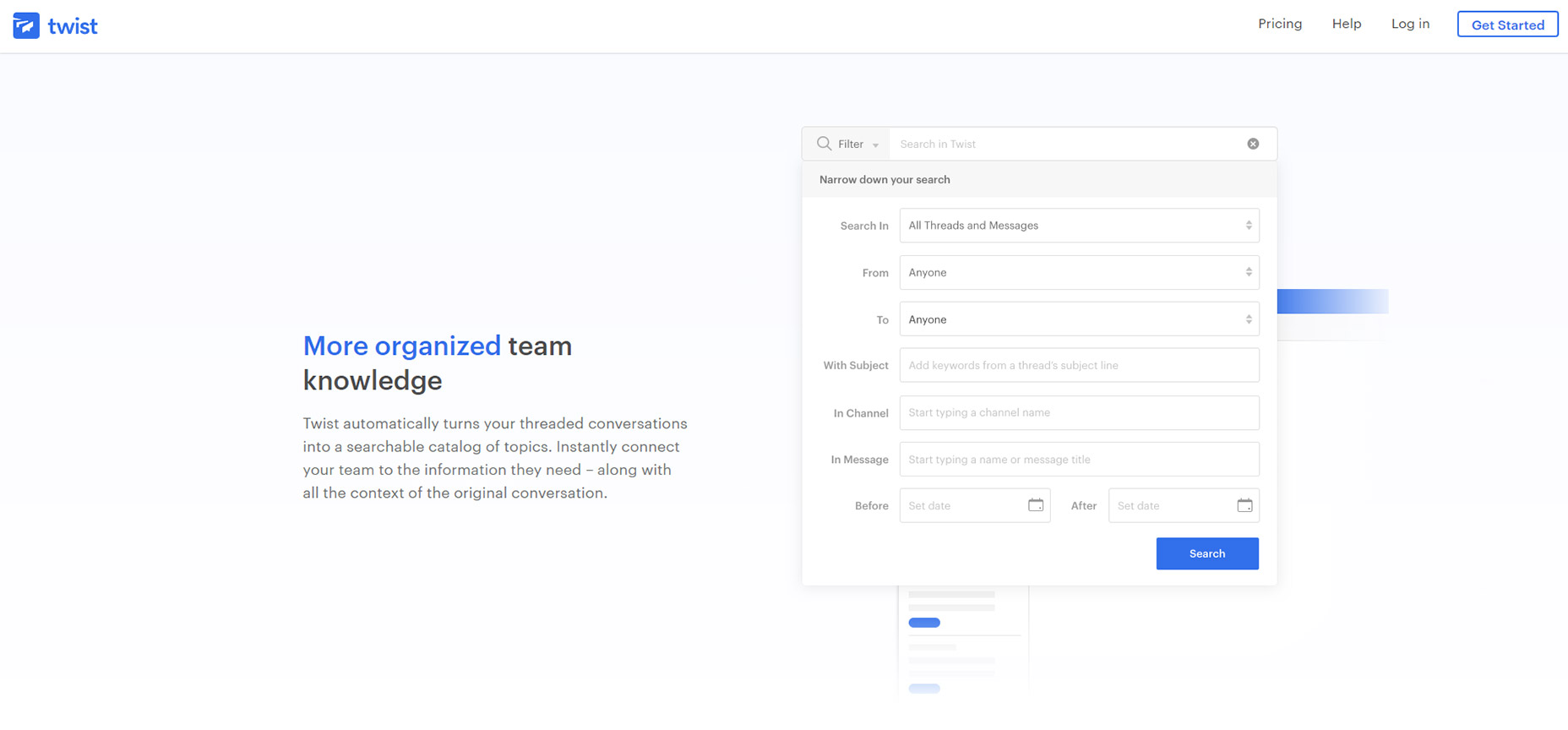
2. Twist

Another technique I often see is targeting most of the page’s content for on-scroll animations.

For example the Twist app homepage includes varying page segments and blocks of text that animate in & out of view on scroll. These have a very soft fading effect so they’re noticeable yet not too harsh.

Some visitors may be annoyed by the delay but I don’t think it’s too long. Plus it only animates one time so if you hit the bottom of the page all animations are done.

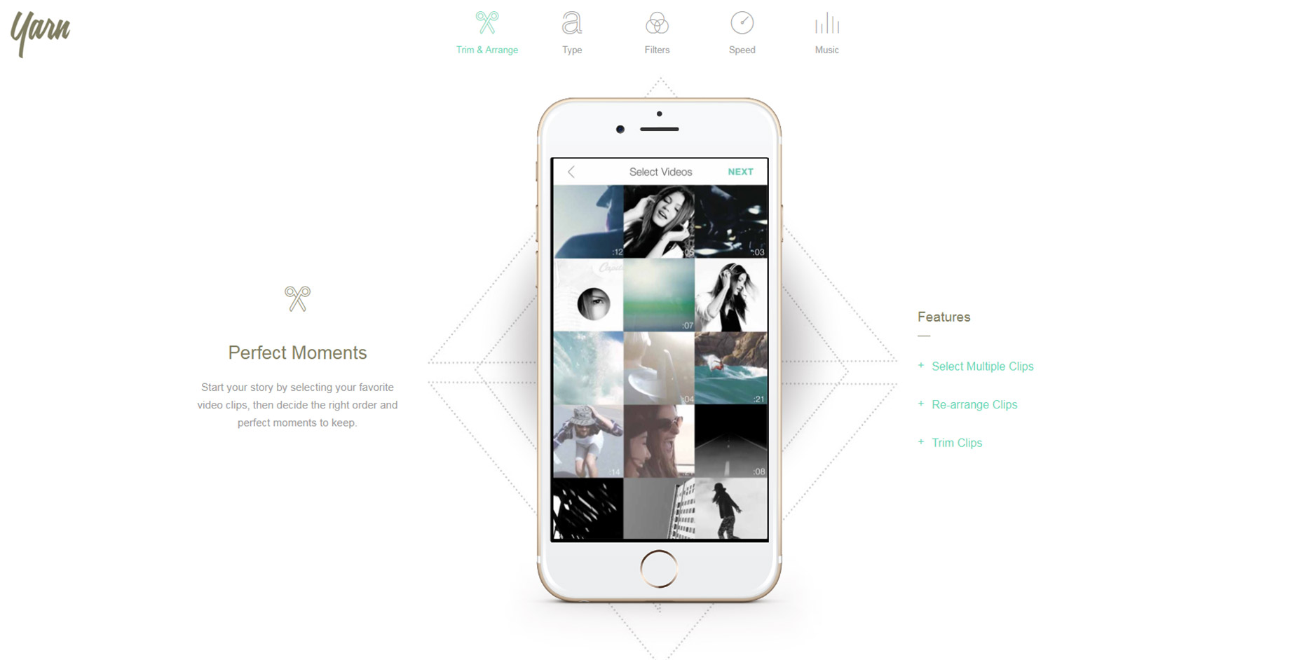
3. Yarn App

For much more complex animations check out the Yarn App lander. This one has multi-part animations and even elements that come into view from different angles.

Some of the screenshot demo images animate upwards while the accompanying text/BG patterns animate down into view. This alternating style is pretty unique and not something I see often.

However the landing page is also incredibly simple and there isn’t much else here to grab attention. In this case varying animations work nicely.

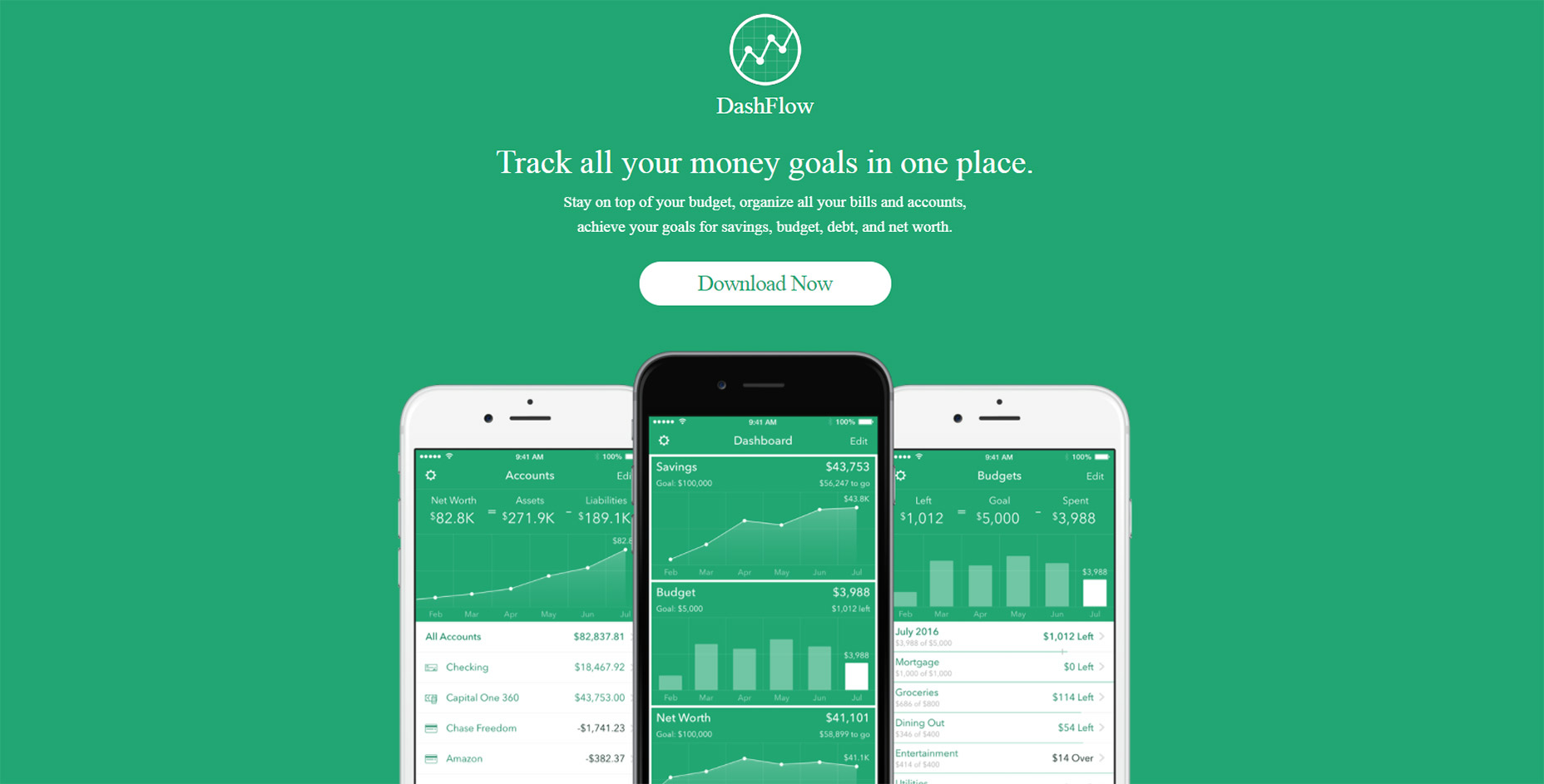
4. DashFlow

Out of all these examples I think DashFlow uses the most common animation techniques.

This lander animates images and text into view all in one sitting. It’s real simple and uses a single-column layout so all content flows straight down in a linear path.

Nothing inherently special about this design beyond the very clear-cut method of animating items on scroll. A great style if you have a similar website and want to keep the animations simple.

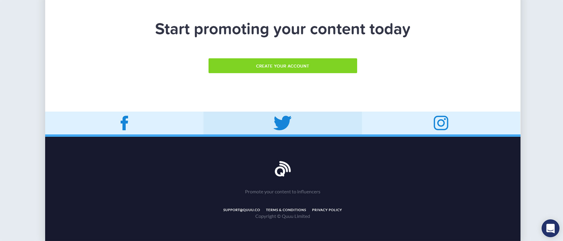
5. Quuu Promote

Quuu Promote keeps animations to the bare minimum and only uses them in CTA areas.

I can’t say if this increases conversions but that does seem to be the goal. When you first load the page the very top header animates into view with a tilting animation on the CTA.

As you scroll down you’ll notice the rest of the page is pretty static. But at the bottom there’s one final CTA above the footer that also animates & runs the same tilting animation.

Goes to show you can have on-scroll animation effects that don’t run across the entire page.

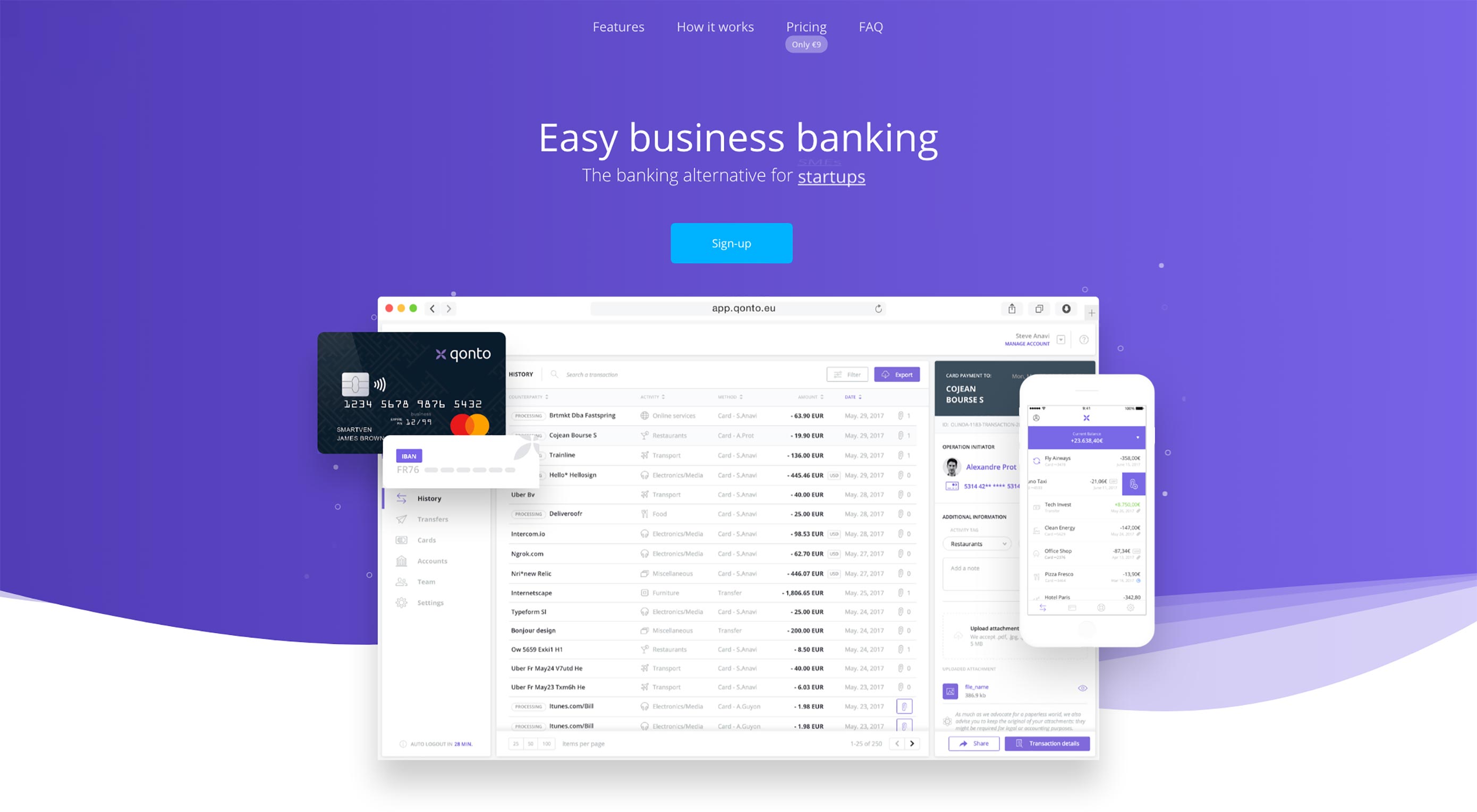
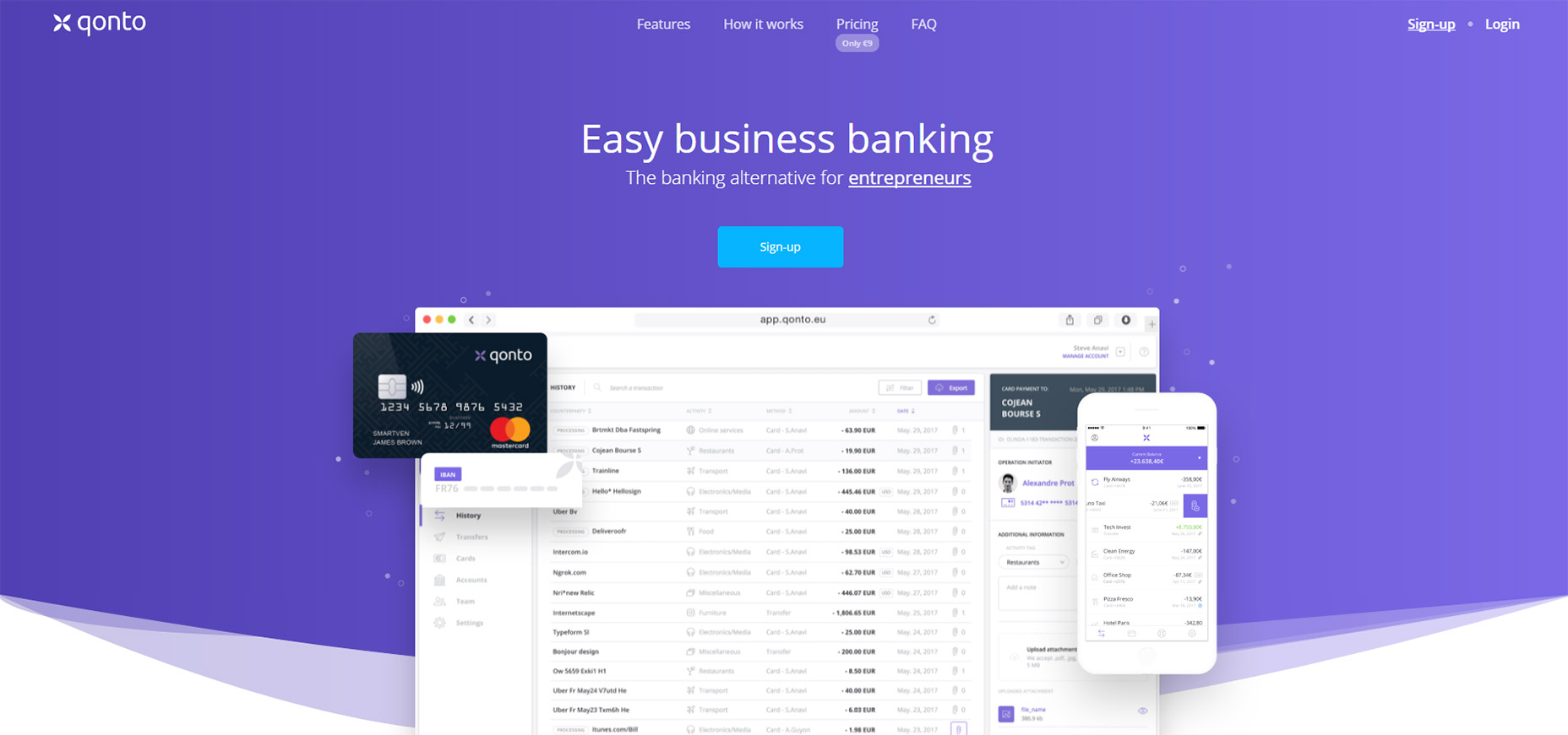
6. Qonto

The homepage for Qonto has an interesting take on scroll-to-view animation. It uses the same type of animation across the entire website and animates individual items into view from the side.

For the majority of the page this includes icon sections that have a small graphic above some content explaining the app’s features. Not too subtle yet not overly overt either.

Plus you can find a few other animation styles in the header along with some BG images that fade into view. This page is just a gorgeous example of what web animation can do.

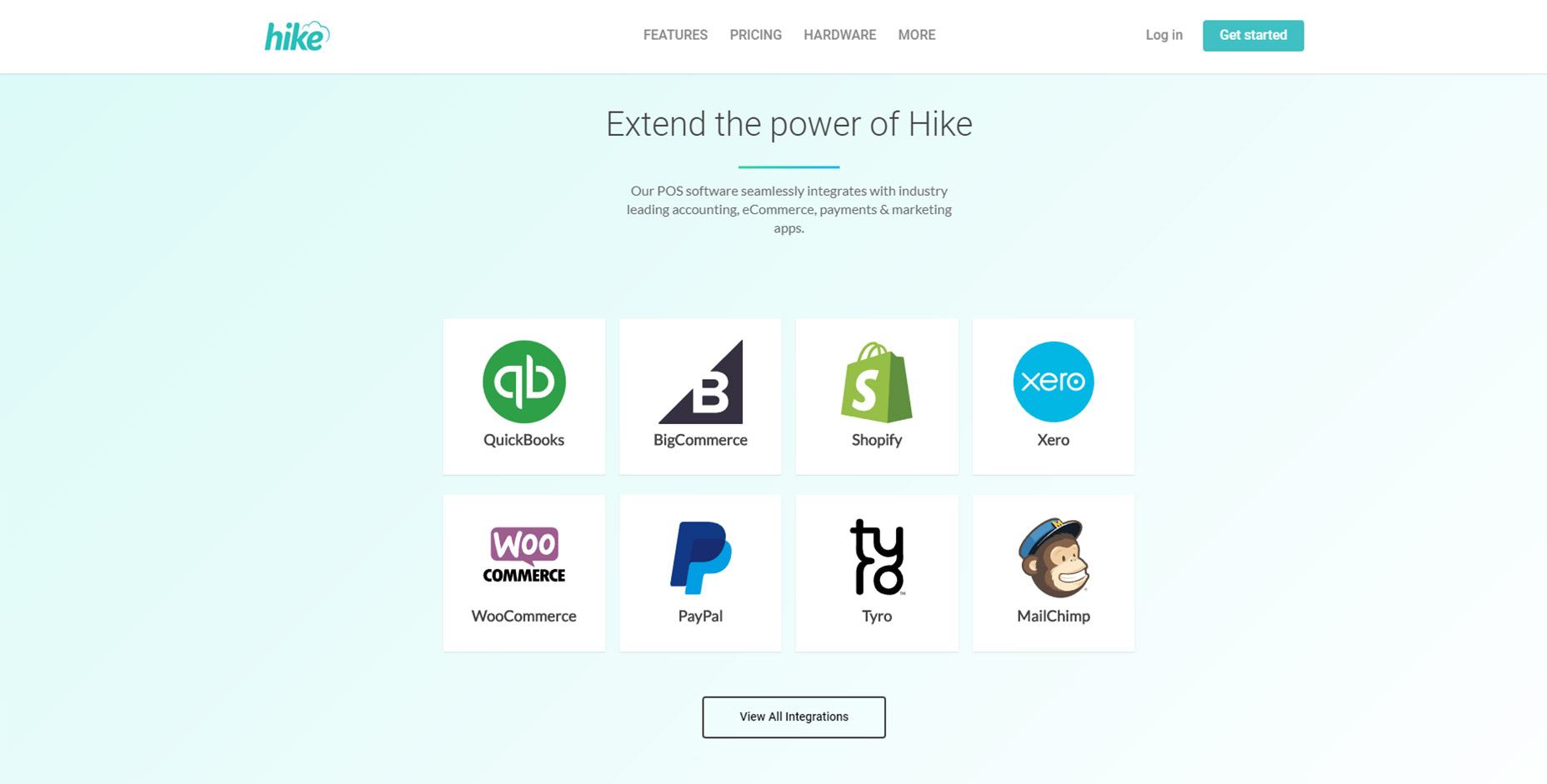
7. Hike

For an example of subtle animations check out Hike.

Their page alternates between animated elements and fixed elements. But the animation effects are fast so you don’t feel annoyed waiting for viewable content.

This is my preference for any scroll-to-animation effect. It’s always a beautiful technique but the timing needs to be quick and to the point. Nobody wants to wait around for content to come into view and Hike clearly understands this.

8. Project Fi

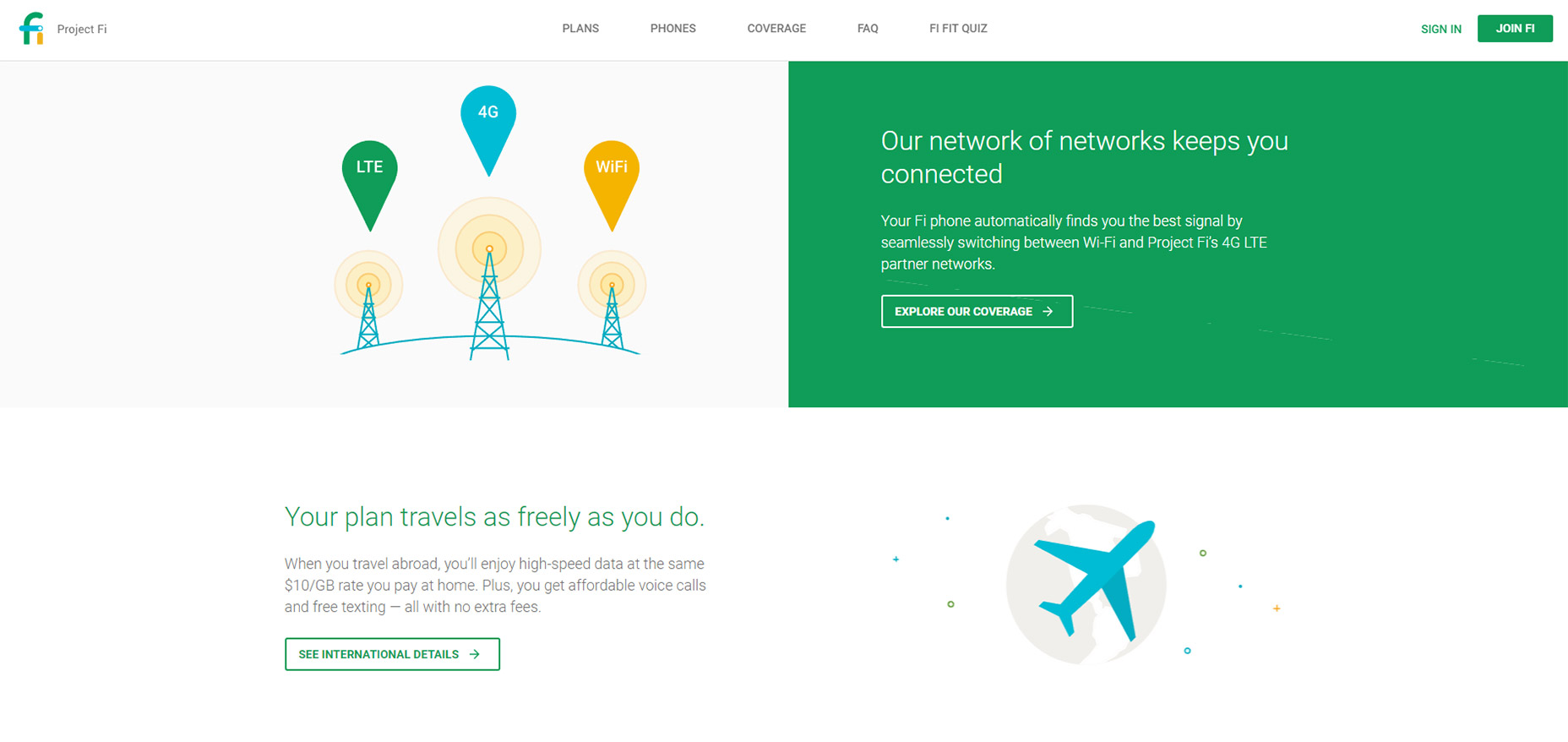
If there’s anyone who knows great UX it’s Google. And across all their products they have a ton of landing pages, Project Fi being one example with some fantastic animations.

These only apply to icons and they don’t fade into view, but rather pop up from lower on the page. As you scroll you’ll find icons that slide up into view for each small section.

It’s a pretty subtle effect but it adds some life into the design. And it’s based solely on the viewer’s position on the page so if you scroll to the top & move back down you’ll be greeted by the same animation effects.

9. Base

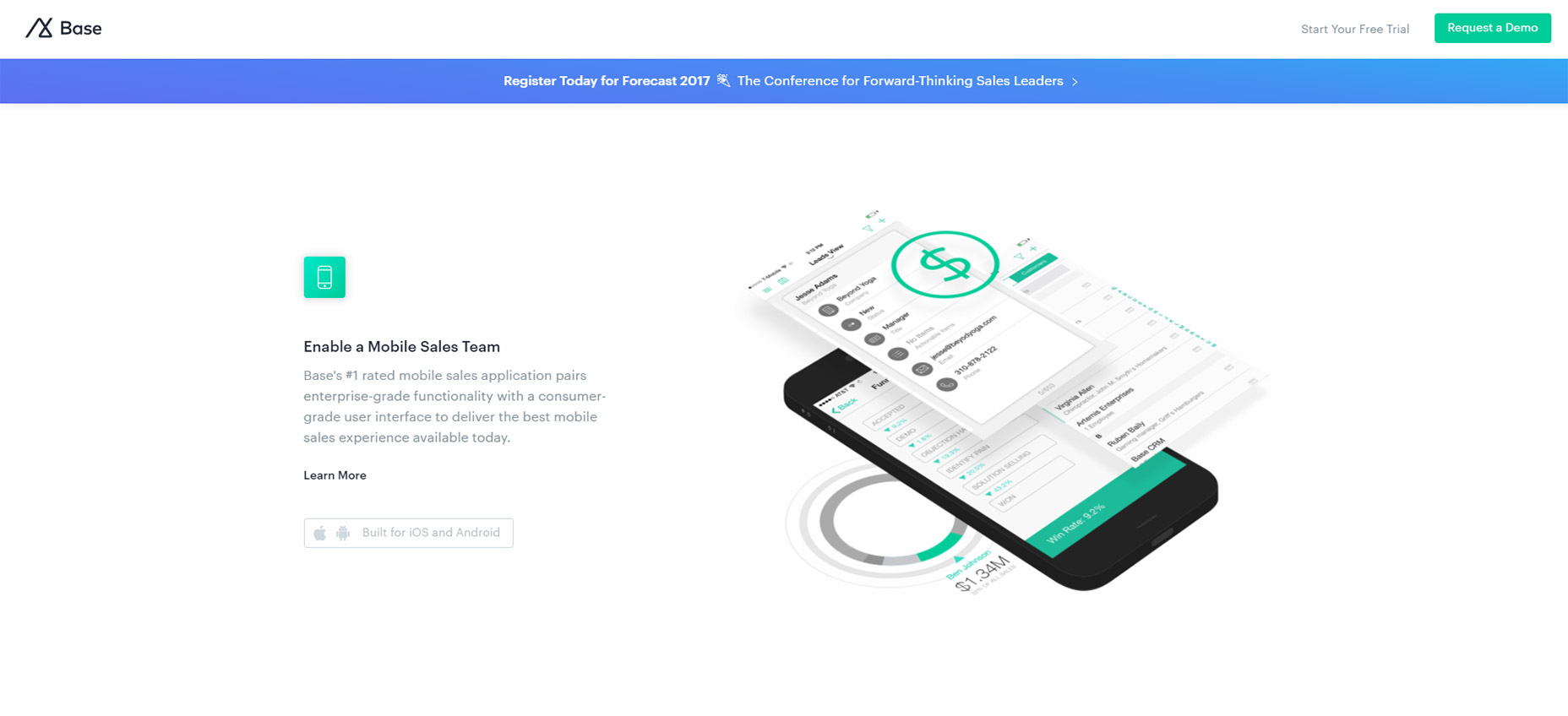
The Base CRM homepage is an excellent example of simple animation at work. This site uses custom animation effects to move images up and into the viewer’s eye line.

Based on the number of landing pages I see daily this is very typical of what I expect. It’s not really a complex animation to recreate and it doesn’t affect the experience too much either.

One thing I wish is that the animations would load a bit faster. But beyond that I think this is a prime example of animating images on scroll with a very clean layout to boot.

10. AnyList

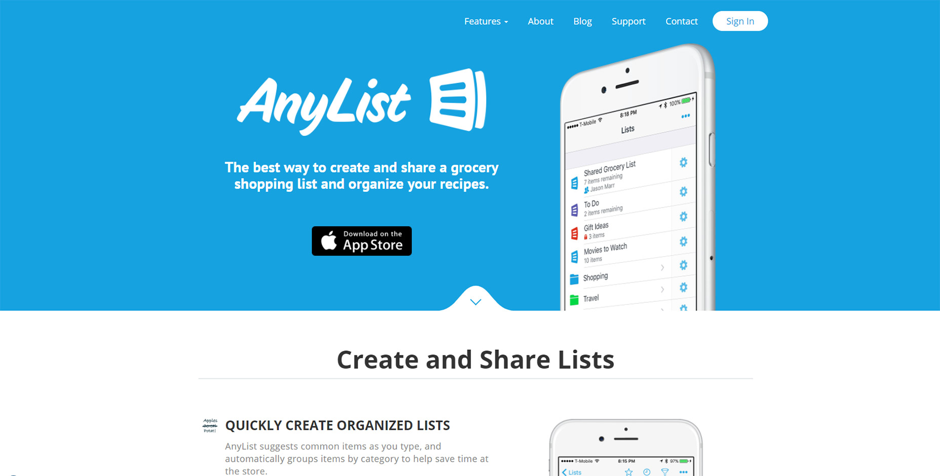
All the best mobile applications have their own websites for promotion. And the best ones usually have some pretty snazzy animation styles.

AnyList mixes a few different techniques together on one page. Their header image animates up from beneath the cut-off area but it’s the only “moving” animation on the page.

Everything else just fades into view and it all uses a pretty quick load time for the animation. These techniques are used elsewhere on the site which gives it a more cohesive feel.

11. Ernest

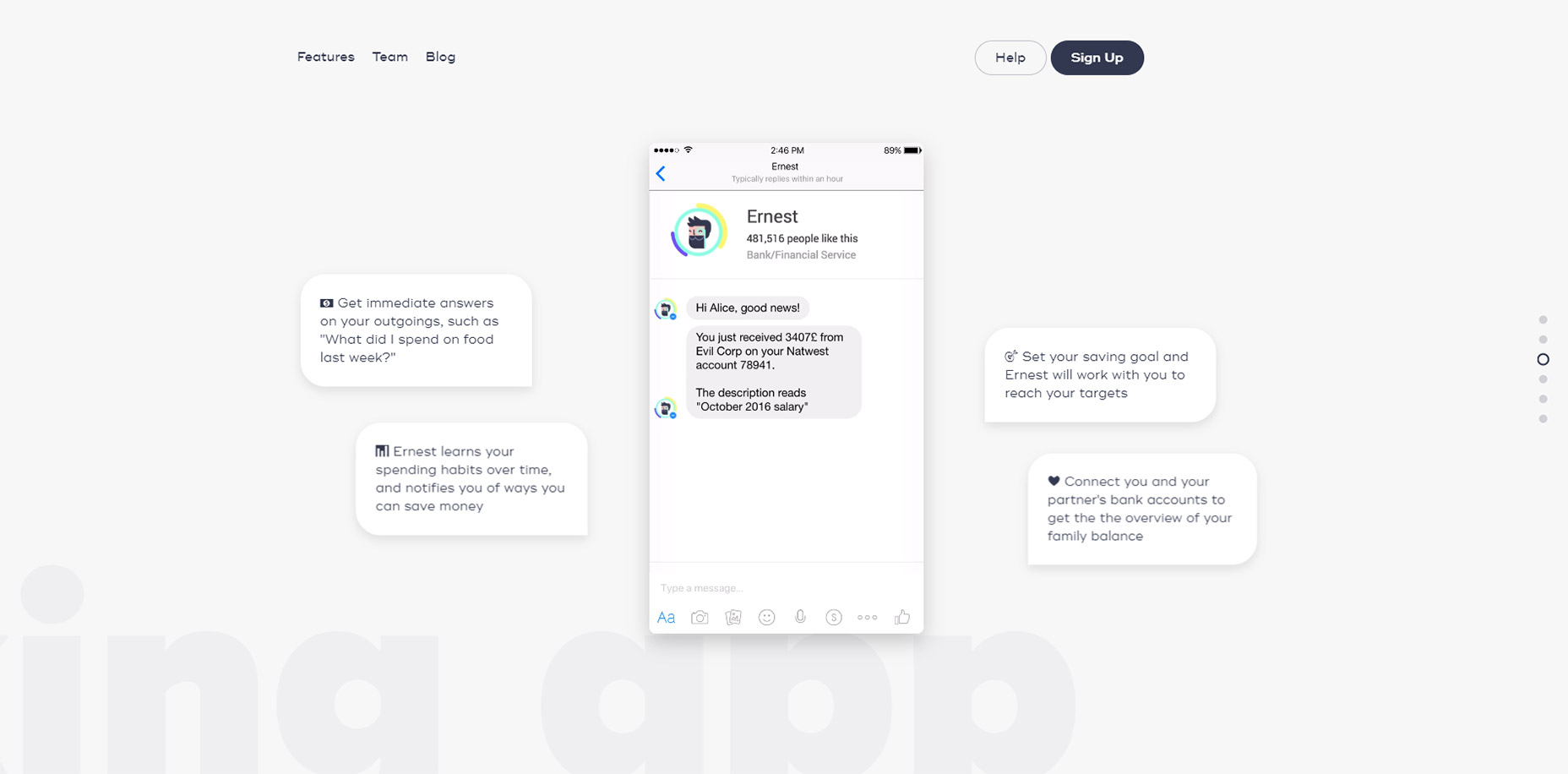
The page style for Ernest is a little different than other landing pages I’ve covered.

It uses parallax scrolling animations to create motion on a single page layout with different sections.

These vary based on the direction you’re scrolling whether you move up or down, and at what speed. They also vary with intensity based on the different sections of the page.

You can navigate using the side dot navigation menu and this quickly jumps around the page to different areas. It’s one of the few techniques you’ll often see on parallax pages and it certainly helps Ernest stand out from the crowd.

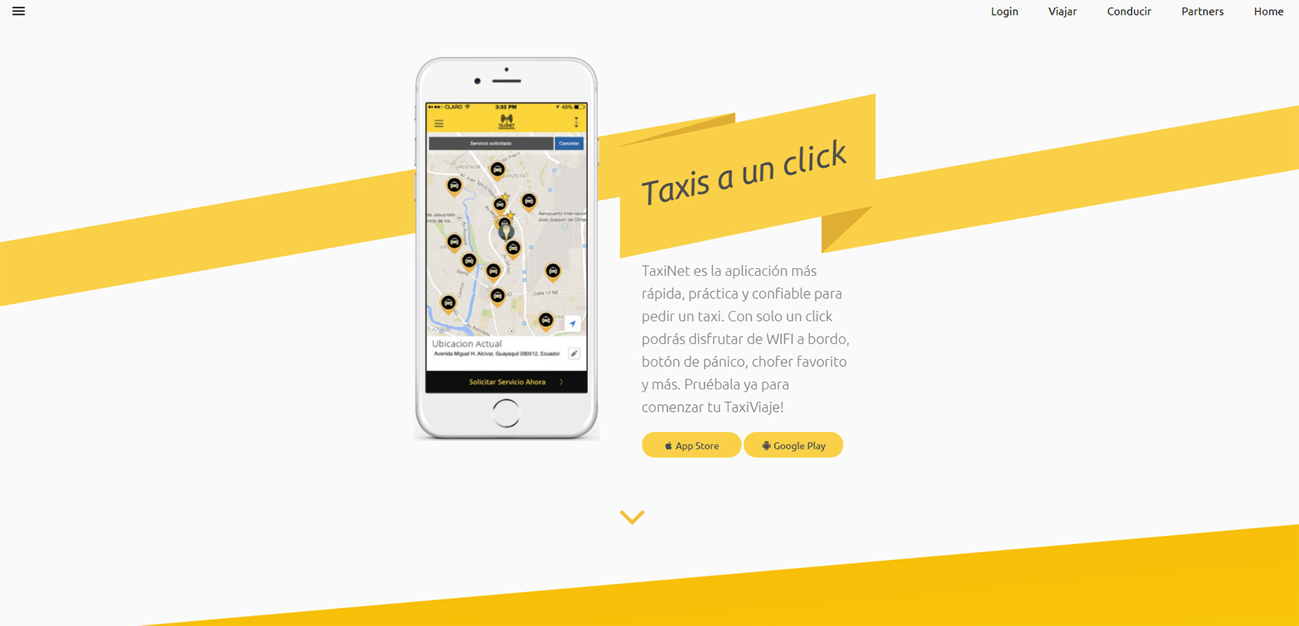
12. TaxiNet

To catch a glimpse of full-page animations in action take a look at the TaxiNet website.

It’s a smorgasbord of scroll-based animation effects tied to icons, text, images, and even background styles. Individual page background colors animate into view with the user, definitely not a typical technique but certainly an interesting one.

If you like this style you could absolutely apply a similar approach to your own landing page. Just make sure you keep the animations snappy and quick because nobody wants to wait around for your neat animations to load.

But if you do ‘em right these scroll-to-view elements add a nice effect to any landing page.

LAST DAY: Zelda – A Beautiful and Classy Script Font – only $7!

Source

p img {display:inline-block; margin-right:10px;}
.alignleft {float:left;}
p.showcase {clear:both;}
body#browserfriendly p, body#podcast p, div#emailbody p{margin:0;}

How to Build and Organize Tables in WordPress? Try wpDataTables

Original Source: http://feedproxy.google.com/~r/1stwebdesigner/~3/EuXvIeliBfY/

You have a beautiful, responsive website. Better yet, your visitors love it. Why not – it’s filled with quality content, and it features eye-catching images. You also put effort into incorporating interesting and thought-provoking videos.

Occasionally, however, you hit a bump in the road. That’s when you’re trying to manipulate a huge amount of data. It is not that easy to fit it into a neat-looking, easily-readable table to place on your website.

No matter how hard you try, the resulting table is incomplete or unattractive. Sometimes this huge amount of data just crashes your page when you attempt to load it.

That’s where you’ll find the wpDataTables plugin comes in handy. With this WordPress plugin, you can display any amount of data in a tabular format on your website. You can do so intuitively and interactively.

If you purchase wpDataTables between the 22nd and 29th of August, it’s yours for $22. This is a 50% discount!

Who Has a Use for It?

One of the reasons professionals like wpDataTables is because it doesn’t need a single line of code. Thus, this plugin saves programmers and web designers a ton of time. However, it’s not just for techies.

Anyone faced with a need to organize data in a tabular format will find this WordPress plugin useful.

This would include:

Small business and eCommerce store owners;
Human Resource and other workplace administrators;
Event planners, bloggers, and marketers

What Can You Use WpDataTables For?

You can use this WordPress table plugin to convert any amount of data into readable tables. This includes millions of rows of data, arranged in hundreds or categories or labels.

Moreover, with this plugin, you can publish responsive and informative tables in WordPress. You can use it for:

Product and price comparisons, product and services catalogs, price lists, and inventories
Event rundowns, including sporting events results and statistics
Progress tracking for businesses and projects, and
All types of data collection

How to Use This WordPress Table Plugin: Six Simple Steps, plus a Bonus Step

Creating and publishing a responsive data table is easier than you think. All you need to do is follow these simple steps:

Step 1: Save time from the get-go by being prepared

The best way to successfully work your way through any process is to have a plan. In this case, you want to have your data organized to fit into your tables’ structure. If you already have a table in Excel, you’re just a couple of clicks away from a good start.
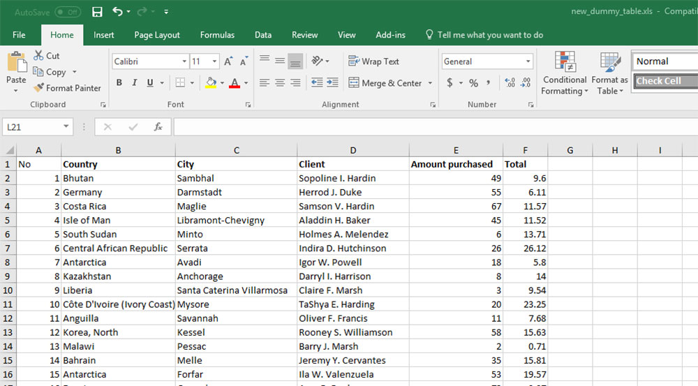
The wpDataTables plugin accepts most any type of data; e.g., Google Spreadsheets, Excel, or MySQL.
Want a PHP array-based table with images for a product catalog? Not a problem with this WordPress table plugin.

Step 2: Adding a new table takes only 2 seconds

Go to the left-hand side of your WordPress dashboard, navigate to wpDataTables. Then click Add New.

Step 3: Now, it’s time to organize your table – down to the minutest detail.

When you click on Add New, a Settings menu will appear; from which you can adjust your new table’s parameters.

Now it’s time to give your table a title. You have the option of making it public, or visible to you alone.
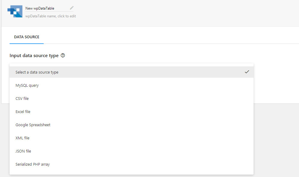
Next step: select your data source. You can choose from Excel, Google Spreadsheet, XML, CSV, JSON, or Serialized PHP Array.

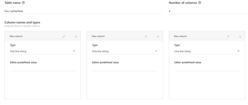
You can also build your table manually with the plugin. This does not require the use of the table source. Feel free to create your table manually in WP Admin with wpDataTables.
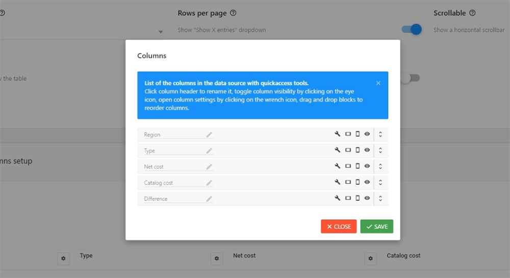
Now, you can upload your data file of choice. Don’t be concerned with how massive or complex it might be; wpDataTables can accommodate it.
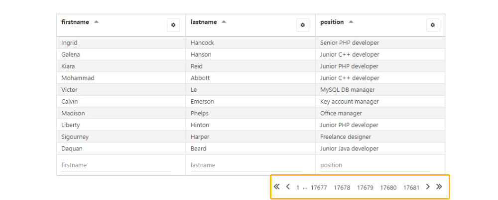
That’s the basics. There are plenty of other useful and interesting features you can work with to make your table just as you want it. Enjoy yourself by taking the time to experiment with them first.
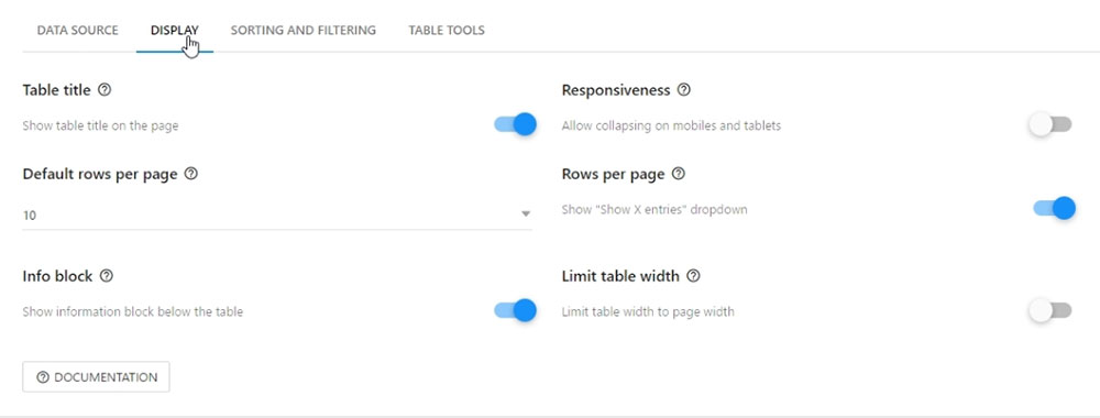
Here’s a sampling of what you can do:

You can make your table responsive (Responsive feature);
You can scroll it horizontally (Scrollable feature);
You can hide it while the page is loading (Hide Table feature);
Do you want to create a filter below each column or within the form? Use the Advanced Filtering feature, or the Filter in Form feature, respectively;
The Table Tools and Enable Sorting features lets you copy, save to Excel or CSV, or sort your tables;
If you want to limit a table’s width, select the Limit Table Layout feature. Also, you can use the Display Length feature to define how many entries you want to display on a page;
If you need to display the sum of the values in numeric columns, the Sum/Totals Row feature will do the trick.

Step 4: Make your table flat-out immaculate

You can preview your table at any time, including when you’re about to make the final touches. This does not involve having to go back and forth to do so.
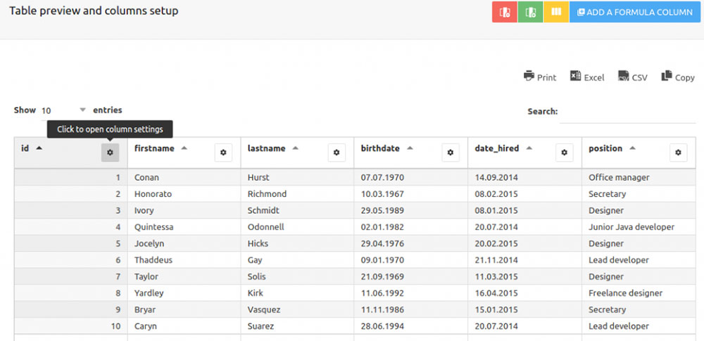
When you’re satisfied with your table’s structure, it is time to address its aesthetics. Work on different colors, color schemes, or font sizes. You can also edit the columns with respect to their type (numbers, text, strings).

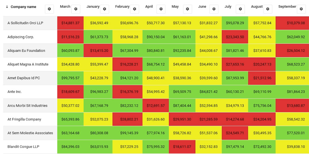
The Conditional Formatting feature is not only useful, but fun to work with. It enables you to highlight rows, columns, or individual cells, based on their content. This is an excellent feature to have available if your table is strictly numerical.
Step 5: Adding a table to a page with a shortcode

When you’re pleased with your table, click Save, and then, Close.

This will take you to the wpDataTables home page. Here you will see your newly-created table, in all its grandeur and ready to publish. You will also be given the shortcode you’ll need to input into your page.

First, copy the shortcode, and then navigate to the page or post the table is to appear on.

Paste the shortcode into the page editor.
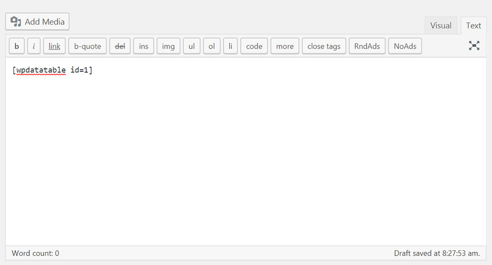
Select the location where you want the table to appear on the page. Usually, this is the location that will allow you to build any needed content around it.

Step 6: Publish your table.

Step 6 is not only the easiest step of all, it’s also the most satisfying.

Click on Publish.

That’s it!

The Bonus Step

If you want to have a flawless graph or chart on your website, the wpDataChart Wizard enables you to do just that. As is the case with tables, your graphs and charts can also be responsive. They can also be highly interactive and easily editable.
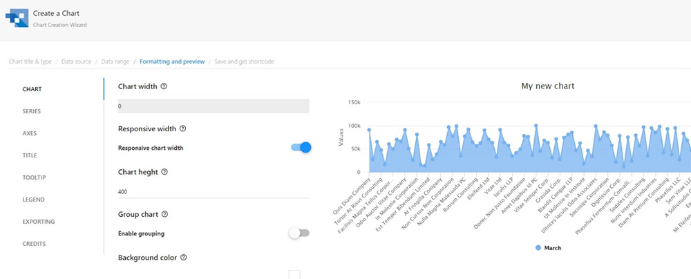
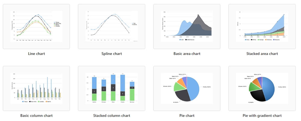
The Wizard can be used with the Google Charts, Highcharts, and Chart.js render engines.
Wrapping it up

There are other features in addition to those mentioned here. They will help you create beautiful, highly-organized, responsive charts in minutes.

With wpDataTables, there’s no more need for struggling to fit massive amounts of data into a small “box”. Another great advantage is that there is no need to write a single line of code!

You can use wpDataTables to manage and present financial and operation statistics. It also allows you to produce large product or services catalogs in a breeze. Moreover, you can feel like a pro performing complex data analysis and comparisons.

Be sure to mark the period between August 22nd and 29th on your calendar. That’s when you can get wpDataTables at a 50% discount.


An Introduction To Gravit Designer: Designing A Weather App (Part 1)

Original Source: https://www.smashingmagazine.com/2017/08/introduction-gravit-designer-designing-weather-app-part-1/


Being a designer at the moment is great because a wealth of modern design applications are available that let you easily bring your ideas to the screen: Sketch, Affinity Designer, Adobe XD (beta) and Figma, to name just a few (not to mention the classics, Photoshop and Illustrator).

An Introduction To Gravit Designer: Designing A Weather App (Part 1)

One app that is quite new, though — and perhaps a bit overlooked — is the free Gravit Designer app. Gravit gives you all of the tools needed to create functional and elegant screen designs. It can also be used to make icons, designs for print, presentations and much more.

The post An Introduction To Gravit Designer: Designing A Weather App (Part 1) appeared first on Smashing Magazine.

The Best Markdown Editor for Linux

Original Source: https://www.sitepoint.com/the-best-markdown-editor-for-linux/

Markdown editors for Linux

Markdown is my preferred way of writing content for the web. I even use it when jotting down notes for myself. It’s a simple, minimalistic method of writing formatted text that works well and doesn’t lock you into a proprietary system. That sits very well with the Linux philosophy.

And it’s catching on. Markdown is a lightweight markup language that can easily be turned into HTML, so it’s very useful for online content. Since John Gruber created it in 2004, it has become increasingly used in forums, blog posts and comments. So it’s worth learning. Gruber explains the syntax on his Daring Fireball blog, and you can grab our free printable Markdown cheat sheet.

There are many Markdown editors available for Mac and Windows. What’s available for Linux? We’ll list your main options in this article, and make some recommendations at the end.

Of course, since Markdown uses plain text, any text editor will do. But Markdown editors provide additional useful features, which may include:

syntax highlighting and a preview pane so you can see what you’re doing
keyboard shortcuts for speedier formatting
export/convert Markdown into HTML, PDF, ODT and more
a distraction-free writing environment with full-screen editing, dark mode and a minimal interface
word count, document statistics and spell check
advanced formatting, including tables and mathematical expressions.

So let’s get into it. Here are 17 of the best Markdown options for Linux.

1. Use Your Favorite Text Editor or IDE

You can use your favorite Linux text editor to write Markdown. You might find that it has native support for Markdown, or that a Markdown extension or plugin is available. Here are some examples:

Vim has a Vim-Markdown plugin that features syntax highlighting and folding.
GNU Emacs has a Markdown Mode for Emacs package that includes shortcut keys and syntax highlighting.
Spacemacs has a Markdown layer to add Markdown support.
Bluefish includes syntax highlighting for Markdown files.
Eclipse has the Markdown Text Editor plugin which includes a document outline, folded sections, preview, export to HTML, task tags, word wrap and paragraph formatting.
Gedit, the Gnome text editor, offers the gedit-markdown plugin with live Markdown preview and syntax highlighting.
Geany offers the Markdown plugin with preview and syntax highlighting.  
Kate, the KDE text editor, supports Markdown syntax highlighting. 
Sublime Text 2 can be turned into a full-featured Markdown editor. We show you how here.
Brackets has a Markdown extension with syntax highlighting and a preview pane.
Atom supports Markdown out of the box, with features like syntax highlighting and preview. This functionality can be expanded by several community-generated packages, including Markdown-Writer, Markdown-Scroll-Sync and Markdown-Format.

2. Abricotine

License: GPL
Other platforms: Windows, Mac

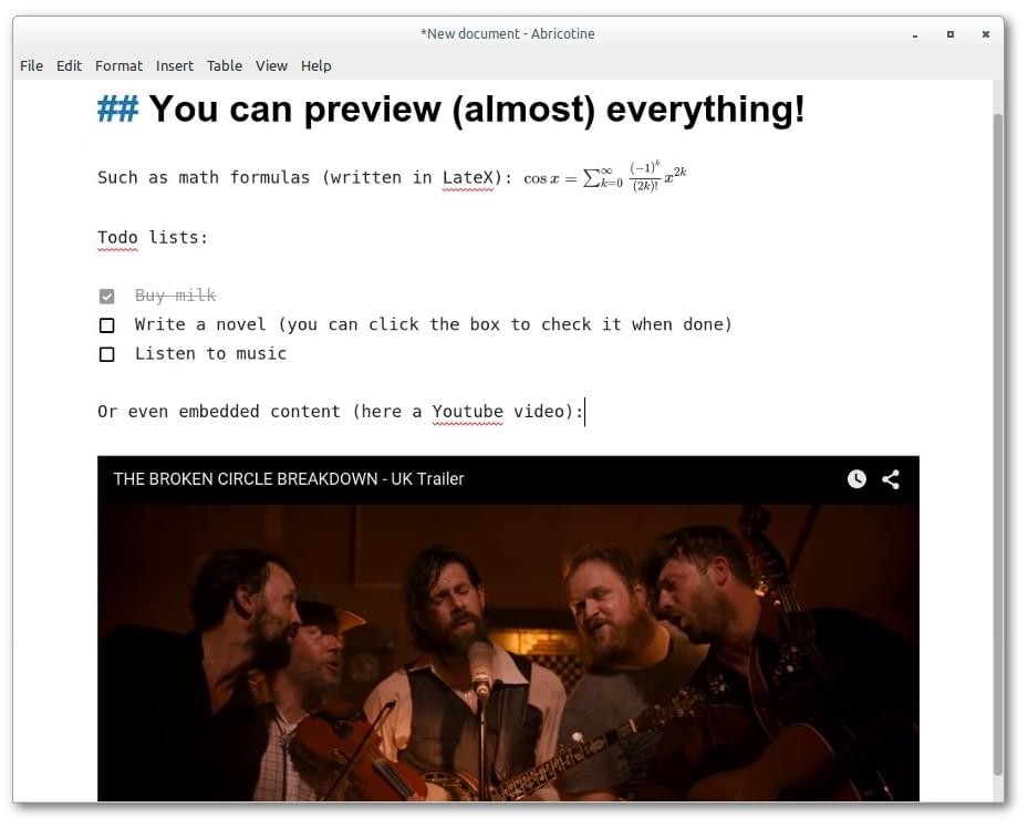
Abricotine is an open-source markdown editor built for desktop.

Abricotine is an advanced Electron-based Markdown editor that renders Markdown in the text editor, along with syntax highlighting. The app supports tables and the ability to insert images and embedded YouTube videos into your document.

Additional features include math written with LateX, checklists, anchors, and spell checking. A table of contents of your document can be displayed in a side panel.

You can download a tarball or packages for Ubuntu from GitHub.

Abricotine Markdown editor screenshot

3. Remarkable

License: MIT license
Other platforms: Windows

The best Markdown editor for Linux and Windows.

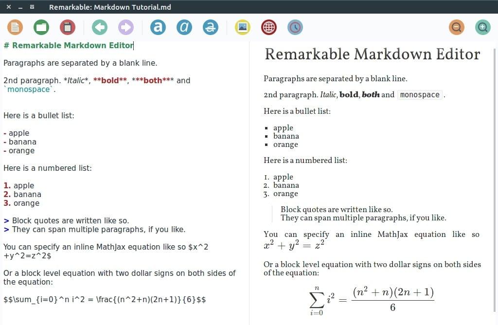
Remarkable is an easy-to-use Markdown editor that supports syntax highlighting and a synchronized preview pane. The customizable environment provides useful shortcuts to speed your formatting, as well as support for advanced MathJax formatting. You can export your documents to HTML or PDF.

Packages for Debian, Ubuntu, Fedora, SUSE and Arch systems are available from GitHub.

Remarkable Markdown editor screenshot

4. ReText

License: GPL
Other platforms: n/a

Simple but powerful editor for Markdown and reStructuredText.

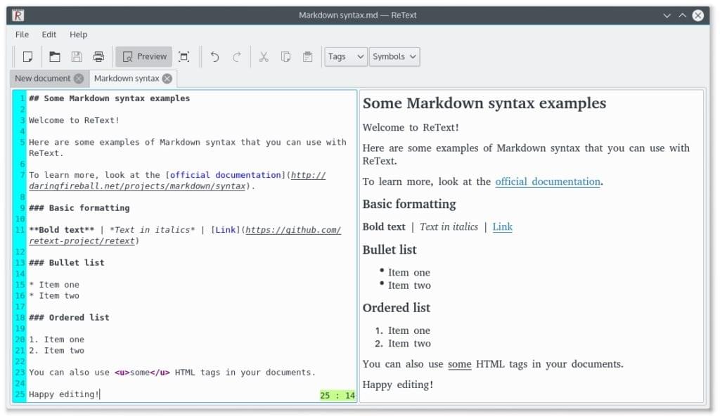
ReText is a simple yet powerful tab-based Markdown editor written in Python. It includes syntax highlighting and a synchronized preview pane, and supports MathJax and Python-Markdown extensions. The app has a table editing mode, and can export to PDF, ODT, HTML and other formats.

ReText is included in many distros’ software repositories (including Debian and Ubuntu), or download it and use the setup.py install command. (Python 3 must be installed.)

Retext Markdown editor screenshot

5. Ghostwriter

License: GPLv3
Other platforms: Windows

A distraction-free Markdown editor for Windows and Linux. Stylish. Open source. Free.

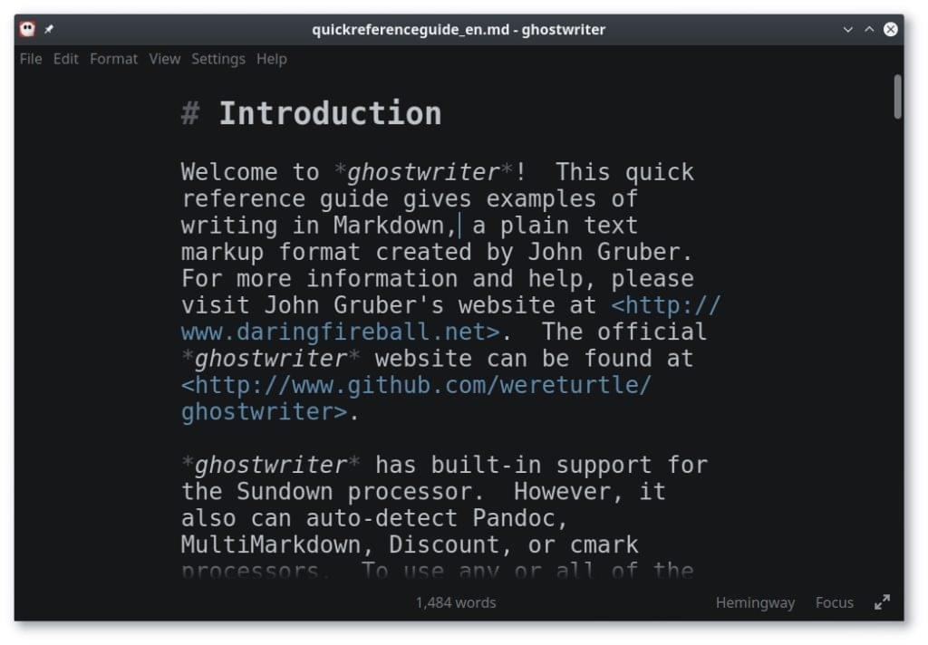
Ghostwriter has a range of distraction-free features, including full screen mode, a clean interface, and a dark theme. The app also has a Focus Mode, which highlights the text around the cursor and fades the rest, and Hemingway Mode, which disables the backspace and delete keys, forcing you to write rather than edit.

Other features include built-in themes, live preview, and drag-and-drop images. There is also an Outline HUD that gives you an overview of your document, and plenty of statistics, including word count. You can export your document to HTML and a variety of other formats.

To install on Ubuntu, just type:

sudo add-apt-repository ppa:wereturtle/ppa
sudo apt update
sudo apt install ghostwriter

You’ll also find links to unofficial packages for Fedora, openSUSE and Arch Linux on GitHub.

Ghostwriter Markdown editor screenshot

6. UberWriter

License: GPLv3
Other platforms: n/a

UberWriter is a writing application for Markdown.

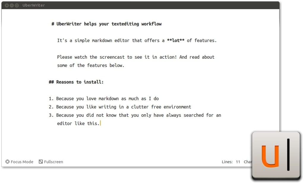
UberWriter is a distraction-free Markdown editor inspired by iA Writer. And like that app, its interface is elegant and minimalistic. It doesn’t even include preferences. The focus is on getting work done, and Markdown is rendered inline.

The app includes a spell check and word count, and can export your document to HTML, PDF and ODT. Focus mode highlights your last sentence, and full screen mode removes the distractions of other apps. A dark mode is also available.

You can get UberWriter from the Ubuntu Software Centre for $5, or install it from a PPA by running these commands:

sudo add-apt-repository ppa:w-vollprecht/ppa
sudo apt-get update
sudo apt-get install uberwriter

You may find packages for other distros online.

UberWriter Markdown editor screenshot

Continue reading %The Best Markdown Editor for Linux%

Online Ads: Simple Mistakes That Might Be Costing You

Original Source: http://inspiredm.com/online-ads-simple-mistakes-might-costing/

Inspired Magazine
Inspired Magazine – creativity & inspiration daily

The world of online advertising is segregated into publishers and advertisers. The publisher is the owner of a site who allows somebody else to advertise on it, while the advertiser is obviously the one doing the advertising.  In some cases the publisher may also be the advertiser, and when this happens it is called internal advertising.  Everything else is external advertising.

Why these terms need to be defined is because they strongly affect how much tolerance and acceptance an audience is likely to have for being exposed to the ad.  In general, an audience will have much higher levels of trust and acceptance in the case of internal advertising, and in turn they are more likely to let their guard down and potentially engage with the advertisement.

On the other hand, external advertising can generate a wide range of responses, but many people report feeling annoyed by external advertisements, and some are even enraged by them. How this came to be is largely due to the collective behavior of a majority of the marketing industry in the early 1990s.

Why internal advertising is more accepted

Users who arrive at a website as a result of a conscious choice to engage with the brand represented by that website are also likely to engage with internal advertising on the website.  Fast food restaurant chains such as McDonald’s, KFC, and Burger King are good examples, as they normally contain a lot of internal advertising, and users are quite willing to engage with these, because they’re already tuned to receive the marketing message. They’re on a site that is relevant to their interest and they want as much information as possible, especially if the ad is promising some kind of incentive like discount coupons.

Why external advertising is less accepted

Due to the shady techniques used by unscrupulous marketers, users quickly developed an aversion to what was seen as invasive advertising. At that time the main source of antagonism was that the ads severely affected the user experience, but gradually as users became aware of the potential for cookies to track and identify them, it triggered an enormous backlash.

The result of marketers going too far

Among other things, these abuses gave rise to the ludicrous European cookie laws, which don’t actually solve any problems and do create new ones. It is also the reason why there’s an entirely new industry dedicated to blocking ads (and ironically many of the systems created to  block the ads are advertised online).

But users don’t really hate ads

The greatest misunderstanding in the marketing industry stems from the idea that users hate ads and this is the reason why they use ad blockers. The truth, however, is different. In reality what users hate is having their privacy invaded. Ads that don’t employ tracking or attempt to “personalize the user experience” are acceptable to the majority of intelligent internet users. Ads that are helpful or provide benefit to the reader in any form as a result of engagement with them may even be viewed with favor, except when the ad appears to be personalized, regionalized (falsely), or making use of tracking techniques.

Advertisers and publishers need to consciously avoid the mistakes that lead to failure

Wouldn’t it be great if there were some simple rules that could tell you what to avoid doing, and how to be more successful in online advertising?  Well hold onto your hat, because those rules actually do exist. Now let’s take a look at the common mistakes that may be costing you money and good will.

Mistake 1: Publishers generating negative cash flow from ads

There are certain types of publishers that have ideal sites for hosting external advertising. In general, they are non-corporate sites. If you have a site that is somehow tied to a brand, it may make your site seem unprofessional if it contains ads for things not related to your business.

Imagine if McDonald’s had ads on their site for a shoe sale at the mall. Such an ad would definitely be out of place, and would detract from the user experience, even if the user was really in the mood to buy some shoes.  They didn’t come to the McDonald’s website expecting to be shown an ad for shoes.

If the ads on your site have a negative effect on your professional appearance and reputation, those ads may be costing you more in terms of lost business than they can possibly generate for you as advertising revenue. In that case, you’re much better off not hosting the ads.

Mistake 2: Utilizing pop-up or pop-under windows for advertising or tracking

This is one of the most annoying things an advertiser or publisher can do. Hardly anyone ever clicks on ads contained in pop-ups or pop-unders, and when they do, it’s often by accident. You don’t win if you get somebody to click through to your site as a result of an accident or through deception. It just annoys the user.

Even major sites like TripAdvisor have used pop-unders, and that has generated a lot of complaints from users who are frustrated by them. One reason why it matters is that pop-unders are stealthy. The user may not even be aware that one has been opened until they go to close the browser window. But it can also impact more seriously on the user, because your pop-under may prevent Firefox from offering the user the opportunity to save their browsing session.

Mistake 3: Nag screens

These are common on commercial blog sites, but have also sometimes found their way onto corporate sites as well. These are modal windows that are triggered on certain events such as the user entering the site, attempting to leave the site, or scrolling past a certain point on the page. The modal usually nags or begs the user to subscribe to a mailing list or something like that. It’s incredibly rude.  It’s like blocking the door of your shop until the customer tells you where they live so you can send them catalogs.

The problem is that these nagging pop-ups actually do work. Various idiots (and the occasional genuinely interested person) actually fill them in, and what eventually happens is the advertiser gets lots of email addresses, so marketers still believe they’re good to have.

What they’re not considering is that the majority of users find them annoying and even when email addresses are harvested and spammed to the hilt, you won’t see a dramatic rise in sales. You may even see a decrease in your sales. That’s because hardly anyone reads the newsletters and other solicited spam you send out.

Nag screens are not the only way to acquire subscribers, and there’s evidence that they’re less effective than the alternative methods.

Mistake 4: Promising one thing and delivering another

This is just plain dishonesty, and it usually backfires. A variation on this is disguising an advertisement as genuine content, and only revealing quite late that you’re trying to sell something to the user. Both types of ad are likely to result in the user taking a negative view of you. Certainly you may make some sales regardless, but you’d probably make a lot more if you were honest in your intentions.

An example is when you offer the user a free trial or free sample, but then they discover it’s not really free. There is a big difference between a free trial and a money back guarantee, but there are plenty of marketers who will happily overlook that difference and call a spade a shovel. Other examples include raising the price above the advertised price by adding more charges where it wouldn’t be justified, showing a product that isn’t actually the product being sold, using obviously fake testimonials, and so on.

Mistake 5: Blatant dishonesty and misrepresentation

This is where the advertiser presents false information to try to convince the consumer to buy. Apart from the fact that it’s illegal in many jurisdictions to do this, it only takes one person to expose the fraud on social media, and your entire reputation could be in ruins. You may even face prosecution and lawsuits.

Mistake 6: Tracking

This is why people use ad-blockers and privacy tools like Ghostery. It’s why more people are using anonymizers, rejecting cookies, and using online personas. And it’s why Europe created their crazy cookie laws. Now that President Trump has approved the selling of browsing history, users are likely to be even more resistant than ever to being tracked. When you use tracking there are two things that happen. The first is that many users perceive this as inevitable, and the second is that nearly all users resent it.

Mistake 7: Over-reliance on display ads

Advertisers often make the mistake of thinking that what works in the offline world is also most effective online. Display ads are not as effective as inline content ads, except where the inline content ads are SEO links pretending not to be ads. When a blogger who is popular among runners makes a recommendation for a certain type of running shoe, readers are more likely to respond favorably to this ad than if it was simply a graphical banner ad displayed on the page or a deceptive link that was only added to get you a click.

header image courtesy of justyna stasik

This post Online Ads: Simple Mistakes That Might Be Costing You was written by Inspired Mag Team and first appearedon Inspired Magazine.

The Funtastic June Bundle: 44 Fonts and 50 Graphic Packs from TheHungryJPEG

Original Source: http://inspiredm.com/funtastic-june-bundle-44-fonts-50-graphic-packs-thehungryjpeg/

Inspired Magazine
Inspired Magazine – creativity & inspiration daily

We are always looking for new fonts and graphics that will make our web designs look even better, and today we have found a great bundle from the guys at TheHungryJPEG.com! TheHungryJPEG is a marketplace for designers, crafters, newbies, seasoned graphic design ninjas and anybody with an interest in the design world and features premium bundles released every week with amazing deals and premium weekly freebies.

WHAT YOU WILL GET?

The Funtastic June Bundle is THE biggest fonts and graphics bundle on TheHungryJPEG to date! 
This bundle features only high quality, beautiful, and remarkable fonts and graphics to boost up your designs into a new level.
44 fonts and 50 graphic packs.
96% OFF over 90 premium design resources.
Only $29!

JUST A FEW OF THE GOODIES INCLUDED:
Chirp Font by Denise Chandler
Caviar Font Duo by Media Lab 
Indulge Script by Anthony James 
Pink Willow by Maroon Baboo
Little Ballerina by Typia Nesia 

Breezy Picnic by Denise Chandler

BUY NOW

This post The Funtastic June Bundle: 44 Fonts and 50 Graphic Packs from TheHungryJPEG was written by Inspired Mag Team and first appearedon Inspired Magazine.

30 Free Education Icons Sets

Original Source: http://www.hongkiat.com/blog/school-education-icon-sets-free/

From official websites of universities, schools, and colleges to study consultancy sites and portals, the internet is brimming with websites related to education. Usually, there’s a lot of information on an education website, however, in order to make the navigation of a complex education website easy and interesting, icons prove to be the perfect elements.

30 Free Medical Icon Sets You Can Download

.no-js #ref-block-post-32046 .ref-block__thumbnail { background-image: url(“http://media02.hongkiat.com/thumbs/250×160/free-medical-icon-sets.jpg”); }

30 Free Medical Icon Sets You Can Download

Icons are one of those seemingly trivial elements that put a rather huge influence on the overall look…Read more

Though there are many multi-pupose icon sets that can go with just about any website, but a specifically education-related website would be best suited with special education icon sets. And what more can you ask for if you get such high quality icons all for free!

On that account I am sharing a list of 30 free school and education icon sets that can be a useful addition to your icons repository or be used in your next education-related web project. Do make sure to check the licence for each icon set and mention the author, if it’s required.

School & Childhood Icons Set

Format: SVG, PNG [Download]

childhoodchildhoodSchool Icons Vector

Format: AI [Download]

paper-planepaper-planeSchool Icon Collection

Format: EPS [Download]

calculatorcalculatorEducation Icons

Format: PNG, SVG, PNG, PSD [Download]

telescopetelescopeLine Education Icons Free

Format: AI [Download]

chemistry-iconschemistry-icons6 Modern Education Icons

Format: PSD, EPS [Download]

school-lampschool-lampBecris Freebie Outline Icons

Format: PNG, SVG, AI, EPS [Download]

becrisbecrisSchool and Education Hand Drawn Icons

Format: PSD [Download]

chalkboardchalkboardScience and Education Icons

Format: SVG, AI [Download]

science-iconsscience-iconsEducation Elements Vector Icons

Format: SVG, AI [Download]

school-busschool-busMinimal Line Icons

Format: AI, EPS, PDF, SVG [Download]

minimalistic-schoolminimalistic-schoolJolly Icons

Format: AI, EPS, PDF, PSD [Download]

school-lunchschool-lunchGraduation Icon

Format: SVG, EPS [Download]

graduation-iconsgraduation-icons60 Education Vector Icons Freebie

Format: AI, EPS, PNG [Download]

sports-iconssports-iconsEducation Icon Set

Format: PNG, PSD, EPS, SVG [Download]

chancerychanceryEducation Vector Icons

Format: EPS [Download]

education-vector-iconseducation-vector-iconsEducation Icon Set

Format: SVG, EPS [Download]

rulerrulerSchool Icons Vector

Format: AI [Download]

school-bagpackschool-bagpackKnowledge Icon Set

Format: AI, EPS, PDF, PSD [Download]

knowledge-iconsknowledge-iconsEducation Icon Set

Format: SVG [Download]

school-educationschool-educationEducation Icon Set

Format: AI [Download]

school-bellschool-bell20 Free Vector Education Icons

Format: AI, SVG [Download]

line-color-icons-schoolline-color-icons-schoolEducation Icons Collection

Format: EPS, AI [Download]

college-iconscollege-iconsA free Education Icon Set

Format: PNG, AI, TTF, SVG [Download]

retina-ready-iconsretina-ready-iconsAcademic Icon Collection

Format: EPS [Download]

school-line-iconsschool-line-iconsBack to School Icon Set

Format: AI, EPS [Download]

backtoschoolbacktoschoolEducation Icons

Format: AI [Download]

abc-iconsabc-iconsVector School Stuff Icons

Format: AI [Download]

blue-school-iconsblue-school-iconsIcons About Education

Format: EPS [Download]

about-educationabout-educationPencil Icon Set

Format: EPS [Download]

pencil-iconspencil-icons
20+ Free E-Commerce Icon Sets to Download

.no-js #ref-block-post-25471 .ref-block__thumbnail { background-image: url(“http://media02.hongkiat.com/thumbs/250×160/free-ecommerce-icons.jpg”); }

20+ Free E-Commerce Icon Sets to Download

Editor’s note: For a newer, updated version of this post, check it out here. Looking for shopping icons…Read more

12 Instagram Accounts For UI & UX Design Inspiration

Original Source: http://feedproxy.google.com/~r/1stwebdesigner/~3/zuaUlgm6tBA/

Instagram is one of the best sites to find quality UX inspiration. But you need to know who to follow and which hashtags are worth browsing.

I’m hoping this article will set you on the right path with a collection of the 12 best UX accounts on Instagram. These are all very active and perfect for anyone breaking into the field, or looking to expand their reach with more Instagram inspiration.

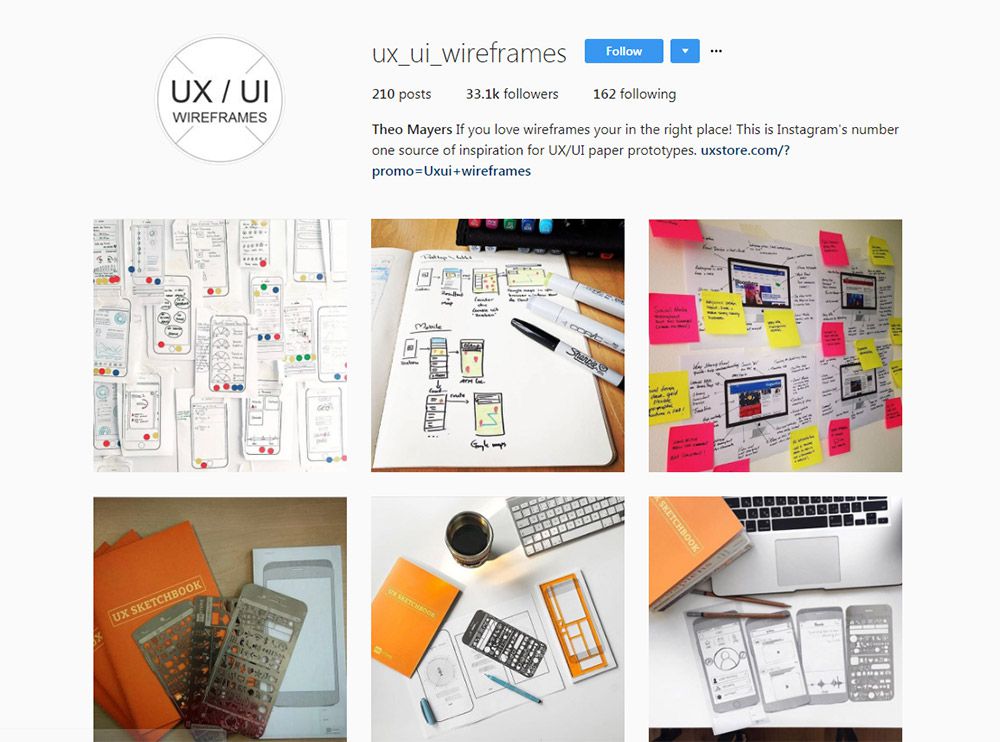
1. @ux_ui_wireframes

uiux wireframe instagram

My absolute favorite account is @ux_ui_wireframes and it’s been around for years now.

New posts are frequently added, and many of them are sourced from designer accounts through hashtags. So this works like a curation resource where the account owner connects with other designers and asks if they can republish the photo on their account.

Naturally this draws more attention to the designer’s work and gives you a bunch of diverse UX inspiration. Cool stuff!

2. @uxdesignmastery

ux design mastery

Here’s another one I really like that’s pushing just about 100k followers.

The @uxdesignmastery account comes from the main website offering tutorials and courses on this topic. So their photos are meant to guide you towards the site and increase users while offering some cool inspiration.

New UX designers will find this incredibly valuable since the website is chock full of knowledge. But even if you just follow the Instagram account you can still learn a lot from their uploads.

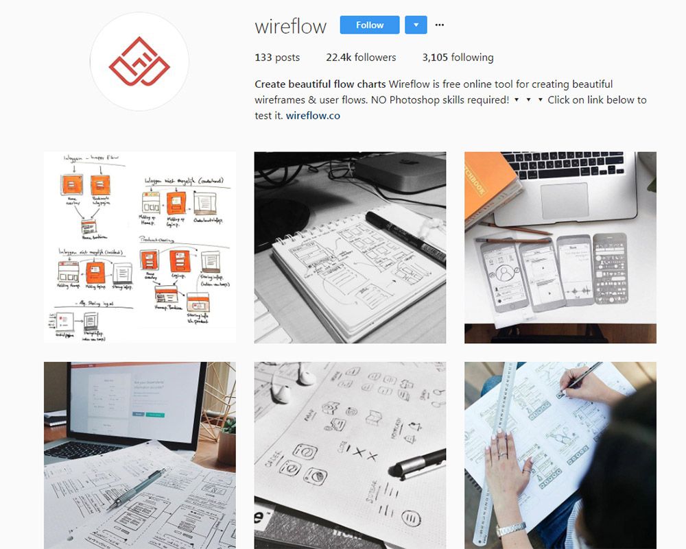
3. @wireflow

wireflow instagram page

The team at @wireflow have their own Instagram account for publishing custom wireframes, prototypes, and storyboards for user flows.

Again this is managed by the main site which promotes their tool for simple flowchart management. It’s actually a great tool because you can use it freely on the web and the results are instantaneous in your browser.

But their Instagram account goes beyond digital work to include a lot of hand-drawn wireframes and user flows. Excellent for people who prefer classic methods of brainstorming.

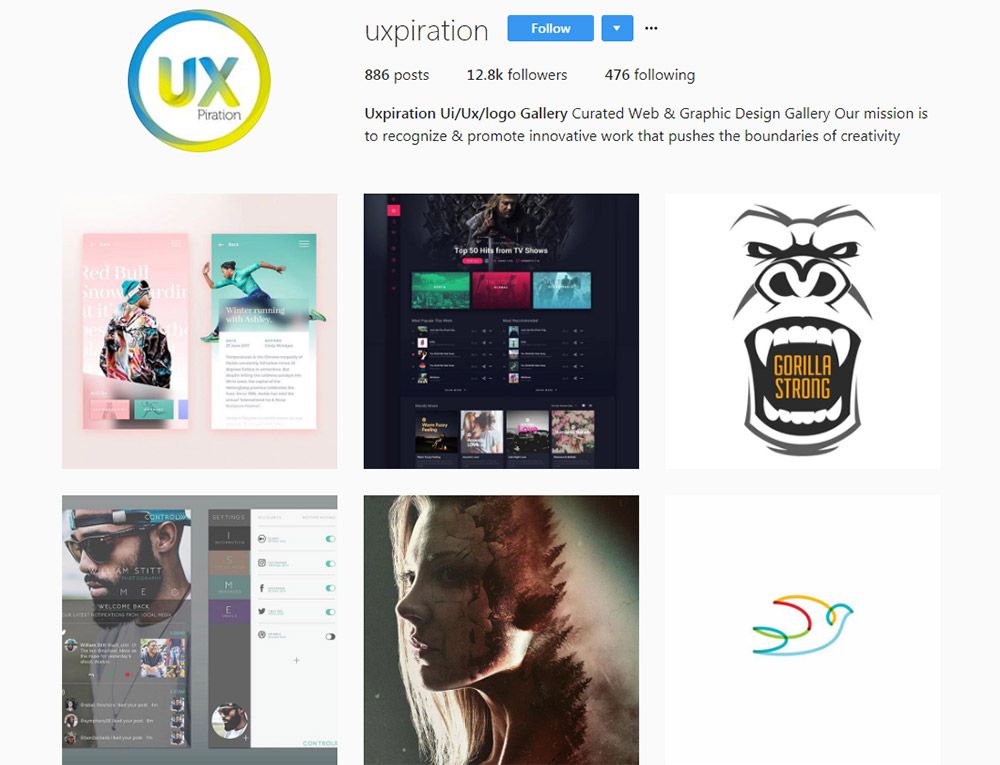
4. @uxpiration

uxpiration instagram

With a following of 12k designers and growing fast, one of my favorite newer accounts is @uxpiration.

It’s built solely to promote designers and help get work out there for ideas. This account almost takes on a communal feel giving back to the overall design community.

Well worth following if you want UX, UI, or general design inspiration.

5. @uxdesigns

uxdesigns instagram

Looking for animated interface designs? Then you’ll want to follow the @uxdesigns Instagram page.

A lot of these photos are pulled from Dribbble where designers share UX animations and custom interfaces. They’re all tagged properly so you can usually find the original designer pretty quickly.

But this is one feature I like about Instagram’s support for GIFs, and it shows just how useful this account is.

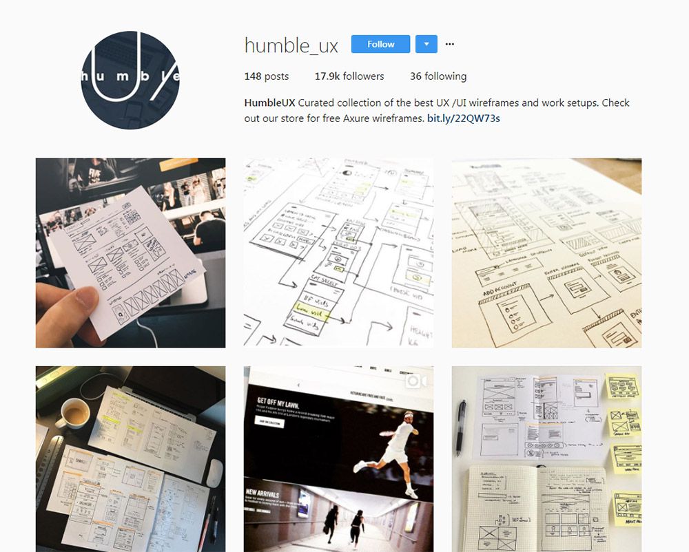
6. @humble_ux

humble ux instagram

For a good mix of digital and traditional, check out @humble_ux.

It has almost 20,000 followers and over 150 posts with many new ones added every week. The photos come from the Humble UX team who curate shots from around the web and share a few of their own too.

Most designs are sketches or brainstorms on a whiteboard, so you’ll see a lot of traditional mediums. This is great for all types of UX from mobile to websites and even desktop apps too.

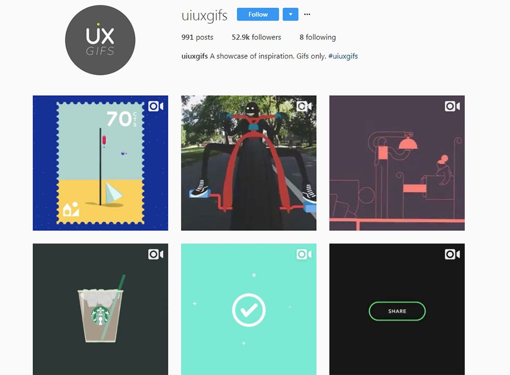
7. @uiuxgifs

uiuxgifs instagram

Here’s a premiere animation UX account that everyone should know about.

@uiuxgifs only publishes animated designs that feature logos, icons, or interfaces in motion. It’s a fairly large account with over 50,000 followers and they update constantly.

But the thing to note is that they publish a lot more than just interfaces. Many of their posts do center around logos and icons that animate separate from any interface, so this may not be as relevant to strict UX designers.

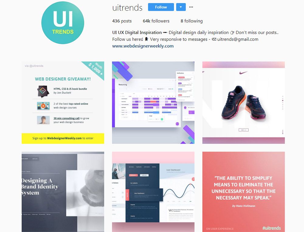
8. @uitrends

uitrends instagram

On the flip side here’s an account that only focuses on interfaces. The @uitrends Instagram is full of custom designs and even redesigns from popular websites.

Many of these are sourced from Dribbble so they all have that Dribbblification look to them.

But there are some gems mixed in, and you can find a lot of quality inspiration on this page. Plus they frequently update so it’s an excellent resource to browse for design ideas.

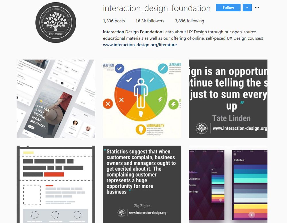
9. @interaction_design_foundation

interaction design Instagram

The Interaction Design Foundation offers lessons and courses in UX design along with free articles for beginners. It’s a massive resource with a ton of great learning materials on the topic of user experience.

So naturally they have an Instagram account and it’s got a lot of posts in there.

As of this writing it totals over 1,330 posts and has just above 16,000 followers. This is one of the few Instagram accounts that mixes UX inspiration along with photos featuring tips, advice, infographics, statistics, and quotes from UX designers.

I definitely recommend this account for adding some variety to your feed.

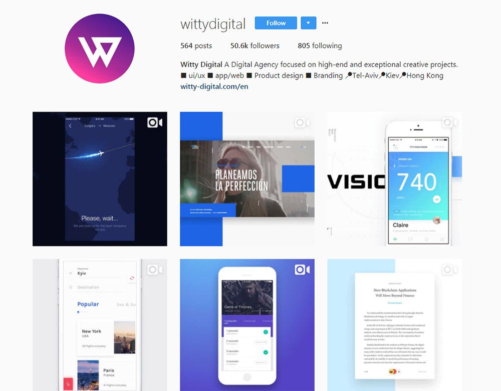
10. @wittydigital

wittydigital instagram

The team at @wittydigital run a gorgeous digital design account with over 50,000 followers.

I’m not sure who updates this account but it is the official one for Witty Digital’s agency. It’s a massive international design firm with operations from Hong Kong to the Israel.

But their Instagram account is packed full of animated UX pieces and some really inspiring design concepts. Well worth following if you love animated GIF designs.

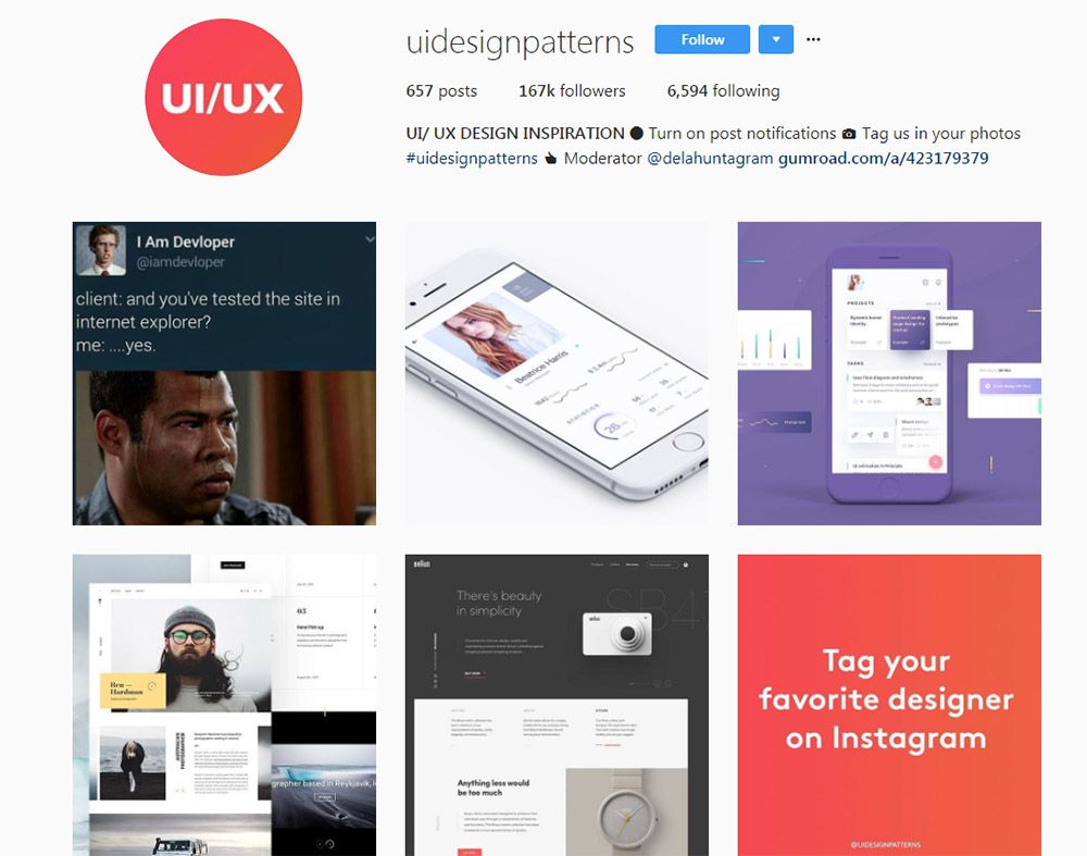
11. @Uidesignpatterns

uidesignpatterns instagram

@Uidesignpatterns is quite possibly the largest Instagram account on design work.

It totals a massive 167,000 followers with only about 600 posts. These posts come from designers from all over the world, and you can even tag your content on Instagram to have them feature your work.

Each post includes a mention to the designer so you can browse around and find people who may inspire your work. Plus this account is really made for designers, and you can tell by some of the humorous posts they do.

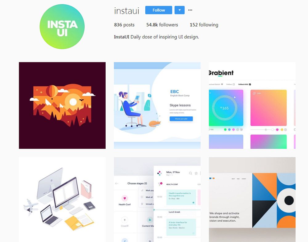
12. @instaui

instaui instagram

Last but certainly not least is @instaui. This one’s also pretty large with over 50k followers and new posts every day or so.

One thing to note is that despite their username they don’t always post UI designs. There are lots of digital illustrations, vector icons, logo designs, and general graphic design pieces.

But this is still a really cool Instagram account if you’re looking for general design ideas and want to follow active accounts that update on the regular.

And if you want to try finding even more accounts, check out the #uxdesign hashtag. If you dig deep enough, you’re bound to find more profiles worth following.