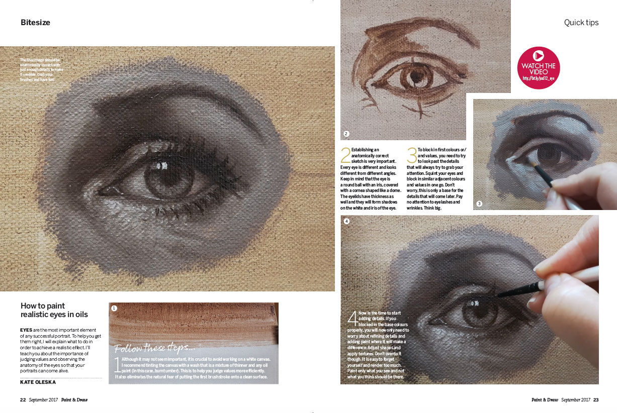
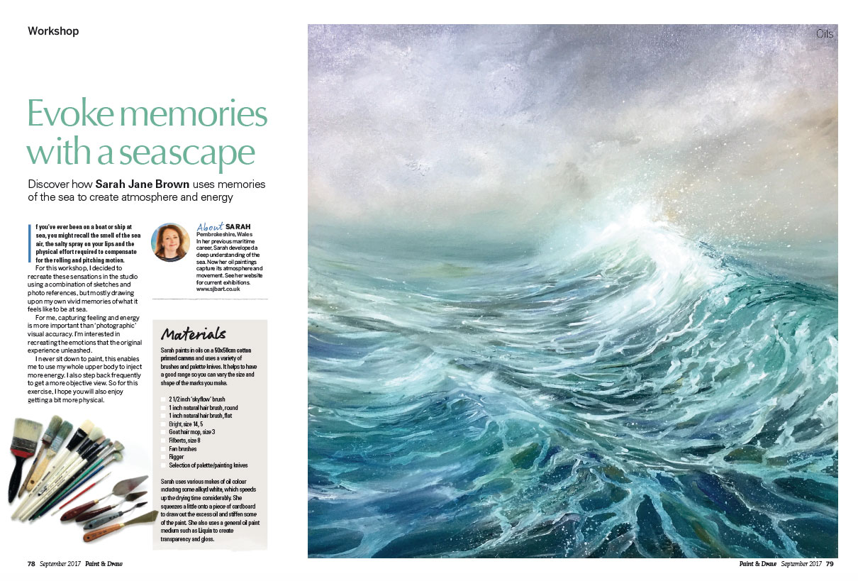
Find the Perfect Icons with IconShock 2.0

Original Source: http://feedproxy.google.com/~r/1stwebdesigner/~3/VYTvtNy8n2M/

Icons are one of the must-have assets that every designer needs in their toolbox. They’ve become an essential part of crafting the perfect UI.

The trouble is that it can be difficult to find the right icon for the job. Sure, it may be the right object. But it may not be the right color or available in the size you need. That leads to having to settle for something that doesn’t work as well as you’d like.

That’s what makes IconShock 2.0 so unique. They’ve hand-crafted over 2 million icons – over 400 sets in all. Not only that, but they cover over 30 styles with almost all of them being pixel-perfect vectors. But that’s just scratching the surface of what IconShock 2.0 can do.

Customized to Fit Your Needs

Customized to Fit Your Needs

It’s one thing to simply download an icon file and then try to make it fit your project. It’s quite another to download an icon that is customized to your exact specifications. Yet IconShock provides you with that very experience.

Using their web-based customization tool, you can pick an icon and make it your own. Choose the sizing and colors you want. You’ll even get a list of related icons and the ability to search for others. From there, download a transparent PNG file. Premium members get even more options, like large sizes (up to 512px) and the ability to export to SVG or AI file formats. Plus, premium members get access to every single icon in the collection – with 100+ new ones added weekly.

As well as being able to choose and customize those particular icons your project requires, now, with IconShock 2.0, you can also download many of those icons in icon font format as well!

The whole process is quick, fun and really increases efficiency. The end result is getting exactly what you want – which ends up in a better project.

A True Variety of Icon Sets

IconShock 2.0 offers an incredible array of choices (2 million+ icons makes for a pretty good selection). Their icon sets cover multiple industries and, odds are, you’re going to find the perfect fit for whatever you’re working on.

Let’s take a look at five of their most popular sets, each with hundreds of icons you can customize and download for free:

Flat Icons

IconShock 2.0’s Flat Icons Bundle sports a clean, colorful style that will help you to create a standout UI. The soft color palette combined with geometric shapes will add a touch of class to any design project.

Flat Icons

Glyph Icons

The Glyph Icons Bundle is made of up minimal outlined shapes. Perfect for when simplicity is a must.

Glyph Icons

iPhone Icons

With the iPhone Icons Bundle, you’ll find a set of solid monochrome icons based on the original iOS 6 designs. They were built with the original iPhone sizes in mind, but can be customized to match your needs.

iPhone Icons

iOS Line Icons

If you’re looking for truly minimal outline styling, the iOS Line Icons Bundle may be a great fit for you. They’re conceptually accurate with iOS 7 and above.

iOS Line Icons

Material Design Icons

The Material Icons Bundle is a great choice when following Google’s Material Design. Based on minimal glyph icons, but with Material’s color palette added in for extra punch.

Material Design Icons

Icon Fonts

And, don’t forget that all of the above icon sets are available to download in icon font as well. All perfect for quick integration into popular web frameworks like Bootstrap and Semantic.

iPhone Icons

Looking for Something Else?

We’ve only begun digging into the vast icon library of IconShock 2.0. Take a look at their entire list of icon sets to see all that they have to offer.

Start Using IconShock 2.0 for Free

Now that you’ve seen the top-quality icons and game-changing tools of IconShock 2.0, it’s time to add their collection to your design toolbox. You can start using these stellar icons for free. If you’re looking for even more power, upgrade to a premium membership and take things to the next level.


Dwelling On The Past: The Importance Of Project Retrospectives (Part 1)

Original Source: https://www.smashingmagazine.com/2017/09/importance-project-retrospectives-part-1/


We should always look for opportunities to grow and improve. Retrospectives and reflections allow you to codify what you’ve learned from experience, to document mistakes and avoid future ones, and to increase your potential to grow in the future.

Dwelling On The Past: The Importance Of Project Retrospectives (Part 1)

Agile methodologies typically include time for retrospectives throughout a project. Regardless of your methodology, all teams would benefit from having a retrospective at the conclusion of a project.

The post Dwelling On The Past: The Importance Of Project Retrospectives (Part 1) appeared first on Smashing Magazine.

10 Unexpected Sources of Design Inspiration

Original Source: https://www.sitepoint.com/10-unexpected-sources-of-design-inspiration/

There's a source of inspiration for every type of design you can think of. Struggling to create the perfect font pairing? Head to Typewolf. Searching for ideas for your website redesign, or a specific webpage? Browse Crayon. Looking for all-around epic sources of design inspiration? Check out the latest crop of Webby Award winners.

But as awesome as these collections are, it's dangerous to rely on them exclusively. If all designers are referencing the same ideas, concepts and templates from the same websites for design inspiration, every design then sort-of becomes a variation of an existing one. It's almost impossible to create something novel or unique, when all designers are basing their ideas on the same inspiration sources.

Luckily, there's a solution for that…

Throw some new sources of design inspiration into the mix, alongside your regular sources! These 10 websites will keep you inspired in unexpected ways.

1. 99% Invisible

99% Invisible is a blog and radio show hosted by Roman Mars. It delves into the unnoticed yet beautiful, intriguing and significant forces that shape our world.

In other words…the 99%.

Each episode is approximately 15-25 minutes long and covers a single topic related to architecture, objects, visuals, history, technology, society, cities, sounds and infrastructure. Not only will it help you look at your surroundings with fresh eyes, but it'll help you hone your attention to detail. It's the "little things" that often make or break a design, so an enhanced focus on little details is definitely a skill worth mastering.

99% Invisible

2. The Dieline

My grocery trips have been taking twice as long since I discovered The Dieline. This epic website features at least one innovative packaging design per day, but often shares two or three. You'll be both surprised and delighted to see how the most mundane items (like pencils) can be elevated by logo design and clever packaging.

The fundamentals of design apply to packaging like any other aspect of design. For example, if there's not enough white space in the design on a bag of coffee, it’ll look crowded and strain the consumer's eyes when they're trying to read it in the supermarket, resulting in a loss of sale. Because these design concepts carry over in many ways, scrolling through The Dieline will reinforce your existing design knowledge regardless of whether you’re you're a logo, web or user interface designer.

The Dieline

3. The Great Discontent (TGD)

The Great Discontent is a print and digital magazine showcasing all types of creatives from photographers and graphic designers to illustrators and filmmakers. Unlike many other design inspiration sources, TGD features the astonishing designers behind the work, not the only works themselves.

Sometimes it can be even more inspiring to read about an artist's beginnings, their current projects, and the biggest challenges they've faced, than to see the work itself.

After all, creative work can be emotionally draining, since you're not using up both your physical and mental strength equally, but rather 100% (and sometimes more!) of your mental strength. Knowing that others can relate often rejuvenates you and inspires you to carry on. You'll also learn how other creatives generate their amazing ideas.

The Great Discontent

4. Design Milk

Design Milk never lets me down when I need straight-up visual eye-candy. This online magazine curates the best art, interior design, furniture, fashion, technology and architecture from around the world. The photographs are stunning, the cultures and aesthetics are stylistically varied but universally interesting, and the writing is solid. If you need bursts of inspiration from a variety of different art concepts, Design Milk is definitely for you.

And, if you're only interested in a specific vertical—say, architecture—it's easy to filter out other content and narrow down your search.

Design Milk

5. Style Guides by Brad Frost

Nothing fuses the creative and the orderly together like a style guide. Brad Frost, well-known front-end designer and author of Atomic Design, created Style Guides to house an ever-growing collection of resources on the topic. The Talks and Tools sections are certainly worth scrolling through, although my favorite is Examples. You'll find some of the most well-crafted style guides in existence, from the biggest brands today.

Better yet, you can sort through them by their content.

6. Card Nerd

Counterintuitively, rules and restrictions often inspire some of the most inventive designs. After all, they force you to find unexpected solutions and workarounds, where a "no-limits" approach has the tendency to make designers feel lazy.

This explains why business cards are a reliable source of inspiration. A business card designer has a tiny medium for a big task: communicating someone's professional identity. Whenever you're struggling to pare down your copy to the essentials, or make a design feel less busy, use Card Nerd. This gallery is updated several times a day with new business cards, ranging from minimalist to bold and colorful.

Continue reading %10 Unexpected Sources of Design Inspiration%

Stylish UI Design for Nike SB Concept Project

Original Source: http://feedproxy.google.com/~r/abduzeedo/~3/4pynoNruqg0/stylish-ui-design-nike-sb-concept-project

Stylish UI Design for Nike SB Concept Project

Stylish UI Design for Nike SB Concept Project

abduzeedo
Sep 05, 2017

We have featured Side B projects in the past here on Abduzeedo. We like to diversify but they really got me by creating an beautiful UI Design concept project for Nike SB. If you didn’t know, I am a huge skateboarding fan. I used to skateboard when I was younger, I still do from time to time. For some reason I stopped but I keep up with the sport by following skaters as well as watching the Street League. If there’s one thing that got me into design was skateboarding. The culture, the style and the focus on creativity are very important for a skateboarder in a very similar way it’s for designers. Anyway, enough of me talking, check out this super stylish UI design for Nike SB.

UI Design Concept


ui design
ux design
UI/UX


Collective #344

Original Source: http://feedproxy.google.com/~r/tympanus/~3/jaYWctjPQ3I/

C345_PageCloud

Our Sponsor
The Website Builder You’ll Love To Use

Reinventing websites for everyone. Build your own custom site, no code or restrictions. Start with your designs or choose a pre-built layout.

Try PageCloud today

C344_ARexperiments

AR Experiments

A growing collection of augmented reality experiments.

Check it out

C344_GuideCSSGrid

Guide to building layouts with CSS Grid

A place to learn and prototype with CSS Grid.

Check it out

C344_SketchAE

Bringing Sketch and After Effects Closer Together

Josh Fleetwood introduces two new animation workflow tools from UX Motion Design at Google.

Read it

C344_webvr

The Complete Guide For Web VR and immersive experiences

Yuval Keshtcher interviews Austin Knight about virtual reality, augmented reality, and mixed reality.

Read it

C344_checkboxes

CSS Checkbox Library

Lots of custom checkboxes with many styles to choose from.

Check it out

C344_Vivify

Vivify

An easy-to-use CSS animation library.

Check it out

C344_variablefonts

User Interfaces for Variable Fonts

Andrew Johnson writes on how to structure design tools to adapt to the new advantages variable fonts provide us with.

Read it

C344_Crystls

Crystal Caves

A light and shadow experimentation with 2D projections in canvas by Huw.

Check it out

C344_webscraping

Getting started with Puppeteer and Chrome Headless for Web Scraping

Emad Ehsan has put together this starter guide on Web Scraping in Chrome Headless.

Check it out

C344_gitcheatsheet

Git Cheatsheet

A great reference for Git with useful links and resources. By Ashish Rawat.

Check it out

C344_cssgridarticle

Breaking Down a CSS Grid Layout

An article by Tim Wright where he dissects a CSS Grid Layout.

Read it

C344_medium

Make Medium Readable Again

Matt Baer made a Chrome extension to neutralize some bad UI on Medium-powered sites.

Check it out

C344_utilityclasses

So you need a CSS utility library?

An article on CSS utility libraries with lots of resources by Chris Coyier.

Read it

C344_copy

Your logo is copied

Ferdinand Vogler writes on how after a few years in design you eventually find out that everything has been done before.

Read it

C344_roadtrip

Roadtrip

Remembering a 3500 km journey through Google StreetView. By Lionel Tardy.

Check it out

C344_Manualpriority

Manual priority control of resource fetching

Addy Osmani suggests that there should be a value in exposing a way to manually specify the priority of resource requests.

Read it

C344_alexana

Free Font: Alexana

Mark Mora designed this interesting display font.

Get it

C344_particles

Curl Noise

A mesmerizing demo by Misaki Nakano.

Check it out

C344_chatbot

What does it take to build a chatbot? Let’s find out.

Vanco Stojkov shows how straightforward it is to build a chatbot.

Read it

C344_theweb2050

The Web in 2050

Jacques Mattheij has a gloomy outlook on the future of the web. Something to think about.

Read it

C344_Arabic

Designing for the Arab User – Basic Arabic UX for Business

Some great insight to designing layouts for Arabic interfaces. By Anna Rubkiewicz.

Read it

C344_leica

CSS Camera

A great demo of an animated CSS only camera by Cassidy Williams.

Check it out

Collective #344 was written by Pedro Botelho and published on Codrops.

Learn line and wash skills with Paint & Draw issue 12

Original Source: http://feedproxy.google.com/~r/CreativeBloq/~3/65_neH0He6A/learn-line-and-wash-skills-with-paint-draw-issue-12

Paint & Draw is off to the seaside this issue as we've got plenty of tutorials and workshops dedicated to the life aquatic. These features include tips for using watercolours in experimental ways, plus a look at how to paint some of the ocean's oldest inhabitants…

Our lead feature though is a workshop by artist Tony Underhill. With his advice for using inks and watercolours, your artwork will soon start bringing the outdoors in. Thanks to his tips, you'll also get a better understanding of how the two mediums can work together for maximum impact.

Buy issue 12 of Paint & Draw here

Issue 12 also includes the first part of a new series dedicated to pencil drawing. Our readers have been calling out for this so we're happy to deliver. In these workshops you'll learn the essentials of how to draw with pencils, from tips on how to hold them, to different ways you can use them to make marks.

Of course, the latest issue also comes with all the news, reviews and exhibition previews you've come to expect from Paint & Draw, so make sure you don't miss it. Some more of the magazine's highlights are below.

Subscribe to Paint & Draw here
Fun tips for painting ammonites

Replicate beautiful ammonite textures in watercolours

In this watercolour workshop, artist and author Stephanie Law shares how to paint the intricate textures of prehistoric ammonite fossils. She also guides you through how to add some sparkle to your finish for that extra-special touch.

Flamingo painting and the power of 'negative shapes'

This workshop shows you how to bring out main features and add interest

Make your artwork stand out from the crowd with these composition tips from Marie Antoniou. With her tips for painting colours and patterns, you're sure to start giving your artwork something extra special.

How to paint realistic eyes in oils

Learn how to start painting perfect peepers with these tips

Eyes are the most important part of any successful portrait, so it's important that you get them right. With these quick tips you'll get a better grasp of the anatomy of eyes so that your faces look more lifelike than ever.

Evoke memories with a seascape

Memories of the sea can create atmosphere and energy

Artist Sarah Jane Brown reveals how she channels her previous maritime career into her art with this eye-opening workshop. With her oil painting tips, she shows how you can recreate the mercurial mood of the sea.

More great content from Paint & DrawBuy issue 12 of Paint & Draw here

How to Design Beautiful Mobile Apps for an Online Store

Original Source: http://feedproxy.google.com/~r/Designrfix/~3/pZKTCsIm_uA/design-beautiful-mobile-apps-online-store

One can see the importance of the mobile app for shopping in that the projected worldwide sales figure for mobile e-shopping will touch $162.5 billion by the end of the year. And yet there is no urgency shown by the online retailers in moving towards this platform. Only 10% of them offer mobile e-shopping facilities […]

The post How to Design Beautiful Mobile Apps for an Online Store appeared first on designrfix.com.

20 Best Photoshop Text Effects Tutorials [2017]

Original Source: http://www.hongkiat.com/blog/photoshop-text-effects-2017/

There are endless posibilities of creating amazing stuff in Adobe Photoshop, especially when it comes to text. Using Photoshop you can create interesting typography like a glossy emblem effect or flaming text. If your next graphic design project is going to involve manipulations with typography, then don’t miss out this collection of fresh Photoshop text effect tutorials.

20 Ultra Light and Elegant Fonts for Web Designers

.no-js #ref-block-post-19193 .ref-block__thumbnail { background-image: url(“http://media02.hongkiat.com/thumbs/250×160/ultra-light-elegant-fonts.jpg”); }

20 Ultra Light and Elegant Fonts for Web Designers

Along with color and layout selections, choosing the right font is essential for producing pretty much any good…Read more

These tutorials will help you learn how to create a 3D effect, utilize masks, shadows, and patterns, combine text and photography, imitate double exposure and much more along the way. So, scroll down and choose the tutorial you are going to follow today.

First, here are two from us

Glossy Emblem Text Effects – Create the following nice looking Glossy Emblem text effect in 4 simple steps.

glossy emblemglossy emblem

Flaming Text Effect – Creating flamming text effect using Photoshop’s Flame Filter.

flaming textflaming textHere are another 20 more!

Geometric Collage Text Effect – In this Photoshop tutorial, you’ll get to know how to use both selection and move tools to cut parts of the image and fill the text with them in order to achieve the geometric look.

geometric-textgeometric-text

Create an Ice-Cream Scoop Effect – Who does not like ice cream? This guide will walk you through the process of creating ice cream letters using brushes, layers, and textures in Photoshop.

scoopscoop

Atmospheric Under-Water Effect – This short article will tell you how to create a water splash text effect in no time. You’re going to use textures, gradients, and image of water drops.

splash-text-effectsplash-text-effect

How to Create a Portrait Quote – This quick Photoshop tutorial shows how to combine a text quote with the portrait using a few simple tools in just one minute. Such kind of text effect could be used for a portfolio website, business cards, or invitations.

portrait-quoteportrait-quote

Bold Floral Text Effect – Use simple selection and adjustment tools in Photoshop to create this fantastic floral text effect. This floral text will look amazing on wedding invitations.

floral-textfloral-text

Create a Futuristic Metal Effect – This step-by-step Photoshop tutorial will teach you how to create this futuristic metal text effect. This effect is created by using a texture, a pattern, and a few layer styles.

futuristic-textfuturistic-text

Cartoon Gradient Text Effect – Do you remember that nice fairytale text in the end of TV cartoons? In this guide, you’ll learn how to create a similar pink text effect with the move tool, layer styles, and strokes.

fairy-texteffectfairy-texteffect

Design Skin-Textured Typography – This skin text effect looks a little creepy, however, this tutorial could be done just for practice. You are going to use skin texture and combine text with real meat photo to achieve a realistic look.

skin-textskin-text

Stylized Hay Bale Typography – In this autumn-inspired Photoshop tutorial, you are going to learn how to create a text made of hay and place it on a field photo. You can follow step-by-step instructions or watch the video.

harvestharvest

Double Exposure Inspired Text Effect – Double exposure effect has become quite poplar lately. It can be applied not only to portraits but to the text too. In this Photoshop tutorial, you’ll get to know how to combine a few exposure into a single image using blending modes and adjustment layers.

double-exposure-textdouble-exposure-text

Retro ‘Saved by the Bell’ Inspired Effect – Are you a retro TV fan? In this guide, you’ll see the process of creating a vintage sitcom title art of the 80s and 90s. You will see how to use Photoshop’s 3D tools and settings, shapes, and filters to achieve the effect you need.

retro-textretro-text

Photography & Type Dramatic Effect – In this article, you’re going to learn how to integrate typography with 3D effect into an image naturally. This text effect could be used to create flyers, posters, and postcards.

dramatic-textdramatic-text

Quick & Easy Duotone Text Effect – Using gradient map and the textured image you can create fantastic modern duo tone text affect in Photoshop. This text effect can be used not only for graphic design but for motion design as well.

duo-tone-textduo-tone-text

Create a Tasty 3D Typographic Illustration – Using this tutorial you can create a mouth-watering text effect with brownies, cookies, and donuts. This Photoshop tutorial is quite complicated and is created with advanced users in mind.

sweet-text-effectsweet-text-effect

Conform Text to a Surface Using Displacement Map – In this article, you will learn how to add depth and shape to your text the same as the background, so your image looks complicated and great. In this exact post, you’ll see how to add a simple text into a towel surface.

text-on-surfacetext-on-surface

Lollipop Inspired Text Effect – You can create realistic lollipop text effect using a few text and shape layers, textures, and filters. You can write your own text and change colors according to your needs.

lollipop-text-effectlollipop-text-effect

Create a Glossy, Puffy Text Effect – This amazing Photoshop tutorial is similar to the previous one, but here you’re going to create puffy ice text effect with a gradient. This process won’t take a lot of time because the tutorial is short and sweet.

puffy-textpuffy-text

Create a Simple Wedding Confetti Effect – In this guide, you’ll see the process of using a couple of textures, brushes, and layer styles to create a confetti text effect. This text effect is a perfect choice for wedding invitations thanks to its elegant refined look.

wedding-textwedding-text

Create a 3D Neon Night Club Sign – The neon sign created with this Photoshop tutorial is so realistic that it’s hard to believe it’s not a photo. Follow this simple yet powerful tutorial to create a similar neon sign of your own.

neon-sign-tutorialneon-sign-tutorial

Layered Floral Typography Text Effect – Blending typography and images is my favorite type of Photoshop text effect tutorials. This one will help you combine a flower image with a simple text to achieve an elegant beautiful look.

floral-text-effectfloral-text-effect
30 Free Slab Serif Fonts for Logos and Headlines

.no-js #ref-block-post-37600 .ref-block__thumbnail { background-image: url(“http://media02.hongkiat.com/thumbs/250×160/free-slab-serif-fonts.jpg”); }

30 Free Slab Serif Fonts for Logos and Headlines

Slab serif fonts are quite attractive and versatile that can be used in an array of contexts. This…Read more

An Introduction To Gravit Designer: Designing A Weather App (Part 2)

Original Source: https://www.smashingmagazine.com/2017/08/introduction-gravit-designer-designing-weather-app-part-2/


Welcome back to the second part of this tutorial on Gravit Designer. In the first part we took a general look at Gravit and set everything up, created the background image in the weather app and the status bar, and then started to make the initial elements of the design’s content. Let’s continue where we left off.

An Introduction To Gravit Designer: Designing A Weather App (Part 2)

Having created the main text layers of the content area in part one of this tutorial, let’s continue with the weather conditions for the different times of day.

The post An Introduction To Gravit Designer: Designing A Weather App (Part 2) appeared first on Smashing Magazine.

Is Success Down To The Quality Of Your Work?

Original Source: https://www.smashingmagazine.com/2017/08/success-quality-of-work/


One of the biggest fallacies of our industry is that good work speaks for itself. It is a self-delusional lie that those with a good reputation tell themselves to explain their success.

Is Success Down To The Quality Of Your Work?

I will let you in on a secret; I am not that amazing at my job. Don’t get me wrong; I am good. But I am not a leading mind in our industry or anything. But, people often talk as if I am.

The post Is Success Down To The Quality Of Your Work? appeared first on Smashing Magazine.