4 Ways To Design a Perfect Split Screen Homepage

Original Source: https://www.webdesignerdepot.com/2017/08/4-ways-to-design-a-perfect-split-screen-homepage/

One screen divided in two.

The split screen technique has long been known in the film industry, with early examples dating back to the silent movies days of the early 20th century, and it is still a popular device in by film and tv today.

A split-screen layout is in use when full-screen elements are divided into two or more vertical parts. A scene from the film “Scott Pilgrim vs the World”

However, this is a relatively new technique for the web design industry. Split screens only became popular around mid-2016 and now we have more and more websites which use this design pattern. There are a few reasons why this design pattern became so popular:

It has a nice aesthetic quality. When executed correctly it can offer users a wonderful viewing experience.
It’s a good choice for responsive frameworks. Split-screen design can be adapted for a variety of screens, even small ones. When it comes to smaller screens, such as mobile displays, the panels can be stacked.
It helps guide navigation. Using simple design techniques, you can draw the user’s attention to a specific part of the screen or encourage them to click.

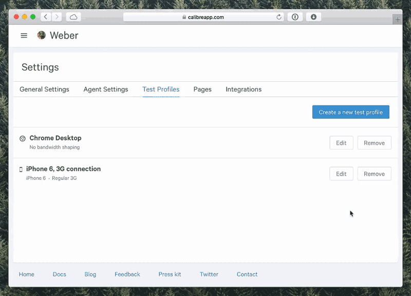
When Split Screen Works The Best

Split-screen is especially good when you have two things to promote. For example, when a site offers two entirely opposite variations. This approach allows designers to give prominence to both things and allow the user to quickly select between them.

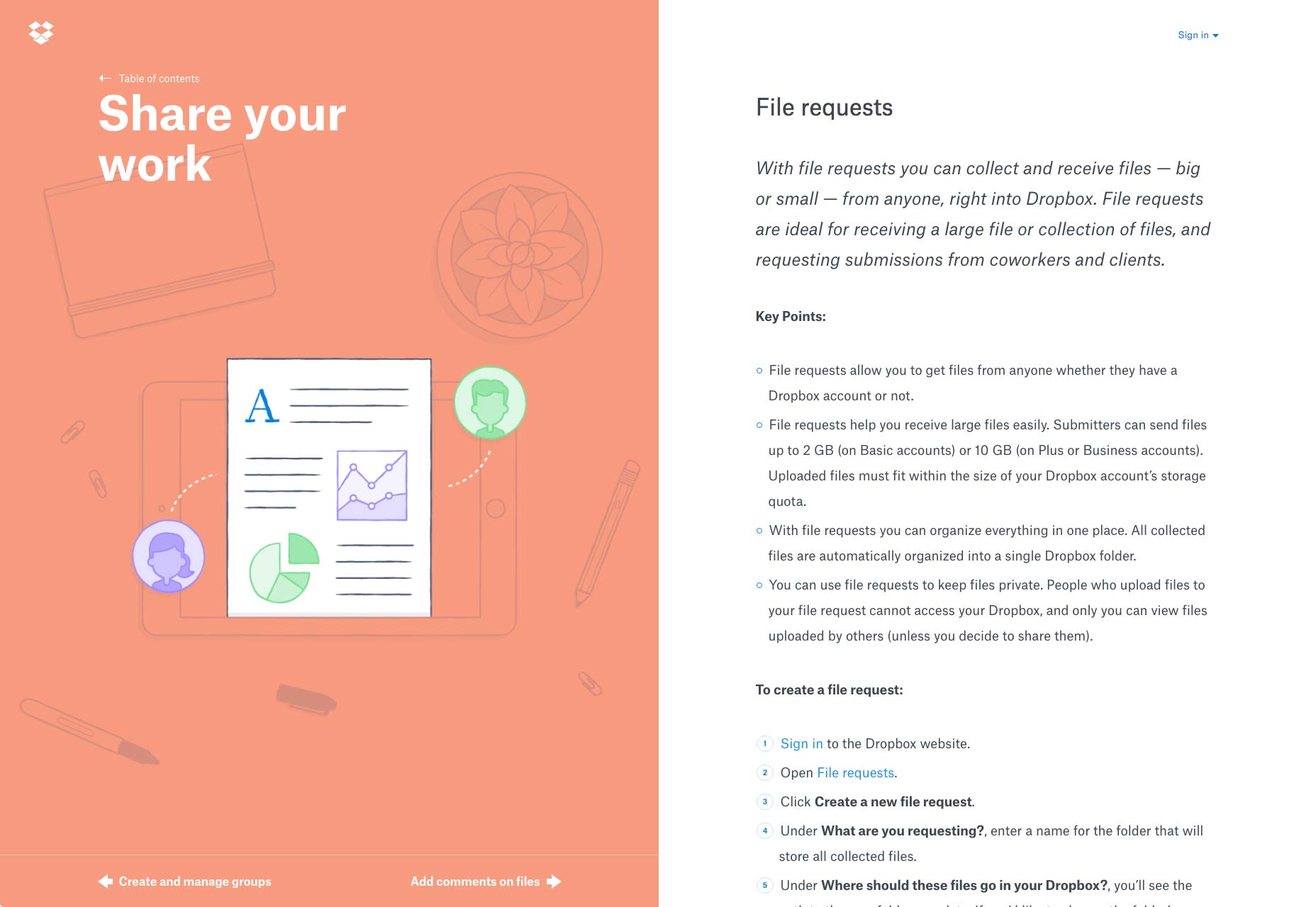
One screen, two messages in Dropbox Guides

When You Should Avoid Split Screen

Split-screen designs don’t expand well as the content grows, therefore it is not recommended to apply them to content-heavy layouts. It’s important to keep the screens simple because complex split screens make the UI look overloaded with information. That’s why split-screen layout would be a perfect fit for minimalist website designs.

How to Decide if Split Screen is Good For You

If you’re considering a split-screen technique for your website, I advise you to ask yourself a few questions:

Is it suitable for your content?
Will there be enough negative space to make the layout work?
Will your users appreciate the layout or it will confuse them?
Will it be OK to split your users’ attention in half?

The most important thing to keep in mind that content is king and split-screen should be a simple way to deliver your message to people.

Design Techniques For Split Screens
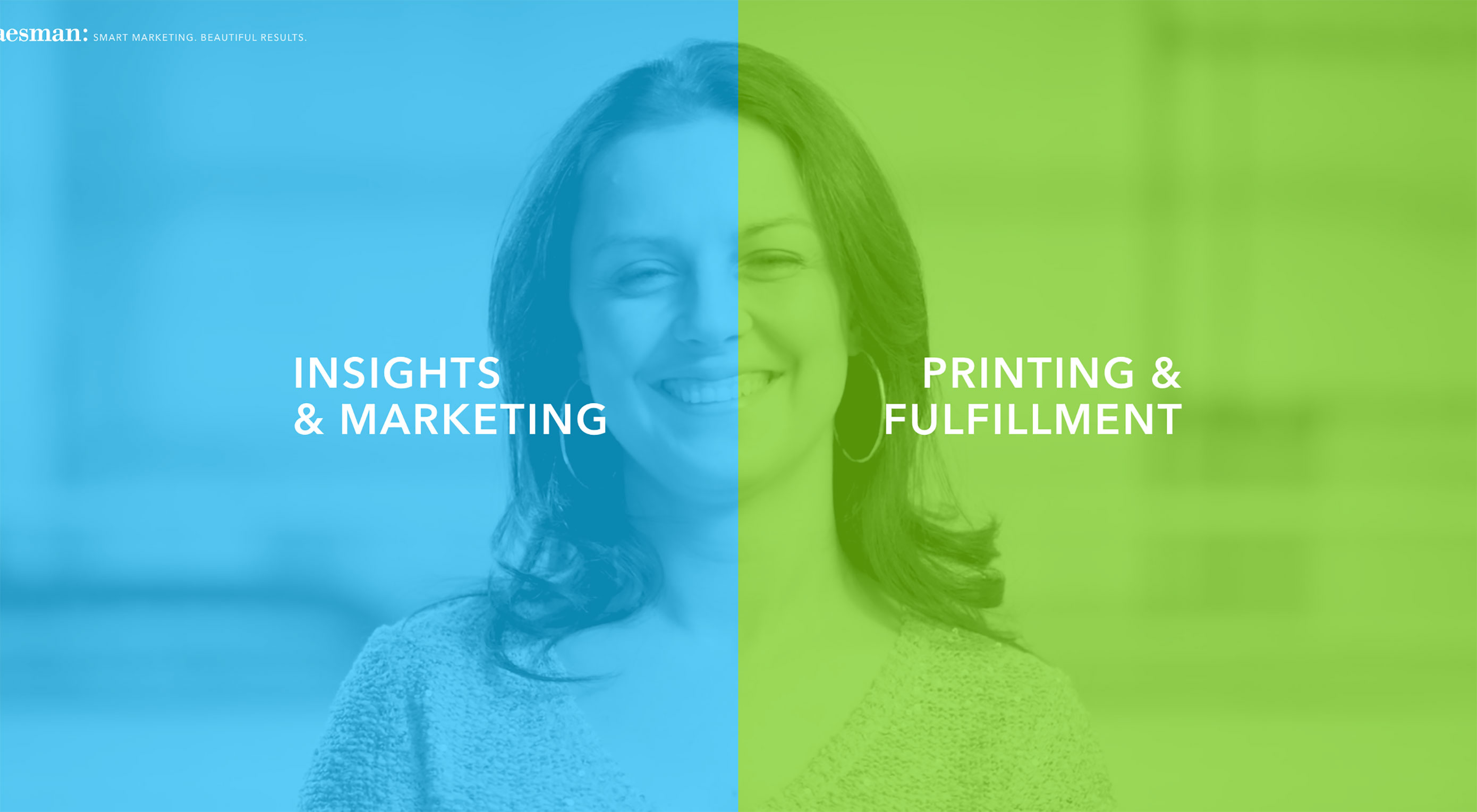
1. Pair Vibrant Color and Dramatic Typography

Thanks to Flat and Material Design, vibrant colors and dramatic typography are big trends now. Vibrant colors are visually stimulating and dramatic typography enhances the text content. Simply combine the two and you will create a visually interesting design. Baesman has done this masterfully. They gave equal importance to both elements while, at the same time, allowing the user to choose between them quickly.

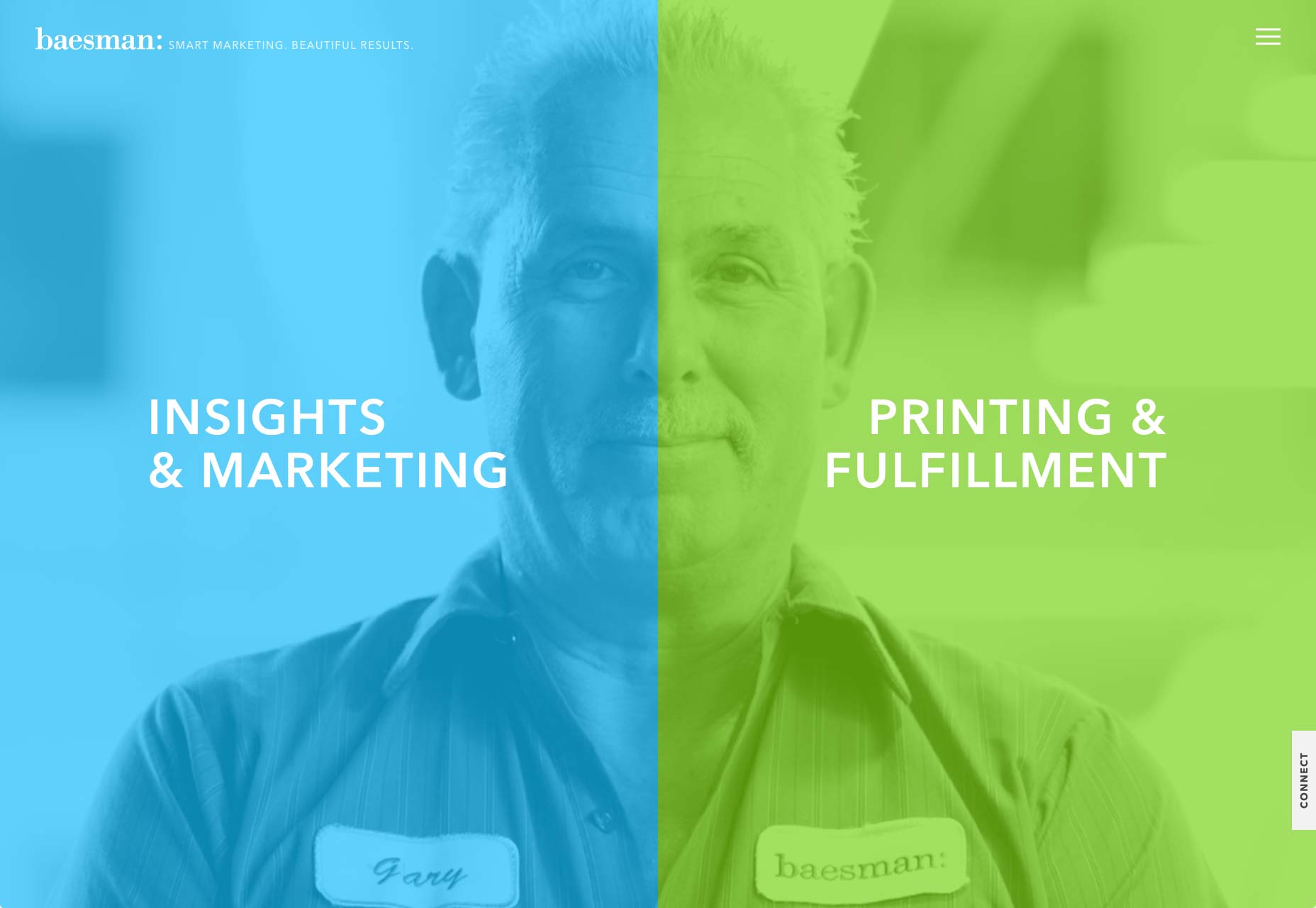
Bright colors and interesting typography pairs can add interest

2. Draw User Attention to the CTA Button

Much more than a simple graphic trend, splitting the screen into two distinct parts provides an original way to guide the user through your site. It’s a great option when you want to create a bigger focal point for calls to action. In the example below, you can see how negative space creates a vertical divide to give equal weighting to two different options.

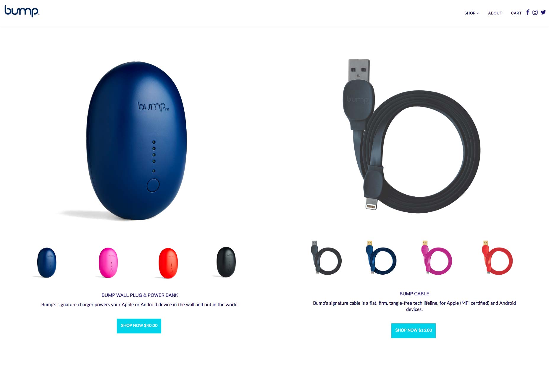
Vertical divide allows emphasis on two different CTAs without favoring either

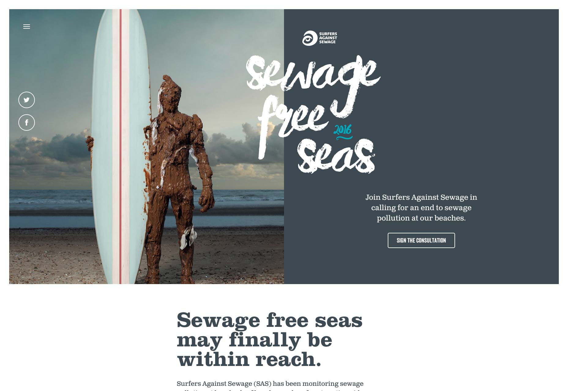
3. Create Visual Flow Between “Screens”

When split screen represents a single object, it’s important to establish a connection between content containers. One possible way to do that is by using a color. Simply duplicate a distinct color to establish visual flow between two screens. This works particularly well with a brand color or hue with a lot of contrast. Using color it’s possible to communicate a stronger connection between two pieces of content.

Another possible way to create a strong connection is layering a single element such as text copy across screens:

Overlapping text connects two screens

Last but not least you can use a colored overlay for this purpose:

Consider the left part of the screen

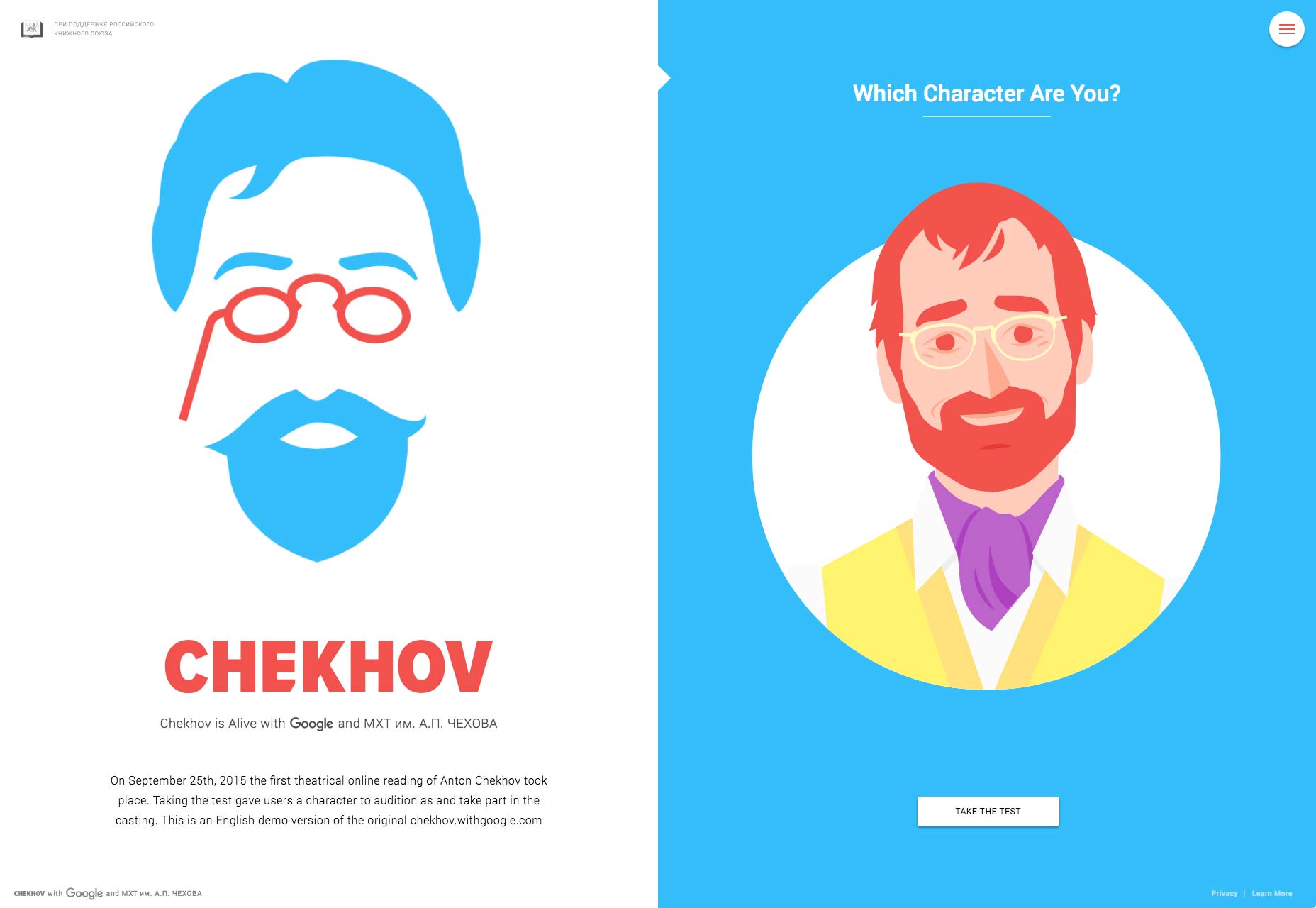
4. Use Animation To Encourage Users To Act

Fine animation and interactive effects encourage users to click. Look at the design used for the “Chekhov is Alive” site below. The design begs you to click to find your character.

Conclusion

It takes approximately three seconds for a visitor to make a decision regarding your website. Consequently, your layouts should always be visitor-friendly if you want to reduce bounce rates. Split-screen technique can help you with that. Split-screen designs are a fun, functional, and responsive way to create an engaging design.

eBook: Better Web Typography for a Better Web – only $13!

Source

p img {display:inline-block; margin-right:10px;}
.alignleft {float:left;}
p.showcase {clear:both;}
body#browserfriendly p, body#podcast p, div#emailbody p{margin:0;}
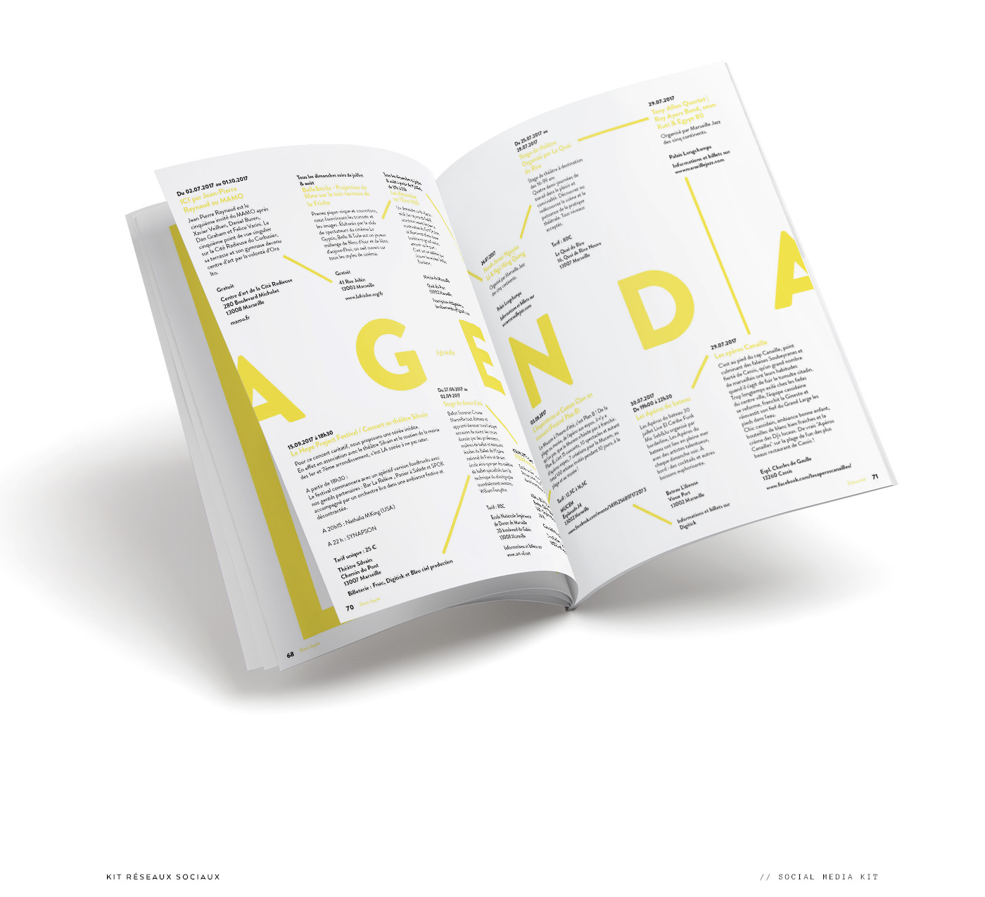
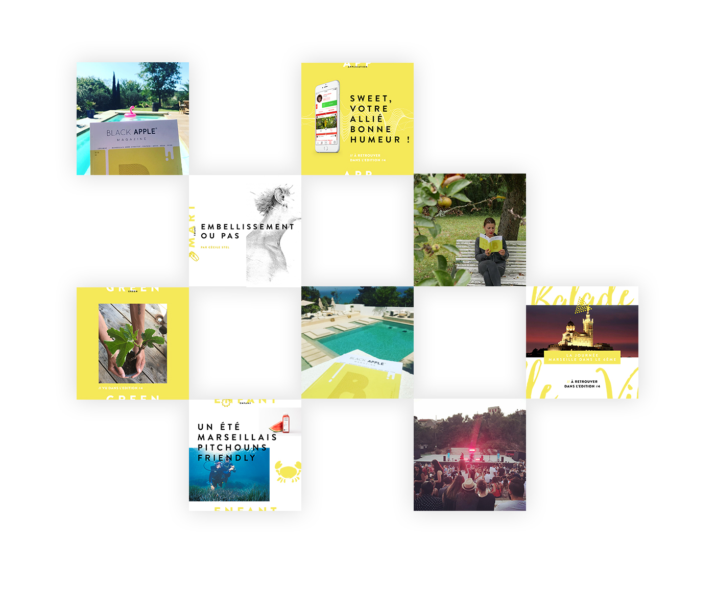
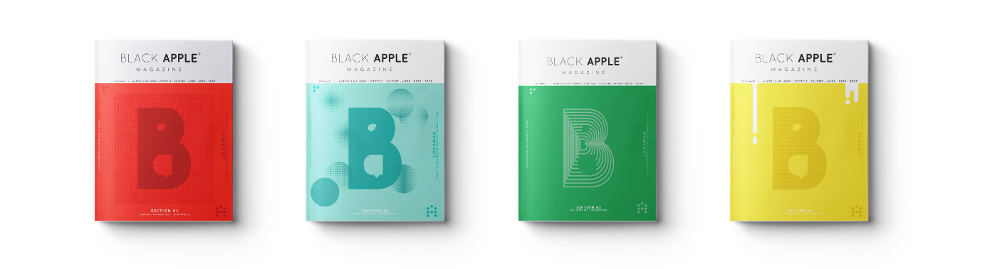
How to Drive Recurring E-Commerce Sales in 2017

Original Source: http://www.hongkiat.com/blog/drive-recurring-ecommerce-sales/

I often see businesses more concerned about getting new customers instead of retaining the existing ones. But, do you know that it costs five times as much to attract a new customer than to keep an existing one!

Considering how important it is to retain your old e-commerce customers to drive repeated sales, I have written this article touching all the key points. I will discuss different tips to help you in creating a better e-commerce experience for your customers so they keep coming back to your site for more.

Identify the reasons why customers leave

Firstly, you need to identify all the possible reasons of customers leaving your site. These can be any of the following:

The customer has left the market.
Your competitor has persuaded the customer to join their service.
Dissatisfied with your service.
Customer believes you do not care for them.

Once you pinpoint the reason why your existing customer has decided to take a u-turn, it automatically becomes easy for you to work on that particular segment of your e-commerce business.

Calculate CLV (Customer Lifetime Value)

In order to assess the value of net profit an existing customer (if retained) may provide to your business, we calculate the Customer Lifetime Value (CLV). It is a predictive analytics technique that can help you forecast the entire future relationship of the customer with your enterprise.

The easiest way to calculate CLV is by using the below formula:

(Legend)

CLV = Customer Lifetime Value
CV = Customer Value
t = Store’s Average Lifespan

Where:

(Legend)

AOV = Average Order Value
f = Purchase Frequency

AOV can be calculated by the formula:

And f can be calculated by the formula:

And

t (stores lifespan) is usually 1 to 3 years.

This is a basic calculation that shows as how many months or years the customer stays with the company before going dormant.

e-commerce-salese-commerce-salesStrategies to retain customers

It is critical for an e-commerce business to drive more online revenue by generating repeated e-commerce sales. Here are some of the ways to enable customers to spend more without becoming dormant:

1. Simplify the checkout process

Customers are more likely to purchase repeatedly at your website if the checkout process is simple and convenient. Do not make the customer fill the details every time they purchase, rather provide auto-filling of the fields that remain same like the name, address, and card details. Your focus should be to save your customer’s time and add convenience to the process.

Here are some ways to simplify the checkout process:

Use AJAX to dynamically update the page without the need to refresh it.
Remove distractions (like the main menu) and keep only the essential fields (payment details and delivery details) in the checkout page. Tools like Usersnap can help you track bugs on your site easily.
If there is an error on the customer’s part then highlight the error by using a message popup and instruct the customer what to do next.
Once the order is placed, clearly state the date and time of the delivery.
Send emails and messages confirming the order placement.
Ensure, the checkout works smoothly on all devices.

Have a look at the below one-step checkout process for Magento:

magento-checkout-3magento-checkout-32. Reward your customers

Customers love to be rewarded. It can be in the form of inviting your loyal customers to company events or sending them customized messages or gifts on their birthdays or anniversaries. Tools like LoyaltyBox are a great help in automating the process of rewarding your customers.

Here are some more ways you can apply to reward your customers:

Give cashback or loyalty points to the customers once they complete their first purchase which can be redeemed at their next purchase.
Charge upfront fee and provide VIP benefits. A great example is of Amazon Prime which charges $99 annually and the users get free shipping with no minimum purchase.
Partner with other companies to provide the customers with all inclusive offers. For example, you can tie up with a spa company and offer free spa services to customers when they reach a particular level.
3. Ask for constructive feedback

Customers look for a platform where they can share their voice. Feedback is an important medium to optimize the customer purchase journey. You can ask for user feedback through the following ways:

Send emails to customers after they make a purchase asking them about their experience like “Did you find the checkout process easy?” OR “What would you like to change in the checkout process in order to make it easier?”
Similarly, you can ask them about their experience with the particular product that they purchased.
You can also provide pro-active live chat support to gather real time feedback and minimize the friction to the purchase.
Gather data using customer surveys. Move forward with a shorter, “slider” survey that appears onscreen as a customer browses your site.
toysrus-5toysrus-54. Offer regular discounts

Who doesn’t like discounts? Rewarding your loyal customers by sending them discount coupons is a great way to enhance customer retention.

Shopify is one of the most reliable platforms when it comes to generating extra online sales. You can take advantage of Shopify’s coupon and discount feature. Create coupons and assign discount codes to generate more business.

You can create discounts on the basis of:

Percentage – 10% off on your overall purchase.
Shipping costs – offer customers free shipping.
5. Provide efficient customer service

You should always be supportive towards your customers and help them with whatever issues they might be facing. A bad and inefficient customer service is often one of the common reasons why customers fail to repeat purchase. Here are some tips for providing better customer service:

The customer service executives should be courteous and respectful.
They must listen to what the customer is saying. A good support agent has to be a good listener.
Response should be given in real time and all the queries should be fixed at the earliest. Support agents often try to neglect the customer queries and do not provide an immediate solution.
Consistently check with your customers whether they are happy with the products and services. Proper feedback is crucial for the success of the business. You can check out the customer service feedback templates provided by SurveyMonkey.
6. “Open a Relationship” instead of “Closing a Sale”

The growth of an e-commerce business is dependant on sales, however, the sales are eventually generated by customers. Therefore, if you try to close sales instead of opening relationship with the customers, it will only benefit you in short-term.

Instead, it is important to open up a relationship with your customer and focus on long-term benefits for your e-commerce business.

In conclusion

It is important for you to maintain the right attitude with your customers at each point during the customer lifecycle. You must exceed the expectations of the customers and always remain available. Remember that a happy customer is a loyal customer.

How do you keep the customers happy? Do let me know in the comments below.

5 Ways Customer Service Can Yield Better Search Results

.no-js #ref-block-post-28028 .ref-block__thumbnail { background-image: url(“http://media02.hongkiat.com/thumbs/250×160/how-to-earn-higher-online-revenue.jpg”); }

5 Ways Customer Service Can Yield Better Search Results

Nowadays search engine optimization is more focused towards search experience optimization – also known as “the other SEO”…Read more

User Authentication For Web And iOS Apps With AWS Cognito (Part 1)

Original Source: https://www.smashingmagazine.com/2017/08/user-authentication-web-ios-apps-aws-cognito-part-1/


Developers and organizations alike are looking for a way to have more agility with mobile solutions. There is a desire to decrease the time from idea to test. As a developer, I often run up against one hurdle that can slow down the initial build of a mobile hypothesis: user management.

User Authentication For Web And iOS Apps With AWS Cognito (Part 1)

Over the years, I have built at least three user management systems from scratch. Much of the approach can be based on a boilerplate, but there are always a few key items that need to be customized for a particular client. This is enough of a concern that an entire category of user management, authentication and authorization services have sprung up to meet this need. Services like Auth0 have entire solutions based on user and identity management that developers can integrate with.

The post User Authentication For Web And iOS Apps With AWS Cognito (Part 1) appeared first on Smashing Magazine.

Making Better HTML Tables

Original Source: http://inspiredm.com/making-better-html-tables/

Inspired Magazine
Inspired Magazine – creativity & inspiration daily

Strangely enough, one of the most difficult web technologies to master is one of the earliest ones to be available for the browser after plain text and images. The problem is even greater today with so many different device types that need to be thought about.

Perfect tables are nearly impossible to create unless they contain so few items that no problems are likely to be triggered. The kinds of errors that can arise include:

Text wrapping incorrectly
Justification errors
Table rendering off screen
Scroll problems
Row height errors
Column width errors
General ugliness or untidiness

In this article we’ll take a look at how to avoid problems like that, so your tables have the best chance of creating a good impression.

Avoidance strategies to avoid

Because tables are so difficult to get right, some people try to avoid using them. Some common strategies are using CSS to create a fake table, and using an image of the data table without implementing it in code.

Both of these avoidance strategies have flaws and should be avoided. Using CSS to imitate a table lacks the semantic structure inherent in a table, which can create usability and accessibility problems.

An image of a table won’t suffer the problems that are listed in the introduction, but degrades your SEO potential and can’t be easily modified if your data needs updating. It also introduces usability and accessibility problems.

Frameworks are your friends

Common frameworks such as Bootstrap and Foundation contain many time-saving tools, and tables are no exception. Building a classy looking table in Bootstrap is not difficult, but does come with some limitations if you just build off the rack without adding some bespoke tailoring to your efforts.

Looks aren’t everything

Because content and style should always be independent, it can make sense to build your table in plain HTML first just to make sure it will look good before any special table styling is applied.

This can also be helpful in reminding you that good table construction requires more than just making the table look good. It should also be a useful information delivery system. If the goal of the table is not to convey information, then you shouldn’t be using a table for whatever it is you are doing.

Aim for accessibility

Some people have difficulty seeing and reading printed text, so it’s a good idea to make tables accessible for them. You can find out everything you need to know about making your tables more accessible from WebAIM.

Consider giving ID values to table components

For maximum control over each part of the table (rows, cells), you can consider giving them individual ID values. Adding class values as well will give you even more flexibility.

Doing these things creates a lot more work for you, so it’s only practical when you need to be able to fine tune any item by reference. If you do decide to do this, you will be able to directly manipulate any table item using JavaScript and CSS.

One of the complexities of table making is that we declare rows but not columns. The columns are created dynamically, calculated according to how many data items you place on each row. This is why tables add to your page loading time.

Effectively it means columns exist only in an abstract sense before the page is rendered, so you can’t give them any kind of reference. By giving the first TD item on a row a class of, for example, “firstCol”, you provide a way to directly reference a column.

Compact tables are best

It has become fashionable to build everything with big, high visibility components. From an accessibility point-of-view, this is wonderful. In terms of usability, however, it isn’t always the best way, because it can lead to problems.

The developers of Bootstrap experimented with responsive tables, but tables and responsiveness don’t go well together. Designing your tables from the start so they’ll fit on a mobile screen in portrait mode is a smart move.

Tables should always be scrollable

It’s a good practice to always set the overflow value of a table to auto, but not on the table itself. Instead, wrap the table inside a div, something like this:

Then there’s a lot of PHP code that constructs the table body, closing with this:

The part that does the work of making the table scrollable is on the first line, where the table-wrap div is given a fixed height and has its overflow value set to auto. If you do this to the table itself, instead of to a wrapper around the table, it can have unintended effects.

Call in the heavy hitters if you need to

For simple tables, this is overkill, but when you have a table that really needs advantages like adjustable column widths and column sorting, there are some powerful jQuery applications that have been built to help with the task of constructing complex tables.

The biggest and most likely best is Flexigrid. This has a similar look to a Java Swing table, and works in a similar way.

The features of Flexigrid may even be too much for what you need, so in this case you could consider TableSorter, which is quite a bit simpler.

While the features of these kinds of tools can be exciting, it’s important to that they’re going to add even more to your page loading time. It’s best to save this kind of thing for when you really must have it.

Automated conversion tools won’t normally give best results

There are CMS plug-ins available that allow you to convert document tables to HTML tables. These are not anywhere near as good as building the table yourself manually, so if you want superior results, automation of this kind is not the way to go.

Your own home-grown automation is fine, however

Using PHP to construct your tables from database information is always a good idea, and definitely preferable to typing everything manually. The difference here is you have full control over how the automation works.

When you use third party automation, the third party author has to make assumptions about your table. This means you’ll end up with a generic table that may lack many features compared to creating the table yourself.

Use tables appropriately and they will reward you

Good tables are designed, they don’t just happen. When you design an information delivery system, you want it to be efficient and effective. Make sure your tables are designed to be just that, and your site will achieve maximum benefit from their inclusion.

header image courtesy of Maggie Appleton

This post Making Better HTML Tables was written by Inspired Mag Team and first appearedon Inspired Magazine.

Editorial Design for the Beautiful Black Apple Magazine [BAM]

Original Source: http://feedproxy.google.com/~r/abduzeedo/~3/lSepZYrDC_Y/editorial-design-beautiful-black-apple-magazine-bam

Editorial Design for the Beautiful Black Apple Magazine [BAM]

Editorial Design for the Beautiful Black Apple Magazine [BAM]

abduzeedo
Aug 17, 2017

Editorial design has for me is the biggest source of inspiration. The beauty of organizing text, imagery and colors to create composition that is not only visual pleasing but also efficient at communicating the message to the reader. BUREAU CHAPEAU MELON created and shared this incredible editorial design project on their Behance profile It’s the design for Black Apple Magazine and it has it all. Gorgeous imagery, elegant use of white space, vibrant colors, trendy illustrations, as I said, these types of projects are truly inspiring.

Description

Black Apple Magazine [BAM] is a free bimonthly publication distributed  in key outlets of the Marseille city. Launched in January 2017 by Aurélia Andréoli (Founder and CEO of the design studio Bureau Chapeau Melon) and Anne-Sophie Vignau (Founder of Pepper D printing), BAM is design, qualitative and authentic. Distributed free of charge, it gives pride to its inhabitants and visitors. 

Editorial design

Bureau Chapeau Melon  is a creative agency based in Marseille, France. For more information make sure to check out:

chapeau-melon.fr
blackapplemagazine.com


editorial design
graphic design


Migrating from WordPress.Com to Self-Hosted WordPress

Original Source: https://www.sitepoint.com/migrating-from-wordpress-com/

WordPress.com is a limited version of WordPress run by Automattic. Here, you can create a blog or website in moments without worrying about hosting and managing your WordPress. However, to use many more complex plugins and functionality, and to have the full breadth of customization you desire, you may at some point decide to use […]

Continue reading %Migrating from WordPress.Com to Self-Hosted WordPress%

Your Site without JavaScript

Original Source: https://www.sitepoint.com/calibre-your-site-without-javascript/

This post was originally published on calibreapp.com and reposted here with the author’s permission. If you’re interested in taking Calibre for a spin, you can start a free 14-day trial today.

There are plenty of reasons why the presence of JavaScript (what it does, how it works, and how heavy it is) needs to be considered a little more thoughtfully.

Web traffic today is made up of more than 50% mobile devices, of these devices, many operate under extremely volatile network connections—loading scripts alone in less than 10 seconds is nigh on impossible in many situations.

If you’re working on a single page app, with no reasonable content-only fallbacks, this can be far more damaging than you may think—users will be watching a white screen, with partial content, for a long time.

According to Google’s DoubleClick, when comparing sites that load in 5 seconds to sites that load in 19 seconds, the faster sites had 70% longer average session lengths, 35% lower bounce rates and 25% higher ad viewability than their slower counterparts.

Performance is important, there’s no doubting that, but what common negative impacts does JavaScript have on our sites? How are we currently evaluating performance?

Let’s Have a Brief (but Constructive) Look at the Cost of JavaScript

When commonly auditing the performance impacts of JavaScript, we look at:

The number of render-blocking scripts present on the page
How long scripts take to download, and the amount of data transferred

But what we’re often missing is what happens thereafter…

Once the device has downloaded the scripts, they must be parsed, converted to bytecode, compiled and then executed.

Parse and compile time are two reasons why the same site that works great on your $3000 MacBook, feels kind of janky on a 2-year-old smartphone.

Chrome parse/compile times on a regular desktop browser, verses a low power mobile device

The above graphic compares Chrome parse/compile times on a regular desktop browser, verses a low power mobile device. This graphic is taken from Addy Osmani’s excellent article titled “JavaScript Start-up Performance”.

Ouch.

Let’s say, as an experiment, that we removed all scripts to establish a performance baseline, to answer the question “Just how fast could this be?”.

Calibre exists to make it trivial for teams to have better visibility to more areas of performance and user-experience, so in the spirit of that, you can now run a direct comparison of your site with, or without JS—as a Test profile.

Calibre App: testing with and without JavaScript

?Now you’re testing with and without JavaScript

I enabled the ability to disable scripts, and run a few test runs against popular global news sites, both with, and without JavaScript.

Continue reading %Your Site without JavaScript%

Fresh Resources for Web Developers – July 2017

Original Source: http://www.hongkiat.com/blog/designers-developers-monthly-08-2017/

Having been maintaining this series for a few years now has allowed me to witness the progress in web development. There are a number of tools that were so popular only a few years ago but not so much in the recent times mainly because they failed to gain meaningful adoption. While there are web development resources that retain their popularity even today.

Click for More Resources

.no-js #ref-block-tax-37662-1 .ref-block__thumbnail {
background-image: url( “http://media02.hongkiat.com/thumbs/related/tag-fresh-resources-developers.jpg” );
}

Click for More Resources

Find our entire collection of recommended resources and the best web design and development tools available.

So here we have put together a number of useful resources that are worth a try. We have a JavaScript library to create Bot chat, an open source e-commerce platform, and a couple of CSS libraries. Let’s move on to see them in details.

MuzzleApp

Created by the same developers behind CodeKit, Muzzle is a macOS app to avoid you from embarrassment. It will turn off all notification when screen sharing. Muzzle works by automatically setting macOS “Do Not Disturb” mode when screen sharing or apps such as Skype, Google Hangouts, and Slack is started.

MuzzleAppMuzzleAppFractures

A collection of CSS classes that allow you to quickly create a webpage prototype. Fracture is based on Atomic design where styles are split into tiny pieces – leaving small footprint. Instead of bringing full-fledge styled components, it introduces classes like radius-1 to to style an element with small corner radius.

FracturesFracturesCSS DB

This shows you the list of the progress CSS features and their current stage to be implemented as a new standard. Now you know nesting CSS selector is currently on its way to be the standard.

CSS DBCSS DBPreact

Apache has recently announced to disallow ReactJS and similar projects that are distributed under Facebook BSD+Patents license to be included in Apache’s product. If your product has been affected by this license, consider Preact that’s a drop-in replacement for ReactJS and is licensed under a more permissive MIT license.

PreactPreactPell

Pell is a JavaScript library to build WYISWYG editor. By default, it comes with the common buttons like the Italic, Bold, Underline, and the Headings with more will be added in the future. Built with ES6, Pell requires no dependencies library like jQuery, is small in size, yet it is maintained to be compatible with IE9.

PellPellMarkvis

Markdown is limited to particular syntaxes. It adds the ability to include chart in your Markdown content. If you are not sure what Markdown is, check out our post on Writing Web Content with Markdown.

MarkvisMarkvisMoment PHP

Moment is a PHP library to manipulate dates similar to Moment.js for JavaScript. Using the library, it is easy to get, for example, the current time in in the other timezone and formatting date based on your locale.

Moment PHPMoment PHPTonik

A WordPress starter theme built for modern PHP. It utilizes Namespacing, custom templating, autoloader, Webpack, and a bunch of other goodness of modern web development.

TonikTonikAwesome Guidelines

This is a list of coding standards of various programming languages including C, Javascript (of course), PHP, Ruby and even Visual Basic. It can be a great resource to keep your code clean and tidy.

Awesome GuidelinesAwesome GuidelinesBotUI

This is the era of Bot. This JavaScript library allows you to create a conversational UI. I do think having Bot could be a better replacement of traditional ‘Form’ and serves a more natural experience to your users.

BotUIBotUIReaction Commerce

Open source CMS for commerce hasn’t changed much for years with most of them built on top of PHP. ReactionCommerce aims to change that with the latest web technology stacks. It is built using JavaScript and is an event-driven CMS providing real-time experience. It comes with the features like order processing, payments, shipping, analytics, etc to allow get up and run an e-commerce site quickly.

Reaction CommerceReaction CommerceTinyReset

A modern CSS resetter with minimal footprint. TinyReset is a good alternative to the legendary reset.css by Eric Meyer.

.TinyResetTinyResetMartinet

Martinet is Command Line Tool to build static website with modern tools like Webpack, TypeScript, Pug for templating, LESS, and NPM. It is designed so that we don’t have to worry on the site configuration. Simply follow the convention and run martinet, your website will be up and running.

MartinetMartinetBillboard

BillboardJS is JavaScript to build interactive data visualization based on D3.js. There is an array of visualization types you can build with this library including line, bar, pie, doughnut, and see the demo page for more details.

BillboardBillboardSVGI

SVGI is a Command Line Tool that allows you to lookup SVG elements or SVG files. Once installed, you will get access to the svgi command line where you retrieve list of Nodes on the SVG, the size, and the elements hierarchy.

SVGISVGITimeStrap

Another interesting open-source platform on our list after ReactionCommerce, TimeStrap a time tracking an invoicing system that you can host anywhere just like WordPress. A good alternative for those who prefer to manage invoicing on their own system rather than using external services.

TimeStrapTimeStrapSlate

A tool to create static single page for APIs documentation. Slate is used in many popular projects such as WooCommerce, Travis-, CoinBase, and even NASA.

SlateSlateFontJoy

A tool to generate great font pairing. Press the “Generate” button to retrieve new font combinations infinitely. What’s interesting is that this tool generates the result with Machine or Deep Learning. I’m not sure how that exactly works but if you’re curious check out this page.

FontJoyFontJoyCoolHue

Gradient makes a comeback to the web. But this time, with CoolHue. The tool has a great collection of beautiful gradients since web colors have improved so much as compared to the last 10 years. It is now common to see websites featuring gradients on every corner of their page.

CoolHueCoolHueFrontPress

FrontPress is a front-end framework that utilize WP-API and AngularJS. It is a great starting point if you want to create a headless CMS with WordPress, something I’m very much looking forward to.

FrontPressFrontPress
E-Commerce Design Resources: The Ultimate Round-Up

.no-js #ref-block-post-6445 .ref-block__thumbnail { background-image: url(“http://media02.hongkiat.com/thumbs/250×160/e-commerce-design-resources-the-ultimate-round-up.jpg”); }

E-Commerce Design Resources: The Ultimate Round-Up

E-commerce design requires much of the same design knowledge and skill as any other type of web design.…Read more

Sass Functions to Kick-Start Your Style Sheets

Original Source: https://www.sitepoint.com/sass-functions-kick-start-style-sheets/

Sass Functions

Sass has a number of built-in functions to help you set up the styles for your project a lot quicker and easier.

Let’s dive into a few of them!

The Darken and Lighten Sass Functions

Possibly two of the best-known functions in this list, I’m going to count these as one because they do the same thing, but in different directions.

As the names suggest, darken and lighten will darken and lighten a color by a certain percentage respectively. You could use them on a button’s hover state or throughout a site to create hierarchy. Here’s how:

[code language=”sass”]
$main-color: #6dcff6;
$darker-color: darken($main-color, 20%);
$lighter-color: lighten($main-color, 20%);
[/code]

The second argument in these two functions takes a percentage value by which to darken/lighten a color. This way you don’t have to look up the hex for a slightly lighter color every time you want an easy interaction state. For example, you could do this:

[code language=”sass”]
.brand-button {
background: $main-color;
}

.brand-button:hover {
background: $lighter-color;
}

.brand-button:visited {
background: $darker-color;
}
[/code]

Which compiles into this:

[code language=”css”]
.brand-button {
background: #6dcff6;
}

.brand-button:hover {
background: #cdeffc;
}

.brand-button:visited {
background: #0fafee;
}
[/code]

Using these functions means that you could create an effective color palette that can remain consistent throughout your project. If, for instance, you have highlight and inactive state colors based off of a main brand color and your client decides to change their main color midway through development (it happens more than I care to admit…), you only have to change one value and see it cascade throughout the rest of a site.

The Opacify and Transparentize Sass Functions

Still sticking with colors, opacify and transparentize make colors more or less opaque respectively.

Continue reading %Sass Functions to Kick-Start Your Style Sheets%

Designers: Endless Client Revisions Got You Down? 260+ Pre-built Websites Are The Solution

Original Source: http://www.hongkiat.com/blog/designers-endless-client-revisions/

(This branded content is brought to you by Be Theme)

When you think your client is finally satisfied, here comes another revision request. This time, it’s because he’s just come across a font he believes better fits in with the company brand.

That would be acceptable, except it’s the third time it’s happened! You find yourself stuck with the same project for a few more days, instead of moving on to the next one.

There are a couple of things you can do about it:

You can use a tool that gives your client exactly what he wants early on;
Use the tool that allows you to make changes easily.

Here’s one that does both.

Be Theme delivers what your clients need – the first time.

Be Theme offers a selection of more than 260 pre-built websites. Thus, it’s not hard to find one that’s a perfect match for your client’s needs or niche.

These pre-built websites are completely customizable. Moreover, you have a wealth of design options to work with. So, it’s easy to a make a change in the unlikely event of needed revision.

Even better, you can respond to your client’s request for a website in as little as 4 hours.

See how easy you can install Be Theme by watching this cool 40-second video.

10 Be Theme template examples that can get the job done.

Be eLearning

For clients who sell online courses.

This attractive pre-built website provides a great starting point to build a website for a client with online courses to sell, or is creating an eLearning platform. Although plenty of white space is used its design, Be eLearning supports a large amount of content.

Be Craftbeer

For small business owners

A client who is selling handcrafted products will want a website that features attention-getting images, like this one in Be Craftbeer. Its structured, well-balanced design, cool JavaScript effects, and clever display of buttons should please even the pickiest client.

Be Tiles

For interior designers and architects

Be Tiles lays the groundwork for a client wishing to showcase visual effects; the type of website often associated with architectural firms and interior design agencies.

Give the client a few examples of stunning portfolio styles, and you’re not likely to be bothered by revision requests.

Be Artist

For clients working in creative industries

Be ArtistBe Artist

A client who has high standards and exquisite tastes, can be difficult to satisfy, as he or she will expect the same in the website you deliver. Be Artist will put your fears to rest.

Parallax scrolling and neat JavaScript portfolio filtering effects allow you to display the client’s creative talent in exceptional ways.

Be Burger

For clients working in the catering industry

Be BurgerBe Burger

Here’s your chance to design a website for a client in a catering or food service business that stands out from the crowd in this highly competitive niche.

Mouth-watering images, easy-to-order forms, and a simple menu structure should satisfy any food service client.

Be Sports club

For clients in the fitness & wellness industry

Be Sports clubBe Sports club

This dynamic and interactive pre-built website is a perfect match for the niche it represents. Clients owning or representing a sports club, fitness center, or health and wellness center, will like this modern design, with its clean lines, clever parallax effects and attention-getting animations.

Be Hotel2

For clients in the travel and lodging industry

Be Hotel2Be Hotel2

Be Hotel2 illustrates how large cover images, and well-designed galleries showing spacious hotel rooms and other amenities for guests, can trigger a desire on the part of a visitor to pick up the phone and book a room.

You can build a complex website like this in 4 hours.

Be Restaurant

For restaurant or bistro owners

Be RestaurantBe Restaurant

You don’t see many websites for restaurants as charming as this one. Be Restaurant2 was designed from scratch to meet a variety of needs.

It will serve equally well as a basis for an upscale restaurant’s website, or for a client who owns a small, neighborhood bistro.

Be VPN

For your IT clients

Be VPNBe VPN

This website is modern, clean, and well-structured, which is what an IT team or company will expect from you. Be VPN’s corporate look isn’t hurt one bit by providing a friendly, human touch. The juice glass looks like it belongs where it’s been placed.

Be Car

For clients who sell luxury products

Be CarBe Car

This pre-built website has elegant and tasteful details coupled with intuitive design. It offers everything a client selling luxury items might expect in a website.

A hero image surrounded by plenty of white space is an excellent way to shine a spotlight on a luxury product.

Summary

How does Be Theme eliminate those bothersome client revisions?

You have the largest number of pre-built websites on the market. This makes it a no-brainer to find one to match your client’s needs.
With Be Theme, it’s possible to deliver a complex website with text, images, and the works. It will take as little as 4 hours of your time.
The fact that Be Theme is a Top 5 ThemeForest best seller speaks for itself. This theme ensures the quality your clients will see in your deliverables. Thousands of designers and developers agree with this fact.
The pre-built websites are customizable and easy to work with. This makes them easily adaptable to any client’s needs.
The designs are beautiful, intuitive and come with well-structured content. The functionality is embedded in each pre-built website along with other features.
Conclusion

No more time wasted working on revisions that tend to pile up in your inbox. All that’s required of you is to meet your client’s needs the first time around.

This will not be hard to do when you have 260+ themes and the Be Theme 1-click installer to work with.

You may still get a request for a revision now and then, but you’ll never again see them in the double digits. Besides, with Be Theme, you can make the most demanding clients happy with your initial works.