3 Things to Consider Before Switching Hosting

Original Source: http://inspiredm.com/3-things-consider-switching-hosting/

Inspired Magazine
Inspired Magazine – creativity & inspiration daily

Are you fed up with your current host and now you’re looking for a different provider?

Maybe you found a cheaper host or a faster one or a host that offers some sort of benefit like a website builder.

These are all valid reasons to switch hosting companies, but it’s essential to consider a few things before making the big change.

First of all, no matter how much the host tells you that they’ll do everything for you, some of the work is going to be completed by you. Most notably, your email address transfer.

Some companies don’t have email addresses provided through their host, so those people won’t have to worry about anything. However, it takes some reading, understanding, and frustration to configure your Outlook or other inboxes with the new hosting credentials.

So, start by understanding that moving hosts doesn’t mean you sit back and watch the experts take care of everything. It’s a collaborative process that’ll most likely take a significant amount of time out of your day. After all, you have to communicate all of the logins to your hosting company and walk through the process of setting up your emails.

Some other considerations come into play during your switch from one host to another. If you’re thinking about jumping ship, take a good look at these thoughts so as not to make a rash decision. You may discover a great deal, but if you find out that the new host stinks, it’s a whole separate process trying to get your money back and moving the files to the old host again.

Therefore, keep reading to learn about the things to consider before switching hosting.

1. Is the Host You’re Switching to Considered One of the Best?

Your entire website setup relies on the hosting. The speed, security, management, and control over your site depends on getting a good host. Therefore, it’s extremely important to consider whether or not the world is talking about the new host.

If you can’t find anything on blogs or other online publications, it’s probably not a good idea to risk your website with the host.

The best hosting companies get mentioned all the time on “best of” lists, where the articles break down why they’re so good, based on criteria like speed, uptime, and customer support.

You’ll also learn more details about the hosts, considering most hosting company websites have extremely salesy and confusing information. So, instead of looking through hosting website sales copy, you’re at an extreme advantage checking out reputable blogs that talk about hosting, blogging, and building website.

As you peruse the internet for reviews, seek out articles that reveal critical, unbiased information about those hosts. If you start seeing your prospective host in these lists as quality options, you’ll most likely have enough information to pull the trigger.

For instance, I like to see some of the following in the articles:

The cost – It’s great when the author showcases all hosting plans from each company. We also like to see how long you have to prepay in order to get a certain rate. The reason for this is because most hosts market their lowest price on the website, but then you’ll discover you have to pay for something like two or three years in advance to get that monthly rate.
Money back guarantees – Although the goal is to locate a great host so that you don’t have to leave again, it’s important to find articles that highlight money back guarantees. This way, you know how long you have to get a full refund.
Load time – If the author didn’t at least complete a little research on load time I’d skip the article altogether. Why? Because hosting has a strong effect on how fast your website loads up to customers. The speed affects SEO and how often users leave your site without looking at anything.
Uptime – This is in the same category as load time, but it’s more about whether or not your site is going to randomly crash because of server problems. Most often the uptime for a host is close to 100%, but it’s good to check in the hosting reviews to see if anyone else has experience uptime problems.

2. Are You Getting Swindled?

Let’s face it, most brands and individuals looking into hosting think about pricing before security or speed. It’s not the way it should be, but budgets are a real thing.

Therefore, it’s ideal to find some of the cheapest pricing you can for a host. The only problem is that when you see hosts selling for less than a dollar, or somewhere around that, there’s a chance you’re getting swindled out of your money and placed on an easily hacked, unsafe server.

In addition, you might find that these super cheap hosts operate in a bad IP neighborhood, and this means that Google will most likely punish your site in return.

Along with rough downtime and bad support, your best bet is to avoid situations like these.

For example, some of the cheapest Aussie Hosting options are pretty bad. However, you can find quality shared and VPS hosting in that region without having to spend too much money. This is especially the case if you’re a blogger or small business owner who doesn’t initially expect to see much traffic coming to the site.

3. How’s the Customer Support?

When transferring from one host to another, the customer support comes into play quite often.

It’s also essential to have a phone line, live chat, and email address to contact the host after everything has been moved over. After all, you’re bound to encounter troubles with your site files. When that happens, you need someone to talk to.

Are You Ready to Switch Hosting?

Okay, so you’ve evaluated whether or not your future host is considered one of the best, checked to make sure you’re not getting swindled, and made sure that the customer support is pretty good.

Once you’ve walked through those steps you should have no problem switching over to the new host. Good luck!

header image courtesy of Alexey Kuvaldin

This post 3 Things to Consider Before Switching Hosting was written by Inspired Mag Team and first appearedon Inspired Magazine.

Getting Ready for Web Video

Original Source: http://inspiredm.com/getting-ready-web-video/

Inspired Magazine
Inspired Magazine – creativity & inspiration daily

Video is one of those really contentious points about web design. There are some people who feel like web pages should not have embedded video at all. These people are wrong.

Like any technology, however, we should respect it and not abuse it. The two worst things you can do are:

AutoPlay videos, without express consent from the user
Embed too many videos in one page

Both of these things are likely to cause annoyance to users and should be avoided unless you have a very good reason.

Knowing what not to do will only get you so far. The rest of your online video success story will depend on knowing the things you ought to do, which is what we’ll cover in the rest of this article.

Video categories

There are six different types of videos that are commonly used on sites. These are:

Regular video – you point a camera at something and record it
Live stream – you point a camera at something and don’t record it
Slide show – composed from a series of still images, often with voice over plus added descriptive text
Animation – various methods, but more commonly 3D rendered animations made with Maya3D or Blender.
Screencast – software records images from your computer, normally used for tutorials, usually with text overlays and voice narration.
Hybrid screencast – a screen cast with regular video segments, and possibly also slideshow segments.

Knowing which type of video you want to produce is a good start. Actually that brings us neatly to the next topic.

Plan your video

Good video doesn’t normally happen by accident. Meticulous planning pays off, and that means you know what kind of video you’re going to produce, how you’re going to produce it, and (very importantly) why.

Don’t fail to plan. For a start, your video should be scripted. This is true even if there is no dialog or narration. The script gives you a clear impression of how the video is supposed to unfold. You can also optionally story board the video, but a crew that can’t work straight from a script is not a very visionary crew.

If you’re making a bigger production, you’ll also benefit from budget planning, scene breakdown, shooting sequence (shot list), location scouting, etc. The more time you invest into planning, the better your video is likely to be. Professional preparation leads to professional results.

Software that can help you with script writing and planning includes Trelby and CeltX.

Invest in quality equipment

The equipment you use will have a big impact on the result. It may be difficult to believe, but the camera is not the most important part of your equipment investment.

That’s because for web video (in 2018, at least) it’s rarely sensible to shoot video above normal HD (1920px wide), and in fact it’s better to shoot in SD (1280px wide) or lower, and the aspect ratio should always be 16:9.

One source of confusion with these resolutions, by the way, is the slightly misleading standard names used, which references the vertical height (720p / 1080p) rather than the width, which is the most natural thing people think about.

In thinking about this, bear in mind that a video with a frame height of 720px will not fit on the screen real estate of most users, so it is easy to see why shooting above 720p will not give superior results for web video.

The larger your video frame is, the more resources it will hog on the user’s device, including in some cases failing to play at all, or playing very poorly. Your goal really should be to get the highest image quality and the lowest file size (in bytes).

The reason all this is mentioned is because cameras up to HD will be quite inexpensive compared to cameras that can shoot at higher resolutions, and you’ll just be wasting your money if you invest in them, because most users in 2018:

Do not have screens large enough to support the enormous frame size
Do not have connections fast enough to stream anything above HD smoothly
Do not have connections able to stream anything above SD smoothly either
Are not overly concerned about quality as long as it is reasonable

Quality of your content is the more important thing. So cameras for web video are cheap. What matters a lot more is the audio, and that is where you should invest sensibly.

Cheap audio solutions are likely to result in poor results, so avoid cheap audio and invest in quality. What you save on your camera can be reinvested into sound. Literally what you’d regard as a sound investment.

The main microphone types are shotgun, boom, and wireless. The top brands include Rode, Senheiser, Shure, and Audio-Technica.

Shotgun microphones will do the job if the camera is reasonably near and there is no wind. A boom mic can be made from a shotgun mic mounted on a pole with an extension cable. Wireless is the most expensive and the most likely to give you trouble.

You should invest in a good quality tripod as well, with the generally accepted best brand on the market being Manfrotto. What you should invest in lighting depends on the location. Other items you’ll need could include reflectors and shaders.

Completely optional items that can be useful include sliders, dollies, jibs, and lens filters. Don’t invest in these items unless your production warrants their purchase.

Set the scene

The best idea with online video is to keep it short whenever possible, and when it’s not possible, break it down into segments. This is far better than one long continuous narrative, and makes your video look more professional.

For each segment, think about what will be in the frame. If the camera will pan, track, or otherwise follow your movement between two or more points, think about what will be in the frame at each point. Rehearse it and mark the spots where you will stand if you’re in an on-camera role.

How you can mark ground spots is with chalk, tape, small bean bags, or stones. The camera operator should use a tripod or Steadicam for best results. Shaky video is truly horrible.

For screen casts and slideshows, think about how well the user can see what you’re showing. Zoom in on key elements if necessary, and be willing to switch betweeen different zoomed and unzoomed views, as the situation requires.

Make your own green screen

If you are presenting from behind a desk, a green screen can be a big improvement to your presentation. Simply get yourself a large, flat, solid surface, which should be smooth and unblemished, and paint it a bright shade of green.

For ultimate compatibility, also create magenta and cyan screens that can be swapped in if you need to show anything green colored in your frame.

With a green screen (or magenta, or cyan) you can use a technology called chroma key to replace the solid color with any image, including another video.

Obviously there’s not much point in making a video if nobody wants to watch it, so try to keep things interesting. Beware, however, not to be insincere or act out of character, because poor acting is worse than no acting at all.

Humor can be powerful if it is done well, and used only where it is appropriate. Likewise solemn, somber, and scandalous tones can also create interest when used appropriately.

Product videos and testimonials should be delivered enthusiastically and highlight the best features, however product reviews should be brutally honest in order to boost your credibility and win the trust of your viewers. Nothing is more valuable than trust.

Editing

Editing your video is the biggest task of all. For this, you’ll need software, and that software must be a nonlinear video editor (NLE). With this you can put mix and match the various clips you’ve shot to make a coherent narrative.

Not all editing software is equal. The best video editors are Cinlerra, Adobe Premiere Pro, Blender, and Sony Vegas Pro.

Rendering

Rendering is usually done, at least on the first pass, by the video editing software. When rendering for DVD, your goal is to get maximum video quality, regardless of the file size. Rendering for the web is a whole different thing.

The only formats worth considering are MP4 and WEBM, and while the latter will give you a better file size, it is not currently universally supported by all browsers. It is worth keeping in mind for the future.

Although your sound capture needs to be first rate, your rendered audio definitely should not be. In fact this is where most people go wrong, leaving their sound at ridiculously high fidelity when it’s not necessary. Reducing the audio quality will go a long way towards reducing file size while not noticeably affecting the outcome.

Codecs are a hotly debated topic, but the general consensus of professionals is to use the H.264 codec (or equivalent), because this will ensure maximum compatibility and a good balance between quality and file size.

Finally, consider shrinking the physical dimensions of the video if it is going to be viewed within a pre-defined space, and the user would not be expected to view it in full screen mode (doing so will work, but results in pixelation… their problem, not yours).

You can also use video transcoders such as Handbrake for your final render to fine tune the resulting file and ensure maximum compatibility. In some regions ISPs have restricted access to Handbrake downloads, but that’s just a testament to how good it is.

Captioning

Don’t under-estimate the power of captioning. Investing the time to create proper closed captions (subtitles) for your video production will be a very good investment. At the very least, allow auto-captions, but creating your own, especially if you allow a choice of languages, is always a good idea except when your video contains no speech.

Hosting

Considering how many mobile users there are and the prevalence of 3G connections, with 4G still being a (slowly growing) minority, HD video is not the best of ideas, and since Vimeo’s support for captioning is not on a par with Google’s, this makes Google the better choice for online video hosting at present.

Notice, however, that it was Google, not YouTube, that got the mention there. For numerous reasons, YouTube is not the best way to host your video, however there is nothing to prevent you uploading multiple versions of your video, one you host on a private Google account and one you host on YouTube.

The version embedded on your site should be the version hosted on your Google account.

The one exception to the rule is if you’re producing feature content, where you are showing off your film making prowess. In this case, Vimeo may have the edge.

For low bandwidth sites (those that attract less traffic than the bandwidth they have available), you could consider hosting the video on your own server. This can provide some advantages, especially in terms of loading time.

This post Getting Ready for Web Video was written by Inspired Mag Team and first appearedon Inspired Magazine.

Brand Identity & Motion Design: Animated Logofolio

Original Source: http://feedproxy.google.com/~r/abduzeedo/~3/osGlGqhWWZc/brand-identity-motion-design-animated-logofolio

Brand Identity & Motion Design: Animated Logofolio

Brand Identity & Motion Design: Animated Logofolio

abduzeedo
Dec 21, 2017

The folks over at Iteo, a digital agency from Poland shared a quite interesting project on their Behance profile. It is titled Animated Logofolio and it’s basically a portfolio of logos and all the pieces are animated. It’s definitely beautiful and it does give much more value to the work in addition to adding yet another dimension to the complicated task that is to design a brand identity. I love the idea of adding motion to brand identity, most of the modern design work in this field tries to add the idea of movement and nothing better than seeing that as a way to preview the work. Well done Iteo!

Iteo is a design and development agency from Katowice, Poland. For more information make sure to check out www.iteo.co

Brand identity and motion design


branding


7 Dependable Ways to Boost WordPress Loading Speed

Original Source: https://www.hongkiat.com/blog/dependable-ways-boost-wordpress-speeds/

The first thing a user experiences about your website, even before the design or content, is its loading speed. A typical web user expects a page to load between 500 ms (quick) and 2 seconds (slow,…

Visit hongkiat.com for full content.

5 A/B Testing Tools for Making Data-driven Design Decisions

Original Source: https://www.sitepoint.com/ab-testing-tools/

A/B testing is becoming more and more common as teams realize how important it is for a website’s success. The Web is a huge, competitive marketplace with very few (if any) untapped markets, meaning that being successful by offering something unique is rare. Much more common is that you’re competing for the business of your customers with several other websites, so attempting to convert every visitor into a customer or upselling/cross-selling your services better could make all the difference to your bottom line.

Due to this, the market for A/B testing tools and CRO (conversion rate optimization) tools is growing exponentially. But choosing one can be quite a time-consuming challenge, so in this article I’ll compare the best A/B testing tools to help you decide which is most suitable for you or your team. If you want to get up to speed with A/B testing and CRO, check out our recent Introduction to A/B Testing article.

TL;DR: A/B testing is about experimenting with visual and content changes to see which results in more conversions. A/B testing often follows usability testing as a means of testing a solution to a flaw in the user experience identified using metrics like bounce rate in an analytics tool like Google Analytics, and thanks to the depth and quality of A/B testing tools available now, A/B testing is accessible to designers as well as marketers and developers.

1. Optimizely

Summary: the leading A/B testing tool in 2017
Price: contact sales team
Who it’s for: designers, marketers and developers collaborating

Optimizely

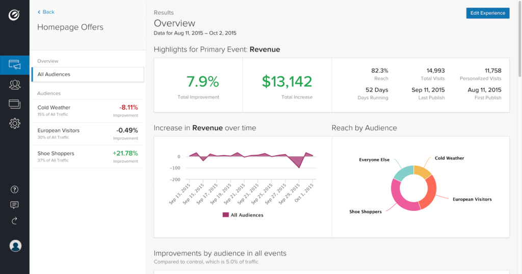
Optimizely is one of the leading — if not the leading — A/B testing and CRO tools on the market today. It offers analytics tools to suit users of all levels, and a multitude of A/B testing tools. (You could think of it as the Google Analytics of A/B testing, with a much simpler user interface.)

Consider this scenario: You have an ecommerce store built with Magento. You’re aware that in certain cases it may benefit stores to add a one-step checkout solution instead of the standard multi-page checkout, but you’re not sure if your store fits that use case. You need to test both options and compare the results with/without the one-step checkout experience. You know that running two versions of the checkout simultaneously requires changes to the code, which is a complex matter.

With Optimizely, you can send a certain amount of your users to a totally separate checkout experience to collect conversion data. If the experiment yields negative results, you delete the experiment and the original checkout web page still exists and works fine. No harm done.

With their Web Experimentation tool, which offers an easy-to-use visual editor to create A/B tests without requiring a developer (optional), the ability to target specific user types and segments, and create experiments on any device, Optimizely has all your bases covered.

Although you can run A/B tests without a developer, your variations can be more targeted (for example, your variations can go beyond color, layout and content changes) if you have the skills and/or resources to develop custom experiments with code. By integrating your A/B tests into your code, you can serve different logic and test major changes before pushing them live.

Also, if your product extends beyond the web, Optimizely works with iOS, tvOS and Android apps. Optimizely’s Full Stack integrations makes it possible to integrate A/B tests into virtually any codebase, including Python, Java, ruby, Node, PHP, C#, Swift and Android.

2. Google Optimize

Summary: A/B testing that seamlessly integrates with Google Analytics
Price: free
Who it’s for: anyone, being the easiest to learn of the bunch

Google Optimize

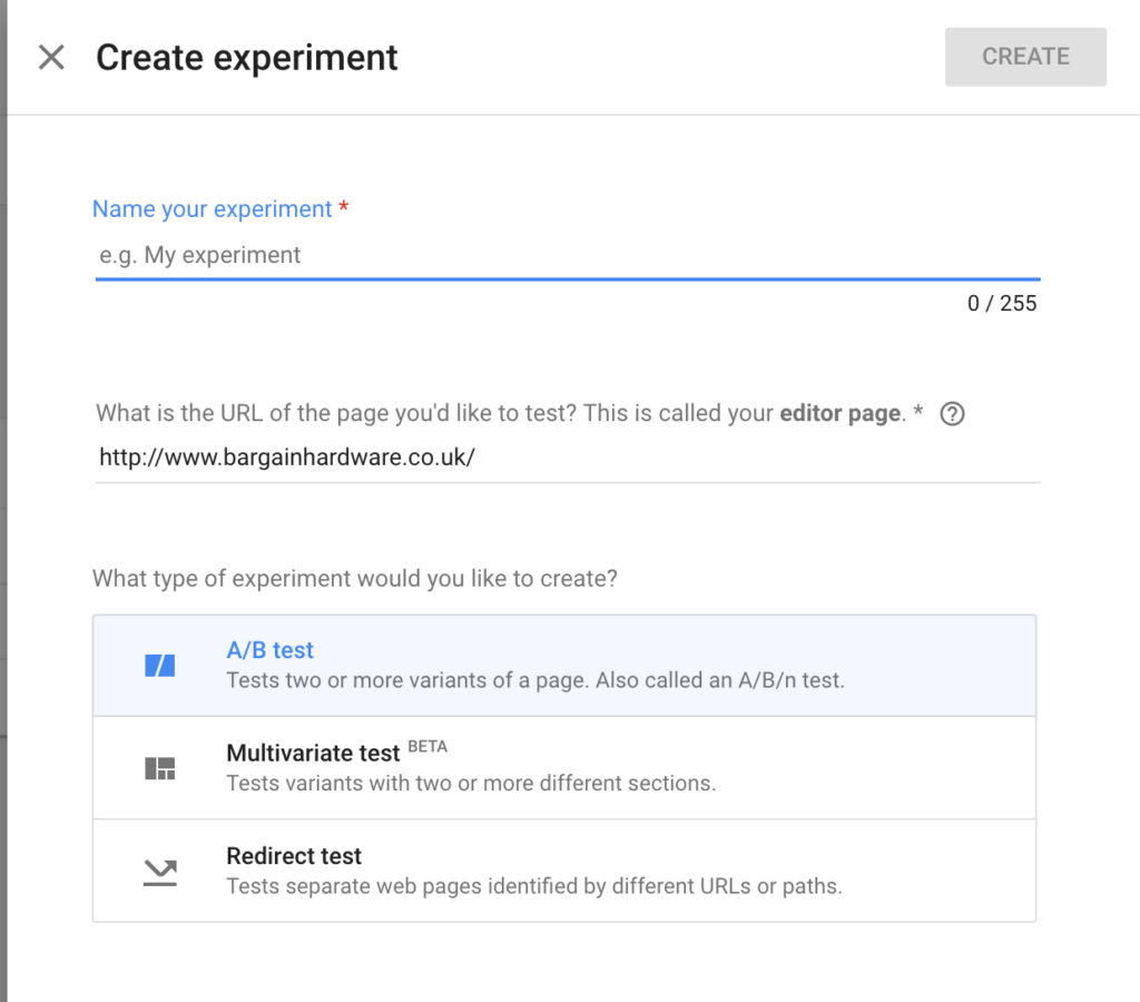
Google Optimize is a free, easy-to-use tool that integrates directly with your Google Analytics Events and Goals to make A/B testing quick and easy! It’s ideal for traditional A/B testing, focusing on comparing different CTA (call to action) elements, colors and content.

Developers aren’t required for implementing Google Optimize, since it’s as simple as adding a line of JavaScript to your website and then customising your layout with the visual editor. With this you can change the content, layout, colors, classes and HTML of any element within your page.

It’s not as sophisticated as Optimizely, since it doesn’t allow you to create custom experiments with code/developers, but it’s free. It’s great for those starting out with A/B testing.

For each Google Optimize experiment, you’ll need to specify which Google Analytics Goals or Events will be the baseline for your A/B tests. For example, if you were A/B testing a product page, you could use an “Add To Basket” event that you’ve defined in Google Analytics to evaluate which of your variations converts the best. The Google Analytics report then gives you a clear indication of which variation converts best. It’s ideal for those on a low budget!

Just don’t get carried away, as Google famously once did, by testing 40 different shades of blue to see which converted best!

Continue reading %5 A/B Testing Tools for Making Data-driven Design Decisions%

The State of Web Design, December 2017

Original Source: https://www.webdesignerdepot.com/2017/12/the-state-of-web-design-december-2017/

I might have noticed a trend or two in web design this last year.

Let me rephrase that: I spend the vast majority of my time online. I do my shopping, here, and my work, and a lot of my leisure reading. I browse the Internet mid-gaming, whether to look up information on the game I’m playing, or just to entertain myself some more because my ADD is really that bad. I even spend a huge amount of time browsing portfolio sites, where designers get to live out their design fantasies.

And even with all of that, I know for a fact that I’ve barely scratched the surface of this huge-ass network. But in my corner of it—the corner mostly dominated by Western designers—I have noticed a trend or two. And here’s where we are:

Revenge of the Flash

No, not that Flash. I wish. Watching Barry Allen tear the world apart with his sheer ridiculous power would be kind of awesome.

I believe that we are currently in the middle of a light backlash, though few might say it that way. It’s a response to the trend of flat design (and the short moment of brutalism that would follow). But instead of making 3D-looking dials and knobs on every UI again, many people seem determined to resurrect Flash, or at least call up its spirit and put it into JavaScript’s body.

Designers very quickly got tired of “flat design” as a style. I don’t blame them. Many people just grabbed a framework that looked like Material Design and didn’t think too much about it. Nowadays, while many sites are still technically flat, they try to avoid the feel of flat design, and even the word itself. Their answer to this has been to take advantage of HTML5 and JavaScript to animate pretty much everything they could think of. Think I’m kidding?

Daniel Archam’s brutalist-looking website depends on JS to work at all. And it has a screen-saver. Now don’t get me wrong: it’s a creative and good-looking site. I even featured it in November’s monthly portfolio article. But you can’t deny that there’s a certain mentality at work, here.

The response to flat design has been turn it into flash design. Or some weird post-minimalist thing. Or some combination of the two. This mentality has resulted in some beautiful and highly innovative websites that are unintuitive, inaccessible, and generally a pain to use.

I predict that the pendulum will swing once more (now there’s a safe prediction if I ever saw one). Web standards advocates will probably turn their attention to JS and animation in general, and point out some of the flaws inherent websites that require JS to show their content at all. Then some people will take that too far, and ditch JS entirely, and perhaps CSS, too. Then there will be a backlash to that.

I’m only mostly kidding about that last part.

The Divide

I feel like the web design community may, for a while, become split in two. I mean, it kind of already is, but it might even become official. The two primary parties will probably be what I call The Standardistas and the Experimentalists.

The Standardistas are dedicated to making sure the web is accessible, usable, and as idiot-proof as humanly possible. If they can build it without touching JavaScript, they will. If they can make it a static site, they probably will. Fancy animations and effects are used minimally.

The Experimentalists are tired of being constrained by the technology of our era. As far as they’re concerned, if the user’s JavaScript is broken, or their browser is outdated, who cares? Their target demographic uses up-to-date hardware and software. They’re going to try new things, because they intend to lead the next wave of innovation, or at least follow right behind whomever is leading it.

Those are extreme descriptions, of course. Any good designer will recognize characteristics of both sides in themselves. The industry needs both. But as the pendulum keeps swinging, I can see more and more designers choosing one path over the other to some extent. I doubt it’ll ever come to blows, metaphorical or physical, but a contest of sorts may one day come.

Variety Ain’t Just a Magazine

People love their bandwagons. While some people are set on going their own way, and others are set on going whatever way is opposite the majority, most love a trend. This isn’t necessarily a bad thing. In web design, trends have been used to teach basic design principles, help new technologies catch on, oppose bad practices, and so on.

Sure, adopting a design trend without clearly understanding what it’s for has caused some issues. However, I’d say that overall, trends have pushed the web forward. The fact that a whole lot of websites end up looking almost exactly the same is probably just the price we pay.

That all being said, I have seen a lot more variety this year than in previous years. Maybe that’s because I was looking for it, though I doubt it. I’ve always looked for variety, and it has occasionally been darned difficult to find.

And then maybe it’s because we have a wide variety of trends now, and people are getting on board with all of them. Perhaps that’s the future of web design: if we eventually create hundreds or thousands of distinct aesthetic trends, we’ll get some variety by the sheer force of statistics. I can think of worse futures for the industry.

All around, I think we’re in for interesting times, and a lot of debate. I personally can’t wait.

Hi-Res Xmas Mockup Scene Generator – only $14 $10!

Source

p img {display:inline-block; margin-right:10px;}
.alignleft {float:left;}
p.showcase {clear:both;}
body#browserfriendly p, body#podcast p, div#emailbody p{margin:0;}

The Changing Face of Web Design in 2018

Original Source: http://inspiredm.com/changing-face-web-design-2018/

Inspired Magazine
Inspired Magazine – creativity & inspiration daily

One of the interesting recent developments in web design trends is actually the trend away from trends… or in other word what is happening is a kind of regression to simpler ways, at least from those in the know.

On the other side of the coin, there’s a big shift happening in certain types of corporate sites, especially some British and American media sites, where there’s a tendency to overload pages with so much extraneous content that it can severely impact on the ability of the user to see the content they actually arrived to see.

If the first two paragraphs sound hopeless tangled, well that’s a very succinct allegory for the state of web development in 2018… tangled. It’s a problem we need to sort out, because it won’t be good for anyone if web standards continue to slip.

We’ll return to this topic of overloading later on in the article, because it’s quite a big topic. What I’d just like to briefly do before we get into that is to focus attention on some of the problems we’ll see being solved before that more serious problem is dealt with, and also some of the good things we’ll be seeing happening on the web design front in 2018.

Carousels are finished

There’s a place for carousels, but the abuse of them is going to end, simply because it’s been so overdone that people are tired of them.

Unfortunately on some sites they’re being replaced by something even more obnoxious, which is an autoplay video banner, but this can be expected to die out naturally as developers finally figure out that too many users are on mobile connections and slow broadband for this to be a practical idea.

Carousel abuse, by the way, is simply a situation where they’re used for no other reason than to use them, serving no real purpose to better inform or entertain the viewer.

Death of the 1-3-1-6 layout

This layout pattern was at some point decided as what should be the future of web design, because at the time it was first used, it looked kind of cool. As with many overused fashions, however, people have started to find it irritating.

The layout also is flawed from the point of view that it’s not well suited to good responsive design (even if it can be made to work in responsive design), and encourages overloading with unnecessary elements.

Again, it is a problem of including elements just so they’ll fit the layout and not because they add value to the user experience.

Increase in true responsive design

Designers are better informed now about the need for responsive design, and they’re getting a lot better at implementing it. We should expect to see a lot more sites getting responsive design right, and that can only be a net gain for the users.

As a designer what you’ll want to be conscious of is that the focus on responsive design (which is a good thing) doesn’t result in a lacklustre desktop browser experience (which would be a bad thing). We need to think about how we’re using space to make sure it is efficient and always delivering a quality user experience.

gif image courtesy of Gal Shir

Rise of the narrative theme

More commercial marketing agencies are going to realize the value of building proper relationships with users, and so we should see an increase in narrative themes, ones that draw us in with a story and informative text, instead of just presenting a wall of products for us to choose and buy.

That doesn’t mean we should go crazy with text and video, it just means we should dial down the commercial focus, instead focusing on building trust, and then convert that trust into sales.

illustration courtesy of Folio Illustration Agency

Huge problems ahead with Internet nanny state

Browsers and ISPs continue to take a hardline stance in terms of trying to protect users from their own lack of savvy, and this in turn is punishing honest developers and small business sites who can’t don’t need security certificates and can’t afford the extra cost.

What we really need is for the Internet users to become more savvy, implementing their own safeguards, instead of technology providers stepping in to do it for them.

illustration courtesy of Ben Stafford

The problem this nannying creates is that it assumes every site to be malicious until proven otherwise, ignores the fact that malicious sites routinely do things by the book to masquerade as non-malicious sites, and that truly malicious sites are a minority.

There’s also the fact that users should take responsibility for their own security, plus the equally important fact that the majority should not be punished (or restricted) because of the actions of a malignant minority.

Geolocation triggered CDN will fall out of fashion

At first it’s going to rise, then people are finally going to figure out it doesn’t work the way it is supposed to, and then (if there’s any sense left in the world) people will stop using this extremely bad idea.

What is meant to happen is the site looks at the IP address and then attempts to fetch CDN resources from the CDN server closest to the client. It would be fine except some sites try to get too fancy. They also look at the client locale and try to serve location-specific content to the client.

This inevitably leads to DNS resolution conflicts, causing even major sites such as Google and Facebook to malfunction on some client machines. It has become an issue because designers have forgotten that people travel.

Travelers don’t always reset the locale on their devices when they travel, and there can be many reasons for this. The conflict between the device locale and the IP location (unless a VPN is used) seems to cause routing problems with many sites.

image courtesy of Alexander Zinchenko

The scourge of overloaded pages

An overloaded page is one that contains a ridiculous amount of external resources, especially JavaScript, where the external resources contribute nothing positive to the user experience. These resources are included solely for the benefit of the site owner, either for making money, collecting information, or just because the designer is a plug-in junky.

Overloaded pages can be annoying for anyone, but they’re especially annoying for mobile users, users running older hardware, and users with slow connections.

It’s the kind of thing that in the past we’d expect to see on trash sites, but lately it has become a problem on many different kind of sites, including mainstream media sites.

Let’s check out an example:

What we’re looking at here is not meant to single out this particular site. It is typical of just about any UK mainstream media site these days, and some American sites are just as overloaded, if not even more so. This doesn’t look overloaded at first glance, but take a closer look.

With JavaScript enabled, a normal Internet connection, and anything less than the latest hardware, the page loading time will be spectacularly unimpressive. At least part of the reason is that the page tries to load scripts from all these domains:

Remember, if even one of these scripts fails to load, it can introduce delays and malfunctions for the rest of the page load.

Most of the news sites are adding these unprofessional click-bait ads at the bottom of their articles. These have no business on a business site. It’s amazing that they’ve been so universally adopted, and what should be a major concern is that these ads can sometimes be offensive or just annoyingly insensitive, which can lead to a backlash against your site.

Plus of course loading all these resources (including all the scripts, images, videos, and other things), puts a strain on the client machine. CPU and memory are consumed with each item loaded, and in a multi-tab browsing environment, when most browsers are still plagued with bugs, it all ads up to a potentially frustrating time for users.

You know who the users are going to blame when their browser (and maybe entire OS session) crashes? They’re going to blame you. When they do, it’s unlikely you’ll ever get that user back, or they’ll come back grudgingly, expecting problems.

It’s understandable some sites need to raise money through advertising, but there’s no way to justify connecting to 39 different domains in order to do so. It’s just going too far, when it’s not necessary. You could serve less ads, and serve them all from one place, and the results would be better.

Another advantage of avoiding overloading is fewer privacy invasions, raising the trust level of your site. Users don’t hate ads, they hate ads that get in the way of what they’re doing and which invade their privacy, even to the point of spying on them and following them around.

Let’s stop doing that, and make money honestly with clean sites the way nature intended. It can only result in more profits for your company and a better user experience for those visiting your site.

header image courtesy of Ksenia Shokorova

This post The Changing Face of Web Design in 2018 was written by Inspired Mag Team and first appearedon Inspired Magazine.

Inspiring Examples of Designer Workspaces

Original Source: http://feedproxy.google.com/~r/1stwebdesigner/~3/9IRvQ8t-QKU/

Designer workspaces are an ever-popular source of inspiration. Creatives often enjoy looking at the computer and equipment a designer uses, their often-minimalist desk and furniture, or even the prints or art they have on their wall.

There’s plenty to be inspired by and draw from when putting together or rearranging your own workspace setup.

In this article, we’re going to round up a selection of the most beautiful and inspiring designer workspaces from the past year.

Workspace

designer workspace

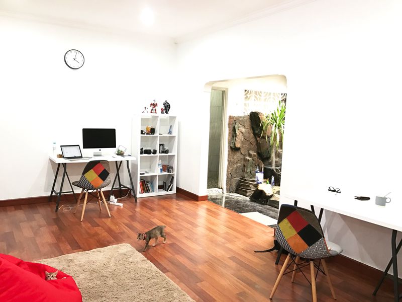
Beautifully spacious, this minimalist workspace combines the simplicity of Apple products and white furniture, with some creative chairs and a bright red bean bag.

My Workstation

designer workspace

Eddie’s workspace shows off his wonderfully customized MacBook lid, covered with some beautiful stickers. He uses a Wacom tablet and curved widescreen monitor.

My Workplace!

designer workspace

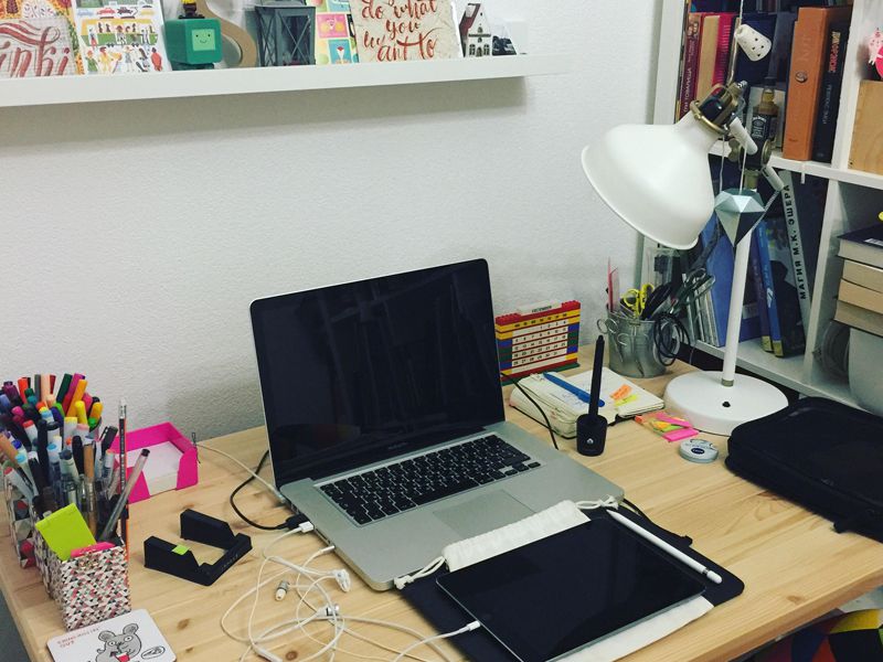
A little messy, but nonetheless inspiring, Svetlana’s workspace is filled with cards, prints, coloring pens and pen tablets. The iPad Pro is also used for illustration.

Workstation

designer workspace Workstation

This futuristic example is beautifully themed with purple throughout. The lighting is atmospheric and reminiscent of a gamer setup.

Workspace 2017

designer workspace 2017

This workspace includes a beautiful colorful print, action figures, and a limited PS4 games console. It’s simple but playful and offers a balance between minimalist and maximalist.

Workstation

designer workspace

Very minimal in its setup, this workspace uses an abundance of white, with a beautifully curved seat and fancy lighting, walls and an unorthodox pencil pot.

Workspace

designer workspace

Similarly minimalist, this setup uses a glossy white desk with a signed photo, simple clock, and small cactus plant.

Home Workspace Setup

designer workspace

Using a wall-mounted monitor, this setup is extremely colorful against the teal wall behind. The desk looks high quality and has been carefully themed with lighting and items like the clock and lamp.


10 Ways To Learn PPC Like a Pro

Original Source: https://www.webdesignerdepot.com/2017/12/10-ways-to-learn-ppc-like-a-pro/

Businesses looking for online marketing and web services are rarely looking for one provision. Typically, they are looking for an agency that can act as a one-stop-shop for all their internet-based projects.

Pay-per-click advertising is one such service that businesses are interested in. The ability to promote their company on search engines like Google and Bing is integral to earning revenue online. But if you’ve never delved into the world of PPC, how do you bring this service into your wheelhouse?

In this article, we will cover ten cost-effective and actionable ways you can learn to set up, manage and optimize Pay-Per-Click campaigns for your clients. When used, these resources will make it easy for you to confidently offer PPC to your customers.

1. Lynda.com

This online learning platform is owned by LinkedIn and specializes in expert led training. They offer a range of PCC courses, from beginner level to advanced techniques. For a fee of $19.99 per month, you can have access to over 6,000 courses. The PPC focused courses cover everything from sophisticated targeting methods to account structuring and auditing. A great resource for employees looking to take on PPC responsibilities or business owners who want to have a firm understanding of the services they offer.

2. Google Adwords

When it comes to PPC advertisements, there is no disputing that Google is the giant. Website hosting company godaddy spends over $5 million per year on Google Adwords alone. If you want to be a successful PPC service provider, you have to know the Google Adwords platform inside out. Thankfully, Google offers several courses and official documents that can be accessed for free. Even better is that the courses are self-paced, so you can learn on your own schedule and have peace of mind knowing you are getting the information straight from the horse’s mouth.

3. Udemy

Udemy is another online learning site that offers affordable classes on a variety of topics. They update their courses each year, so you can be confident you are learning all the latest tips and tricks. Over 11,000 people have already taken their 2017 PPC course, and it has a rating of 4.8 out of 5. If you want to learn how to use PPC to boost traffic to websites or remarket to your previous website visitors, this is the perfect place to start.

4. Unbounce

Unbounce is landing page creation software. If you plan on managing PPC campaigns, chances are you will have to learn how to create landing pages. What is a landing page? It’s any web page that is created specifically with conversion focus in mind. Usually, PPC ads will include the link to a landing page rather than a website homepage to reduce the likelihood that visitors will be distracted on the website or click exit before completing the conversion step. Unbounce has a PPC blog that is full of insider tips, recent updates, and valuable tidbits of information.

5. Wordstream

When notable brands like The New York Times, Entrepreneur Magazine, and The Huffington Post trust an online learning site, you know it is worth considering. Such is the case with Wordstream, a marketing software and PPC management solutions site. Wordstream offers proprietary programs like their Adwords Performance Grader, which analyzes your current campaigns and lets you know where there is room for improvements. But what really helps them stand out is their absolute mountain of PPC learning material. Better yet, you don’t need to be a Wordstream customer to access most of their content

6. Bing Ads

Bing is owned by Microsoft, and the multinational technology company offers its own courses on learning its platform. The Bing Ads Training Courses take you through every step of creating, managing, and optimizing a Bing advertising campaign. And while Bing is commonly viewed as a secondary search engine in comparison to Google, it is still a lucrative path to take for businesses looking to gain traction online. Did you know that the Bing Network Audience spend 34 per cent more online than average internet searchers? Potential customers on this platform are likely to buy and invest in brands they see as trustworthy. A great place to make your company known!

7. The Ultimate Guide to PPC Advertising

This book by Richard Stokes is available on Amazon for approximately $20.00. Richard is the founder of the digital intelligence firm AdGooRoo, and has unique insight into the world of online paid advertising. In this book, he shares his personal strategies to increase click-through rates, steal impressions from competitors, and much more. Well worth the read!

8. PPC Hero

PPC Hero is the perfect go-to website for all things PPC. From interesting and educational blog posts to webinars and toolkits, there is something for every learner. Learn everything from Adwords Smart Display to how to utilize Excel to capture your PPC data. Be prepared to dedicate a fair amount of time to this website, however. The sheer amount of valuable info is astonishing!

9. Klientboost

Klientboost is a well-recognized resource in the online marketing industry. They are known for helping clients build landing pages that convert and PPC campaigns that drive traffic and revenue. They offer several courses, some more complex than others. Their 7-Day Adwords Toolbelt course is packed with useful tips. You can also check out their guides, webinars and blogs. Each has a plethora of practical, game-changing material to learn from!

10. CXL Institute

If you are already able to create a PPC framework and complete the basics, but you want to optimize the work you have done to increase conversions, this is the site for you. You won’t find run-of-the-mill updates and tutorials here. The CXL Institute prides itself on offering detailed, comprehensive articles, courses, workshops and conferences. Topics often covered include A/B split testing, Google Tag Manager, email marketing, and more. Google itself trains some of their employees by sending them to the CXL Institute courses, so you can be certain that you are learning from the very best.

LAST DAY: 250 High-Resolution Textures with Extended License – only $19!

Source

p img {display:inline-block; margin-right:10px;}
.alignleft {float:left;}
p.showcase {clear:both;}
body#browserfriendly p, body#podcast p, div#emailbody p{margin:0;}

CSS Glitch Effect

Original Source: http://feedproxy.google.com/~r/tympanus/~3/88gNj-zE9ZA/

Today we’d like to show you how to create a little experimental glitch-like effect on an image. The effect will be powered by CSS animations and the clip-path property. The technique involves using several layers of images where each one will have a clip-path, a blend mode and a translation applied to it. It was inspired by the technique seen on the speakers page of the 404 conference.

ImageGlitchEffect_Featured

Please note this effect is very experimental; we use several properties that won’t work in older browsers. The clip-path property is not supported in IE or Edge.

We also use CSS variables for setting some properties that will allow for an easy adjustment of the effect.

Breaking down the effect

When searching the web for an easy to use and light-weight glitch implementation, we came across this question on Reddit. Somebody was asking how the glitch effect was pulled off on the speaker line up page of the 404 conference. The glitch effect was made using CSS animations on a stack of three images that are the same. The animations consist of a rapidly changing clip property on all layers except the first one. Additionally, the layers are being moved slightly. So what we are seeing, is slices of the image, slightly offset and in constant movement.

We wanted to experiment with this and recreate the effect using the clip-path property instead. Although it has less browser support (it doesn’t work in IE or Edge), it allows for a more flexible usage since we can use percentage values and apply it to elements that are not necessarily positioned absolutely.

Combining the effect with background blend modes, allows us to create some interesting looking image effects.

The way this works is to create an image stack where each overlaying image will animate its clip-path in, what looks like, random sizes. We’ll use a stack of 5 images:

<div class=”glitch glitch–style-1″>
<div class=”glitch__img”></div>
</div>

Let’s have a look at the main styles for the hover effect that you can see in the last demo. Note that we’ve defined some variables previously, but they should be self-explanatory:

.glitch {
position: relative;
width: var(–glitch-width);
max-width: 400px;
height: var(–glitch-height);
max-height: calc(400px * 1.25);
overflow: hidden;
margin: 0 auto;
}

.glitch:hover {
cursor: pointer;
}

.glitch__img {
position: absolute;
top: calc(-1 * var(–gap-vertical));
left: calc(-1 * var(–gap-horizontal));
width: calc(100% + var(–gap-horizontal) * 2);
height: calc(100% + var(–gap-vertical) * 2);
background: url(../img/1.jpg) no-repeat 50% 0;
background-color: var(–blend-color-1);
background-size: cover;
background-blend-mode: var(–blend-mode-1);
}

We don’t want to show the sides being cut off, so we make sure that the image dimensions take the gap, i.e. the movement into consideration.

Then, we set the background colors and blend modes for each layer:

/* Set the background colors for the glitch images*/
.glitch__img:nth-child(2) {
background-color: var(–blend-color-2);
background-blend-mode: var(–blend-mode-2);
}

.glitch__img:nth-child(3) {
background-color: var(–blend-color-3);
background-blend-mode: var(–blend-mode-3);
}

.glitch__img:nth-child(4) {
background-color: var(–blend-color-4);
background-blend-mode: var(–blend-mode-4);
}

.glitch__img:nth-child(5) {
background-color: var(–blend-color-5);
background-blend-mode: var(–blend-mode-5);
}

As this is going to be a hover effect, we want all layers except the first one to be hidden by default:

.glitch__img:nth-child(n+2) {
opacity: 0;
}

Then, on hover, we show all layers:

.glitch:hover .glitch__img:nth-child(n+2) {
opacity: 1;
}

And we also apply the animations and a transform to each layer:

.glitch:hover .glitch__img:nth-child(2) {
transform: translate3d(var(–gap-horizontal),0,0);
animation: glitch-anim-1-horizontal var(–time-anim) infinite linear alternate;
}

.glitch:hover > .glitch__img:nth-child(3) {
transform: translate3d(calc(-1 * var(–gap-horizontal)),0,0);
animation: glitch-anim-2-horizontal var(–time-anim) infinite linear alternate;
}

.glitch:hover > .glitch__img:nth-child(4) {
transform: translate3d(0, calc(-1 * var(–gap-vertical)), 0) scale3d(-1,-1,1);
animation: glitch-anim-3-horizontal var(–time-anim) infinite linear alternate;
}

/* Hover flash animation on last image */
.glitch:hover > .glitch__img:nth-child(5) {
animation: glitch-anim-flash 0.5s steps(1,end) infinite;
}

The calc(-1 * var(–gap-horizontal)) basically allows us to set a negative value of a given variable.

Have a look at this slow motion visualization to see what’s going on under the hood (this GIF is quite big, so it might take a while to load):

glitchvisualization2

The last layer is only flashing and moving slightly while the others also get cut by a clip-path.

Let’s have a look at one of the animations for setting the clip-path:

@keyframes glitch-anim-1-horizontal {
0% {
-webkit-clip-path: polygon(0 2%, 100% 2%, 100% 5%, 0 5%);
clip-path: polygon(0 2%, 100% 2%, 100% 5%, 0 5%);
}
10% {
-webkit-clip-path: polygon(0 15%, 100% 15%, 100% 15%, 0 15%);
clip-path: polygon(0 15%, 100% 15%, 100% 15%, 0 15%);
}
20% {
-webkit-clip-path: polygon(0 10%, 100% 10%, 100% 20%, 0 20%);
clip-path: polygon(0 10%, 100% 10%, 100% 20%, 0 20%);
}
30% {
-webkit-clip-path: polygon(0 1%, 100% 1%, 100% 2%, 0 2%);
clip-path: polygon(0 1%, 100% 1%, 100% 2%, 0 2%);
}
40% {
-webkit-clip-path: polygon(0 33%, 100% 33%, 100% 33%, 0 33%);
clip-path: polygon(0 33%, 100% 33%, 100% 33%, 0 33%);
}
50% {
-webkit-clip-path: polygon(0 44%, 100% 44%, 100% 44%, 0 44%);
clip-path: polygon(0 44%, 100% 44%, 100% 44%, 0 44%);
}
60% {
-webkit-clip-path: polygon(0 50%, 100% 50%, 100% 20%, 0 20%);
clip-path: polygon(0 50%, 100% 50%, 100% 20%, 0 20%);
}
70% {
-webkit-clip-path: polygon(0 70%, 100% 70%, 100% 70%, 0 70%);
clip-path: polygon(0 70%, 100% 70%, 100% 70%, 0 70%);
}
80% {
-webkit-clip-path: polygon(0 80%, 100% 80%, 100% 80%, 0 80%);
clip-path: polygon(0 80%, 100% 80%, 100% 80%, 0 80%);
}
90% {
-webkit-clip-path: polygon(0 50%, 100% 50%, 100% 55%, 0 55%);
clip-path: polygon(0 50%, 100% 50%, 100% 55%, 0 55%);
}
100% {
-webkit-clip-path: polygon(0 70%, 100% 70%, 100% 80%, 0 80%);
clip-path: polygon(0 70%, 100% 70%, 100% 80%, 0 80%);
}
}

The slices will go from tiny, to a bit larger and also nothing, leaving a “pause” on some of the frames and then starting again from another position.

A great tool to visualize clip paths is Clippy by Bennett Feely.

The final animation is a simple flash of the last layer:

@keyframes glitch-anim-flash {
0% {
opacity: 0.2;
transform: translate3d(var(–gap-horizontal), var(–gap-vertical), 0);
}
33%, 100% {
opacity: 0;
transform: translate3d(0,0,0);
}
}

This looks especially interesting when applying an overlay blend mode with a fitting color.

Note that we can also apply this effect to text elements. Check out the demos to see it in action!

And that’s it! We hope you’ve found some inspiration in this little experiment.

References and Credits

Images by Unsplash.com
imagesLoaded by Dave DeSandro

CSS Glitch Effect was written by Mary Lou and published on Codrops.