Fresh Resource for Web Developers — March 2018
Original Source: https://www.hongkiat.com/blog/designers-developers-monthly-03-2018/
Useful PHP-related resources including frameworks and other learning material.
Visit hongkiat.com for full content.
12 Fixed Sticky Navbars That’ll Grab Your Attention
Original Source: https://www.webdesignerdepot.com/2018/03/12-fixed-sticky-navbars-thatll-grab-your-attention/
 Sticky menus, sliding navigations, fixed navbars…there’s quite a few names for this trend.
But they all mean the same thing: a navigation that follows you around the page while you scroll.
Not everyone likes this design style because it takes up extra space on the page. But it also gives users direct access to all nav links from anywhere on the page.
If you’re looking for sticky menus with eye appeal these examples are sure to get you excited. And if you’re looking for inspiration on your own project these are guaranteed to delight.
1. Ascensión Latorre
I don’t understand a word of French but luckily it’s not needed to appreciate this sticky navbar on the Ascensión Latorre website.
At the very top of the page you’ll see a full logo with text and the nav links. When scrolling down the text actually disappears and the navbar slides up.
This takes up far less space and it’s certainly ideal for graphics-heavy menus.
I’ve even seen this technique with logos that resize smaller on scroll too. This design just hides the text, but they could save even more room by resizing the pegasus graphic smaller.

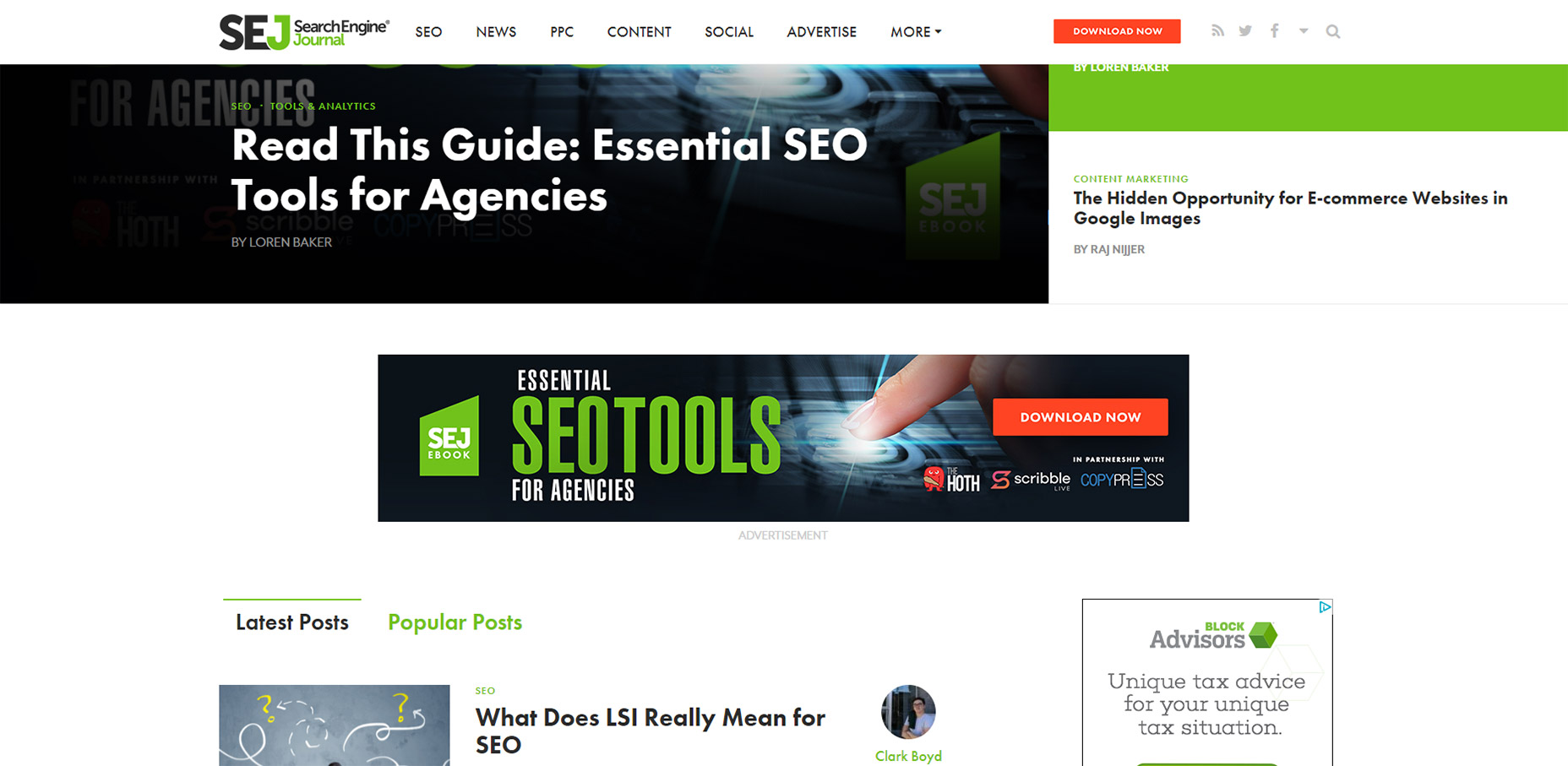
2. Search Engine Journal
This has to be my favorite navbar effect just because I’ve never seen it on any other website. SEJ is a great blog and I think they know user experience design.
Quick note: you can only see this effect on the homepage. You’ll notice the navbar remains stickied on all pages but I’m specifically talking about the logo animation.
If you visit the homepage you’ll find the logo embedded directly in their “featured story” box, one major component in a great magazine-style website. But if you scroll down past that featured box you’ll catch a really cool animation.
The nav text shifts over to the right and the logo animates into view. This is such a cool design because it feels so dynamic.
Yes their sticky navigation is pretty cool. Nice dropdown menus, great colors, typography, etc. But that logo animation is one feature I’ll never forget.
3. AWD Agency
Moving onto the AWD Agency website, this is the first vertically-oriented nav in my list.
They do a great job of keeping that menu stickied along the side of the page without taking up much space. How?
With a hidden menu toggle, of course!
Just click the little icon towards the left-hand side to open the menu. Click it again to close it. This remains accessible for all users on all devices so it works on the largest desktop monitors and the smallest smartphones.
Very clean effect and a nice way to handle fixed vertical navigation.

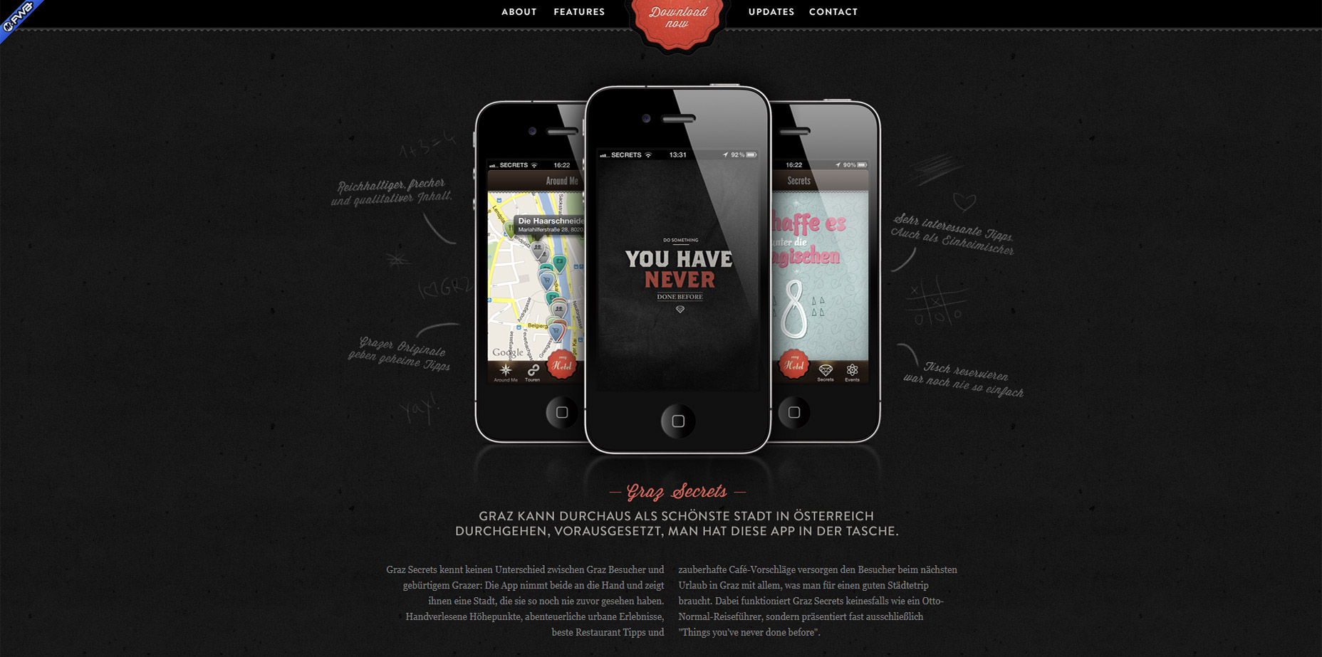
4. Graz Secrets
I’ve never used the Graz Secrets iPhone app. But after using their website I’d like to think the app has just as much of a fantastic user experience.
The top navbar stays fixed and uses a small border to keep it distinguished from the page content.
One design style I really like is the center “download now” button.
It stays animated even while you scroll so it’s meant to grab attention. Plus it blends nicely into the navbar so it feels like one cohesive unit.
5. Grain & Mortar
Grain & Mortar has to be one of the cleanest agency website I’ve seen this past year.
So many layouts are cluttered with excess graphics, animations, or just designed to be “hip” yet come off as confusing. Not G&M. I could go on about all of their layout’s awesome features, but this post is about sticky navigations. And they have a sleek one.
The navbar doesn’t even appear until you scroll down past the header. A very cool effect and it can work well for websites that have large hero images in their headers.

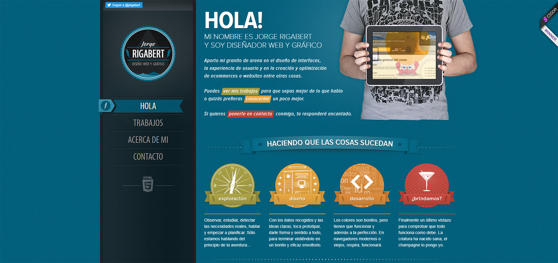
6. Jorge Rigabert
The portfolio website of Jorge Rigabert is another example of a non-English design with excellent user experience.
Whenever I see a website that I can’t read, but I still understand how to navigate, it tells me the site was designed well.
On this page you’ll find a fixed vertical nav that scrolls with you along the page. Since it’s a single-page design the links highlight depending on which section you’re viewing.
That’s a pretty common effect for single page layouts but it’s handled very nicely on Jorge’s page.
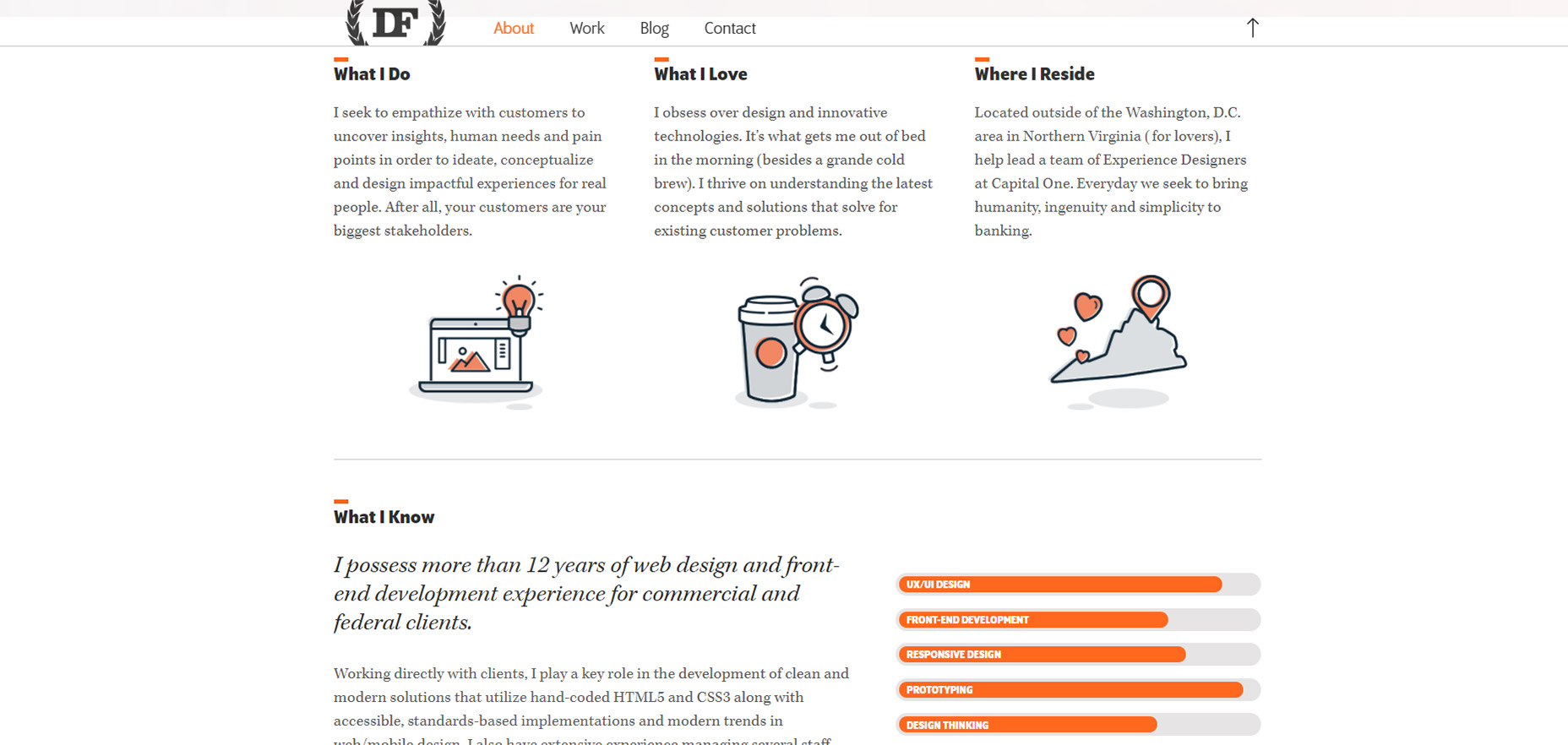
7. Daniel Filler
One other portfolio I really like is Daniel Filler’s site.
This borrows the same element from Grain & Mortar where you see the fullsize hero image header at the top, but as you scroll down the navbar shifts into “view mode” with a clean semi-transparent background.
If you search the web you’ll find plenty of ways to recreate this style. And there are lots of tips out there on designing great hero headers too.
The nicest thing about Daniel’s header bar is the small form. It doesn’t take up much space but you still know it’s his website. Also the small upwards-facing arrow is a nice touch to bring visitors right back to the top of the page(especially on mobile).
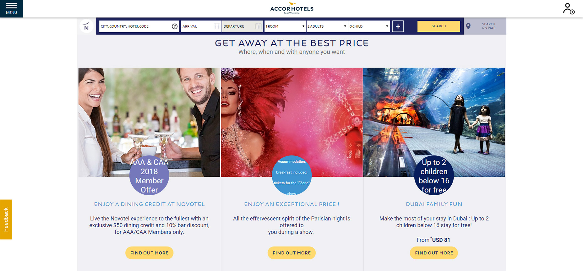
8. Novotel Hotels
Of all the hotel websites I’ve studied, the sticky nav on Novotel Hotels is definitely unique.
As you scroll down the navbar follows, of course.
But once you hit the booking details bar you’ll notice that gets stickied too. Pretty cool!
I’m sure this design technique helps to increase leads and help users plan their trips a lot faster.
9. FHOKE
So the FHOKE agency has a pretty basic navigation.
It’s actually more like many smaller elements that follow you along the page, just kept near the top.
There is no background color on the navigation bar so the menu links blend seamlessly into the page. But they also change color as they pass over certain page elements.
This helps to increase contrast while still making the navigation accessible across the page.

10. Brit + Co
There’s a couple nice things about the Brit + Co sticky navigation menu.
Going beyond the design and dropdowns, I really like the auto-hide feature which saves a lot of space while reading content.
When you scroll down the menu automatically hides out of view. Then as you scroll back up it pops out to greet you once more.
The other nice thing is the search feature, it’s all controlled dynamically and it falls directly underneath the navigation.
A very simple effect yet certainly something that’ll grab your eye.

11. Coloud
Have a look at the Coloud website and scroll a bit on the page.
You’ll notice the top navigation does appear at the top, but it looks…different.
This navigation is minified so it takes up less space and it doesn’t even sport the company logo. Seems crazy but I think I get why.
People should know what site they’re on because the logo was at the very top when the page first loaded. Nobody is gonna forget the website just because they scroll down.
And the “scroll to top” link is probably more valuable than a logo anyways.
This seems like a technique that could do well on all sorts of ecommerce websites or lengthier blog posts.

12. Prollective
Last but certainly not least is a simple example of sticky navigation in action.
Check out Prollective and have a look in the top-right corner. Four links in a vertical column.
And that’s it! No scrolling logo, no search bar, nothing else to get in the way. If you have a small website with only a few pages this can work tremendously well.
This technique saves space by avoiding the top bar and it still gives visitors direct access to all links from everywhere on the site. It’s an effect that could do very well on minimalist projects.
Add Realistic Chalk and Sketch Lettering Effects with Sketch’it – only $5!
![]()
Source
p img {display:inline-block; margin-right:10px;}
.alignleft {float:left;}
p.showcase {clear:both;}
body#browserfriendly p, body#podcast p, div#emailbody p{margin:0;}
Essential Web Technologies to Learn (2018 Edition)
Original Source: https://inspiredm.com/essential-web-technologies-learn-2018-edition/
Becoming a web developer is easy, so they say. What most people feeding you that line neglect to mention is that while almost anyone can be a web developer, not everyone using that title is good at web development.
All of us must make a start somewhere, and if you’re just getting started in your web developer career, this article is for you. It is also an article for seasoned web developers who may not have kept up with the latest essential skill sets and want to discover what they are for 2018.
1. HTML
This is the most obvious essential skill that any web developer needs to know. At the least, you’ll need to be an expert in HTML5.
HTML is the “language of the web”, and it’s what all sites are built in, even sites that aren’t built in it. What does that mean? It means sites that are built with another language like PHP are in the end rendered to HTML because this is the language browsers understand.
Basically if there is no HTML, there is no web page.

illustration courtesy of Maggie Appleton
2. CSS
HTML is like the frame of a building, CSS is like the cladding. The CSS defines how elements in the page will look, and also to some extent how they will function.
Learning CSS was once optional, but now it isn’t. You can build a good website without using a single line of CSS, but you’ll look like a complete amateur to anyone viewing the source code of the page.
3. JavaScript
There are people who will tell you it’s possible to be a web developer without learning JavaScript. Those people are wrong.
JavaScript is a powerful language that allows you to include client-side interactivity in your web pages. Not every website needs JavaScript, but every web developer does.

illustration courtesy of Maggie Appleton
4. DOM
Having learned the basics of JavaScript and CSS, you’re ready to make an in-depth study of the DOM, and in this way make full use of what you’ve learned so far. If you don’t learn to dominate the DOM, you will never really make it to the top in front-end development. That means you’ll be stuck making mediocre business sites in WordPress instead of working on really interesting projects that test the limits of your creativity.
5. PHP
Learning PHP is a big step up from learning JavaScript, but the good news is that it’s an even easier language to learn (it’s smaller for a start). PHP handles interactivity and other important tasks on the server side.
There’s another language called ASP that fills a similar role. The difference is that only a minority of websites use ASP (but that’s still millions), and so it’s much less essential to learn ASP than to learn PHP.
Other server side languages that could be interesting to learn but are not considered essential to learn include:
Ruby
ColdFusion
PERL
Java (also a client side language)
Python (also a client side language)
C++ (also a client side language)
There are also a few more obscure languages out there like Lua and Haskell, but you’re very unlikely to ever be asked to code anything in those languages, and if you’ve ever seen them, it’s likely you wouldn’t want to use them.
The one exception is Go, a programming language developed at Google as a viable alternative for C++. It hasn’t really caught on yet, but it actually is quite a good language for doing things that you’d otherwise use C++ for.
Learning any of these alternative languages makes you an interesting programmer, while learning PHP makes you a useful and employable programmer.

illustration courtesy of Sandor
6. AJAX
After you have leaned JavaScript and at least one server side language, you’ll be ready for AJAX. Probably the best way to think of AJAX is that it provides a bridge between client side processing and server side processing.
There are some things you would want to do that would require reloading the entire page if you handled those things entirely server side. By using AJAX, you can generate server responses that update your page without reloading.
7. MySQL
This is one of those things like PHP where it’s not the only technology in its class, but it’s so widely used that it has basically become the defacto standard, and it would be kind of crazy not to learn it.
MySQL is a free open source database system. It works very well, it doesn’t cost anything, it has reasonably good security. These are all reasons why it is so popular.
8. GIMP or PhotoShop
Even as a developer, you will often need to work with images. It’s not enough to just be able to use GIMP or PhotoShop, you should be a master of them. Preferably learn to use both.
The big dilemma you’ll run into is that for web work, GIMP is the best tool for the job, but around 90 percent of companies prefer you to use PhotoShop as it is ingrained into their culture.
The reason why GIMP is more suitable is that it’s actually designed for working in RGB color, while PhotoShop was intended for print design and is based on CMYK. That’s just the beginning of the differences though.
If you can do it in GIMP you can do it in PhotoShop, but the reverse is not true.

9. GIT
When you work on corporate and collaborate projects, a robust content versioning system (CVS) is essential, and GIT is popular due to being cross-platform and available anywhere.
Learning GIT is not simple. It is one of the most complicated content versioning systems around. Learning to use it is still essential because it is the most used CVS in existence, and is unlikely to be replaced any time soon.
The things you’ll need to be able to do (at a minimum) include:
Creating repositories
Pushing (check in) and Pulling (check out) code
Conflict resolution
Create project description pages and so on.
GIT is not fun. It doesn’t do anything interesting. Nobody will know if you used it or didn’t use it. But if you are being hired by an agency, they’ll expect you to be thoroughly familiar with it.
10. SEO
It can be important to have at least a basic understanding of SEO, even if it is only to ensure you don’t break any of the rules, or that you can advise clients if they’re at risk of breaking the rules.
As a developer, you’ll rarely be responsible for the actual site content, and often you won’t even be responsible for the design. That doesn’t give you a free pass to ignore SEO, however, because if the client does slip up and can somehow blame it on you, they will.
New web technologies are always emerging
It’s important to get a good grounding in the ten essential technologies listed above, because that will set you up in a good position to cope with the newer technologies that are about to come along. You’ll be ready for those changes and confident enough to handle them.
header image courtesy of Achin
The post Essential Web Technologies to Learn (2018 Edition) appeared first on Inspired Magazine.
Here’s Why Graphic Design Determines the Fate of Every Digital Signage Campaign
Original Source: http://feedproxy.google.com/~r/Designrfix/~3/pSWvlz-43JI/graphic-design-determines-fate-digital-signage-campaign
Graphic design and advertisement are never truly separate. Every good print ad or a striking video commercial has a team of experienced graphic designers behind the projects. A good graphic designer knows how to balance the visuals with functions. Always remember that when a design has the correct balance of all the elements, viewers tend […]
The post Here’s Why Graphic Design Determines the Fate of Every Digital Signage Campaign appeared first on designrfix.com.
How To Use Heatmaps To Track Clicks On Your WordPress Website
Original Source: https://www.smashingmagazine.com/2018/03/heatmaps-track-links-wordpress/
There are lots of ways to measure the performance of a web page and the most popular one is by far Google Analytics. But knowing exactly what images, words, or elements on your site catch your site visitor’s specific attention is not possible with these tools alone.
Sometimes, you simply want to know what makes your page great in terms of design, layout, content structure (you name it) and what prompts people to take one intentional action instead of another. You will be probably surprised to learn that there’s actually a solution to your question: heatmaps.
Unlike Google Analytics, which works with numbers and statistics, the heatmaps show you the exact spots that receive the most engagement on a given page. Through heatmaps, you will know what are the most clicked areas on a page, what paragraphs people select while scanning your content, and what is the scrolling behavior of your clients (e.g., how many went below the fold or how many reached the bottom of the page).
In this article, we will talk about why heatmaps are so efficient for your marketing goals and how they can be integrated with your WordPress site.
Why Use Heatmaps On Your WordPress Site
Before progressing to the “how to” part, you might want to know why it’s worth it to dedicate valuable time on implementing heatmaps for your WordPress site and what their actual role is.
First off, visual marketing is constantly growing as many more people now respond positively to a modern and user-friendly interface and skip a plain, non-interactive one. If a certain action requires too many steps and a hard to maneuver platform, they eventually give up, and you lose clients.
Getting the process just right ain’t an easy task. That’s why we’ve set up ‘this-is-how-I-work’-sessions — with smart cookies sharing what works really well for them. A part of the Smashing Membership, of course.
Explore features →

Of course, great content is still the key, but the way your site is structured and combines various elements will influence the activity of your visitors, which is either convert (engage) or leave.
Marketing experts researched this kind of behavior over time:
37% of marketers think visual marketing is the most important form of content for their business, second only to blogging (38%);
51% of B2B marketers prioritized creating visual content assets in 2016;
38% of people will stop engaging with a website if the content/layout is unattractive.
But what were heatmaps built for specifically? A heatmap can help you discover valuable and, sometimes, surprising facts about your audience.
If you add one to your WordPress site, you can:
Track your visitors’ clicks and become aware of their expectations while browsing through your site. This way, you can adjust your pages and make them catchier and more compelling.
Find out what is of interest for people. You’ll know what information they are looking for, so you can put it in the spotlight and use it to your favor.
Analyze the scrolling behavior. See how many visitors reached the bottom area of the site and how many left immediately without browsing further through the sections.
Keep an eye on the cursor movement and see what pieces of content your audience is hovering over (or selecting) in a text.

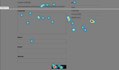
Scrolling behavior heatmap
Again, using heatmaps is not only about tracking clicks for fun, it can have many implications for your business’ growth. They can influence purchases or conversions of any kind (it depends on what you want to achieve with your site).
You will know if your call-to-action buttons get the attention you intended, compared to other elements on the same page. Maybe other design elements you placed on your sales page distract people from clicking the buy button, and this can be seen on the hot spots map. Based on the results, you can change the way they look, their position, their styling, etc., hence sales increase.
Bloggers can also use the heatmaps because this way they will know how to create customer-friendly, appealing layouts for their content. Some layouts generate more traffic than others, and it’s up to you to find out which ones.
If people linger on a certain piece of information, it means it’s valuable for them, and you can use it to your favor by placing a link or a button nearby. Or you can simply create a separate post with even more information on that topic.
How To Add A Heatmap To Your WordPress Site
No matter if we are talking about plugins originally made for WordPress or third-party tools, the integration is not difficult at all. Usually, the most difficult part about heatmaps is the interpretation of the results — the conclusions along with the implications they have on your business and how to use them to your advantage.
When it comes to installing them, you just need to choose one tool and start the tests. Crazy Egg, Heatmap for WordPress, Hotjar Connecticator, Lucky Orange, and SeeVolution are the best and most popular tools that will help you in this direction. Heatmap for WordPress and Hotjar are free, while the other three come in premium plans (they offer free trials, though).
It’s important to mention that all these tools (except for Heatmap for WordPress) work with other website builders as well, not only WordPress. They are universal; it’s just that the WordPress developers found an easy way to integrate them with the latter so that the non-coders won’t struggle much with it. To integrate them with any other website builder, such as Squarespace for instance, you need to play with the code a little bit.
So, how to set up the heatmaps on your site? Let’s use Hotjar because it does a good job overall. It is intuitive, modern, and quick to implement in WordPress.
In this case, let’s take Hotjar Connecticator plugin as an example. After installing and activating it, you need to create an account on hotjar.com, add the URL of the site you want to monitor (you can add more sites later), and copy the provided tracking code to the plugin’s page in your WordPress dashboard (as seen below).

Now, it’s time to create the heatmap, which can be done right from the Hotjar platform (you can’t customize anything on your WordPress dashboard). So, click on Heatmaps, then New Heatmap.
Next, you need to choose your Page Targeting preferences. Do you want to track the hot spots on a single page? Do you test several pages at the same time to compare their results? That works too. If you need the latter, you have some URL formats available, so you can make sure you can target all the pages from a specific category (sorted by type, publishing date, etc.) You can even write the exact words that the links contain and Hotjar starts tracking the pages.
An interesting thing about Hotjar is that it lets you exclude page elements that you don’t want to monitor by adding their CSS selectors. This way, you can avoid being distracted by unneeded things when you compare or analyze the results and can focus only on the ones that you want to test.
After you create the heatmap, the first screenshot with the hot spots will be provided only after the page starts to get visitors and clicks, so don’t expect results right away. The tool tracks all the views you had on that page since the heatmap was created so that you can make reports based on the views and the number of clicks. This kind of reports let you know you how clickable (or not) your content is.
Here’s how the first screenshot provided by Hotjar looks (the testing was done on an uncustomized version of Hestia WordPress theme):
Another awesome thing about this tool is that it provides you the option to create simple and interactive polls to ask your users why they’re leaving your page or what were the things they didn’t enjoy about your page.
Case Study: How We Improved Landing Pages On ThemeIsle And CodeinWP With Heatmaps
The theory sounds captivating, and it’s almost always easier than the practice itself. But does this method really work? Is it efficient? Do you get pertinent results and insights at the end of the day?
The answer is: Yes, if you have patience.
We love heatmaps at ThemeIsle and use them on many of our pages. The pages are mostly related to WordPress themes since the company is an online shop that sells themes and plugins for this particular platform.
One of the most popular pieces of content from CodeinWP blog is related to themes as well. We have a large range of listings, and many of them rank in top three of Google results page. Lately, we have experimented with two types of layouts for the lists: one that has a single screenshot presenting the theme’s homepage and another providing three screenshots: homepage, single post page, and mobile display.
The main thing we noticed after comparing the two versions was that quite the same number of people reached to end of the list, but the clicks distribution was different: the listing with more visuals didn’t get as many clicks in the bottom half as the one with only one screenshot. This means that the list with more visuals is more explanatory because it offers more samples from the theme’s design, which helps people realize faster which ones are appealing to them. Given this fact, there’s no need for extra clicks to see how a theme looks.
In the one-screenshot case, people dig deeper to find more details about a theme, since there’s only the homepage that they can see from the picture. Hence, they will click more to get to the theme’s page and launch its live demo.
So, if you’re looking for advertising opportunities or you’re using affiliate links, the one-picture version will help you more in terms of user engagement and time spent on your site.

Another example of using heatmaps is Hestia theme’s documentation page. During the testing process, we noticed that a significant number of users are interested in upgrading to the premium version after seeing the number of clicks on the word “Upgrade”, which convinced us to move the upgrade button to a more obvious place and improve the destination page that contains the premium features of the theme.
Speaking of premium features, another experiment of ours was to track the cursor movement and see what are the features people are hovering over more when checking the documentation. Based on the results, we used the most popular items on many landing pages that were seeking conversion – which, in this case, was the upgrade to the premium theme by our free users.
We also created a heatmap for our FAQ page to track the less clicked questions, which we replaced subsequently with other relevant ones. The test is still in progress, as we are trying to improve our support services and offer the customers smoother experiences with our products.

The Importance Of A/B Testing
After getting great insights from the heatmaps, you don’t have to stop there. Create alternatives for your pages based on the results and use the A/B testing method to see which ones perform better.
A/B testing is probably the most popular method with which you can compare two or more versions of the same page. The end goal is to find out which one converts better. You should try it because it definitely helps you get closer to your goals and offers you a new perspective on how your content is being consumed by your audience.
So, after using heatmaps for a while and tracking the behavior of your users, start to make a plan on how to improve your site’s usability. Create alternatives, don’t stick with only one. If you have more than one idea, put them all to test and observe people’s reactions. The goal here is to create the most efficient landing page, the one that has the best chances to convert or to receive the expected engagement.
But how does A/B testing work?
Well, there are several plugins built to make this method work on your WordPress site, but Nelio A/B Testing is the most popular based on the reviews it has on WordPress.org directory (and it’s also free). After installing the plugin, you can choose the type of experiment you want to run. It has a large range of options to compare: pages, posts, headlines, widgets, and more.

Now, starting an experiment is really easy, it takes a few minutes. When you create it, you need to add the original page you want to run tests on, the alternative you want to compare it to, and the goal (what you are trying to achieve with the experiment: get page views, clicks, or direct people to an external source). After stopping the experiments, the plugin will show you detailed results that revolve around the goal you set in the first place. So, at the end of the test, you can tell which page performed better, and you can use it on your site… until a new idea comes to your mind and you should start testing again. Because digital marketing is not about assuming and hoping that things will happen, it’s about making things happen. That’s why you should always test, test, and test again.
By the way, with Nelio A/B Testing plugin, you can create heatmaps too, but they are not as sophisticated as the plugins listed earlier and don’t deliver as many insights. But you can try it out if you want to run quick experiments and need some basic information about a page.
Conclusion
If you want to have a successful business or to be the author of a bold project, keep adjusting your strategies. Try new things every day, every week. To be able to adjust, it’s not enough to simply know your audience but to also test its behavior and make the next moves based on that.
Marketing is not about guessing what your customers want; it’s about finding it yourself and offering them that one thing they need. The heatmaps method will help you along the way by sketching people’s behavior on your site and highlighting what they care most about. It’s simple, fast, visual (you don’t need to dig too much into statistics to understand your audience), and fun.
Knowing what your users’ actions are when they land on your web pages could be something truly fascinating, and you can learn a lot from it.
![]()
(mc, ra, il)
6 Awesome WordPress Snippets Plugins to Boost Your Google Search Traffic
Original Source: http://feedproxy.google.com/~r/Designrfix/~3/_1tz-XwXl2o/6-awesome-wordpress-snippets-plugins-boost-google-search-traffic
Even if you’re ranking well in Google’s search results, you could be leaving a lot of valuable clicks on the table. These days in order for a site to stand out in Google’s crowded search results, savvy internet marketers are making heavy use of rich snippets. In a nutshell, rich snippets let you embed axillary, […]
The post 6 Awesome WordPress Snippets Plugins to Boost Your Google Search Traffic appeared first on designrfix.com.
How to Survive GDPR: The Essential Guide to the Web’s New Privacy Regulations
Original Source: https://www.webdesignerdepot.com/2018/03/how-to-survive-gdpr-the-essential-guide-to-the-webs-new-privacy-regulations/
 With less than 2 months before the General Data Protection Regulations (GDPR) come into force on the 25th May, tens of thousands of businesses are woefully underprepared, and many businesses outside of the EU do not realize that GDPR also applies to them.
Passed by the European Union (EU) to protect the privacy of Europeans’ data, the laws apply to anyone, from Pittsburgh to Pretoria, involved in the collection, storage, or handling of that data. The pan-European approach is designed to protect European data, but the global nature of the web means GDPR establishes the standard for data privacy worldwide.
The financial penalties of non-compliance are exceptionally steep: up to €20million, or 4% of global turnover (whichever is higher) per infraction. But GDPR should not be seen as an obstruction to business, rather a set of sorely-needed best practices for how we collect and handle data.
the global nature of the web means GDPR establishes the standard for data privacy worldwide
GDPR provides protection for an individual’s data, such as a name; it provides even greater protection for sensitive data, such as religion or politics. That might sound overly officious in a country where freedom of religion is constitutionally mandated, but there are numerous jurisdictions in which a person can be imprisoned, tortured, and executed, for holding the ‘wrong’ beliefs. Closer to home it is looking increasingly likely that the exploitation of Facebook data by firms including Cambridge Analytica was a determining factor in several shock election results; if GDPR had been introduced two years earlier there might be a woman in the Oval Office, and the UK might be continuing as an EU member state.
Whatever your motivation for GDPR-compliance, ensuring that your website meets these best practices is substantially simpler, and cheaper, than non-compliance.
The nature of GDPR means that different businesses are affected in different ways, there is no one-size-fits-all route to compliance. This article is not legal advice, and should not be construed as such. If in any doubt, consult your regulator, or a qualified legal practitioner in your jurisdiction.
What is GDPR?
The modern web runs on data, not just site generated content, but user information. It powers everything from social media posts to ecommerce charts. As web professionals we desperately need a comprehensive set of best practices that ensure that human beings aren’t swept aside by the advance of technology.
Those best practices are what GDPR gives us.
Part of the reason that GDPR-compliance appears burdensome to business is that we’ve previously been very lax when advocating for users’ privacy. Many of the current laws are a quarter of a century old. GDPR brings privacy laws into the 21st century. By ensuring that your site, SaaS, or app is GDPR-compliant you’re demonstrating that you take your users’ privacy seriously.
GDPR helps you establish trust with your users, and once your users trust you, they will be willing to divulge more data; strengthening the bond between your brand and your customers.
GDPR is an intelligently constructed set of regulations that make everyone’s data safer, create a happier, less paranoid web, and help lay the groundwork for future data handling.
What Data is Protected?
There are two main types of data that GDPR requires us to protect: personal, and sensitive.
Personal data is any data that relates to an identifiable person. Your name, email address, location, biometric data, online identifiers such as usernames, all qualify as personal data.
Sensitive data is anything that the EU judges to be more private than a name. Your ethic origin, religion, sexual preferences, politics, any criminal history, are all considered sensitive data. Sensitive data is more protected under GDPR and the penalties for failing to protect it are much higher.
What’s not yet clear, is when personal data becomes sensitive data. That decision is likely to be made by the regulators on a case-by-case basis. For example, an email address is personal data, but if your email address is “hilaryfan65915795@…” then it’s possible to infer your politics, which upgrades it to sensitive data.
GDPR makes provisions for data that can be inferred or collated from different sources. If a malicious entity can use the data you hold, such as an IP address, to link sensitive data held on another site to a particular individual, then you have contributed to compromising that user’s sensitive data, even if you do not hold the sensitive data yourself.
The best practice is to never ask for more data than you require—the less data you hold, the less there is to lose.
User Rights Under GDPR
GDPR prioritizes the rights of data owners. In any situation that you are considering requesting user data, first ask yourself: how will this affect the rights of the owner?
GDPR specifies the following formal rights that data owners have:
The right to be informed;
The right to access;
The right to corrections;
The right to delete data;
The right to limit processing;
The right to data portability;
The right to object;
The right not to be subjected to automated decision-making.
However, data collectors also have rights. For example, imagine a user has subscribed to your newsletter. Later, that user decides they no longer wish to receive the newsletter and unsubscribes. You must, without exception, permanently erase that user’s email address. However, if when the user subscribed you recorded their IP address to verify their consent (as you should), you are entitled to retain that data to demonstrate your business’ GDPR-compliance.
To Whom Does GDPR Apply?
GDPR applies to data that is collected, processed, and/or stored in Europe, regardless of where the data is gathered. If you have a newsletter, and a single European subscribes to it, then GDPR applies to you.
If you are transferring personal data outside of the EU…then you must obtain explicit consent to do so
One significant complication of GDPR is that it prohibits transferring data outside of the EU to any country that the EU does not deem to have adequate data protection laws. At the time of writing, several countries including Argentina and New Zealand meet this standard; the United States and Canada are deemed to have partially adequate privacy laws. If you are transferring personal data outside of the EU for processing, or storage, then you must obtain explicit consent to do so from the user who owns the data.
Given the multi-jurisdictional nature of the web, and technology like CDNs, it is wise to assume that at some point in time, data you collect and store, will be transferred outside of the EU and its approved countries. Therefore whatever other permissions you ask from your users, it is advisable to always obtain permission to hold their data outside of the EU.
Practical Steps to GDPR Compliance
It’s important to understand that it is not the EU regulator’s responsibility to prove your non-compliance—they do not have to catch you red-handed. It is your legal duty to prove that you are compliant, and failing to do so is in itself non-compliance.
(The simplest way to demonstrate GDPR compliance is to meet the ISO 27001 standard. However, meeting that standard involves a far higher level of security than most small businesses will be able to meet.)
Adopting Privacy By Design
The fundamentals of GDPR are defined by the Privacy By Design (PBD) approach. PBD takes the attitude that privacy is not ensured by legal compliance, but rather must be adopted as an organization’s default approach.
PBD was first proposed by the Information and Privacy Commissioner of Ontario, Dr Ann Cavoukian over twenty years ago. In 2010 the International Data Protection and Privacy Commissioners voted unanimously to recognize PBD as an essential component of privacy policy. In 2012 the US Federal Trade Commission recognized PBD as a recommended practice.
PBD holds that privacy, once lost, cannot be regained, and therefore threats to privacy must be anticipated and prevented. PBD is defined by seven principles:
Be proactive: PBD is preventative, not remedial. In short, it’s pointless locking the stable door once the horse has bolted.
Privacy by default: A user should not have to take any action to ensure privacy. If a user does nothing, then their data is treated as private.
Embed privacy in design: Privacy isn’t added to a system as an afterthought, it is an integral component of any product or system.
Privacy doesn’t limit functionality: PBD rejects the idea that any legitimate use of data needs to compromise privacy.
Full life privacy: PBD covers the entire lifecycle of a piece of data, from the point it is collected, during its storage, and until it is destroyed permanently.
Transparent privacy: Privacy standards are fully transparent, so anyone using the product or system clearly understands how their data is protected.
Privacy is user-centric: PBD is about respecting the privacy of the individual, the owner of the data should be the first priority.
One of the core concepts of GDPR is that not only should PBD be implemented, but that you fully document your PBD process. If you’re unlucky enough to have to report a data breach to your regulator, the documentation of your PBD approach is the basis for the regulator’s investigation, and its decision regarding your culpability. A substantial portion of that documentation is your Privacy Impact Assessment.
Writing a Privacy Impact Assessment
A core component of PBD, and a requirement of GDPR compliance is a Privacy Impact Assessment (PIA).
Any digital product should have a PIA. Ideally the PIA is a living document that grows as a product is devised (in accordance with the third principle of PBD), but you can write them retrospectively for existing products.
The purpose of the PIA is to document the threats to privacy in your system, and the steps you have taken to combat them. It is essentially a personalized checklist of privacy issues and can be seen as a roadmap for protecting your users’ privacy.
There’s no standard checklist for a PIA, because each project is unique, but there are some recommended practices you can follow. Don’t be afraid to add extra detail if your project warrants it.
Identify the need for a PIA: Why are you writing a PIA? Describe the scope of your project. Describe what data is likely to be required. Describe how sensitive you expect that data to be.
Document the expected data flows: How will users disclose data, how will it be transmitted and stored, will it be processed and if so how? Identify anyone who will be using the data, including management and developers. Speculate on future uses for the data, what might it possibly be used for in future? How long will the data be stored? How can the user modify or remove their data?
Document consent processes: How will you record the user’s consent? How will you verify consent? If consent is not expressly given, is there a legally justifiable basis for collecting the data?
Identify risks: What is the risk to individuals from the data? Is any unnecessary data collected? Is the data backed up, do the backups have the same level of security? Who has access to the data, what about interns, what about third-parties? What if the data is lost, modified, disclosed, misused? Assess any risks including legal complications and loss of reputation.
Identify solutions: Devise ways to reduce, and if possible eliminate, privacy risks. Assess the cost of solutions in terms of time and investment. How do the solutions impact user privacy, and the project? Are there proper procedures in place to handle a data breach? Are there proper procedures in place to comply with legal processes such as a court order to disclose information?
Document the solutions’ integration in the project: Ensure that solutions identified are built into the project. Update the PIA to reflect any technical changes this required.
Continue to build on and expand the PIA throughout the life of your product.
As per principle four of PBD, privacy protection will not compromise any legitimate use of user data. If through the development of the PIA an unacceptable, or unsolvable risk to privacy emerges, then you should question the viability of the project.
Appointing a Data Protection Officer
Large organizations, and any processing certain types of data (banks for example) are required to appoint a Data Protection Officer (DPO) whose role is to ensure that the organization is GDPR compliant. Smaller companies are exempt from appointing a formal DPO. For example, if you run a restaurant, you do not normally need to appoint a formal DPO, however, if you run a delivery business from that restaurant, and you keep on file sensitive data such as allergies (which constitutes medical data) or dietry preferences (especially if those preferences are religious) you will almost certainly require a DPO.
Different member states in the EU describe the requirements for a DPO differently, so it is wise to check.
Regardless of the legal requirement it is always advisable to have a single point of contact who can coordinate privacy efforts across your organization.
GDPR is All About Consent
It seems extraordinary to have to say this in 2018, but a lack of a ‘no’ does not mean ‘yes’. As per principle 2 of PBD, the desire for privacy should be assumed by default.
As per principle 4 of PBD, you cannot say that a user may only use the system if they consent to compromise their right to privacy. Users are entitled to consent, but they are also entitled to not consent.
Never trick users into consent. Those woeful double, triple, and quadruple negative lines of microcopy designed to confuse users into checking one box and unchecking another, are not acceptable under GDPR; users must understand exactly what they’re being asked to disclose, why they’re being asked to disclose it, how it will be secured, and how they can consent (or not).
Under GDPR, consent is carefully defined to ensure that users’ rights are protected:
Consent should be explicit, verifiable, and freely given: You cannot trick or pressure a user to consent. A pre-ticked checkbox does not constitute consent.
Consent must be requested in plain language: You must have reasonable grounds to believe that your users will understand the consent they are being asked to give.
Consent for digital services from a child under 16 requires parental consent: Some EU states will reduce this to 13, but err on the side of caution. Note that if you are gaining consent from children the request for consent must be written in language both the child, and their guardian understand.
Consent must be granular: Users may be willing for you to retain and use their data, but not be willing for you to pass it on to third-parties. Never require blanket permissions. You cannot employ the classic “By visiting this site you agree…” text.
If the consent that you obtain from your users fails any of these requirements, then it will be deemed that you do not have consent, regardless of your users’ intentions.
Writing a Public Privacy Statement
Most websites include a general privacy statement, but GDPR compliance requires a much more specific privacy statement than one that you may have published previously.
In order to comply with principles 6 and 7 of PBD, your site, app, or service must have a Public Privacy Statement (PPS) that is written in plain-language that you can reasonably expect your users to understand.
Your PPS should include the following information:
What data you are collecting: Ensure you include all of the data you’re collecting, not just the obvious; include IP addresses, timezones, default languages, everything.
Why you are collecting that data: For each piece of data, explain why you are collecting it, and why you consider collecting it to be both reasonable and necessary.
What data is required: List any data that is required, either contractually or practically. For example, if the user’s email address is required in place of a username, then say so.
Which third-parties are you sharing data with: Under GDPR you cannot post a general statement about sharing with third parties, you must specify which third-parties, and what data is shared with each third-party, and for what purpose.
Where else you are getting data from: If you’re collating data from elsewhere, what are you importing, where from, and how are you using it?
How long you will hold the data: Be specific about how long the data will exist on your system. Will you remove the data as soon as the user ceases to be a customer? If you intend to hold the data indefinitely, say so.
How the user can invoke their rights: Explain how the user can discover what data you hold, and how the user can request the data be updated or removed.
It’s common to provide reassurances such as “We will not share your data with any third party” but that is untrue for most companies. Whether it be analytics, or third-party hosting, we share an extraordinary amount of data on behalf of our users, GDPR requires us to take responsibility for it. Don’t make promises you can’t keep.
What GDPR Means for Web Designers
There are numerous small ways in which we can improve GDPR-compliance, without radically altering our sites. In many cases, it is simply a change in mindset.
Introduce just-in-time notices. This is the habit of telling users about the data you’re collecting, at the point of collection. For example, beneath your newsletter subscription field, explain that you’re collecting their email address to send marketing material and you’ll also record their IP address to verify their consent. This ensures that, in keeping with principle 6 of PBD, users are aware of what data you hold, for what purpose, and don’t have to go hunting for a privacy policy. (Always include a link to a full Public Privacy Statement in case the user wants more information.)
In order to comply with principle 2 of PBD, when gathering consent, checkboxes must not be pre-selected.
Reduce the data you are recording. For example, location data is often recorded with greater precision than required. If you need to know the state someone is located in, it does not follow that you need to know the city, or the suburb. If you’re collecting longitude and latitude data, truncate a few digits before recording it.
When you record user data, ensure that you record the manner in which consent was given, the date and time. Include the option to mark the consent as rescinded, in case you need to remove the data in future.
Pseudonymize data where possible by replacing identifiable data such as a name, or email address, with an anonymous ID.
Compartmentalize data where possible, so that personal data such as application preferences, are not stored alongside security data such as usernames and passwords.
It’s been standard practice for some years to rely on an email address as a username. Think carefully about whether this design pattern makes sense for your users. It will certainly simplify your login, but it also exposes private data to potential disclosure or misuse.
Ensure that no part of your UI displays personal data. If your UI indicates someone is logged in with a welcome message, then use the least sensitive data you can. For example, an avatar of the user is less sensitive than their name, which is less sensitive than their email address. Assume that someone is reading the user’s screen over their shoulder, without their knowledge; what data are you giving away that you don’t need to?
Could a malicious user compromise data by triggering an error? For example, if a user enters email addresses in a “Forgot Email” form, will the form confirm that the password reminder has been sent (and by inference confirm that the user has an account)?
UX is all about research. If you’re conducting research into your users, how are you storing that data? Is the data sensitive? Are you profiling them?
First Steps to GDPR Compliance
The first step in GDPR compliance for small to medium businesses is to ensure that all stakeholders are aware of, and engaged with the process; it is far easier to implement procedural changes when you have management buy-in.
The next step is to establish which member state is your regulator. If you’re operating within the EU, this will normally be the member state in which your HQ is located. If you’re in the UK, then GDPR applies to you as an EU regulation up until the end of the Brexit transition period in December 2020, after which the UK government expects to enshrine GDPR in British law—at the time of writing it is unclear whether the UK regulator will continue as a member state regulator after March 2019. If you’re operating outside of the EU then it makes sense to select a member state that speaks the same language as you, for English-speaking countries the obvious choice would be Ireland.
Next, carry out a full audit of the data that you currently hold. Where did it come from? Is it current? Who do you share it with? Is it necessary? Is it safe? If you can’t answer all of these questions to all of your stakeholders’ satisfaction (or your DPO if you’ve appointed one), then delete the data.
Do your house-keeping. If a user hasn’t logged into your site since 1997, it’s a fair bet they’re no longer a customer, and the data you hold for them is neither necessary, nor current. Send them a polite email asking if they’d like their account to remain open, if you don’t hear back, then close the account for them and delete their data.
Speak to any third-party you share data with and ensure that they are aware of, and committed to meeting the 25th May 2018 deadline. Large companies, including Google and Twitter, and more niche companies like MailChimp and Intercom, are all committed to GDPR compliance.
it’s a common misconception that GDPR means wiping your mailing list and asking people to resubscribe
Check your mailing list—it’s a common misconception that GDPR means wiping your mailing list and asking people to resubscribe. This is not necessarily the case—if you’ve been building it ethically it may already be compliant; if you have explicit consent to retain an email address for everything you use it for (such as marketing) the user’s consent was opt-in and not assumed, you have a timestamp recording the time of the consent, the email address was not required as part of a transaction (as payment for a ‘free’ PDF for example), and there is a mechanism to withdraw consent, then you may be legitimately able to keep that address in your database. Some companies will find that it is less onerous to wipe their mailing list and start again, even if they could demonstrate proper consent.
Lastly check with whomever hosts your site to ensure that their infrastructure is suitably secure for storing your users’ data.
Conclusion
GDPR is a long-overdue set of best practices for privacy in business, and particularly on the web. It instructs us to treat our users’ data with the same care and respect we treat our own.
The penalties for non-compliance with GDPR are tiered. Tier one is €10m, or 2% of global turnover (whichever is higher); Tier two is €20m, or 4% of global turnover (whichever is higher). These penalties will depend on factors such as whether you have attempted to comply, whether you have taken action to mitigate any data loss, and the types of data involved. In addition, GDPR gives individuals the right to be compensated for any material and/or non-material breach of GDPR.
Although this might seem draconian, the severe penalties facilitate our role as advocates for our users. It is far easier to get management buy-in with the threat of financial penalties.
GDPR-compliance is about protecting your users; become their advocate, fight for their privacy, enshrine their rights in every product you build. It will result in better products, loyal users, and a more trusting—and trustworthy—web.
Add Realistic Chalk and Sketch Lettering Effects with Sketch’it – only $5!
![]()
Source
p img {display:inline-block; margin-right:10px;}
.alignleft {float:left;}
p.showcase {clear:both;}
body#browserfriendly p, body#podcast p, div#emailbody p{margin:0;}
Ready, Set, Convert – 5 Conversion Rate Optimization Trends for 2018
Original Source: http://feedproxy.google.com/~r/1stwebdesigner/~3/DYnn1e8-fDE/
Whether you’re running an eCommerce site or a standard online business page, your aim will be to convert as many visitors into paying customers as possible. Conversion is the name of the game for any company, and it can happen all over your website, from your homepage to a product page, landing page, or even your blog.
CRO or “Conversion Rate Optimization” is about finding out where your leads turn into customers and working to streamline the process. The better your website is at generating sales, the more sustainable and profitable your organization becomes.
The question is, how do you enhance conversions in a competitive era where customers are more cynical than ever? The following conversion rate optimization trends for 2018 could help.
1. Create a Personalized Experience
The “one-size-fits-all” approach to sales is a thing of the past. In a time when companies are struggling to stand out in an ever-more-saturated space, you can’t afford to deliver a generic online experience. Fortunately, all you need to do to set yourself apart is get to know your customers. According to Accenture, 65% of consumers are more likely to purchase from a retailer who knows their buying history. What’s more, the same percentage feel more compelled to spend money when promotions are tailored to their interests.
Now that your customers have their pick of dozens of different brands to work with, it’s up to you to show them what makes your company different. A great price and a compelling product or service can be a good start, but 96% of marketers today say that personalization helps to build stronger, more lucrative customer relationships.
You can personalize visitor experiences by segmenting customers based on their needs, such as in the Mention.com landing page example below. On the other hand, you can use dynamic advertisements to deliver personalized ads based on previous purchases.

2. Help Shoppers Get the Answers They Need
More options in the marketplace empower today’s customers to select the brand that appeals most to their interests. However, the more choice someone has, the more complex their buyer journey becomes. Because of this, many of today’s customers will instantly go for the experience that’s as simple, and straightforward as possible.
The quicker you can show your customers why they should buy from you, and what they need to do to tap into the value you have to offer, the better their experience will be. Leads want to be able to find the answers to their problems with very little hassle. For instance, Pew Research indicates that 83% of US adults want to have their questions answered about products or services, but they don’t want to call someone to discuss their query.
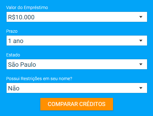
The easiest way to make sure that your customers have the information they need to make a quick purchase is to provide everything they need to know right there on your landing page. The simple and effective form on the Emprestimo Online landing page allows customers to choose the specific information they need about creditors, and get answers instantly with the click of a button.
3. Use Plenty of Social Proof
Today’s customers are more empowered and informed than ever before. They know they have a world of information at their fingertips, and they’re willing to use it to make sure that they’re getting the best deal. This means that if you want to convince someone to buy from you, you need to prove that they can trust you to deliver an exceptional experience first.
While you can always optimize your landing pages to include statements about your values or benefits, people are far more likely to trust the opinions of other customers, than the words of a brand. This means that you need to generate social proof in the form of testimonials and reviews you can include on your website.
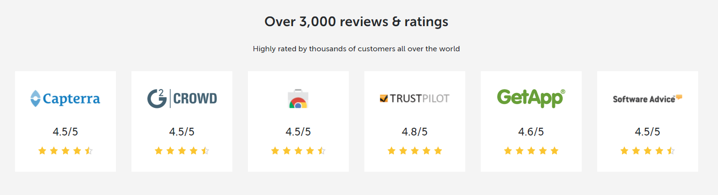
82% of adults in the modern marketplace will read reviews and ratings from other clients before they purchase something online. The great news for companies is that you can streamline their search by demonstrating your best reviews on your landing pages, in the form of quotes, 5-star ratings and more. Some companies even showcase video reviews. The PipeDrive website highlights both customer quotes and links to other review websites to turbo-charge its social proof score.
4. Use Video to Hook Customers and Explain Your Values
In 2018, video is more popular than ever. Over the years, this marketing tactic has been gaining weight as a strategy for engaging and captivating customers. Today, countless companies are already using videos and animations to communicate the complexities of their brand story, explain their values, and develop stronger relationships with possible customers.
While you might still need written content to help you rank higher on Google, and appeal to people with different preferences, video is a fast and simple way to earn viewer attention. After all, watching a video requires minimal input from your customer, so they’re less likely to give up and click the back button when they can’t figure out what you have to offer.
The key to success with video is making sure it’s exciting, interesting, and short. Beyond that, it’s up to you to be as creative as you like. Brands have done everything from creating hand-drawn animations to behind-the-scenes videos of their companies. Whatever method you choose, research shows that a video on your landing page can increase conversion rates by 80%.
The Rosetta Stone website includes videos on the landing page, links to interactive demos for different customers, and more. Remember, your videos don’t have to be limited to just one page on your website, they can spread throughout your entire online content portfolio.

5. Create a Simple and Effective Checkout Page
It’s always been important to give your customers a straightforward checkout experience, but in a world where cyber security attacks are running rampant, a good checkout process can be the difference between a sale, or another abandoned cart. In fact, studies have found that most eCommerce retailers experience an average abandonment rate of 70%.
While there are plenty of reasons why a person might leave your website at the last moment, from a distraction to the promise of a better price elsewhere, a lack of optimization on checkout pages can be a common problem. Interestingly, one of the biggest reasons that people will give up on a purchase when they hit the checkout page is that the “extra” costs like postage and packing are too high.
If you can’t do much about the price of your shipping fees, then you should make sure that your customers know exactly what they’re going to pay before they get to the checkout. For instance, if you have a flat shipping charge, show it next to your product prices. On the other hand, if you have a minimum fee for free shipping, display it as a banner on your product pages.
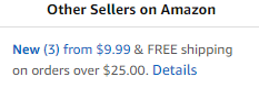
Amazon.com displays whether an item has free shipping or not on each product page, so you can judge whether you want to pay the extra fees or look for a different seller.
Are You Ready for Better Conversions?
The online world has never been more competitive, with new companies joining the fray on an almost constant basis. The good news is that if you’re willing to do some research and stay ahead of the trends, then you should have everything you need to outshine the competition and earn those all-important conversions.
Collective #399
Original Source: http://feedproxy.google.com/~r/tympanus/~3/i9BhEkz_zuU/

Pixelify
A community for sharing digital items that are free for personal or commercial use.
Check it out

Our Sponsor
monday.com: The #1 Trello alternative for your team
Manage your design projects & tasks, plan product roadmap visually, and communicate all in one place while you stay-on-top of your team’s entire workflow.
Create a free account

ScrollBooster
A small drag-to-scroll library made by Ilya Shubin.
Check it out

Emma
Powered by Algolia and Yarn, Emma is a command line assistant which helps you search and install packages more quickly.
Check it out

UI Faces
A very useful avatar aggregator that uses different sources. Made by Mighty Alex.
Check it out

D3 Graph Theory
A quick and interactive introduction to graph theory. By Avinash Pandey.
Read it

CSS Doodle Art
Some amazing CSS art made by Yuán Chuān.
Check it out

Conversational Design
An excerpt from Chapter 1 of Erika Hall’s new book, Conversational Design.
Read it

Theming With Variables: Globals and Locals
Andres Galante shows how to use the concept of Global and Component variables for better design theming.
Read it

Evie
Evie is free template bundled with a minimal style guide. Read more about it in this article.
Check it out

AI Color Wheel
The AI Color Wheel automatically colorizes logos, illustrations, wireframes and other graphical art.
Check it out

Luxe
An easy to learn game engine for making 2D or 3D games for Mac, Linux, Windows, iOS, Android and the Web.
Check it out

How JavaScript works: the rendering engine and tips to optimize its performance
Alexander Zlatkov’s 11th article in a series dedicated to exploring JavaScript and its building components.
Read it

LinkedIn Reimagined
Vamsi Batchu’s elaborate vision of a better LinkedIn.
Check it out

Free Font: Long Johnson
A great display font designed by João Vitor Scarpim.
Get it

Wiggly Squiggly
Steve Gardner created some colorful SVG squiggles that follow the mouse.
Check it out

EU wants to require platforms to filter uploaded content (including code)
Read all about upload filters that the EU proposed as requirement because of potential copyright infringement.
Read it

Responsive Table
Jeremy Church shares a mobile-friendly table solution with persistent table headers.
Read it

Check out these useful ECMAScript 2015 (ES6) tips and tricks
Some very useful tips for EcmaScript 2015 by Raja Rao.
Read it

Geometric cover replication with CSS Grid, clip-path and writing-mode
Melissa Em created this nice demo.
Check it out

Whisps C
An really nice p5.js powered demo.
Check it out

From Our Blog
Glitch Effect Slideshow
A simple slideshow that uses the CSS Glitch Effect for the slide transitions.
Check it out
Collective #399 was written by Pedro Botelho and published on Codrops.

