Original Source: https://www.smashingmagazine.com/2018/03/heatmaps-track-links-wordpress/
There are lots of ways to measure the performance of a web page and the most popular one is by far Google Analytics. But knowing exactly what images, words, or elements on your site catch your site visitor’s specific attention is not possible with these tools alone.
Sometimes, you simply want to know what makes your page great in terms of design, layout, content structure (you name it) and what prompts people to take one intentional action instead of another. You will be probably surprised to learn that there’s actually a solution to your question: heatmaps.
Unlike Google Analytics, which works with numbers and statistics, the heatmaps show you the exact spots that receive the most engagement on a given page. Through heatmaps, you will know what are the most clicked areas on a page, what paragraphs people select while scanning your content, and what is the scrolling behavior of your clients (e.g., how many went below the fold or how many reached the bottom of the page).
In this article, we will talk about why heatmaps are so efficient for your marketing goals and how they can be integrated with your WordPress site.
Why Use Heatmaps On Your WordPress Site
Before progressing to the “how to” part, you might want to know why it’s worth it to dedicate valuable time on implementing heatmaps for your WordPress site and what their actual role is.
First off, visual marketing is constantly growing as many more people now respond positively to a modern and user-friendly interface and skip a plain, non-interactive one. If a certain action requires too many steps and a hard to maneuver platform, they eventually give up, and you lose clients.
Getting the process just right ain’t an easy task. That’s why we’ve set up ‘this-is-how-I-work’-sessions — with smart cookies sharing what works really well for them. A part of the Smashing Membership, of course.
Explore features →

Of course, great content is still the key, but the way your site is structured and combines various elements will influence the activity of your visitors, which is either convert (engage) or leave.
Marketing experts researched this kind of behavior over time:
37% of marketers think visual marketing is the most important form of content for their business, second only to blogging (38%);
51% of B2B marketers prioritized creating visual content assets in 2016;
38% of people will stop engaging with a website if the content/layout is unattractive.
But what were heatmaps built for specifically? A heatmap can help you discover valuable and, sometimes, surprising facts about your audience.
If you add one to your WordPress site, you can:
Track your visitors’ clicks and become aware of their expectations while browsing through your site. This way, you can adjust your pages and make them catchier and more compelling.
Find out what is of interest for people. You’ll know what information they are looking for, so you can put it in the spotlight and use it to your favor.
Analyze the scrolling behavior. See how many visitors reached the bottom area of the site and how many left immediately without browsing further through the sections.
Keep an eye on the cursor movement and see what pieces of content your audience is hovering over (or selecting) in a text.
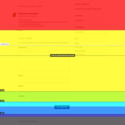
Scrolling behavior heatmap
Again, using heatmaps is not only about tracking clicks for fun, it can have many implications for your business’ growth. They can influence purchases or conversions of any kind (it depends on what you want to achieve with your site).
You will know if your call-to-action buttons get the attention you intended, compared to other elements on the same page. Maybe other design elements you placed on your sales page distract people from clicking the buy button, and this can be seen on the hot spots map. Based on the results, you can change the way they look, their position, their styling, etc., hence sales increase.
Bloggers can also use the heatmaps because this way they will know how to create customer-friendly, appealing layouts for their content. Some layouts generate more traffic than others, and it’s up to you to find out which ones.
If people linger on a certain piece of information, it means it’s valuable for them, and you can use it to your favor by placing a link or a button nearby. Or you can simply create a separate post with even more information on that topic.
How To Add A Heatmap To Your WordPress Site
No matter if we are talking about plugins originally made for WordPress or third-party tools, the integration is not difficult at all. Usually, the most difficult part about heatmaps is the interpretation of the results — the conclusions along with the implications they have on your business and how to use them to your advantage.
When it comes to installing them, you just need to choose one tool and start the tests. Crazy Egg, Heatmap for WordPress, Hotjar Connecticator, Lucky Orange, and SeeVolution are the best and most popular tools that will help you in this direction. Heatmap for WordPress and Hotjar are free, while the other three come in premium plans (they offer free trials, though).
It’s important to mention that all these tools (except for Heatmap for WordPress) work with other website builders as well, not only WordPress. They are universal; it’s just that the WordPress developers found an easy way to integrate them with the latter so that the non-coders won’t struggle much with it. To integrate them with any other website builder, such as Squarespace for instance, you need to play with the code a little bit.
So, how to set up the heatmaps on your site? Let’s use Hotjar because it does a good job overall. It is intuitive, modern, and quick to implement in WordPress.
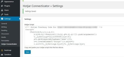
In this case, let’s take Hotjar Connecticator plugin as an example. After installing and activating it, you need to create an account on hotjar.com, add the URL of the site you want to monitor (you can add more sites later), and copy the provided tracking code to the plugin’s page in your WordPress dashboard (as seen below).
Now, it’s time to create the heatmap, which can be done right from the Hotjar platform (you can’t customize anything on your WordPress dashboard). So, click on Heatmaps, then New Heatmap.
Next, you need to choose your Page Targeting preferences. Do you want to track the hot spots on a single page? Do you test several pages at the same time to compare their results? That works too. If you need the latter, you have some URL formats available, so you can make sure you can target all the pages from a specific category (sorted by type, publishing date, etc.) You can even write the exact words that the links contain and Hotjar starts tracking the pages.
An interesting thing about Hotjar is that it lets you exclude page elements that you don’t want to monitor by adding their CSS selectors. This way, you can avoid being distracted by unneeded things when you compare or analyze the results and can focus only on the ones that you want to test.
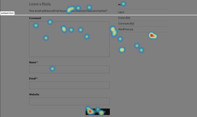
After you create the heatmap, the first screenshot with the hot spots will be provided only after the page starts to get visitors and clicks, so don’t expect results right away. The tool tracks all the views you had on that page since the heatmap was created so that you can make reports based on the views and the number of clicks. This kind of reports let you know you how clickable (or not) your content is.
Here’s how the first screenshot provided by Hotjar looks (the testing was done on an uncustomized version of Hestia WordPress theme):
Another awesome thing about this tool is that it provides you the option to create simple and interactive polls to ask your users why they’re leaving your page or what were the things they didn’t enjoy about your page.
Case Study: How We Improved Landing Pages On ThemeIsle And CodeinWP With Heatmaps
The theory sounds captivating, and it’s almost always easier than the practice itself. But does this method really work? Is it efficient? Do you get pertinent results and insights at the end of the day?
The answer is: Yes, if you have patience.
We love heatmaps at ThemeIsle and use them on many of our pages. The pages are mostly related to WordPress themes since the company is an online shop that sells themes and plugins for this particular platform.
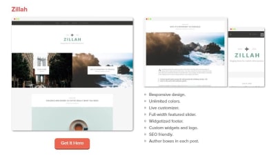
One of the most popular pieces of content from CodeinWP blog is related to themes as well. We have a large range of listings, and many of them rank in top three of Google results page. Lately, we have experimented with two types of layouts for the lists: one that has a single screenshot presenting the theme’s homepage and another providing three screenshots: homepage, single post page, and mobile display.
The main thing we noticed after comparing the two versions was that quite the same number of people reached to end of the list, but the clicks distribution was different: the listing with more visuals didn’t get as many clicks in the bottom half as the one with only one screenshot. This means that the list with more visuals is more explanatory because it offers more samples from the theme’s design, which helps people realize faster which ones are appealing to them. Given this fact, there’s no need for extra clicks to see how a theme looks.
In the one-screenshot case, people dig deeper to find more details about a theme, since there’s only the homepage that they can see from the picture. Hence, they will click more to get to the theme’s page and launch its live demo.
So, if you’re looking for advertising opportunities or you’re using affiliate links, the one-picture version will help you more in terms of user engagement and time spent on your site.
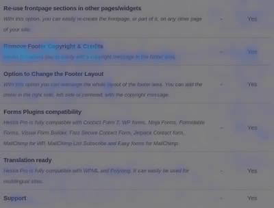
Another example of using heatmaps is Hestia theme’s documentation page. During the testing process, we noticed that a significant number of users are interested in upgrading to the premium version after seeing the number of clicks on the word “Upgrade”, which convinced us to move the upgrade button to a more obvious place and improve the destination page that contains the premium features of the theme.
Speaking of premium features, another experiment of ours was to track the cursor movement and see what are the features people are hovering over more when checking the documentation. Based on the results, we used the most popular items on many landing pages that were seeking conversion – which, in this case, was the upgrade to the premium theme by our free users.
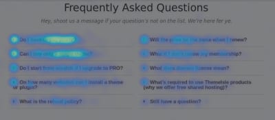
We also created a heatmap for our FAQ page to track the less clicked questions, which we replaced subsequently with other relevant ones. The test is still in progress, as we are trying to improve our support services and offer the customers smoother experiences with our products.
The Importance Of A/B Testing
After getting great insights from the heatmaps, you don’t have to stop there. Create alternatives for your pages based on the results and use the A/B testing method to see which ones perform better.
A/B testing is probably the most popular method with which you can compare two or more versions of the same page. The end goal is to find out which one converts better. You should try it because it definitely helps you get closer to your goals and offers you a new perspective on how your content is being consumed by your audience.
So, after using heatmaps for a while and tracking the behavior of your users, start to make a plan on how to improve your site’s usability. Create alternatives, don’t stick with only one. If you have more than one idea, put them all to test and observe people’s reactions. The goal here is to create the most efficient landing page, the one that has the best chances to convert or to receive the expected engagement.
But how does A/B testing work?
Well, there are several plugins built to make this method work on your WordPress site, but Nelio A/B Testing is the most popular based on the reviews it has on WordPress.org directory (and it’s also free). After installing the plugin, you can choose the type of experiment you want to run. It has a large range of options to compare: pages, posts, headlines, widgets, and more.

Now, starting an experiment is really easy, it takes a few minutes. When you create it, you need to add the original page you want to run tests on, the alternative you want to compare it to, and the goal (what you are trying to achieve with the experiment: get page views, clicks, or direct people to an external source). After stopping the experiments, the plugin will show you detailed results that revolve around the goal you set in the first place. So, at the end of the test, you can tell which page performed better, and you can use it on your site… until a new idea comes to your mind and you should start testing again. Because digital marketing is not about assuming and hoping that things will happen, it’s about making things happen. That’s why you should always test, test, and test again.
By the way, with Nelio A/B Testing plugin, you can create heatmaps too, but they are not as sophisticated as the plugins listed earlier and don’t deliver as many insights. But you can try it out if you want to run quick experiments and need some basic information about a page.
Conclusion
If you want to have a successful business or to be the author of a bold project, keep adjusting your strategies. Try new things every day, every week. To be able to adjust, it’s not enough to simply know your audience but to also test its behavior and make the next moves based on that.
Marketing is not about guessing what your customers want; it’s about finding it yourself and offering them that one thing they need. The heatmaps method will help you along the way by sketching people’s behavior on your site and highlighting what they care most about. It’s simple, fast, visual (you don’t need to dig too much into statistics to understand your audience), and fun.
Knowing what your users’ actions are when they land on your web pages could be something truly fascinating, and you can learn a lot from it.

(mc, ra, il)
 Sticky menus, sliding navigations, fixed navbars…there’s quite a few names for this trend.


