An Introduction to TypeScript: Static Typing for the Web

Original Source: https://www.sitepoint.com/introduction-to-typescript/

TypeScript is one of many attempts at creating a better experience with JavaScript.

“Oh, I’m using Gulp because of reason A” or “Oh, I’m using Redux because of reason B”. You hear these sorts of things from front-end developers all the time. It’s become fashionable to use new ways of improving on JavaScript’s old faults, and that’s not a bad thing. Even ES2015 and the updates that have followed have been pretty determined attempts at righting those wrongs.

TypeScript is a promising change to our favorite language that may be having a significant impact on JavaScript’s future.

What Exactly is TypeScript?

TypeScript is a strongly-typed superset of JavaScript, which means it adds some syntactical benefits to the language while still letting you write normal JavaScript if you want to. It encourages a more declarative style of programming through things like interfaces and static typing (more on these later), offers modules and classes, and most importantly, integrates relatively well with popular JavaScript libraries and code. You could think of it as a strongly static layer over current JavaScript that has a few features to make life (and debugging especially) a bit more bearable.

TypeScript gained particular attention a few years ago because it was selected for full support by Angular 2 and following (which is also written in TypeScript itself). It’s also developed by Microsoft, which means it has the backing of two major tech companies (not a bad place for any language). Since this time, it’s gained more of a following and mainstream status.

Needless to say, TypeScript is definitely worth looking into.

How Does it Work?

TypeScript actually looks much like modern JavaScript. At the most basic level, it introduces a static typing paradigm to JavaScript, so instead of the following:

var name = “Susan”,
age = 25,
hasCode = true;

We could write the following:

let name: string = “Susan”,
age: number = 25,
hasCode: boolean = true;

As you can see, there’s not a whole lot of difference here. All we’re doing is explicitly telling the system what type each variable is; we’re telling it from the get-go that name is a string and age is a number. But that just seems like we have to write more code. Why bother telling the system such specific information? Because it gives the system more information about our program, which in turn means it can catch errors that we might make further down the road.

Imagine, for instance, you have something like this in your code:

var age = 25;
age = “twenty-five”;

Mutating a variable like this and changing its type will likely end up breaking stuff somewhere else, especially in a really big program, so it’s great if the compiler can catch this before we load this up in our browser and have to sit for half an hour looking for the issue ourselves. Basically, it makes our program safer and more secure from bugs.

There’s more, though. Here’s an example from the TypeScript website intro tutorial (which you can find here):

interface Person {
firstname: string;
lastname: string;
}

function greeter(person : Person):string {
return “Hello, ” + person.firstname + ” ” + person.lastname;
}

let user = {firstname: “Jane”, lastname: “User”};

document.body.innerHTML = greeter(user);

Now there are a few more unusual things here than we had before. We’ve got a run-of-the-mill object, called user, containing a first and last name, and that’s being passed to greeter() and the output inserted into the body of the document. But there is some bizarre-looking stuff in the arguments of thegreeter function, as well as something called an interface.

Let’s start with the greeter function:

function greeter(person: Person):string {
return “Hello, ” + person.firstname + ” ” + person.lastname;
}

We can see that greeter takes a person parameter and we expect it to be of type Person. In this way, we can be sure that when we ask for that person’s first name, it will definitely be there and we won’t induce headaches upon ourselves if it fails. The :string after the function parameters tells us what type we expect this function to return when we call it.

The body of the function is nothing complicated but, of course, by now you’re probably wondering what on earth a Person type actually is. This is where the interface feature comes in:

interface Person {
firstname: string;
lastname: string;
}

Interfaces are used in TypeScript to define the structure of objects (and only objects). In this example, we’re saying that any variable of type Person must be an object containing a firstname and a lastname property, both of the string type. We’re basically creating a custom type for our object.

This is useful because it tells the compiler, as well as yourself and any developer who will work on this in the future, exactly what type of data to expect. We’re basically modelling the object properties, creating something we can reference if we need to debug later. This is often why you’ll see interfaces at the top of TypeScript files, as they give us a good idea of the data the program is working with in the rest of the file.

In our example, if we use this Person interface with a variable at any point in the program and it doesn’t contain either a firstname or lastname, both of type string (our user object thankfully does), then the compiler will moan at us and we will be forced to mend our ways.

Not only that, but having static typing means that an IDE or editor with support for TypeScript will be able to provide us with very good, very specific hinting and auto-completion so that we can develop code that is both faster and safer.

There are many more features that TypeScript allows us to use, such as generics and namespaces, so at least a quick read of their documentation is highly recommended.

Continue reading %An Introduction to TypeScript: Static Typing for the Web%

The Future Of Mobile Web Design: Video Game Design And Storytelling

Original Source: https://www.smashingmagazine.com/2018/03/future-mobile-web-design-video-game-design-storytelling/

As technologies change and design techniques evolve, it’s inevitable that we’d experience massive growth in terms of design quality. There are similar parallels we can see within video game design as well. For instance:

This was CERN, the very first website back in 1991. Just some basic HTML and ample white space:

CERN was the first website created just with plain text and hyperlinks.

The very first website to appear online back in 1991. (Large preview)

This example from Smashing Magazine is how we design websites and share information online in 2018:

Smashing Magazine demonstrates how much we can do with web design in 2018.

A much more complicated and yet beautiful web design… 27 years after the advent of websites. (Large preview)

Nope, we can’t do any magic tricks, but we have articles, books and webinars featuring techniques we all can use to improve our work. Smashing Members get a seasoned selection of magic front-end tricks — e.g. live designing sessions and perf audits, too. Just sayin’! 😉

Explore Smashing Wizardry →

Smashing Cat, just preparing to do some magic stuff.

Now, if you look at the history of video game design, you’ll note a similar track; one in which early games like Pong were incredibly simplistic and devoid of any real story:

But now there are games like Grand Theft Auto that put players in the actual driver’s seat, allowing them to control the pace, direction, and outcomes of their experience:

As technologies improve and design techniques evolve, improvements in digital design are inevitable. What is truly impressive, however, is how we are now able to use design to tell a story. In other words, we no longer need to use long scrolls to set up plots or describe what a company does. This is especially great when designing for the mobile experience, which already sets pretty strict limits on how much we can “tell” versus “show.”

In this article, I want to look at three ways in which video game designers get the storytelling aspect of design right, and how web designers can use these techniques to provide users with an immersive experience and drive them more quickly and effectively to conversion.

Three Video Game Storytelling Techniques We Need More Of In Web Design

Video games have come a long way since they were introduced in the late ‘70s in terms of graphics, user controls and, of course, story development. With video game design evolving around the same time as web design, there are similar features and trends that can be found between the two. The only thing is, I don’t know if many web designers think to look to video games for design tips.

Granted, the overwhelming use of shocking colors and cheesy dialogue won’t work that well when you’re developing a professional website. However, it’s the way in which video game designers tell a story with design elements — and effectively guide players to the end by using those elements — that we need to pay attention to.

As your visitors’ attention spans shorten and demand grows for more engaging experiences, web designers can greatly benefit from using these storytelling techniques on the web and, more importantly, for mobile.

1. Make Your Visitor the Hero

Ever since the early days of video games, the goal was to put the player in the front seat and to let them be the hero of the story.

Take PAC-MAN, for instance:

The player was always the hero (i.e., PAC-MAN), and his or her mission was to work through the situation (i.e., to fight the ghosts) and get to the end.

The same holds true for modern gaming as well, though many games go the route of giving players the impression they have control over their heroic journey. A good example of this are the Telltale games.

Basically, each of their games is crafted around a well-known story. In the example above, the game is based on the events that unfold in the T.V. show Game of Thrones. Throughout the game, players are called upon to step into the world and make active choices about what happens next. Sometimes this is through dialogue (at 6:00), and sometimes it happens through action (at 11:55).

In the end, every player of the game ends up at the same place regardless of which way they turn or what line they utter. This doesn’t make the experience any less enthralling for the player as they are actively engaged throughout, and there is a reward in the end — even if it’s one they share with every other person who has played this game.

That’s exactly what websites should do for their visitors, right? They allow visitors to take full control over the experience so that they want to get to the end. For the web, this translates to conversion. And the best way to do this, as evidenced by video games, is to give visitors the ability to pick and choose how they traverse through the story.

Here are some ways in which you can do this with web design:

Create User Personas

Develop user personas before you do anything else when strategizing and planning for a website. Your personas should have a key “problem” they face. It’s then your job to establish the user’s journey in a way that helps them discover solutions to that problem.

Enable Avatar Setup

For those of you with websites that allow for users to create profiles, this is a great opportunity to enable them to define their own unique identity. Allow them to upload a photo of themselves and to personalize their profile. You can also give them different access settings which directs what kinds of content they see, what types of offers they receive, and so on.

WordPress membership websites like WPMU DEV are a good example of websites that do this. Users can create their own profiles and earn points and special statuses based on how much work they put into the community.

WPMU DEV enables users to create their own profiles.

A fun community where web design and development professionals can set up individual profiles. (Large preview)

Use Relatable Content

In video game design, there is something known as “ludonarrative dissonance.” Basically, it “is the unpleasant situation where we’re asking players to do something they don’t want to do… or prevent them from doing what they want.”

You’ve likely encountered this sort of resistance as you’ve designed websites in the past.

You review the analytics and discover high bounce rates on certain pages or even right from within the home page. You discover that there’s a visual element or a line of copy that just doesn’t sit right with your audience. That’s because it’s a disruption in what should be an otherwise immersive experience. By using content that resonates with the visitor, that makes them feel like you’re telling their story, they won’t feel disconnected and want to stray from the goal.

Spin a Fantasy

Here’s an interesting fact: people are 22 times more likely to remember data when it’s presented in a narrative form.

Let’s face it; if you’re building a website on behalf of a business or other professional entity, you don’t have some dramatic tale to spin like a video game does. And that’s fine.

Consumers aren’t visiting websites in order to get caught up in hours of epic storytelling. That said, they do still expect to be engaged by what you’re sharing with them.

So, why not depict a fantastic scenario through visual storytelling? The brain digests visual content 60% more quickly than written content, so your web designs and other visuals (like video, animation, and so on) are the keys to doing this.

The Airbnb blog always does a great job of this type of visual storytelling.

Airbnb’s blog uses images that tell a story within themselves.

The Airbnb blog is a master of visual storytelling. (Large preview)

While every story is probably told through 800 to 1,000 words, it’s also accompanied by highly attractive visuals that tell you something about what you’d experience at this specific destination.

2. Minimize Distractions by Using Symbols

Let’s talk specifically about websites viewed from mobile devices for a second, shall we? As of August 2017, 52.64% of all visits to websites were done via a smartphone. And, starting in 2017, the most popular size for a smartphone was between five and six inches and will only continue to grow in popularity as the years go on.

That’s not a lot of space to fill with content for the majority of site visitors, is it? So, how do you effectively tell a story if you have limited real estate? If we’re to take a page out of the video game design handbook, then we should turn to symbols.

Kontra makes a good point about this:

“[O]ne, often overlooked, strong point of game UX is the preference towards symbolism. The ability to transform meaning into symbols was a huge step towards visual decluttering.”

Functional minimalism is already something you’re doing in your own web design efforts, but have you thought about how it can tie into the storytelling aspect as well? When it comes to video games, symbols help clear the way so that players can focus on the story before them. You’ll see this most often in two-dimensional, side-scroller games:

Street Fighter and other fighting games place the health bar at the top:

Sonic the Hedgehog places the life counter at the bottom:

There are even ones like Virtua Racing and other geographic-dependent games that put their navigation off to the side for players to reference:

As you can see, the use of symbols keeps the gamespace clear and easy to follow along with.

Whether you’re designing mostly for desktop or mobile users, your aim is to design a space that encourages users to follow along and not get caught up in distractions. So, while you might think that full-screen, overlay navigation is a creative choice for your website or the ever-present live chat pop-up will get more engagements, you may be doing yourself a great disservice.

By employing the use of easily recognized symbols throughout your site, you can keep the design clean and clear and distraction-free. The story you’re weaving throughout is the most important thing, and you don’t want to stand in the way of visitors being able to get to it.

MSR is a beautiful example of this done well:

MSR minimizes distractions from the main content area by using symbols.

A good example of how to minimize navigation and directional cues so visitors can focus on the main content and story. (Large preview)

The website is for their architecture design firm. Rather than write volumes of text about what they’ve done and how they do it, they allow the images to speak for themselves. They’ve then employed a number of symbols to help visitors continue on to other points of interest in their journey.

Here are some ways in which you might use symbols to declutter your site:

Hamburger icon (for the navigation)
Profile photo icon (for account details)
Pencil icon (for an editing interface)
Gear icon (for settings)
Shopping cart icon (to checkout)
Magnifying glass (to expand the search bar)
Connector icon (to open social sharing and RSS feed options)
Question mark (to expand live chat, search, or help options)
And so on.

One thing to note here is that you don’t want to overdo it with icons. As you can see from the video game examples above, the entire interface isn’t strewn with icons. They’re simply there to hold the place of elements players are already familiar with and will refer to often. That’s the way you should handle icons for your own site. Think about how easy your icons will be to decipher as well as which ones are absolutely necessary. Decluttering doesn’t mean hiding every element under an icon; you simply want to tidy up a bit.

If you’re concerned with the potential for confusion over what your icons mean to users, then use labels, alt text, or tooltips to provide further elaboration to those who need it.

3. Be Smart About How You Use Space

One of the nice things about video games is how they use actual walls and roadblocks to prevent players from navigating into territory where they shouldn’t be. One of my favorite games that does this right now is called LittleBigPlanet. While it is similar to side-scrolling adventures like Super Mario, its design expands beyond the basic two dimensions usually experienced in these kinds of games.

As you can see, the player encounters a number of hard surfaces which then prompt him or her to move back and forth between layers, to climb up various elements, and to find a more ideal route towards the end of the game.

First-person shooter games like Halo also use physical elements to keep players confined to the main gamespace and on track to completing the mission and story.

As a web designer, you don’t have the luxury of crafting walls around the user’s journey on your site. That said, you don’t have to design a website and leave it all to chance. There are ways to steer visitors through a direct path to conversion.

Kill Screen did an interesting write-up about the art of spatial storytelling in video games. In it, writer Sharang Biswas explained the idea that “Spaces can be designed. They can be made to promote certain pathways, encourage specific behaviors, even elicit emotional reactions.”

There are a number of ways in which you can do this with design:

Use a Spotlight

In video games, you can use light and darkness to draw attention to important pathways. On websites, it’s not always easy to employ the use of lightness or darkness as too-dark of a design or too-light of text could lead to a bad user experience. What you want to do instead is create a “spotlight” of sorts. You can do this by infusing a key area of your design with a dramatic color or a boldly stylized font.

In a site that’s otherwise pretty light in color usage, Kappow does a nice job using it to highlight two key areas of the site where it’s clear visitors should visit: its case studies.

Kappow uses bright swatches of color to draw attention.

It’s more than obvious where Kappow wants visitors to focus their attention as they scroll through the home page. (Large preview)

Add Clues

If you’ve ever played a horror video game before, you know how critical the element of sound can be for it. Here’s an example of how Until Dawn uses sound (as well as visual footprints) to try to steer the player in the right direction:

In all honesty, I’m not a big fan of music on websites, even if they’re from auto-play videos that I visited the website for in the first place. I’m sure I’m not the only one who feels this way as there aren’t many websites that employ the use of background music or auto-play audio anymore.

That said, while you might not be able to direct visitors down the page with the sound of something playing down below, you can use other elements to lead them. For one, you can use interactive elements like animation to draw their attention to where it needs to go. Let’s take a game like Angry Birds, for example.

See how the little red birds are hopping up and down while they wait their turn? It’s a subtle gesture, but one that is sure to draw first-time players’ attention to the area of the screen in which they should directly interact if they want to move on to the next level. Animation on a website would work just as effectively if you’re trying to lure visitors’ eyes down to a key element like a contact form or a clickable button.

But it doesn’t just have to be animation. Other video game designers simply plant clues around the landscape to steer players through the journey. I’m not suggesting that your site start hiding Easter eggs all over the place. Instead, you may want to think about using subtle arrows or lines that define the space in which visitors should “play” and then move down through.

Employ a Mascot

For some brands, it might make sense to employ the use of an actual mascot to guide visitors through the story. If it’s an already established mascot and it won’t intrude too heavily on the experience, then why not bring it on the journey to ensure that visitors are checking in at all the right spots?

Or you can do like BarkBox and use a series of related mascots to guide visitors through different parts of the site (especially the signup and subscription process).

Black-and-white illustrated mascots on BarkBox website.

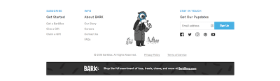
BarkBox uses a series of illustrated black-and-white mascots to guide visitors through the conversion processes. (Large preview)

Summary

As attention spans shorten and visitors just want to get to the good stuff on a website, designers have to get more creative in how they communicate their website’s “story.” Ideally, your web design will do more showing of that story instead of telling, which is how video game design tends to succeed in this matter.

Remember: Storytelling isn’t just relegated to big brands that can weave bright and shiny tales about how consumers’ lives were changed with their products. Nor is it just for video game designers that have hours of gameplay to develop for their audiences. A story simply needs to convey to the end-user how their problem can be fixed by your site’s solution. Through subtle design strategies inspired by video game storytelling techniques, you can effectively share and shape your own story.

Smashing Editorial
(da, ra, yk, il)

Website or Mobile App: Which Should You Launch First?

Original Source: http://feedproxy.google.com/~r/Designrfix/~3/yyCzv7XIYU4/website-mobile-app-launch

What should you launch first: a website or a mobile app? Almost every startup nowadays struggles to make this decision, and it may either bring success or ruin your idea. Website vs mobile app There’s nobody who can give you a 100% right answer. Usually, businesses start with a website. However, nowadays many startups lean […]

The post Website or Mobile App: Which Should You Launch First? appeared first on designrfix.com.

Typography: 36 Days of Type by TJ Nicklin

Original Source: http://feedproxy.google.com/~r/abduzeedo/~3/0OEKM_-ImrY/typography-36-days-type-tj-nicklin

Typography: 36 Days of Type by TJ Nicklin

Typography: 36 Days of Type by TJ Nicklin

abduzeedo
Mar 08, 2018

I always admire those that challenge themselves to daily activities like taking a photo a day, or design something different every day. It seems simple at first, however, like everything in life, the closest you get to the realization of something, the more difficult things become. I believe it does that to naturally select those that have real passion for the others. For this post I’d love to share the typography work that TJ Nicklin created titled 36 DAYS OF TYPE. The style and quality of the illustrations is just top notch. 

36 Days of Type is a project that invites Designers, Illustrators and Graphic Artists to express their particular view on the letters and numbers in the alphabet. Participants are challenged to design a letter or number each day. I took the opportunity to explore and experiment with color, texture and patterns.

Typography

Typography
graphic design


Becoming a Confident and Respected Freelance Designer

Original Source: http://feedproxy.google.com/~r/1stwebdesigner/~3/Kvvm4RqVYGE/

Recently, I attended a local WordCamp and heard a fascinating talk about the difference between being nice and too nice. Essentially, it was an honest discussion of valuing yourself and your time. The fact is that there are people out there who will look to use you as a doormat – if you let them.

I think that’s something many of us have experienced in our freelance design careers. You give people an inch and they attempt to take a mile. This is especially so when you’re first starting out on your own. Some will see you as inexperienced and perhaps a bit naive. You may even see yourself as unworthy.

But, in reality, we are worthy of being treated fairly. At the same time, it’s up to us to ensure that others treat us with the respect we deserve. Here are a few ways we can go about making it happen, even for the most shy among us.

Don’t Let Small Things Fester

In my own life, I’m very averse to conflict. I often go out of my way to avoid it – even to the point where I’m miserable. So for many years I simply looked the other way when someone took an extra cookie or two out of the jar, so to speak.

What I’ve found is that, if these relatively small transgressions are left alone, they don’t really go away. Instead, they build up into something of a passive-aggressive relationship (a one-sided one, at that). It seems like every time you deal with that client who got away with something, the frustration of it is in the front of your mind.

I ask myself why I just can’t let it go. But I think it’s more than just what the other person did (or my perception of what they did, anyway) that gets to me. It’s also the fact that I essentially let them do it. So I’m not only frustrated about them, but perhaps even more so with myself.

The better approach is to stamp out these little fires when they occur. Obviously, you have to pick and choose your spots as not all battles are really worth fighting. But if you feel that you’re being taken advantage of or otherwise treated unfairly, it’s better to try and resolve the situation.

For example, if something goes beyond the scope of an agreed-upon project, don’t be afraid to point it out and let your client know that there will be extra costs involved. Otherwise, you’ll have that sour taste in your mouth long after the incident.

Don't Let Small Things Fester

Get Your Policies in Writing

Sometimes we have gray areas in our contracts that could be open to interpretation. That’s not always a bad thing, as it’s good to have at least some level of flexibility when working with a client. But it’s also potentially dangerous in that the wrong client may think that it gives them the freedom to take more than you feel they are entitled to.

This is one of those lessons that can take a while to learn. Being the trusting type, I often left things a little too loose (and probably still do from time to time). It has led to losing out on both time and money. And that is all on me.

But as freelancers and professionals we must stand up for ourselves. If we don’t take care of our business, who else will? We have to set rules that help us protect our own interests.

The solution here should be fairly simple. You’ll want to make sure that you have a contract or proposal that spells out the services you’re going to provide. And it’s worth noting that anything not specifically mentioned in your proposal could mean extra charges for the client. A little bit of wiggle room is fine, but you’ll want to protect yourself as well.

The other bright side of putting it all down on paper is that it will help you avoid confrontation. But even if you do need to speak to your client about an issue, you have the contract to back you up. It just makes things a whole lot easier to deal with.

Get Your Policies in Writing

Embrace Your True Value

We so often underestimate our value. Why? I think it often has to do with the fact that our industry is filled with incredibly-talented (and, what the heck, good-looking) people. It’s easy to point out that we’re not quite as good as someone else. We may think that others are better at design and know code like the back of their hand. How can we possibly compete with, or be worth as much, as they are?

For many years, that was my mantra. I could never be as good as so-and-so. Therefore, it’s okay to be the human equivalent of a speed bump.

The truth is that there are indeed people out there who are better or more experienced. This is a part of life, whether you design websites, sell cars or cook gourmet meals. That doesn’t mean that your skills and time aren’t valuable.

Value shouldn’t be determined by how we think of ourselves as compared to others. Instead, we should focus on what makes us unique. If you’re good at what you do and passionate about it, that’s something to set you apart.

Once you start believing in yourself and understand your value, you’ll gain confidence. That, in turn, will make you less likely to be taken advantage of. When you know your value, you won’t accept anything less.

Embrace Your True Value

Confidence Builds Over Time

Developing the self-esteem you need to succeed in business isn’t something that happens overnight. While some people are just born with that sense of self worth, the rest of us may take a little while to see the light. If you’re not there just yet – don’t panic.

Sometimes, things just get better with experience. The perspective you gain over time can lead you to the right place. There are also certain moments in our careers that seem to do the trick. For me, I actually think a lot of it had to do with writing. Being able to think through and communicate the experiences I’ve had have brought some clarity.

Only when we value and respect ourselves can we expect that same treatment from others. Regardless of how you get there, just know that it’s possible. In fact, just taking some of the steps above may put you on the right path. The result will be a healthier and happier approach to your work.


6 Ways to Let Your Users Customize Their Own UX

Original Source: https://www.webdesignerdepot.com/2018/03/6-ways-to-let-your-users-customize-their-own-ux/

“I am consumer, hear me roar!”

That’s a thing I actually wrote once, un-ironically, in a text conversation with a friend. I was looking for a product that would allow me to perform a particular task in a particular way. Unsatisfied with the options I’d found so far, I kept looking. My friend suggested using one of the products I had already decided to ignore, and just do things their way.

To hell with that. I’m the customer. I’m the guy with the money they want. I might only be one customer, but my money’s just as good as anyone else’s. Why shouldn’t I spend it on a product that does things the way I want to do them?

Some users look for the cheapest deal in terms of money. Others look for the cheapest deal in terms of time and mental effort.

Some users look for the cheapest deal in terms of money. Others look for the cheapest deal in terms of time and mental effort. This is why app makers build options and settings into their apps. They know not everyone does things the same way, so limiting their possible options limits their possible customers.

Web apps and sites are catching on to this idea, too, and I’m here to share some of the more common (and important) ways to let your users customize their own experience.

1. Language

I know I’ve addressed this before, but it’s still happening. So I’ll keep talking about it. I’m not saying every single site has to be multi-lingual. Some sites don’t need it, and proper localization can get quite expensive. I’m saying that if your site has multiple languages, you really need to let the user pick the language they want to use.

That sounds like common sense, but I keep running into sites where the language is chosen for me based on my location, and they won’t let me change it. I live in Mexico, and my first language is English. You can probably see the problem. But it’s not just edge cases like me. What about people using VPNs located in other countries? What about people traveling on vacation?

There’s no reason not to let your users set their language manually.

2. Light or Dark Themes

If your site requires (or even just encourages) its users to do a lot of reading there, then you should consider giving them at least one light theme, and one dark. I myself prefer to read with a light theme, and the room lights on. But others seem to get tired reading like that. They especially seem to like having a dark theme when reading in the dark, as it keeps the screen itself from nearly blinding them.

I know. This sounds a lot like I’m recommending that you maintain two separate versions of your site. Just note two things: One, most sites don’t require nearly enough reading that this sort of option would be necessary. Two, if you plan ahead, you could theoretically change all of the colors on your site with a few lines of CSS. That’s the beauty of the cascade.

3. How Information is Sorted

So if you’re looking at information in a table these days, it’s pretty reasonable to expect to be able to sort the information you’re looking at in various ways: alphabetically, numerically, by category, or what-have-you. You can apply pretty much the same approach to any other type of content, though.

Blogs have long been designed so that you could quickly filter out content you were less interested in, by employing tags, categories, and more. Social media sites have completely failed in this regard by increasingly trying to phase out reverse-chronological timelines, and even removing content from our view with algorithms. Listen, developers, just because I don’t interact with a bit of content doesn’t mean I don’t want to see it. I’m a lazy goddamn interactor, and I look at a lot of content. Stop hiding it from me!

4. Currency

I’m used to doing a mental conversion in my head from U.S. dollars to Mexican pesos. Sometimes I get the exchange rate wrong though, and something is more expensive than I expect. Sometimes I get it wrong the other way, and end up pleasantly surprised.

Either way, this could all be avoided if more online stores allowed me to choose my own currency. I admit that implementing this might indeed be a pain. I don’t know how many APIs there are out there for doing on-the-fly currency conversions with up-to-date conversion rates, but there’s got to be at least one, right?

5. Privacy

I for one am always glad when a socially-oriented site offers to let me decide exactly how much information I want to let everyone see. Required information (such as my e-mail address) is not always information I want to hand out to just anyone. I mean, if anyone wants to find out too much information about me, I’ve already given it all to Google and Facebook, but why make it too easy?

6. Social Interaction

Equally important to privacy features are the ones that allow me to decide exactly how social I want to be. Being able to block individual users is a good start, but what if platforms that have private messaging allowed us to simply turn it off?

Perhaps it seems contrary to the entire concept of the social web to allow people to limit the social features on their accounts. But there are many sites I use that have social features that I personally have no use for. And until they all get Gmail’s spam filtering technology, we might be better off without some of them altogether.

Add Realistic Chalk and Sketch Lettering Effects with Sketch’it – only $5!

Source

p img {display:inline-block; margin-right:10px;}
.alignleft {float:left;}
p.showcase {clear:both;}
body#browserfriendly p, body#podcast p, div#emailbody p{margin:0;}

Freebie: Designer Workspace Illustrations (AI, EPS, SVG, PNG)

Original Source: http://feedproxy.google.com/~r/tympanus/~3/KNXefUxGY60/

DesignerWorkspace_Featured

Today we’re very happy to share 10 unique illustrations with you. The set contains detailed and modern line illustrations of a designer’s workspace in two different views (top and frontal).

About the Designer Workspace Illustrations

This colorful set contains 10 line illustrations of a designer’s workspace in two views (top and frontal). A touch of Pantone’s color of the year 2018 “Ultra Violet” gives it a futuristic modern look, even more so when combined with vibrant gradients and light gray elements. Whatever you might need on your desk as a designer is included: technology, designer software, notebooks, pens, color swatches and even plants to brighten up your space.

The following files are included in the set:

5 top view illustrations
5 frontal view illustrations
Ai files
EPS10 files
PNG files (optimized)
SVG files

Preview

Check out a preview of the illustrations:

DesignerWorkspace_01

DesignerWorkspace_02

Download the Designer Workspace Illustrations for Free

You can download the freebie here:

Designer Workspace Illustrations by Polar Vectors (4.6 MB)

The illustrations are free for personal and commercial use. Please don’t resell or redistribute them.

If you are interested in more workspace themed line illustrations check out the Her Workspace Illustrated Instagram Pack:

Her-Workplace-illustrated-instagram-pack1

About Polar Vectors

Polar Vectors is a shop that provides a wide range of vector graphics collections for your creative needs; everything from illustrations, icons, textures, patterns to illustrated letters. For any updates on new releases and discounts follow Polar Vectors on Instagram.

We hope you enjoy this freebie and find it useful!

If you’d like to contribute and publish your exclusive freebie on Codrops just drop us a line.

Freebie: Designer Workspace Illustrations (AI, EPS, SVG, PNG) was written by Diana Hlevnjak and published on Codrops.

Create a vector displacement mesh brush

Original Source: http://feedproxy.google.com/~r/CreativeBloq/~3/UJeAtBYH8fM/zbrush-training-create-a-vector-displacement-mesh-brush

Don't miss Vertex 2018, our debut event for the CG community. Packed with inspiring talks from industry pros working in games, VFX and more, plus career advice, workshops, an expo and more, if you work – or play – in CG, it’s unmissable. Book your ticket now.

Vector Displacement Mesh (VDM) is a 3D sculpt, used as brush building blocks, that enables undercutting when drawing on a model’s surface. But what exactly does it mean? 

The simplest way to understand it is to start with alphas. Alpha textures are greyscale images that we often use for sculpting fine-detailed patterns like wrinkles and skin pores. Without them we would have to painstakingly draw the details on by hand, one by one. Alphas are awesome and quite efficient to use in combination with bushes, but they are basically flat images with black values, and they do not support undercuts and overhangs, which limits what can be done with them. 

However, Alpha 3D stores the information of all XYZ axes and does not have any vertical elevation restrictions. By definition, it is 3D as it uses VDM in its system. All you need to worry about is the polygon density to enable proper projection of the Vector Displacement Mesh onto your model. 

Create detailed 3D shapes with ease

Let’s look at an example of creating some highly detailed 3D art: imagine I want to model some dragon scales, but I don't want to use a 2D alpha because this way I would have to go back and sculpt them some more for extra depth. Scales do not just sit there side by side, they overhang and partially cover one another, so it takes a great deal of time making them look realistic. It is a long, tiring and very repetitive process, but there is a way to make it easier and quicker in the future. 

I can create a Vector Displacement Mesh, save it as a brush and simply draw my sculpt onto a model with a single stroke, as many times as my heart desires. Job done! I know that I still have to spend some time making those VDM brushes, of course, but once they are done, I will not have to go and create them again – they will be sitting in my brush library, waiting for the next time I need them. 

Here I will demonstrate how easy it is in these simple steps, making a swirl frosting for my 10-minute 3D cupcake.  

01. Start the swirl

With a clay brush selected, build a little hill in the middle of the canvas

To start off, we first need to get a canvas, so head to Lightbox> Project>MISC and select the Brush 3D template. With a clay brush selected, build a little hill in the middle of the canvas, more or less to the size of the swirl. Now, with the radial symmetry on and DamStandard brush selected, start sculpting the grooves and peaks of the swirl shape. 

02. Fix distorted edges

Make sure to stay away from the edges of the plane

Make sure to stay away from the edges of the plane. If you accidentally mess up the edges, you have to fix them before saving the VDM: mask the edges, invert mask, go to Tool>Deformation>Relax Plane Grid or Morph to Grid, depending on the level of damage caused to your plane. This should reshape the edges and add more geometry.

03. Save out to the VDM

To save as a VDM, select a brush that can save all the information contained in your model

To save out your sculpt as a VDM, you need to select a brush that can save all the information contained in your model. With Chisel3D selected, open the Brush palette, select Create and click on Create MultiAlpha Brush. This automatically creates a new Chisel brush out of your model. Your current Alpha texture now contains a VDM of the sculpt with a 3D mark in top-left corner. 

04. Save out the brush

Last thing to do is create an icon for your brush and save it

In order to now save out the brush and create an icon for it, open a 3D sphere and turn it into a polymesh. Divide it a few times and drag out your VDM. Position the sphere to capture the icon, go to the Brush palette, hold down the Alt key and click on SelectIcon. With the icon generated, you can finally save it out with Brush>Save As. Rename your brand-new brush and it is done! 

This article was originally published in issue 230 of 3D World, the world's best-selling magazine for CG artists. Buy issue 230 or subscribe to 3D World here.

Book your Vertex 2018 ticket now

On 13 March we’re launching Vertex 2018: a one-day event in London for the CG community. Featuring a jam-packed schedule of inspiring talks from the industry’s most exciting practitioners, there will also be workshops, networking opportunities, a busy expo and lots more. Get your ticket to Vertex 2018 now. 

Related articles:

Behind the scenes on The Shape of WaterModel an alien pirate creature in ZBrushHow to master creature anatomy

Web Design Guide Even a Non-Designer Can Use

Original Source: http://feedproxy.google.com/~r/Designrfix/~3/q-r1ZH4PKrg/web-design-guide-nondesigner

Just like Entrepreneurship, good design principles can be exercised and learned by everyone. If you are a graphic designer who is willing to start his career or a novice who is willing to switch his field to designing here is a quote that can boost up your morale” “I never took lessons to play the […]

The post Web Design Guide Even a Non-Designer Can Use appeared first on designrfix.com.

One of These Site and Page Building Tools is Meant for You

Original Source: https://www.sitepoint.com/one-of-these-site-and-page-building-tools-is-meant-for-you/

This article was created in partnership with BAWMedia. Thank you for supporting the partners who make SitePoint possible.

Searching for precisely the right website builder to suit your needs can be a daunting chore. There are good ones and not-so-good ones on the market. The problem is that there are so many good website builders. Also, more than a few of them can legitimately claim to be top-of-the-line. Therefore, it can be awfully difficult to make a choice.

Is one of your requirements that the product must be free? Then, your search should narrow considerably. However, it still won’t necessarily be easy to find what you’re looking for.

The good news is — we’ve just made it an easy task. We’re delighted to be able to present the best of the best free website builders heading into 2018. You’ll find builders for creatives, for small businesses, and for personal use. All these builders will enable you to create awesome portfolios and galleries.

Take a break, grab a cup of coffee, and enjoy!

1. Mobirise Website Builder

Mobirise Website Builder

     Since the Mobirise Website Builder is free for both commercial and personal use, it would only make sense to download it to check it out. Mobirise isn’t just another copycat builder either. It takes somewhat of a different approach to creating a website (one that you’ll like) and you’re free to use any host you choose once your site is ready to launch.

Mobirise’s cool combination of a drag and drop builder and its cool selection of trendy pre-made building blocks really speeds up the building process and your workflow as well. A comprehensive set of design elements, together with Mobirise’s Bootstrap 4 templates also come with the package. The net result is your ability to easily add functionality to your sites that might otherwise require lots of time, effort, and coding. Coding is not necessary with the Mobirise Builder. It’s simply a matter of dropping blocks onto a page and adding, rearranging, and editing content as necessary. Once done, you’re ready to publish.

Download the Mobirise Website Builder for Mac OS or Windows and check it out!

2. Visual Composer Website Builder

Visual Composer website builder

     The Visual Composer Builder is the creation of WPBakery’s VC team. 5+ years of design and development experience have gone into this completely new type of WordPress builder. It is not to be confused with the WPBakery Builder.

The two builders are independent and completely different from one another, and we believe this would be a good time to give the Visual Composer Builder a try. Both free and Premium versions are available.

This website builder features a live drag and drop frontend editor, a backend editor, a host of advanced design options, WordPress shortcodes and widgets support, and much more. VC-created sites will be responsive, they can be tied into Social Media, and you can accomplish all of this without any need to write code.

We suggest checking out the free version and putting it through its paces and looking into the Premium version’s features later.

3. Portfoliobox

Portfoliobox

     Because it makes it so easy to build websites and professional-looking galleries and portfolios that are unique in all respects, Portfoliobox is an excellent choice for creatives, be they photographers, artists or designers of all types.

Portfoliobox is not theme-based, so you’re not constrained to using a standard theme. You can use any style you want for any page and do it from the comfort of your web browser. Web hosting comes with the package, and there’s never a need for coding.

Since this web building tool is responsive you can control the look of your website pages, portfolios, and galleries on mobile devices.

Hosting is included when you sign up for a free account. Portfoliobox’s Pro plan offers extended hosting capabilities and a free personalized domain. Another cool option to check – a student account offer from Portfoliobox. If your school supports this opportunity, do not miss it!

Continue reading %One of These Site and Page Building Tools is Meant for You%