12 Fixed Sticky Navbars That’ll Grab Your Attention
Original Source: https://www.webdesignerdepot.com/2018/03/12-fixed-sticky-navbars-thatll-grab-your-attention/
 Sticky menus, sliding navigations, fixed navbars…there’s quite a few names for this trend.
But they all mean the same thing: a navigation that follows you around the page while you scroll.
Not everyone likes this design style because it takes up extra space on the page. But it also gives users direct access to all nav links from anywhere on the page.
If you’re looking for sticky menus with eye appeal these examples are sure to get you excited. And if you’re looking for inspiration on your own project these are guaranteed to delight.
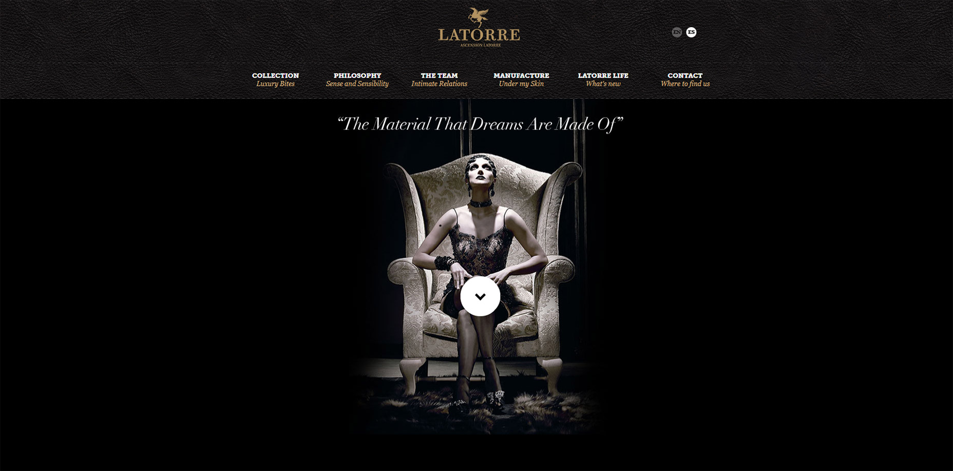
1. Ascensión Latorre
I don’t understand a word of French but luckily it’s not needed to appreciate this sticky navbar on the Ascensión Latorre website.
At the very top of the page you’ll see a full logo with text and the nav links. When scrolling down the text actually disappears and the navbar slides up.
This takes up far less space and it’s certainly ideal for graphics-heavy menus.
I’ve even seen this technique with logos that resize smaller on scroll too. This design just hides the text, but they could save even more room by resizing the pegasus graphic smaller.
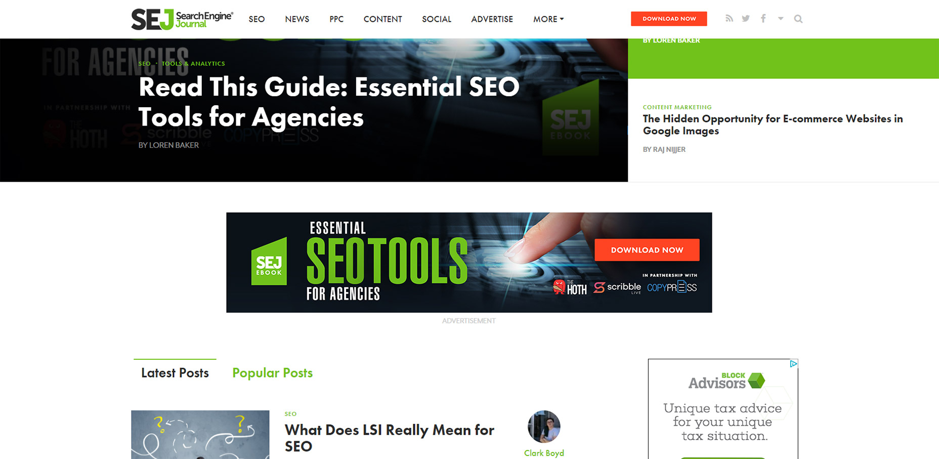
2. Search Engine Journal
This has to be my favorite navbar effect just because I’ve never seen it on any other website. SEJ is a great blog and I think they know user experience design.
Quick note: you can only see this effect on the homepage. You’ll notice the navbar remains stickied on all pages but I’m specifically talking about the logo animation.
If you visit the homepage you’ll find the logo embedded directly in their “featured story” box, one major component in a great magazine-style website. But if you scroll down past that featured box you’ll catch a really cool animation.
The nav text shifts over to the right and the logo animates into view. This is such a cool design because it feels so dynamic.
Yes their sticky navigation is pretty cool. Nice dropdown menus, great colors, typography, etc. But that logo animation is one feature I’ll never forget.
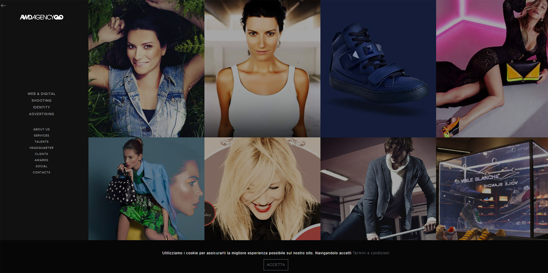
3. AWD Agency
Moving onto the AWD Agency website, this is the first vertically-oriented nav in my list.
They do a great job of keeping that menu stickied along the side of the page without taking up much space. How?
With a hidden menu toggle, of course!
Just click the little icon towards the left-hand side to open the menu. Click it again to close it. This remains accessible for all users on all devices so it works on the largest desktop monitors and the smallest smartphones.
Very clean effect and a nice way to handle fixed vertical navigation.
4. Graz Secrets
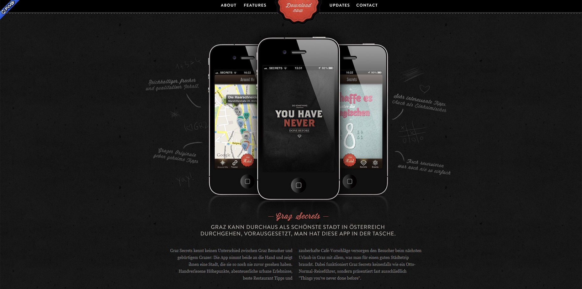
I’ve never used the Graz Secrets iPhone app. But after using their website I’d like to think the app has just as much of a fantastic user experience.
The top navbar stays fixed and uses a small border to keep it distinguished from the page content.
One design style I really like is the center “download now” button.
It stays animated even while you scroll so it’s meant to grab attention. Plus it blends nicely into the navbar so it feels like one cohesive unit.
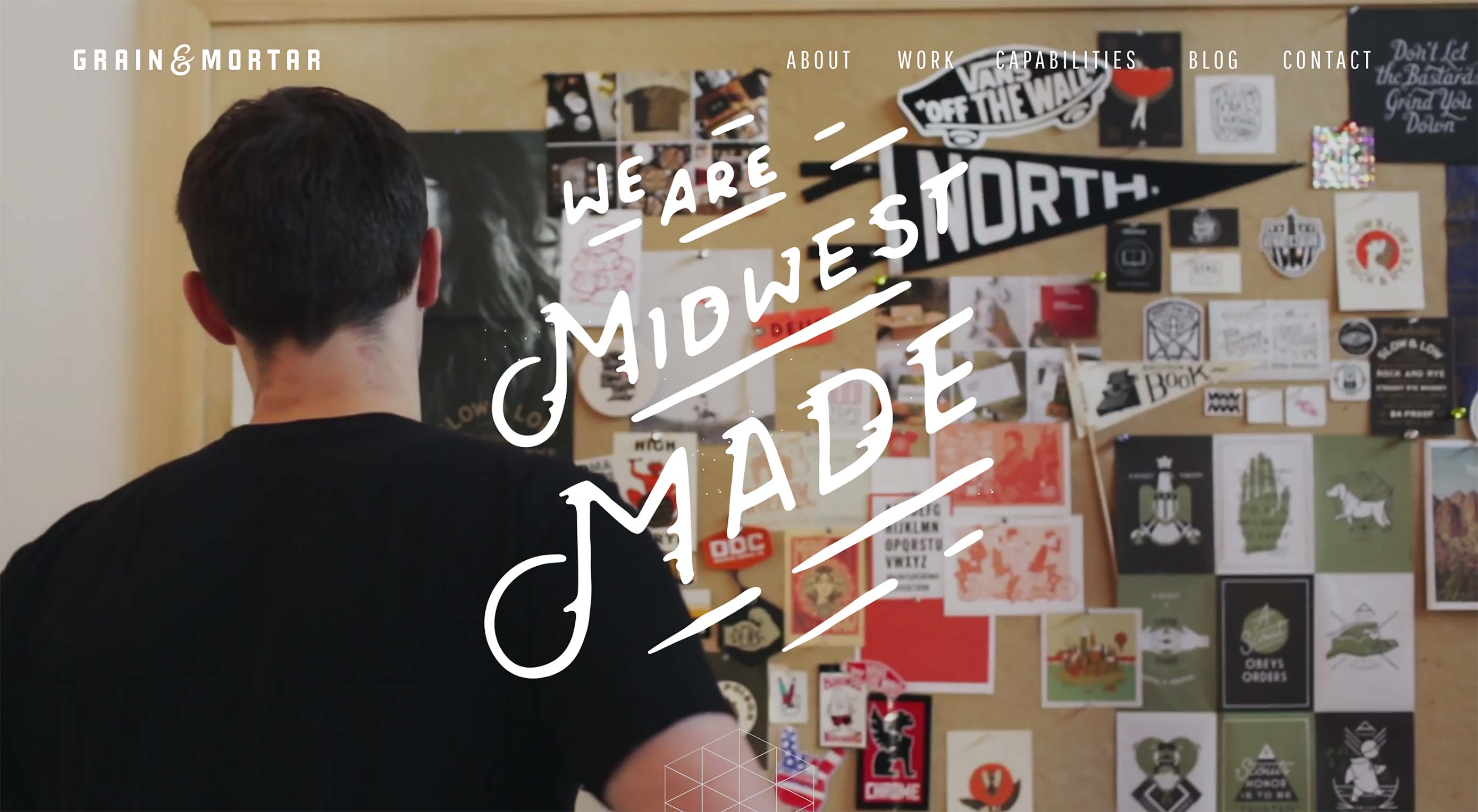
5. Grain & Mortar
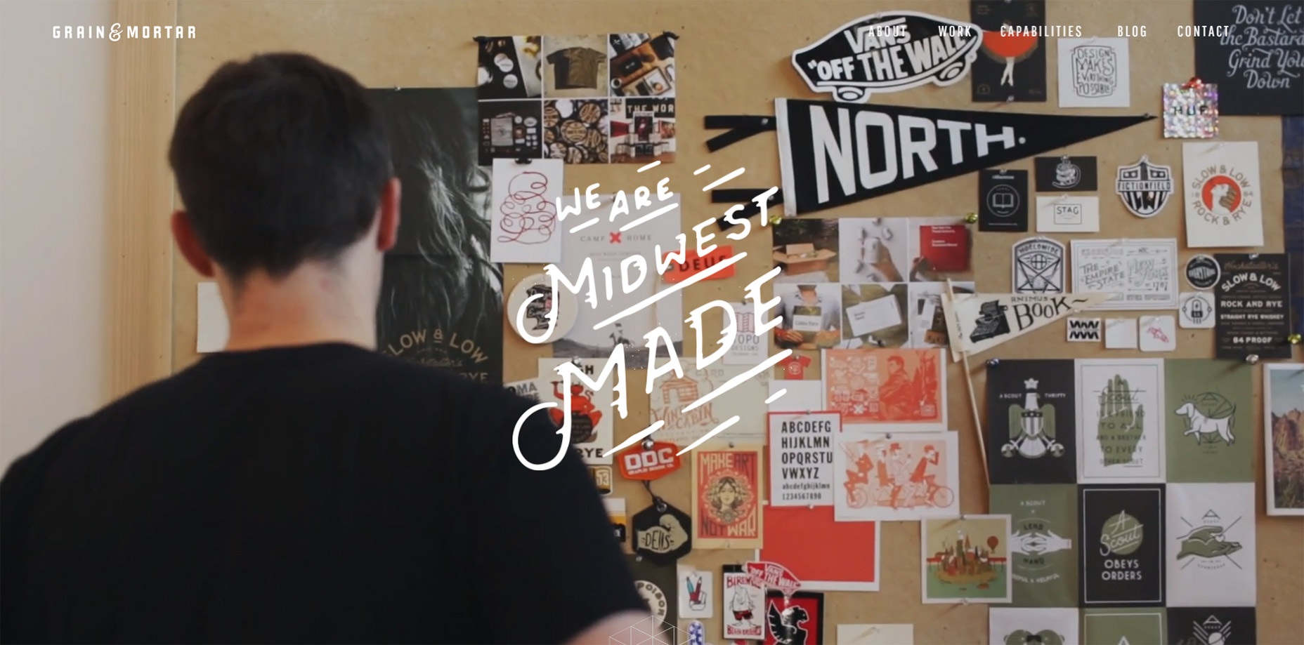
Grain & Mortar has to be one of the cleanest agency website I’ve seen this past year.
So many layouts are cluttered with excess graphics, animations, or just designed to be “hip” yet come off as confusing. Not G&M. I could go on about all of their layout’s awesome features, but this post is about sticky navigations. And they have a sleek one.
The navbar doesn’t even appear until you scroll down past the header. A very cool effect and it can work well for websites that have large hero images in their headers.
6. Jorge Rigabert
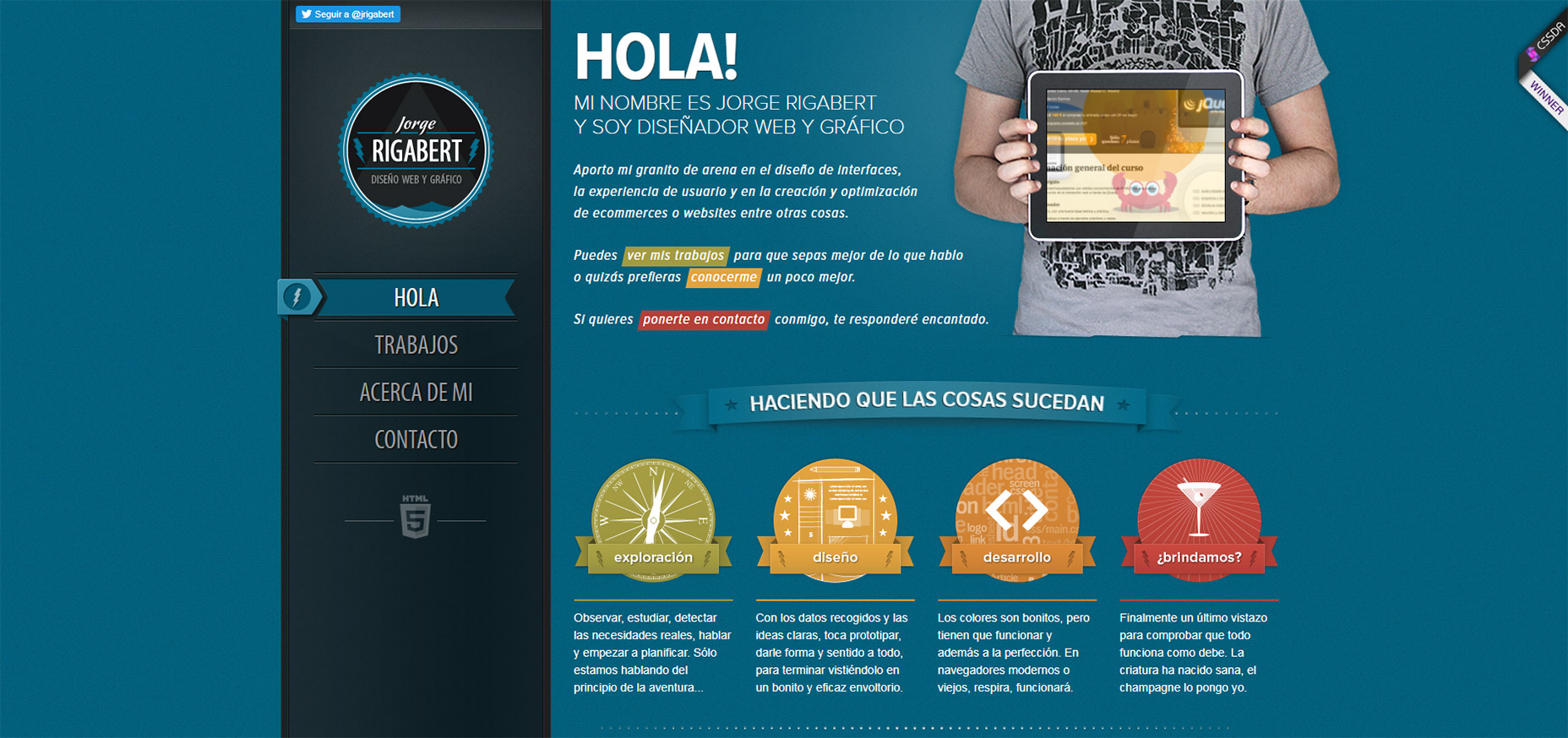
The portfolio website of Jorge Rigabert is another example of a non-English design with excellent user experience.
Whenever I see a website that I can’t read, but I still understand how to navigate, it tells me the site was designed well.
On this page you’ll find a fixed vertical nav that scrolls with you along the page. Since it’s a single-page design the links highlight depending on which section you’re viewing.
That’s a pretty common effect for single page layouts but it’s handled very nicely on Jorge’s page.
7. Daniel Filler
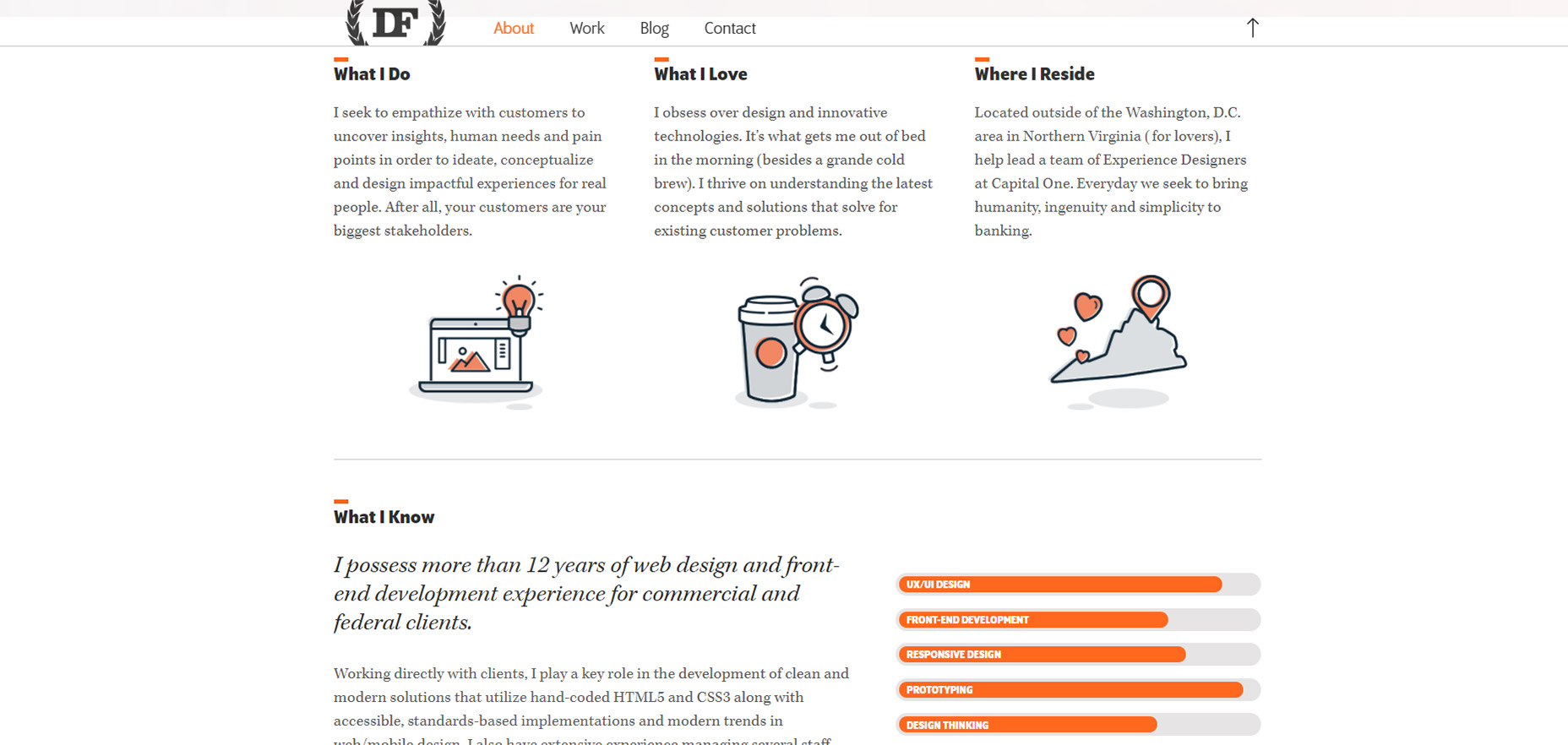
One other portfolio I really like is Daniel Filler’s site.
This borrows the same element from Grain & Mortar where you see the fullsize hero image header at the top, but as you scroll down the navbar shifts into “view mode” with a clean semi-transparent background.
If you search the web you’ll find plenty of ways to recreate this style. And there are lots of tips out there on designing great hero headers too.
The nicest thing about Daniel’s header bar is the small form. It doesn’t take up much space but you still know it’s his website. Also the small upwards-facing arrow is a nice touch to bring visitors right back to the top of the page(especially on mobile).
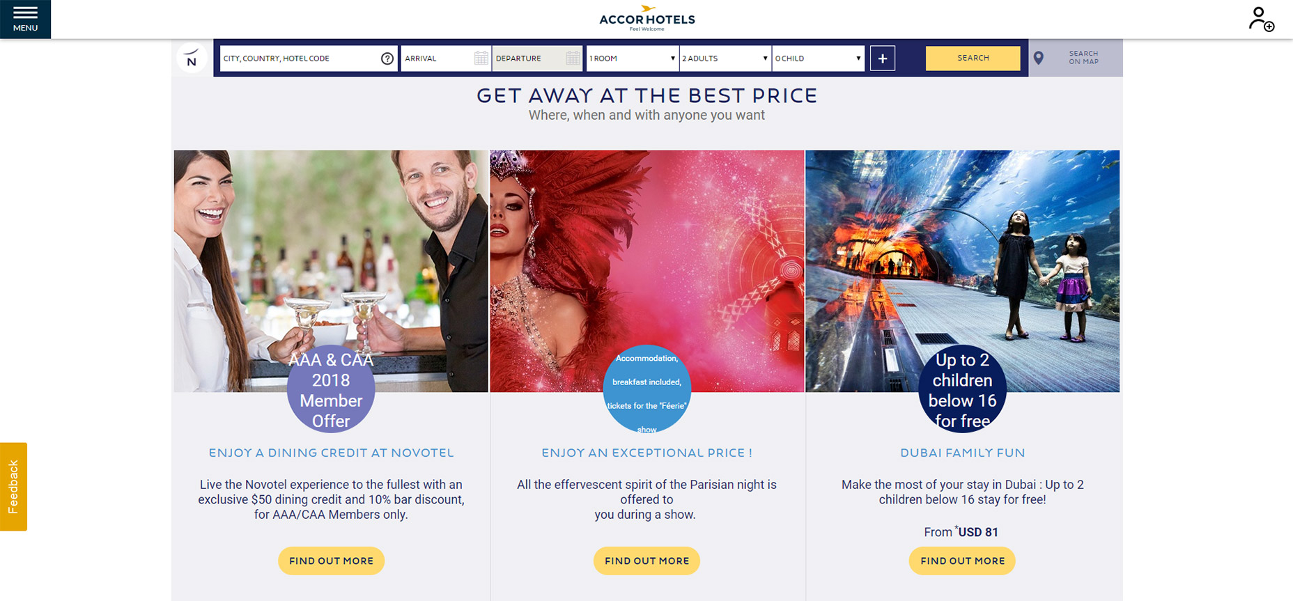
8. Novotel Hotels
Of all the hotel websites I’ve studied, the sticky nav on Novotel Hotels is definitely unique.
As you scroll down the navbar follows, of course.
But once you hit the booking details bar you’ll notice that gets stickied too. Pretty cool!
I’m sure this design technique helps to increase leads and help users plan their trips a lot faster.
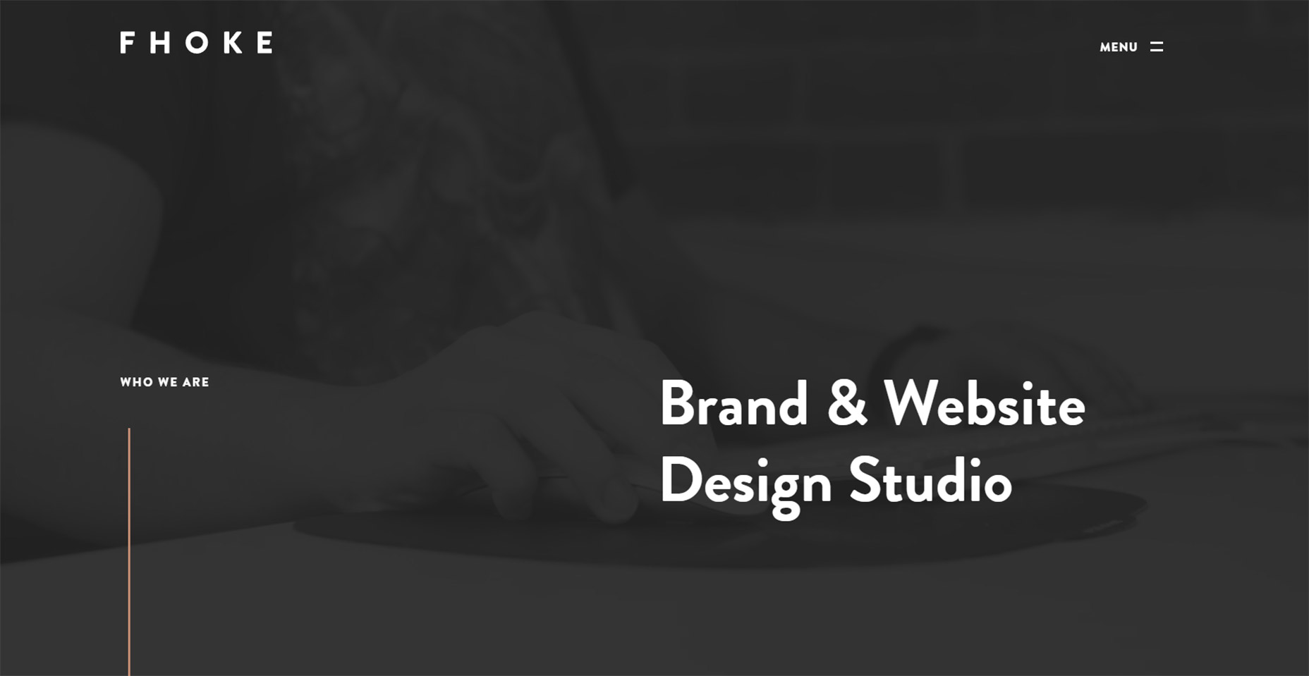
9. FHOKE
So the FHOKE agency has a pretty basic navigation.
It’s actually more like many smaller elements that follow you along the page, just kept near the top.
There is no background color on the navigation bar so the menu links blend seamlessly into the page. But they also change color as they pass over certain page elements.
This helps to increase contrast while still making the navigation accessible across the page.
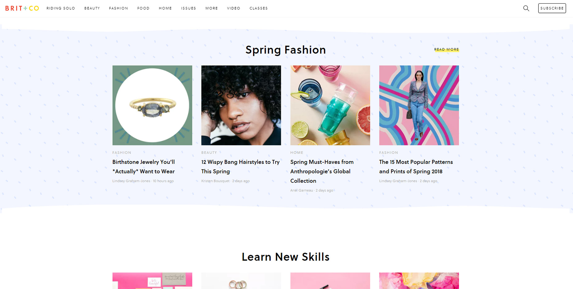
10. Brit + Co
There’s a couple nice things about the Brit + Co sticky navigation menu.
Going beyond the design and dropdowns, I really like the auto-hide feature which saves a lot of space while reading content.
When you scroll down the menu automatically hides out of view. Then as you scroll back up it pops out to greet you once more.
The other nice thing is the search feature, it’s all controlled dynamically and it falls directly underneath the navigation.
A very simple effect yet certainly something that’ll grab your eye.
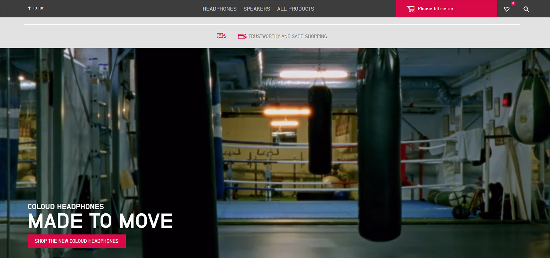
11. Coloud
Have a look at the Coloud website and scroll a bit on the page.
You’ll notice the top navigation does appear at the top, but it looks…different.
This navigation is minified so it takes up less space and it doesn’t even sport the company logo. Seems crazy but I think I get why.
People should know what site they’re on because the logo was at the very top when the page first loaded. Nobody is gonna forget the website just because they scroll down.
And the “scroll to top” link is probably more valuable than a logo anyways.
This seems like a technique that could do well on all sorts of ecommerce websites or lengthier blog posts.
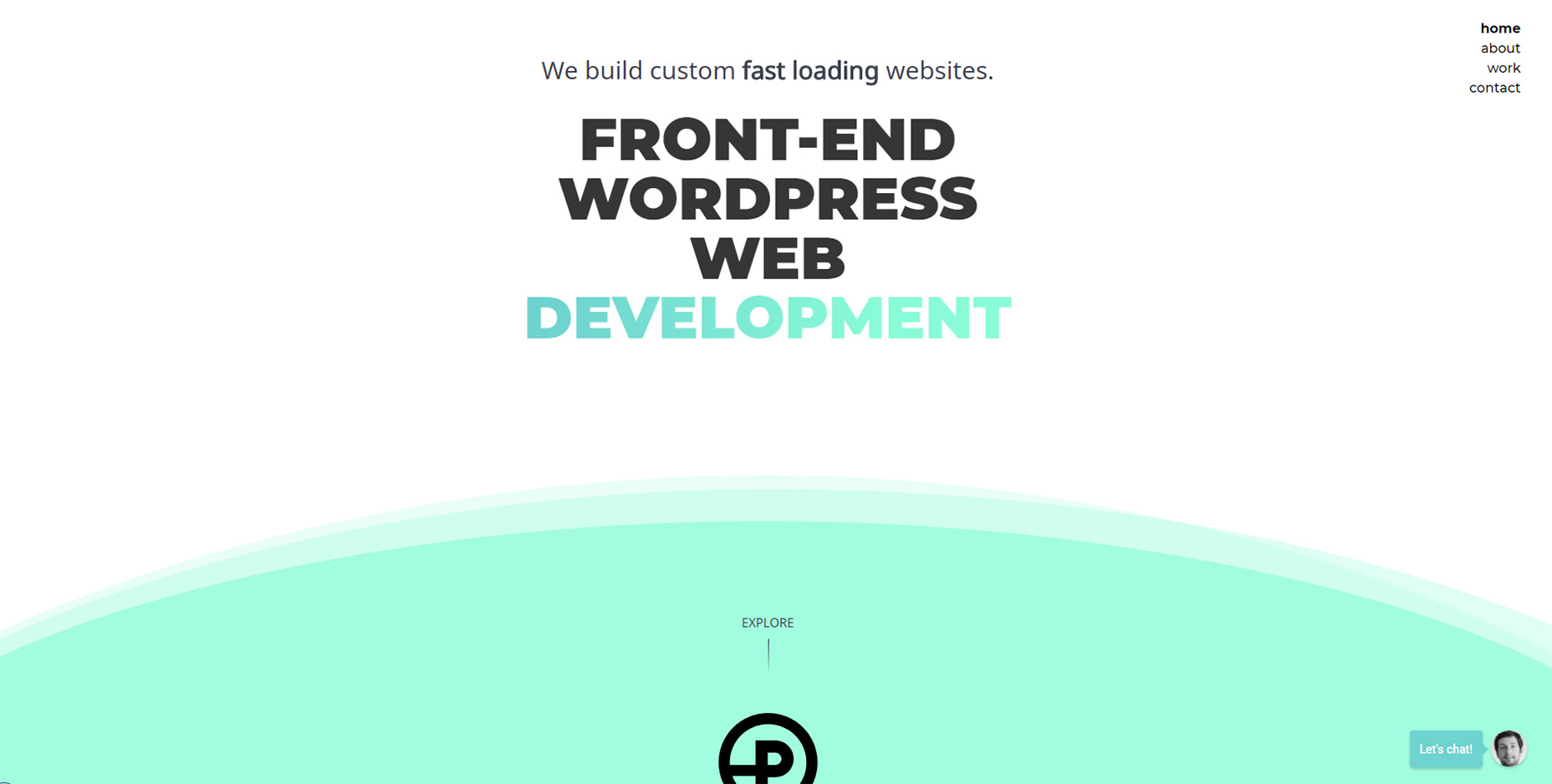
12. Prollective
Last but certainly not least is a simple example of sticky navigation in action.
Check out Prollective and have a look in the top-right corner. Four links in a vertical column.
And that’s it! No scrolling logo, no search bar, nothing else to get in the way. If you have a small website with only a few pages this can work tremendously well.
This technique saves space by avoiding the top bar and it still gives visitors direct access to all links from everywhere on the site. It’s an effect that could do very well on minimalist projects.
Add Realistic Chalk and Sketch Lettering Effects with Sketch’it – only $5!
![]()
Source
p img {display:inline-block; margin-right:10px;}
.alignleft {float:left;}
p.showcase {clear:both;}
body#browserfriendly p, body#podcast p, div#emailbody p{margin:0;}


Leave a Reply
Want to join the discussion?Feel free to contribute!