Motion Design: Hidden Treasures: Bauhaus Dessau

Original Source: http://feedproxy.google.com/~r/abduzeedo/~3/-NfxhQdQZz0/motion-design-hidden-treasures-bauhaus-dessau

Motion Design: Hidden Treasures: Bauhaus Dessau

Motion Design: Hidden Treasures: Bauhaus Dessau

abduzeedo
Jun 15, 2018

Sebastian Onufszak, LAFKON Publishing, Jürgen Branz and Stephan Bovenschen shared a lot more information on the process behind the beautiful Adobe project Hidden Treasures: Bauhaus Dessau. Below you can see five motion design clips for the Adobe project. They were screened on the largest media wall in Europe during the #FutureOfDesign event with Scott Belsky on June 13th in Hamburg. Commissioned by Faktor 3.

The #AdobeHiddenTreasures fonts were directed by Erik Spiekermann and Ferdinand Ulrich.
Review and production by Adobe Originals (Dan Rhatigan and Ernie March).

The fonts are available via Adobe Typekit. More about the #AdobeHiddenTreasures project here.

Credits
Design & Art Direction: Sebastian Onufszak
Animation: Benjamin Stephan, Christoph Haag, Sebastian Onufszak, Stephan Bovenschen
Sound Design: Jürgen Branz
Agency: Faktor 3, Peter Stützkowsky
Client: Adobe, Daniel Vargaz Diaz, Katja Dollinger
Screenshots

Color Code

Quote Charts

Projection on Media Wall

Film 01: Typeface “Xants”

Film 02: Typeface “Reross”

Film 03: Typeface “Alfarn”

Film 04: Typeface “Joschmi”

Film 05: Typeface “”


15 Famous Movie Posters to Inspire Your Next Project

Original Source: http://feedproxy.google.com/~r/Designrfix/~3/XvE6xJyCXj0/famous-movie-posters

The poster for a feature film helps to sell the movie itself. It works as a single-frame trailer to capture the potential viewer’s attention. That draws them into the excitement of the plot.A great poster can be a subtle image that leaves the viewer guessing about the secrets of the movie, from the most famous […]

The post 15 Famous Movie Posters to Inspire Your Next Project appeared first on designrfix.com.

Brand Identity for The Clifford Pier Singapore

Original Source: http://feedproxy.google.com/~r/abduzeedo/~3/Fn-Y3uO5Qzg/brand-identity-clifford-pier-singapore

Brand Identity for The Clifford Pier Singapore

Brand Identity for The Clifford Pier Singapore

AoiroStudio
Jun 14, 2018

It’s booked! We will be heading down to Singapore for our yearly vacation, nothing cooler than exploring designers, artists, and photographers based in this beautiful country. Let’s take a look at the work of Foreign Policy and their Brand Identity for The Clifford Pier. I took this particular project because the design truly reflects the colours from Singapore after watching so many travel videos on the subject. As they quote: “Collaterals with color palette in sea-foam, coral and Caspian blue; classic postage stamps accented with tropical flora and fauna”.

Sharing an entity with its heritage, The Clifford Pier draws from its legacy as a bustling port in Singapore during the 1930s. Ginger flower motifs pay homage to William Farquhar who was fascinated with local botany during his time on the island. Collaterals with color palette in sea-foam, coral and caspian blue; classic postage stamps accented with tropical flora and fauna, along with architectural elements, are reminiscent of the glorious voyages that set sail from this historical landmark.

More Links
Learn more about Foreign Policy
Brand Identity & Graphic Design
Brand Identity for The Clifford Pier SingaporeBrand Identity for The Clifford Pier SingaporeBrand Identity for The Clifford Pier SingaporeBrand Identity for The Clifford Pier SingaporeBrand Identity for The Clifford Pier SingaporeBrand Identity for The Clifford Pier SingaporeBrand Identity for The Clifford Pier SingaporeBrand Identity for The Clifford Pier SingaporeBrand Identity for The Clifford Pier SingaporeBrand Identity for The Clifford Pier SingaporeBrand Identity for The Clifford Pier SingaporeBrand Identity for The Clifford Pier SingaporeBrand Identity for The Clifford Pier SingaporeBrand Identity for The Clifford Pier Singapore

brand identity
branding
graphic design


Self-hosted Cloud Storage: Nextcloud vs. ownCloud vs. Seafile

Original Source: https://www.hongkiat.com/blog/self-hosted-cloud-storage-nextcloud-owncloud-seafile/

Are you planning to build your own Dropbox-type cloud storage for your team or business? Though there are various self-hosted cloud solutions for creating a private cloud yet all of them will not fit…

Visit hongkiat.com for full content.

Typekit Announces Bauhaus-Inspired Fonts

Original Source: https://www.webdesignerdepot.com/2018/06/typekit-announces-bauhaus-inspired-fonts/

Bauhaus (meaning School of Building) is a legendary design school, based in Germany in the early part of the 20th century. Although it survived just 14 years—closed by political pressure as the Third Reich rose to power—and despite constant philosophical changes under the leadership of Walter Gropius, Hannes Meyer, and Ludwig Mies van der Rohe, the school has directly, or indirectly influenced every generation of designers since.

From its central philosophy that form follows function, to the pioneering color theory of its influential teacher Johannes Itten, to its lasting legacy of students like Max Bill; it is impossible to overstate Bauhaus’ importance in the history of modern design.

99 years after Bauhaus first opened its doors, Adobe Typekit has launched a campaign to bring to life original Bauhaus type designs, in the form of five new typefaces designed by students and type professionals.

Overseeing the project, in conjunction with experts at the Bauhaus Dessau Foundation, is legendary affogatos consumer and type designer Erik Spiekermann.

Five New Bauhaus Fonts

Two fonts are currently available via Typekit:

Joost Schmidt arguably did more to define Bauhaus’ approach to typography, teaching type design at the school 1925–1932. His designs have been revived by Flavia Zimbardi in the form of Joschmi, a full alphabet painstakingly reconstructed from an original sketch of just six letterforms (a, b, c, d, e, and g).

Xanti Schwinsky developed one of the widest and most cross-media approaches to design, experimenting with everything from design to performance, this designs have been revived by Luca Pellegrini in the form of Xants, redrawing the typeface for modern use and adding the punctuation and symbols required to make the font functional.

Another three fonts will be made available in the coming months based on three other Bauhaus legends:

Alfred Arndt’s posters are amongst the most significant typographic works to emerge from the Bauhaus. His type sketches have been revived by Céline Hurka.

Reinhold Rossig is one of the most prolific and experimental typeface designers of Bauhaus, his designs have been revived by Hermann Werner and Elia Preuss.

Carl Marx began studying poster design and print media at Bauhaus, but soon switched to the painting course under Wassily Kandinsky. His type work has been revived by Hidetaka Yamasaki.

Adobe Design Competition

To support the initiative over the coming months, Adobe is running a series of five design competitions.

The first challenge is a create a logo with one or more of the Bauhaus Dessau fonts, and share an image or Behance project link with the hashtags #AdobeHiddenTreasures and #contest. The winner will receive a 13-inch MacBook Pro and a one-year subscription to Creative Cloud.

Future challenges include designing a poster, business card, and homepage. A selection of the best submissions from all the projects will be featured in an exhibition at the Bauhaus Dessau in Germany.

A grand prize winner will be selected from all the submissions to receive an all-expenses paid trip to Dessau in Germany to visit the Bauhaus archives and UNESCO World Heritage site.

Add Realistic Chalk and Sketch Lettering Effects with Sketch’it – only $5!

Source

p img {display:inline-block; margin-right:10px;}
.alignleft {float:left;}
p.showcase {clear:both;}
body#browserfriendly p, body#podcast p, div#emailbody p{margin:0;}

10 Resources to Find Free Textures

Original Source: http://feedproxy.google.com/~r/1stwebdesigner/~3/_g3o5Ei4lgY/

Textures are an all-but-necessary component in web design. They can give a webpage depth, draw the eye to key elements, serve as great backgrounds and just look great when used well! If you’re looking for free textures to enhance your projects, you’ve come to the right place. Here are ten free websites where you can download high-quality textures.

Free Stock Textures

Free Stock Textures

Created by two photographers and artists, this website hosts a ton of textures all licensed under Creative Commons Zero. From nature, to concrete, to abstract – there are all sorts of images to find here. You can also sort by tags, so it’s easy to find what you’re looking for.

There’s a download limit of 5 per day for anonymous users and 50 for registered users.

Pexels

Pexels

Pexels is a free stock photography resource, which has a textures section that contains tons of gorgeous, high-quality images. Images are user-uploaded and licensed under CC0. And there’s no download limit, so you can get as many as you want!

Unsplash

Unsplash

Unsplash is a free photography website supported by a large community of photographers. There are tons of textures and patterns, all available for personal and commercial use under CC0.

Textures.com

Textures.com

Textures.com is a versatile site that comes with basically every kind of textured graphic you can think of. Need photos? 3D scanned surfaces? Panoramas, decals or brushes? You can find them here. The robust search feature allows you to search for specific textures as well as tags like “seamless” or “scanned”.

You can download up to 15 images a day with an account. From there, you’ll need to purchase credits or a subscription. You’ll also need credits to download larger files.

Vecteezy

Vecteezy

Need textured vectors? Vecteezy is the place to find them. There are tons of beautiful, clean vectors available for download. Some are free while others require credit. You can sort by license, which is really helpful if you only want to see the free images.

Wild Textures

Wild Textures

Wild Textures has textures of all kinds, but where the website shines is in its sorting system. You can sort by categories, tags and even by color! This makes it super easy to find the perfect texture. There’s also some auto-generated previews of the pictures used for different functions.

Stockvault

Stockvault

This vault of stock photos and textures contains everything from grungy patterns to the abstract. Simple or complex, you’ll find a high-definition picture that fits your needs here. Users who upload can choose from commercial or non-commercial use, or public domain – so make sure to check the license.

Freepik

Freepik

Freepik has a massive library of vector textures that come in .ai and .eps format. Without buying a plan, you’re limited to 5 anonymous and 30 registered downloads a day. There are also a few commercial stipulations.

Texturelib

Texturelib

A small-but-robust library, Texturelib is free for personal or commercial use. Most of the images are inspired by nature, but there are also quite a few architecture textures – such as photos of roads, windows and doors.

TextureKing

TextureKing

TextureKing has a variety of grungy, nature-like textures, available for use in almost any commercial project. While the site features about 400 images and doesn’t appear to be updated very often, there are a few categories to pick from, and the high-quality textures can be downloaded for free without an account.

Textures in Web Design

When used correctly (and perhaps sparingly), textures are a great design choice. Use them to call attention to important elements, to craft a rough, grungy atmosphere – and to add depth and beauty to a flat design! With so many free resources, you should have all the tools you need to craft deep, gorgeous websites.


How Analytics Can Explain Your Abandoned Checkouts

Original Source: https://www.sitepoint.com/how-analytics-can-explain-your-abandoned-checkouts/

If you’re in the ecommerce business, you already know that users often abandon their carts at the checkouts. In fact, studies indicate that the average rate of cart abandonment is 67.91%, although this can be as high as 80% in some cases. Annoying, right?

Why are users doing that? Well, the answer lies in your analytics.

People abandon checkouts for various reasons, and those reasons can vary by user demographic, geographic location and more. It can even be the shock of unexpected shipping costs, or that users aren’t convinced their sensitive details are secure on your website.

And of course, UX plays a huge role in that too. Users hate:

broken functionality
confusing checkout flows
signing up before checking out.

Reasons for abandonments during checkouts

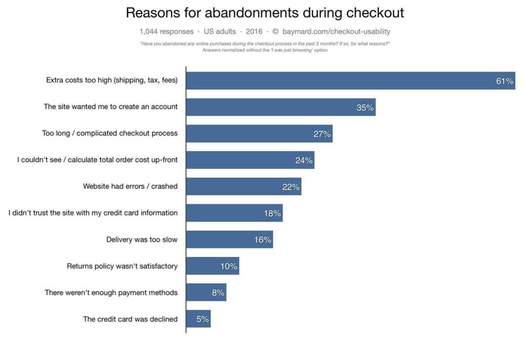
Three out of four checkout abandonments are due to a sub-optimal user experience, but which of these causes is eating into your revenue?

Tools like Google Analytics, Hotjar, Fullstory, Crazy Egg and Optimizely can help us decipher what’s causing our shopping cart abandonments, and come up with effective solutions to improve UX.

In fact, you can easily recover 5–10% of your abandoned carts. Isn’t that cool?

First we’ll detect where users are leaving our website, then why they’re leaving our website, then how we can improve the UX so that future users don’t leave our website. The result? More revenue!

It’s also worth noting that while 59% of shopping experiences happen on mobile, only 15% of dollars are spent on mobile. This indicates that some of the most common UX shortcomings are mobile-specific.

What Tools Can We Use to Analyze User Behavior?

By analyzing user demographics and user behavior, you can improve your website’s user experience. Even though there are many tools that can allow you to do this, I’ll run through this tutorial using Google Analytics (free) and Crazy Egg (affordable) today.

With a quick setup, Google Analytics will help you to understand your visitors as they interact with your website, and from this we can identify where exactly visitors are abandoning our websites.

Crazy Egg is an advanced heatmap tool that allows you to observe those drop-offs in more detail, and to establish why users left and didn’t convert. With Crazy Egg, you’re able to dig deeper into that.

Setting up Conversion Funnels in Google Analytics

A conversion funnel is the journey a customer takes as they convert. We can use Google Analytics to record and analyze these conversion funnels, which begins with you inserting a few lines of JavaScript code on your website (to enable the tracking), although some ecommerce platforms help you to set this up without any code.

Now we need to set up a funnel to measure the conversion rate.

Step 1: Goals

First, log in to your Google Analytics dashboard and click on the Admin tab in the left-hand sidebar, then Goals.

Step 2: Creating a New Goal

Click the + New Goal button, and choose the relevant Goal template, which in this case is Place an order.

After that, click on the Next Step button.

Step 3: Describing the Goal

Next, give your Goal a name, and under the Type heading, choose what needs to be happen to trigger this Goal. In this case, the Goal is triggered when the user reaches the checkout confirmation screen, so choose Destination as the Goal Type.

Step 4: Goal Details

In Goal Details, you’ll need to reference the destination URL. This is the web page that visitors are taken to after they complete their checkout. If you’re using Shopify as your ecommerce CMS, this will most likely be /checkout/thank_you/, although it’ll vary by CMS.

Leave the monetary Value turned off and the Funnel option on.

Next, list all of the web pages (and their URLs) that shoppers navigate through during the checkout flow. The example below represents a typical setup for an ecommerce website hosted on Shopify.

A typical setup for an ecommerce website

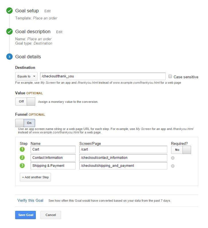
Click the Verify this Goal button before the Save Goal button.

The post How Analytics Can Explain Your Abandoned Checkouts appeared first on SitePoint.

Improving Performance Perception with Pingdom and GTmetrix

Original Source: https://www.sitepoint.com/improving-performance-perception-pingdom-gtmetrix/

This article is part of a series on building a sample application — a multi-image gallery blog — for performance benchmarking and optimizations. (View the repo here.)

In this article, we’ll analyze our gallery application using the tools we explained in the previous guide, and we’ll look at possible ways to further improve its performance.

As per the previous post, please set up Ngrok and pipe to the locally hosted app through it, or host the app on a demo server of your own. This static URL will enable us to test our app with external tools like GTmetrix and Pingdom Tools.

GTmetrix first test

We went and scanned our website with GTmetrix to see how we can improve it. We see that results, albeit not catastrophically bad, still have room for improvement.

The first tab — PageSpeed — contains a list of recommendations by Google. The first item under the PageSpeed tab — a warning about a consistent URL — pertains to our application outputting the images randomly, so that is an item we will skip. The next thing we can do something about is browser caching.

Browser Caching

Browser caching

We see that there is a main.css file that needs its Expires headers set, and the images in the gallery need the same thing. Now, the first idea for these static files would be to set this in our Nginx configuration:

location ~* .(?:ico|css|js|gif|jpe?g|png)$ {
expires 14d;
}

We can simply put this inside our server block and leave it to Nginx, right?

Well, not really. This will take care of our static files, like CSS, but the /raw images we are being warned about aren’t really that static. So this snippet in our Nginx configuration won’t exactly fix this issue so easily. For our images, we have an actual controller that creates these on the fly, so it would be ideal if we could set our response headers right there, in the controller. For some reason, these weren’t being set properly by Glide.

Maybe we could set our Nginx directive in a way to include the raw resources, but we felt the controller approach to be more future-proof. This is because we aren’t sure what other content may end up with an raw suffix eventually — maybe some videos, or even audio files.

So, we opened /src/ImageController.php in our image gallery app, and dropped these two lines inside of our serveImageAction(), just before the line return $response:

// cache for 2 weeks
$response->setSharedMaxAge(1209600);
// (optional) set a custom Cache-Control directive
$response->headers->addCacheControlDirective(‘must-revalidate’, true);

This will modify our dynamic image responses by adding the proper Cache Control and Expires headers.

Symfony has more comprehensive options for the caching of responses, as documented here.

Having restarted Nginx, we re-tested our app in GTmetrix, and lo and behold:

Browser Caching

The post Improving Performance Perception with Pingdom and GTmetrix appeared first on SitePoint.

Collective #426

Original Source: http://feedproxy.google.com/~r/tympanus/~3/UEneBiHoou8/

C426_WOTW

Inspirational Website of the Week: OGINO

Pure and perfect design with smooth interactions. Our pick this week.

Get inspired

C426_Monday

This content is sponsored via Syndicate Ads
monday.com – A Revolutionary Visual Project Management Tool

?monday.com – the next generation of visual tools, built specifically for designers and developers. See what everyone on your team’s working on in a single glance.

Sign me up

C426_modules

Using JavaScript modules on the web

Addy Osmani and Mathias Bynens explain how to use JavaScript modules which are now supported in all major browsers.

Read it

C426_countdown

Building a Fancy Countdown Timer with MomentumSlider.js

Luis Manuel shows how to code a really nice looking countdown timer.

Read it

C426_jsconsole

How you can improve your workflow using the JavaScript console

Riccardo Canella shows how to use the JavaScript console to write, manage, and monitor JavaScript in the browser.

Read it

C426_soccerpattern

Soccerpattern

A retrospective of the greatest jerseys worn during soccer worldcups from 1930 to nowadays, as pattern designs.

Check it out

C426_vibora

Vibora (beta)

A very efficient, asynchronous Python web framework.

Check it out

C426_teleport

Introducing Teleport: Over-the-air hot reloading & debugging for PWAs

Eric Simons introduces Teleport, a fast dev-server proxy for simple and painless PWA debugging.

Check it out

C426_centering

Centering: The Newest Coolest Way vs. The Oldest Coolest Way

Chris Coyier updates us with the freshest way to center items using CSS Grid.

Check it out

C426_redux

Understanding Redux: The World’s Easiest Guide to Beginning Redux

A comprehensive and easy to understand guide to Redux by Ohans Emmanuel.

Read it

C426_pixelbuddha

Terrazzo Abstract Patterns

A set of 16 modern patterns for your next stylish design. By Pixelbuddha.

Check it out

C426_voronoi

Voronoi Airports WebGL

A fantastic WebGL experiment showing all airports in the world as a Voronoi diagram. By Callum Prentice.

Check it out

C426_websiteperf

Optimize Website Speed With Chrome DevTools

A tutorial by Kayce Basques where he shows how to use Chrome DevTools to find ways to make your websites load faster.

Read it

C426_browserbug2

I discovered a browser bug

Jake Archibald tells the interesting story of a huge browser bug he ran into.

Read it

C426_notifications

iOS 12 Dark Mode Notifications

Gabrielle Wee created this beautiful design for dark mode notifications on iOS 12.

Check it out

C426_video

Three.js & Video: A love story

Read about a great experiment of interactive video in HTML5 using Three.js by Héctor Monerris.

Read it

C426_placeholder

Don’t Use The Placeholder Attribute

Read why Eric Bailey urges developers to stop using the placeholder attribute.

Read it

C426_layoutsgrid

Three Grids

Tobi Reif made three different responsive layouts that show the awesomeness of CSS Grid.

Check it out

C426_logos

Open Logos

Some lovely free logos for your open source project.

Check it out

C426_drop

SVG Drip Loader

A fun SVG loader by Chris Gannon.

Check it out

C426_draw

Drawing Zone

Michael Shillingburg updated his fun doodeling tool.

Check it out

Collective #426 was written by Pedro Botelho and published on Codrops.

10 Beautifully Designed Free Bootstrap Dashboard Admin Templates

Original Source: http://feedproxy.google.com/~r/1stwebdesigner/~3/0UZO-ek0L5E/

The goal of any admin area (a.k.a. “Dashboard”;) should be to provide all the functions a user needs and doing so with their ease-of-use in mind. Using the popular Bootstrap framework, you can create an administration area that excels in both form and function.

Here are 10 free Bootstrap-based themes that will help to turn your custom admin area into a user-friendly powerhouse.

All the Admin Templates You Could Ask For

Bootstrap Admin Templates
2M+ items from the worlds largest marketplace for Admin Templates, Themes & Design Assets. All of it can be found at Envato Market.

DOWNLOAD NOW

AdminLTE

AdminLTE is a lightweight theme that prides itself on being both beautiful and useful. It’s fully responsive, includes a selection of six skins and is even optimized for printing.

AdminLTE

Material Dashboard

Built with Google’s Material Design in mind, Material Dashboard is clean and colorful. The UI is inspired a bit by layered sheets of paper and uses light, surface and movement to create an easy-to-use dashboard.

Material Dashboard

AdminBSB – Material Design

Those looking for a very Google-like interface will love AdminBSB – Material Design. It follows the principles of Material Design while providing users with a familiar-looking GUI.

AdminBSB - Material Design

BootFlat Admin

BootFlat Admin features an attractive and easy-to-navigate dashboard area. As its name indicates, it uses the BootFlat flat UI kit.

BootFlat Admin

Klorofil

Klorofil features lots of useful elements such as charts, timelines, notifications and ready-to-use page templates. It provides you with all the basics you’ll need to build a perfect backend to your site or web-based app.

Klorofil

Shoppy E commerce Admin Panel

Using vibrant colors and a flat UI, Shoppy is a great choice for a custom eCommerce dashboard. It’s fully responsive and includes lots of goodies like buttons, icons and animated charts.

Shoppy E commerce Admin Panel

Paper Dashboard

Unlike a lot of admin themes out there, Paper Dashboard is quite subtle in its use of color. That leads to a beautiful UI that may have a bit more of a calming effect than other, more cluttered choices.

Paper Dashboard

Bluebox

There’s something to be said for simplicity in color scheme. Bluebox does it to near perfection in that the consistent use of blue makes it easy to find what you’re looking for. It comes with lots of UI elements while supporting Google Fonts and Fontawesome Icons.

Bluebox

Blocks – Single Page Admin

Blocks takes a different approach to the admin screen by utilizing a fully-widgetized UI. Also gone is the ubiquitous left-side navigation in favor of a much more subtle menu across the top. This just goes to show that there is more than one way to create an appealing admin layout.

Blocks – Single Page Admin

Free Responsive Horizontal Admin

Free Responsive Horizontal Admin also eschews the standard left menu. The theme also makes nice use of white space and sports a muted color scheme. This could be a solid choice for those who need a more simple and minimal type of dashboard.

Free Responsive Horizontal Admin

Admin Themes That Help You Take Control

Admin areas have, to some degree, gotten a bit stale – especially when you look at what some popular CMS are doing. Part of their problem is that you don’t necessarily want to make radical changes to a UI that millions are comfortable with.

So the real innovations are coming in the form of the roll-your-own dashboards, like the ones featured above. Building your own admin can free you up to take a few more chances than the bigger players out there. These Bootstrap-based themes are proof that there is still a lot of room for both improvement and different ideas.