Creating Tables In Figma

Original Source: https://www.smashingmagazine.com/2019/09/creating-tables-in-figma/

Creating Tables In Figma

Creating Tables In Figma

Sasha Belichenko

2019-09-25T12:30:59+02:00
2019-09-25T17:05:50+00:00

In this tutorial, we will talk about how tables can be created in Figma by using components and Atomic Design methodology. We will also take a look at the basic elements of the table layout and how components can be included in the component library so that they can become part of the design system you are using.

To make it easy for you, I’ve prepared a mockup example that uses all of the components we need for this tutorial.

To follow along, you will need to have at least some understanding of the basic Figma concepts, its interface, and how to work with Figma components. However, if you’re new to Figma and working with table data, I recommend watching the “Getting Started” video to help you better understand Figma end-to-end, as well as the article “How To Architect A Complex Web Table” that was published not too long ago here on Smashing Magazine.

To simplify the scope of this tutorial, let’s assume that the colors, fonts, and effects already exist as styles in the Figma project you’re about to begin. In terms of Atomic Design, they are atoms. (To learn more, the folks at littleBits wrote a great article on the topic.)

The target audience for this tutorial are designers (UX, UI) who have either already adopted Figma into their workflows or are planning to try Figma in their next design projects but aren’t sure how to get started.

So, without further ado, let’s dig in!

Quick Note: While writing this article, Figma introduced plugins. At the time of publishing, there weren’t any good ones for working with tables, but things might change fast. Who knows, maybe this article will actually help an aspiring Figma plugin developer to create a really neat Figma Tables plugin, or at least, I hope it will. ?

Introduction

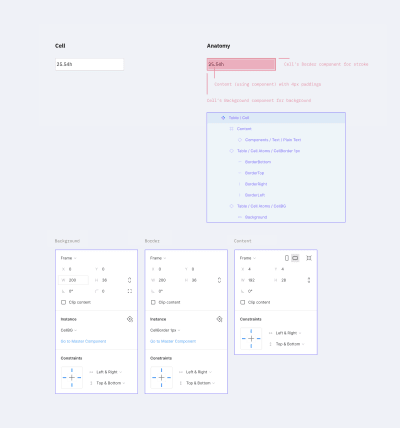
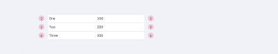
Imagine the table as an organism. The table cell is then a molecule which is comprised of individual atoms. In design terms, they’re cell properties.

So, let’s start with the cell. It has three properties:

Background
Border
Content

Now we’ll take a closer look at each one of them.
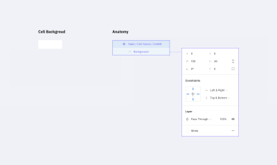
Background

The background will be a separate component in Figma. The size doesn’t really matter since we can stretch the component as we need, but let’s begin with setting the size to 100×36 pixels.

In this component, add a rectangle of the same size as the component itself. It will be the only object inside the component. We need to attach the rectangle’s borders to the component’s borders by using constraints (set constraints to “Left & Right” and “Top & Bottom” at the right panel in the Constraints section), so that the rectangle stretches automatically to the size of the component.

If you’d like to see this in action, watch this tutorial on how the constraints work in Figma.

The Background Component

The Background Component (the ‘atom’) (Large preview)

The fill color of the rectangle will determine the background color of the cell. Let’s pick the white color for it. I recommend choosing that color from the color styles that are configured at the beginning of the project.

Background color
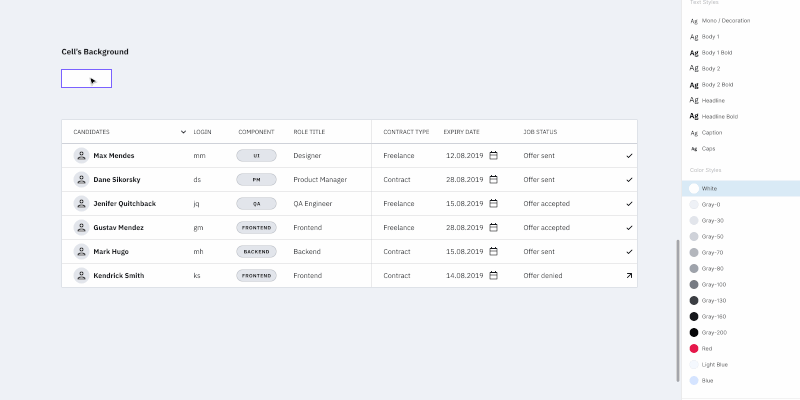
Changing the background color (Large preview)

Border

This one is a bit trickier than the background. You can’t just create one rectangle with a stroke. We may need different kinds of borders: one for the separate cells (with borders around), one for the whole row of cells with only top and bottom borders, or one for the table header that we might want to separate from the rest with a wider line. There are many options.

Border properties:

Border line (left, right, top, bottom, or absence of any of them)
Line width
Line color
Line style

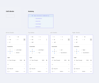
Each line within the cell border might havea different width, color, and style. For example, the left one could be a continuous red line, and the top one a dotted grey line.

Let’s create a component with a size of 100×36 pixels (the same as we did before). Inside the component, we need to add 4 lines for each border. Now pay attention to how we are going to do this.

Add a line for the bottom border with the length of the component width;
Set its position to the bottom border and constraints to stretch horizontally and stick to the bottom border;
For the top border, duplicate the line for the bottom border, rotate it by 180 degrees and stick to the top of the component. (Don’t forget to change its constraints to stick to the top and stretch horizontally.);
Next, for the left border, simply rotate by -90 degrees and set its position and constraints to be at the left side sticking to the left border and stretching vertically;
Last but not least, you can create the right border by rotating it by 90 degrees and setting its position and constraints. Set stroke color and stroke width for each line to gray (select from the color styles) and 1 pixel respectively.

Note: You may be asking yourself why we rotated the line for the bottom border. Well, when you change the stroke width for a line in Figma, it will rise. So we had to set this “rise” direction to the center of the component. Changing the line’s stroke width (in our case it is the border size) won’t expand outside the component (cell).

Now we can hide or customize the styles separately for every border in the cell.

The Border Component

A border component with 1px stroke (Large preview)

If your project has several styles for table borders (a few border examples shown below), you should create a separate component for each style. Simply create a new master component as we did before and customize it the way you need.

Border Styles

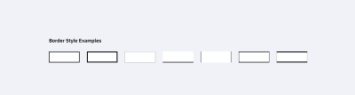
A few extra examples of border styles. Note that the white background is not included in the component. (Large preview)

The separate stroke component will save up lots of your time and add scalability. If you change the stroke color inside the master component, the whole table will adjust. Same as with the background color above, each individual cell can have its own stroke parameters.

Border’s width and colorChanging border’s width and color (Large preview)

Content

This is the most complex component of all.

We need to create all possible variations of the table content in the project: plain text, a text with an icon (left or right, different alignment), checkboxes, switches, and any other content that a cell may possibly contain. To simplify this tutorial, please check the components in the mockup file. How to create and organize components in Figma is a topic for another article.

However, there are a few requirements for content components:

Components should stretch easily both vertically and horizontally to fit inside a cell;
The minimum size of the component should be less than the default cell size (especially height, keep in mind possible cell paddings);
Avoid any margins, so the components can align properly inside a cell;
Avoid unnecessary backgrounds because a cell itself has it already.

Content components examples

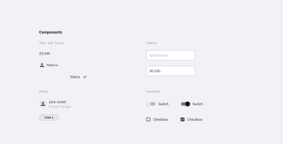
Examples of cell content in components. This is not a complete list; you can use most of the components of your design system inside a table. (Large preview)

Content components can be created gradually: start with the basic ones like text components and add new ones as the project grows in size.

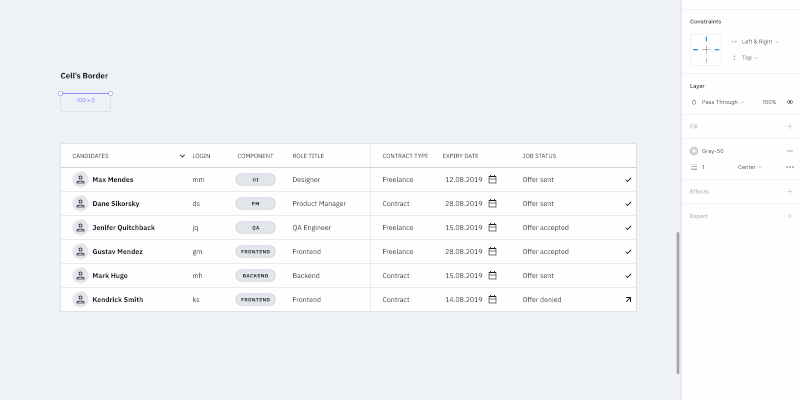
The reason we want the content to be in components is the same as with other elements — it saves uptime. To change the cell’s content, we just need to switch it in the component.

Changing the component inside the cell
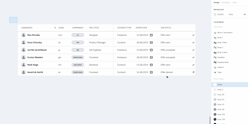
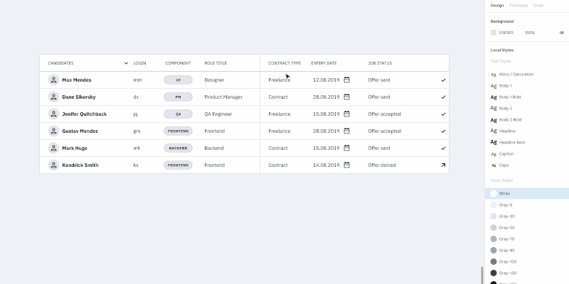
Editing the table using cells components (Large preview)

Creating A Cell Component

We created all the atoms we need: background, border, content. It’s time to create a cell component, i.e. the molecule made from atoms. Let’s gather all the components in a cell.

The cell component

The cell component (the ‘molecule’) (Large preview)

Set the background component as the bottom layer and stretch it to the whole cell size (set constraints to “Left & Right” and “Top & Bottom”).

Add the border component with the same constraints as the background component.

Now to the most complicated part — the content content.

The cell has paddings, so you need to make a frame with the component’s content. That frame should be stretched to the whole cell size except for the paddings. The content component should also be stretched to the whole frame size. The content itself needs to be deprived of any margins, so all paddings will be set by the cell.

At the end of the day, cell paddings are the only property in a component that we will set only once without an opportunity to change it later. In the example above, I made it 4px for all sides.

Note: As a fix, you can create columns with empty cells (with no content and width of 16px for example) left and right to the column where extra margin is needed. Or if your table’s design allows, you can add horizontal paddings inside the cell component. For example, cells in Google Material Design have 16px paddings by default.

Don’t forget to remove the “Clip content” option for the cell and frame (this can be done at the right-hand panel in the Properties section). The cell’s content can go out of its borders; for example, when a dropdown is inside your cell and you want to show its state with a popup.

Note: We’ll be using this cell style as the main one. Don’t worry if your table has additional styles — we’ll cover that in the Table States and Components, Not Overrides sections.

Cell Options For A Standard Table

This step could be optional but if your table needs states then you can’t go without it. And even more so if there is more than one border style in the table.

So let’s create additional cell components from which it’d be easier to build up a table. When working with a table, we will select the appropriate component depending on its position in the table (e.g. depending on the type of borders).

In order to do that, let’s take our cell component and create eight more masters from it. We also need to disable the appropriate layers responsible for borders. The result should look like the image below.

Cell options

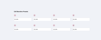
The cell options we need to build a table. Note that there could be a few extra depending on your table borders styles. (Large preview)

The top row is for the cells on top and in the middle of the table. The bottom row is only for the cells at the bottom. This way we’ll be able to put the cells one after another with no gaps and keep the same stroke width.

A few examples:

The First example

If each cell in the table has a border, we’d only need cells 1, 4, 5 and 8. (Large preview)

The Second example

If there are merged cells or border absence, we must apply the rest 2 and 3 cells as well as 6 and 7 to the bottom row. (Large preview)

The Third example

If the table design considers the absence of vertical borders, cells 2 and 6 would be enough. (Large preview)

Note: For each border style created above, it’d be good to add master components like the ones described earlier.

So we have excluded the necessity of overriding cell’s instances (disabling the appropriate layers, to be precise). Instead of that, we use various components. Now if, for example, a column uses a different style from the default (the fill color or border), you can choose this column and simply change the relative component. And everything will be alright. On the opposite side, changing a border of each cell manually (disabling the appropriate borders) is a pain you don’t want to bother with.

Now we are ready to create tables (in terms of Atomic Design — organisms) from the various cell components (molecules) we made.

Customizing The Table

Changing the row’s height in the whole table is relatively easy: highlight the table, change the element height (in this case, the cell’s height, H in the right-hand panel in the Properties section), and then change the vertical margin from the element to 0. That’s it: changing the line height took two clicks!

Changing the row heightChanging the row height for the whole table (Large preview)

Changing the column width: highlight the column and change the width size. After moving the rest of the table close up, select the whole table by using the Tide Up option in the Alignment panel as well as the first item in the dropdown list under the rightmost icon.

Changing the column widthChanging the column width. (Large preview)

Note: I wouldn’t recommend grouping rows and columns. If you change the column size extending the elements, you’ll get fractional values for width and height. If you don’t group them and snap to the pixel grid, the cell size will remain an integer number.

The background color, stroke type, and content data can be changed in the appropriate component or in one of the eight cells master components (cells that had different stroke styles). The only parameter that can’t be changed right away is the cell margins, e.g. content paddings. The rest are easily customizable.

Components, Not Overrides

Looking at what we got in the end, it might seem like overkill. And it is if there is only one table in your project. In this case, you can simply create one cell component and leave the background and stroke components off. Simply include them in the cell component, create the table and do the necessary customization for each separate cell.

But if components are included in a library that is used by a number of other files, here comes the most interesting stuff.

Note: *I do not recommend changing the background color and stroke in components’ instances. Change them only in the master. By doing so, those instances with overrides won’t get updated. This means you would have to do that manually and that’s what we’re trying to avoid. So let’s stick to the master components.*

If we need to create an additional type of table cells (e.g. the table header), we add the necessary set of master components for cells with the appropriate styles (just like we did above with the eight cells that had different stroke styles), and use it. Yes, it takes longer than overriding components’ instances but this way you will avoid the case when changing the masters will apply those changes to all layouts.

Table States

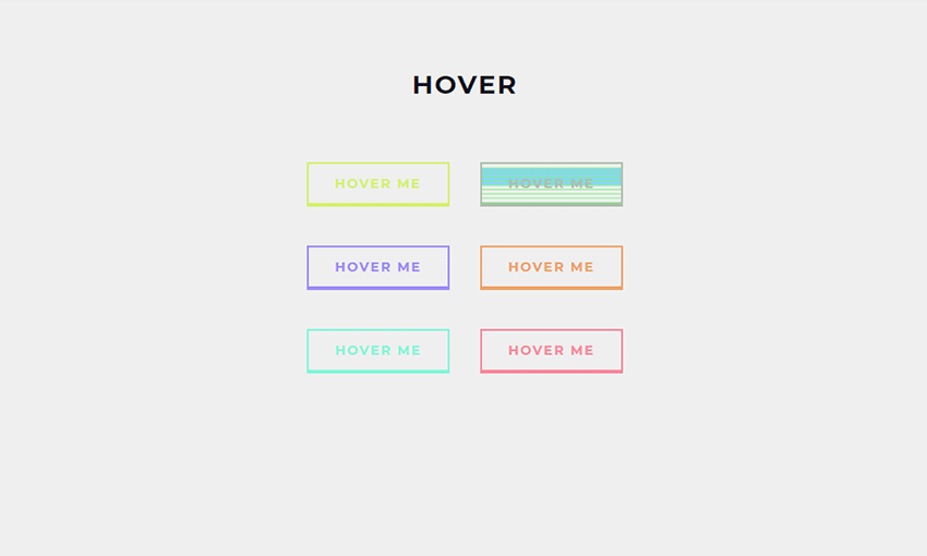
Let’s talk about the states of the table’s elements. A cell can have three states: default, hover, and selected. Same for columns and rows.

If your project is relatively small, all states can be set by overrides inside instances of your table components. But if it’s a big one, and you’d want to be able to change the look of the states in the future, you’ll have to create separate components for everything.

You’ll need to add all eight cells with different stroke variants for each of the states (maybe less, depends on the stroke style). And yes, we’ll need separate components for the background color and the stroke for the states as well.

In the end, it’ll look similar to this:

Hover and Selected

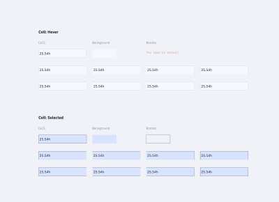
The cells’ states (hover and selected) (Large preview)

Here’s where a bit of trouble comes in. Unfortunately, if we do everything as described above (when changing the component’s state from one to another), there is a risk of losing the cell’s content. We’ll have to update it apart from the case when the content type is the same as in the master cell. At this point, we can’t do anything about it.

Table with rows’ states

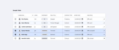
Table with various rows’ states. (Large preview)

I added tables in the mockup file that were made in a few different ways:

Using this tutorial (separate components for cells’ styles);
Using the cell component (components for borders, background, and content);
Using the cell component that unites everything (with only content components in addition).

Try to play around and change the cell’s styles.

Changing the stateChanging the state of the row. (Large preview)

Conclusion

If you’re using the same components library in several projects and you’ve got a reasonable number of tables in each of them, you can create a local copy of components (cells components with stroke styles and, if needed, cells components with different states), customize them, and use them in the project. The cell content can be set based on local components.

Also, if you’re using the table for one large project with different kinds of tables, all the above-mentioned components are easily scaled. The table components can be improved to infinity and beyond, like creating the cell states when hovering and other kinds of interactions.

Questions, feedback, thoughts? Leave a comment below, and I’ll do my best to help you!

Figma Table Mockup Download

As promised, I created a complete version of the Figma table mockup that you’re welcome to use for learning purposes or anything else you like. Enjoy!

Tables in Figma mockup design

Here’s a Figma table mockup that you can use for learning purposes — let the creativity begin!

Related Reading

“Atomic Design,” Brad Frost
“How To Architect A Complex Web Table,” Slava Shestopalov, Smashing Magazine
“Creating Atomic Components In Figma,” Design & Engineering team, littleBits
“Figma Tables: Data Grid Design By A Single Cell-Component,” Roman Kamushken, Setproduct

Useful Resources

Figma YouTube Channel
The official Figma channel on YouTube — it’s the first thing to watch if you are new to Figma.
Google Sheets Sync
A Figma plugin that helps you get data from Google Sheets into your Figma file. This should work fine with the techniques from this tutoria, but you’ll need to invest some time into renaming all the text layers for this to work properly.

Smashing Editorial
(mb, yk, il)

Crafting Stylised Mouse Trails With OGL

Original Source: http://feedproxy.google.com/~r/tympanus/~3/aBOCpNSpPt0/

Mmm… swirly goodness…
Hey! Snap out of it! Ok. Now, in this tutorial we’re going to have some fun creating this pretty crazy little effect by tipping our toes into WebGL. The water is warm, I promise!

What’s OGL?

OGL is a WebGL library that is going to save us having to write a bunch of pretty unfriendly WebGL code directly. It has been my baby for the last year or so – I’ve been busy adding a bunch of examples to try and give people a kick-start with practical references.

By design, it’s tightly coupled to WebGL with only a small amount of abstraction – meaning it’s very lightweight. For example, the OGL classes required for this experiment are under 13kb gzipped – and more than half of them are just maths.

You got any more of them mouse trails?

Yes! Moving on, sorry.

Mouse trails (or any sort of trails) are just innately fun to interact with. The little touch of physics that it adds can really make an animation feel incredibly reactive and tangible, to the point where you can be certain that a good percentage of your users’ time will be spent playing with the effect, before consuming any of your site’s content… sorry not sorry.

Of course, they can be achieved using a whole range of techniques. Example time.

Starting with a really clever, recent one done using the DOM (html) and CSS. I especially love the difference-blend style they’ve added to the trail. The crux of the effect is a number of diminishing circles that follow one another, giving the effect of a tapered line.
Developed by Luca Mariotti. With the ink trail effect from Ricardo Mendieta.

Here’s an effective take on one, made using the 2D Canvas api. This one draws a circle at the head of each line every frame, while simultaneously the whole scene slowly disappears.
By Hakim El Hattab.

And here’s one used as a main game mechanic, made using SVG by yours truly – a few trips-around-the-sun ago… It’s a dynamic bezier curve whose start, middle and end positions are updated every frame.

So each of these previous (viable) options use drawing APIs (CSS, Canvas 2D, SVG) to render those pixels. WebGL, on the other hand, leaves all of that pixel-drawing math in your capable hands. This means two things.

Firstly, it’s more work for you. Yep, it’ll probably take you longer to get something up and running, working out those pesky projection matrices, while keeping an eye on the optimisation of your attribute buffers…

Buuut (important but), it’s less work for the computer – so it’ll run (normally, waaaay) faster. You’re basically cutting out the middle man. It also gives you a crazy amount of flexibility, which I highly appreciate.

The Approach

I’m a fan of visualising problems to understand them (let’s not talk about quaternions…), so let’s break it down.

We will start by making a number of points, made up of [x, y] coordinates, arranged in a lovely little line.

app-dots

Then we’ll use these to generate a geometry, duplicating each point so that there are two vertices at each step along the curve. Why two? Just a sec.

app-line

Now, because our paired points are at the exact same position, our line is infinitely thin when rendered – and hence, invisible… No good. What we need to do is separate those pairs to give the line some width. And, puuuush.

app-mesh

And there we have our line mesh, all visible and line-y…

The part I nimbly skipped over there is also the most complicated – how do we know in which direction to move each vertex?

To solve this, we need to work out the direction between the previous and next points along the line. Then we can rotate it by 90 degrees, and we’re left with the angle we want: the normal.

app-normal

Now that we have our normal, we can start getting a bit creative. For example, what if we separated the pairs differing amounts at each point? Here, if we make the pairs get closer together toward the ends of the line, it will give us this sharp, tapered effect.

app-taper

Now see what fun ideas you can come up with! I’ll wait. A bit more. Ok, stop.

And that’s the most complicated part over. Note: I haven’t gone into the depths of each caveat that drawing lines can present, because, well, I don’t need to. But I couldn’t possibly write about lines without mentioning this extremely informative and digestible article, written by Matt DesLauriers about everything you’d want to know about drawing lines in WebGL.

Code time – setting the scene

To kick us off, let’s set up a basic OGL canvas.

Here’s an OGL CodeSandbox Template project that I’ll be using as a guide. Feel free to fork this for any OGL experiments!

First import the required modules. Normally, I would import from a local copy of OGL for the ability to tree-shake, but to keep the file structure empty on CodeSandbox, here we’re using jsdelivr – which gives us CDN access to the npm deployment.

import {
Renderer, Camera, Orbit, Transform, Geometry, Vec3, Color, Polyline,
} from ‘https://cdn.jsdelivr.net/npm/ogl@0.0.25/dist/ogl.mjs’;

Create the WebGL context, and add the canvas to the DOM.

const renderer = new Renderer({dpr: 2});
const gl = renderer.gl;
document.body.appendChild(gl.canvas);

Create our camera and scene.

const camera = new Camera(gl);
camera.position.z = 3;

const controls = new Orbit(camera);

const scene = new Transform();

And then render the scene in an update loop. Obviously the scene is empty, so this will currently look very black.

function update(t) {
requestAnimationFrame(update);
controls.update();

renderer.render({scene, camera});
}

But now we can do all of the things!

As an input to OGL’s Polyline class, we need to create a bunch of points (xyz coordinates).

Here, the x value goes from -1.5 and 1.5 along the line, while the y value moves in a sine pattern between -0.5 and 0.5.

const count = 100;
const points = [];
for (let i = 0; i < count; i++) {
const x = (i / (count – 1) – 0.5) * 3;
const y = Math.sin(i / 10.5) * 0.5;
const z = 0;

points.push(new Vec3(x, y, z));
};

Then we pass those points into a new instance of Polyline, along with colour and thickness variables (uniforms). And finally, attach it to the scene.

const polyline = new Polyline(gl, {
points,
uniforms: {
uColor: {value: new Color(‘#1b1b1b’)},
uThickness: {value: 20},
},
});

polyline.mesh.setParent(scene);

Here we have that working live. (Click and drag, scroll etc. If you want…)

How about a square? Let’s just change those points.

const points = [];
points.push(new Vec3( 0, -1, 0));
points.push(new Vec3(-1, -1, 0));
points.push(new Vec3(-1, 1, 0));
points.push(new Vec3( 1, 1, 0));
points.push(new Vec3( 1, -1, 0));
points.push(new Vec3( 0, -1, 0));

Circle?

const count = 100;
const points = [];
for (let i = 0; i < count; i++) {
const angle = i / (count – 2) * Math.PI * 2;
const x = Math.cos(angle);
const y = Math.sin(angle);
const z = 0;

points.push(new Vec3(x, y, z));
};

You may have noticed that when you rotate or zoom the camera, the line will always stay the same thickness. You would probably expect the line to get thicker when it’s closer to to camera, and also to be paper thin when rotated on its side.

This is because the pair separation we spoke about earlier is happening after the camera’s projection is applied – when the vertex values are in what’s called ‘NDC Space’ (Normalized Device Coordinates). Projection matrices can be confusing, but luckily, NDC Space is not.

NDC Space is simply picturing your canvas as a 2D graph, with left to right (X), and bottom to top (Y) going from -1 to 1. No matter how complicated your scene is (geometry, projections, manipulations), each vertex will eventually need to be projected to a -1 to 1 range for X and Y.

code-screen

A more common term you’ve probably heard is Screen Space, which is very similar, but instead of a -1 to 1 range, it’s mapped from 0 to 1.

We generally use cameras to help us convert our 3D coordinates into NDC Space, which is absolutely vital when you need to spin around an object, or view geometry from a specific perspective. But for what we’re doing (mouse trails. I haven’t forgotten), we don’t really need to do any of that! So, in fact, we’re going to skip that whole step, throw away the camera, and create our points directly in NDC Space (-1 to 1) from the get-go. This simplifies things, and it also means that we’re going to get the opportunity to write a custom shader! Let me show you.

Shaping the line with a custom shader

Firstly, let’s create our points in a straight line, with the X going from -0.5 to 0.5 and the Y left at 0. Keeping in mind that the screen goes from -1 to 1, this means we will end up with a horizontal line in the center of the screen, spanning half the width.

const count = 40;
const points = [];
for (let i = 0; i < count; i++) {
const x = i / (count – 1) – 0.5;
const y = 0;
const z = 0;

points.push(new Vec3(x, y, z));
};

This time when we create our Polyline, we are going to pass in a custom Vertex shader, which will override the default shader found in that class. We also don’t need a thickness just yet as we’ll be calculating that in the shader.

const polyline = new Polyline(gl, {
points,
vertex,
uniforms: {
uColor: {value: new Color(‘#1b1b1b’)},
},
});

Now, there are two shaders in the WebGL pipeline, Vertex and Fragment. To put it simply, the Vertex shader determines where on the screen to draw, and the Fragment shader determines what colour.

We can pass into a Vertex shader whatever data we want, that’s entirely up to you. However, it will always be expected to return a position on the viewport that should be rendered (in Clip Space, which, for this case, is the same as NDC Space; -1 to 1).

At the start of our Vertex shader, you will find the input data: Attributes and Uniforms. Attributes are per-vertex variables, whereas Uniforms are common variables for all of the vertices. For example, as this shader is run for each vertex passed in, the position Attribute value will change, moving along each point, however the uResolution Uniform value will remain the same throughout.

attribute vec3 position;
attribute vec3 next;
attribute vec3 prev;
attribute vec2 uv;
attribute float side;

uniform vec2 uResolution;

At the very end of our Vertex shader, you’ll find a function called main that defines the variable gl_Position. These two names are non-debatable! Our WebGL program will automatically look for the main function to run, and then it will pass the gl_Position variable on to the Fragment shader.

void main() {
gl_Position = vec4(position, 1);
}

As our points are already in NDC Space, our shader – made up of just these two sections – is technically correct. However the only issue (the same as we had in our breakdown) is that the position pairs are on top of each other, so our line would be invisibly thin.

So instead of passing our position right on through to the output, let’s add a function, getPosition, to push each vertex apart and give our line some width.

vec4 getPosition() {
vec2 aspect = vec2(uResolution.x / uResolution.y, 1);
vec2 nextScreen = next.xy * aspect;
vec2 prevScreen = prev.xy * aspect;

vec2 tangent = normalize(nextScreen – prevScreen);
vec2 normal = vec2(-tangent.y, tangent.x);
normal /= aspect;
normal *= 0.1;

vec4 current = vec4(position, 1);
current.xy -= normal * side;
return current;
}

void main() {
gl_Position = getPosition();
}

Ah, now we can see our line. Mmmm, very modernist.

This new function is doing the exact steps in our approach overview. See here.

We determine the direction from the previous to the next point.

vec2 tangent = normalize(nextScreen – prevScreen);

Then rotate it 90 degrees to find the normal.

vec2 normal = vec2(-tangent.y, tangent.x);

Then we push our vertices apart along the normal. The side variable has a value of -1 or 1 for each side of a pair.

current.xy -= normal * side;

“OK OK… but you skipped a few lines”.

Indeed. So, the lines that determine and apply the aspect ratio are there to account for the rectangular viewport. Multiplying against the aspect ratio makes our scene square. Then we can perform the rotation without risk of skewing. And after, we divide by the aspect to bring us back to the correct ratio.

And the other line…

normal *= 0.1;

Yes that one… is where we can have some fun. As this manipulates the line’s width.

Without this bit of code, our line would cover the entire height of the viewport. Why? See if you can guess…

You see, as the normal is a ‘normalised’ direction, this means it has a length of 1. As we know, the NDC Space goes from -1 to 1, so if our line is in the middle of the screen, and each side of the line is pushed out by 1, that will cover the entire range of -1 to 1. So multiplying by 0.1 instead only makes our line cover 10% of the viewport.

Now if we were to change this line, to say…

normal *= uv.y * 0.2;

We get this expanding, triangular shape.

width-01

This is because the variable uv.y goes from 0 to 1 along the length of the line. So we can use this to affect the shape in a bunch of different ways.

Like, we can wrap that code in a pow function.

normal *= pow(uv.y, 2.0) * 0.2;

width-02

Hm, how exponentially curvy. No, I want something more edgy.

normal *= abs(fract(uv.y * 2.0) – 0.5) * 0.4;

width-03

Too edgy…

normal *= cos(uv.y * 12.56) * 0.1 + 0.2;

width-04

Too flabby.

normal *= (1.0 – abs(uv.y – 0.5) * 2.0) * 0.2;

width-05

Almost… but a little too diamond-y.

normal *= (1.0 – pow(abs(uv.y – 0.5) * 2.0, 2.0)) * 0.2;

width-06

That’s not bad. Let’s run with that.

So now we have our shape, let’s deal with the movement.

Adding movement

To start off we just need 20 points, left at the default [0, 0, 0] value.

Then we need a new Vec3 that will track the mouse input, and covert the X and Y values to a -1 to 1 range, with the Y flipped.

const mouse = new Vec3();

function updateMouse(e) {
mouse.set(
(e.x / gl.renderer.width) * 2 – 1,
(e.y / gl.renderer.height) * -2 + 1,
0
);
}

Then in our update function, we can use this mouse value to move our points.

Every frame, we loop through each of our points. For the first point, we ease it to the mouse value. For every other point, we ease it to the previous point in the line. This creates a trail effect, that grows and shrinks as the user moves the mouse faster and slower.

requestAnimationFrame(update);
function update(t) {
requestAnimationFrame(update);

for (let i = points.length – 1; i >= 0; i–) {
if (!i) {
points[i].lerp(mouse, 0.9);
} else {
points[i].lerp(points[i – 1], 0.9);
}
}
polyline.updateGeometry();

renderer.render({scene});
}

Have a play with it below.

We can make this a bit more fun by replacing the first point’s linear easing with a spring.

const spring = 0.06;
const friction = 0.85;
const mouseVelocity = new Vec3();
const tmp = new Vec3();

requestAnimationFrame(update);
function update(t) {
requestAnimationFrame(update);

for (let i = points.length – 1; i >= 0; i–) {
if (!i) {
tmp.copy(mouse).sub(points[i]).multiply(spring);
mouseVelocity.add(tmp).multiply(friction);
points[i].add(mouseVelocity);
} else {
points[i].lerp(points[i – 1], 0.9);
}
}
polyline.updateGeometry();

renderer.render({scene});
}

The extra bit of physics just makes it that much more interesting to play with. I can’t help but try and make a beautiful curving motion with the mouse…

Finally, one line is never enough. And what’s with all of this dark grey?! Give me 5 coloured lines, with randomised spring values, and we’ll call it even.

And there we have it!

As we’re using random values, every time you refresh, the effect will behave a little differently.

End

Thank you so much for sticking with me. That ended up being a lot more in-depth than I had planned… I implore you to play around with the code, maybe try randomising the number of points in each line… or changing the shape of the curve over time!

If you’re new to WebGL, I hope this made the world of buffer attributes and shaders a little less overwhelming – it can be really rewarding to come up with something interesting and unique.

Crafting Stylised Mouse Trails With OGL was written by Nathan Gordon and published on Codrops.

Illustrator Sebastian Curi on colour, character design and keeping things fun

Original Source: http://feedproxy.google.com/~r/CreativeBloq/~3/D0yQ1iBd_8k/illustrator-sebastian-curi-on-colour-character-design-and-keeping-things-fun

You may have been to a design conference before. But have you ever been to one that starts when the sun goes down? 

That's the secret ingredient behind Us by Night which takes place in the evening, leading to a special different atmosphere, that's markedly different from other creative events. 

Taking place in Antwerp, Belgium this Thursday, Friday and Saturday (26-28 September), Us by Night is packed with fun activities, including an arcade, a night market, a delicious selection of local food, and fluorescent ping-pong.

But of course, the main attractions are the briliant and inspirational speakers from across the world, and one of the top attractions this year will be the return of Sebastian Curi. 

Who is Sebastian Curi?

Sebastian Curi is an Argentinian illustrator and animator, currently based in Vancouver, who's known for his fun characters and bold illustration style, characterised by strong lines, big shapes and simple colour palettes.

Artwork

Illustration for mobile payment service Venmo by Sebastian Curi

Having spent a decade working in the animation industry, he's recently switched his main focus to illustration, working with a variety of agencies, clients and artists including Apple, Warby Parker, Collins, The New Yorker, IDEO, WeWork, CNN, Soul Cycle and others.

We caught up with him to find out what he'll be talking about at Us by Night, and why you shouldn't miss his talk.

How did growing up in Argentina influence your work?

I’m from Buenos Aires. Growing up, my parents moved a lot around the province in search of better job opportunities so I’m not really from any neighborhood. I started working when I was studying in high school and, as my family had little money, my creative development moved slowly until I reached a job in a graphic design studio. 

Argentina is a country of contradictions and instability. As a by-product of that, you learn how to deal with lots of things at the same time. 

In my case that involved studying and working at the same time and working in different positions around the design and animation industry, until I found what I liked. Kind of a jack of all trades, master of none situation.   

How did you come to live in Canada?

After working for some years in different studios in Buenos Aires, I went freelance as an animator. At some point I felt really stuck with my career, and sent a couple emails to studios in the world that I liked. 

Amazingly, I got an offer from a big production company in Los Angeles, and that started a whole different stage for me. LA is an amazing city but travelling the world seemed such an exciting thing to do. 

Illustration of woman running with dog

Outdoor Voices 1 by Sebastian Curi

After two years at this production company, I didn’t feel connected to my work and my illustration stuff was still something that I thought as a side job. 

So I went looking for a smaller and more cosy studio and that’s how I arrived at Vancouver, Canada to work at Giant Ant.

Was your recent move from animation to illustration an easy one?

I worked in animation for 10 years and leaving that was a very hard move to make. I was very hesitant, and because of that I kept working on studios until I was completely sure I could sustain myself and my wife without problems. 

That also created its own problems. Having two jobs put me in a place of lots of stress, little time and all of that impacted in my health a lot.

It took me more than a year of working every morning or night, and putting some weekends into my illustration stuff, to feel that I have something interesting to bring to the industry.

I finally moved into illustration because I feel I can have more ownership of my work as an illustrator. I love the freedom I have to work, how clients move in this industry, the time it takes me to finish a project. Every little thing about illustration seems magical to my “animator eyes”.

Is it important that you create characters with flaws? 

I’m all about bold and simple drawings. I like the spontaneity of my process and how they lead to joyful and lively results. 

For me, illustration is a way to create moments and have some fun, and this people I draw are perfect for conveying the things I want to say.

Three colourful cartoon characters and a dog

Illustration for mobile payment service Venmo by Sebastian Curi

In the beginning, the imperfections in my drawings were due to a lack of ability to draw perfectly. But at some point I fell in love with the textures and handmade vibe they give overall… so I stuck to them.

How much do you collaborate with others?

I love to collaborate. You are as good as the people you work with, and I really like to work with people that I can learn from. 

Lately, I’ve been doing a lot of animation with some amazing animators. Also, I worked a week on a huge mural for the Vancouver Mural Fest.

I would say collaborating is the only thing I really miss from animation. Illustration can be a bit lonely.

What’s your approach to colour? 

For me, colours have beauty in themselves. It’s all about proportion and vibration. I prefer to work with big shapes and just let the colours do their thing. 

Illustration of person holding a rainbow between their palms

Outdoor Voices 2 by Sebastian Curi

I usually tend to start with high vibration colours in big sizes and then I just add details of lines and patterns with low saturation colours. It’s never the same, I like some combinations but I try to keep things fun at this stage.

Colour gives you the tone of the story. It creates the context.

What are you speaking about at Us by Night?

This is my first talk at a design festival so I’m pretty nervous about it. I love to attend these kind of events, listen to podcasts and read about the industry – but saying something that helps people or brings value is a challenging thing to do.

Sebastian Curi's work on big screen in conference centre

On show at Apple Today

My talk is going to be about changing over time in search of keeping it fun. How to find something you love and make it a job but in a healthy and sustainable way. Basically, it will focus on my journey, how each step took me to where I’m at now.

Us by Night takes place at Antwerp, Belgium from Thursday September 26, 2019 – Saturday September 28, 2019.


Tips On Designing Creative Websites That Will Wow Your Clients

Original Source: https://www.webdesignerdepot.com/2019/09/tips-on-designing-creative-websites-that-will-wow-your-clients/

The global market keeps getting bigger and bigger, which should be good news for web designers – but there’s a catch.

The clients you can expect to serve are more sophisticated and want creative websites, not just the regular HTML and CSS.

You can’t deliver just anything and expect them to be happy. You’ll also have some serious competition to contend with. As a consequence, your website must adequately address an ever-growing need for improvements. Like in flexibility, responsiveness, and conversion optimization.

Fortunately, the cloud has a silver lining; and a bright one at that. Tools to meet these challenges and address them head on are readily available. With the most notable case in point being Be Theme, the largest and most versatile WordPress theme of them all.

With a tool like Be Theme at your fingertips, you’ll be more than able to successfully handle any challenge that comes your way.

Then, it’s simply a matter of following these 5 simple steps to design creative websites. They are eye-catching, impressive in their ability to convert visitors to users and guaranteed to put smiles on your clients’ faces.

5 Steps to Building Astoundingly Creative Websites
Step 1: Choose a Mesmerizing Color Palette

The color palette you use can make a difference between a so-so website and an attention-getting one. Choosing one should not be difficult if you follow a few simple rules:

its colors need to attract instant attention;
they need to be on-brand, and;
the color palette you select needs to visually support the message your app or website is designed to convey

Artist features BOLD color touches that will instantly attract attention.

This Be Theme pre-built website is another great example of what can be accomplished with an eye-grabbing color palette.

Carbon8 is an example of how to align the color palette with the website’s brand. It is done with its clever use of various shades of green. Note how the deep green element draws visitor’s eyes to the center of the page.

BeInsurance features a subtle, crisp color palette. It perfectly reinforces a strategy of using crisp, clear images to gain the clients you need.

BeFestival is a great example of using a color palette designed to appeal to a larger audience.

Step 2: Display Crystal-Clear Photos and Images

This step should be obvious. A crystal clear presentation suggests the business behind it goes the extra mile. That is when it comes to clearly present their products and services. Using the best images you can get your hands on can give you an extra edge over the competition.

BeStylist is an example of the advantage of displaying images with flair. The crisp image definitely supports the intended message.

Or, try something like RansomLTD; minimalist, yet crisp and powerful.

A pre-built website like Zajno illustrates how crystal-clear pics can be used to display your creativity.

The Design Shop employs flair and creativity to entice visitors with crisp and compelling images of your products.

Step 3: Show Visitors How Your Creativity Benefits Them

Creativity isn’t about you. It’s about serving your visitors. It can be extremely effective when it helps them imagine themselves actually using your product or service.

BeMarketing’s homepage video illustrates another way to show people how they can benefit from using your products.

Lane illustrates a fabulous approach you can use to express your structural design perspectives.

BeSimple takes a minimalist approach. It’s the typography and way the text is presented rather than the text itself that’s effective.

BeTravelBlogger provides the basis for a travel blogger’s dream site. You can use it to present your travel adventures and escapades with a super-cool layout of graphics and snippets.

Step 4: (Over)use “White” Space

Yes, it’s true. White space is a design element you can sometimes overuse without causing harm. In fact, in many cases “more is better”, as is obvious in the following examples.

Makespace has a clean design that allows the eye to focus on key elements, imagine, and create.

BeSketch & The Drive New York are two examples where plenty of white space is used to great effect.

When white space is part of the brand it can really help to drive the message home. BeIcecream is an extreme example of how plenty of white space can be used to great effect.

Step 5: Make Your CTAs Grab Them By The Eyeballs

If you don’t have CTA buttons that can’t be ignored, your website isn’t going to convert as many visitors into users as you hoped or planned. You want those buttons to be big, bright, and bold enough to make people feel they absolutely have to be clicked on.

BeDrawing’s CTA button is above the fold as it should be, and it clearly stands out. You can’t help but notice it the instant you’ve finished reading the headline. Its centering on the page makes it serve as a gate that invites visitors to enter.

Stuart makes effective placement and use of 3 clearly defined CTA buttons.

Your CTA can match other elements on the page and still easily attract attention. A great example of this is BeKids, where the color of the button matches the color of other hero section elements.

Building Creative Websites – a Summary

Follow these surefire steps (with the help of a surefire website building tool) and you’re well on your way to satisfying the most demanding of clients. Crisp, stunning visuals, a cleverly chosen color palette and the clever use of white space, images that enable visitors to see themselves using your products, and the all-important bold and beautiful CTA buttons give you the combination for success.

Success typically breeds additional work. Sometimes web design is not as much fun as it used to be. If you suddenly find yourself juggling projects and deadlines to the point you’d be better off using pre-built websites.

You’ll find the most generous gallery of more than 450 creative websites on Be Theme that you can customize to your liking. Start using them now and you’ll never have to worry about juggling projects and deadlines!


[– This is a sponsored post on behalf of Be Theme –]

Source

p img {display:inline-block; margin-right:10px;}
.alignleft {float:left;}
p.showcase {clear:both;}
body#browserfriendly p, body#podcast p, div#emailbody p{margin:0;}

What’s New for Designers, September 2019

Original Source: https://www.webdesignerdepot.com/2019/09/whats-new-for-designers-september-2019/

While there aren’t as many new tools out there to play with right now, the ones available are a lot of fun. From tools to help speed up workflows and manage productivity, to creative gamification and funky typefaces, these new tools for designers will make you want to stick to your desk.

Here’s what new for designers this month.

Quark

Quark might not be exactly what you are thinking if you have roots in print design. This Quark, in beta, is designed to help you create projects in HTML, CSS, and JavaScript with native app capabilities. The interface is made for rapid development and prototyping so you can create apps fast.

Doka

Doka is an in-browser photo editor. You can perform all kinds of basic photos edits with this free tool, including cropping and resizing (even by aspect ratio). There are even a few simple filters. Get your photo ready to go and download it for use in projects. It’s one of the best simple photo editing tools out there.

Copy Palette

Copy Palette will help you create the most elegant monochromatic palettes. Pick a base color, number of variations and adjust the contrast on the way to making an SVG palette that you can use in Figma or Sketch with a simple copy and paste.

Summit Form

Summit Form is a drag and drop online form builder. Embed forms on your website or link through social media or email. It’s easy to use and there’s no coding if you want to build forms with ease. (This is a paid tool, but it is fairly low cost.)

SVG to JSX

SVG to JSX is a plugin that lets you copy SVG code as a react component for use in Figma. And it’s as simple as a right-click.

Tiler

Tiler combines small images to create a large image masterpiece. What’s different about this tool is mosaic squares aren’t just square. You can adjust shapes and size to suit your needs. Options include circles, lines, waves, cross stitches, legos, minecraft blocks, paper clips, letters, and more.

Can I Email?

Can I Email? Is one of those tools you don’t know how much you need it, until you use it. Fill in what you want to know into the “can I email” field at the top of the screen to see what elements are supported by which email clients.

UseAuth

UseAuth is a simple method of adding authentication to a React app. (Mostly because it takes care of everything for you.) It uses an AuthProvider component for configuration and shares states between components, including users, login forms, and redirects.

Fragments iOS Wireframe Kit

Fragments is an iOS wireframe kit for Sketch that you can use for mobile app development. It includes 370 layouts in 10 categories based on nested symbols and layer styles. Test it out with the free version – 25 ready-made screens – before committing to the full kit.

SVG Artista

SVG Artista simplifies the process of making an SVG animation. It was born out of the animation for animista.net. It animates the stroke and fill properties of SVG images with plain CSS and works best with paths, lines, circles, and polygon elements. This isn’t a full animation tool, but does work for quick elements.

The Most Dangerous Writing App

The Most Dangerous Writing App is a game that deletes your content if you get out of the flow, literally. Stop writing for more than 5 seconds and you lose all your progress. It sounds scary but is an interesting creative tool.

Abstract Illustrations

Abstract Illustrations is a collection of one-line vectors that you can use in projects. It’s a trending style that you can find in a lot of projects right now.

Day/Night Ambient Animation

Have you ever wanted to change your page content or aesthetic based on light level? Using the Ambient Light API, Many Moore shows you how. It works using the #enable-generic-sensor-extra-classes flag in chrome://flags.

Chart.xkcd

Chart.xkcd is a tool that lets you create hand-drawn style charts. All you need to use it is the script included in your website with a SVG node to render the chart. This tool makes your charts quirky and anything but boring.

Friend NDA Generator

Friend NDA Generator or frieNDA is a silly little tool that creates a non-disclosure agreement between friends so you can really share secrets. Sadly, this might be a necessary tool in the digital age.

Flying Pages

Flying Pages is a WordPress plugin that helps preload pages before a user clicks so they will seem to load faster and more instantly. It uses a tiny bit of JavaScript and preloads when the browser becomes idle. Plus, it’s designed not to crash due to too many preloads.

Terms and Conditions Generator

Terms and Conditions Generator can help you create a professional document with clauses and legalize for your website or app. Use it to help protect your interests and content. The tool is scalable for everything from simple blogs to e-commerce and works in 100-plus countries.

Camar

Camar is an art-deco style vintage typeface for display use. The font includes all uppercase characters, numbers, and punctuation with a funky feel.

Florista

Florista is an elegant script with clean lines and interesting optional tails. It includes upper- and lowercase letters.

Fox Cavalier

Fox Cavalier is a futuristic slab serif that can make for interesting display use. It contains only uppercase letterforms.

Leon Sans

Leon Sans is a cool geometric sans serif that’s entirely made from code. You can change weight dynamically or create custom font animations or effects in the Canva element of HTML 5. It’s a pretty cool example of creative coding.

Sporter

Sporter evokes feelings of the fall (American) football season with cool block letters that resemble what you’d see on a jersey. It includes all uppercase letters.

Source

p img {display:inline-block; margin-right:10px;}
.alignleft {float:left;}
p.showcase {clear:both;}
body#browserfriendly p, body#podcast p, div#emailbody p{margin:0;}

Is There Such A Thing As Too Much Social Proof?

Original Source: https://www.smashingmagazine.com/2019/09/too-much-social-proof/

Is There Such A Thing As Too Much Social Proof?

Is There Such A Thing As Too Much Social Proof?

Suzanne Scacca

2019-09-23T13:30:59+02:00
2019-09-23T18:06:20+00:00

It’s very easy to start a business these days. But succeeding in that business is another story. There are just too many people who want to escape the 9-to-5, do something with their big idea and make a better life for themselves in the process. I totally applaud that.

However, it’s not practical to think that the idea will sell itself. Consumers need to be given some reason to trust that their money (or time) will be well spent. And when a business or product is new, the best way to gain this trust is by getting clients, customers and others to vouch for you.

That said, is it possible to go overboard with testimonials, reviews, case studies, client logos and other forms of social proof? And is there a wrong way to build social proof into a mobile website or PWA?

Yes and yes!

When Too Much Social Proof Is A Bad Thing

I was working on the copy for a new website earlier this year. My client told me that the design team had prepared a wireframe for the home page and wanted me to use that as a framework for the copy. Normally, I would be stoked. When I work as a writer, I want to stay in writer mode and not have to worry about layout and design suggestions.

The only problem was that the home page they wanted was littered with social proof and trust marks. It would’ve looked like this (note: the purple boxes contain social proof):

Sample wireframe with social proof

A sample wireframe of a home page with too much social proof. (Source: Canva) (Large preview)

In reviewing the wireframe, I had a number of gripes. For starters, it was way too long, especially for mobile visitors.

There was no way people were going to scroll seven times to find the section that finally invites them to take action.

Secondly, there was too much social proof. I know that seems counterintuitive. After all, isn’t it better to have more customer validation? I think in some cases that’s correct. Like with product reviews.

In BrightLocal’s 2018 Local Consumer Review Survey, respondents said they want to see at least 40 product reviews, on average, before believing a star rating.

BrightLocal number of reviews to believe start rating

BrightLocal’s consumer review survey says that consumers want to see 40 review before believing a business’s start rating. (Source: BrightLocal) (Large preview)

Even then, consumers aren’t looking for a perfect score. As you can see here, only 9% of respondents need a business to have a perfect rating or review in order to buy something from them:

BrightLocal star rating preference

BrightLocal survey respondents prefer to see a minimum of 3- or 4-star ratings instead of 5. (Source: BrightLocal) (Large preview)

And I can tell you why that’s the case.

I used to write product reviews. One of the things I’d do when assessing the quality of a product (before making my own judgments) was to look at what online reviewers — professional reviewers and customers — had to say about it. And let me tell you… there are tons of fake reviews out there.

They’re not always easy to spot on their own. However, if you look at enough reviews at once, you’ll start to notice that they all use the same verbiage. That usually means the company paid them to leave the review or gave family, friends and employees pre-written reviews to drop.

I’m not the only one who’s noticed this trend either. BrightLocal’s respondents have as well:

BrightLocal fake reviews

33% of BrightLocal respondents have seen lots of fake reviews while 42% have seen at least one. (Source: BrightLocal) (Large preview)

Only 26% of respondents said they hadn’t come across a fake review while 42% had seen at least one in the last year and 33% had seen a lot.

When it comes to things like testimonials and case studies, I think consumers are growing just as weary about the truthfulness of the praise.

TrustRadius surveyed B2B buyers on the subject of online reviews vs. case studies. This is what it found:

TrustRadius customer reviews vs. case studies

TrustRadius asked respondents to assess their feelings on customer reviews vs. case studies (Source: TrustRadius) (Large preview)

It makes sense why consumers don’t feel as though case studies are all that authentic, trustworthy or balanced. Case studies are written by the companies themselves, so of course they’re only going to share a flattering portrait of the business or product.

Having worked in the digital marketing space for a number of years, I can tell you that many customer testimonials aren’t always genuine either. That’s why businesses need need to stop worrying about how much social proof they have and start paying more attention to the truthfulness and quality of what they’re sharing with visitors.

The point I’m trying to make isn’t that we should ditch social proof. It’s an important part of the decision-making process for consumers. But just because it can affect their decision, it doesn’t mean that repeatedly bashing them over the head with it will work either. If your website and its messaging can’t seal the deal, a bunch of logos and quotes meant to convince them to buy won’t either.

What you need to focus on when building social proof into a mobile site or PWA is quality over quantity. Sure, you might want to highlight the sheer quantity of reviews that have been gathered on a product, but in terms of space on your website? With social proof, less is more.

Tips For Building Social Proof Into A Mobile Website Or PWA

You don’t have a lot of room to spare on mobile and you don’t want to make your visitors dig and dig to find the important details. So, while you do need social proof to help sell the business and its product, you need to do so wisely.

That means giving your content room to shine and strategically enhancing it with social proof when it makes the most sense to do so.

Consolidate Social Proof on the Home Page

I know how hard it can be to convince people to work with you or buy from you when your business is new. That’s especially the case when you’re entering a field that’s already dominated by well-known and well-reviewed companies.

However, rather than make your home page longer than it needs to be — for desktop or mobile visitors — why not consolidate the strongest social proof you have and put it in one section?

What’s neat about this option is that you can get creative with how you mix and match your social proof.

Customer Reviews + Trust Seals

Two Men and a Truck is the kind of company that needs customer testimonials. It’s the only way they’re going to effectively convince new customers to trust them to enter their home and carefully transport their belongings from one location to another.

Two Men and a Truck social proof

Local movers Two Men and a Truck stack a testimonial on top of trust seals on the home page. (Source: Two Men and a Truck) (Large preview)

Rather than bog down their home page with testimonials, Two Men and a Truck use one especially positive review and a number of professional trust seals to close the deal in one fell swoop.

Google Reviews + Facebook Reviews

Another way to consolidate social proof on the home page is by aggregating reviews from other platforms as the website of Drs. Rubinstein and Ducoff does:

Drs. Rubinstein and Ducoff home page with Google and Facebook reviews

The home page of Drs. Rubinstein and Ducoff shows off the latest reviews from Google and Facebook along with an average star rating across all platforms. (Source: Drs. Rubinstein and Ducoff) (Large preview)

This is a tiny section — it doesn’t even fill the entire screen — and yet it packs a lot of punch.

First, you have the total number of reviews and average star rating shown at the top. Remember that survey from BrightLocal? This is the kind of thing that would go a long way in convincing new patients to sign up. There’s a good amount of reviews to go on and the average rating seems realistic.

Also, because these reviews come from Google and Facebook, they’re connected to real people’s profiles. Plus, the date is included in the Google review.

Unlike testimonials which are just a quote and a person’s name (if we’re lucky), this is a quote, a star rating and the date it was published. This way, prospective patients don’t have to wonder how long ago it was that Drs. Rubinstein and Ducoff received these reviews.

Twitter + App Store Reviews + Awards

You’ll find another creative example of consolidated social proof on the Pocket website.

Pocket aggregates social proof from a number of sources

Pocket uses Twitter, the Google App Store, the Google Play Store Webby Awards as trust marks. (Source: Pocket) (Large preview)

Even though Pocket is free to use, that’s not necessarily enough to convince someone to try a new piece of software — especially if you want them to download it as a mobile app.

Rather than rely on faceless testimonials, though, Pocket has chosen to show off some convincing and verifiable social proof:

A quote from a Twitter user with a healthy follower base,
The actual rating of its app on both apps stores,
The number of times it’s won a Webby award.

It’s a unique patchwork of social proof which is sure to stand out from the traditional quote block many websites use to promote their products.

Make It Sticky

One of the great things about making the move to a PWA is you can use app-like elements like a sticky bar to show off important information to visitors. If it makes sense to do so, you could even put some social proof there.

Google Reviews Widget

There’s been a big surge in independent mattress companies in recent years. Tuft & Needle. Loom & Leaf. Saatva. They all seem to promise the same thing — a better quality memory foam mattress at a steal of a price — so it’s got to be hard for consumers to choose between them.

One way to make this differentiation is with Google Reviews.

On the desktop website for Lull, the home page reviews callout is tucked into the bottom-left corner.

Lull Google customer reviews on desktop

Lull shares Google customer reviews in a widget on its desktop website. (Source: Lull) (Large preview)

It’s almost too small to notice the reviews with so much more to take in on the home page. That’s a good thing though. The social proof is always present without being overwhelming.

What’s interesting to note, though, is that the mobile counterpart doesn’t show any Google reviews on the home page. It’s not until someone gets to the Mattress page where they’re able to see what other customers have said.

Lull Google customer reviews on mobile

Lull shares Google customer reviews in a sticky bar on its PWA. (Source: Lull) (Large preview)

In this particular screenshot, you can see that the Mattress page on the PWA has a section promoting the product’s reviews. However, even when visitors scroll past that section, the sticky bar continues to remind them about the quantity and quality of reviews the mattress has received on Google.

CTA Banner

Another type of website this sticky social proof would be useful for would be one in hospitality. For example, this website for the Hyatt Regency San Antonio:

Hyatt Regency San Antonio Suites page

An example of one of the Suites pages on the Hyatt Regency San Antonio website. (Source: Hyatt Regency San Antonio) (Large preview)

Just like the Lull example above, the Hyatt Regency tucks its social proof into a sticky bar on its internal sales pages.

Hyatt Regency sticky bar with social proof

The Hyatt Regency places TripAdvisor reviews next to its conversion elements in a sticky bar. (Source: Hyatt Regency San Antonio) (Large preview)

Visitors see the number of TripAdvisor reviews and star ratings when they first enter the Suites page. When they scroll downwards, the sticky bar stays in place just long enough (about one full scroll) for visitors to realize, “Cool. It’ll be there if or when I’m ready to do more research.”

What’s nice about how this particular sticky bar is designed is that the reviews are part of the conversion bar. It’s kind of like saying, “Want to book your trip, but feeling nervous about it? Here’s one last thing to look at before you make up your mind!”

Create a Dedicated Page for Social Proof

If you’re not building a PWA or you have too much social proof to show off in a small space, create a dedicated page for it. This is a great option, too, if you plan to share something other than just testimonials or reviews.

Testimonials/Reviews

Winkworth is an estate agency in the UK. Testimonials are a useful way to convince other sellers and lessors to work with the agency. Yet, the home page doesn’t have any. Instead, the company has chosen to place them on a Testimonials page.

Winkworth testimonials page

The Winkworth estate agency keeps its home page free of testimonials and instead places them on a dedicated page. (Source: Winkworth) (Large preview)

It’s not as though this page is just a throwaway of every positive thing people have said. The testimonials look like they’ve been hand-picked by Winkworth, especially the longer ones that contain more details about the experience and the people they worked with.

Winkworth testimonials

An example of some of the hand-picked testimonials Winkworth has gathered for its Testimonials page. (Source: Winkworth) (Large preview)

Each testimonial includes the person’s name as well as which Winkworth location they’re referring to. This way, visitors can learn more about the experience at specific locations instead of just hearing how great Winkworth is as a whole.

Case Studies

It’s not just testimonials that could use their own page. Case studies shouldn’t clutter up the home page either.

While Bang Marketing promotes its case studies with a promotional banner on the home page, that’s all you hear of it there. They save their customers’ stories for individual pages like this one:

Bang Marketing case studies

Bang Marketing includes a video testimonial with every case study. (Source: Bang Marketing) (Large preview)

Each case study page is minimally designed, but captures all of the information needed to tell the story.

First, there’s a video from the client explaining what Bang Marketing was able to do for them. Then, there’s a brief description of what the team worked on. Finally, high-quality images provide visitors with a look at the resulting product.

This is a much more effective way to share case studies than placing a barrage of portfolio images all over the home page.

Press

There are two ways to handle the Press section of a website. The company could publish its own press releases or it can share information about where it’s been featured in the press.

While the former is useful for sharing company news and wins with visitors, it’s just too self-promotional and won’t help much with conversion. The latter option could really make a big impact though.

This, for instance, is what visitors will find on the About & Press page for The Dean Hotel:

The Dean Hotel Boston magazine cover

The Dean Hotel includes magazine covers and article screenshots as social proof on its website. (Source: The Dean Hotel) (Large preview)

After a short intro of the hotel, the rest of the page is covered in magazine covers and article screenshots that go back as far as 2013. Visitors can click through to read each of the articles, too.

Dean Hotel social proof

The Dean Hotel uses articles as social proof on its website. (Source: The Dean Hotel) (Large preview)

This is a unique way for a website of any type to share social proof with visitors.

If your client happens to have a bunch of positive press and never-ending hype surrounding its brand, try to leverage that on the site. Plus, by including screenshots from the articles themselves, you get another opportunity to show off the product (or, in this case, the hotel and its rooms).

Wrapping Up

Consumers have become very savvy when it comes to marketing and sales online. That’s not to say that they don’t fall for it — usually, when it’s done genuinely and with transparency. However, we’re at a point where a brand saying, “We’re the best! Trust us! Buy from us!”, doesn’t usually cut it. They need more validation than that.

At the end of the day, your mobile website or PWA needs social proof to convince visitors to convert.

That said, be careful with how you build social proof into the site, especially on the home page. You don’t have time or space to waste, so don’t create something unnecessarily bulky just so you can show off how many testimonials, reviews, case studies, client logos high-profile partnerships you have. This is about quality over quantity, so make it count.

Smashing Editorial
(ra, yk, il)

Four Common Font Types and When to Use Them

Original Source: http://feedproxy.google.com/~r/1stwebdesigner/~3/YZcqNpcyVao/

When you’re first learning the nuances of typography, all those different font types can be confusing. You might know the difference between serif and sans-serif, but do you know the right time to use them? And what about the dozens of subtypes?

There are four main types of fonts you can use in web design, each with their own distinctive look. Not sure where to begin? We’ll give you a little typography guidance so you can design a website that perfectly conveys the mood you’re going for.

UNLIMITED DOWNLOADS: 400,000+ Fonts & Design Assets

DOWNLOAD NOW

Serif

Serif Font Examples

Serif fonts are the go-to for elegant and professional designs. These stylish typefaces are marked by the little dashes extending from the stroke of each letter. Serifs have long been used for extensive passages in print. They give websites an old-fashioned, sophisticated tone.

In general, serif fonts are suitable for almost any situation: headers, body text, small to large sizes, and short or long copy – they should only be avoided in very small sizes. Some also claim that serifs are less screen-legible.

Old Style: Going back to the 1400s, these serifs are marked by low line contrast and diagonal stress.
Transitional: Transitional styles bridge the gap between traditional and modern serifs. You begin to see more line contrast and stylistic additions.
Didone: These modern serifs have dramatic line contrast, and are very commonly used in print pieces.
Slab Serif: Wide, bold, and instantly eye-catching, slab serifs make great display fonts.

Sans-Serif

Sans-Serif Font Examples

Throughout history sans-serifs were rejected in favor of their more elegant cousins, but the bold and legible typeface is now used to represent modernity, simplicity, and efficiency.

Sans-serif fonts lack the small strokes at the end of letters, and as a result are more legible on screens and at smaller sizes. These fonts are a jack of all trades, and look great at any size and in any length of text. Use them when you’re shooting for a modern or minimalist vibe.

Grotesque: The earliest sans-serifs, these fonts are simple and bold, often with a square shape to them.
Neo-Grotesque: Neo-Grotesques less resemble early serifs, with a more minimalistic style.
Geometric: Composed of simple shapes like circles and squares, these have an appealing simplicity but are a little less legible in body type.
Humanist: Inspired by calligraphy and old-style serifs, humanist fonts are unique with highly varied line widths.

Script

Script Font Examples

Script fonts are defined by their handwritten, cursive- or calligraphy-like style. They bring the elegance of serifs with a more authentic and beautiful design.

Unlike serifs, however, scripts aren’t made for legibility. They shouldn’t be used as body text or passages longer than a paragraph or two. They look great as headers, logos, or short quotes. If you need something a little more unique, try a script font.

Due to its unique nature, this typeface is hard to classify, but there are a few distinctive categories.

Formal: Inspired by handwriting from the 1600s-1800s, formal scripts often have large, dramatic loops and antiquated styling, and appear to be drawn with a quill or pen.
Casual: Casual scripts are just as beautiful but less formal, looking more like fancy modern handwriting. Often, they look as if drawn with brush strokes.

Decorative/Display

Decorative and Display Font Examples

The last font type, and the hardest to pin down, is decorative/display typefaces. These fonts are the most unique and come in any kind of style you can think of, from graffiti to abstract to three-dimensional font types.

You may be able to get away with using a script font in a paragraph if you’re feeling adventurous, but decorative fonts belong only in single sentences and as header text. They’re designed for style, not legibility.

There’s also symbol fonts, which display letters as various ornaments like faces or objects. This can have some use as decoration.

Display and decorative fonts are optimized for use at very large sizes. Use them anywhere but your body text.

Create Better Font Palettes

Now that you know how to use every type of font, it’s time to put together a font palette for your design project. Most websites use two or three main typefaces, a header and body font.

Remember to use the rule of contrasts. You could use a script header font and match it with an elegant serif, or serif body text with an eye-catching sans-serif title. You could even try two of the same types of fonts, but pick a bolder display typeface and contrast it with a clean body font.

Your choices are unlimited, so experiment with various flavors of fonts and see what happens.


15 Questions To Ask Your Next Potential Employer

Original Source: https://www.smashingmagazine.com/2019/09/questions-ask-next-potential-employer/

15 Questions To Ask Your Next Potential Employer

15 Questions To Ask Your Next Potential Employer

Robert Hoekman Jr

2019-09-20T12:30:59+02:00
2019-09-20T22:08:07+00:00

In my book “Experience Required”, I encourage in-house UX professionals to leave companies who refuse to advance their UX intelligence and capability. There are far too many companies these days who understand the value of UX to waste your time being a martyr for one who will only frustrate you. Your best chance of doing a good job is to avoid a bad position.

Smartly, during a recent Q&A about the book, an audience member asked how we can avoid taking these jobs in the first place. What kinds of questions, he wondered, can you ask during an interview to spot red flags before the company stabs the whole flagpole into your sacred UX heart?

Know What You Want To Know

There’s the usual stuff, sure, such as asking why the position you’re applying for is currently open. What the company’s turnover rate is like. Why that turnover rate is so low or high. A little Googling will easily enough net you a decent list of broad questions you can ask any employer.

But what you really want is to get UX-specific. You want to hone in on precisely what your life might be like should you take the position.

Your best chance of doing a good job is to avoid a bad position.

Sadly, I lacked a great answer at the time to the question about interview questions, so I let it eat at me until I woke up at three a.m two days later and started writing notes. That morning, I emailed my reply to the moderator.

Ask A Great Question, Then Shut Up

To devise the list below, I considered what kinds of things I’d wish a company knew and understood about UX prior to working with them. I can operate in all kinds of situations—as a UX and process innovation consultant, this has been my job, and pleasure, for nearly 13 years now—but I want to know from the start, every time, that the effort will be set up for success. These questions aim to uncover the dirty details that will tell me what I’m walking into.

Much like a good validation session or user interview, these questions are open-ended and designed to draw out thoughtful, long-winded responses. (One-word answers are useless.) I strongly recommend that when and if you ask them, you follow each question with a long, stealthy vow of silence. People will tell you all about who they are if you just shut up long enough to hear them do it. Stay quiet for at least ten seconds longer than you think is reasonable and you’ll get the world.

People will tell you all about who they are if you just shut up long enough to hear them do it.

I’d ask these questions of as many individuals as possible. Given that tech interviews are often hours-long and involve many interviewers, you should be able to grab yourself a wealth of good answers before you head out the door to process and sleep.

If, on the contrary, you are given too little time to ask all these questions, prioritize the ones you’re personally most concerned about, and then consider that insufficient interview time might be a red flag.

Important: The key to the answers you receive is to read between the lines. Listen to what is said, note what is not said, and decide how to interpret the answers you get. I’ve included some red flags to watch out for along with each question below.

The Questions

Let’s get right to it.

1. How does this company define UX? As in, what do you believe is the purpose, scope, and result of good UX work?

Intent

Literally every person on Earth who is asked this question will give a slightly, or wildly, different answer than you expect or hope for. At the very least, the person interviewing you should have an opinion. They should have a sense of how the company views UX, what the various UX roles have to offer, and what effect they should have.

Red Flag(s)

The UX team has a very limited role, has no real influence, and the team, for the most part, is stretched so thin you could put them on a cracker.

2. How do the non-UX people on your product team currently participate in UX decisions?

Follow-ups: Describe a recent example of this kind of participation. What was the UX objective? How was that objective vetted as a real need? What did you do to achieve the objective, step-by-step? How did it turn out? What did you learn?

Intent

Find out how the entire product team approaches UX and how collaborative and supportive they might be in acquiring and acting on good research insights.

Red Flag(s)

They don’t participate in UX decisions.

3. What UX roles exist in the organization, and what do they do?

Intent

Determine where you’ll fit in, and how difficult it might be for you to gain influence, experience, or mentorship (depending on what you’re after). Also, build on the previous question about who does what and how.

Red Flag(s)

UX people at the company are heavily skilled in graphic design, and not so skilled in strategy. The current team members have limited influence. Your role will be similar. Strategy is handled by someone else, and it trickles down to the UX team for execution.

4. Who is your most experienced UX person and in what ways does that experience separate them from others?

Intent

Determine the range of UX intelligence on the team from highest to lowest. Is the person at the top whip-smart and a fantastic leader? Does that person mentor the others and make them better?

Red Flag(s)

The interviewer cannot articulate what makes that person better or more compelling than others. If they can’t answer this question, you’re speaking to someone who has no business making a UX hiring decision. Ask to speak to someone with more inside knowledge.

Noteworthy, but not necessarily a red flag: If you learn that the most experienced person on the team is actually someone with a very sleight skill set, this can mean either there’s room for you to become an influencer, or the company puts so little value on UX that they’ve selected only employees with a small view of UX. The latter could mean you’ll spend all your time trying to prove the value of bigger UX involvement and more strategic work. You may like that sort of thing. I do. This would not be a red flag for me. It might be for you.

5. What are the company’s plans for UX long-term? (Expand it? Reduce it? How so, and why? Is there a budget for its expansion? Who controls it and how is it determined?)

Intent

Map out your road for the next couple of years. Can you rise into the role you want? Or will you be stuck in a cul-de-sac with zero chance of professional growth?

Red Flag(s)

We plan to keep doing exactly what we do now, and what we do now is pretty boring or weak. Also, we have no budget—like, ever—so if you want to bring in a consultant, attend a seminar, hire another person, or run a comprehensive usability study with outside customers, well, good luck with that.

6. How do UX professionals here communicate their recommendations?

Follow-up: How could they improve?

Intent

Learn how they do it now, and more importantly, whether or not it works.

Red Flag(s)

The interviewer has no answer, or—far worse—has an anti-answer that involves lots of arm-waving and ideas falling on deaf ears. The former can, again, mean the interviewer has no business interviewing a UX candidate. The latter can mean the UX team is terrible at communicating and selling its ideas. While this can be overcome with your much better communication skills, it will almost certainly mean the company has some baggage to wade through. Poor experiences in the past will put other product team members on defense. You’ll have to play some politics and work extra heard on building rapport to get anywhere.

7. Who tends to offer the most resistance to UX recommendations and methods and why?

Follow-up: And how much power does that person have?

Intent

This person will either give you the most grief or will give you the great opportunity to improve your communication skills (remember: design is communication!). Knowing who it is up front and how that person operates can tell you what the experience will be like.

Red Flag(s)

Executives, because they distrust UX. If you lack support at the top, it will be a daily struggle to achieve anything substantive.

8. What do UX practitioners here do to advance their values and methods beyond project work? Please be specific.

Intent

See how motivated the UX team is to perpetuate UX values to the rest of the company and improve how the team works.

Red Flag(s)

They don’t.

9. What do you think they should do differently? Why?

Intent

Discover how your interviewer feels about UX. This is, after all, a person who has a say in hiring you. Presumably, this person will be a big factor in your success.

Red Flag(s)

Keep their noses out of product development, stop telling the engineers what to do (speaks to perception of pushy UX people).

10. Describe a typical project process. (How does it start? What happens first? Next? And then?)

Intent

Find out if there is a process, what it looks like, and how well it aligns with your beliefs as a UX professional.

Red Flag(s)

You’ll be assigned projects from the top. You’ll research them, design a bunch of stuff in a vacuum with no way to validate and without any iteration method, and then you’ll hand all your work to the Engineering team, who will then have a thousand questions because you never spoke to each other until just now.

Bonus Question

How and when does the team try to improve on its process? (If it doesn’t, let’s call that a potential red flag as well.)

11. How has your company learned from its past decisions, and what have you done with those learnings?

Intent

UX is an everlasting experiment. Find out if this company understands it’s supposed to learn from the work and become smarter as a result.

Red Flag(s)

No examples, no thoughts.

12. If this is an agency who produces work for clients: What kind of support or backup does this agency provide for its UX recommendations, and how much power does the UX group have to push back against wrongheaded client ideas?

Follow-ups: How does the team go about challenging those ideas? Provide a recent example.

Intent

Find out how often you’ll be thrown under the proverbial bus when a client pushes back against what you know to be the right approach to a given problem. Your job will be to make intelligence-based recommendations; don’t torture yourself by working with people who refuse to hear them.

Red Flag(s)

The interviewer says the agency does whatever the clients demand. You will be a glorified wireframe monkey with no real power to change the world for the better.

13. How does the company support the UX group’s work and methods?

Intent

Determine how the company as a whole thinks about UX, both as a team and a practice. Is UX the strange alien in the corner of the room, or is it embraced and participated in by every product team member?

Red Flag(s)

UX is a strange alien. Good luck getting anyone to listen to you.

14. What design tools (software) does your team use and why?

Follow-ups: How receptive are people to trying new tools? How does evolution happen?

Intent

Know what software you should be familiar with, why the team uses it, and how you might go about introducing new tools that could be better in some situations.

Red Flag(s)

Gain insight into how the team thinks about the UI portion of the design process. Does it start with loose ideas drawn on napkins and gradually move toward higher-quality? Or does it attempt to start with perfection and end up throwing out a lot of work? (See the next question for more on this.)

15. Does a digital design start low-fi or high-fi, and what is the thinking behind this approach?

Follow-up: If you start lo-if, how does a design progress?

Intent

You can waste a lot of hours on pixel-perfect work you end up throwing out. A company who burns through money like that is also going to be the first one to cut staff when things get tight. No idea should be carried through to its pixel-perfect end until it’s been collaborated on and vetted somehow, so you want to know that the company is smart enough to start lo-fidelity and move gradually to hi-fidelity. Hi-fi work should be the result of validation and iteration, not the start of it. A lo-fi > hi-fi process mitigates risk.

Red Flag(s)

All design work starts and ends in Photoshop or Sketch, and is expected to be 100% flawless and final before anyone sees what you’ve produced.

Running The Interview

In an unrelated Q&A years ago, a hiring manager asked how to spot a good UX professional during an interview. I answered that he should look for the person asking all the questions. I repeated this advice in Experience Required.

Now you can be the one asking all the questions.

And in doing so, not only will you increase your odds of being offered the gig, you’ll know long before the offer shows up whether to accept it.

If you, dear reader, have more ideas on how to scavenger-hunt a company’s red flags, we’re all ears. Tell us about it in the comments below.

Smashing Editorial
(cc, il)

Brand Identity for Cargobot Inspired by Classical Modernism

Original Source: http://feedproxy.google.com/~r/abduzeedo/~3/V78ZEkJOR94/brand-identity-cargobot-inspired-classical-modernism

Brand Identity for Cargobot Inspired by Classical Modernism

abduzeedoSep 20, 2019

h3l © shared a super cool brand identity project for Cargobot. The development of Cargobot’s identity is inspired by classical modernism. His functionalist personality alludes to the simplicity of movement as the main identity axis. The briefing and corporate requirement raised design slogans based on concepts such as “friendly”, “close”, “direct” and “digital”, among others.

The development of the brand identity project covered diverse thematic axes based on the most specific attributes of the business covered by the company. Abstract triggers as symbolism coming from the territory of settlement and gestation, their projective interests; more figurative axes such as roads and routes, to truck operators and distribution plants; the philosophy of life, its consumer behavior, ideals and its various elements related to the industry. From the synthesis and its subsequent conceptualization, the project was debugging towards the simple a recognizable symbol enhancing from the present its behavior towards the future.

Being a brand born in the digital scene, from its first sketches to its mastering, the universe of applications responds to an ON LINE base. In response to the requirement and in the search for innovation in the development of brands, cargobot elevates its pregnancy and recognition in the manipulation of the identity system, the personality of the language emerges in repetition and rotation operations, a unique and comprehensive territory, capable of support with absolute versatility the ON LINE and OFF LINE requirements and even more dialogue in the market with full autonomy and recall. These results present Cargobot within a development mechanism conceived by h3l as the future of brands, symbols that cease to be unique ways to transform into concepts–Cargobot is a pregnant and metaphorical brand with a language based on movement represented by static forms.

For more information check out: www.cargobot.io

Brand Identity

Definition

Inertia is the resistance, of any physical object, to any change in its velocity. This includes changes to the object’s speed, or direction of motion. 

An aspect of this property is the tendency of objects to keep moving in a straight line at a constant speed when no forces are upon them — and this aspect, in particular, is also called inertia.

Definition

 In mathematics, a sequence is an enumerated collection of objects in which repetitions are allowed. Like a set, it contains members (also called elements, or terms). … Unlike a set, the same elements can appear multiple times at different positions in a sequence, and order matters.


Trippy CSS Distortion Effects

Original Source: http://feedproxy.google.com/~r/1stwebdesigner/~3/Bc0K9cGqc7w/

Sometimes a cool glitchy, distorted effect is the perfect addition to your web design. Maybe you’re creating a tech site, a developer’s portfolio, or something completely experimental. Distortion effects are an unconventional but interesting way to grab visitors’ attention with a unique animation.

We’ve collected some glitchy CSS effects for you to use today. They’re free to copy or study as a learning tool, and they range from text and image glitch effects to hover distortions to trippy background animations. Whatever you’re looking for, one of these effects has the inspiration you need.

Your Web Designer Toolbox
Unlimited Downloads: 500,000+ Web Templates, Icon Sets, Themes & Design Assets


DOWNLOAD NOW

Pure CSS Glitch Effect

See the Pen
Pure CSS Glitch Effect by Felix Rilling (@FelixRilling)
on CodePen.

CodePen Challenge: Color Pop

See the Pen
CodePen Challenge: Color Pop by Johan Lagerqvist (@lgrqvst)
on CodePen.

Trippy CSS Effect

See the Pen
Trippy CSS effect by kryo (@kryo2k)
on CodePen.

Glitch Photo Filters CSS

See the Pen
Glitch Photo Filters CSS by Sergey (@canti23)
on CodePen.

Perspective Split Text Menu Hover

See the Pen
Perspective Split Text Menu Hover by James Bosworth (@bosworthco)
on CodePen.

Clean CSS Glitch

See the Pen
Clean CSS Glitch by Piotr Galor (@pgalor)
on CodePen.

Creepy Squiggly Text Effect with SVG

Example of Creepy Squiggly Text Effect with SVG

Text Shuffle & Distort

See the Pen
Text shuffle & distort fx by Blaz Kemperle (@blazicke)
on CodePen.

Glitch CSS

See the Pen
Glitch CSS by Iliuta Stoica (@iliutastoica)
on CodePen.

Infinite SVG Triangle Fusion

See the Pen
Infinite SVG Triangle Fusion by Rob DiMarzo (@robdimarzo)
on CodePen.

Glitch Effect in CSS

See the Pen
Glitch effect in CSS by Thomas Aufresne (@origine)
on CodePen.

Buttons with Trippy Background Animation on Hover

Example of Buttons with Trippy Background Animation on Hover

Trippy – CSS only

See the Pen
Trippy – CSS only by Emmanuel Lainas (@RedGlove)
on CodePen.

Laser Text Animation

Example of Laser Text Animation

Glitch Text

See the Pen
Glitch Text by Chase (@chasebank)
on CodePen.

Oddly Satisfying CSS Only Triangle Animation

See the Pen
Oddly satisfying CSS Only triangle animation by eight (@eight)
on CodePen.

Paint on Heat Distortion

See the Pen
Paint on Heat Distortion by Matt Popovich (@mpopv)
on CodePen.

Trippy Squares – Left to Right Wave

See the Pen
Trippy Squares – Left to Right Wave! by Praveen Puglia (@praveenpuglia)
on CodePen.

Glitch Clock

See the Pen
Glitch Clock by Constantine (@museum404)
on CodePen.

Glitchy and Psychedelic CSS Effects

There’s something simply awesome about an unusual distortion effect. Using them correctly can help you make an awesome website that people will love to explore. Too much distortion can be an eyestrain, but a cool trippy background animation or some glitchy text can pull the whole design together.

You also should be careful with implementing too many CSS effects onto your website. Too many animations can lead to a slowdown. If you find your website loading slowly, this guide can help you cut down on bloat and let you keep your awesome new effects.

Next time you’re making a dark website, a site with tech or programming focus, or a page you want to be unconventional and unique, try out one of these free glitchy CSS effects. You’ll love the character it can bring to a design.