The 20 secret UX tips you need to know

Original Source: http://feedproxy.google.com/~r/CreativeBloq/~3/Tg4dQJayu-A/10-steps-engaging-user-experience-3156607

Gathering UX tips from the experts could be the key to the success of your website. Over the last 20 years, I’ve worked with some great brands across multi-discipline experiences. When doing this, you tend to pick up a heap of knowledge along the way that you use on a daily basis without even thinking about. The sort of things that become ingrained. Whether you are new to user experience and UI design or an all-rounded design veteran, I hope this is a small insight into my top 20 pro tips for creating the best possible experiences for your users.

If you're designing all-new UX, you'll want to see how it fares with the user. Check out Creative Bloq's handy guide to user testing for all you'll need to know.
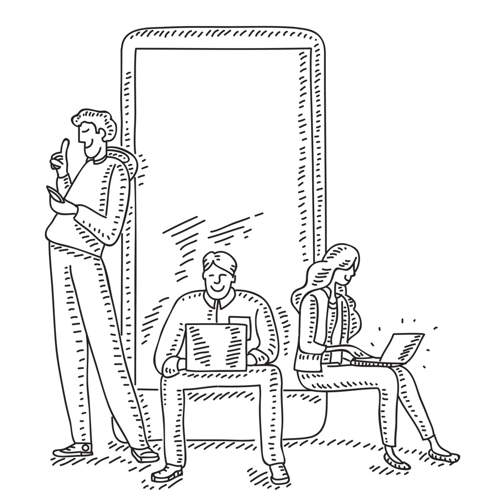
01. Know your users

UX tips: User profiles

Get to know your users, listen to them and mix up the way you test

As a designer, it’s really important to design how your users are likely to interact with a website, product or mobile application when exploring it. Don’t just use analytics and stats; get into the shoes of your users. Dig a little bit deeper. After understanding users, you will be able to make informed decisions in your design.

02. Write user profiles and user stories

When creating user profiles, ensure you actually interview a person. Time and time again I see a lot of profiling that is made up and not based on any form of research. When writing user stories, having an actual person in mind will help you to funnel those users to making the decisions you want. Never assume as a designer. It’s good practice to get into the routine of writing user stories. 

A user story is a high-level definition of a requirement, containing just enough information so that you can implement it within your UX. This not only helps to focus the hierarchy of what you are trying to get people to do, it also helps you to clearly create user goals. Point the user stories back to your user profiles within your interaction design. Ultimately, this will help with conversion and also create a testing hierarchy to work from.

03. Listen to your users

Listening is one of the most important aspects of good UX design. Always take time to listen to your customers and most importantly when collaborating with conversion rate specialists. As a UX designer it’s your responsibility to bring together all of the requirements from a wide range of stakeholders.

That's why the greatest digital projects are often those where there is a perfect equilibrium between the client's objectives and the user's needs. Sit on that fence, and balance well.

04. Get out of the lab environment when testing mobile

I’ve thought this for a long time about user testing. Why would you test a user in a lab when the majority of their time using a mobile is on the move? You can gain excellent insight by changing the way you test and where you test.

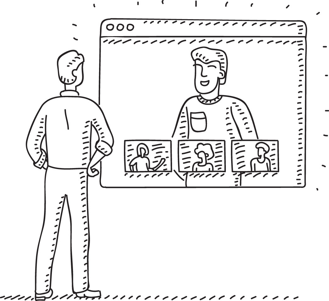
05. Use effective tools for collaborative teams

UX tips: workflow

Consider tools, logic and animation

If you are an independent business you will no doubt find yourself collaborating with a number of specialist people on a project. Setting up clear communication channels is a must. I spend more time planning, collaborating and organising teams to deliver great products and design. I tend to use software such as Jira or Confluence for the more heavyweight projects and Trello or Asana for smaller projects linked with Slack. These are fantastic tools to make your life easier when delivering projects. It will also save your inbox and the off chance of losing an important email.

06. Design with UX in mind

It’s good to seek inspiration. There are a lot of great resources online and huge communities of users that share their work, research and results, so seek these out. I like to find UX inspiration on Instagram and sites like awwwards.com and Behance.

07. Embrace the white space

I always use consistent typography and white space. Your clients will expect you to fill the space or certainly ‘make the logo bigger’ but white space is so important, especially designing for mobile. Ensure you follow some simple grid systems. I do this all the time with layouts. It not only makes the design process simpler but also consistent. Have fun with white space and don’t be afraid to play around with the size of typographic headers and also the fonts you use. Think of a website like a road trip: move users seamlessly from one section to the next by understanding the users’ personas, goals and needs.

08. Never put emotion before logic

UX tips friction free

Be careful not to distract the user

Users often perceive visually pleasing designs as being easy to use. However, there is a fine line between distracting a user from their task and enforcing branding/marketing. Users are more likely to notice items near the top of the page, in order of their importance.

09. Include animation

Splash screens and simple loading animations create brand intrigue. When onboarding a user for the first time, go the extra mile with simple animations, top tips or even introduce your app with some brand animations. Allow the user to skip or ‘don’t show’ if they are returning but don’t overload your animations. More than three seconds loading time results in around a 55 per cent bounce rate. Give users feedback if their waiting time is more than one second.

10. Reduce the need for carousels

Okay, I’ll raise my hand and admit using a carousel in a recent project but it was to explain a customer’s process and it wasn’t just the latest promo marketing had asked me to add into a home page. Stats do indicate that most users stop viewing carousel content after three or four slides. Don’t overload a carousel with more than four slides or even better, get into the habit of not using them at all.

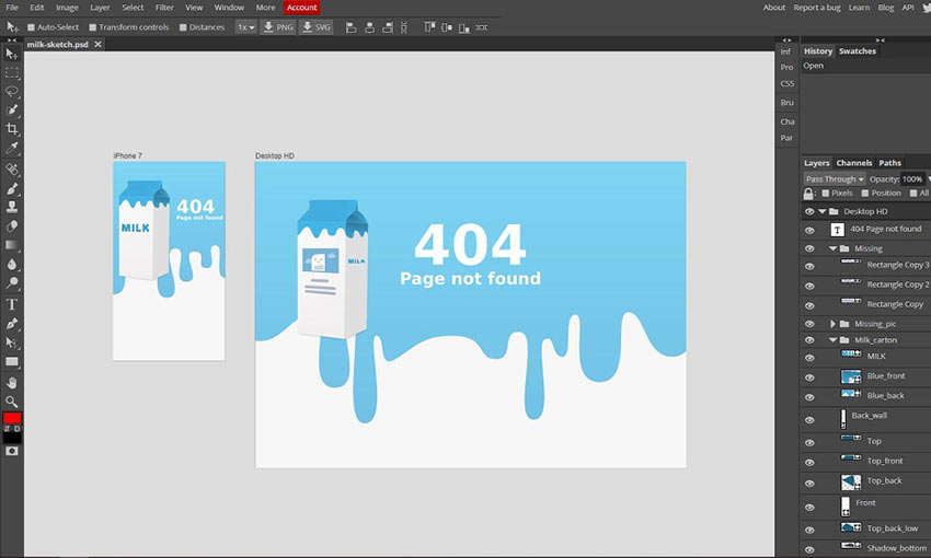
11. Focus on details

Think about focusing on the other tiny details, as it will take your user experience to the next level. When was the last time you designed an interesting 404 page? Here are some great examples of how to design a 404 error page – and how not to.

12. Concentrate on content

UX tips: Content

Content is king

Copy and content rule when it comes to your interface. Make good use of headings, sub-headings and copy breaks. Create smaller paragraphs to help viewers scan your web pages quickly to make your content more user-friendly. I like to make sure copy isn’t too long. Be clear and concise with what you are saying. Users will scroll down the web page as long as it is clear that relevant information is below the fold. However, don’t make the pages too long. It’s all in the balance.

13. Design with content and not Latin text

I see this all the time when designers don’t work with the content. It does help customers ‘fill in the boxes’ but UX and UI design should never be about this. When I design I aim to write the content or collaborate with a copywriter. It gives a customer more context with your wireframes and early design stages. Even if it’s first draft content, it still enables you to make more informed decisions on how the content people are engaging with will be presented.

14. Have a conversation with your site’s users

UX tips

Make online experiences conversational

Well not literally but metaphorically. Make online experiences conversational. Content can be so much more appealing when your users connect. Don’t leave users in the dark; offer simple guidance (I don’t mean waffle) about what they need to do. It makes it more engaging. Brands like Innocent Drinks are a great example of how to create good conversation with brand experience.

15. Know that less is more

Paul Rand, American art director and graphic designer born in 1914, once said: “Good design doesn’t date, bad design does”. We tend to see a lot of design trends and styles that come and go, not just in terms of UI and UX but across design in general. Find your own design style. Work hard at it, create rules, follow design practice and question why. All great design always has one thing in common and that is simplicity. So strive for simplicity and clarity in your design to ensure it is received by the audience in a single glance or interaction. Minimalist and simple designs are easy to understand and are more appreciated by your audience.

16. Learn Hick’s law

If you don’t know about Hick’s law, do some research into it, as it will change the way you approach user interface design. Hick’s law – also known as the Hick–Hyman law – takes its moniker from the British and American psychologists William Edmund Hick and Ray Hyman and establishes the time it takes for a person to make a decision based on the possible choices available. 

Hick’s law assesses the information capacity in choice reaction experiments. The amount of time it takes in order to process a certain amount of bits in the Hick–Hyman law is known as the rate of gain of information. So in essence, keep those options to a minimum. Apply this practical advice to your designs. Remove unessential noise so users have a clear journey of interaction. 

You’ve got to find the balance between creating an engaging brand experience that converts users and designing something that looks like it was straight out of the 1990s. Speed things up by reducing the chance users will get distracted and leave. Research more into Hick’s law as it no doubt will help with your end product; it certainly has helped me.

17. Never interrupt users for no reason

Don’t get me started on chatbots or instant messages. Although there are pros and cons about using chatbots, interrupting a user as they start their problem-solving journey is detrimental to their experience. For example, opening up a dialogue box without the user having done anything is a bad idea and just annoying. Many sites bombard visitors with ‘How can I help?’ or ‘I’m a chatbot… let’s get started’. A dialogue should always open on an interaction and never be intrusive.

18. Avoid 'Get Started' as a call to action

Avoid ‘Get Started’ as a call to action This is one of my pet hates. I see it a lot. In fact avoid internalised language across any call to actions but especially ‘Get Started’. Your customer may call it one thing but your user might not understand it. Language is key, so ensure it’s simple and direct. Take care to never use ambiguous language.

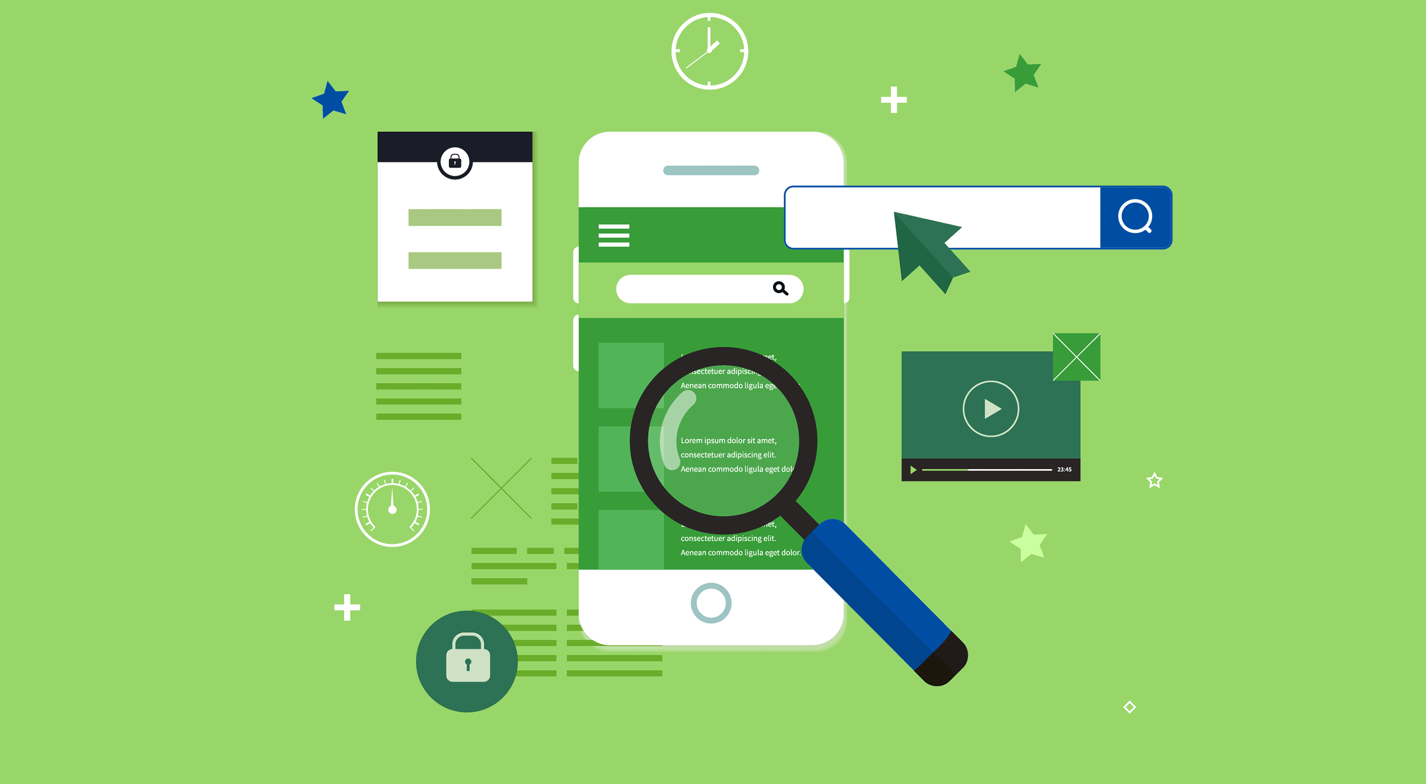
19. Be proactive when it comes to responsive design

UX tips: Accessibility

Design with accessibility and responsiveness in mind

I always start with designing for mobile and then work on mobile and desktop simultaneously. There are more approaches than ‘just stacking the content’ for mobile. As a UI designer I’ve learnt to effectively design responsive user interfaces that make use of flexible layouts, images and style sheets. Having a good relationship with your coder is a must if you’re not building the site or app. 

20. Make your designs accessible

I had an experience a few years back working with a client that got extremely frustrated during the design stage. There was a huge problem trying to get colours signed off. What I hadn’t ascertained was that the customer was in fact slightly colour blind. Colour blindness (colour vision deficiency) affects approximately one in 12 men and one in 200 women in the world. In Britain, this means that there are approximately 3 million colour blind people (about 4.5 per cent of the entire population), most of whom are male. 

I highly recommend getting hold of some sim specs during your testing process. It will take your user testing to a new level. Convert your designs to greyscale to ensure all users have a unified experience. Avoid the use of blue for any text on websites other than links. Be aware of the contrast on mobile websites as well. Reserve one colour for CTAs and make sure it contrasts with the rest of the page. Cold and dark colours stay in the background and warm bright colours like orange come forward. If your client’s brand has similar colours in tone, recommend a new contrast colour. You might find conversions go up. 

Check out our guide to inclusive web design.

This article was originally published in issue 321of net, the world's best-selling magazine for web designers and developers. Buy issue 321 or subscribe to net.

Related articles:

The best new UX books right now7 golden rules of UXHow to use colour to shape UX

Understand CSS Border Corner Shape

Original Source: https://www.hongkiat.com/blog/css3-border-shape/

We have been seeing several new CSS3 features that are widely implemented, such as Rounded Corner, Box Shadow, and Text Shadow, just to name a few. Still, there are several features that are…

Visit hongkiat.com for full content.

50 Beautiful Nature Wallpapers For Your Desktop

Original Source: https://www.hongkiat.com/blog/100-absolutely-beautiful-nature-wallpapers-for-your-desktop/

Huge collection of high-quality and beautiful nature wallpapers.

The post 50 Beautiful Nature Wallpapers For Your Desktop appeared first on Hongkiat.

Visit hongkiat.com for full content.

Photoshop Alternatives for Designers

Original Source: http://feedproxy.google.com/~r/1stwebdesigner/~3/DggnTxgLQEU/

One of the biggest hurdles to becoming a web or graphic designer is the cost. Professional design software takes time to learn and is expensive on top.

Photoshop may be the leader in graphics editing, but it has a price tag to match. With the Creative Cloud service on a monthly payment scheme, it can cost you a minimum of $120 per year, and you don’t even get a permanent license to use Photoshop.

If that’s just too expensive for you, or you want editing software with a perpetual licensing model, there are plenty of alternatives out there. Some are even free. Here are 6 design software alternatives with similar functions and feel to Photoshop.

Your Web Designer Toolbox
Unlimited Downloads: 500,000+ Web Templates, Icon Sets, Themes & Design Assets


DOWNLOAD NOW

Affinity Photo

Example of Affinity Photo

Affinity Photo is one of the best and most similar Photoshop alternatives available. A one-time $50 fee gets you access to an advanced and affordable program for Mac or Windows, or you can get a cheaper version for your tablet.

The editor comes with support for RAW files, panoramas, vector drawing, and effective retouching tools. Its one downside is the limited plugin selection that leaves it not very extendable. But for a majority of designers, it can take Photoshop’s place pretty well.

GIMP

Example of GIMP

You can’t beat free, and open source GIMP is a popular Photoshop competitor. A majority of Photoshop’s tools are available here, and it accepts a wide range of file formats including PSDs.

One of GIMP’s main features is its customizability. There are hundreds of third-party tools ranging from entire plugins to artistic brushes. However, its interface is less streamlined than Photoshop’s, and it’s missing some important tools like non-destructive editing and CMYK support.

But overall, it’s a solid choice for graphic designers if you don’t need certain advanced features.

Sketch

Example of Sketch

Sketch is a vector graphics editor and web design tool for macOS, with multiple improvements over Photoshop in areas of UI design. It’s made for website prototyping and comes with grids built in, pixel perfect precision, and smart guide functionality.

The program is focused solely on UI and mockups, and comes with no features like bitmap brushes or photo editing. If you find yourself using Photoshop’s other artistic features frequently, you may want a more general-purpose editor. But UI/UX designers will quickly fall in love with this easy-to-use program.

Photopea

Example of Photopea

For a free, entirely in-browser editor, Photopea comes with a surprising array of features. Its clean interface will feel very familiar to Photoshop fans, and you’ll be shocked at how much is packed into it.

That said, if you’re used to advanced or even mid-level Photoshop features, Photopea doesn’t yet hold up in all of these areas. It’s a great emergency editor, and perfect if you only need a basic set of tools. Some designers won’t need anything more, but don’t expect the raw power of a downloadable program from this.

Krita

Example of Krita

If your design work often involves painting and creating artwork or graphics, Krita would be a great choice. It’s free and open source, and has the power of Photoshop with an interface specialized for artists.

There are over 100 brushes included and ways to download more, a fully customizable interface, vector support, and HDR painting. Krita isn’t suitable for general editing and manipulation, but it’s perfect for illustrators and graphic designers.

Figma

Example of Figma

Figma is similar to Sketch in that it’s focused around prototyping and UI design, but it comes with its own host of features. The biggest is its support for live multi-user editing with your teammates. It works in the browser and has a free starter plan for up to two designers.

It also comes with vector editing, commenting, prototyping tools, and the ability to export as a PDF or image. If your focus is on collaboration, and you want to design alongside others, Figma is definitely one to consider.

Low-Cost Photoshop Alternatives

Photoshop is considered a staple of a designer’s toolkit, but it hardly has a monopoly on the industry. There are plenty of other programs out there that have similar functionality to Photoshop and a price tag as low as free.

Just remember that these programs only provide similar functionality to Photoshop. If you use other programs in the Creative Cloud suite, such as Lightroom, Illustrator, Dreamweaver, or InDesign, you’ll need to find alternatives for those as well.


How to Build a News App with Svelte

Original Source: https://www.sitepoint.com/svelte-news-app-build/?utm_source=rss

How to Build a News App with Svelte

Svelte is a new JavaScript UI library that’s similar in many ways to modern UI libraries like React. One important difference is that it doesn’t use the concept of a virtual DOM.

In this tutorial, we’ll be introducing Svelte by building a news application inspired by the Daily Planet, a fictional newspaper from the Superman world.

About Svelte

Svelte makes use of a new approach to building users interfaces. Instead of doing the necessary work in the browser, Svelte shifts that work to a compile-time phase that happens on the development machine when you’re building your app.

In a nutshell, this is how Svelte works (as stated in the official blog):

Svelte runs at build time, converting your components into highly efficient imperative code that surgically updates the DOM. As a result, you’re able to write ambitious applications with excellent performance characteristics.

Svelte is faster than the most powerful frameworks (React, Vue and Angular) because it doesn’t use a virtual DOM and surgically updates only the parts that change.

We’ll be learning about the basic concepts like Svelte components and how to fetch and iterate over arrays of data. We’ll also learn how to initialize a Svelte project, run a local development server and build the final bundle.

Prerequisites

You need to have a few prerequisites, so you can follow this tutorial comfortably, such as:

Familiarity with HTML, CSS, and JavaScript (ES6+),
Node.js and npm installed on your development machine.

Node.js can be easily installed from the official website or you can also use NVM for easily installing and managing multiple versions of Node in your system.

We’ll be using a JSON API as a source of the news for our app, so you need to get an API key by simply creating an account for free and taking note of your API key.

Getting Started

Now, let’s start building our Daily Planet news application by using the degit tool for generating Svelte projects.

You can either install degit globally on your system or use the npx tool to execute it from npm. Open a new terminal and run the following command:

npx degit sveltejs/template dailyplanetnews

Next, navigate inside your project’s folder and run the development server using the following commands:

cd dailyplanetnews
npm run dev

Your dev server will be listening from the http://localhost:5000 address. If you do any changes, they’ll be rebuilt and live-reloaded into your running app.

Open the main.js file of your project, and you should find the following code:

import App from ‘./App.svelte’;

const app = new App({
target: document.body,
props: {
name: ‘world’
}
});

export default app;

This is where the Svelte app is bootstrapped by creating and exporting an instance of the root component, conventionally called App. The component takes an object with a target and props attributes.

The target contains the DOM element where the component will be mounted, and props contains the properties that we want to pass to the App component. In this case, it’s just a name with the world value.

Open the App.svelte file, and you should find the following code:

<script>
export let name;
</script>

<style>
h1 {
color: purple;
}
</style>

<h1>Hello {name}!</h1>

This is the root component of our application. All the other components will be children of App.

Components in Svelte use the .svelte extension for source files, which contain all the JavaScript, styles and markup for a component.

The export let name; syntax creates a component prop called name. We use variable interpolation—{…}—to display the value passed via the name prop.

You can simply use plain old JavaScript, CSS, and HTML that you are familiar with to create Svelte components. Svelte also adds some template syntax to HTML for variable interpolation and looping through lists of data, etc.

Since this is a small app, we can simply implement the required functionality in the App component.

In the <script> tag, import the onMount() method from “svelte” and define the API_KEY, articles, and URL variables which will hold the news API key, the fetched news articles and the endpoint that provides data:

<script>
export let name;

import { onMount } from “svelte”;

const API_KEY = “<YOUR_API_KEY_HERE>”;
const URL = `https://newsapi.org/v2/everything?q=comics&sortBy=publishedAt&apiKey=${API_KEY}`;
let articles = [];

</script>

onMount is a lifecycle method. Here’s what the official tutorial says about that:

Every component has a lifecycle that starts when it is created and ends when it is destroyed. There are a handful of functions that allow you to run code at key moments during that lifecycle. The one you’ll use most frequently is onMount, which runs after the component is first rendered to the DOM.

Next, let’s use the fetch API to fetch data from the news endpoint and store the articles in the articles variable when the component is mounted in the DOM:

<script>
// […]

onMount(async function() {
const response = await fetch(URL);
const json = await response.json();
articles = json[“articles”];
});
</script>

Since the fetch() method returns a JavaScript Promise, we can use the async/await syntax to make the code look synchronous and eliminate callbacks.

The post How to Build a News App with Svelte appeared first on SitePoint.

These fake AirPods are utterly ludicrous

Original Source: http://feedproxy.google.com/~r/CreativeBloq/~3/xhZSkN2t6R4/fake-airpods

Apple AirPods have become the absolute must-have accessory for iPhone, iPad and iPod since their launch in 2016. They have a lot of brilliant tech packed into them, and although they looked a bit weird when they first came out, it's now impossible to walk down the street without passing loads of people with those telltale AirPod arms hanging out of their ears.

AirPods aren't without their drawbacks, though. For starters, they're expensive; even if you search out the best Apple AirPod deals, you're talking over £150 for a pair, and that's before you've factored in the essential wireless charging case. That's a lot to pay for something that you're more likely to lose than you are a traditional pair of wired earphones.

Apple Black Friday deals: What to expect in 2019

And of course, you need an Apple device to go with them; no AirPods for you, Android owners. Amazon's just announced its own Echo Buds, which appear to be a strong AirPod alternative with many similar features at a less hefty price, but do they look as cool as actual AirPods? 'Cool' is very much a subjective thing, but we feel that many would think that no, they do not.

Fake AirPods: ASOS site

From a distance, who’s going to know?

However, if you want that distinctive, "Hey, look at me, I've got some AirPods!" look, here's ASOS with a solution that'll give you instant street cred at a tiny fraction of the price. It's launched its own fake AirPods – that's ASOS DESIGN faux headphone ear piece in silver tone to you – and they're absolutely ideal for looking like you're wearing AirPods. At least from a distance.

Like real AirPods, they're not quite perfect. For one thing, they're not that unmistakable AirPod white. Instead they're 100 per cent zinc with a silver-tone finish, which isn't likely to fool anyone, but you could always claim that you have a cousin who works at Apple who gave you a secret silver pair that isn't even going to be out until next year. Definitely worth a shot.

Fake AirPods: close-up

No, they don’t work. And yeah, you only get one.

Oh, and for another thing, they don't actually work. All they're for is making it look a bit like you're wearing AirPods. You may laugh, but we're absolutely certain there's a market for this. Admittedly, though, if being able to listen to music or podcasts is a deal-breaker for you then you might want to pass on these.

And for a third and final thing, we think you only get one faux headphone ear piece. So if you want to achieve the full effect then you'll probably have to order two of them. But at £6 a shot you're not exactly going to break the bank; you could buy at least 25 of them for what you'd pay for some actual functional AirPods!

ASOS, we salute your chutzpah. Please send us some.

Related articles:

The 10 most beautiful Apple products (and the 5 ugliest)Apple shares how AirPod users personalise their cases – and they look amazing!The 100 greatest Apple creations

Popular Design News of the Week: September 16, 2019 – September 22, 2019

Original Source: https://www.webdesignerdepot.com/2019/09/popular-design-news-of-the-week-september-16-2019-september-22-2019/

Every week users submit a lot of interesting stuff on our sister site Webdesigner News, highlighting great content from around the web that can be of interest to web designers. 

The best way to keep track of all the great stories and news being posted is simply to check out the Webdesigner News site, however, in case you missed some here’s a quick and useful compilation of the most popular designer news that we curated from the past week.

Note that this is only a very small selection of the links that were posted, so don’t miss out and subscribe to our newsletter and follow the site daily for all the news.

Don’t Make the Same Design Fail as the Chicago Bulls Logo


15 Unique Website Layouts


Where to Put Buttons on Forms


Free Collection of Amazing PNG Images


5 Soft Skills Every Product Designer Should Master


Microsoft’s New Font for Devs is Very Aesthetically Pleasing (and Free)


7 CTA Button Design Guidelines


Sticky Positioning with Nothing but CSS (Thanks to CSS Position: Sticky)


Typography Basics: Terminology, Examples, And Infographics


AI UI Pattern Library


Inconsistent Behavior Among Browsers When Clicking on Buttons


(Why) Some HTML is “Optional”


A Love Letter to Personal Websites


Augmented-UI


Dark Mode – Working with Color Systems


‘Intent’ Should Be Every Marketer’s #1 Obsession


Four Tips from my First Year as a UX Developer


UX Design — Question Everything


This Typeface Hides a Secret in Plain Sight. And that’s the Point


10 Best Sites for Vector Illustrations


Storybook 5.2


To do Better Work, Change your Environment


100,000 AI-Generated Faces – Free to Use!


Apparently We’ve been Doing Logos Wrong all this Time


Light Theme, Redeemed


Want more? No problem! Keep track of top design news from around the web with Webdesigner News.

Source

p img {display:inline-block; margin-right:10px;}
.alignleft {float:left;}
p.showcase {clear:both;}
body#browserfriendly p, body#podcast p, div#emailbody p{margin:0;}

Floral Tattoos: Exquisite Black and Grey work by Vanessa Dong

Original Source: http://feedproxy.google.com/~r/abduzeedo/~3/1s41lhuU_c8/floral-tattoos-exquisite-black-and-grey-work-vanessa-dong

Floral Tattoos: Exquisite Black and Grey work by Vanessa Dong

GisMullrSep 27, 2019

Who doesn’t like a beautiful tattoo? I’m talking about those pieces that get your attention. Artworks that make your turn your head to see more of it and check the details. And yes, I’m the kind of person that will start a conversation if I like a tattoo. I know, weird. There are several different styles of tattoo out there. But I’m always drawn to black and grey pieces with beautiful outline and minimal design. And I believe this is why I simply love Vanessa’s work. The tattoos she creates are delicate and beautiful. Masterpieces on skin. The pictures she posts of her work are breathtaking and totally inspiring. She specializes in floral/botanical work and you will see plenty of lines, geometric shapes and negative space on her pieces. Since I’m a sucker for black and grey tattoos and I basically stalk Vanessa on Instagram I decided to get in touch with her and publish some of her work here.

Tattoo artists have the privilege of drawing permanent artworks on people’s skin. And I admire them for that. They listen to your idea and create a concept that will be inked on your skin for good. And oh boy, we all love beautiful timeless tattoo pieces like the ones you will see here. Vanessa is based in Vancouver, BC and she keeps her followers informed about her books on Instagram. So stay tuned to her account if you want to get inked. This is certainly a great excuse to visit Vancouver. 😉

Vanessa is a tattoo artist based in Vancouver, BC. She specializes in floral/botanical black and grey work. She is currently based out of a private studio in East Vancouver. Her work has been featured on Hypebae, Daily Hive Vancouver, Narcity Canada as well as The Mix Society. Vanessa graduated with a Bachelors Degree at Emily Carr University for Communication Design. She did her apprenticeship with Katia at Rainfire Tattoo in 2012-2013. Vanessa loves creating pieces for her clients that are one of a kind.

Exquisite Black and Grey Floral Tattoos by Vanessa DongExquisite Black and Grey Floral Tattoos by Vanessa DongExquisite Black and Grey Floral Tattoos by Vanessa DongExquisite Black and Grey Floral Tattoos by Vanessa DongExquisite Black and Grey Floral Tattoos by Vanessa DongExquisite Black and Grey Floral Tattoos by Vanessa DongExquisite Black and Grey Floral Tattoos by Vanessa DongExquisite Black and Grey Floral Tattoos by Vanessa DongExquisite Black and Grey Floral Tattoos by Vanessa DongExquisite Black and Grey Floral Tattoos by Vanessa DongExquisite Black and Grey Floral Tattoos by Vanessa DongExquisite Black and Grey Floral Tattoos by Vanessa DongExquisite Black and Grey Floral Tattoos by Vanessa DongExquisite Black and Grey Floral Tattoos by Vanessa DongExquisite Black and Grey Floral Tattoos by Vanessa DongExquisite Black and Grey Floral Tattoos by Vanessa DongExquisite Black and Grey Floral Tattoos by Vanessa DongExquisite Black and Grey Floral Tattoos by Vanessa Dong

More links:

tattoosbyvanessa.com
Instagram


Is It Time to Embrace AMP?

Original Source: https://www.webdesignerdepot.com/2019/09/is-it-time-to-embrace-amp/

If you own a website, you should have at least heard the term AMP before. If you haven’t, it’s likely you will hear more about it very soon.

Google’s Accelerated Mobile Pages (AMP) Project has impacted the user experience of millions of mobile web users since its initial launch in 2015. Though primarily used to help website owners build interactive sites that load fast on mobile devices, this project never fails to impress with new and improved features, despite some people’s inability to keep up.

Google recently announced one such feature – Swipe to Visit – in late July of this year. Designed to make it faster and easier than ever for users to view images on mobile devices, this feature also makes accessing those images’ webpages a cinch. All you have to do is search for an image, view the website header preview, and swipe up to be redirected to the website.

This begs the question: Is all of this really necessary?

Of course, Google claims that this is dedicated to improving the user experience, but is having to support projects such as AMP something that should be required by all website owners looking for higher search engine results pages (SERPs)? Or is this just another excuse for Google to control what happens on the Internet?

While there are good arguments on either side, one thing is for sure: Swipe to Visit will change the way people view images and access websites on their mobile devices. You’ll need to decide whether this is something you want to support or not, after you understand the good and the bad of AMP.

Why Is AMP So Important?

When your mobile webpages take forever to load, don’t work right, or force people to zoom, pinch, or rotate their devices, you risk losing a reader instantly. Poorly optimized mobile web design and clunky advertisements ruin the user experience. Google understands this.

In an effort to improve the performance of the mobile web, Google teamed up with Twitter to launch the AMP project. Has it worked?

One study suggests that webpages using AMP load four times faster and use eight times less data compared to traditional, mobile-optimized webpages. Another reveals that AMP can reduce bounce rates by as much as 40%. And let’s not forget about the Events Ticket Center that dropped their page loading times from five to six seconds to a blazing-fast, one-second loading time.

If you’re a publisher that relies on advertisements, you stand to generate up to three times the ad revenue each day and see your ads load five seconds faster by implementing AMP pages.

More than 31 million domains have adopted Google AMP pages since then.

Why Swipe To Visit Is A Good Thing

Whether you’re a fan of Google AMP or not, there’s no denying that the Swipe to Visit feature is a good thing. 

Every person out there with a website is vying for the first page in Google SERPs. However, Google has made it increasingly hard for websites to rank organically, seeing as paid ads and featured snippets are dominating the first page these days.

On tiny mobile devices, this means your website isn’t initially seen much of the time, even if it’s on the first page.

What if we told you that appearing in specialized Google image searches would allow your website to rank higher? Using Google AMP and Swipe to Visit does just that.

Thanks to the unique way people can instantly access your website with a simple swipe, you can not only expect better search rankings, but higher clickthrough rates and lower bounce rates.

Swipe to Visit makes it simple for site visitors to scan images, compare offers, and make better purchasing decisions, all of which are considered by Google to be best practices (and award your higher SERPs). This means that anyone adopting Google AMP pages will automatically enjoy more site traffic from image searches.

The Criticism of AMP

The other side of the coin is that there are a lot of problems associated with AMP.

The truth is that implementing AMP pages is not that easy. Even some websites that do enable Google AMP pages don’t get the results they expected simply because they didn’t do a thorough enough job implementing AMP throughout the entire website.

Criticism from experts centers on the fact that AMP mainly works because it’s so restrictive. Imposing limits is ultimately how AMP reduces load times and bandwidth use. 

Further, a good amount of third-party software doesn’t yet work well with AMP, which can hinder functions like data tracking.

To utilize Google Analytics tracking, AMP requires that every single AMP page uses a unique analytics tag, which can be a burdensome task from the start for large websites, if the tags are added manually.

There are also other things to think about, such as:

There are still branding limitations since JS and CSS aren’t used
AMP only works if users click your AMP-enabled webpage
Even WordPress-specific AMP plugins aren’t always easy to use or compatible with other plugins

Lastly, development has been relatively slow-paced in the AMP world. While 30+ million domains have adopted AMP pages, that’s nowhere near recognizable enough for the average mobile user to realize they’re using (and benefiting from) AMP pages.

Final Thoughts: To Adopt AMP or Not?

The Google AMP project is a great concept with the goal of improving the user experience and helping website owners reap the benefits of said user experiences. When it comes to helpful features like Swipe to Visit, this project becomes even more valuable. However, until AMP pages become more mainstream in mobile results, the time and effort it will take to overhaul your site and implement AMP may not be worth it right now.

In the end, every website owner has a different set of circumstances. This means that enabling AMP on an entire website, on just certain pages, or not at all, might be your best solution.

As the competition continues to stiffen in the online world, it’s going to become more important than ever to consider all the tools available at your disposal, including AMP pages, and determine how these tools can be used to help you achieve your goals.


Featured image via DepositPhotos.

Source

p img {display:inline-block; margin-right:10px;}
.alignleft {float:left;}
p.showcase {clear:both;}
body#browserfriendly p, body#podcast p, div#emailbody p{margin:0;}

5 Popular Freelancing Advice You Should Ignore

Original Source: https://www.hongkiat.com/blog/popular-freelancing-advices/

No matter what your freelance niche is, there’s tons of advice out there that’s considered gospel. Just as there’s popular blogging advice that doesn’t always work,…

Visit hongkiat.com for full content.