Entries by admin

​Download 10 Free Images From Adobe Stock

Original Source: https://www.webdesignerdepot.com/2018/06/%E2%80%8Bdownload-10-free-images-from-adobe-stock/

It’s been just three years since Adobe unveiled Adobe Stock, and in that time the service has grown from 40 million photos and vectors, to over 90 million assets ranging from professional photographs, to high-quality 3D files; that’s over 45,000 new assets uploaded every day.

The bitmaps, vectors, videos, 3D models, and design templates offer both designers and businesses a simple way of employing art-direction as a sales tool, without the associated cost.

Professional-Grade Assets

In a world of competitive marketing, social media, and 24 hour advertising, successful brands need shots that aren’t just well-taken, but well produced, with post-production in Adobe Lightroom or Photoshop as a minimum requirement.

As the devices we view the web on become more sophisticated, the need for professional-grade images grows; the time has passed when snap-shots taken on a home-camera—even a high-end model—are sufficient.

Because Adobe Stock is tightly integrated into the tools that professional photographers prefer, Adobe Stock has a disproportionately high number of professional photographers uploading work, giving users unprecedented access to the type of quality shot that actively draws in users.

In addition to the normal range of images, Adobe Stock Editorial delivers a hand-picked set of premium images that are highly topical. If your business works in fast-paced news media, or leverages current events to engage users, then Adobe Stock Editorial gives you access to images that you won’t find anywhere else.

Taking Your Business Global with Adobe Stock

One of the biggest issues facing brands in 2018 is the increasing global identity of consumers. Even when selling nationally, brands are finding that customers expect to be represented in marketing material.

Gone are the days when a company could shoot its catalogue on the back lot and hope to make a connection with its customer base; a company based in New Jersey needs to include assets that speak to consumers in New Mexico.

Even when a company has the budget to hire a professional photographer, a team of models, hair and makeup professionals, and post-production services, it’s rare that there’s the budget to ship the team to different locations. Adobe Stock enables companies to engage different cultures, both interstate, and international, by providing professional grade images that reflect their customers, no matter where they’re located.

Adobe Stock assets are royalty-free, meaning there are no geographic, or time limits on using them. And Adobe Stock excels at enabling brands to express their values through selective images; different nationalities, cultures, genders, and age groups can all be found in a few clicks.

Adobe Stock also helps you combat safe-guarding issues. Because all Adobe Stock images of people include model releases (meaning the model has consented to their likeness being used) you can safely add pictures of people, including children, without running into privacy issues.

By using Adobe Stock you’re gaining access to the local expertise of photographers worldwide, leveraging their insights to engage your audience in ways you never expected.

Adobe CC Integration

Adobe Stock has the tightest integration with Adobe Creative Cloud (CC) of any stock provider, and includes numerous features that are exclusive to CC members.

CC products allow you to browse through Adobe Stock images, and even search by keyword, directly in the UI. In the case of images you can try before you buy using water-marked images, and only pay for images if you decide to license them. Purchasing couldn’t be simpler thanks to Adobe CC Libraries; when you buy the stock, the water-marked version of the asset is automatically swapped for a clean, high-quality version.

Adobe Stock even supplies design templates. Now, you can create a new file in your favorite Adobe design app by selecting a purchased template, then customizing it as per your requirements.

10 Free Images

To help you experience the power and depth of Adobe Stock for yourself, Adobe are offering WebdesignerDepot readers 10 free images.

To claim your free images, simply create a free Adobe ID (you don’t need an Adobe CC membership).


[– This is a sponsored post on behalf of Adobe –]

Add Realistic Chalk and Sketch Lettering Effects with Sketch’it – only $5!

Source

p img {display:inline-block; margin-right:10px;}
.alignleft {float:left;}
p.showcase {clear:both;}
body#browserfriendly p, body#podcast p, div#emailbody p{margin:0;}

20 Best New Portfolios, June 2018

Original Source: https://www.webdesignerdepot.com/2018/06/20-best-new-portfolios-june-2018/

Welcome back, Readers. It’s June, and if I got paid extra for every instance of the word “minimalist” in this article, I could probably afford to vacation in Canada. Well, my point is that minimalism is the general theme of this month, because that’s what it has all come down to: various forms of minimalism.

Still, within that descriptor, there’s a fair amount of variety to be had here. Enjoy.

Note: I’m judging these sites by how good they look to me. If they’re creative and original, or classic but really well-done, it’s all good to me. Sometimes, UX and accessibility suffer. For example, many of these sites depend on JavaScript to display their content at all; this is a Bad Idea™, kids. If you find an idea you like and want to adapt to your own site, remember to implement it responsibly.

Bruno Ferdinand

Bruno Ferdinand is a designer with strong type skills and the nearly-obligatory hipsterish tendencies we see a lot of nowadays. The guy does simple, beautiful, and kind of rustic design rather well.

Platform: JS app

Yumpic

Yumpic is a portfolio site featuring — and you might have guessed this — photos and videos of food. They specialize in food-related digital content for anyone who wants to make the perfect Instagram account, and also (read: actually mostly) for people who make money off their food. The actual portfolio work is artfully interspersed with illustration and playful touches, which definitely sets the right mood,in my opinion.

Platform: WordPress

Duane Dalton

Duane Dalton’s portfolio pretty strongly reflects his print-focused work, being minimalist and asymmetrical. It’s one of the simpler sites on this list, but no less visually pleasing for that.

Platform: Static Site

Kenta Toshikura

Kenta Toshikura’s website is one of those minimalist-looking presentation-style sites. As is par for the course in cases like these, I’d not look too closely at the usability, but the visuals and general aesthetic style are just plain pretty, darnit. In particular, there’s this touch of 3D-feeling typography that catches my eye.

Platform: Static Site

Ellen Mandemaker

I’m not precisely sure what Ellen Mandemaker makes, precisely, but my best guess is art. And art is what you get from the get go: you’ll see a collage of it to begin with, and then a simple and orderly portfolio that promptly and efficiently throws you into the deep end. It’s one of those portfolios that made me think “I’m not entirely sure what I’m looking at, but I like it.”

Platform: Static Site

No Plans

No Plans is a one-page portfolio that keeps things fairly simple, preferring a clean design and a decidedly serif-friendly way of doing things. Also, they indent some of their paragraphs. I know, right? You hardly ever see that these days.

Platform: WordPress

Lab101

I’ll never be a fan of sites that change your cursor, but everything else about Lab101 is pretty solid. The overall aesthetic is minimalist and modern, with some interesting touches of 3D animation on the “Contact” page.

Platform: WordPress

Studio Bjørk

Studio Bjørk has a thing for monochromatic palettes, diagonal lines, and horizontal layouts. And you know what? It works out pretty darned well for them. There’s also a significant bit of animation, great type, and some background video here and there, all combining to make a site that a marketer would call dynamic. Oh,

[Sighs.] Fine, I’ll call it dynamic, too. It just sounds so much like marketer-speak that I didn’t want to say it.

Platform: Static Site

Juul Hondius

I often make reference to magazine-style designs ion this article series, but Juul Hondius’ portfolio is one of the more interesting examples I’ve seen lately. It looks like an old, ooold magazine, complete with small spacing issues and slightly cramped text, combined with beautiful and striking photography.

Those might technically be “issues”, but the design as a whole hits me with a very specific sense of nostalgia that just sells the imagery to me. Besides, it’s a photographer’s site. How badly do you want to read the text anyway?

Platform: Static Site

Thu-Van Tran

Thu-Van Tran’s website has one main theme that makes it visually interesting: layers. Every page is loaded on top of the home page like one piece of paper overlaying another. It’s like a paper prototype come to life. Combined with the sheer simplicity of layout, and strong typographic choices, it stands out.

Platform: Static Site

Aristide Benoist

Aristide Benoist’s portfolio combines a grid-based aesthetic with warping animations to striking effect. While most of the text could and certainly should be bigger, the visual theme of this site is enough to make you look, at least. Whether it’s interesting enough to make you grab your glasses will greatly depend on the user.

Platform: Static Site

Datagif

Datagif love their sans-serif type, and apparently spicing up standard layouts with geometric flourishes and animation. This one’s not going to blow your mind, but it looks good, even kind of playful for all the corporate aesthetic it has. Give it a look.

Platform: Static Site (I think)

Handsome

Oh, Handsome takes me back maybe five years or so. The large serif type, the darkened photos as backdrops, all those barely visible straight lines. Did we just go back to the early days of flat design? Well, it’s both nostalgic, nearly perfectly executed, and a pleasure to browse.

Platform: Static Site

Sister

Sister’s agency site is living proof that any design style, even the once super-artsy minimalism-with-asymmetry trend, can be given an almost corporate flair. And that’s not a criticism. Corporate-feeling front end design tends to be modern and devastatingly effective in its simplicity, and the same is true here.

Not a fan of those occasional modal pop-ups, though. That’s a corporate trend that can go straight to hell.

Platform: WordPress

Makers and Allies

Makers and Allies is a branding studio in the finest tradition of hipster design studios, but with a lot more motion design added to the mix. It evokes just the right balance of rustic aesthetics with the modern technical competence we expect. Or at least the animation we expect. Whatever, it looks good, even if some of the text could use more contrast.

Platform: WordPress

Bipolar Studio

Bipolar Studio combines motion graphics with a pretty modernist aesthetic style, and good old fashioned big type. Their work basically is video, so it’s they use a lot of it in their design. I do like the little “stats” section at the end of each project page, detailing what it took to complete each project.

It’s just that, and I can’t believe I’m saying this, but the logo could be bigger. With type that thin, it should be.

Platform: Static Site and/or JS App

Akins Parker

Akins Parker’s agency site wasn’t made with Powerpoint, but it’s presentational design in its purest form. You go to see this one for the graphics, not for the usability.

Platform: Static Site

Ian Jones

Ian Jones’ portfolio is another site to embrace the visual grid theme. But unlike many other sites, the visual representation of the grid is only visible when his work is on the page. It’s a dead-simple approach, but it looks calm and professional, and I can’t fault that.

Platform: Static Site

Michael Uloth

Michael Uloth is a rare talent indeed. When he’s not literally singing opera, he builds minimalist-yet-beautiful websites for artsy people. His own site is no exception.

Platform: Static Site and/or JS App

Lasse Fløde

Lasse Fløde is a photography studio with a striking one-page portfolio. Lovers of white space should definitely enjoy this one, as it employs that asymmetrical almost collage-style so favored by many photography portfolios these days. Simple and effective.

Platform: Static Site

Add Realistic Chalk and Sketch Lettering Effects with Sketch’it – only $5!

Source

p img {display:inline-block; margin-right:10px;}
.alignleft {float:left;}
p.showcase {clear:both;}
body#browserfriendly p, body#podcast p, div#emailbody p{margin:0;}

The Best Ways to Use Symmetrical Design in your Projects

Original Source: http://feedproxy.google.com/~r/Designrfix/~3/OYioZuhXa5k/symmetrical-design

Symmetrical Design is a form of artwork where the objects or elements arrange identically on both sides of the axis. You will have perfect symmetry when the objects that are mirrors and exactly the same. While perfect symmetry can be alluring, that is not the only acceptable form of symmetrical design.Why Symmetrical Design is Important in […]

The post The Best Ways to Use Symmetrical Design in your Projects appeared first on designrfix.com.

19 great parallax scrolling websites

Original Source: http://feedproxy.google.com/~r/CreativeBloq/~3/Yi0kECfpYmc/parallax-scrolling-1131762

One web design trend that refuses to go away is parallax scrolling. With this, the website layout sees the background of the web page moving at a slower rate to the foreground, creating a 3D effect as you scroll. It can sometimes be overwhelming, but when used sparingly it can provide a nice, subtle element of depth that results in a distinctive and memorable website.

But to show how it should be done, we've collected together sites that employ the technique to good effect. In some cases the parallax scrolling is the star of the show; in others it simply adds a touch of depth that makes the foreground seem to pop out a little.

01. Bear Grylls

Digital agency Outpost was tasked with creating a new digital strategy for explorer and TV personality Bear Grylls. “To live up to the new brand vision and values and embody the ‘adventure brand’ we needed to take people on a journey online,” says the studio in its case study. A rich, dynamic user experience was key.

Subtle parallax is used throughout, but the real scene-stealer is the homepage. Grylls appears in a dramatic mountainscape, and the viewer is drawn into the scene as they scroll. It’s a great introduction to the adventures to follow.

02. ToyFight

ToyFight is an award-winning creative agency, and its website is a whole lot of fun. Founders Jonny Lander and Leigh Whipday have turned themselves into 3D figures, which appear in a range of scenes throughout the site (including this cheeky Sagmeister & Walsh reference). Clever use of parallax amplifies the 3D effect, and paired with bold, bright, plain backgrounds, never becomes overwhelming or irritating.

03. Hello Monday

Hello Monday is a design agency based in Denmark. It aims to create immersive digital experiences that tell a story and bring joy to their users, and it has gone one step beyond with its portfolio site. When creating a studio site, the difficulty is that adopting cool or cutting-edge design ideas often means sacrificing clarity and usability, which is paramount for a design portfolio. 

Hello Monday manages to achieve both by introducing a subtle parallax effect within a pared-back page layout. Each project hero image moves slightly, to bring it to life and add energy to the design without detracting from the information on show. The effect is used on the studio’s homepage only, with individual project pages kept static to allow the work to shine. 

04. A-dam

Screenshot of the A-dam website shows men in underwear

A-dam uses parallax to showcase its stylish underwear

A-dam designs original boxer briefs and shorts for men with character, using GOTS-certified organic cotton. The boxers are handmade by people with fair wages and normal working hours. They're an ethical and stylish alternative to your usual supermarket pants, and their site, created by Build in Amsterdam, showcases them nicely, with assorted parallax elements popping in from all directions as you scroll.

05. Diesel: BAD Guide

84.Paris created this impressive parallax website (and associated social media campaign) to accompany the launch of Diesel’s BAD fragrance. The one-page site presents the series of rules that make up the ‘BAD Guide’. 

The user can explore by dragging the mouse around the parallax page, which is laid out like a pinboard of images to click through. There’s advice on everything from Tinder (‘Swipe right, right, right, right – you’ll sort them out later’) to Instagram (‘Don’t forget to get in touch with an ex on Thursdays #TBT’), accompanied by monochrome illustrations.

06. Myriad

Screenshot of Myriad website shows 'Myriad' written in shapes

Bareface’s site for Myriad shows off the furniture system’s infinite possibilities

Myriad is a range of modular office furniture by Boss Design that's designed to be flexible and reconfigurable, allowing you to build your own working spaces as you see fit. As part of its work on the launch, Bareface created a site showcasing Myriad's infinite possibilities with clever use of parallax elements, pulling in inspiring arrangements of furniture as you explore the site.

07. Firewatch

Screenshot of Firewatch website shows an illustration of a hiker looking over a golden canyon at dawn

Each layer of trees moves independently

One of the most beautiful examples of parallax scrolling we’ve seen is this website for the game Firewatch, which uses six moving layers to create a sense of depth. It’s great because there’s no scroll hijacking (something that often accompanies the parallax effect), and it’s only used at the top of the page – the rest of the site is still so you can read the information without getting seasick. If you want to see how it’s done, here’s a nice demo on CodePen.

08. Garden Studio

Screenshot of Garden site shows an illustration of a bench under red-leafed trees overlooking a lake

Layering of the landscape makes it seem three dimensional

In a similar vein, Garden Studio has also opted to use the parallax technique in a sensible and delightful way at the top of its site, before moving into a mostly static page. The shifting landscape is subtle and unobtrusive yet also the star of the show – we found ourselves scrolling up and down again and again. 

09. GitHub 404

Screenshot of GitHub's 404 page shows a cartoon Jedi-type character saying 'This is not the web page you were looking for'

GitHub’s 404 breaks the rules of parallax for a disorienting effect

This isn’t strictly parallax scrolling as the effect happens on mouse wiggle as opposed to scroll, but it’s a really fun page that uses layering to add depth. Unlike 'proper' parallax, the background moves faster than the foreground, creating a disorienting, otherworldly feel.

10. Jess & Russ

Screenshot shows an illustration of a woman in a white dress being carried by a swift over a city skyline at night

Every illustration has a sense of depth

It's no surprise that design power couple Russ Maschmeyer and Jessica Hische's wedding website is a beauty to behold. The site charts their romantic story, with parallax scrolling used throughout to add depth to the illustrations. They got married in 2012, but the website is still well worth a look.

11. Alquimia WRG

Example of parallax scrolling websites: Alquimia

Alquimia WRG uses parallax elements to simulate a 3D space environment

Based in Milan, Alquimia WRG is a digital agency that aims to create amazing and effective experiences for brands on digital media. Clean and minimal, and only black and white, the website uses a mixture of the usual suspects (HTML5, CSS, and JavaScript) to achieve a neat package.

HTML5 canvas is used to animate the initial loading image. Subtle "parallax elements in the homepage are dynamically created and animated to simulate a 3D space environment through mouse movement," says Andrea Bianchi, creative director at Alquimia.

Page navigation is achieved via a simple and smooth page sliding effect, which is implemented by changing CSS properties with JavaScript. The works page contains a simple list of selected projects, which, when selected, reveals further information in a smooth sliding effect.

When such content is loading, a JavaScript animated preloading bar appears at the bottom of the screen, which is a nice touch. The site achieves its goal, which, as Bianchi says, "was to create an ideal balance between content, usability and user experience".

12. Make Your Money Matter

Example of parallax scrolling websites: Make Your Money Matter

Manage your finances with information and advice from Make Your Money Matter

Finance and money are hardly the most interesting of subjects. But New York-based digital agency Firstborn is quids in with this dynamic parallax scrolling website Make Your Money Matter for the Public Service Credit Union.

With the aim of teaching the public the benefits of joining a credit union, rather than using a bank, this brilliant site includes everything from how a credit union works, to where to find one and how to apply, as well as a calculator showing just how much banks profit from customer's deposits.

13. Seattle Space Needle

Example of parallax scrolling websites: Seattle Space Needle

Scrambled egg all over my face. What is a boy to do?

The site for Seattle's iconic Space Needle starts at the base of the 605-foot tower and invites you to scroll up all the way to the top, taking in views of Seattle and the SkyCity Restaurant along the way. And if 605 feet isn't quite high enough for you, keep on scrolling and see what you find!

14. Madwell

parallax scrolling: Madwell

New York agency Madwell uses parallax scrolling to add a sense of depth

Design and development agency Madwell, based in New York, shows off its portfolio with a range of parallax scrolling effects to create a noticeable 3D style that adds a huge amount of depth.

15. Peugeot Hybrid4

parallax scrolling: Madwel

Peugeot uses parallax scrolling to create an auto-playing web comic

Peugeot has gone all out with using parallax scrolling to create an auto-playing comic in the browser. The comic plays as you scroll down the page (or use its autoplay feature that automatically scrolls) and helps to advertise the car manufacturer's new HYbrid4 technology.

16. Cultural Solutions

parallax scrolling: Madwe

The circles move at different speeds for a subtle 3D effect

Arts consultancy Cultural Solutions employs a subtle parallax scrolling effect to introduce depth to its homepage. Its main brand image is the use of colourful circles – the circles in the background move slower than those in the foreground, creating a subtle 3D effect.

17. Walking Dead

Parallax scrolling websites: Walking Dead

Walking Dead uses parallax scrolling to pull you into its gory world

We're big fans of TV zombie drama The Walking Dead at Creative Bloq, and we were gripped by this website launched to promote it. The imaginative site harks back to the show's comic strip origins and makes clever use of parallax scrolling to pull you into its sick and depraved world.

"We came at this as fans of the show, first and foremost," says lead designer Gavin Beck. "With this drive, we wanted to create a world within the Walking Dead that fans could explore and appreciate.

"To achieve this, we looked to several existing technologies and techniques such as HTML5, CSS3, JavaScript/jQuery, Web Audio/HTML5 Audio, and parallax scrolling. The challenge was to find a unique approach to incorporate all these methods into a single engaging experience across all platforms."

18. New York Times: Tomato Can Blues

Examples of parallax scrolling websites: New York Times

A beautiful experience is to be had with this parallax scrolling New York Times article

In today's era of low attention spans and bite-size media, how do you attract people to longform journalism? Here's a great response to that problem from the New York Times, combining some clever web design techniques with storytelling and comic-inspired illustrations created by Atilla Futaki.

One of the best examples of parallax scrolling we've seen, the article takes you through the story of a cage fighter written by Mary Pilon. As you scroll through the content, the illustrations come alive with clever animations and alterations, allowing you to fully immerse yourself in the content.

Futaki's illustrations were based on police records, witness accounts, photographs and the reporter's notes, and the attention to detail shines through. All in all it's a great reading experience – is this the future of online journalism?

19. Snow Fall

Example of parallax scrolling websites: Snow Fall

The New York Times’ ‘Snow Fall’ article kickstarted a whole new craze for rich parallax sites

One of the first sites to really push the boundaries on what you could do with longform editorial content online, the New York Times' Snow Fall article combines a range of different elements, including parallax scrolling and web video.

The article, about the horror of an avalanche at Tunnel Creek, was published online in December 2012 but still stands strong as an example of what you can do with parallax scrolling. The newspaper presented the Pulitzer-winning article in an innovative way that grabbed the design community's attention worldwide.

Related articles:

5 quick ways to improve your portfolio dramatically35 brilliantly designed 404 error pagesCreate an interactive parallax image

Quality Solidity Code with OpenZeppelin and Friends

Original Source: https://www.sitepoint.com/solidity-openzeppelin/

Given the fact that all of Ethereum’s computations need to be reproduced on all the nodes in the network, Ethereum’s computing is inherently costly and inefficient. (In fact, Ethereum’s developer docs on GitHub state that we shouldn’t expect more computational power from Ethereum than we do from a 1999 phone.)

So, security on the Ethereum Virtual Machine — meaning, the security of smart contracts deployed on Ethereum blockchain — is of paramount importance. All the errors on it cost real money — whether it’s errors thrown by badly-written contracts, or hackers exploiting loopholes in contracts, like in the well-known DAO hack, which caused a community split and sprang the Ethereum Classic blockchain into existence.

Turing Completeness — and a whole range of other design decisions that have made Ethereum a lot more capable and sophisticated — have come at a cost. Ethereum’s richness has made it more vulnerable to errors and hackers.

To add to the problem, smart contracts deployed on Ethereum cannot be modified. The blockchain is an immutable data structure.

This and this article go into more depth regarding security of smart contracts, and the ecosystem of tools and libraries to help us to make our smart contracts secure.

Let’s look at some amazing upgrades to our toolset we can use today to utilize the best practices the Solidity environment can offer.

Helper Tools

One of the coolest tools in the toolset of an Ethereum developer is OpenZeppelin’s library. It’s a framework consisting of many Solidity code patterns and smart contract modules, written in a secure way. The authors are Solidity auditors and consultants themselves, and you can read about a third-party audit of these modules here. Manuel Araoz from Zeppelin Solutions, an Argentinian company behind OpenZeppelin, outlines the main Solidity security patterns and considerations.

OpenZeppelin is establishing itself as an industry standard for reusable and secure open source (MIT) base of Solidity code, which can easily be deployed using Truffle. It consists of smart contracts which, once installed via npm, can be easily imported and used in our contracts.

The process of installing truffle

The Truffle Framework published a tutorial for using OpenZeppelin with Truffle and Ganache.

These contracts are meant to be imported and their methods are meant to be overridden, as needed. The files shouldn’t be modified in themselves.

ICO patterns

OpenZeppelin’s library contains a set of contracts for publishing tokens on the Ethereum platform — for ERC20 tokens, including a BasicToken contract, BurnableToken, CappedToken. This is a mintable token with a fixed cap, MintableToken, PausableToken, with which token transfers can be paused. Then there is TokenVesting, a contract that can release its token balance gradually like a typical vesting scheme, with a cliff and vesting period, and more.

There’s also set of contracts for ERC721 tokens — or non-fungible, unique tokens of the CryptoKitties type.

ERC827 tokens contracts, standard for sending data along with transacted tokens, are also included.

There’s also a set of crowdsale contracts — contracts for conducting Initial Coin Offerings. These can log purchases, deliver/emit tokens to buyers, forward ETH funds. There are functions for validating and processing token purchases.

The FinalizableCrowdsale contract provides for execting some logic post-sale. PostDeliveryCrowdsale allows freezing of withdrawals until the end of the crowdsale. RefundableCrowdsale is an extension of the Crowdsale contract that adds a funding goal, and the possibility of users getting a refund if the goal is not met.

Destructible contracts can be destroyed by the owner, and have all the funds sent to the owner. There are also contracts for implementing pausability to child contracts.

OpenZeppelin provides many helpers and utilities for conducting ICOs — like a contract which enables recovery of ERC20 tokens mistakenly sent to an ICO address instead of ETH. A heritable contract provides for transferring of ownership to another owner under certain circumstances. The Ownable contract has an owner address, and provides basic authorization/permissions and transferring of ownership.

The RBAC contract provides utilities for role-based access control. We can assign different roles to different addresses, with an unlimited number of roles.

Zeppelin also provides a sample crowdsale starter Truffle project which hasn’t been audited yet, so it’s best used as an introduction to using OpenZeppelin. It makes it easy to start off with a crowdsale and a token fast.

The post Quality Solidity Code with OpenZeppelin and Friends appeared first on SitePoint.

Move the World Mural Drawings by Deck Two

Original Source: http://feedproxy.google.com/~r/abduzeedo/~3/atJW2Zx6Duw/move-world-mural-drawings-deck-two

Move the World Mural Drawings by Deck Two

Move the World Mural Drawings by Deck Two

AoiroStudio
Jun 08, 2018

Very cool project title for a mural drawing by Deck two who is an artist from Paris, France. Entitled: Move the World, we follow him on this absolute beautiful drawing showcasing the important landmarks of the World. It’s quite stunning and I can’t even imagine the level of patience it would take to work on this kind of project. Props to Thomas for his incredible dedication!

One of my last mural project in Memphis, Tennessee. A huge 2,6 x 13 meters long panoramic view in the entrance of JKI offices. That mural embraces all the famous places in the world that the company has been reaching through the years. Long days of work to complete this freehand mural with just a couple of Molotow acrylic markers. I chose a small 2mm nib to get as much details as I could so the visitors could stare at the walls to discover all the hidden details. I hope you guys will like it too.

More Links
Learn about about Deck two
Follow Deck two’s work on Behance
Illustration & Art Direction
Move the World Mural Drawings by Deck TwoMove the World Mural Drawings by Deck TwoMove the World Mural Drawings by Deck TwoMove the World Mural Drawings by Deck TwoMove the World Mural Drawings by Deck TwoMove the World Mural Drawings by Deck TwoMove the World Mural Drawings by Deck TwoMove the World Mural Drawings by Deck TwoMove the World Mural Drawings by Deck TwoMove the World Mural Drawings by Deck TwoMove the World Mural Drawings by Deck Two

mural
murals
drawing
drawings


The best VPN for Mac and Windows in 2018

Original Source: http://feedproxy.google.com/~r/CreativeBloq/~3/_a5IKv_V09U/best-vpn-deals-for-mac-and-windows

Struggling to know which is the best VPN service for your needs? We can help: we’ve taken a look at all the major Virtual Private Networks and rated the best VPNs below, to help you choose which is right for you.

The best web hosting services of 2018

Whether you’re working from Beijing and need the best VPN for China, or you’re based in your local coffee shop and need better security, we’ve got the best VPN for creative professionals – as well as the best VPN deals – right here.

And don’t worry: you don’t have to be technical. VPNs are surprisingly simple. Some just take minutes to get up and running… 

What is a VPN and why do I need it?

VPN, which stands for virtual private network, is a service that encrypts your internet communications. It enables users to securely access a private network, and send and receive data remotely.

If you’re a freelancer, for example, a VPN lets you remotely connect to an office network as though you were working in the building. It’ll also let you securely send confidential material to a client or do your banking from an unsecured public network, such as a coffee shop Wi-Fi spot, or abroad.

A VPN can also keep your internet browsing anonymous, or make you appear to be located in another country – which can be useful if you work with global clients that have IP-based restrictions on their sites. “I often have to fire up the VPN to make myself appear as if I’m in different EU territories,” says London-based web designer Robert Fenech. “A quick 'turn on and select country', and voila.”

Sometimes it’s not the website protocols themselves that you have to get round, but government censorship. Just imagine you’re visiting Beijing and needed to download some Photoshop files from a service that the ‘Great Firewall of China’ has blocked. A VPN can help you get around that too.

Whatever your reasons for using a VPN, there are a number of services on the market. Here, we’ve picked the very best VPNs for designers, artists and creatives. 

The best VPN services and deals in 2018

Canadian VPN service TunnelBear is aimed squarely at non-technies and VPN newbies. It’s incredibly easy to use, and gives you a wide range of clients – covering both desktop and mobile devices.  Setting up the TunnelBear VPN takes a matter of minutes, with a hugely simplified process compared to other VPN services. Explanations are jargon-free and written in the kind of plain English everyone can understand. 

The flipside of that, of course, is that options are limited compared to other VPNs, so more advanced users looking for high levels of configuration will be better off with a rival service. But that aside, what TunnelBear does, it does very well, with the choice of more than 20 servers around the globe, and pretty impressive speeds overall (although those speeds do drop a little over long-distance connections).

Paid plans give you unlimited data and can be had for a reasonable $4.16 per month. And TunnelBear also offers a free VPN service, which limits you to just 500MB of traffic per month.

Best VPN: Cyber Ghost

 CyberGhost is the best VPN for you if you're looking for a service that's a bit more customisable than TunnelBear (above) – yet feel a little intimidated by jargon and over-complex instructions. It's headquartered in Romania, and has a ton of easy-to-follow guides that explain everything in basic English that anyone can follow.

These are handily divided up by device, so you don’t have to cross-reference all over the place. And they explain everything from how to surf anonymously and how to block ads to more advanced fare, such as how to configure a Raspberry Pi as a web proxy with OpenVPN, or how to share a VPN connection over Ethernet.

And it’s good that these guides exist, because Cyber Ghost does offer a large number of configuration options, such as setting it to automatically run on Windows startup, assigning specific actions for different Wi-Fi networks, and making CyberGhost automatically run when you use certain apps, such as Facebook. 

The interface is pretty easy to use too. The main window offers six simple options: Surf Anonymously, Unblock Streaming, Protect Network, Torrent Anonymously, Unblock Basic Websites, and Choose My Server. And you can try the service out before you buy with the free plan – although it has some restrictions: you can only connect one device at a time, it may run slower than the full commercial service, and it displays adverts.

All in all, Cyber Ghost is a great VPN service for anyone who’s not a total newbie and wants to push what their VPN is capable off, but doesn’t want to go wading too deep into the techie weeds. 

Best VPN: VYPR VPN

VYPR VPN is a fast, highly secure service without third parties. If you’re looking for privacy, then a service based in Switzerland – known throughout history for obsessive levels of discretion within its banking system – has to be a good start. But while Vypr is keen to trumpet its service’s ability to provide privacy and security, it’s really the speed of the thing that’s the most impressive. 

VYPR VPN is hardly alone in claiming to offer “the world’s most powerful VPN”. However, it backs up this claim on the basis that, unlike many of its rivals, it owns its own hardware and runs its network. Either way, it was pretty nifty when we took it for spin. In short, if your work involves uploading and downloading a lot of hefty files, and shaving time off that is going to make a difference to your quality of life, VYPR VPN is the one of the best VPNs you can choose. 

Best VPN: Windscribe

Windscribe offers a decent enough VPN that has one main benefit over rivals: its commercial plan allows for unlimited connections. That means that you can use it on as many devices as you want simultaneously, where most providers only offer five. 

Alternatively, you might be attracted by the high-level of privacy it offers. You don’t have to use your real name or provide an email address to sign up to the service. And if you want to stay totally anonymous you can (as with most VPNs) you can pay with Bitcoin. Plus, being based in Canada, it’s nicely out of reach of US law enforcement agents.

If neither of those things are a big selling point, though, then it probably shouldn’t be your first choice, as performance and features as a whole are fairly average. Prices start at $3.70 a month for a biannual plan.

Best VPN: HotSpot shield

HotSpot shield offers an impressive level of speed

HotSpot Shield is another fast mover. When we took it for a spin, we experienced very fast upload and download speeds when transferring big image files, and while these weren’t quite up to Vypr’s levels, they were pretty darned close. 

This may not be the best choice if privacy is your biggest priority, though. HotSpot Shield is based in California, making it subject to U.S law enforcement. It doesn’t let you pay for the service with Bitcoin. And it uses its own proprietary VPN protocol, which some people are suspicious of because it hasn’t been widely analysed externally. 

That said, Hotspot Shield Premium's high speeds and low prices have clear appeal, and the seven-day trial makes it easy to test the service for yourself. As you'd expect, the best value for money is the one-year subscription, unless you want to commit to the lifetime plan. 

Best VPN: ExpressVPN

ExpressVPN has a hard-won reputation for excellent customer service

ExpressVPN is based in the British Virgin Islands, which may ring alarm bells for privacy enthusiasts. But there’s no need to worry: this self-governing tax haven is in no way interfered with by British law enforcement. As you’d hope from the name, it’s also a super-fast VPN service and offers high levels of encryption. On the downside, it only offers three simultaneous connections per user, where most services offer five.

But what really stands out for ExpressVPN is its customer support. Although it’s not alone in offering live chat, 365 days a year, 24 hours a day, its agents have a great reputation for sorting problems quickly, efficiently and with a smile in their voice. And while that’s not often our main consideration when selecting a provider of any service, perhaps it should be.

Related articles:

The expert guide to working from homeThe essential guide to tools for designers10 top prototyping tools

The Complete Guide to WordPress Performance Optimization

Original Source: https://www.sitepoint.com/complete-guide-wordpress-performance-optimization/

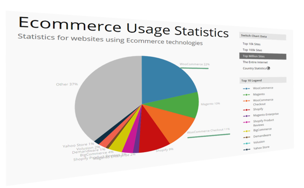
According to Builtwith.com, WordPress holds close to 50% of the CMS share of the world’s top 1,000,000 websites. As for the ecommerce sphere, we’re at 33% with WooCommerce. And if we cast a wider net, percentages go higher. Although we may complain that WordPress can get bloated, resource-heavy, and its data model leaves a lot to be desired, there is no denying that WordPress is everywhere.

Ecommerce software stats by builtwith.com

WordPress can thank its simplicity and a low barrier to entry for this pervasiveness. It’s easy to set up, and requires next to no technical knowledge. Hosting for WordPress can be found for as little as a couple of dollars per month, and the basic setup takes just a half hour of clicking. Free themes for WordPress are galore, some with included WYSIWYG page builders.

Many look down on it, but in many ways we can thank WordPress for the growth of the internet and PHP, and many internet professionals have WP’s gentle learning curve to thank for their careers.

But this ease of entry comes at a cost. Plenty of websites that proudly wear the WordPress badge were not done by professionals but by the cheapest developers. And often, it shows. Professional look and professional performance were afterthoughts.

One of the main points of feedback the owner of an aspiring high-quality website will get from a grudging professional is that performance and a professional look and feel shouldn’t be afterthoughts. You can’t easily paint or stick them over a website. Professional websites should be premeditated.

lingscars.com

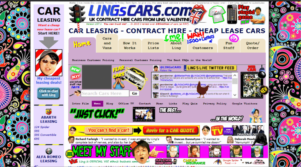
Above, a famous UK used car dealer, Ling’s Cars, tried a unique way to make a kitsch marketing punchline. Unless you’re REALLY sure about what you’re doing, DO NOT try this at home

And this starts with…

Choice of Hosting

Typically, new users will go with products that are on the low-cost side, with most of beginner-friendly bells and whistles. Considering the shady business practices by some big industry players in this arena, and the complaints and demands for site migration professionals coming from clients, this is a part of website setup that requires due attention.

We can divide WordPress hosting vendors into a few tiers.

Premium, WordPress-dedicated vendors like Kinsta whose plans start at $100 per month, or even higher-grade managed hosting like WordPress VIP by Automattic, may be worth their salt, but also may be out of reach for many website owners.

Medium tier Flywheel, A2 hosting, Siteground and Pantheon are among those considered reliable and performance oriented, offering acceptable speed and a managed hosting service for those more price-conscious. Users here may get a bit less hand-holding, but these services usually strike an acceptable balance between a solid setup, price, and options for more advanced users. Not to forget, there is Cloudways, which is a hybrid between VPS and managed hosting. Those with their audience in Europe may look into Pilvia, as it offers a performant server stack and is pretty affordable.

There’s an interesting survey of customer satisfaction with more prominent hosting vendors, published by Codeinwp.

For those of us not scared of the command line, there are VPS and dedicated-server vendors like Digital Ocean, Vultr, Linode, Amazon’s Lightsail, Hetzner in Europe, and OVH. Hetzner is a German vendor known for its quality physical servers on offer, somewhat above the price of virtual servers, while OVH offers very cost-efficient virtual servers. For the price-conscious, OVH’s subsidiary Kimsufi in Europe and Canada also offers bargain physical dedicated servers, and Host US has very affordable virtual servers.

With managed hosting, things to look for are a good server stack, good CDN integration, and of course SSD storage. Guaranteed resources, like with A2, are a big plus. The next thing to look for is SSH-access. Tech-savvy users may profit from WP-CLI availability.

When choosing a VPS, the thing to look for is XEN or KVM virtualization over OpenVZ, because it mitigates the overselling of resources, helping guarantee that the resources you bought are really yours. It also provides better security.

Easy Engine is software that can make your entire VPS/WordPress installation a one-hour job.

Regarding the server stack, Nginx is preferred to Apache if we’re pursuing performance, and PHP 7 is a must. If we really need Apache, using Nginx as a reverse proxy is a plus, but this setup can get complex.

Tests performed give PHP 7 a big edge over the previous version. According to fasthosts.co.uk:

WordPress 4.1 executed 95% more requests per second on PHP 7 compared to PHP 5.6.

When choosing your hosting, be aware of negative experiences with some providers that have become notorious.

Software Considerations

Things that usually slow down WordPress websites are bulky, bloated front ends with a lot of static resources and database queries. These issues arise from the choice of theme (and its page builders, huge sliders, etc) — which not only slow down initial loading due to many requests and overall size, but often slow down the browser due to a lot of JavaScript, and stuff to render, making it unresponsive.

The golden rule here is: don’t use it unless there’s a good reason to.

This may seem like a rule coming from the mouth of Homer Simpson, but if you can skip any of the bells and whistles, do so. Be conservative. If you must add some shiny functionality or JS eye candy, always prefer those tailored and coded as specifically as possible for your exact need. If you’re a skilled coder, and the project justifies the effort, code it yourself with minimalism in mind.

Review all the plugins your website can’t live without — and remove the others.

And most importantly: back up your website before you begin pruning!

Data model

If you have a theme where you use a lot of custom posts or fields, be warned that a lot of these will slow down your database queries. Keep your data model as simple as possible, and if not, consider that WordPress’ original intended purpose was as a blogging engine. If you need a lot more than that, you may want to consider some of the MVC web frameworks out there that will give you greater control over your data model and the choice of database.

In WordPress we can build a rich custom data model by using custom post types, custom taxonomies and custom fields, but be conscious of performance and complexity costs.

If you know your way around the code, inspect your theme to find unnecessary database queries. Every individual database trip spends precious milliseconds in your TTFB, and megabytes of your server’s memory. Remember that secondary loops can be costly — so be warned when using widgets and plugins that show extra posts, like in sliders or widget areas. If you must use them, consider fetching all your posts in a single query, where it may otherwise slow down your website. There’s a GitHub repo for those not wanting to code from scratch.

Meta queries can be expensive

Using custom fields to fetch posts by some criteria can be a great tool to develop sophisticated things with WP. This is an example of a meta query, and here you can find some elaboration on its costs. Summary: post meta wasn’t built for filtering, taxonomies were.

get_post_meta is a function typically called to fetch custom fields, and it can be called with just the post ID as an argument, in which case it fetches all the post’s meta fields in an array, or it can have a custom field’s name as a second argument, in which case it returns just the specified field.

If using get_post_meta()for a certain post multiple times on a single page or request (for multiple custom fields), be aware that this won’t incur extra cost, because the first time this function is called, all the post meta gets cached.

Database hygiene

Installing and deleting various plugins, and changing different themes over the lifetime of your website, often clutters your database with a lot of data that isn’t needed. It’s completely possible to discover — upon inspecting why a WordPress website is sluggish, or why it won’t even load, due to exhausted server memory — that the database has grown to hundreds and hundreds of megabytes, or over a gigabyte, with no content that explains it.

wp-options is where a lot of orphaned data usually gets left behind. This includes, but is not limited to, various transients (this post warns of best practices regarding deletion of transients in plugins). Transients are a form of cache, but as with any other caching, if misused, it can do more harm than good. If your server environment provides it, wp-cli has a command set dedicated to transients management, including deletion. If not, there are plugins in the WordPress plugins repo that can delete expired transients, but which offer less control.

If deleting transients still leaves us with a bloated database without any tangible cause, WP-Sweep is an excellent free tool that can do the job of cleaning up the database. Another one to consider is WP Optimize.

Before doing any kind of database cleanup, it’s strongly recommended that you back up your database!

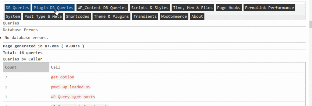
One of the plugins that comes in very handy for profiling of the whole WordPress request lifecycle is Debug Objects. It offers an inspection of all the transients, shortcodes, classes, styles and scripts, templates loaded, db queries, and hooks.

Debug Objects plugin output

After ensuring a sane, performance-oriented setup — considering our server stack in advance, eliminating the possible bloat created by theme choice and plugins and widgets overload — we should try to identify bottlenecks.

If we test our website in a tool like Pingdom Speed Test, we’ll get a waterfall chart of all the resources loaded in the request:

Pingdom Waterfall Chart

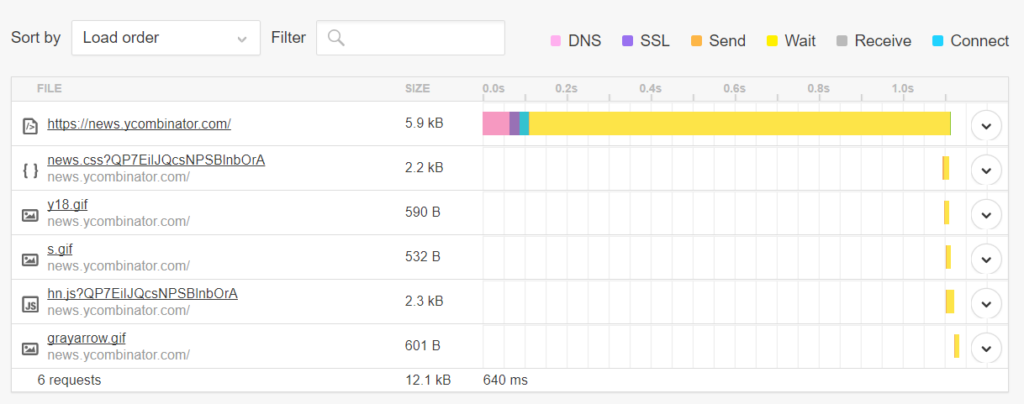
This gives us details about the request-response lifecycle, which we can analyze for bottlenecks. For instance:

If the pink DNS time above is too big, it could mean we should consider caching our DNS records for a longer period. This is done by increasing the TTL setting in our domain management/registrar dashboard.
If the SSL part is taking too long, we may want to consider enabling HTTP/2 to benefit from ALPN, adjusting our cache-control headers, and finally switching to a CDN service. “Web Performance in a Nutshell: HTTP/2, CDNs and Browser Caching” is a thorough article on this topic, as is “Analyzing HTTPS Performance Overhead” by KeyCDN.
Connect, Send, and Receive parts usually depend on network latency, so these can be improved by hosting close to your intended audience, making sure your host has a fast uplink, and using a CDN. For these items, you may want to consider a ping tool too (not to be confused with the Pingdom tools mentioned above), to make sure your server is responsive.
The Wait part — the yellow part of the waterfall — is the time your server infrastructure takes to produce or return the requested website. If this part takes too much time, you may want to return to our previous topics of optimizing the server, WordPress installation, and database stack. Or you may consider various layers of caching.

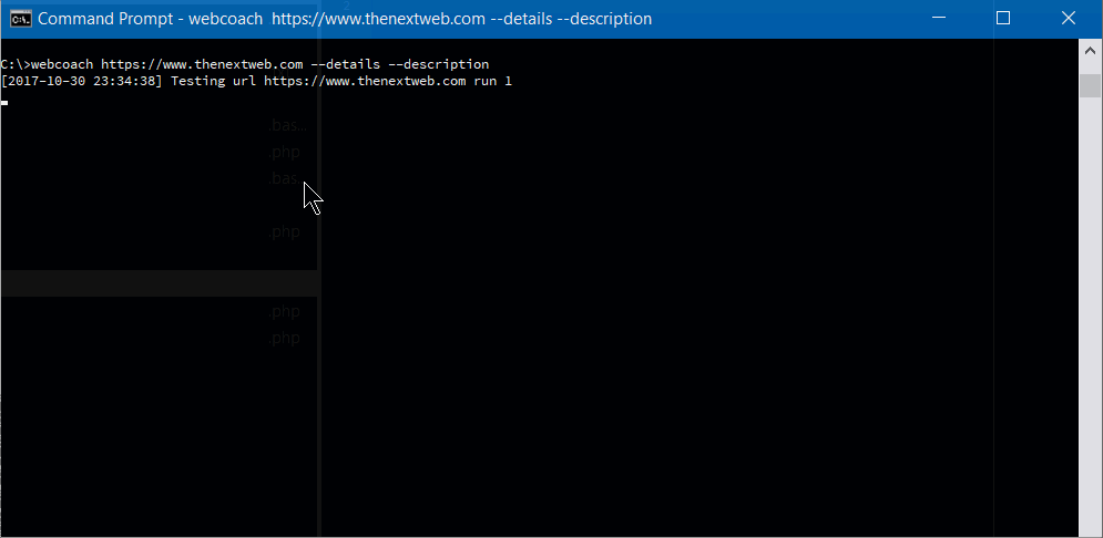
To get a more extensive testing and hand-holding tips on improving the website, there’s a little command line utility called webcoach. In an environment with NodeJS and npm installed (like Homestead Improved), installing it is simple:

npm install webcoach -g

After it’s been installed, we can get detailed insights and advice on how to improve our website’s various aspects, including performance:

webcoach command

The post The Complete Guide to WordPress Performance Optimization appeared first on SitePoint.

15 Tools and Resources That Will Help You Grow as a Designer

Original Source: https://www.sitepoint.com/15-tools-and-resources-that-will-help-you-grow-as-a-designer/

This article was created in partnership with BAWMedia. Thank you for supporting the partners who make SitePoint possible.

It’s hard to stay in your web design comfort zone when trends and technologies are in a continual state of change. Many of your design and development tools might continue to serve you well for some time. The same may be true for the resources you rely on.

There will come a time however when a favored tool or a resource is no longer up to the task. Investing in new tools or resources is generally the easiest way to keep up with the changing times. This is especially when a tool or resource is easily affordable, and in some cases, free.

This might be a good time to take stock of what you have in your designer's toolkit. See whether some changes might be in order. This list of 15 of 2018's top tools and resources should get you off to a good start.

1. Mason

Mason

Requirements are always subject to change. These changes can be a headache to designers and developers as they usually involve repetitive cycles of work. Many of today's software tools are equipped to handle requirements changes only to the extent that they can repeat prior tasks.

Mason has a different approach.

Mason is a combination design/development, and maintenance/collaboration tool that can put an end to repetitive deployment cycles by relieving designers or developers the task of instituting changes or fixes they shouldn't have to be bothered with.

Mason has a wealth of software design features, including pre-packaged building blocks that address common requirements. What Mason does that is different is to allow downstream users (software maintenance individuals or teams, and even clients) to make changes in these building blocks in response to changing requirements or needs for fixes or product updates.

Mason's login and user registration protocols ensure that you always have total control over product changes, even though as a team leader or designer you're no longer required to make them yourself.

2. Mobirise

Mobirise

The ability to create mobile-friendly websites and apps is no longer a nice option to work with. In today's world it's mandatory. Some themes still treat device-friendliness as if it were a good design option to have. Mobirise on the other hand, was created with mobile devices in mind.

Not only does Mobirise contain everything you need to build device-friendly websites and apps, but it does so without any cost to you and without any restrictions whatsoever. Mobirise is free to use for both your personal and commercial pursuits. It's simply a matter of downloading it now and getting started.

Mobirise is an offline app, so you'll have total control over product design and hosting. It's also an excellent choice for smaller projects such as small websites, portfolios, landing pages, and promo sites.

3. Elementor

Elementor

If you don't believe Elementor is the #1 WordPress page builder on the market, you might take a close look at the numbers. 900,000 or so users downloaded this free, open source and feature rich page-building platform in a little less than 2 years.

Performance and ease of use account, in part, for Elementor's popularity, but its users also love its superior workflow features, visual form builder, custom CSS, and the menu builder.

Things are only going to get better for this product's users — and for you as well if you choose to download it. The Elementor 2.0 release, with a wealth of powerful new tools is already underway and will continue in increments throughout the rest of the year.

New features include enhanced WooCommerce shop product pages, single post page builders, new eCommerce page-building options and more. Users still can enjoy their favorite features of 1.0 version, too.

4. Goodiewebsite

Goodiewebsite

Goodiewebsite has helped hundreds of clients with website development. This is a platform, which specializes in websites on the order of 1-10 pages in size, design to code conversion (PSD, Sketch, Figma, XD, etc.), and simple WordPress sites.

Goodiewebsite services are cost effective and the tasks assigned to them are always performed professionally and reliably.

5. monday.com

monday.com

Whether you’re a team of two, or a team of 20,000 scattered around the globe, and whether it is tech on non-tech oriented, if you're looking for a high-performance team management tool, monday.com will suit your needs to perfection.

This team management tool allows you to accomplish tasks without spreadsheets or white boards and avoids any need for scheduling an unending series of meetings. monday.com promotes project transparency and empowers team members.

6. A2's Fully Managed WordPress Hosting

A2

A2 Hosting adjusts to your specific hosting requirements instead of the other way around. You can expect to receive precisely the hosting experience you want and need at an affordable price other services simply cannot match. Site staging, automated backups, blazing fast servers, 24/7 Guru support – it's all there!

7. The Hanger

The Hanger

Whether the plan is to create an online presence for an existing clothing retailer or open a strictly eCommerce business, you might as well do it with a touch of pizzaz to draw the customers in.

The Hanger is a modern-classic WordPress theme that's just the cup of tea for building a high-quality online store in no time at all and customizing it to fit your brand or your client's.

The post 15 Tools and Resources That Will Help You Grow as a Designer appeared first on SitePoint.