19 great parallax scrolling websites
Original Source: http://feedproxy.google.com/~r/CreativeBloq/~3/Yi0kECfpYmc/parallax-scrolling-1131762
One web design trend that refuses to go away is parallax scrolling. With this, the website layout sees the background of the web page moving at a slower rate to the foreground, creating a 3D effect as you scroll. It can sometimes be overwhelming, but when used sparingly it can provide a nice, subtle element of depth that results in a distinctive and memorable website.
But to show how it should be done, we've collected together sites that employ the technique to good effect. In some cases the parallax scrolling is the star of the show; in others it simply adds a touch of depth that makes the foreground seem to pop out a little.
01. Bear Grylls

Digital agency Outpost was tasked with creating a new digital strategy for explorer and TV personality Bear Grylls. “To live up to the new brand vision and values and embody the ‘adventure brand’ we needed to take people on a journey online,” says the studio in its case study. A rich, dynamic user experience was key.
Subtle parallax is used throughout, but the real scene-stealer is the homepage. Grylls appears in a dramatic mountainscape, and the viewer is drawn into the scene as they scroll. It’s a great introduction to the adventures to follow.
02. ToyFight
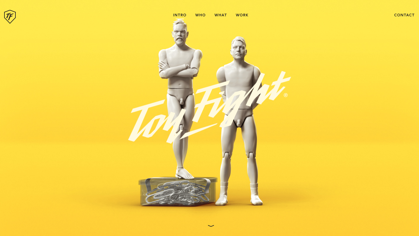
ToyFight is an award-winning creative agency, and its website is a whole lot of fun. Founders Jonny Lander and Leigh Whipday have turned themselves into 3D figures, which appear in a range of scenes throughout the site (including this cheeky Sagmeister & Walsh reference). Clever use of parallax amplifies the 3D effect, and paired with bold, bright, plain backgrounds, never becomes overwhelming or irritating.
03. Hello Monday
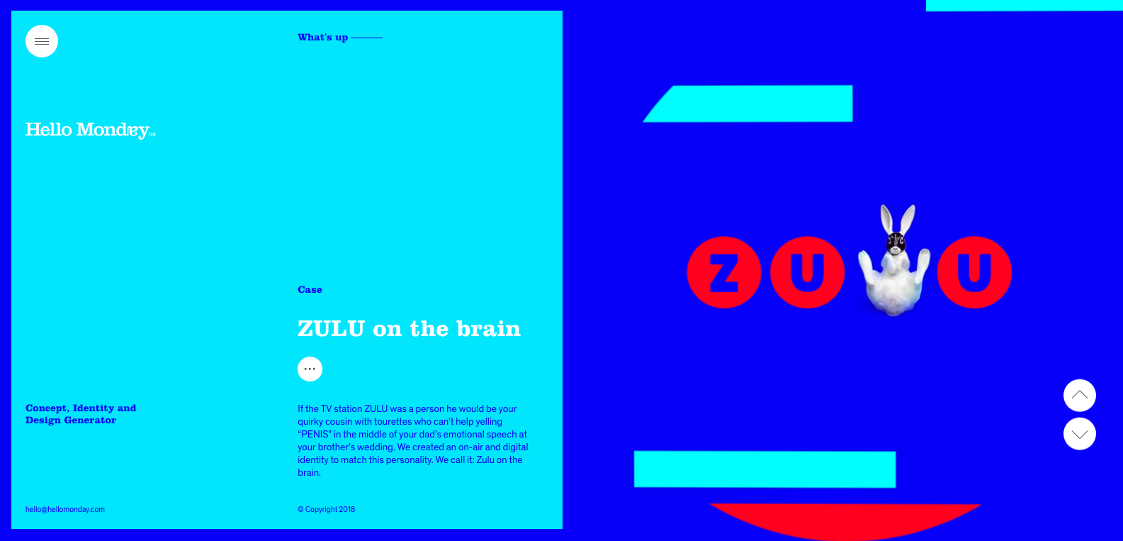
Hello Monday is a design agency based in Denmark. It aims to create immersive digital experiences that tell a story and bring joy to their users, and it has gone one step beyond with its portfolio site. When creating a studio site, the difficulty is that adopting cool or cutting-edge design ideas often means sacrificing clarity and usability, which is paramount for a design portfolio.
Hello Monday manages to achieve both by introducing a subtle parallax effect within a pared-back page layout. Each project hero image moves slightly, to bring it to life and add energy to the design without detracting from the information on show. The effect is used on the studio’s homepage only, with individual project pages kept static to allow the work to shine.
04. A-dam
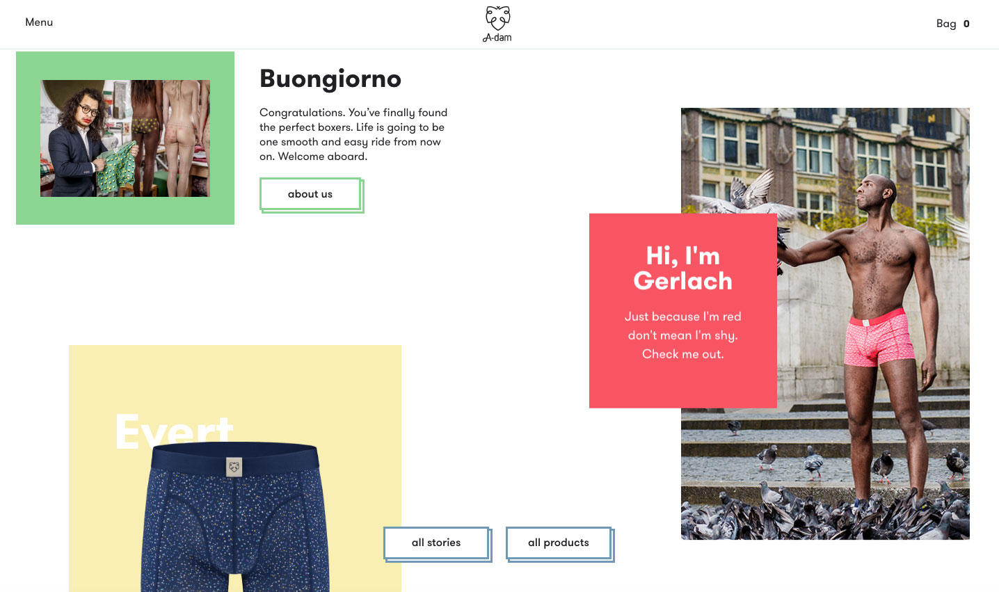
A-dam uses parallax to showcase its stylish underwear
A-dam designs original boxer briefs and shorts for men with character, using GOTS-certified organic cotton. The boxers are handmade by people with fair wages and normal working hours. They're an ethical and stylish alternative to your usual supermarket pants, and their site, created by Build in Amsterdam, showcases them nicely, with assorted parallax elements popping in from all directions as you scroll.
05. Diesel: BAD Guide
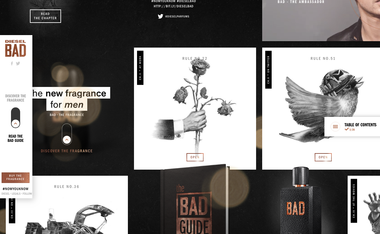
84.Paris created this impressive parallax website (and associated social media campaign) to accompany the launch of Diesel’s BAD fragrance. The one-page site presents the series of rules that make up the ‘BAD Guide’.
The user can explore by dragging the mouse around the parallax page, which is laid out like a pinboard of images to click through. There’s advice on everything from Tinder (‘Swipe right, right, right, right – you’ll sort them out later’) to Instagram (‘Don’t forget to get in touch with an ex on Thursdays #TBT’), accompanied by monochrome illustrations.
06. Myriad
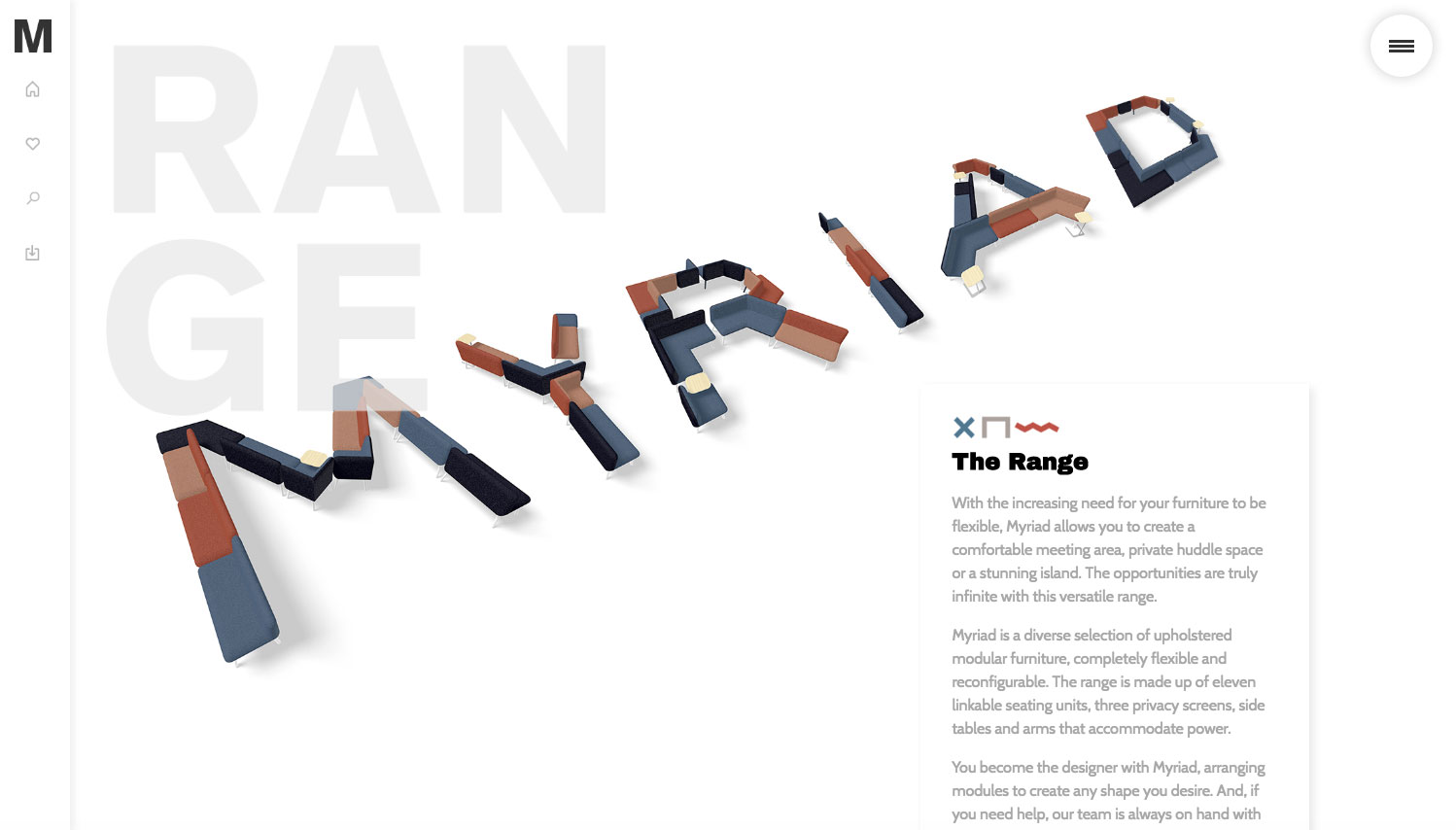
Bareface’s site for Myriad shows off the furniture system’s infinite possibilities
Myriad is a range of modular office furniture by Boss Design that's designed to be flexible and reconfigurable, allowing you to build your own working spaces as you see fit. As part of its work on the launch, Bareface created a site showcasing Myriad's infinite possibilities with clever use of parallax elements, pulling in inspiring arrangements of furniture as you explore the site.
07. Firewatch

Each layer of trees moves independently
One of the most beautiful examples of parallax scrolling we’ve seen is this website for the game Firewatch, which uses six moving layers to create a sense of depth. It’s great because there’s no scroll hijacking (something that often accompanies the parallax effect), and it’s only used at the top of the page – the rest of the site is still so you can read the information without getting seasick. If you want to see how it’s done, here’s a nice demo on CodePen.
08. Garden Studio
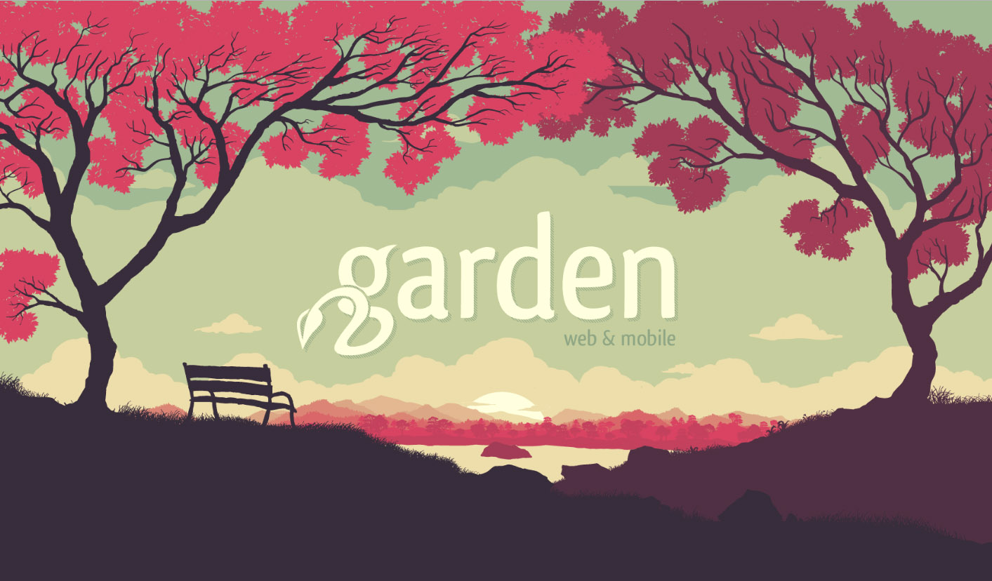
Layering of the landscape makes it seem three dimensional
In a similar vein, Garden Studio has also opted to use the parallax technique in a sensible and delightful way at the top of its site, before moving into a mostly static page. The shifting landscape is subtle and unobtrusive yet also the star of the show – we found ourselves scrolling up and down again and again.
09. GitHub 404
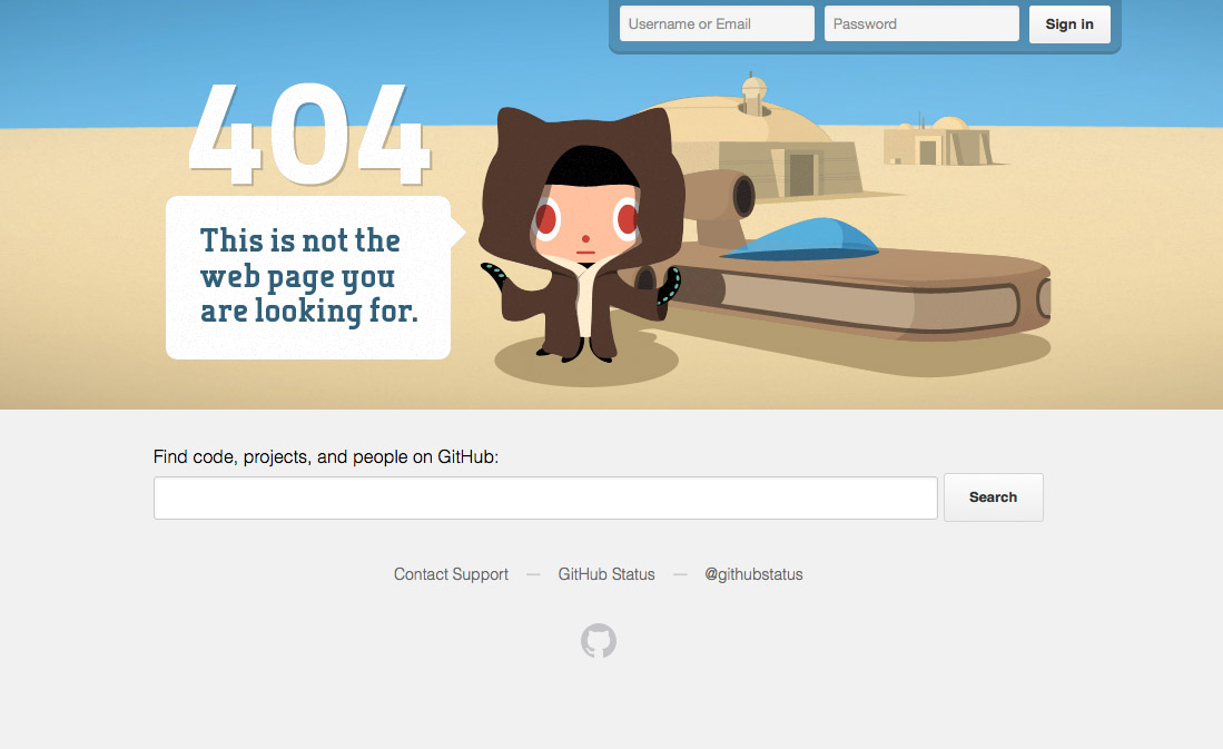
GitHub’s 404 breaks the rules of parallax for a disorienting effect
This isn’t strictly parallax scrolling as the effect happens on mouse wiggle as opposed to scroll, but it’s a really fun page that uses layering to add depth. Unlike 'proper' parallax, the background moves faster than the foreground, creating a disorienting, otherworldly feel.
10. Jess & Russ
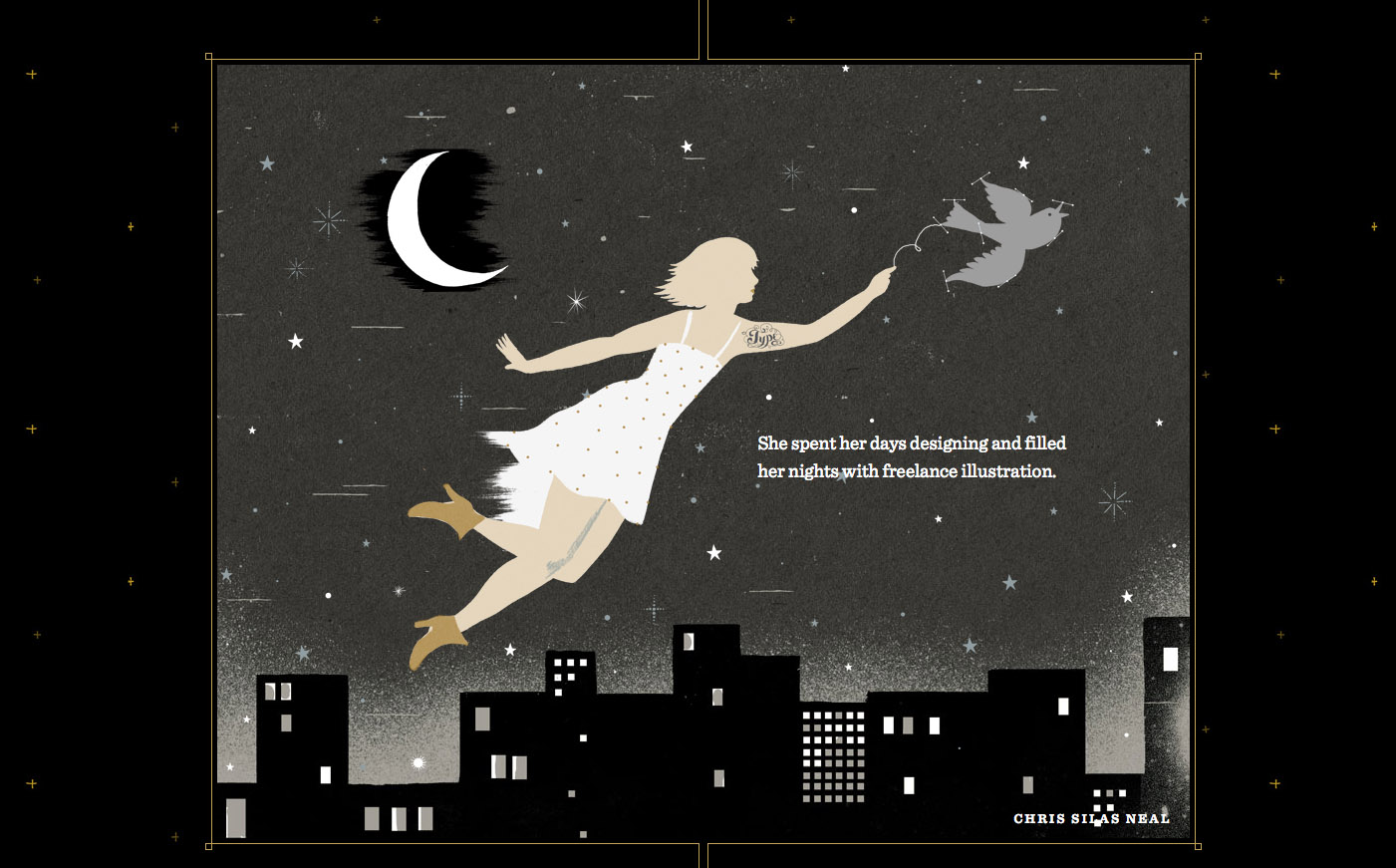
Every illustration has a sense of depth
It's no surprise that design power couple Russ Maschmeyer and Jessica Hische's wedding website is a beauty to behold. The site charts their romantic story, with parallax scrolling used throughout to add depth to the illustrations. They got married in 2012, but the website is still well worth a look.
11. Alquimia WRG
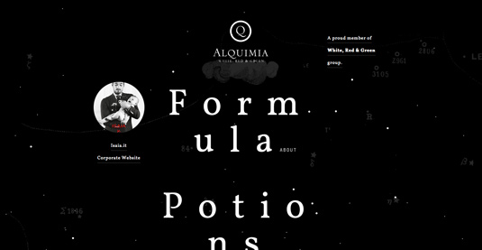
Alquimia WRG uses parallax elements to simulate a 3D space environment
Based in Milan, Alquimia WRG is a digital agency that aims to create amazing and effective experiences for brands on digital media. Clean and minimal, and only black and white, the website uses a mixture of the usual suspects (HTML5, CSS, and JavaScript) to achieve a neat package.
HTML5 canvas is used to animate the initial loading image. Subtle "parallax elements in the homepage are dynamically created and animated to simulate a 3D space environment through mouse movement," says Andrea Bianchi, creative director at Alquimia.
Page navigation is achieved via a simple and smooth page sliding effect, which is implemented by changing CSS properties with JavaScript. The works page contains a simple list of selected projects, which, when selected, reveals further information in a smooth sliding effect.
When such content is loading, a JavaScript animated preloading bar appears at the bottom of the screen, which is a nice touch. The site achieves its goal, which, as Bianchi says, "was to create an ideal balance between content, usability and user experience".
12. Make Your Money Matter
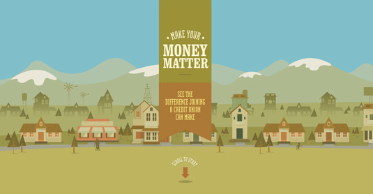
Manage your finances with information and advice from Make Your Money Matter
Finance and money are hardly the most interesting of subjects. But New York-based digital agency Firstborn is quids in with this dynamic parallax scrolling website Make Your Money Matter for the Public Service Credit Union.
With the aim of teaching the public the benefits of joining a credit union, rather than using a bank, this brilliant site includes everything from how a credit union works, to where to find one and how to apply, as well as a calculator showing just how much banks profit from customer's deposits.
13. Seattle Space Needle
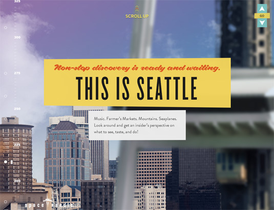
Scrambled egg all over my face. What is a boy to do?
The site for Seattle's iconic Space Needle starts at the base of the 605-foot tower and invites you to scroll up all the way to the top, taking in views of Seattle and the SkyCity Restaurant along the way. And if 605 feet isn't quite high enough for you, keep on scrolling and see what you find!
14. Madwell
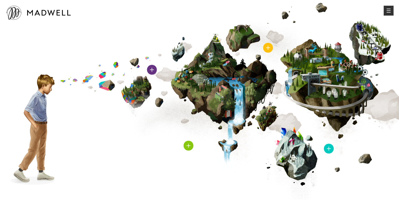
New York agency Madwell uses parallax scrolling to add a sense of depth
Design and development agency Madwell, based in New York, shows off its portfolio with a range of parallax scrolling effects to create a noticeable 3D style that adds a huge amount of depth.
15. Peugeot Hybrid4
Peugeot uses parallax scrolling to create an auto-playing web comic
Peugeot has gone all out with using parallax scrolling to create an auto-playing comic in the browser. The comic plays as you scroll down the page (or use its autoplay feature that automatically scrolls) and helps to advertise the car manufacturer's new HYbrid4 technology.
16. Cultural Solutions

The circles move at different speeds for a subtle 3D effect
Arts consultancy Cultural Solutions employs a subtle parallax scrolling effect to introduce depth to its homepage. Its main brand image is the use of colourful circles – the circles in the background move slower than those in the foreground, creating a subtle 3D effect.
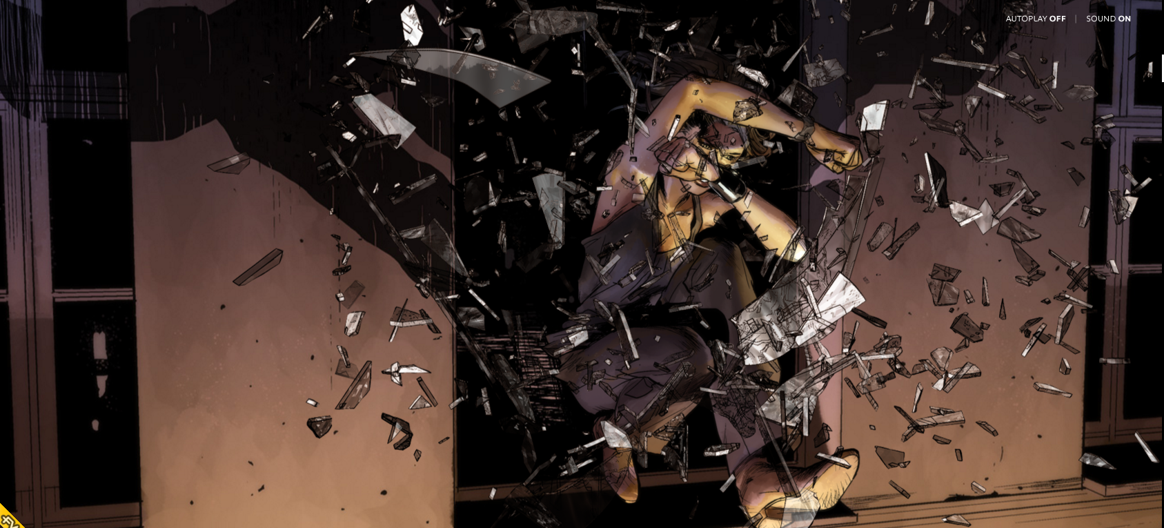
17. Walking Dead
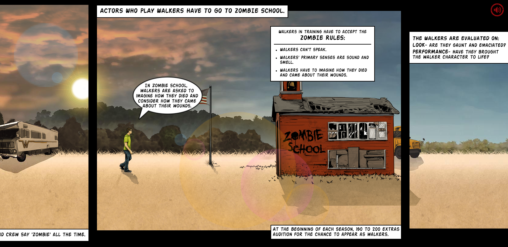
Walking Dead uses parallax scrolling to pull you into its gory world
We're big fans of TV zombie drama The Walking Dead at Creative Bloq, and we were gripped by this website launched to promote it. The imaginative site harks back to the show's comic strip origins and makes clever use of parallax scrolling to pull you into its sick and depraved world.
"We came at this as fans of the show, first and foremost," says lead designer Gavin Beck. "With this drive, we wanted to create a world within the Walking Dead that fans could explore and appreciate.
"To achieve this, we looked to several existing technologies and techniques such as HTML5, CSS3, JavaScript/jQuery, Web Audio/HTML5 Audio, and parallax scrolling. The challenge was to find a unique approach to incorporate all these methods into a single engaging experience across all platforms."
18. New York Times: Tomato Can Blues
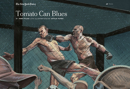
A beautiful experience is to be had with this parallax scrolling New York Times article
In today's era of low attention spans and bite-size media, how do you attract people to longform journalism? Here's a great response to that problem from the New York Times, combining some clever web design techniques with storytelling and comic-inspired illustrations created by Atilla Futaki.
One of the best examples of parallax scrolling we've seen, the article takes you through the story of a cage fighter written by Mary Pilon. As you scroll through the content, the illustrations come alive with clever animations and alterations, allowing you to fully immerse yourself in the content.
Futaki's illustrations were based on police records, witness accounts, photographs and the reporter's notes, and the attention to detail shines through. All in all it's a great reading experience – is this the future of online journalism?
19. Snow Fall
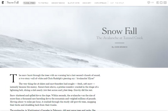
The New York Times’ ‘Snow Fall’ article kickstarted a whole new craze for rich parallax sites
One of the first sites to really push the boundaries on what you could do with longform editorial content online, the New York Times' Snow Fall article combines a range of different elements, including parallax scrolling and web video.
The article, about the horror of an avalanche at Tunnel Creek, was published online in December 2012 but still stands strong as an example of what you can do with parallax scrolling. The newspaper presented the Pulitzer-winning article in an innovative way that grabbed the design community's attention worldwide.
Related articles:
5 quick ways to improve your portfolio dramatically35 brilliantly designed 404 error pagesCreate an interactive parallax image


Leave a Reply
Want to join the discussion?Feel free to contribute!