Original Source: http://feedproxy.google.com/~r/CreativeBloq/~3/uKkjFiGVg-4/best-tattoo-designs
Getting a tattoo is a big deal. Whether it’s a classic or unique design you simply love or a picture or symbol that marks a meaningful event in your life, bagging the best tattoo design is a long and sometimes difficult process. Here, we’ve pulled together some inspiration that’ll help you choose the tattoo design that’s right for you.
To make things simple, we've split the article into themes: flower tattoos (this page), tribal tattoos, mandala tattoos, dragon tattoos, cross tattoos, skull tattoos, geometric tattoos, anchor tattoos, animal tattoos, and couples' tattoos. (If you'd like a slightly different take, check out these incredible examples of watercolour tattoos).
Each of the categories contains more traditional tattoo designs, as well as quirky original ideas. You can navigate to the section you want using the drop-down menu above. Click on the images to see more of each tattoo artists' work.
Doodle art: 52 great examples
01. Rainbow roses tattoo
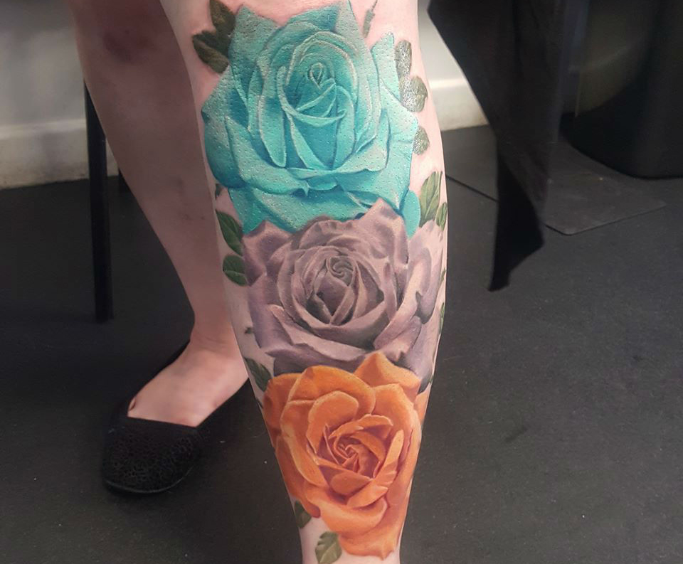
By Morag at Purple Rose Tattoo
This rose tattoo steers away from the standard red colouring, marking it as a classic design but with a modern twist. The intricate shading and delicate leaves add to its realistic execution.
02. Monochrome tattoo
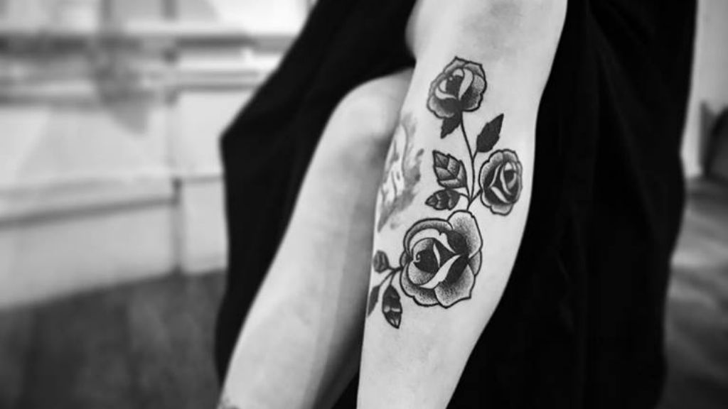
By Hannah Louise Kyle
This black and white rose tattoo again steers away from the classic red, offering up an elegant black-and-white design. The heavy line work keeps it to a traditional tattoo style.
03. Pink rose tattoo
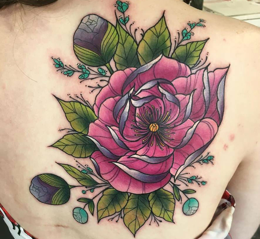
By Esme Loasby
The bright colours is what makes this flower tattoo design stand out, especially when you look closely at the clever colour gradient. Adding more than one flower always makes for a special piece.
04. Wildflowers tattoo
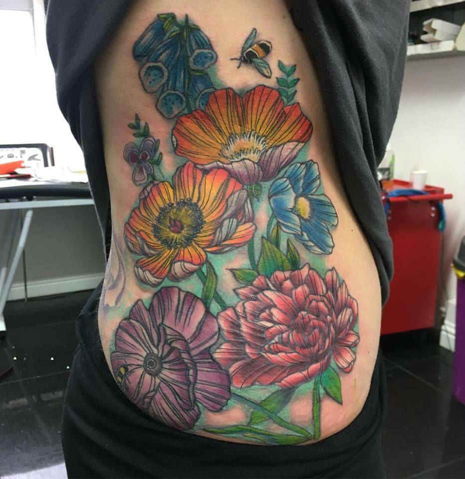
By Esme Loasby
Speaking of choosing more than one type for your flower tattoo, this beautiful botanical creation proves that you can put a lot of elements into one piece and it’ll still work, provided you use a tattoo artist who knows what they're doing.
05. Rose and dagger tattoo
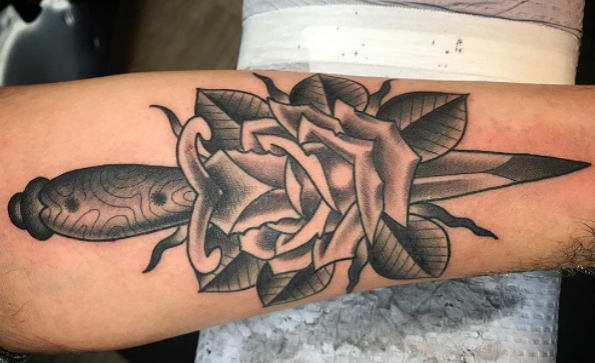
By Tom Butts
If you’re looking for a more traditional design, this rose tattoo could be just the inspiration you’re looking for. The inclusion of the dagger adds an edge and makes it a bold, stand-out piece.
06. Red rose tattoo
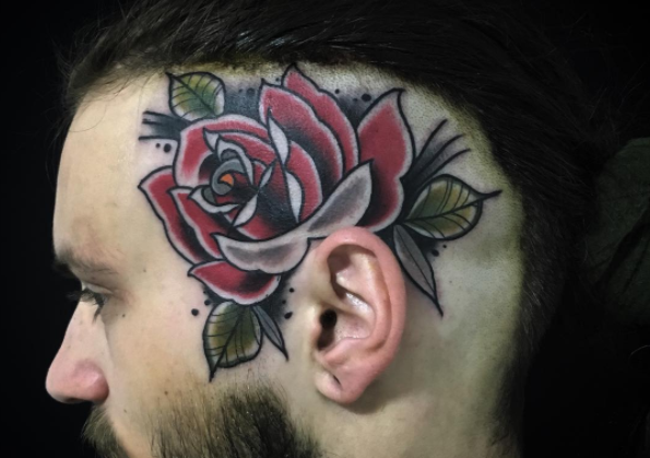
By Sascha Roth
A bolder choice is this rose tattoo design, with clever colour work placed just away from the careful lining. Including so much black might not work for some tattoo designs, or tattooees, but it does here.
07. Geometric peonies tattoo
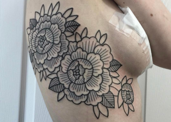
By Mark Jelliman
The linework on this trio of peonies is crafted with such elegance, it makes a real statement. It just goes to show that keeping things simple can often be the best approach when it comes to tattoo design.
Next page: Tribal tattoo designs
These great tattoo designs are all inspired by tribal artworks from around the world. Some of these stick to common themes from native American tribal art, for example, while others give them a contemporary twist.
As before, click on the image to go to the tattoo artist's website or Instagram page.
08. Tribal mask-inspired tattoo
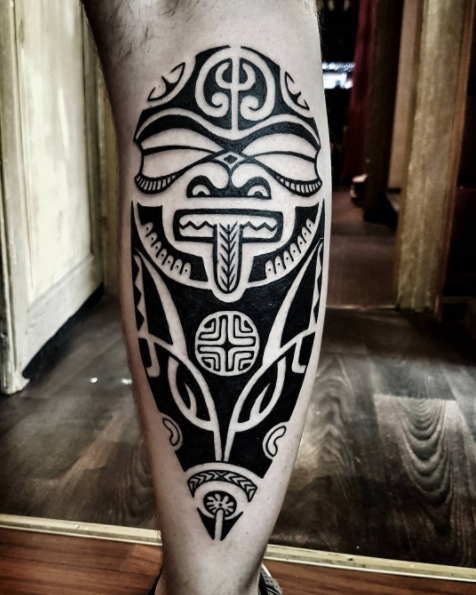
By Manu Dermagrafics
This stunning leg piece was crafted freehand, and with its bold shapes, colour-blocking and seamless line work, it’s a tribal tattoo worth showing off. The shape itself complements the shape of the leg, too.
09. Subtle shading tribal tattoo
By Paxii
What makes this tribal tattoo design stand out is that through the thick line work and colour-filled shapes, there’s a subtle shading that brings it to life, adding new dimensions.
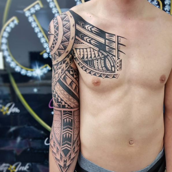
10. Thick framed tribal tattoo
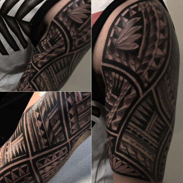
By Mike Schwalger
This custom Polynesian tribal tattoo sleeve is able to include a variety of different shapes and lines without making it look too busy. The thick line framing adds a more artistic flair.
11. Pared-back tribal tattoo
By Leo Braz
Sometimes tribal tattoos can be simple. This piece signifies the serpent in the Marajoara tribe, with the back placement proving to be the perfect place to show it off.
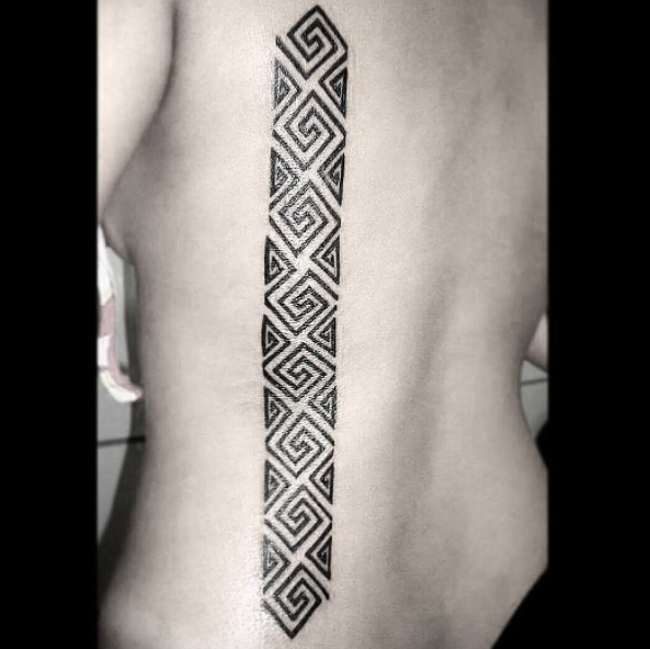
12. Repeat pattern tattoo
By Sunset Tattoo
Keeping with the simple theme, this half-sleeve tribal tattoo offers an intricate yet uncomplicated design. And with such a clean design, the pattern is as mesmerising as it is timeless.
13. Tribal collar tattoo
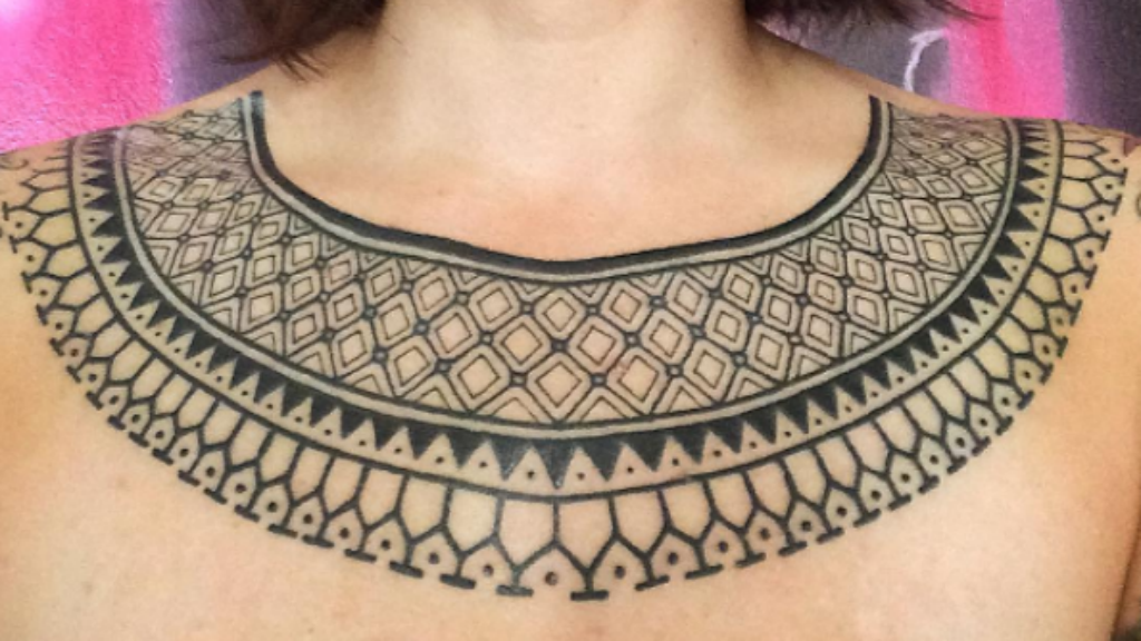
By Margaret River
Tribal tattoo designs often demand a bold placement and this visayan tribal collar is a breathtaking example of how simple line work and intricate patterns can make a statement.
14. Modern twist
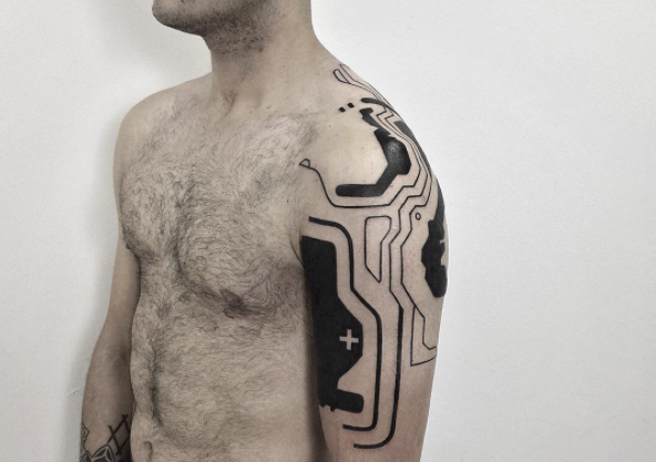
By Daniel Matsumoto
This work, by Daniel Matsumoto, manages to put a modern twist on the classic tribal tattoo design. Mixing thin lines with block colour is a simple but unique way to make it pop.
Next page: Mandala Tattoos
Mandalas are peaceful, spiritual symbols in both the Hindu and Buddhist faiths. With their intricate, nature-inspired patterns, it's no wonder they're a popular choice for tattoos.
As before, click on the image to go to the tattoo artist's website or Instagram page.
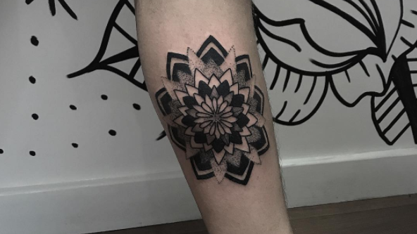
15. Pointillist mandala tattoo
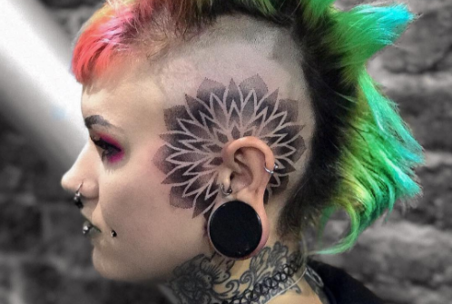
By Ricky Williams
With its circular shape, placing a Mandala tattoo around the ear is a great way to make impact. The pointillism aspect in this design is stunning.
16. Hidden mandala tattoo
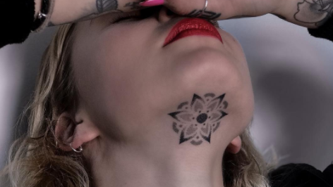
By Ricky Williams
Mandala tattoos come in all sizes and this delicate design could be just the kind of thing you’re after. Sleek, delicate work that gradually moves into darker colour is a special touch.
17. Bold mandala tattoo
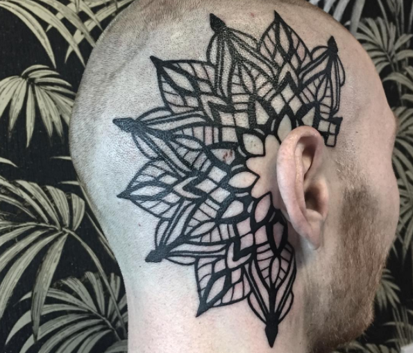
By Jayne Rogers
The thick lines on this half-Mandala tattoo design make it the perfect way to go if you want to make a statement. Choosing to do a half design is also an option if placed around the ear.
18. Layered mandala tattoo
By Niky Brown
Opting for a layering effect on this Mandala tattoo design enables it to take on a more 3D-design effect. Adding some point work really makes this one inspiring.
19. Colourful mandala tattoo
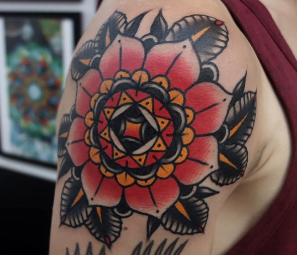
By Mors Tattoo
Taking on a more classic style, the colour work enables the Mandala tattoo to make more of a statement. Adding colour to the leaf exterior makes for a seamless execution.
20. Shaded mandala tattoo
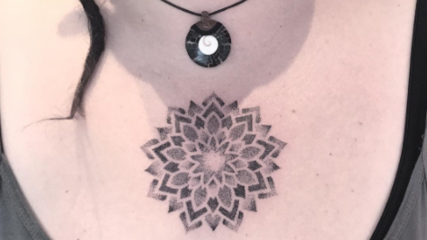
By Renette Hammer
Mandala tattoos circular shape enable them to be placed almost anywhere, but the chest provides a nice canvas to really show them off. Pointillism is also a great way to add depth and subtlety.
21. Stained glass mandala tattoo
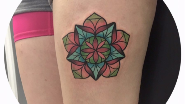
By Skylar Rose Wasserman
If you’re after a Mandala tattoo design with a more colourful, unexpected twist, you could go for something like this. The stained glass window colour effect allows shades to blend into each other.
Next page: Dragon tattoos
Dragon tattoos might show the world how brave and fiery you are, they might celebrate your cultural heritage, or they might just exist because you think dragons are really cool (you're not wrong). Whatever your reason for wanting a dragon tattoo, check out these designs for inspiration and click on the image to go to the artist's website or Instagram page.
22. Whimsical dragon tattoo
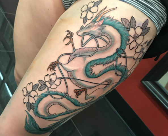
By Alice Badger
Sometimes, it’s best to look to the world of TV and movies for your tattoo design inspiration. This one featuring Haku from anime classic Spirited Away is a great place to start.
23. Fierce dragon tattoo
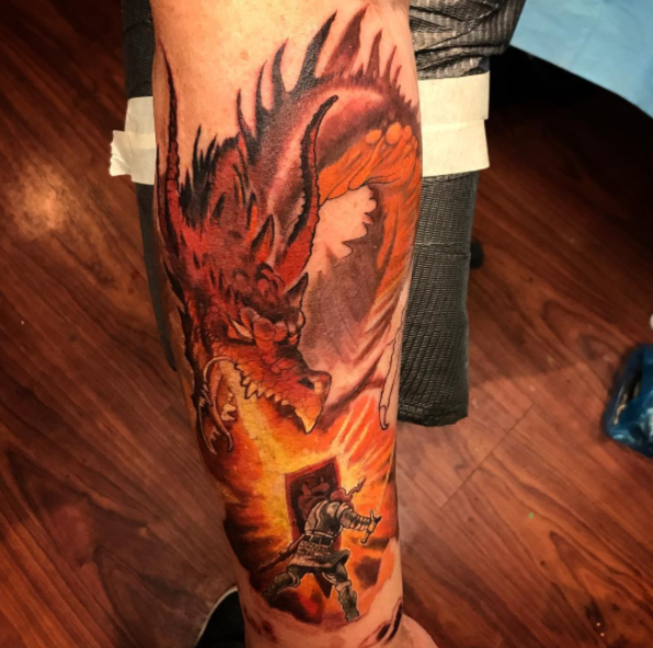
By Lydia Bruno
Dragons are also the perfect way to start off a sleeve, thanks to the variety in which they can be presented. This colourful example leaves room all around for more designs.
24. Oriental dragon tattoo
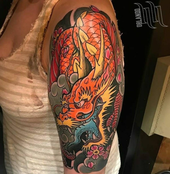
By HH Orlando Tattoo
Speaking of sleeves, this Japanese style dragon tattoo offers colourful inspiration. The detail on the scales is a particularly nice touch, as are the juxtaposing, delicate flowers underneath.
25. Symmetrical dragon tattoo
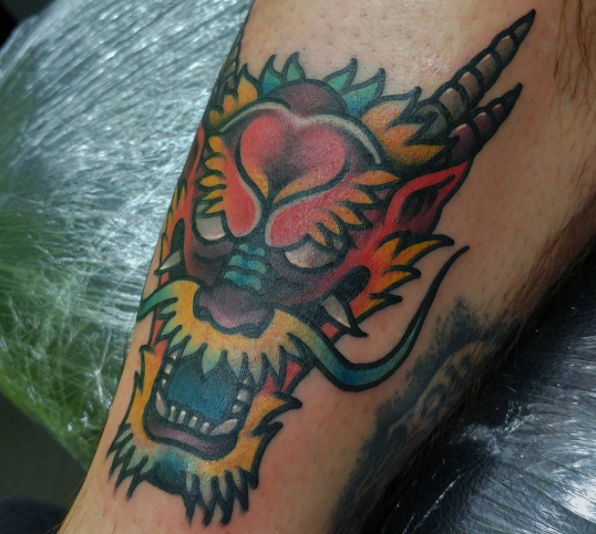
By Joe Fletcher
If you love the idea of a dragon tattoo but you’re wary of getting the whole form tattooed onto, opting for the head could be a great way to show your beast appreciation.
26. Linework dragon tattoo
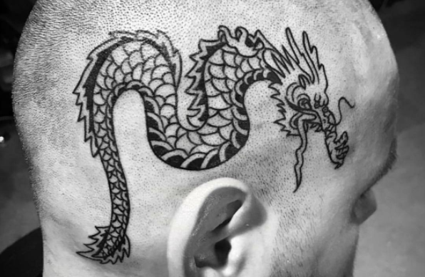
By Heritage Tattoos
A dragon's serpentine body can make it a great option for a head tattoo. This simple, black-and-white linework tattoo design offers elegant inspiration if you’re willing to take the leap.
27. Abstract dragon tattoo
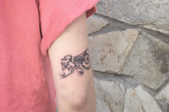
By Dámaris Argüelles Pérez
A more experimental tattoo design could be just the dragon you’re looking for. This puzzle-like piece keeps it modern while also harking back to more traditional tattoo styles.
28. Etchwork dragon tattoo
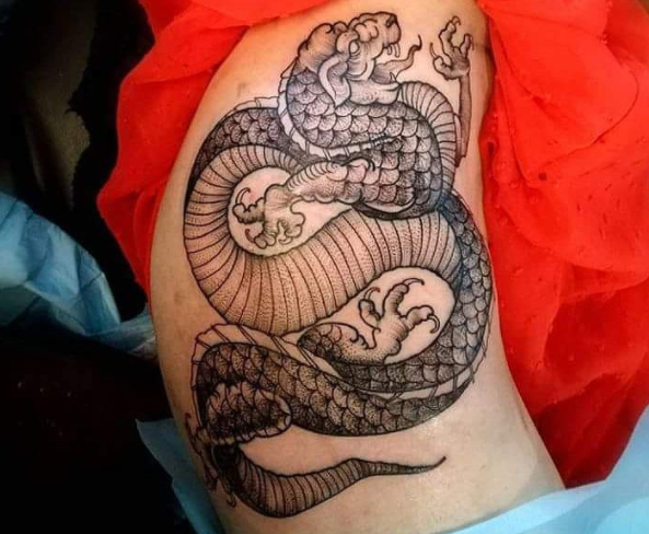
By Byron Barker
This etchwork dragon tattoo design harks back to a neo-traditional style of tattooing and works best when placed on the side of the body, allowing lots of detail.
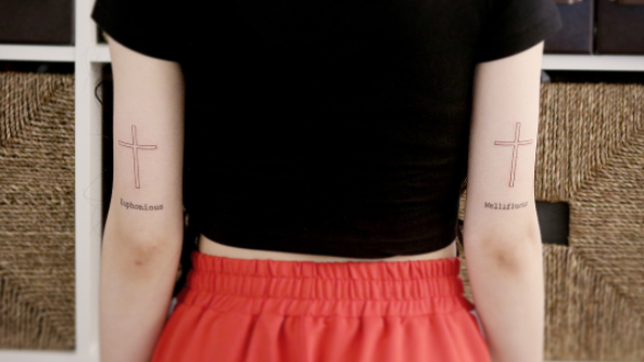
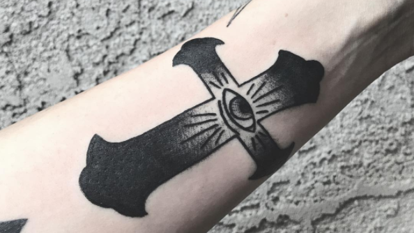
Next page: Cross tattoo designs
Meaningful and beautiful, cross tattoos also come in a variety of styles. Choose a style that's right for you with these great designs. As before, click on an image you like to go to the artist's website or Instagram page.
29. Botanical cross tattoo
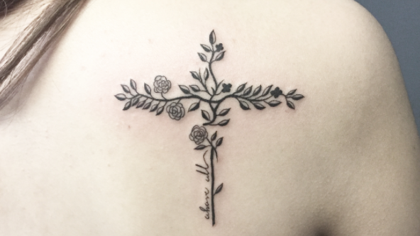
By Reny Tattoos
Cross tattoo designs don’t always need to be in a standard, straight line. This example shows that cross tattoos can be moulded with another style to create something really beautiful.
30. Pretty cross tattoo
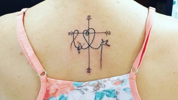
By Bruno Diego
Another way to amp up a cross tattoo design is with layering. This delicate design incorporates illustrations of love hearts in an elegant and original way, making for a special piece.
31. Symbolic cross tattoo
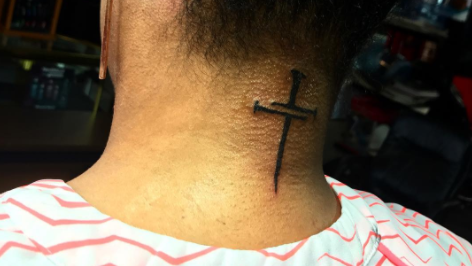
By Hegotme
This clever cross tattoo design references the crucifixion in a minimal but impactful manner. Adding the nails into the design is a great way to do this.
32. Curvy cross tattoo
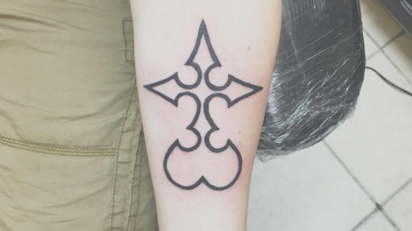
By Kelly Kossuth
Maybe you’re looking for a bolder cross tattoo design? This one from Kelly Kossuth shows how you can be both bold and minimal, thanks to thick line work.
33. Minimal cross tattoo
By Tattooist Uzi
If minimal is more your style, this delicate cross tattoo design could be just the inspiration you need. Delicate line work and zero colour can still make an impact.
34. Shaded cross tattoo
By Slicecrust
This classic cross tattoo design works well thanks to neat shading work and clean, thick lines. It’s a perfect design if you want one placed on your arm.
35. Artistic cross tattoo
By Steven Gilliard
If you want to combine your love of being a designer or artist with your cross tattoo, then this clever piece could be right up your street. The dot work makes it pop.
Next page: Skull tattoo designs
If dragons weren't tough enough for you, how about a skull tattoo? Some of these skull designs are pretty scary, but others are actually really beautiful, and even cute. We're sure they'll all serve to inspire your skull tattoo design.
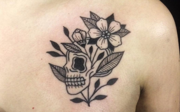
36. Skull and rose tattoo
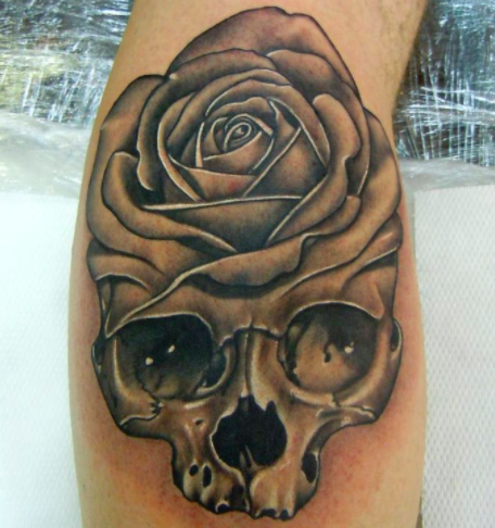
By Phatt German
Sometimes you want to add a bit more depth to a skull tattoo design. This skull, which has a rose design incorporated into its cap, does this very effectively.
37. Multi-layered skull tattoo
By Charlotte’s Web Tattoos
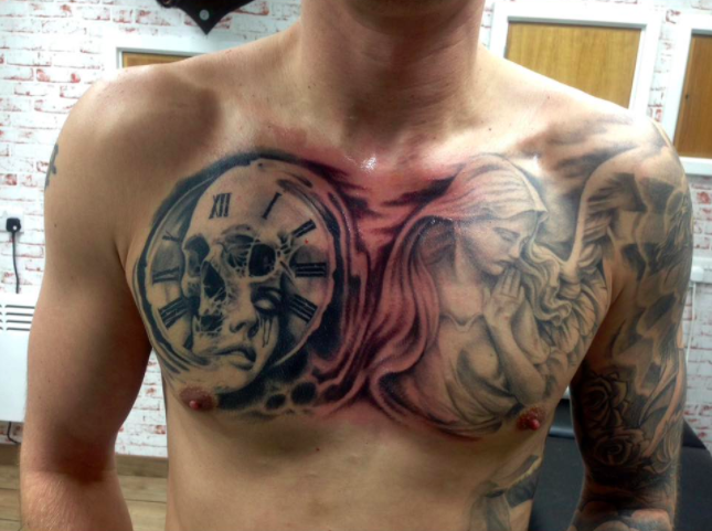
Another way to incorporate depth into a skull tattoo is this half-dead design, which sees a skull merged with a crying face. The addition of a clock makes it extra creepy.
38. Mexican skull tattoo
By Barbie Lowenberg
If you’re wanting something a little less creepy, this cute skull tattoo – complete with floral decoration, in the style of Mexican Día de Muertos (Day of the Dead) skull masks and decorations – is the perfect way to show off your love of the dead.
39. Delicate skull tattoo
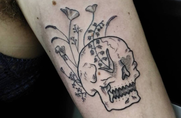
By Uvethekid
Sticking with the floral theme, this skull design offers a more freehand approach, with wavy lines. The difference in line thickness and the dotted shading is what makes it great.
40. Gruesome skull tattoo
By Kelly Violet
If you’re looking for something truly bold, a half-sleeve skull tattoo design is one of the options you could go for. This one, illustrated with medieval weaponry, is jaw-dropping.
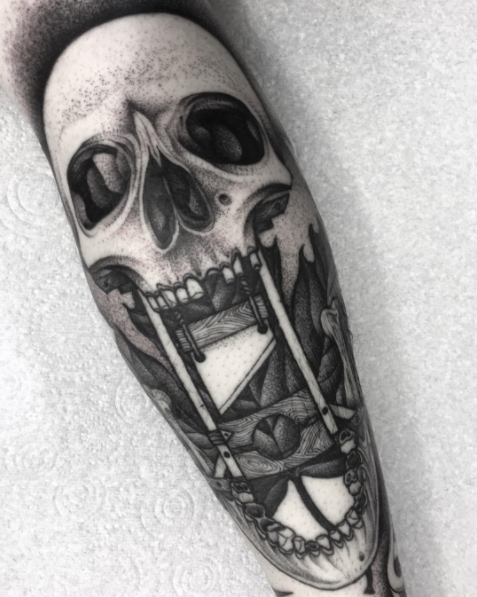
41. Baroque skull tattoo
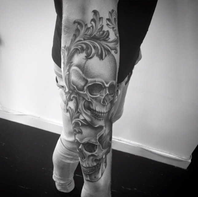
By Siren1
Sometimes, two skulls is better than one, and this detail tattoo design effortlessly places them together without looking crowded. It's perfect on the arm.
42. 3D-effect skull tattoo
By Bali Namaste Tattoo Studio
This small skull tattoo takes a different approach when blending two skulls together, giving off a 3D effect with a minimal and cute design, which is perfect for small areas.
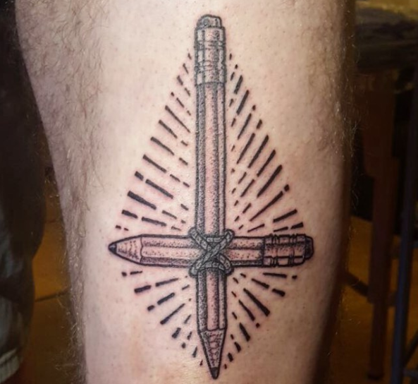
Next page: Geometric tattoo designs
For something a bit different, why not get an interesting tattoo featuring geometric shapes and patterns? They can be as colourful or as big as you like, as these great designs show.
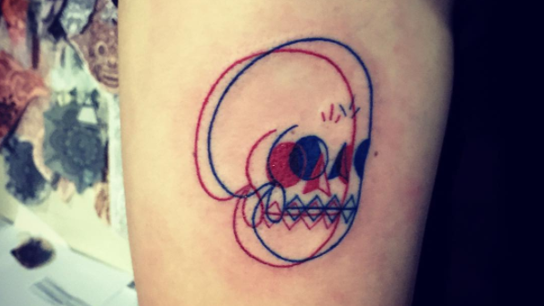
43. Artistic geometric tattoo
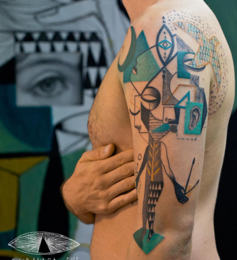
By Expanded Eye
Expanded Eye is a duo known for its incredible geometric tattoo designs. With splashes of colour, clever shading and breathtaking structure, this is the perfect geometric tattoo design inspiration.
44. Prisms tattoo
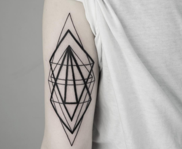
By Malvina Maria Wisniewska
The great thing about geometric tattoos is they can be formed of simple structures but with a detailed execution. The interweaving line thickness on this design is a great example of that.
45. Honeycomb tattoo
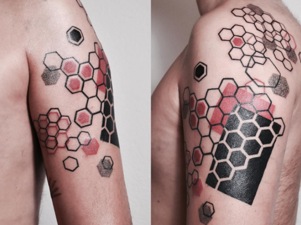
By Miriam Frank
Mixing shapes and colours into your geometric tattoo design can make for a pretty amazing final piece. By adding just the red to this piece, it ensures the design doesn’t go overboard.
46. Golden Ratio tattoo
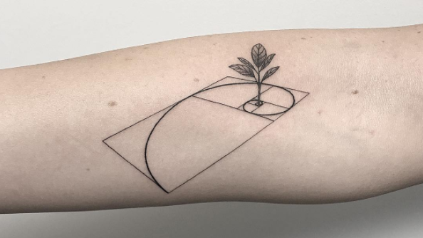
By Michele Volpi
The Golden Ratio describes the perfectly symmetrical relationship between two proportions; this geometric tattoo design is a gorgeous and clever way to pay tribute to its perfections.
47. Pared-back geometric tattoo
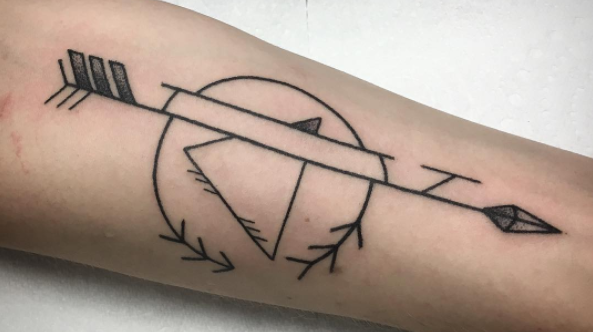
By Sarah Lu
The simplicity of geometric tattoos also means that the hand poking technique can work really well. This simple but effective design puts a different spin on the arrow.
48. Kaleidoscopic tattoo
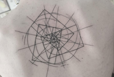
By Diego Favaretto
If you’re wanting a larger geometric piece, this tattoo is a great example of one that works well when placed on the back. The never-ending detail on this one is particularly impressive.
49. Colourful geometric tattoo
By Sasha Unisex
Of course we couldn’t feature geometric tattoo designs without mentioning Sasha Unisex – the tattoo artist who has become renowned across the world for her stunning, colourful geometric work.
Next page: Anchor tattoo designs
Anchor tattoos are about as traditional as tattoo designs get, and are currently enjoying a retro resurgence. But, as these designs prove, a traditional theme doesn't have to result in a stale old-fashioned design. Click on any image to discover the tattoo artist behind the innovative design.
50. Anchor and heart tattoo
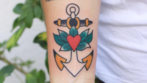
By Patryk Hilton
If you’re after a classic tattoo staple, an anchor design is one of the best options. This traditional style piece is a great way to make a statement.
51. Exotic anchor tattoo
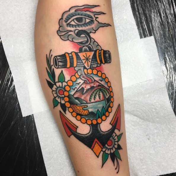
By Sam Ricketts
Anchors can also act as a frame for a tattoo design, with this example proving particularly impressive. By using a simple anchor as your base, you can embellish it to your heart’s content.
52. Anchor and bird tattoo
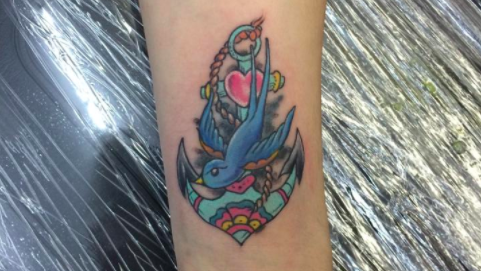
By Sami Tutch
You can always embellish your anchor tattoo design but in a more subtle, sweet way. This little anchor features cartoonish characters that make it perfect for a cute arm piece.
53. Watercolour anchor tattoo
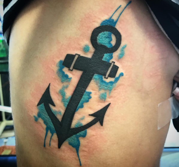
By Tracy Burton
If you want a splash of colour on your anchor tattoo design, adding in wave-like watercolour is a great way to include your love of anchors in the sea.
54. Sketchy anchor tattoo
By Elena Aiello
Continuing the watery theme is this cute anchor tattoo design, which adds splashes of colour in a simple, hand-drawn style. The heart is also perfectly incorporated in the design.
55. Monochrome anchor tattoo
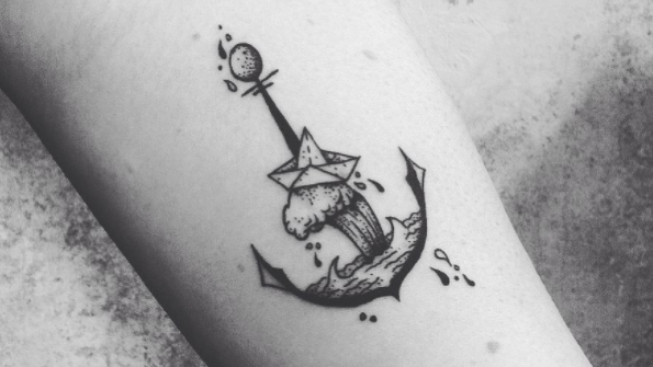
By Ecke Wunderland
The detail on this tiny anchor tattoo design is so perfectly executed, it almost deserves more space. The inclusion of the paper boat is a delightful touch, finishing off the piece beautifully.
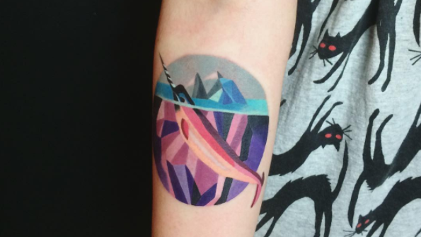
56. Geometric anchor tattoo
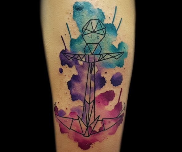
By Aracely Ramírez Ponce
If you want the colour to be the main focus of your anchor tattoo design, this watercolour, geometric anchor is a great way to show it off.
Next page: Animal tattoo designs
Another popular choice, animal tattoos might honour a beloved pet, serve as a reminder of a great experience, or show part of your personality through your choice of a favourite animal.
These animal tattoos again vary wildly in style, so if you find an art style that you like, click on the image to go through to the artist's website or Instagram page to see more.
57. Fox tattoo
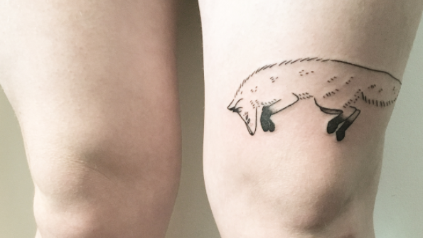
By Lotte Vanns
This simple, hand-poked design is the perfect way to pay tribute to your favourite animal. Because of this fox's long body, placing it around the knee is a great way to show it off.
58. Greyhounds tattoo
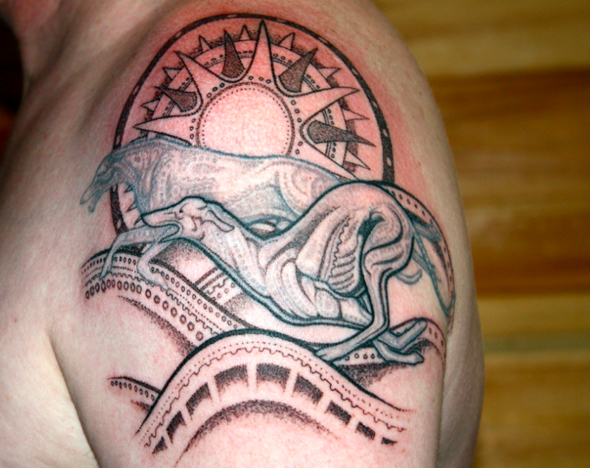
By Daemon Rowanchilde
These racing greyhounds are stunning in their own right – thanks mostly to their meticulously drawn anatomy – but by placing them within another design, the whole piece becomes pretty breathtaking.
59. Dinosaur tattoo
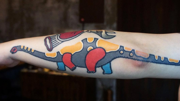
By Kimsany
The cartoonish colour-blocking on this brachiosaurus makes it truly unique. Complete with intricate line work and the perfect long arm placement, this is one way to get noticed.
60. Elephant tattoo
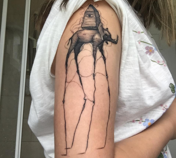
By Adrián Desgracia
This sketchy design is great if you want to go for a sleeve design with a difference. The surrealist aspect of the elephant is also reminiscent of Salvador Dali’s work.
61. Whale tattoo
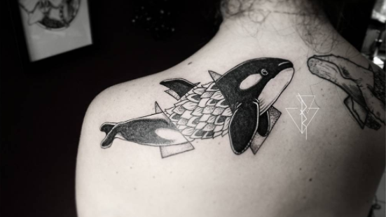
By Raphael
Not sure what style to go for in your animal tattoo design? This is one solution: this unique killer whale design combines two different styles in one, with the animal's middle section drawn as shaded scales.
62. Bird tattoo
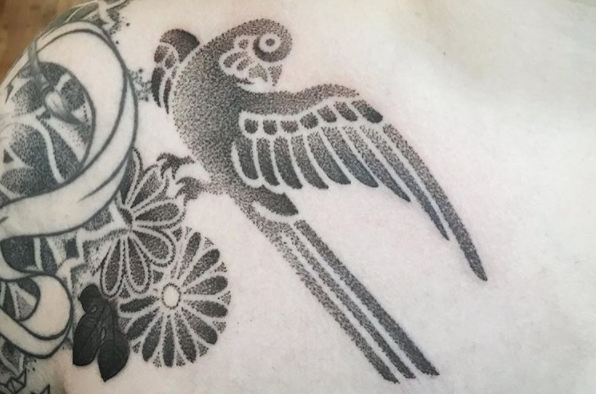
By Jason Corbett
Pointillism is a beautiful option when it comes to bird tattoo designs. This one, perched just on the shoulder, keeps it simple with minimal detail and colour.
63. Dog tattoo
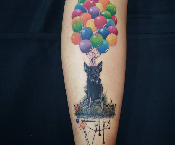
By Ricardo Romero Rios
Lots of people get their best pal tattooed on them. This one, depicting man’s best friend, is a cute way to illustrate your love for your furry friend – and there's a sweet Up reference to boot.
Next page: Couples' tattoo designs
Not just the preserve of drunken nights out, matching tattoos are a popular way to mark your commitment to your other half. While some of these designs go sickeningly all-out on the slush factor, others are more subtle, fun, and perhaps even tasteful enough to dodge the laser should you break up (not that you will, obviously).
64. Pizza tattoos
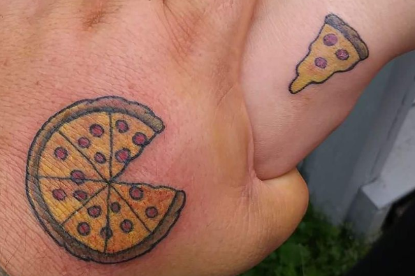
By justinsams
There’s no better way of combining your love of your partner with your love of pizza. This cute design may be a little cheesy for some.
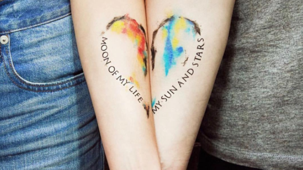
65. Sun and moon tattoos
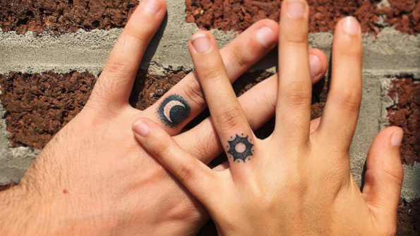
By Jessica Leigh Ozimek
If you’re getting married, you might want to make things even more permanent with ring finger tattoos. This sun and moon tattoo design is a sweet way to show off your love.
66. Chatty tattoos
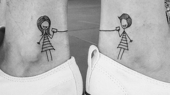
By Dream Tattoo
Your best pal is always there to listen when you need it most. When you’re far away from each other, this simple tattoo design will remind you that they’re always there.
67. King and queen tattoos
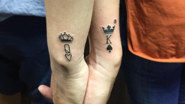
By B9 Tattoo Studio
Be the king and queen of all couples with these minimalist playing-card inspired tattoo designs. It’s best to keep it simple, especially when placed on the hands or wrists.
68. Fox tattoos
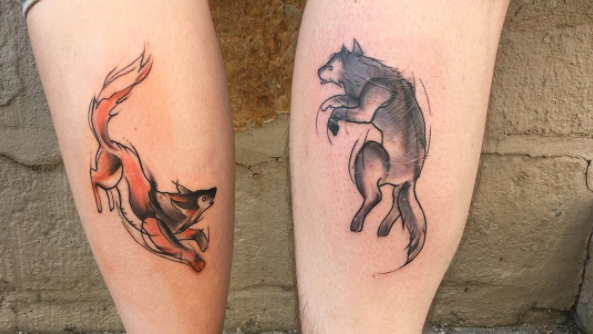
By Farbenfroh Tattoo Art
These playful partner tattoos are great if you’re thinking of getting a couples' tattoo on your leg. The hand-drawn, sketchy style and clever shading make these particularly beautiful.
69. Colour mode tattoos
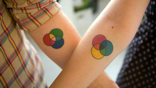
By NYC Adorned
If you’re looking for something with a designer twist, you couldn’t opt for anything better than these cute colour mode pieces (you might recognise these as belonging to Jessica Hische and Russ Maschmeyer). If you're screen-based, go for RBG, while print designers are more likely to favour CMYK.
70. Heart tattoos
By First Class Tattoo Studio
How about combining your couples tattoo design with your favourite show? This Game of Thrones-inspired piece is a great way to show off two of the things you love.
Read more:
3 tips for designing tattoosWhat happens when tattoo design meets illustration13 incredible examples of watercolour tattoo art


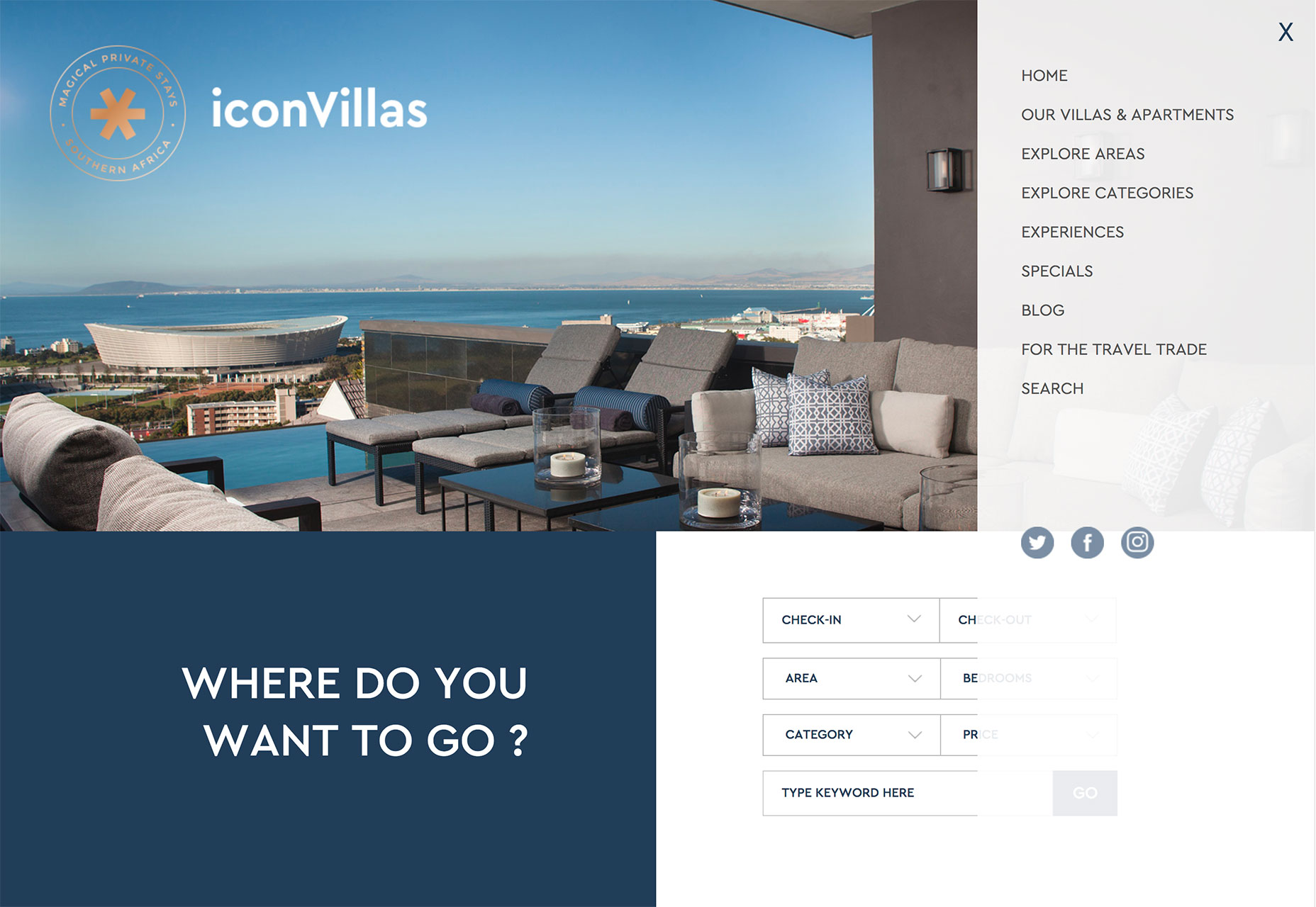
 Welcome to our roundup of the best websites launched (or relaunched with major updates) in the last four weeks. September marks the beginning of Fall in the northern hemisphere, and reflecting that change, we’re seeing fewer light, airy, minimal designs, and more rich, warm, comforting designs.
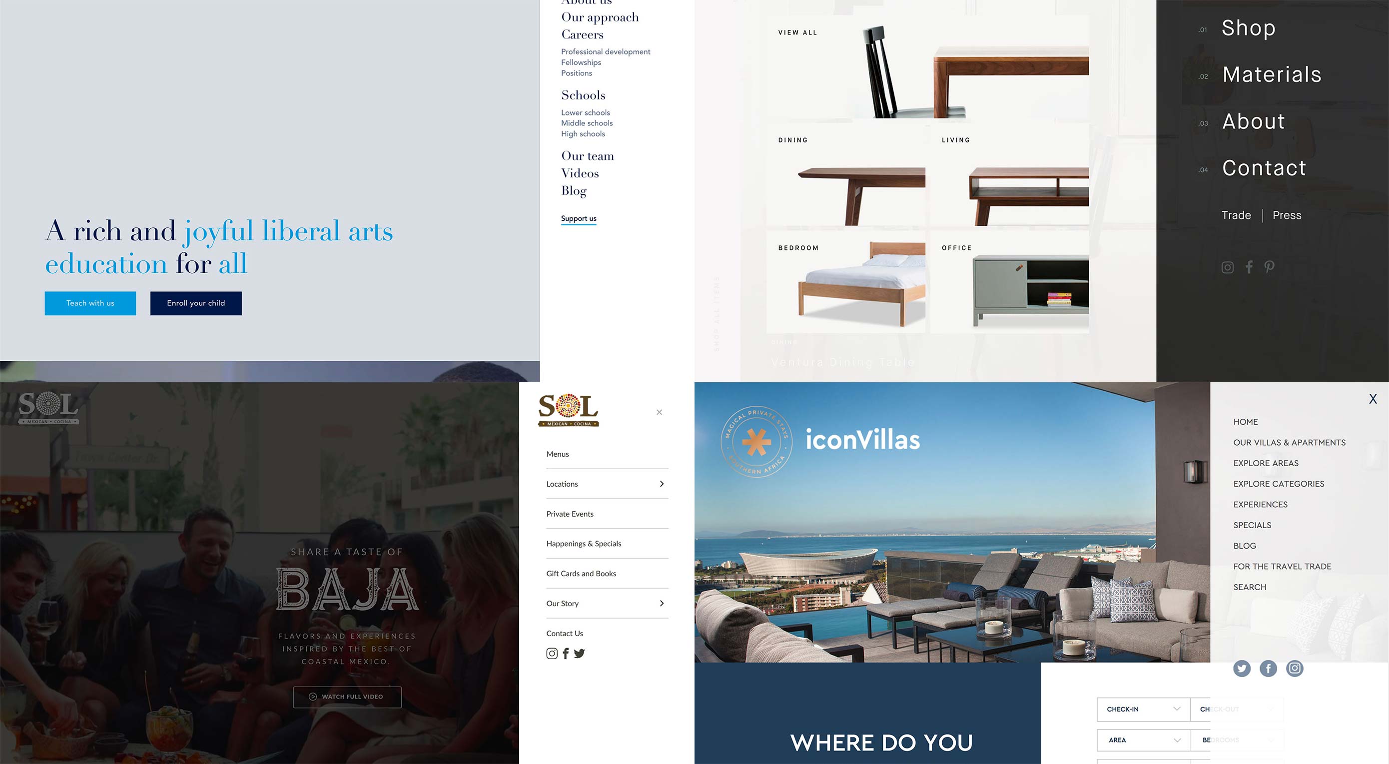 I love the hamburger menu. I hate the hamburger menu.
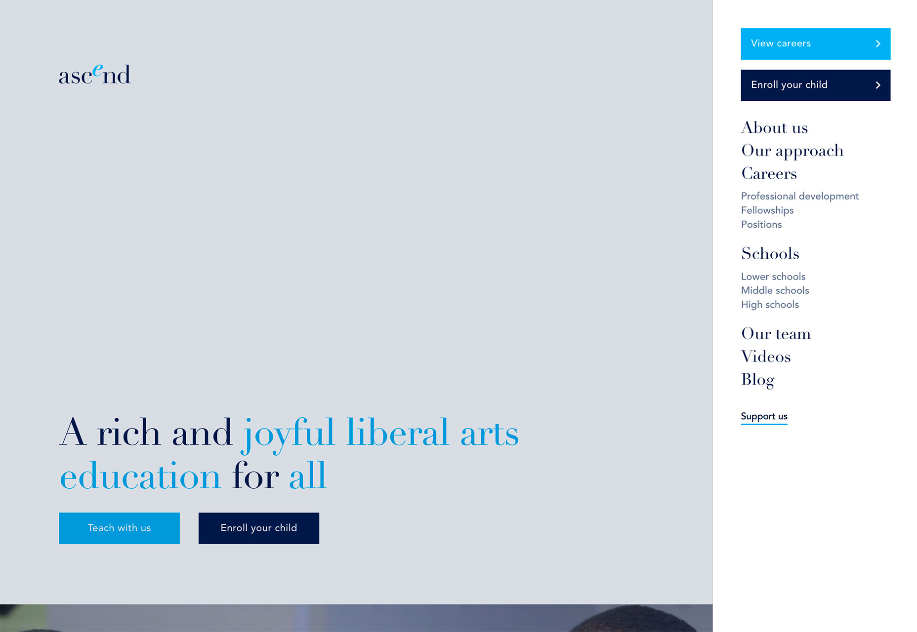


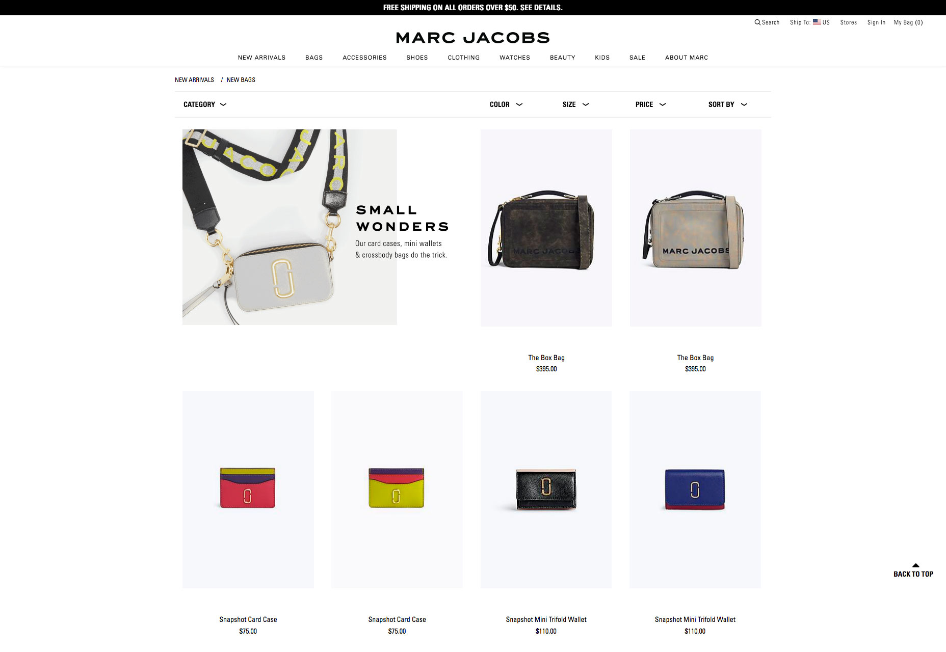
 Worldwide, retail e-commerce sales totaled $2.29 trillion last year. By the end of this year they’ll have reached $2.8 trillion. If the trend continues apace, e-commerce sales will reach a whopping $4.479 trillion by 2021.

