The best Bluetooth speaker in 2018

Original Source: http://feedproxy.google.com/~r/CreativeBloq/~3/CWHejCD703U/best-bluetooth-speaker

Bluetooth speakers are one of 2018's must-have gadgets. And with such a broad range of uses, from annoying people on public transport, to delivering high-def audio in design studios, the sheer breadth of options makes the task of choosing the best Bluetooth speaker a difficult one.

The best wireless headphones in 2018

Ultimately, though, it’s all about how a speaker sounds. And whether you’re looking for a Bluetooth speaker for your home, studio, or something super-portable, we’ve got you covered.

Which Bluetooth speakers should you buy? 

Choosing the best Bluetooth speaker isn’t just about the quality of the device – it’s also about the technology it’s using to pair to your audio source. All versions of Bluetooth are not created equal, and when it comes to specs, there can often be information that, if overlooked, can come back to bite you on the butt.

But other factors are important, too. How durable is the speaker? What is the battery life? How much does it weigh? And, ultimately, how does it sound? When it comes to range, most of these speakers will reach around 30m, but will depend on other factors such as interference; so consider how it’s going to be used.

Which are the best Bluetooth speakers?

Right now, the best Bluetooth speaker that combines audio quality, durability, and battery-life is the UE Boom 2. Its styling is idiosyncratic, and won’t suit everyone, but it’s loaded with features, and provides fantastic audio for the price. 

In this post we’ve pulled together a selection of the best Bluetooth speakers, for a number of different scenarios, and pored over the specs to provide you with the most relevant information. 

The best Bluetooth speakers right now

Bluetooth speakers

The best Bluetooth speaker overall: The UE Boom 2 builds on the success of its predecessor, with increased durability and some styling improvements – but it’s ultimately the same speaker that bagged a hatful of awards in its first iteration. Possibly the biggest improvement with the UE Boom 2, though, is the increased IPX rating (from 4 to 7), which means it can now be submerged for up to 30 minutes, and still keep on rocking. And through a companion app (for iOs and Android), you can also customise buttons, and even connect multiple speakers together via its ‘DJ’ feature, where other Boom 2 owners can add their own music to a group of connected Booms (but don’t worry; if you don’t like what you’re hearing, you can always boot them from your speaker party). 

The UE Boom app also enables you to adjust audio settings, such as bass and treble, which really helps when dealing with bass-heavy music. The audio performance of the UE Boom 2 hasn’t just been improved via its software, though, and also features upgraded 1.75in active drivers, as well as 3in passive radiators.

Lastly, but by no means least, let’s look at the design. In most cases, this is the thing that first attracts people to the UE Boom 2. It’s colourful (with numerous choices), a little eccentric, and a welcome change to the homogenous aesthetic of most speakers. But, having said this, some may find the design a little too garish for their tastes.

Bluetooth speakers

The best high-end Bluetooth speakers: We have a little confession to make: we have a serious soft-spot for the design of the Dali Katch. From its slim aluminium housing, to its leather carry handle, this is a speaker that oozes specs appeal. On its own, this wouldn’t be enough for inclusion, but it also sounds incredible (which for its slim design, is a serious feat of engineering).

Coming with two 21mm soft dome tweeters, two dual 3.5-inch woofers, and two passive bass radiators, this speaker packs a serious punch. But when things get bass-heavy, you’ll still be able to detect the mid-range—and this thing can go seriously loud, too! You can’t edit the equaliser settings with the Katch, but it does have two pre-sets: Clear and Warm (for bass-heavy audio). And between them, they’ll cover most tastes.

Lastly, if you are pairing with a device that supports aptX, then you have the added bonus of being able to play high-definition audio through the Katch, which takes it to another level of audio performance.

Bluetooth speakers

The best Bluetooth speakers for home and studio: This is a category with two big hitters: the Zeppelin Wireless from Bowers & Wilkins, and the Naim Mu-so. For cost and performance alone, we’d recommend the Zeppelin, and you can get more details in our best wireless speakers for 2018’ post.

But if cost is no issue, then the Naim Mu-so tops our list. Make no mistake, though: weighing in at 14.8kg, this isn’t a Bluetooth speaker that you’ll be slinging into your backpack anytime soon (not unless you’re in training for an endurance competition). 

Building on Naim’s high-end audio heritage, there’s little to give away the Mu-so’s digital make-up. An aluminium body encases an MDF cabinet, which, as well as providing audio dampening, also adds some serious weight to the unit. Elsewhere, recessed LEDs provide a visual cue when connecting, but sit behind the front grille, for a truly minimalist look. And the last design element of note is the main volume control, which will appeal to nob lovers everywhere (comprised of a solid ring of bead-blasted anodised aluminium).

Sound wise, the Mu-so’s power is something to behold, with six 75 watt amplifiers delivering a total of 450 watts (all controlled by a 32-bit digital signal processor, which Naim claims is capable of “millions of calculations per second”). And listening to music on the Mu-so, we believe them–it’s as close to audio perfection as you’ll get with a Bluetooth speaker (and comes with full support for AptX, too).

Bluetooth speakers

The best outdoor Bluetooth speakers: For this category, we’re going to make a few assumptions. The first is that – if you’re looking for an outdoor speaker – there’s a good chance you don’t want to spend a huge amount of money on it (because it will undoubtably be put through the wringer). Secondly, we’re going to assume that you want it to be fully-waterproof, because ‘outdoors’ often equates to ‘raining cats and dogs’.

With these factors in mind, the selection is seriously narrowed down, and this category is a toss-up between the JBL Charge 3 and the UE Wonderboom; but for its sheer cuteness and competitive price, we’ve opted for the latter.

You can’t talk about the UE Wonderboom without mentioning its looks (as we already have). Its stubby design is akin to someone over-pouring a bucketload of awesome into a drinks can, and then wrapping the whole thing in a mesh fabric, before finally topping and tailing it with a rubberised membrane. 

The design of the Wonderboom means that you get full-360 degree audio, and thanks to its IPX7 waterproof rating it also means you can play catch with this thing in a swimming pool! It really is that durable.

On top of the speaker you’ll find buttons for power, pairing and playback, and you can even connect two devices simultaneously, for easy audio switching. And whilst the UE Wonderboom sounds great, it doesn’t have the high-end bass support of the JBL Charge 3, but it handles mid-ranges brilliantly, and given that it’s almost £100 cheaper, we’re happy to make the sacrifice on top-end bass.

Bluetooth speakers

The best Bluetooth speakers for iPhone: You’ll be able to connect all of the Bluetooth speakers featured in this list via your iPhone. But, for this inclusion, we’ve tried to find a speaker that matches both the design and audio expectations of iPhone users, which is why we’ve turned to the Bose SoundLink Mini II. Styling-wise, it has a lot in common with the Jam Heavy Metal, including a hefty weight of 670g. It features a curved aluminium body, with grilles on the front and back of the device. And, like the Heavy Metal, it also handles bass extremely well (better than the Heavy Metal, in fact, which is no small feat).

Standard control buttons sit on top of the device, and in its second iteration the Soundlink Mini II ditches the dedicated Aux button in favour of auto-switching when a new device is plugged in. This is a nice addition.

The only downside to the Mini II is that, for the price, we’d expect support for aptX, which has been omitted. However, despite this small gripe, if you’re looking for a speaker that’s a step up from the competition, and will sit happily next to you iPhone, this is it.

Read more:

5 of the best TV series on Amazon PrimeHow to remove a background in Photoshop5 timeless illustration styles (and what to use them for)

Exclusive Freebie: Yoga and Mindfulness Icon Pack

Original Source: https://inspiredm.com/exclusive-freebie-yoga-and-mindfulness-icon-pack/

Are you looking to add some peace and tranquility to your life? Well, look no further! The Yoga and Mindfulness Icon Pack from Flaticon is beautifully designed to bring a sense of tranquility into your life.  Each icon comes in three versions and what’s more, you can edit the colours! Free for personal and commercial use!

Download the icon pack from here.

The post Exclusive Freebie: Yoga and Mindfulness Icon Pack appeared first on Inspired Magazine.

Five Great Fractal Art Tools You Should Use Today

Original Source: http://feedproxy.google.com/~r/Designrfix/~3/K10If99g-lg/fractal-art

You’ve probably heard about fractals before, but you might not know very much about them. They sound a little scientific, and a little mathematical, which may be why you have stayed away. However, fractals can be quite artistic. Fractal art is a form of computer-generated art that uses an algorithm to create repeating patterns in which […]

The post Five Great Fractal Art Tools You Should Use Today appeared first on designrfix.com.

4 Mistakes to Avoid During App Design and Development

Original Source: http://feedproxy.google.com/~r/Designrfix/~3/GRfTUnJodeU/mistakes-to-avoid-app-design-development

Studies show that businesses who offer apps to consumers increase sales by nearly 55 percent. For most app developers, finding a way to provide their clients with top-notch apps that are both functional and appealing is a must. Once a developer has constructed an app, they will usually be hired to maintain and update it when […]

The post 4 Mistakes to Avoid During App Design and Development appeared first on designrfix.com.

Designing A Textbox, Unabridged

Original Source: https://www.smashingmagazine.com/2018/09/designing-a-textbox-unabridged/

Designing A Textbox, Unabridged

Designing A Textbox, Unabridged

Shane Hudson

2018-09-06T13:30:16+02:00
2018-09-06T11:42:22+00:00

Ever spent an hour (or even a day) working on something just to throw the whole lot away and redo it in five minutes? That isn’t just a beginner’s code mistake; it is a real-world situation that you can easily find yourself in especially if the problem you’re trying to solve isn’t well understood to begin with.

This is why I’m such a big proponent of upfront design, user research, and creating often multiple prototypes — also known as the old adage of “You don’t know what you don’t know.” At the same time, it is very easy to look at something someone else has made, which may have taken them quite a lot of time, and think it is extremely easy because you have the benefit of hindsight by seeing a finished product.

This idea that simple is easy was summed up nicely by Jen Simmons while speaking about CSS Grid and Piet Mondrian’s paintings:

“I feel like these paintings, you know, if you look at them with the sense of like ‘Why’s that important? I could have done that.’ It’s like, well yeah, you could paint that today because we’re so used to this kind of thinking, but would you have painted this when everything around you was Victorian — when everything around you was this other style?”

I feel this sums up the feeling I have about seeing websites and design systems that make complete sense; it’s almost as if the fact they make sense means they were easy to make. Of course, it is usually the opposite; writing the code is the simple bit, but it’s the thinking and process that goes into it that takes the most effort.

With that in mind, I’m going to explore building a text box, in an exaggeration of situations many of us often find ourselves in. Hopefully, by the end of this article, we can all feel more emphatic to how the journey from start to finish is rarely linear.

A Comprehensive Guide To User Testing

So you think you’ve designed something that’s perfect, but your test tells you otherwise. Let’s explore the importance of user testing. Read more →

Getting workflow just right ain’t an easy task. So are proper estimates. Or alignment among different departments. That’s why we’ve set up “this-is-how-I-work”-sessions — with smart cookies sharing what works well for them. A part of the Smashing Membership, of course.

Explore features →

Smashing TV, with live sessions for professional designers and developers.

Brief

We all know that careful planning and understanding of the user need is important to a successful project of any size. We also all know that all too often we feel to need to rush to quickly design and develop new features. That can often mean our common sense and best practices are forgotten as we slog away to quickly get onto the next task on the everlasting to-do list. Rinse and repeat.

Today our task is to build a text box. Simple enough, it needs to allow a user to type in some text. In fact, it is so simple that we leave the task to last because there is so much other important stuff to do. Then, just before we pack up to go home, we smirk and write:

<input type=”text”>

There we go!

Oh wait, we probably need to hook that up to send data to the backend when the form is submitted, like so:

<input type=”text” name=”our_textbox”>

That’s better. Done. Time to go home.

How Do You Add A New Line?

The issue with using a simple text box is it is pretty useless if you want to type a lot of text. For a name or title it works fine, but quite often a user will type more text than you expect. Trust me when I say if you leave a textbox for long enough without strict validation, someone will paste the entire of War and Peace. In many cases, this can be prevented by having a maximum amount of characters.

In this situation though, we have found out that our laziness (or bad prioritization) of leaving it to the last minute meant we didn’t consider the real requirements. We just wanted to do another task on that everlasting to-do list and get home. This text box needs to be reusable; examples of its usage include as a content entry box, a Twitter-style note box, and a user feedback box. In all of those cases, the user is likely to type a lot of text, and a basic text box would just scroll sideways. Sometimes that may be okay, but generally, that’s an awful experience.

Thankfully for us, that simple mistake doesn’t take long to fix:

<textarea name=”our_textbox”></textarea>

Now, let’s take a moment to consider that line. A <textarea>: as simple as it can get without removing the name. Isn’t it interesting, or is it just my pedantic mind that we need to use a completely different element to add a new line? It isn’t a type of input, or an attribute used to add multi-line to an input. Also, the <textarea> element is not self-closing but an input is? Strange.

This “moment to consider” sent me time traveling back to October 1993, trawling through the depths of the www-talk mailing list. There was clearly much discussion about the future of the web and what “HTML+” should contain. This was 1993 and they were discussing ideas such as <input type="range"> which wasn’t available until HTML5, and Jim Davis said:

“Well, it’s far-fetched I suppose, but you might use HTML forms as part of a game playing interface.”

This really does show that the web wasn’t just intended to be about documents as is widely believed. Marc Andreessen suggested to have <input type="textarea"> instead of allowing new lines in the single-line text type, [saying]: (http://1997.webhistory.org/www.lists/www-talk.1993q4/0200.html)

“Makes the browser code cleaner — they have to be handled differently internally.”

That’s a fair reason to have <textarea> separate to text, but that’s still not what we ended up with. So why is <textarea> its own element?

I didn’t find any decision in the mailing list archives, but by the following month, the HTML+ Discussion Document had the <textarea> element and a note saying:

“In the initial design for forms, multi-line text fields were supported by the INPUT element with TYPE=TEXT. Unfortunately, this causes problems for fields with long text values as SGML limits the length of attributea literals. The HTML+ DTD allows for up to 1024 characters (the SGML default is only 240 characters!)”

Ah, so that’s why the text goes within the element and cannot be self-closing; they were not able to use an attribute for long text. In 1994, the <textarea> element was included, along with many others from HTML+ such as <option> in the HTML 2 spec.

Okay, that’s enough. I could easily explore the archives further but back to the task.

Styling A <textarea>

So we’ve got a default <textarea>. If you rarely use them or haven’t seen the browser defaults in a long time, then you may be surprised. A <textarea> (made almost purely for multi-line text) looks very similar to a normal text input except most browser defaults style the border darker, the box slightly larger, and there are lines in the bottom right. Those lines are the resize handle; they aren’t actually part of the spec so browsers all handle (pun absolutely intended) it in their own way. That generally means that the resize handle cannot be restyled, though you can disable resizing by setting resize: none to the <textarea>. It is possible to create a custom handle or use browser specific pseudo elements such as ::-webkit-resizer.

The default <code>&lt;textarea&gt;</code> looks very small with a grey border and three lines as a resize handle.

A default textarea with no styling (Large preview)

It’s important to understand the defaults, especially because of the resizing ability. It’s a very unique behavior; the user is able to drag to change the size of the element by default. If you don’t override the minimum and maximum sizes then the size could be as small as 9px × 9px (when I checked Chrome) or as large as they have patience to drag it. That’s something that could cause mayhem with the rest of the site’s layout if it’s not considered. Imagine a grid where <textarea> is in one column and a blue box is in another; the size of the blue box is purely decided by the size of the <textarea>.

Other than that, we can approach styling a <textarea> much the same as any other input. Want to change the grey around the edge into thick green dashes? Sure here you go: border: 5px dashed green;. Want to restyle the focus in which a lot of browsers have a slightly blurred box shadow? Change the outline — responsibly though, you know, that’s important for accessibility. You can even add a background image to your <textarea> if that interests you (I can think of a few ideas that would have been popular when skeuomorphic design was more celebrated).

Scope Creep

We’ve all experienced scope creep in our work, whether it is a client that doesn’t think the final version matches their idea or you just try to squeeze in a tiny tweak and end up taking forever to finish it. So I ( enjoying creating the persona of an exaggerated project manager telling us what we need to build) have decided that our <textarea> just is not good enough. Yes, it is now multi-line, and that’s great, and yes it even ‘pops’ a bit more with its new styling. Yet, it just doesn’t fit the very vague user need that I’ve pretty much just thought of now after we thought we were almost done.

What happens if the user puts in thousands of words? Or drags the resize handle so far it breaks the layout? It needs to be reusable, as we have already mentioned, but in some of the situations (such as a ‘Twittereqsue’ note taking box), we will need a limit. So the next task is to add a character limit. The user needs to be able to see how many characters they have left.

In the same way we started with <input> instead of <textarea>, it is very easy to think that adding the maxlength attribute would solve our issue. That is one way to limit the amount of characters the user types, it uses the browser’s built-in validation, but it is not able to display how many characters are left.

We started with the HTML, then added the CSS, now it is time for some JavaScript. As we’ve seen, charging along like a bull in a china shop without stopping to consider the right approaches can really slow us down in the long run. Especially in situations where there is a large refactor required to change it. So let’s think about this counter; it needs to update as the user types, so we need to trigger an event when the user types. It then needs to check if the amount of text is already at the maximum length.

So which event handler should we choose?

change
Intuitively, it may make sense to choose the change event. It works on <textarea> and does what it says on the tin. Except, it only triggers when the element loses focus so it wouldn’t update while typing.
keypress
The keypress event is triggered when typing any character, which is a good start. But it does not trigger when characters are deleted, so the counter wouldn’t update after pressing backspace. It also doesn’t trigger after a copy/paste.
keyup
This one gets quite close, it is triggered whenever a key has been pressed (including the backspace button). So it does trigger when deleting characters, but still not after a copy/paste.
input
This is the one we want. This triggers whenever a character is added, deleted or pasted.

This is another good example of how using our intuition just isn’t enough sometimes. There are so many quirks (especially in JavaScript!) that are all important to consider before getting started. So the code to add a counter that updates needs to update a counter (which we’ve done with a span that has a class called counter) by adding an input event handler to the <textarea>. The maximum amount of characters is set in a variable called maxLength and added to the HTML, so if the value is changed it is changed in only one place.

var textEl = document.querySelector(‘textarea’)
var counterEl = document.querySelector(‘.counter’)
var maxLength = 200

textEl.setAttribute(‘maxlength’, maxLength)
textEl.addEventListener(‘input’, (val) => {
var count = textEl.value.length
counterEl.innerHTML = ${count}/${maxLength}
})

Browser Compatibility And Progressive Enhancement

Progressive enhancement is a mindset in which we understand that we have no control over what the user exactly sees on their screen, and instead, we try to guide the browser. Responsive Web Design is a good example, where we build a website that adjusts to suit the content on the particular size viewport without manually setting what each size would look like. It means that on the one hand, we strongly care that a website works across all browsers and devices, but on the other hand, we don’t care that they look exactly the same.

Currently, we are missing a trick. We haven’t set a sensible default for the counter. The default is currently “0/200” if 200 were the maximum length; this kind of makes sense but has two downsides. The first, it doesn’t really make sense at first glance. You need to start typing before it is obvious the 0 updates as you type. The other downside is that the 0 updates as you type, meaning if the JavaScript event doesn’t trigger properly (maybe the script did not download correctly or uses JavaScript that an old browser doesn’t support such as the double arrow in the code above) then it won’t do anything. A better way would be to think carefully beforehand. How would we go about making it useful when it is both working and when it isn’t?

In this case, we could make the default text be “200 character limit.” This would mean that without any JavaScript at all, the user would always see the character limit but it just wouldn’t feedback about how close they are to the limit. However, when the JavaScript is working, it would update as they type and could say “200 characters remaining” instead. It is a very subtle change but means that although two users could get different experiences, neither are getting an experience that feels broken.

Another default that we could set is the maxlength on the element itself rather than afterwards with JavaScript. Without doing this, the baseline version (the one without JS) would be able to type past the limit.

User Testing

It’s all very well testing on various browsers and thinking about the various permutations of how devices could serve the website in a different way, but are users able to use it?

Generally speaking, no. I’m consistently shocked by user testing; people never use a site how you expect them to. This means that user testing is crucial.

It’s quite hard to simulate a user test session in an article, so for the purposes of this article, I’m going to just focus on one point that I’ve seen users struggle with on various projects.

The user is happily writing away, gets to 0 characters remaining, and then gets stuck. They forget what they were writing, or they don’t notice that it had stopped typing.

This happens because there is nothing telling the user that something has changed; if they are typing away without paying much attention, then they can hit the maximum length without noticing. This is a frustrating experience.

One way to solve this issue is to allow overtyping, so the maximum length still counts for it to be valid when submitted but it allows the user to type as much as they want and then edit it before submission. This is a good solution as it gives the control back to the user.

Okay, so how do we implement overtyping? Instead of jumping into the code, let’s step through in theory. maxlength doesn’t allow overtyping, it just stops allowing input once it hits the limit. So we need to remove maxlength and write a JS equivalent. We can use the input event handler as we did before, as we know that works on paste, etc. So in that event, the handler would check if the user has typed more than the limit, and if so, the counter text could change to say “10 characters too many.” The baseline version (without the JS) would no longer have a limit at all, so a useful middle ground could be to add the maxlength to the element in the HTML and remove the attribute using JavaScript.

That way, the user would see that they are over the limit without being cut off while typing. There would still need to be validation to make sure it isn’t submitted, but that is worth the extra small bit of work to make the user experience far better.

An example showing “17 characters too many” in red text next to a <code>&lt;textarea&gt;</code>.

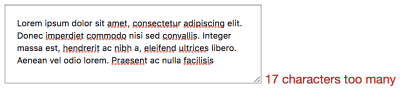
Allowing the user to overtype (Large preview)

Designing The Overtype

This gets us to quite a solid position: the user is now able to use any device and get a decent experience. If they type too much it is not going to cut them off; instead, it will just allow it and encourage them to edit it down.

There’s a variety of ways this could be designed differently, so let’s look at how Twitter handles it:

A screenshot from Twitter showing their textarea with overtyped text with a red background.

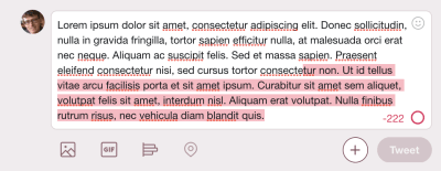
Twitter’s <textarea> (Large preview)

Twitter has been iterating its main tweet <textarea> since they started the company. The current version uses a lot of techniques that we could consider using.

As you type on Twitter, there is a circle that completes once you get to the character limit of 280. Interestingly, it doesn’t say how many characters are available until you are 20 characters away from the limit. At that point, the incomplete circle turns orange. Once you have 0 characters remaining, it turns red. After the 0 characters, the countdown goes negative; it doesn’t appear to have a limit on how far you can overtype (I tried as far as 4,000 characters remaining) but the tweet button is disabled while overtyping.

So this works the same way as our <textarea> does, with the main difference being the characters represented by a circle that updates and shows the number of characters remaining after 260 characters. We could implement this by removing the text and replacing it with an SVG circle.

The other thing that Twitter does is add a red background behind the overtyped text. This makes it completely obvious that the user is going to need to edit or remove some of the text to publish the tweet. It is a really nice part of the design. So how would we implement that? We would start again from the beginning.

You remember the part where we realized that a basic input text box would not give us multiline? And that a maxlength attribute would not give us the ability to overtype? This is one of those cases. As far as I know, there is nothing in CSS that gives us the ability to style parts of the text inside a <textarea>. This is the point where some people would suggest web components, as what we would need is a pretend <textarea>. We would need some kind of element — probably a div — with contenteditable on it and in JS we would need to wrap the overtyped text in a span that is styled with CSS.

What would the baseline non-JS version look like then? Well, it wouldn’t work at all because while contenteditable will work without JS, we would have no way to actually do anything with it. So we would need to have a <textarea> by default and remove that if JS is available. We would also need to do a lot of accessibility testing because while we can trust a <textarea> to be accessible relying on browser features is a much safer bet than building your own components. How does Twitter handle it? You may have seen it; if you are on a train and your JavaScript doesn’t load while going into a tunnel then you get chucked into a decade-old legacy version of Twitter where there is no character limit at all.

What happens then if you tweet over the character limit? Twitter reloads the page with an error message saying “Your Tweet was over the character limit. You’ll have to be more clever.” No, Twitter. You need to be more clever.

Retro

The only way to conclude this dramatization is a retrospective. What went well? What did we learn? What would we do differently next time or what would we change completely?

We started very simple with a basic textbox; in some ways, this is good because it can be all too easy to overcomplicate things from the beginning and an MVP approach is good. However, as time went on, we realized how important it is to have some critical thinking and to consider what we are doing. We should have known a basic textbox wouldn’t be enough and that a way of setting a maximum length would be useful. It is even possible that if we have conducted or sat in on user research sessions in the past that we could have anticipated the need to allow overtyping. As for the browser compatibility and user experiences across devices, considering progressive enhancement from the beginning would have caught most of those potential issues.

So one change we could make is to be much more proactive about the thinking process instead of jumping straight into the task, thinking that the code is easy when actually the code is the least important part.

On a similar vein to that, we had the “scope creep” of maxlength, and while we could possibly have anticipated that, we would rather not have any scope creep at all. So everybody involved from the beginning would be very useful, as a diverse multidisciplinary approach to even small tasks like this can seriously reduce the time it takes to figure out and fix all the unexpected tweaks.

Back To The Real World

Okay, so I can get quite deep into this made-up project, but I think it demonstrates well how complicated the most seemingly simple tasks can be. Being user-focussed, having a progressive enhancement mindset, and thinking things through from the beginning can have a real impact on both the speed and quality of delivery. And I didn’t even mention testing!

I went into some detail about the history of the <textarea> and which event listeners to use, some of this can seem overkill, but I find it fascinating to gain a real understanding of the subtleties of the web, and it can often help demystify issues we will face in the future.

Smashing Editorial
(ra, il)

9 Must-Have Features For Magento 2 Product Pages

Original Source: http://feedproxy.google.com/~r/Designrfix/~3/GcJK6fIXGFw/9-must-have-features-for-magento-2-product-pages

A product page is like a magic mirror that answers customers’ questions about an item. The better the answers, the higher the sales. Check that your Magento 2 product pages have these nine elements that make shopping decisions easy and quick for customers.   Before jumping to the product page itself, let’s look at it […]

The post 9 Must-Have Features For Magento 2 Product Pages appeared first on designrfix.com.

10 Simple CSS Snippets for Creating Beautiful Blockquotes

Original Source: http://feedproxy.google.com/~r/1stwebdesigner/~3/Y1YMa9qWQv4/

Why reinvent the wheel designing elements that already have free designs online? Blockquotes remain a staple of text-heavy websites and they come in so many distinct styles.

I’ve curated my top picks for the best free blockquotes you can find. Every one of these designs uses pure CSS code so they’re easy to replicate.

Circular Quote

Perhaps the most unique and stylish quote of this entire post is this literature circular quote.

It rests on a bright orange background so this may not be practical for your typical layout. But with some minor color adjustments it would look nice on a white background regardless of the layout.

The most spectacular part is that every element is created with pure CSS including the rounded circle pattern. It’s a truly pragmatic blockquote that also pushes the boundaries of CSS.

BQ Patterns

For tamer examples check out these blockquote patterns created by developer Derek Wheelden.

This again relies purely on CSS3 with different classes for each blockquote. The last of the 3 has the footer element to cite the quote source. It’s an optional feature that some people like, certainly not necessary for a simple website though.

It goes to show how much you can achieve with unique fonts and some minor CSS tweaks.

Notepaper

It might be hard to believe but this notepaper blockquote is created entirely with CSS3 code. No background images, no vectors, just CSS gradients and transforms.

I can’t say how many people would find this design useful. It’s a fantastic notecard that really does replicate the style of paper. But regardless of how it can be used, this design is beyond incredible and it proves how far CSS has come.

The HTML is fully semantic with modern blockquotes and this should work in all modern browsers. A magical use of web technology if I’ve ever seen it.

Classy Blockquotes

Sometimes it makes sense to include a photo of the person being quoted. This may sound tough but you can clone these blockquotes by Andrew Wright to get this effect on your site.

Andrew’s pen uses placeholders for images so they do look a little… basic. But there’s nothing to stop you from changing some colors, updating the fonts, and adding a photo to spice up your quotes.

A very simple design and pretty easy to restyle on your own.

Simple Block

This is by far my favorite blockquote because it really can work on any website. Developer Harm Putman uses the cite attribute from the blockquote to populate a citation at the bottom.

I really like the dividing bars that clearly separate the blockquote from the rest of the content. This includes a small quotation mark icon fixed in the middle to let the user know this is a clearly a quote.

Sleek, elegant, and simple. Three traits that work well in any website.

Greyed Block

For a darker approach check out this greyed blockquote that can double as a pullquote if resized.

It has a pretty clean design using Font Awesome blockquotes and lively text. I think it’d look a lot better with a stronger font but it’s certainly legible with anything you use.

I consider this as a solid “base” for building on top of and styling your own blockquote from there.

Automatic Quotes

This design by Luke Watts is more of a pullquote than a blockquote. The quoted text pulls to the side of the body text, but it still draws attention with bright colors and quotation marks.

It’s called an automatic quote because it adds the quote marks into the design via CSS. So you can just wrap your text in the proper tag and it’ll automatically style it with quotations. Pretty sweet!

However as a blockquote this would be fairly basic. I think this works best as a pull quote and does its job well.

Raised Blockquote

You can do a lot with CSS box shadows to create depth and clarity. This raised blockquote by Lukas Dietrich is pretty simple and real easy to clone.

It has one background color and a pretty clear box shadow near the bottom. This also uses a custom Google font called Bitter for the upright quotation marks.

If you have a darker layout or if you’re willing to adjust the drop shadow a bit then this quote style can fit almost any web project.

Alternating Quotes

These alternating quotes by Tommy Hodgins prove that you don’t need much to create fantastic blockquotes.

By adding a small grey border to one side you separate the text from the rest of the page. It will clearly stand out against the page body which and makes browsing any page a whole lot easier.

Plus the alternating styles let you add these with any orientation you like.

Material Design Blockquote

Last but not least I found this cool material blockquote using similar colors and styles from Google’s material design rules.

The background icon is what really makes this stand out and feel like a true blockquote. I do think the font color is a tad light, but this can always be adjusted for use in your own website.

This is the coolest material-style blockquote you’ll find and it’s totally free.

All of these blockquote styles are fantastic but certainly not the only ones. You can find many more online with lots of variety to pick from. So if you’re looking to browse more check out the blockquote tag on CodePen to see what else is out there.


Join the Creative Bloq Contributor Network!

Original Source: http://feedproxy.google.com/~r/CreativeBloq/~3/tUNYgrhOYvA/write-creative-bloq-contributor-network-612326

On Creative Bloq we're always on the lookout for talented writers to join our network of contributors. If you're a great writer with a passion for all things creative (or, if you're a graphic designer, illustrator, web designer or 3D artist who wants to share their expertise), then we want to hear from you. Here's what you need to know if you're interested in joining our Creative Bloq contributor network.

What are you looking for?

Creative Bloq is all about making design entertaining, inspiring and accessible to as many people as possible. We're the online face of a number of different design magazines: Computer Arts, net, ImagineFX, Web Designer and 3D World. That means we cover a wide range of different types of design, and we need passionate experts to share their knowledge and expertise. 

We want to provide a platform for writers that share our passion to get published. Here are some types of content that we cover:

Features exploring key issues or trends in the industryTutorials that help designers solve a specific problemTips articles to help creatives expand their skillsReviews of the hottest new kit and appsNews about the freshest projects from agencies, designers and, artists
How do I join this Network?

If you think you have what it takes, send an email to contact@creativebloq.com. Outline where your interests and knowledge lie, and please include some examples of posts or articles you've written.

It's a great idea to approach us with a few ideas (or just one, well-formed idea!) about what you want to write for us. Take a good look around the site for ideas of articles that might fit, and make sure you're not suggesting something we've already published.

We look forward to hearing from you! And if you know someone else that fits the bill, please share this amongst your friends.

Note that due to the volume of emails we receive we are not able to reply to all pitches. If you haven't heard back from us, then please assume that we're not interested at the moment, though feel free to suggest a different idea in the future.


20 Best New Portfolios, September 2018

Original Source: https://www.webdesignerdepot.com/2018/09/20-best-new-portfolios-september-2018/

Hello Readers. It’s September, so as soon as your kids are off to school, maybe you can finally have a five-minute power nap. Take that power nap with equal parts gusto and relief, dear Reader. You’ve earned it.

Last month, one of you asked for less “ultra-modern” designs, and the design gods have seen fit to provide. We still have some of that ultra-modern goodness — because apparently now that it’s been started, we can’t make it stop — but I managed to find and sprinkle in a few more classic-feeling designs. Enjoy.

Note: I’m judging these sites by how good they look to me. If they’re creative and original, or classic but really well-done, it’s all good to me. Sometimes, UX and accessibility suffer. For example, many of these sites depend on JavaScript to display their content at all; this is a Bad Idea™, kids. If you find an idea you like and want to adapt to your own site, remember to implement it responsibly.

45royale

45royale is one of those sites that combines minimalism with a healthy love of gradients.The layouts are simple, and the type is good, but it’s the use of color that truly makes this site stand out.

Platform: WordPress

RedElegant

RedElegant embraces a classic and more corporate-client-friendly aesthetic with just a touch of that material design feel. It’s the sort of design you’d expect to see at a bank.

Interesting side note, the WordPress theme used seems to be a heavily customized version of the Twenty Seventeen default WordPress theme. The extent of the customization makes this site impressive, as I would never have guessed this if I hadn’t looked at the source.

Platform: WordPress

5e Rue

5e Rue combines a fairly minimalist and classical feel with light hints of more modern artistic flourish, and a bold use of blue. The serif heading type overlaps with illustration-style bits in a way that creates a beautiful yet staid experience. It puts me in mind of a classic Parisian café, and not just because the studio itself is in Paris, okay?

Platform: Static Site

Co-Partnership

Co-Partnership has gone for the solid background with the big sans-serif text, and just a little bit of asymmetry. Well, there’s nothing at all wrong with using a tried and true formula.

I particularly like what they do with their logotype. The ever-shifting branding is a nice touch of art direction on an otherwise very simple site.

Platform: WordPress

Object

Object goes hard on the use of color as art direction. Just about every page has a different palette, and the overall effect is quite pleasing. While I’ll admit that the “hero” section on their home page is a bit of an eye-gouger, the overall effect is a pleasant one.

Platform: WordPress

60fps

60fps specializes in motion design, so it’s to be expected that their site will be a bit JavaScript-heavy. Even so, the animation used feels understated, even while making its presence known so clearly. With unique-feeling layouts and good typography, the whole experience is one of the better ones I’ve seen in the “presentation site” category.

I just wish they would stop with the scroll-jacking. I’m not a fan.

Platform: Static Site

Hochburg

Hochburg uses a very light touch with animation and a very simple, minimalist, and grid-based look. One thing I do rather like about the home page is this very light animated static effect to highlight portfolio pieces when you hover on them. It’s just a good-looking plain old dark layout, and I love it.

Platform: Contao CMS

Rimini Berlin

Rimini Berlin is interesting for in that the entire site is an accordion element. Sure, the implementation is a bit too JS-dependent for my taste, but it does preserve navigational context on this one-page site in a fairly clever way. Give me a pure CSS implementation, or at least some simple fallbacks, and I’d have nothing to complain about.

Platform: WordPress

ED.

ED. goes for full minimalism, and a classic three-ish-column approach. In fact, I’m kind of a fan of the way the columns shift around a bit when you click on a project, even if I’m unsure about this trend of letting your branding clip onto the content of your site. It’s a simple effect, but it works, and allows for a certain flexibility in this simple layout.

Platform: WordPress

Intervaro

Intervaro goes for full minimalism with a touch of material design, by which I guess I mean drop shadows and a fixed navigation bar. That’s Material Design, right? And Material Design is the new corporate aesthetic?

Whatever, it’s a simple and good-looking portfolio site. Bonus points: they implemented a rather fantastic-looking dark mode for users who find that easier on their eyes.

Platform: WordPress

Modest Department

I find myself fascinated by the choices made on Modest Department’s portfolio site because they went with very intentionally small thumbnails for everything. Is it to fit with the name? Is it to save people’s bandwidth? Either way, it does both.

The small thumbnails and wide spacing naturally draw the eye in and make you really look at what they’re showing you. It would be inadvisable for an extended browsing experience, but it’s great for a quick portfolio. It’s not great for those with visual impairments, but they could zoom in, and clicking on a thumbnail gets you a full-sized video in any case.

Platform: WordPress

Koto

Koto’s studio portfolio has gone with a one-column portfolio site, relying on their use of color and branding to help them stand out. And it works. Every element feels very intentionally placed despite the almost extreme simplicity. And I can’t fault the way they use illustration-style elements.

Platform: WordPress

Jane Studios

With all of the comparably simple sites on this list so far, we were due for another artsy one. Enter Jane Studios, a site so minimalist, artsy, and generally PowerPoint-like, we might have reached peak modern design. I’ll never be a fan of that in-all-the-corners navigation, but the rest of the site is an excellent example of its kind,

Platform: WordPress

Raxo

Raxo gets a spot on this list only partly because I’m a sucker for horizontal layouts like the one they have on their home/landing page. The rest of the site is a fairly simple and business-like affair with a strong but not overwhelming use of solid red.

Once again, I’m going to complain a bit about the navigation, though. Hamburger icons are bad enough on a desktop site, but it’s not even a hamburger icon anymore. It’s a circle. Come on. The rest is pretty good, though.

Platform: Static Site

RubyAnne Designs

RubyAnne Designs, which is abbreviated very awesomely as “RAD”, is an architecture firm. Unlike many architecture sites, this one skips a lot of the fluff and just shows you the houses already. The aesthetic is nearly brutalist, but don’t let that stop you from checking it out. It’s a fantastic example of a simple, clean, and not at all overdone architecture portfolio.

Platform: SquareSpace

Robin Mastromarino

Robin Mastromarino is an interaction designer, which means you should expect lots of animation. The animation is fairly low-key, though, and doesn’t detract from this delightfully clean and well-structured site.

The click-and-drag slideshow probably works better on mobile than it does on the desktop. Well, mobile is a huge market, so that works.

Platform: Static Site

Célia Lopez

Célia Lopez’ portfolio lands squarely in artsy territory with lots of 3D-ish graphics and that aesthetic form that’s just so “modern” that I feel like inventing a new word for it. Supermodern? Anyway, as presentation sites go, this one looks absolutely lovely. I love the heading type, especially.

Platform: JS App(?)

Hamish Stephenson

Hamish Stephenson’s flim and photography portfolio is dark, simple, and… smooth? Look, it feels smooth. Maybe that’s just because Samuel L. Jackson stares out at you from the portrait section of the site, but it just looks “cool”, in that dark and honey-voiced narrator sense of the word. Like old jazz.

Man, blurry background elements have never gotten so much praise, but here we are.

Platform: WordPress

Sebastian Chen Speier

Sebastian Chen Speier’s one-page portfolio is fairly post-modern, minimalist, and basically defines the phrase “dead simple”. It does that whole hover-over-text-to-see-a-preview thing, but with a twist: click, and you’ll get different preview images. It’s not the most intuitive setup, but it’s worth checking out for the novelty alone.

Platform: Static Site

Helder

The Helder agency site is of that school of thought that holds bold text in high regard. It’s all bold. All of it. Then there’s the strong color changes (that still somehow work), the stark imagery… it’s just a design that doesn’t hold back. And yet, it still looks kind of reserved for all that.

Platform: WordPress

Add Realistic Chalk and Sketch Lettering Effects with Sketch’it – only $5!

Source

p img {display:inline-block; margin-right:10px;}
.alignleft {float:left;}
p.showcase {clear:both;}
body#browserfriendly p, body#podcast p, div#emailbody p{margin:0;}

7 Reasons Why You Should Be a Graphic Designer

Original Source: http://feedproxy.google.com/~r/Designrfix/~3/JF8tA9VyhHI/7-reasons-why-you-should-be-a-graphic-designer

In a working world where the threat of automation hangs large, there’s at least one sector of the market that can still offer job security for decades to come: the creative industry. Imagination is a human trait that can’t be copied, making a career in the creative world all the more appealing for job hunters. […]

The post 7 Reasons Why You Should Be a Graphic Designer appeared first on designrfix.com.