Using SVG with Media Queries
Original Source: https://www.sitepoint.com/using-svg-with-media-queries/
The following is a short extract from Tiffany’s upcoming book, CSS Master, 2nd Edition, which will be available shortly.
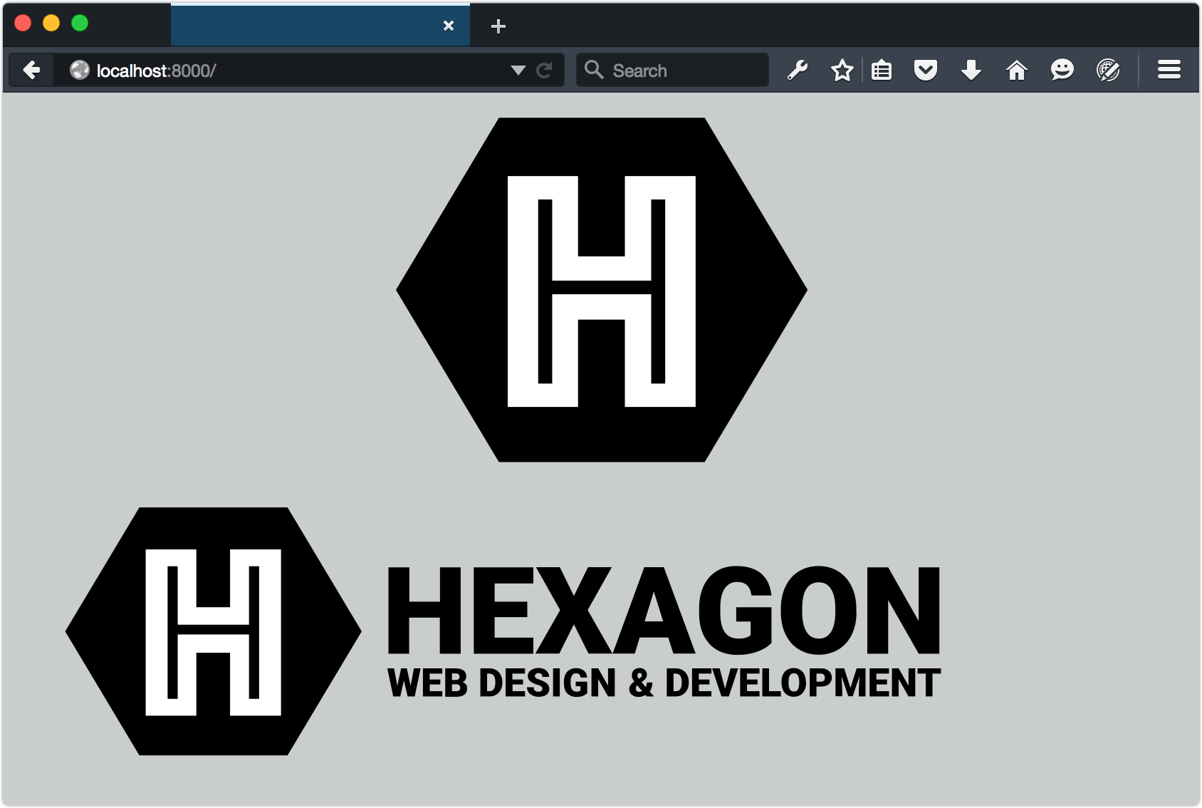
With HTML documents, we might show, hide, or rearrange parts of the page based on the conditions of the viewport. If the browser window is 480 pixels wide, for example, we might shift our navigation from a horizontal one to a vertical, collapsible list. We can do something similar with media queries and SVG documents. Consider a logo, such as that of the fictitious Hexagon Web Design & Development below.

Without media queries, this SVG logo would simply stretch or shrink to fit the viewport or its container. But with media queries, we can do more clever things.
Let’s distinguish between the HTML document viewport and the SVG document viewport. When SVG is inline, the HTML viewport and the SVG viewport are one and the same. The SVG document behaves like any other HTML element. On the other hand, when an SVG document is linked—as with the object or img elements—we’re dealing with the SVG document viewport.
Media queries work in both cases, but when the SVG document is linked, its viewport is independent of its HTML document. In that case, the size of the browser window doesn’t determine the size of the SVG viewport. Instead, the viewport size is determined by the dimensions of the object, iframe, or img element. Take the (abridged) SVG document that follows as an example:[^4]
<svg version="1.1" id="HexagonLogo" xmlns="http://www.w3.org/2000/svg" xmlns:xlink="http://www.w3.org/1999/xlink" x="0px" y="0px" viewBox="0 0 555 174" xml:space="preserve">
<defs>
<style type="text/css">
/* CSS goes here */
</style>
</defs>
<g id="hex">
<polygon id="hexagonbg" points="55.2,162 10,86.5 55.2,11 145.5,11 190.7,86.5 145.5,162 "/>
<path id="letterH" fill="#FFFFFF" d="M58,35.5h33v35.2h18.4V35.5 h33.2v103.4h-33.2v-38.3H91v38.3H58V35.5z M77.5,126.5V87.3h45.6v39.2h4V47.9h-4v35.6H77.5V47.9h-4v78.6H77.5z"/>
</g>
<g id="word-mark">
<g id="hexagon-word">
…
</g>
<g id="web-design-and-dev">
…
</g>
</g>
</svg>
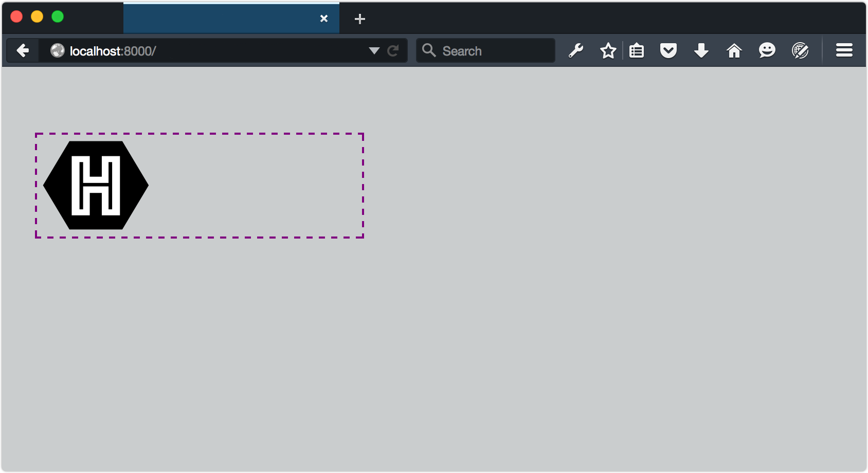
In smaller viewports, let’s show just the H in a hexagon symbol:
@media (max-width: 20em) {
[id=word-mark] {
display: none;
}
}
In smaller viewports, let’s show just the H in a hexagon symbol:
Now, whenever our SVG’s container is less than or equal to 20em, only the symbol portion of our logo will be visible, as indicated below.
To trigger this view from the HTML document, set the width of the SVG container:
<object data="hexlogo.svg" type="image/svg+xml" style="width: 20em;"></object>
As you may have noticed from looking at the image above, our SVG image retains its intrinsic dimensions even though part of it has been hidden. This, unfortunately, is a limitation of SVG. To fix it, we need to change the viewBox attribute of the SVG document, but only when the viewport is below a certain size. This is a great use case for matchMedia.
The viewBox attribute, as its name suggests, determines the viewable area of an SVG element. By adjusting it, we can determine which part of an SVG image fills the viewport. What follows is an example using matchMedia and a media query to update the viewBox attribute:
<script type="text/javascript">
var svg, originalViewBox, max20em, mq, updateViewBox;
svg = document.querySelector('svg');
/* Store the original value in a variable */
originalViewBox = svg.getAttribute('viewBox');
/* Define our media query and media query object */
mq = matchMedia("(max-width: 20em)");
/* Define the handler */
updateViewBox = function(){
if (mq.matches) {
/* Change the viewBox dimensions to show the hexagon */
svg.setAttribute('viewBox', "0 0 200 174");
} else {
svg.setAttribute('viewBox', originalViewBox);
}
}
/* Fire on document load */
// WebKit/Blink browsers
svg.onload = updateViewBox;
// Firefox & IE
svg.addEventListener('SVGLoad', updateViewBox, true);
/* Fire if the media condition changes */
mq.addListener(updateViewBox);
</script>
Note: Browsers are a little bit of a mess when it comes to handling the SVGLoad event. In my tests, addEventListener worked most consistently with Firefox. For best results in Chrome and Safari, use the onload event attribute. Microsoft Edge also works best with onload, but only when used as an attribute of the <svg> tag. In other words, <svg onload="updateViewBox">.
Now, whenever the SVG container is 20em or less, the value of viewBox will be "0 0 200 174". When it exceeds 20em, viewBox will be restored to its initial value as represented below.
Note: For a fuller primer on creating interactive SVG documents, read the “Dynamic SVG and JavaScript” chapter of An SVG Primer for Today’s Browsers from the W3C.
Since this technique uses either the onload event attribute or the SVGLoad event, it’s a good idea to embed our CSS and JavaScript within the SVG file. When CSS is external, the SVGLoad event may fire before its associated CSS finishes loading.
The post Using SVG with Media Queries appeared first on SitePoint.


Leave a Reply
Want to join the discussion?Feel free to contribute!