What's Worth Preserving? Chicago Design Museum's Heartfelt Book Project

Original Source: http://feedproxy.google.com/~r/abduzeedo/~3/iUJ66OTohdU/whats-worth-preserving-chicago-design-museums-heartfelt-book-project

What’s Worth Preserving? Chicago Design Museum’s Heartfelt Book Project

What's Worth Preserving? Chicago Design Museum's Heartfelt Book Project

ibby
Sep 28, 2017

We love Kickstarter almost as much as our morning Cup of Jo so upon discovering this heartwarming project by Chicago Design Museum’s Founder and Executive Director Tanner Woodford we just had to share with our readers in hopes we could help bring it to life. My personal affection for handwritten notes and helping save this lost art is also a motivating factor for supporting this special cause. Over the past year, Tanner  has sent hundreds of letters to a variety of people across all walks of life. In it, he kindly asks the recipient to answer a broad question that traces back to the medium on which it was sent.

“What’s worth preserving?”


Responses poured in. Each was more interesting and profound than the previous, expressing its author’s heartfelt, authentic and captivating thoughts through their handwriting. While the individual letters are fascinating, the sum of the portfolio is greater than its parts.

In an era of constant distractions, the process of writing a letter by hand serves as a reminder to breathe, and to be in the moment. Writing an answer to a thoughtful question promotes reflection. 

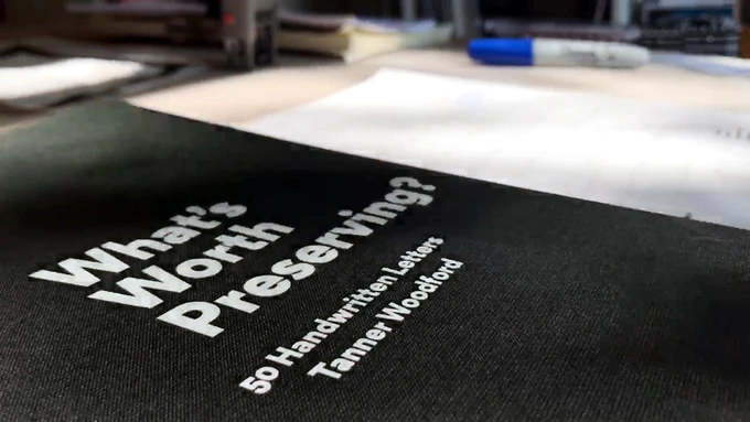
The book of 50 letters is the first edition. It’s published by ChiDM, created by its executive director Tanner Woodford, edited by Christopher Jobson of Colossal, with a project video by Bowie. Thank you to Kickstarter for helping projects like this exist and please click on this link to help bring to life! 

An early draft of the book.

People who have answered “What’s worth preserving?” in their handwriting so far.

The first response came from Dave Eggers of McSweeney’s and 826 Valencia, who suggested “it’s worth preserving the knowledge that good design comes from good designers (not robots)” on a custom, hand-drawn letterhead.

Dave Eggers is the Founder of McSweeney’s and 826 Valencia.

Elissa Tenny is President of the School of the Art Institute of Chicago.

Bestselling author Seth Godin sent a giant novelty post-it note with a short list on it that included both “lemons” and “giving a damn/making a ruckus.”

Seth Godin is the author of 18 bestsellers.

Proceeds from sales of this book support ChiDM, a 501c3 non-profit organization that strengthens design culture and builds community. For ChiDM, the book is a critical step in a broader effort to promote cultural discourse, preserving ideas alongside those that have them. 

Proceeds support ChiDM. Photo: Geoff Adler, Peyote.

Returned mail


Tanner Woodford
kickstarter
What’s Worth Preserving?


An Overview Of The Most Common UX Design Deliverables

Original Source: https://www.smashingmagazine.com/2017/09/comprehensive-overview-ux-design-deliverables/


What do UX designers do on a daily basis? A lot of things! UX professionals need to communicate design ideas and research findings to a range of audiences. They use deliverables (tangible records of work that has occurred) for that purpose.

A Comprehensive Overview Of UX Design Deliverables

I’ve created a list that contains the most common deliverables produced by UX designers as they craft great experiences for users. For better readability, I’ve combined the deliverables according to UX activities.

The post An Overview Of The Most Common UX Design Deliverables appeared first on Smashing Magazine.

How to Create an Agile UX Workflow

Original Source: http://feedproxy.google.com/~r/1stwebdesigner/~3/fxdMT-OJddo/

Agile used in sports means athletic, energetic, and limber. It is applied to gymnasts and Olympic athletes at the top of their game. It can be used to describe mental processes that are fast, flexible, and acute.

In the world of user experience design, agile refers to a number of processes that start with minimal overhead and combines teams of collaborators to complete a fluid sequence of tasks. The agile approach values interactions and individuals, customer collaboration, and a quick response to change.

Scrum Methodology

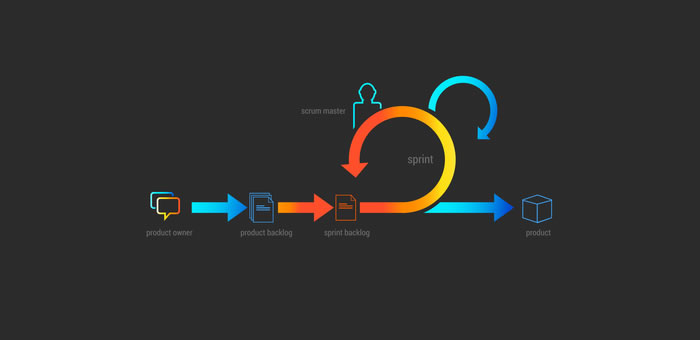
An agile workflow based on the Scrum model started out in software design. It starts with a team planning meeting in which all members break down processes and decide how many each member can commit to. They create a list of tasks that can be completed in a specified length of time, usually between two weeks and a month.

The scrum team codes and tests features for functionality during the first agile sprint, a brief time frame for intense work. They attend brief, daily scrum meetings facilitated by the ScrumMaster, who is like a coach. Team members share progress and brainstorm solutions to problems. Daily meetings keep the team synchronized throughout the sprint.

Image via prosoftnearshore.com.

At the end of the sprint, they review what they’ve created with stakeholders, receive feedback, and plan the next sprint. Feedback suggests revisions or changes that drive the next phase of development.

An agile workflow helps teams complete projects quickly, so industries like law and marketing have adopted similar methodologies. A UX workflow diagrams the steps from research and gathering user data, through usability testing just ahead of development.

Currently an estimated 69 percent of UX practitioners use an Agile UX workflow. Google’s methodology allows professionals to move from designing to testing in as little as a week, but each organization can modify stages to fit the best time frame for their project.

Transitioning to Agile UX Workflows

Teamwork speeds the process. Designers, developers, and managers create cross-functional teams so everyone is working on different aspects of the same problem concurrently. As a group and as individuals, each segment focuses on user activities, needs, and interactions, and studies every aspect through that lens.

The process is seen as a series of stages or increments. At each stage, development can loop back to correct problems or misconceptions, or move forward to the next stage.

Chunk UX Design for Agile Planning

When teams move quickly to see a project from start to finish in a very brief period, it’s tempting to shift focus from meeting the user’s needs to completing the task. A finished product is worthless if doesn’t accomplish the goals for which it was designed.

Chunk design work into smaller tasks so you can continually refocus on user research. First, define your intent, then plan UX activities that will support that intent. Break activities into smaller tasks, then use agile software or sticky notes to create user stories.

Decide in what order requirements should be accomplished and who will be responsible for each. Every decision must be directly related to a user story.

Sprint Like Google

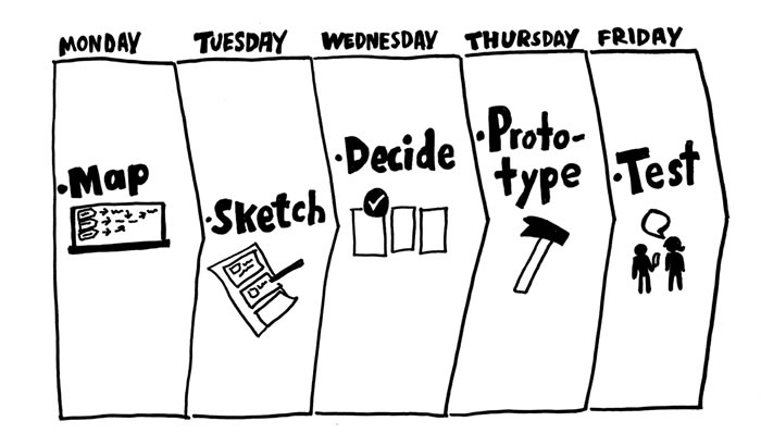
Strong design processes follow a systematic plan, but there’s always room for iteration. If an idea doesn’t go as expected, take a step back to re-iterate before moving forward. Google’s Design Sprint involves five phases, but designers are free to loop at any point.

Let’s look at the steps, each of which is designed to take one day. Organizations that don’t follow Google’s timeline can still use the same sequence to make their UX workflow agile.

Image via zapier.net

Unpack the Project. Google’s Design Sprint starts with a team meeting that includes all relevant individuals from throughout the organization. Designers, sales staff, customer service representatives, marketers, and senior management should all provide input from the beginning.

Because so many people and levels of responsibility are involved, it’s helpful to invite a facilitator to keep discussions on track. Here are some things to cover as you unpack:

Present an outline for how a solution will benefit your company.
Provide reviews of what competitors are currently offering.
Demonstrate both the problem and any partial solutions that already exist.
Furnish user personas and analytical data
Summarize the proposed solution.
Deliver business metrics that support success.

If you aren’t using Google’s process, an agile workflow still starts by setting a vision. Designers provide the team with a starting vision, whether through customer journey mapping or sketches of page-flow.

Sketch Solutions. Everyone who was involved in the unpacking meeting separates to create a pencil and paper sketch of possible solutions. If the problem is complex, participants can break it into pieces and indicate the order in which they should be addressed. Start with a simple framework. Details will be developed as you iterate over time.

Make Decisions. List important factors like your budget, technology constraints, and user input, and then review possible solutions to narrow them down to a limited number. Create storyboards for the top solutions. Use a design wall to display solutions. Reevaluate whether each solution is focused on the user.

Create Prototypes. Groups each take one of the top solutions and get to work. Google suggests building prototypes quickly using Keynote templates or any other tool that allows models to be developed in a day. Develop a testing process for use the next day or the next stage. Invite and incorporate stakeholder contributions at every step.

Test designs. Invite users to interact with your prototype. As they do, record feedback and note what didn’t go as planned. User experience drives the next iteration. UX designers can note friction points and lags in user experience from either back-end performance issues or design flaws.

In the beginning, organizations may need longer than intended to complete some phases. Just like athletes improve with practice, design teams will develop faster sprints with repeated practice.

Whether you model your Agile UX workflow on Google’s model or develop a different pace for your organization, time management is part of what makes the agile process so productive.

Time Tracking and Time Boxing

Just like a runner has a rough estimate of how long it will take them to complete a distance, and uses regular checkpoints to monitor progress, Agile sets estimates and tracks progress through time.

Estimates help teams project how long it will take to deliver a product. At first, it can be difficult to calculate how long a sprint will take, but with practice, the work will develop a predictable rhythm. Track how long it takes to complete individual tasks during a sprint, then combine them to begin developing an average sprint time.

Time boxing involves setting a limited amount of time during which an activity must be completed. Time box UX research, and review meetings and sprints, to maximize efficiency. This forces each team member to immediately reject ideas that won’t work and focus on the ones that show the most promise.

Teamwork Drives Workflow

Just like the design process has many distinct parts that flow together, each team member has a role within the iterative cycle. Designers instinctively picture pages as a whole and set about addressing design tasks as necessary to create the whole, but that means working independently.

Instead, write tasks as individual user stories and involve the team in creating content toward individual goals. Allow the whole to evolve through input from the team.

Designers have the most input during backlog, analysis, development, and testing. When the developer is working through details, that’s a good time to collaborate. Project management tools like Basecamp< and design platforms like UXPin and Invision App can aid communication between web designers and developers.

The iterative design cycle involves designing for individual stories. Each organization goes through a unique process when transitioning to an Agile UX workflow. Be willing to compromise and adjust until your team and your product come together into something even greater than you first envisioned.


Getting Started With Free Vector App Gravit

Original Source: https://www.webdesignerdepot.com/2017/09/getting-started-with-free-vector-app-gravit/

Free stuff! Get your free stuff here! Well, it’s a free vector editor, anyway. We like those, right? To be more specific, I am talking about Gravit. Like I said, it’s free, it always will be, and it has a little something for most people. Plus, it has a version for just about every desktop OS (including Linux and Chrome OS. It has a browser version. Android and iPad versions are coming. It even has a simpler version for total beginners called Klex, which is a bit like Canva.

We’ve mentioned it a couple of times here on WDD, but we’ve never examined it in any sort of depth. Well version 3.2 has just been released, so it’s time to remedy that. Here it is, our introduction to Gravit Designer:

Standard features

It’s a vector editor. It’s got your pen and pencil line-drawing tools. It has shapes, symbols, and boolean operations. You can make multi-page documents. Export your images to all of the standard formats, such as PDF, SVG, JPEG, PNG, etc. Oh, and you can export to Sketch.

Now, most decent vector editors support CMYK, but Gravit lays claim to:

The first engine that fully supports CMYK rendering in the browser…

So yeah, you can do print work in the browser, if you want to.

Standout features

It’s free. Have I mentioned that, yet?

Free cloud storage: the cloud storage is accessible from both the web and desktop versions of the app, so it’s perfect for constantly-mobile designers. The only real downsides are that there currently doesn’t seem to be a way to share documents on your corner of the cloud with others. Oh, and every system is vulnerable, so if you’re making classified vector drawings, maybe just leave them on your hard drive.

Effects: Basically layer styles and basic filters, but for individual objects, and groups of objects. You can’t apply effects to entire layers, so they’re used purely for organization and easier object manipulation.

Presentations: You can take any multi-page document, and play it as a presentation. Just design your pages and go.

Libraries: You can’t make your own libraries of shapes, yet, but it comes with some built in to make things easier on beginners. There are icons, emojis, some clip art

Anchors: Anchors are a simple way of creating responsive graphics. I wouldn’t try designing a whole responsive site layout with them, but if you have to make graphics for, say, a variety of social media channels, Gravit will work quite nicely. This is actually the intended use case.

Interface

Well it wouldn’t be a proper introduction unless we gave you a head start with the interface. Gravit’s UI is not overly complicated, but time is money. Oh, and note that you can change your theme in the settings menu. I’m actually partial to the “light” theme.

On first running the app, you’ll be presented with a screen that’s supposed to get you started fast. It should be noted that there are a number of graphical templates for various uses, including website graphics, social media posts, presentations, posters, and more.

Standard tools are all located in the top toolbar. This is where you’ll switch between select tools, drawing tools, shape tools, object arrangement functions, and more. It’s the obvious stuff. It feels a bit empty for now, when the window is full screen at 1080p, but you can do a lot with the tools provided. The left sidebar is where you can manage your pages and layers, access the libraries and some handy tutorials on the app’s basic functions.

The sidebar on the right is contextual. Depending on what tool and/or object you select, everything changes. This is where you’ll adjust settings, input precise pixel measurements for objects, and all that sort of thing.

The contextual sidebar is also where you’re going to find all of the available object effects. You’ll only see options like Blur, Color Adjust, Drop Shadow, and Inner Shadow to start with. But don’t stop there; click that “More” option. There are quite a few complex and artistic filters and effects to be found.

You’ll also find the Anchor options here. As previously mentioned, these options can be used to “anchor” any object relevant to its position on the page, or in relation to a parent object.

Using the cloud functionality is simple enough. You can save files to the cloud, open them from the cloud, and organize them with folders. It’s fairly bare-bones for now, but it works. For a single user, it works perfectly well enough.

Conclusion

This app can absolutely do some awesome things in the hands of a professional; but illustrators will most likely want to stick with whatever paid app they’re using. It can do a lot, but it can’t do everything Illustrator can to make your workflow easier, for example.

On the other hand, Gravit is a great option for beginners, and web designers with limited vector graphics needs. Just need to whip up a quick banner? This app has you covered with templates to get you started, and enough complex functionality to let designers flex their creative muscles. On top of that, it’s great for anyone who does a lot of design work on the go.

1,300+ Premium Logo Templates: Vintage, Modern & More – only $14!

Source

p img {display:inline-block; margin-right:10px;}
.alignleft {float:left;}
p.showcase {clear:both;}
body#browserfriendly p, body#podcast p, div#emailbody p{margin:0;}

React Router v4: The Complete Guide

Original Source: https://www.sitepoint.com/react-router-v4-complete-guide/

React Router is the de facto standard routing library for React. When you need to navigate through a React application with multiple views, you’ll need a router to manage the URLs. React Router takes care of that, keeping your application UI and the URL in sync.

This tutorial introduces you to React Router v4 and a whole lot of things you can do with it.

Introduction

React is a popular library for creating single-page applications (SPAs) that are rendered on the client side. An SPA might have multiple views (aka pages), and unlike the conventional multi-page apps, navigating through these views shouldn’t result in the entire page being reloaded. Instead, we want the views to be rendered inline within the current page. The end user, who’s accustomed to multi-page apps, expects the following features to be present in an SPA:

Each view in an application should have a URL that uniquely specifies that view. This is so that the user can bookmark the URL for reference at a later time — e.g. www.example.com/products.
The browser’s back and forward button should work as expected.
The dynamically generated nested views should preferably have a URL of their own too — e.g. example.com/products/shoes/101, where 101 is the product id.

Routing is the process of keeping the browser URL in sync with what’s being rendered on the page. React Router lets you handle routing declaratively. The declarative routing approach allows you to control the data flow in your application, by saying “the route should look like this”:

<Route path=”/about” component={About}/>

You can place your <Route> component anywhere that you want your route to be rendered. Since <Route>, <Link> and all the other React Router API that we’ll be dealing with are just components, you can easily get used to routing in React.

A note before getting started. There’s a common misconception that React Router is an official routing solution developed by Facebook. In reality, it’s a third-party library that’s widely popular for its design and simplicity. If your requirements are limited to routers for navigation, you could implement a custom router from scratch without much hassle. However, understanding how the basics of React Router will give you better insights into how a router should work.

Overview

React Router Logo This tutorial is divided into different sections. First, we’ll be setting up React and React Router using npm. Then we’ll jump right into React Router basics. You’ll find different code demonstrations of React Router in action. The examples covered in this tutorial include:

basic navigational routing
nested routing
nested routing with path parameters
protected routing

All the concepts connected with building these routes will be discussed along the way. The entire code for the project is available on this GitHub repo. Once you’re inside a particular demo directory, run npm install to install the dependencies. To serve the application on a development server, run npm start and head over to http://localhost:3000/ to see the demo in action.

Let’s get started!

Setting up React Router

I assume you already have a development environment up and running. If not, head over to “Getting Started with React and JSX”. Alternatively, you can use Create React App to generate the files required for creating a basic React project. This is the default directory structure generated by Create React App:

react-routing-demo-v4
├── .gitignore
├── package.json
├── public
│ ├── favicon.ico
│ ├── index.html
│ └── manifest.json
├── README.md
├── src
│ ├── App.css
│ ├── App.js
│ ├── App.test.js
│ ├── index.css
│ ├── index.js
│ ├── logo.svg
│ └── registerServiceWorker.js
└── yarn.lock

The React Router library comprises three packages: react-router, react-router-dom, and react-router-native. react-router is the core package for the router, whereas the other two are environment specific. You should use react-router-dom if you’re building a website, and react-router-native if you’re on a mobile app development environment using React Native.

Use npm to install react-router-dom:

npm install –save react-router-dom

React Router Basics

Here’s an example of how our routes will look:

<Router>
<Route exact path=”/” component={Home}/>
<Route path=”/category” component={Category}/>
<Route path=”/login” component={Login}/>
<Route path=”/products” component={Products}/>
</Router>

Router

You need a router component and several route components to set up a basic route as exemplified above. Since we’re building a browser-based application, we can use two types of routers from the React Router API:

<BrowserRouter>
<HashRouter>

The primary difference between them is evident in the URLs that they create:

// <BrowserRouter>
http://example.com/about

// <HashRouter>
http://example.com/#/about

The <BrowserRouter> is more popular amongst the two because it uses the HTML5 History API to keep track of your router history. The <HashRouter>, on the other hand, uses the hash portion of the URL (window.location.hash) to remember things. If you intend to support legacy browsers, you should stick with <HashRouter>.

Wrap the <BrowserRouter> component around the App component.

index.js
/* Import statements */
import React from ‘react’;
import ReactDOM from ‘react-dom’;

/* App is the entry point to the React code.*/
import App from ‘./App’;

/* import BrowserRouter from ‘react-router-dom’ */
import { BrowserRouter } from ‘react-router-dom’;

ReactDOM.render(
<BrowserRouter>
<App />
</BrowserRouter>
, document.getElementById(‘root’));

Note: A router component can only have a single child element. The child element can be an HTML element — such as div — or a react component.

For the React Router to work, you need to import the relevant API from the react-router-dom library. Here I’ve imported the BrowserRouter into index.js. I’ve also imported the App component from App.js. App.js, as you might have guessed, is the entry point to React components.

The above code creates an instance of history for our entire App component. Let me formally introduce you to history.

history

history is a JavaScript library that lets you easily manage session history anywhere JavaScript runs. history provides a minimal API that lets you manage the history stack, navigate, confirm navigation, and persist state between sessions. — React Training docs

Each router component creates a history object that keeps track of the current location (history.location) and also the previous locations in a stack. When the current location changes, the view is re-rendered and you get a sense of navigation. How does the current location change? The history object has methods such as history.push() and history.replace() to take care of that. history.push() is invoked when you click on a <Link> component, and history.replace() is called when you use <Redirect>. Other methods — such as history.goBack() and history.goForward() — are used to navigate through the history stack by going back or forward a page.

Moving on, we have Links and Routes.

Links and Routes

The <Route> component is the most important component in React router. It renders some UI if the current location matches the route’s path. Ideally, a <Route> component should have a prop named path, and if the pathname is matched with the current location, it gets rendered.

The <Link> component, on the other hand, is used to navigate between pages. It’s comparable to the HTML anchor element. However, using anchor links would result in a browser refresh, which we don’t want. So instead, we can use <Link> to navigate to a particular URL and have the view re-rendered without a browser refresh.

We’ve covered everything you need to know to create a basic router. Let’s build one.

Demo 1: Basic Routing
src/App.js
/* Import statements */
import React, { Component } from ‘react’;
import { Link, Route, Switch } from ‘react-router-dom’;

/* Home component */
const Home = () => (
<div>
<h2>Home</h2>
</div>
)

/* Category component */
const Category = () => (
<div>
<h2>Category</h2>
</div>
)

/* Products component */
const Products = () => (
<div>
<h2>Products</h2>
</div>
)

/* App component */
class App extends React.Component {
render() {
return (
<div>
<nav className=”navbar navbar-light”>
<ul className=”nav navbar-nav”>

/* Link components are used for linking to other views */
<li><Link to=”/”>Homes</Link></li>
<li><Link to=”/category”>Category</Link></li>
<li><Link to=”/products”>Products</Link></li>

</ul>
</nav>

/* Route components are rendered if the path prop matches the current URL */
<Route path=”/” component={Home}/>
<Route path=”/category” component={Category}/>
<Route path=”/products” component={Products}/>

</div>
)
}
}

We’ve declared the components for Home, Category and Products inside App.js. Although this is okay for now, when the component starts to grow bigger, it’s better to have a separate file for each component. As a rule of thumb, I usually create a new file for a component if it occupies more than 10 lines of code. Starting from the second demo, I’ll be creating a separate file for components that have grown too big to fit inside the App.js file.

Inside the App component, we’ve written the logic for routing. The <Route>’s path is matched with the current location and a component gets rendered. The component that should be rendered is passed in as a second prop.

Here / matches both / and /category. Therefore, both the routes are matched and rendered. How do we avoid that? You should pass the exact= {true} props to the router with path=’/’:

<Route exact={true} path=”/” component={Home}/>

If you want a route to be rendered only if the paths are exactly the same, you should use the exact props.

Nested Routing

To create nested routes, we need to have a better understanding of how <Route> works. Let’s do that.

<Route> has three props that you can you use to define what gets rendered:

component. We’ve already seen this in action. When the URL is matched, the router creates a React element from the given component using React.createElement.
render. This is handy for inline rendering. The render prop expects a function that returns an element when the location matches the route’s path.
children. The children prop is similar to render in that it expects a function that returns a React element. However, children gets rendered regardless of whether the path is matched with the location or not.

Path and match

The path is used to identify the portion of the URL that the router should match. It uses the Path-to-RegExp library to turn a path string into a regular expression. It will then be matched against the current location.

If the router’s path and the location are successfully matched, an object is created and we call it the match object. The match object carries more information about the URL and the path. This information is accessible through its properties, listed below:

match.url. A string that returns the matched portion of the URL. This is particularly useful for building nested <Link>s
match.path. A string that returns the route’s path string — that is, <Route path=””>. We’ll be using this to build nested <Route>s.
match.isExact. A boolean that returns true if the match was exact (without any trailing characters).
match.params. An object containing key/value pairs from the URL parsed by the Path-to-RegExp package.

Now that we know all about <Route>s, let’s build a router with nested routes.

Switch Component

Before we head for the demo code, I want to introduce you to the <Switch> component. When multiple <Route>s are used together, all the routes that match are rendered inclusively. Consider this code from demo 1. I’ve added a new route to demonstrate why <Switch> is useful.

<Route exact path=”/” component={Home}/>
<Route path=”/products” component={Products}/>
<Route path=”/category” component={Category}/>
<Route path=”/:id” render = {()=> (<p> I want this text to show up for all routes other than ‘/’, ‘/products’ and ‘/category’ </p>)}/>

If the URL is /products, all the routes that match the location /products are rendered. So, the <Route> with path :id gets rendered along with the Products component. This is by design. However, if this is not the behavior you’re expecting, you should add the <Switch> component to your routes. With <Switch>, only the first child <Route> that matches the location gets rendered.

Continue reading %React Router v4: The Complete Guide%
Collective #351

Original Source: http://feedproxy.google.com/~r/tympanus/~3/Z898E5CXYGg/

C351_WOTW

Inspirational Website of the Week: Era Ceramics

A bold design that stands out with its typography and nice details. Our pick this week.

Get inspired

C351_BeTheme

Our Sponsor
How to be more productive when delivering websites to your clients

Saving hours of your work time? Yes, that’s possible with the help of Be Theme’s 270+ pre-built websites.

Check out how

C351_FizzySchool

Fizzy School

Great learning resource for anyone writing jQuery. By Dave DeSandro.

Check it out

C351_sticky

An event for CSS position:sticky

Eric Bidelman shows how you can use an IntersectionObserver to fire a custom event when position:sticky elements become fixed or when they stop sticking.

Read it

C351_DataViz

DataVizProject.com

Find the right visualization for your project with this comprehensive and inspirational archive of data visualizations.

Check it out

C351_FreeCodecampGuide

Here’s a new way to learn coding tools and concepts right when you need them

Quincy Larson introduces the new freeCodeCamp Guide.

Read it

C351_iphonedesign

Designing Websites for iPhone X

Timothy Horton’s guide on designing for the new iPhone with some practical examples.

Read it

C351_CSSAccessibility

Writing CSS with Accessibility in Mind

Some great tips on how to improve the accessibility of your web sites and apps with CSS. By Manuel Matuzovic.

Read it

C351_PaymentAPI

Addressing common misconceptions about the Payment Request API

Eiji Kitamura calls out some common misconceptions about the Payment Request API.

Read it

C351_D3

Learn D3.js in 5 days

Email lessons by Ben Clinkinbeard that will teach you D3.js.

Check it out

C351_PixelBuddha

Happtizens Character Creator Set (AI, EPS, PNG)

A fantastic set of pre-made super-cute and geeky characters made by Haxon for PixelBuddha.

Get it

C351_SM

User Authentication For Web And iOS Apps With AWS Cognito (Part 2)

Second part of the tutorial by David Tucker on how to work with AWS Cognito.

Read it

C351_Lysis

Free Font: Lysis

A free display typeface with a unique character designed by Nathan Dawdy.

Get it

C351_Logos

Branded in Memory

A very insightful article on how we remember logos and the psychology behind it. By Signs.com.

Read it

C351_CSSTruth

Web truths: CSS is not real programming

Chris Heilman explains the fact that working with CSS is not traditional programming.

Read it

C351_HackerNews

Hacker News Progressive Web Apps

Addy Osmani showcases the results of some implementations on HNPWA.

Read it

C351_Slider

Untitled Slider

Nathan Taylor made this fantastic slideshow with a rotating layout.

Check it out

C351_Font

Free Font: Archia Regular

A free font family from the atipo foundry. Get the regular style for free.

Get it

C351_webgl

webgl-wireframes

The code for the November 2017 net magazine tutorial, “Stylized Wireframe Rendering in WebGL”. By Matt DesLauriers.

Check it out

C351_chatbot

i-chatbot

A component for building conversational interfaces for React.

Check it out

C351_Roots

Roots

Awesome demo of curling roots by Louis Hoebregts.

Check it out

C351_ColorGradient

ColorSpace Gradient Color CSS Generator

An easy to use tool for generating CSS gradients.

Check it out

C351_icongram

icongram

With icongram you can easily use icons from popular icon sets on the fly.

Check it out

C351_StaticApi

Creating a Static API from a Repository

Eduardo Bouças takes the concept of statically-generated sites and translates them to the context of APIs.

Read it

C351_Booking

How Booking.com manipulates you

Roman Cheplyaka dissects some nasty anti-patterns on Booking.com.

Read it

C351_OrganicShape

From Our Blog
Organic SVG Shape Morph Ideas

A small set of ideas for organic shape effects. The demos show some ways to use animated SVG morphs interactively on a website, including a menu hover and a content reveal effect.

Check it out

Collective #351 was written by Pedro Botelho and published on Codrops.

12 Incredible UX Designer Portfolio Sites

Original Source: http://feedproxy.google.com/~r/1stwebdesigner/~3/RdTA5Hqbz0U/

Design portfolios are fairly easy to set up. You can build project grids or add visual case studies to showcase your work, and the quality is immediately visible.

With UX design, it’s a little tougher because it’s often about the process and the results on each project. To craft a great UX portfolio I recommend studying others to get ideas.

This collection is by no means a complete collection of UX designer portfolio sites. But it’s an excellent place to start looking for ideas and studying how other UX designers present their work.

1. Hanna Jung

hanna jung ux designer

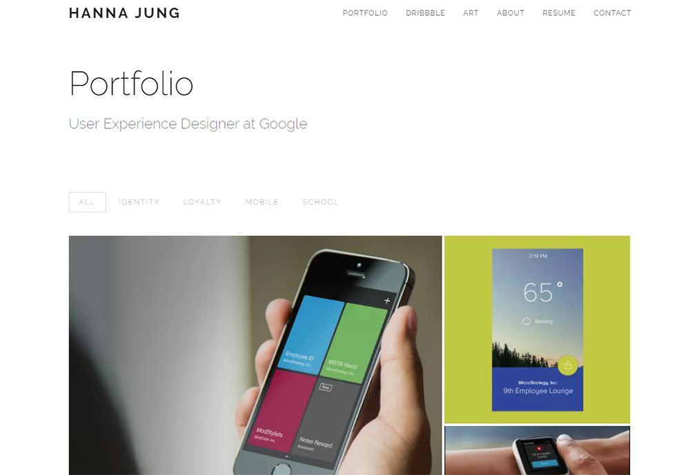
Hanna’s portfolio site offers a minimalist style with a primary focus on the work. It uses plenty of visuals to sell projects but it doesn’t feel like “just” a UX portfolio.

The header and tagline clarify exactly what Hanna does, and this is probably the best way to grab attention. If you’re designing a portfolio site for yourself always try to share what you do early, so visitors know what they’re looking at.

Each project photo inside the grid links to an internal page with more info. You can turn this into a detailed photo gallery, a quick synopsis, or even a detailed case study. But offering more info about each project on a separate page is never a bad idea.

2. Adham Dannaway

adham dannaway ux portfolio

Many people know Adham Dannaway’s site because it’s been featured in galleries across the web. And for good reason!

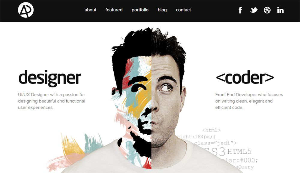
His homepage uses a brilliant graphic illustrating the type of work he does: both design and code.

There’s a significant overlap between UI designers and UX designers, so a lot of freelancers position themselves in this overlap. It makes you more valuable to a client who may want to hire for both skills, or just one knowing both skills worth off each other.

But the real reason Adham’s portfolio works so well is the internal structure of his portfolio project pages. Check out this one as an example. Notice how it reads in a linear fashion and helps sell the work done on that project.

Definitely the best choice for anyone launching a UX portfolio site from scratch.

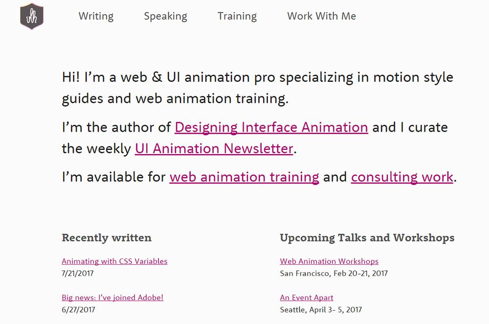
3. Val Head

val head ux portfolio

Val Head is a well-known designer with a specialty in UI/UX animations along with interaction design. Her portfolio site is a testament to all the work she does.

And you’ll notice the homepage doesn’t use a single image beyond her logo.

The structure immediately grabs your attention whether it’s focused on Val’s newsletter, her speaking engagements, or her recent blog articles. A fantastic design showing how you can sell your UX work without many visuals at all.

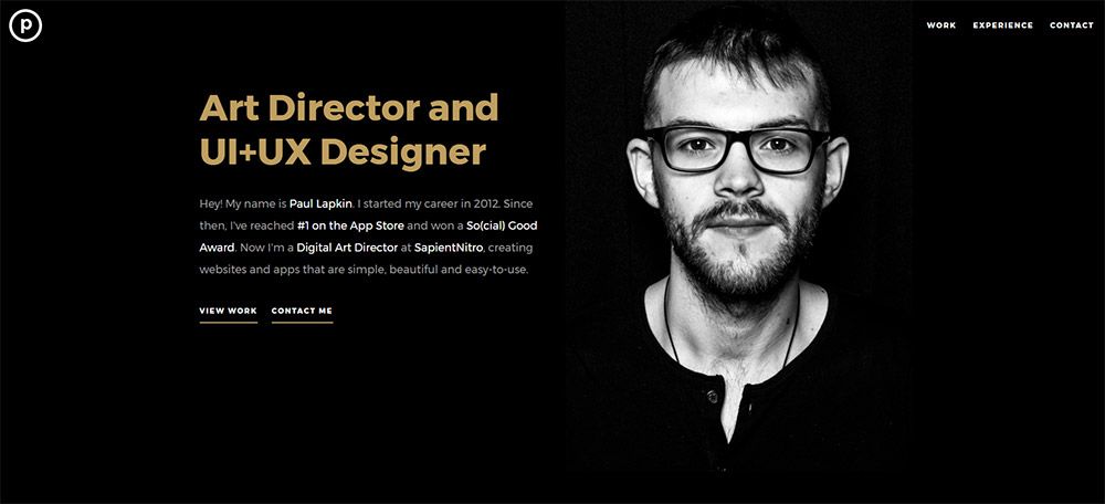
4. Paul Lapkin

paul lapkin designer site

Some designers don’t feel comfortable adding their personal photos onto their portfolio. Others like it because it adds personality and gives visitors a chance to see who they are.

Paul Lapkin uses a fullscreen header background portrait that immediately grabs attention. The heading text describes his work as a UI+UX designer along with further details underneath.

This intro text is meant to grab your attention and leave you wanting more. The “view work” link is pretty clear, and if you can write copy that also grabs attention this style might work for you too.

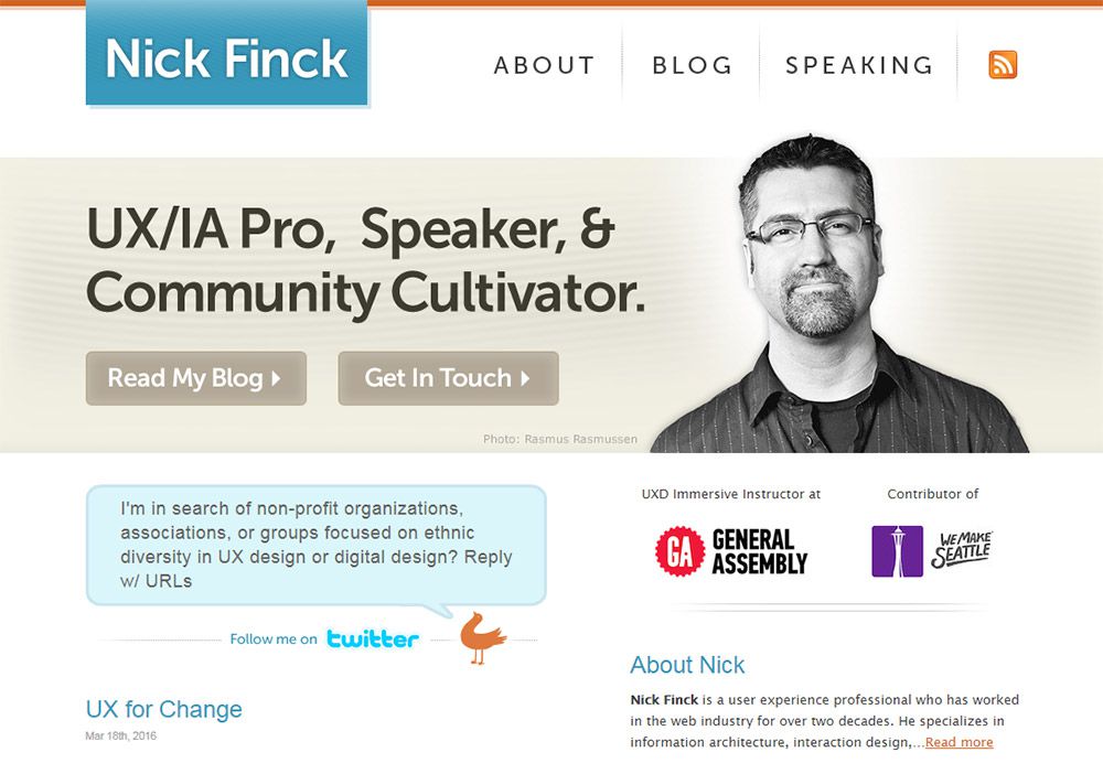
5. Nick Finck

nick finck portfolio

Nick Finck has a much more traditional website with a clear header, navigation, and footer area. Not all modern portfolios look like this but this layout works well and has for years.

One thing I really like on the homepage is the header section with Nick’s photo. This includes two CTAs that encourage you to dig deeper into Nick’s work.

A lot of his portfolio’s essence is in the writing and in his past project work for companies like Adobe and Google. This means it’s less about selling and more about building connections with potential clients.

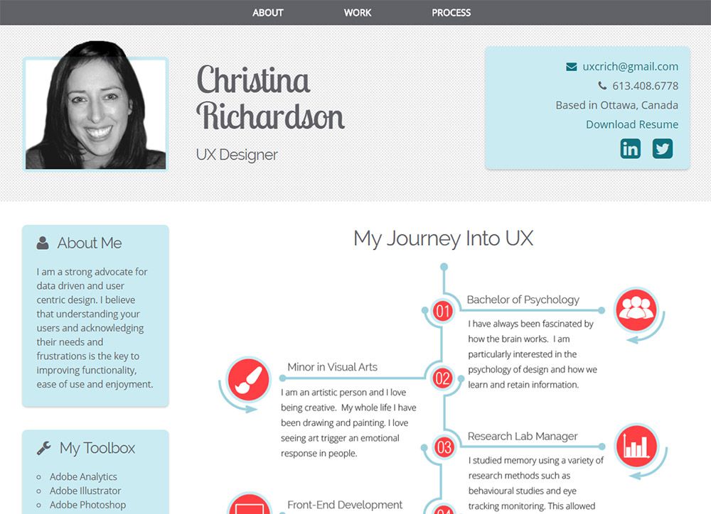
6. Christina Richardson

christina richardson portfolio

A while back I was browsing through portfolios and found Christina Richardson’s site.

This has always been a favorite of mine for a few reasons. It naturally has a sense of personality, but it doesn’t feel too cluttered or heavily customized. The whole site runs as a single-page design so it’s super easy to navigate too.

But I also really like the UX timeline feature since it’s a visual representation of work experience.

This feels a lot more user-friendly than a boring resume, but it gets the same message across. Very UX-y if I do say so myself.

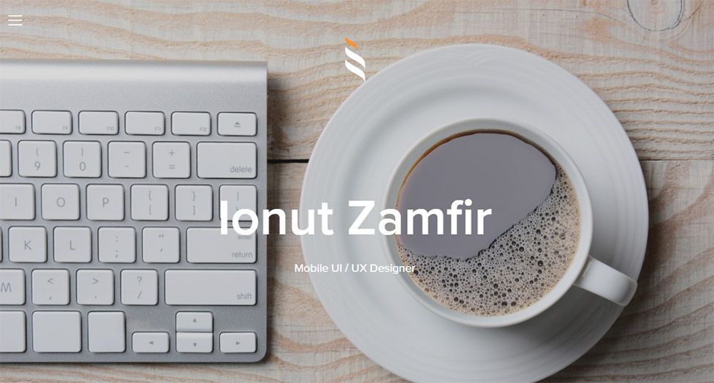
7. Ionut Zamfir

ionut zamfir portfolio design

Split-page designs work well if you have the right photos. Ionut Zamfir follows this trend brilliantly in his UX design portfolio.

Background images litter each section of the page and you’ll even find a slideshow featuring pics of his work.

It’s definitely a simple website, but sometimes that’s all you need. Some visuals to help sell, information about the designer and a contact form.

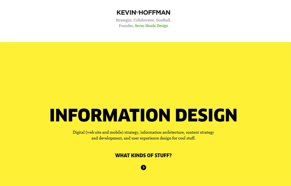
8. Kevin M. Hoffman

kevin m hoffman ux portfolio

Other than photos you can also use contrast and colors to grab attention. That’s what you’ll find on Kevin Hoffman’s site which also breaks the page up with horizontal block sections.

Text is pretty easy to read and it doesn’t follow any particular formula. Not to mention the colors don’t exactly match, but they also don’t clash either.

I’d call this an experimental portfolio layout, but it does serve its purpose.

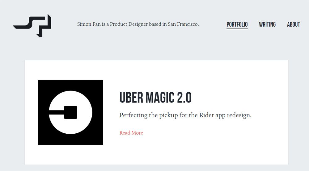
9. Simon Pan

simon pan ux designer

The portfolio site of Simon Pan is one of the best places for case study layouts. You can learn so much just going through his portfolio and reading through his case studies.

With UX design it’s more about selling your knowledge through the process. Clients want to know what you did on a project and how you solved problems for past clients.

Simon’s copywriting is exquisite, and it helps sell his work well. This is one of the best skills you can pick up if you’re pushing towards a case study mentality.

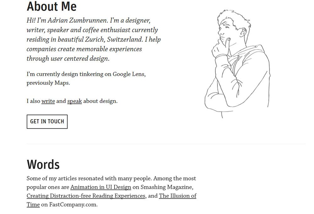
10. Adrian Zumbrunnen

adrian zumbrunnen portfolio site

With a unique combination of minimalism and dynamic effects, this portfolio is certainly eye-catching.

Adrian Zumbrunnen uses a dark + light color scheme that feels typical of many design portfolios.

But he includes other elements like bold CTA buttons, links to video recordings of his talks, and even an illustration of himself. Pretty unique!

11. Ramin Nasibov

ramin nasibov portfolio

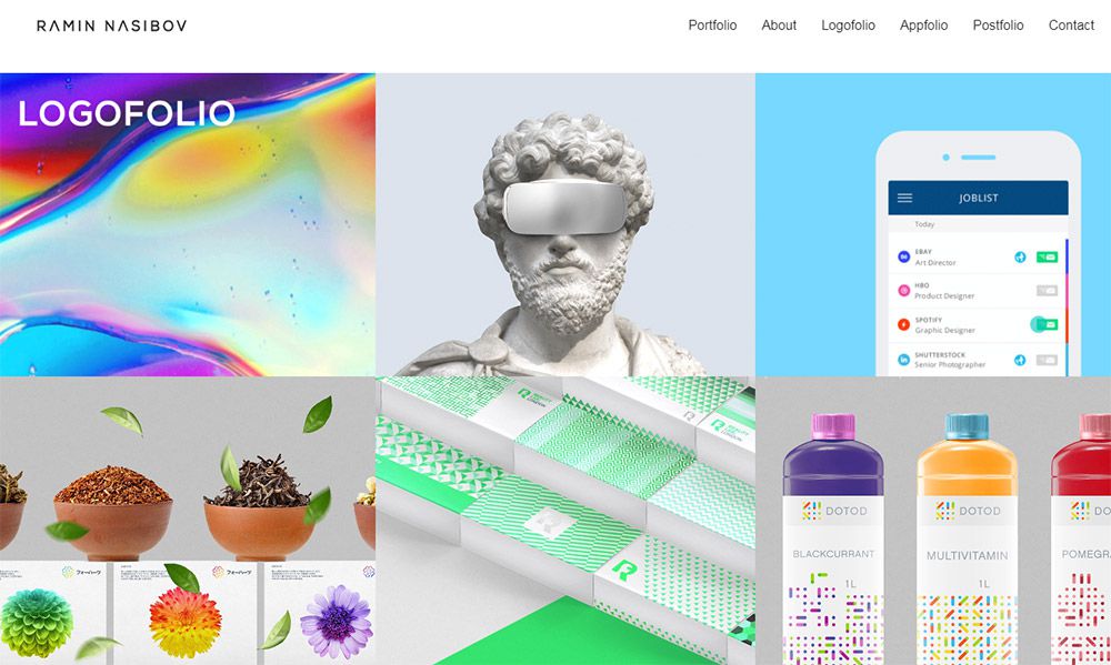
Ramin Nasibov follows a typical grid layout that works well on visual designer’s portfolios. This site is real easy to browse and it works nicely on mobile too(along with other grid-style layouts!)

One thing I would like to see on Ramin’s homepage is more info about himself. But he does so much work in the design space that it makes sense to focus solely on the work.

If you’re trying to draw more attention to your work instead of yourself I recommend a grid-style layout just like this.

12. Nishtha Mehrotra

nishtha mehrotra designer portfolio

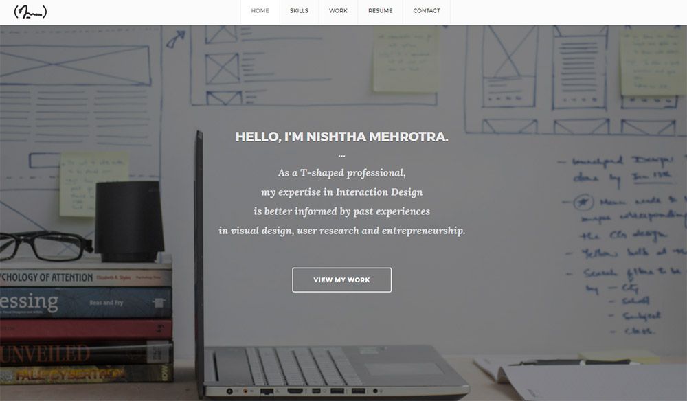
On Nishtha Mehrotra’s site you’ll find a nice mix of everything. It uses a custom hero header with animations, a visual portfolio grid, and a clean contact section with an email and a phone number.

The site feels incredibly professional, and it has been designed with the user in mind. Single page portfolios are often better if you can fit everything you want to say onto one page.

I also like the resume section which feels a lot easier to browse than a PDF doc. Overall a really clean site, and well worth studying if you’re going for the single-page portfolio look.


5 Most Important Key Steps To Take Before Designing A Small Business Website

Original Source: http://feedproxy.google.com/~r/Designrfix/~3/McWo6WGdEEQ/5-important-key-steps-designing-small-business-website

Creating a website has become a precursor, a preliminary requisite to look into and create before you set your business selling goods or services. Globalization and digitalization have become a part and parcel of every economy, trade, and commerce, thus in order to carve a niche for oneself in the flourishing market, one needs to […]

The post 5 Most Important Key Steps To Take Before Designing A Small Business Website appeared first on designrfix.com.

The Perfect Office – 8Bitdo SN30 Retro Controller, Bose Soundwear Speaker, Office Ideas and More

Original Source: http://feedproxy.google.com/~r/abduzeedo/~3/-wbHtg9nFpI/perfect-office-8bitdo-sn30-retro-controller-bose-soundwear-speaker-office-ideas-and-more

The Perfect Office – 8Bitdo SN30 Retro Controller, Bose Soundwear Speaker, Office Ideas and More

The Perfect Office - 8Bitdo SN30 Retro Controller, Bose Soundwear Speaker, Office Ideas and More

PauloGabriel
Sep 26, 2017

We’ve seen some great gadgets and equipment for designers. There are so many cool stuff out there that we could assemble infinite perfect office spaces every week! So we’ll assemble some, and we’d like you to help us. What equipment would the perfect office have?

This week we’ve found some super nice items for you, beginning with the beautiful retro game controller 8Bitdo SN30. There’s also the professional LCD monitors made by Philips, and an amazing work desk with a touchscreen built-in! But there’s more!

8Bitdo SN30 Universal Retro Game Controller


The Perfect Office - 8Bitdo SN30 Retro Controller, Bose Soundwear Speaker, Office Ideas and More!

Got a flashy new Nintendo Switch, but yearn for the true Nintendo experience? Look no further! (at Gear Patrol)

Philips Professional LCD Monitors


The Perfect Office - 8Bitdo SN30 Retro Controller, Bose Soundwear Speaker, Office Ideas and More!

The first of the new P-series displays to arrive is the Philips 328P6AU (pictured). The monitor is based on an IPS-ADS panel with a 2560×1440 resolution and can hit 400 nits in brightness. Philips says that the 328P6AU display can reproduce 98% of the AdobeRGB color gamut (and therefore it is safe to say that it can cover 100% of the sRGB), but it does not reveal anything beyond that. The firm also is not disclosing the refresh rate of the panel, but given how the monitor is being positioned, it is likely that it is set at 60 Hz. Since the 328P6AU is a professional display, its stand can set the monitor in portrait mode and allows all kinds of other adjustments (height, rotate, tilt). (at AnandTech)

SmartDesk 3 AI Standing Desk


The Perfect Office - 8Bitdo SN30 Retro Controller, Bose Soundwear Speaker, Office Ideas and More!

This SmartDesk’s ‘AI’ standing desk really just has a touchscreen tablet built-in. The company also says the built-in display syncs with Google’s software suite to notify users when they have meetings. There’s also an Uber button so you can request a ride from your desk. So basically, Autonomous built a touchscreen tablet into a desk and preloaded some apps. That seven-inch display has a 400×800 resolution and connects to Wi-Fi, by the way.The SmartDesk has an activity log that tells you how long you have been working, sitting or standing and suggests when you should sit or stand. (at Like Cool)

Bose Soundwear Companion Speaker


The Perfect Office - 8Bitdo SN30 Retro Controller, Bose Soundwear Speaker, Office Ideas and More!

Typically, there are two ways to listen to music: through speakers that other people can hear, or via ear- or headphones that make your listening private but keep you isolated from the world around you. The Bose SoundWear Companion Speaker is meant to fill that gap. It wraps around your neck, resting on your shoulders and using the company’s waveguide technology to deliver full, rich sound to your ears while minimizing noise for those around you. A built-in microphone pairs with an on-device button for taking calls and using Siri or Google Assistant and a series of custom designed covers let you change its looks to suit your taste. (at Uncrate)

August Smart Lock


The Perfect Office - 8Bitdo SN30 Retro Controller, Bose Soundwear Speaker, Office Ideas and More!

Now on its third generation, the August Smart Lock has gotten an all-new design as well as some new features. Notably, the round look of the original — still available in the new Pro model — is gone, replaced with a taller unit that has an actual thumb turn for manual operation. Battery life has doubled, and the new DoorSense feature can tell if the door is open or closed, so you can set it to automatically lock when the door shuts, providing added peace of mind. While it uses Bluetooth to let you control the lock with your phone, remote operation is possible with the addition of an August Connect module or Doorbell Cam Pro, which also add support for Alexa and Google Assistant. (at Uncrate)

Office Ideas!

Here are some office ideas for you! How do you like these? Don’t forget that you may suggest gadgets or ideas via twitter: @paulogabriel – Also, if you’d like to sponsor this post, drop me a line! I hope you enjoy these! Cheers. 😉

The Perfect Office - 8Bitdo SN30 Retro Controller, Bose Soundwear Speaker, Office Ideas and More!

The Perfect Office - 8Bitdo SN30 Retro Controller, Bose Soundwear Speaker, Office Ideas and More!

The Perfect Office - 8Bitdo SN30 Retro Controller, Bose Soundwear Speaker, Office Ideas and More!

The Perfect Office - 8Bitdo SN30 Retro Controller, Bose Soundwear Speaker, Office Ideas and More!

The Perfect Office - 8Bitdo SN30 Retro Controller, Bose Soundwear Speaker, Office Ideas and More!

perfect office
home office
office ideas
gadgets


10 Pure CSS Call-To-Action Button Sets

Original Source: http://feedproxy.google.com/~r/1stwebdesigner/~3/CrMqABfo0lk/

Every website and landing page should have a clear call-to-action button. This encourages the user to click and perform an action, whether to make a purchase, start a trial, or sign up for an account.

There is no single best way to design a CTA and you can use many different styles, from large gradients to ghost buttons, and everything inbetween. But other factors like color, size, and position also have an affect on usability.

I’ve hand-picked 10 of my favorite CTA designs, all built with pure CSS. If you’re looking for CTA inspiration, then you’re bound to find something in this collection.

1. Floating Button

Here’s one of the most unique styles I’ve seen and it’s certainly not common on the web. This floating button could become a staple for landing pages that mesh nicely with the design.

It uses a CSS3 drop shadow along with a repeating animation to create the floating effect. This all runs through CSS which makes it even easier to replicate for your own project.

Granted, the hover effect is a bit dull, although the actual button design itself more than makes up for this. Plus you can always expand the hover effect to include other CSS3 animations if you’re willing to push the envelope.

2. Green Circled CTA

You’ll find plenty of CTAs like this on landing pages promoting offers or ebooks. They often use the red hand-drawn circle effect to make it blend into the page and seem more natural to click.

What’s cool about this green CTA button is the hover effect animation. It works on both the button and the red squiggles in the background. Certainly not the effect you’d assume at first glance!

But for a real easy CTA, that’s sure to grab attention, you should try this out. And since the button uses pure CSS you can easily change the color scheme to match any layout.

3. Material Button

If you like working with Google’s material design then you’ll love this unique button set. It’s built in one single style but offers two different triggers: mouse hover and click.

The button snippet uses SCSS/Sass for CSS code, but you can compile it down into CSS right from CodePen. This makes it easier to copy/paste the code for personal use if you’re not a big Sass fan.

The animation effects mimic Google’s design guidelines, so this set is brilliant for any material web project you might be creating.

4. Colorful CTAs

Super small and easy-to-use best describes this button set created by developer Rohan Nair.

The color choices are made to match but you can always change the scheme in CSS. The real eye-catching effect here is the click animation that moves the button “down” into the page.

This gives the illusion of depth and helps each button stand out from other elements on the page.

Again this all uses pure CSS, so it’s a pretty easy button set to copy and customize.

5. Micro Interaction Button

If you want even greater button animation effects take a peek at these microinteraction buttons designed by Phil Hoyt.

They use Font Awesome for the arrow icons mixed with custom CSS animations. While hovering any button, the text label animates out of view and instead displays the icon font prominently.

Depending on your CTA design this may not work as well, especially if you can’t find an icon to represent the button behavior. clearly

Although if you can work this into your site, the hover effect is bound to grab attention.

6. Bordered Buttons

I found these bordered buttons while skimming CodePen and they immediately stood out from the herd.

They don’t inherently feel like CTAs, but with larger text or a larger button size these little designs could dominate a header with ease.

Each button uses the CSS translate() method along with custom background colors to create the border effect. It’s a fairly complicated technique but it’s also the best method considering a plain CSS border wouldn’t animate the same way.

If you like these designs and want to give them a shot, they should run smoothly in every modern web browser.

7. Gradient Styles

Classic gradient buttons will never go out of style and they’re used prominently in larger frameworks like Bootstrap.

With these gradient buttons you can easily update the hover & click animations all while keeping true to the color format. It uses LESS CSS which makes it easier to darken gradient colors using percentages rather than hex codes.

I always like gradient buttons so long as they blend with a layout. And these certainly aren’t the only gradient styles you’ll find so check CodePen if you’re looking for more.

8. YouTube Call to Action

Here’s a rather unique CTA that leads to a YouTube video. It’s a fixed badge in the lower-right corner of the screen and while hovering you can see the video CTA appear on top.

It’s a pretty simple design but it’s not going to be useful on every web page. It can be used to promote deals, new releases, and of course links to other sites like YouTube.

But if you’re looking for a prominent CTA button for your page header, this template won’t help much. Still a very unique idea and certainly worth saving if you could ever use something like this in the future.

9. Flip-Down Buttons

3D animations for the web are easy to create if you know what you’re doing. But even if you don’t understand CSS it’s just as easy to copy 3D code snippets like these flip-down buttons made by Arnie McKinnis.

They’re built on LESS, but you can turn that into plain CSS right inside CodePen. The buttons rely on CSS transforms to create the 3D effect which only appears on mouse hover.

It’s a pretty unique design because the CTA itself is technically “under” the button. Hovering only displays the clickable link underneath making the colorful button more of a fancy shell to grab attention.

But if you like the 3D animated effect, definitely give this a try on your own site.

10. Pure CSS Hovers

Rather than focusing on a unique design or color scheme these pure CSS buttons offer custom hover animations.

They all look similar to typical ghost buttons where you have a border color and no internal color. But while hovering you’ll notice each button’s border style animates into something new.

It’s a tricky effect to get right, and it’s not something you can just pick up and customize without some effort. Although if you know your way around CSS, you should figure it out pretty quickly.

11. Pulsing CTA

If you’re looking to consistently grab attention from visitors then try this pulsing CTA design. It uses a delay via CSS to create a repeating pulse animation with an outer glow.

But if you dive into the CSS code, you can change the pulse animation to be anything you like. It’s pretty versatile, and of course, it should blend in nicely with any design.

Also if you click the “X” icon in the corner you’ll get to see the full animation effect all over again. This loads the button into view along with the window so it even has a cool animation for the first pageload.

Most websites use pure CSS buttons these days so it’s not all that difficult to find one you like and clone the code for a kick-ass CTA.