Organic SVG Shape Morph Ideas

Original Source: http://feedproxy.google.com/~r/tympanus/~3/DQy-PQj6iOY/

Today we’d like to share some more animated organic SVG shapes with you. The idea is to integrate some flowy, natural looking shapes into a web page as decorative elements, sometimes with an interaction, i.e. a background of menu that changes on hovering the menu items, or simply, a constantly animating wave background that got inspired by Kévin Lagier’s design. In one of the demos we also use some patterns and clip paths that get animated to fullscreen in order to reveal some other content. The morphing path and other animations in these demos are powered by anime.js.

OrganicShapeMorphIdeas

This demo is kindly sponsored by: Jetpack Professional, the only WordPress plugin you really need.

Attention: Note that the demos are highly experimental and are best viewed on a modern desktop browser.

Have a quick look at all the demos:

OrganicShapeMorphIdeas01

OrganicShapeMorphIdeas02

OrganicShapeMorphIdeas03

OrganicShapeMorphIdeas04

OrganicShapeMorphIdeas05

We hope you enjoy the demos and find them inspiring!

References and Credits

anime.js by Julian Garnier
Keyboard icon by Paul te Kortschot from the Noun Project
Patterns from Hero Patterns

Organic SVG Shape Morph Ideas was written by Mary Lou and published on Codrops.

Collective #350

Original Source: http://feedproxy.google.com/~r/tympanus/~3/keK0WbStk3E/

C350_nomnom

Our Sponsor
Data-driven designers use NomNom to learn from customers faster

The easiest way to search, organize and share all your customer feedback and user research in one place. NomNom is data-driven design made easy.

Check it out

C350_typography

How New Font Technologies Will Improve The Web

François Poizat writes on how promising the future of web typography looks.

Read it

C350_postmodencss

A Rube Goldberg Machine

An introduction to post-modern web development by Ada Rose covering topics such as CSS Grid, CSS Custom Properties and Web Animations.

Read it

C350_colors

Colors

Colors is a data-driven collection of color palettes.

Check it out

C350_minmax

min() and max() now in WebKit

Vincent De Oliveira’s tweet on the amazing min() and max() CSS functions that are now supported in WebKit.

Check it out

C350_swingingcat

CSS: Cat Swinging on String

An adorable swinging kitten demo by David Khourshid.

Check it out

C350_sensor

Sensors For The Web!

Read how the Generic Sensor API is bridging the gap between native and web applications when it comes to sensor data.

Read it

C350_webpush

Web Push Notifications with Firebase (Video Series)

A video series by Ire Aderinokun on how Web Push Notifications work on the example of the Simply Notify app.

Read it

C350_nextreality

Next Reality

A great place to find and submit the newest augmented reality applications.

Check it out

C350_documentation

The Ten Essentials for Good API Documentation

Diana Lakatos’ first article of a two part guide on how to write a good API documentation.

Read it

C350_chromeext

Chrome extensions for quick site redesigns

Monica Dinculescu made a Chrome extension that you easily use to alter a site’s CSS.

Read it

C350_reactdesigner

React and Styled Components for Designers

Will Thomas shows how a designer can get up and running with React quickly, and start building and styling components.

Read it

C350_finally

Finally the Promise.prototype.finally() is available

Read about Promise.prototype.finally which makes it easier to apply some code after a JavaScript Promise is fulfilled.

Read it

C350_jscheatsheet

Modern JavaScript cheatsheet

A cheatsheet for JavaScript code you will frequently encounter in modern projects. By Manuel Beaudru.

Check it out

C350_speechbubbles

Eccentric Speech Bubbles Vector Pack (AI, EPS, SVG, PSD, PNG)

A set of creative speech bubble vectors by Creative Veila.

Get it

C350_changecss

How to View and Edit CSS in Chrome Developer Tools

Learn how to make real-time changes to a website with Chrome DevTools in this tutorial by Brandon Morelli.

Read it

C350_redux

The Problems with Redux: Can React, MobX, and Realm save us?

Erich Reich shares his experiences creating mobile apps with React Native and highlights some challenges with Redux.

Read it

C350_paperbird

Only CSS: Paper Bird

A nice demo of a flying paper bird by Yusuke Nakaya.

Check it out

C350_flexbox

The Ultimate Guide to Flexbox – Learning Through Examples

Ohans Emmanuel’s guide to flexbox with many practical examples.

Read it

C350_themeswitch

A Theme Switcher

Another useful inclusive component tutorial by Heydon Pickering.

Read it

C350_sketch

Cherise Sketch App

A great Sketch design resource by Andrew Chraniotis.

C350_global

Global Mutable State

Learn how reducing the amount of global mutable state in your program is one of the best ways to improve the quality of your code. By Eric Normand.

Read it

C350_toolkit

AR Tool Belt

A set of augmented-reality tools for the professional or DIY handyman, launching alongside iOS 11 and ARKit.

Check it out

Collective #350 was written by Pedro Botelho and published on Codrops.

Name Your Price for The Marketing Copywriter Bundle

Original Source: http://feedproxy.google.com/~r/Designrfix/~3/GH_fA8yLUlM/price-marketing-copywriter-bundle

Your website is usually the first contact your target audience has with your business. Often, people would do research before and look up your website before doing business with you. This way, they can see whether or not you’re running a reliable and trustworthy company. While a professional-looking website gives off the idea that you […]

The post Name Your Price for The Marketing Copywriter Bundle appeared first on designrfix.com.

Industrial Design: Tiller, a Minimal Device for tracking your time

Original Source: http://feedproxy.google.com/~r/abduzeedo/~3/Nd2ScPoxXRw/industrial-design-tiller-minimal-device-tracking-your-time

Industrial Design: Tiller, a Minimal Device for tracking your time

Industrial Design: Tiller, a Minimal Device for tracking your time

AoiroStudio
Sep 20, 2017

We would like to share another project that is currently live on Kickstarter. For this case, it’s a beautiful, minimal device for tracking your time. Introducing Tiller, approached with a clean industrial design. This product has been created to make time tracking straightforward, simple, and unnoticeable. Just one tap starts or stops a timer, and a small turn switches between items. It’s a significant reduction compared to other software-based products. Let’s dive in.

In their words

We solve real problems by bringing good design and technology together. Like most professionals, our work stacks up, so we strived to find an easier way to track our time and get the most out of our work day. That’s how Tiller was born.

Take the time out of time tracking and get more work done.

Product Gallery
Industrial Design: Tiller, a Minimal Device for tracking your timeIndustrial Design: Tiller, a Minimal Device for tracking your timeIndustrial Design: Tiller, a Minimal Device for tracking your timeIndustrial Design: Tiller, a Minimal Device for tracking your timeIndustrial Design: Tiller, a Minimal Device for tracking your timeIndustrial Design: Tiller, a Minimal Device for tracking your timeIndustrial Design: Tiller, a Minimal Device for tracking your timeIndustrial Design: Tiller, a Minimal Device for tracking your timeIndustrial Design: Tiller, a Minimal Device for tracking your time


Industrial Design: Tiller, a Minimal Device for tracking your time

Some Facts

• Integrations with some of your favorite apps starting with Harvest, Toggl, WorkflowMax, and AND CO. 
• Our software has been designed to be as unobtrusive as possible. The interface to track your time only pops up when you need it.

More Links
Support Tiller on Kickstarter
Learn more about Joan at wearejoan.com

industrial design
design
kickstarter


The Designer’s Guide to Color Contrast

Original Source: https://www.webdesignerdepot.com/2017/09/the-designers-guide-to-color-contrast/

The colors you choose while designing a website, poster, or any other type of image, will have a huge impact on whether or not the overall design is successful. After all, there is a lot of psychology behind the colors that people are attracted to, and designers need to incorporate this into everything they do.

Color contrast plays a very valuable role, but it is often overlooked, undervalued and misunderstood. To avoid this problem, you must learn more about color contrast, including how and why you should use it. Once you go beyond the basics of knowing that red and orange aren’t good colors to create contrast but black and white are, you can begin to develop an enhanced aesthetic that will please clients and viewers.

Why is Color Contrast So Useful?

Color contrast, in a nutshell, provides visual intrigue and keeps viewers interested. Consider for a moment how boring it would be if an entire poster was made out of one color or only included shades from the same color family. Although there are some instances when this does work from an artistic perspective, it’s not an approach that is likely to grab someone’s attention when they’re perusing store shelves, looking at movie posters or surfing the web. Therefore, it’s wise to use contrasting colors whenever appropriate.

Think about the classic Coca-Cola can. If the entire thing was red, it wouldn’t stand out nearly as much as it does. The white writing truly pops off of the red background, which grabs attention and is instantly recognizable. This contrast is visually stunning, and it stands out from its competitors.

How to Best Use Color Contrast

The color choices you make must depend largely on the format that you’re using. The Coca-Cola can provides a great way to explain this process. In a physical product such as a can of soda, the red background works. It also stands out well in print advertising, on TV commercials and much more. But what if you were to attempt to design a website with these same colors?

To put it as bluntly as possible, a solid red website page background with white text on top would be atrocious. A full red background will work, though, if you put a text box on top of it that has a lighter color such as white or tan. From there, you’d most likely want to use black text in the text box to create another layer of contrast. Not only will this approach be more eye-catching but it will also enable people to actually read the text. Remember: black text on red is very difficult to read.

Other examples of contrasting color combinations that won’t work well on the web and may also be almost indecipherable in other formats include light green on medium green, green on red and red on blue. Instead, consider using white on green and yellow or white on blue. If you must put text on a solid red background, it’s best to use white just like Coca-Cola.

Of course, color contrast isn’t always used to call attention to text. If you’re looking to put two different contrasting colors together to draw the eye to something specific on the page, you can choose between dramatically different colors and the more subtle contrast that is caused by changes in shade, tint and saturation.

Color contrast plays a huge role in getting your CTA or button standing out. This should go without saying but when the user is skimming the landing page or your article, a CTA with a different color than the page will grab their attention.

This all sounds good but in order to see it in action we should take a look at some companies that are using color contrast to their advantage.
Teamweek is by far one of the best examples I can give you. As you can see in the image above, although the plans are all a different color, the contrast between the turquoise button and the rest of the page still does an amazing job drawing your attention to the CTA. 

The same thing happens on their sign-up page. Although the page is rich in colors and patterns, the user’s attention is redirected to the center of the page.

Trip Advisor does a nice job of using contrasting colors and white space to direct each user’s eyes to the most important aspects of their search results. The mixture of green and yellow is pleasing to the eye, and they kept the classic blue hyperlink color to make it easy for people to know where to click to learn more. Even better, they chose a bold yellow with black text for their “show prices” button, which stands out so much that people are virtually certain to engage with this call-to-action.

Another prime example of how to use contrasting colors to your advantage can be found at CheeseSurvivalKit.com. Alternating between open and negative space with their choice of white and gray pulls the eye in. Topping off this combination with a splash of red helps ensure that website visitors will be visually intrigued enough to stick around.

What Every Designer Needs to Know

Approximately 8 percent of men worldwide suffer from some form of color-blindness. This condition is much rarer in women, but 1 out of every 17 people with color-blindness is female. In total, 4.5 percent of the world’s population does not see all colors as the rest of the world does.

This may seem like a small enough percentage that you wouldn’t cater to their needs. However, the reality is that in the UK alone, 2.7 million people are colorblind. This is something designers really need to consider, especially if they’re creating something that is targeted at men.

Red/green blindness is the most common version of color-blindness. What this means is that the red and green elements of any color will not have their true appearance to these individuals. For instance, a person with red/green blindness will perceive purple as blue. This happens because they’re unable to see the red tone that helps differentiate purple from blue.

As you can imagine, this makes the process of choosing the perfect color contrast even more difficult. If you were to choose green as your primary background color or even as a font color, 4.5 percent of your intended viewing audience may not be able to accurately see everything. They may not even be able to read the words very well depending on the hue you chose and how severe their color-blindness is.

The Bottom Line

Ultimately, a color contrast should make both elements stand out, but especially the element that is most important. In other words, if you’re putting text on a colorful background or image, make sure that the words are easy to see and read. Keep your audience in mind and try to steer clear of color combinations that would make the final result difficult for people with color-blindness.

300+ Beautiful, Hi-Res Textures and Backgrounds – only $24!

Source

p img {display:inline-block; margin-right:10px;}
.alignleft {float:left;}
p.showcase {clear:both;}
body#browserfriendly p, body#podcast p, div#emailbody p{margin:0;}

What Can a Web Designer Achieve that You Can’t?

Original Source: http://feedproxy.google.com/~r/Designrfix/~3/KTsM69XteOg/web-designer-achieve

It has become a truism of the modern internet that a cut-throat website matters. Anyone with a decent education can build a basic DIY website, but that’s not always enough. If you want people to find your website, let alone interact with it, a lot needs to be done. Here is what a web developer […]

The post What Can a Web Designer Achieve that You Can’t? appeared first on designrfix.com.

Architecture: House Yorii located in Saitama Prefecture, Japan

Original Source: http://feedproxy.google.com/~r/abduzeedo/~3/LYJJupaanws/architecture-house-yorii-located-saitama-prefecture-japan

Architecture: House Yorii located in Saitama Prefecture, Japan

Architecture: House Yorii located in Saitama Prefecture, Japan

AoiroStudio
Sep 20, 2017

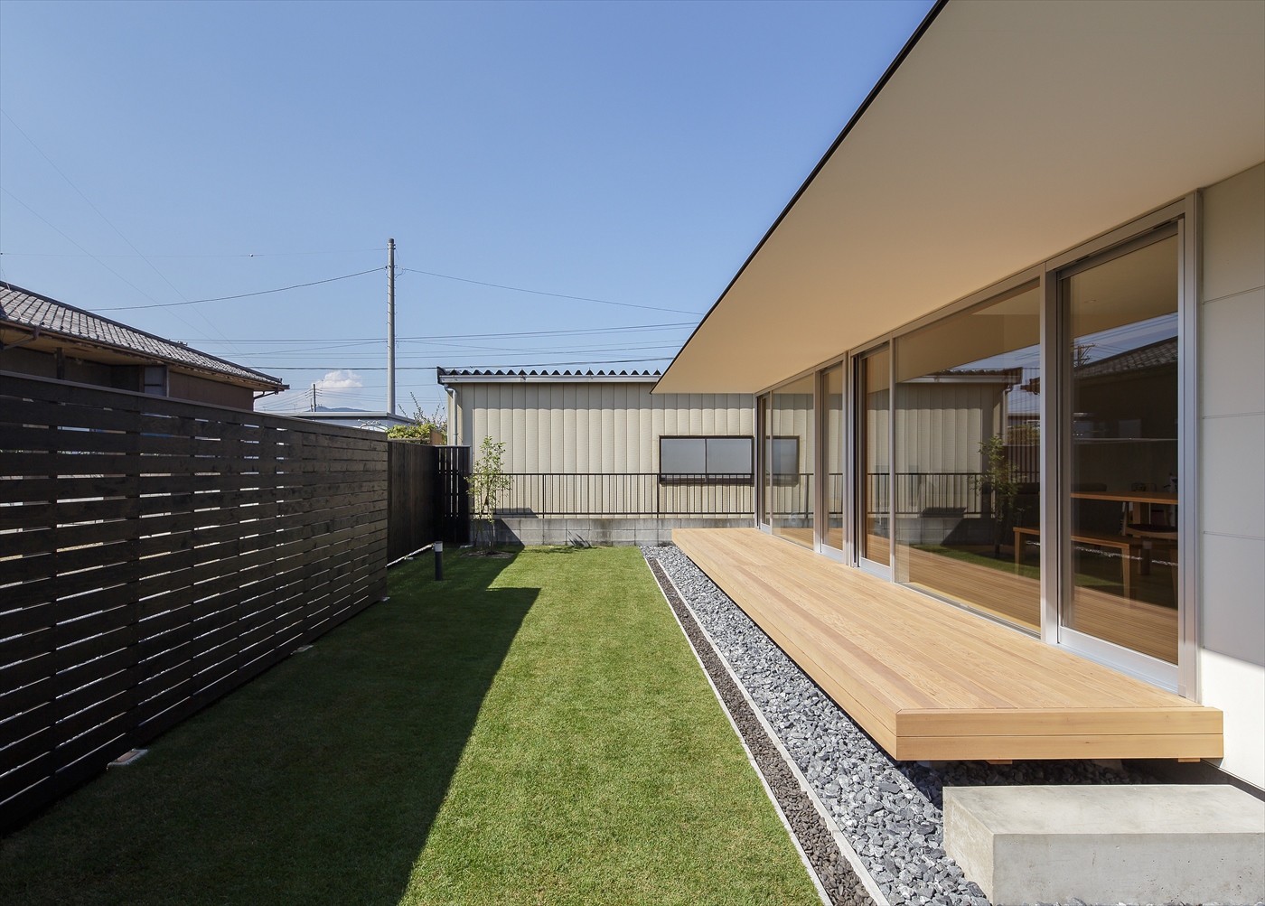
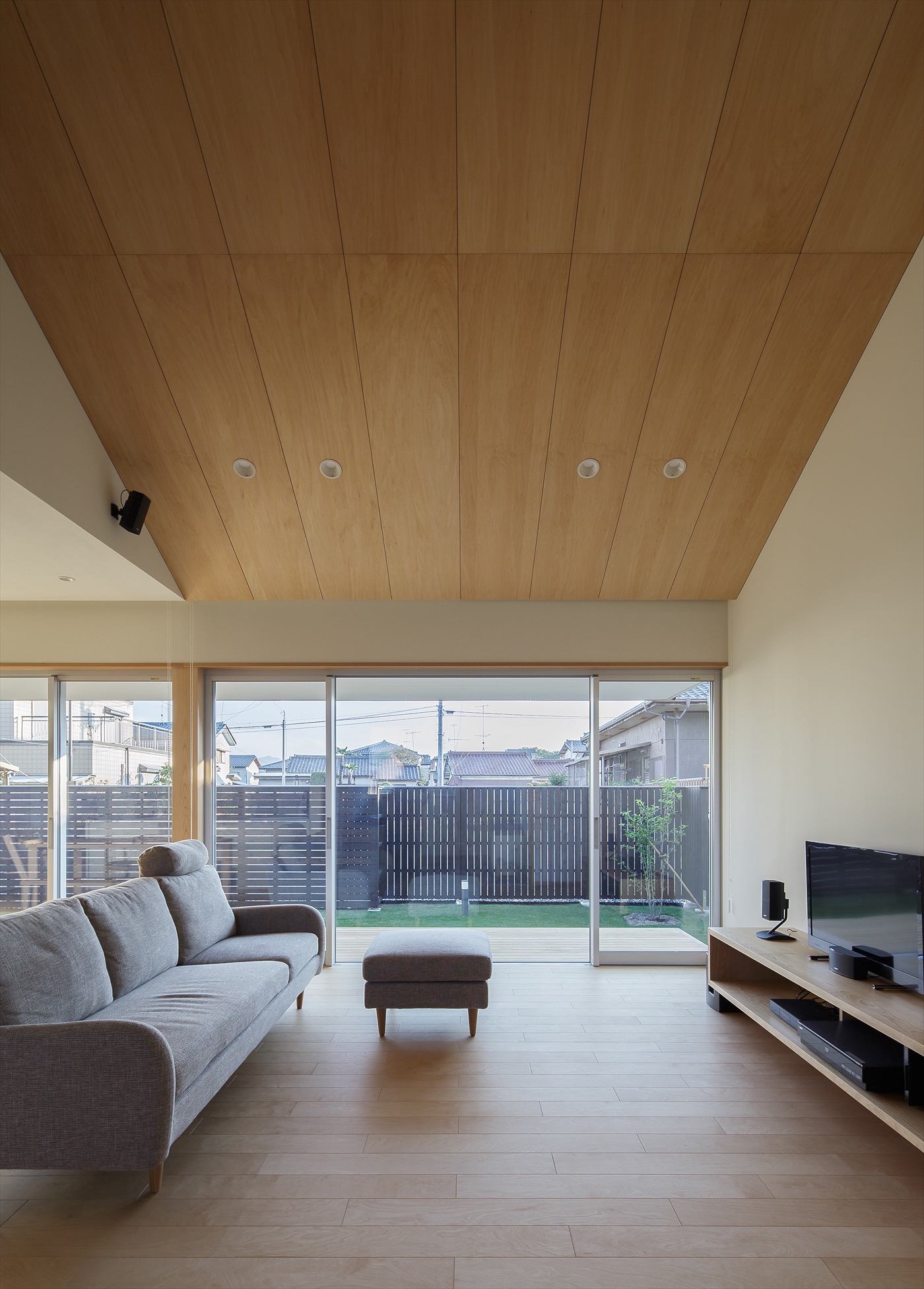
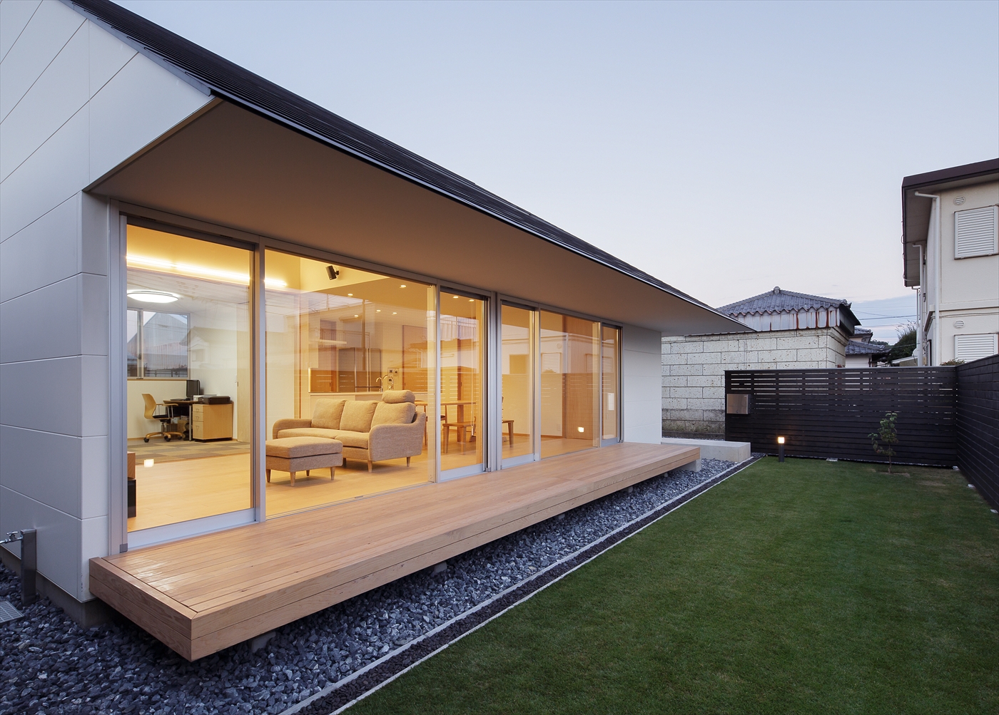
It’s been a little while since our last article about architecture, how about a minimal house located in Saitama Prefecture, Japan. At less than 30km from the center area of Tokyo, you’ll be charmed by its minimalist design where the house structure is surrounded of clean lines. I really love the ancient vs modern take on the balcony deck to the backyard. A simple and yet really meaningful design by Shinsuke Yokoyama.

Shinsuke Yokoyama is an architect and interior designer based in Tokyo, Japan. You should follow more of this work on Behance.

若い夫婦の住まいは,この先の時間の経過と共に家族構成や生活環境が変化していくことが想像される為,シンプルな動線と、可変性のある大空間を用意している。日射をコントロールする為の屋根とつながる大きく迫り出した庇はウッドデッキ,前庭へと視線を誘導する.生活が始まり賑わいが生まれるように、インテリアは白と白木のあっさりとした素材で構成した。大きな屋根が架かった小さな住宅がこれから成長する家庭をおおらかに守っていくストーリーをイメージしている。

Product Gallery
Architecture: House Yorii located in Saitama Prefecture, JapanArchitecture: House Yorii located in Saitama Prefecture, JapanArchitecture: House Yorii located in Saitama Prefecture, JapanArchitecture: House Yorii located in Saitama Prefecture, JapanArchitecture: House Yorii located in Saitama Prefecture, JapanArchitecture: House Yorii located in Saitama Prefecture, JapanArchitecture: House Yorii located in Saitama Prefecture, JapanArchitecture: House Yorii located in Saitama Prefecture, JapanArchitecture: House Yorii located in Saitama Prefecture, JapanArchitecture: House Yorii located in Saitama Prefecture, Japan


Credits
Architect: Kato Architect Office
Constructor: Ozawa Kougyou
Photo: Ryotaro Watanabe
More Links
Learn more about Shinsuke Yokoyama: shinsukeyokoyama.tumblr.com
Follow Shinsuke on Behance

architecture
interior design
japan


Building Inclusive Toggle Buttons

Original Source: https://www.smashingmagazine.com/2017/09/building-inclusive-toggle-buttons/


Some things are either on or off and, when those things aren’t on (or off), they are invariably off (or on). The concept is so rudimentary that I’ve only complicated it by trying to explain it, yet on/off switches (or toggle buttons) are not all alike. Although their purpose is simple, their applications and forms vary greatly.

Building Inclusive Toggle Buttons

In this inaugural post, I’ll be exploring what it takes to make toggle buttons inclusive. As with any component, there’s no one way to go about this, especially when such controls are examined under different contexts. However, there’s certainly plenty to forget to do or to otherwise screw up, so let’s try to avoid any of that.

The post Building Inclusive Toggle Buttons appeared first on Smashing Magazine.

25 Solutions That Heavily Help Designers And Developers

Original Source: http://feedproxy.google.com/~r/Designrfix/~3/cbKB-RQfahs/25-solutions-heavily-designers-developers

Having many web tools and premium services on the market helps a lot but also complicate things. Which one should you use? Some do not have free trials, and you need to pay before deciding if it’s a right fit for you. For all of you in this situation, we have managed to build a […]

The post 25 Solutions That Heavily Help Designers And Developers appeared first on designrfix.com.

Searching for Clean(er) Searches

Original Source: http://inspiredm.com/searching-cleaner-searches/

Inspired Magazine
Inspired Magazine – creativity & inspiration daily

If there is one year for positive change, look no further, it’s 2017. Because there’s no better time than now to do something, but also because this world, on so many levels (well, you know, you’ve been there too) was seriously derailed in the past couple of years.

You are probably involved already, struggling with small or large steps to make a difference in the world, to have a positive impact, minimize your carbon footprint, leave the air breathable and the water drinkable for your kids and their kids. You probably cycle, volunteer, decided to run for office (yay!), sign petitions, enjoy the outdoors. But by the end of your life you will still have spent a few good years staring into a screen. Due to nature of work or for entertainment only, it’s gonna be years, trust me. They add up. Worry not though, you can make a difference even in front of a computer screen doing your daily searches.

I search, You search, We…

You’re online and irrespective of the tasks, you will search at least one time during the course of one working day. Am I right? Searching the www is high in the charts when it comes to spending time online. I mean, we even search for search. Spelling. Our own names. We search for pretty much everything. Everything included. And there’s a carbon meter attached to this daily routine too, as with most activities that need a source of power.

You can imagine our excitement when we discovered that some of those behind several search engines intend to tackle the carbon problem. While DuckDuckGo is more into protecting your online privacy, Google promises to run on 100% renewable energy by the end of this year, and Ecosia plants trees every time you search the web.

Online searches have been steadily growing into trillions since the dawn of the internet. The trend is on the rise and there are no signs of a slowdown.

Raising Awareness while Making Change Happen
Charming server error

No, you cannot literally plant trees by simply searching. At least not yet (have you seen the guy who emailed lemonade? Literally). Ecosia is the search engine that plants trees with its ad revenue. It’s a great example of social change applied to the most common online activity.

You search the web with Ecosia > Search ads generate income for Ecosia > Ecosia uses this income to plant trees.

They’ve planted over 7 million trees so far. Here’s how they decide where to plant them. On their website you can find details about their projects, videos, stories, and useful info on why trees are essential to life – if you ever had any doubts. You don’t have to be a full-time treehugger to get excited when your search for “sugar free” and just planted a tree. I mean, even when their server is down, they’ll put some trees up (see screenshot).

Using  Renewable Energy to Keep them Engines Running
Renewable Energy ProjectsGoogle: New Renewable Energy Projects via venturebeat.com

In 2015, Google bought 44% of its power from wind and solar farms, according to The Guardian, and they plan to go 100% renewable this year. It’s worth keeping an eye on them and see how and when they’ll reach their target. Just in case you were feeling guilty for using Google.

The renewable trend would be very hard to stop, hence similar companies are joining this common-sense challenge along sustainability programs. For the sake of your own carbon footprint, doing a quick search (ha!) to test their sustainability efforts should come in handy.

Search Engines with Renewable Goals Only

If you want to find out more about clean energy, then you should know that there are search engines only for this. Take reegle. It acts as a unique clean energy information portal, targeting specific stakeholders including governments, project developers, businesses, financiers, NGOs, academia, international organizations and civil society. Others, like Solar Search, specialize in searches related to mainly solar energies. You’ll probably come across some inspiring projects.
If you’re really committed to making a difference, don’t stop here, move beyond the search engine. See how clean your apps are. If you’re the techie-sustainable type and have ideas for a low carbon economy, take some time to put them into practice, pitch them, share them, spread the word. Go for it!

Switch it Off and Other Such Details

Saving energy at home and at work matter. Just as low energy consuming applications and power saving system matter. And no, standby is not as friendly as you think.
University of Cambridge has its own green challenge in an attempt to prevent unnecessary energy use. They are committed to reducing carbon emissions energy-and-carbon, and they compiled Facts & Figures to help you find out how much energy you can save from simple actions such as switching off lights and equipment.

“Leaving a computer on overnight for a year creates enough CO2 to fill a double-decker bus.” (Carbon Trust)

“Reducing your PC monitor brightness from 100% to 70% can save up to 20% of the energy the energy the monitor uses.” (Harvard)

A true activist should consider all his actions, and change or adapt as many of his habits as possible, including his virtual ones. Your virtual life has an impact in real life. And not necessarily yours.

More Than Clean Searches

This article does not enourage online activism only. Don’t forget to increase the efficacy of offline activism. These days online and offline have to come together. Entangling your daily virtual existence with meaningful clicks does sound like a powerful tool, a quiet form of activism pushing change in the most unexpected places. Direct action, changing your daily routine, less waste, more awareness in your life, every bit will make a difference in the big scheme of life.

You might not save the world with this, but you’ve certainly made a step in the right direction.
Leave the right footprints. Your grandchildren will be grateful.

This post Searching for Clean(er) Searches was written by Anca Rusu and first appearedon Inspired Magazine.