How to Find and Remove Duplicate Photos on Your Mac

Original Source: https://www.hongkiat.com/blog/detect-duplicated-photos-mac/

Following our guide on locating and eliminating duplicate photos on iPhone or iOS, this post will show you how you can easily spot and erase duplicate photos on your Mac. Forget about manually sifting through each photo on your Mac to find duplicates.

Duplicate Photo Finder is a Mac application designed to swiftly remove duplicate and similar photos from your Mac. It’s compatible with your photo library, as well as local and external storage devices, meaning it can scan any hard drive connected to your Mac.

Duplicate Photo Finder App InterfaceDuplicate Photo Finder App Interface
Delete Duplicate Photos with Duplicate Photos Finder

The Duplicate Photos Finder app is available for free on the Mac Store. Once you’ve downloaded and installed it, open the app and click on the “Scan Folder” button. Select the folder you wish to scan for duplicate photos and click “Find Duplicates“.

Find Duplicates ButtonFind Duplicates Button

This process is straightforward. If you’re scanning your entire computer for duplicates, be prepared to wait a little longer for the completion of the scan

Scanning Process ScreenScanning Process Screen

You might also need to grant the app permission to access specific folders for a thorough scan.

Grant Permission ScreenGrant Permission Screen

Upon completion, if any duplicate photos are found, you will be presented with a preview of the duplicate photos, grouped together, with one of the duplicate photos marked with a Trash icon for deletion.

Trash Icon on DuplicateTrash Icon on Duplicate
Conclusion – The App’s Not Perfect

Although this app claims in identifying duplicate photos, it is at best, in my opinion, good at finding similar photos. Below are some examples where the app succeeded and failed to identify true duplicates.

App Success ExampleApp Success Example
App Failure ExampleApp Failure Example
Comparison Success
Comparison FailureComparison Failure
Duplicate GroupingDuplicate Grouping
False Positive ResultFalse Positive Result
Accurate DetectionAccurate Detection

When using this app, it’s crucial to review the photos identified as duplicates to ensure accuracy before selecting “Trash Marked” to delete the photos, preventing the loss of non-duplicate images.

The post How to Find and Remove Duplicate Photos on Your Mac appeared first on Hongkiat.

10 Best Dropshipping Websites Examples in 2024

Original Source: https://ecommerce-platforms.com/articles/best-dropshipping-websites-example-design

If you are contemplating setting up your first ecommerce store but are not sure what line of business is best for you, dropshipping is one of the best places to start.

Dropshipping stores have a low barrier for entry, require minimal capital and leave all the logisitcs to the dropshipping supplier.

Your sole role is building the website, optimizing for search engines (i.e. SEO), finding customers, facilitating the order and providing post-purchase customer support.

But while dropshipping rides on a relatively simple online business model, not every dropshipping store survives or thrives.

If you are going to succeed, learning from those that have made it can significantly increase your odds. And success revolves around the website. Dropshipping is dependent on the quality and features of the site it runs on.

We take a look at the best dropshipping store examples and the attributes that make each of them stand out from their peers.

Note that while Shopify is the most popular ecommerce platform among the best dropshippping stores, you can create a successful website on other platforms too.

Best Dropshipping Website Example Designs

1. Warmly Décor

Product Type: Home Decor

Warmly Décor claims to offer high quality décor products at as much as 80% off retail prices by shipping products from various factories across the world. The main product categories are furniture, bathroom and lighting.

Key Strengths

Simple color theme – With black text, a white background and a small navigation menu, Warmly Décor maintains a clean and uncluttered feel.

Under $200 page – For shoppers looking for lower priced items, Warmly Décor has a $200 and below page.

Real-time purchase notifications – A message pops-up at the bottom of the screen each time someone around the world buys from Warmly Décor. It shows the first name of the person as well as the specific product they ordered. This marketing technique rides on a basic trait of human behavior – people are naturally drawn to things that other people like.

Automatic currency converter – Items are automatically listed in users’ local currency based on IP address.

Further reading 📚

How to Start Dropshipping Business in 6 Simple Steps (2023)

16 Best Dropshipping Suppliers in 2023 (Dropshipping Companies & Free Suppliers List) for Ecommerce

2. Babybub

Product Type: Maternity Products

Babybub sells multiple dropshipping products for pregnant and nursing women such as maternity leggings, maternity belts, sleep masks, wearable breast pumps and compression travel cases. However, the store’s flagship and best-selling product is the maternity pillow as well as its full body attachment.

Key Strengths

Focus on best-selling products – Babybub’s home page is effectively dedicated to the maternity pillow. While product diversification is good risk management, prioritizing the home page’s real estate to a product with tried-and-tested demand can be a great way to maintain and grow sales.

Discount Pop-Up – Visitors to the website get an offer for a 10% discount on their first order if they sign up to Babybub’s mailing list. By providing an incentive to sign up, Babybub aims to not just increase sales but also expand its marketing reach. Email marketing remains one of the lowest cost digital marketing channels.

‘Maternity’ in logo – The store has a catchy name but one that might be a little confusing for visitors expecting to find infant-focused products. To clarify its target market, the logo includes the word ‘maternity’ to show who its primary audience is.

3. Be Activewear

Product Type: Clothing

Be Activewear is an Australia-based fashion online store that sells sportswear products representing more than 60 Australian brands. While most items primarily target teen and adult women of different body sizes, the store also has products for men and children.

Key Strengths

Minimizable discount offer – When visitors land on a Be Activewear page, they are presented with a pop-up offering a 10% discount on the first purchase if they opt into the mailing list. If one chooses to close this pop-up, it is minimized to the left corner of the screen. This makes it always accessible anytime the user decides they would like to opt in.

Free shipping clarity – Many of the best Shopify dropshipping stores claim to offer free shipping but fail to indicate the conditions under which this is available. The end result is shopper disappointment and a rapidly growing number of abandoned shopping carts. Be Activewear states at the top of each page that free shipping is only available for orders above a specific amount and that this minimum is different for Australian orders and international orders.

Custom orders – If a customer is looking for a particular brand or products but one that isn’t available on Be Activewear, she can send an email to the store and they commit to trying to get it on board.

4. Burga

Product Type: Phone Cases

Burga is a dropshipping website that mainly sells phone cases but also other phone, laptop and tech accessories. Founded in Lithuania in 2016, it attracts hundreds of thousands of visitors per month and ships worldwide.

Key Strengths

Instagram traffic – With more than 700,000 Instagram followers, Burga makes the most of the sizable user traffic its website can gain at little to no cost. Each post on the page gets hundreds of likes.

‘Come back soon’ – When a user to the Burga website switches to another tab on their web browser, the Burga tab will have a flashing ‘Come back soon’. That way, if a visitor gets distracted by something else, the flashing tab will catch their attention and draw them back.

Frozen notification bar – Burga has a sale, discount, and shipping offers notification bar at the start of the page. It remains visible even when a visitor scrolls down further along the page.

5. Fashion Nova

Product Type: Clothing

Fashion Nova is one of the largest dropshipping stores in the world. Apart from the millions of visitors to its ecommerce store, the company also has a couple of physical stores.

Key Strengths

Product diversity – Fashion Nova has an expansive range of products. From a business perspective, this is vital for the diversification of income streams.

Social media reach – Fashion Nova has expansive social media reach, a fact that has provided a reliably large flow of qualified leads at little to no cost. The store has – 21 million Instagram followers, 4.1 million on TikTok, 3.4 million on Facebook, 900,000 on Pinterest and 80,000 on YouTube.

Discount Pop-Up – Visitors to the website get a 10% discount on their first order when they opt in to Fashion Nova’s mailing list.

6. Haus

Product Type: Furniture

Sometimes referred to as Haus London to distinguish it from other businesses sharing this relatively common business name, Haus deals in furniture, homeware and lighting. Founded in 2007, it has a physical store in East London but has an online dropshipping store as well. Products are sourced from major European and international design brands as well as smaller and independent manufacturers.

Key Strengths

Simple layout – The website has a simple layout that features cool page colors, gentle fonts, a brief navigation menu as well as a large hero image above-the-fold.

Physical Shop – For shoppers that may not be comfortable ordering furniture online, Haus provides the option of visiting their shop. While the cost of setting up a physical store may be prohibitive for most brand new ecommerce stores, it can serve as a useful source of foot traffic if the website’s traffic and revenue’s growth demands it.

Pay in installments – For higher value items that are not currently in stock, customers can pay 50% when they place the order and 50% when the item is restocked and available for delivery.

7. Inspire Uplift

Product Type: Diverse

Inspire Uplift is as close as you can come to a dropshipping supermarket. The main product categories include home/garden tools, beauty, wellness, electronics, crafts, art, clothing, footwear, accessories, toys, games and pet supplies.

Key Strengths

Product diversity – Inspire Uplift has an expansive range of products. From a business perspective, this is vital for the diversification of income streams.

Customer reviews – The store displays the current number of customer reviews via a link at the top of each page. There are currently more than 70,000 buyer reviews which provide important social proof.

24/7 customer support – Inspire Uplift provides 24/7 customer support through a live chat service and email. Unlike a lot of dropshipping stores, the company can also be reached via phone and has also indicated its physical address in Miami, Florida. Such accessibility inspires confidence among potential customers that they are buying from an established store.

Social media diversification – Many dropshipping stores focus their social media marketing strategy on the one social media network they have found greatest success. Consistent with the store’s diversification strategy, Inspire Uplift has a large social media presence on four major platforms – 6 million Facebook followers, 3.8 million on Pinterest, 270,000 on YouTube and 72,000 on Instagram. Only on Twitter and TikTok does the store have a small following but the accounts remain active, likely as an effort to steadily grow reach over time.

8. Materiol

Product Type: Labelers, Organizers and DIY

Materiol deals in labelers, organizers and do-it-yourself (DIY) equipment. As with a lot of everyday items, most of the products are sourced from China.

Key Strengths

Simple – Materiol has a simple layout. The home page has a single hero image that indicates the three product categories the store specializes in.

GIFs – For some products, the store uses GIFs as the thumbnail image. That not only draws user attention but allows the dropshipping site to quickly demonstrate a product’s features and capabilities.

Shop by brand – Materiol has dedicated pages for the brands available on the website. Users who want to avoid going through all the products in a particular category can go straight to the brand they are most interested in.

9. Notebook Therapy

Product Type: East Asian Stationery

Notebook Therapy specializes in East Asian-inspired stationery renowned for thoughtful design and functionality. The website has an extensive product range and ships worldwide. It has amassed 1.6 million followers on Instagram. It has tens of thousands of followers on Facebook and Pinterest as well.

Key Strengths

Instagram reach – Instagram has one of the highest engagement rates among social media platforms. Each post on Notebook Therapy’s Instagram account draws thousands of likes thereby being a steady source of low cost leads.

Automatic price currency conversion – The website detects the visitor’s location and automatically displays prices in local currency. This takes away the need for mental or manual arithmetic when determining the local currency equivalent of dollar-quoted pricing.

$50 coupon – Through an on-page pop-up as well as on the main navigation menu, visitors are encouraged to opt into Notebook Therapy’s mailing list to win a $50 gift card.

10. Palo

Product Type: Gadgets and Gifts

Palo sells mostly small trending gadgets and gifts.

Key Strengths

Minimalist theme – The store has a simple black and white look and feel accentuated by the livelier colors on the home page’s hero image.

Orderly product descriptions – Product pages are simple, intuitive, organized and tidy. Product features are described in bulleted paragraphs and are accompanied by high quality product images.

Automatic currency converter – Items are automatically listed in users’ local currency based on IP address.

Free shipping – Palo provides free shipping for the majority of items on the website with no requirement for a minimum order amount.

Transparency on long shipping times – The store is upfront about sourcing its products from factories around the world resulting in longer wait times than for a standard ecommerce business.

11. Amazingly Cat

Product Type: Cat Toys

Founded in 2016, Amazingly Cat offers unique cat toys that are not typically available in major retail stores.

Key Strengths:

Personality quiz – To make sure cat owners are getting the right toy for their cat, Amazingly Cat has a cat personality quiz. Owners respond to a set of questions that assess the cat’s age, temperament, activity, likes and dislikes. The store then offers recommendations on what toys are likely to be most suitable.

Social media – Amazingly Cat does a good job of leveraging free traffic from its Facebook page. By regularly posting products and content to its more than 1 million followers, the store can generate a steady flow of leads from a pool of fans that are interested in cats and cat toys. It has a smaller but significant presence of more than 60,000 followers on Instagram. This is substantial given Instagram has a higher engagement rate than Facebook.

Blog – The store has an active blog containing regular posts sharing important insights on cats. It has useful tidbits for everyone from first-time cat owners to more seasoned pet owners.

Wrapping Up

Dropshipping is a cut-throat industry. From the get-go, your dropshipping store is in a battle for eyeballs and conversions against dozens or hundreds of entrepreneurs selling identical products.

It is easy for one to sink into insignificance amidst this sea of competitors.

Despite the intensity of competition, the dropshipping stores covered here have soared above the waves and maintained an edge over their rivals.

That said, it is important to note that replicating a successful dropshipping store’s website design and business strategy is unlikely to work.

Instead, assess the strengths of each website within the context of your dropshipping business goals then adopt what is most relevant to your business goals. Further, work with reliable dropshippers only that have a stellar reputaiton for delivering on orders.

The post 10 Best Dropshipping Websites Examples in 2024 appeared first on Ecommerce Platforms.

A Guide To Designing For Older Adults

Original Source: https://smashingmagazine.com/2024/02/guide-designing-older-adults/

Today, one billion people are 60 years or older. That’s 12% of the entire world population, and the age group is growing faster than any other group. Yet, online, the needs of older adults are often overlooked or omitted. So what do we need to consider to make our designs more inclusive for older adults? Well, let’s take a closer look.

This article is part of our ongoing series on design patterns. It’s also a part of the video library on Smart Interface Design Patterns 🍣 and is available in the live UX training as well.

Make Users Feel Independent And Competent

When designing for older adults, we shouldn’t make our design decisions based on stereotypes or assumptions that are often not true at all. Don’t assume that older adults struggle to use digital. Most users are healthy, active, and have a solid income.

They might use the web differently than younger users, but that doesn’t mean we need to design a “barebones” version for them. What we need is a reliable, inclusive digital experience that helps everyone feel independent and competent.

Good accessibility is good for everyone. To make it happen, we need to bring older adults into our design process and find out what their needs are. This doesn’t only benefit the older audience but improves the overall UX — for everyone.

One Task At A Time and Error Messages

When designing for older users, keep in mind that there are significant differences in age groups 60–65, 65–70, 70–75, and so on, so explore design decisions for each group individually.

Older adults often read and analyze every word (so-called Stroop effect), so give them enough time to achieve a task, as well as control the process. So avoid disappearing messages so that users can close them themselves when they are ready or present only 1 question at a time in a form.

Older adults also often struggle with precise movements, so avoid long, fine drag gestures and precision. If a user performs an action, they didn’t mean to and runs into an error, be sure your error messages are helpful and forgiving, as older adults often view error messages as a personal failure.

As Peter Sylwester has suggested, sensory reaction times peak at about the age of 24 and then degrade slowly as we age. Most humans maintain fine motor skills and decent reaction times well into old age. Therefore, error messages and small updates and prompts should almost always be a consideration. One good way to facilitate reaction time is to keep errors and prompts close to the center of attention.

As always, when it comes to accessibility, watch out for contrast. Particularly, shades of blue/purple and yellow/green are often difficult to distinguish. When using icons, it is also a good idea to add descriptive labels to ensure everyone can make sense of them, no matter their vision.

Guidelines For Designing For Older Adults

Avoid disappearing messages: let users close them.
Avoid long, fine drag gestures and precision.
Avoid floating labels and use static field labels instead.
Don’t rely on icons alone: add descriptive labels.
Ask for explicit confirmation for destructive actions.
Add a “Back” link in addition to the browser’s “Back” button.
In forms, present one question or one topic per screen.
Use sufficient contrast (particularly shades of blue/purple and yellow/green can be hard to distinguish).
Make error messages helpful and forgiving.

Wrapping Up

We should be careful not to make our design decisions based on assumptions that are often not true at all. We don’t need a “barebones” version for older users. We need a reliable, inclusive product that helps people of all groups feel independent and competent.

Bring older adults in your design process to find out what their specific needs are. It’s not just better for that specific target audience — good accessibility is better for everyone. And huge kudos to wonderful people contributing to a topic that is often forgotten and overlooked.

Useful Resources

“How To Write Better Microcopy For Older Adults,” by Michal Halperin Ben Zvi and Kinneret Yifrah
“What You Can Learn From Older Adults About Accessible Design,” by Becca Selah
“A Guide to Interface Design For Older Adults,” by Sergei P.
“Designing User Interfaces for an Aging Population,” by Jeff Johnson and Kate Finn
Age-Friendly Digital Design Toolkit (PDF guide, email required)
Age-Positive Image Library
“Voice Design Strategies for the Elderly Population,” by Shyamala Prayaga
“Creating Online Environments That Work Well For Older Users,” by Barry Rueger
“Usability Testing With Older Adults,” by Megan Chan

Meet Smart Interface Design Patterns

If you are interested in similar insights around UX, take a look at Smart Interface Design Patterns, our 10h-video course with 100s of practical examples from real-life projects — with a live UX training starting March 8. Everything from mega-dropdowns to complex enterprise tables — with 5 new segments added every year. Jump to a free preview.

Meet Smart Interface Design Patterns, our video course on interface design & UX.
Jump to the video course →

100 design patterns & real-life
examples.
10h-video course + live UX training. Free preview.

Safiro Font: Mastery in Font Design & Typography

Original Source: https://abduzeedo.com/safiro-font-mastery-font-design-typography

Safiro Font: Mastery in Font Design & Typography

abduzeedo0206—24

Explore the elegance of Safiro font, a masterpiece in font design and typography, perfect for branding, editorial, and web design. Discover its unique neogrotesque style.

In the ever-evolving world of design, the Safiro font emerges as a standout example of how typography can profoundly influence branding and visual identity. Created by the renowned type foundry atipo®, Safiro is not just a font; it’s a testament to the power of design when art meets precision.

This sans-serif family is a brilliant showcase of the neogrotesque style, grounded in rationalist principles yet reimagined through a modern lens. The creators have masterfully balanced the proportions of each letter, achieving an exquisite blend of technical accuracy and aesthetic grace. This balance gives Safiro a distinctive personality, setting it apart in the realm of font design.

One of Safiro’s most compelling features is its stroke contrast, which adds depth and character without overwhelming the design. This subtlety ensures that the font retains its elegance across various applications, from the digital screen to the printed page. It’s this versatility that makes Safiro an excellent choice for a wide range of projects, including logo creation, branding efforts, editorial layouts, packaging designs, and web interfaces.

The Safiro family is impressively comprehensive, offering eight weights that range from Regular to Bold. This spectrum of weight options, coupled with true italics, provides designers with unparalleled flexibility. Whether crafting a minimalist logo or a dynamic web page, Safiro adapts effortlessly, underscoring the content with its unique charm.

In a world where brands strive to stand out, Safiro offers a foundation for creating identities that resonate. Its unique blend of elegance and functionality makes it a precious tool in a designer’s arsenal. As we explore the possibilities Safiro brings to the table, it’s clear that this font is not just about creating words on a page; it’s about crafting experiences that engage and inspire.

In conclusion, Safiro is more than a font; it’s a milestone in font design and typography, demonstrating how thoughtful design can elevate communication in any medium. Its contribution to the visual language of our time will undoubtedly be cherished by designers and brands looking to make a lasting impression.

Font and typography artifacts

Artifact from the Safiro Font: Mastery in Font Design & Typography article on AbduzeedoArtifact from the Safiro Font: Mastery in Font Design & Typography article on AbduzeedoArtifact from the Safiro Font: Mastery in Font Design & Typography article on AbduzeedoArtifact from the Safiro Font: Mastery in Font Design & Typography article on AbduzeedoArtifact from the Safiro Font: Mastery in Font Design & Typography article on AbduzeedoArtifact from the Safiro Font: Mastery in Font Design & Typography article on AbduzeedoArtifact from the Safiro Font: Mastery in Font Design & Typography article on AbduzeedoArtifact from the Safiro Font: Mastery in Font Design & Typography article on AbduzeedoArtifact from the Safiro Font: Mastery in Font Design & Typography article on AbduzeedoArtifact from the Safiro Font: Mastery in Font Design & Typography article on AbduzeedoArtifact from the Safiro Font: Mastery in Font Design & Typography article on AbduzeedoArtifact from the Safiro Font: Mastery in Font Design & Typography article on AbduzeedoArtifact from the Safiro Font: Mastery in Font Design & Typography article on AbduzeedoArtifact from the Safiro Font: Mastery in Font Design & Typography article on Abduzeedo

For more information make sure to check out ATIPOFOUNDRY.COM

Exciting New Tools for Designers, February 2024

Original Source: https://www.webdesignerdepot.com/tools-for-designers-february-2024/

2024 is well underway and shaping up to be an interesting year. So, to help you keep your focus on working hard and getting stuff done, we’ve collected another bunch of helpful bits and pieces from across the web.

On-Scroll Animation Ideas for Sticky Sections

Original Source: https://tympanus.net/codrops/2024/01/31/on-scroll-animation-ideas-for-sticky-sections/

Some ideas of how sticky sections can be animated while exiting the viewport.

8 Ways to Fix the “Sorry PowerPoint Can’t Read 0” Error

Original Source: https://www.hongkiat.com/blog/sorry-powerpoint-cant-read-0/

If you’ve ever encountered the “Sorry, PowerPoint can’t read” error while trying to open a PPT file on your Mac, you know how stressful it can be, especially if you’re gearing up for an important presentation.

Don’t worry, though; in this article, we will delve into the causes of this issue and offer eight practical solutions to resolve it. Plus, we’ll share handy tips to prevent this problem in the future. Let’s dive in!

Troubleshooting PowerPoint on MacTroubleshooting PowerPoint on Mac

“My PPT is showing a repair message and an error like, ‘Sorry, PowerPoint can’t read 0.’ I created a PPT on my MacBook Air, transferred it to a USB, made some edits, and then replaced the file. Since then, I’m getting this error. I’m not sure if the problem is with my laptop or with Microsoft. What should I do?” – A Question from Reddit

Understanding the “Sorry PowerPoint Can’t Read 0” Error

The “Sorry, PowerPoint can’t read 0 Mac” error indicates that PowerPoint is unable to open or process the presentation file. The 0 in the error message might point to a missing or invalid element in the file’s structure.

Here’s a look at why this error might occur on your Mac:

A widespread issue with PowerPoint affecting multiple files could stem from an improper installation of the software.

The file might be inaccessible due to permission or security settings.
Your PPT file could be corrupted, possibly due to an unexpected crash or an error during saving.
The file is outdated or saved in a format that’s not standard.
You might be attempting to open the file with a version of PowerPoint that’s not compatible with it.
Complex features like advanced animations or unusual fonts might cause issues if they’re not supported by your PowerPoint version.

Easy Steps to Resolve “Sorry PowerPoint Can’t Read 0” on Mac

Often, the “Sorry, PowerPoint can’t read 0” error is caused by a damaged or corrupted PPT file. A quick solution is using a third-party tool like 4DDiG File Repair.

This tool simplifies the repair process to just three clicks and works on videos, audio, images, and documents, including PPT files. You also get to preview the fixed files before saving them. Here are the key features of this tool:

Repairs inaccessible or corrupted files across various formats like PowerPoint, Word, Excel, and Outlook.
Effectively fixes PPT files that won’t open, boasting a high success rate.
Batch repairs multiple PowerPoint files of different formats simultaneously.
Supports Office 365 and older PowerPoint versions from 2007 onwards.
Works on both Windows and macOS.
User-friendly interface, suitable even for those not tech-savvy.

To begin, download and install the repair tool on your Mac. Follow these steps to fix the “Sorry PowerPoint Can’t Read” error due to corrupted PPT files:

Choose “File Repair” and click “Add File(s)” to upload the damaged PPT files, or drag and drop them into the tool.
Adding Files to Repair ToolAdding Files to Repair Tool
Hit “Start Repair.” The tool will begin scanning and repairing the corruption in your presentations.
Starting Repair ProcessStarting Repair Process
Once the scan is complete, click “View Results” to review the repaired PPT files. Choose “Export” to save them in a desired location.
Exporting Repaired FilesExporting Repaired Files

Alternative Methods to Resolve “Sorry PowerPoint Can’t Read 0” Error

Besides using 4DDiG File Repair, there are several free alternatives to fix the “Sorry, PowerPoint can’t read” error without spending money. Let’s explore seven of the most effective ones:

Method 1: Change the Presentation Format

Incompatibility between your presentation format and the PowerPoint version can lead to the “Sorry, PowerPoint can’t read 0 Mac” error. Changing the file format of your PPT can solve this issue.

Here’s what you can do:

Open the problematic presentation in a version of PowerPoint that’s compatible with it.
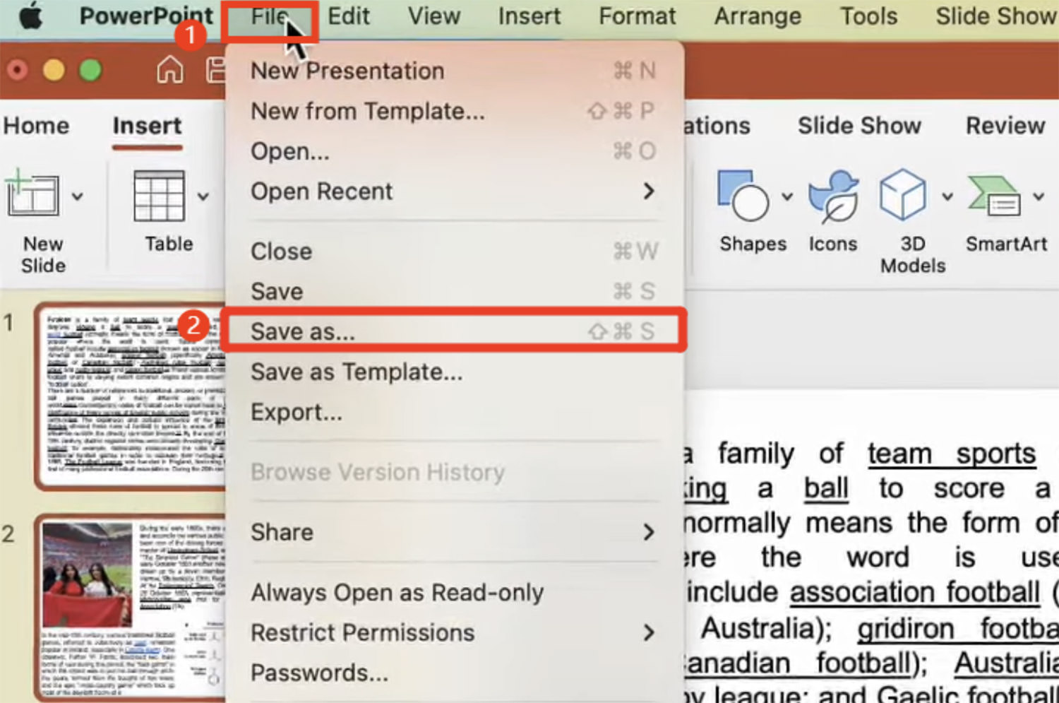
Go to “File” and then choose “Save As.”
Saving Presentation in New FormatSaving Presentation in New Format
From the “File Format” dropdown menu, select the appropriate format. Use PowerPoint 97-2003 for .ppt files, and PowerPoint 2007 or later for .pptx files.
Selecting File FormatSelecting File Format
Give a new name and choose a location for the PPT file, then click “Save.”

Method 2: Update PowerPoint Regularly

Using an outdated version of PowerPoint can cause the “Sorry, PowerPoint can’t read 0” error due to potential bugs and glitches. Updating the app can often resolve this. Here’s how:

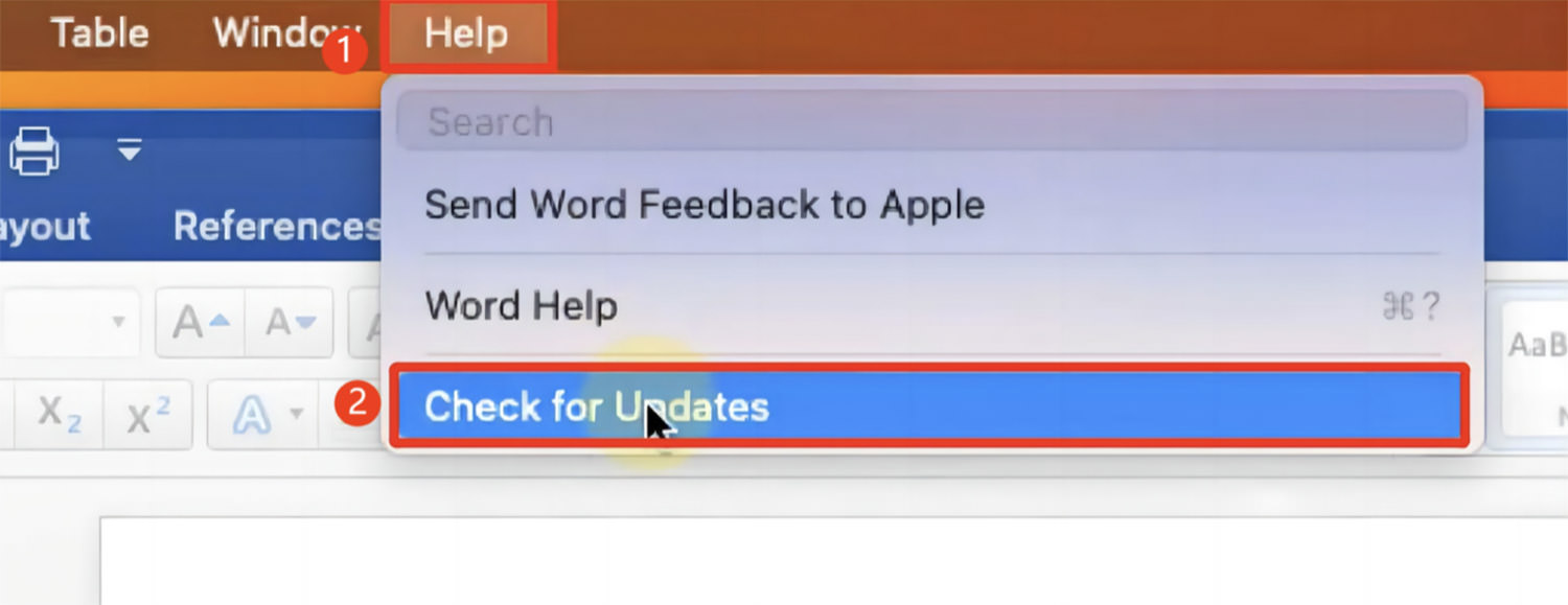
Launch PowerPoint or any other Office application, click on “Help” in the top menu, and select “Check for Updates.”
Checking for PowerPoint UpdatesChecking for PowerPoint Updates
If there’s an update available, click on the “Update” button to download and install the latest version.
Updating PowerPointUpdating PowerPoint

Method 3: Start PowerPoint in Safe Mode

Add-ins or extensions might conflict with PowerPoint, causing the “Sorry, PowerPoint can’t read 0 Mac” error. Running PowerPoint in Safe Mode disables these add-ins, helping to identify the culprit.

Follow these steps:

For M1 Mac users, “Shut Down“; for Intel Mac users, “Restart” and hold down the Power button.
M1 users should select “Macintosh HD” and choose “Continue in Safe Mode“; Intel users should press Shift after restarting, then open the PowerPoint file.
Booting Mac in Safe ModeBooting Mac in Safe Mode

Check if the “Sorry, PowerPoint can’t read 0” error persists in Safe Mode. If it doesn’t, an add-in is likely the issue. You can then disable the problematic add-in.

Method 4: Create a New User Account on Mac

The “Sorry, PowerPoint can’t read 0” error may be due to a corrupted user profile. Creating a new user account can provide a fresh start without any corruption or errors.

Here’s how to create a new user account on Mac:

Click the Apple logo, navigate to “System Preferences,” and select “Users & Groups.”
Accessing Users & GroupsAccessing Users & Groups
Click the padlock icon, enter your Mac password, and click “Unlock.”
Unlocking System PreferencesUnlocking System Preferences
Press the “+” button to add a new user, fill in the account details, set a password, and select “Create User.”
Creating New UserCreating New User
Select the new user profile and tick the option for “Allow user to administer the computer.”
Setting Admin RightsSetting Admin Rights
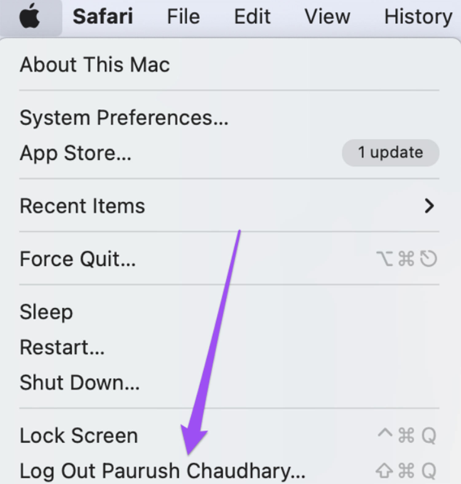
Log out from the current account (via the Apple logo), and log in with the new account. Then, try running PowerPoint.
Switching User AccountsSwitching User Accounts

Method 5: Open PPT in OneDrive

If you’re unsure whether the “Sorry, PowerPoint can’t read 0” error is due to the file or the app, try uploading the problematic PPT to OneDrive. Open it there to see if you can access its content.

This approach can help you determine the root of the problem.

Opening PPT in OneDriveOpening PPT in OneDrive
Method 6: Use Version History in OneDrive

To tackle the “Sorry, PowerPoint can’t read” error, consider restoring your PPT file from Version History. This is effective especially when dealing with files on OneDrive.

Here’s how to do it:

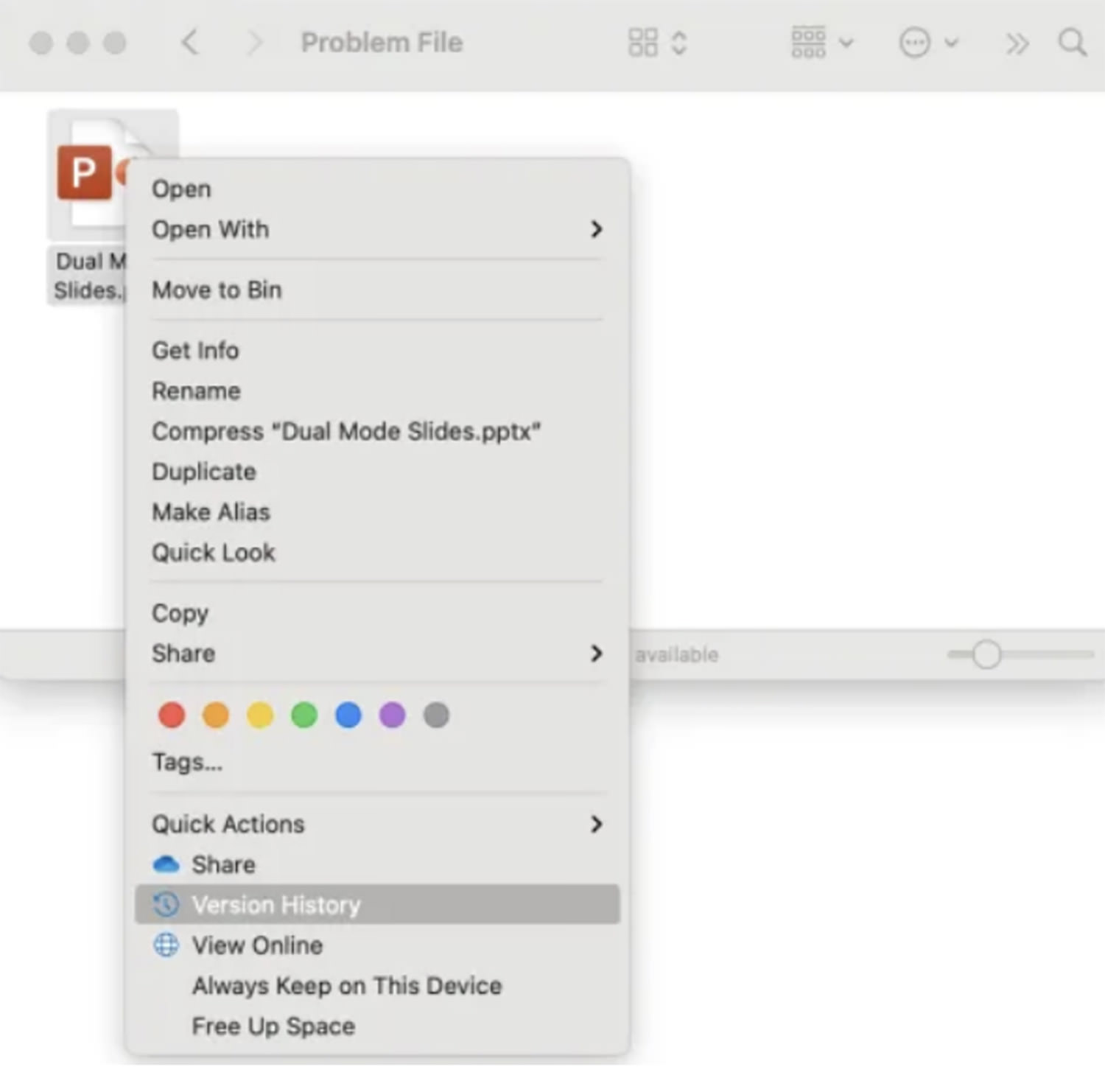
Navigate to “Finder,” right-click on the PPT file, and select “Version History.” You might find several versions of your file here.
Accessing Version HistoryAccessing Version History
Choose the version you want by clicking on the three dots next to it, then select “Restore” (or “Download“).
Restoring Previous VersionRestoring Previous Version

Method 7: Reinstall PowerPoint

A faulty PowerPoint installation or corrupted Office files can lead to the “Sorry, PowerPoint can’t read” error on Mac. This usually happens when vital files or components are missing or damaged.

To fix this, uninstall and then reinstall MS Office. Here’s how:

Go to “Launchpad,” find PowerPoint, and hold it until you see a cross icon on the app.
Uninstalling PowerPointUninstalling PowerPoint
Click “Delete” to uninstall PowerPoint, then visit the App Store to reinstall it.
Reinstalling PowerPointReinstalling PowerPoint

Tips to Prevent Future PowerPoint Issues

After resolving the “Sorry, PowerPoint can’t Read 0” error, follow these tips to avoid similar problems in the future:

Authentic Installation – Ensure you install MS PowerPoint from a reputable source to guarantee its authenticity.
Protect Your Mac – Use a trusted anti-malware tool and perform regular scans to safeguard your Mac from security threats.
Regular Updates – Consistently update both MS Office and your Mac’s operating system for improved security and compatibility.
Safe Add-ins – Avoid untrusted PowerPoint add-ins. Stick to those that are compatible and have a good reputation.
Careful File Transfer – Handle your PowerPoint files with care. Ensure safe transfers and avoid abrupt shutdowns during file movement.

Conclusion

In this article, we’ve examined the “Sorry, PowerPoint can’t read 0” error, its causes, and provided eight effective fixes. For issues related to file corruption, 4DDiG File Repair is a dependable solution.

This versatile tool not only repairs PowerPoint files in formats like .ppt, .pptx, and .potm but also fixes videos, audios, archives, and images. It’s an all-in-one solution for repairing various file types.

The post 8 Ways to Fix the “Sorry PowerPoint Can’t Read 0” Error appeared first on Hongkiat.

15 Best New Fonts, January 2024

Original Source: https://www.webdesignerdepot.com/best-fonts-january-2024/

It’s January, and what better time to revisit our typography and freshen up our designs for 2024.

MuFo: Branding and Visual Identity for Photography Museum

Original Source: https://abduzeedo.com/mufo-branding-and-visual-identity-photography-museum

MuFo: Branding and Visual Identity for Photography Museum

abduzeedo0129—24

Explore the innovative branding and visual identity of Krakow’s MuFo, the only museum in Poland dedicated to photography. Uncover how MuFo’s unique design sets it apart.

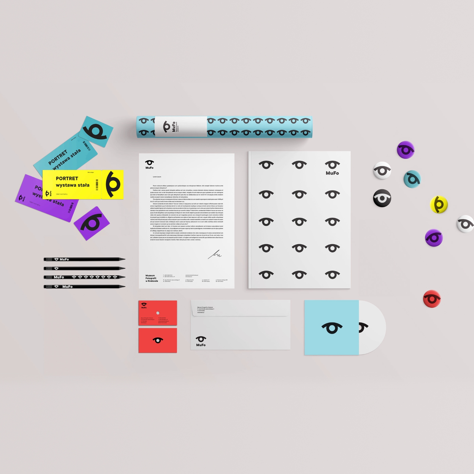
In the heart of Krakow, the Museum of Photography, now rebranded as MuFo, stands as a beacon of cultural and visual innovation. This transformation is not just a change of name, but a complete overhaul of its visual identity, symbolizing the museum’s new direction and broader offerings.

MuFo, derived from the words Museum and Fotografia (Photography in Polish), exemplifies simplicity and memorability in branding. This concise, easily pronounceable name transcends language barriers, positioning the museum as an accessible cultural hub, not just in Poland but internationally.

The museum’s logo is a testament to thoughtful design. Focusing on universal concepts like vision, observation, and the photographic lens, it converges into a symbol resembling an eye. This emblem is not merely a static image; it represents the dynamic nature of photography and the museum’s role as a site of observation and discovery.

But MuFo’s visual identity extends beyond its logo. It is a comprehensive expression of the museum’s character. The identity is versatile, with variable layouts and forms that adapt to different contexts. This flexibility is crucial in a world where digital and urban spaces are saturated with information and imagery. MuFo’s use of a vivid color palette further enhances its visibility, ensuring that its communication is clear and impactful in a diverse urban landscape.

MuFo is more than a museum; it’s a cultural epicenter, a hub for exchanging ideas, and a showcase of rich photographic collections. Its design and branding reflect this status, making it a standout entity in Poland and a significant landmark on the cultural map of Europe.

The redesign of MuFo is a clear indication of the museum embracing the 21st century, where design goes hand in hand with functionality and cultural significance. It’s a place that captures the eye and the imagination at first glance, inviting visitors to explore the depths of photography and its impact on society. This project is a striking example of how visual identity can revitalize an institution, making it a beacon of cultural and artistic innovation.

Branding and visual identity artifacts

Artifact from the MuFo: Branding and Visual Identity for Photography Museum article on Abduzeedo

Artifact from the MuFo: Branding and Visual Identity for Photography Museum article on AbduzeedoArtifact from the MuFo: Branding and Visual Identity for Photography Museum article on Abduzeedo

Artifact from the MuFo: Branding and Visual Identity for Photography Museum article on Abduzeedo

Artifact from the MuFo: Branding and Visual Identity for Photography Museum article on AbduzeedoArtifact from the MuFo: Branding and Visual Identity for Photography Museum article on Abduzeedo

Artifact from the MuFo: Branding and Visual Identity for Photography Museum article on AbduzeedoArtifact from the MuFo: Branding and Visual Identity for Photography Museum article on Abduzeedo

Artifact from the MuFo: Branding and Visual Identity for Photography Museum article on Abduzeedo

Artifact from the MuFo: Branding and Visual Identity for Photography Museum article on Abduzeedo

Artifact from the MuFo: Branding and Visual Identity for Photography Museum article on Abduzeedo

For more information make sure to check out podpunkt.pl /​​​​​​​ superskrypt.pl ​​​​​​​

The Feature Trap: Why Feature Centricity Is Harming Your Product

Original Source: https://smashingmagazine.com/2024/01/feature-centricity-harming-product/

Most product teams think in terms of features. Features are easy to brainstorm and write requirement docs for, and they fit nicely into our backlogs and ticketing systems. In short, thinking in terms of features makes it easy to manage the complex task of product delivery.

However, we know that the best products are more than the sum of their parts, and sometimes, the space between the features is as important as the features themselves. So, what can we do to improve the process?

The vast majority of product teams are organized around delivering features — new pieces of functionality that extend the capabilities of the product. These features will often arise from conversations the company is having with prospective buyers:

“What features are important to you?”
“What features are missing from your current solution?”
“What features would we need to add in order to make you consider switching from your existing provider to us?” and so on.

The company will then compile a list of the most popular feature requests and will ask the product team to deliver them.

For most companies, this is what customer centricity looks like; asking customers to tell them what they want — and then building those features into the product in the hope they’ll buy — becomes of key importance. This is based on the fundamental belief that people buy products primarily for the features so we assemble our roadmaps accordingly.

We see this sort of thinking with physical products all the time. For instance, take a look at the following Amazon listing for one of the top-rated TV sets from last year. It’s like they hurled up the entire product roadmap directly onto the listing!

Now, of course, if you’re a hardcore gamer with very specific requirements, you might absolutely be looking for a TV with “VRR, ALLM, and eARC as specified in HDMI2.1, plus G-Sync, FreeSync, Game Optimizer, and HGiG.” But for me? I don’t have a clue what any of those things mean, and I don’t really care. Instead, I’ll go to a review site where they explain what the product actually feels like to use in everyday life. The reviewers will explain how good the unboxing experience is. How sturdy the build is. How easy it is to set up. They’ll explain that the OS is really well put together and easy to navigate, the picture quality is probably the best on the market, and the sound, while benefiting from the addition of a quality sound bar, is very clear and understandable. In short, they’ll be describing the user experience.

The ironic thing is that when I talk to most founders, product managers, and engineers about how they choose a TV, they’ll say exactly the same thing. And yet, for some reason, we struggle to take that personal experience and apply it to our own users!

Tip: As a fun little trick, next time you find yourself arguing about features over experience, ask people to get out their phones. I bet that the vast majority of folks in the room will have an iPhone, despite Samsung and Google phones generally having better cameras, more storage, better screens, and so on. The reason why iPhones have risen in dominance (if we ignore the obvious platform lock-in) is because, despite perhaps not having the best feature set on the market, they feel so nice to use.

Seeing Things From The Users’ Perspective

While feature-centric thinking is completely understandable, it misses a whole class of problems. The features in and of themselves might look good on paper and work great in practice, but do they mesh together to form a convincing whole? Or is the full experience a bit of a mess?

All the annoying bumps, barriers, and inconsistencies that start accruing around each new feature, if left unsolved, can limit the amount of value users can extract from the product. And if you don’t effectively identify and remove these barriers in a deliberate and structured way, any additional functionality will simply add to the problem.

If users are already struggling to extract value from existing features, how do you expect them to extract any additional value you might be adding to the product?

“As a product manager, it’s natural to want to offer as many features as possible to your customers. After all, you want to provide value, right? But what happens when you offer too many features? Your product becomes bloated, convoluted, and difficult to use.”
— “Are Too Many Features Hurting Your Product?”

These barriers and inconsistencies are usually the result of people not thinking through the user experience. And I don’t mean user experience in some abstract way. I mean literally walking through the product step-by-step as though you’d never seen it before — sometimes described as having a “beginner’s mind” mdash; and considering the following questions:

Is it clear what value this product delivers and how I can get that value?
If I were a new user, would the way the product is named and structured make sense to me?
Can I easily build up a mental model of where everything is and how the product works?
Do I know what to do next?
How is this going to fit into my existing workflow?
What’s getting in my way and slowing me down?

While approaching things with a beginner’s mind sounds easy, it’s actually a surprisingly hard mindset for people to adopt — letting go of everything they know (or think they know) about their product, market, and users. Instead, their position as a superuser tends to cloud their judgment: believing that because something is obvious to them (something that they have created and have been working on for the past two years), it will be obvious to a new user who has spent less than five minutes with the product. This is where usability testing (a UX research method that evaluates whether users are able to use a digital product efficiently and effectively) should normally “enter the stage.”

The issue with trying to approach things with a beginner’s mind is also often exacerbated by “motivated reasoning,” the idea that we view things through the lens of what we want to be true, rather than what is true. To this end, you’re much more likely to discount feedback from other people if that feedback is going to result in some negative outcome, like having to spend extra time and money redesigning a user flow when you’d rather be shipping that cool new feature you came up with last week.

I see this play out in usability testing sessions all the time. The first subject comes in and struggles to grasp a core concept, and the team rolls their eyes at the incompetence of the user. The next person comes in and has the same experience, causing the team to ask where you found all these stupid users. However, as the third, fourth, and fifth person comes through and experiences the same challenge, “lightbulbs” slowly start forming over the team members’ heads:

“Maybe this isn’t the users’ fault after all? Maybe we’ve assumed a level of knowledge or motivation that isn’t there; maybe it’s the language we’ve used to describe the feature, or maybe there’s something in the way the interface has been designed that is causing this confusion?”

These kinds of insights can cause teams to fundamentally pivot their thinking. But this can also create a huge amount of discomfort and cognitive dissonance — realizing that your view of the world might not be entirely accurate. As such, there’s a strong motivation for people to avoid these sorts of realizations, which is why we often put so little effort (unfortunately) into understanding how our users perceive and use the things we create.

Developing a beginner’s mind takes time and practice. It’s something that most people can cultivate, and it’s actually something I find designers are especially good at — stepping into other people’s shoes, unclouded by their own beliefs and biases. This is what designers mean when they talk about using empathy.

Towards A Two-Tier Process (Conclusion)

We obviously still need to have “feature teams.” Folks who can understand and deliver the new capabilities our users request (and our business partners demand). While I’d like to see more thought and validation when it comes to feature selection and creation, it’s often quicker to add new features to see if they get used than to try and use research to give a definitive answer.

As an example, I’m working with one founder at the moment who has been going around houses with their product team for months about whether a feature would work. He eventually convinced them to give it a try — it took four days to push out the change, and they got the feedback they needed almost instantly.

However, as well as having teams focused on delivering new user value, we also need teams who are focused on helping unlock and maximize existing user value. These teams need to concentrate on outcomes over outputs; so, less deliver X capability in Y sprints than deliver X improvement by Y date. To do this, these teams need to have a high level of agency. This means taking them out of the typical feature factory mindset.

The teams focusing on helping unlock and maximize existing user value need to be a little more cross-disciplinary than your traditional feature team. They’re essentially developing interventions rather than new capabilities — coming up with a hypothesis and running experiments rather than adding bells and whistles. “How can we improve the onboarding experience to increase activation and reduce churn?” Or, “How can we improve messaging throughout the product so people have a better understanding of how it works and increase our North Star metric as a result?”

There’s nothing radical about focusing on outcomes over outputs. In fact, this way of thinking is at the heart of both the Lean Startup movement and the Product Led Growth. The problem is that while this is seen as received wisdom, very few companies actually put it into practice (although if you ask them, most founders believe that this is exactly what they do).

Put simply, you can’t expect teams to work independently to deliver “outcomes” if you fill their their calendar with output work.

So this two-tier system is really a hack, allowing you to keep sales, marketing, and your CEO (and your CEO’s partner) happy by delivering a constant stream of new features while spinning up a separate team who can remove themselves from the drum-beat of feature delivery and focus on the outcomes instead.

Further Reading

“Why Too Many Features Can Ruin a Digital Product Before It Begins” (Komodo Digital)
Digital products are living, ever-evolving things. So, why do so many companies force feature after feature into projects without any real justification? Let’s talk about feature addiction and how to avoid it.
“Are Too Many Features Hurting Your Product?” (FAQPrime)
As a product manager, it’s natural to want to offer as many features as possible to your customers. After all, you want to provide value, right? But what happens when you offer too many features? Your product becomes bloated, convoluted, and difficult to use. Let’s take a closer look at what feature bloat is, why it’s a problem, and how you can avoid it.
“Twelve Signs You’re Working in a Feature Factory,” John Cutler
The author started using the term Feature Factory when a software developer friend complained that he was “just sitting in the factory, cranking out features, and sending them down the line.” This article was written in 2016 and still holds its ground today. In 2019 there appeared a newer version of it (“Twelve signs You’re Working in a Feature Factory — Three Years Later”).
“What Is The Agile Methodology?,” (Atlassian)
The Agile methodology is a project management approach that involves breaking the project into phases and emphasizes continuous collaboration and improvement. Teams follow a cycle of planning, executing, and evaluating.
“Problem Statement vs Hypothesis — Which ­­Is More Important?,” Sadie Neve
When it comes to experimentation and conversion rate optimization (CRO), we often see people relying too much on their instincts. But in reality, nothing in experimentation is certain until tested. This means experimentation should be approached like a scientific experiment that follows three core steps: identify a problem, form a hypothesis, and test that hypothesis.
“The Build Trap,” Melissa Perri (Produx Labs)
The “move fast and break things” mantra seems to have taken the startup world by storm since Facebook made it their motto a few years ago. But there is a serious flaw with this phrase, and it’s that most companies see this as an excuse to stop analyzing what they intend to build and why they should build it — those companies get stuck in what I call “The Build Trap.”
“What Is Product-led Growth?” (PLG Collective)
We are in the middle of a massive shift in the way people use and buy software. It’s been well over a decade since Salesforce brought software to the cloud. Apple put digital experiences in people’s pockets back in 2009 with the first iPhone. And in the years since the market has been flooded with consumer and B2B products that promise to meet just about every need under the sun.
The Lean Startup
The Lean Startup isn’t just about how to create a more successful entrepreneurial business. It’s about what we can learn from those businesses to improve virtually everything we do.
“Usability Testing — The Complete Guide,” Daria Krasovskaya and Marek Strba
Usability testing is the ultimate method of uncovering any type of issue related to a system’s ease of use, and it truly is a must for any modern website or app owner.
“The Value of Great UX,” Jared Spool
How can we show that a great user experience produces immense value for the organization? We can think of experience as a spectrum, from extreme frustration to delight. In his article, Jared will walk you through how our work as designers is able to transform our users’ experiences from being frustrated to being delighted.
“Improving The Double Diamond Design Process,” Andy Budd (Smashing Magazine)
The so-called “Double Diamond” is a great way of visualizing an ideal design process, but it’s just not the way most companies deliver new projects or services. The article proposes a new “Double Diamond” idea that better aligns with the way work actually gets done and highlights the place where design has the most leverage.
“Are We Moving Towards a Post-Agile Age?,” Andy Budd
Agile has been the dominant development methodology in our industry for a while now. While some teams are just getting to grips with Agile, others have extended it to the point that it’s no longer recognizable as Agile; in fact, many of the most progressive design and development teams are Agile only in name. What they are actually practicing is something new, different, and innately more interesting — something I’ve been calling Post-Agile thinking.