Original Source: https://www.smashingmagazine.com/2019/02/ios-performance-tricks-apps/
iOS Performance Tricks To Make Your App Feel More Performant
iOS Performance Tricks To Make Your App Feel More Performant
Axel Kee
2019-02-05T13:00:00+01:00
2019-02-05T17:04:51+00:00
Although modern iOS hardware is powerful enough to handle many intensive and complex tasks, the device could still feel unresponsive if you are not careful about how your app performs. In this article, we will look into five optimization tricks that will make your app feel more responsive.
1. Dequeue Reusable Cell
You’ve probably used tableView.dequeueReusableCell(withIdentifier:for:) inside tableView(_:cellForRowAt:) before. Ever wondered why you have to follow this awkward API, instead of just passing an array of cell in? Let’s go through the reasoning of this.
Say you have a table view with a thousand rows. Without using reusable cells, we would have to create a new cell for each row, like this:
func tableView(_ tableView: UITableView, cellForRowAt indexPath: IndexPath) -> UITableViewCell {
// Create a new cell whenever cellForRowAt is called.
let cell = UITableViewCell()
cell.textLabel?.text = “Cell (indexPath.row)”
return cell
}
As you might have thought, this will add a thousand cells to the device’s memory as you scroll to the bottom. Imagine what would happen if each cell contained a UIImageView and a lot of text: Loading them all at once could cause the app to run out of memory! Apart from that, every single cell would require new memory to be allocated during scrolling. If you scroll a table view quickly, a lot of small chunks of memory will be allocated on the fly, and this process will make the UI janky!
To resolve this, Apple has provided us with the dequeueReusableCell(withIdentifier:for:) method. Cell reuse works by placing the cell that is no longer visible on the screen into a queue, and when a new cell is about to be visible on the screen (say, the subsequent cell below as the user scrolls down), the table view will retrieve a cell from this queue and modify it in the cellForRowAt indexPath: method.
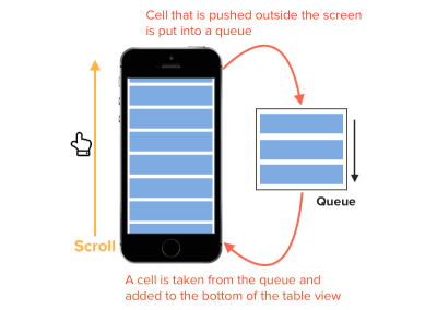
How cell reuse queues work in iOS (Large preview)
By using a queue to store cells, the table view doesn’t need to create a thousand cells. Instead, it needs just enough cells to cover the area of the table view.
By using dequeueReusableCell, we can reduce the memory used by the app and make it less prone to running out of memory!
Getting workflow just right ain’t an easy task. So are proper estimates. Or alignment among different departments. That’s why we’ve set up “this-is-how-I-work”-sessions — with smart cookies sharing what works well for them. A part of the Smashing Membership, of course.
Explore Smashing Membership ↬

2. Using A Launch Screen That Looks Like The Initial Screen
As mentioned in Apple’s Human Interface Guidelines (HIG), launch screens can be used to enhance the perception of an app’s responsiveness:
“It’s solely intended to enhance the perception of your app as quick to launch and immediately ready for use. Every app must supply a launch screen.”
It’s a common mistake to use a launch screen as a splash screen to show branding or to add a loading animation. Design the launch screen to be identical to the first screen of your app, as mentioned by Apple:
“Design a launch screen that’s nearly identical to the first screen of your app. If you include elements that look different when the app finishes launching, people can experience an unpleasant flash between the launch screen and the first screen of the app.
“The launch screen isn’t a branding opportunity. Don’t design an entry experience that looks like a splash screen or an “About” window. Don’t include logos or other branding elements unless they’re a static part of your app’s first screen.”
Using a launch screen for loading or branding purposes could slow down the time of first use and make the user feel that the app is sluggish.
When you start a new iOS project, a blank LaunchScreen.storyboard will be created. This screen will be shown to the user while the app loads the view controllers and layout.
To make your app feel faster, you can design the launch screen to be similar to the first screen (view controller) that will be shown to the user.
For example, the Safari app’s launch screen is similar to its first view :

A comparison of launch screen and first view of Safari app (Large preview)
The launch screen storyboard is like any other storyboard file, except that you can only use the standard UIKit classes, like UIViewController, UITabBarController, and UINavigationController. If you attempt to use any other custom subclasses (such as UserViewController), Xcode will notify you that using custom class names is prohibited.

Launch screen storyboard cannot contain non-UIKit standard class. (Large preview)
Another thing to note is that UIActivityIndicatorView doesn’t animate when placed on the launch screen, because iOS will generate a static image from the launch screen storyboard and displays it to the user. (This is mentioned briefly in the WWDC 2014 presentation “Platforms State of the Union”, around 01:21:56.)
Apple’s HIG also advises us not to include text on our launch screen, because the launch screen is static, and you can’t localize text to cater to different languages.
Recommended reading: Mobile App With Facial Recognition Feature: How To Make It Real
3. State Restoration For View Controllers
State preservation and restoration allow the user to return to the exact same UI state from just before they left the app. Sometimes, due to insufficient memory, the operating system might need to remove your app from memory while the app is in the background, and the app might lose track of its last UI state if it is not preserved, possibly causing users to lose their work in progress!
In the multitasking screen, we can see a list of apps that have been put in the background. We might assume that these apps are still running in the background; in reality, some of these apps might get killed and restarted by the system due to the demands of memory. The app snapshots we see in the multitasking view are actually screenshots taken by the system from right when we exited the app (i.e. to go to the home or multitasking screen).
Screenshots of apps taken by iOS when user exits the app (Large preview)
iOS uses these screenshots to give the illusion that the app is still running or is still displaying this particular view, whereas the app might have been already terminated or restarted in the background while still displaying the same screenshot.
Have you ever experienced, upon resuming an app from the multitasking screen, that the app shows a user interface different from the snapshot shown in the multitasking view? This is because the app hasn’t implemented the state-restoration mechanism, and the displayed data was lost when the app was killed in the background. This can lead to a bad experience because the user expects your app to be in the same state as when they left it.
From Apple’s article:
“They expect your app to be in the same state as when they left it. State preservation and restoration ensures that your app returns to its previous state when it launches again.”
UIKit does a lot of work to simplify state preservation and restoration for us: It handles the saving and loading of an app’s state automatically at appropriate times. All we need to do is add some configuration to tell the app to support state preservation and restoration and to tell the app what data needs to be preserved.
To enable state saving and restoring, we can implement these two methods in AppDelegate.swift:
func application(_ application: UIApplication, shouldSaveApplicationState coder: NSCoder) -> Bool {
return true
}
func application(_ application: UIApplication, shouldRestoreApplicationState coder: NSCoder) -> Bool {
return true
}
This will tell the app to save and restore the application’s state automatically.
Next, we’ll tell the app which view controllers need to be preserved. We do this by specifying the “Restoration ID” in the storyboard :
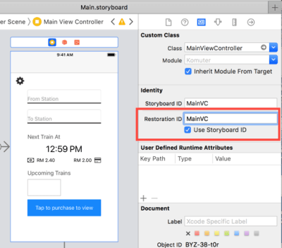
Setting restoration ID in storyboard (Large preview)
You can also check “Use Storyboard ID” to use the storyboard ID as the restoration ID.
To set the restoration ID in the code, we can use the restorationIdentifier property of the view controller.
// ViewController.swift
self.restorationIdentifier = “MainVC”
During state preservation, any view controller or view that has been assigned a restoration identifier will have its state saved to disk.
Restoration identifiers can be grouped together to form a restoration path. The identifiers are grouped using the view hierarchy, from the root view controller to the current active view controller. Suppose a MyViewController is embedded in a navigation controller, which is embedded in another tab bar controller. Assuming they are using their own class names as restoration identifiers, the restoration path will look like this:
TabBarController/NavigationController/MyViewController
When the user leaves the app with the MyViewController being the active view controller, this path will be saved by the app; then the app will remember the previous view hierarchy shown (Tab Bar Controller → Navigation Controller → My View Controller).
After assigning the restoration identifier, we will need to implement the encodeRestorableState(with coder:) and decodeRestorableState(with coder:) methods for each of the preserved view controllers. These two methods let us specify what data need to be saved or loaded and how to encode or decode them.
Let’s see the view controller:
// MyViewController.swift
// MARK: State restoration
// UIViewController already conforms to UIStateRestoring protocol by default
extension MyViewController {
// will be called during state preservation
override func encodeRestorableState(with coder: NSCoder) {
// encode the data you want to save during state preservation
coder.encode(self.username, forKey: “username”)
super.encodeRestorableState(with: coder)
}
// will be called during state restoration
override func decodeRestorableState(with coder: NSCoder) {
// decode the data saved and load it during state restoration
if let restoredUsername = coder.decodeObject(forKey: “username”) as? String {
self.username = restoredUsername
}
super.decodeRestorableState(with: coder)
}
}
Remember to call the superclass implementation at the bottom of your own method. This ensures that the parent class has a chance to save and restore state.
Once the objects have finished decoding, applicationFinishedRestoringState() will be called to tell the view controller that the state has been restored. We can update the UI for the view controller in this method.
// MyViewController.swift
// MARK: State restoration
// UIViewController already conforms to UIStateRestoring protocol by default
extension MyViewController {
…
override func applicationFinishedRestoringState() {
// update the UI here
self.usernameLabel.text = self.username
}
}
There you have it! These are the essential methods to implement state preservation and restoration for your app. Keep in mind that the operating system will remove the saved state when the app is being force-closed by the user, in order to avoid getting stuck in a broken state in case something goes wrong in the state preservation and restoration.
Also, don’t store any model data (i.e. data that should have been saved to UserDefaults or Core Data) to the state, even though it might seem convenient to do so. State data will be removed when the user force quits your app, and you certainly don’t want to lose model data this way.
To test whether state preservation and restoration are working well, follow the steps below:
Build and launch an app using Xcode.
Navigate to the screen with state preservation and restoration that you want to test.
Return to the home screen (by swiping up or double-clicking home button, or pressing Shift ⇧ + Cmd ⌘ + H in the simulator) to send the app to the background.
Stop the app in Xcode by pressing the ⏹ button.
Launch the app again and check whether the state has been restored successfully.
Because this section only covers the basics of state preservation and restoration, I recommend the following articles by Apple Inc. for more in-depth knowledge of state restoration:
Preserving And Restoring State
UI Preservation Process
UI Restoration Process
4. Reduce Usage Of Non-Opaque Views As Much As Possible
An opaque view is a view that has no transparency, meaning that any UI element placed behind it is not visible at all. We can set a view to be opaque in the Interface Builder:
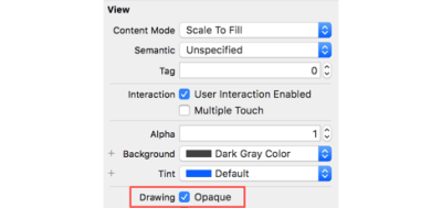
Set UIView to opaque in storyboard (Large preview)
Or we can do it programmatically with the isOpaque property of UIView:
view.isOpaque = true
Setting a view to opaque will make the drawing system optimize some drawing performance while rendering the screen.
If a view has transparency (i.e. alpha is below 1.0), then iOS will have to do extra work to calculate what should be displayed by blending different layers of views in the view hierarchy. On the other hand, if a view is set to opaque, then the drawing system will just put this view in front and avoid the extra work of blending the multiple view layers behind it.
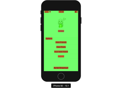
You can check which layers are being blended (non-opaque) in the iOS Simulator by checking Debug → Color Blended Layers.

Show color blended layers in Simulator
After checking the Color Blended Layers option, you can see that some views are red and some are green. Red indicates that the view is not opaque and that its output display is a result of layers blended behind it. Green indicates that the view is opaque and no blending has been done.
Assign non-transparent background color to UILabel whenever possible to reduce color blended layers. (Large preview)
The labels shown above (“View Friends”, etc.) are highlighted in red because when a label is dragged to the storyboard, its background color is set to transparent by default. When the drawing system is compositing the display near the label area, it will ask for the layer behind the label and do some calculation.
One way you can optimize app performance is to reduce how many views are highlighted with red as much as possible.
By changing label.backgroundColor = UIColor.clear to label.backgroundColor = UIColor.white, we can reduce layer blending between the label and the view layer behind it.
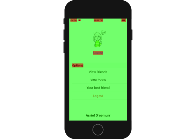
Many labels are highlighted in red because their background color is transparent, causing iOS to calculate the background color by blending the view behind it. (Large preview)
You might have noticed that, even if you have set a UIImageView to opaque and assigned a background color to it, the simulator will still show red in the image view. This is probably because the image you used for the image view has an alpha channel.
To remove the alpha channel for an image, you can use the Preview app to make a duplicate of the image (Shift ⇧ + Cmd ⌘ + S), and uncheck the “Alpha” checkbox when saving.
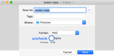
Uncheck the ‘Alpha’ checkbox when saving an image to discard the alpha channel. (Large preview)
5. Pass Heavy Processing Functions To Background Threads (GCD)
Because UIKit only works on the main thread, performing heavy processing on the main thread will slow down the UI. The main thread is used by UIKit not only to handle and respond to user input, and also to draw the screen.
The key to making an app responsive is to move as many heavy processing tasks to background threads as possible. Avoid doing complex calculation, networking, and heavy IO operation (e.g. reading and writing to disk) on the main thread.
You might have once used an app that suddenly became unresponsive to your touch input, and it feels like the app has hung. This is most probably caused by the app running heavy computation tasks on the main thread.
The main thread usually alternates between UIKit tasks (such as handling user input) and some light tasks in small intervals. If a heavy task is running on main thread, then UIKit will need to wait until the heavy task has finished before being able to handle touch input.
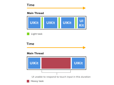
Here is how the main thread handles UI tasks and why it causes the UI to hang when heavy tasks are performed. (Large preview)
By default, the code inside view controller lifecycle methods (such as viewDidLoad) and IBOutlet functions are executed on the main thread. To move heavy processing tasks to a background thread, we can use the Grand Central Dispatch queues provided by Apple.
Here’s the template for switching queues :
// Switch to background thread to perform heavy task.
DispatchQueue.global(qos: .default).async {
// Perform heavy task here.
// Switch back to main thread to perform UI-related task.
DispatchQueue.main.async {
// Update UI.
}
}
The qos stands for “quality of service”. Different quality-of-service values indicate different priorities for the specified tasks. The operating system will allocate more CPU time and CPU power I/O throughput for tasks allocated in queues with higher QoS values, meaning that a task will finish faster in a queue with higher QoS values. A higher QoS value will also consume more energy due to it using more resources.
Here is the list of QoS values from highest to lowest priority:
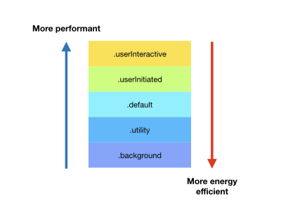
Quality-of-service values of queue sorted by performance and energy efficiency (Large preview)
Apple has provided a handy table with examples of which QoS values to use for different tasks.
One thing to keep in mind is that all UIKit code should always be executed on the main thread. Modifying UIKit objects (such as UILabel and UIImageView) on the background thread could have an unintended consequence, like the UI not actually updating, a crash occurring, and so on.
From Apple’s article:
“Updating UI on a thread other than the main thread is a common mistake that can result in missed UI updates, visual defects, data corruptions, and crashes.”
I recommend watching Apple’s WWDC 2012 video on UI concurrency to better understand how to build a responsive app.
Notes
The trade-off of performance optimization is that you have to write more code or configure additional settings on top of the app’s functionality. This might make your app delivered later than expected, and you will have more code to maintain in the future, and more code means potentially more bugs.
Before spending time on optimizing your app, ask yourself whether the app is already smooth or whether it has some unresponsive part that really needs to be optimized. Spending a lot of time optimizing an already smooth app to shave off 0.01 seconds might not be worth it, as the time could be better spent developing better features or other priorities.
Further Resources
“A Suite of Delicious iOS Eye Candy,” Tim Oliver, Tokyo iOS Meetup 2018 (Video)
“Building Concurrent User Interfaces on iOS,” Andy Matuschak, WWDC 2012 (Video)
“Preserving Your App’s UI Across Launches,” Apple
“Concurrency Programming Guide: Dispatch Queues,” Documentation Archive, Apple
“Main Thread Checker,” Apple

(jd, ra, il)


