20 Best New Portfolios, October 2018
Original Source: https://www.webdesignerdepot.com/2018/10/20-best-new-portfolios-october-2018/
 Hello Readers! Can you believe that I have not found one single Halloween-themed portfolio? I guess no one wanted to base their entire site on a one-day holiday. While understandable, this disappoints me.
Someone get me a vector skeleton!
What we do have is a general mix of calm and soothing minimalist sites punctuated by riotous color which might, if you’re not ready for it, hurt your eyes for a second. Enjoy.
Note: I’m judging these sites by how good they look to me. If they’re creative and original, or classic but really well-done, it’s all good to me. Sometimes, UX and accessibility suffer. For example, many of these sites depend on JavaScript to display their content at all; this is a Bad Idea , kids. If you find an idea you like and want to adapt to your own site, remember to implement it responsibly.
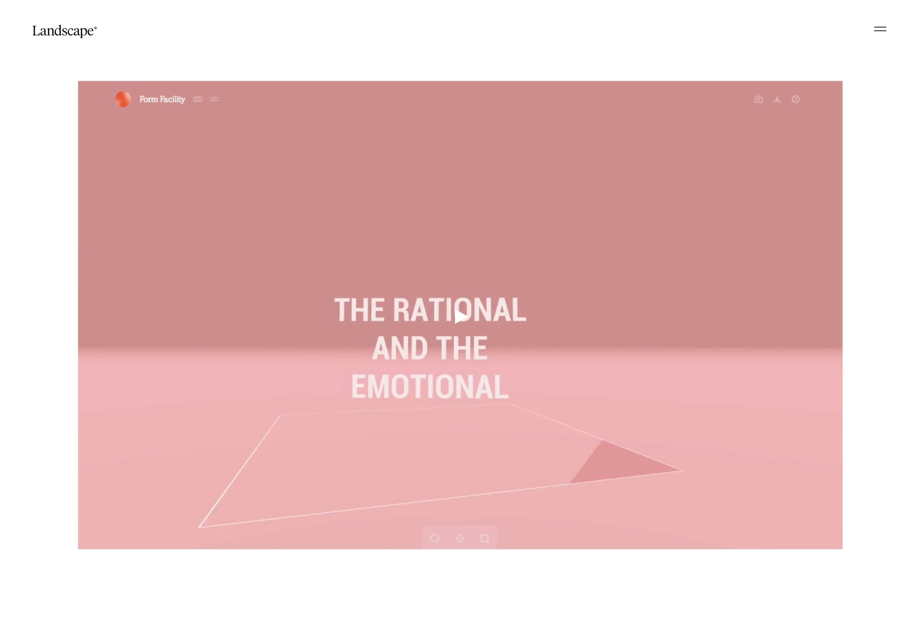
Landscape
To start us off, Landscape brings us an almost classically minimalist design, with a bit of an asymmetrical, collage-style layout. The (thankfully soundless) highlight reel on the home page can be a little jarring, but does a good job of showing the striking variety in their work.
Platform: WordPress
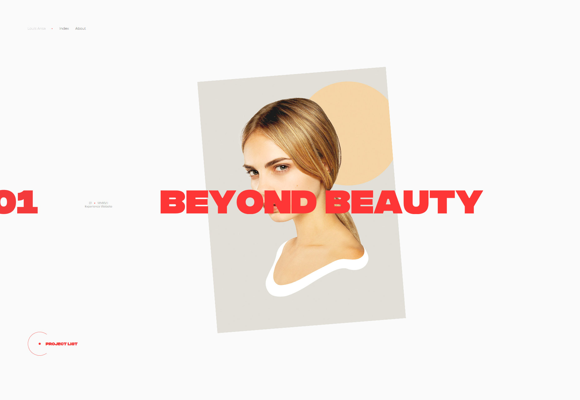
Louis Ansa
Continuing under “L”, Louis Ansa has an even bolder and even more animation-heavy site, though the animation is a bit easier on the eyes. There is a bit of “collage” in the design, but it’s a light touch that quickly gives way to a more typical layout style, while keeping everything (literally) moving. I personally love the way they used color for this one.
Platform: JS App
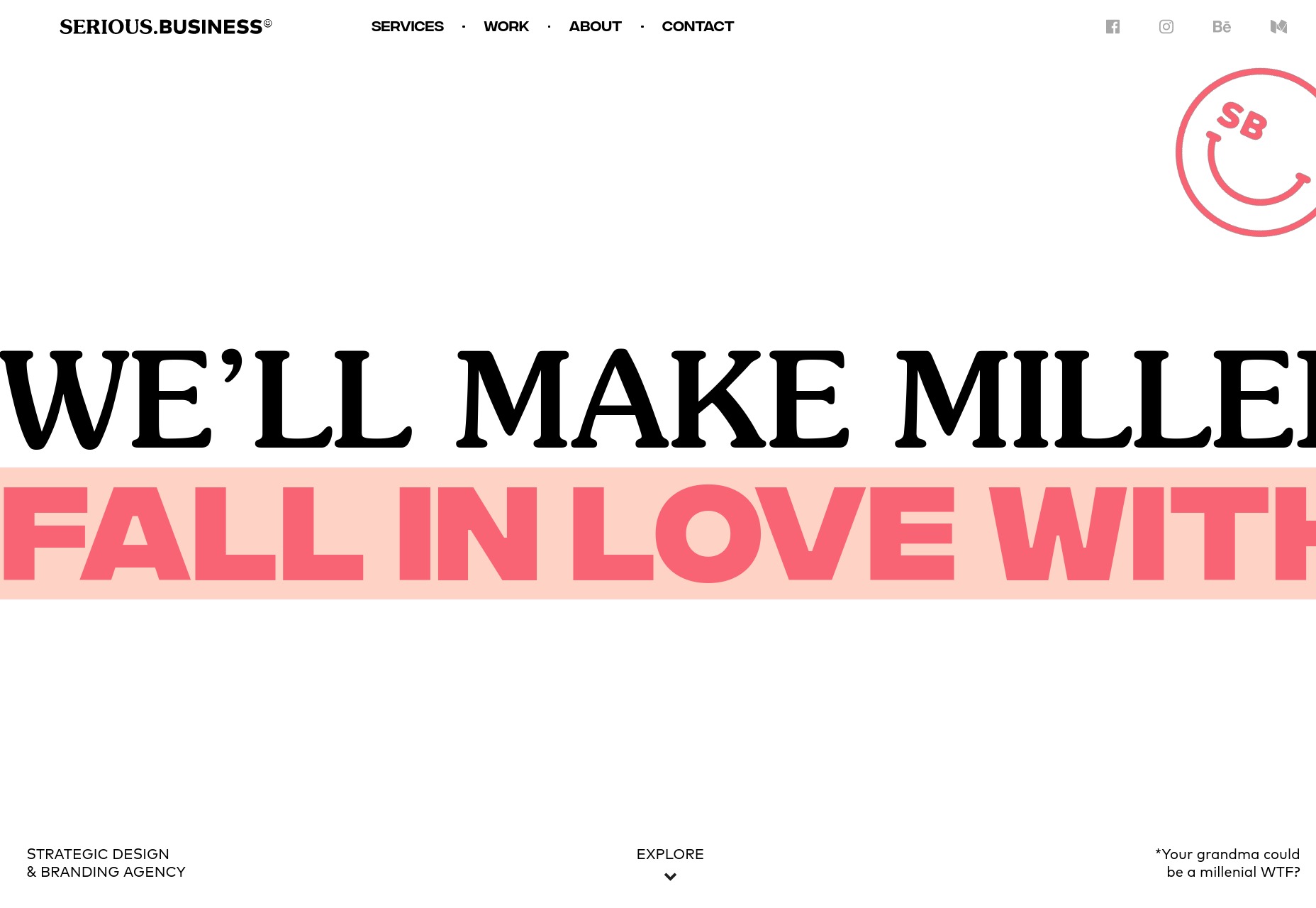
Serious Business
The logo for Serious Business has an ironic smiley face because of course it does. They even go so far as to promise to “make Millenials fall in love with your brand”… but I’ll try not to hold that against them.
I’ll say that they’re good at branding, though. The typography combined with some small graphical elements gives the site a distinct personality, while the variety in layout and presentation encourages exploration of the site. Animation takes you pretty seamlessly from one page to another in a way I can’t deny that I like.
Platform: Vue JS App
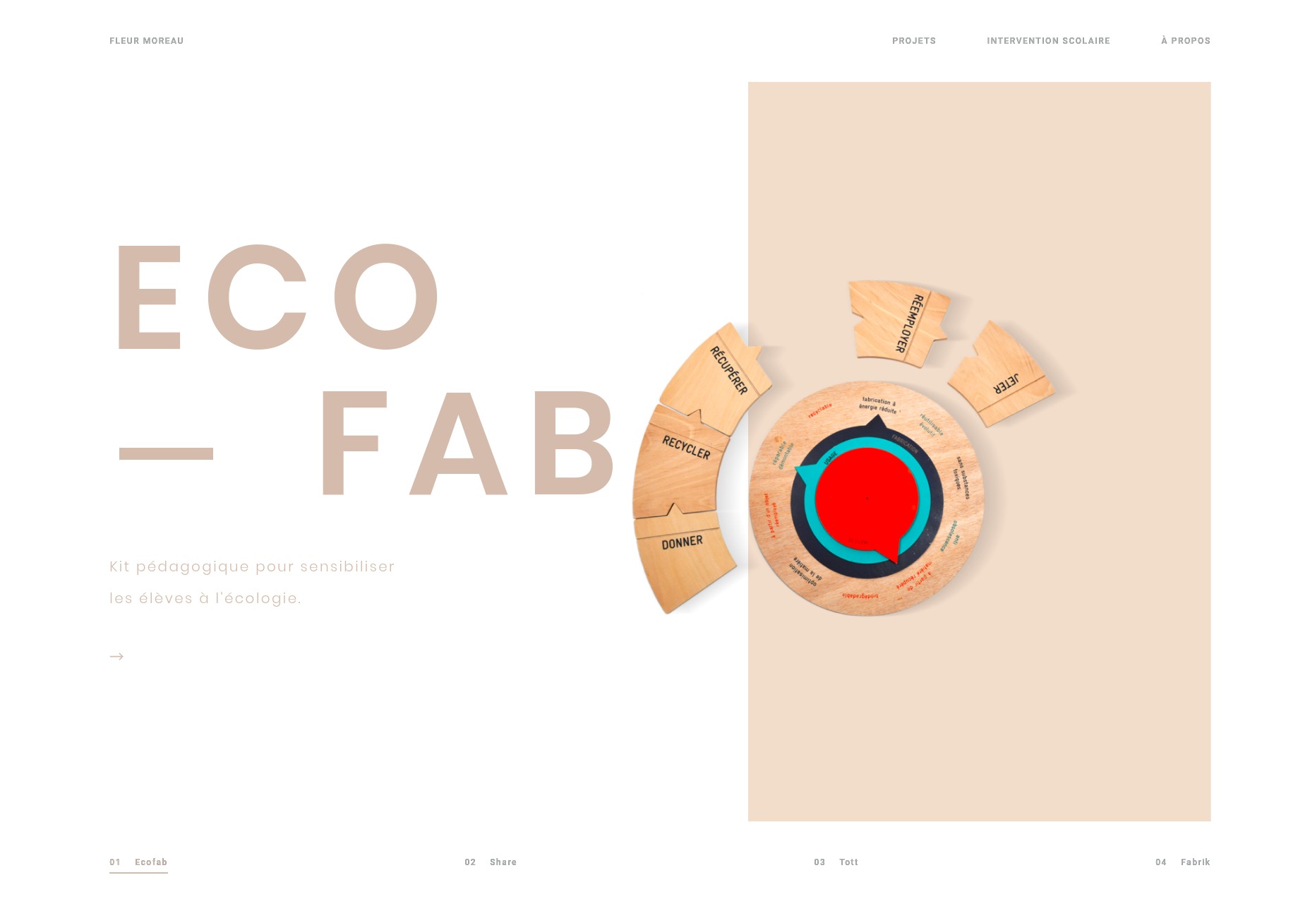
Fleur Moreau
Fleur Moreau is a studio that seems to make very minimalist and modern school supplies. When it comes right down to it, they do some pretty precision engineering, so their site reflects that professionalism, rather than going for the throw-colors-everywhere approach you might expect. For a site that sells things kids will inevitably destroy, it looks downright elegant, and this is accomplished mostly through typography.
Platform: Vue JS App
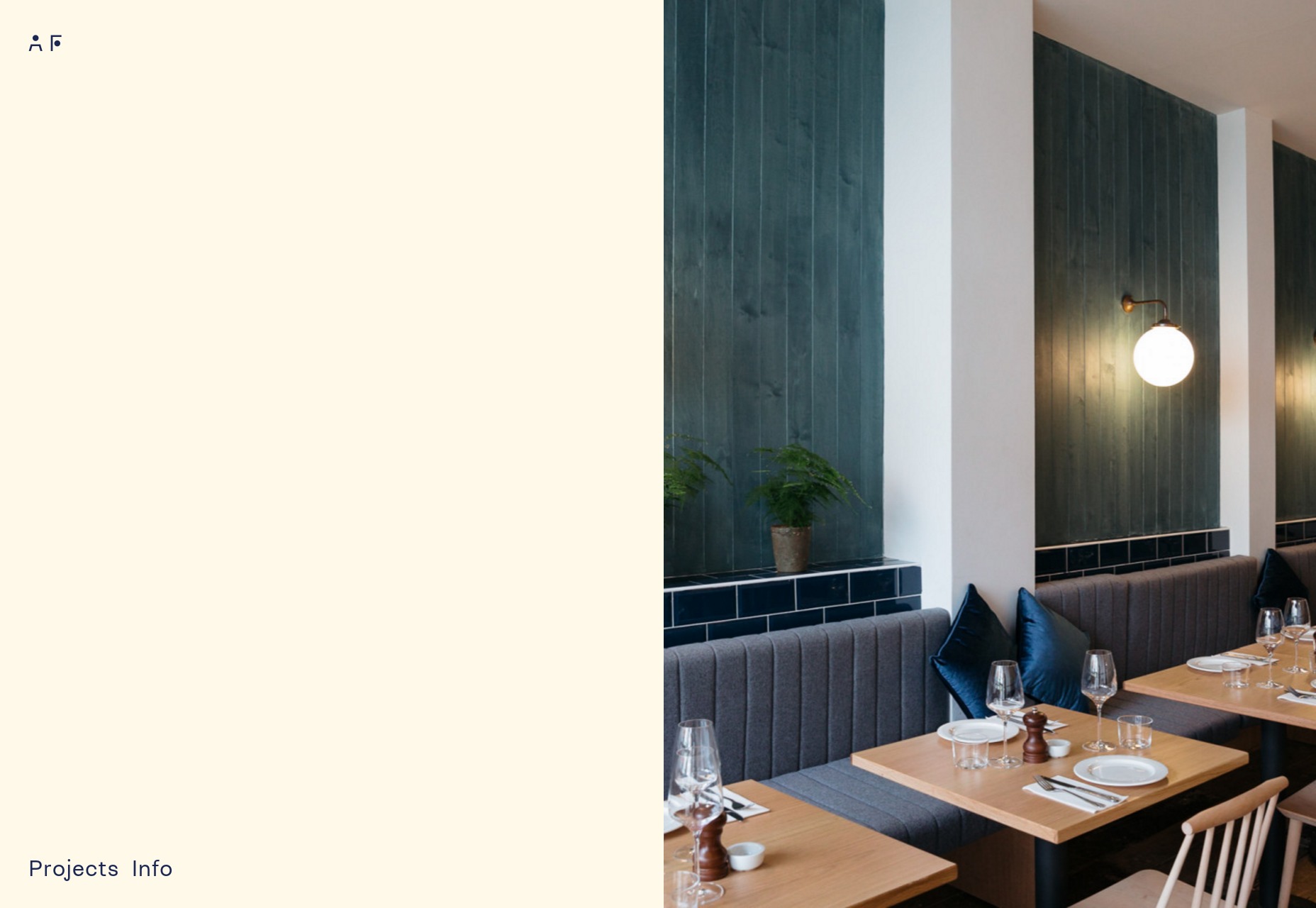
Ahmad Fakhry
Ahmad Fakhry is an interior/furniture designer, and so his site is predictably minimalist. What makes it fun for me is that I’m a sucker for those 50/50 split website layouts, though this one adapts, depending on which content is taking priority at any given moment. That last bit is something I like to see.
Platform: Static Site
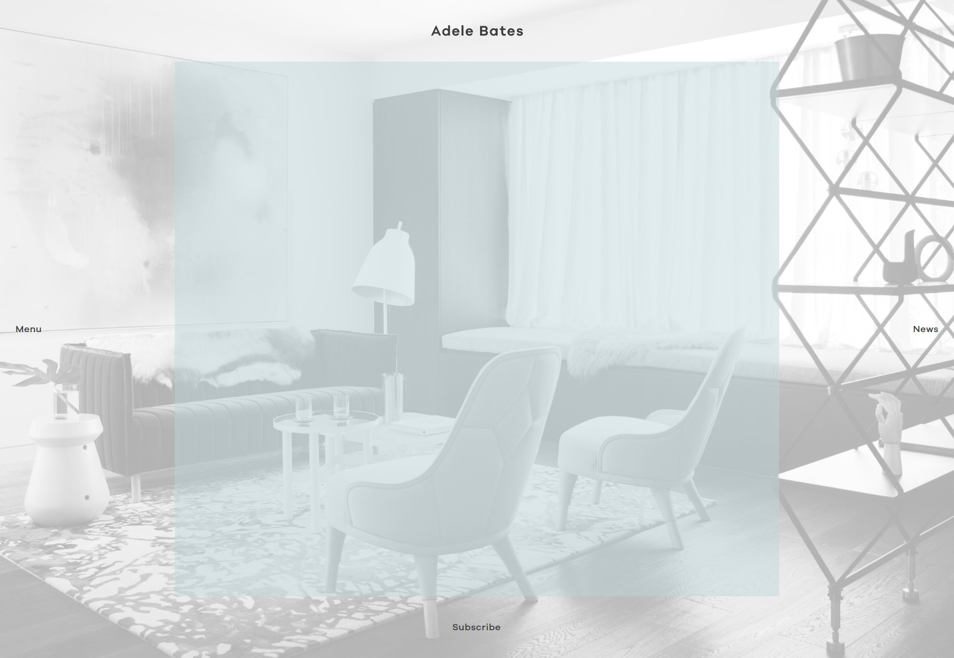
Adele Bates
Adele Bates’ portfolio is one of those that puts the navigation all around the edges of the design. I’m normally not a fan, but there’s enough contrast to make it work.
The rest of the site is even structured specifically to draw your eyes to the sides of the page at any time, so you can’t miss the bits you’re supposed to click on. Combine that with a solid modernist design aesthetic, and it all works rather well.
Platform: WordPress
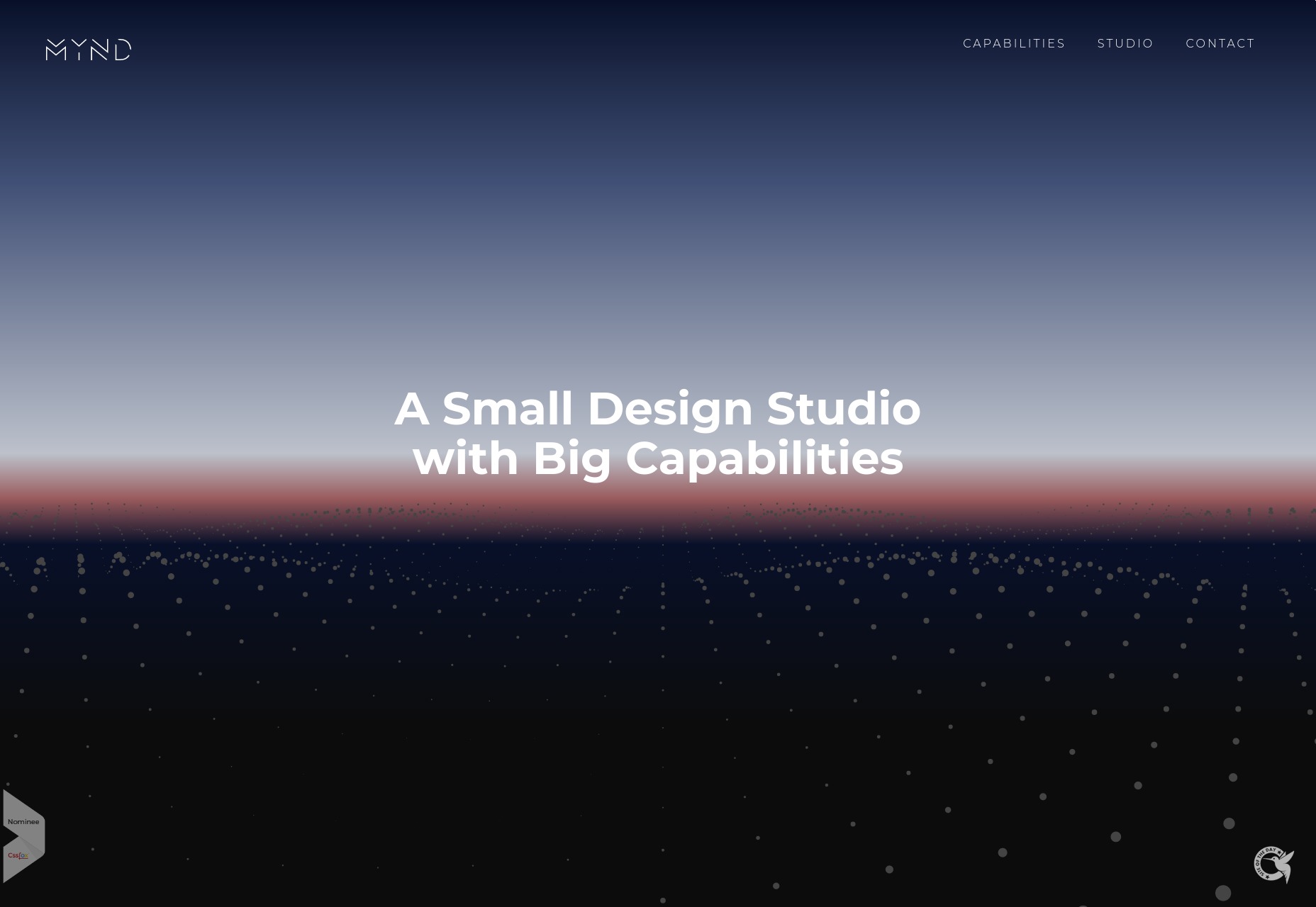
Mynd
Mynd’s portfolio site is fairly standard layout-wise, and depends on the graphical talents of its creators to stand out, and stick in your head. Said graphics are simple, but visually striking enough to pull it off. To paraphrase Star Wars, it’s an older approach, but it checks out.
Platform: Static Site
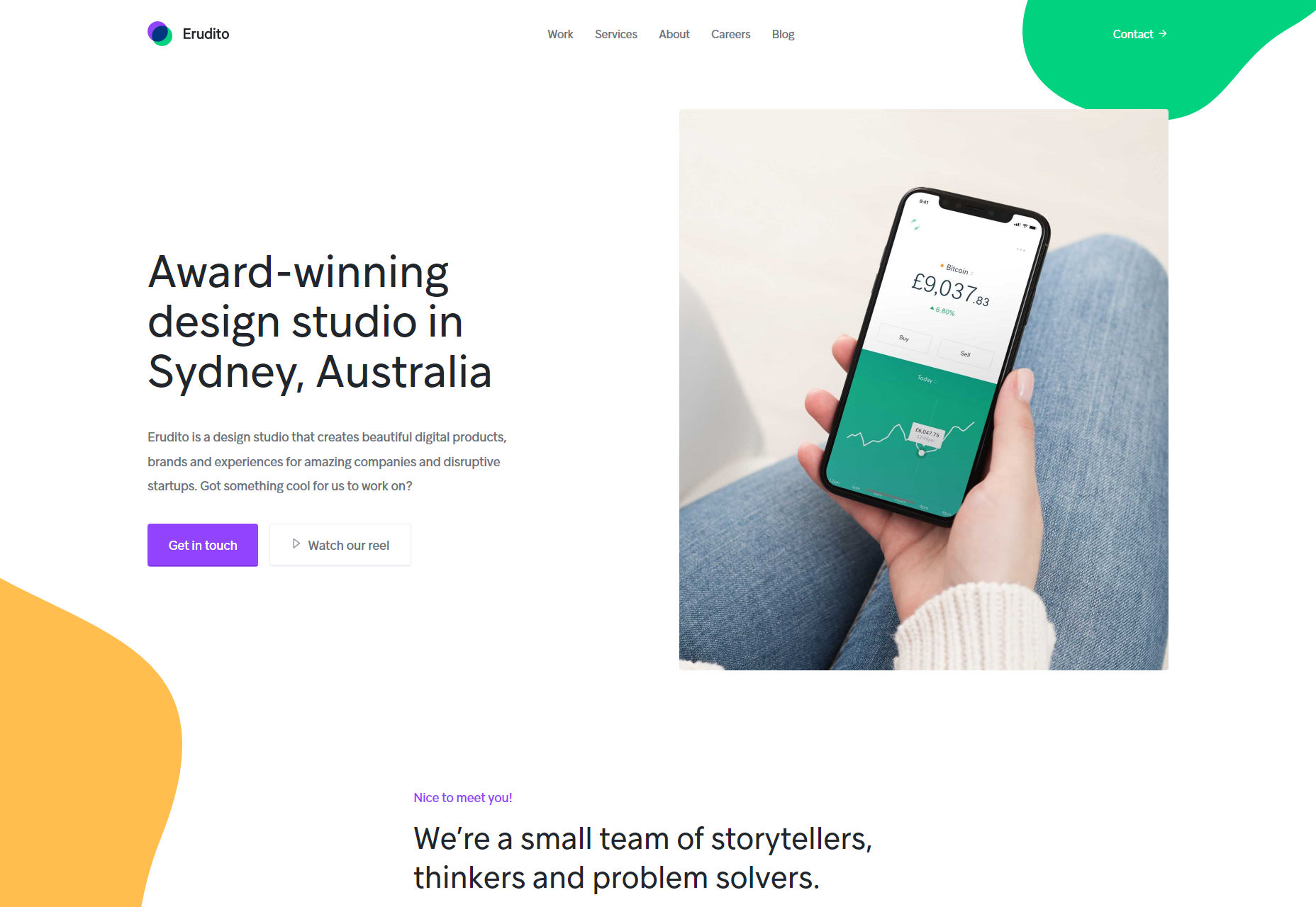
Erudito
Random blobs of color used to be the domain of cheap flyers made for local businesses in the ’90s. But if you make those colors kind-of-pastel, use the blobs sparingly, and throw them on to a delicious yet solid foundation of simple type and layout, you get Erudito.
I haven’t been this excited about blobs of color since I was eight years old, or so.
Platform: Static Site
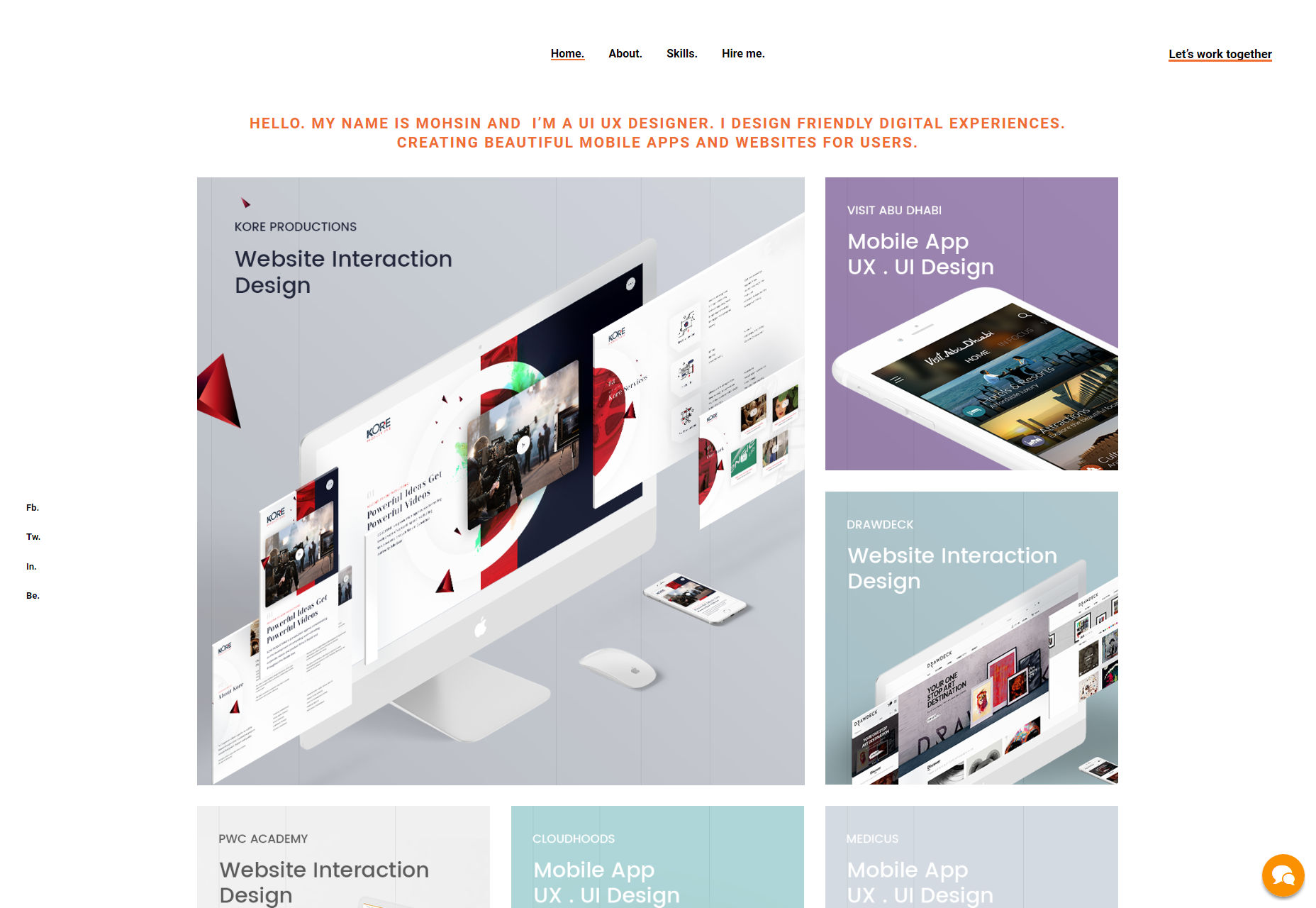
Moshin
Moshin makes use of the good-old grid-as-aesthetic-element trick, though you’re not going to see any actual lines outside of project preview images. However, those hints at simplicity and order sort of train the eye to see the same principles at work in the rest of the website, which I thought was a nice touch.
Platform: WordPress
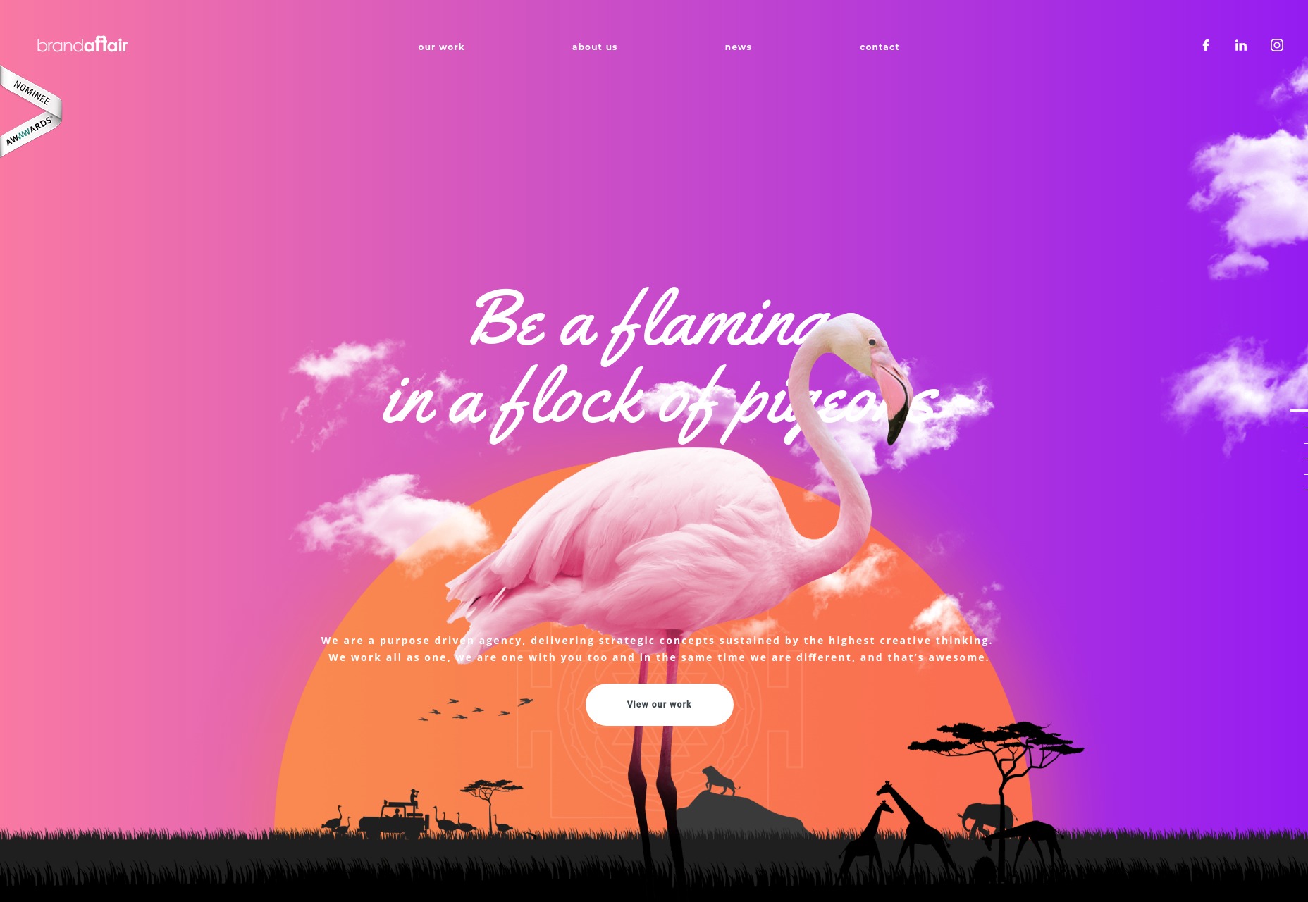
Brand Affair
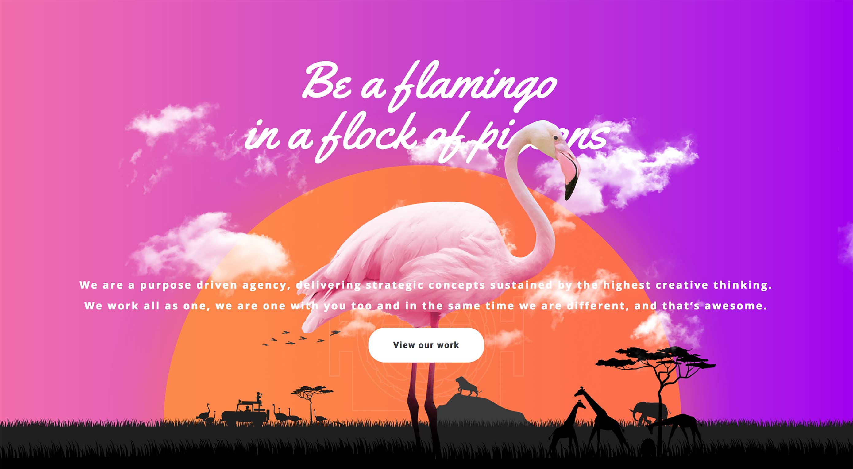
Is it just me, or are branding-focused studios usually the ones that really go all out with the fun stuff? Well Brand Affair is carrying on the tradition with their sunsets, their animals, and their clear and ever-present flair for the dramatic. I guess when your color palette is “all of the colors”, you truly have some room to get wild.
And yet, according to my browser, it’s not quite as bandwidth-heavy as you’d think. On top of everything else, I have to give them props for their optimization.
Platform: Static Site
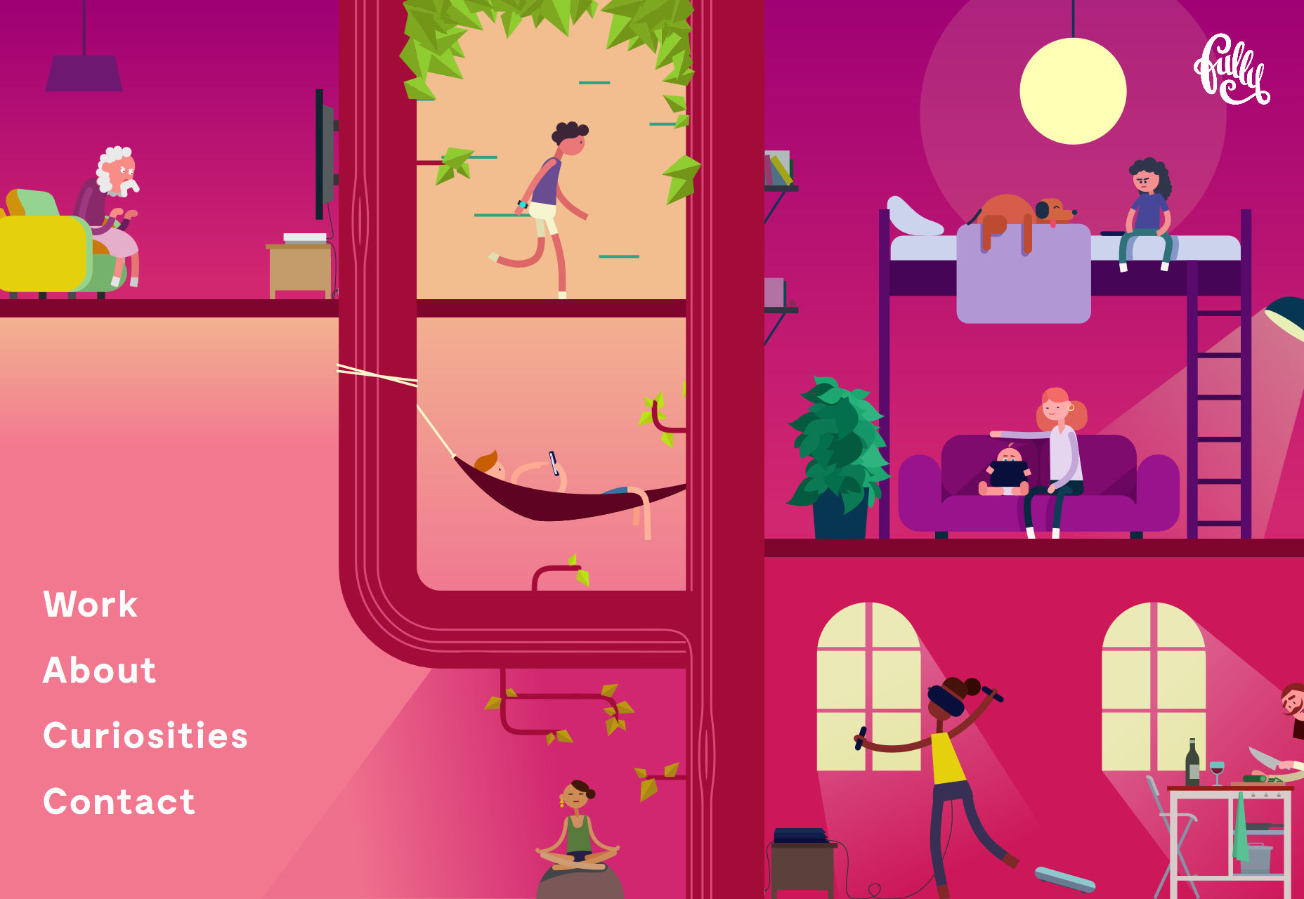
Fully Studios
Fully Studios is another one that’ll throw the rainbow at you, but this time it comes with a healthy dose of illustration, and SVG animation. The rest of the site is a lovely mix of soft colors, retro-style UI elements, and a bit of monospaced type.
Platform: Static Site
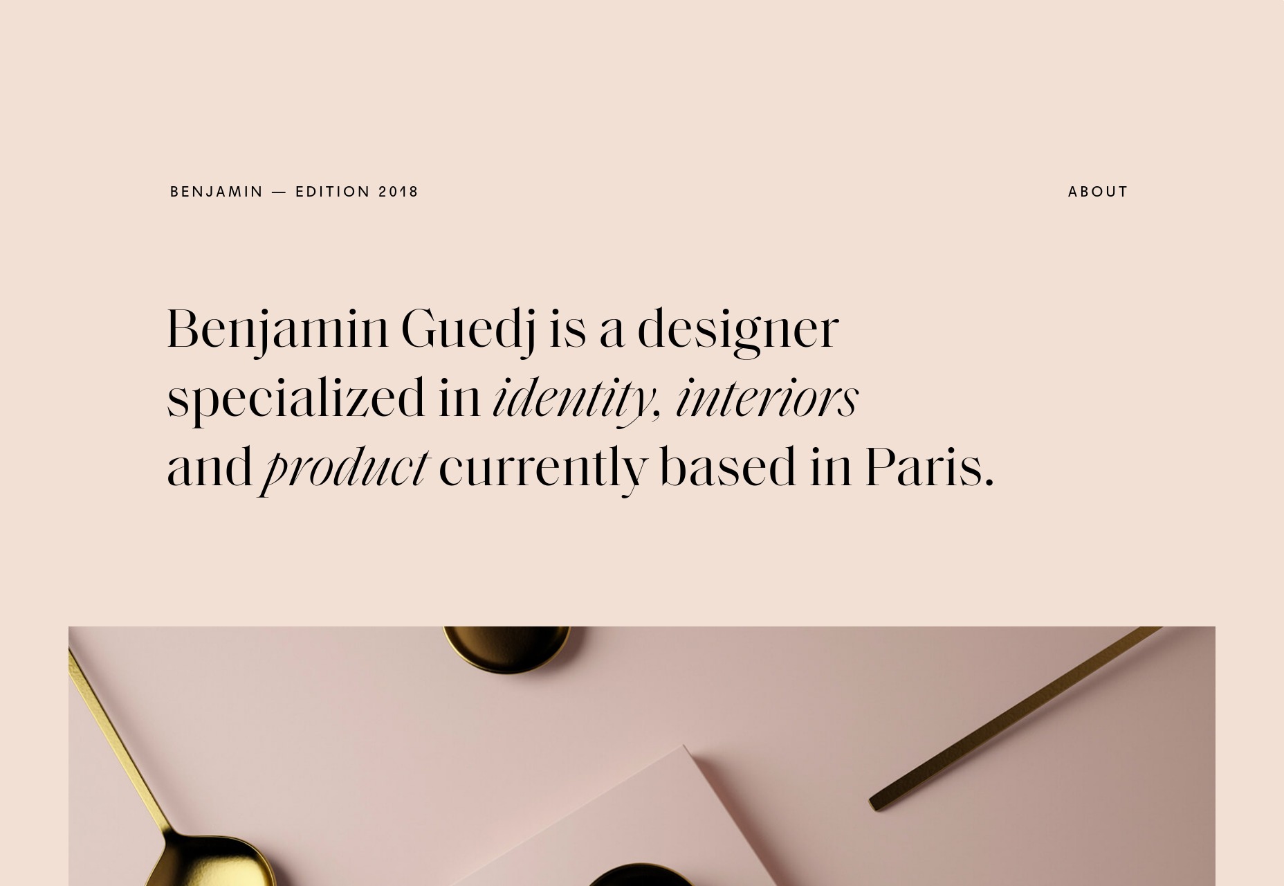
Benjamin Guedj
Bringing us back from the edge of color-induced hypnosis, Benjamin Guedj’s portfolio is clean and pretty, with elegant-feeling type. The serif font chosen here can get a little hard to read at smaller sizes, but otherwise this is just a small, good-looking site that doesn’t do any more than it needs to.
Platform: Static Site
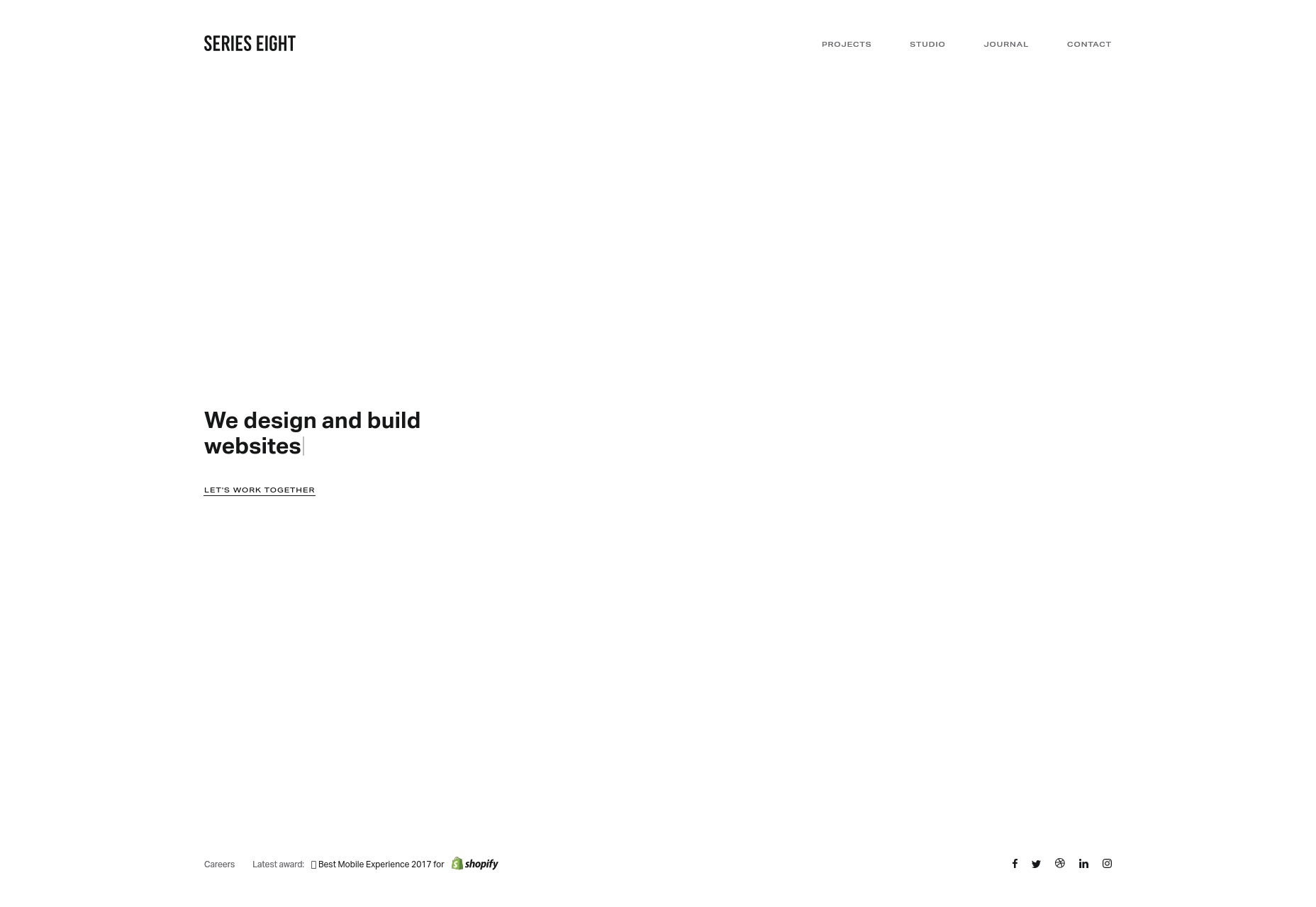
Series Eight
Series Eight: It’s simple. It’s somewhat monochromatic. It’s very “sans-serif”. Those are all compliments.
Platform: Static Site
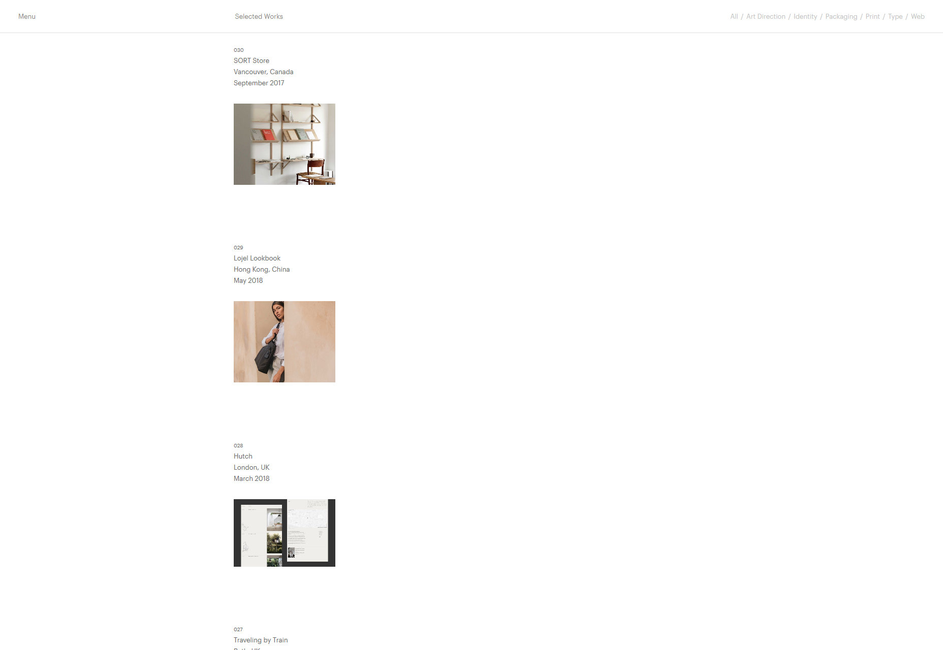
Faculty
Faculty doesn’t quite look like a spreadsheet or database, but it kind of feels like it was inspired by one. All of the content gets its own column, and stays there across all pages. The overall effect is one of clear organization and goals, and I love it.
Platform: WordPress
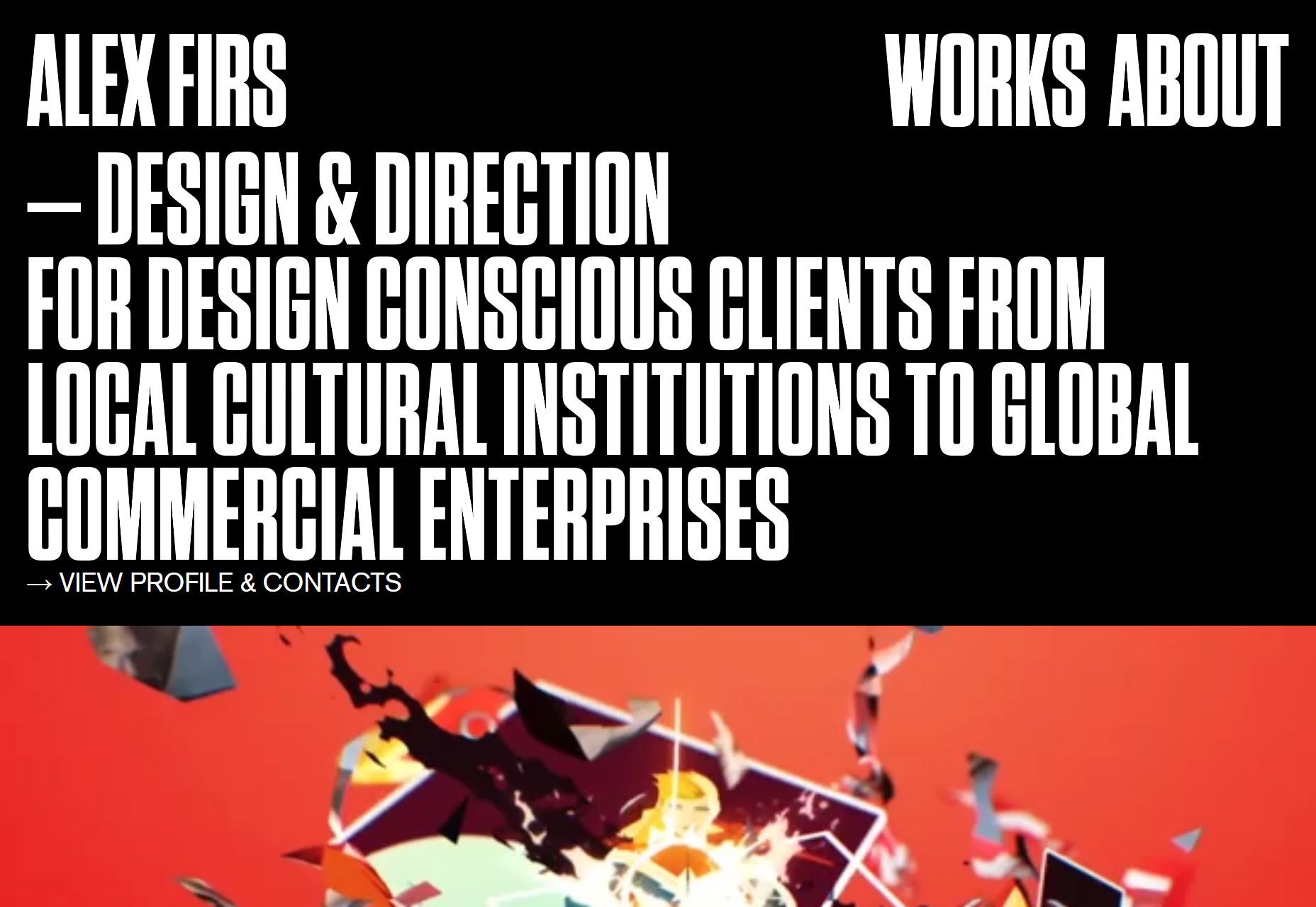
Alex Firs
Alex Firs’ portfolio evokes a little bit of comic book flavor in its typography in with its modernism, and goes for a quite bold look. It’s all black, white, and solid reds.
One thing I’d like to note for other portfolio designers: the video backgrounds are only animated when you hover over the projects associated with them. This is a good way to focus a user’s attention, and save bandwidth. I’m just saying.
Platform: WordPress
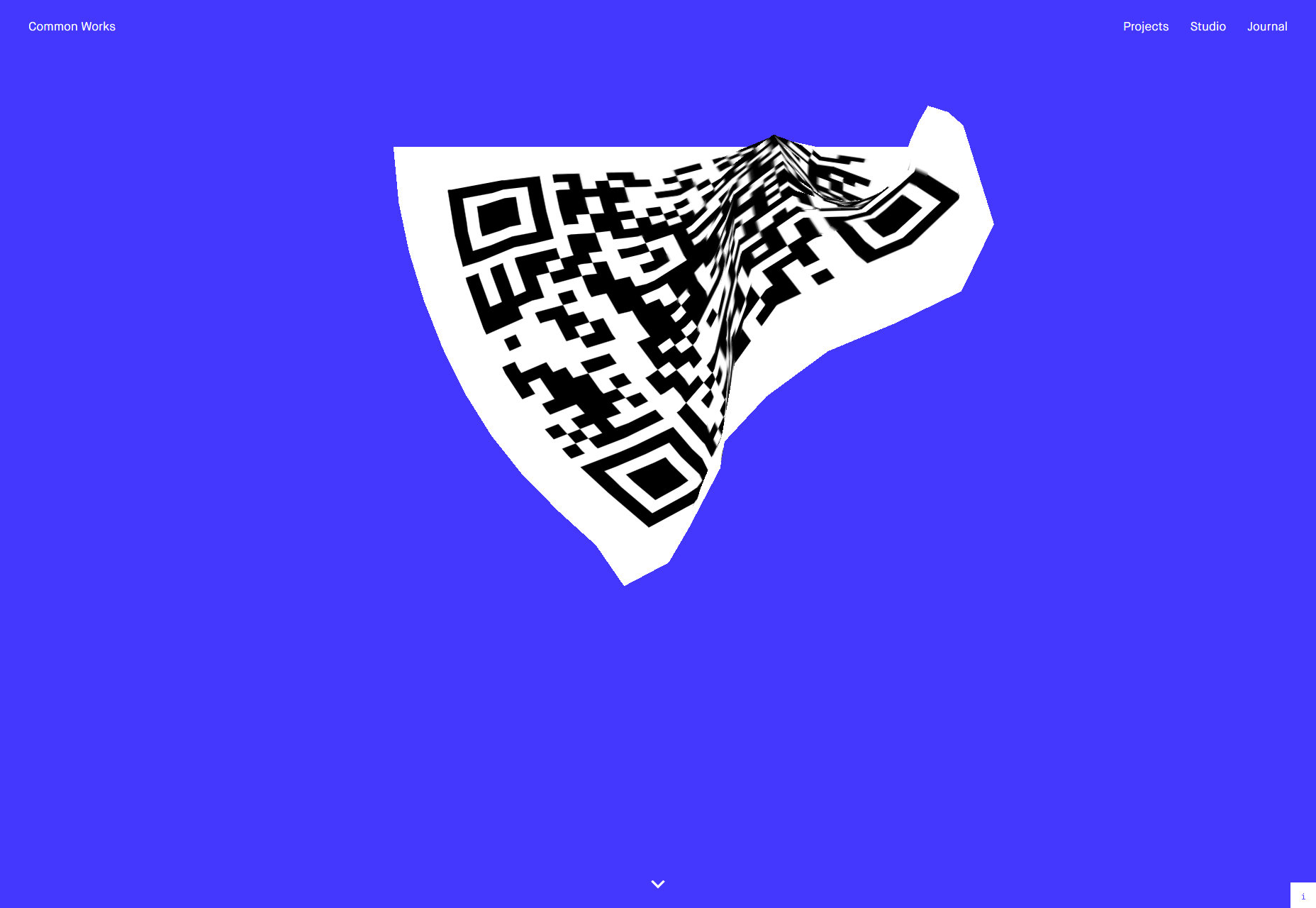
Common Works
Common Works embraces some, well… common design patterns, but it is a beautiful site nonetheless. It made the list specifically because I am a sucker for Easter eggs, though. The animated QR code can be a bit tough to scan because of the animation, but it’s worth it.
Platform: Static Site
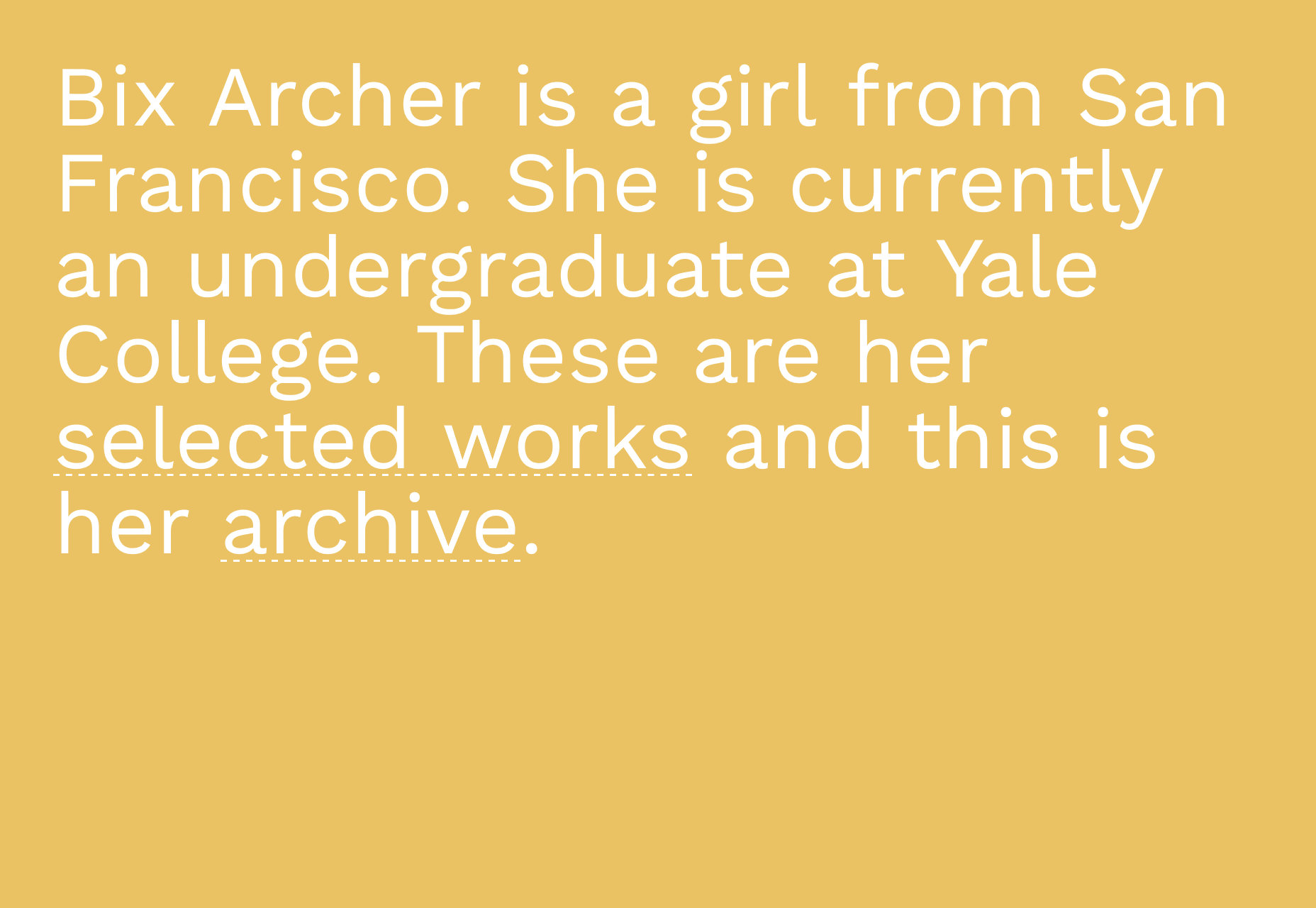
Bix Archer
Now Bix Archer’s portfolio does have a spreadsheet that serves as her main project archive, and a collage of modals to feature specific projects. As models of curation go, it’s a good setup for a one-page portfolio.
Platform: Static Site
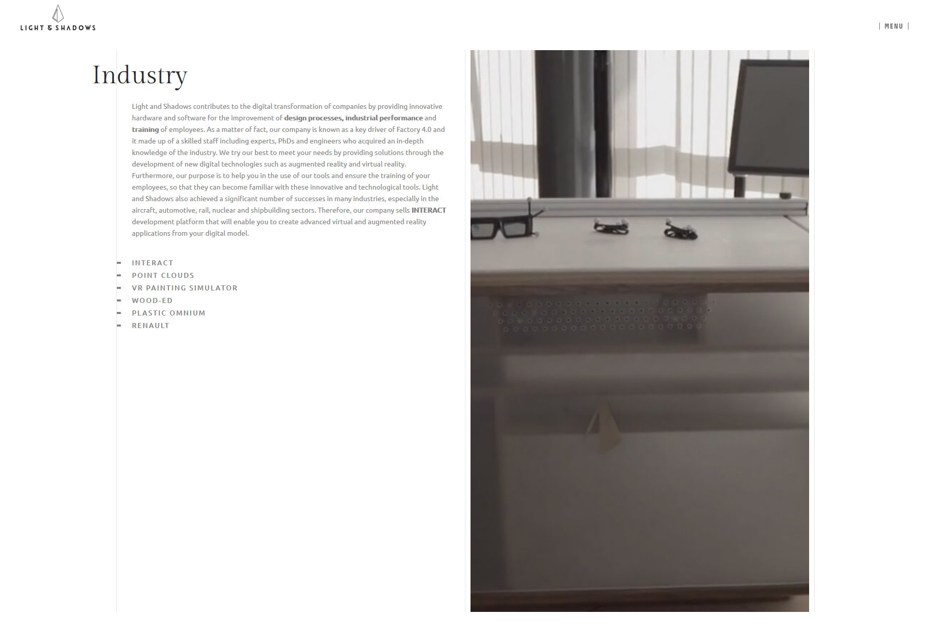
Light and Shadows
Light and Shadows evokes an early 00’s idea of what a futuristic interface would look like, while still retaining a distinctly contemporary feel overall in its presentation-style UI. It comes complete with animated lines, text that “descrambles” itself, everything.
And yet, there’s no auto-playing audio. Good work, guys. You designed a site that excited my inner child without annoying the rest of me.
Platform: WordPress
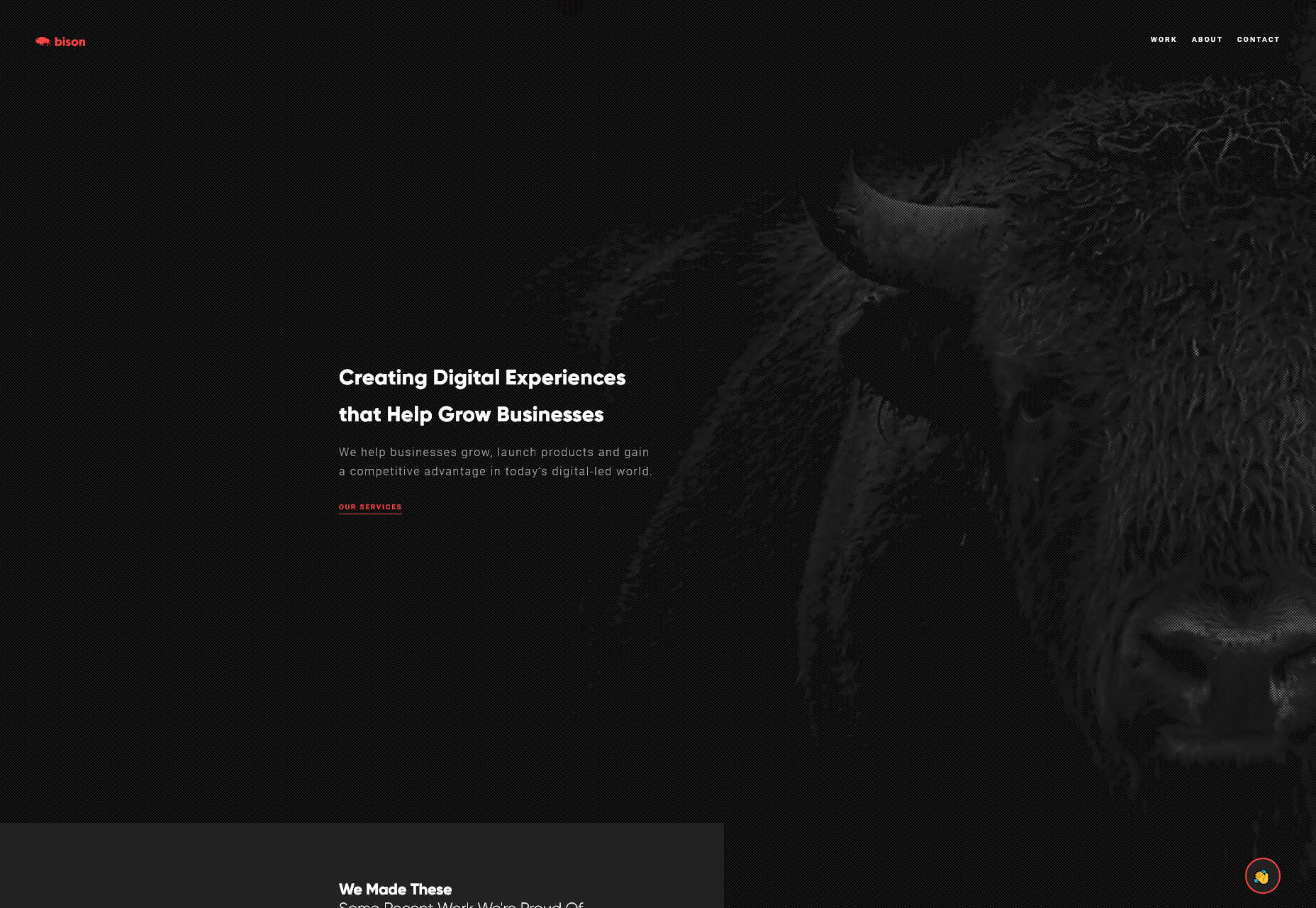
Bison Studio
Bison Studio is a lovely-looking portfolio with solid type (except for a few instances where it could use more contrast), and that thing where almost every elements will, at some point, overlap onto another one. Plus, how many websites will put a buffalo chewing on something on their home page? How many?
Platform: JS App
Dragon Rouge
Dragon Rouge doesn’t hold back on the personality. Start scrolling through the site, and you’ll get hit with some pretty large images out of nowhere, and then there’s that mouse cursor.
Look, I’m usually not a fan of custom cursors, because half the time they’re just harder to see. This one is… not like that. Just give the link a click. You’ll see what I mean.
Platform: WordPress
Add Realistic Chalk and Sketch Lettering Effects with Sketch’it – only $5!
![]()
Source
p img {display:inline-block; margin-right:10px;}
.alignleft {float:left;}
p.showcase {clear:both;}
body#browserfriendly p, body#podcast p, div#emailbody p{margin:0;}


Leave a Reply
Want to join the discussion?Feel free to contribute!