Original Source: https://www.smashingmagazine.com/2018/04/sirikit-intents-app-guide/
Will SiriKit’s Intents Fit Your App? If So, Here’s How To Use Them
Will SiriKit’s Intents Fit Your App? If So, Here’s How To Use Them
Lou Franco
2018-04-11T17:00:44+02:00
2018-04-11T15:22:34+00:00
Since iOS 5, Siri has helped iPhone users send messages, set reminders and look up restaurants with Apple’s apps. Starting in iOS 10, we have been able to use Siri in some of our own apps as well.
In order to use this functionality, your app must fit within Apple’s predefined Siri “domains and intents.” In this article, we’ll learn about what those are and see whether our apps can use them. We’ll take a simple app that is a to-do list manager and learn how to add Siri support. We’ll also go through the Apple developer website’s guidelines on configuration and Swift code for a new type of extension that was introduced with SiriKit: the Intents extension.
When you get to the coding part of this article, you will need Xcode (at least version 9.x), and it would be good if you are familiar with iOS development in Swift because we’re going to add Siri to a small working app. We’ll go through the steps of setting up a extension on Apple’s developer website and of adding the Siri extension code to the app.
“Hey Siri, Why Do I Need You?”
Sometimes I use my phone while on my couch, with both hands free, and I can give the screen my full attention. Maybe I’ll text my sister to plan our mom’s birthday or reply to a question in Trello. I can see the app. I can tap the screen. I can type.
But I might be walking around my town, listening to a podcast, when a text comes in on my watch. My phone is in my pocket, and I can’t easily answer while walking.
Getting the process just right ain’t an easy task. That’s why we’ve set up ‘this-is-how-I-work’-sessions — with smart cookies sharing what works really well for them. A part of the Smashing Membership, of course.
Explore features →

With Siri, I can hold down my headphone’s control button and say, “Text my sister that I’ll be there by two o’clock.” Siri is great when you are on the go and can’t give full attention to your phone or when the interaction is minor, but it requires several taps and a bunch of typing.
This is fine if I want to use Apple apps for these interactions. But some categories of apps, like messaging, have very popular alternatives. Other activities, such as booking a ride or reserving a table in a restaurant, are not even possible with Apple’s built-in apps but are perfect for Siri.
Apple’s Approach To Voice Assistants
To enable Siri in third-party apps, Apple had to decide on a mechanism to take the sound from the user’s voice and somehow get it to the app in a way that it could fulfill the request. To make this possible, Apple requires the user to mention the app’s name in the request, but they had several options of what to do with the rest of the request.
It could have sent a sound file to the app.
The benefit of this approach is that the app could try to handle literally any request the user might have for it. Amazon or Google might have liked this approach because they already have sophisticated voice-recognition services. But most apps would not be able to handle this very easily.
It could have turned the speech into text and sent that.
Because many apps don’t have sophisticated natural-language implementations, the user would usually have to stick to very particular phrases, and non-English support would be up to the app developer to implement.
It could have asked you to provide a list of phrases that you understand.
This mechanism is closer to what Amazon does with Alexa (in its “skills” framework), and it enables far more uses of Alexa than SiriKit can currently handle. In an Alexa skill, you provide phrases with placeholder variables that Alexa will fill in for you. For example, “Alexa, remind me at $TIME$ to $REMINDER$” — Alexa will run this phrase against what the user has said and tell you the values for TIME and REMINDER. As with the previous mechanism, the developer needs to do all of the translation, and there isn’t a lot of flexibility if the user says something slightly different.
It could define a list of requests with parameters and send the app a structured request.
This is actually what Apple does, and the benefit is that it can support a variety of languages, and it does all of the work to try to understand all of the ways a user might phrase a request. The big downside is that you can only implement handlers for requests that Apple defines. This is great if you have, for example, a messaging app, but if you have a music-streaming service or a podcast player, you have no way to use SiriKit right now.
Similarly, there are three ways for apps to talk back to the user: with sound, with text that gets converted, or by expressing the kind of thing you want to say and letting the system figure out the exact way to express it. The last solution (which is what Apple does) puts the burden of translation on Apple, but it gives you limited ways to use your own words to describe things.
The kinds of requests you can handle are defined in SiriKit’s domains and intents. An intent is a type of request that a user might make, like texting a contact or finding a photo. Each intent has a list of parameters — for example, texting requires a contact and a message.
A domain is just a group of related intents. Reading a text and sending a text are both in the messaging domain. Booking a ride and getting a location are in the ride-booking domain. There are domains for making VoIP calls, starting workouts, searching for photos and a few more things. SiriKit’s documentation contains a full list of domains and their intents.
A common criticism of Siri is that it seems unable to handle requests as well as Google and Alexa, and that the third-party voice ecosystem enabled by Apple’s competitors is richer.
I agree with those criticisms. If your app doesn’t fit within the current intents, then you can’t use SiriKit, and there’s nothing you can do. Even if your app does fit, you can’t control all of the words Siri says or understands; so, if you have a particular way of talking about things in your app, you can’t always teach that to Siri.
The hope of iOS developers is both that Apple will greatly expand its list of intents and that its natural language processing becomes much better. If it does that, then we will have a voice assistant that works without developers having to do translation or understand all of the ways of saying the same thing. And implementing support for structured requests is actually fairly simple to do — a lot easier than building a natural language parser.
Another big benefit of the intents framework is that it is not limited to Siri and voice requests. Even now, the Maps app can generate an intents-based request of your app (for example, a restaurant reservation). It does this programmatically (not from voice or natural language). If Apple allowed apps to discover each other’s exposed intents, we’d have a much better way for apps to work together, (as opposed to x-callback style URLs).
Finally, because an intent is a structured request with parameters, there is a simple way for an app to express that parameters are missing or that it needs help distinguishing between some options. Siri can then ask follow-up questions to resolve the parameters without the app needing to conduct the conversation.
The Ride-Booking Domain
To understand domains and intents, let’s look at the ride-booking domain. This is the domain that you would use to ask Siri to get you a Lyft car.
Apple defines how to ask for a ride and how to get information about it, but there is actually no built-in Apple app that can actually handle this request. This is one of the few domains where a SiriKit-enabled app is required.
You can invoke one of the intents via voice or directly from Maps. Some of the intents for this domain are:
Request a ride
Use this one to book a ride. You’ll need to provide a pick-up and drop-off location, and the app might also need to know your party’s size and what kind of ride you want. A sample phrase might be, “Book me a ride with <appname>.”
Get the ride’s status
Use this intent to find out whether your request was received and to get information about the vehicle and driver, including their location. The Maps app uses this intent to show an updated image of the car as it is approaching you.
Cancel a ride
Use this to cancel a ride that you have booked.
For any of this intents, Siri might need to know more information. As you’ll see when we implement an intent handler, your Intents extension can tell Siri that a required parameter is missing, and Siri will prompt the user for it.
The fact that intents can be invoked programmatically by Maps shows how intents might enable inter-app communication in the future.
Note: You can get a full list of domains and their intents on Apple’s developer website. There is also a sample Apple app with many domains and intents implemented, including ride-booking.
Adding Lists And Notes Domain Support To Your App
OK, now that we understand the basics of SiriKit, let’s look at how you would go about adding support for Siri in an app that involves a lot of configuration and a class for each intent you want to handle.
The rest of this article consists of the detailed steps to add Siri support to an app. There are five high-level things you need to do:
Prepare to add a new extension to the app by creating provisioning profiles with new entitlements for it on Apple’s developer website.
Configure your app (via its plist) to use the entitlements.
Use Xcode’s template to get started with some sample code.
Add the code to support your Siri intent.
Configure Siri’s vocabulary via plists.
Don’t worry: We’ll go through each of these, explaining extensions and entitlements along the way.
To focus on just the Siri parts, I’ve prepared a simple to-do list manager, List-o-Mat.
 Making lists in List-o-Mat (Large preview)
You can find the full source of the sample, List-o-Mat, on GitHub.
To create it, all I did was start with the Xcode Master-Detail app template and make both screens into a UITableView. I added a way to add and delete lists and items, and a way to check off items as done. All of the navigation is generated by the template.
To store the data, I used the Codable protocol, (introduced at WWDC 2017), which turns structs into JSON and saves it in a text file in the documents folder.
I’ve deliberately kept the code very simple. If you have any experience with Swift and making view controllers, then you should have no problem with it.
Now we can go through the steps of adding SiriKit support. The high-level steps would be the same for any app and whichever domain and intents you plan to implement. We’ll mostly be dealing with Apple’s developer website, editing plists and writing a bit of Swift.
For List-o-Mat, we’ll focus on the lists and notes domain, which is broadly applicable to things like note-taking apps and to-do lists.
In the lists and notes domain, we have the following intents that would make sense for our app.
Get a list of tasks.
Add a new task to a list.
Because the interactions with Siri actually happen outside of your app (maybe even when you app is not running), iOS uses an extension to implement this.
The Intents Extension
If you have not worked with extensions, you’ll need to know three main things:
An extension is a separate process. It is delivered inside of your app’s bundle, but it runs completely on its own, with its own sandbox.
Your app and extension can communicate with each other by being in the same app group. The easiest way is via the group’s shared sandbox folders (so, they can read and write to the same files if you put them there).
Extensions require their own app IDs, profiles and entitlements.
To add an extension to your app, start by logging into your developer account and going to the “Certificates, Identifiers, & Profiles” section.
Updating Your Apple Developer App Account Data
In our Apple developer account, the first thing we need to do is create an app group. Go to the “App Groups” section under “Identifiers” and add one.
 Registering an app group (Large preview)
It must start with group, followed by your usual reverse domain-based identifier. Because it has a prefix, you can use your app’s identifier for the rest.
Then, we need to update our app’s ID to use this group and to enable Siri:
Go to the “App IDs” section and click on your app’s ID;
Click the “Edit” button;
Enable app groups (if not enabled for another extension).
 Enable app groups (Large preview)
Then configure the app group by clicking the “Edit” button. Choose the app group from before.
 Set the name of the app group (Large preview)
Enable SiriKit.
 Enable SiriKit (Large preview)
Click “Done” to save it.
Now, we need to create a new app ID for our extension:
In the same “App IDs” section, add a new app ID. This will be your app’s identifier, with a suffix. Do not use just Intents as a suffix because this name will become your module’s name in Swift and would then conflict with the real Intents.
 Create an app ID for the Intents extension (Large preview)
Enable this app ID for app groups as well (and set up the group as we did before).
Now, create a development provisioning profile for the Intents extension, and regenerate your app’s provisioning profile. Download and install them as you would normally do.
Now that our profiles are installed, we need to go to Xcode and update the app’s entitlements.
Updating Your App’s Entitlements In Xcode
Back in Xcode, choose your project’s name in the project navigator. Then, choose your app’s main target, and go to the “Capabilities” tab. In there, you will see a switch to turn on Siri support.
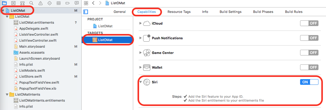 Enable SiriKit in your app’s entitlements. (Large preview)
Further down the list, you can turn on app groups and configure it.
 Configure the app’s app group (Large preview)
If you have set it up correctly, you’ll see this in your app’s .entitlements file:
 The plist shows the entitlements that you set (Large preview)
Now, we are finally ready to add the Intents extension target to our project.
Adding The Intents Extension
We’re finally ready to add the extension. In Xcode, choose “File” → “New Target.” This sheet will pop up:
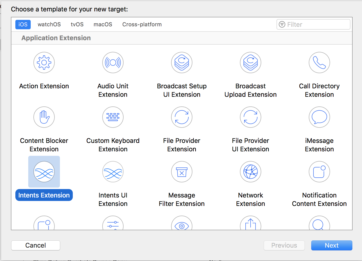 Add the Intents extension to your project (Large preview)
Choose “Intents Extension” and click the “Next” button. Fill out the following screen:
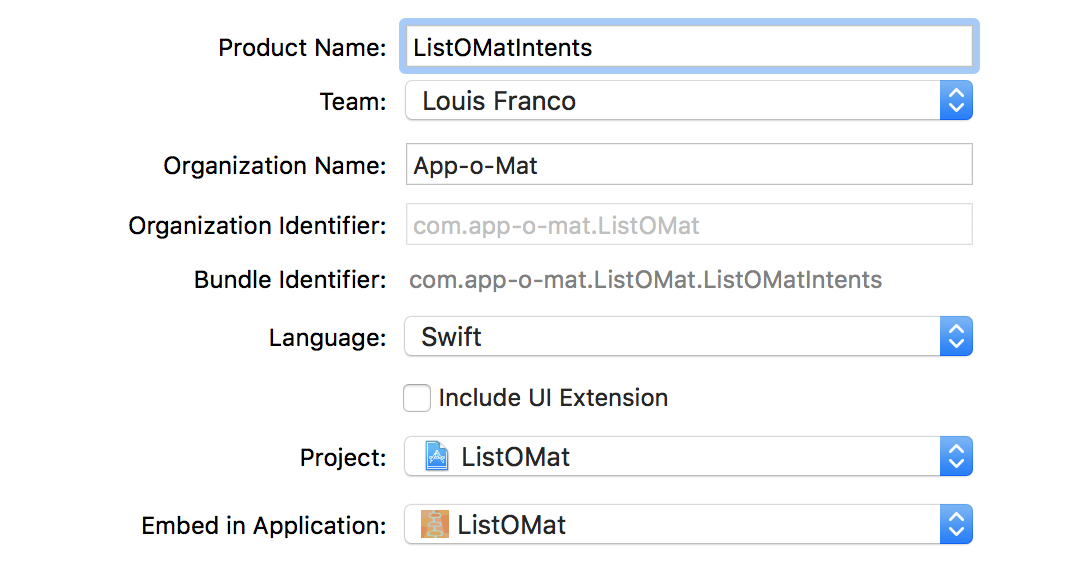 Configure the Intents extension (Large preview)
The product name needs to match whatever you made the suffix in the intents app ID on the Apple developer website.
We are choosing not to add an intents UI extension. This isn’t covered in this article, but you could add it later if you need one. Basically, it’s a way to put your own branding and display style into Siri’s visual results.
When you are done, Xcode will create an intents handler class that we can use as a starting part for our Siri implementation.
The Intents Handler: Resolve, Confirm And Handle
Xcode generated a new target that has a starting point for us.
The first thing you have to do is set up this new target to be in the same app group as the app. As before, go to the “Capabilities” tab of the target, and turn on app groups, and configure it with your group name. Remember, apps in the same group have a sandbox that they can use to share files with each other. We need this in order for Siri requests to get to our app.
List-o-Mat has a function that returns the group document folder. We should use it whenever we want to read or write to a shared file.
func documentsFolder() -> URL? {
return FileManager.default.containerURL(forSecurityApplicationGroupIdentifier: “group.com.app-o-mat.ListOMat”)
}
For example, when we save the lists, we use this:
func save(lists: Lists) {
guard let docsDir = documentsFolder() else {
fatalError(“no docs dir”)
}
let url = docsDir.appendingPathComponent(fileName, isDirectory: false)
// Encode lists as JSON and save to url
}
The Intents extension template created a file named IntentHandler.swift, with a class named IntentHandler. It also configured it to be the intents’ entry point in the extension’s plist.
 The intent extension plist configures IntentHandler as the entry point
In this same plist, you will see a section to declare the intents we support. We’re going to start with the one that allows searching for lists, which is named INSearchForNotebookItemsIntent. Add it to the array under IntentsSupported.
 Add the intent’s name to the intents plist (Large preview)
Now, go to IntentHandler.swift and replace its contents with this code:
import Intents
class IntentHandler: INExtension {
override func handler(for intent: INIntent) -> Any? {
switch intent {
case is INSearchForNotebookItemsIntent:
return SearchItemsIntentHandler()
default:
return nil
}
}
}
The handler function is called to get an object to handle a specific intent. You can just implement all of the protocols in this class and return self, but we’ll put each intent in its own class to keep it better organized.
Because we intend to have a few different classes, let’s give them a common base class for code that we need to share between them:
class ListOMatIntentsHandler: NSObject {
}
The intents framework requires us to inherit from NSObject. We’ll fill in some methods later.
We start our search implementation with this:
class SearchItemsIntentHandler: ListOMatIntentsHandler,
INSearchForNotebookItemsIntentHandling {
}
To set an intent handler, we need to implement three basic steps
Resolve the parameters.
Make sure required parameters are given, and disambiguate any you don’t fully understand.
Confirm that the request is doable.
This is often optional, but even if you know that each parameter is good, you might still need access to an outside resource or have other requirements.
Handle the request.
Do the thing that is being requested.
INSearchForNotebookItemsIntent, the first intent we’ll implement, can be used as a task search. The kinds of requests we can handle with this are, “In List-o-Mat, show the grocery store list” or “In List-o-Mat, show the store list.”
Aside: “List-o-Mat” is actually a bad name for a SiriKit app because Siri has a hard time with hyphens in apps. Luckily, SiriKit allows us to have alternate names and to provide pronunciation. In the app’s Info.plist, add this section:
 Add alternate app name’s and pronunciation guides to the app plist
This allows the user to say “list oh mat” and for that to be understood as a single word (without hyphens). It doesn’t look ideal on the screen, but without it, Siri sometimes thinks “List” and “Mat” are separate words and gets very confused.
Resolve: Figuring Out The Parameters
For a search for notebook items, there are several parameters:
the item type (a task, a task list, or a note),
the title of the item,
the content of the item,
the completion status (whether the task is marked done or not),
the location it is associated with,
the date it is associated with.
We require only the first two, so we’ll need to write resolve functions for them. INSearchForNotebookItemsIntent has methods for us to implement.
Because we only care about showing task lists, we’ll hardcode that into the resolve for item type. In SearchItemsIntentHandler, add this:
func resolveItemType(for intent: INSearchForNotebookItemsIntent,
with completion: @escaping (INNotebookItemTypeResolutionResult) -> Void) {
completion(.success(with: .taskList))
}
So, no matter what the user says, we’ll be searching for task lists. If we wanted to expand our search support, we’d let Siri try to figure this out from the original phrase and then just use completion(.needsValue()) if the item type was missing. Alternatively, we could try to guess from the title by seeing what matches it. In this case, we would complete with success when Siri knows what it is, and we would use completion(.notRequired()) when we are going to try multiple possibilities.
Title resolution is a little trickier. What we want is for Siri to use a list if it finds one with an exact match for what you said. If it’s unsure or if there is more than one possibility, then we want Siri to ask us for help in figuring it out. To do this, SiriKit provides a set of resolution enums that let us express what we want to happen next.
So, if you say “Grocery Store,” then Siri would have an exact match. But if you say “Store,” then Siri would present a menu of matching lists.
We’ll start with this function to give the basic structure:
func resolveTitle(for intent: INSearchForNotebookItemsIntent, with completion: @escaping (INSpeakableStringResolutionResult) -> Void) {
guard let title = intent.title else {
completion(.needsValue())
return
}
let possibleLists = getPossibleLists(for: title)
completeResolveListName(with: possibleLists, for: title, with: completion)
}
We’ll implement getPossibleLists(for:) and completeResolveListName(with:for:with:) in the ListOMatIntentsHandler base class.
getPossibleLists(for:) needs to try to fuzzy match the title that Siri passes us with the actual list names.
public func getPossibleLists(for listName: INSpeakableString) -> [INSpeakableString] {
var possibleLists = [INSpeakableString]()
for l in loadLists() {
if l.name.lowercased() == listName.spokenPhrase.lowercased() {
return [INSpeakableString(spokenPhrase: l.name)]
}
if l.name.lowercased().contains(listName.spokenPhrase.lowercased()) || listName.spokenPhrase.lowercased() == “all” {
possibleLists.append(INSpeakableString(spokenPhrase: l.name))
}
}
return possibleLists
}
We loop through all of our lists. If we get an exact match, we’ll return it, and if not, we’ll return an array of possibilities. In this function, we’re simply checking to see whether the word the user said is contained in a list name (so, a pretty simple match). This lets “Grocery” match “Grocery Store.” A more advanced algorithm might try to match based on words that sound the same (for example, with the Soundex algorithm),
completeResolveListName(with:for:with:) is responsible for deciding what to do with this list of possibilities.
public func completeResolveListName(with possibleLists: [INSpeakableString], for listName: INSpeakableString, with completion: @escaping (INSpeakableStringResolutionResult) -> Void) {
switch possibleLists.count {
case 0:
completion(.unsupported())
case 1:
if possibleLists[0].spokenPhrase.lowercased() == listName.spokenPhrase.lowercased() {
completion(.success(with: possibleLists[0]))
} else {
completion(.confirmationRequired(with: possibleLists[0]))
}
default:
completion(.disambiguation(with: possibleLists))
}
}
If we got an exact match, we tell Siri that we succeeded. If we got one inexact match, we tell Siri to ask the user if we guessed it right.
If we got multiple matches, then we use completion(.disambiguation(with: possibleLists)) to tell Siri to show a list and let the user pick one.
Now that we know what the request is, we need to look at the whole thing and make sure we can handle it.
Confirm: Check All Of Your Dependencies
In this case, if we have resolved all of the parameters, we can always handle the request. Typical confirm() implementations might check the availability of external services or check authorization levels.
Because confirm() is optional, we could just do nothing, and Siri would assume we could handle any request with resolved parameters. To be explicit, we could use this:
func confirm(intent: INSearchForNotebookItemsIntent, completion: @escaping (INSearchForNotebookItemsIntentResponse) -> Void) {
completion(INSearchForNotebookItemsIntentResponse(code: .success, userActivity: nil))
}
This means we can handle anything.
Handle: Do It
The final step is to handle the request.
func handle(intent: INSearchForNotebookItemsIntent, completion: @escaping (INSearchForNotebookItemsIntentResponse) -> Void) {
guard
let title = intent.title,
let list = loadLists().filter({ $0.name.lowercased() == title.spokenPhrase.lowercased()}).first
else {
completion(INSearchForNotebookItemsIntentResponse(code: .failure, userActivity: nil))
return
}
let response = INSearchForNotebookItemsIntentResponse(code: .success, userActivity: nil)
response.tasks = list.items.map {
return INTask(title: INSpeakableString(spokenPhrase: $0.name),
status: $0.done ? INTaskStatus.completed : INTaskStatus.notCompleted,
taskType: INTaskType.notCompletable,
spatialEventTrigger: nil,
temporalEventTrigger: nil,
createdDateComponents: nil,
modifiedDateComponents: nil,
identifier: “(list.name)t($0.name)”)
}
completion(response)
}
First, we find the list based on the title. At this point, resolveTitle has already made sure that we’ll get an exact match. But if there’s an issue, we can still return a failure.
When we have a failure, we have the option of passing a user activity. If your app uses Handoff and has a way to handle this exact type of request, then Siri might try deferring to your app to try the request there. It will not do this when we are in a voice-only context (for example, you started with “Hey Siri”), and it doesn’t guarantee that it will do it in other cases, so don’t count on it.
This is now ready to test. Choose the intent extension in the target list in Xcode. But before you run it, edit the scheme.
 Edit the scheme of the the intent to add a sample phrase for debugging.
That brings up a way to provide a query directly:
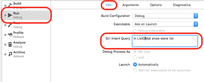 Add the sample phrase to the Run section of the scheme. (Large preview)
Notice, I am using “ListOMat” because of the hyphens issue mentioned above. Luckily, it’s pronounced the same as my app’s name, so it should not be much of an issue.
Back in the app, I made a “Grocery Store” list and a “Hardware Store” list. If I ask Siri for the “store” list, it will go through the disambiguation path, which looks like this:
 Siri handles the request by asking for clarification. (Large preview)
If you say “Grocery Store,” then you’ll get an exact match, which goes right to the results.
Adding Items Via Siri
Now that we know the basic concepts of resolve, confirm and handle, we can quickly add an intent to add an item to a list.
First, add INAddTasksIntent to the extension’s plist:
 Add the INAddTasksIntent to the extension plist (Large preview)
Then, update our IntentHandler’s handle function.
override func handler(for intent: INIntent) -> Any? {
switch intent {
case is INSearchForNotebookItemsIntent:
return SearchItemsIntentHandler()
case is INAddTasksIntent:
return AddItemsIntentHandler()
default:
return nil
}
}
Add a stub for the new class:
class AddItemsIntentHandler: ListOMatIntentsHandler, INAddTasksIntentHandling {
}
Adding an item needs a similar resolve for searching, except with a target task list instead of a title.
func resolveTargetTaskList(for intent: INAddTasksIntent, with completion: @escaping (INTaskListResolutionResult) -> Void) {
guard let title = intent.targetTaskList?.title else {
completion(.needsValue())
return
}
let possibleLists = getPossibleLists(for: title)
completeResolveTaskList(with: possibleLists, for: title, with: completion)
}
completeResolveTaskList is just like completeResolveListName, but with slightly different types (a task list instead of the title of a task list).
public func completeResolveTaskList(with possibleLists: [INSpeakableString], for listName: INSpeakableString, with completion: @escaping (INTaskListResolutionResult) -> Void) {
let taskLists = possibleLists.map {
return INTaskList(title: $0, tasks: [], groupName: nil, createdDateComponents: nil, modifiedDateComponents: nil, identifier: nil)
}
switch possibleLists.count {
case 0:
completion(.unsupported())
case 1:
if possibleLists[0].spokenPhrase.lowercased() == listName.spokenPhrase.lowercased() {
completion(.success(with: taskLists[0]))
} else {
completion(.confirmationRequired(with: taskLists[0]))
}
default:
completion(.disambiguation(with: taskLists))
}
}
It has the same disambiguation logic and behaves in exactly the same way. Saying “Store” needs to be disambiguated, and saying “Grocery Store” would be an exact match.
We’ll leave confirm unimplemented and accept the default. For handle, we need to add an item to the list and save it.
func handle(intent: INAddTasksIntent, completion: @escaping (INAddTasksIntentResponse) -> Void) {
var lists = loadLists()
guard
let taskList = intent.targetTaskList,
let listIndex = lists.index(where: { $0.name.lowercased() == taskList.title.spokenPhrase.lowercased() }),
let itemNames = intent.taskTitles, itemNames.count > 0
else {
completion(INAddTasksIntentResponse(code: .failure, userActivity: nil))
return
}
// Get the list
var list = lists[listIndex]
// Add the items
var addedTasks = [INTask]()
for item in itemNames {
list.addItem(name: item.spokenPhrase, at: list.items.count)
addedTasks.append(INTask(title: item, status: .notCompleted, taskType: .notCompletable, spatialEventTrigger: nil, temporalEventTrigger: nil, createdDateComponents: nil, modifiedDateComponents: nil, identifier: nil))
}
// Save the new list
lists[listIndex] = list
save(lists: lists)
// Respond with the added items
let response = INAddTasksIntentResponse(code: .success, userActivity: nil)
response.addedTasks = addedTasks
completion(response)
}
We get a list of items and a target list. We look up the list and add the items. We also need to prepare a response for Siri to show with the added items and send it to the completion function.
This function can handle a phrase like, “In ListOMat, add apples to the grocery list.” It can also handle a list of items like, “rice, onions and olives.”
 Siri adds a few items to the grocery store list
Almost Done, Just A Few More Settings
All of this will work in your simulator or local device, but if you want to submit this, you’ll need to add a NSSiriUsageDescription key to your app’s plist, with a string that describes what you are using Siri for. Something like “Your requests about lists will be sent to Siri” is fine.
You should also add a call to:
INPreferences.requestSiriAuthorization { (status) in }
Put this in your main view controller’s viewDidLoad to ask the user for Siri access. This will show the message you configured above and also let the user know that they could be using Siri for this app.
 The device will ask for permission if you try to use Siri in the app.
Finally, you’ll need to tell Siri what to tell the user if the user asks what your app can do, by providing some sample phrases:
Create a plist file in your app (not the extension), named AppIntentVocabulary.plist.
Fill out the intents and phrases that you support.
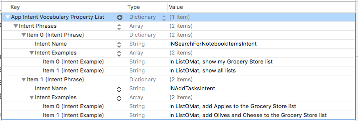 Add an AppIntentVocabulary.plist to list the sample phrases that will invoke the intent you handle. (Large preview)
There is no way to really know all of the phrases that Siri will use for an intent, but Apple does provide a few samples for each intent in its documentation. The sample phrases for task-list searching show us that Siri can understand “Show me all my notes on <appName>,” but I found other phrases by trial and error (for example, Siri understands what “lists” are too, not just notes).
Summary
As you can see, adding Siri support to an app has a lot of steps, with a lot of configuration. But the code needed to handle the requests was fairly simple.
There are a lot of steps, but each one is small, and you might be familiar with a few of them if you have used extensions before.
Here is what you’ll need to prepare for a new extension on Apple’s developer website:
Make an app ID for an Intents extension.
Make an app group if you don’t already have one.
Use the app group in the app ID for the app and extension.
Add Siri support to the app’s ID.
Regenerate the profiles and download them.
And here are the steps in Xcode for creating Siri’s Intents extension:
Add an Intents extension using the Xcode template.
Update the entitlements of the app and extension to match the profiles (groups and Siri support).
Add your intents to the extension’s plist.
And you’ll need to add code to do the following things:
Use the app group sandbox to communicate between the app and extension.
Add classes to support each intent with resolve, confirm and handle functions.
Update the generated IntentHandler to use those classes.
Ask for Siri access somewhere in your app.
Finally, there are some Siri-specific configuration settings:
Add the Siri support security string to your app’s plist.
Add sample phrases to an AppIntentVocabulary.plist file in your app.
Run the intent target to test; edit the scheme to provide the phrase.
OK, that is a lot, but if your app fits one of Siri’s domains, then users will expect that they can interact with it via voice. And because the competition for voice assistants is so good, we can only expect that WWDC 2018 will bring a bunch more domains and, hopefully, much better Siri.
Further Reading
“SiriKit,” Apple
The technical documentation contains the full list of domains and intents.
“Guides and Sample Code,” Apple
Includes code for many domains.
“Introducing SiriKit” (video, Safari only), WWDC 2016 Apple
“What’s New in SiriKit” (video, Safari only), WWDC 2017, Apple
Apple introduces lists and notes
“Lists and Notes,” Apple
The full list of lists and notes intents.

(da, ra, al, il)














 Making lists in List-o-Mat (Large preview)
 Registering an app group (Large preview)
 Enable app groups (Large preview)
 Set the name of the app group (Large preview)
 Enable SiriKit (Large preview)
 Create an app ID for the Intents extension (Large preview)
 Enable SiriKit in your app’s entitlements. (Large preview)
 Configure the app’s app group (Large preview)
 The plist shows the entitlements that you set (Large preview)
 Add the Intents extension to your project (Large preview)
 Configure the Intents extension (Large preview)
 Add the intent’s name to the intents plist (Large preview)
 Add alternate app name’s and pronunciation guides to the app plist
 Edit the scheme of the the intent to add a sample phrase for debugging.
 Add the sample phrase to the Run section of the scheme. (Large preview)
 Siri handles the request by asking for clarification. (Large preview)
 Add the INAddTasksIntent to the extension plist (Large preview)
 Siri adds a few items to the grocery store list
 The device will ask for permission if you try to use Siri in the app.
 Add an AppIntentVocabulary.plist to list the sample phrases that will invoke the intent you handle. (Large preview)


