Quickly Create Simple Yet Powerful Angular Forms

Original Source: https://www.sitepoint.com/angular-forms/

Forms are an essential part of many web applications, being the most common way to enter and edit text-based data. Front-end JavaScript frameworks such as Angular, often have their own idiomatic ways of creating and validating forms that you need to get to grips with to be productive.

Angular allows you to streamline this common task by providing two types of forms that you can create:

Template-driven forms – simple forms that can be made rather quickly.
Reactive forms – more complex forms that give you greater control over the elements in the form.

In this article, we’ll make a simple example form with each method to see how it’s done.

Prerequisites

You do not need to know all the details of how to create an Angular application to understand the framework’s usefulness when it comes to forms. However, if you want to get a better grasp of Angular, you can take a look at this SitePoint article series on building a CRUD app with Angular.

Requirements

We will use Bootstrap in this tutorial. It is not an integral part of an Angular application, but it will help us streamline our efforts even further by providing ready-made styles.

This is how you can add it to your application:

Open the command prompt and navigate to the folder of your project

Type npm install bootstrap@next. This will add the latest version of bootstrap to the project

Edit the .angular-cli.json file and add a link to the Bootstrap CSS file

“apps”: [
“styles”: [
“../node_modules/bootstrap/dist/css/bootstrap.css”
]
]

We will not use the Bootstrap JavaScript file in this application.

Both template-driven Forms and Reactive Forms require the FormsModule. It should be added to the application in app.module:

import { FormsModule } from ‘@angular/forms’;
@NgModule({
imports: [
BrowserModule,
FormsModule
]
})

With that out of the way, we can proceed with the forms themselves.

Template-Driven Forms

Let us assume you want to create a simple form as quickly as possible. For example, you need a company registration form. How can you create the form?

The first step is to create the <form> tag in your view.

<form #companyForm=”ngForm”>

We need to modify this tag in two ways in order to submit the form and use the information from the input fields in our component:

We will declare a template variable using the ngForm directive.
We will bind the ngSubmit event to a method we will create in our component

<form #companyForm=”ngForm” (ngSubmit)=”submitCompany(companyForm.form);”>

We will create the submitCompany method in the component a bit later. It will be called when the form is submitted and we will pass it the data from the form via companyForm.form.

We also need a submit button, regardless of the content of the form. We will use a few Bootstrap classes to style the button. It is good practice to disable the button before all the data validation requirements are met. We can use the template variable we created for the form to achieve this. We will bind the disabled property to the valid property of the companyForm object. This way the button will be disabled if the form is not valid.

<button class=”btn btn-primary” [disabled]=”!companyForm.valid”>Submit</button>

Let us assume our simple form will have two fields – an input field for the name of the company and a drop-down field for the company’s industry.

Creating form inputs

First, we create an input field for the name:

<input type=”text”
class=”form-control”
name=”company-name”>

Right now we have a standard input with the type, name and class attributes. What do we need to do to use the Angular approach on our input?

We need to apply the ngModel directive to it. Angular will create a control object and associate it with the field. Essentially, Angular does some of the work for you behind the scenes.

This is a good time to mention that ngModel requires the input field to have a name or the form control must be defined as standalone in ngModelOptions. This is not a problem because our form already has a name. Angular will use the name attribute to distinguish between the control objects.

In addition, we should specify a template variable for the input: #nameField in this case. Angular will set nameField to the ngModel directive that is applied to the input field. We will use this later for the input field’s validation. This variable will also allow us to perform an action based on the value of the field while we are typing in it.

Now our input looks like this:

<input type=”text”
class=”form-control”
name=”company-name”
ngModel
#nameField=”ngModel”>

It is almost the same, but with a few key changes.

Validation

Let us assume we want the company name field to be required and to have a minimum length of 3 characters. This means we have to add the required and minlength attributes to our input:

<input type=”text”
class=”form-control”
name=”company-name”
ngModel
#nameField=”ngModel”
required
minlength=”3″>

Sounds simple enough, right? We will also need to display an error message if any of these two requirements are not met. Angular allows us to check the input’s value and display the appropriate error message before the form is submitted.

We can perform such a check while the user is typing in the form. First of all, it is a good idea to display an error only after the user has started to interact with the form. There is no use in displaying an error message right after we load the page. This is why we will insert all the error messages for this input inside the following div:

<div *ngIf=”nameField.touched && nameField.errors”></div>

The ngIf directive allows us to show the div only when a specific condition is true. We will use the nameField template variable again here because it is associated with the input. In our case, the div will be visible only, if the input has been touched and there is a problem with it. Alright, what about the error messages themselves?

We will place another div inside the aforementioned one for each error message we want. We will create a new div for the error message and use the nameField template variable again:

<div class=”alert alert-danger”
*ngIf=”nameField.errors.required”>
The company name is required
</div>

We are using the “alert alert-danger” bootstrap classes to style the text field. The nameField variable has the property errors, which contains an object with key-value pairs for all the current errors. The ngIf directive allows us to show this error message only when the ‘required’ condition is not met. We will use the same approach for the error message about the minimum length.

Continue reading %Quickly Create Simple Yet Powerful Angular Forms%

Web Design Inspiration for the Week

Original Source: http://feedproxy.google.com/~r/abduzeedo/~3/8-C6uvb6R-I/web-design-inspiration-week

Web Design Inspiration for the Week

Web Design Inspiration for the Week

abduzeedo
Mar 12, 2018

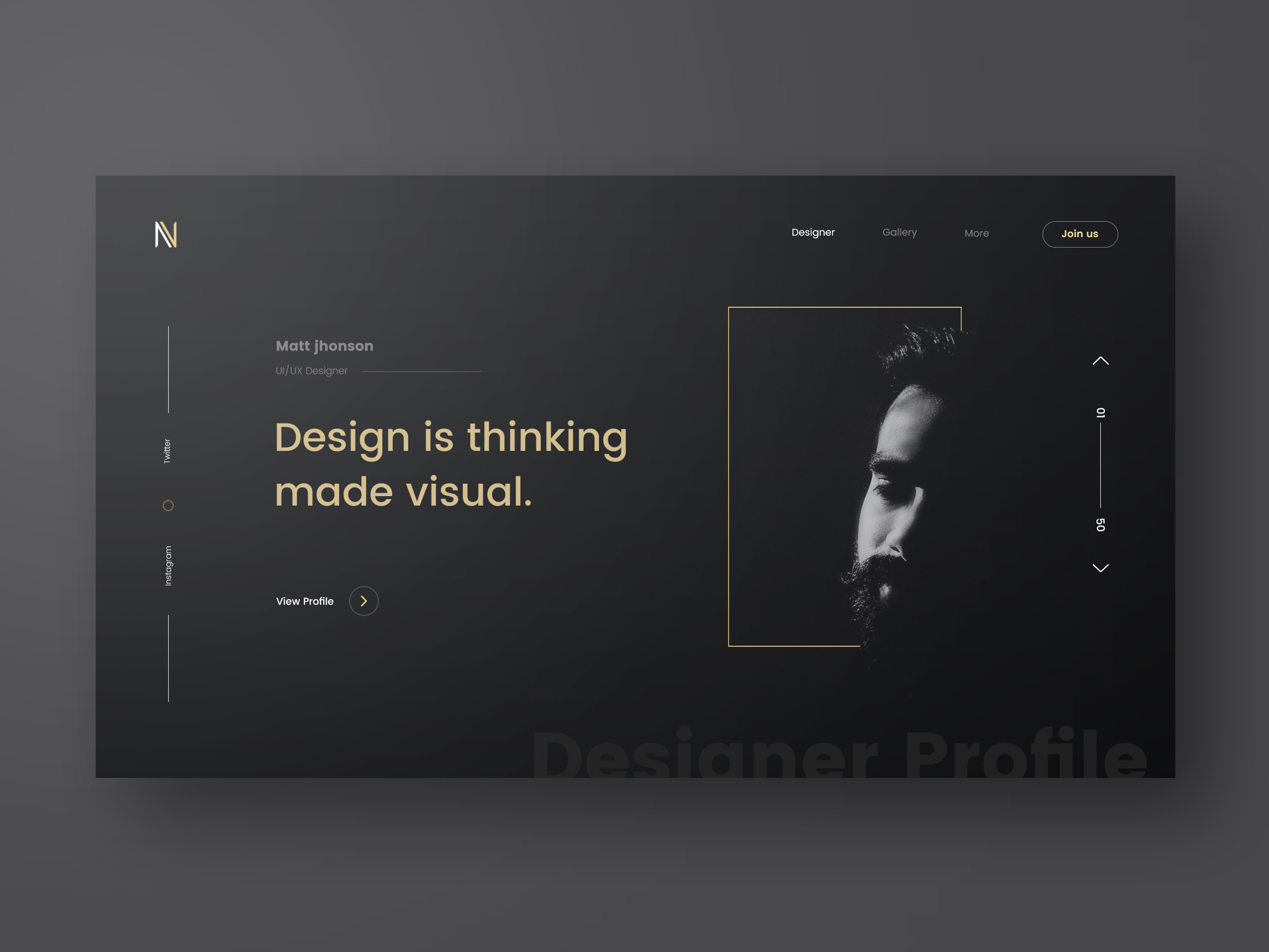
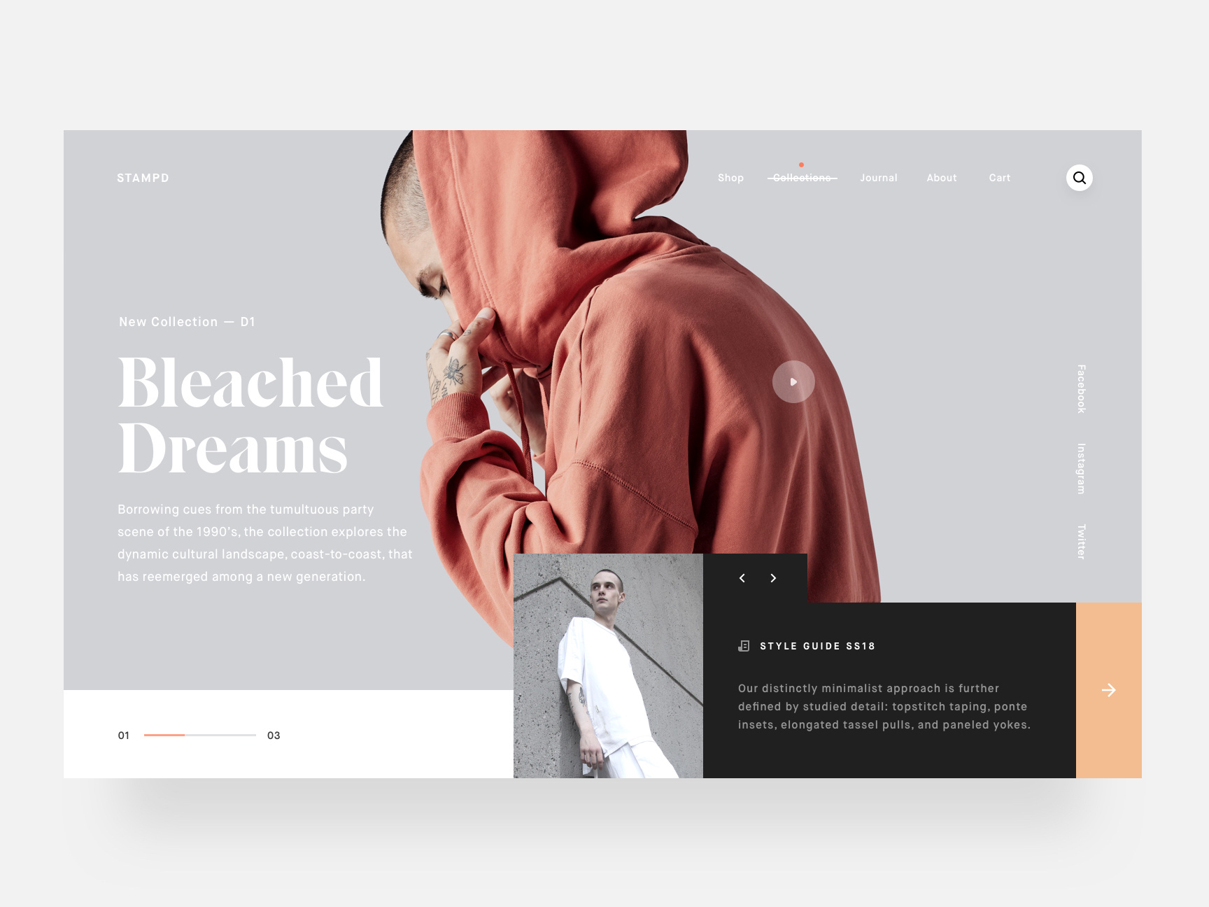
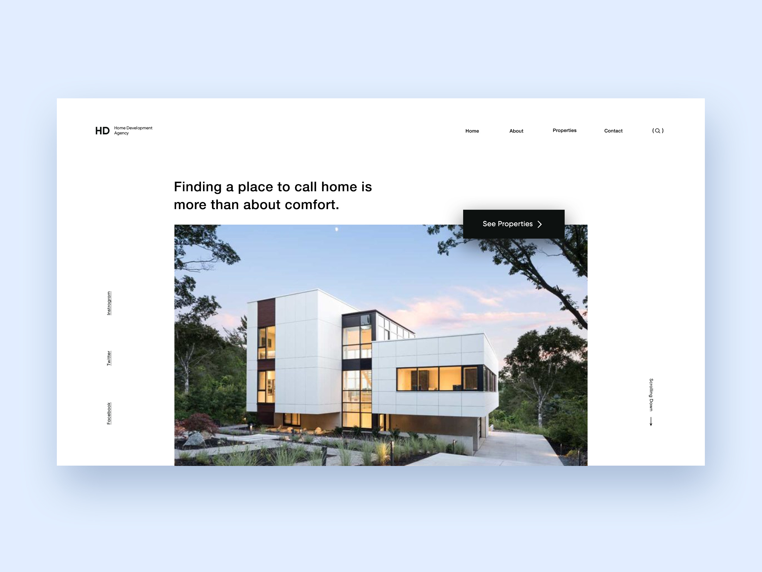
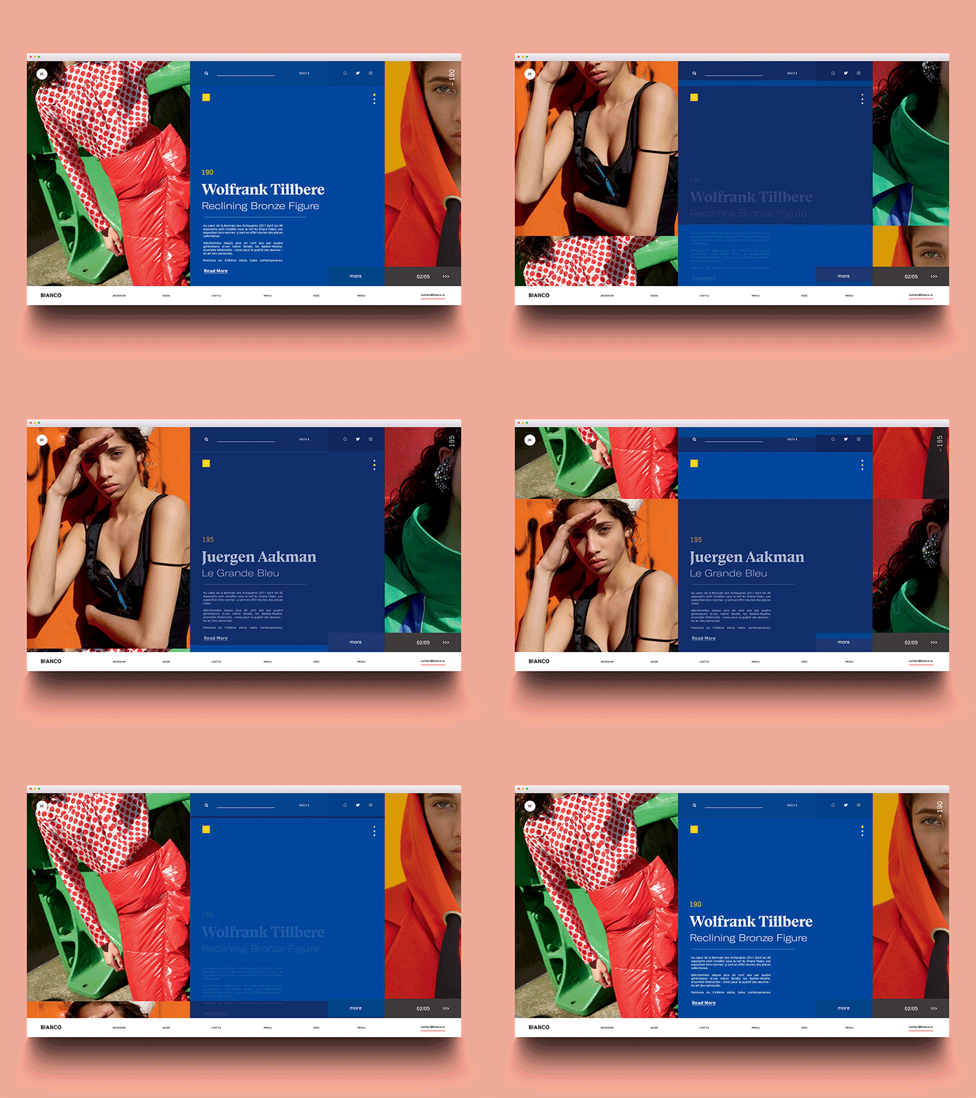
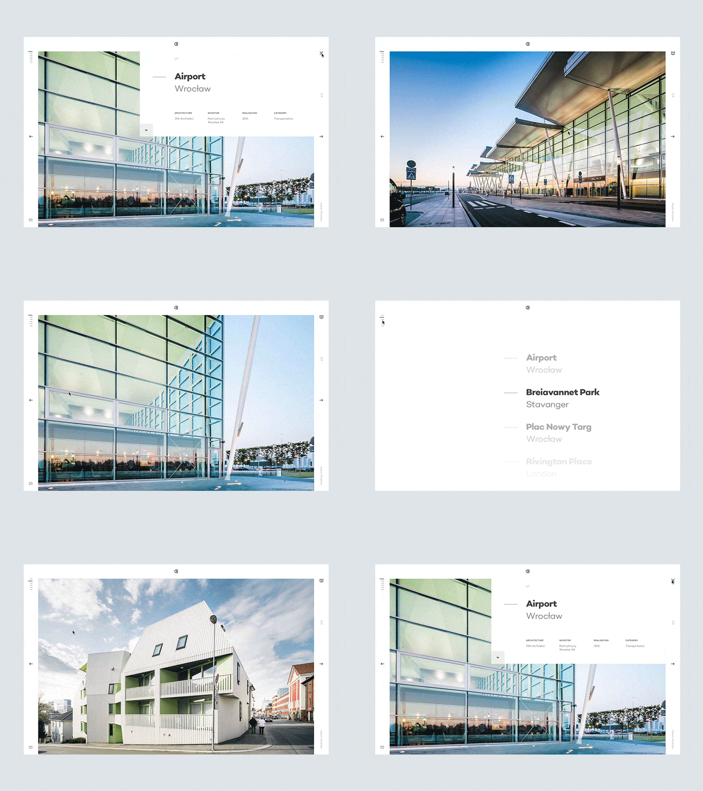
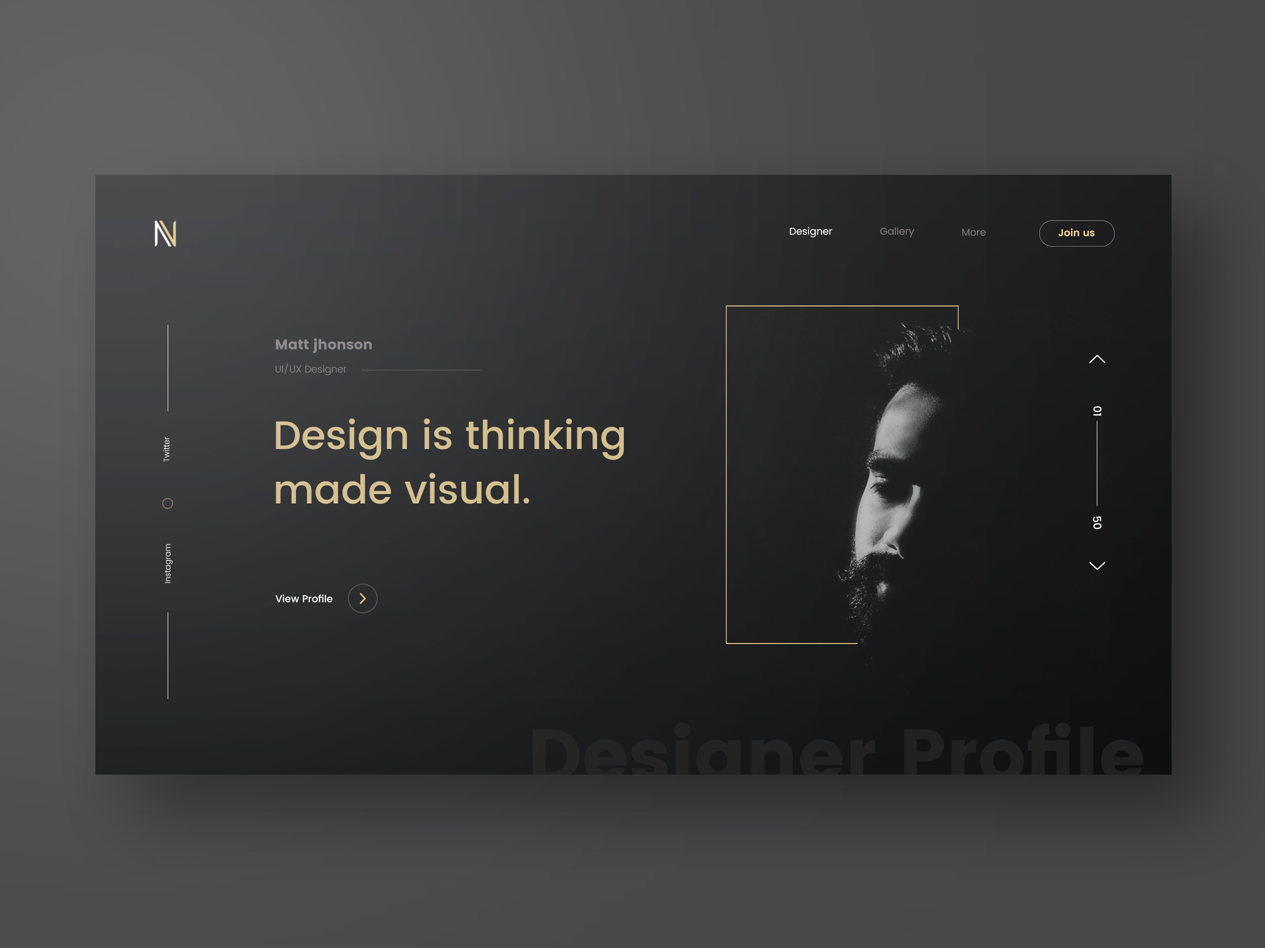
We tend to focus most of our efforts on mobile design because, we carry those devices with us all the time and it is probably the first experience we will have with most of digital content. However I feel that the desktop web design might come back stronger, at least in terms of design. I have seen beautiful designs coming from sites like Dribbble and Behance. The biggest constraint the web has is the monetization. Till today the best way to do that is by including advertising on the pages. Those can add clutter and break the purity of the designs. I’d love to propose a challenge for who design the best concepts that include ads. Maybe that could be the next ABDZ challenge, what do you think?

For this post I will share some web design concepts I captured during my daily visit to Dribbble. Check out and see if you can spot a new emerging pattern.

Web design

ArchBetraydan stampdHumble Buildings ArchitectureHome development agencyBianco2S p e t i aFoto2Designer profile full viewRecently Added

web design


Building a New Parse Server & MongoDB Atlas-Based Application

Original Source: https://www.sitepoint.com/building-new-parse-server-mongodb-atlas-based-application/

This article was originally published on mongoDB. Thank you for supporting the partners who make SitePoint possible.

Whether you’re migrating from the deprecated Parse.com (api.parse.com) or building a new application, the Parse Server community is alive and strong, and since Parse Server version 2.1.11, there is support for MongoDB 3.2 which makes MongoDB Atlas an ideal back-end for Parse Server based applications.

Existing hosted Parse / api.parse.com users can migrate their back-end using Parse’s Database Migration tool directly to MongoDB Atlas using a connection string like the following (with bold items replaced with your details):

[code language=”bash”]
mongodb://username:password@node1.mongodb.net:27017,node2.mongodb.net:27017,node3.mongodb.net:27017/applicationDbName?replicaSet=clusterName-shard-0&ssl=true&authSource=admin
[/code]

We will learn in this blog post:

How to deploy a MongoDB Atlas cluster
How to deploy the Parse Server (in our case we will show how to do so using AWS Elastic Beanstalk quick start, but updated to use the newest version of Parse Server)
How to configure Parse Server to connect to MongoDB Atlas
How to confirm connectivity

How to Set Up A New Sample Parse Server Application with A MongoDB Atlas Back End

Deploy MongoDB Atlas cluster
Consider sizing options but start small for a hello world style application. You can always scale later (MongoDB Atlas allows you to migrate to larger instances with no downtime to your database).
Register for MongoDB Atlas at mongodb.com/atlas
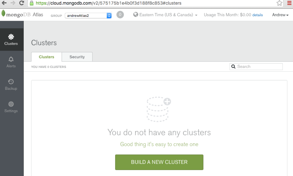
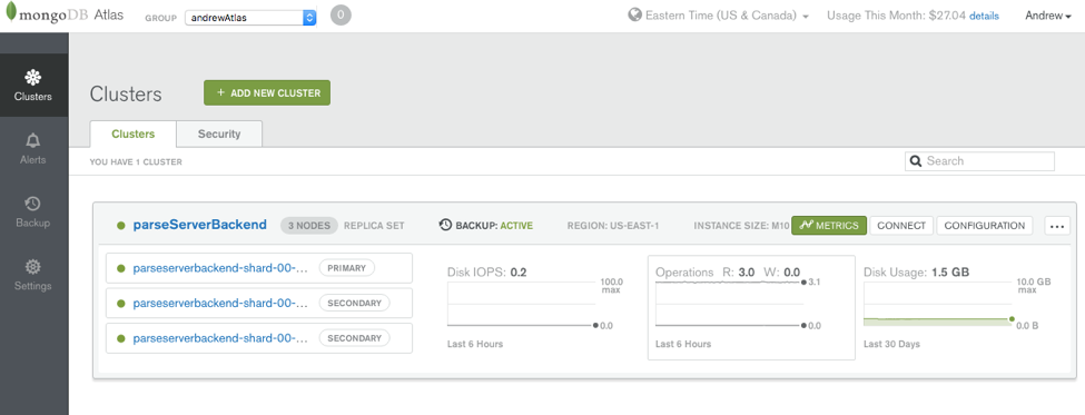
Build and deploy your first cluster (we’ll use a small M10 instance-sized replica set for our example, and deploy it into the US East region) Parse Server Clusters
MongoDB Atlas Cluster
We’ll Create a user with at least readWrite on the applicationDbName database (or the user with readWriteAnyDatabase@admin which gets created automatically will do) Parse Server Mongo DB Atlas

For testing purposes, we will open IP address to all IP addresses initially (0.0.0.0/0): Later we should leave only open to our application servers’ public IP addresses. Parse Server MongoDB Atlas
Choose where and how you want to deploy the Parse Server:
Many options are described here, some of which provide easier set-ups than others. AWS Elastic Beanstalk and Heroku are easy options.

Continue reading %Building a New Parse Server & MongoDB Atlas-Based Application%

20 Best Free Email Marketing Tools And Resources

Original Source: https://www.hongkiat.com/blog/email-marketing-tools-resources/

Email marketing is an essential part of marketing, and one of the best ways to build and maintain relationships with clients and customers. Of course, you can design and send out all the emails…

Visit hongkiat.com for full content.

How to Set New Default Apps in Windows 10

Original Source: https://www.hongkiat.com/blog/change-default-apps-windows-10/

I am not a big fan of Windows 10 built-in apps, which is why I always download third-party alternatives that are usually more powerful. However, this also forces me to manage default apps frequently….

Visit hongkiat.com for full content.

An Introductory Guide To Business Insurance For Designers And Developers

Original Source: https://www.smashingmagazine.com/2018/03/guide-business-insurance-designers-developers/

At some point in your career, most web designers and developers can relate to issues with scope creep, unexpected project delays, client relationships breaking down, and unpaid invoices. The good news is that there’s an insurance policy to help with these scenarios. In the UK, we call it “professional indemnity insurance.” Elsewhere, it can be called “professional liability” or “errors and omissions insurance.”

Let’s explore what this insurance is and how it’s designed to keep web professionals in business. I’ll also be sharing real stories of businesses who were glad they had insurance.

What Is Professional Indemnity Insurance?

Professional indemnity insurance protects your business from screw-ups and problem clients.

Let’s say a client threatens legal action, claims loss of income or damages due to a service you provided. Even if you’re in the wrong, professional indemnity steps in to ensure the consequences to your business aren’t crippling.

A creative agency working on a project together

A creative agency working on a project together. (Large preview)

It’s also important to distinguish what professional indemnity insurance isn’t. After all, business insurance is an umbrella term for different types of cover. One of those covers is public liability insurance — or general liability insurance as it’s known in the US.

Public liability insures your business against claims of:

physical injury to clients and members of the public
accidents on your work premises
damage to third-party property.

This is a popular cover for those who have clients visit their office or those who work from client premises. However, in this article, we’re focusing exclusively on professional indemnity.

Getting the process just right ain’t an easy task. That’s why we’ve set up ‘this-is-how-I-work’-sessions — with smart cookies sharing what works really well for them. A part of the Smashing Membership, of course.

Explore features →

Smashing TV, with live sessions for professional designers and developers.

How Can Insurance Help Me If I’m A Designer Or Developer?

Business insurance isn’t often talked about in web circles. I think it’s because insurers have focused their products and user experience on traditional industries. A lot of the information out there isn’t relevant to those of us working in digital.

To add to that, people don’t equate working with a computer as being a danger or massive liability. Especially when you have all of your clients sign a contract. This can lull designers and developers into a false sense of security. A common objection I hear from web professionals when talking about insurance is:

I can’t cause any damage as a web designer. For anything that does go wrong, I have a clause in my contract that says I’m not liable.

Firstly, I have to debunk the myth of not needing to have insurance because you work with a contract. Contracts don’t alleviate you from liability. They’re useful for laying the foundation of what duties are expected of both parties, but insurance steps into action when those duties come into question.

With every scenario I’m sharing today, they all had the following in common:

A contract was signed by both parties.
They had years of experience in their profession.
They were professionally insured, but never expected to have to use their insurance.

Below are real stories of how professional indemnity insurance helped these designers and developers.

Scope Creep

A developer built a web platform to spec, but the client complained of missing functionality.

The developer agreed to build the perceived missing functionality for a further fee, but the client believed it should have been included in the initial build. Not only did the client refuse to pay the remaining invoice, but they threatened legal action if the developer didn’t cooperate.

Having professional indemnity insurance meant that the developer had a team of legal experts behind him. They helped the developer communicate with his client to avoid the problem escalating.

The developer’s professional indemnity policy also had a mitigation costs clause. This meant the insurer paid the amount owed to him by his client, which was thousands of pounds.

Project Delays

Designers and developers often work to tight deadlines. Missing deadlines can cause problems if the project has an important launch date.

A creative agency was hired to design a website, but the project started to unravel. Key members of the team left part way through the project and the pace of the work being completed slowed down.

While the website was delivered in time for launch, it was missing a lot of major features. The client said it wasn’t fit for purpose.

After wasting money on a marketing campaign for the launch, the client refused to pay the final invoice. They also incurred extra expenses from hiring new contractors to complete the website’s missing features.

The client threatened to involve solicitors if the agency pursued payment.

The unpaid invoice was settled by the insurer under the mitigation costs clause of their professional indemnity policy. The insurer also provided the agency with legal advisors to confirm with the client that the project is considered at an end.

Client Relationships Breaking Down

This is a common catalyst for professional indemnity claims. Even if we spot a few amber flags, we like to believe we can make our client relationships work and projects run smoothly. However scary it is, sometimes you have to burn bridges with a client.

A designer did this when working with a client they felt didn’t respect them. An ever-changing scope, long hours, and poor pay lead to a breakdown in the relationship. What had started off as a promising project was now a strained working relationship and source of stress. The designer decided to walk away from the project.

Unfortunately, that wasn’t the end of things. The client wanted to be reimbursed for the money they had already paid to the designer. They also wanted damages for the loss of income due to a delayed launch and compensation for hiring other contractors to complete the project.

A team of legal experts was arranged by the insurer to deal with the designer’s client. A settlement was agreed out of court, which was also covered by the insurer.

What Does A Professional Indemnity Policy Insure Against?

Professional indemnity insurance is a meaty policy, so it isn’t feasible to cover every scenario here. At its core, it’s designed to put your business back in the same financial position after a loss as it was in before a loss. As you can see from the stories above, a loss can be legal fees, client damages, compensation or even unpaid invoices. However, this has to stem from a client expressing dissatisfaction with your work.

While all professional indemnity policies differ, let’s look at some of the key features you can expect to see.

Defence Costs

If a client makes a claim against you, your professional indemnity policy will pay the defence costs. This isn’t just for situations that have escalated to court. Insurers want to solve problems before they get to that stage, so they’ll provide a team of legal experts to help negotiate terms with your client.

Intellectual Property Infringement

Web and graphic designers are vulnerable to arguments over copyright infringement, whereas developers could get into disputes over who owns the code. This clause covers claims against copyright infringement, trademarks, slogans, and even domain names.

Mitigation Costs

If you read the stories above, you’ll have seen mitigation costs mentioned where unpaid invoices were paid by the insurer. If a client is dissatisfied with your work, refuses to pay any or all your fees and threatens to bring a claim against you, professional indemnity may pay the amount owed to you by your client. This is only if the insurer believes it will avoid a claim for a greater amount.

Negligence

Negligence covers a broad spectrum, but think of this as a warranty for any mistakes you make that lead to an unhappy client.

Unintentional Breach Of Contract

Breach of contract can take many forms. It could be something as simple as failing to deliver a project on time or not meeting the client’s expectations. Any breach of contract may entitle the client to make a claim against you.

A web developer working on his laptop

A web developer working on his laptop. (Large preview)

Some Practical Tips For Buying Insurance

The first question people ask when it comes to buying insurance is, “How much should I insure my business for?”. The level of cover will typically start at £100,000 and can go well into the millions. It can be a difficult question to answer, but there are factors that can help you arrive at a reasonable figure.

Client Contracts

If your client contract has an insurance clause, it’s usually for £1,000,000 of professional indemnity. This is the base level of cover a client would expect. It’s the most common level of cover I see businesses buy.

Types of Clients

What type of clients are you working with? Is it large corporations with in-house legal teams, or local small businesses? It’s not unwise to assume the larger companies pose a bigger threat, therefore should have a higher level of cover. You may also find that larger companies will have an insurance clause in their contract.

Type Of Work You Do

A developer building a payment platform will potentially face a bigger risk than somebody designing a website to showcase a restaurant’s menu. Does your work involve dealing with sensitive information or higher-cost products? Are businesses depending on your service to generate income for them?

If it feels like I’ve skirted around answering this, it’s because there isn’t a straightforward figure. A lot of insurers will simply tell you to buy what you’ve budgeted for. If in doubt, consider a base level of £1,000,000 and periodically evaluate your clients and type of work you do. Most insurers allow you to make a mid-term adjustment part way through your policy to increase your level of cover.

Other than the cost of insurance, there are a few other factors to be aware of when buying insurance.

Insuring More Than One Activity

The web is a multi-disciplinary industry. You should be looking for a policy that can cover your various activities. A web developer may also provide web hosting. A designer may also offer consulting services. If you fall outside of the typical box, you might find it useful talking to a broker or using a service like With Jack where your policy can be customized instead of using an online comparison site.

Insuring Your Work Worldwide

By default, professional indemnity policies in the UK exclude US jurisdiction. If you’re working with US clients under US contract law, look for an insurer that can lift the jurisdictional limit from your policy, so you’re insured worldwide. Just beware that it will increase your premium.

Your Policy Can Adapt To Your Needs

Insurance can be flexible. Don’t delay buying insurance because you’re thinking of switching from sole trader to Limited company down the line, or because you’re waiting to add a new service to your business. A good insurance company will allow you to adjust your policy, adapting it as your business changes and grows.

How Insurance Can Help You Build A Bulletproof Business

Whenever I see newcomers ask for advice on starting their business in the web industry, I see a lot of suggestions that look like this:

“Get an accountant immediately.”
“Build a network!”
“Have your clients sign a contract.”
“Monitor your cashflow!”

This is all great advice, of course, but rarely do I see anybody mentioning getting insured. Insurance should be a crucial part of any professional designer or developer’s toolbox.

Offering your professional services to clients comes with a degree of risk. It’s your responsibility to mitigate that risk. You have to be confident that — if something does go wrong — you can get back to work quickly. There can be issues with mistakes in your work, a relationship going sour or a client claiming they’re unhappy with your service. It doesn’t matter how good you are, these things happen!

This is why I’m sharing these stories — to highlight the importance of being insured. I want to get web professionals not just thinking about insurance, but understanding it. Insurance is something we don’t necessarily want to budget for or consider, yet as professionals, we have to. The stories above show how critical it can be.

So yes, work with a contract. Monitor your cash flow. Have an accountant manage your bookkeeping, but also get insured. There’s little point in building your business only for one problem client or mistake to take it away from you.

Smashing Editorial
(ra, yk, il)

Pay What You Want for the Absolute Python Bundle

Original Source: http://feedproxy.google.com/~r/Designrfix/~3/gDYyIHPmEvg/pay-what-you-want-absolute-python-bundle

Python is a popular programming language for general purpose programming. It is a simple, easy to use syntax that can be used to build just about anything. Python is a fun and easy language to learn, even for beginners; thus, making it an ideal choice for individuals who want to get started in learning computer […]

The post Pay What You Want for the Absolute Python Bundle appeared first on designrfix.com.

An Introduction to TypeScript: Static Typing for the Web

Original Source: https://www.sitepoint.com/introduction-to-typescript/

TypeScript is one of many attempts at creating a better experience with JavaScript.

“Oh, I’m using Gulp because of reason A” or “Oh, I’m using Redux because of reason B”. You hear these sorts of things from front-end developers all the time. It’s become fashionable to use new ways of improving on JavaScript’s old faults, and that’s not a bad thing. Even ES2015 and the updates that have followed have been pretty determined attempts at righting those wrongs.

TypeScript is a promising change to our favorite language that may be having a significant impact on JavaScript’s future.

What Exactly is TypeScript?

TypeScript is a strongly-typed superset of JavaScript, which means it adds some syntactical benefits to the language while still letting you write normal JavaScript if you want to. It encourages a more declarative style of programming through things like interfaces and static typing (more on these later), offers modules and classes, and most importantly, integrates relatively well with popular JavaScript libraries and code. You could think of it as a strongly static layer over current JavaScript that has a few features to make life (and debugging especially) a bit more bearable.

TypeScript gained particular attention a few years ago because it was selected for full support by Angular 2 and following (which is also written in TypeScript itself). It’s also developed by Microsoft, which means it has the backing of two major tech companies (not a bad place for any language). Since this time, it’s gained more of a following and mainstream status.

Needless to say, TypeScript is definitely worth looking into.

How Does it Work?

TypeScript actually looks much like modern JavaScript. At the most basic level, it introduces a static typing paradigm to JavaScript, so instead of the following:

var name = “Susan”,
age = 25,
hasCode = true;

We could write the following:

let name: string = “Susan”,
age: number = 25,
hasCode: boolean = true;

As you can see, there’s not a whole lot of difference here. All we’re doing is explicitly telling the system what type each variable is; we’re telling it from the get-go that name is a string and age is a number. But that just seems like we have to write more code. Why bother telling the system such specific information? Because it gives the system more information about our program, which in turn means it can catch errors that we might make further down the road.

Imagine, for instance, you have something like this in your code:

var age = 25;
age = “twenty-five”;

Mutating a variable like this and changing its type will likely end up breaking stuff somewhere else, especially in a really big program, so it’s great if the compiler can catch this before we load this up in our browser and have to sit for half an hour looking for the issue ourselves. Basically, it makes our program safer and more secure from bugs.

There’s more, though. Here’s an example from the TypeScript website intro tutorial (which you can find here):

interface Person {
firstname: string;
lastname: string;
}

function greeter(person : Person):string {
return “Hello, ” + person.firstname + ” ” + person.lastname;
}

let user = {firstname: “Jane”, lastname: “User”};

document.body.innerHTML = greeter(user);

Now there are a few more unusual things here than we had before. We’ve got a run-of-the-mill object, called user, containing a first and last name, and that’s being passed to greeter() and the output inserted into the body of the document. But there is some bizarre-looking stuff in the arguments of thegreeter function, as well as something called an interface.

Let’s start with the greeter function:

function greeter(person: Person):string {
return “Hello, ” + person.firstname + ” ” + person.lastname;
}

We can see that greeter takes a person parameter and we expect it to be of type Person. In this way, we can be sure that when we ask for that person’s first name, it will definitely be there and we won’t induce headaches upon ourselves if it fails. The :string after the function parameters tells us what type we expect this function to return when we call it.

The body of the function is nothing complicated but, of course, by now you’re probably wondering what on earth a Person type actually is. This is where the interface feature comes in:

interface Person {
firstname: string;
lastname: string;
}

Interfaces are used in TypeScript to define the structure of objects (and only objects). In this example, we’re saying that any variable of type Person must be an object containing a firstname and a lastname property, both of the string type. We’re basically creating a custom type for our object.

This is useful because it tells the compiler, as well as yourself and any developer who will work on this in the future, exactly what type of data to expect. We’re basically modelling the object properties, creating something we can reference if we need to debug later. This is often why you’ll see interfaces at the top of TypeScript files, as they give us a good idea of the data the program is working with in the rest of the file.

In our example, if we use this Person interface with a variable at any point in the program and it doesn’t contain either a firstname or lastname, both of type string (our user object thankfully does), then the compiler will moan at us and we will be forced to mend our ways.

Not only that, but having static typing means that an IDE or editor with support for TypeScript will be able to provide us with very good, very specific hinting and auto-completion so that we can develop code that is both faster and safer.

There are many more features that TypeScript allows us to use, such as generics and namespaces, so at least a quick read of their documentation is highly recommended.

Continue reading %An Introduction to TypeScript: Static Typing for the Web%

The Future Of Mobile Web Design: Video Game Design And Storytelling

Original Source: https://www.smashingmagazine.com/2018/03/future-mobile-web-design-video-game-design-storytelling/

As technologies change and design techniques evolve, it’s inevitable that we’d experience massive growth in terms of design quality. There are similar parallels we can see within video game design as well. For instance:

This was CERN, the very first website back in 1991. Just some basic HTML and ample white space:

CERN was the first website created just with plain text and hyperlinks.

The very first website to appear online back in 1991. (Large preview)

This example from Smashing Magazine is how we design websites and share information online in 2018:

Smashing Magazine demonstrates how much we can do with web design in 2018.

A much more complicated and yet beautiful web design… 27 years after the advent of websites. (Large preview)

Nope, we can’t do any magic tricks, but we have articles, books and webinars featuring techniques we all can use to improve our work. Smashing Members get a seasoned selection of magic front-end tricks — e.g. live designing sessions and perf audits, too. Just sayin’! 😉

Explore Smashing Wizardry →

Smashing Cat, just preparing to do some magic stuff.

Now, if you look at the history of video game design, you’ll note a similar track; one in which early games like Pong were incredibly simplistic and devoid of any real story:

But now there are games like Grand Theft Auto that put players in the actual driver’s seat, allowing them to control the pace, direction, and outcomes of their experience:

As technologies improve and design techniques evolve, improvements in digital design are inevitable. What is truly impressive, however, is how we are now able to use design to tell a story. In other words, we no longer need to use long scrolls to set up plots or describe what a company does. This is especially great when designing for the mobile experience, which already sets pretty strict limits on how much we can “tell” versus “show.”

In this article, I want to look at three ways in which video game designers get the storytelling aspect of design right, and how web designers can use these techniques to provide users with an immersive experience and drive them more quickly and effectively to conversion.

Three Video Game Storytelling Techniques We Need More Of In Web Design

Video games have come a long way since they were introduced in the late ‘70s in terms of graphics, user controls and, of course, story development. With video game design evolving around the same time as web design, there are similar features and trends that can be found between the two. The only thing is, I don’t know if many web designers think to look to video games for design tips.

Granted, the overwhelming use of shocking colors and cheesy dialogue won’t work that well when you’re developing a professional website. However, it’s the way in which video game designers tell a story with design elements — and effectively guide players to the end by using those elements — that we need to pay attention to.

As your visitors’ attention spans shorten and demand grows for more engaging experiences, web designers can greatly benefit from using these storytelling techniques on the web and, more importantly, for mobile.

1. Make Your Visitor the Hero

Ever since the early days of video games, the goal was to put the player in the front seat and to let them be the hero of the story.

Take PAC-MAN, for instance:

The player was always the hero (i.e., PAC-MAN), and his or her mission was to work through the situation (i.e., to fight the ghosts) and get to the end.

The same holds true for modern gaming as well, though many games go the route of giving players the impression they have control over their heroic journey. A good example of this are the Telltale games.

Basically, each of their games is crafted around a well-known story. In the example above, the game is based on the events that unfold in the T.V. show Game of Thrones. Throughout the game, players are called upon to step into the world and make active choices about what happens next. Sometimes this is through dialogue (at 6:00), and sometimes it happens through action (at 11:55).

In the end, every player of the game ends up at the same place regardless of which way they turn or what line they utter. This doesn’t make the experience any less enthralling for the player as they are actively engaged throughout, and there is a reward in the end — even if it’s one they share with every other person who has played this game.

That’s exactly what websites should do for their visitors, right? They allow visitors to take full control over the experience so that they want to get to the end. For the web, this translates to conversion. And the best way to do this, as evidenced by video games, is to give visitors the ability to pick and choose how they traverse through the story.

Here are some ways in which you can do this with web design:

Create User Personas

Develop user personas before you do anything else when strategizing and planning for a website. Your personas should have a key “problem” they face. It’s then your job to establish the user’s journey in a way that helps them discover solutions to that problem.

Enable Avatar Setup

For those of you with websites that allow for users to create profiles, this is a great opportunity to enable them to define their own unique identity. Allow them to upload a photo of themselves and to personalize their profile. You can also give them different access settings which directs what kinds of content they see, what types of offers they receive, and so on.

WordPress membership websites like WPMU DEV are a good example of websites that do this. Users can create their own profiles and earn points and special statuses based on how much work they put into the community.

WPMU DEV enables users to create their own profiles.

A fun community where web design and development professionals can set up individual profiles. (Large preview)

Use Relatable Content

In video game design, there is something known as “ludonarrative dissonance.” Basically, it “is the unpleasant situation where we’re asking players to do something they don’t want to do… or prevent them from doing what they want.”

You’ve likely encountered this sort of resistance as you’ve designed websites in the past.

You review the analytics and discover high bounce rates on certain pages or even right from within the home page. You discover that there’s a visual element or a line of copy that just doesn’t sit right with your audience. That’s because it’s a disruption in what should be an otherwise immersive experience. By using content that resonates with the visitor, that makes them feel like you’re telling their story, they won’t feel disconnected and want to stray from the goal.

Spin a Fantasy

Here’s an interesting fact: people are 22 times more likely to remember data when it’s presented in a narrative form.

Let’s face it; if you’re building a website on behalf of a business or other professional entity, you don’t have some dramatic tale to spin like a video game does. And that’s fine.

Consumers aren’t visiting websites in order to get caught up in hours of epic storytelling. That said, they do still expect to be engaged by what you’re sharing with them.

So, why not depict a fantastic scenario through visual storytelling? The brain digests visual content 60% more quickly than written content, so your web designs and other visuals (like video, animation, and so on) are the keys to doing this.

The Airbnb blog always does a great job of this type of visual storytelling.

Airbnb’s blog uses images that tell a story within themselves.

The Airbnb blog is a master of visual storytelling. (Large preview)

While every story is probably told through 800 to 1,000 words, it’s also accompanied by highly attractive visuals that tell you something about what you’d experience at this specific destination.

2. Minimize Distractions by Using Symbols

Let’s talk specifically about websites viewed from mobile devices for a second, shall we? As of August 2017, 52.64% of all visits to websites were done via a smartphone. And, starting in 2017, the most popular size for a smartphone was between five and six inches and will only continue to grow in popularity as the years go on.

That’s not a lot of space to fill with content for the majority of site visitors, is it? So, how do you effectively tell a story if you have limited real estate? If we’re to take a page out of the video game design handbook, then we should turn to symbols.

Kontra makes a good point about this:

“[O]ne, often overlooked, strong point of game UX is the preference towards symbolism. The ability to transform meaning into symbols was a huge step towards visual decluttering.”

Functional minimalism is already something you’re doing in your own web design efforts, but have you thought about how it can tie into the storytelling aspect as well? When it comes to video games, symbols help clear the way so that players can focus on the story before them. You’ll see this most often in two-dimensional, side-scroller games:

Street Fighter and other fighting games place the health bar at the top:

Sonic the Hedgehog places the life counter at the bottom:

There are even ones like Virtua Racing and other geographic-dependent games that put their navigation off to the side for players to reference:

As you can see, the use of symbols keeps the gamespace clear and easy to follow along with.

Whether you’re designing mostly for desktop or mobile users, your aim is to design a space that encourages users to follow along and not get caught up in distractions. So, while you might think that full-screen, overlay navigation is a creative choice for your website or the ever-present live chat pop-up will get more engagements, you may be doing yourself a great disservice.

By employing the use of easily recognized symbols throughout your site, you can keep the design clean and clear and distraction-free. The story you’re weaving throughout is the most important thing, and you don’t want to stand in the way of visitors being able to get to it.

MSR is a beautiful example of this done well:

MSR minimizes distractions from the main content area by using symbols.

A good example of how to minimize navigation and directional cues so visitors can focus on the main content and story. (Large preview)

The website is for their architecture design firm. Rather than write volumes of text about what they’ve done and how they do it, they allow the images to speak for themselves. They’ve then employed a number of symbols to help visitors continue on to other points of interest in their journey.

Here are some ways in which you might use symbols to declutter your site:

Hamburger icon (for the navigation)
Profile photo icon (for account details)
Pencil icon (for an editing interface)
Gear icon (for settings)
Shopping cart icon (to checkout)
Magnifying glass (to expand the search bar)
Connector icon (to open social sharing and RSS feed options)
Question mark (to expand live chat, search, or help options)
And so on.

One thing to note here is that you don’t want to overdo it with icons. As you can see from the video game examples above, the entire interface isn’t strewn with icons. They’re simply there to hold the place of elements players are already familiar with and will refer to often. That’s the way you should handle icons for your own site. Think about how easy your icons will be to decipher as well as which ones are absolutely necessary. Decluttering doesn’t mean hiding every element under an icon; you simply want to tidy up a bit.

If you’re concerned with the potential for confusion over what your icons mean to users, then use labels, alt text, or tooltips to provide further elaboration to those who need it.

3. Be Smart About How You Use Space

One of the nice things about video games is how they use actual walls and roadblocks to prevent players from navigating into territory where they shouldn’t be. One of my favorite games that does this right now is called LittleBigPlanet. While it is similar to side-scrolling adventures like Super Mario, its design expands beyond the basic two dimensions usually experienced in these kinds of games.

As you can see, the player encounters a number of hard surfaces which then prompt him or her to move back and forth between layers, to climb up various elements, and to find a more ideal route towards the end of the game.

First-person shooter games like Halo also use physical elements to keep players confined to the main gamespace and on track to completing the mission and story.

As a web designer, you don’t have the luxury of crafting walls around the user’s journey on your site. That said, you don’t have to design a website and leave it all to chance. There are ways to steer visitors through a direct path to conversion.

Kill Screen did an interesting write-up about the art of spatial storytelling in video games. In it, writer Sharang Biswas explained the idea that “Spaces can be designed. They can be made to promote certain pathways, encourage specific behaviors, even elicit emotional reactions.”

There are a number of ways in which you can do this with design:

Use a Spotlight

In video games, you can use light and darkness to draw attention to important pathways. On websites, it’s not always easy to employ the use of lightness or darkness as too-dark of a design or too-light of text could lead to a bad user experience. What you want to do instead is create a “spotlight” of sorts. You can do this by infusing a key area of your design with a dramatic color or a boldly stylized font.

In a site that’s otherwise pretty light in color usage, Kappow does a nice job using it to highlight two key areas of the site where it’s clear visitors should visit: its case studies.

Kappow uses bright swatches of color to draw attention.

It’s more than obvious where Kappow wants visitors to focus their attention as they scroll through the home page. (Large preview)

Add Clues

If you’ve ever played a horror video game before, you know how critical the element of sound can be for it. Here’s an example of how Until Dawn uses sound (as well as visual footprints) to try to steer the player in the right direction:

In all honesty, I’m not a big fan of music on websites, even if they’re from auto-play videos that I visited the website for in the first place. I’m sure I’m not the only one who feels this way as there aren’t many websites that employ the use of background music or auto-play audio anymore.

That said, while you might not be able to direct visitors down the page with the sound of something playing down below, you can use other elements to lead them. For one, you can use interactive elements like animation to draw their attention to where it needs to go. Let’s take a game like Angry Birds, for example.

See how the little red birds are hopping up and down while they wait their turn? It’s a subtle gesture, but one that is sure to draw first-time players’ attention to the area of the screen in which they should directly interact if they want to move on to the next level. Animation on a website would work just as effectively if you’re trying to lure visitors’ eyes down to a key element like a contact form or a clickable button.

But it doesn’t just have to be animation. Other video game designers simply plant clues around the landscape to steer players through the journey. I’m not suggesting that your site start hiding Easter eggs all over the place. Instead, you may want to think about using subtle arrows or lines that define the space in which visitors should “play” and then move down through.

Employ a Mascot

For some brands, it might make sense to employ the use of an actual mascot to guide visitors through the story. If it’s an already established mascot and it won’t intrude too heavily on the experience, then why not bring it on the journey to ensure that visitors are checking in at all the right spots?

Or you can do like BarkBox and use a series of related mascots to guide visitors through different parts of the site (especially the signup and subscription process).

Black-and-white illustrated mascots on BarkBox website.

BarkBox uses a series of illustrated black-and-white mascots to guide visitors through the conversion processes. (Large preview)

Summary

As attention spans shorten and visitors just want to get to the good stuff on a website, designers have to get more creative in how they communicate their website’s “story.” Ideally, your web design will do more showing of that story instead of telling, which is how video game design tends to succeed in this matter.

Remember: Storytelling isn’t just relegated to big brands that can weave bright and shiny tales about how consumers’ lives were changed with their products. Nor is it just for video game designers that have hours of gameplay to develop for their audiences. A story simply needs to convey to the end-user how their problem can be fixed by your site’s solution. Through subtle design strategies inspired by video game storytelling techniques, you can effectively share and shape your own story.

Smashing Editorial
(da, ra, yk, il)

Website or Mobile App: Which Should You Launch First?

Original Source: http://feedproxy.google.com/~r/Designrfix/~3/yyCzv7XIYU4/website-mobile-app-launch

What should you launch first: a website or a mobile app? Almost every startup nowadays struggles to make this decision, and it may either bring success or ruin your idea. Website vs mobile app There’s nobody who can give you a 100% right answer. Usually, businesses start with a website. However, nowadays many startups lean […]

The post Website or Mobile App: Which Should You Launch First? appeared first on designrfix.com.