10 Beautifully Designed Free Bootstrap Dashboard Admin Templates
Original Source: http://feedproxy.google.com/~r/1stwebdesigner/~3/0UZO-ek0L5E/
The goal of any admin area (a.k.a. “Dashboard”;) should be to provide all the functions a user needs and doing so with their ease-of-use in mind. Using the popular Bootstrap framework, you can create an administration area that excels in both form and function.
Here are 10 free Bootstrap-based themes that will help to turn your custom admin area into a user-friendly powerhouse.
All the Admin Templates You Could Ask For
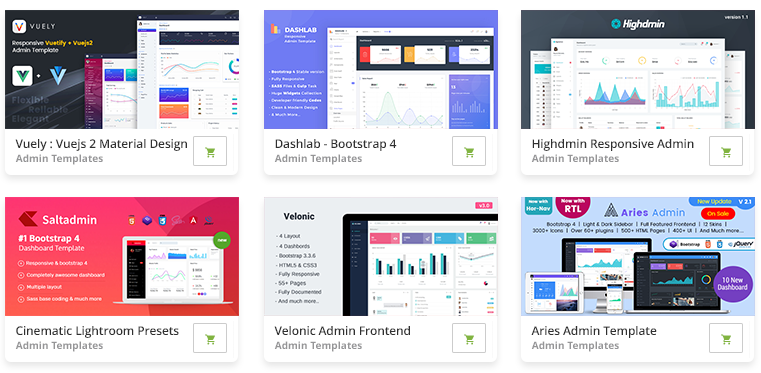
2M+ items from the worlds largest marketplace for Admin Templates, Themes & Design Assets. All of it can be found at Envato Market.
DOWNLOAD NOW
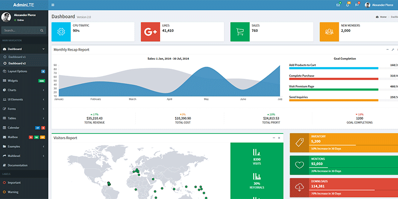
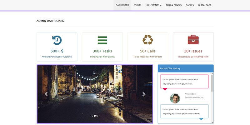
AdminLTE
AdminLTE is a lightweight theme that prides itself on being both beautiful and useful. It’s fully responsive, includes a selection of six skins and is even optimized for printing.
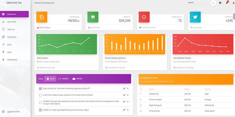
Material Dashboard
Built with Google’s Material Design in mind, Material Dashboard is clean and colorful. The UI is inspired a bit by layered sheets of paper and uses light, surface and movement to create an easy-to-use dashboard.
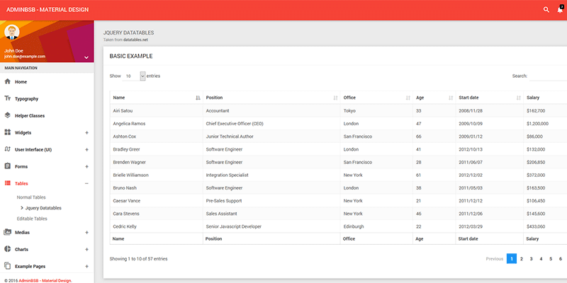
AdminBSB – Material Design
Those looking for a very Google-like interface will love AdminBSB – Material Design. It follows the principles of Material Design while providing users with a familiar-looking GUI.
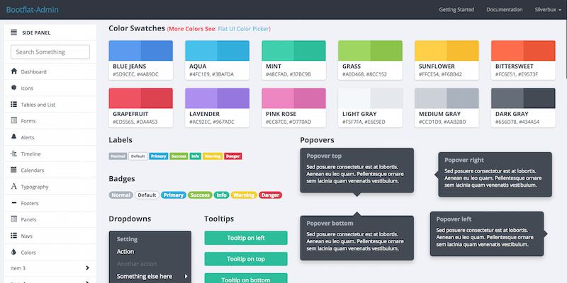
BootFlat Admin
BootFlat Admin features an attractive and easy-to-navigate dashboard area. As its name indicates, it uses the BootFlat flat UI kit.
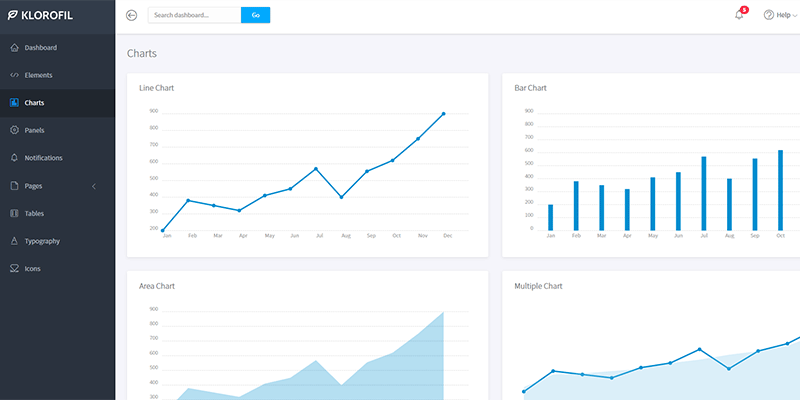
Klorofil
Klorofil features lots of useful elements such as charts, timelines, notifications and ready-to-use page templates. It provides you with all the basics you’ll need to build a perfect backend to your site or web-based app.
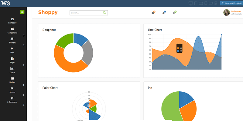
Shoppy E commerce Admin Panel
Using vibrant colors and a flat UI, Shoppy is a great choice for a custom eCommerce dashboard. It’s fully responsive and includes lots of goodies like buttons, icons and animated charts.
Paper Dashboard
Unlike a lot of admin themes out there, Paper Dashboard is quite subtle in its use of color. That leads to a beautiful UI that may have a bit more of a calming effect than other, more cluttered choices.
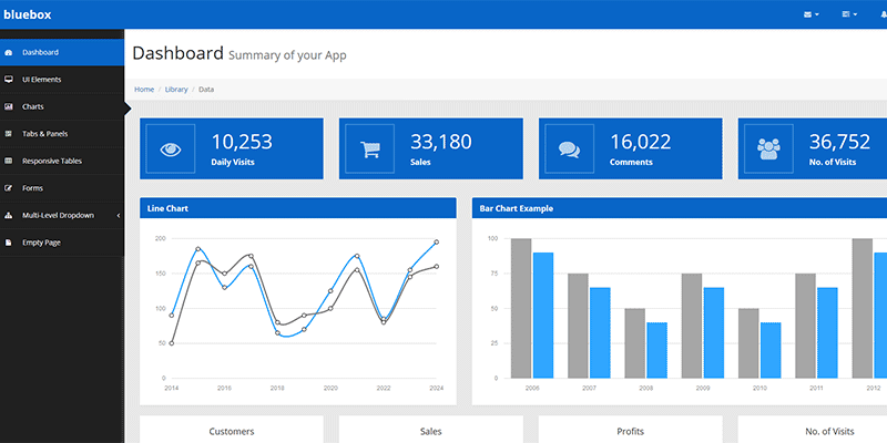
Bluebox
There’s something to be said for simplicity in color scheme. Bluebox does it to near perfection in that the consistent use of blue makes it easy to find what you’re looking for. It comes with lots of UI elements while supporting Google Fonts and Fontawesome Icons.
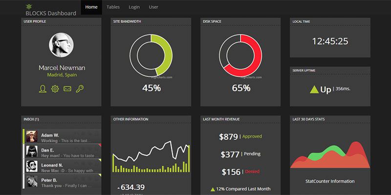
Blocks – Single Page Admin
Blocks takes a different approach to the admin screen by utilizing a fully-widgetized UI. Also gone is the ubiquitous left-side navigation in favor of a much more subtle menu across the top. This just goes to show that there is more than one way to create an appealing admin layout.
Free Responsive Horizontal Admin
Free Responsive Horizontal Admin also eschews the standard left menu. The theme also makes nice use of white space and sports a muted color scheme. This could be a solid choice for those who need a more simple and minimal type of dashboard.
Admin Themes That Help You Take Control
Admin areas have, to some degree, gotten a bit stale – especially when you look at what some popular CMS are doing. Part of their problem is that you don’t necessarily want to make radical changes to a UI that millions are comfortable with.
So the real innovations are coming in the form of the roll-your-own dashboards, like the ones featured above. Building your own admin can free you up to take a few more chances than the bigger players out there. These Bootstrap-based themes are proof that there is still a lot of room for both improvement and different ideas.