The Best Designers Are Taoists (Sort Of)
Original Source: https://www.webdesignerdepot.com/2018/10/the-best-designers-are-taoists-sort-of/
 Okay, for the love of any God you prefer, read this bit before you start writing comments…please? I’ve been studying up on philosophical Taoism lately because someone very near and dear to me is a (philosophical) Taoist, and I wanted to understand her better. What I’ve found is that web and UX designers have, by studying the data, come to a lot of the same conclusions as ancient Eastern philosophers.
While the lessons in this article may not be new to most of you, I thought it would be interesting to see how the principles of good design match up with Lao Tzu’s1 principles for good living. The world’s top designers are not, to my knowledge, actual Taoists. Neither am I evangelizing for Taoism. For one, I do not consider myself to be a Taoist, and secondly, evangelism as we know it is largely anathema to the ones I’ve met.
Thirdly, the practitioners of philosophical Taoism I’ve met will get a little annoyed if you call it a religion. Philosophical Taoism is just that: a philosophy, and many people adopt the philosophy alongside any religion they might already have.2
But without getting further into that3, here’s what I’ve found.
1. Don’t Struggle
“Struggle” as a concept, is unavoidable. We struggle so we can eat. But Taoist philosophy says that we should not struggle more than we have to. Take a lioness, for example: she may struggle to hunt down enough food for her cubs and her pride, but she does not struggle to be a lion. That part is instinctual, and she revels in it.
We humans, and designers/developers in particular, are very good at overcomplicating things for ourselves. We struggle not just to design and improve at our jobs, but we often struggle in ways that simply aren’t necessary. If you need examples, I’m just going to refer you back to Zeldman’s article: The Cult of the Complex. Smart designers keep it simple.
Another way good designers embrace this principle is in our love of workarounds and adaptability. While Bruce Lee himself was apparently non-religious, that whole “be like water, my friend” speech is actually one of the most important metaphors in the Tao te Ching. Water doesn’t struggle against obstacles, it goes around them. Nowadays, that sort of adaptability is basically a requirement for getting hired onto any studio or team that know what they’re doing.
2. Don’t Meddle
The Tao te Ching was, like many early self help books—I’m kidding—intended to be read by people in positions of leadership. Much of the advice is geared toward teaching local leaders—referred to in the book as “sages”—how to lead people, and more importantly, how not to. Most of the verses regarding this topic advise the sage against meddling too much in the affairs of their people.
Good designers would advise the same. Give your users a clear and easy path to the end goal, and then let them do their thing. Attempting to meddle with the way people browse will usually just annoy the hell out of them. Think of scroll jacking, modal pop-ups, the old pop-ups, obscure and unnecessarily creative navigation, and that sort of thing.
3. Be Slow to Judge
I know, Jesus said that, too. But the Tao te Ching takes the concept a bit further in suggesting that we should refrain from calling anything, anyone, or any circumstance good or bad until things have truly had a chance to play out. That is, don’t pass judgement until all the data is in4.
Designers these days are increasingly coming to rely on this same principle to inform their work. It’s one thing to “feel” like a big blue button would be better than a small green one, or vice versa. It’s another to know without a doubt that one is working better than another. While A/B testing is not always the best way to make design decisions, the importance of actually following the data to its conclusion cannot be understated.
4. Show, Don’t Tell
Taoists might make good designers, but they’re terrible marketers. I’m kidding again. It’s just that the Taoists I’ve encountered so far place far more importance on showing, rather than telling. Evangelism, as I’ve said, is not something they do. They believe that the only way to truly convince another to follow the Tao is to do it themselves, and let others observe the benefits.
Design is inherently visual, so this comes rather naturally to most of us. Good designers embrace this principle at every level with marketing, tutorials, or app walkthroughs, and of course, with the actual images in our content. After all, seeing is believing. A picture is worth a blah blah blah. We know this one.
5. Do No Harm
Correlating with that “Don’t Struggle” bit, philosophical Taoism encourages people to be themselves, to live how they want, and do what they feel is right, with just one very important caveat: don’t hurt anybody else. Violence is a last resort for self defense, and infringing on the freedom of others is anathema.
What we designers have discovered is that bad designers—the ones using dark patterns, trying to abuse SEO, and injecting two hundred trackers and a Bitcoin miner through ads—make the Internet worse for everyone. As the ecosystem of the Internet tries to defend itself, the bad actors find their gains are short-lived, sites find themselves struggling to make any kind of ad revenue, and the reputation of the whole industry is tarnished.
6. Contribute With no Expectation of Reward
Conversely, Taoism teaches that when we do good, we should do it without expectation of thanks, or reward. People who do this are often (though I’d say not always) given that recognition, and greater access to the community’s resources. Meanwhile, people that do good for recognition are usually found out, and fade into obscurity.
We’ve found this out in our community: the names we recognize in the design world are most often those of people who made our lives as designers easier. The people who wrote tutorials, ran educational podcasts, made videos, and did it all for free. Eventually, many of them did get recognition, and money, and invaluable contacts in the industry, but they had to put in a lot of thankless work first. People like me are design writers. They are design heroes.
1 Lao Tzu is the reputed author of the original Tao te Ching: a collection of 81 verses that outline principles for good living and leadership.
2 There is a branch of Taoism that is steeped in a fair amount of mysticism and incense which makes it look, sound, and smell like religion, but even these practitioners may tell you it’s not one. And then there’s another branch that is rather religious, with various gods and so on. There are lots of branches, and it gets complicated.
3 Wikipedia is your friend. Heck, I started my study with Dudeism, a form of Taoism that uses the movie The Big Lebowski as the source of all its symbolism.
4 There is a famous Taoist parable which illustrates this type of indifference and its utility: A farmer has only one horse. When the horse runs away his neighbors say “What bad luck!” The farmer merely says, “Is it?” Days later, the horse returns and brings with it a beautiful wild stallion. His neighbors say “What good luck!” The farmer replies, “Is it?” Enchanted by the new horse, the farmer’s son tries to ride it, but is thrown and badly injured. The neighbors say “What bad luck!” To which the farmer shrugs, “Is it?” Not long afterwards the country is under threat and every able young man is conscripted into the military, but the son cannot go because of his injuries. “What good luck!” the neighbors say. The farmer again only says, “Is it?”
– Benjamin, Oliver. The Tao Te Ching: Annotated Edition (pp. 75-76). Abide University Press. Kindle Edition.
Featured image via DepositPhotos.
Add Realistic Chalk and Sketch Lettering Effects with Sketch’it – only $5!
Source
p img {display:inline-block; margin-right:10px;}
.alignleft {float:left;}
p.showcase {clear:both;}
body#browserfriendly p, body#podcast p, div#emailbody p{margin:0;}
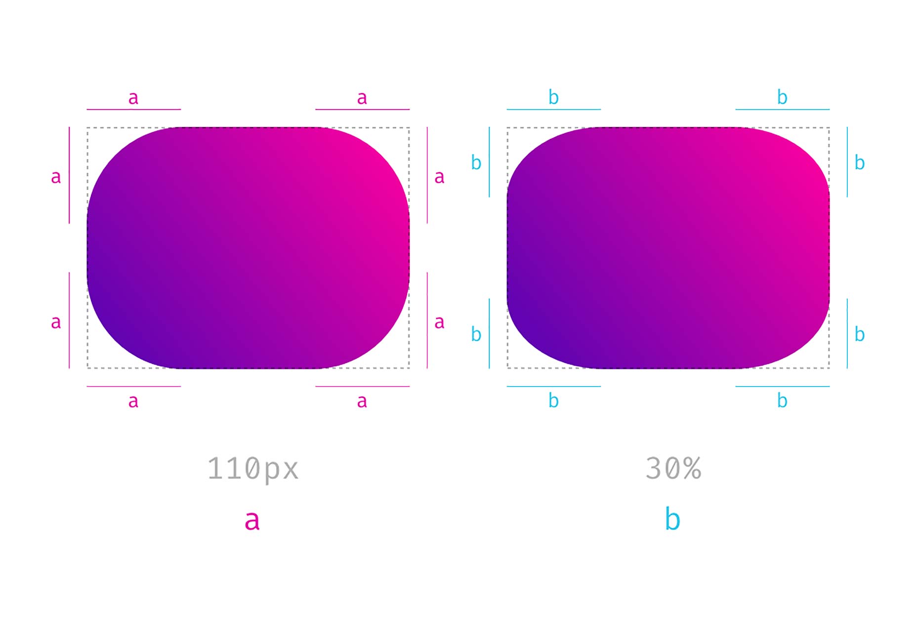
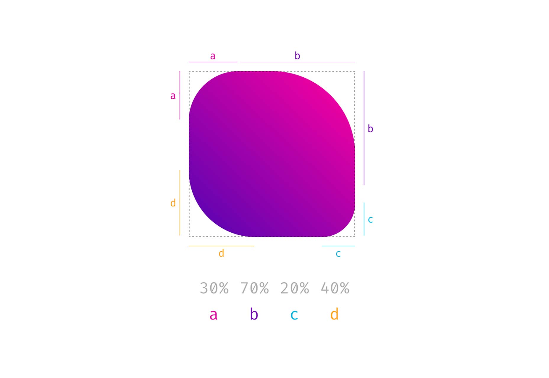
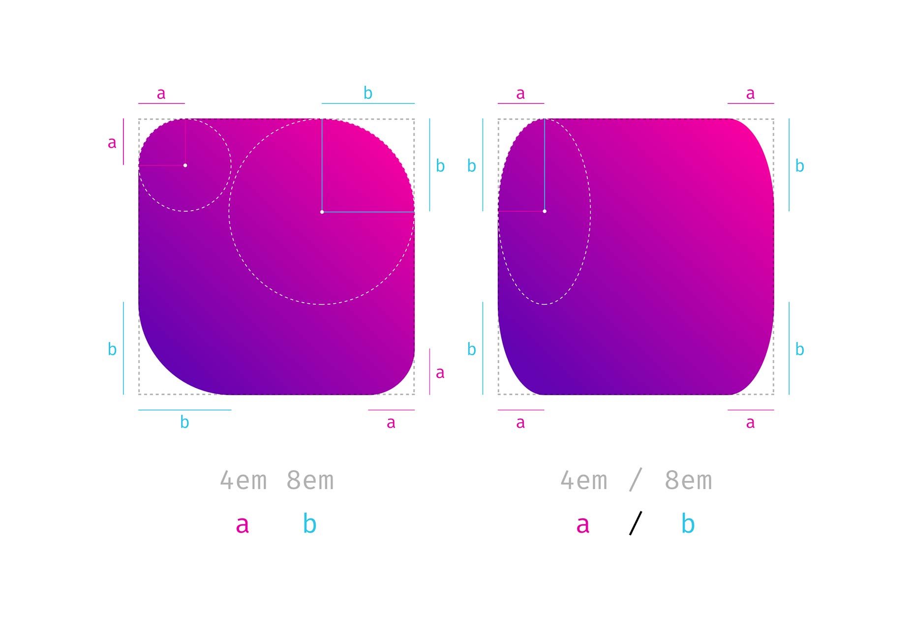
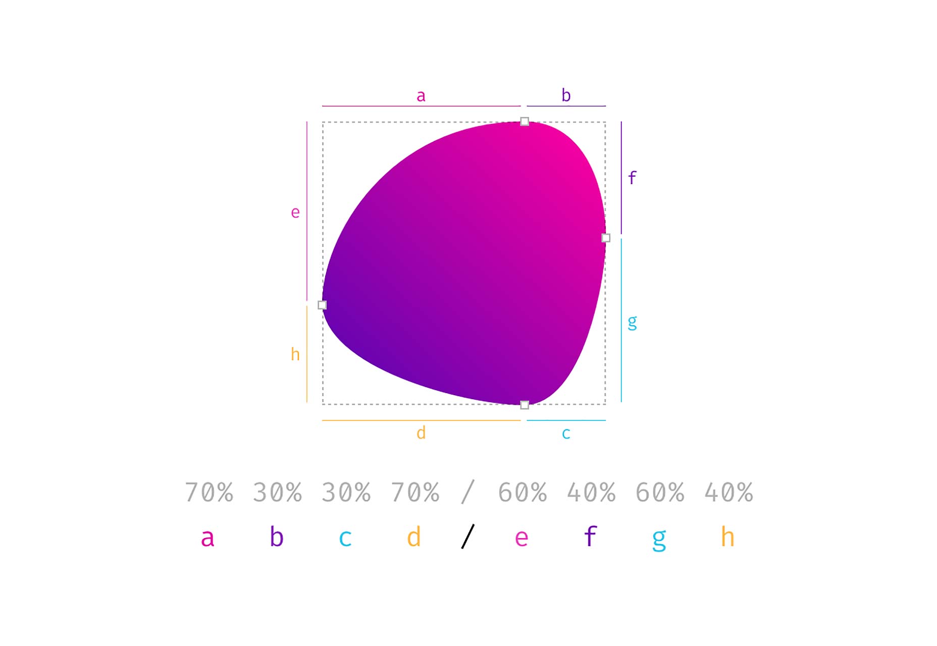
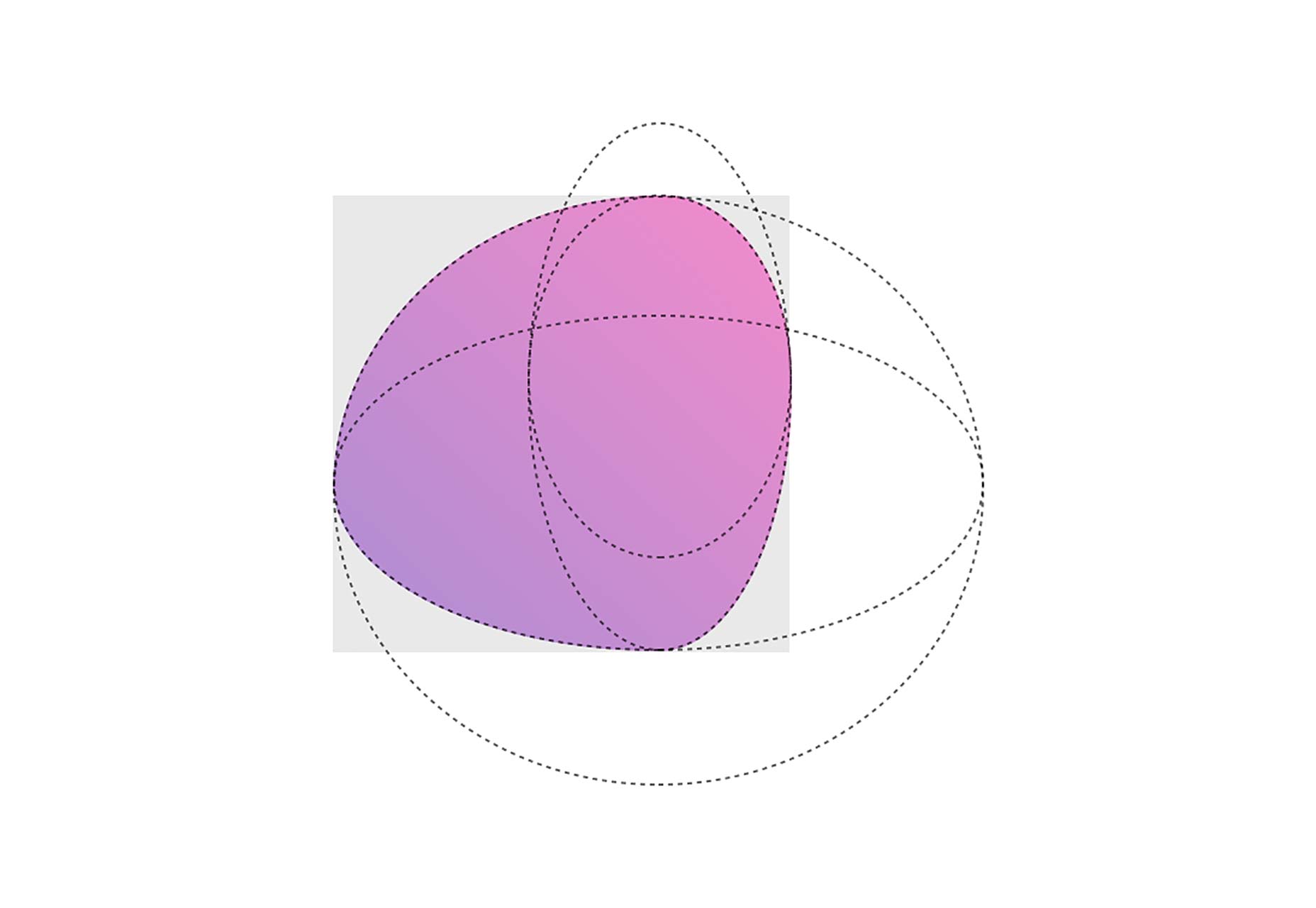
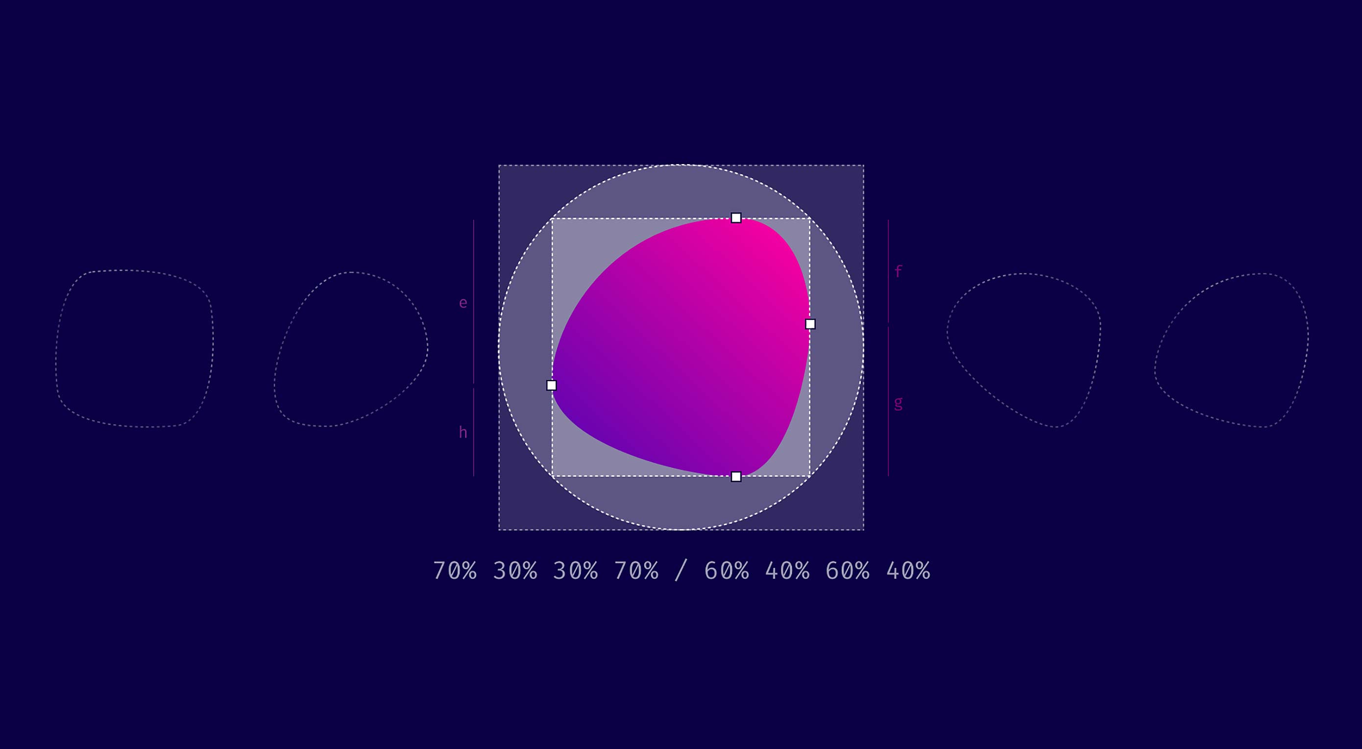 TL/DR: When you use eight values specifying border-radius in CSS, you can create organic looking shapes. WOW. No time to read it all ? — we made a visual tool for you. Find it here.
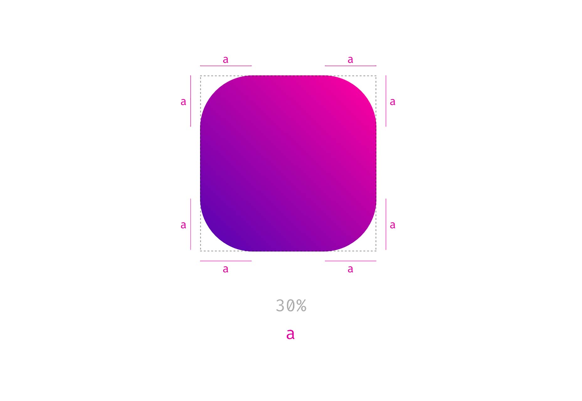

 WordPress database defined during installation
 Udraft Plus creating a backup