Should a Web Page Have a Single CTA?

Original Source: https://www.webdesignerdepot.com/2019/12/should-a-web-page-have-a-single-cta/


Does adding multiple CTAs to your web pages just confuse your users? That’s a heavily debated question in the digital design space.

Some web designers believe that multiple CTAs give visitors more choice on how they convert. Others feel that leads can only handle a single CTA at a time without getting overwhelmed and abandoning ship.

So, what’s the truth?

Well, that depends. Every consumer has unique browsing habits, and different people act uniquely depending on the situation. That means that how you choose to use CTAs will depend on a lot of different things, including the client you’re working with.

While it’s true that multiple CTA buttons could lead to decision paralysis for leads, there’s also a chance that an extra CTA could keep someone moving further down the buying funnel if they’re not yet ready to purchase.

Perhaps the question isn’t “Should a web page have a single CTA?” but “When and why should a web page have just one CTA?”

Defining the Marketing Call to Action

Let’s start simple, by looking at what a CTA actually is.

A call to action is a button or link that tells the user on your website what to do next.

When a potential customer scrolls to the bottom of your landing page or home page, they might see a CTA telling them to “Create an Account”, “Buy Now”, or “Download Here”. CTAs are all about one thing: action.

The mystorytime.com website simply uses the CTA “Start” on its homepage:

Regardless of the end goal of your CTA, the goal is always to drive conversions. For instance, you might be encouraging:

Awareness: “Learn More”, “Find out how”
Consideration: “Download Now”
Decision: “Contact us”, “Book a Demo”
Retention: “Become a Member”, “Sign up Now”
Advocacy: “Share your Thoughts”

The most important thing to remember about CTAs is that every one of your marketing assets should have one. Without a CTA, you’re not pushing your customers to the next stage in their buying journey – which means that you have a roadblock on your path to conversions.

Think of it this way, WordStream found that a single CTA in an email increases clicks by 371%, and sales by up to 1617%. You want those kind of results for your web pages too!

Different Web Pages Require Different Numbers of CTA

Just because every web page should have a CTA, doesn’t mean that it’s a good idea to use the same strategy for everything.
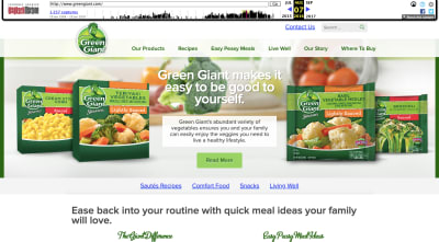
Each asset in your digital portfolio, from your home pages to your landing pages plays a role in the customer journey. While some assets, like your homepage, need to give your audience members plenty of choice, others should be as focused as possible.

Let’s look at how many CTAs are appropriate for the different pages on your website.

Homepage CTAs

A homepage is going to have multiple CTAs because it’s the first page introducing customers to your brand and whatever you have to offer.

The people who visit a company or client’s homepage won’t necessarily have a single goal in mind. Some of them will want to learn more about a brand, while others will want to check out your client’s products.

Take a look at the King and Mcgaw homepage, for instance, there are plenty of options to click on:

With a homepage, you want to give customers as much freedom as possible. They’re at a stage in their buyer journey where they don’t want to be pushed into a single decision.

Sure, some customers might arrive on your website and decide to immediately buy something, but it’s not likely. Give leads a chance to enter a journey of nurturing with your client business before you push them into doing too much, too fast.

Product Page CTAs

Most product pages will have at least a couple of CTAs available, because there’s a chance that your site will have more than one kind of visitor. On the one hand, you could have a buyer that wants to add your product to their basket and continue browsing; On the other hand, you might have a lead that just wants to check out straight away.

Depending on the kind of product that your client is selling, you might even have people visiting a website’s product pages that just want to talk to a customer service rep. There are plenty of product pages out there that include a link to the contact page.

Check out this page from Karimoku Cat for instance. It comes with a link to both a product page, and an Amazon page, so customers can choose how they want to continue their journey.

Support Page CTAs

Support or contact pages on a website will also probably have a number of CTAs.

After all, most businesses don’t just give their customers the option to call a service rep when they have problems today. Instead, they might want you to design a page where users can answer their own questions through an FAQ, reach a chatbot, or connect with other users in a forum.

The onwards.agency support page comes with access to an email address for users, a phone number, and links to Google Maps, Twitter, and Instagram:

As a designer, you can choose whether to present those links as buttons, or just basic hyperlinks for customers to click on.

Landing Page CTAs

Now here’s where everything starts to change.

While many of the web pages on a site can get away with having more than one CTA button, your dedicated landing pages can’t.

A landing page isn’t just another part of a client website website, it’s focused strategy intended to drive specific action from a customer. Because of this, most landing pages should only stick with a single CTA that tells the audience member exactly what they want to do next. That’s the case with this simple Squeeze page here:

When your clients put a lot of time, effort and focus into getting their users to arrive on a certain page, it’s your job as a designer to make sure that they stay there. Focus on a specific conversion request that keeps the visitor focused.

If you do decide to place an extra CTA on a landing page, make sure it’s something that will drive a similar outcome to the fundamental call to action. For instance “Buy now” could be accompanied by “Enquire today”.

Choosing The Right Number of CTAs for Any Page

There’s a common belief in the digital design world that you should only ever design a web page around a single call to action. However, that’s just not the case.

While some pages should definitely have a single focus – others shouldn’t.

A single call to action is the best route for dedicated pages where you want your customers to do one thing and nothing else. Squeeze pages, landing pages and lead capture pages often perform better the more focused they are.

If a customer has clicked on an add or an email link to arrive at your landing page, there’s a good chance that they’re already ready to convert. There are other pages on a site that might require a single CTA too. For instance, a particular service page might just offer the option to send an inquiry to a team.

However, there is room in website design for multiple CTAs too.

A home page, store pages, and even contact pages might include more than one CTA button – and that’s okay.

It’s all about adhering to the experience your client needs at different stages in the buying cycle when they’re trying to reach their customer.

Source

p img {display:inline-block; margin-right:10px;}
.alignleft {float:left;}
p.showcase {clear:both;}
body#browserfriendly p, body#podcast p, div#emailbody p{margin:0;}

Blank Poster Volume 1 Book is Pure Poster Design Inspiration

Original Source: http://feedproxy.google.com/~r/abduzeedo/~3/ZbuZ37TXgzA/blank-poster-volume-1-book-pure-poster-design-inspiration

Blank Poster Volume 1 Book is Pure Poster Design Inspiration

abduzeedoDec 20, 2019

Blank Poster Volume 1 is a poster design and inspiration book featuring 700+ posters made by 393 designers from 53 nationalities. The posters featured are a selection of experimental, minimal, weird and interesting posters submitted to blankposter.com and were all based on random one-word design briefs. 

Book Description

The very first Blank Poster publication is here and it’s filled with experimental, funny, interesting and creative poster designs. It features 700+ posters made by 393 designers from 53 nationalities and 5 interviews with participants of the Blank Poster project.

With this publication we aim to demonstrate a wide variety of designs found within Blank Poster and show the creative potential in this random and experimental exercise.

Specifications

Pages: 272
Dimensions: 213 × 298 × 20 mm
Format: Softcover
Language: English
For more information check out https://blankposter.com/
Poster Design


Amazing Pure CSS Multicolor Gradients with Gradienta

Original Source: http://feedproxy.google.com/~r/abduzeedo/~3/hx3lCI3M0cM/amazing-pure-css-multicolor-gradients-gradienta

Amazing Pure CSS Multicolor Gradients with Gradienta

abduzeedoDec 21, 2019

Gradienta is one of Shahadat Rahman, a Bangladeshi product designer, graphic designer, speaker & passive happiness earner side project that he made for both designers and developers to use ultra lightweight, colorful, responsive backgrounds for their personal and commercial projects. It is free to use, open source and requires no credit or attribution at all.

All of these gradients are available as CSS codes, SVG and JPG images. If you are a designer, you can use SVG or JPG image in your projects. Therefore, a developer can use all CSS/SVG/JPG (even SVG codes) version in a website or app.

Some SVG file or CSS code render differently in different browsers and OS. In my opinion, this is beautiful. Why a webpage or app interface should look the same in different device? And otherwise, you have the option to use JPG image for accuracy.

CSS Backgrounds


Surface Laptop 3 review

Original Source: http://feedproxy.google.com/~r/CreativeBloq/~3/VoUF-Xcgf0s/surface-laptop-3-review

Microsoft has just refreshed its range of Windows 10-based Surface devices and sitting at the top of the new models is this – the third generation of the Surface Laptop; Microsoft’s traditional ultraportable clamshell laptop. It doesn’t have a removable screen like its sister devices, but it still boasts a superb touch panel and you can use it with Microsoft’s Surface Pen stylus – as such it has a distinct differentiator versus Apple’s notebook lineup.

Its closest competitor is undoubtedly Apple’s MacBook Air, though as with the specs across Apple’s MacBook Air range, some of the Surface Laptop configurations are similar to what you’d get inside the MacBook Pro. There are more rivals then ever in this space and Dell’s XPS 13 and HP’s Spectre range definitely join Apple and Microsoft’s efforts at the top table.

Surface Laptop 3

The Surface Laptop 3 – like its predecessor – is available in 13.5 and 15-inch versions, but it’s the smaller model we’re reviewing. Although Microsoft’s Surface devices are available in various colour options, it’s the matt black model we’re looking at here.

Microsoft Surface Laptop 3: Price

The Surface Laptop 3 is a premium device and is priced accordingly. It sits above the Surface Pro in Microsoft’s range but underneath the Surface Book 2 with its detachable tablet display (where the whole screen comes off and can be used as an independent tablet). Our Core i5-based, 8GB RAM and 256GB SSD review model (£1,269) sits above the base level with its brushed black metal finish.

The cheaper (£999) version uses Alcantara fabric around the keyboard and has a 128GB SSD instead. Further up the lineup you can upgrade to a Core i7 processor with 16GB RAM (£1,389), and you can also choose to upgrade the 256GB drive to 512GB (£1,679) or 1TB (£2,114). It doesn’t take a genius to deduce that the lower priced models represent decent value, but things start to get rather expensive further up the tree and you’re paying a lot for factory-fitted storage.

Surface Laptop 3

Again you also need to pay £99 if you want to add the Surface Pen accessory but unlike with Surface Pro devices (which don’t have a trackpad) it feels less essential. You’ll probably want to  get one to complete the experience, though.

The metal version of the laptop is available in the aforementioned black, sandstone and platinum, while the Alcantara fabric is available in platinum and colbalt blue.

Microsoft Surface Laptop 3: Power and performance

In use, the Surface Laptop 3 always feels nible and quick – you’re certainly never left waiting for anything to happen. One of the advantages in buying the Surface Laptop is that you know it comes loaded with the very latest hardware under the hood. Both processor choices inside the 13-inch are from the latest 10th generation series of Intel Core processors – the 1.2Ghz Core i5-1035G7 used here and the upgrade option, which is the 1.3GHz Core i7-1065G7. Both are quad core chips, launched in late 2019. In Geekbench 4 and CInebench benchmarks, the Surface Laptop 3 comes out favourably thanks to its new processors – comfortably beating the MacBook Air and previous Surface Laptop 2. 

Surface Laptop 3

However, the increased performance does mean a little hit on battery life– we got around 8 to 9 hours in general use and that’s a touch under last year’s model and the Dell XPS 13, though it’s not that much to worry about (there’s also fast charging with this new model, too, so you can get it to 80 percent in an hour). It’s worth noting that if longevity is your wish, the MacBook Air has low power processors and will last significantly longer. The MacBook Pro is probably a better comparison in this instance and, again, you’ll get 8 to 9 hours out of that,.

The 13.5-inch model has some disadvantages versus both the 15-inch model and some rival laptops in that it doesn’t have an option for dedicated graphics, instead sticking with Intel’s Iris Plus graphics. The 15-inch models boast AMD Radeon Vega or RX Vega graphics running alongside Ryzen 5 and Ryzen 7 processors.

Surface Laptop 3

To be fair, that’s a similar situation on the MacBook Pro, where the 13-inch relies on Intel graphics with AMD Radeon Pro only available on the newer 16-inch (alongside Intel processors, though). Intel’s on board graphics are extremely capable these days, but you’re still going to want something with a bit more poke if you’re using it for intensive graphics or video work. As such, the Surface Laptop 3 isn’t a complete do-anything machine like the new 16-inch MacBook Pro or the more powerful versions of the Surface Book 2, but it’s not far off.

Microsoft Surface Laptop 3: Display

The 13.5-inch PixelSense display is unchanged from the previous two generations. This is a bit of a growing trend in the laptop space and clearly manufacturers feel boundary-pushing isn’t necessary at present. Remember that brighter and more pixel dense displays always have a hit on battery life, so it’s probably a compromise not willing to be made by consumers.

Surface Laptop 3

The good news is that the 13.5-inch PixelSense display is still absolutely superb with a 2,256×1,504 resolution which works out at 201ppi. The one disadvantage of this display compared to some rivals such as the HP Spectre x360 is that it does not fold flat and that’s a little bit of a disadvantage for creatives. Microsoft would obviously argue that with the Surface Pro and Surface Book it offers other options for that market.

Microsoft Surface Laptop 3: Other features

So what else is new with this version of the Surface Laptop? One of the headline features is undoubtedly that Microsoft has joined rivals in including USB-C as a key method of connectivity on its latest Surface devices instead of Mini DisplayPort. However, it has decided to stick with its proprietary Surface Connect standard for charging. 

This is unnecessary and by having Surface Connect on board alongside a solitary USB-C and one USB-A port, it shows that Microsoft is hedging its bets rather than having the conviction of rivals to move to USB-C for power, data and video. Worse still is the fact that the USB-C ports included don’t include compatibility with Thunderbolt 3; that’s a big miss for those who need to speedily access large amounts of data.

Surface Laptop 3

The trackpad has also been improved this time – it’s now 20 percent bigger than it was (not that it was small previously) – while Surface keyboards remain some of the best around. There’s also compatibility with the new Wi-Fi 6 standard, too. And yes, you get a headphone jack.

Microsoft Surface Laptop 3: Should you buy it?

The headline is that one of the best ultraportable laptops on the market just got better. There are still a couple of niggles – like the lack of Thunderbolt 3 support – but broadly the picture painted by the Surface Laptop 3 is a rosy one. 

It feels great to use and beats the MacBook Air on performance. However, it isn’t the cheapest as you move up the model lineup. And it will only appeal to a subset of the creative market, too – because it doesn't have the option to take things a step further with the graphics, its not an option when you compare it to the higher end versions of  the Surface Book 2 and MacBook Pro series. 

In a way, plumping for a Surface Laptop means you're prioritising portability. That may be no bad thing if, say, you've got another machine that you can use as your main creative tool. Certainly, video editors will need to look elsewhere. 

But, as an ultraportable, there are few better on the market and there's not a lot to choose between this, the MacBook Air and another of our favourites, the Dell XPS 13. 


5 Smart Ways to Get Your Clients to Pay Your Rates

Original Source: https://www.hongkiat.com/blog/get-clients-to-pay-your-rate/

If you’re a freelancer, you are probably getting paid much less than you’re worth for the following reasons. One, you are influenced by what your competitors are charging – why…

Visit hongkiat.com for full content.

19 Best Portfolios of 2019

Original Source: https://www.webdesignerdepot.com/2019/12/19-best-portfolios-of-2019/

Every month we roundup the best new portfolios released in the previous four weeks. This month we’re looking back at the whole of 2019, and picking out 19 of our favorites from the last 12 months. There’s a mixture here of colorful and restrained, experimental and expected; the one thing they all have in common is an attention to details that creates an exceptional UX. Enjoy!

WTF Studio

If you’re going to name your business WTF Studio, you need a suitably WTF site. Able Parris is a NY-based creative director who’s more than happy to slap you in the face with colour and motion. What we really loved about this site is that once you’ve scrolled past the anarchic introduction, it’s actually very safe, very clear. Attitude doesn’t have to mean sacrificing UX.

Stereo

Stereo features smooth animation, a beautiful palette, and some really gorgeous type. What makes it stand out is the unusual navigation menu — it scrolls across the center of the screen like an old-style marquee. We also loved its sweeping animation as it transitions from state to state.

Eva Garcia

We weren’t just impressed with the portfolios of design agencies this year. Eva Garcia’s portfolio is a classic example of how to build a portfolio site. It’s brand-appropriate, intuitive to use, and lets the work come to the fore.

Kévin Chassagne

Kévin Chassagne’s site is a great example of a site that delivers excellent layout, and awesome animation, without relying on JavaScript. The JavaScript here is used for a few details, but you really lose nothing without it. Everything from the typography, to the colour scheme, to the simple UX are great for a portfolio when you’re potentially browsing hundreds of sites at once.

Nicky Tesla

Nicky Tesla’s portfolio is one of the most original of 2019. It’s a spreadsheet; it doesn’t just look like a spreadsheet, it actually is one; it’s a publicly available spreadsheet on Google, with a domain attached. It’s not the most beautiful portfolio you’ll ever see, but it is daringly committed to its core concept.

Florian Wacker

Florian Wacker’s portfolio features absolutely beautiful typography. This site wowed us back at the start of the year, when minimalism was still de rigueur. As a pitch to design agencies that value good typography, this is almost faultless.

Adam Brandon

More minimalism from the start of 2019 in the form of Adam Brandon’s portfolio. His client list is fairly formidable, with Netflix, Apple, Nike, and Ford in there. The site sensibly takes a step back and lets the work promote itself.

EVOXLAB

Evoxlab is an unusual site for us, in that it has gone out of its way to mimic powerpoint slides, which is bordering on skeuomorphism. Well, kinda. It certainly feels like a slideshow. We’ve included it because it’s really committed to the concept, and in this case it works.

Plug & Play

The agency site for Plug & Play is one of the least challenging sites we’ve seen in 2019. In many ways it verges on cliché, but that’s all intentional, because this site is about a simplified user experience. What’s more we love the way it transitions from dark mode to light, as you scroll.

Athletics

Athletics jumps right into fullscreen video case studies of work for clients like IBM. At that point, if you have the budget, you’re probably sold, but Athletics follows up with a grid of lower-profile, but equally exciting design work.

Revolve Studio

Revolve Studio’s site really stands out not because of the presentation-style user experience, but because it’s built in ASP.NET. It also stands out by not showing any work, which is an unusual approach that has been surprisingly popular over the last year.

Florian Monfrini

Florian Monfrini’s portfolio is an expanded, full screen, collage approach. It fills the space well, and was one of the sites that adopted this approach long before it became fashionable.

Angle2

We love the typography of Angle2. It’s another slideshow-style site, but it’s brought to life by the angles and skew of the typography. Despite the energetic feeling text, and the variety of designs — one per page — it always remains usable.

Florent Biffi

If 2019 was the year of a single effect, it was the year of rippling, liquid-style effects. One of the first we saw was Florent Biffi’s site, with huge, bold typography and a subtle rippling effect over the design.

Bethany Heck

We really loved the semi-brutalist approach of Bethany Heck’s portfolio. It’s just a collection of project titles, and in places the accompanying logos, that lead either to the site being referenced, or to an internal link with delightful typography.

Bold

Bold’s portfolio is a simple presentation with some exceptionally sophisticated details. We loved the way the border expands from the images as you scroll, creating the sense of zooming into a project. It’s a confident and understated portfolio that sells to big names, with big budgets.

Transatlantic Film Orchestra

The Transatlantic Film Orchestra make music for video. Its website opens with calm, dark, monochromatic visuals, and absolutely no auto-play audio, which is exactly the right approach. When we actually chose to play the audio, we loved the UI.

Nick Losacco

Nick Losacco’s site highlights a lot of different skills, not least his typeface design. The whole site relies heavily on bold typography and an acidic red background for its personality.

Versett

Versett’s portfolio is a clean, modern site, that leans towards a one-page approach without ever fully embracing it. It’s easy to scan if you’re a business comparing potential agencies, and we loved the “More+” menu option that herds you towards different options like product design, or launching a new company.

Source

p img {display:inline-block; margin-right:10px;}
.alignleft {float:left;}
p.showcase {clear:both;}
body#browserfriendly p, body#podcast p, div#emailbody p{margin:0;}

The Real Future of Remote Work is Asynchronous

Original Source: https://www.sitepoint.com/the-real-future-of-remote-work-is-asynchronous/?utm_source=rss

I’ve been working remotely for over a decade – well before the days of tools like Slack or Zoom. In some ways, it was easier back then: you worked from wherever you were and had the space to manage your workload however you wanted. If you desired to go hardcore creative mode at night, sleep in, then leisurely read fiction over brunch, you could.

Now, in the age of the “green dot” or “presence prison,” as Jason Fried calls it, working remotely can be more suffocating than in-person work. The freedom that we worked hard to create — escaping the 9-to-5 — has now turned into constant monitoring, with the expectation that we are on, accessible, productive, and communicative 24/7.

I see this in job positions for remote roles. Companies frequently champion remote, proudly advertising their flexible cultures to only then list that candidates must be based within 60 minutes of Pacific Time Zone, that the hours are set, and standup is at 8:30am daily. One of the benefits of remote work is that it brings the world closer together and creates a level-playing field for the world’s best talent. Whether you were in Bengaluru or Berlin, you could still work with a VC-backed, cash-rich startup in San Francisco earning a solid hourly rate. If remote slowly turns into a way of working in real-time with frequent face-time, we will see less of this.

And let’s not forget trust: the crux of remote culture. Companies create tools that automatically record your screen at intervals to show management or clients you’re delivering. I founded a freelance marketplace called CloudPeeps and not recording your screen, as Upwork does, is one way we attract a different caliber of indie professional.

You can have more freedom in an office. From my beige cubicle at one of my first roles, I witnessed a colleague plan a wedding over the course of many months, including numerous calls to vendors and 20 tabs open for research. Most of the team was none the wiser – this wouldn’t be the case with remote today.

At the heart of this friction is the demand for real-time, synchronous communication. If we champion asynchronous as the heart of remote, what does the future of remote look like?

The post The Real Future of Remote Work is Asynchronous appeared first on SitePoint.

Creating Voice Skills For Google Assistant And Amazon Alexa

Original Source: https://www.smashingmagazine.com/2019/12/voice-skills-google-assistant-amazon-alexa/

Creating Voice Skills For Google Assistant And Amazon Alexa

Creating Voice Skills For Google Assistant And Amazon Alexa

Tris Tolliday

2019-12-23T12:00:00+00:00
2019-12-24T12:35:33+00:00

Over the past decade, there has been a seismic shift towards conversational interfaces. As people reach ‘peak screen’ and even begin to scale back their device usage with digital wellbeing features being baked into most operating systems.

To combat screen fatigue, voice assistants have entered the market to become a preferred option for quickly retrieving information. A well-repeated stat states that 50% of searches will be done by voice in year 2020. Also, as adoption rises, it’s up to developers to add “Conversational Interfaces” and “Voice Assistants” to their tool belt.

Designing The Invisible

For many, embarking on a voice UI (VUI) project can be a bit like entering the Unknown. Find out more about the lessons learned by William Merrill when designing for voice. Read article →

What Is A Conversational Interface?

A Conversational Interface (sometimes shortened to CUI, is any interface in a human language. It is tipped to be a more natural interface for the general public than the Graphic User Interface GUI, which front end developers are accustomed to building. A GUI requires humans to learn its specific syntaxes of the interface (think buttons, sliders, and drop-downs).

This key difference in using human language makes CUI more natural for people; it requires little knowledge and puts the burden of understanding on the device.

Commonly CUIs comes in two guises: Chatbots and Voice Assistants. Both have seen a massive rise in uptake over the last decade thanks to advances in Natural Language Processing (NLP).

Understanding Voice Jargon

(Large preview)

Keyword
Meaning

Skill/Action
A voice application, which can fulfill a series of intents

Intent
Intended action for the skill to fulfill, what the user wants the skill to do in response to what they say.

Utterance
The sentence a user says, or utters.

Wake Word
The word or phrase used to start a voice assistant listening, e.g. ‘Hey google’, ‘Alexa’ or ‘Hey Siri’

Context
The pieces of contextual information within an utterance, that helps the skill fulfill an intent, e.g. ‘today’, ‘now’, ‘when I get home’.

What Is A Voice Assistant?

A voice assistant is a piece of software capable of NLP (Natural Language Processing). It receives a voice command and returns an answer in audio format. In recent years the scope of how you can engage with an assistant is expanding and evolving, but the crux of the technology is natural language in, lots of computation, natural language out.

For those looking for a bit more detail:

The software receives an audio request from a user, processes the sound into phonemes, the building blocks of language.
By the magic of AI (Specifically Speech-To-Text), these phonemes are converted into a string of the approximated request, this is kept within a JSON file which also contains extra information about the user, the request and the session.
The JSON is then processed (usually in the cloud) to work out the context and intent of the request.
Based on the intent, a response is returned, again within a larger JSON response, either as a string or as SSML (more on that later)
The response is processed back using AI (naturally the reverse – Text-To-Speech) which is then returned to the user.

There’s a lot going on there, most of which don’t require a second thought. But each platform does this differently, and it’s the nuances of the platform that require a bit more understanding.

(Large preview)

Voice-Enabled Devices

The requirements for a device to be able to have a voice assistant baked in are pretty low. They require a Microphone, an internet connection, and a Speaker. Smart Speakers like the Nest Mini & Echo Dot provide this kind of low-fi voice control.

Next up in the ranks is voice + screen, this is known as a ‘Multimodal’ device (more on these later), and are devices like the Nest Hub and the Echo Show. As smartphones have this functionality, they can also be considered a type of Multimodal voice-enabled device.

Voice Skills

First off, every platform has a different name for their ‘Voice Skills’, Amazon goes with skills, which I will be sticking with as a universally understood term. Google opts for ‘Actions’, and Samsung goes for ‘capsules’.

Each platform has its own baked-in skills, like asking the time, weather and sports games. Developer-made (third-party) skills can be invoked with a specific phrase, or, if the platform likes it, can be implicitly invoked, without a key phrase.

Explicit Invocation: ”Hey Google, Talk to <app name>.”

It is explicitly stated which skill is being asked for:

Implicit Invocation: ”Hey Google, what is the weather like today?”

It is implied by the context of the request what service the user wants.

What Voice Assistants Are There?

In the western market, voice assistants are very much a three-horse race. Apple, Google and Amazon have very different approaches to their assistants, and as such, appeal to different types of developers and customers.

Apple’s Siri

Device Names: ”Google Home, Nest”

Wake Phrase: ”Hey Siri”

Siri has over 375 million active users, but for the sake of brevity, I am not going into too much detail for Siri. While it may be globally well adopted, and baked into most Apple devices, it requires developers to already have an app on one of Apple’s platforms and is written in swift (whereas the others can be written in everyone’s favorite: Javascript). Unless you are an app developer who wants to expand their app’s offering, you can currently skip past apple until they open up their platform.

Google Assistant

Device Names: ”Google Home, Nest”

Wake Phrase: ”Hey Google”

Google has the most devices of the big three, with over 1 Billion worldwide, this is mostly due to the mass of Android devices that have Google Assistant baked in, with regards to their dedicated smart speakers, the numbers are a little smaller. Google’s overall mission with its assistant is to delight users, and they have always been very good at providing light and intuitive interfaces.

Their primary aim on the platform is to use time — with the idea of becoming a regular part of customers’ daily routine. As such, they primarily focus on utility, family fun, and delightful experiences.

Skills built for Google are best when they are engagement pieces and games, focusing primarily on family-friendly fun. Their recent addition of canvas for games is a testament to this approach. The Google platform is much stricter for submissions of skills, and as such, their directory is a lot smaller.

Amazon Alexa

Device Names: “Amazon Fire, Amazon Echo”

Wake Phrase: “Alexa”

Amazon has surpassed 100 million devices in 2019, this predominantly comes from sales of their smart speakers and smart displays, as well as their ‘fire’ range or tablets and streaming devices.

Skills built for Amazon tend to be aimed at in skill purchasing. If you are looking for a platform to expand your e-commerce/service, or offer a subscription then Amazon is for you. That being said, ISP isn’t a requirement for Alexa Skills, they support all sorts of uses, and are much more open to submissions.

The Others

There are even more Voice assistants out there, such as Samsung’s Bixby, Microsoft’s Cortana, and the popular open-source voice assistant Mycroft. All three have a reasonable following, but are still in the minority compared to the three Goliaths of Amazon, Google and Apple.

Building On Amazon Alexa

Amazons Ecosystem for voice has evolved to allow developers to build all of their skills within the Alexa console, so as a simple example, I am going to use its built-in features.

(Large preview)

Alexa deals with the Natural Language Processing and then finds an appropriate Intent, which is passed to our Lambda function to deal with the logic. This returns some conversational bits (SSML, text, cards, and so on) to Alexa, which converts those bits to audio and visuals to show on the device.

Working on Amazon is relatively simple, as they allow you to create all parts of your skill within the Alexa Developer Console. The flexibility is there to use AWS or an HTTPS endpoint, but for simple skills, running everything within the Dev console should be sufficient.

Let’s Build A Simple Alexa Skill

Head over to the Amazon Alexa console, create an account if you don’t have one, and log in,

Click Create Skill then give it a name,

Choose custom as your model,

and choose Alexa-Hosted (Node.js) for your backend resource.

Once it is done provisioning, you will have a basic Alexa skill, It will have your intent built for you, and some back end code to get you started.

If you click on the HelloWorldIntent in your Intents, you will see some sample utterances already set up for you, let’s add a new one at the top. Our skill is called hello world, so add Hello World as a sample utterance. The idea is to capture anything the user might say to trigger this intent. This could be “Hi World”, “Howdy World”, and so on.

What’s Happening In The Fulfillment JS?

So what is the code doing? Here is the default code:

const HelloWorldIntentHandler = {

canHandle(handlerInput) {

return Alexa.getRequestType(handlerInput.requestEnvelope) === ‘IntentRequest’

&& Alexa.getIntentName(handlerInput.requestEnvelope) === ‘HelloWorldIntent’;

},

handle(handlerInput) {

const speakOutput = ‘Hello World!’;

return handlerInput.responseBuilder

.speak(speakOutput)

.getResponse();

}

};

This is utilizing the ask-sdk-core and is essentially building JSON for us. canHandle is letting ask know it can handle intents, specifically ‘HelloWorldIntent’. handle takes the input, and builds the response. What this generates looks like this:

{

“body”: {

“version”: “1.0”,

“response”: {

“outputSpeech”: {

“type”: “SSML”,

“ssml”: “Hello World!”

},

“type”: “_DEFAULT_RESPONSE”

},

“sessionAttributes”: {},

“userAgent”: “ask-node/2.3.0 Node/v8.10.0”

}

}

We can see that speak outputs ssml in our json, which is what the user will hear as spoken by Alexa.

Building For Google Assistant

(Large preview)

The simplest way to build Actions on Google is to use their AoG console in combination with Dialogflow, you can extend your skills with firebase, but as with the Amazon Alexa tutorial, let’s keep things simple.

Google Assistant uses three primary parts, AoG, which deals with the NLP, Dialogflow, which works out your intents, and Firebase, that fulfills the request, and produces the response that will be sent back to AoG.

Just like with Alexa, Dialogflow allows you to build your functions directly within the platform.

Let’s Build An Action On Google

There are three platforms to juggle at once with Google’s solution, which are accessed by three different consoles, so tab up!

Setting Up Dialogflow

Let’s start by logging into the Dialogflow console. Once you have logged in, create a new agent from the dropdown just below the Dialogflow logo.

Give your agent a name, and add on the ‘Google Project Dropdown’, while having “Create a new Google project” selected.

Click the create button, and let it do its magic, it will take a little bit of time to set up the agent, so be patient.

Setting Up Firebase Functions

Right, now we can start to plug in the Fulfillment logic.

Head on over to the Fulfilment tab. Tick to enable the inline editor, and use the JS snippets below:

index.js

‘use strict’;

// So that you have access to the dialogflow and conversation object
const { dialogflow } = require(‘actions-on-google’);

// So you have access to the request response stuff >> functions.https.onRequest(app)
const functions = require(‘firebase-functions’);

// Create an instance of dialogflow for your app
const app = dialogflow({debug: true});

// Build an intent to be fulfilled by firebase,
// the name is the name of the intent that dialogflow passes over
app.intent(‘Default Welcome Intent’, (conv) => {

// Any extra logic goes here for the intent, before returning a response for firebase to deal with
return conv.ask(`Welcome to a firebase fulfillment`);

});

// Finally we export as dialogflowFirebaseFulfillment so the inline editor knows to use it
exports.dialogflowFirebaseFulfillment = functions.https.onRequest(app);

package.json

{
“name”: “functions”,
“description”: “Cloud Functions for Firebase”,
“scripts”: {
“lint”: “eslint .”,
“serve”: “firebase serve –only functions”,
“shell”: “firebase functions:shell”,
“start”: “npm run shell”,
“deploy”: “firebase deploy –only functions”,
“logs”: “firebase functions:log”
},
“engines”: {
“node”: “10”
},
“dependencies”: {
“actions-on-google”: “^2.12.0”,
“firebase-admin”: “~7.0.0”,
“firebase-functions”: “^3.3.0”
},
“devDependencies”: {
“eslint”: “^5.12.0”,
“eslint-plugin-promise”: “^4.0.1”,
“firebase-functions-test”: “^0.1.6”
},
“private”: true
}

Now head back to your intents, go to Default Welcome Intent, and scroll down to fulfillment, make sure ‘Enable webhook call for this intent’ is checked for any intents your wish to fulfill with javascript. Hit Save.

(Large preview)

Setting Up AoG

We are getting close to the finish line now. Head over to the Integrations Tab, and click Integration Settings in the Google Assistant Option at the top. This will open a modal, so let’s click test, which will get your Dialogflow integrated with Google, and open up a test window on Actions on Google.

On the test window, we can click Talk to my test app (We will change this in a second), and voila, we have the message from our javascript showing on a google assistant test.

We can change the name of the assistant in the Develop tab, up at the top.

So What’s Happening In The Fulfillment JS?

First off, we are using two npm packages, actions-on-google which provides all the fulfillment that both AoG and Dialogflow need, and secondly firebase-functions, which you guessed it, contains helpers for firebase.

We then create the ‘app’ which is an object that contains all of our intents.

Each intent that is created passed ‘conv’ which is the conversation object Actions On Google sends. We can use the content of conv to detect information about previous interactions with the user (such as their ID and information about their session with us).

We return a ‘conv.ask object’, which contains our return message to the user, ready for them to respond with another intent. We could use ‘conv.close’ to end the conversation if we wanted to end the conversation there.

Finally, we wrap everything up in a firebase HTTPS function, that deals with the server-side request-response logic for us.

Again, if we look at the response that is generated:

{

“payload”: {

“google”: {

“expectUserResponse”: true,

“richResponse”: {

“items”: [

{

“simpleResponse”: {

“textToSpeech”: “Welcome to a firebase fulfillment”

}

}

]

}

}

}

}

We can see that conv.ask has had its text injected into the textToSpeech area. If we had chosen conv.close the expectUserResponse would be set to false and the conversation would close after the message had been delivered.

Third-Party Voice Builders

Much like the app industry, as voice gains traction, 3rd party tools have started popping up in an attempt to alleviate the load on developers, allowing them to build once deploy twice.

Jovo and Voiceflow are currently the two most popular, especially since PullString’s acquisition by Apple. Each platform offers a different level of abstraction, so It really just depends on how simplified you’re like your interface.

Extending Your Skill

Now that you have gotten your head around building a basic ‘Hello World’ skill, there are bells and whistles aplenty that can be added to your skill. These are the cherry on top of the cake of Voice Assistants and will give your users a lot of extra value, leading to repeat custom, and potential commercial opportunity.

SSML

SSML stands for speech synthesis markup language and operates with a similar syntax to HTML, the key difference being that you are building up a spoken response, not content on a webpage.

‘SSML’ as a term is a little misleading, it can do so much more than speech synthesis! You can have voices going in parallel, you can include ambiance noises, speechcons (worth a listen to in their own right, think emojis for famous phrases), and music.

When Should I Use SSML?

SSML is great; it makes a much more engaging experience for the user, but what is also does, is reduce the flexibility of the audio output. I recommend using it for more static areas of speech. You can use variables in it for names etc, but unless you intend on building an SSML generator, most SSML is going to be pretty static.

Start with simple speech in your skill, and once it is complete, enhance areas which are more static with SSML, but get your core right before moving on to the bells and whistles. That being said, a recent report says 71% of users prefer a human (real) voice over a synthesized one, so if you have the facility to do so, go out and do it!

(Large preview)

In Skill Purchases

In-skill purchases (or ISP) are similar to the concept of in-app purchases. Skills tend to be free, but some allow for the purchase of ‘premium’ content/subscriptions within the app, these can enhance the experience for a user, unlock new levels on games, or allow access to paywalled content.

Multimodal

Multimodal responses cover so much more than voice, this is where voice assistants can really shine with complementary visuals on devices that support them. The definition of multimodal experiences is much broader and essentially means multiple inputs (Keyboard, Mouse, Touchscreen, Voice, and so on.).

Multimodal skills are intended to complement the core voice experience, providing extra complementary information to boost the UX. When building a multimodal experience, remember that voice is the primary carrier of information. Many devices don’t have a screen, so your skill still needs to work without one, so make sure to test with multiple device types; either for real or in the simulator.

(Large preview)

Multilingual

Multilingual skills are skills that work in multiple languages and open up your skills to multiple markets.

The complexity of making your skill multilingual is down to how dynamic your responses are. Skills with relatively static responses, e.g. returning the same phrase every time, or only using a small bucket of phrases, are much easier to make multilingual than sprawling dynamic skills.

The trick with multilingual is to have a trustworthy translation partner, whether that is through an agency or a translator on Fiverr. You need to be able to trust the translations provided, especially if you don’t understand the language being translated into. Google translate will not cut the mustard here!

Conclusion

If there was ever a time to get into the voice industry, it would be now. Both in its prime and infancy, as well as the big nine, are plowing billions into growing it and bringing voice assistants into everybody’s homes and daily routines.

Choosing which platform to use can be tricky, but based on what you intend to build, the platform to use should shine through or, failing that, utilize a third-party tool to hedge your bets and build on multiple platforms, especially if your skill is less complicated with fewer moving parts.

I, for one, am excited about the future of voice as it becomes ubiquitous; screen reliance will reduce and customers will be able to interact naturally with their assistant. But first, it’s up to us to build the skills that people will want from their assistant.

Smashing Editorial
(dm, il)

Chaos engineering: What it is and how to use it

Original Source: http://feedproxy.google.com/~r/CreativeBloq/~3/40tSmWOK5DA/chaos-engineering-what-it-is-and-how-to-use-it

Netflix is the birthplace of chaos engineering, an increasingly significant approach to how complex modern technology architectures are developed. It essentially means that as you’re binging on your favourite Netflix show, the platform is testing its software while you watch. (Take a look at alternative user testing software.) 

The practice of chaos engineering began when Netflix’s core business was online DVD rentals. A single database corruption meant a big systems outage, which delayed the shipping of DVDs for three days. This prompted Netflix’s engineers to migrate from a monolithic on-premises software stack to a distributed cloud-based architecture running on Amazon Web Services (AWS).

While users of a distributed architecture and hundreds of micro-services benefitted from the elimination of a single point of failure, it created a much more complex system to manage and maintain. This consequently resulted in the counterintuitive realisation that in order to avoid any possibility of failure, the Netflix engineering team needed to get used to failing regularly!

10 painful UI fails (and what you can learn from them)

Enter Chaos Monkey: Netflix’s unique tool that enables users to roam across its intricate architecture and cause failures in random places and at arbitrary intervals throughout the systems. Through its implementation, the team was able to quickly verify if the services were robust and resilient enough to overcome unplanned incidents.

This was the beginning of chaos engineering – the practice of experimenting on a distributed system to build confidence in the system’s capability to withstand turbulent conditions in production and unexpected failures.

Chaos Monkey’s open source licence permits a growing number of organisations like Amazon, Google and Nike to use chaos engineering in their architectures. But how chaotic can chaos engineering really get?

Chaos Monkey logo

Chaos Monkey is used by an increasing number of organisations

Successful chaos engineering includes a series of thoughtful, planned and controlled experiments, designed to demonstrate how your systems behave in the face of failure.

Ironically, this sounds like the opposite of chaos. However, practitioners must keep in mind that the goal is learning in order to prepare for the unexpected. Modern software systems are often too complex to fully interpret, so this discipline is about performing experiments to expose all elements of the unknown. A chaos engineering experiment expands our knowledge about systemic weaknesses.

Before chaos engineering can be put into practice, you must first have some level of steadiness in your systems. We do not recommend inducing chaos if you are constantly fighting fires. If that’s in place, here are some key tips for conducting successful chaos engineering experiments:

01. Figure out steady systems

Begin by identifying metrics that indicate your systems are healthy and functioning as they should. Netflix uses ‘streams per second’ – the rate at which customers press the play button on a video streaming device – to measure its steady state.

02. Create a hypothesis

Every experiment needs a hypothesis to test. As you’re trying to disrupt the steady state your hypothesis should look something like, 'When we do X, there should be no change in the steady state of this system’. All chaos engineering activities should involve real experiments, using real unknowns.

03. Consider real world scenarios

For optimal results, think: ‘What could go wrong?’ and then simulate that. Ensure you prioritise potential errors too. Chaos engineering might seem scary at first but when done in a controlled way, it can be invaluable for understanding how complex modern systems can be made more resilient and robust. Learning to embrace organised chaos will help your teams fully understand the efficiency and resiliency of your systems against hazardous conditions.

This article was originally published in issue 324 of net, the world's best-selling magazine for web designers and developers. Buy issue 324 or subscribe to net today.

Related articles:

3 big reasons Agile projects fail (and how to avoid them)8 steps to inclusive web design7 fantastic design fails – and what we can learn from them

Ways to get a 3D effect of a product image

Original Source: http://feedproxy.google.com/~r/Designrfix/~3/iL-qSsf7u4k/ways-to-get-a-3d-effect-of-a-product-image

You are visualizing our new article on the Ghost Mannequin Services. You might know mannequin is employed to create 3D effects of various apparel products like the cardigan, T-shirt, jeans, Polo shirt, sweater, jacket and swimming costume. Many e-commerce sellers even use this for visualizing their e-commerce correctly instead of the human model. But if […]

The post Ways to get a 3D effect of a product image appeared first on designrfix.com.